Category Archives: Homework Assignment

Filters

Author:
Category:

AS Photography Exam Title Guidance : “Structure”

AS Photog Exam: w/c Monday 24th April

  • Groups C & D: Monday 24th & Thursday 27th April
  • (Wednesday NO EXAM)
  • Groups A & E: Tuesday 25th & Friday 28th April

Read this carefully and think how you can design a thorough unit of investigation that explores your chosen theme, topic or subject matter…

structure
ˈstrʌktʃə/
noun
  1. 1.
    the arrangement of and relations between the parts or elements of something complex.
    “the two sentences have equivalent structures”
  2. 2.
    a building or other object constructed from several parts.
    “the station is a magnificent structure and should not be demolished”
    synonyms: building, edifice, construction, erection, pile, complex, assembly

    “a vast Gothic structure with strange ornamental spirelets”
verb
  1. 1.
    construct or arrange according to a plan; give a pattern or organization to.
    “services must be structured so as to avoid pitfalls”
    synonyms: arrange, organize, order, design, shape, give structure to, assemble, construct, build, put together

    “the programme is structured around periods of residential study”

<<<CHOOSE 1 STARTING POINT ONLY>>>

Use mindmaps and moodboards to start…

You should aim to complete at least 1 Photo-shoot per week

Structure

  1. Erin O’Keefe often photographs objects propped up in a corner. Her work explores the visual ambiguities of shadow, space, shape, colour and reflection. Originally an architect, her photographs are of real structures without using digital manipulation such as Photoshop. Many other photographers have experimented with constructed spaces and reflections, such as Florence Henri, Robert Smithson, Owen Kydd, David Haxton, Thomas Demand, Paul Strand etc

Florence Henri
Composition Nature Morte, 1929
photograph

2. Robert Frank shocked his adopted country when he published his groundbreaking book The Americans in 1957. Rather than seeing the cosy Middle America personified in later TV cartoons like The Flintstones, he revealed the raw push and shove of a society that was at odds with itself. Other photographers such as Nan Goldin, Jeff Wall, Chris Killip and Sophie Calle have also been compelled to expose the real structures in society and ‘Tell it like it is’.

Robert Frank
Canal Street – New Orleans, 1955
photograph

3. Stories can be told in a single frame, three frames, or, as in films, millions of frames. Narrative structures can be linear, such as with Duane Michals’ sequences, or non-linear such as Paul Graham’s A Shimmer of Possibility and Wolfgang Tillmans’ If One Thing Matters, Everything Matters. Photographers, filmmakers and animators find unique ways to structure the narratives in their work.

Duane Michals
Alice’s Mirror
photograph

Bill Owens
Untitled from ‘Suburbia’
photograph

4. Photographers have been fascinated by the structure of natural forms from the earliest days of the medium. Karl Blossfeldt found a monumental presence in simple seedheads. Edward Weston revealed beauty in the forms of peppers and shells. Robert
Mapplethorpe, Ori Gersht, Todd McClelland and Olivia Parker have also focused on natural forms in different ways, demonstrating personal responses to light and texture.

RM
Honesty
photograph

Here are some other suggestions that may stimulate your imagination  / Starting points for photo-assignments
• Pine cones, pineapples, grapevines, hops, ivy, bindweed
• Scrapyards, building sites, cranes, restoration yards, derelict ruins
• Crystals, molecules, geology, fossils, footprints, tracks
• Stadiums, orchestras, rock concerts, floodlights, staircases
• Motorways, railways, runways, dockyards
• Flowers, plants, trees, fungi, algae, feathers, scales, shells
• Nests of weaver birds, wasps and bees, termite mounds, baskets
• Circuit boards, pipework, telephone poles, towers, pylons, skyscrapers
• Shop displays, escalators, bars, libraries, theatres and cinemas
• Gardens, parks, playgrounds, swimming pools, beaches
• Dolls, mannequins, puppets, cuddly toys, Lego

Assessment Objectives

You should provide evidence that fulfils the four Assessment Objectives:

AO1 Develop ideas through sustained and focused investigations informed by contextual and other sources, demonstrating analytical and critical understanding
AO2 Explore and select appropriate resources, media, materials, techniques and processes, reviewing and refining ideas as work develops
AO3 Record ideas, observations and insights relevant to intentions, reflecting critically on work and progress
AO4 Present a personal and meaningful response that realises intentions and, where appropriate, makes connections between visual and other elements.

Your preparatory studies should show evidence of:

• your development and control of visual literacy and the formal elements (tone,
texture, colour, line, form and structure)
• an exploration of techniques and media
• investigations showing engagement with appropriate primary and
secondary sources
• the development of your thoughts, decisions and ideas based on the theme
• critical review and reflection

Good luck and make sure you ask for guidance at any stage of the process…remember to play to your strengths and approach this unit in a similar way to your coursework units !!!

 

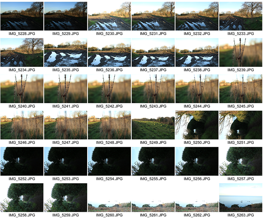
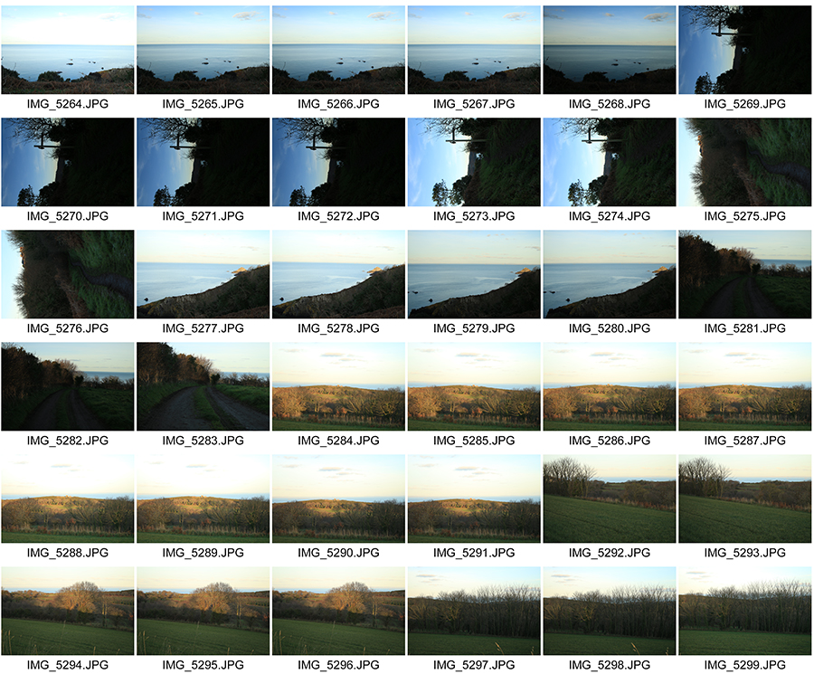
Landscapes // Photoshoot 2 : Bel Croute

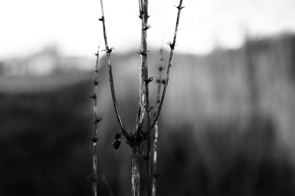
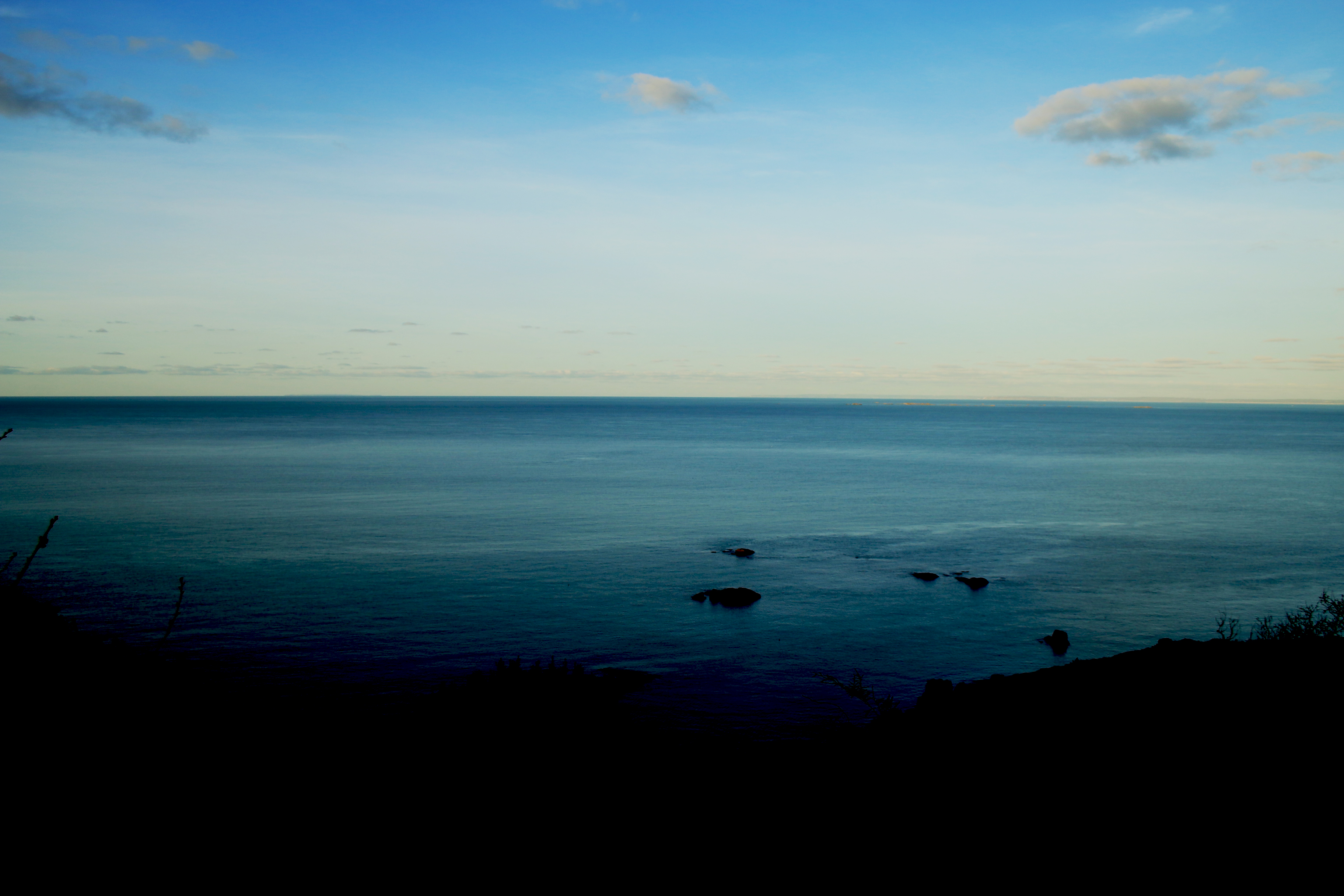
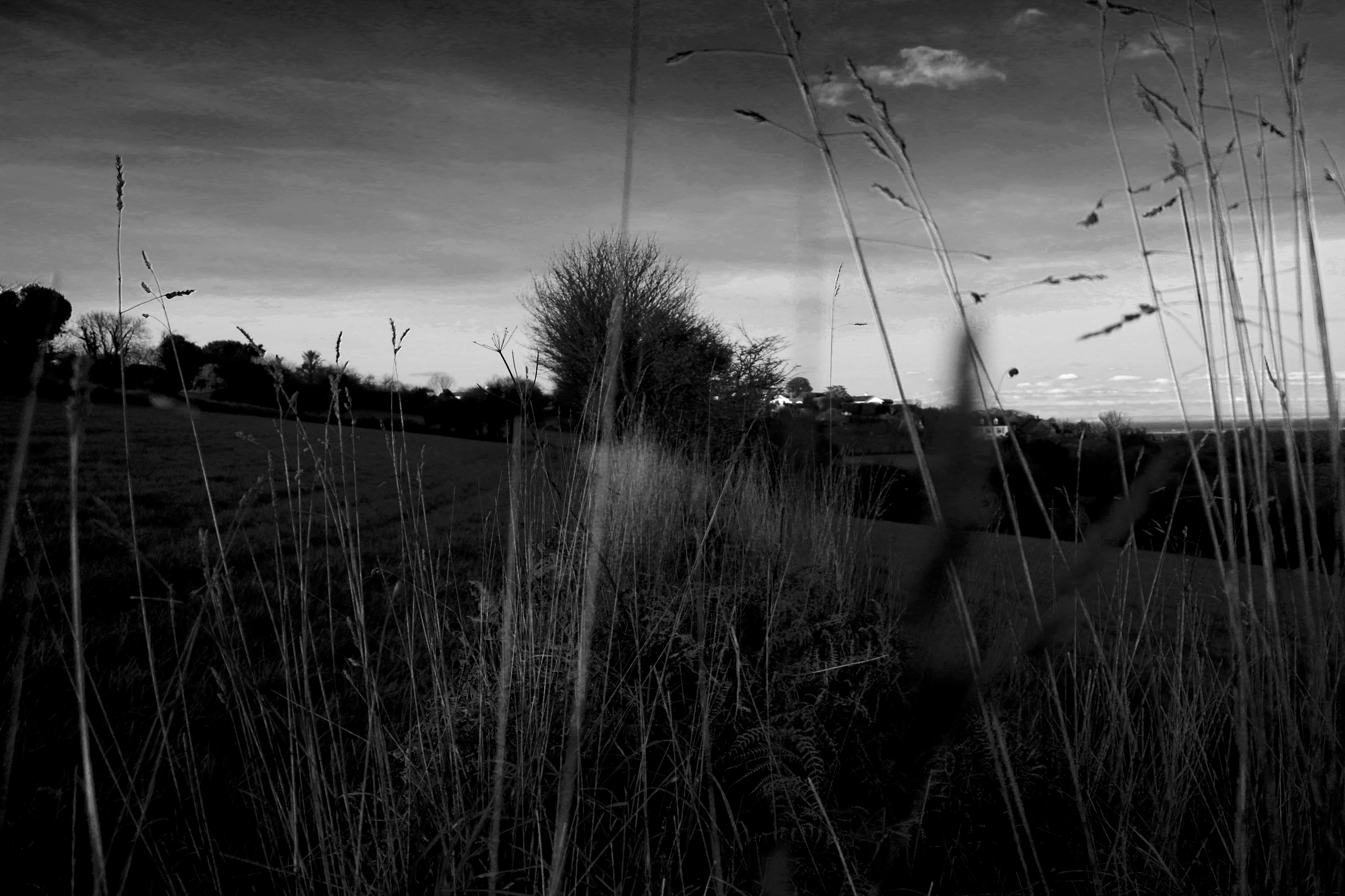
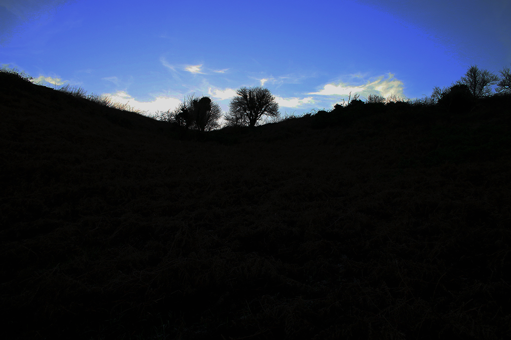
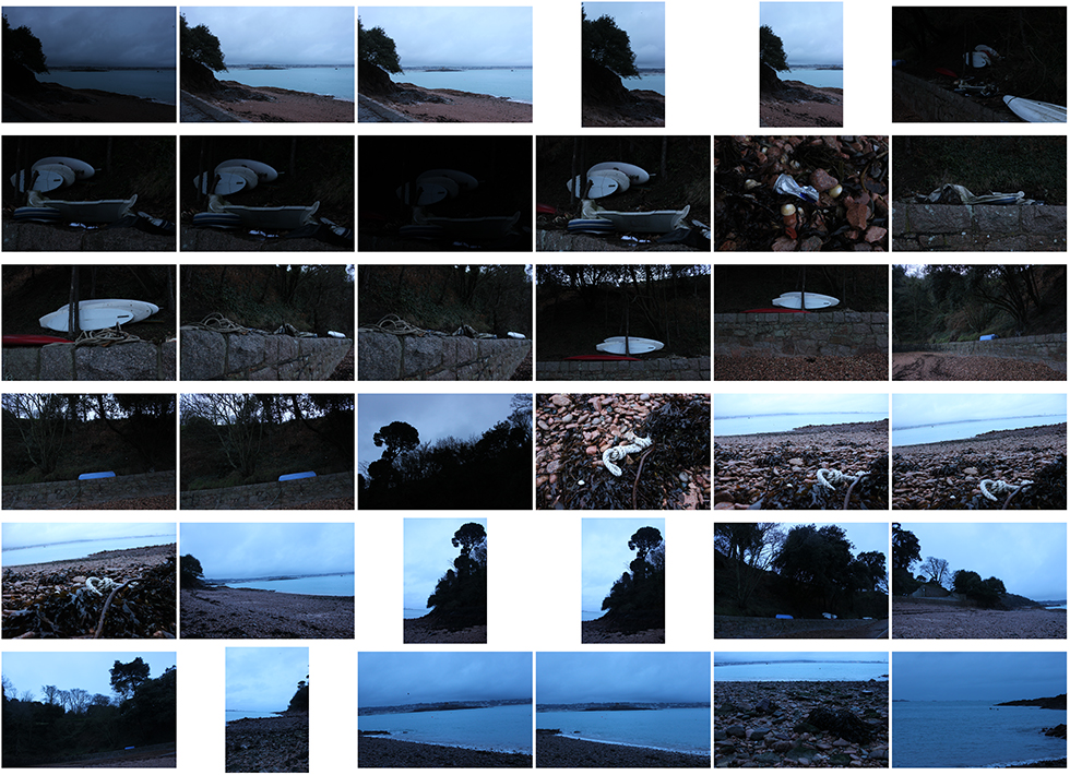
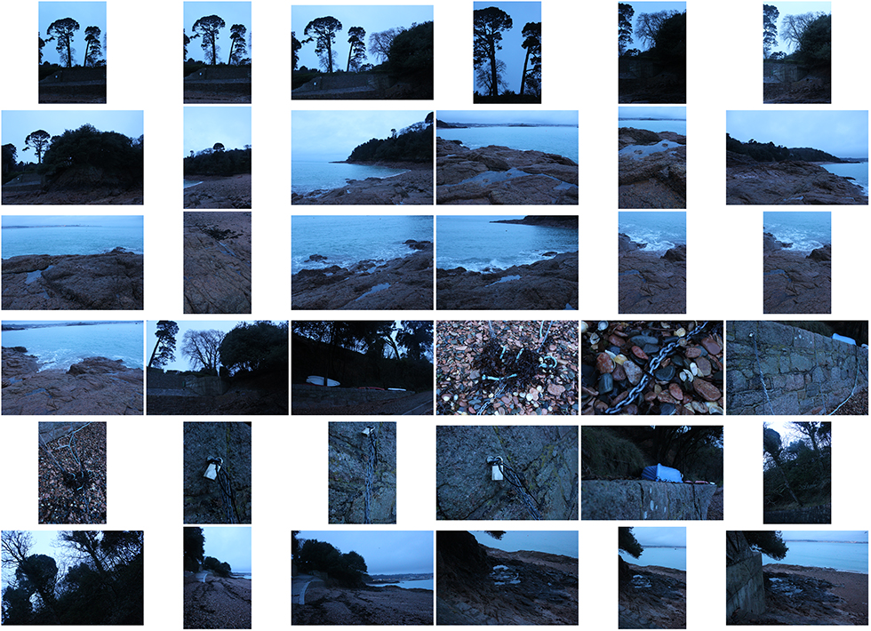
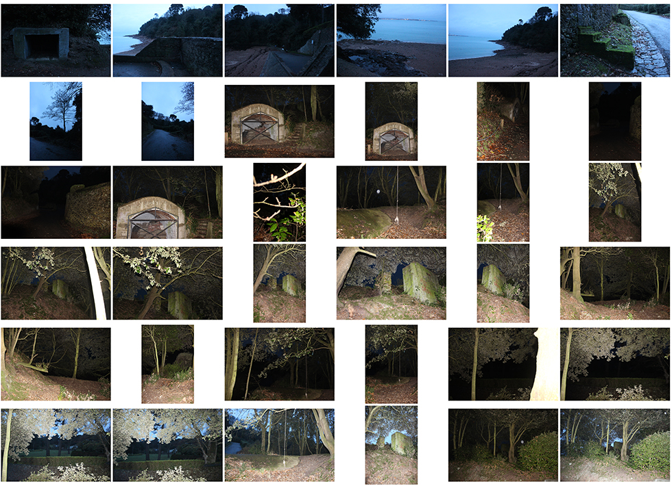
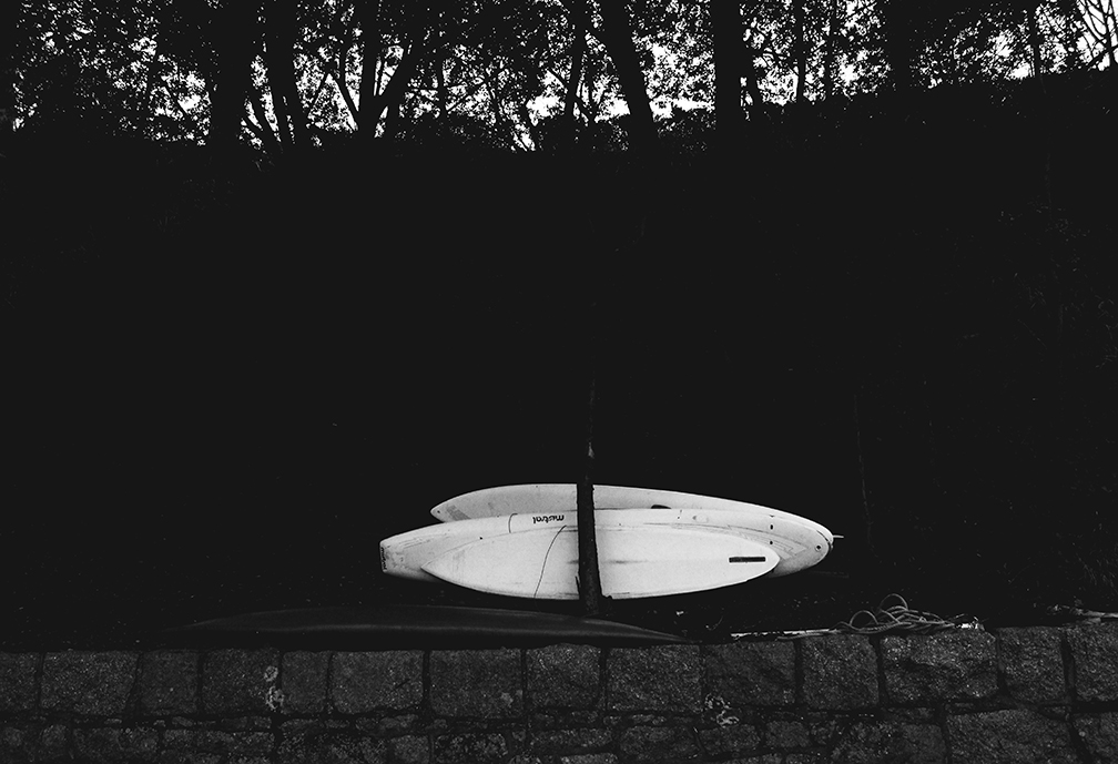
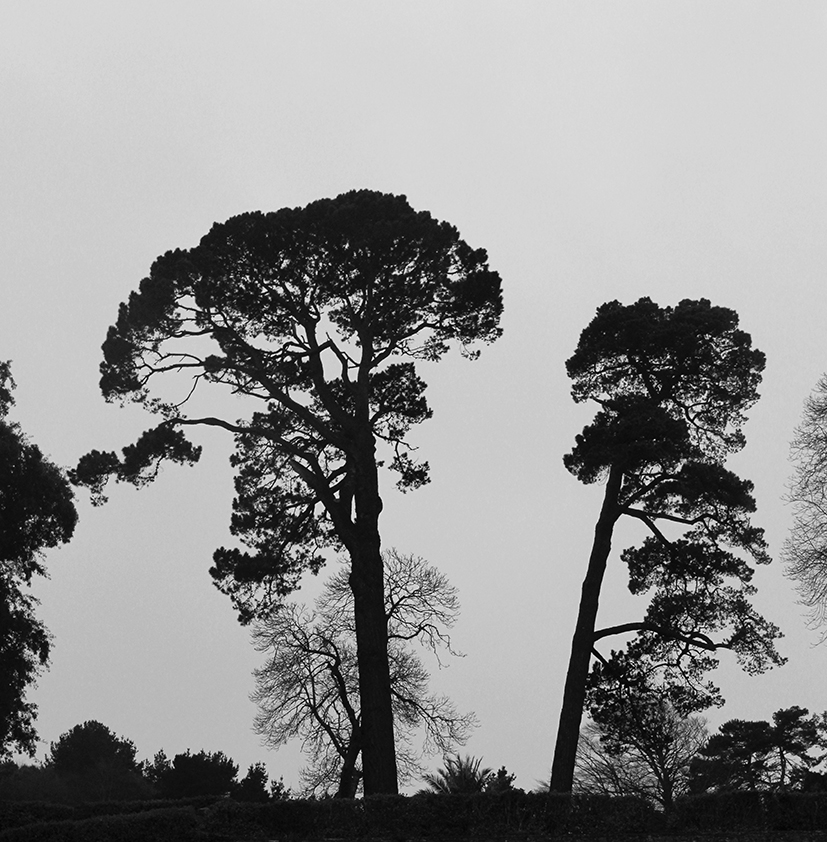
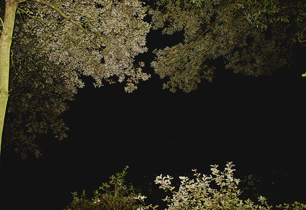
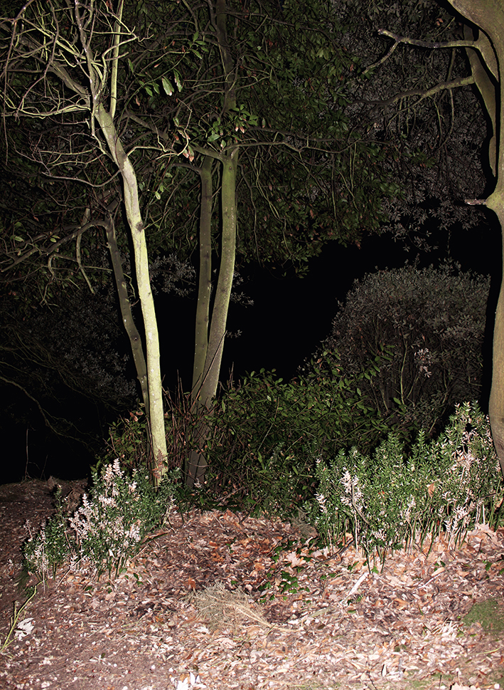
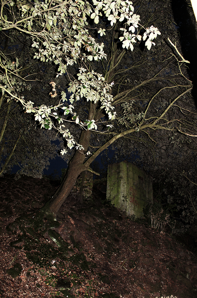
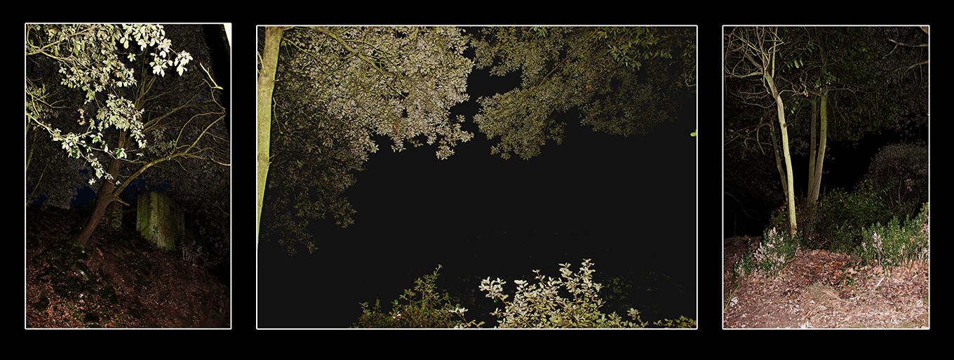
For this photoshoot at Bel Croute, it was early in the evening therefore it wad getting quite dark and the sun had already set. Because of this, i could not capture the bright, fun colours of sun drifting behind the horizon, therefore had to focus on the dark colours that the sky and seascape provided me. However, I could also include several textures in this shoot as there was pebbles scattered across the beach, mini rock pools, the sea, and the land above the lower sea level. My favourite aspect of this photoshoot is the woods area which took full advantage of once it had begun to get very dark. I used the flash to allows the foreground to be brightly lit and in focus, however, it made the background to become very dark, giving a background for the trees and greenery to stand out against. When editing in Photoshop, I wanted to pay around mostly with brightness and contrast to show the use of flash.

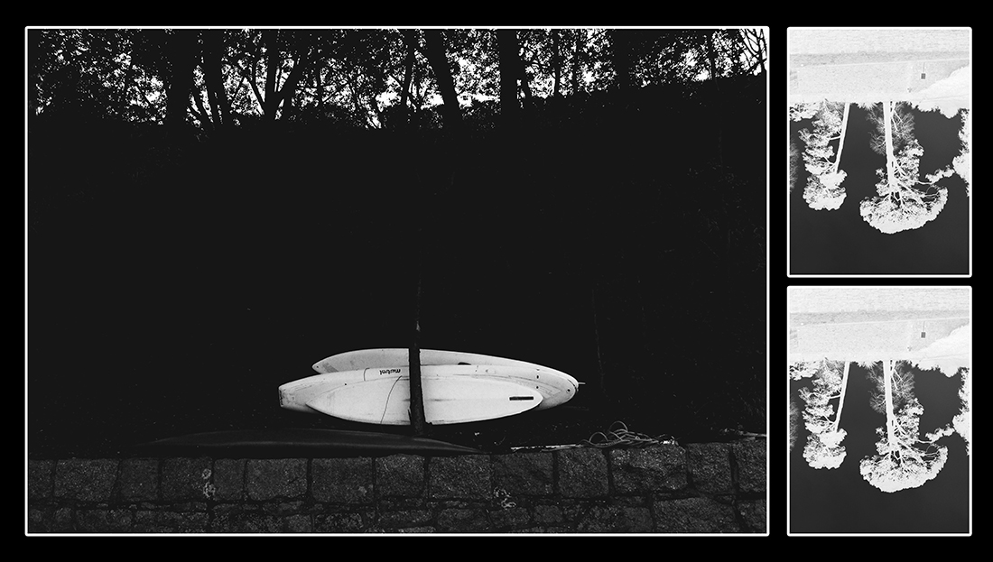
I also experimented with close-ups and macros in this shoot because the textures available to me allowed me yo find little objects that looked great in macro form, such as the chains and padlocks keeping boats ashore. As well as seaweed and pebbles, I could find many different patterns.

There was also a blue tone that glazed the images that I noticed when looking back at the images which adds to the nautical theme and also brightens the look as well as the mood to each image.

bc-cs-1

bc-cs-2 bc-cs-3 bc-cs-4

// BEST EDITS // 

1
3

2

4 5 6

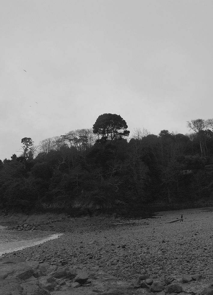
collagecollage-2

Instructions >>> Week 15 | Jan 9-14 onwards 2017

Amended Mock Exam Schedule!!!
Monday 6th March Pds 1 – 5 = 12D

Tuesday 7th March Pds 1 – 5 = 12A

Wednesday 8th March Pds 1 – 5 = 12E

Friday 10th March Pds 1-5 = 12C

Photographing Urban Landscapes

  1. Research and explore The New Topographics and how photographers have responded to man’s impact on the land, and how they found a sense of beauty in the banal ugliness of functional land use… 
  2. Create a blog post that defines and explains The New Topographics and the key features and artists of the movement. Analyse some key imagery (COMPLETE BY FRIDAY 13 JAN)
  3. As a response to Alliance Francaise Climate Change : State of Emergency at Jersey Arts Centre you must produce a blog post that includes examples of ARCHIVAL IMAGES of a local landscape that you have photographed. Compare these images and describe and explain the changes. Does the imagery connect with any of the artists we have studied??? How and why??? You can look at housing areas, industrial areas, erosion of the coastline, reclaimed land etc.(COMPLETE BY FRIDAY 20 JAN)
  4. You can then begin to make contrasts and comparisons to your imagery (for example if you have a sense of repetition) you may want to focus on Bernd and Hilla Becher’s TYPOLOGIES (COMPLETE BY FRIDAY 27 JAN)
  5. You can make links with The New Objectivity movement and their approach to industrial features eg Albert Renger-Patzsch / Karl Blossfeldt : what was The New Objectivity and what was it a reaction to ??? (try to set the context) (COMPLETE BY FRIDAY 27 JAN)
  6. We will then be looking at ABSTRACTION and FORMALISM and you will be expected to explore shape, pattern, colour, line, symmetry and texture and present a range of blog posts that show your findings, experiments and links to suitable artists as a point of reference / influence. (COMPLETE BY FRIDAY 3 FEB)
  7. You must complete a homework task that tackles the techniques involved in producing night landscapes, using long exposures and slow shutter speeds. You can photography light trails, townscapes, stars and star-trails etc…. (COMPLETE BY FRIDAY 10 FEB)
  8. Skills Checklist
    Skills Checklist above and complete by Friday 17th Feb to ensure you have confident skills using photoshop…


Ensure that you include an analysis of a key image from artists and discuss the following key terms…

  • Composition (rule of thirds, balance, symmetry)
  • Perspective (linear and atmospheric, vanishing points)
  • Depth (refer to aperture settings and focus points, foreground, mid-ground and back-ground)
  • Scale (refer to proportion, but also detail influenced by medium / large format cameras)
  • Light ( intensity, temperature, direction)
  • Colour (colour harmonies / warm / cold colours and their effects)
  • Shadow (strength, lack of…)
  • Texture and surface quality
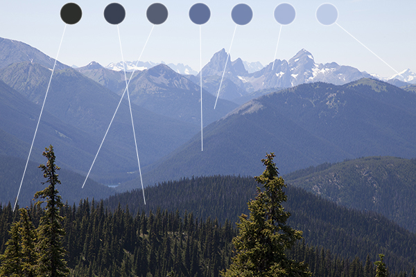
  • Tonal values ( contrast created by highlights, low-lights and mid-tones)

Previous tasks

All students will be expected to engage with a range of initial approaches to Landscape Photography…

  • A brief history and overview of landscape art and photography
  • Romanticism in Landscape painting and photography
  • Ansel Adams and Edward Weston and their impact on contemporary landscape photography
  • A site visit / guided walk (see Psychogeographies blog-post)
  • Havre Des Pas Photoshoot = Period 5 lessons starting next Thursday 8th  (12D MM), Friday 9th (JC 12C), Tuesday 13th (12A MM) & Wednesday 14th (12E JC).


  •  M:\Departments\Photography\Students\Resources\Landscape Photography\Mr Cole 12A, 12C, 12D, 12E

You must complete the following tasks in Weeks 13 + 14 (before Christmas)

<<<Research and Analysis>>>

  1. An introduction to landscape photography, including a definition and mood-board of influential images
  2. A Case Study on Ansel Adams and Edward Weston

3. Create a blog post that defines and explains what Romanticism is in Landscape Photography…include examples and make reference to Romanticism in other art-forms eg painting

4.Create a blog post that shows your understanding of what Psycho-Geography is and how we can use this concept to help us respond to the urban / rural / sea / land scape (s)…

Homework Assignment

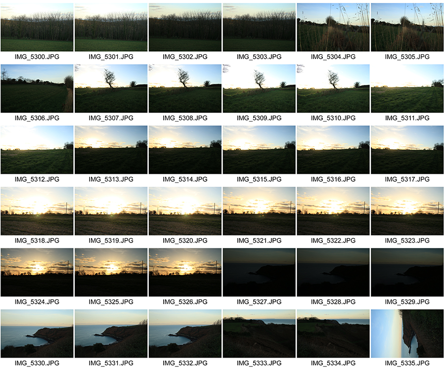
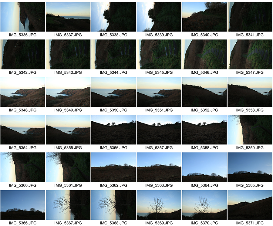
  • Between December 5 2016 and January 5th 2017
  • Take 150-200 photos of romanticised landscapes
  • Try to keep to natural / rural settings with minimal human impact
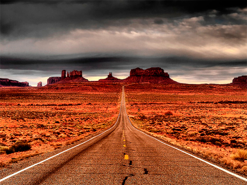
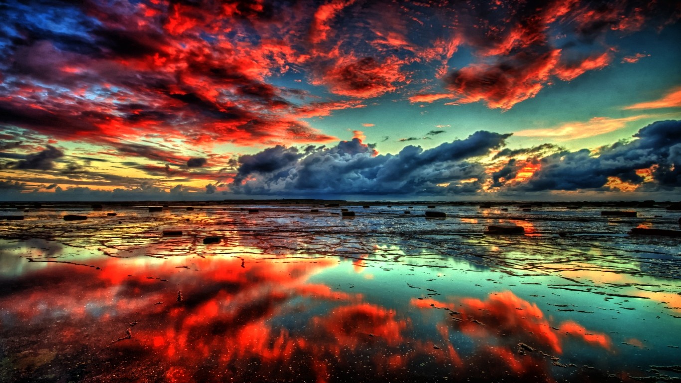
  • We will show you how to “EXPOSURE BRACKET” and you must try using this technique for at least some of your photographs
  • We will then show you how to convert these images to HDR using photoshop

6c61ea1dd7ca9a620af306a4a6e8b21e


Here is a link to the BBC Website “in-pictures”…The British Isles 2016

http://www.bbc.co.uk/news/in-pictures-3816943


The New Topographics


Analysing Your Images

The Formal or Visual Elements

Photographers are usually aware of the ways in which they can create interest in their images regardless of the subject. This is sometimes what separates successful and less successful pictures of the same thing. The following list describes some of the formal or visual elements in any photograph. These are mostly shared with other kinds of pictures, although photography has some that are special:

Light:

Line:

Repetition:
Shape:
Space:

Texture:
Value/Tone:

Colour:

Composition:

Which areas of the photograph are brightest? Are there any shadows? Does the photograph allow you to guess the time of day? Is the light natural or artificial? Harsh or soft? Reflected or direct? How does light fall across the objects in the photograph?
Are there objects in the photograph that act as lines? Are they straight, curvy, thin, thick? Do the lines create direction in the photograph? Do they outline? Do the lines show movement or energy?
Are there any objects, shapes or lines which repeat and create a rhythm or pattern? Do you see echoes or reflections within the image?
Do you see geometric (straight edged) or organic (curvy) shapes? Which are they and how do they relate to each other?
Is there depth to the photograph or does it seem shallow? What creates this appearance? What is placed in the foreground, middle ground and background? Are there important negative (empty) spaces in addition to positive (solid) spaces?
If you could touch the surface of the photograph how would it feel? How do the objects in the picture look like they would feel?
Is there a range of tones from dark to light? Where is the darkest part of the image? Where is the lightest? Are the tones in the photograph balanced or does the image tend towards darkness or lightness overall. How does this affect the mood or atmosphere?
What kind of colours can you see e.g. saturated, muted, complementary, primary? Is there a dominant colour? How would this image be different if it was in black and white? Does the use of colour help us understand the subject or does it work independently?
How have the various elements in the picture been arranged? Does the image seem balanced or unbalanced? Is it possible to superimpose geometrical shapes on the image to better understand the composition e.g. a pyramid? Has the photographer used the Rule of Thirds?+


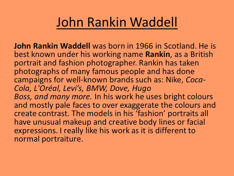
Rankin- Best Photos Analysis

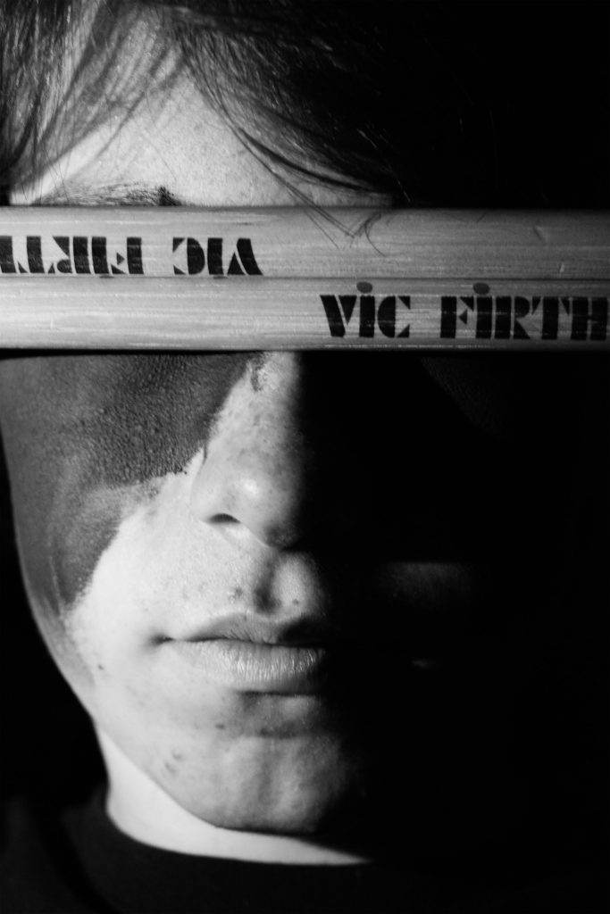
blindfold

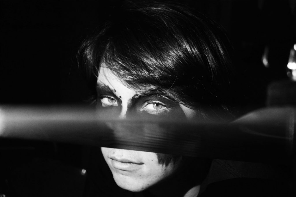
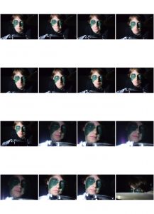
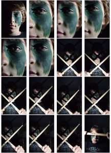
Here I wanted to use chiaroscuro lighting I did this by using the torch from my phone and held it up next to his face as I took the picture with the other hand. I also used the drum sticks as a sort of  blindfold this covered his eyes. On this picture I wanted to focus on the phrase “The eyes are a window to the soul”. This photo perfectly shows my brothers personality as it shows that sometimes my brother using drumming as a barrier to talk or to talk to people. A barrier to talk about the serious stuff and doesn’t always let people see his true self but instead his talent. When editing this photo I wanted to make it black and white as I thought it would look more striking. I also increased the contrast a decreased the brightness slightly.
dave-cut-drums

In this photo I wanted to cut his face in half using the symbol of the drum kit but also make it look like he’s hiding behind exploring the same idea as my previous photo. When editing this photo I made it black and white and increased the contrast as well as the brightness. I like this photo because it feels dramatic, it feels like he is staring into you not at you. It really has the eerie feeling I wanted it too have with the seriousness in his eyes and the dark setting behind him.

dave-high-angle-lighting-bw

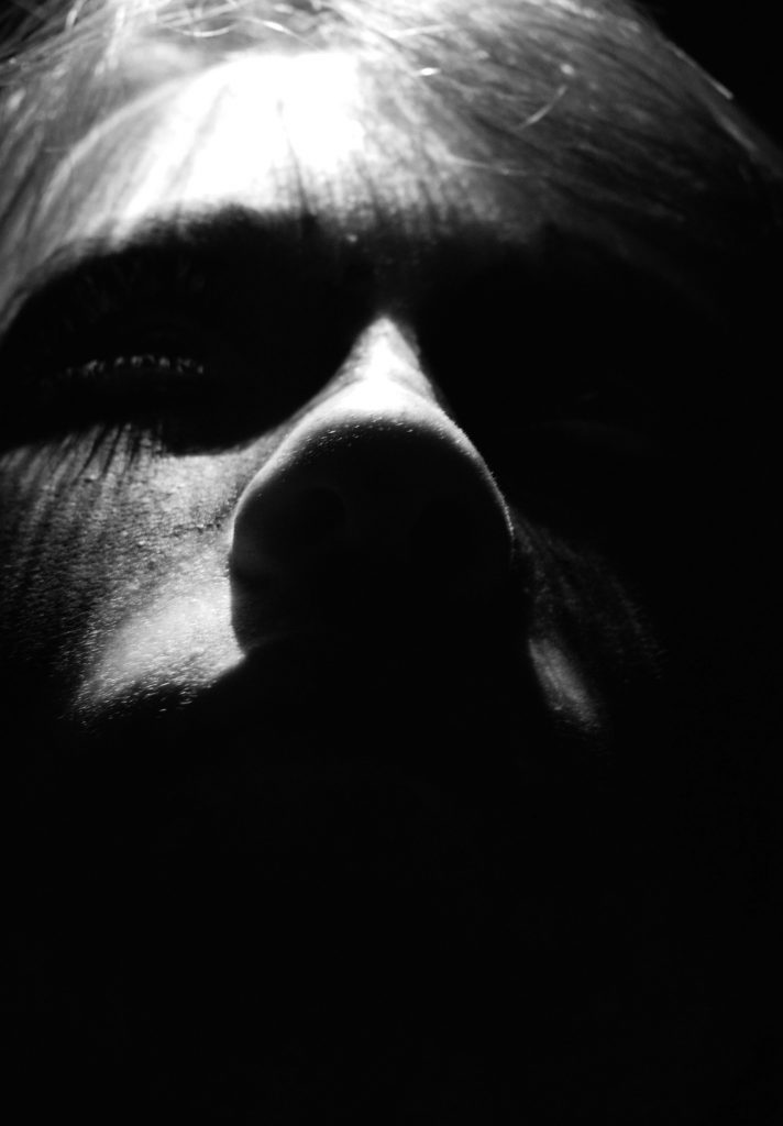
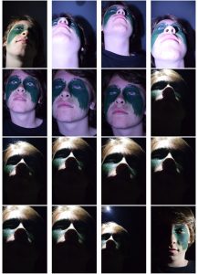
Here I used over head lighting to make this intimidating feel to the photo. I chose to make it black and white because gave the dramatic feel I wanted it to. When editing the photo I wanted only part of his face to by shown so did this by turning it black and white and increasing the contrast dramatically. This also picked up on the shadows made with his eye lashes and enhanced them.

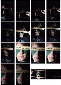
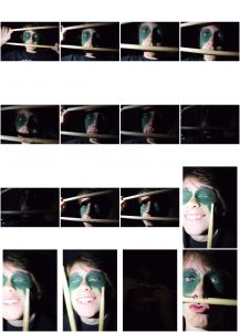
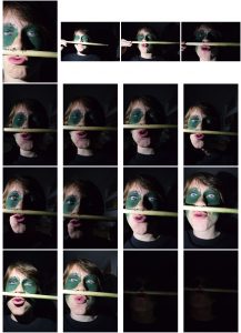
Rankin- Best Photos Contact sheet

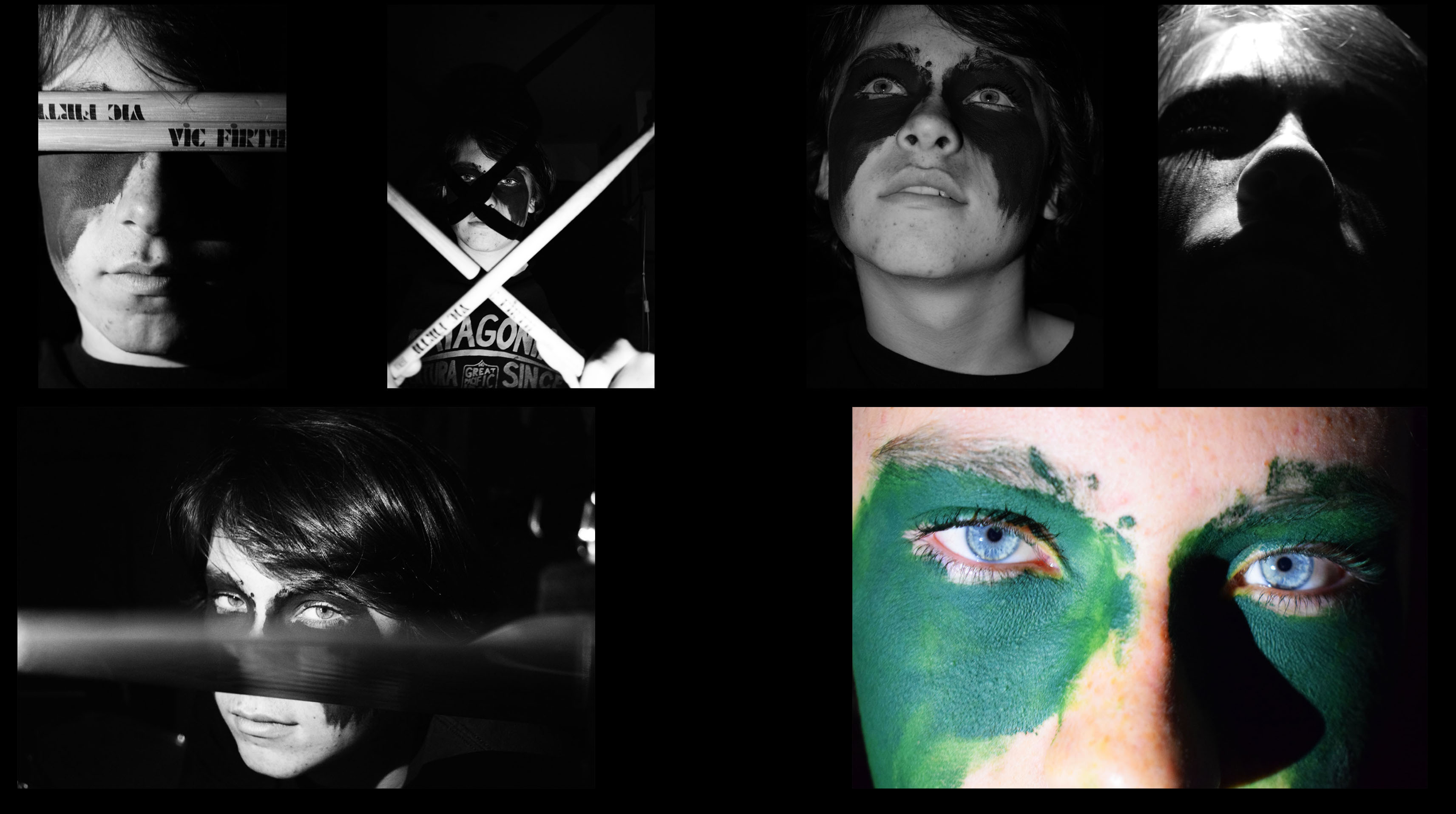
best-dave-ones

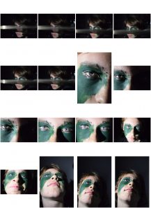
Here I have chosen the best photos from my Rankin project. When I editing these photos I wanted to make them striking, something that captures your attention. I also wanted to make it my own interpretation of Rankins photography. I wanted to show my brothers personality through the photos. This is why I did the photo shoot around the drum kit because my brother puts all his time into playing drums and puts a lot of effort into it. I also used the face paint to show my brothers personality, this why the face paint is messy war paint and looks like he has just put it on his face quickly. I wanted this to show that when he plays his drums its like a battle he puts everything into it, giving it his all. I wanted him to look intimidating but also calm and approachable in other photos.