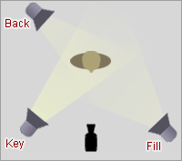
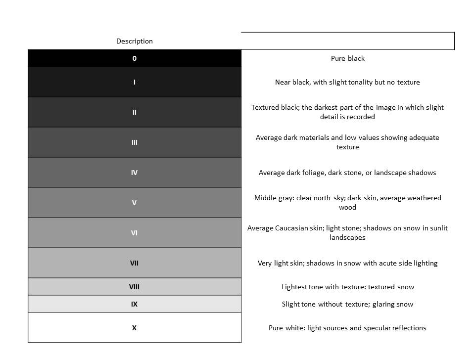
The Three Point Lighting Technique is a standard method used in visual media such as video, film, still photography and computer-generated imagery. It is a simple but versatile system which forms the basis of most lighting. Once you understand three point lighting you are well on the way to understanding all lighting.
The key light, as the name suggests, shines directly upon the subject and serves as its principal illuminator; more than anything else, the strength, color and angle of the key determines the shot’s overall lighting design.
The fill light also shines on the subject, but from a side angle relative to the key and is often placed at a lower position than the key (about at the level of the subject’s face). It balances the key by illuminating shaded surfaces, and lessening or eliminating chiaroscuro effects, such as the shadow cast by a person’s nose upon the rest of the face. It is usually softer and less bright than the key light
The back light shines on the subject from behind, often (but not necessarily) to one side or the other. It gives the subject a rim of light, serving to separate the subject from the background and highlighting contours.
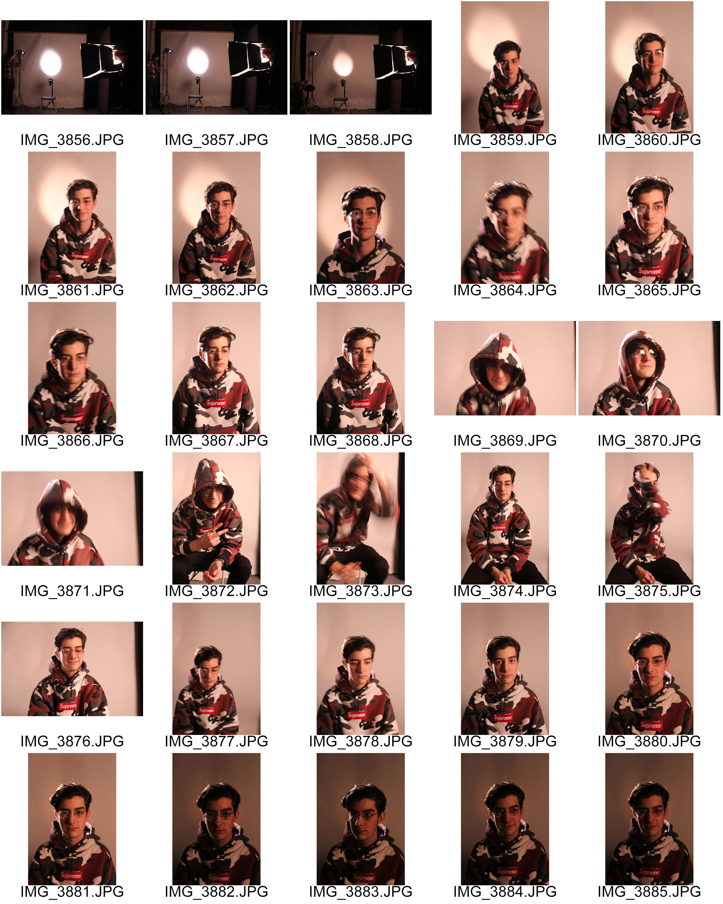
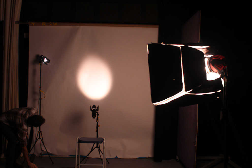
This shoot was a hard as we did not have access to the correct lighting sources. Altogether we had a Fill, Key and Back light however the key light was far more direct and powerful than the full light making it very difficult to cancel out any shadow. i was still able to capture some image which were a good attempt at three point lighting and it was a good starting point so that i know how i will change next time i attempt this shoot to improve it. Nonetheless i still edited a few of the best images in a few different ways and i think that some of the results were very effective and show good studio photography.
This is hot the studio was set up. we started with the lighting in the typical three point lighting positions and then began to move them around to remove as many shadows as possible. i think that the use of two soft boxes in a second shoot would be lot more creative.
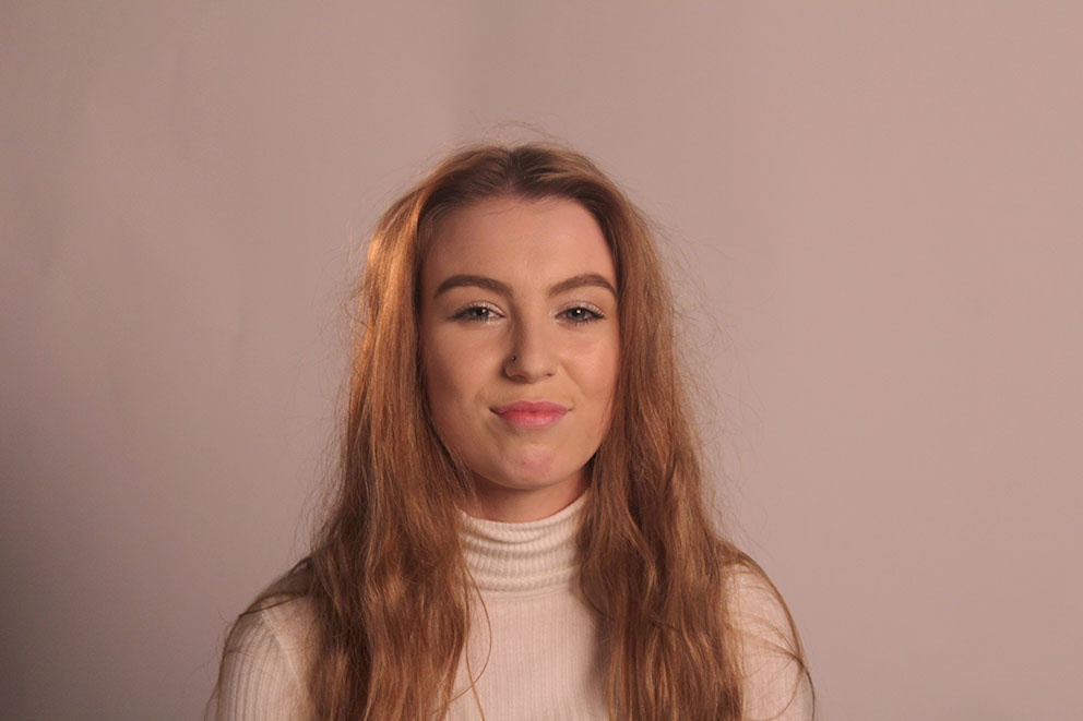
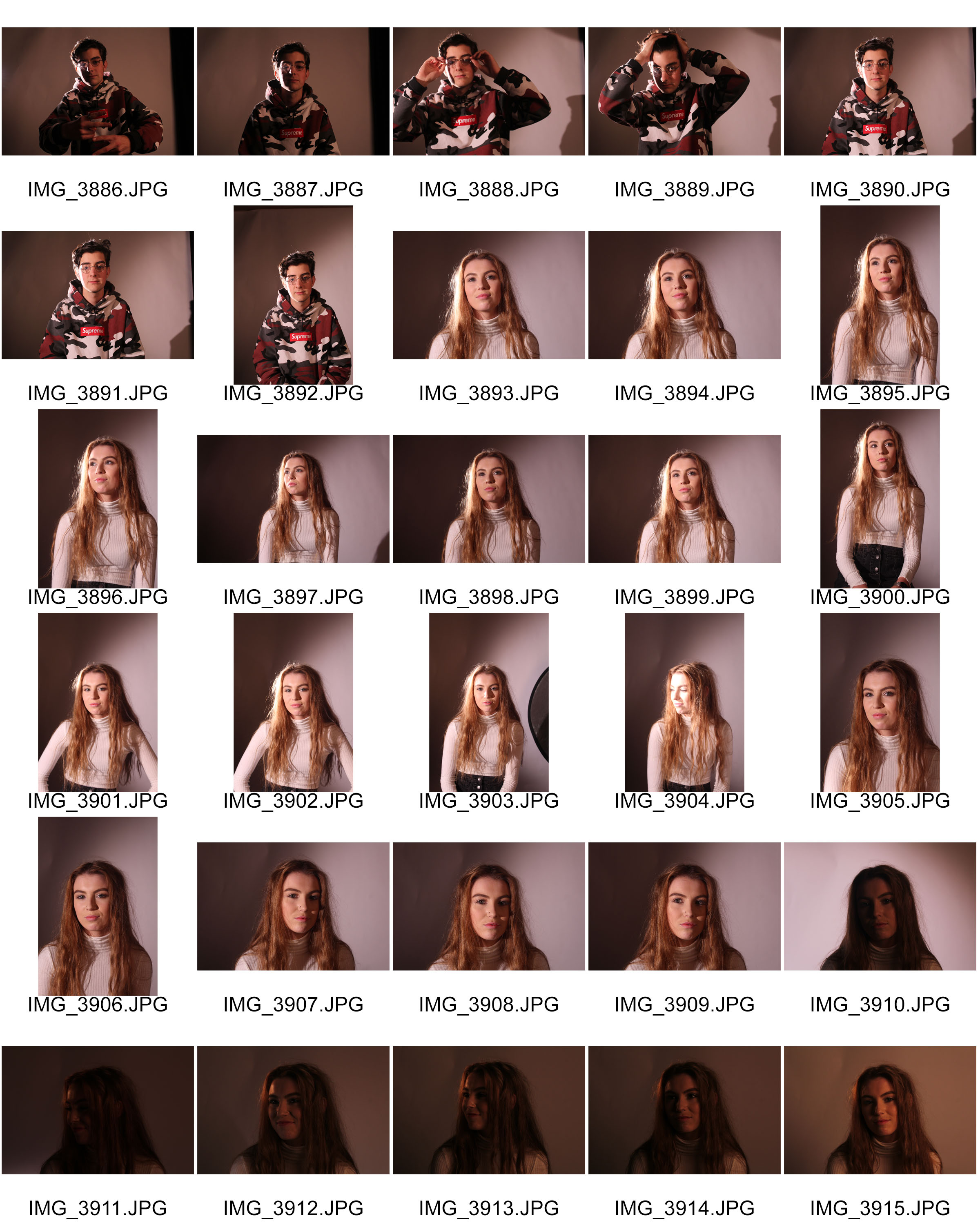
I picked this image as one of the final images from this shoot as it was the image with the least amount of shadow. i think that this image worked best because we had the soft box as the key light coming from the right of the image and the then fill light coming from a 45 degrees angle to the subject which has eliminated most of the shadow although creating a slight illumination on the side of the hair. the third and final light was the back light which we shon against the white background to get hid of any last shadows. the simplicity of the subject and the angle of the body position made the image easier than some of the previous attempts to minimalise the shadowing. the image follows the rule of thirds as the subject has been placed in the centre of the image making the subject an unavoidable focal point. the even amount of background behind the subject makes a good frame helping the further make the subject the focal point as well as giving the portrait some depth of field as the subject stands out on top of the background. the colour tones make the image calm as the lighting is quite soft and the facial expressions make a huge difference to the tone of the image and as she is smiling a happy warm atmosphere is created by this attempt at a three point lighting portrait.
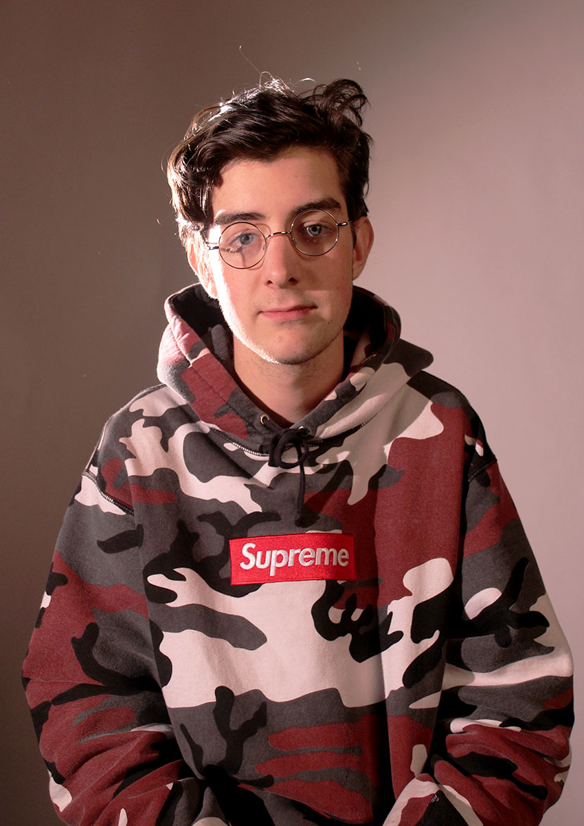
I chose this image to analyse as the angle of the lighting system was not very good for this image. on the left side of the subjects face there is a strong light source which overexposed the side of the face and then the right side of the face which is not getting enough of a light source which meant it could not balance with the light source coming from the other side meaning shadow was created in the right side of the face. Although the overexposure along with the showing creates an affected contrast with the image it is not what i was hoping to capture with an even lighting throughout the image. From photographing this specific subject i found that glasses are very tricky to work with because you get shadow from the glasses and a reflection of the light from the lense. so i have learnt not to take photos with glasses unless i have the correct lighting set up and have fully planned for a complicated prop.
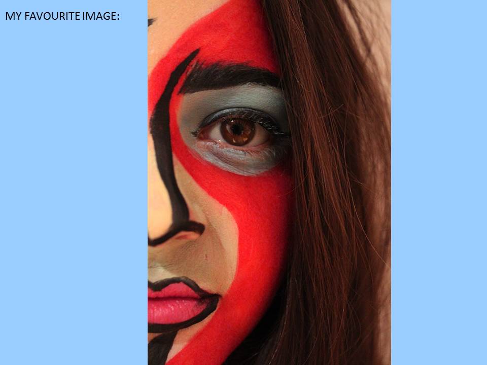
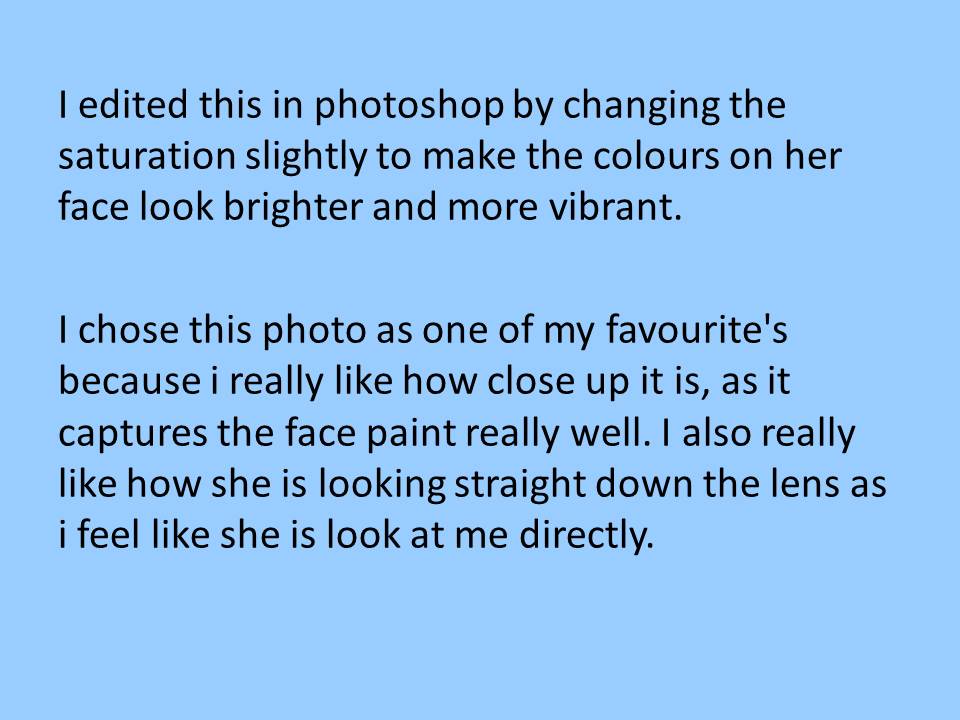
This was my Favorite image from the three point lighting shoot. When i saw this image i immediately had a positive emotional response to it due to the natural style of the image and the fact that it shows the subjects beauty. The way the lighting was directed onto the face really stood out to me and the contrasting colours made it a really interesting photograph to look at.
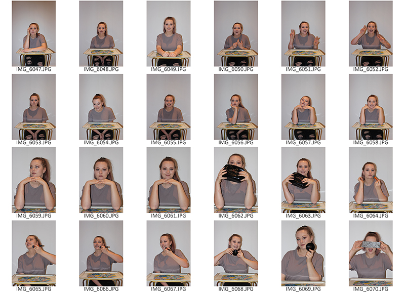
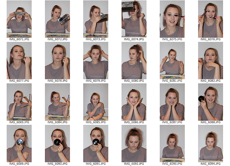
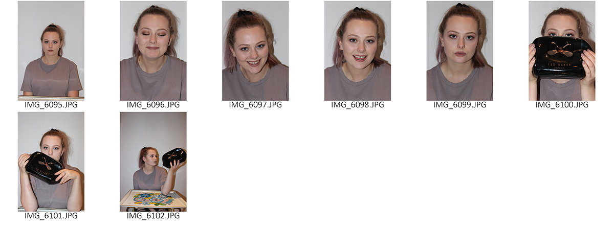
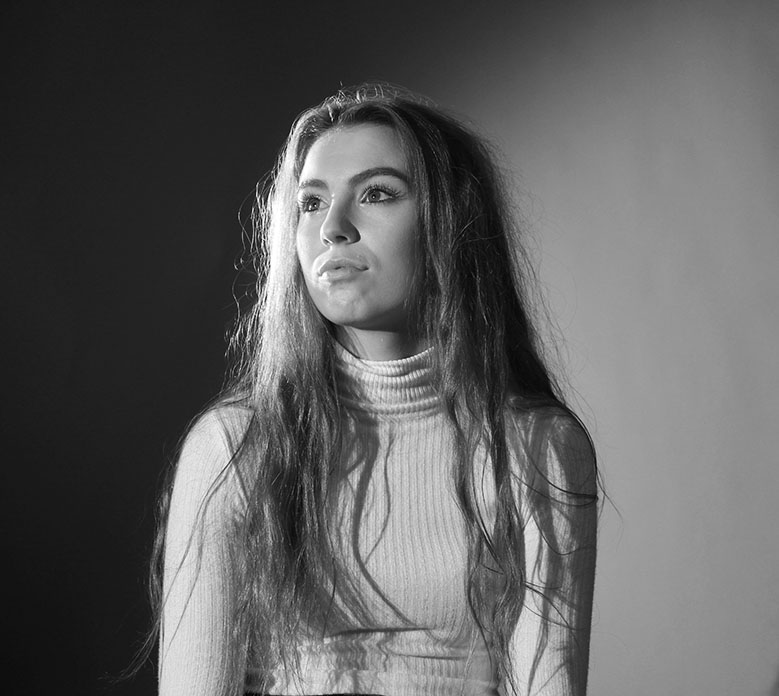
This image is of a teenage girl who volunteered to be a model for the three point lighting photo shoot. the lights were set up in the traditional three point lighting system with the key light facing the subject. the model was sat on a chair in front of a white back drop. The camera was on manual focus which meant i had to support the camera carefully to stop blurring. the white balance was on Fluorescent and the ISO was on 400. The shutter speed was on 1/100 of a second so that the image was taken quickly this also added the use of manual focus well as the image was taken on a fast shutter. The key light for this image was a strong directional light source which allowed us to angle it very specifically. in the case he subject decided to look right at this light illuminated the subjects face. i really like the effect this has given the image as it gives the photo a meaning of the subject being in the spotlight. The contrast in the light sources meant that there is a slight shadow of the right of the subjects face meaning the aim of the shoot was not captured however i feel that this image is very successful as the contrast between light and dark makes the image very powerful and seem almost profession. The way the back light and key light were both directed from the left onto the right meant that the right background is in lightness and the left is in darkness creating a different whilst effective background
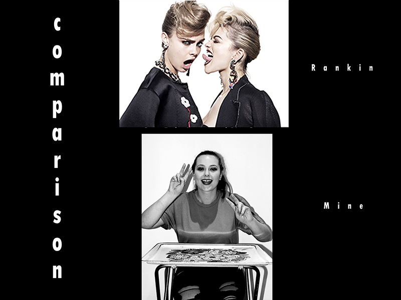
Comparison with Mario Testino’s work
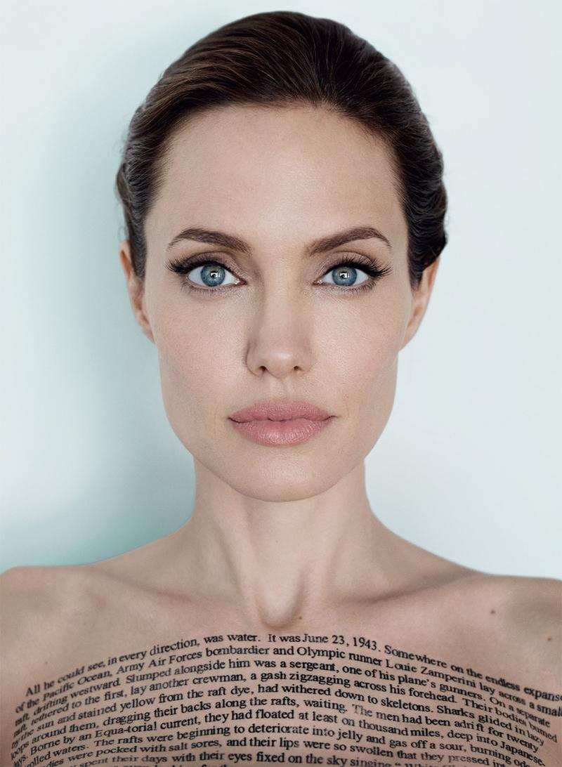
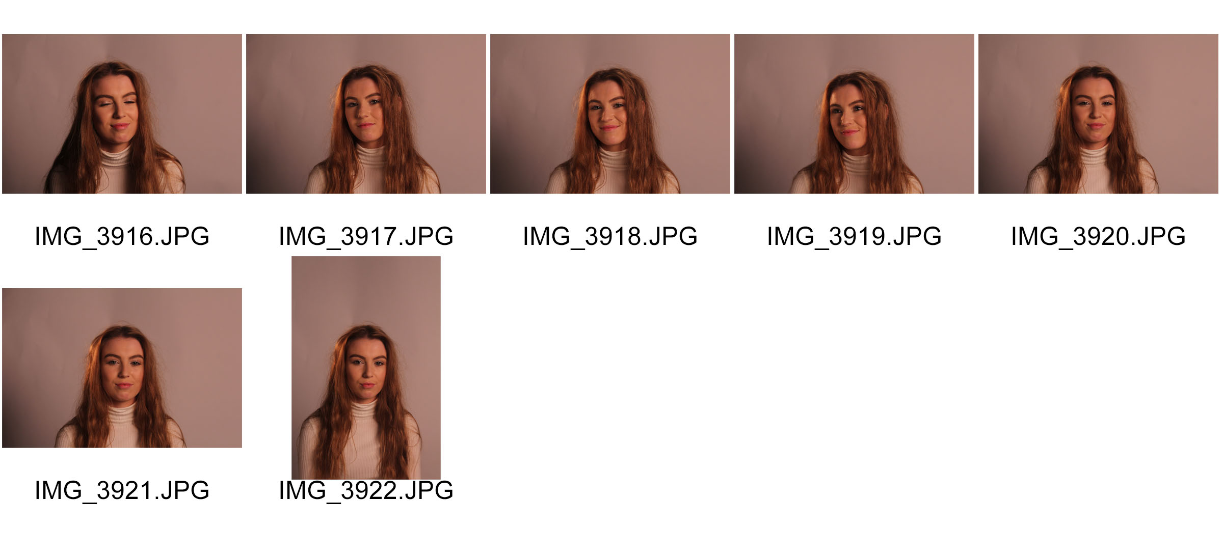
Mario Testino’s images contain better usage of three point lighting than my images. Testino has used two soft box light sources and then a light source on the floor pointing up to create a more even light were the facial parts are equal tone of lighting. The lights were also probably on a lot stronger setting as the background is pure white and most of the image is very clear whereas the lighting that i used was a soft box and then a spot light which made it a lot harder to even out the light and get rid of shadows. to try and get this effect i had to lower the lights down to a softer light which resulted in the images having an orange tint so they weren’t as effective as as Testinos images. Therefore he used a high key lighting whereas my image were taken in more of a low key lighting. His image is also a lot sharper and the clear lines and the simplicity of the images makes the model stand out really clearly, this creates a contrast in the image without the use of shadows. My image is not as clear so it would be good to do this shoot again and have two soft boxes on a harsh lighting so the images are more light.

 Environmental Portrait
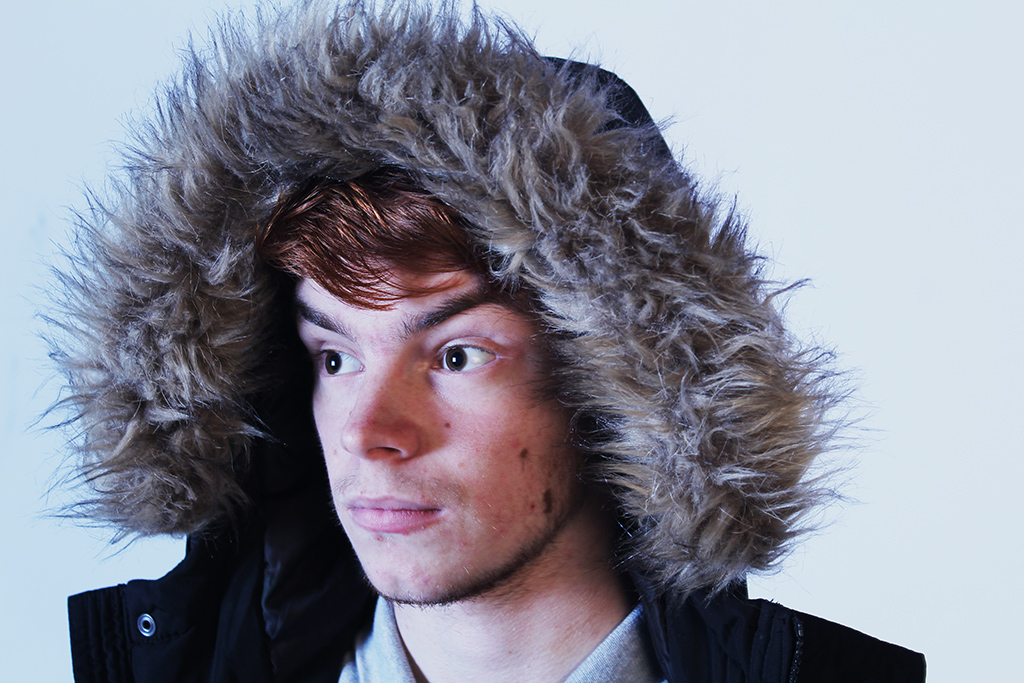
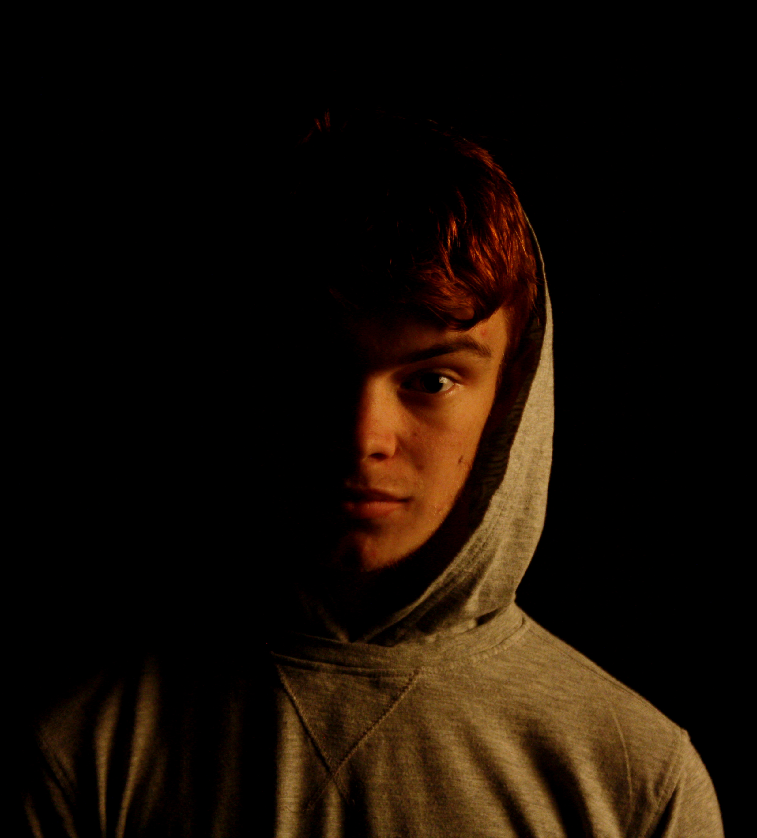
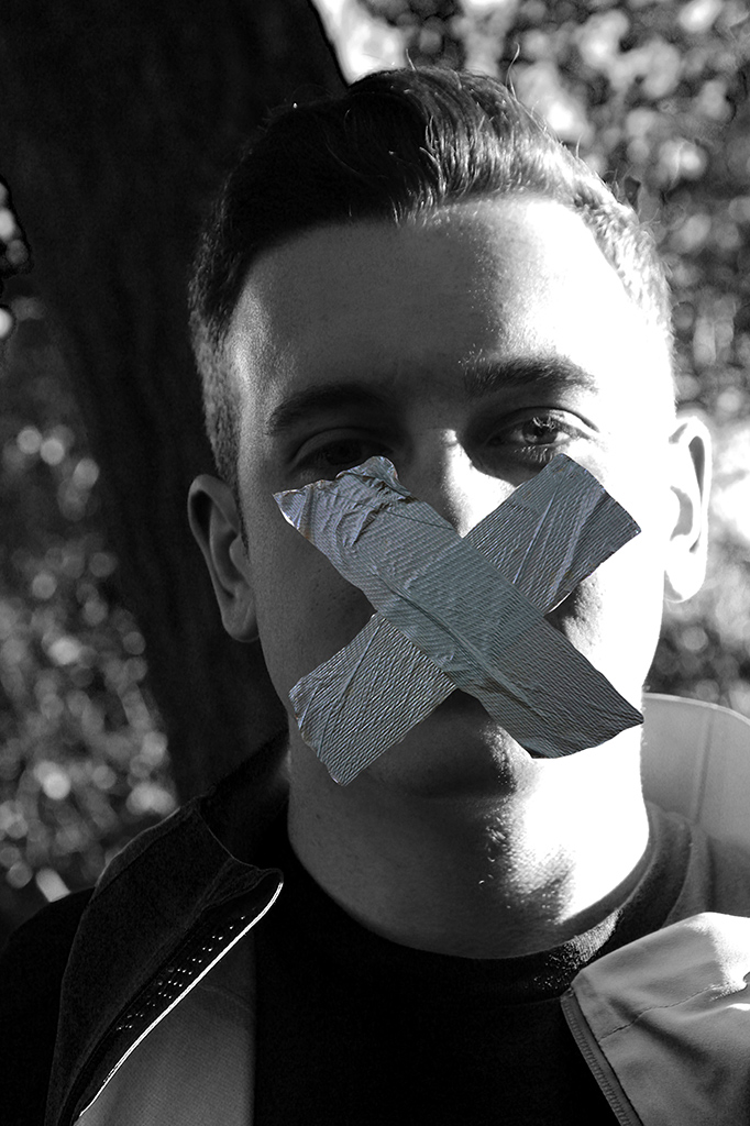
 Hard lighting Portrait
 Two Point Lighting Portrait
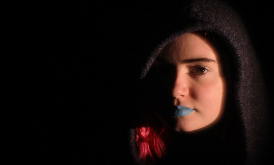
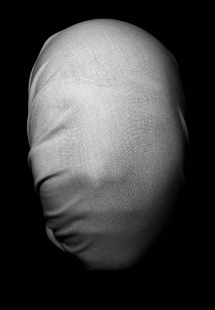
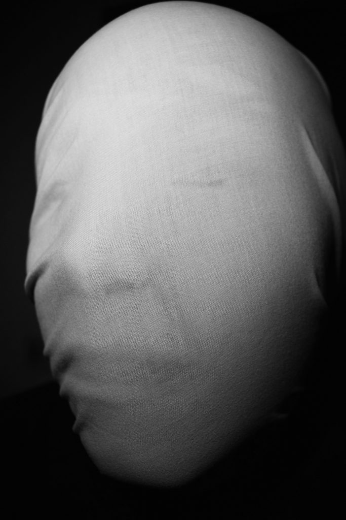
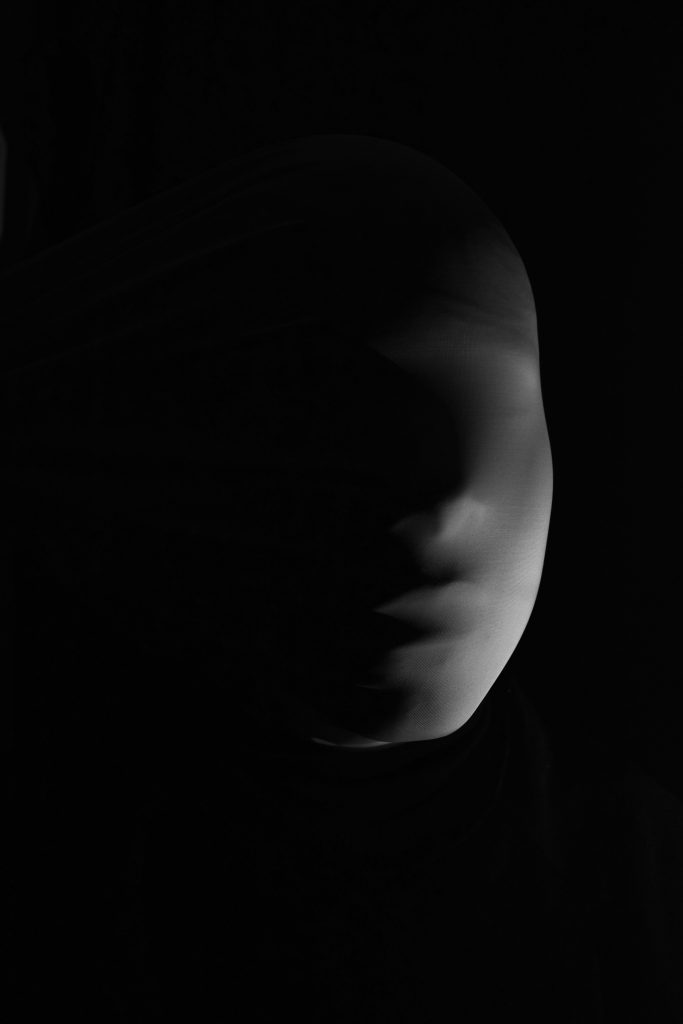
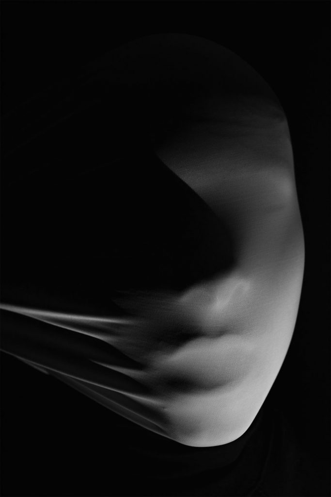
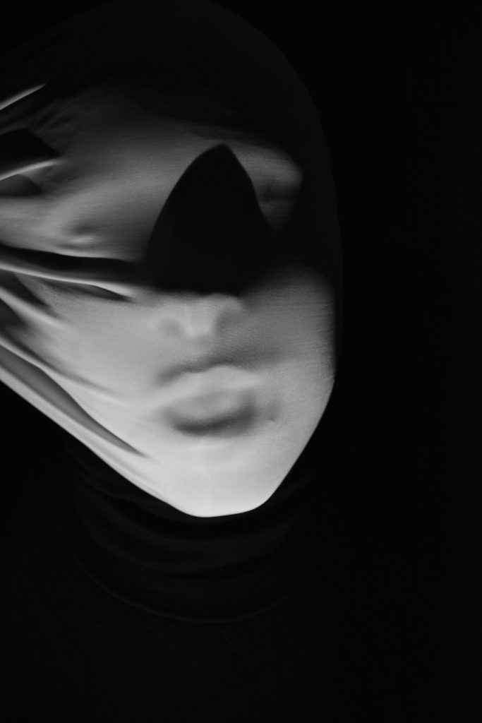
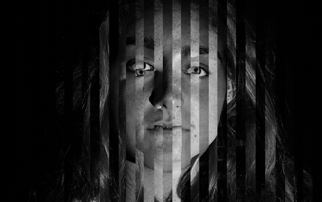
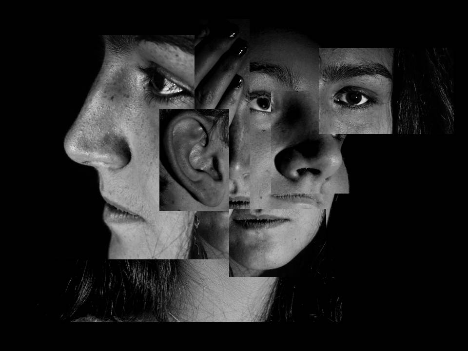
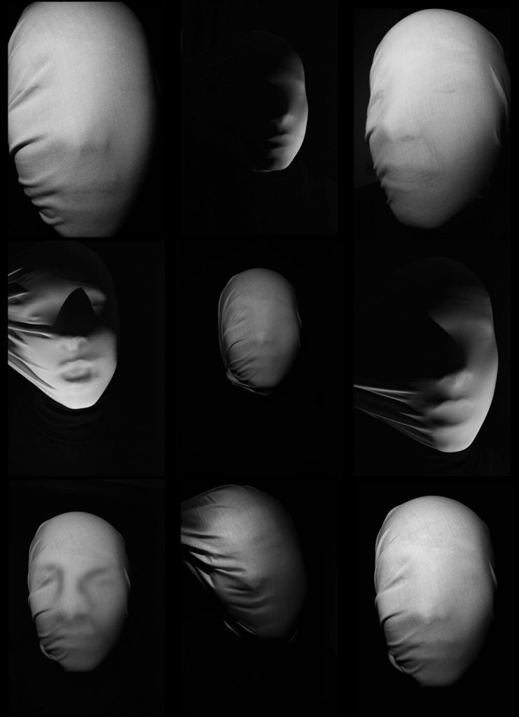
 Loss of identity Portrait
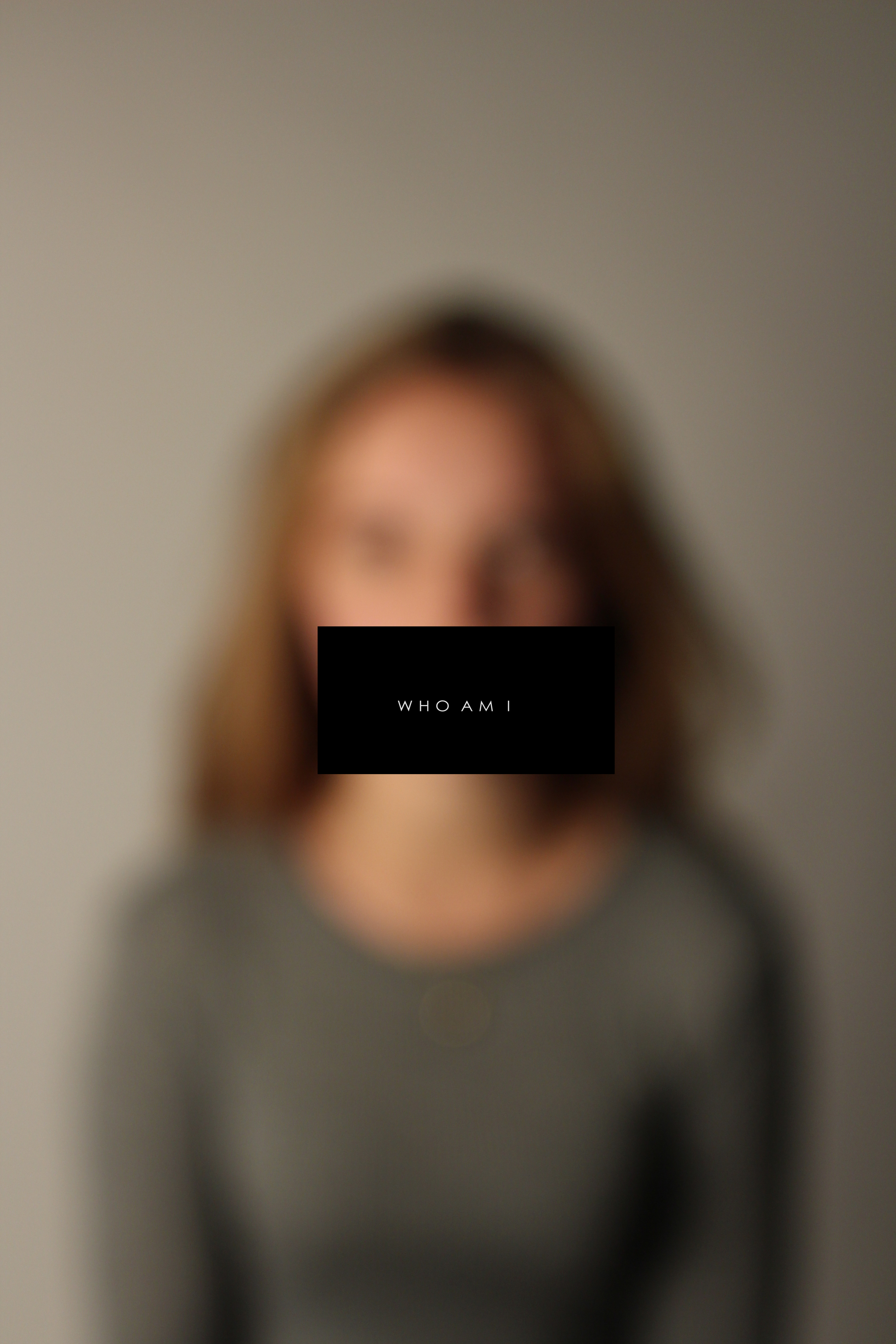 Loss of identity Portrait
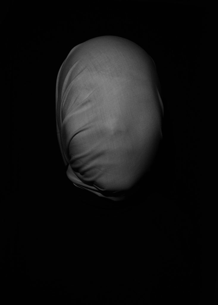
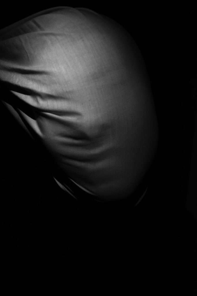
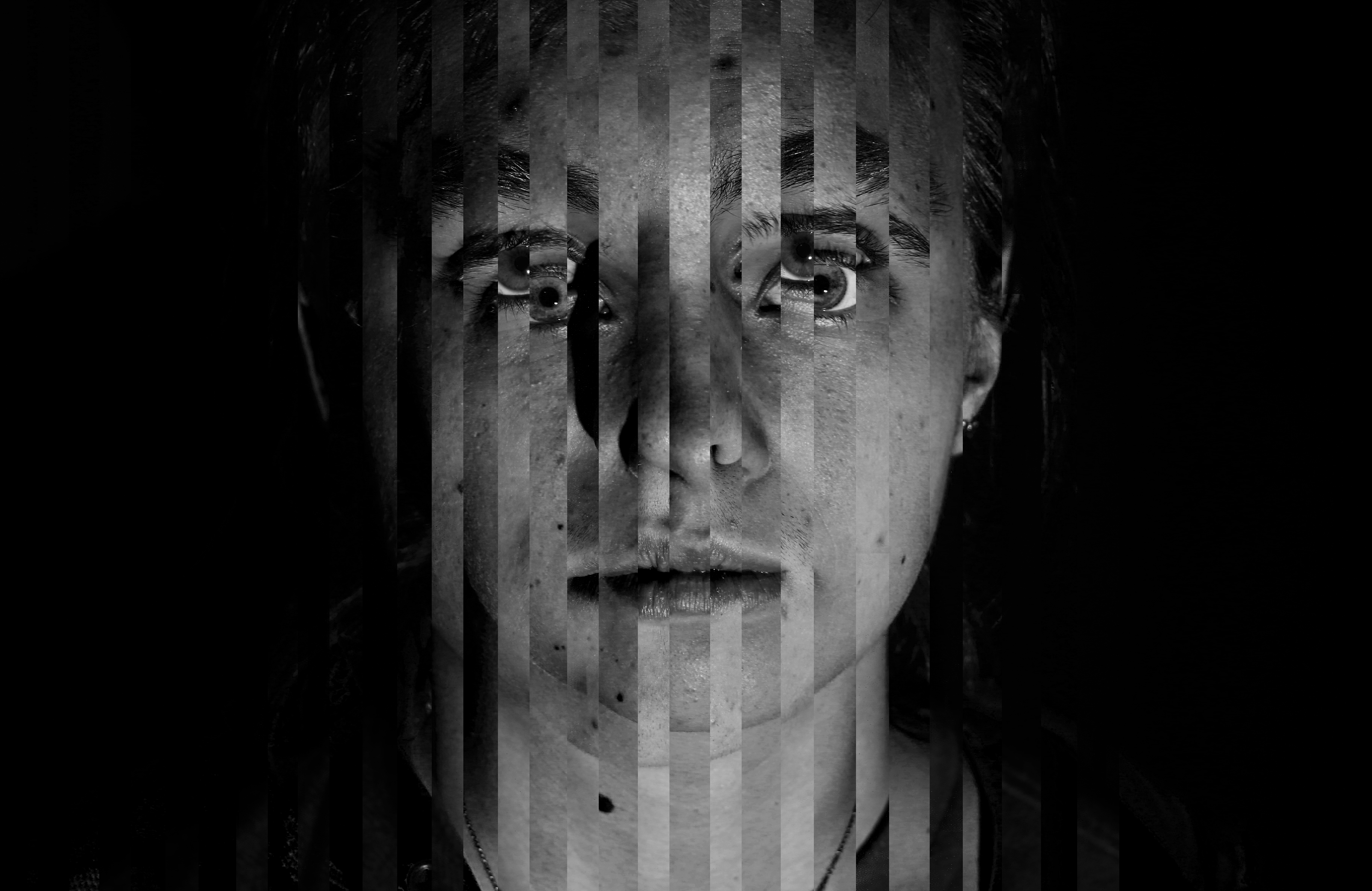
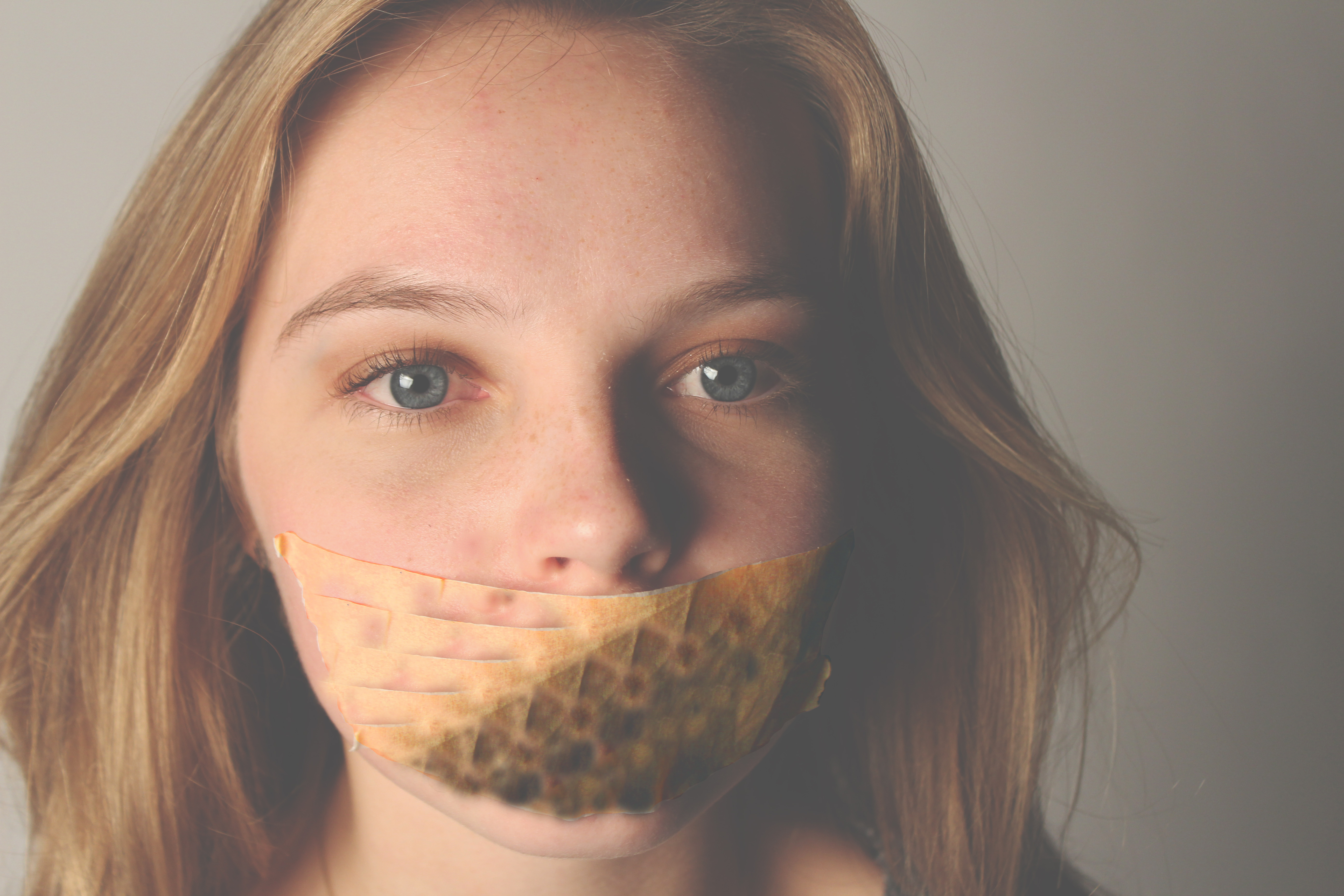 Loss of identity Portraits
 Chiaroscuro lighting Portrait
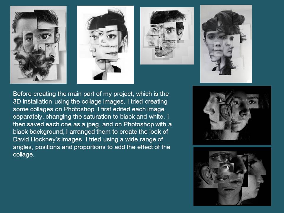
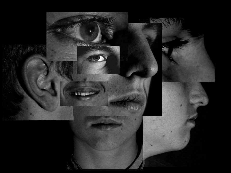
 Hannah Hoch Technique Portrait
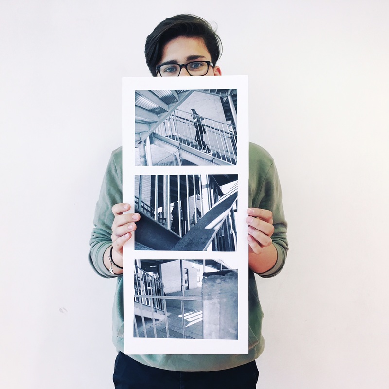
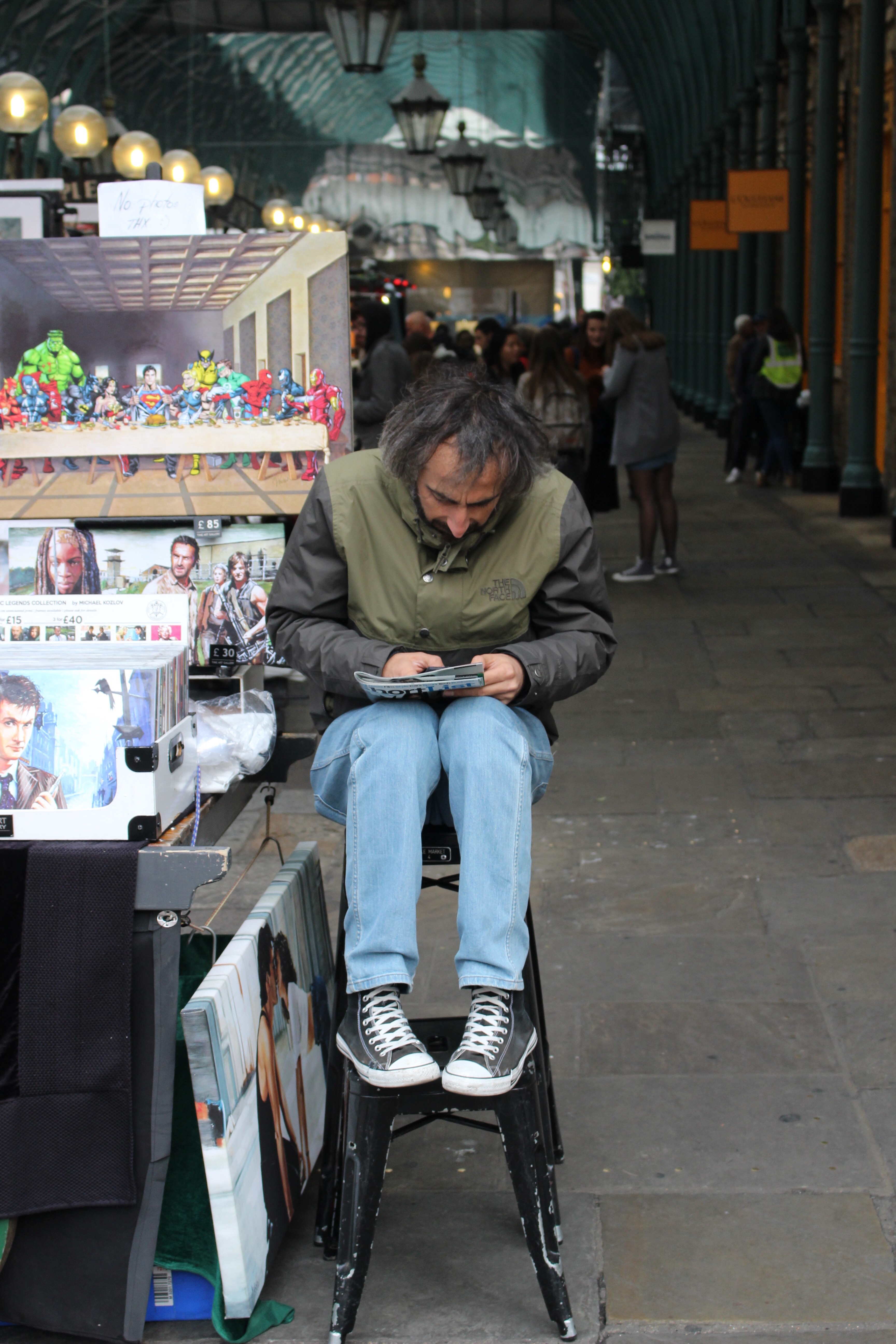
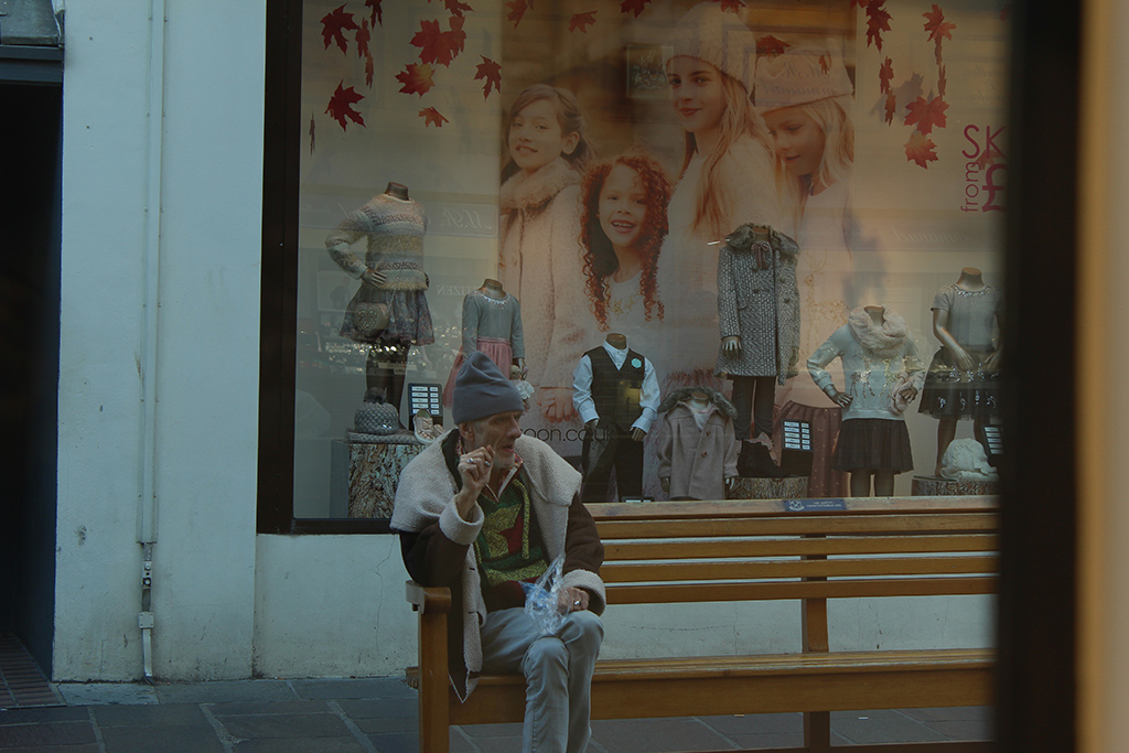 Street Photography Protrait
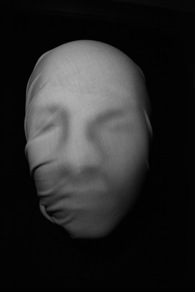
 Here I took the picture at a side angle. The light is coming from above the subject but is still facing the front of the subject. When editing I lightly used the burn tool to make some of the the lines on the face more visible.
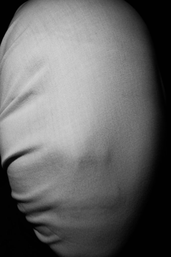

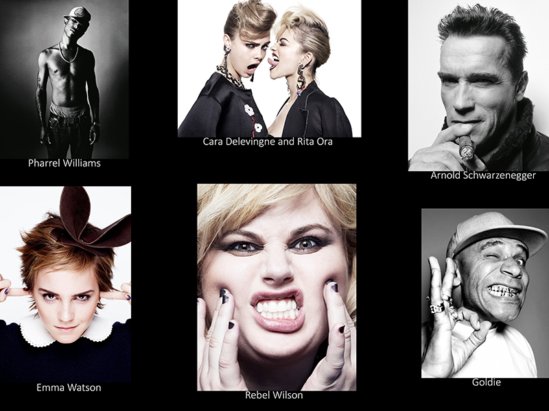
 John Rankin Waddell goes by the name Rankin when photographing celebrities in his day-to-day life as a portrait and fashion photographer. He was born on 28 April 1966