

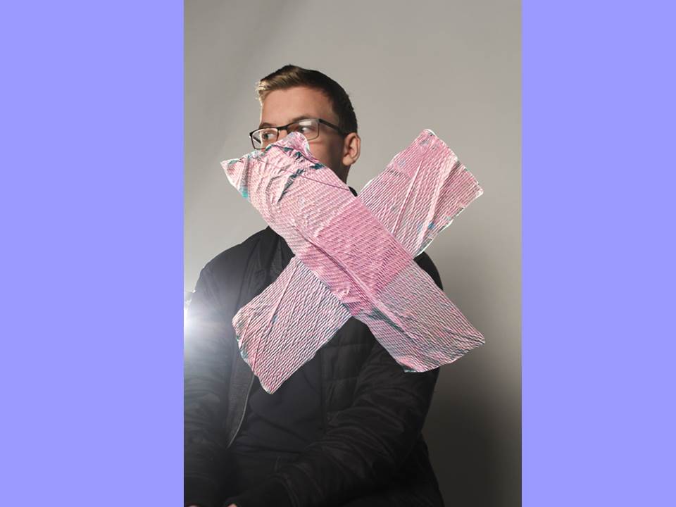
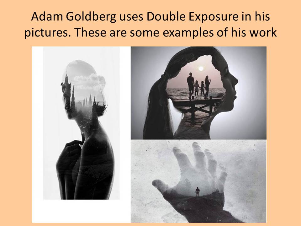
Idea 1:
Idea 2
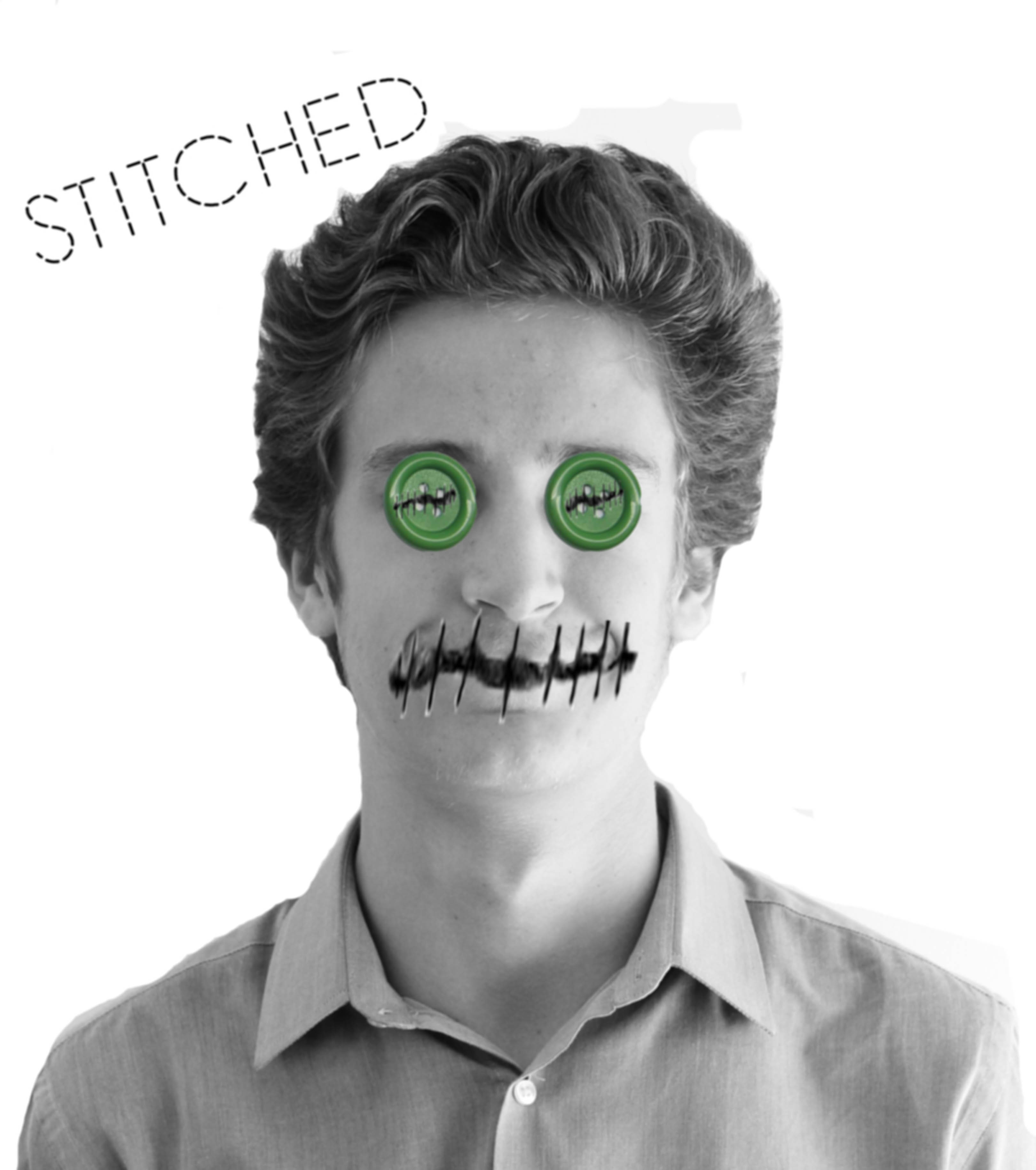
Idea 3
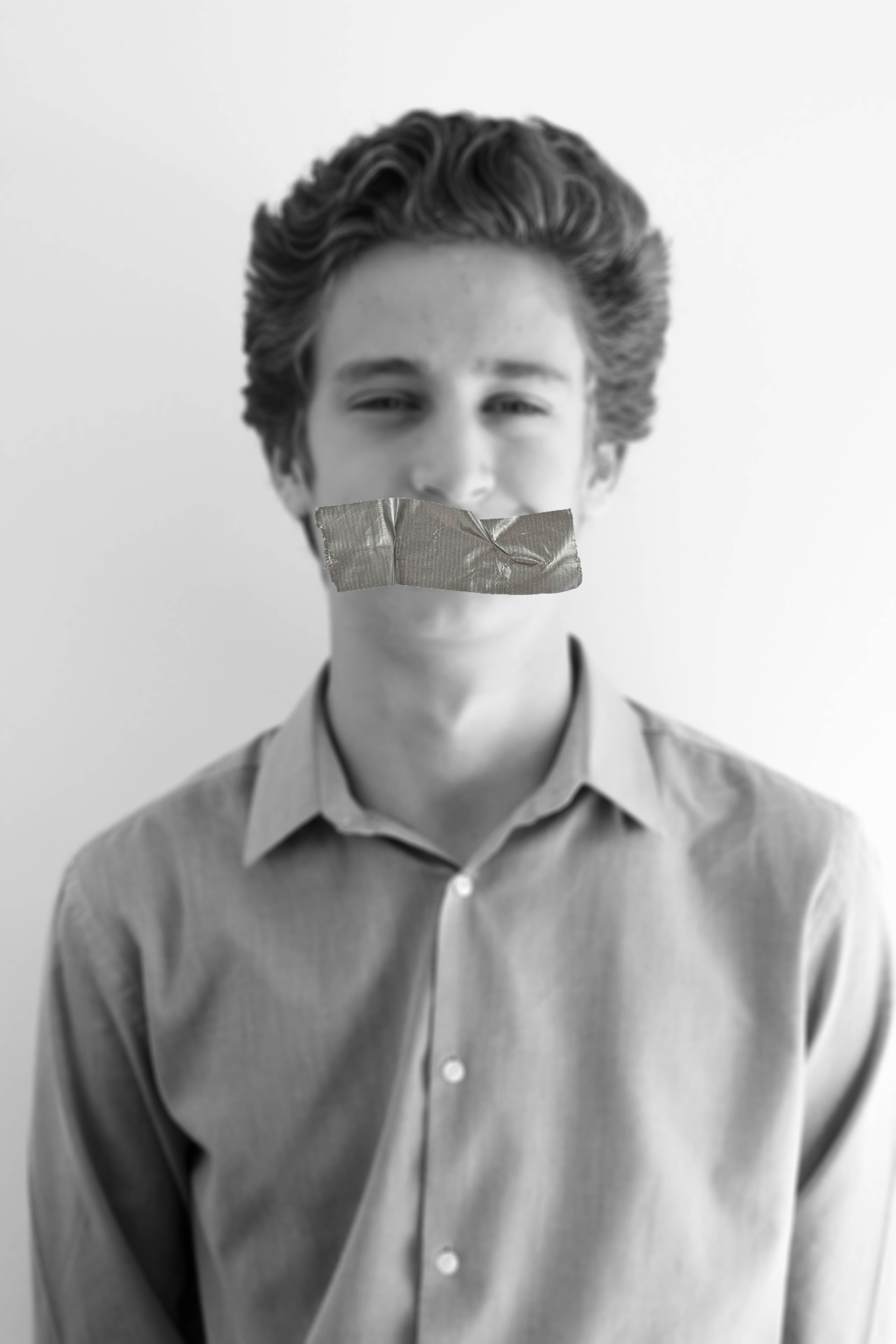
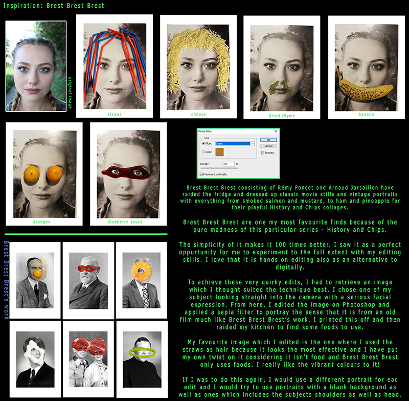
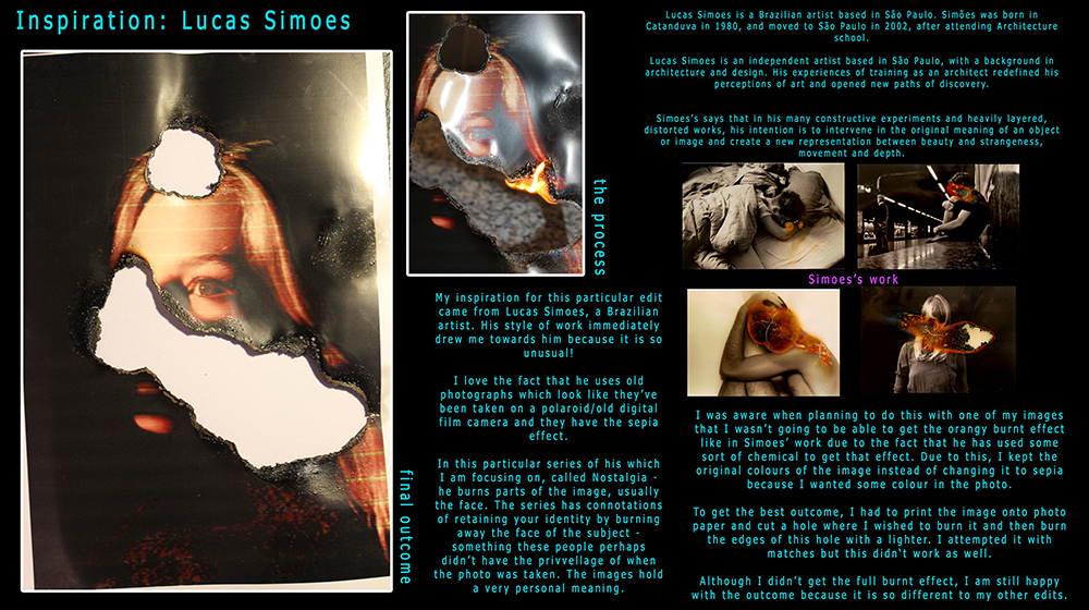
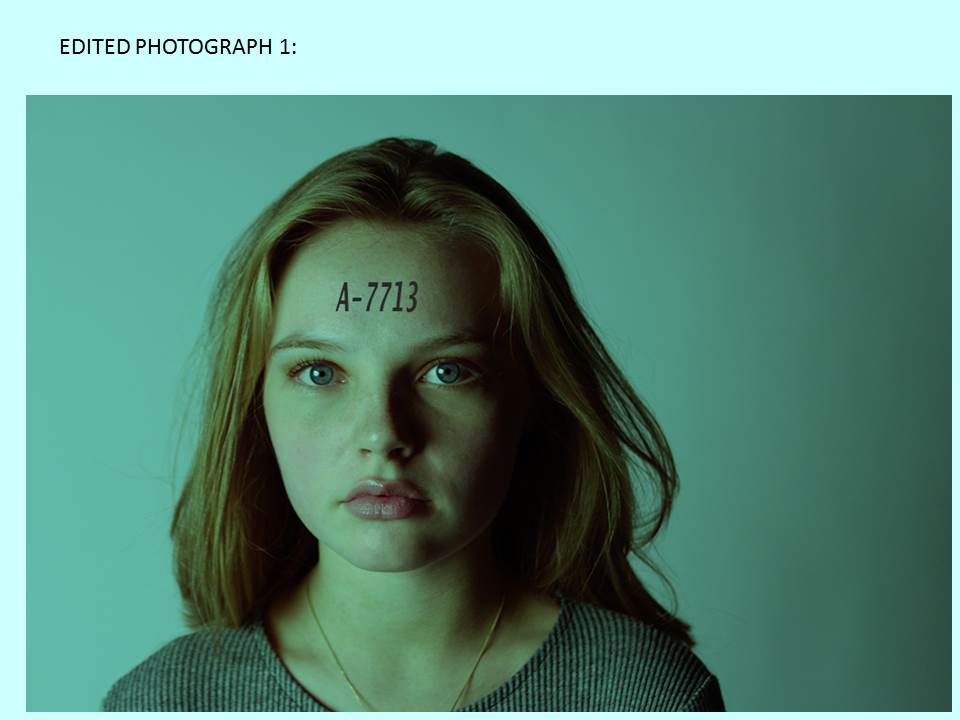
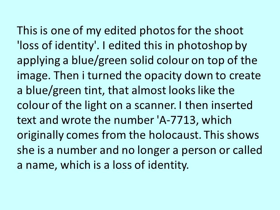
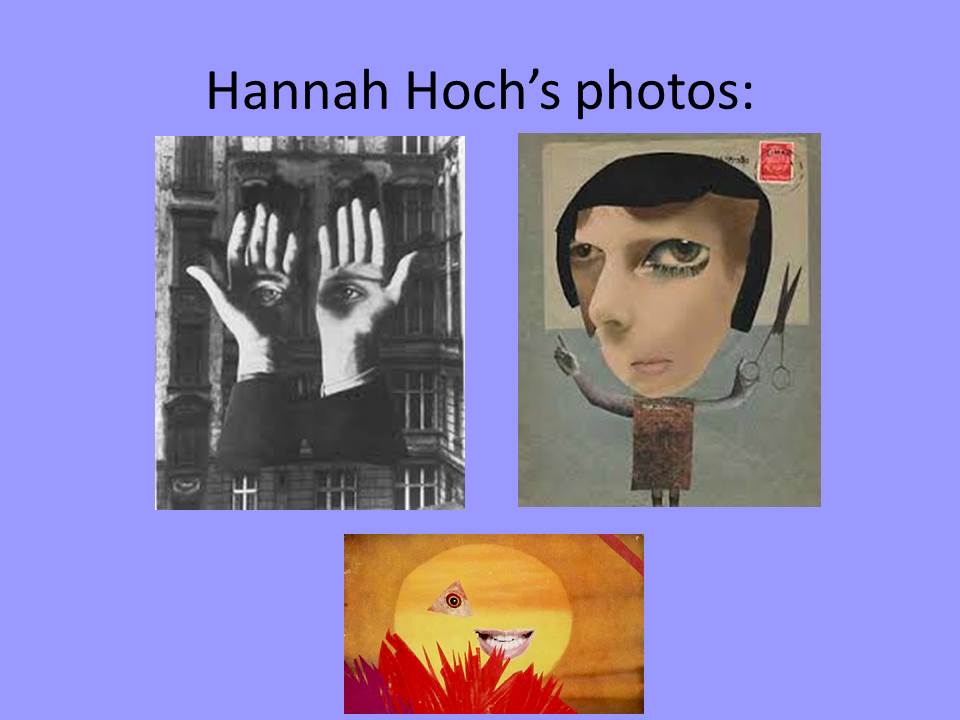
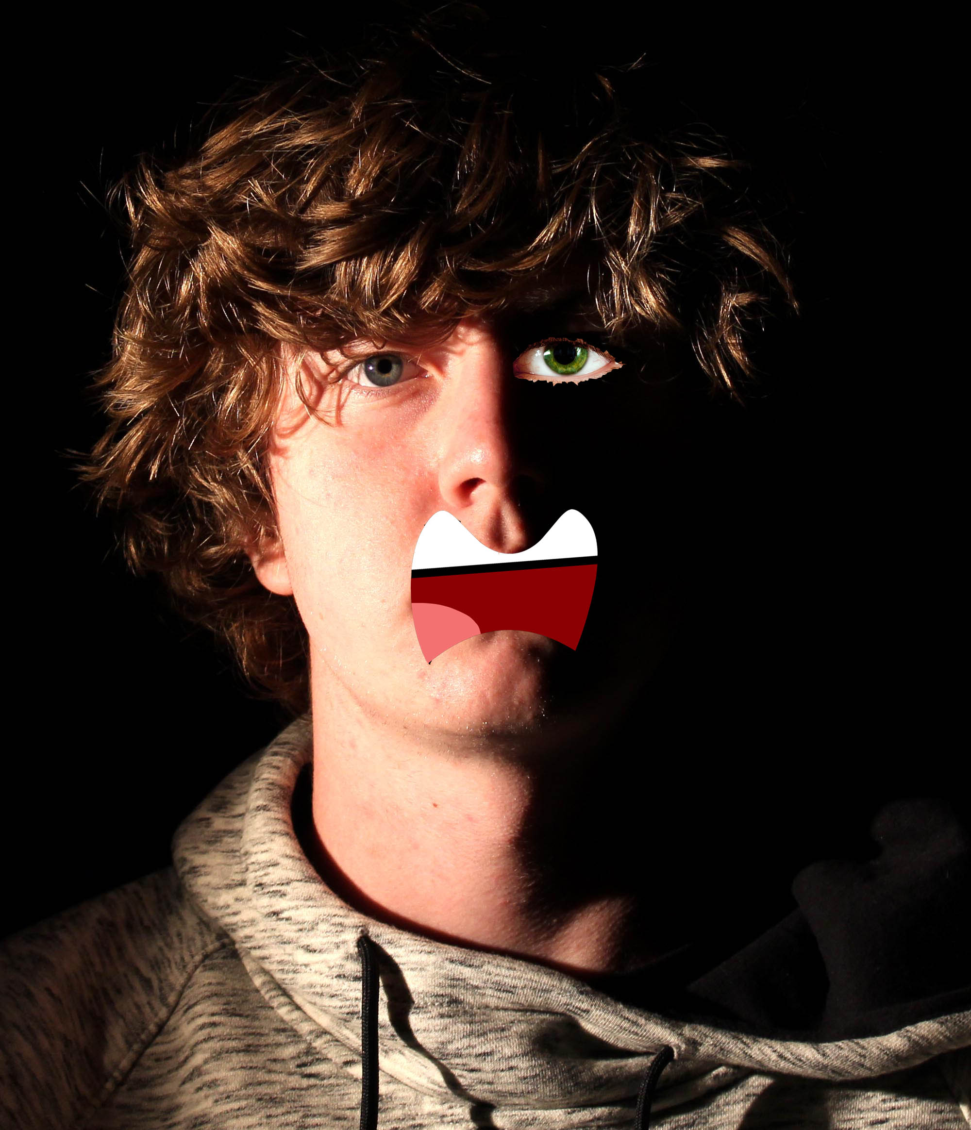
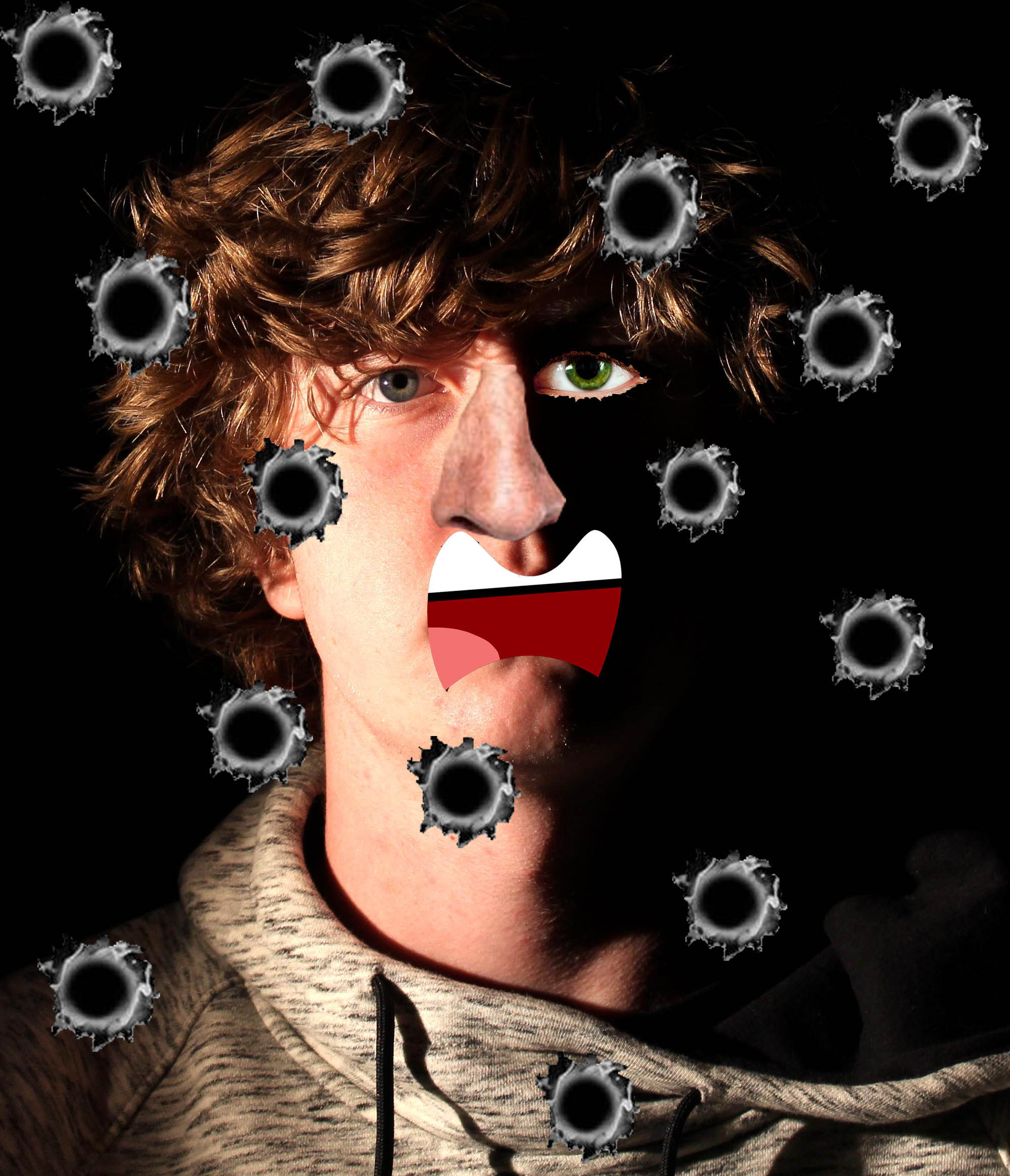
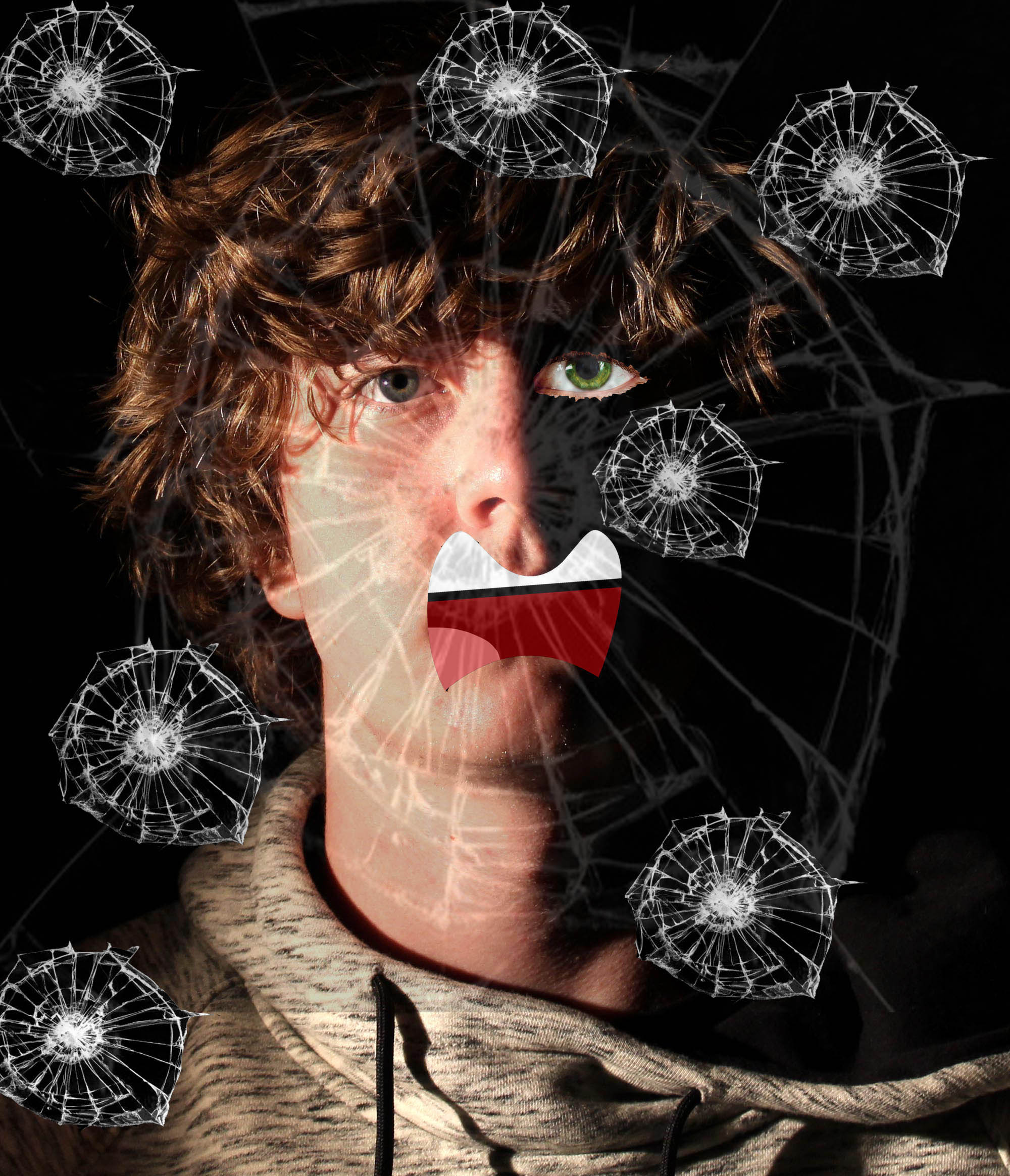
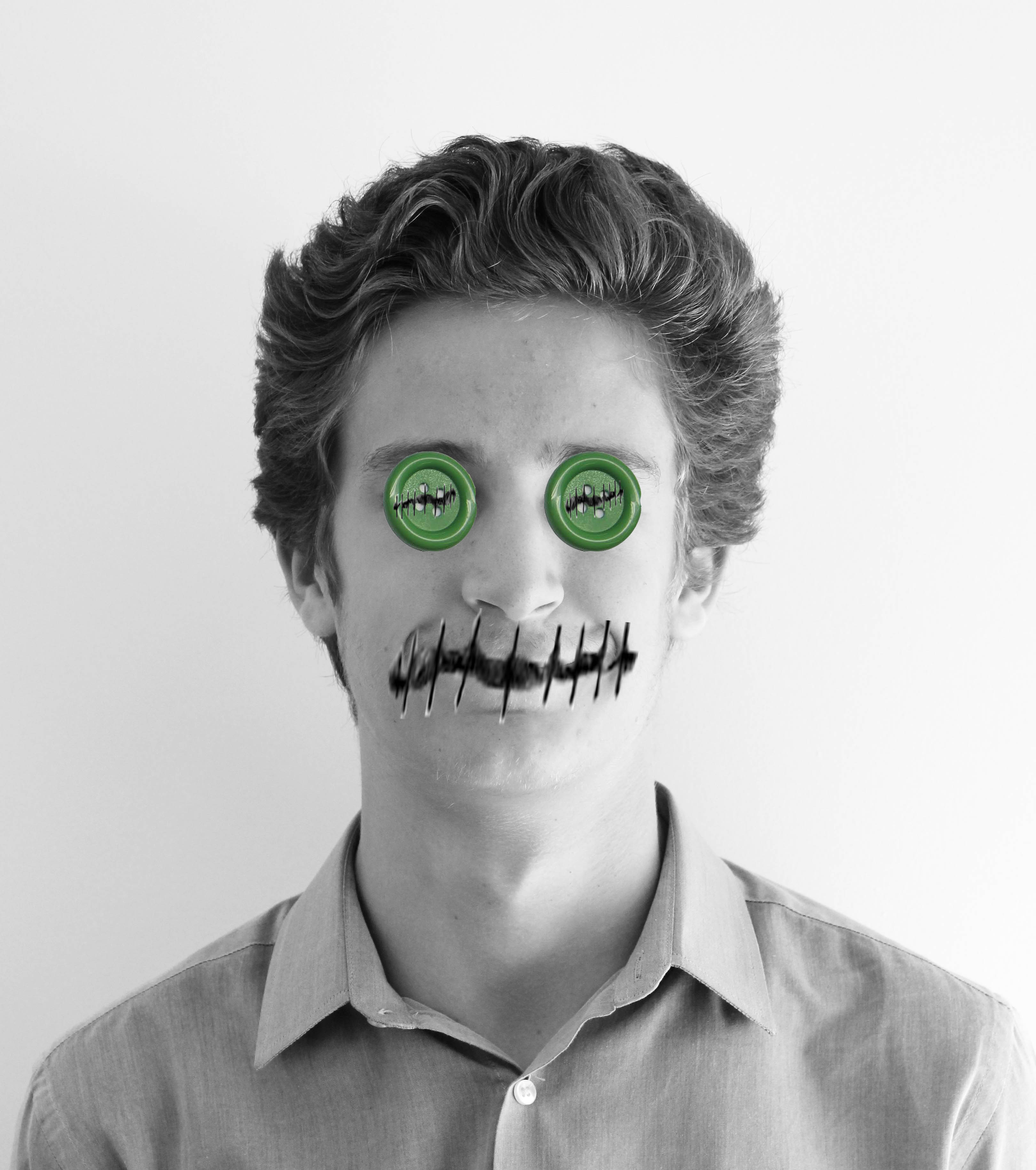
My responses are largely influenced by Hannah Hoch. However I added my own slight twist to personalize my work and make the features of the photograph more relatable to me. I have done another earlier blog post discussing how Hannah Hoch has inspired me.
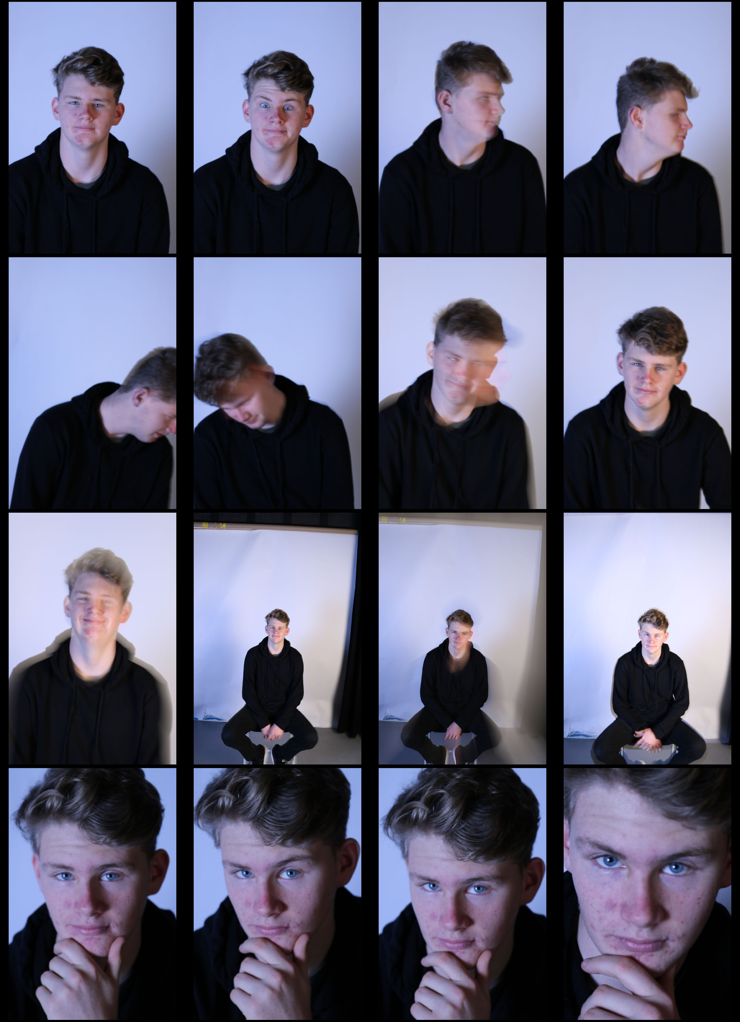
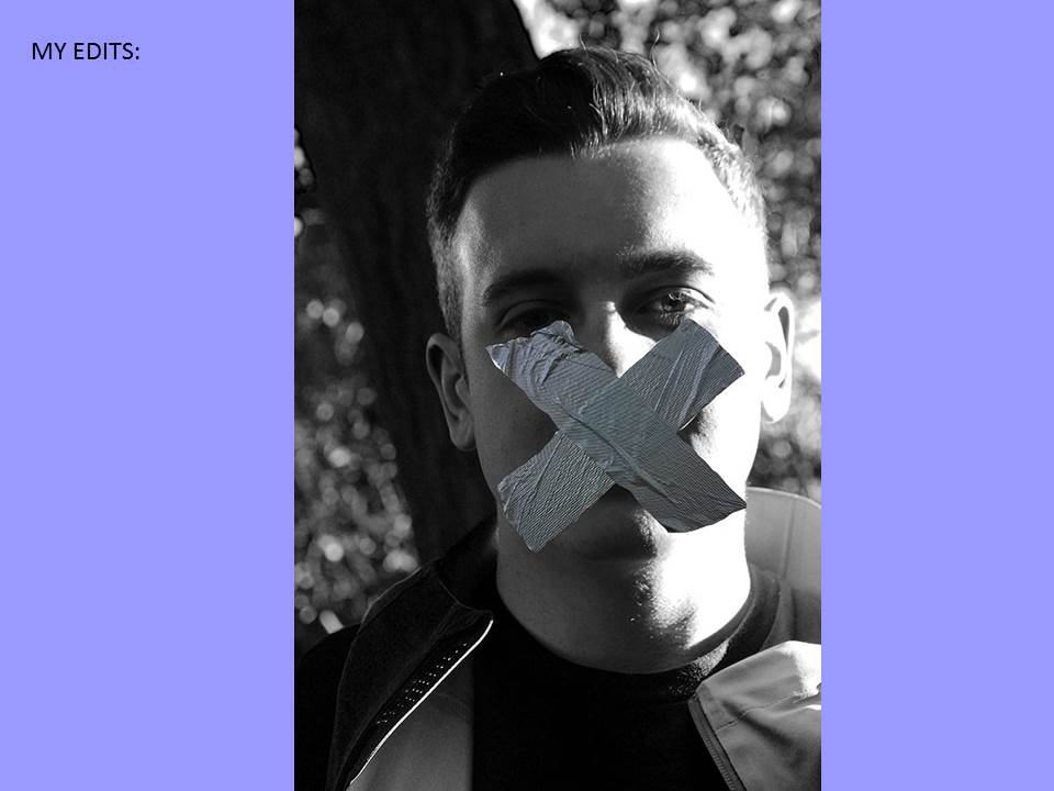
When taking these photos I wanted them to rough and not perfect. You can see this as I have lowered the shutter speed and some of the photos are slanted. When taking these photos I also used the flash box, this went off every time I would take a photo as it was linked to my camera with a transmitter. I also used a soft box, using this and flash box allowed me to take away any shadows on the subjects face.
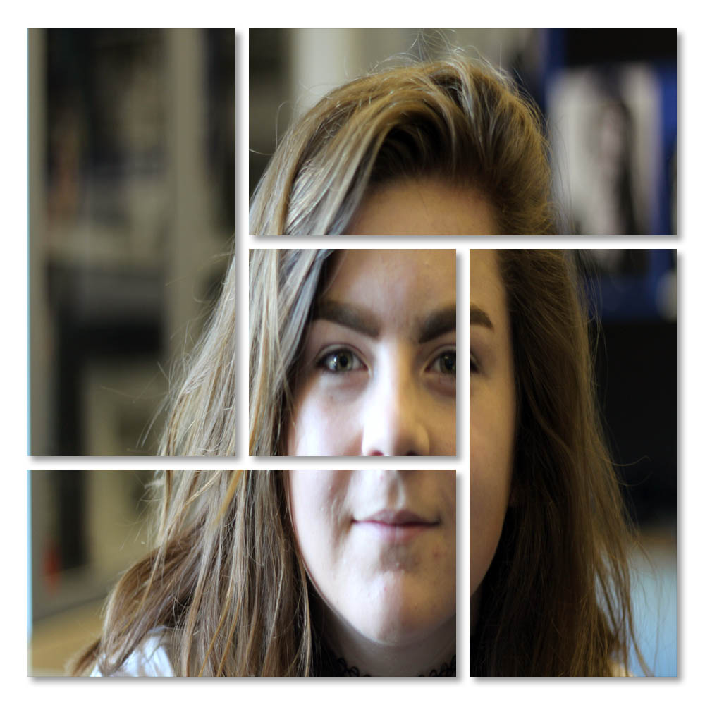
After selecting my image, I went to the edit, preference and then guides and grids option. After doing this I chose view, show and grid. After doing this I added a new layer and selected the rectangular marquee tool and drew m desired box. I then filled the box with black. After doing this, I held down my shift key and drew 10 horizontal rows and 11 columns. I deleted the selected areas and added a drop shadow . Then I opened my desired photograph. and copied and pasted it into my squares. Then, I created a clipping mask and moved the photograph in the best areas that suited the clusters.
