Category Archives: Experimentation

Filters

Author:
Category:

Abstract Pano-Spheres

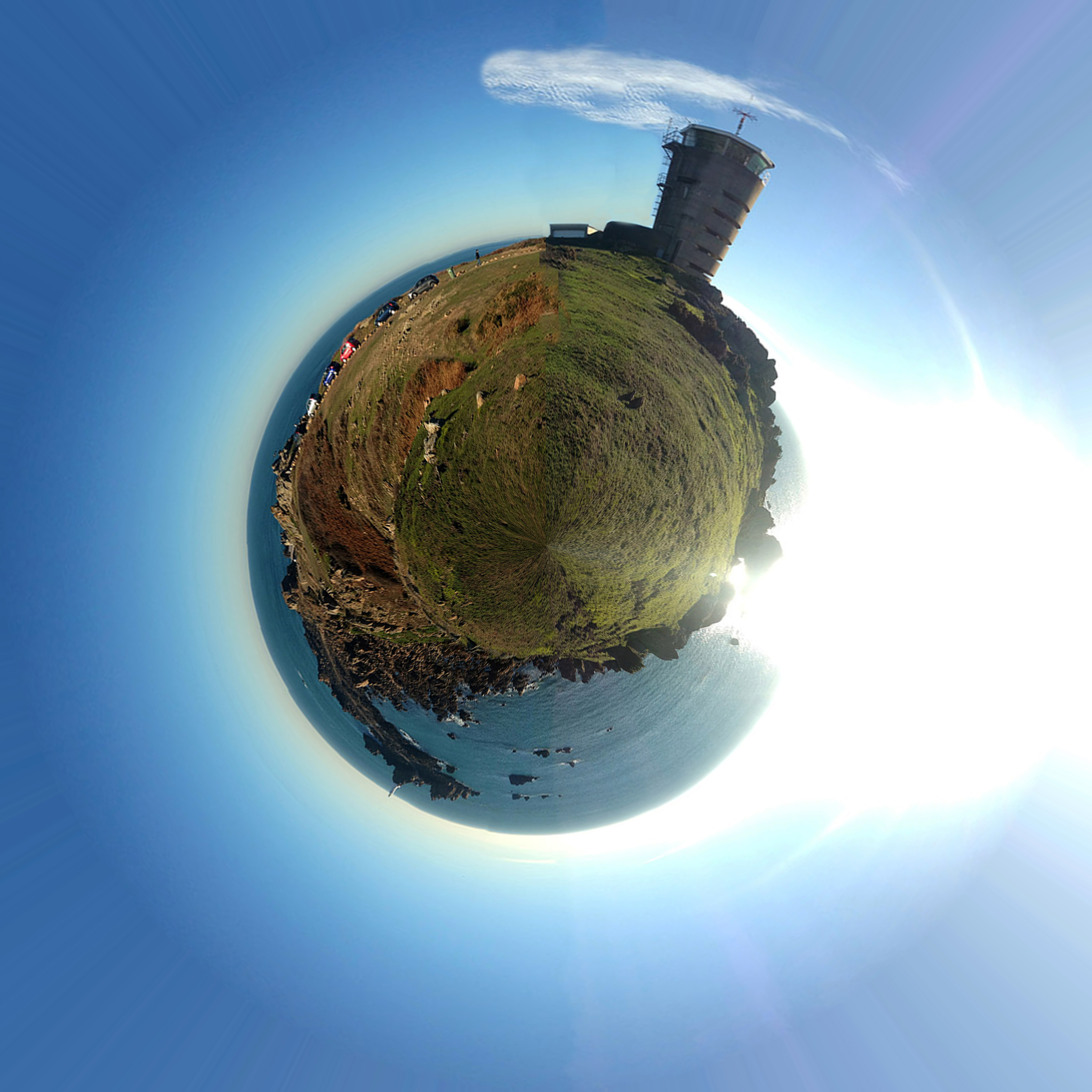
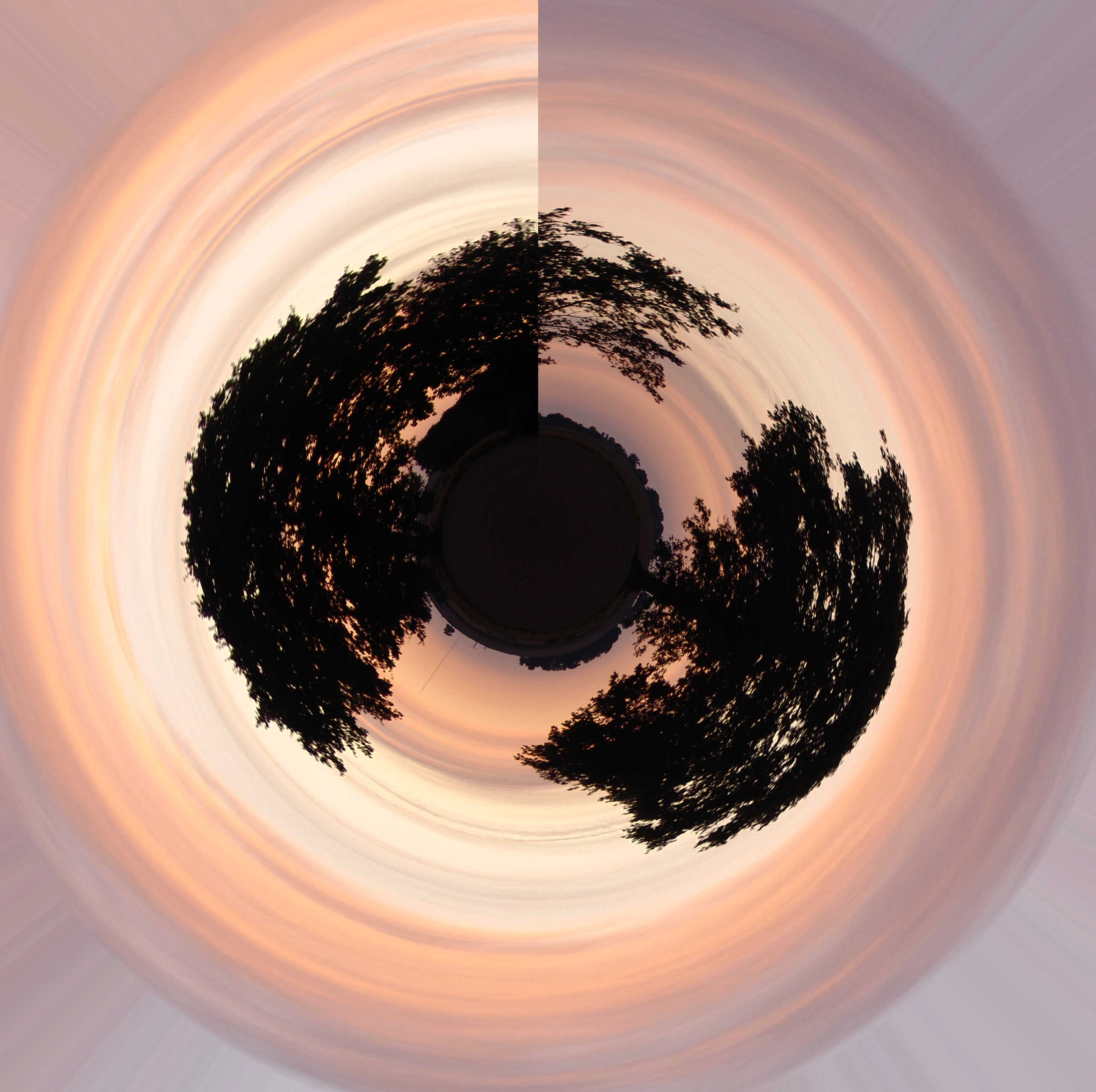
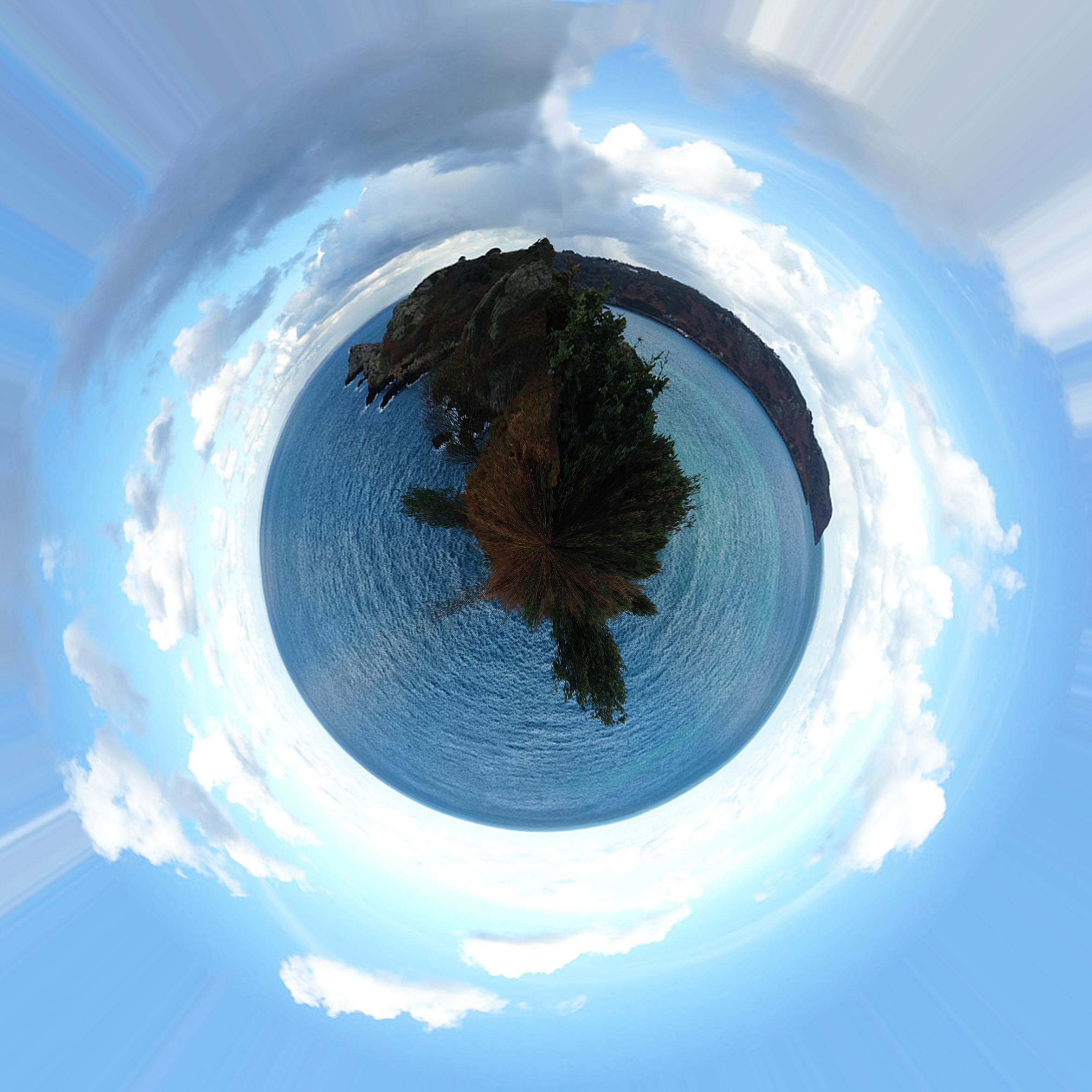
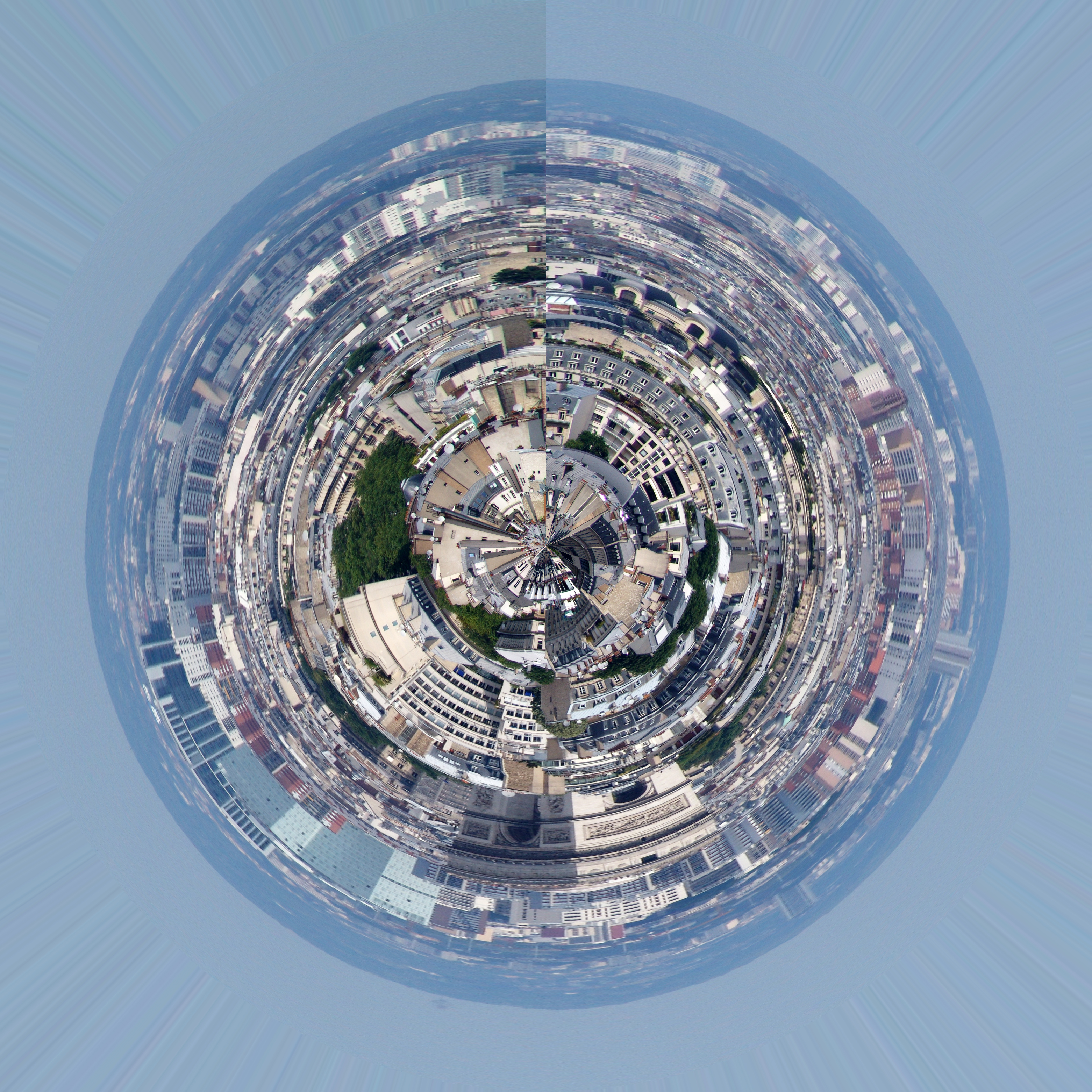
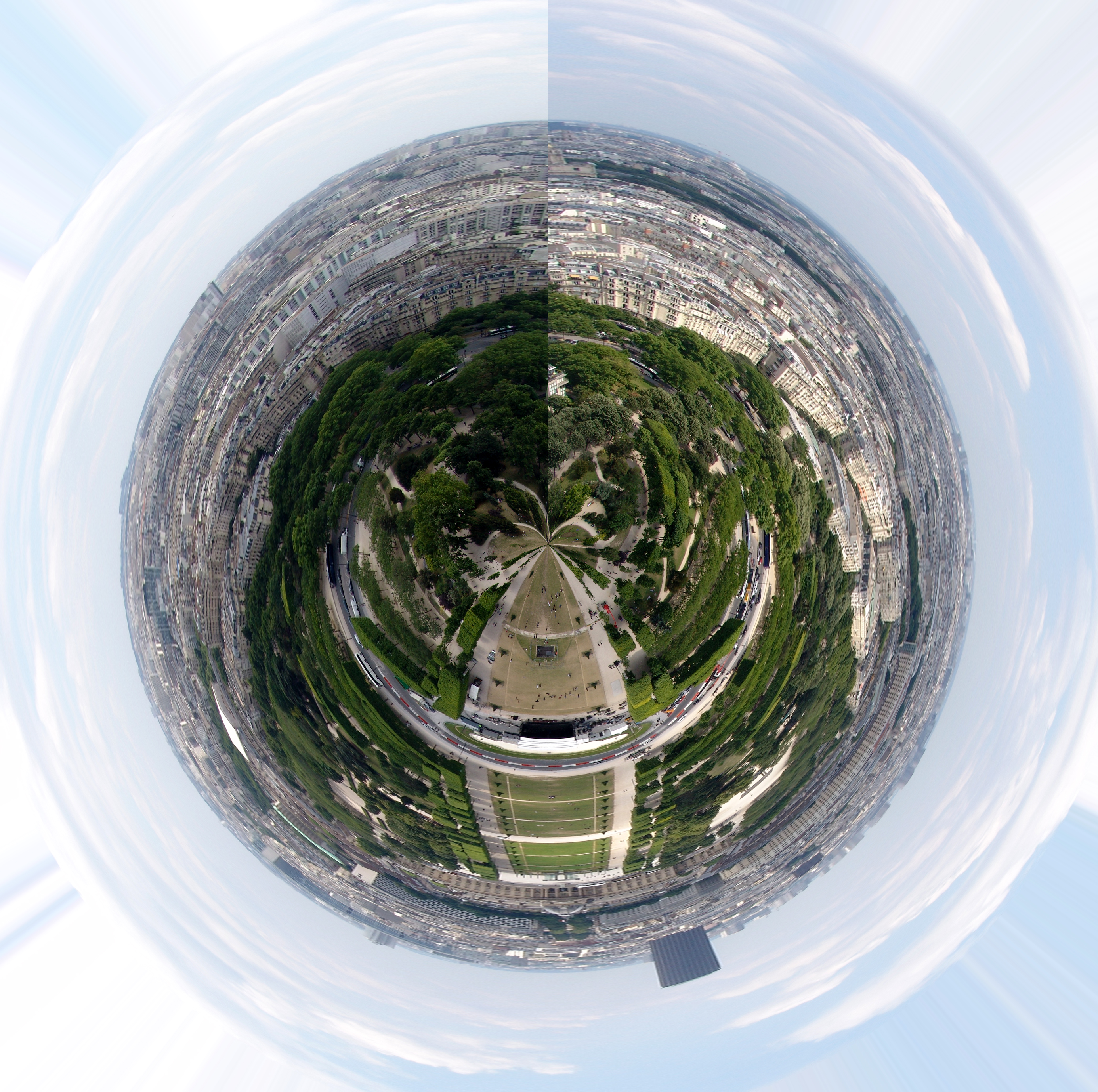
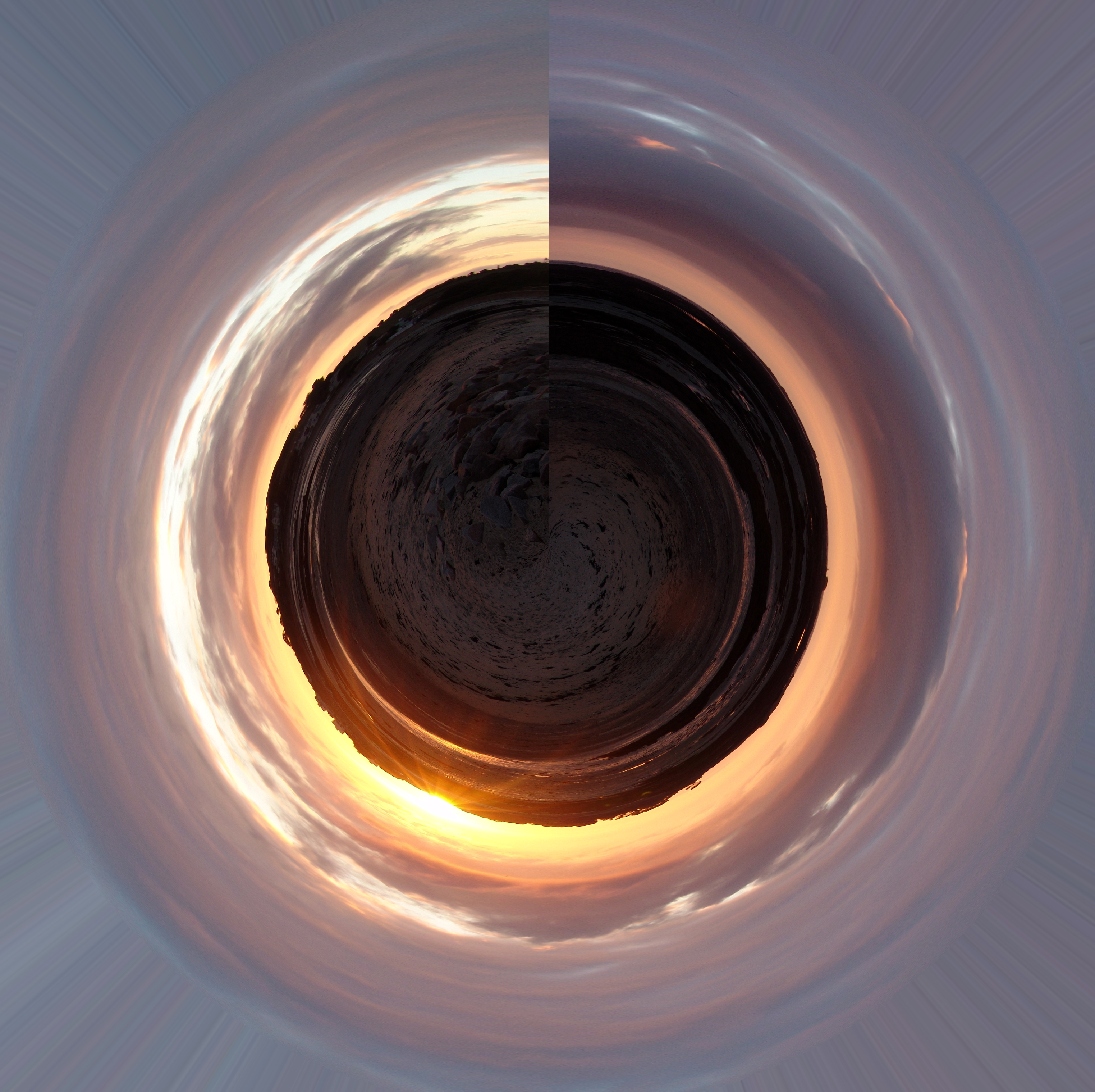
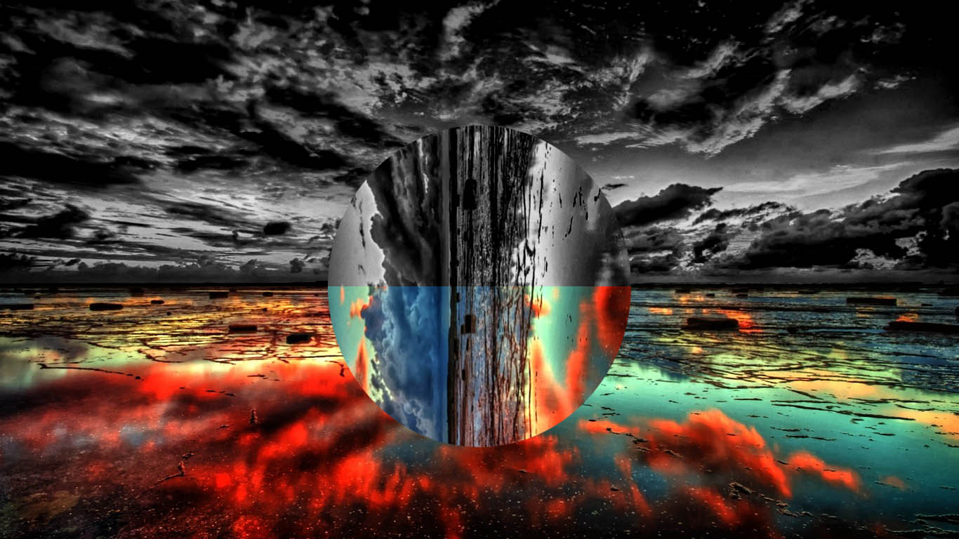
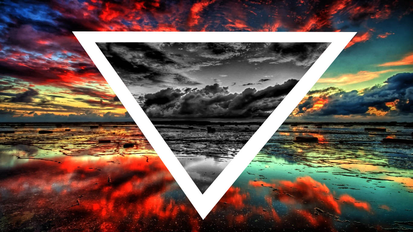
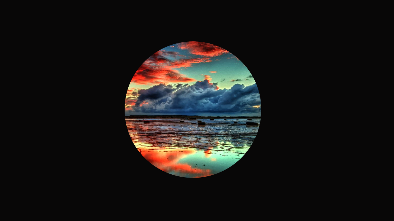
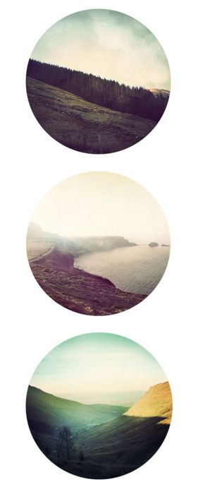
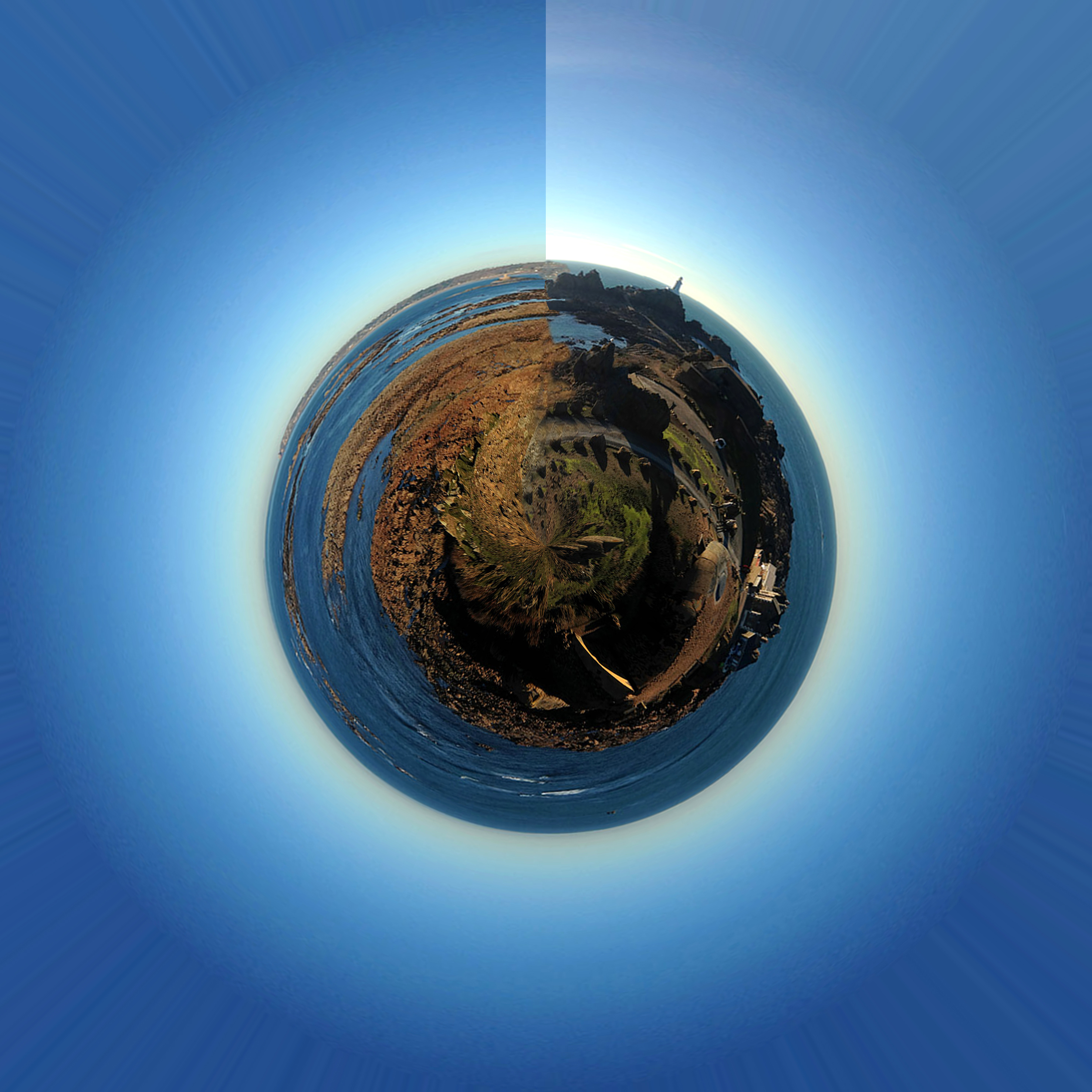
Firstly I cropped the photo using the straighten cropped tool to ensure the proportions of the land were the same. This way when the land met it gave a perfect circle. For the pano-spheres I needed to prepare them for the polar filter. I added a new layer and made the height and width the same – 25×25 cm. Then I rotated the image 180 degrees . After this, I applied the polar filter and then rotated my planet according to my liking and I also adjusted the contrast and colors. I particularly like this pano-sphere as in the panoramic, the sun was at a one sided position in the sky meaning the parts of the sky that are interconnecting are darker and brighter. I particularly like this because as to me personally, it represents a clock as you go around and it starts off light, getting darker as you go through the day. For some pano-spheres I blended the seams together using the clone too. Unfortunately it proved messy to do on some where both ends of the photograph were too different and so I had to leave them how the were.

I did this because I wanted to express my theme of abstract and surrealism.  Interestingly I chose to focus heavily on the surreal beauty of these pano-spheres.  I believe that these edits appear almost appear as planets, with the objects within them appearing as if they make the planets up.  This is interesting to me because it displays a sense of how the planets appear quite abstract with the various objects in the photograph standing out as slightly abnormal.  I believe the surrealism and abstraction in these edits work well together because the abstraction appears with the colors and shapes generated from these edits and the surrealism is the fact that they appear very strange in the sense that one panoramic appears to of made a planet-like shape.

Romanticism // Response to Ansel Adams

Romanticism (Romantic era/Romantic period) was an artistic, literary, musical and intellectual movement that originated in Europe toward the end of the 18th century. Romanticism was characterized by its emphasis on emotion and individualism as well as glorification of all the past and nature, preferring the medieval rather than the classical. It was partly a reaction to the Industrial Revolution.

In photography, photographers who took up the romanticist approach aimed to sensationalise the overall look of their mages by enhancing certain colours to make the image look almost surreal, glorified and they wanted to dramatize certain areas of their photographs.

It is said that “the movement emphasized intense emotion as an authentic source of aesthetic experience, placing new emphasis on such emotions as apprehension, horror and terror, and awe—especially that experienced in confronting the new aesthetic categories of the sublimity and beauty of nature. Romanticism was a huge step away from the subtleties of photography and instead looked very bold and striking.

In the visual arts, Romanticism first showed itself in landscape painting, where from as early as the 1760s British artists began to turn to wilder landscapes and storms, and gothic architecture, even if they had to make do with Wales as a setting. Caspar David Friederich and J.M.W. Turner were born less than a year apart in 1774 and 1775 respectively and were to take German and English landscape painting to their extremes of Romanticism.

Caspar David Friedrich – Wanderer Above the Sea of Fog 1818

Ansel Adams is an example of a modern day photographer who embraced Romanticism. Classed as the master and crucial pioneer of modern landscape photography, inflecting may of our great’s today, Adams used a black and white film in his images he captured of towering mountains, elegant lakes and snowy hills. This added an effect to each of images, differentiating his from others such as Edward Weston as it created a look to the sky which darkened the blue to a mysterious and shadowy, and quite chilling blackish grey colour that casted over the mountains etc. of his photographs. This is a romanticised example of landscape photography.

Image result for ansel adams
Ansel Adams

Charles Baudelaire also stated that,” Romanticism neither depends precisely on choice of subject nor in exact truth, but a mode of feeling.”

There are a variety of exhibitions and competitions where photographers are being asked to capture single images that absorb vision of the romantic qualities of nature within the landscape that surrounds them.


I firstly used the lasso tool to separate the sky from the land. This would allow me to work on the two aspects individually then bring them together at the end. It s easier than attempting to make the sky darker in colour with the land lighter in colour as a whole image.

I then made both aspects black and white and operated on the sky first. I used the brightness and contrast tool to adjust the overall colour as well as shadows, then the levels tool to perfect the levels of black, white and grey in the sky. I also experimented with curves and exposure. I then made the land the right style to complement the sky, much like Ansel Adams.

I finally used the rubber and blending tool to fix up the edges created by separating the tow aspects at the beginning. This made it look  ore professional and slick.

22

SS

Editing // Experimenting // Presenting your final images

You have until Friday 17th February to finalise your best landscape images. You can choose 3-5 images. Choose wisely…

  • you must show a thorough and clear understanding of your influences and inspiration (distinguishing features) (AO1)
  • you must show a skillful ability to capture light and correctly / creatively expose your images (AO3)
  • you must show a range of editing skills…that are informed by your choice of photographer (AO2)
  • you can explore and develop a range of images that illustrate your critical understanding of a particular kind of landscape (AO4)

Your Concept and Context

  • to display a higher level of learning and understanding your final blog posts must show an exploration of a theme, a topic or even a title inspired by these sub-genres
  • documentary…commenting on a range or type of landscape, exposing the “truth” about the areas we live in etc
  • surrealist…composing unreal or imaginary landscapes, possibly dystopian settings
  • abstract…an exploration of alternative beauty, capturing light, colour, shape, reflections etc
  • romanticised…a celebration of natural rawness, wonder and awe inspired by painting, poetry, drama and music

Possible titles to choose from…

Dereliction / Isolation / Lonely Places / Open Spaces / Close ups / Freedom / Juxtaposition / Old and new / Erosion / Altered Landscapes / Utopia / Dystopia / Wastelands / Barren / Skyscapes / Urban Decay / Former Glories / Habitats / Social Hierarchies / Entrances and Exits / Storage / Car Parks / Looking out and Looking in / Territory / Domain / The Realm / Concealed and Revealed

Tanja Deman and the concept of Collective Narratives

Link here :  https://photogrist.com/tanja-deman/

You may want to try a range of experiments inspired by these…

edit 1

HDR 3

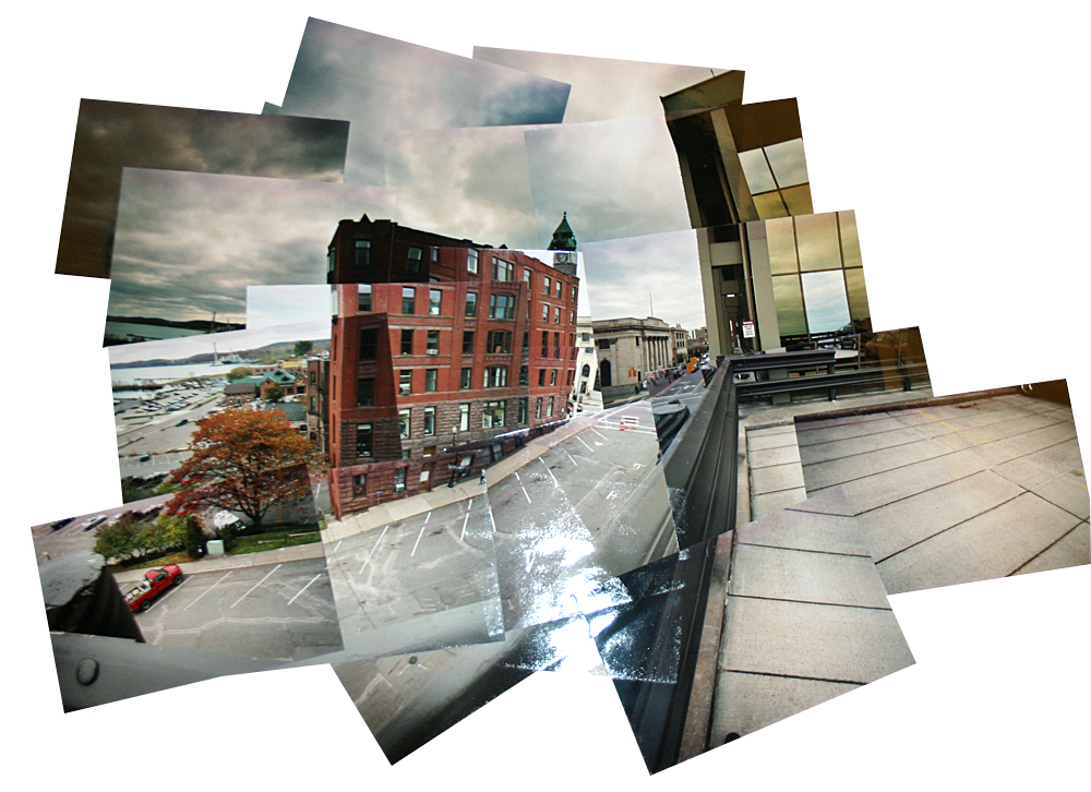
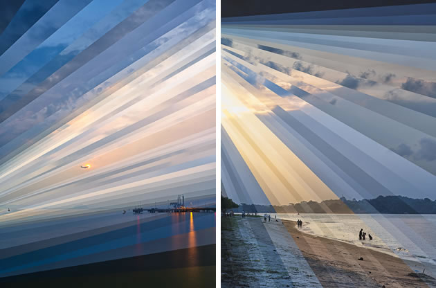
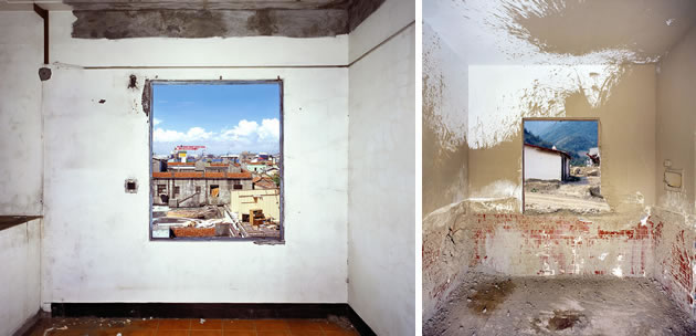
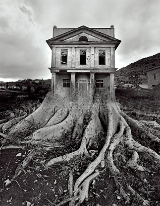
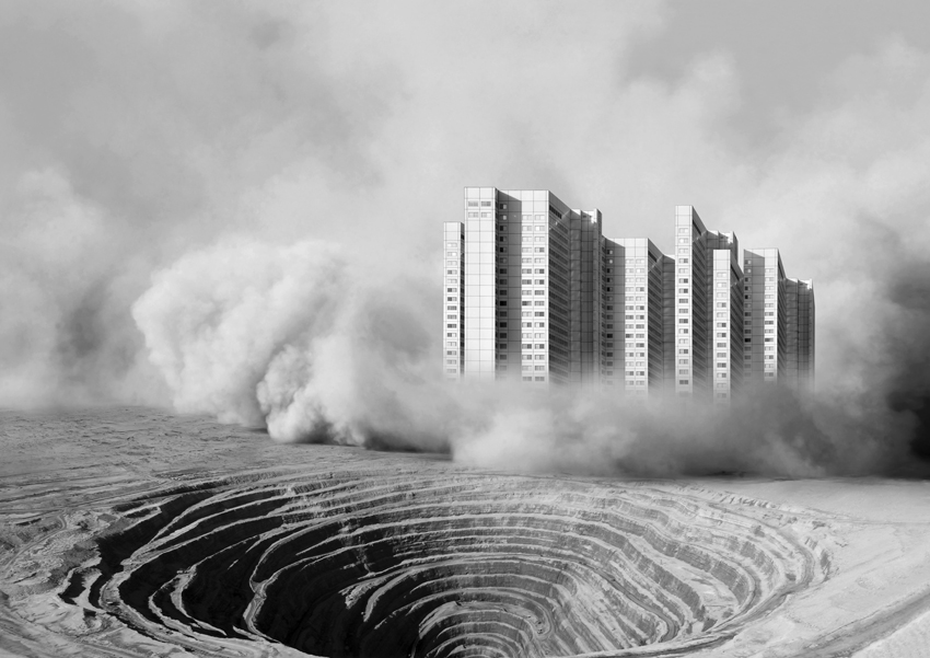
6c61ea1dd7ca9a620af306a4a6e8b21e 709c94cdc82eee263cab4a2e59785088 1807b34230e6ff34201e6fe1ea763ec5 architectural-photography-nick-frank digital-manipulation-photography fabienne-rivory-photography fong-qi-wei-photography frames-within-frames ju_2 richard-koenig-photography Tanja Deman - Dust Storm_4_850

Presentation // grouping of images

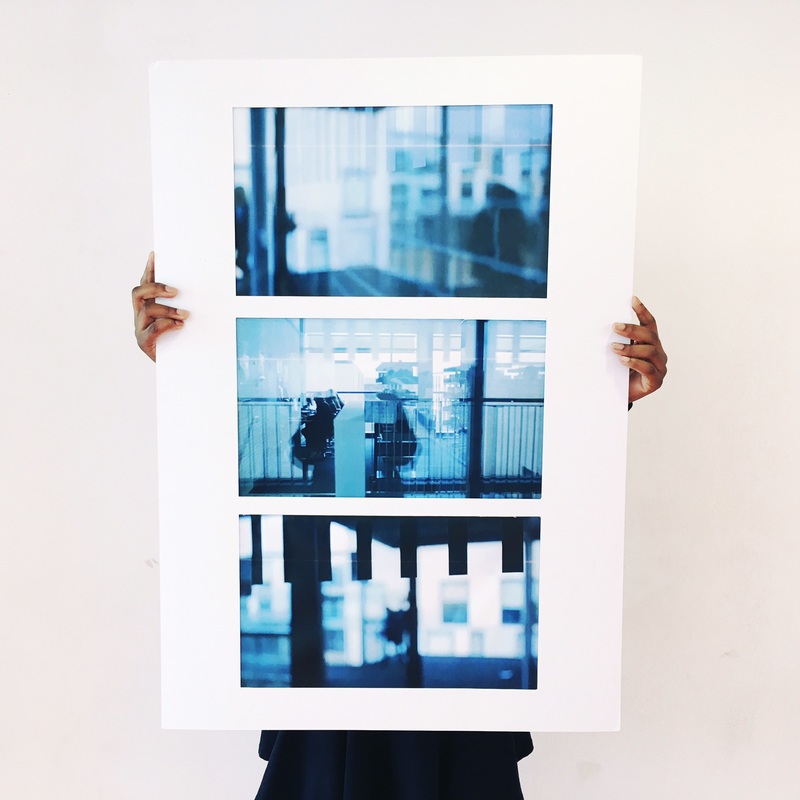
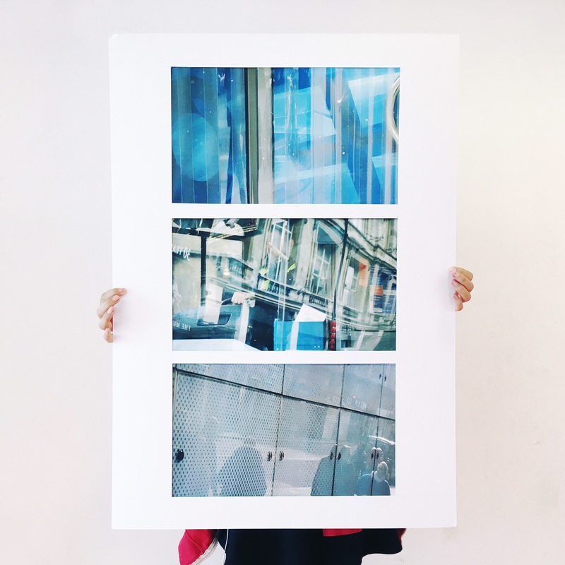
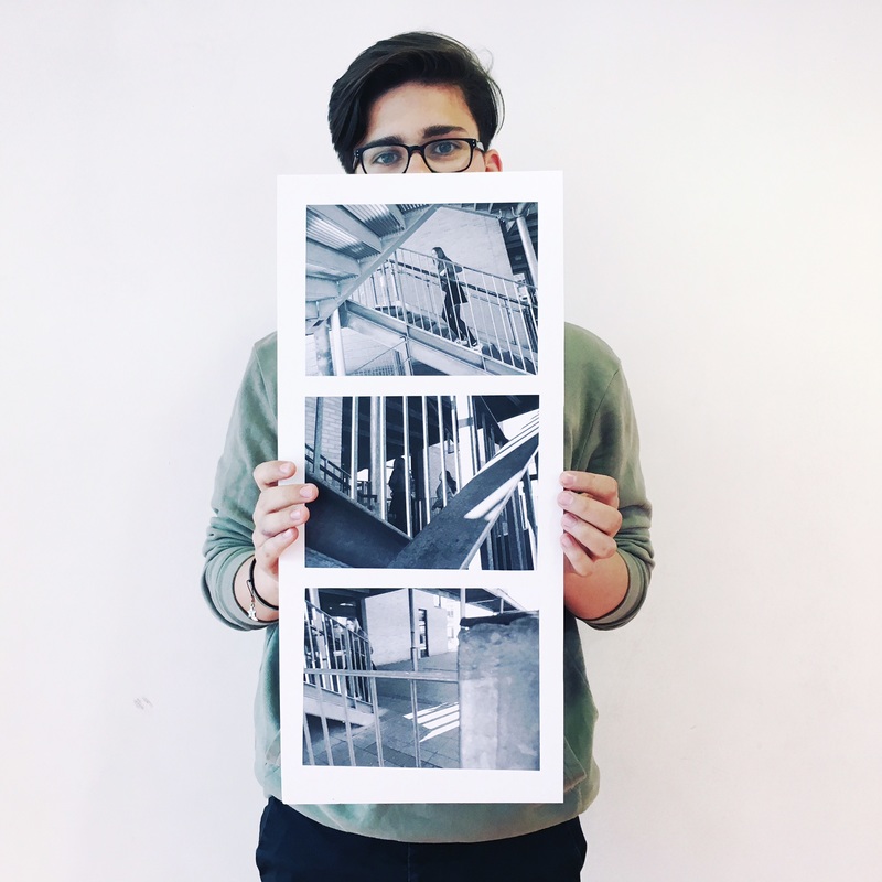
2614621_orig 7387662_orig 9240086_orig


or you may want to include animation, time lapse film or other forms of image presentation like…

Koyaanisqatsi (  “life out of balance,” this renowned documentary reveals how humanity has grown apart from nature. Featuring extensive footage of natural landscapes and elemental forces, the film gives way to many scenes of modern civilization and technology.)


You can use this link to help with analysis…

http://www.photopedagogy.com/photo-literacy.html


Landscape Edits // Inspiration : niklassoestmeyer

wwrgFLAT

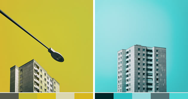
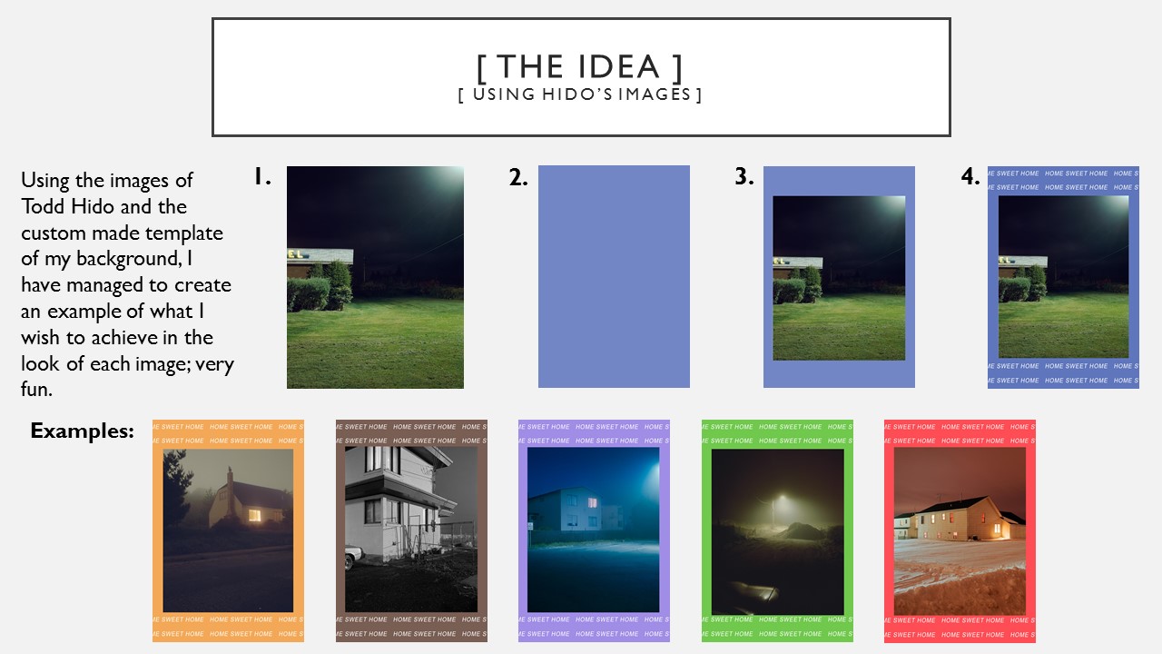
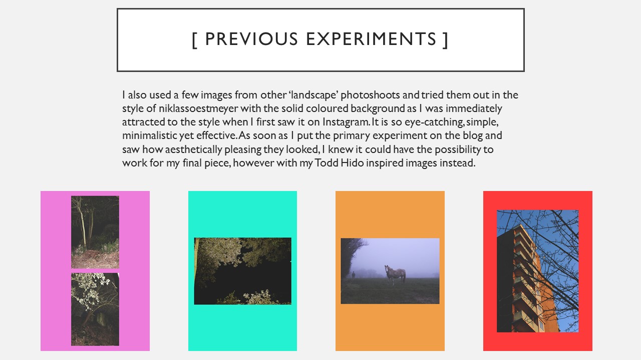
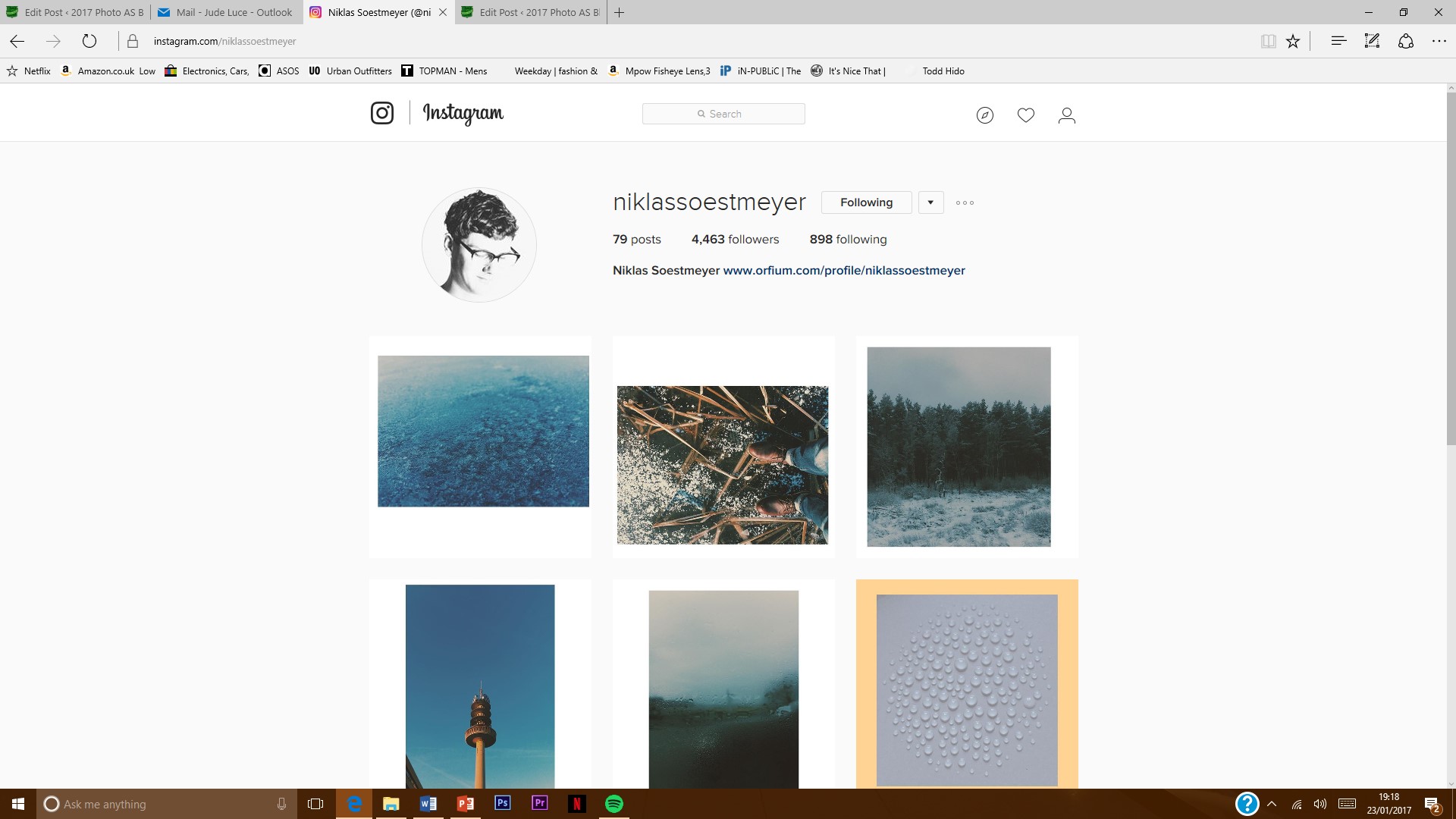
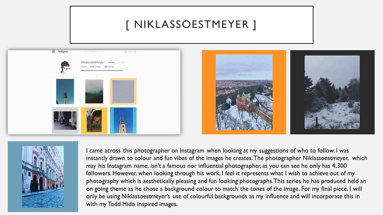
HORSE LEAVES TREESWhen I discovered Niklassoestmeyer on Instagram, I followed him immediately because I was instantly attracted to the bright colours he uses as background. I jus thought it was so simple and minimalistic yet effective. As well as this, the images he uses are mostly landscapes photos which are really aesthetically pleasing and have quite a vintage look to them which I really like and they are paired with the background colour very carefully as he picks out the tonal theme that is in the photo then creates a colour based on this.

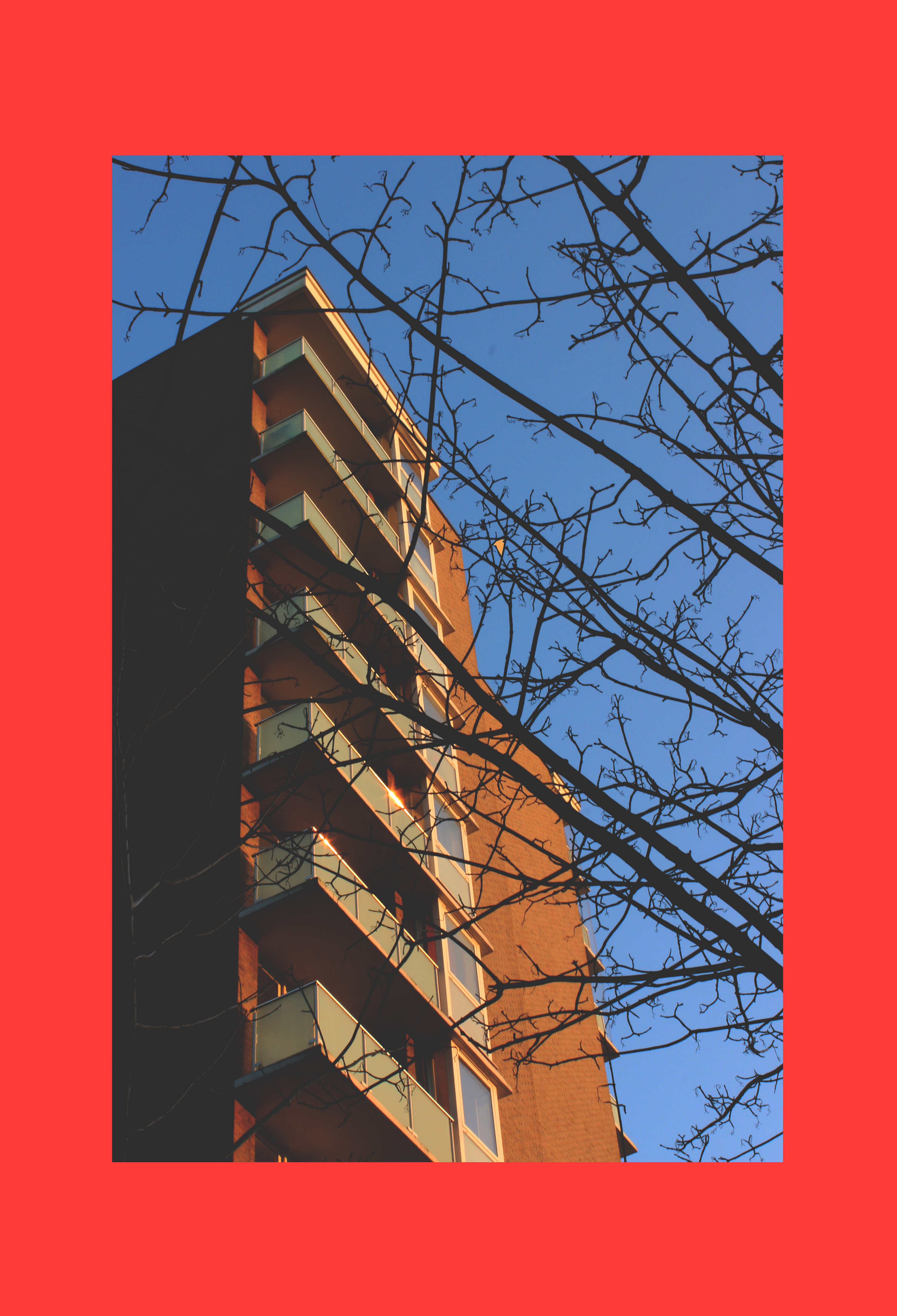
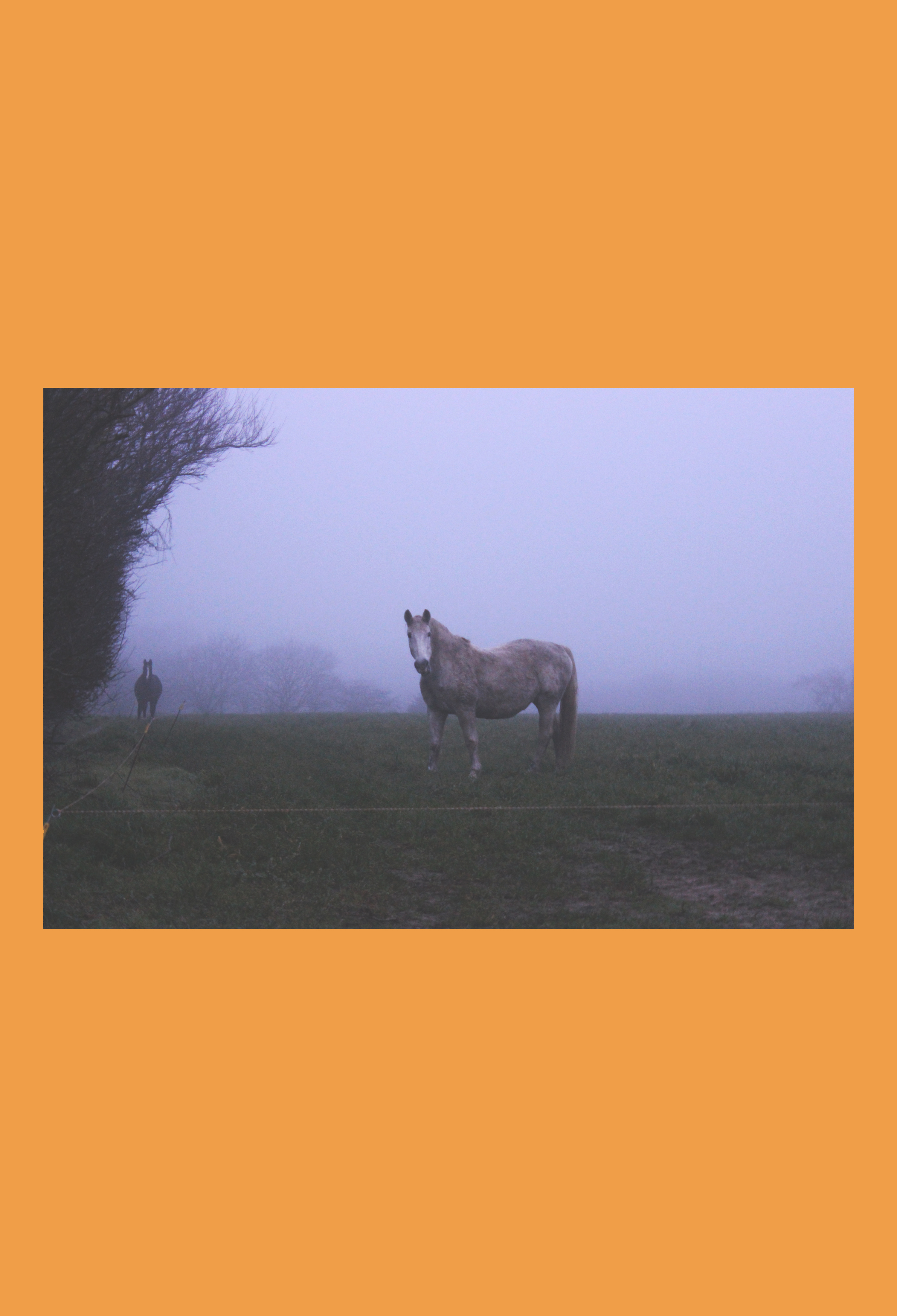
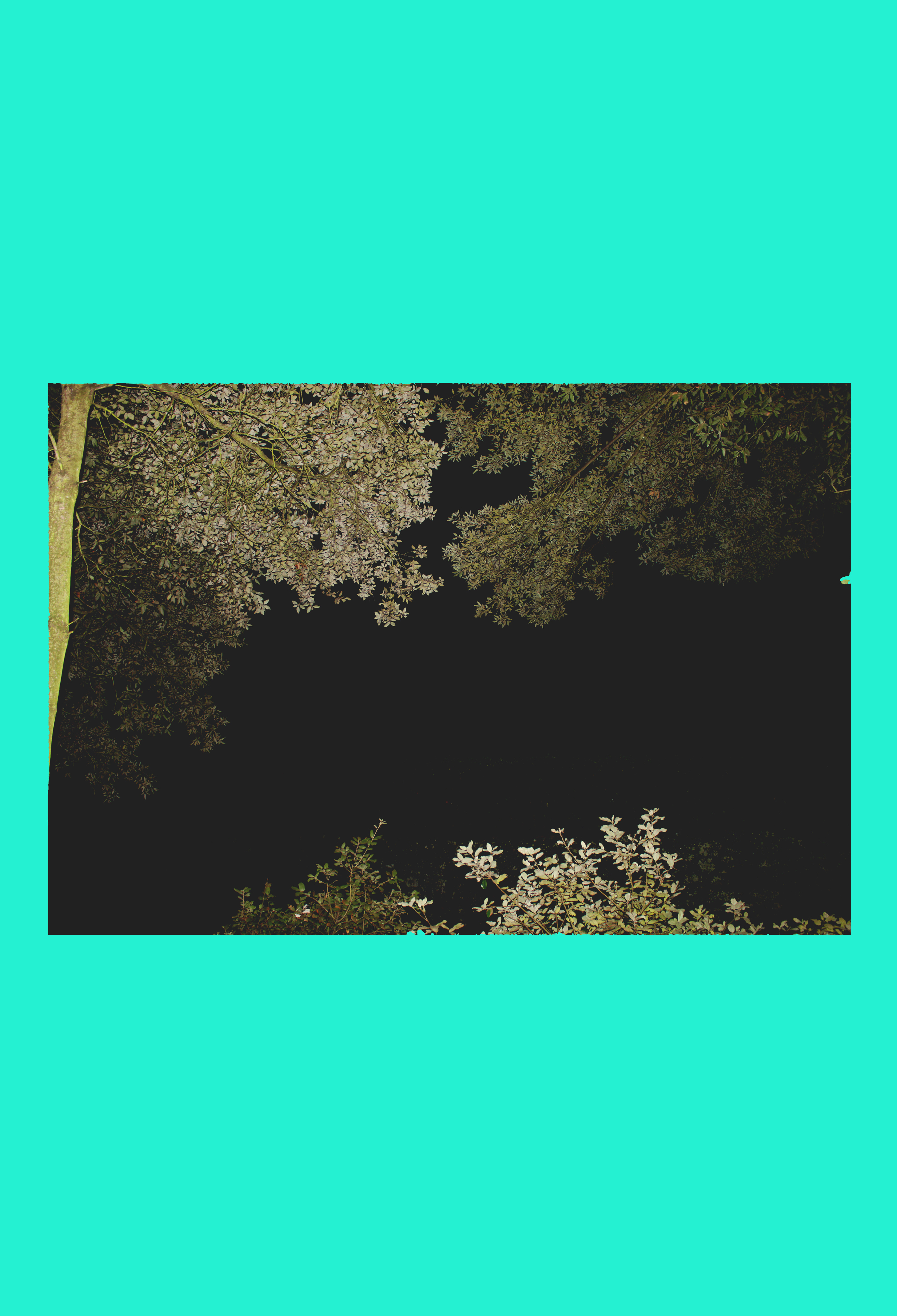
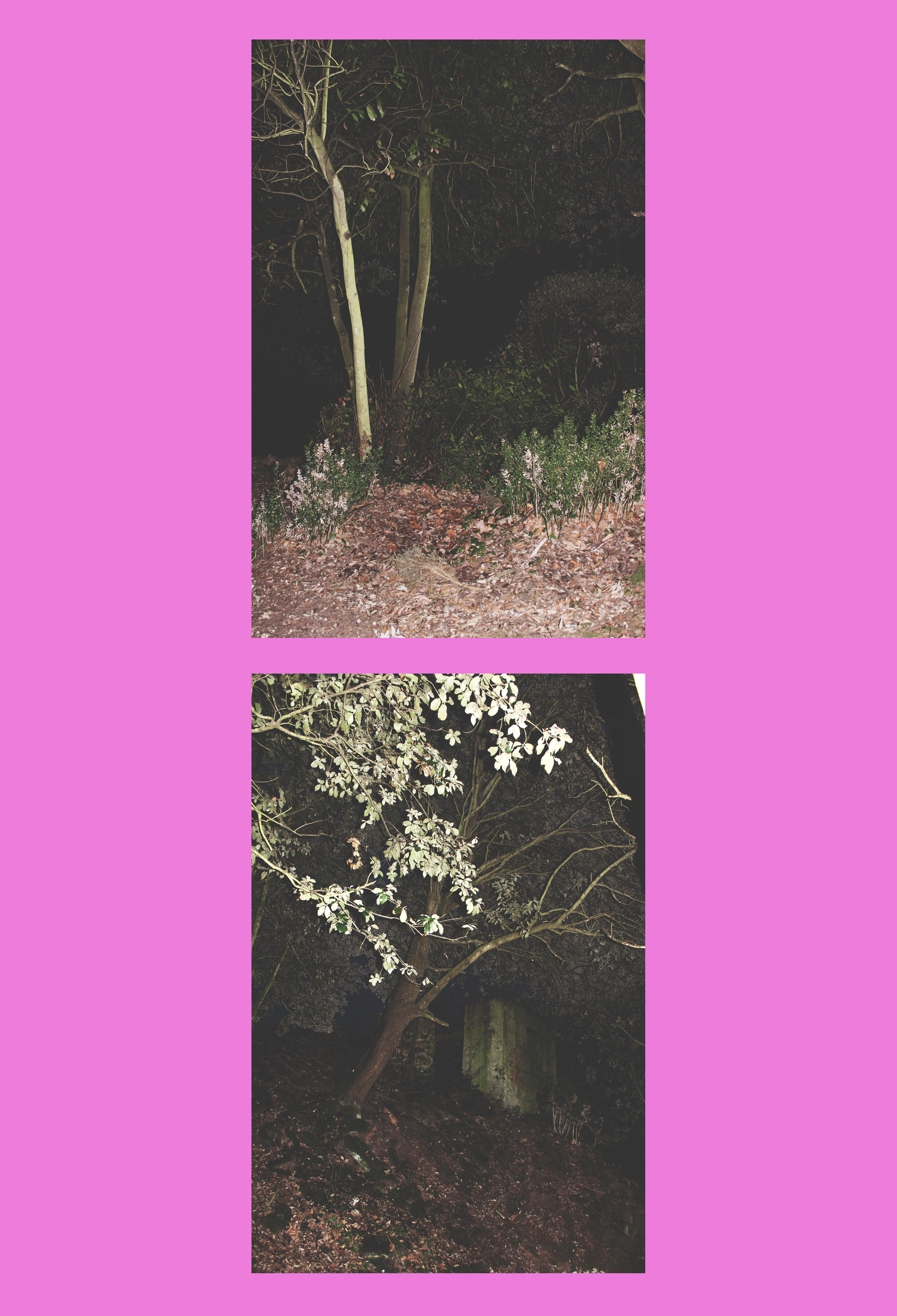
However, when producing my own interpretation of his work I would only concentrate on the coloured background aspect as I had my own images already which I had edited in the style of Niklassoestmeyer, before I had come across his work. I noticed that he mostly used bright colours as opposed to pastels to provide a strong background for his photo to stand out against. I chose my favourite images from all of my edits from my landscape shoots and implemented them to fit onto the fun colour blocks.

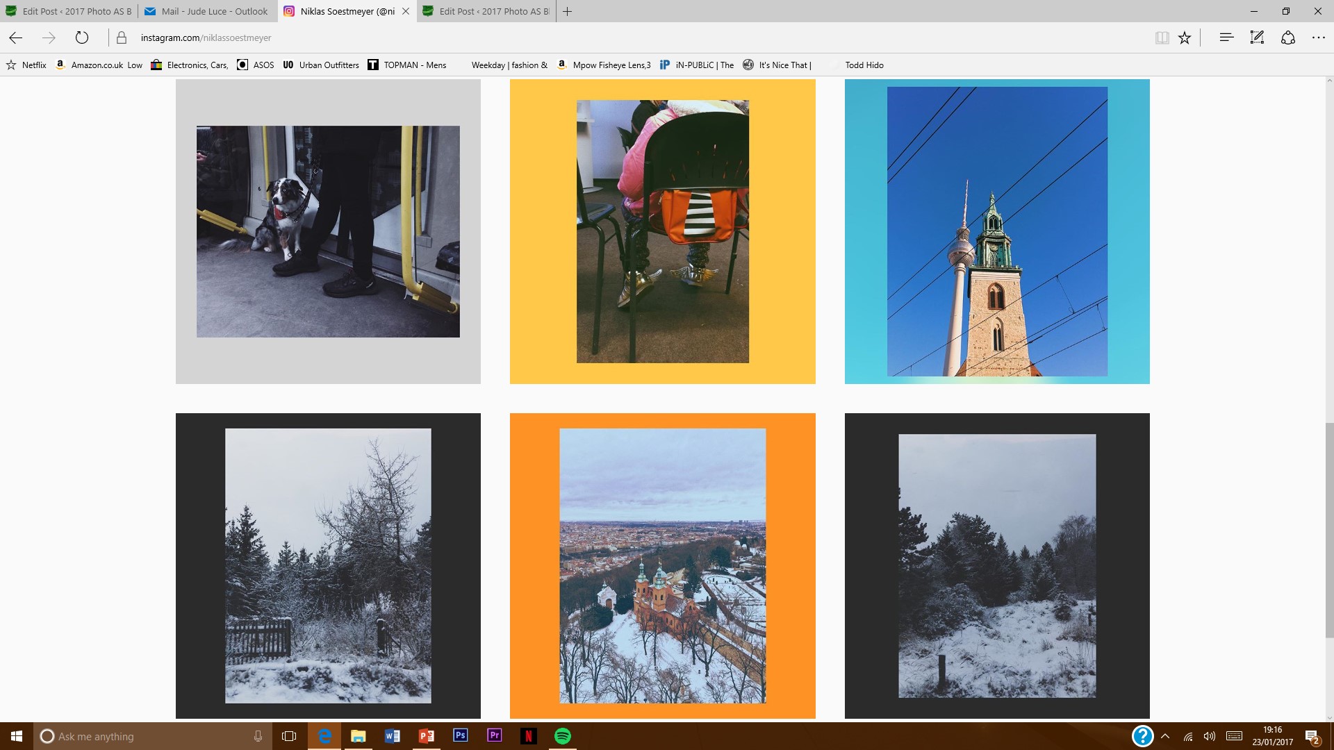
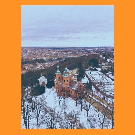
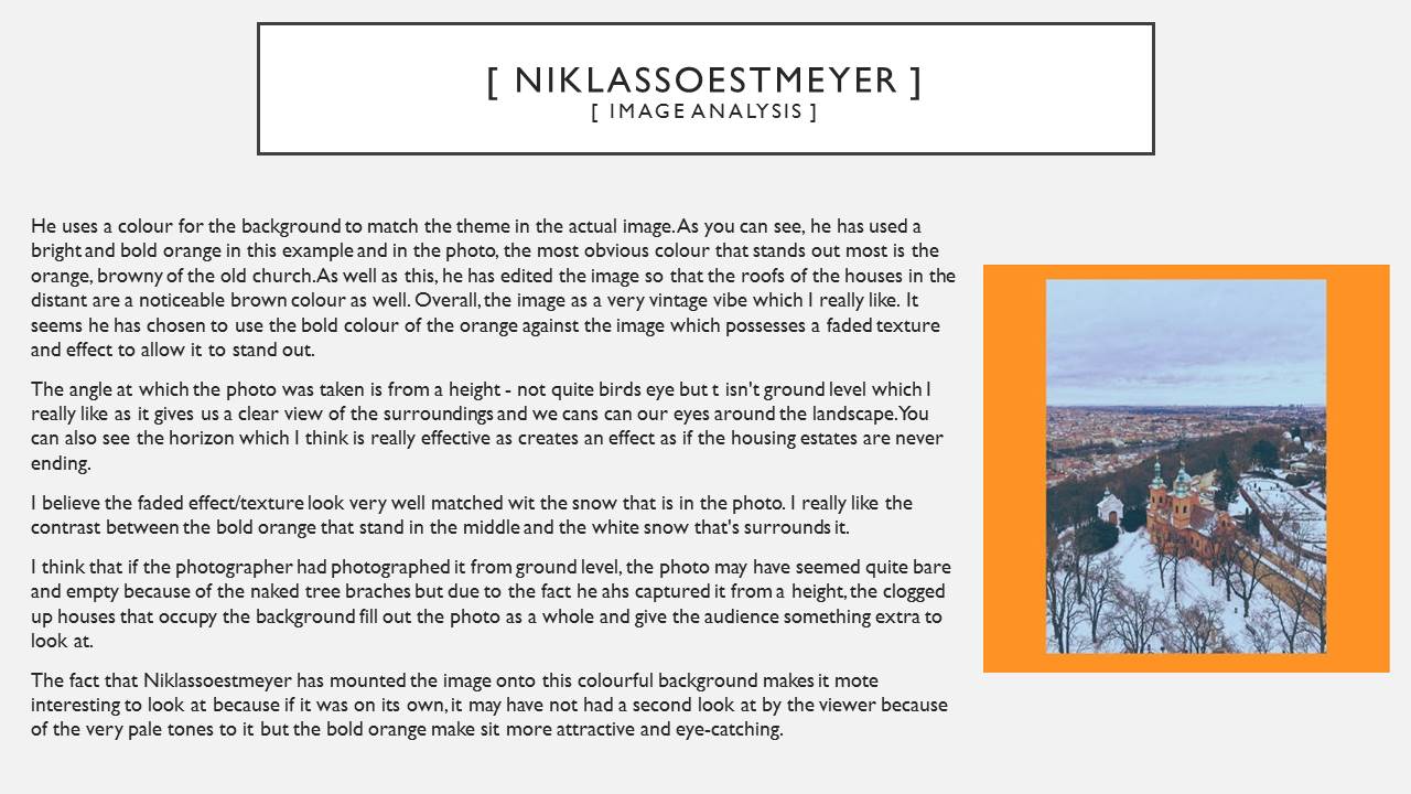
// Image Analysis // Picture1I have picked out this image of Niklassoestmeyer’s to discuss because it is my favourite of his.

Like I talked about earlier on, he uses a colour for the background to match the theme in the actual image. As you can see, he has used a bright and bold orange in this example and in the photo, the most obvious colour that stands out most is the orange, browny of the old church. As well as this, he has edited the image so that the roofs of the houses in the distant are a noticeable brown colour as well. Overall, the image as a very vintage vibe which I really like. It seems he has chosen to use the bold colour of the orange against the image which possesses a faded texture and effect to allow it to stand out.

The angle at which the photo was taken is from a height – not quite birds eye but t isn’t ground level which I really like as it gives us a clear view of the surroundings and we cans can our eyes around the landscape. You can also see the horizon which I think is really effective as creates an effect as if the housing estates are never ending.
I believe the faded effect/texture look very well matched wit the snow that is in the photo. I really like the contrast between the bold orange that stand in the middle and the white snow that’s surrounds it.

I think that if the photographer had photographed it from ground level, the photo may have seemed quite bare and empty because of the naked tree braches but due to the fact he ahs captured it from a height, the clogged up houses that occupy the background fill out the photo as a whole and give the audience something extra to look at.

The fact that Niklassoestmeyer has mounted the image onto this colourful background makes it mote interesting to look at because if it was on its own, it may have not had a second look at by the viewer because of the very pale tones to it but the bold orange make sit more attractive and eye-catching.

Extreme/abstract/romanticized editing

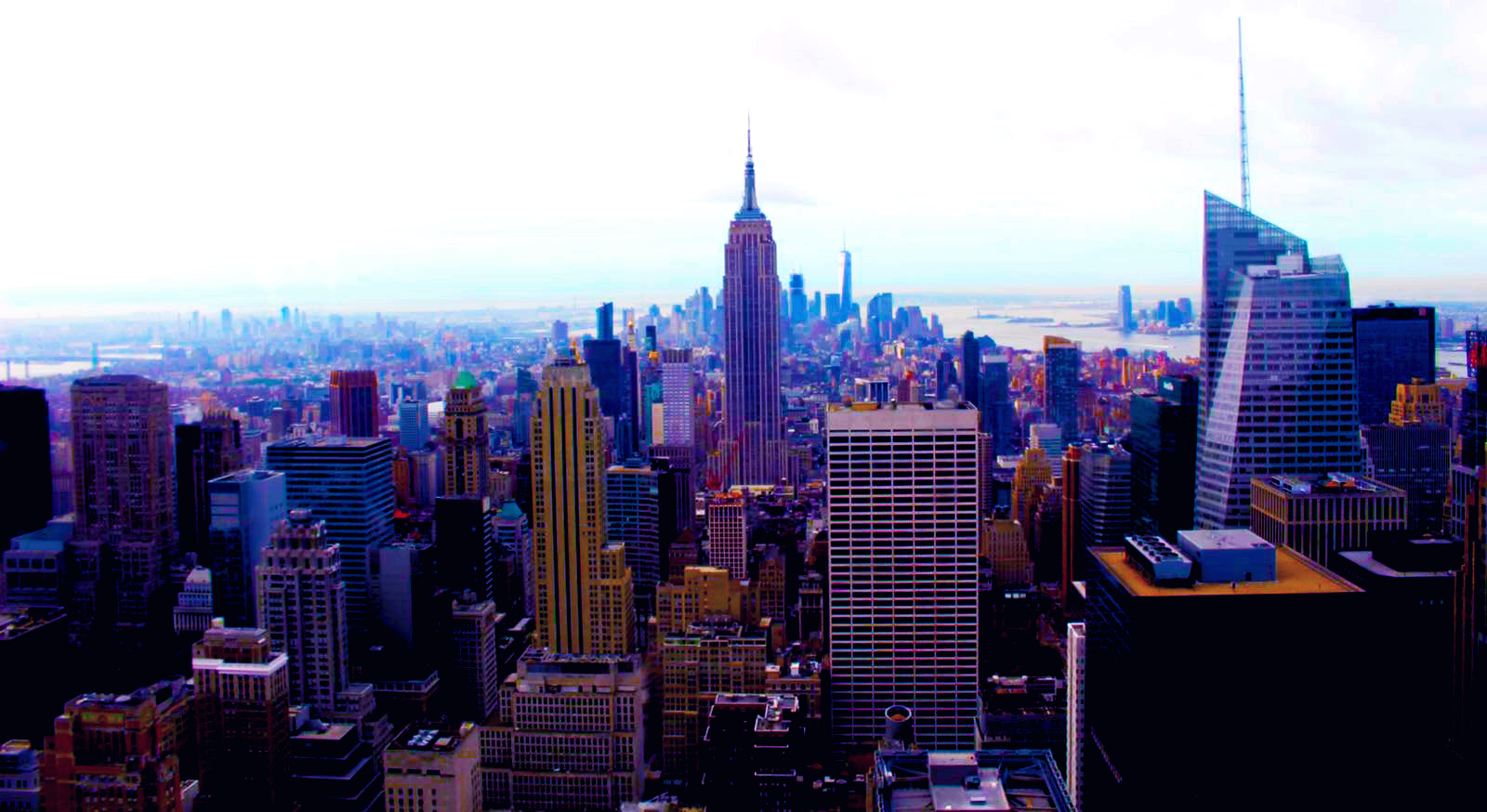
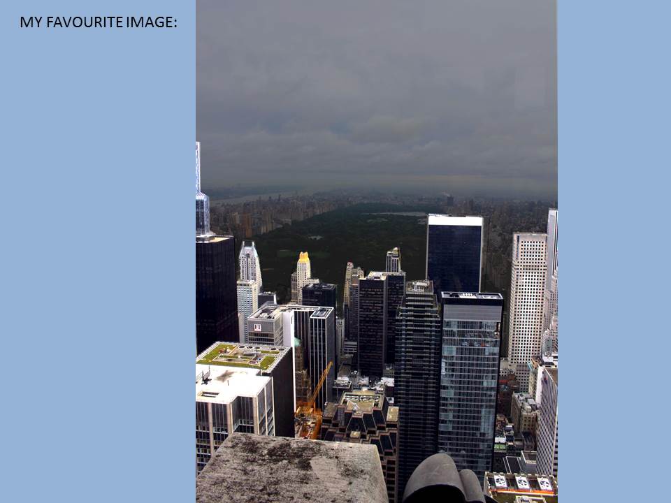
To left are some pictures that I have edited using the saturation and contrast tool. The final edits I used in my other course work are to the right. I decided to show these pictures as I wanted to show how photography is art and how with a little editing the most simple photo can become romanticized.

The top left photo is very abstract and almost looks as if it is a galaxy, a planet or even a unusual eye. However, it is only a bulb with some rope in it. Editing can change the whole meaning or idea of a photograph. In this photo I increased the saturation almost to the top, one side of the bulb took the colour of the sky and the left side took the colour of the wall. The orange and blues work perfectly together and brings the colours of a sunset into an fairly ugly or dull object making it beautiful and interesting. I also like the back ground; the fact that it’s split into sections of colour it works perfect with the colours of the bulb.
The bottom left photo is very romanticized spoiled by the industrial objects. Although it may look like the industrial objects have ruined a what could have been a natural photo I think they make the photo better showing the effects of these ugly containers. It shows how they don’t just pollute the air or the ground we live on but it also pollutes our landscapes. I think the photo is better with them there as now it has a meaning and it isn’t just a pretty photo for people to look at, it is showing the effects of humans being greedy. I also like that now I have edited it is has the bright orange cause the containers and trees to become silhouettes. It looks almost as if they are competing with each other. It looks as if the tree is showing what could have been such as a beautiful forest but it has been stopped by these industrial machines. I got the orange and silhouette effect by increasing the contrast and offset as well as the saturation.

Extension Tasks…Altered Landscapes

  • Continue researching those photographers of the 1920s and 30s who were interested in capturing the surface qualities of various objects, who subscribed to Edward Weston’s view that “The camera should be used for a recording of life, for rendering the very substance and quintessence of the thing itself, whether it be polished steel or palpitating flesh.” What do you understand by the term ‘The New Vision’ or ‘New Objectivity’ in photography?
  • How and why did photographers break away from the Pictorialism of the pre-war period? What impact did the First World War and the Russian Revolution have on photographers’ attitudes to their practice?
  • What was the influence of the invention of the Leica hand held camera?
  • Make a list of different types of surface, material or object. For example: rough stone, well trodden earth, a mirror, the back of a hand, a dog’s coat, cracked concrete, a wooden door …etc. Once you have completed your list (aim for at least 20 items), set about collecting photographs (using your phone and/or camera) of these various surfaces. Consider how best to capture the qualities of each material. Experiment with framing/cropping, point of view (low angle/high angle) and lighting conditions. Upload your images as a  new album/gallery.
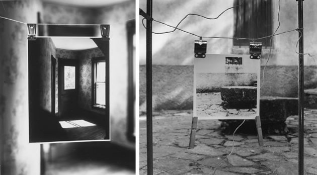
  • Print one or two of these images. Experiment with altering the surface of the prints. Use a list of verbs to help you: scratch, fold, bend, curl, crush, stitch, roll, insert, tear, combine etc. Re-photograph these altered images. Consider using a support for your images by fixing them to a variety of other materials e.g. wood, metal, perspex, glass, tinfoil etc. Try partly covering/obscuring your photographs with other materials – paper, cloth, glass, tinfoil etc. What happens?
  • Check out // Dafna Talmor – Constructed Landscapes

  • https://vimeo.com/163832184