Category Archives: Experimentation

Filters

Author:
Category:

‘Environmental Portraits’ Edits Using Adobe Photoshop – COLOUR SPLASH

 colour-splashcs-original colour-splash-2

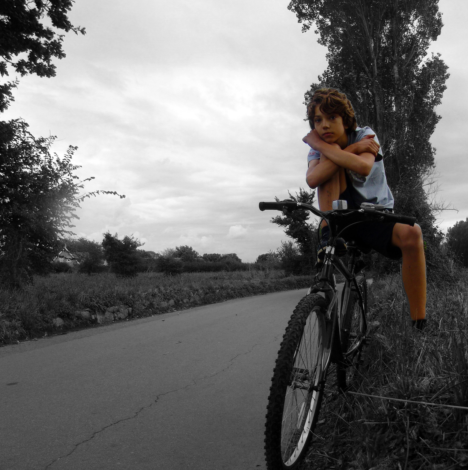
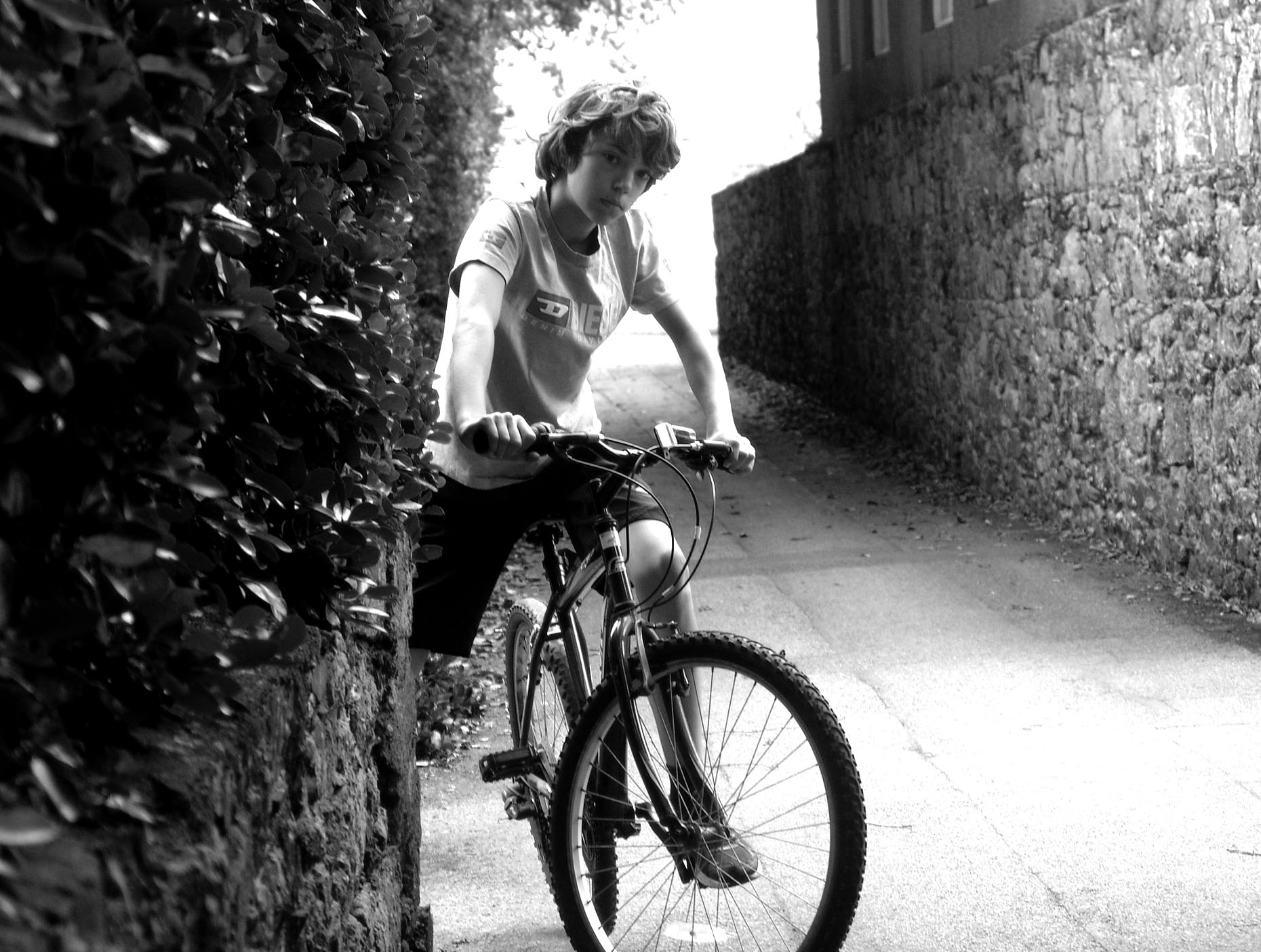
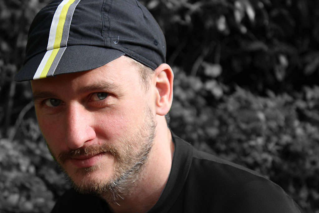
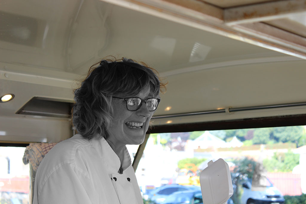
cs-original-2In today’s lesson, we experimented with colour splash. Colour splash involves using the de-saturation tool to then make your image black and white. Then you use the brush tool to basically paint through the layers to make one subject in the image, for example, the foreground in colour and the background in black and white. It has a really good effect.

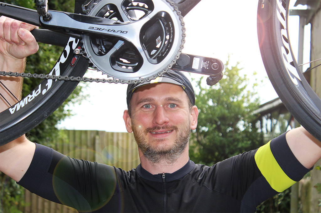
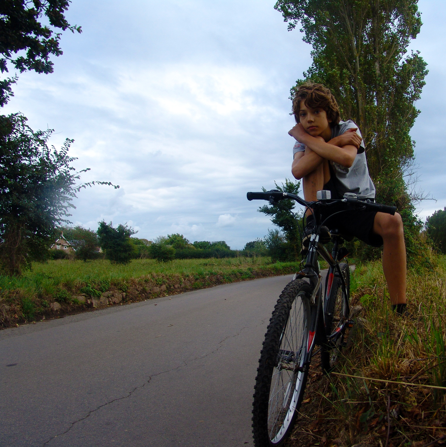
I experimented this with two different photographs from my environmental portraiture series and my favourite one is the cycling one as I think it works best with the colours in this one compared to the second attempt.

I then compressed and flattened the image to save it to allow me to put it on the blog as this post.

Color Splash Edits- Using Environmental Portraits

         Edited                                                                                       Original 

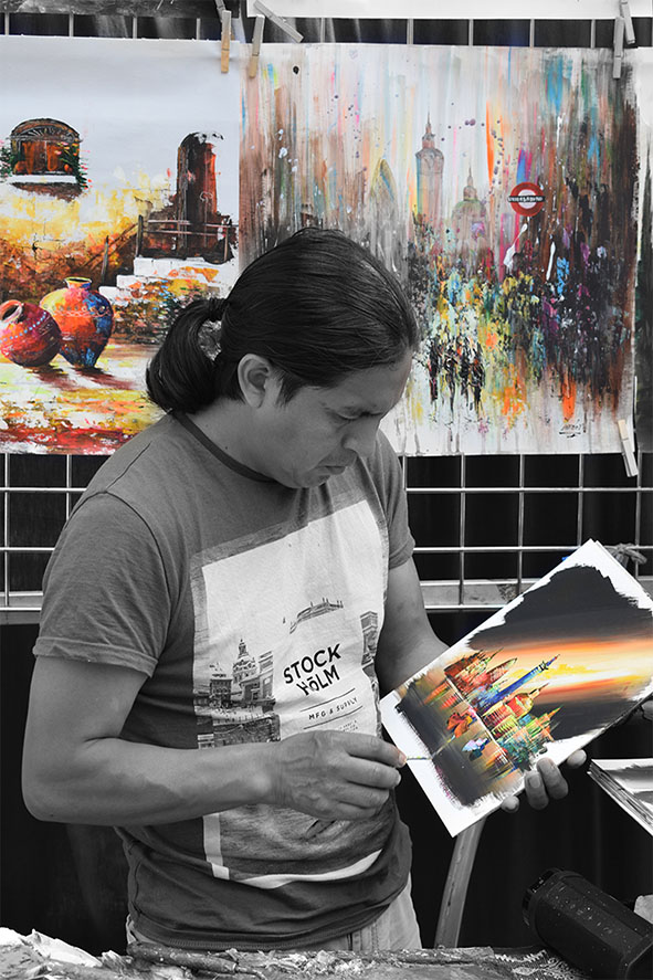
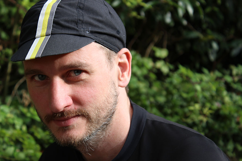
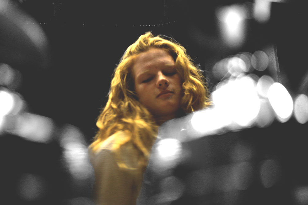
Here is the Original and the Edited version of one of my Environmental Portraits. We did a method called Color Splash. This is when we changed the saturation of the image by making it black and white. We then used a small brush to highlight the areas of the image that we wanted to go back to color. I made the image brighter and added more contrast.

Colour splashing

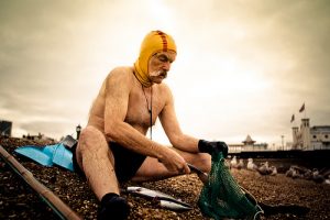
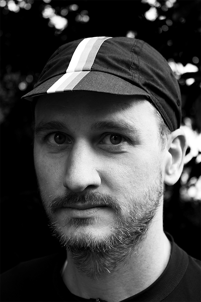
I have created a colour splash. I did this by making the image black and white then using the brush tool I started to add colour to certain parts of the picture. I chose to add colour to his art because they’re the main parts of the photo and have the most colour. By making the man black and white makes the colours in his pictures more noticeable.

Environmental Portraits – Edits using Photodhop

ben-edit-save-2 Today, I used a color splash technique to select various parts in the photograph to remain in color but other parts in black and white.  To start off, I duplicated the layer using Ctrl + J.   I made the background black and white and the new layer as color.  In the toolbox I clicked the black square.  Then using the brush tool, I selected areas of which I wanted to keep in color.  Carefully, I used the opacity tool and the zoom tool to have a precise level of accuracy in selecting the finer areas of the photograph.
dsc05773

‘Environmental Portraits’ Edits Using Adobe Photoshop

unedit-1


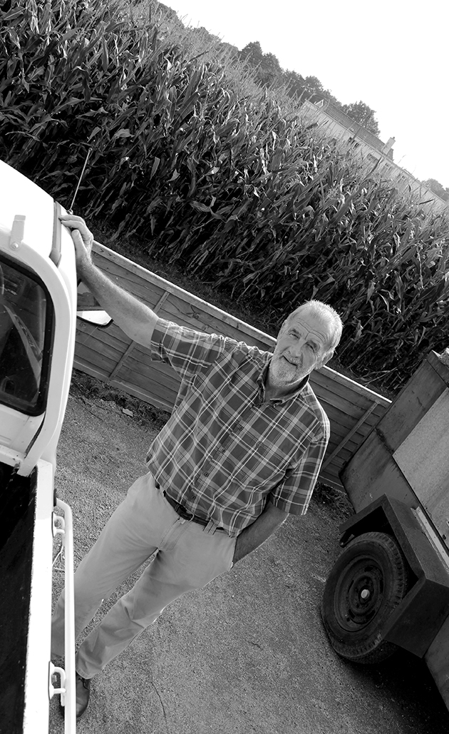
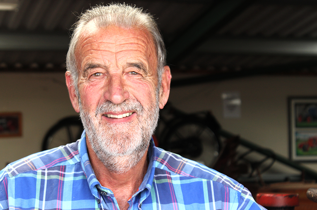
Today in the lesson, I used the program ‘Adobe Photoshop’ to edit the image I took of my Grandpa with his tractors on one of my shoots for environmental portraiture.

Above is the original and below is the edited version. Firstly, I cropped the photograph to enable me to focus on the main aspects of the picture, this being, my Grandpa’s face, the steering wheel and the poster behind him, also about tractors. When cropping the picture, I had make sure I was obeying the rule of thirds by aligning key parts with the lines and intersections. In this photo, my model’s face is centered but I believe it has a positive effect on the viewer.

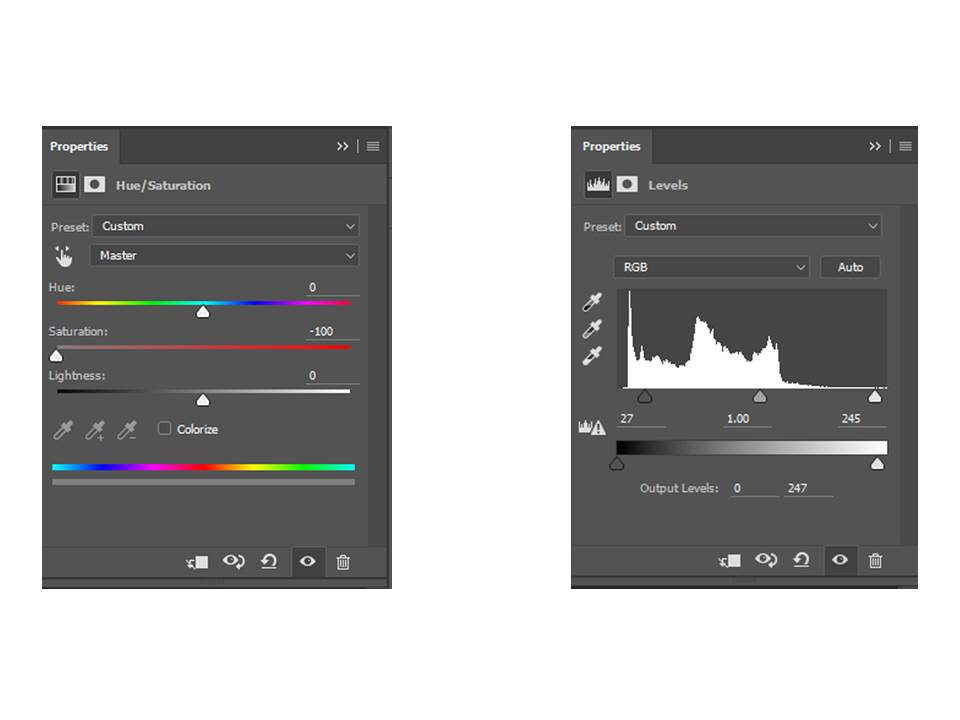
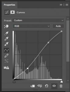
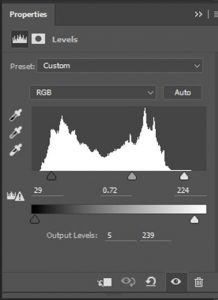
Next, I adjusted the saturation so there was none – it was black and white. By doing this, I was able to use the ‘levels’ tool on Photoshop to alter the intensity of the blacks, whites and mid-tones; essentially changing the contrast. I found a balance I was happy with, which I thought looked effective for the photo.

Finally, once I was happy with the outcome, I flattened this photograph by going to ‘layers’ then ‘flatten image’. This allowed me to put it on the blog to show you my thoughts.

ps

Edit

Environmental Portrait – Edits using Photoshop

ben-edit-save-1

dsc05712


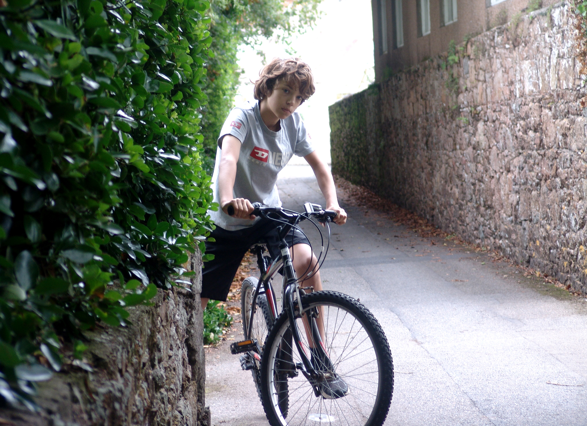
The top photograph is the edited version, and the bottom is the original.

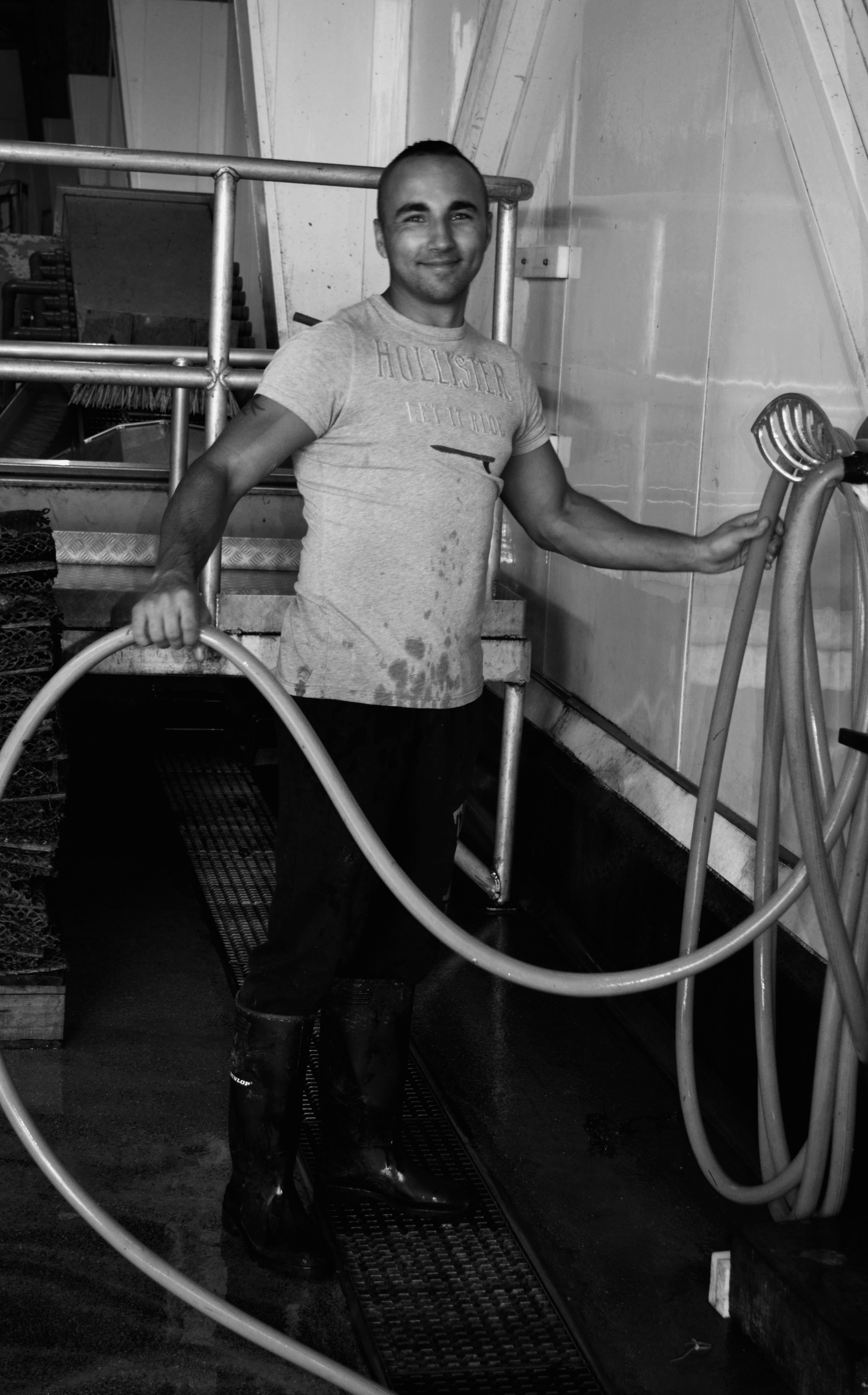
To edit the photograph, I firstly cropped the boundaries so that composition of the photograph fits in well with the rule of thirds.  I secondly,  changed the photograph to black and white by decreasing the saturation to nothing.  I did this because traditionally, portrait photographs were taken in black and white.  Finally, I adjusted the contrast using the levels tool.  By doing this, I enhanced the dark areas and enhanced the bright areas.  To compliment both of these factors I then adjusted the grey scale to create a balance between the two sides of light.

Week 4 (26 Sept – 30 Sept) AS PHOTOGRAPHY // portraits

WEEK 4 Environmental Portraits

This week Mr Mckinlay will be encouraging all students to experiment with their development of camera skills and how to curate the blog posts effectively.

To include : ISO / WB / APERTURE / SHUTTER SPEED / HIGH / LOW ANGLE / CANTED ANGLE / HARD FOCUS / SOFT FOCUS / DEPTH OF FIELD /

Mr Cole will be teaching a range of Adobe Photoshop techniques so that all students can select the most successful images from their Environmental Portrait contact sheets, and then edit them effectively.

To include : FILE MANAGEMENT / ADJUSTMENT LAYERS / CROPPING / BLENDING TECHNIQUES

Each Lesson you should make a blog post to summarise the skills you learned and showcase a finalised image using Adobe Photoshop.

You will also be expected to compare and contrast your work with at least one ENVIRONMENTAL PORTRAIT photographer and analyse your final choice of image (using formal analysis)

NEXT WEEK // STREET PHOTOGRAPHY

EXPERIMENTAL ISO CONTACT SHEET

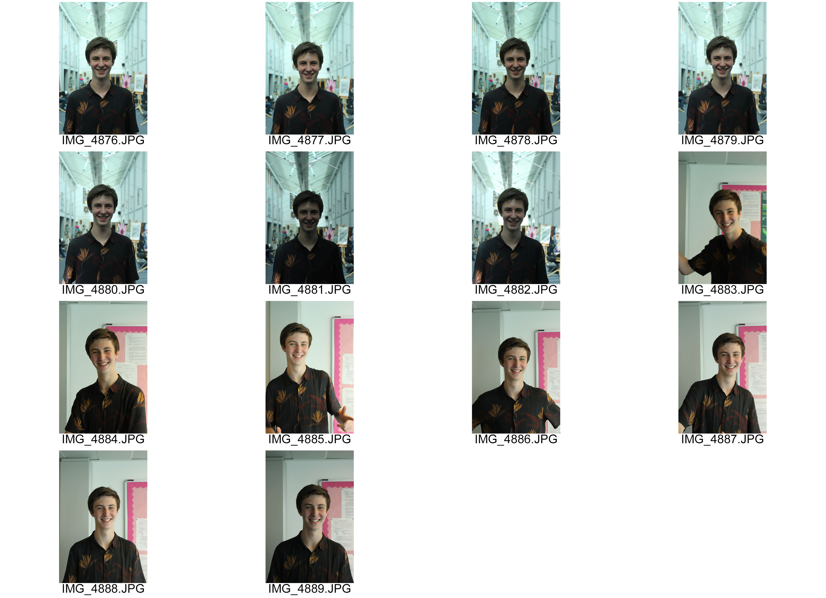
Today in the lesson, we experimented with using different ISO settings on our cameras. We went around the school and chose a model to take portraits of, positioned them in an area which was light in colour and took their photo using each of the ISO settings ranging from 100-6400. We then repeated this but in an area which was dark in colour. For each image, I had to tell our subject to keep still so I could get the best possible outcome.

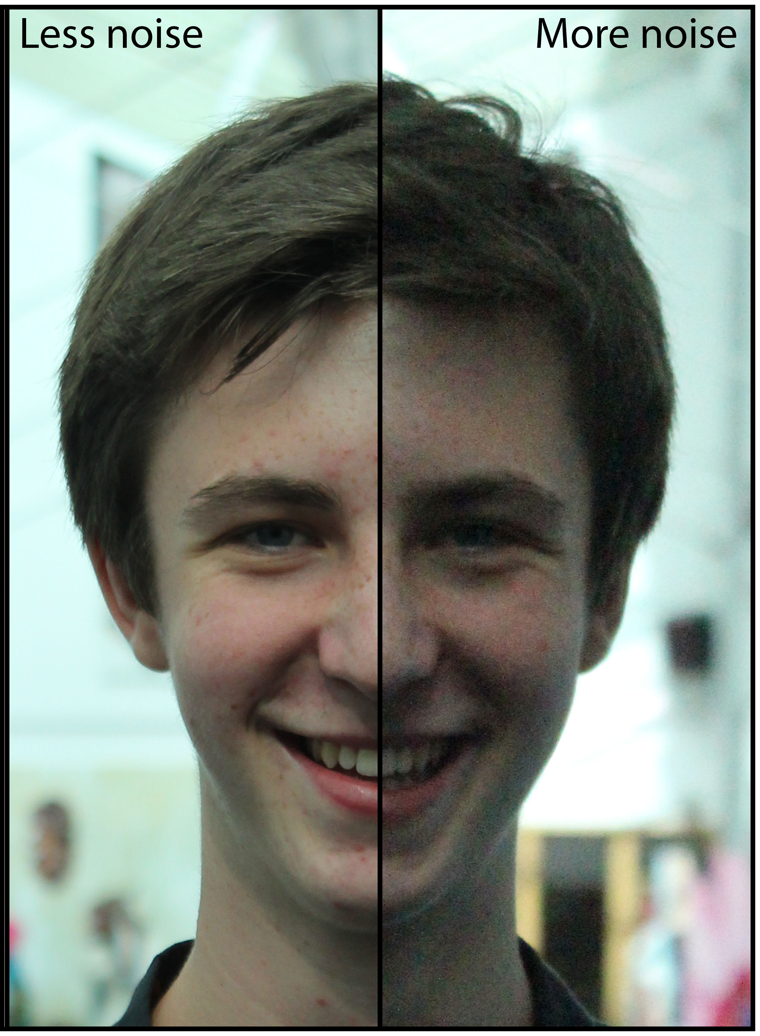
Here is the photoshoot. Now, the difference is hugely noticeable because the light conditions weren’t perfect but it still gives me a vague idea of the uses of ISO and it’s benefits; the lower the ISO number, the less sensitive it will be to light. However, a higher number increases sensitivity to light.

cs-iso-1

jack

I then combined two photographs of Jack – my model so it is clear for you to see the difference ISO can make to an image. The left doesn’t have noise –  the quality is better, however, the right does have noise so the texture and look; the overall quality isn’t as good. These tow photos have been merged but are from the exact same shoot where Jack was stood in the same position.