Category Archives: Analysis

Filters

Author:
Category:

History of Landscape Art and Photography

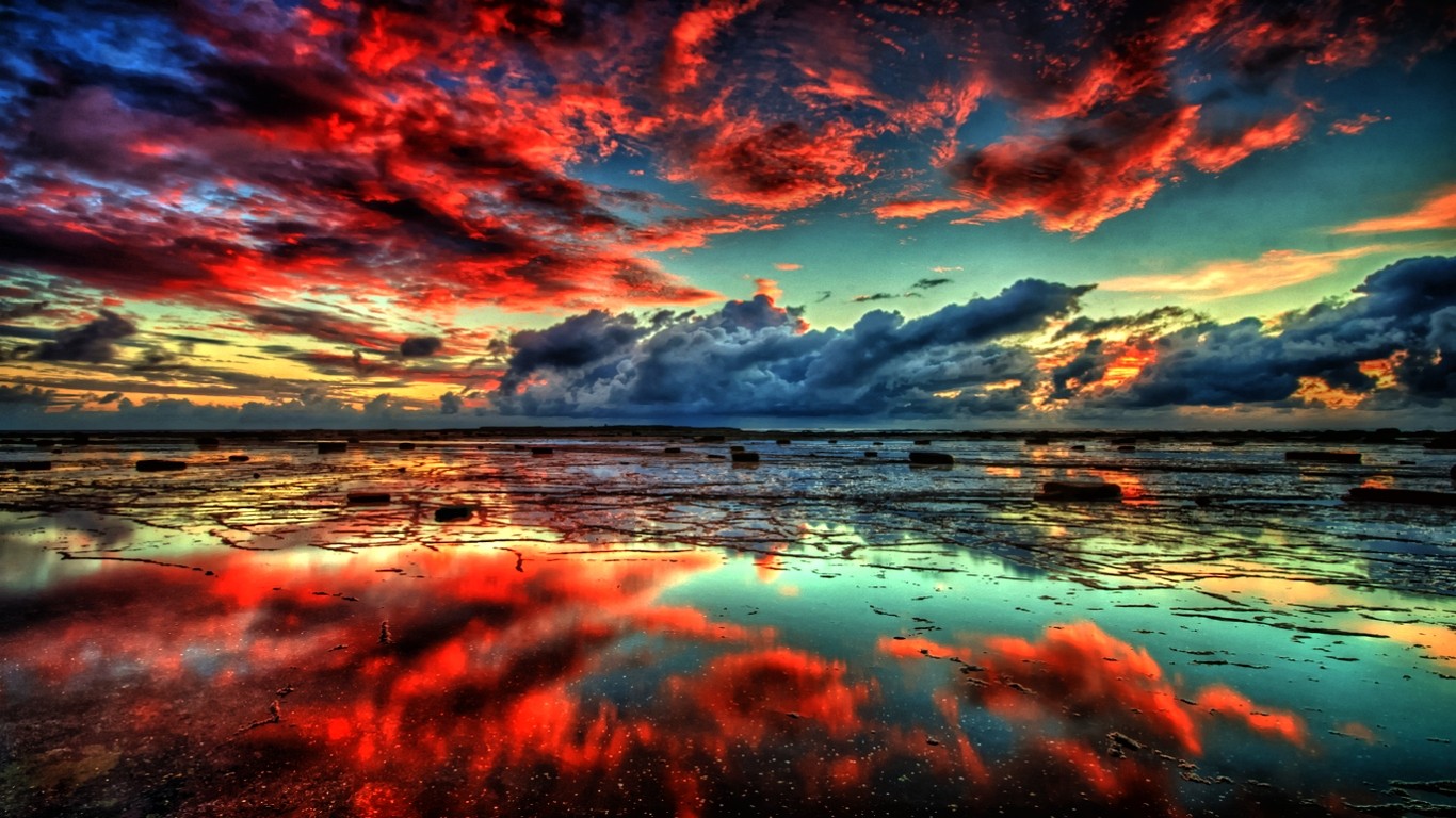
Landscape art and photography is where the essence of nature is captured without a human presence using the landscape itself through various locations such as mountainous, forest , beach, architectural and other places.

Through the centuries, landscape art has developed massively through different influences of the time.  With the Medieval ages, there was much more of a Gothic presence, whereas with the renaissance artists such as Leonardo Da Vinci were being somewhat more expressive by influences such as classic poetry; artists expressed themselves more.  Within the 17th and 18th centuries more styles such as bracketing whereby an object along the side of the foreground that directs the viewer’s eye into the composition were more commonly adopted.  This style still has a strong presence in today’s photograph.

With further developments through the 19th century in landscape, people started to build upon the idea of romanticism to capture the essence and beauty of nature with abstract color with the natural light from the sky, working in cohesion with the composition of the environment of the photograph.

With the turn of the 20th century and early photography being introduced, landscape adapted and took off from where landscape art was at the time.  However artists did somewhat make an effort to separate landscape photography from art.  From here, the natural environment was seen as inspiration.  Artists such as Edward Weston and Ansel Adams took hold of this, expressing their moods and emotions.

Instructions >>> Week 15 | Jan 9-14 onwards 2017

Amended Mock Exam Schedule!!!

Monday 6th March Pds 1 – 5 = 12D

Tuesday 7th March Pds 1 – 5 = 12A

Wednesday 8th March Pds 1 – 5 = 12E

Friday 10th March Pds 1-5 = 12C

Photographing Urban Landscapes

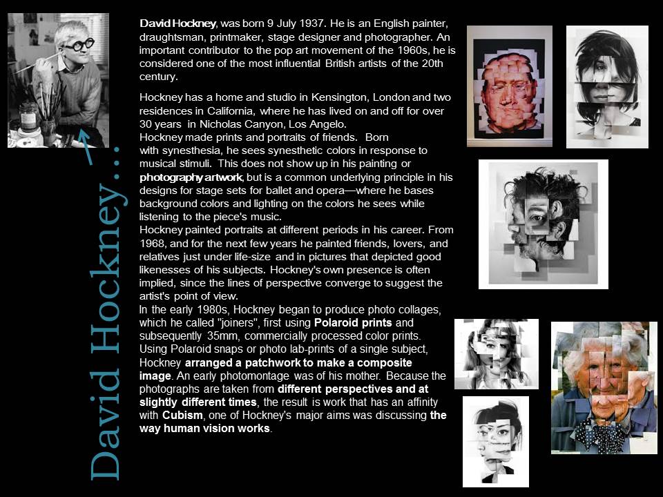
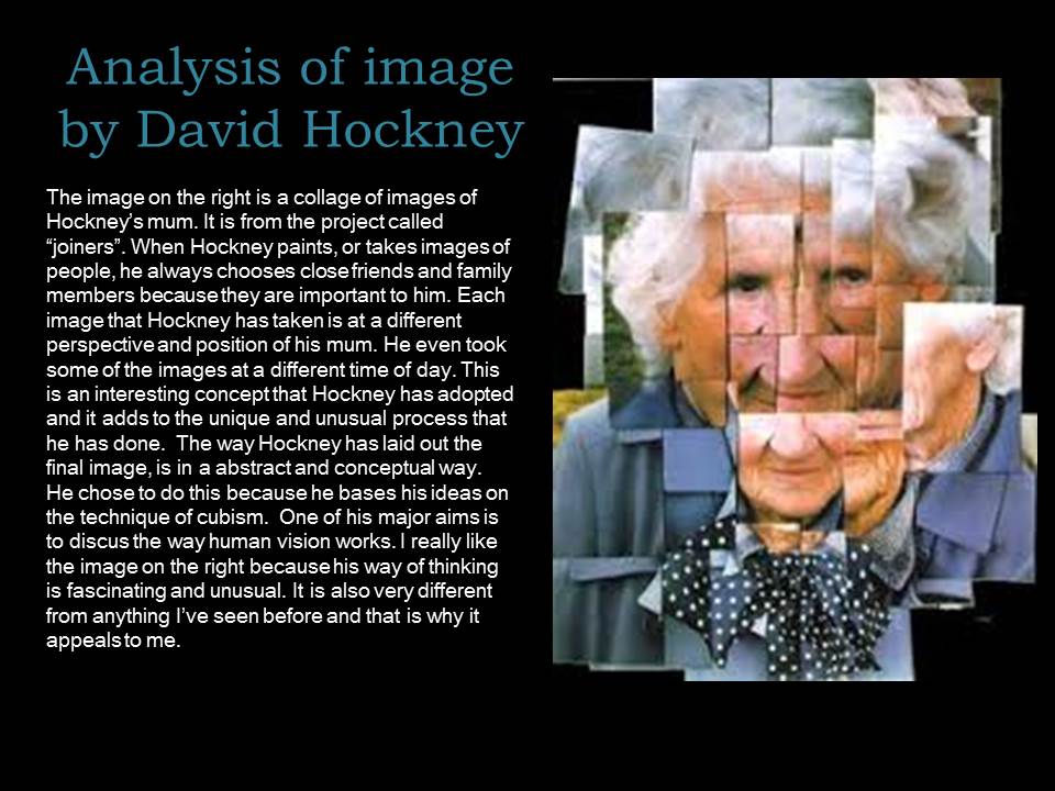
  1. Research and explore The New Topographics and how photographers have responded to man’s impact on the land, and how they found a sense of beauty in the banal ugliness of functional land use… 
  2. Create a blog post that defines and explains The New Topographics and the key features and artists of the movement. Analyse some key imagery (COMPLETE BY FRIDAY 13 JAN)
  3. As a response to Alliance Francaise Climate Change : State of Emergency at Jersey Arts Centre you must produce a blog post that includes examples of ARCHIVAL IMAGES of a local landscape that you have photographed. Compare these images and describe and explain the changes. Does the imagery connect with any of the artists we have studied??? How and why??? You can look at housing areas, industrial areas, erosion of the coastline, reclaimed land etc.(COMPLETE BY FRIDAY 20 JAN)
  4. You can then begin to make contrasts and comparisons to your imagery (for example if you have a sense of repetition) you may want to focus on Bernd and Hilla Becher’s TYPOLOGIES (COMPLETE BY FRIDAY 27 JAN)
  5. You can make links with The New Objectivity movement and their approach to industrial features eg Albert Renger-Patzsch / Karl Blossfeldt : what was The New Objectivity and what was it a reaction to ??? (try to set the context) (COMPLETE BY FRIDAY 27 JAN)
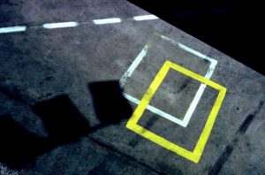
  6. We will then be looking at ABSTRACTION and FORMALISM and you will be expected to explore shape, pattern, colour, line, symmetry and texture and present a range of blog posts that show your findings, experiments and links to suitable artists as a point of reference / influence. (COMPLETE BY FRIDAY 3 FEB)
  7. You must complete a homework task that tackles the techniques involved in producing night landscapes, using long exposures and slow shutter speeds. You can photography light trails, townscapes, stars and star-trails etc…. (COMPLETE BY FRIDAY 10 FEB)
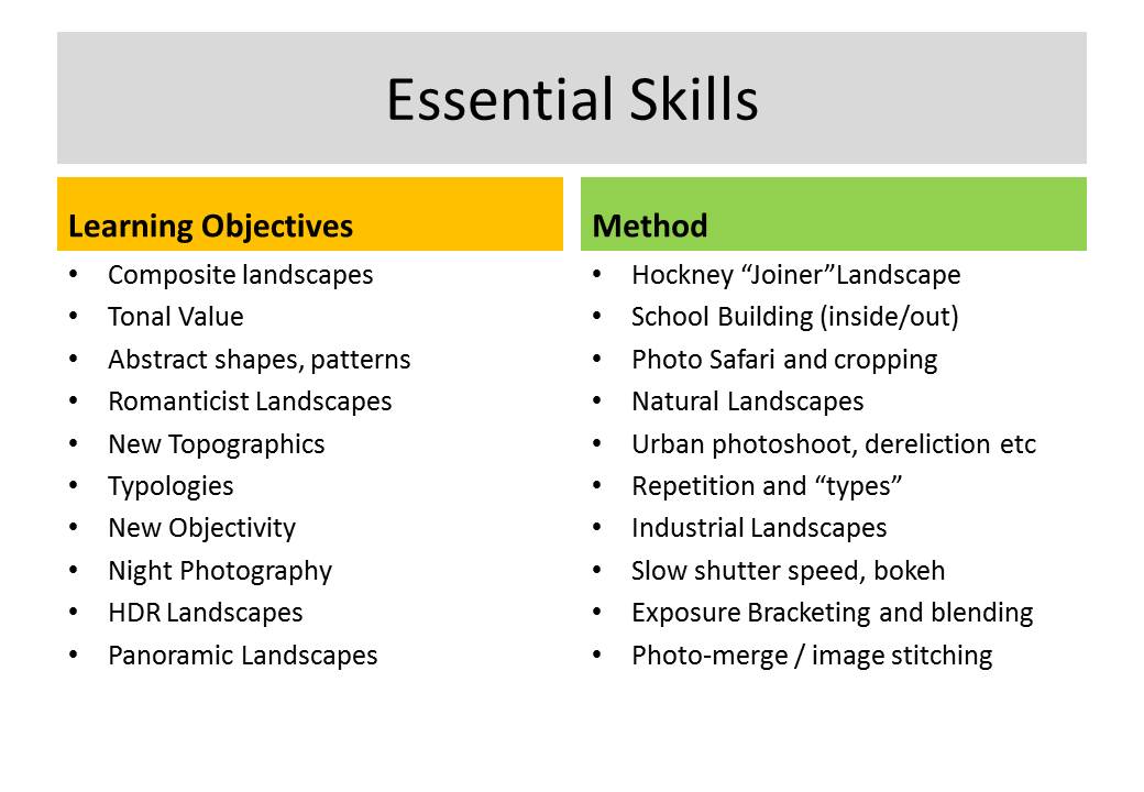
  8. Skills Checklist
    Skills Checklist above and complete by Friday 17th Feb to ensure you have confident skills using photoshop…


Ensure that you include an analysis of a key image from artists and discuss the following key terms…

  • Composition (rule of thirds, balance, symmetry)
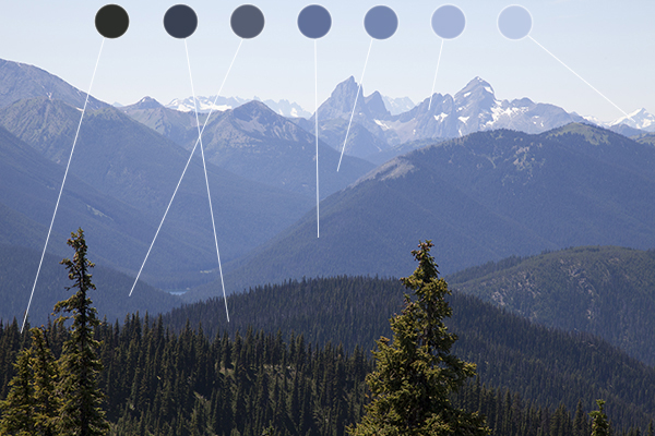
  • Perspective (linear and atmospheric, vanishing points)
  • Depth (refer to aperture settings and focus points, foreground, mid-ground and back-ground)
  • Scale (refer to proportion, but also detail influenced by medium / large format cameras)
  • Light ( intensity, temperature, direction)
  • Colour (colour harmonies / warm / cold colours and their effects)
  • Shadow (strength, lack of…)
  • Texture and surface quality
  • Tonal values ( contrast created by highlights, low-lights and mid-tones)

Previous tasks

All students will be expected to engage with a range of initial approaches to Landscape Photography…

  • A brief history and overview of landscape art and photography
  • Romanticism in Landscape painting and photography
  • Ansel Adams and Edward Weston and their impact on contemporary landscape photography
  • A site visit / guided walk (see Psychogeographies blog-post)
  • Havre Des Pas Photoshoot = Period 5 lessons starting next Thursday 8th  (12D MM), Friday 9th (JC 12C), Tuesday 13th (12A MM) & Wednesday 14th (12E JC).


  •  M:\Departments\Photography\Students\Resources\Landscape Photography\Mr Cole 12A, 12C, 12D, 12E

You must complete the following tasks in Weeks 13 + 14 (before Christmas)

<<<Research and Analysis>>>

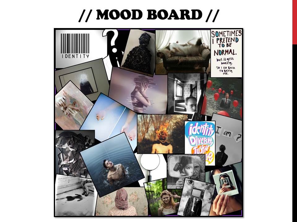
  1. An introduction to landscape photography, including a definition and mood-board of influential images
  2. A Case Study on Ansel Adams and Edward Weston

3. Create a blog post that defines and explains what Romanticism is in Landscape Photography…include examples and make reference to Romanticism in other art-forms eg painting

4.Create a blog post that shows your understanding of what Psycho-Geography is and how we can use this concept to help us respond to the urban / rural / sea / land scape (s)…

Homework Assignment

  • Between December 5 2016 and January 5th 2017
  • Take 150-200 photos of romanticised landscapes
  • Try to keep to natural / rural settings with minimal human impact
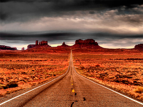
  • We will show you how to “EXPOSURE BRACKET” and you must try using this technique for at least some of your photographs
  • We will then show you how to convert these images to HDR using photoshop

6c61ea1dd7ca9a620af306a4a6e8b21e


Here is a link to the BBC Website “in-pictures”…The British Isles 2016

http://www.bbc.co.uk/news/in-pictures-3816943


The New Topographics


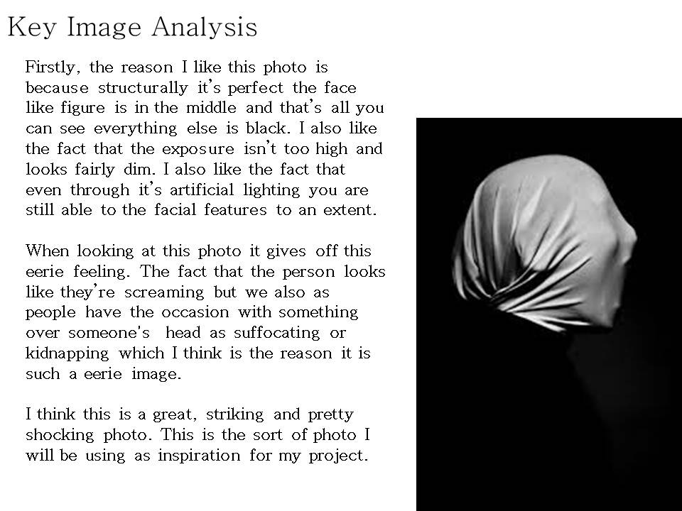
Analysing Your Images

The Formal or Visual Elements

Photographers are usually aware of the ways in which they can create interest in their images regardless of the subject. This is sometimes what separates successful and less successful pictures of the same thing. The following list describes some of the formal or visual elements in any photograph. These are mostly shared with other kinds of pictures, although photography has some that are special:

Light:

Line:

Repetition:
Shape:
Space:

Texture:
Value/Tone:

Colour:

Composition:

Which areas of the photograph are brightest? Are there any shadows? Does the photograph allow you to guess the time of day? Is the light natural or artificial? Harsh or soft? Reflected or direct? How does light fall across the objects in the photograph?
Are there objects in the photograph that act as lines? Are they straight, curvy, thin, thick? Do the lines create direction in the photograph? Do they outline? Do the lines show movement or energy?
Are there any objects, shapes or lines which repeat and create a rhythm or pattern? Do you see echoes or reflections within the image?
Do you see geometric (straight edged) or organic (curvy) shapes? Which are they and how do they relate to each other?
Is there depth to the photograph or does it seem shallow? What creates this appearance? What is placed in the foreground, middle ground and background? Are there important negative (empty) spaces in addition to positive (solid) spaces?
If you could touch the surface of the photograph how would it feel? How do the objects in the picture look like they would feel?
Is there a range of tones from dark to light? Where is the darkest part of the image? Where is the lightest? Are the tones in the photograph balanced or does the image tend towards darkness or lightness overall. How does this affect the mood or atmosphere?
What kind of colours can you see e.g. saturated, muted, complementary, primary? Is there a dominant colour? How would this image be different if it was in black and white? Does the use of colour help us understand the subject or does it work independently?
How have the various elements in the picture been arranged? Does the image seem balanced or unbalanced? Is it possible to superimpose geometrical shapes on the image to better understand the composition e.g. a pyramid? Has the photographer used the Rule of Thirds?+


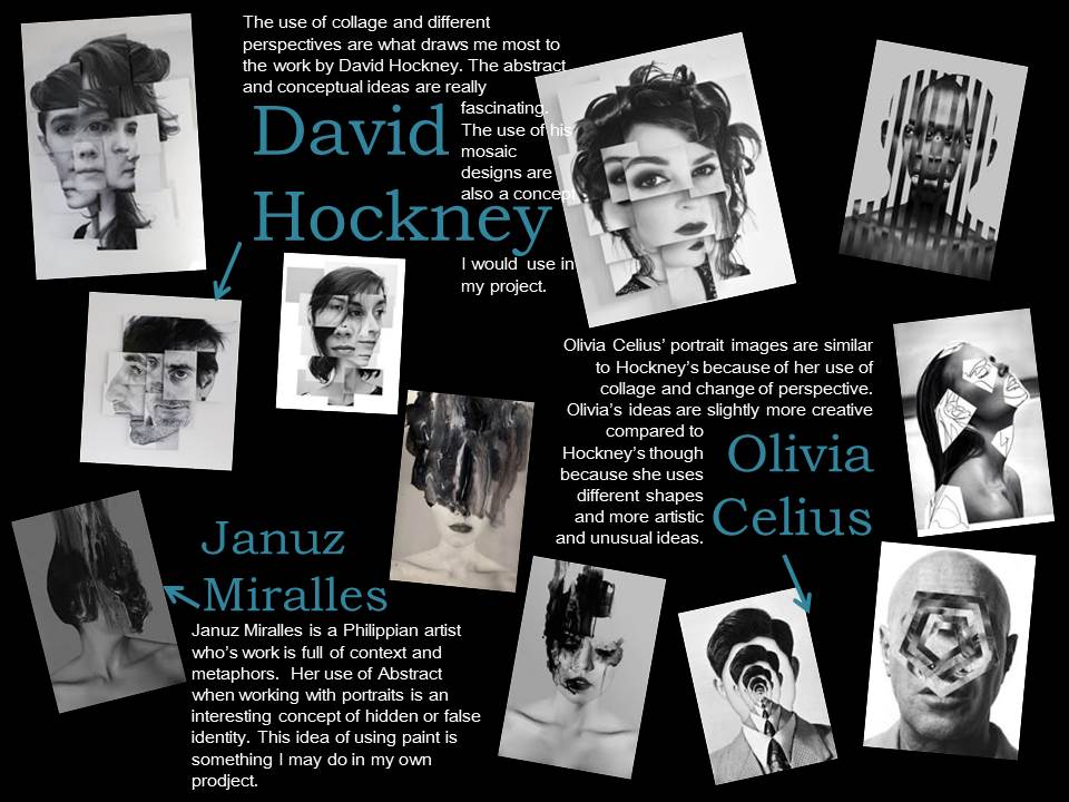
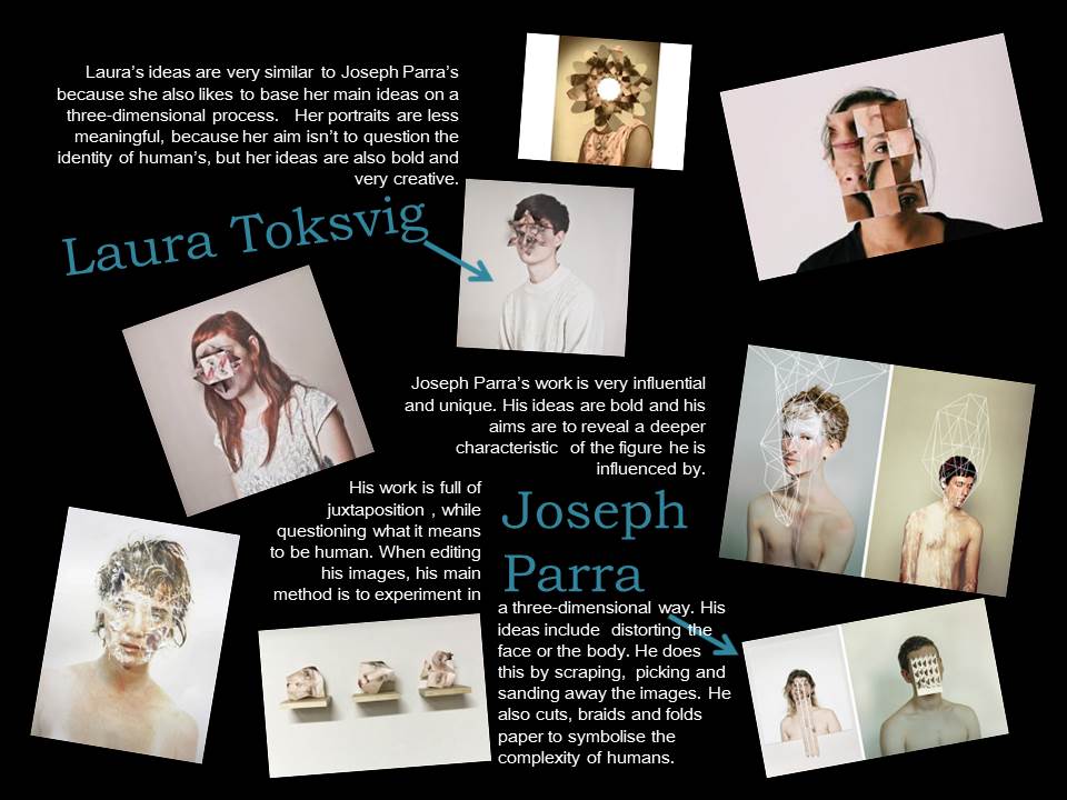
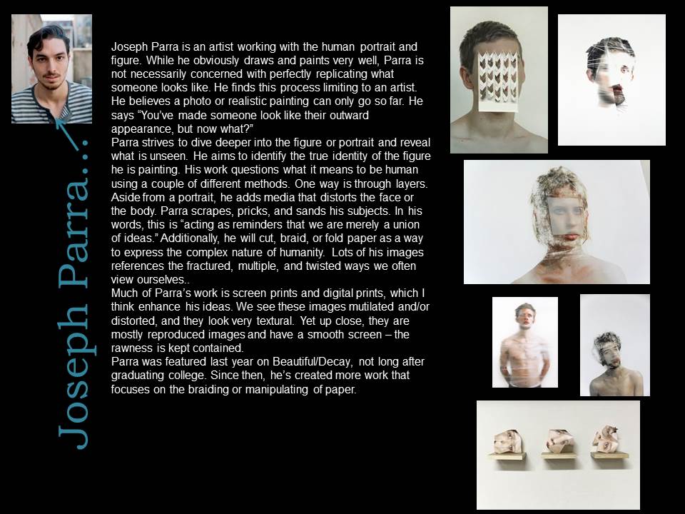
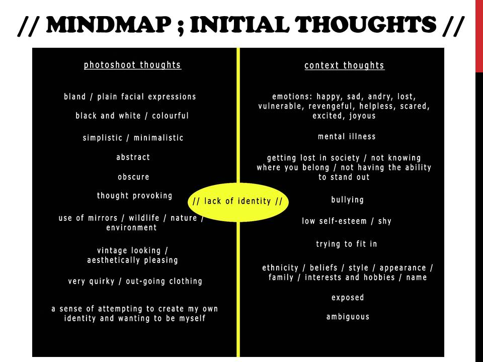
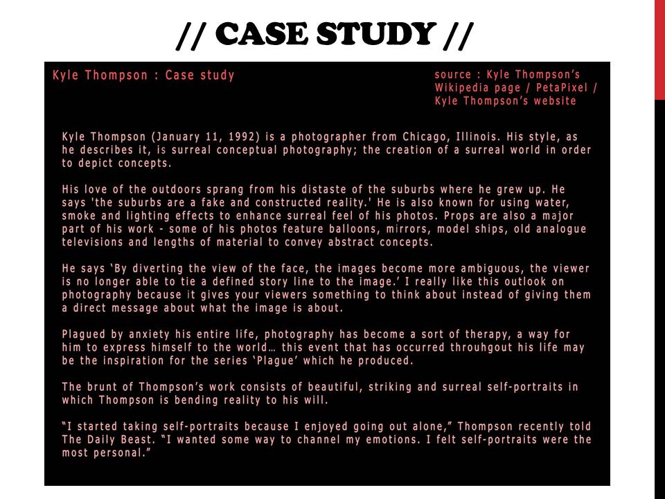
Response to Artists Work – Loss of Identity

dsc06902

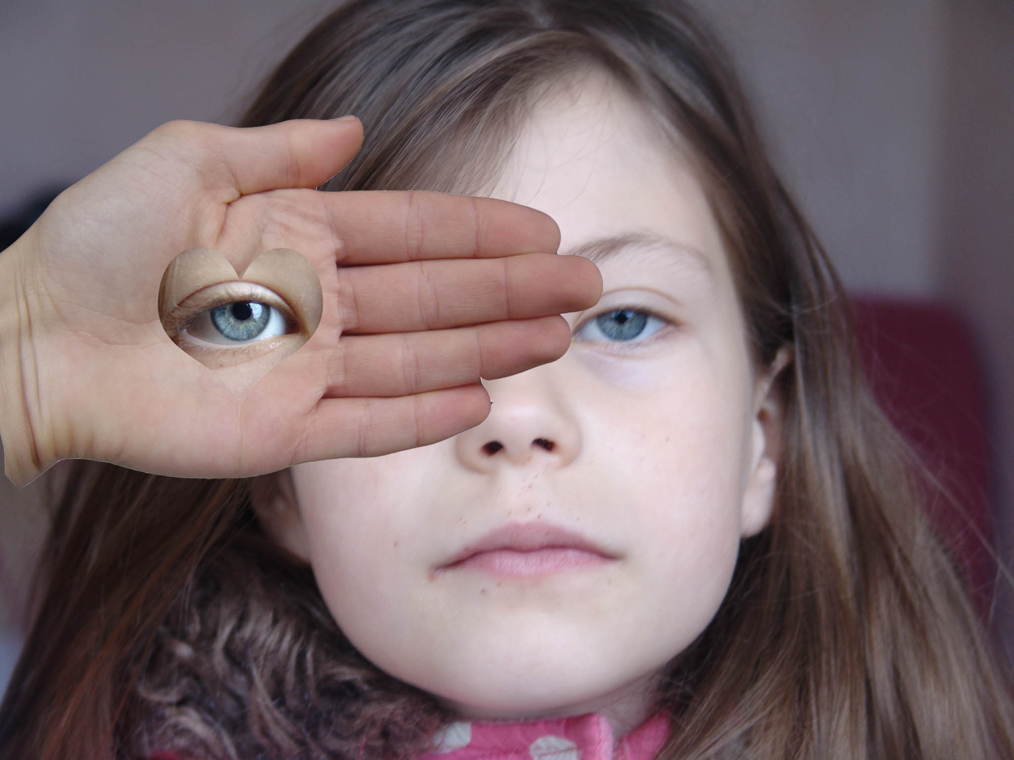
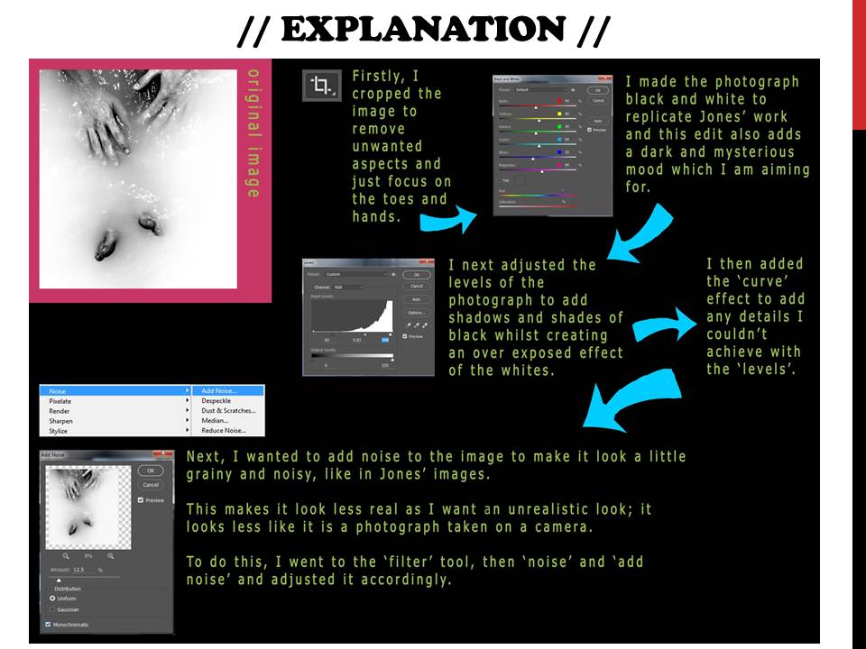
Here I took a portrait photograph of my sister.  This photograph is inspired by Herbert Bayer to respond to his work.  After this,  I added a layer with a hand on top of the background portrait.  Using the custom shape tool with a heart, I selected around the eye from another one of my photographs.  From this,  with the hand layer and the heart layer copied and pasted from another photograph, I merged the layers together to solidify everything.   From this, I made the portrait photograph slightly blurred to give the photograph an isolated feel in the sense that the hand with the heart-shaped eye appeared better defined than the object’s face and features.  To emphasise the feelings of isolation  I cooled down the colors by decreasing the contrast and slightly brightening the more exposed areas.  To contrast this, I slightly warmed up the colors of the hand and eye layer that would strengthen the hand up in front of the face.  I feel what could of gone better was the surroundings.  For example, I wanted the rawness of the bright natural light, with high exposure to be strongly present within the facial features.  However the rawness of the light impacted the environment in which the object is posing making it feel somewhat out of place.  Overall, I believe this was a successful response in Herbert Bayer’s photograph.

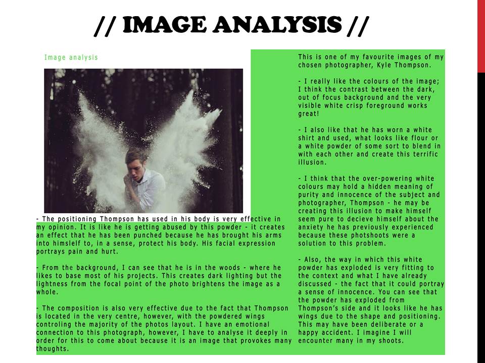
untitled-1

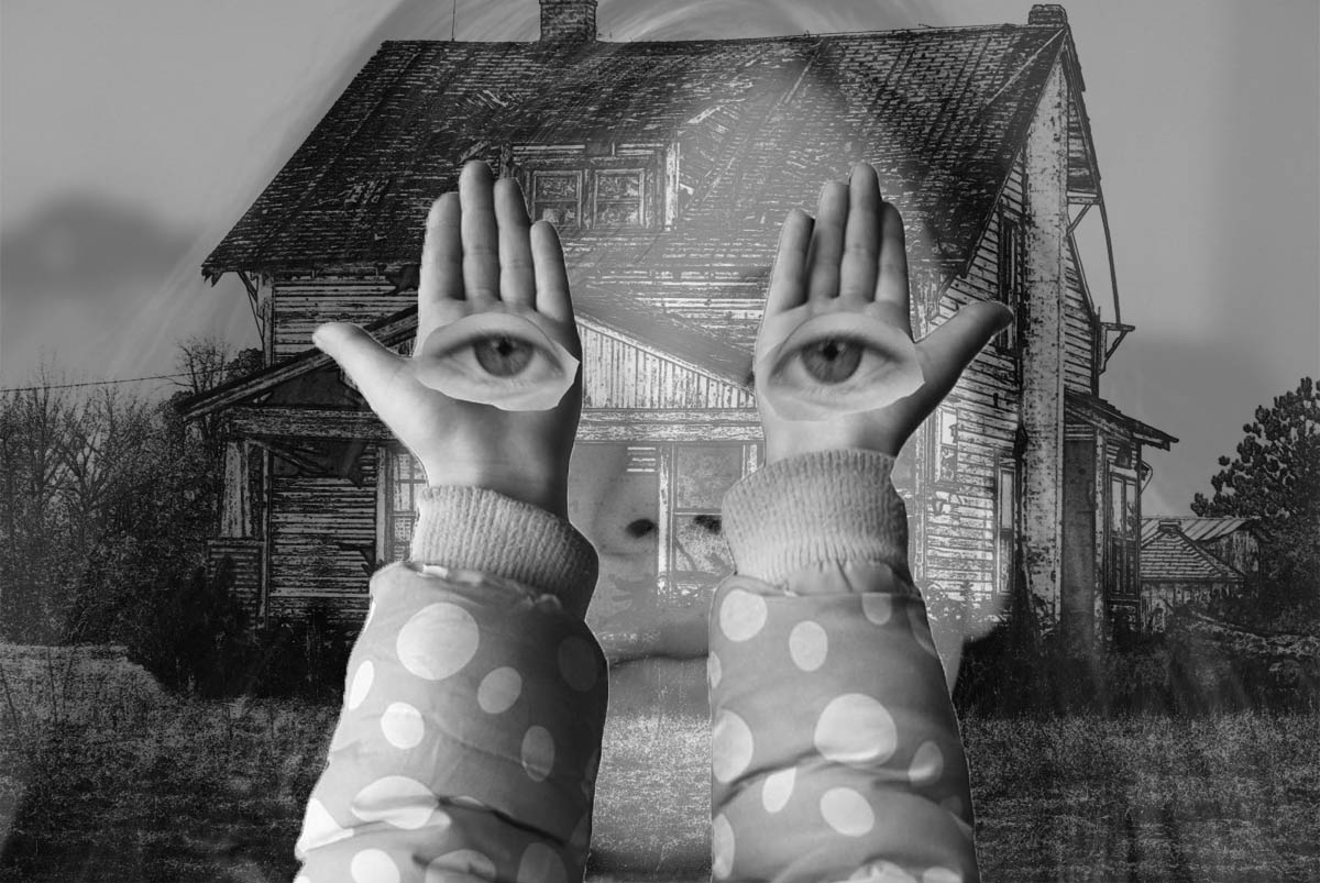
This photograph was again inspired by Herbert Bayer’s work with the hands holding eyes in front of an old, derelict building.  Bayer’s work largely communicates emotions of harshness and aggressiveness.  Therefore I tried to replicate this, with slight variations to increase the harshness.  For example:  in front of the used photograph with the house, I added a layer of a face with an opacity reduced to 23%. The hands were strengthened with an increased contrast and a full opacity, with the eyes reduced to 95% opacity to smooth the outlines of both layers.  I particularly like how  unlike Herbert Bayer’s work, this photograph through the composition of various layers appears as if the house  is somewhat haunted and appears spooky and that the house is watching you.  This makes the fell nervous, and to enhance this, I changed the image to black and white and decreased the brightness,  to increase the spooky themes.  This links in with the Idea of loss of Identity because it appears the apparent spookiness creates the thought that the girl through various things that the derelict house in the background has impacted her to lose her house.    dsc06889

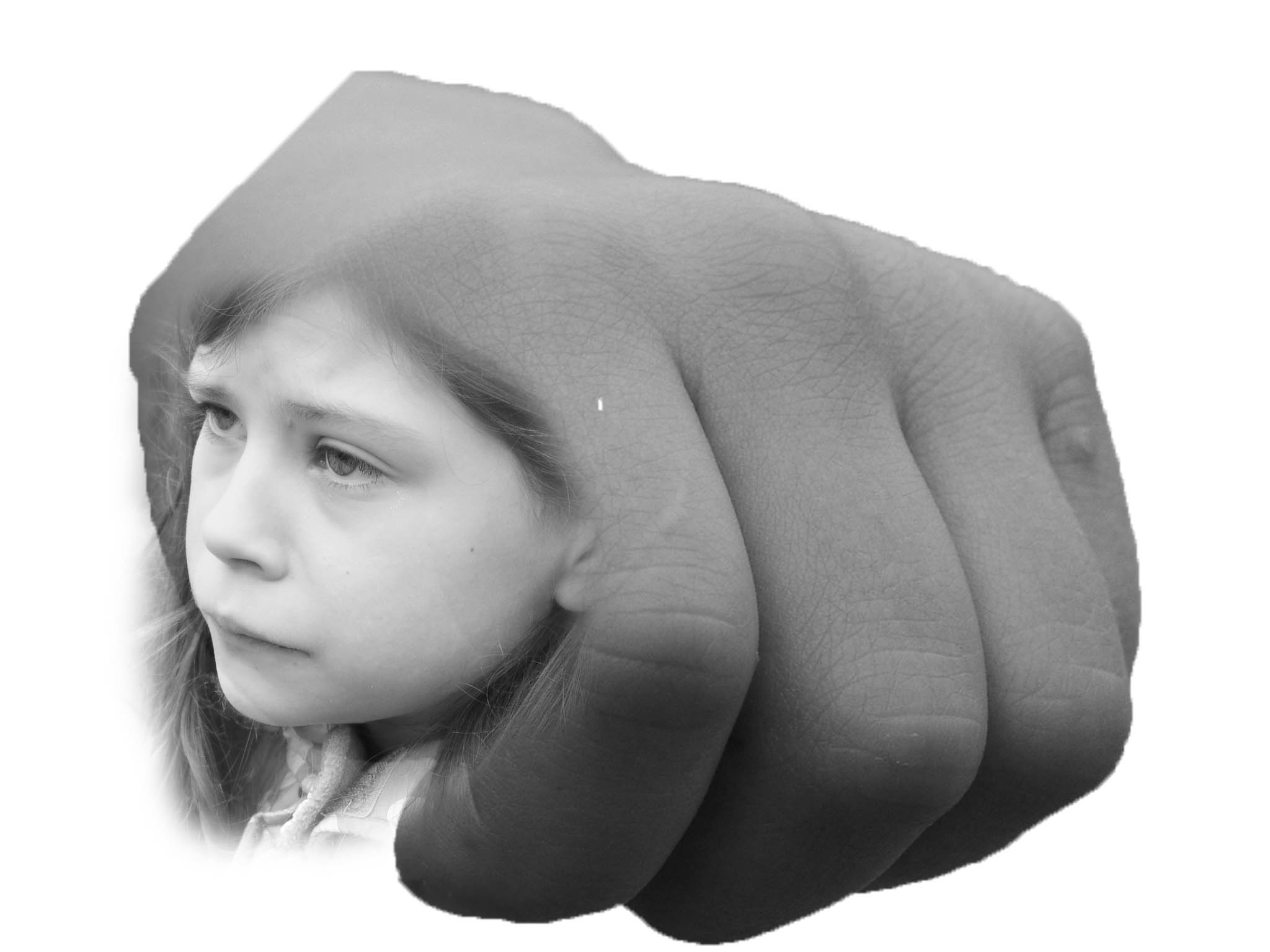
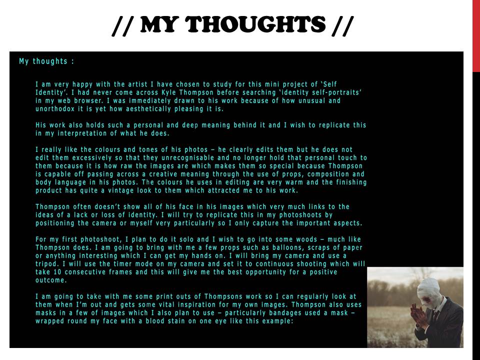
This idea is a direct response to Jerry Uelsmann’s work with the face merged onto the side of the knuckle.  Here I copied a layer of a face and same too with a clenched knuckle.  Jerry Uelsmann’s work largely advocates the idea that the girl is tied in or associated with some violent motion with the bigger fist dominating itself, in a violent manner.  Here we see the object’s face appear sad and disheartened and looking another way with the angle of her face being at a near to a birds-face on angle.  This depression makes the viewer feel sad for the object.  Jerry Uelsmann, in his work, increased the brightness and exposure of the photograph using low key lighting.  I on the other hand used natural lighting to have the object’s face to be all fully lit up, with a blank look to the skin, making the object appear more fragile increasing our sympathy towards the object.  After copying the 2 layers, to merge them together smoothly I did 2 essential actions.  I blurred the face using the gaussian blur effect and then went to select – modify and – feathered the layer.

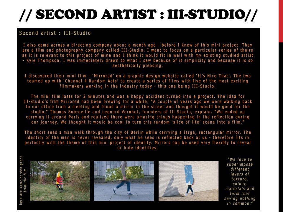
dsc06918

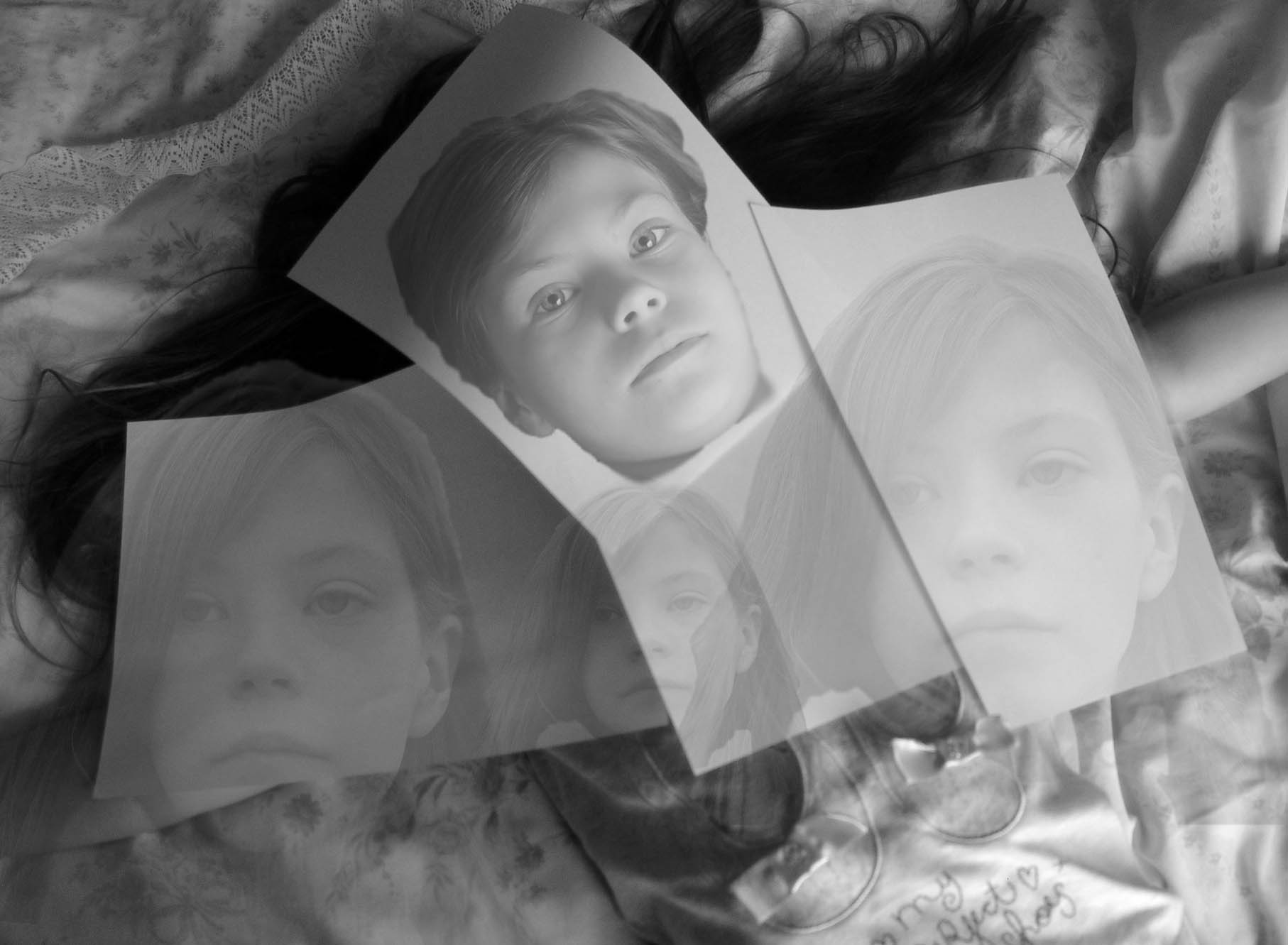
I like this photograph because it is set slightly apart from Jerry Uelsmann’s work with my own tweaks, however there are still elements that show how I wanted to create a strong response to the photographer’s work.  For example:  I took the photograph at a bird’s eye angle with strong dark tones that create feelings of lifelessness.  The object is layed down with paper over them.  I copied a layer from another photograph and placed it where the face would be underneath the paper.  I then minimized the opacity by 25%.  From here, I then added layers with a small opacity of 10%.  This created ghost-like figures that appear quite scary.  To a smaller extent, I set up a lighting system similar to the style generated by low key lighting.  For example,  A single, natural source from the bottom right of the photograph is entering the photograph, creating deep and dark shadows around the body.  This makes the photograph look  as if a terrible fate has befallen upon the object under the paper, and the paper is trying to disguise it.  This is emphasized by the low opacity face over the paper, making the viewer believe that the object iws well and okay, but in reality not so much.

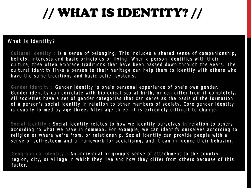
Definition of Self-Portrait and Identity

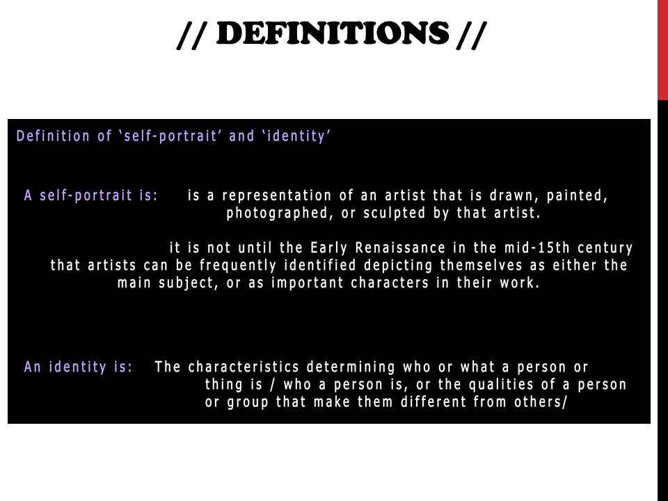
The definition for Self-Portrait is – “a portrait of an artist produced or created by that artist”.    Self Portrait to me is where portraits are taken of one’s self depicting them in a certain way to create a specific effect.  It can be used to focus specifically for how influences around us can lead to a loss of identity.  Therefore to create these effects, within the self portrait you can show these influences having a direct effect on the person.  Or on the other hand you can leave these out and focus on the person, in their own surroundings focusing on the loss of identity building upon the idea of isolation.  With these influences you can focus upon them to create almost a mad setting where they can be pestering the person into madness.  The isolation theme where the person is by themselves could possibly focus on more of the impact of these influences of society that can lose people’s Identity.

Therefore, the definition for identity is “the fact of being who or what a person or thing is”.  For me personally, identity can represent the most accurate and recent of someone who feels a certain way.  I believe one of the most interesting ways of how artists such as Herbert Bayer and Jerry Uelsmann have done this is expressing how the loss of identity has impacted the subject.  This can lead the viewer to believe that the subject is in their own surroundings, facing their problems with no help.  Loss of Identity is where something or someone has caused us to lose our identity and this can lead to confusion and uncertainty of who the identity of someone is.  Loss of Identity can pose questions such as who we are? If we don’t know who we are, what is the point in us being here? What has led us to be hear?  These questions can be asked and answered subtly within a photograph, with various editing effects and photographic techniques incorporated.

Case Study – Herbert Bayer and Jerry Uelsmann

CS 1 – Herbert Bayer.

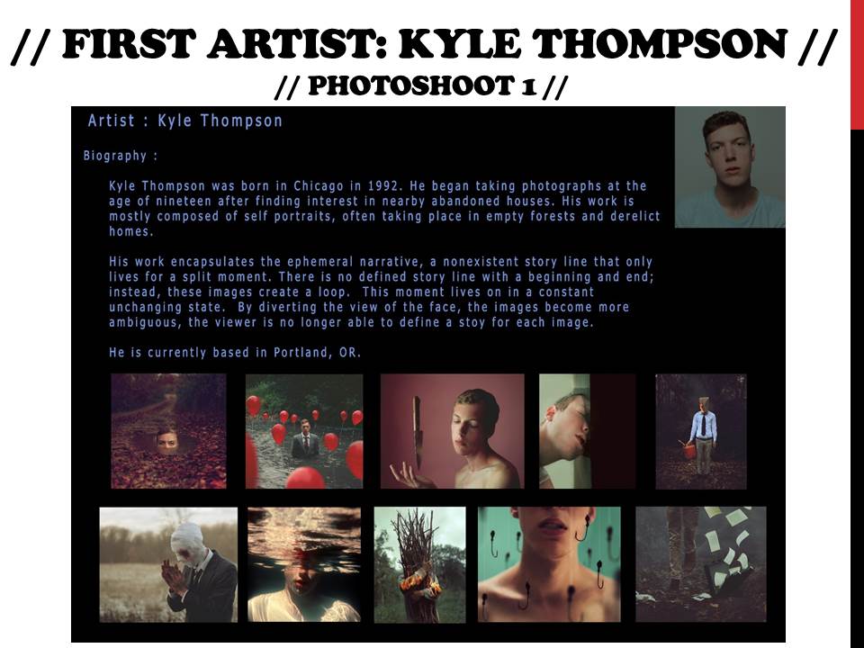
Herbert Bayer was an Austrian and American photographer, born on the 5th April 1900 – 30th September 1985.  Bayer started his creative works in the Bauhaus years in Germany.  His post Bauhaus ventures led him to designing a tourist brochure for the 1936 German Olympics.  After the Bauhaus he started doing his own photography in 1928 working on his “new vision photography”.  His photography work from 1928 – 1938 represented his broad approach to Art by including graphic views of architecture and most notably photo montages.

After moving to America in 1938. Bayer married Dada artist Joella Syrara Haweis, heavily contributing as a major influence to his later work.  The invitation from Alfred H Barr Jr asking him to apply his theories of display to the Bauhaus exhibition at the MoMA in New York.  Bayer developed this task with Edward Steichen, head of the photography department designing the Road to Show (1942).
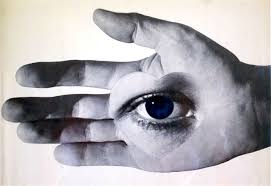
Image result for herbert bayer photography


Here an eye is planted onto a palm of a hand.  I like this photograph because of it’s simplicity but yet how many questions it poses in terms of what sort of identity it is.  The dark shadows are powerful as they create a striking contrast to the bright light coming from a center view.  The bright light creates a calm and smooth texture of the hand giving the photograph a delicate nature.

The dark and imposing shadows around the angles of the light sources is also interesting because they create a mysteriousness that is questionable to the identity of the photograph.  This interestingly makes the photograph look quite abstract, manipulating the scene to suggest there is some hidden answer that can’t be seen.  This is effective as it is  complimented by the darker shades of the eyeliner and mascara.  As this link is made, and the fact that these darker hues surrounding the eye which are associated in this context with mysteriousness, evidently suggests that the eye is all knowing as it knows the mysteriousness.  This makes the viewer somewhat fearful towards this eye as how its presented as all-seeing and all-knowing is quite intrusive to the viewer.

I particularly like how the eye in the center of the palm, is heart shaped.  This interestingly shows Bayer’s aim was to show that our eyes are like our hearts in the sense that our actions and who we are, are controlled and influenced by what we see that defines us.  This is backed up by the fact the eye is placed in the center of the object’s hands as with our hands, we usually use to grab, pass and hold things.  This suggests Bayer is communicating that people are controlled by what they want as what they see from their hands.  This links with the context of which  Bayer was present within the Bauhaus movement as the rise of Hitler and the Nazis gripped Germany, completely obsessed by what they wanted for their own personnel gain.
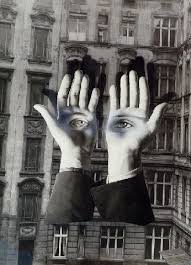
Image result for herbert bayer photography

This photograph is quite similar to the Bayer’s other photograph I have analysed.  Here he has used the hands to show a slightly different style of loss of identity.  For example the hands are portrayed to us quite brightly and well lit.  This is because hands are usually  a part of our body that we can control and therefore shouldn’t necessarily be feared.  How the hands with the eyes are presented as if they have their own brain, creates a stark contrast with the elements of control.  This makes us feel that the hands aren’t something in control now in the picture and are almost another being, watching up at us in a cold stare making us feel nervous.  This is backed up by the fact the tones of color surrounding those piercing eyes are cold and quite bold and striking.

Also,  I like how the composition of the photograph, especially with the background enhances those eyes hard-staring eyes as the hostile environment makes the viewer feel particularly uncomfortable.  The background’s brightness has been toned down, with a strong contrast to bring about imposing dark tones that compliment the eyes as the mood they give off,  contrast the brightly lit hands.  The building looks as if it has been mistreated along with the increased contrast , makes the viewer feel fearful of the environment of the photograph.

This all suggests the photographer’s view he is trying to express how if people allow for their eyes to control themselves in terms of what people want and  become the center of people’s lives, then it can have disastrous consequences. This like the previous photograph  links in with the context of Bayer’s experiences of the Nazis, who lived lives like how Bayer is describing, and turned Germany, what was once a safe place, a downright dangerous place to live.

Cs2 – Jerry Uelsmann

Jerry Uelsmann (1 June 1934 – present) was an American photographer and a forerunner of photo montage.  He developed an interest in photography from a young age.  He studied photography at Rochester Institute of Technology.  He received further degrees from Indiana University.  He taught photography at the University of Florida.  For Jerry Uelsmann the camera enables him to interact with the world emotionally, capturing the true essence of life.  He largely focuses on his work using dark or light rooms, building on darker grey tones most often.  Also, he has created strong contrasts between natural and artificial elements.

Image result for jerry uelsmann fist

I love this photograph because of how expressive it is in terms of how the lady through the violence (from the clenched fist) .

The enhanced strong dark tones of the woman’s face portrays her eyes to be very dark.  This shows that she can foresee the pain she is about to experience.  Also with her eyes, she isn’t looking where she is going suggesting the force of that fist is strong it moves her, and that she doesn’t have a chance to check where she is going.  I also particularly like how the lighting on the woman’s faces which is associated with innocence, delicateness and beauty is somehow undermined by the grey, low key lighting of the fist itself.

Also, the fist is considerably larger than the woman’s face re enforcing my view that that the theme of violence is strong and therefore uncontrollable but also the fact the fist is so big suggests the theme of pain is a big part of her life, so big in fact, she cannot ignore it despite she may try to.  Clearly the fist is preventing the girl from being who she is and we therefore feel sorry for her.  Further evidence to back this up includes the composition exposing contrasting elements to the photograph.  For example: the rough hairs on the fist are quite intrusive as they appear very sharp, whereas the tight and organised composure of the woman, highlighting her hair shows again how the recklessness of this fist is very intrusive.

I believe Uelsmann is communicating to us how violence from others can impact people around them in a way that brigs everyone else down, in a way which is uncontrollable despite people’s efforts to stop it.  The photographer is expressing the view that violence, although it may not be directed at someone specifically, it can affect others and so the photograph is encouraging people to stop violence.
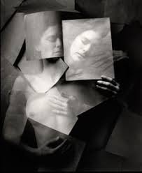
Image result for Jerry Uelsmann loss of identity

I like this photograph because it really captures the sense of emotion in the photograph of how the object appears sad and depressed from her feelings.

Interestingly there isn’t much of a depth of field with the object and the background, this merges the components as one.  I like how the dark shades of within the background and the object further merges the 2 components together.  This is done as the object’s body is toned down in light making it a sort of intermediate tone range between the bright face of the object and the dark background, producing a clear link.  The fact the object’s face is well lit up ad strongly exposed, whereas the background is dark therefore suggesting that the object is generally quite a light hearted  character who is quite a happy character.  However the background which is in a dark setting suggests with intermediate grey tones being exposed around the body suggests the object is facing a particular issue that is causing her to be depressed.
I find it interesting how the photographer has taken the photograph from a bird’s eye angle, with us the viewer looking down at her.  This really emphasizes the fact the object is in a “down place” and this makes the viewer feel sorry for her.  Within the photograph, we see the object hold pieces of paper over her.  This is evenly exposed, with a low contrast setting; producing a strong grey tone.  This appears to the viewer that the object is trying t hide her issues, through weak bits of paper.  We know it’s weak because the grey tone doesn’t fit in with the 2 main contrasting lights f black and white. Also, we know that the opacity has been slightly reduced to further  show how weak the paper is.  From this, we can see through the paper – suggesting that the object cannot hide her problems and that everyone can see them.  However, how the object is in such a dark environment suggests she won’t necessarily get help for her issues which she needs to an extent bring back her identity.  Therefore I believe Uelsamnn is communicating to us that people who try and suffer in silence are often ignored, despite people easily seeing that they are suffering and we need to help people like this more.