Category Archives: Analysis

Filters

Author:
Category:

Natural Light experiment

The google translation of Natural Lighting is “Natural light is light that comes from the sun. It is contrasted with artificial light, which comes from light bulbs, fires and other man-made fixtures used in homes.”

Natural lighting in photos can give off a pure vibe that artificial lighting does not provide. The Sun is an obvious example of Natural Light. The lighting from the sun can create many different spectrum’s of color throughout the day. This provides the perfect Lighting for experimenting.

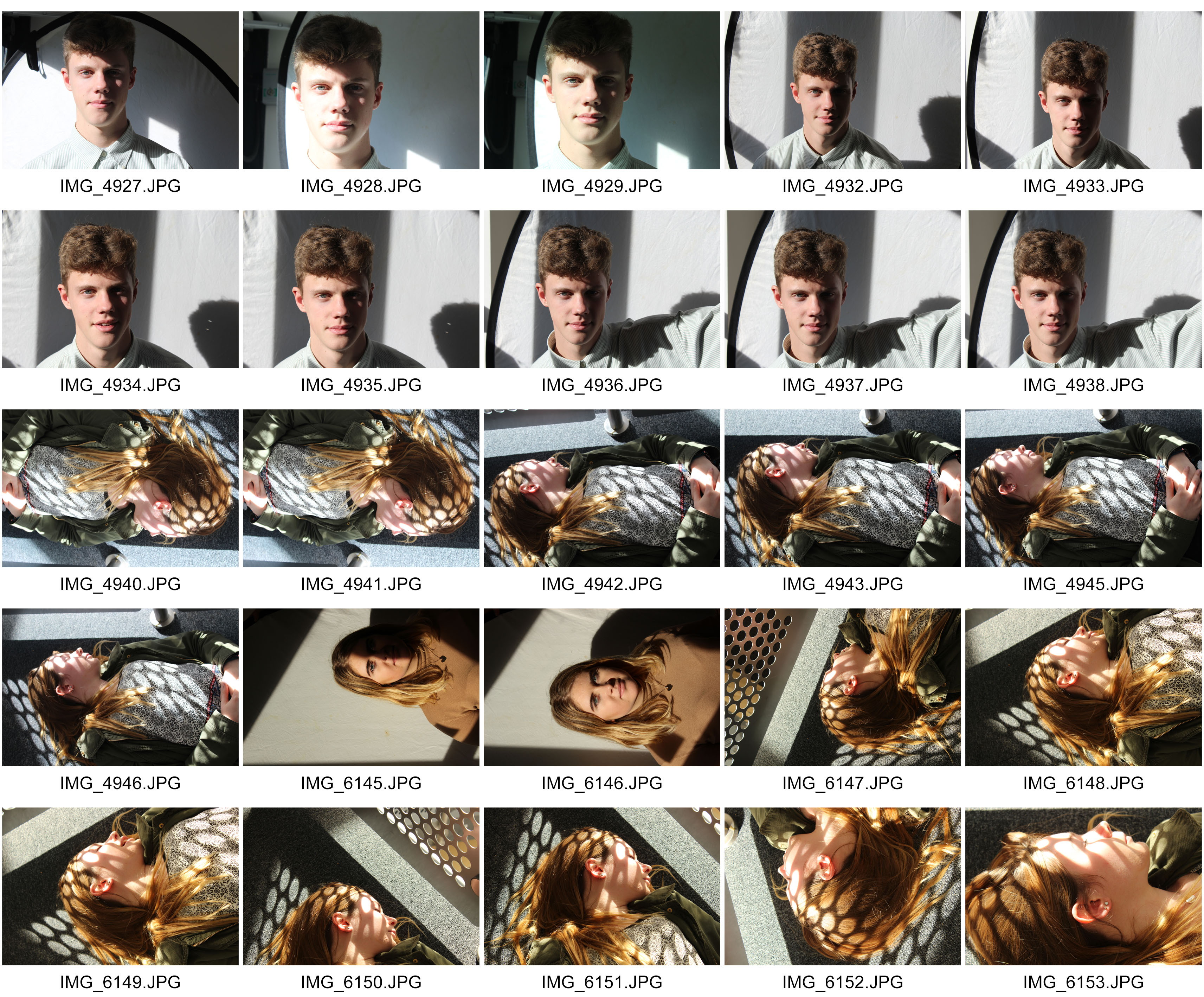
During this photo shoot we were experimenting with different ways of using natural light in photography.  At the beginning, we had someone stand next to a window, so that half their face was eliminated by the natural light coming from outside, and the other half of their face was in shadow.  We experimented by using a reflector. The reflector would reflect the natural light coming from outside onto the persons face, so that the half that was in shadow, would also be eliminated.

contactsheet-sadow-light

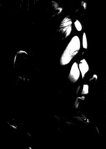
Once we experimented by using a reflector, we wanted to try and capture some interesting images by creating shadows using the natural light. We found a metal frame by the side of a stair way with lots of tiny holes in it. A large amount of Natural Lighting was coming through the window next to the metal frame, and was creating a shadow that we wanted to use in the images.

During the second half of the shoot, we were seeing different ways natural light could create simple shapes and shadows. We asked someone to lie down next to the metal frame where the shadows were being produced. The shadow was now being cast across the persons face. This created a cool and simple effect.

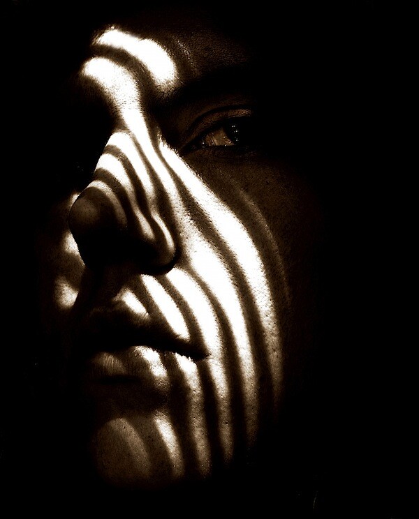
Image result for creating shadows portraitsimg_6153

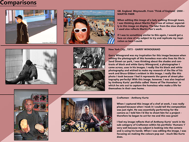
Here is an image that I used for inspiration when editing the images that I took. I wanted to make the image black and white because I think it adds a dramatic effect to the image, and helps to improve the contrast. The shapes created by the metal frame. and the way they frame the persons face makes a really cool effect.

Comparison to Street Photographers Photographs

Robert Frank:

Image result for robert frank the americans

Mine:

dsc06572

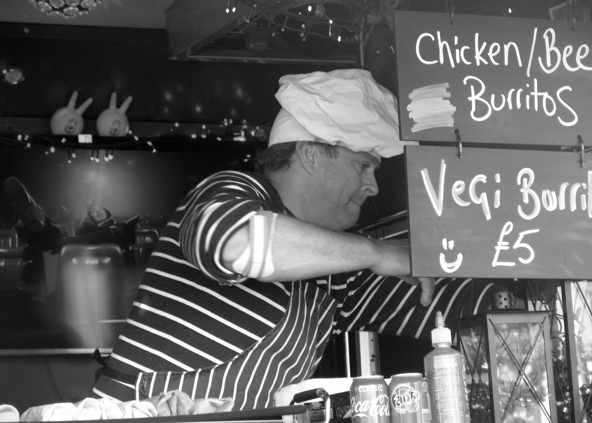
I took my interpretation of Robert Franks’s photograph using a street trader.  This photograph incorporates a sense of Environmental Portraiture as well as street too.  To create a similar effect I lowered the ISO and increased the contrast to enhance the black and white effects.  I also like Robert Frank, allowed for the exposure of light to create a similar effect by displaying a sense of business to the photograph. Also, differently whereas Robert Frank chose to create the girl to be further back, I chose to increase the aperture to create a minimal depth of field to allow the viewer to naturally focus on the man.  I also by cropped the photograph to  make the man fit in with the rule of thirds, attempting to make it easier for the viewer to focus on what the man is doing.   Finally, I took the photograph on a slightly lower shutter speed to capture the business of his hands effectively.  This started to increase the exposure but I balanced it nicely with a slightly lower aperture.


Street Photography

slide1 slide2

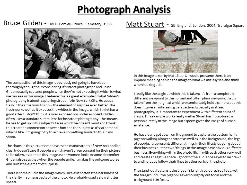
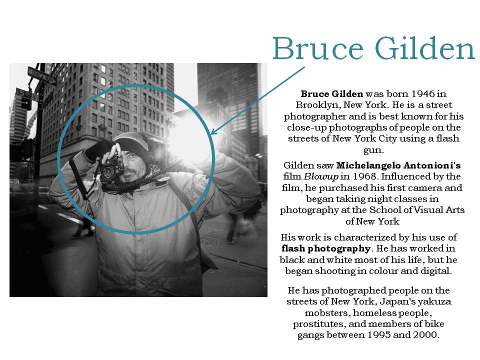
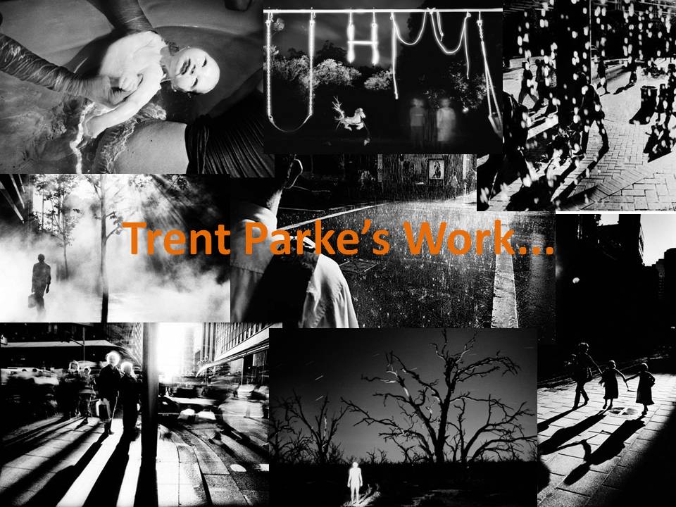
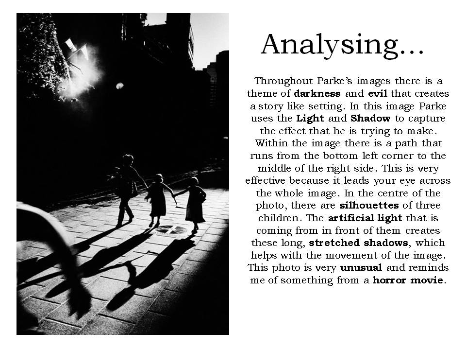
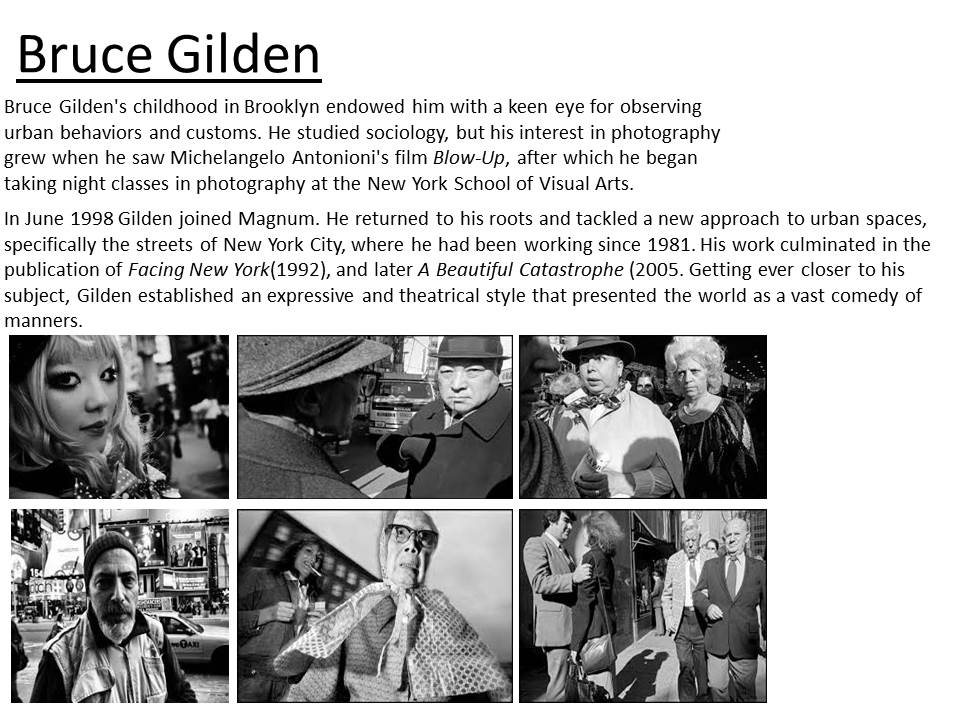
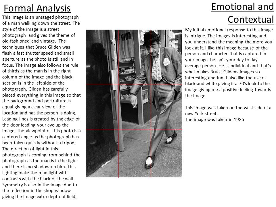
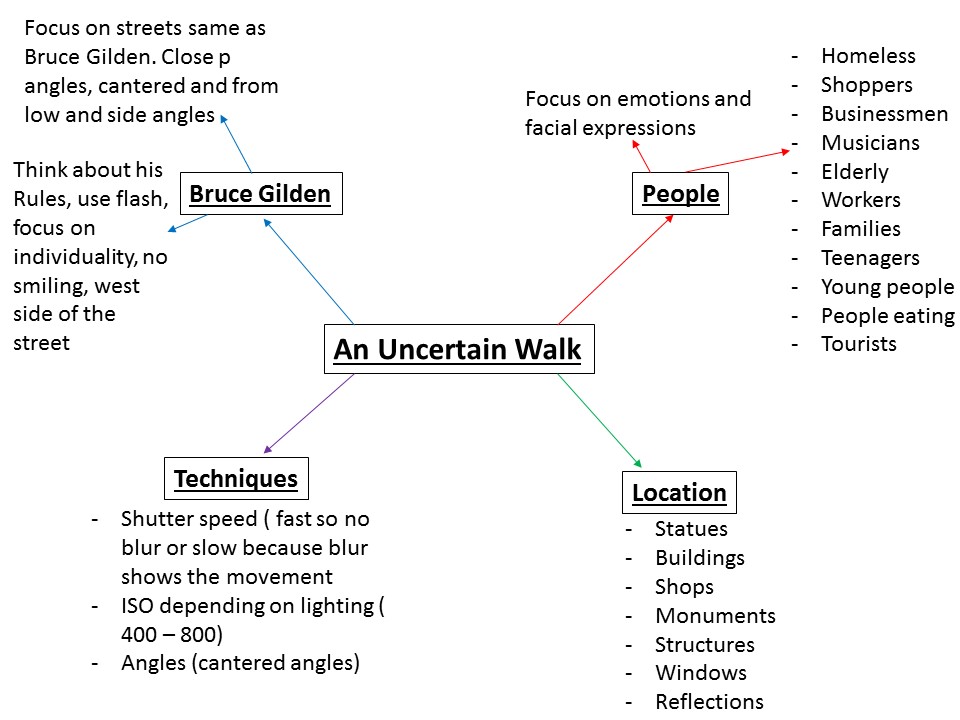
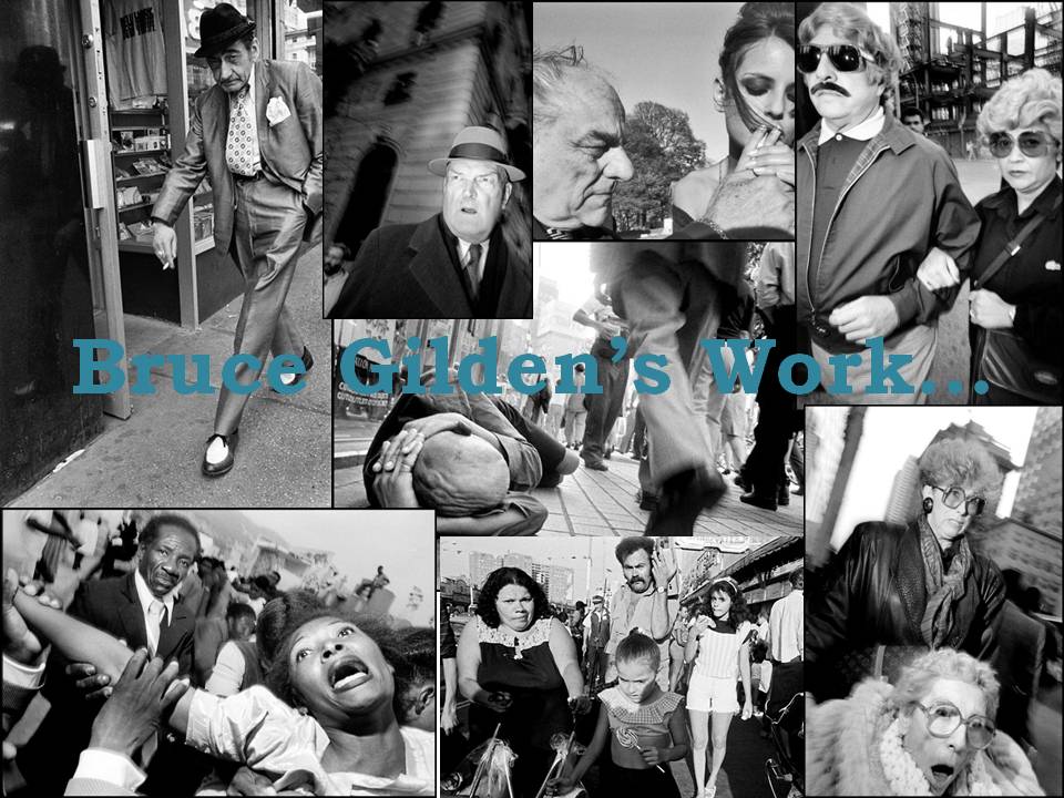
After analysing my artist references Photo i planned how my ‘uncertain walk’ would go. I thought about all the things that i could photograph in town and thought about how i can try an interpretation of Bruce Gildens photographs in my own style. I plan to take these style of photographs by going into town on the 14th of october and walking quickly around town capturing photographs with the flash on.
slide1

Contact Sheets

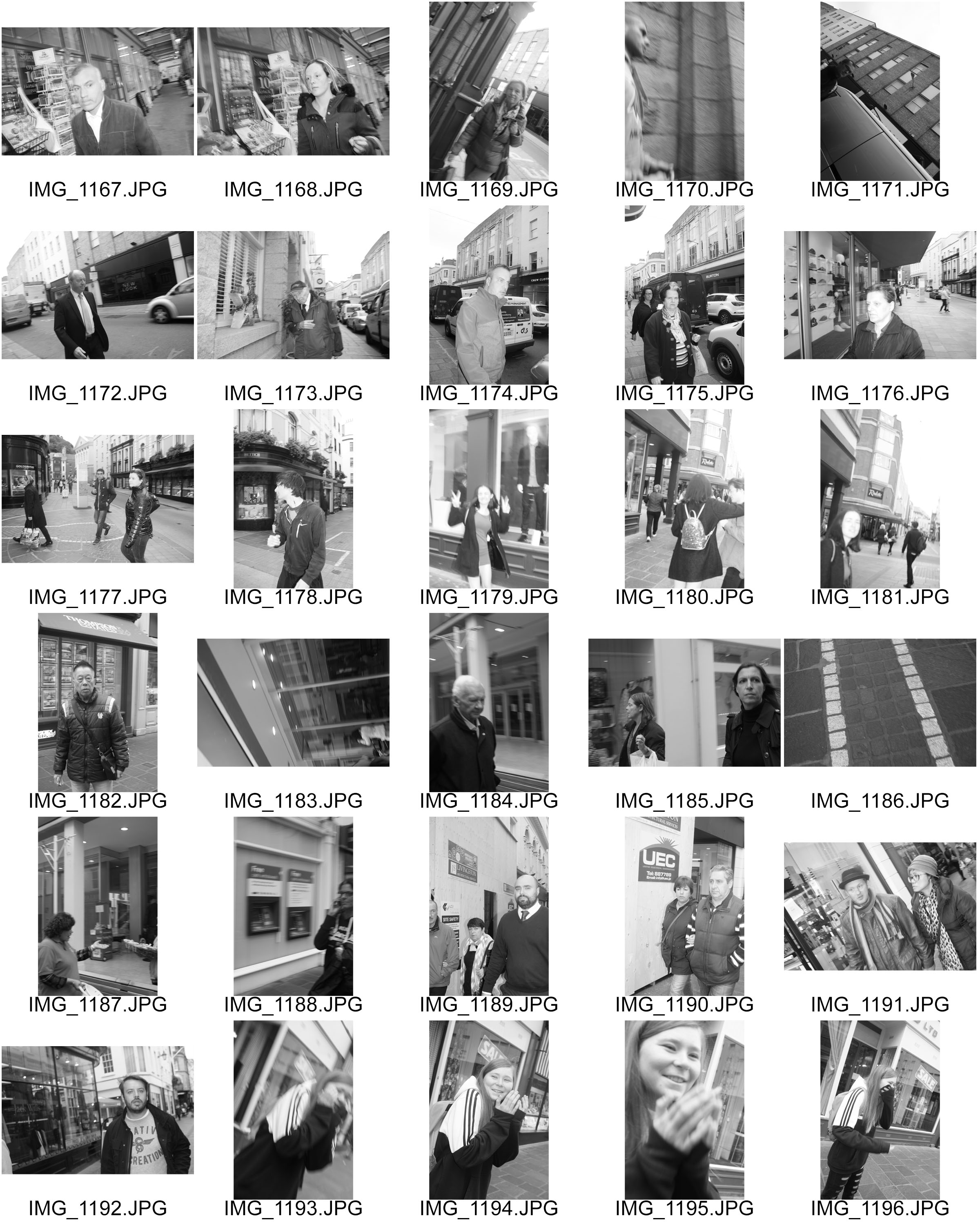
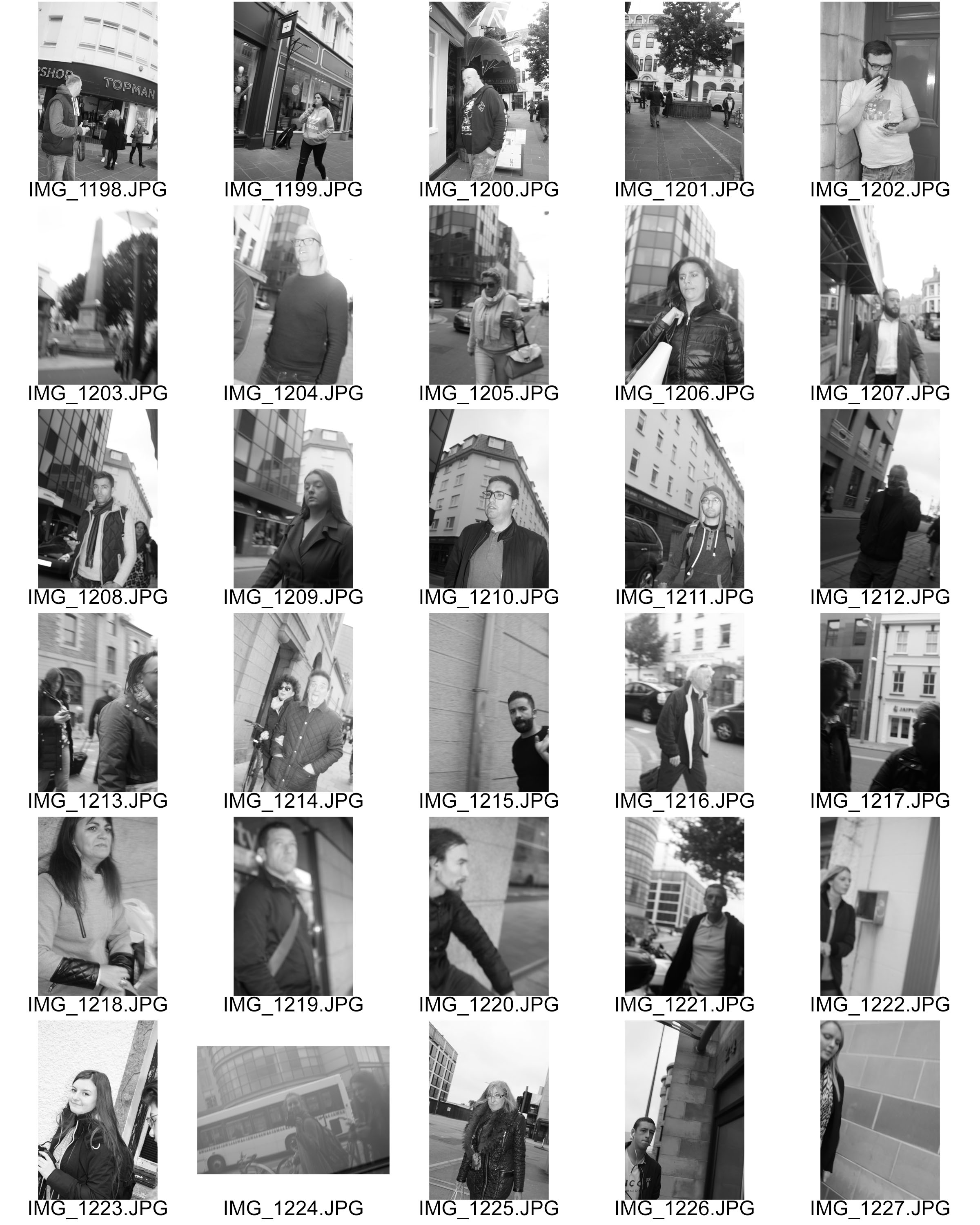
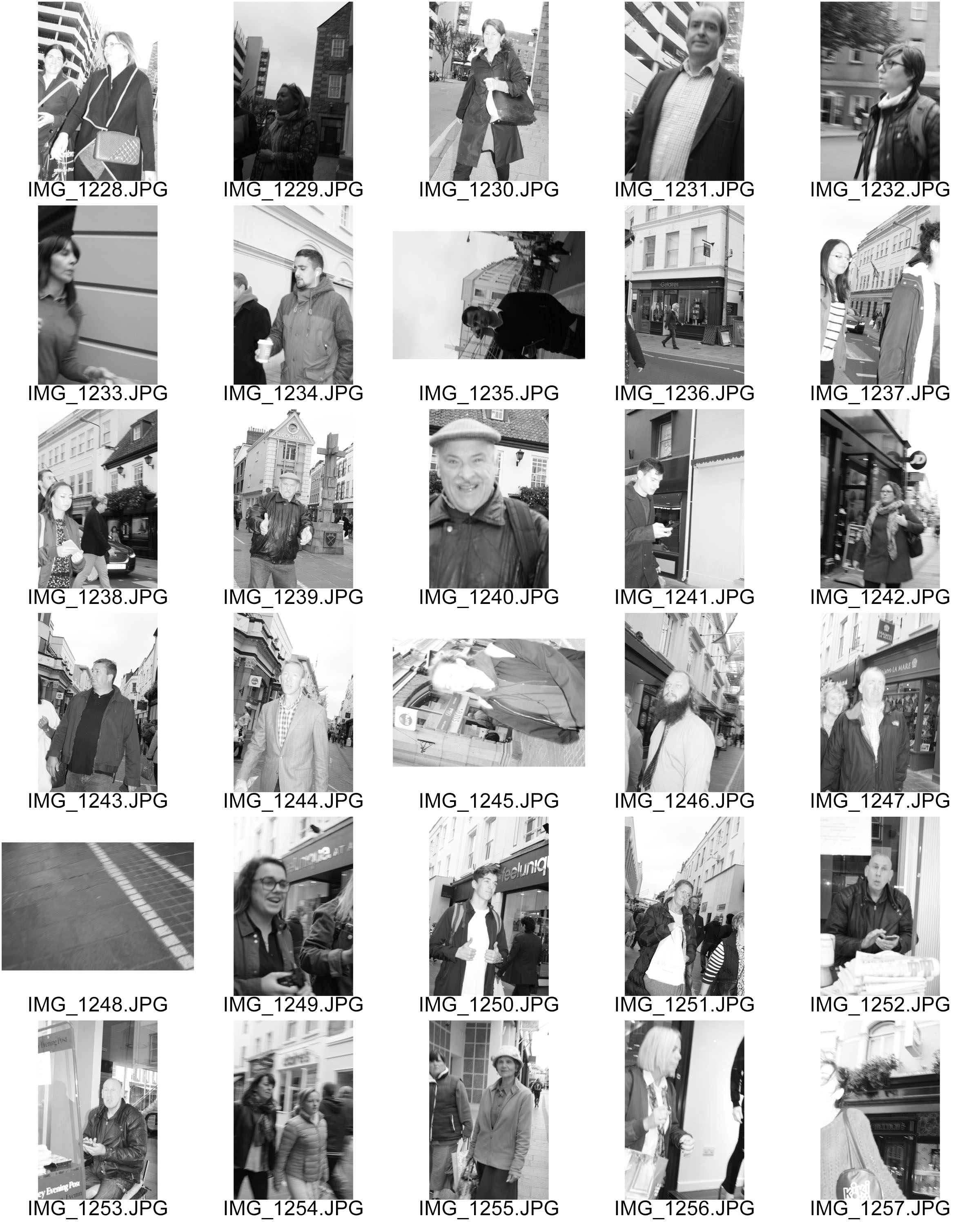
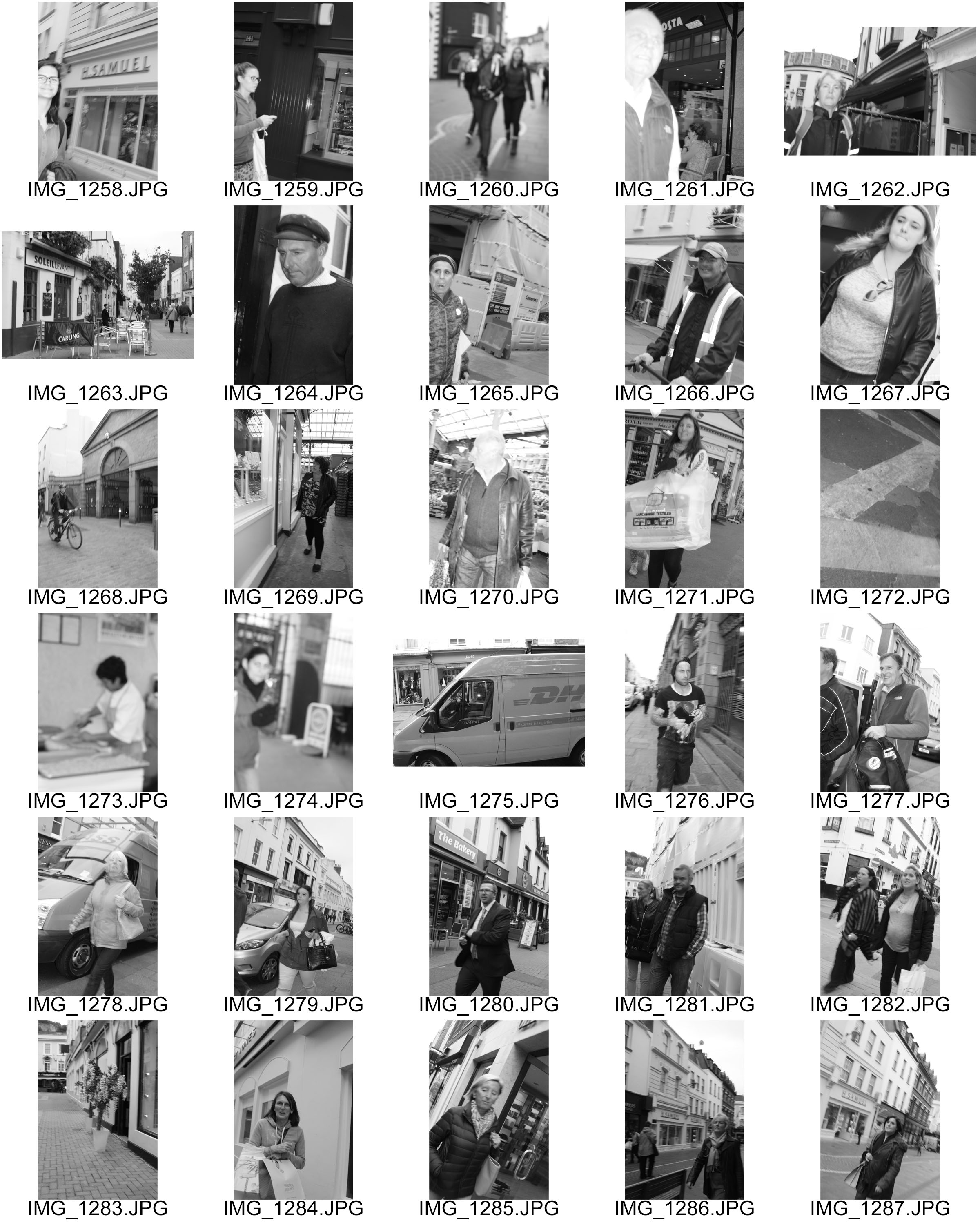
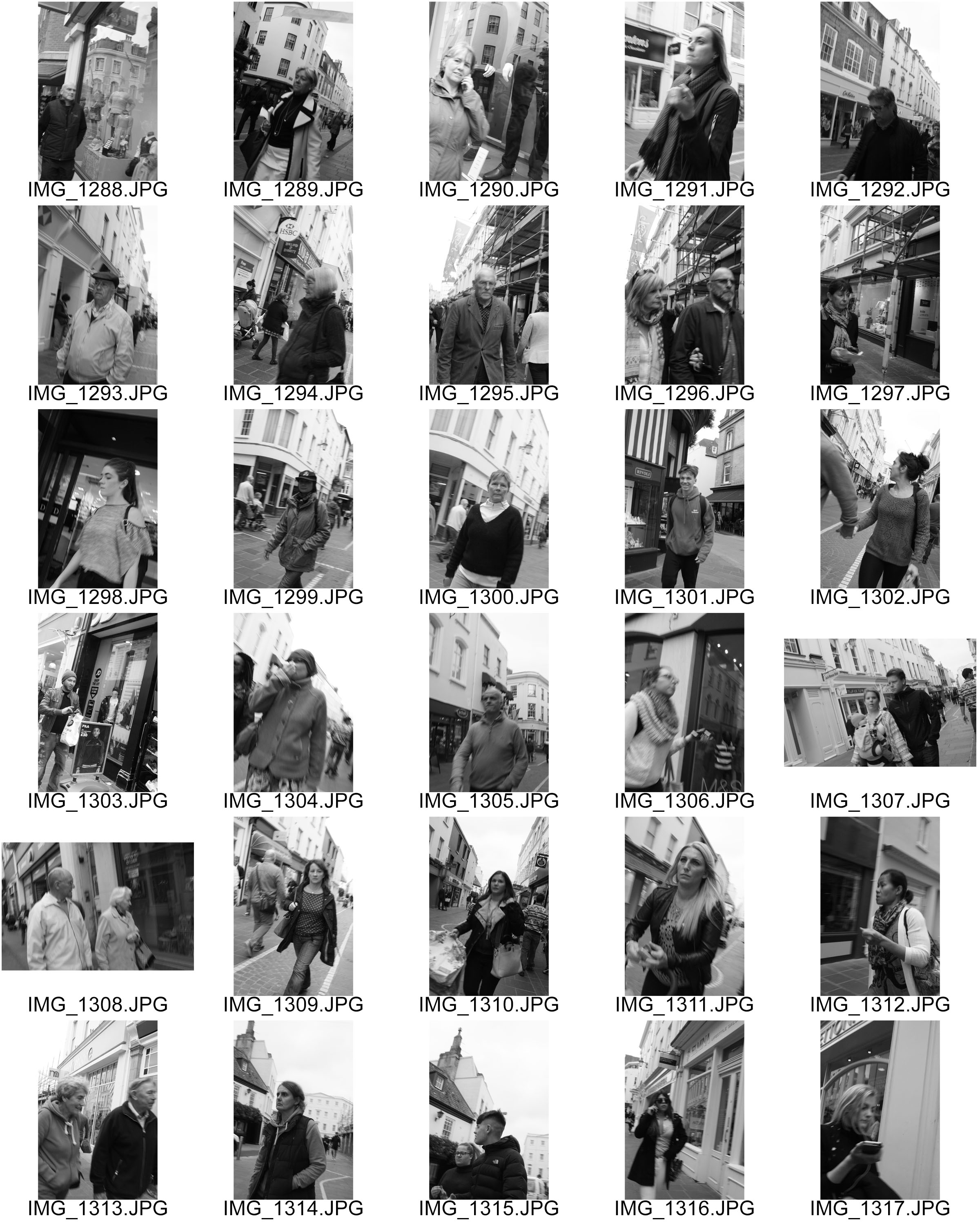
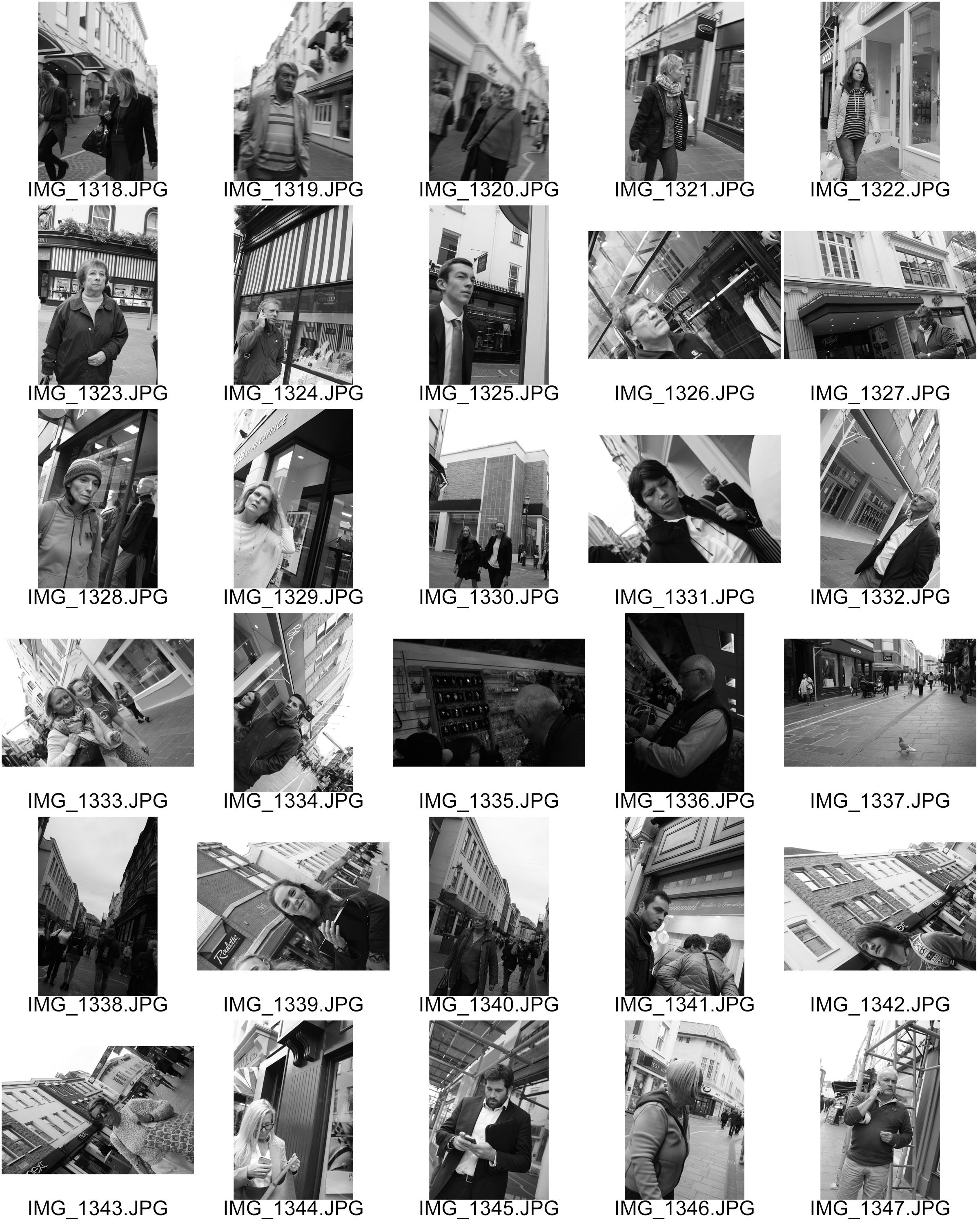
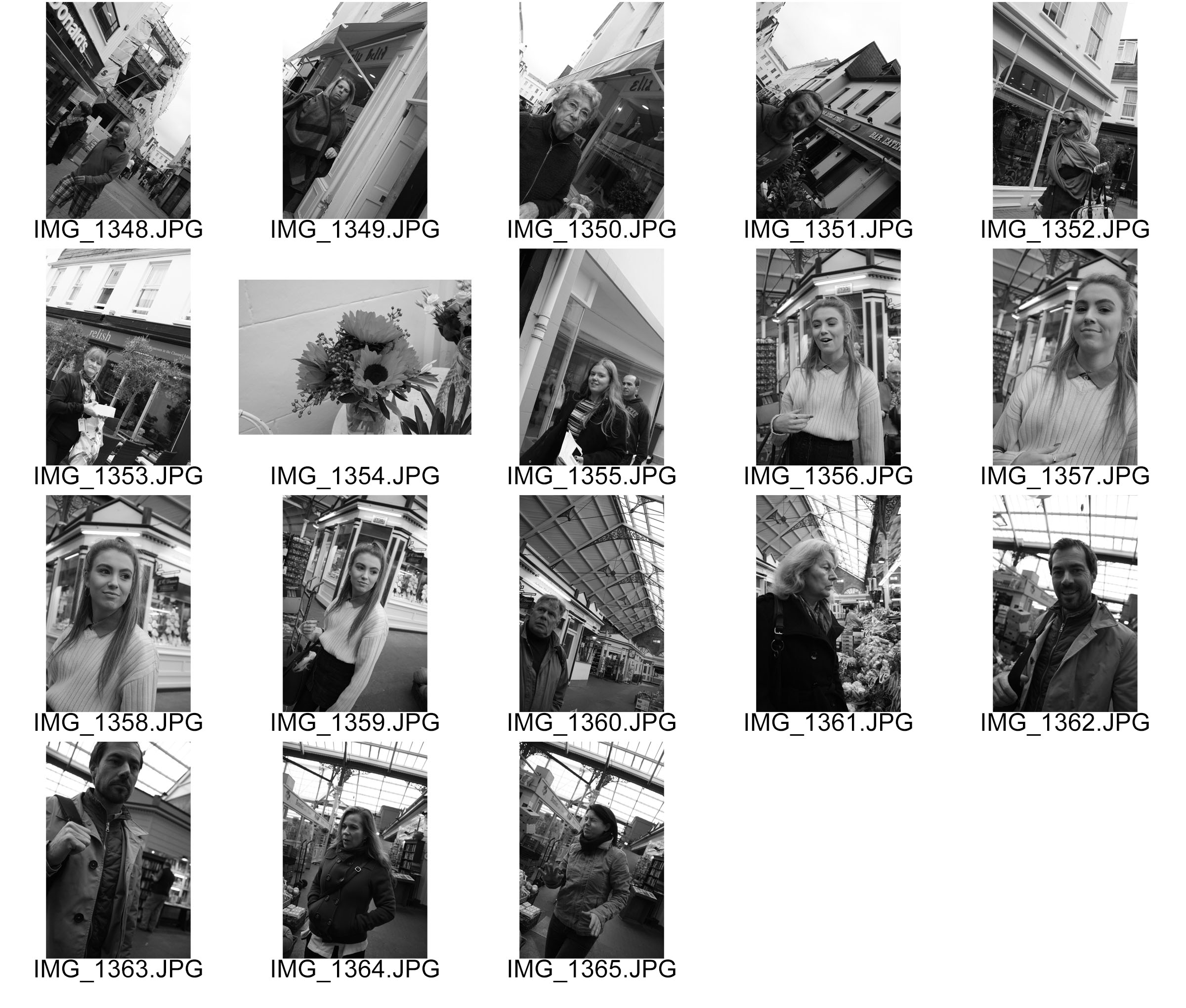
contactsheet-001 contactsheet-002 contactsheet-003 contactsheet-004 contactsheet-005 contactsheet-006 contactsheet-007

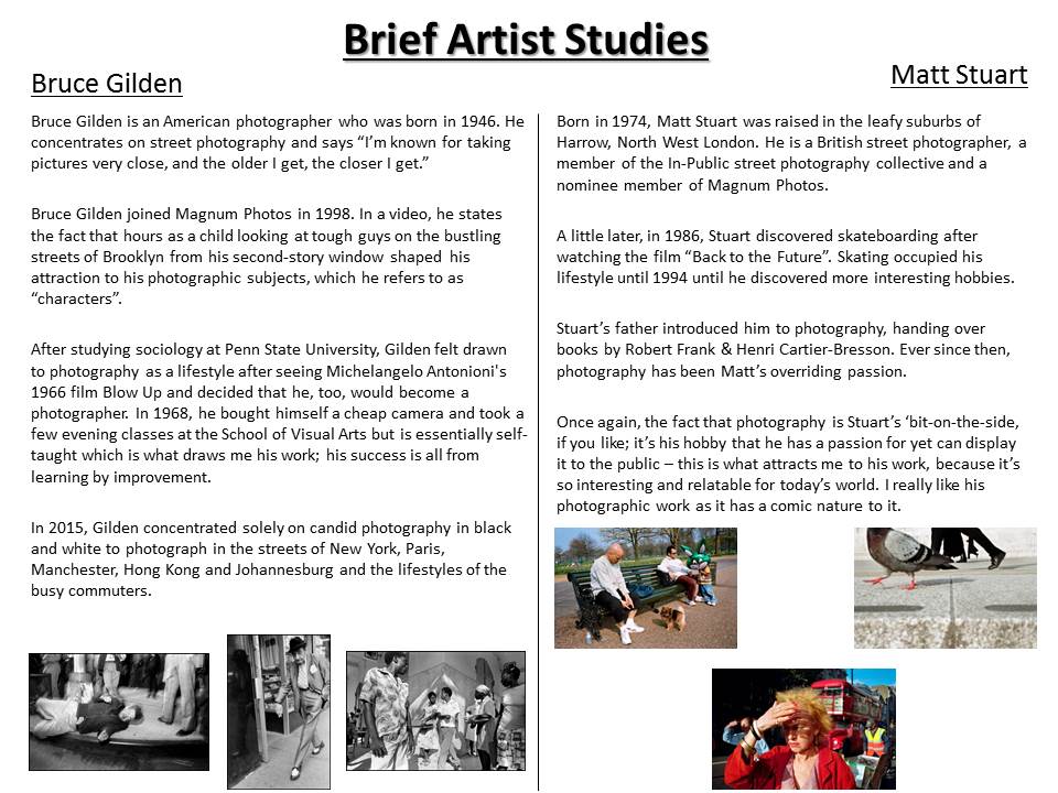
The contact sheets from my street photography shoot show that i made a good attempt at trying to use similar techniques to Bruce Gilden. I focused on peoples faces close up and did not use the zoom i just went close to them and with the flash on took a photo. in the contact sheets you can see that it took a while to get the correct settings on the camera. I had to put the ISO higher to prevent over exposure but all think about the shutter speed so that the person was in focus but the background had a slight blur to it. All together i took 198 photographs. this gives me a range of photos to pick the best ones and adjust them slight to replicate Bruce Gildens work further.
img_1328

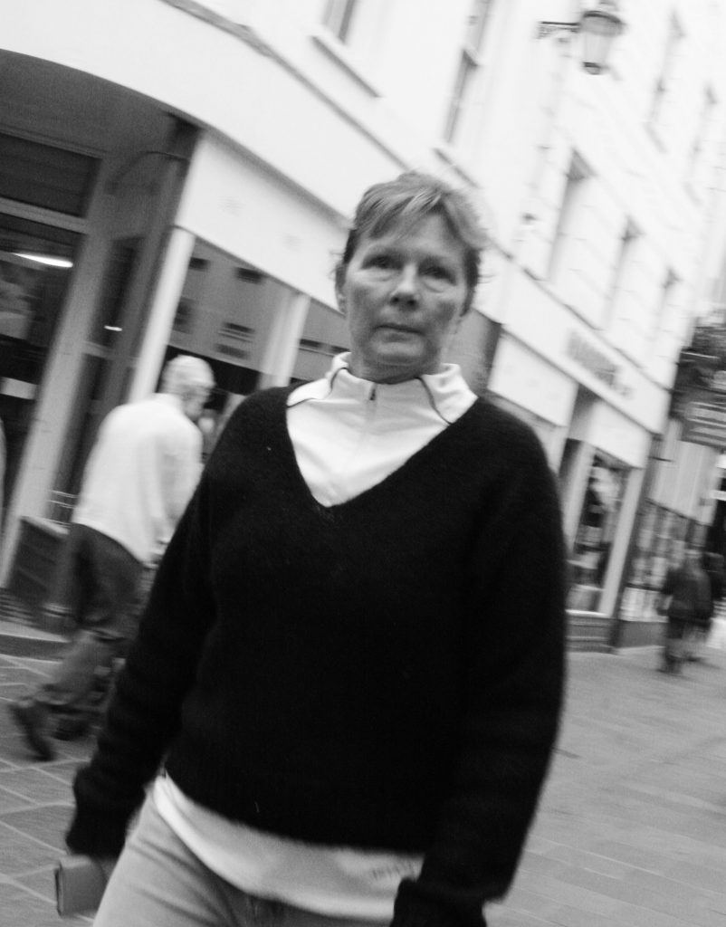
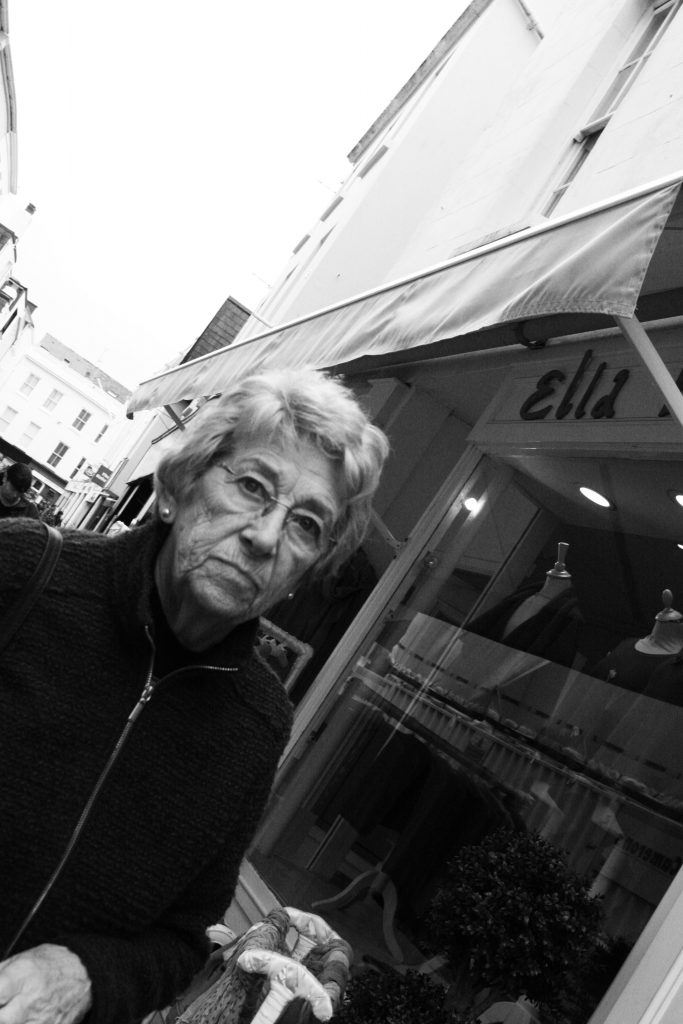
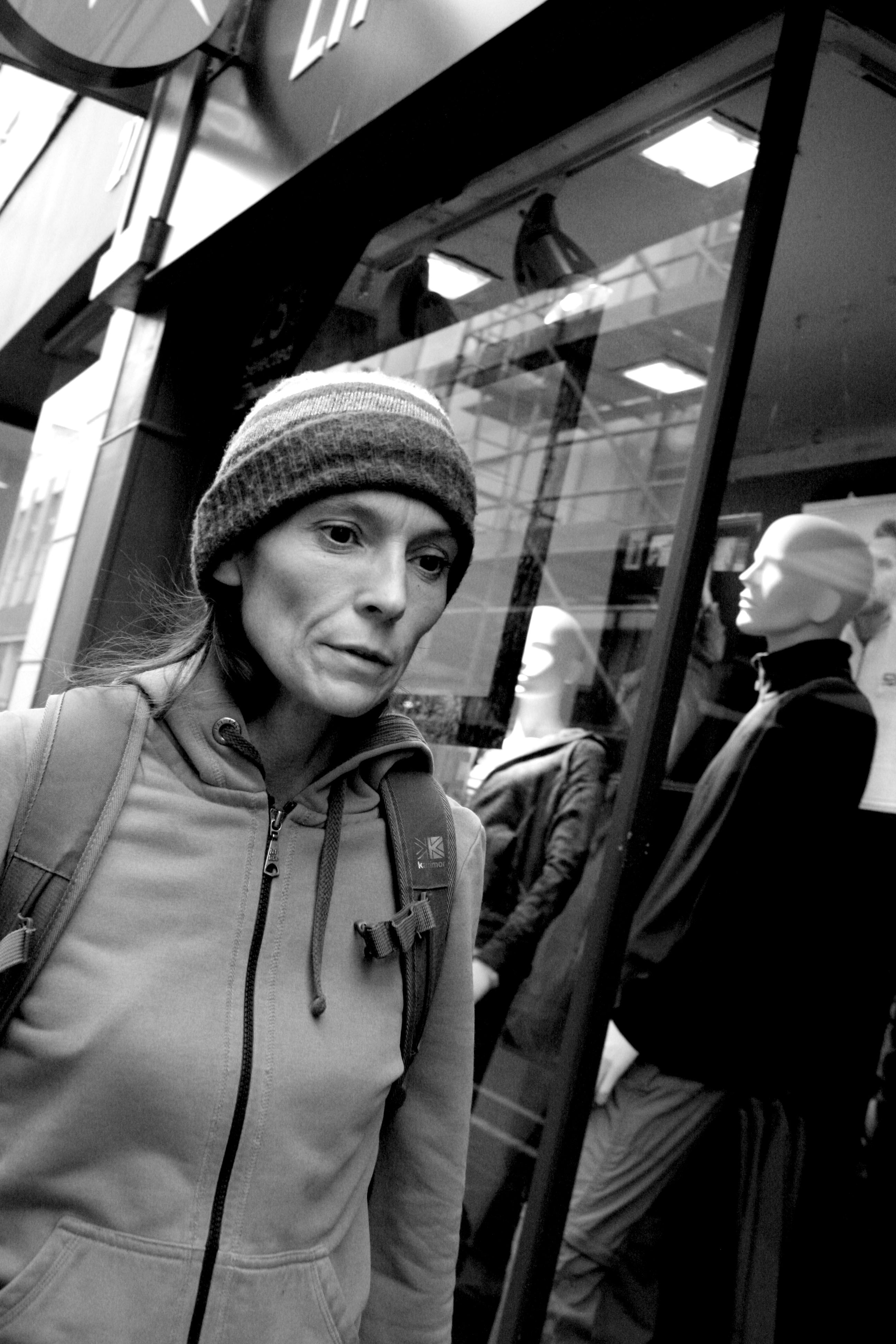
This image is of a lady walking through town. the woman is focused on what she was doing and didn’t even realise i was photographing her. The meaning that is conveyed in this image is  from the black and white of the photograph. it suggests that the photograph is documentary photography telling us about the person. the photograph is also street photography as you can see the image has been taken on the high street, original street photography were all black and white as it conveys the idea of documenting something for example like you would in a newspaper. Taking this image was very technical trying to get the it in the same style as Bruce Gilden. For this particular image the shutterspeed was on 1/80 of a second, the ISO was 800 because is was a bright day but i was also using flash as Bruce Gilden does but i didn’t want to over expose the image. The focus was on auto as the images were taken quickly and it was the best way to avoid blurring on the subjects face.  To take the photo i walked along and then stepped in front of the lady and crouched down so i was slightly looking up on the subject. As i was taking the image i noticed that the manikins in the background made an interesting contrast to the real life subject i was photographing. Rule of thirds wasn’t considered when i was taking the image because it was taken on the move, i just focused on trying to get the model to fill 2/3 of the image.  The use of leading lines in this image in my view is created by the zip on her jumper, it leads your eyes up the image and to the face which is the focal point of the image as i am still focusing on portraits. The cantered viewpoint of this image shows that is was an unstaged photograph. the quantity of this image is bright die to the flash reflecting off the subjects face, this does make the image slightly over exposed but it captures the detail in the subjects face and also replicates that of what Gildens photos are like. This also makes the lighting quite a harsh hard like therefore making the image bold and striking.

This is not my favourite image from the shoot because i do not feel an emotional response from the image. The image makes me feel negative. i think this is because it is quite a cold image therefore does not have a positive impact on me. The mood and tone of the image is somewhat dull and this is emphasised by the woman in the the photograph having an unemotional facial expression.
img_1239

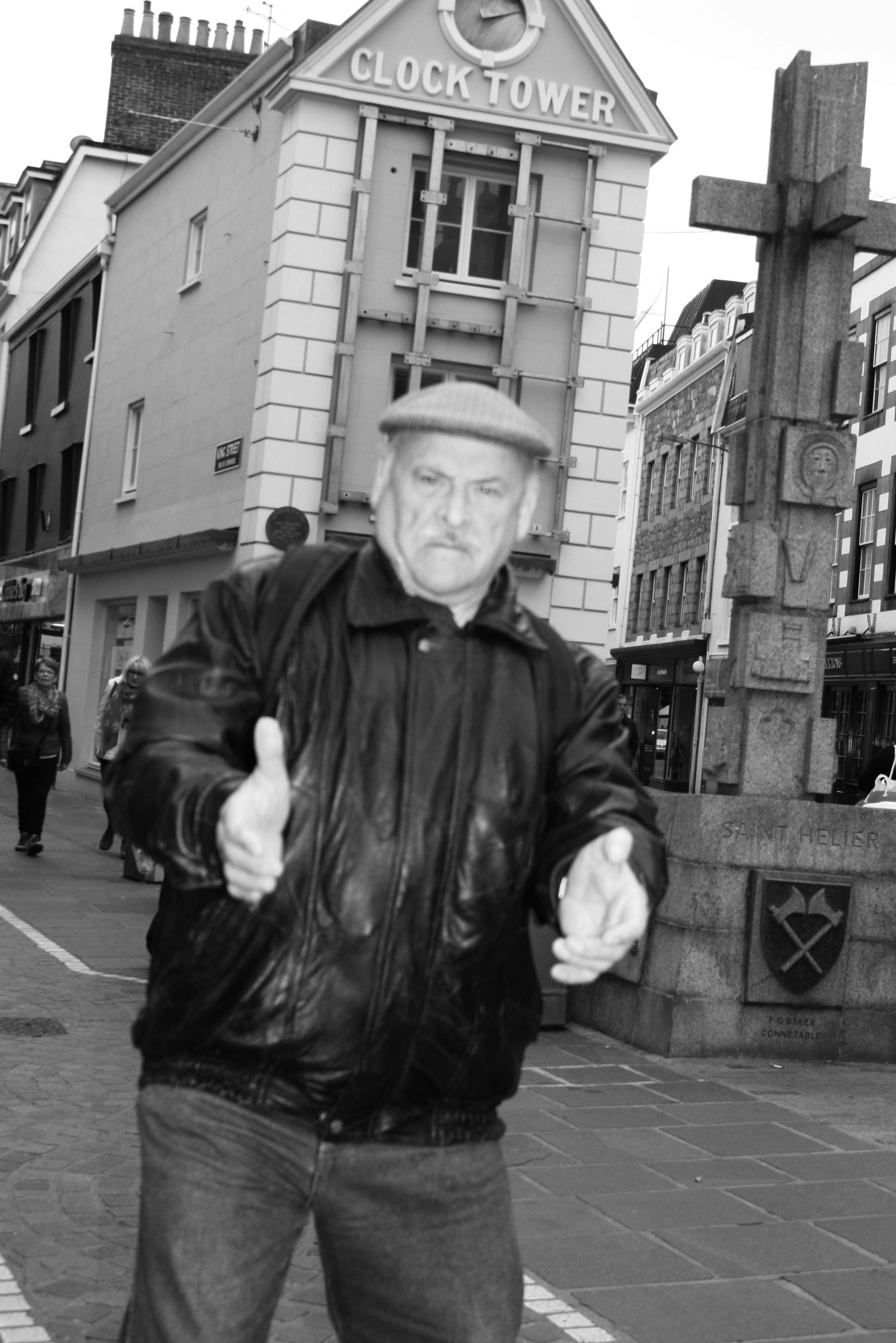
As i was moving into the position i wanted to be in to take this image the man realised and looked shocked i still took the image even though he had jumper slightly back it actually conveys more of a story than just unemotional faces. I think that this unstaged capturing of this moment makes the photograph one of the best photos in terms of documentary street photography from my shoot. Again the image is black and white with high contrast between light and dark due to the flash. i feel that this image even more so than the others shows the subjects personality and in this case makes the image seem like an old outdated street photography image, although the image was digitally manipulative everthing else about the image was natural and had the sense of luck that Bruce Gilden manages to capture in his images just being in the right place at the right time.

When taking this image i had stopped the man walking in front of me so i had actually planned that i was going to try and get him in the middle of the photograph for the reasons that you could see his outfit to show more about his personality. the image follows the rule of thirds as the man is in the centre of the image so your eye is immediately drawn to him making him the focal point of this image. Depth of fiield is an important aspect in this image to make it the successful photograph that i think it is. The man is creating the fore ground of the image helping to make him the focal point and then the clock tower building creates mid ground and also leading lines taking your eyes through the middle of the image and then the background is the members of the public and far away shops.  For this image i tried a different angle and did a straight angle shot. i feel that it worked in the sense of capturing lots in the image but as it was a full bodied shot the image ended up being over exposed with an uneven balance of pure white than pure black, this issue was created from the flash as instead of illuminating the face to get detail it lightened most of the image.

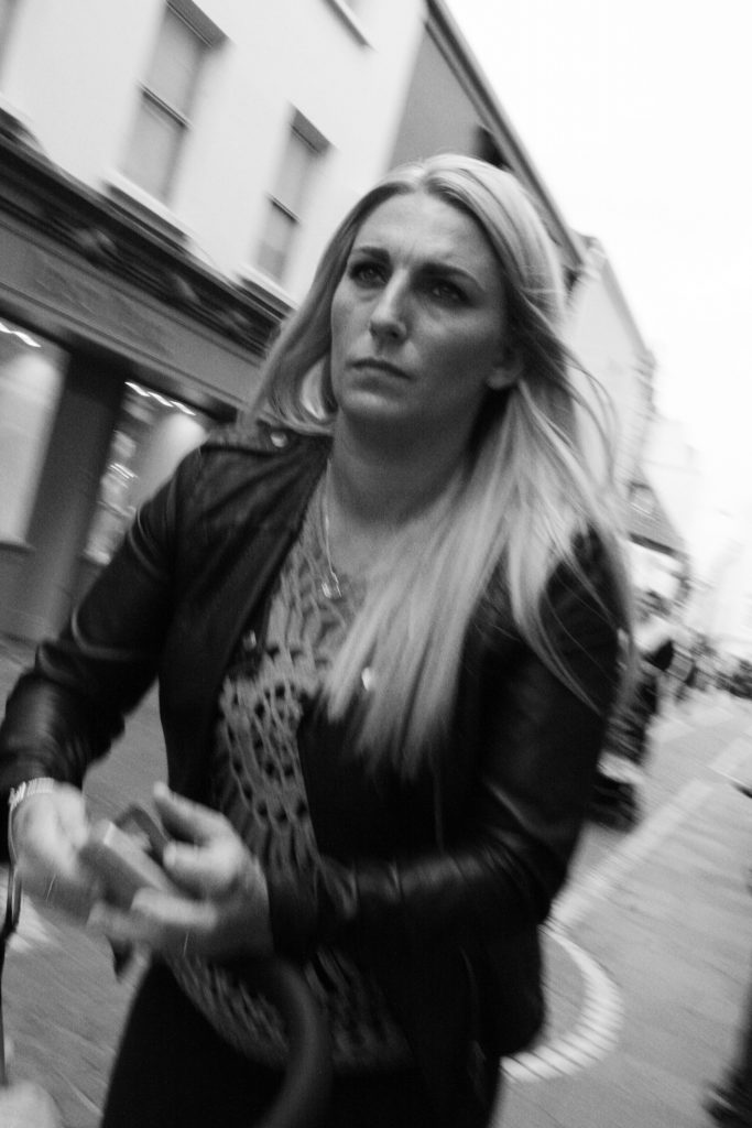
I decided on my shoot to dedicate a certain block of time (10 mins) to focus on women. I wanted to capture images which showed the different generations of woman and how there style conveys a message of who they are and what the are about. This was a more in depth idea during my photoshoot which specifically focused on documentary of who people where and what a quick portrait can tell us about certain people on our first impression. However i was still following my artist Bruce Gilden in the angles and uncertainty of what i was going to be photographing
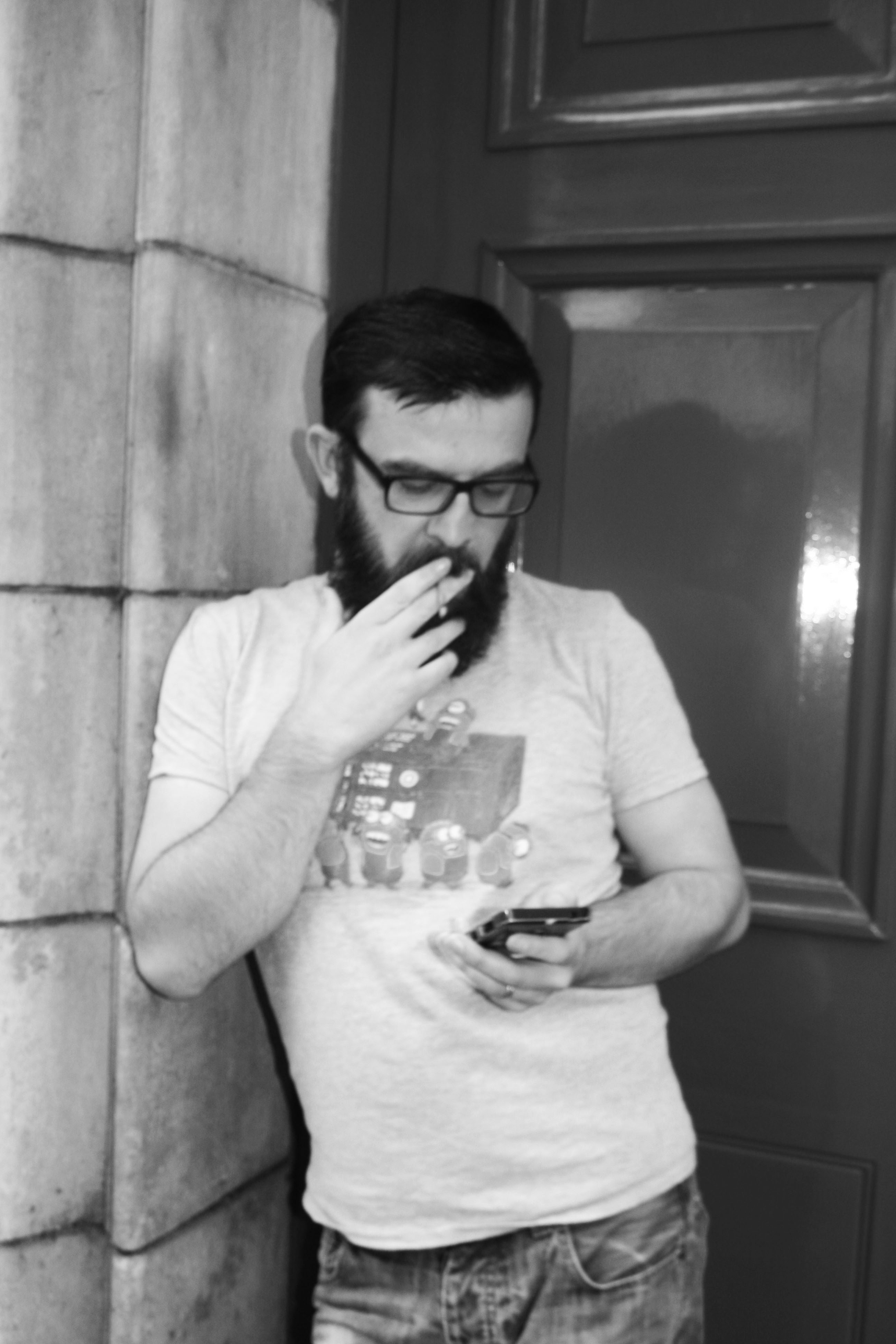
img_1202

I have a very negative emotional response to this image as the subject i photographed was both on his phone and smoking giving the impression of both being unsociable but also not caring able his health. This image was also off topic of things i was trying to photograph as i wasn’t moving when i took the photograph and neither was the subject this makes the image more stage than i wanted. None the less the image is still an interesting street photograph.
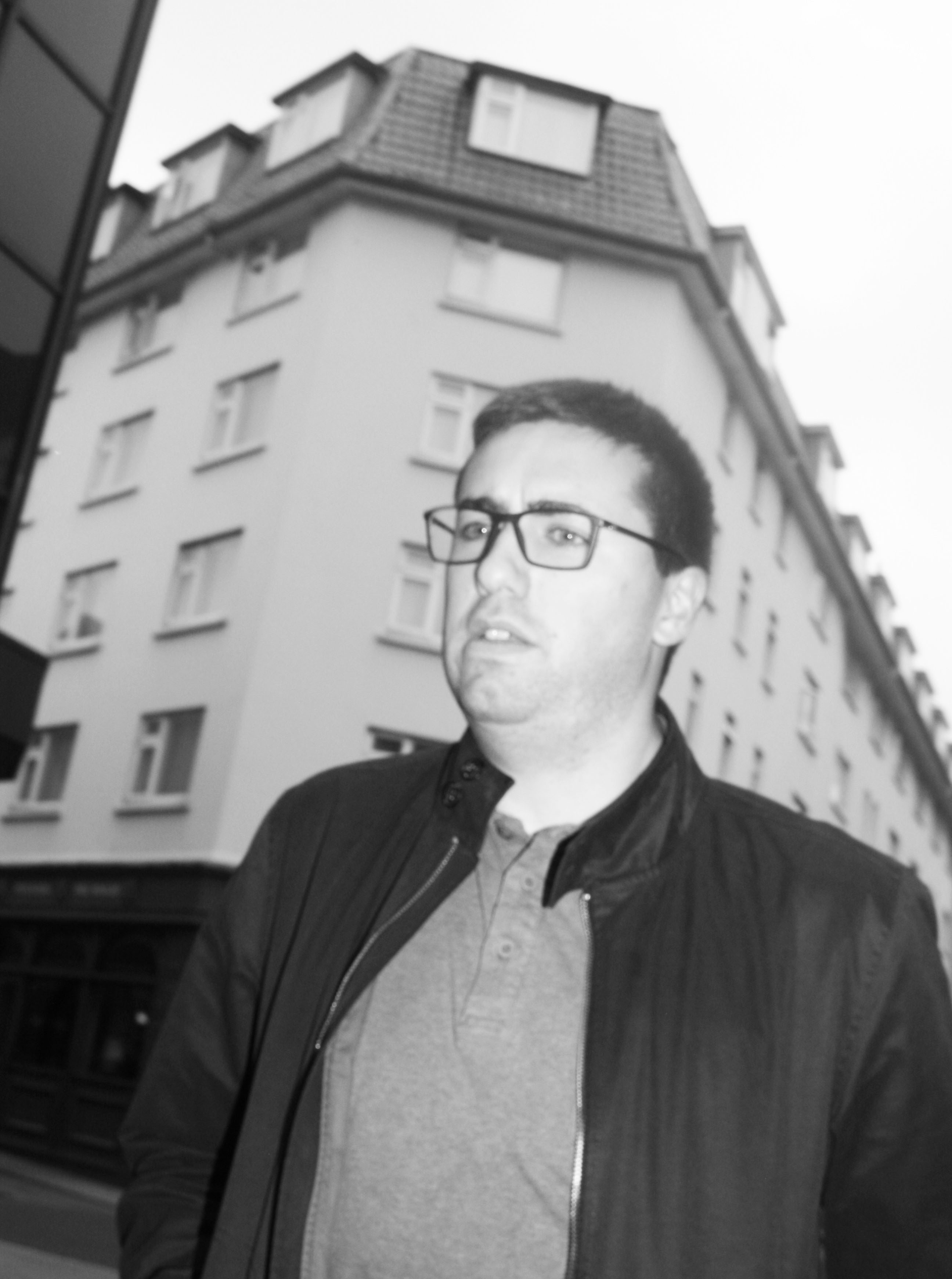
img_1210


The image of the left is Bruce Gildens image and then the image on the right is my interpretation of his work. There are similarities and differences between our street photographs. A similarity is that they have both been taken at a cantered angle focusing on a persons face however Gildens image is a more extreme angle than mine. The images are also both in black and white however the flash is more visible in Bruce Gildens work that mine. The flash has created a harsh direction of light looking straight onto the woman’s face making the features have slight shadow on the side. My image is over exposed due to the flash however it was more of a soft quantity of light meaning the face is not as bright as Gildens work. Another element of both images that shows a similarity is the use of buildings to create depth of field, this is done by both images where the person is the focal point of the image being in the fore ground and then buildings going into the distance making the image less flat. The colour also comes into the idea of how bold or flat the image is. My image has less of a contrast making the aspects of the image not as bold as Bruce Gildens image yet still has the same idea of making sure there is both light and dark in the image.
Aperture and Depth of Field

The meaning of aperture is – “A  space through which light passes in an optical or photographic instrument, Especially the variable opening by which light enters a camera.”

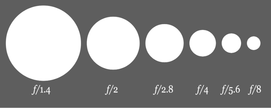
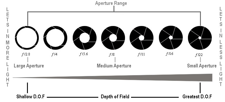
Aperture is measured in ‘f-stops’. The smaller the f-stop the more amount of light is allowed in, and the larger the f-stop, less amount of light is allowed in. Aperture Diagram - f-dtops

The meaning of depth of field is – “the range of distance that appears acceptably sharp.”

Large depth of field means that most of your image will be in focus whether it’s close to your camera or far away. The larger the f-stop, the larger the depth of field will be.
Small (or shallow) depth of field means that only part of the image will be in focus and the rest will be fuzzy.The smaller the f-stop, the smaller the depth of field will be.
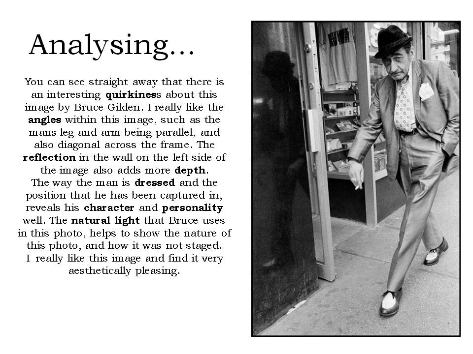
Image result for aperture

The image bellow was taken with a medium aperture, around 16 f-stop,  because the person in the foreground is in focus where as the objects in the background are blurry.


My Favourite Slow Shutter Speed Photograph

img_0588

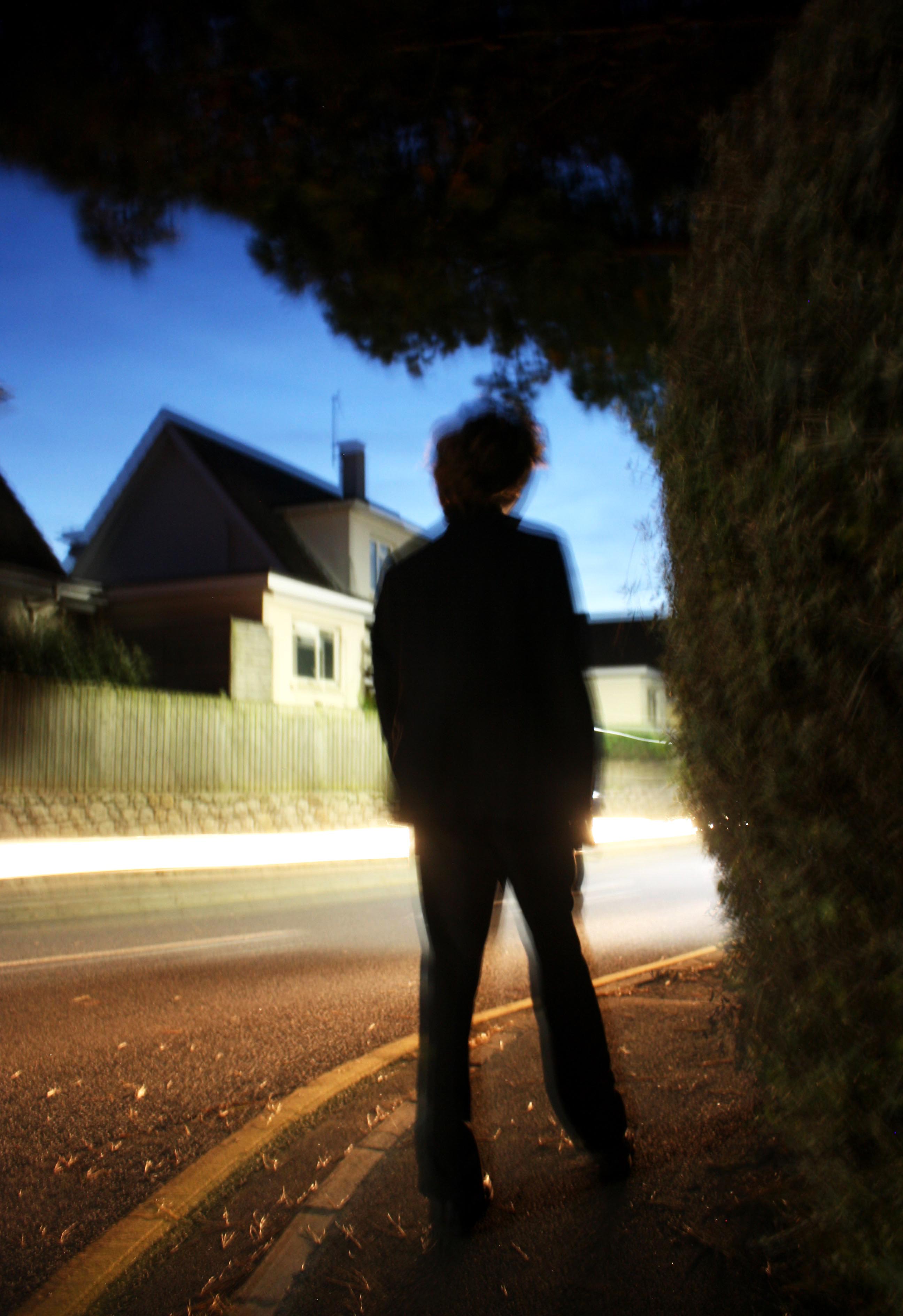
This is my favorite photograph out of my slow shutter speed photo shoot.  I like particularly how the effects of different techniques work well and compliment each other in capturing the sense of movement in the photograph.   For example: the rule of thirds link the person and the tree well nicely establishing a sort of connection.  Also,  the composition of the trees and bushes is effective in capturing the stillness of the setting of the photograph and the person.  This is because the blackness and shadow of the tree is bold and therefore quite effective in enhancing the blackness on the person’s suit.  As trees are known to be still objects, the fact through the dark tones we have established a relationship between the person and the trees, we start to believe the person is almost part of the tree and so his stillness is enhanced.  By making the person and the surrounding objects quite still and bold, the sense of movement of the light is enhanced.   Also,  the angle of the lens taking the photograph is effective because  again the sense of movement is enhanced.  For example the fact the lens is looking slightly up and is placed on the corner gives the photograph a sense of direction.  This makes the viewer curious as to what could be round the corner.  I therefore like how around the corner the enhanced brightness of the street light acts almost as a light source for the headlights passing through the middle third of the photograph.  This makes us more curious as to what could be round the corner.  By taking the photograph incorporating the person in the middle third of the photograph, puts our questions of what is around the corner into his hoes an so we can relate to what the person might be feeling.  I also like how the leaves being blown around on the ground capture the speed of the vehicle passing by, making us feel what the person is feeling with that breeze that comes after a car comes past.  Finally, I enhanced the photograph by adjusting the brightness and contrast to be increased.  This gave the photograph an exaggeration in emotions to communicate them more easily to the viewer.


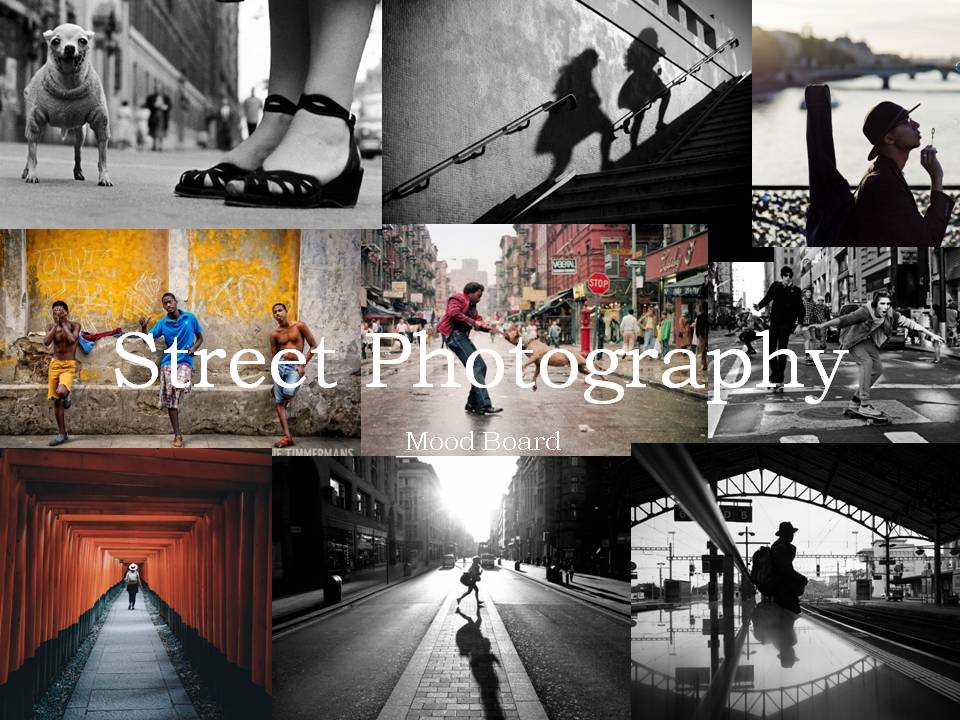
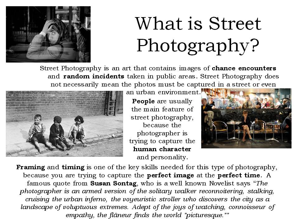
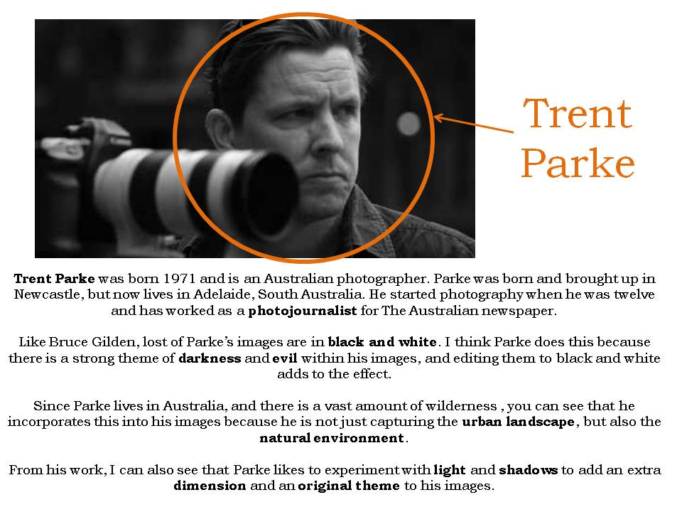
Introduction to Street Photography

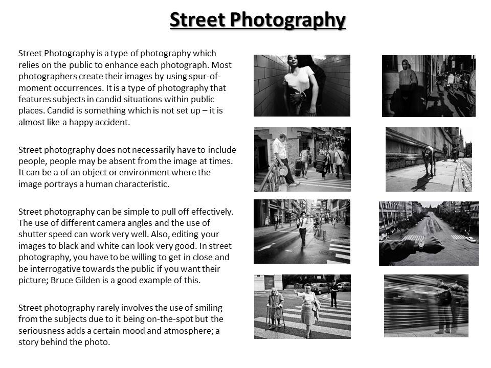
Definition)  “Street photography is photography conducted for art or enquiry that features unmediated chance encounters and random incidents[1] within public places. Street photography does not necessitate the presence of a street or even the urban environment. Though people usually feature directly, street photography might be absent of people and can be of an object or environment where the image projects a decidedly human character in facsimile or aesthetic.”

Robert Frank – An American photographer born in 1924.  He turned to photography leaving his business oriented family.  He started out taking photographs in Peru and returned to the US in 1950.  Frank scored a Guggenheim fellowship to tour the US in 1950.   Here he focused on class and racial issues that affected the US.

Image result for robert frank the americans

The composition of this photograph is interesting in this photograph because a woman is surrounded by the various parts of a kitchen that surrounds her.  By doing this,  it reflects the chaos and busyness of street photography but also the hostility in the sense that there is so much in the urban setting but people often look quite depressed in these settings.  This therefore creates a mood of discomfort to the viewer.  This photograph is slightly overexposed through the use of the artificial lighting.  This reinforces the idea of hostility in the sense the “man made” light almost tries to produce a sense of happiness to the photograph.  However the photograph the fact it is overexposed is quite striking and again makes us understand how this happiness is hollow and fake. To enhance this, I like how the contrast has been increased to separate the dark and light tones.   Also, the depth of where the girl is standing is of particular interest to me in the sense of how and where she is positioned.  The fact she is quite far away and she has her serving counter in front of her suggests a nervousness about the way she is responding with the camera.  It appears that she will only interact with us fully is if we are purchasing something.  This emphasizes the hostile setting in the sense that the  woman appears quite money driven and how she only wants to make money.

William Eggleston – An American Photographer born in 1939.  He was inspired by Robert Frank. and Henri Carter Bresson.  Experimenting with color in 1965/6 after black and white.  Between 1973/4 he discovered dye – transfer printing.   He has published several books describing his experiments with photography.

Image result for william eggleston

I like this photograph of it’s dark connotations but also how the kid is quite contrasting in terms of his surroundings.  The mid ground of black car and road through the composition is interesting because they are both presented as quite dark.  For example:  the dark hue of the car’s paint an the grey color of the road which is complimented by the puddles displays the setting as quite negative.  The fact the passengers in the car are positioned so we can’t see their faces also suggests a sense of lostness and negativity.  The background is quite dark in the sense the grey clouds overlooking the land, supports the idea that we aren’t in a happy place.  Interestingly,  the high exposure of the light coming from the sky contrasts this as a sense of happiness is displayed.  I like this because the fact it is pointing at the boy displays a sense of innocence but also it foreshadows how clearly the kid has an innocence that he wants to use to help change the negativity of the setting to being quite positive.  This is further re-enforced by the fact the kid is wearing a colorful, stripy jumper which is a bit abstract.  This shows a sense of rebelliousness from the rest of the photograph which shows that color and happiness can change a dark and negative situation.  I like how the photographer emphasizes this by placing the boy in the middle third of the lens to allow us to focus on him and his character.