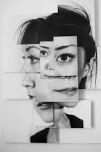
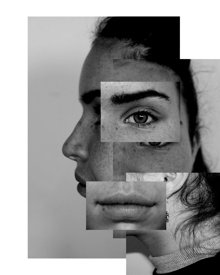
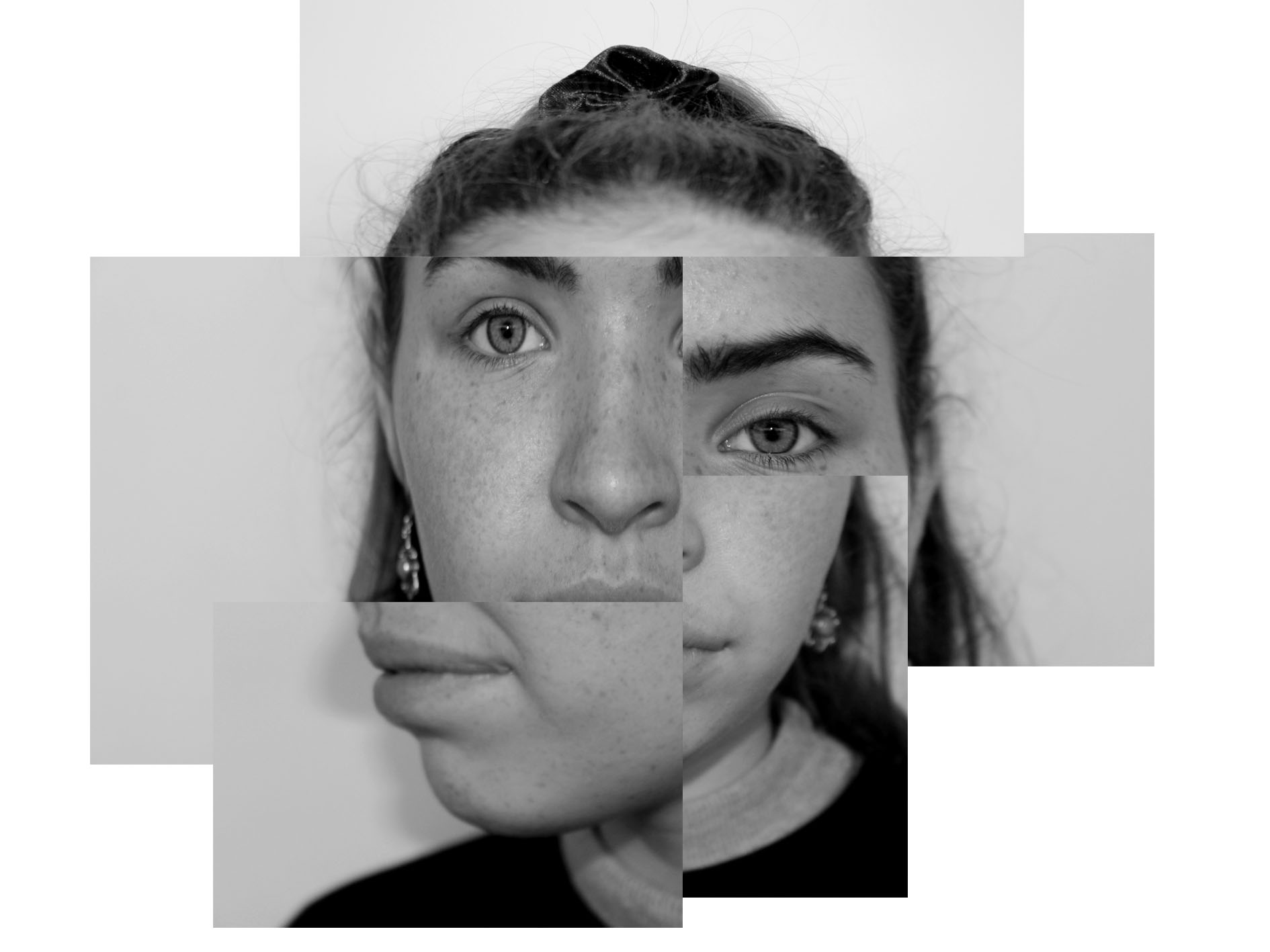
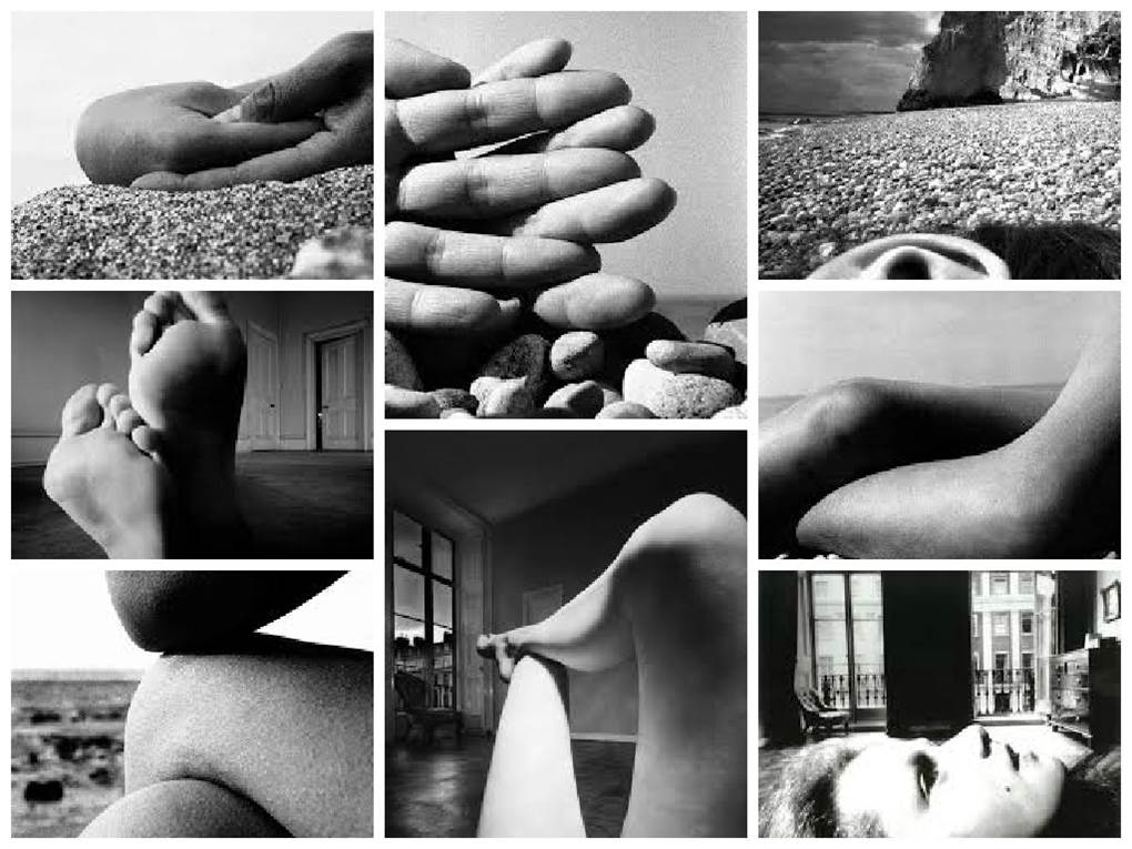
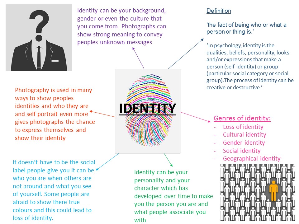
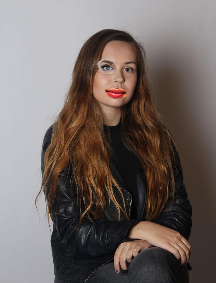
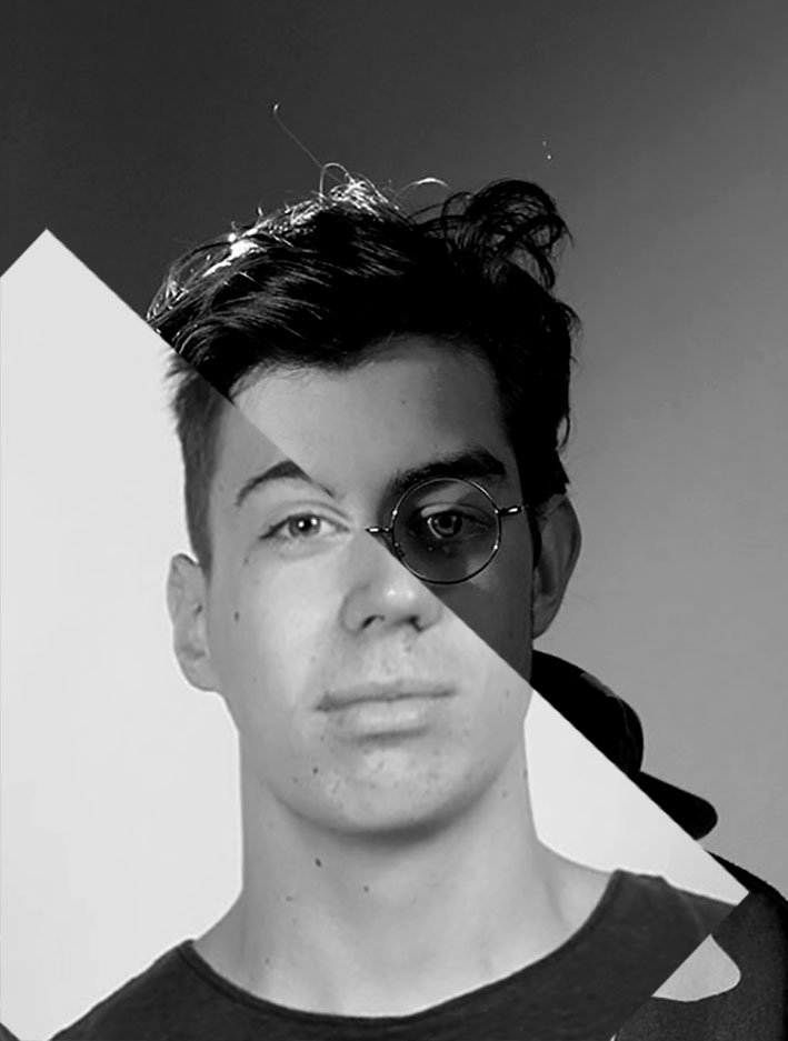
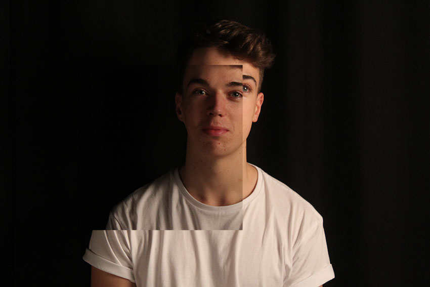
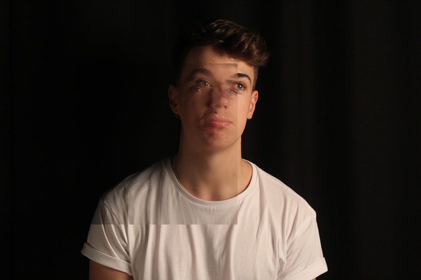
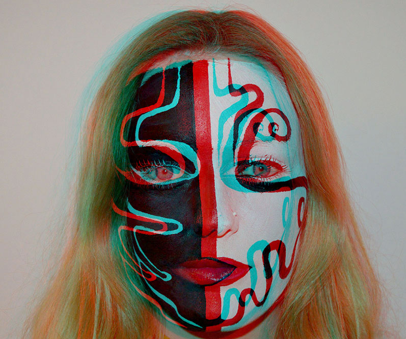
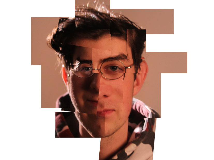
Exploring gender identity
‘Gender Identity. One’s innermost concept of self as male or female or both or neither—how individuals perceive themselves and what they call themselves. One’s gender identity can be the same or different than the sex assigned at birth.’
Wikipedia: All societies have a set of gender categories that can serve as the basis of the formation of a person’s social identity in relation to other members of society.In most societies, there is a basic division between gender attributes assigned to males and females, a gender binary to which most people adhere and which enforces conformance to ideals of masculinity and femininity in all aspects of sex and gender: biological sex, gender identity, and gender expression.
Gender identity photography can range from photos of men doing the stereotypical man to men dressed up as woman. The main message of gender identity photography is not to discriminate people for their identity and who they are or how they present themselves. For my self portrait identity shoot i am going to focu on feminism and the how identity can show femininity and what feminism means to me
Feminism
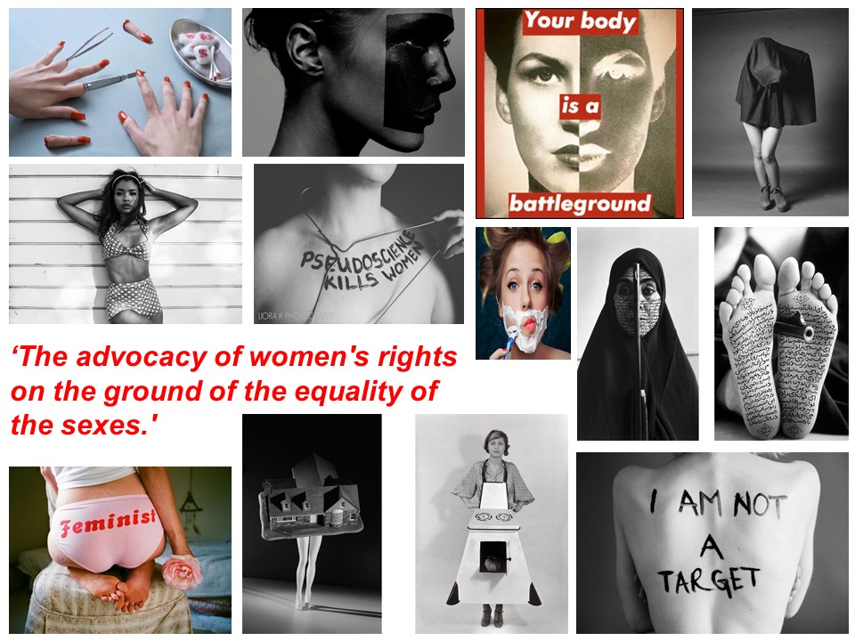
Women depicted in fine art and photography are often nude, alluring and sexually inviting. A 2012 campaign by renowned art activists the Guerrilla Girls said that less than 6% of the artists in the Modern Art section of the Met are women, and across the museum, 85% of the nudes are female.
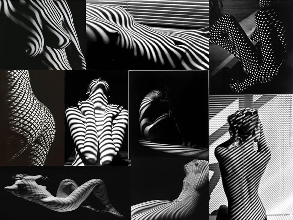
I am interested in looking into photographers that photograph women in there natural forms, looking at there body shape mainly focusing on there back and spines, show who they are and therefore their identity.
Artist Reference – Fernand Fonssagrives
Biography
Fernand Fonssagrives (June 8, 1910 – April 23, 2003), born near Paris, France, was a photographer known for his ‘beauty photography’ in the early 1940s, and as the first husband of the model Lisa Fonssagrives. He died in 2003 at Little Rock, Arkansas.
Fonssagrives was a fashion photographer in the 1940s and 1950s when he took pictures for Town and Country and Harper’s Bazaar magazines. At one point he was the highest paid photographer in New York. His later pictures featured female nudes with patterns of light on their skin. His photographic works are represented in Europe by Michael Hoppen Photography (London) and in the United States by Bonni Benrubi (New York) and Duncan Miller Gallery (Santa Monica). An image he created of his first wife Lisa is on the cover of the Spring Christie’s photographic auction catalog (2008).
Personal Thoughts
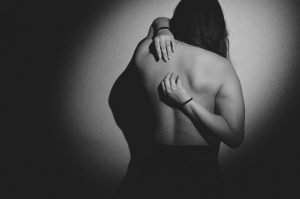
I really loved this style of photography and i had an immediate positive emotional response to it. The image stood out to me because it was what i had been looking for and it also had an abstract effect to it created by the interesting striped shadows that are a huge part of the image. i think the way they cover the image shows the loss of identity and that these women are hiding behind the shadows in the darkness. i also look at the shadows as if they are barcodes which each photo having different length, width and direction shadows showing that each female is different. i also like Fernand Fonssagrives images because he shows woman in there purity and to me this emphasises the message that peoples identities can change when they aren’t wearing clothes which may give away the type of person they are.
Image Analysis
The subject of the image is feminism and the anatomy of the female body. the subject is a woman sitting on the floor with her back facing the camera, icluded in the image is shadows. The image, which is is black and white, has an old film effect to it making it very elegant whilst dramatic. I think that the message that is trying to be conveyed through this image is woman hiding behind things to hide there true natural self. Fernand Fonssagrives has photographed the womans bare back in a way that is tasteful but can have very powerful meaning to it the shadows in the photograph make it as if the subject is trying to blend in to the walls and not be seem however the shadows can also have the opposite effect of drawing your eye to the subject as the shadows are darker on her and curve around the body. this feature in my opinion shows identity. your body is you in your natural form it is the first stage of your identity and how people look at you. The genre of the image is portrait and obvious techniques that have been used are skilled use of shutterspeed and exposure and there are very hard contrasts of light and dark in the image. I think that the rule of thirds is vitial in Fernand Fonssagrives images. In the image we can see that he has followed the rule of thirds placing the subject on the left vertical axis, the effect of doing this is that the subject is not harshly in the centre of the image. Leading lines is a massive feature in this. the shadow lines lead your eyes in a diagonal line through the image. the depth of field in this image is high due to the different sizes on shadows in the image. the bigger lines are closes to the camera therefor being the for ground and the smaller shadow lines create the background. The direction of the light is coming from the top right of the image and is a very hard harsh natural which creates the contrast of white an and black in this image.
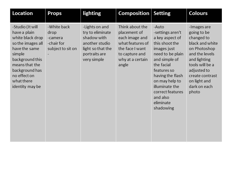
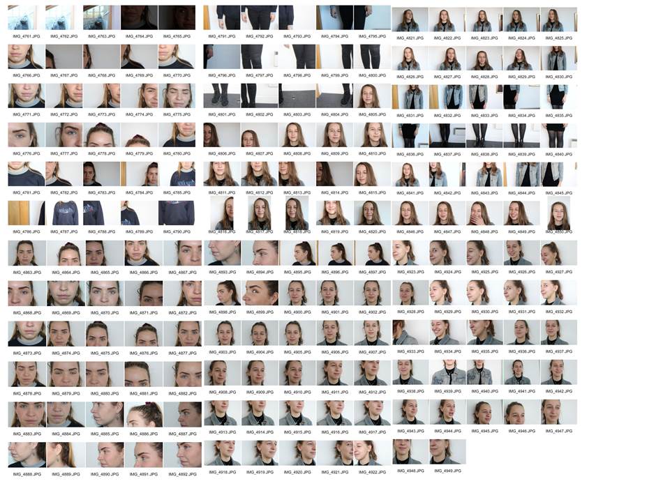
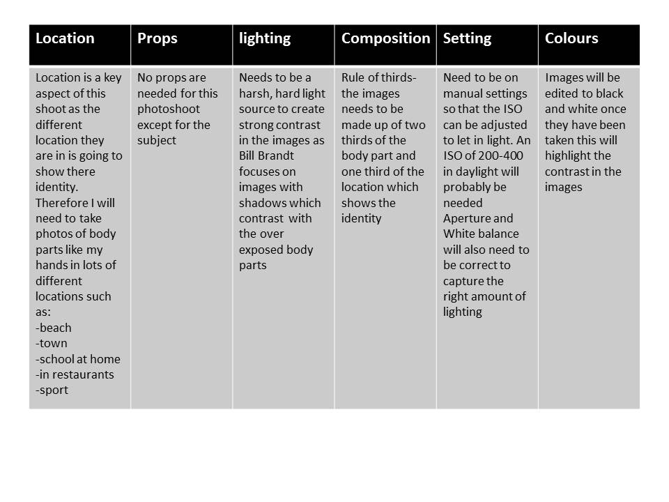
Photo shoot Plan
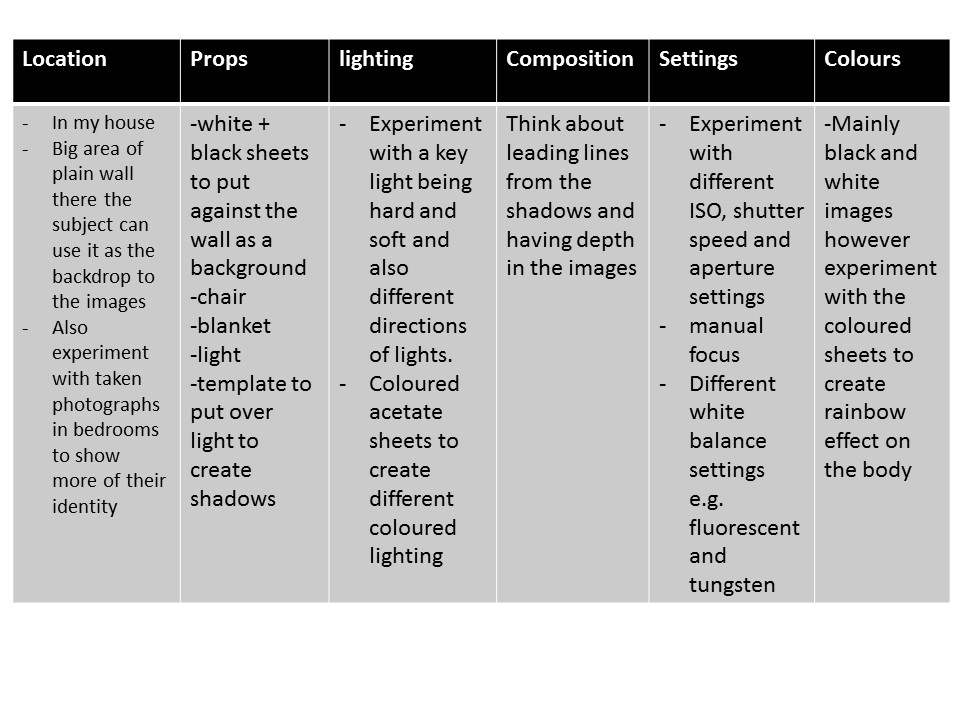
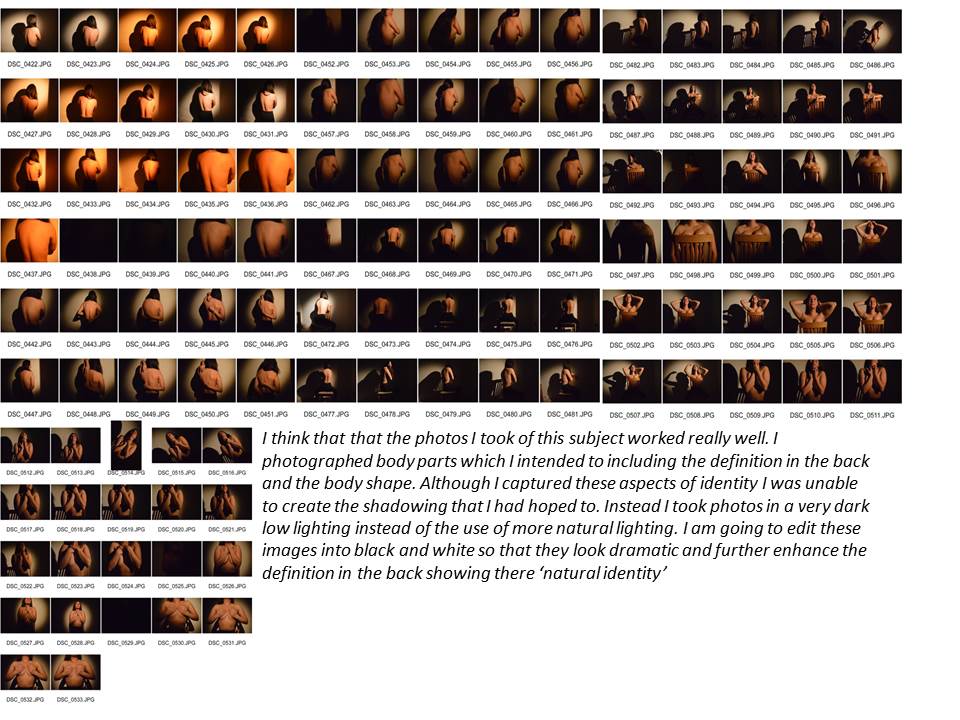
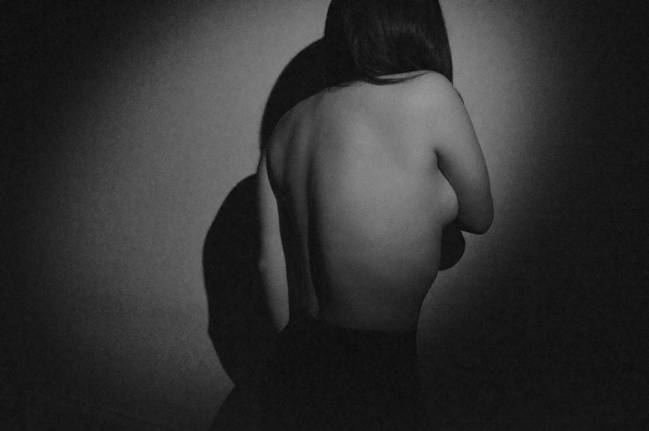
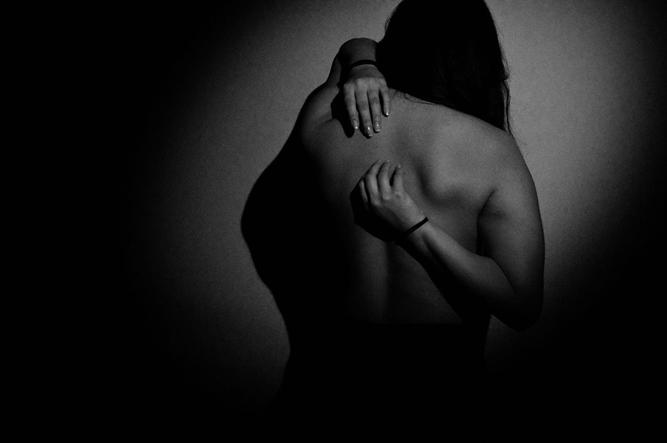
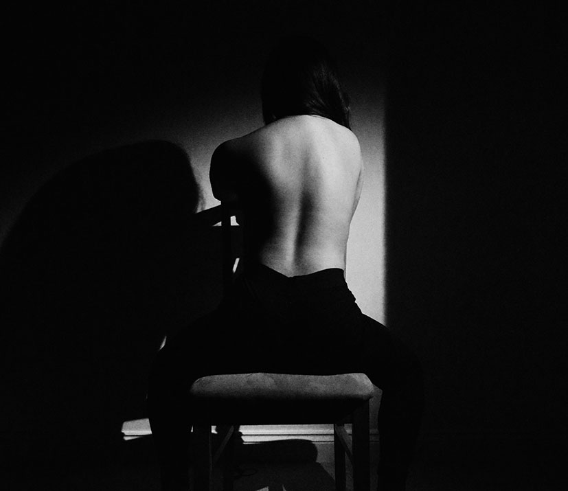
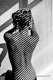
Image Analysis
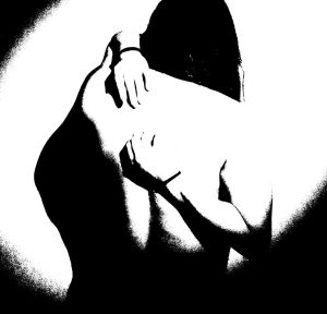
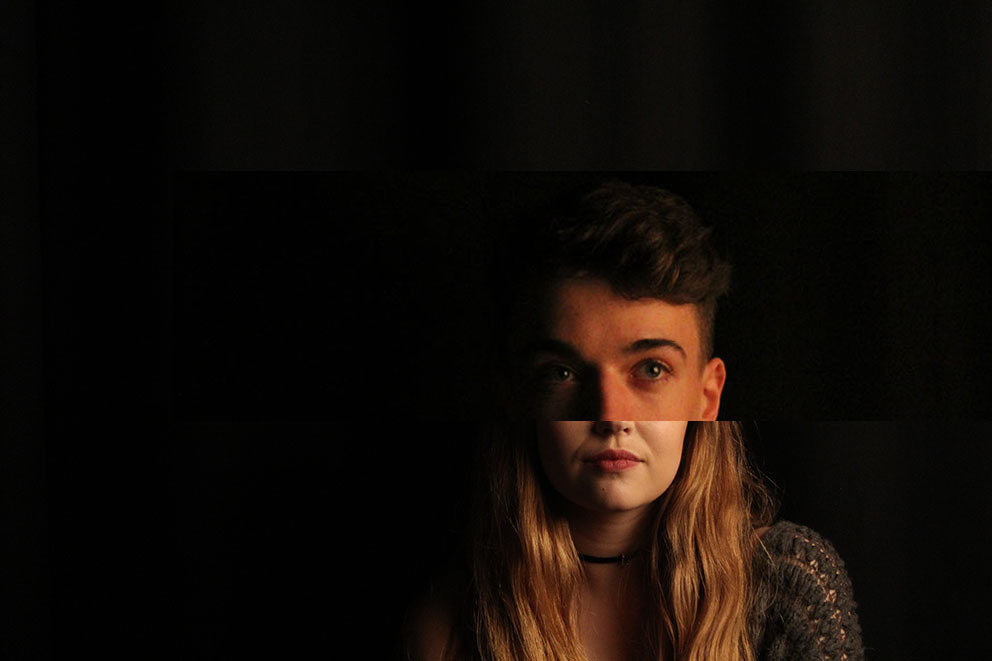
This image is my favourite out of my first gender identity shoot. this image is my favourite because i am emotionally dawn to it when yo first look at the image it looks like it has a deep meaning or message behind it as the darkness s very eye catching and striking. As the subject is facing her back to the camera it gives the idea that maybe they are sad and wanting to hide there identity and therefore who they are. it as if shes hiding away in the darkness carrying a sense of loss of identity but there is just one light illumination her so we can see a very minamalistic outline of her and who she is. The image looks like its from an old film camera or an old style movie with the dramatic lighting creating high contrast. The subject is central in the image in my opinion backing the rule of thirds because she does not cover any over part of the image. the effect of this is that she is the focal point of the image and what your eye is immediately drawn to. Framing is an important aspect of this image. it is created by the dark outer axis of the image that is either side of the subject this further enhances the subject as being the focal point of the image. The noise in this image was due to the ISO being on 6400 which created the specles on the image. although this could be incorporated in the meaning of the image and the dots could be hiding the identity of the subject.
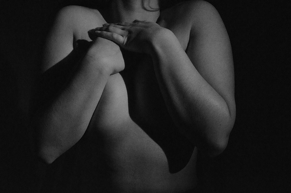
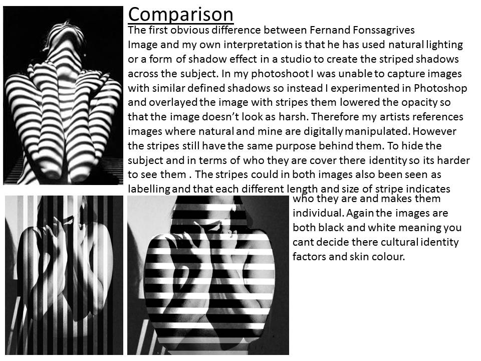
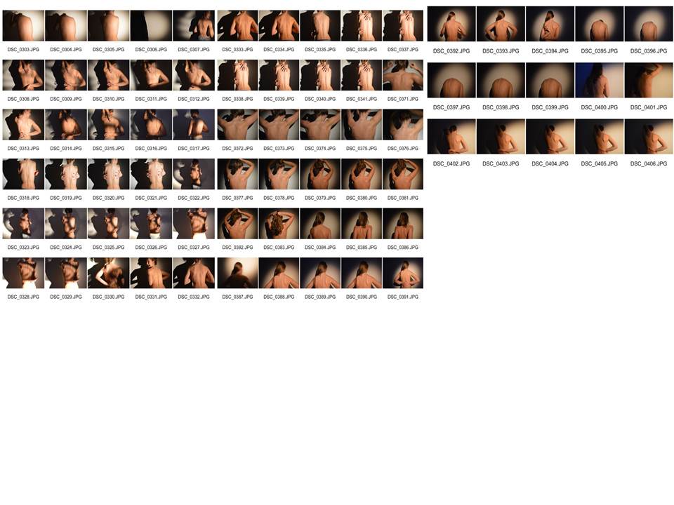
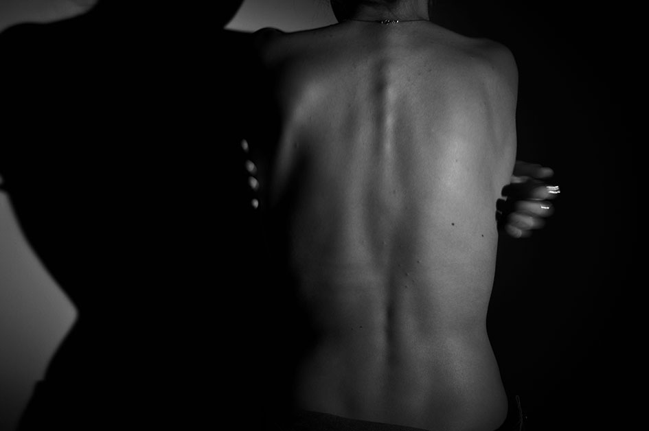
Image analysis
This is one of my favourite images for the entire project as is captures what i planned to capture at the beginning. The are so many elements visible in the back including muscle and back which creates an image which is so interesting to look at and is almost like the subject identity on a fingerprint. the print on their back shows their identity in the natural form of there body. its excluding all makeup, clothing, what their personality might be like and shows you their identity its the most natural form. As said above the lighting and colours was key for this shoot to be successful and i think that this image emphasises the importance of getting the correct ISO, shutter speed, aperture and angle and intensity of the key light. Settings for this image included, ISO; 6400 , Shutter speed: 1/80 and aperture: 5.4. The direction of the light was coming from the top right of the image on the medium setting. you can see the direction of the light due to the left side of the body having a higher level of white light and then creating chiaroscuro on the other side of the body. the quantity of lighting in this image was more faint and the quality of the was a more soft gentle light making the finish to the image smoother than a lot of the others.Again framing is created by the darkness of the studio lighting around the illuminated back and there is leading lines evident through the image from the structure of the body taking your eye all around this image.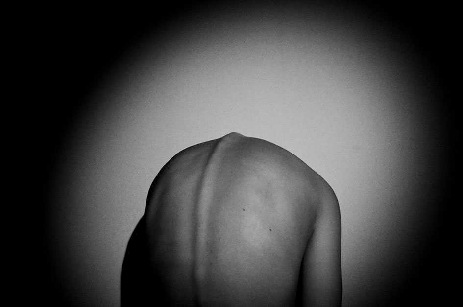
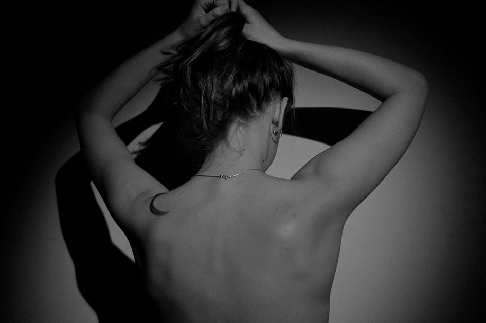
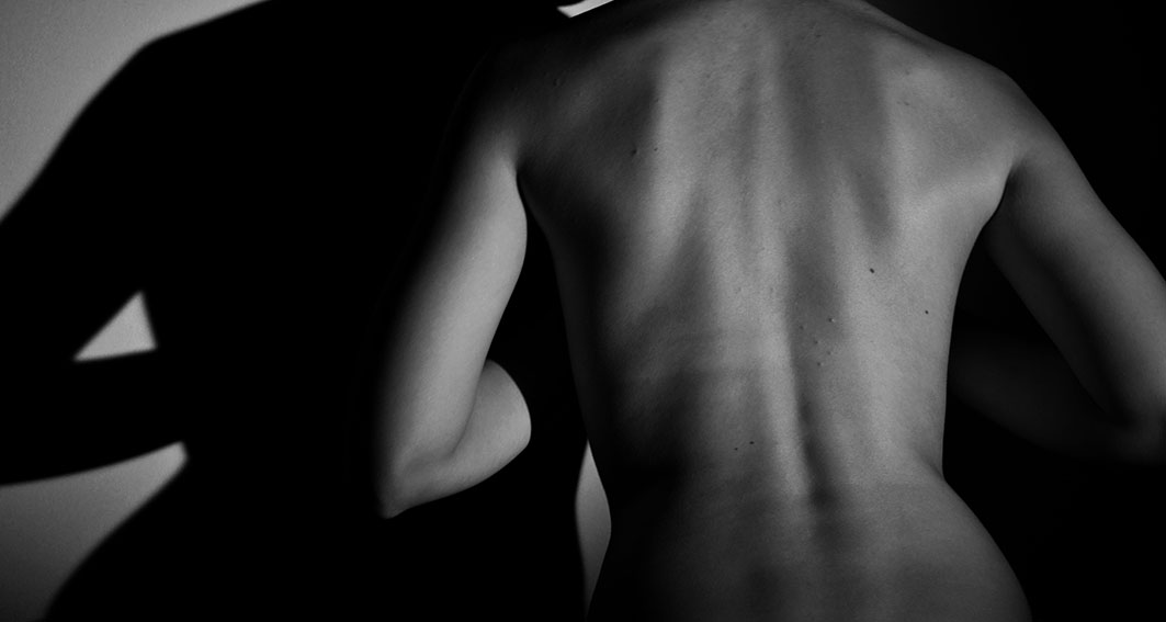
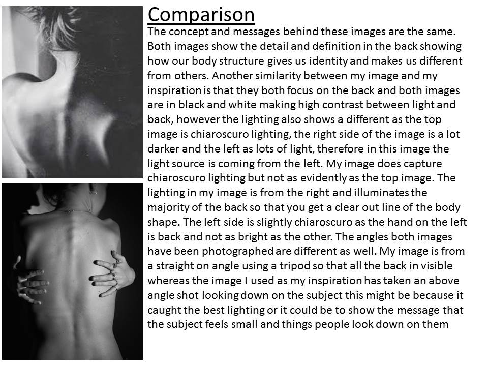
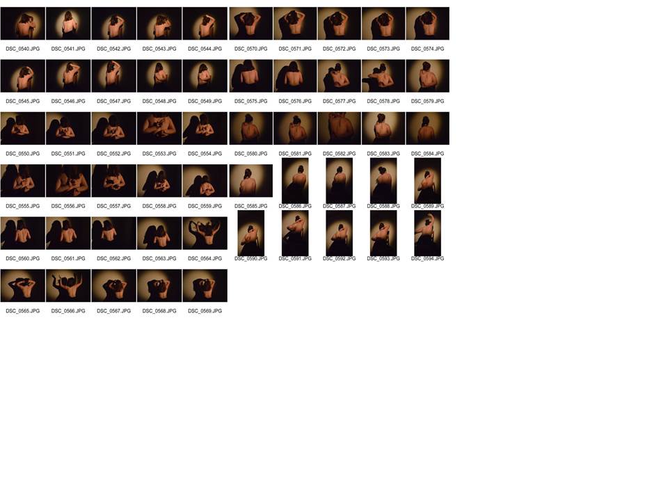
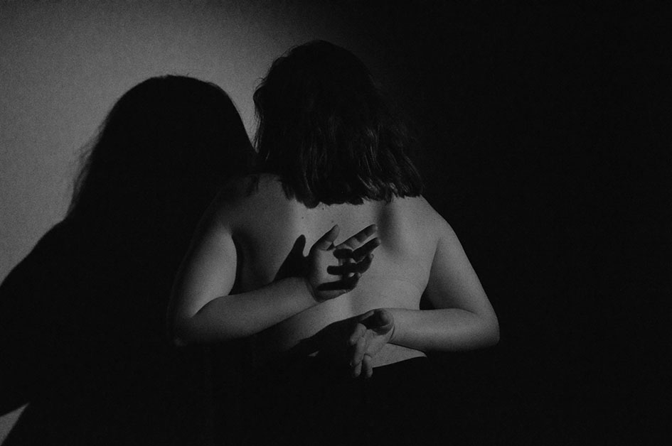
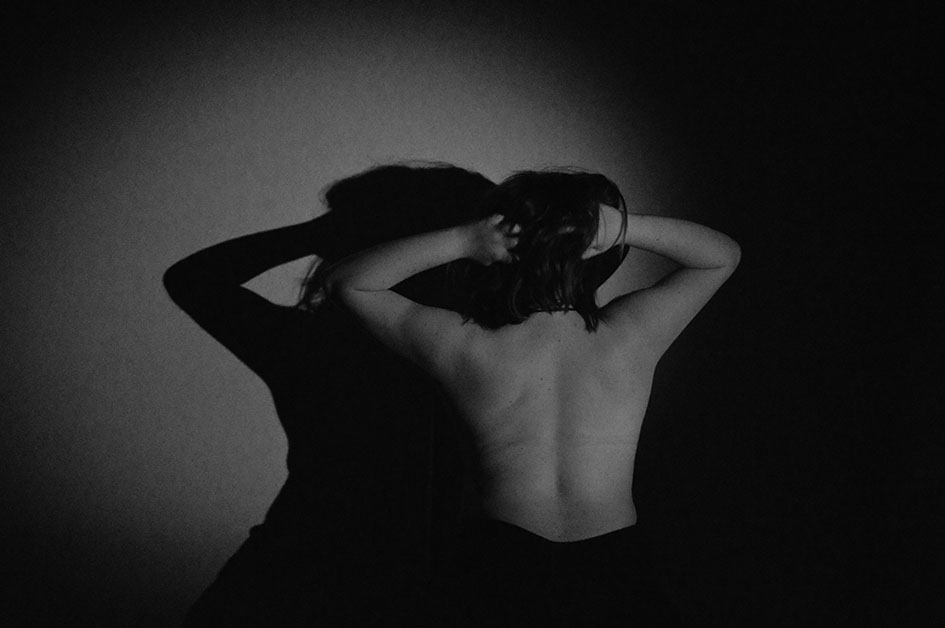
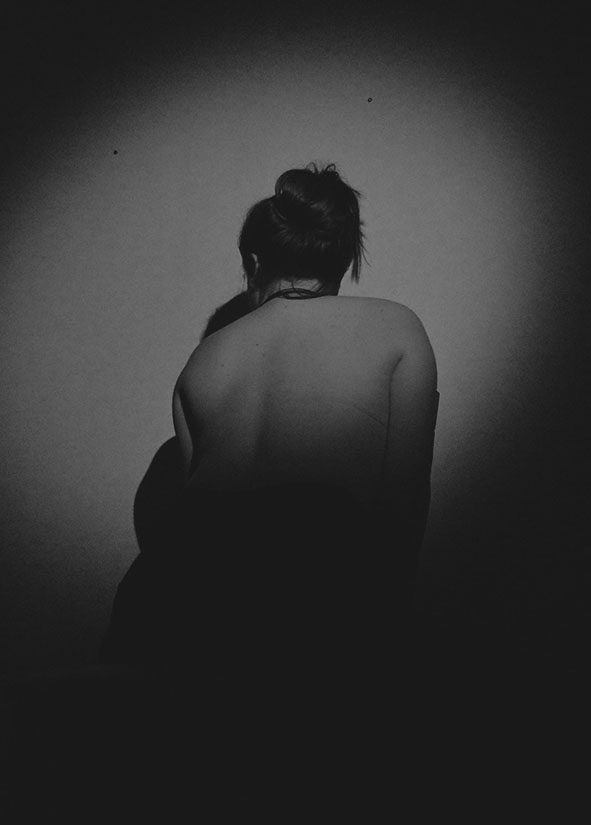
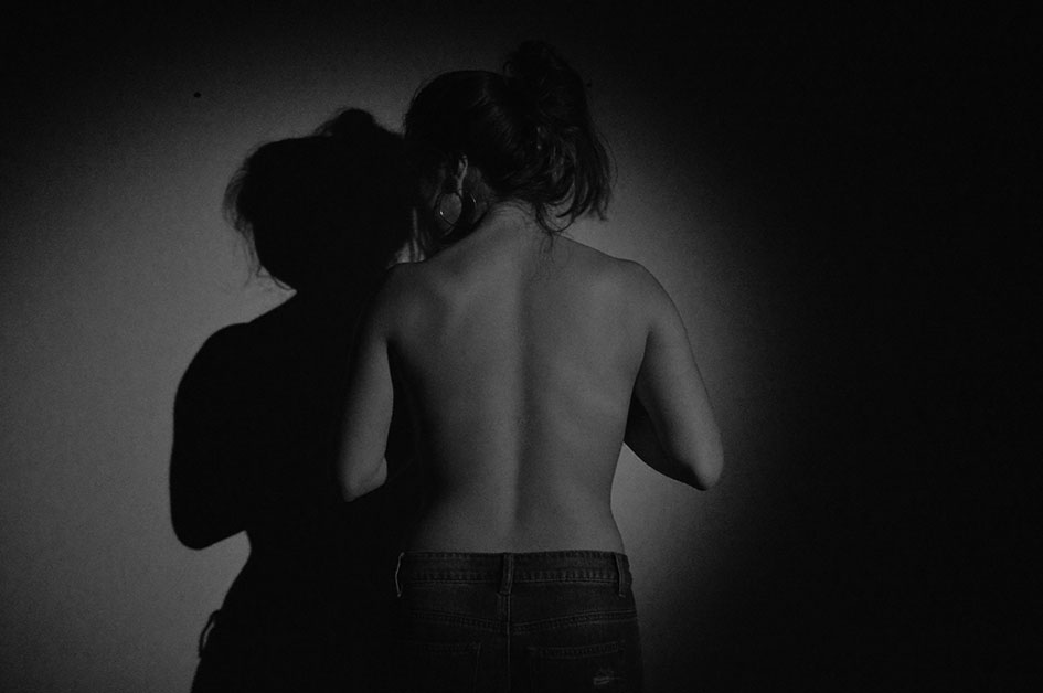
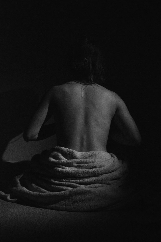
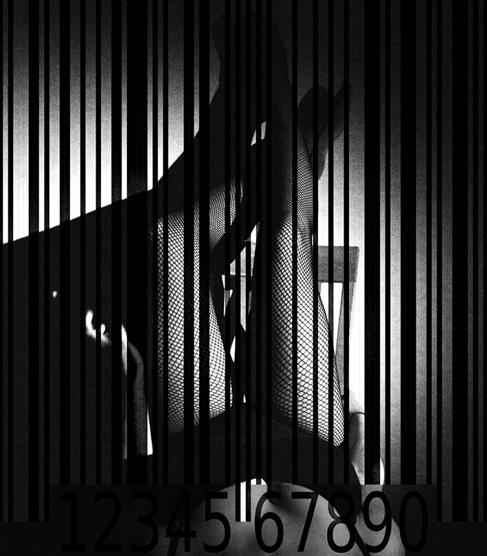
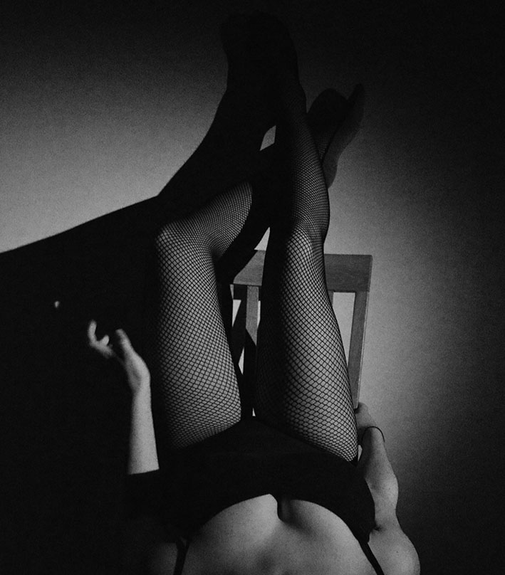
Image Analysis
during this shoot i decided to experiment with different props and clothing to try and show more of the subjects identity but also identity in a different form. the identity being shown in this image isn’t as raw as the others clothing is beginning to become a part of showing who they are. For example in this image you can see that tights an and a leotard are being worn so here we may get the message that they are a dancer or a gymnast and the clothing is starting to tell us about the factors that makes up there environmental and cultural identity. The image carries on the theme of gender identity and femininity as we can see there gender in the image however still showing a loss of identity as the face is not included in the image. i found that i didn’t want to include the face of the subject in a lot of the image because it gives to much away about there identity, without the face you have to think more about there environment and what they are doing to figure out who they are and what there identity is. My favourite part of this image is the colour tones and the lighting. This is because the subject has really been made the focus point of being lighter and then a correct amount of contrast being created by the black clothing and i really like the colours and patterns the tights create to add more detail to the image
Evaluation
For this part of the self portrait and identity project i wanted to focus on gender identity and how identity between men and omen can be different due to their body. i think that i manages to capture this aim in my photographs through images f backs and what makes a womens natural identity. I really enjoyed taking this images because they are sophisticated and i liked that i could focus of the use of lighting and positioning of the subject to make effective images without need to digitally manipulate them and add affects to them. i managed to show loss of identity and gender identity by thinking of how i could position lighting and the subject to make the image beautiful but interesting to people looking at them.