All posts by Peter Le Gal

Filters

Author:
Category:

Camera Handling Skills

Focal Length

focal-length-graphic

The focal length of the lens is the distance between the lens and the image sensor when the subject is in focus, usually stated in millimeters. The focal length tells us the angle of view, the magnification and how large the individual elements will be. The longer the focal length, the narrower the angle of view and higher the magnification. The shorter the focal length, the wider the angle of view and the lower the magnification.

Depth of Field
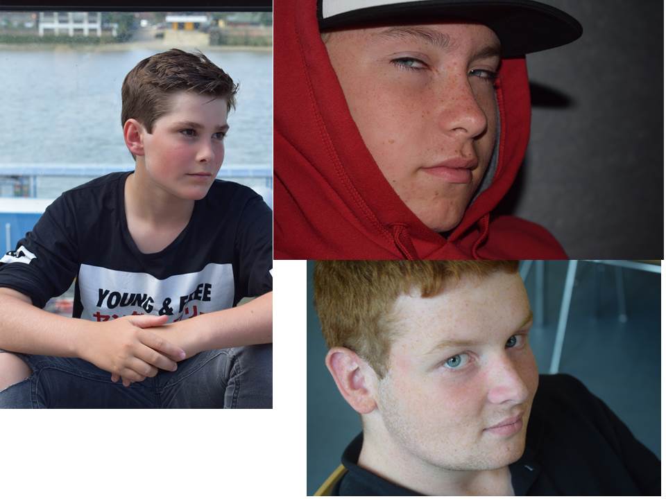
depth-of-field

Here is some examples of depth of field. Depth of Field is the distance between the nearest and the furthest objects that give an image.  Here I have used depth of field in all three of these pictures.Three things that will affect how you control the depth of field of your images are aperture, distance from the thing you a taking a photo of to the camera.

View Point
eye-level

Eye Level- The camera is held by the photographer and shot at the same height level with the eyes of the objects that will be the object of the photo. This forms a flat angle between objects with a camera.
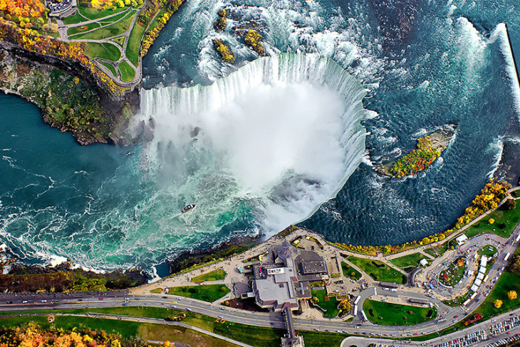
niagara-falls-730x488

Bird eye-Generally bird’s eye view done in a place that has a height of more distant objects separately from the camera. This view is like you are looking through a birds eyes as it it says in the name.
frog-eye-angle-1

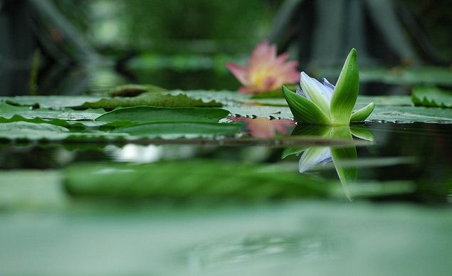
Frog eye– The image is taken with the camera closer as close to the floor. This angle is quite difficult to take, especially for the type of camera that does not have flexible lcd screen.

Angles
dick-tiger-high-angle-with-glove-in-camera-new-york-city-march-30-1962

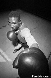
High Angle-High angle is an angle that is used to create a low impression of the image object . High angle is the angle of the picture were taken from above the eye line. The camera is placed above, highlight the object from top to the bottom. This makes the audience feel the subject of photography has widened perspective from the top and smaller at the bottom.
images

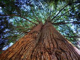
Low Angle-Low Angle is an angle that is used to create impression of height, sturdy and elegant. The shooting is done from the bottom of the object of picture, so that the object is higher than the camera. This creates the impression of images perspective that have up impression and form like a cone.
canted-angle

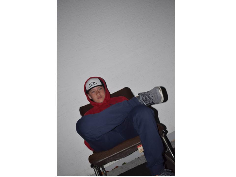
Canted Angle- is a type of camera shot where the camera is set at an angle on its roll axis so that the shot is composed with vertical lines at an angle to the side of the frame, or so that the horizon line of the shot is not parallel with the bottom of the camera frame.
images-1

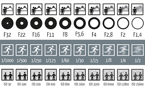
Aperture-your aperture opens up and lets more light into the camera sensor and increases your shutter speed. For your 18-105mm lens, the aperture varies between f/3.5 and f/5.6, so try to keep it in that range.

Shutter speed- is the length of time when the film or digital sensor inside the camera is exposed to light, also when a camera’s shutter is open when taking a photograph

ISO- this measures the sensitivity of the image sensor.  The lower the number the less sensitive your camera is to light and the finer the grain. Higher ISO settings are generally used in darker situations to get faster shutter speeds.
white-balance-chart

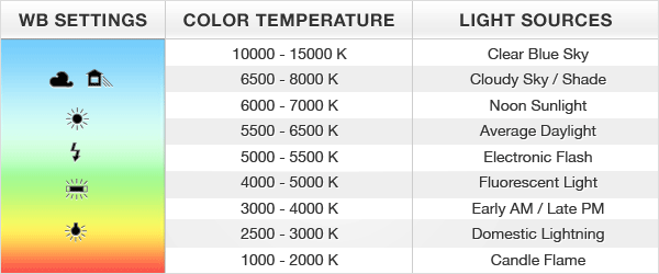
White balance-is the process of removing unrealistic color casts, so that objects which appear white in person are rendered white in your photo. Proper camera white balance has to take into account the “color temperature” of a light source, which refers to the relative warmth or coolness of white light.

Colour splashing

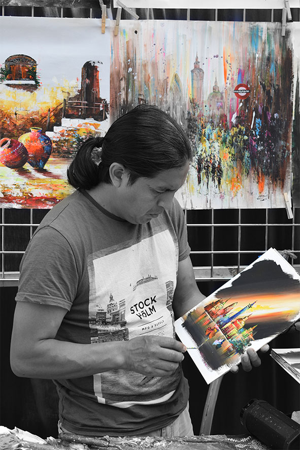
I have created a colour splash. I did this by making the image black and white then using the brush tool I started to add colour to certain parts of the picture. I chose to add colour to his art because they’re the main parts of the photo and have the most colour. By making the man black and white makes the colours in his pictures more noticeable.

Environmental portraits edits using Adobe Photoshop

edit-1-before-and-after

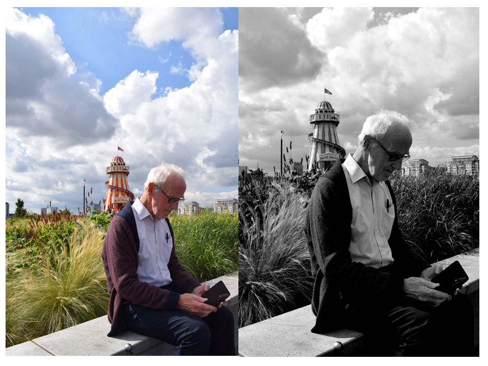
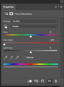
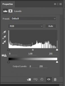
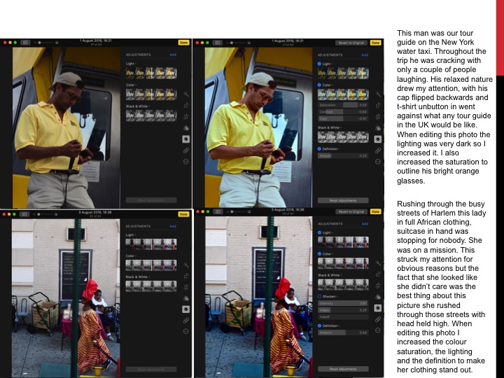
When editing this photo I cropped out all the unimportant things of the image and focused on the man.  I then de-saturated the photograph by using the saturation tool and turning it to -100. This took all the colour out the photograph. I then adjusted the contrast using the levels tool. This allowed me to adjust the dark’s, grey’s and whites of the image. Then I combined all these layers to create one picture by using flatten image.

satuation-toolcontrast-level-tool

White Balance/Contact sheets Experimentation

contactsheet-001

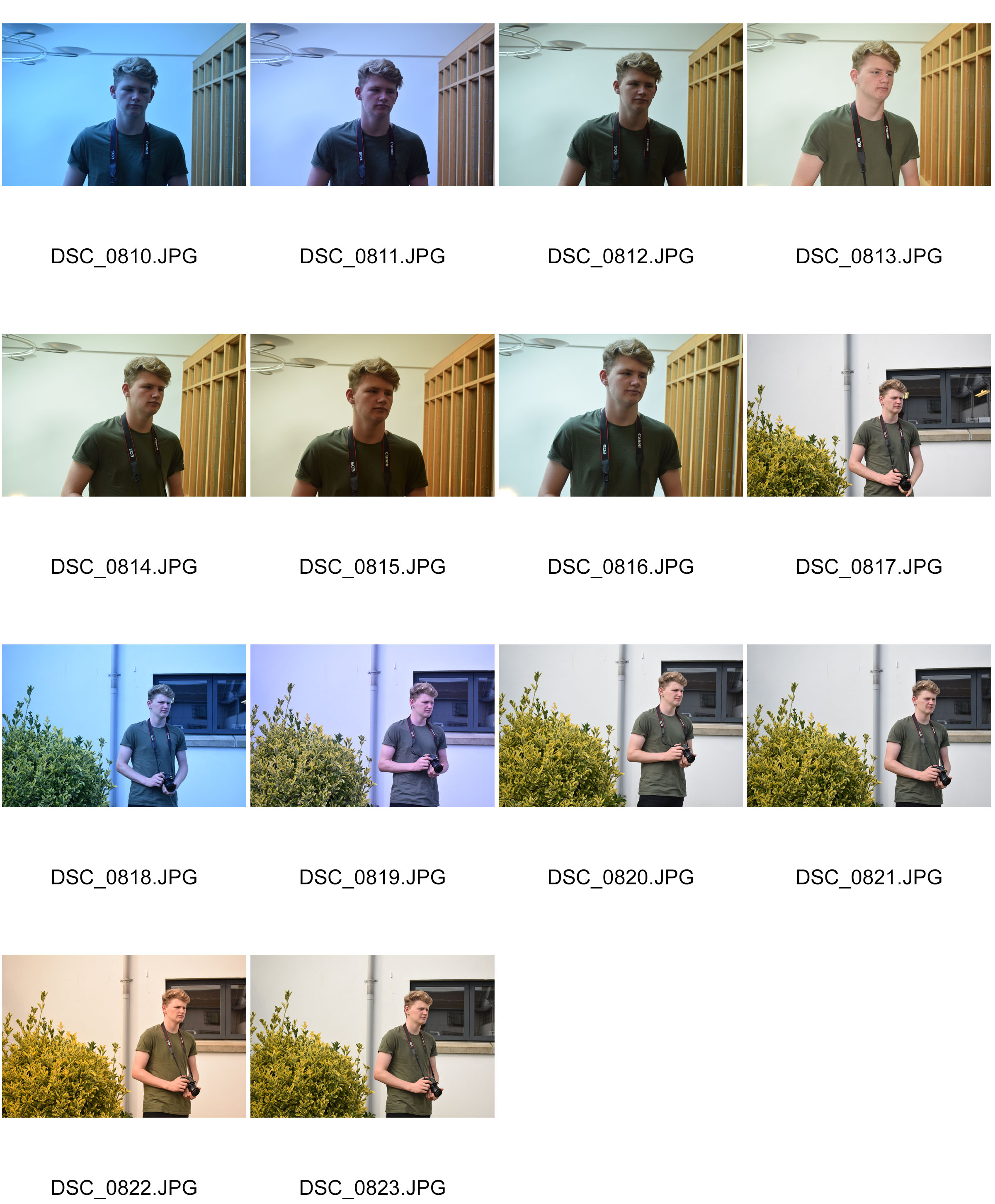
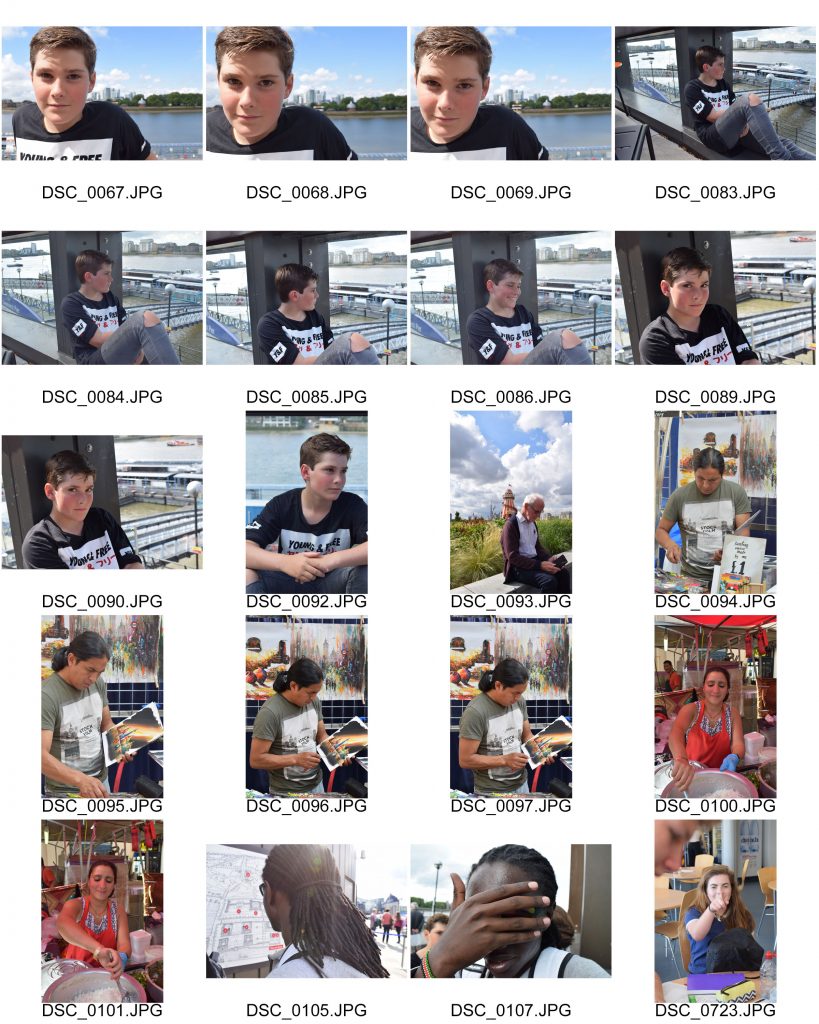
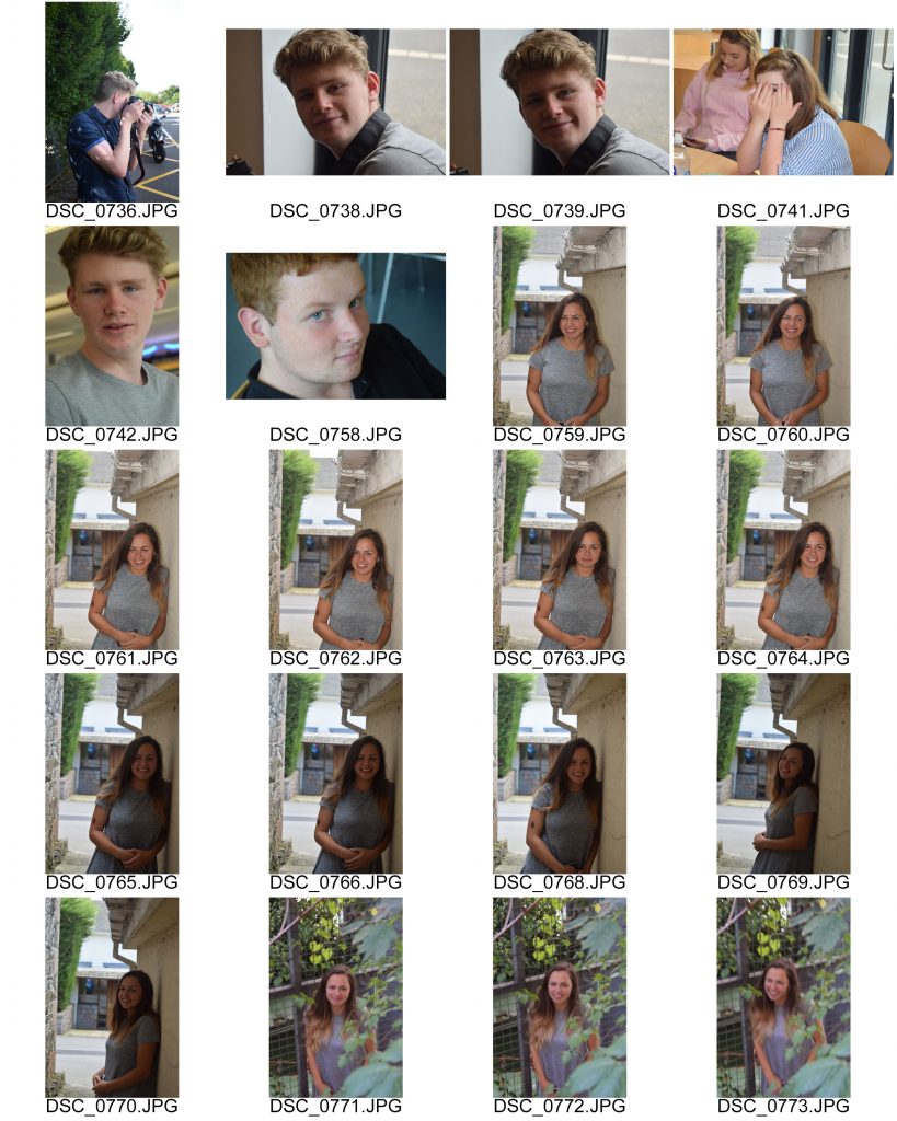
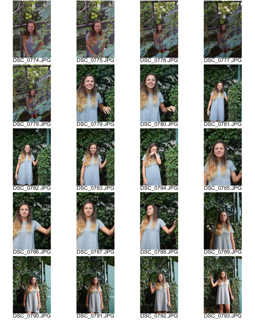
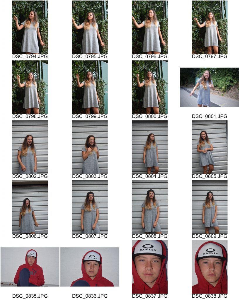
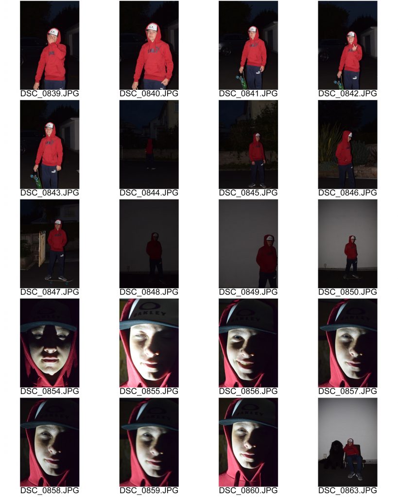
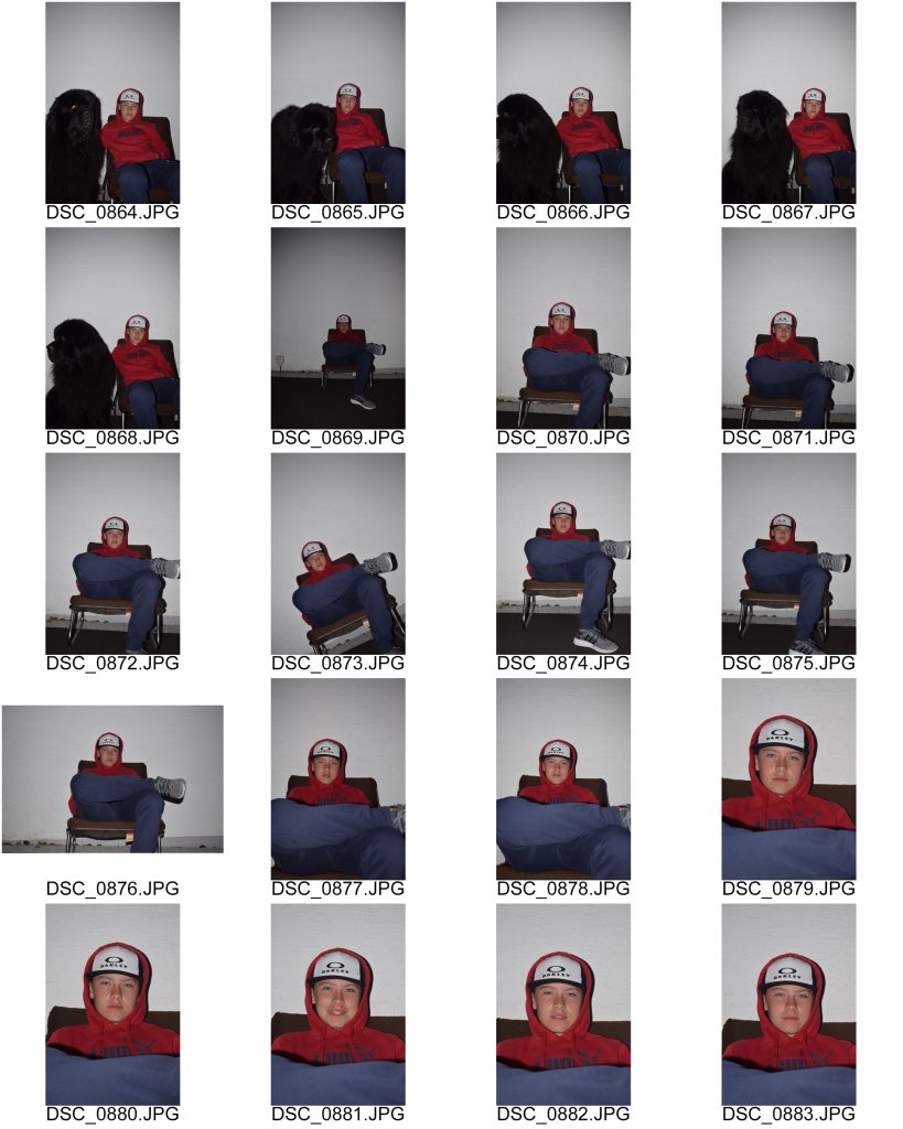
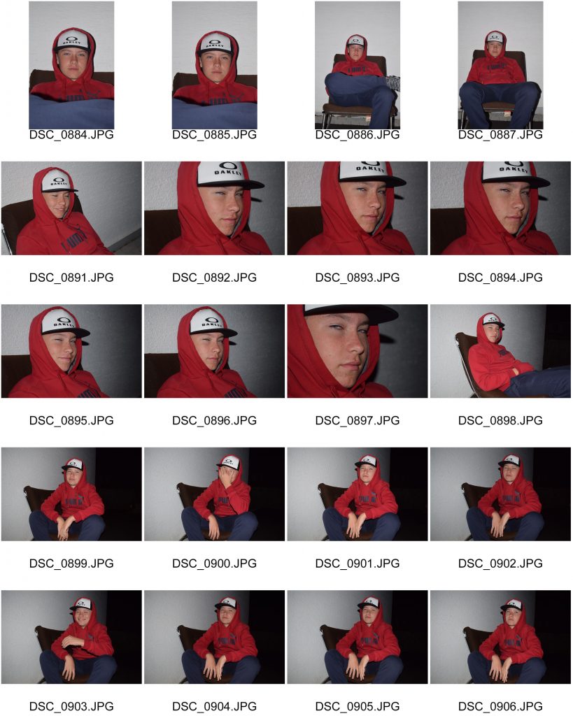
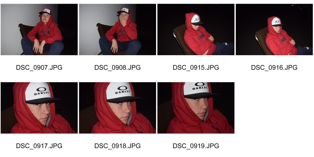
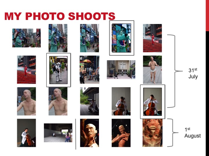
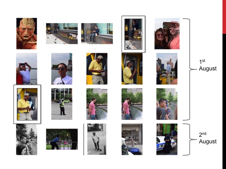
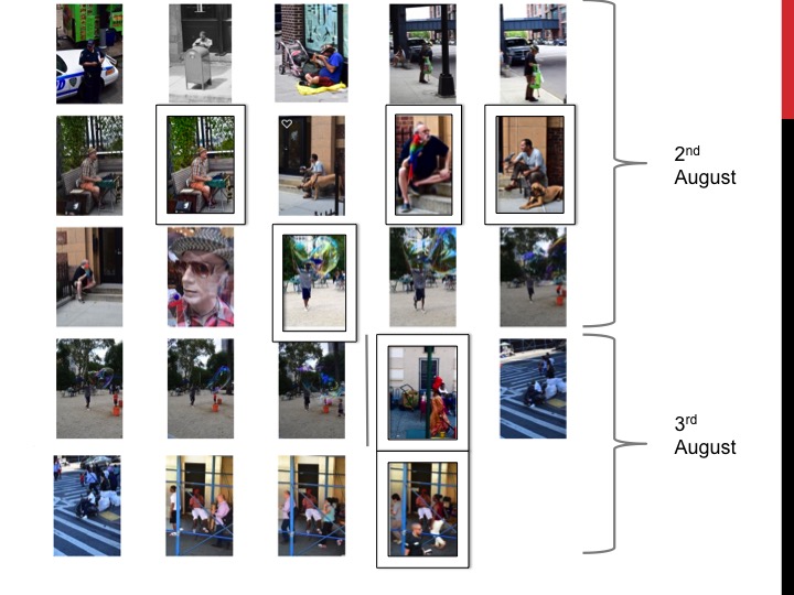
Here I have created a contact sheet. A contact sheet is a piece of photographic paper where the photos you have taken are displayed and dated. These photos allow you to see each photo clearly, this allows you to select the best ones easily. I also have taken the same photo but put a  different white balance setting on them each time.

colour-temperature-chart

This is the Kelvin scale. The Kelvin scale is a scale that measures temperature. This is used a lot in white balance. When light is exposed to harsh white light it is seen as blue where as if it exposed to indoor light that is as harsh it is seen as orange going onto red.  The Kelvin scale puts these things in a range that can be measured.

3 step analysis of a photograph (emotional response)

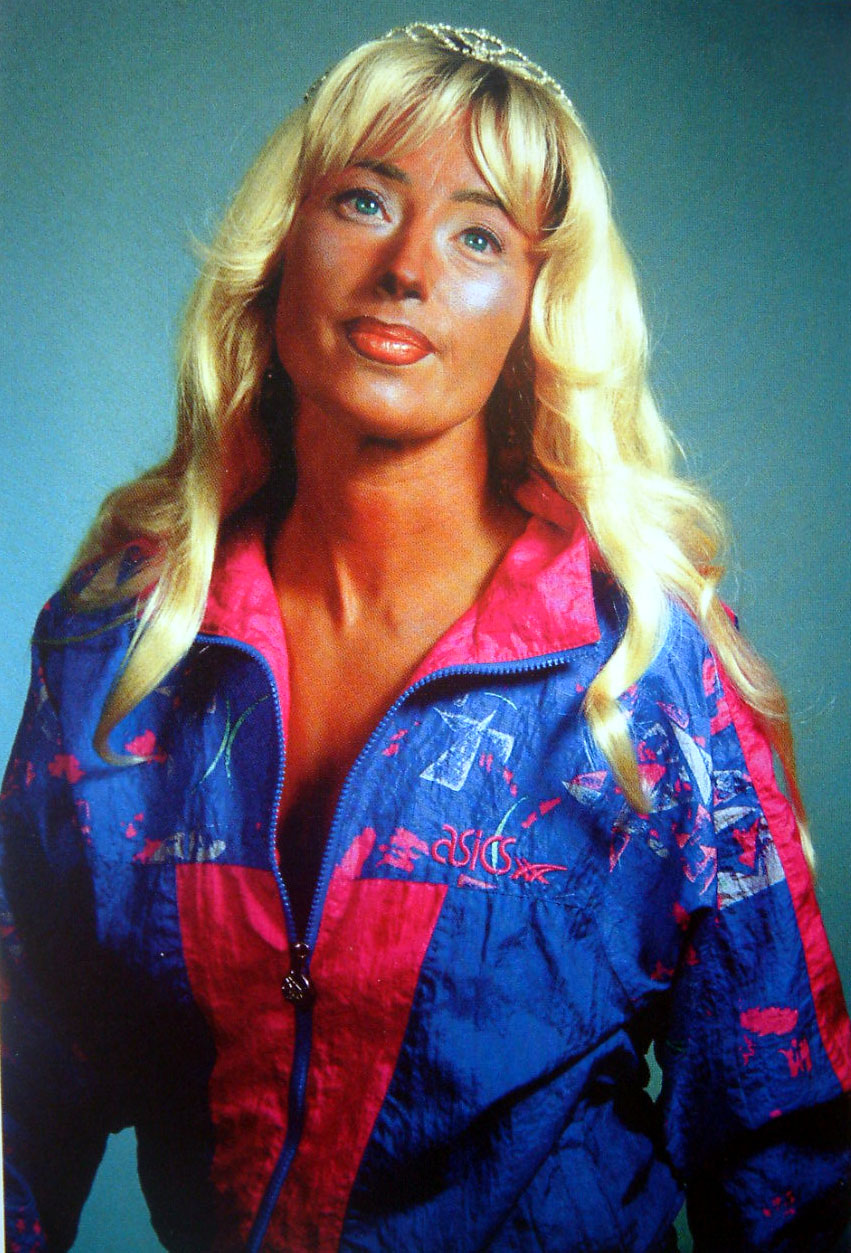
cindy-sherman
Cindy Sherman

I like this photo as it looks very artificial but for a reason. The way she is positioned and the exaggerated colors make her look almost like a doll figure.  When looking at her eyes, they are glazed over and looks as if there is no life in her. I think this picture represents the materialistic things that have taken over her life like the makeup and the crown she is wearing. She is more caring for the way she looks and the things she has than the way she acts. This is the reason why the colors are so saturated. Surrounded by materialistic things she looks dead.

loretta-lux
Loretta Lux

I do not like this photo as it almost looks like a painting  or a drawing. I also dislike the position she is standing in as it looks awkward and nothing like how a child would stand. It is also too perfect for example her skirt matches the green of the leaves and the background is symmetrical. The perfectness of the photo shows that it is artificial  however unlike the photo by Cindy Sherman it is artificial but I do not see the purpose. The child is not acting like a child.

henri-cartier-bresson
Henri Cartier Bresson

This photo interests me as the man in the picture looks like some kind of war hero with his old fashioned coat,  scarf, haircut and pipe in his mouth. He also looks very serious. I like the long distance blurry background as it gives you an opportunity to see the range in which the picture captures without loosing the focus of the photo (the man with the pipe).  Also the man looks like he is day dreaming even though someone is quiet clearly speaking to him. Maybe he is having a flashback from serving his country.