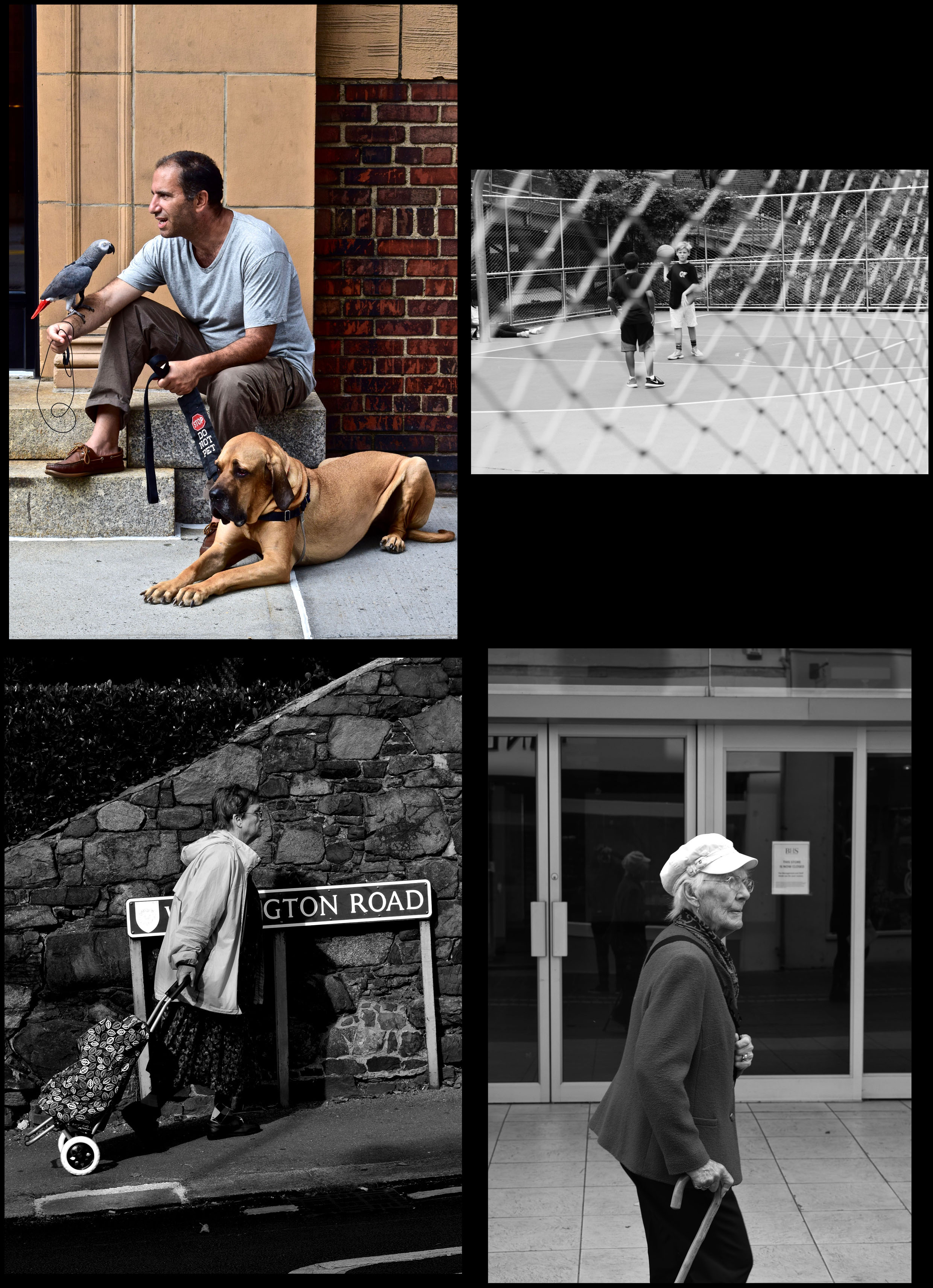
All posts by Peter Le Gal

Filters

Author:
Category:

Best Image- Street Photography

birdman-and-guard-dog-blog

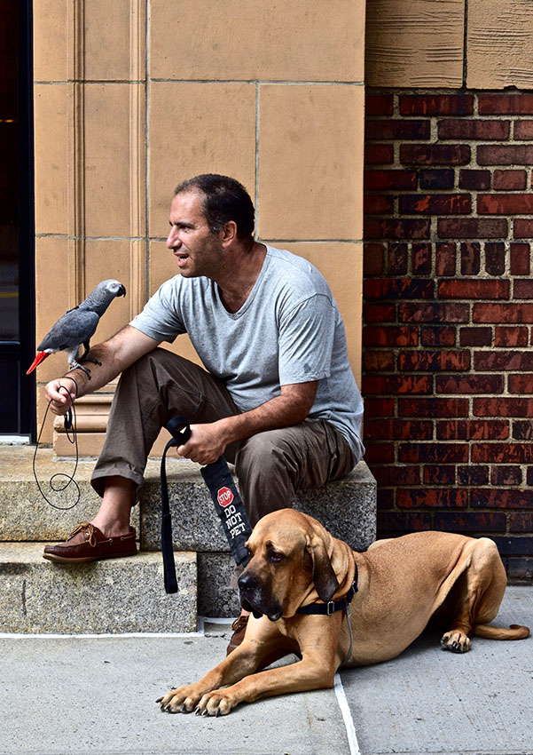
I chose this photo as my favorite because of the pure madness of it. When I first saw this pair I thought it was hilarious as well as ridiculous. The whole casualness of it was the funniest thing. They were sitting there on the stairs outside some apartments, one with a colorful parrot with a impressive a moustache and the other with a bird on his arm and a dog casually talking to each other.Also something that makes this photo special is that I almost didn’t take this photo, as I was afraid of the dog. Usually I’m not afraid of dogs but this dog looked he was going to protect his owner no matter what. However, I am so glad I took this photo, as it is one of my favorite photos I have taken.I like this photo because it shows the loyalty of a dog. The fact that the dog would not rest until he saw me gone showed how loyal he was.

I also like the colors and textures of the picture. The color of the mans grey shirt matches with the color of his bird and the steps. As well as the color of the dogs fur matches with the wall behind his owner. I also like the texture of the dog’s wrinkly skin as well as the gritty and dirty texture of the brick wall. Everything works together perfectly even the bird is facing as a perfect angle for the picture.

I went to New York looking for a strange unique photo and this fits that description perfectly.

Street photography-Best images

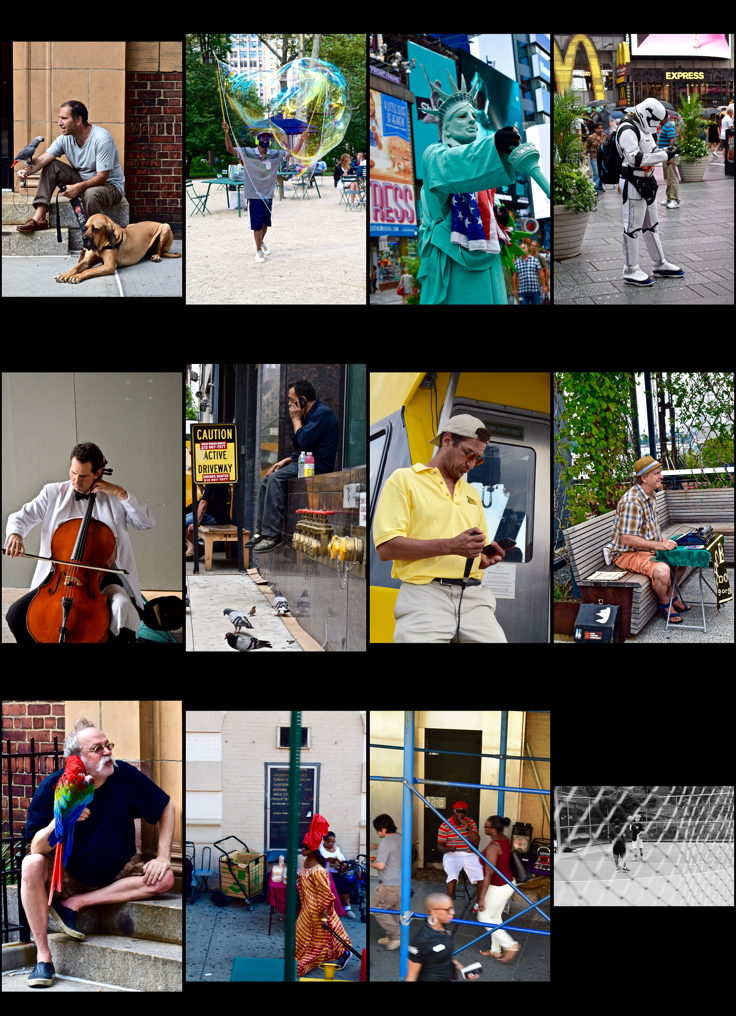
contactsheet-new-york-street-photography-copy

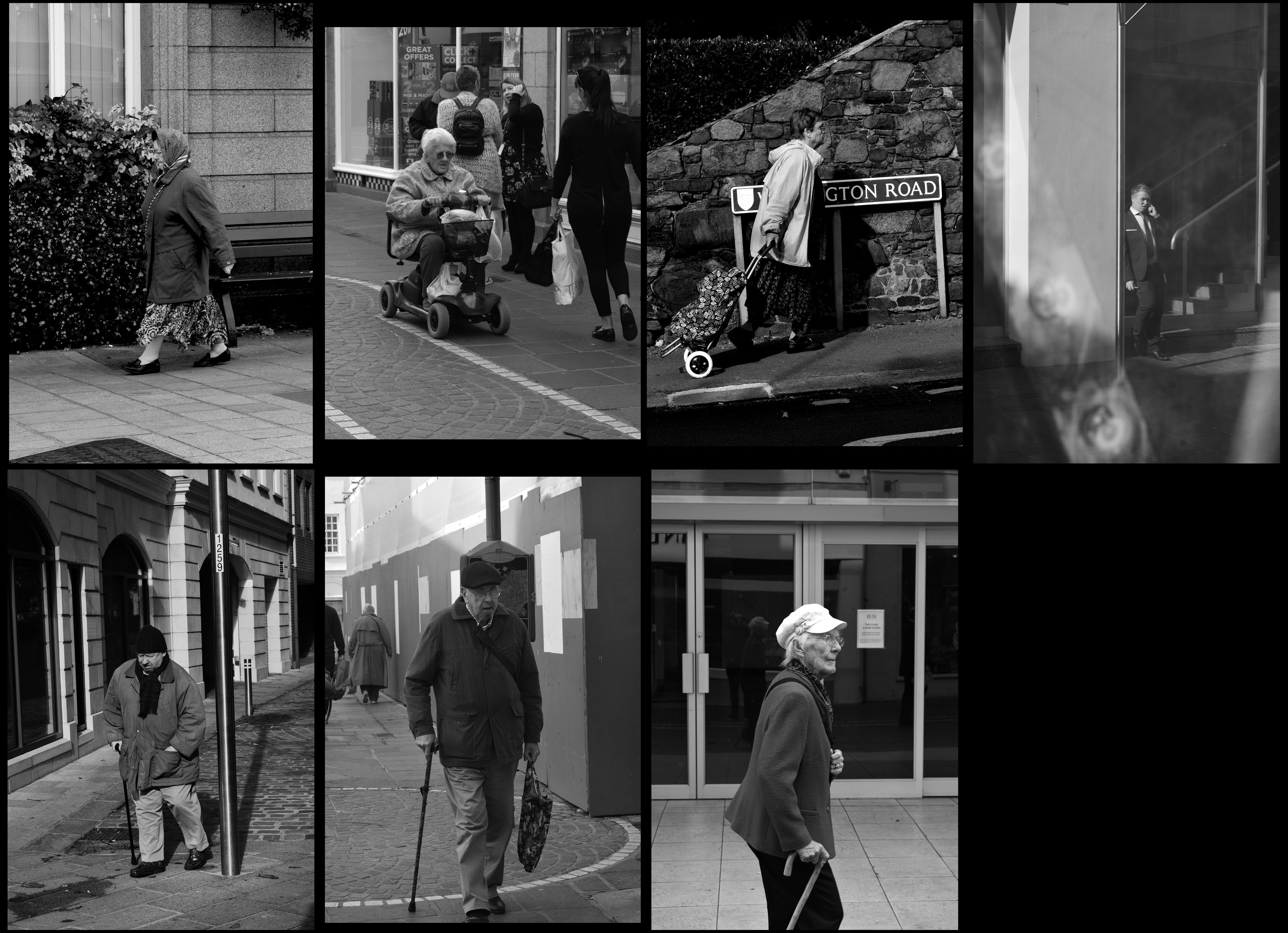
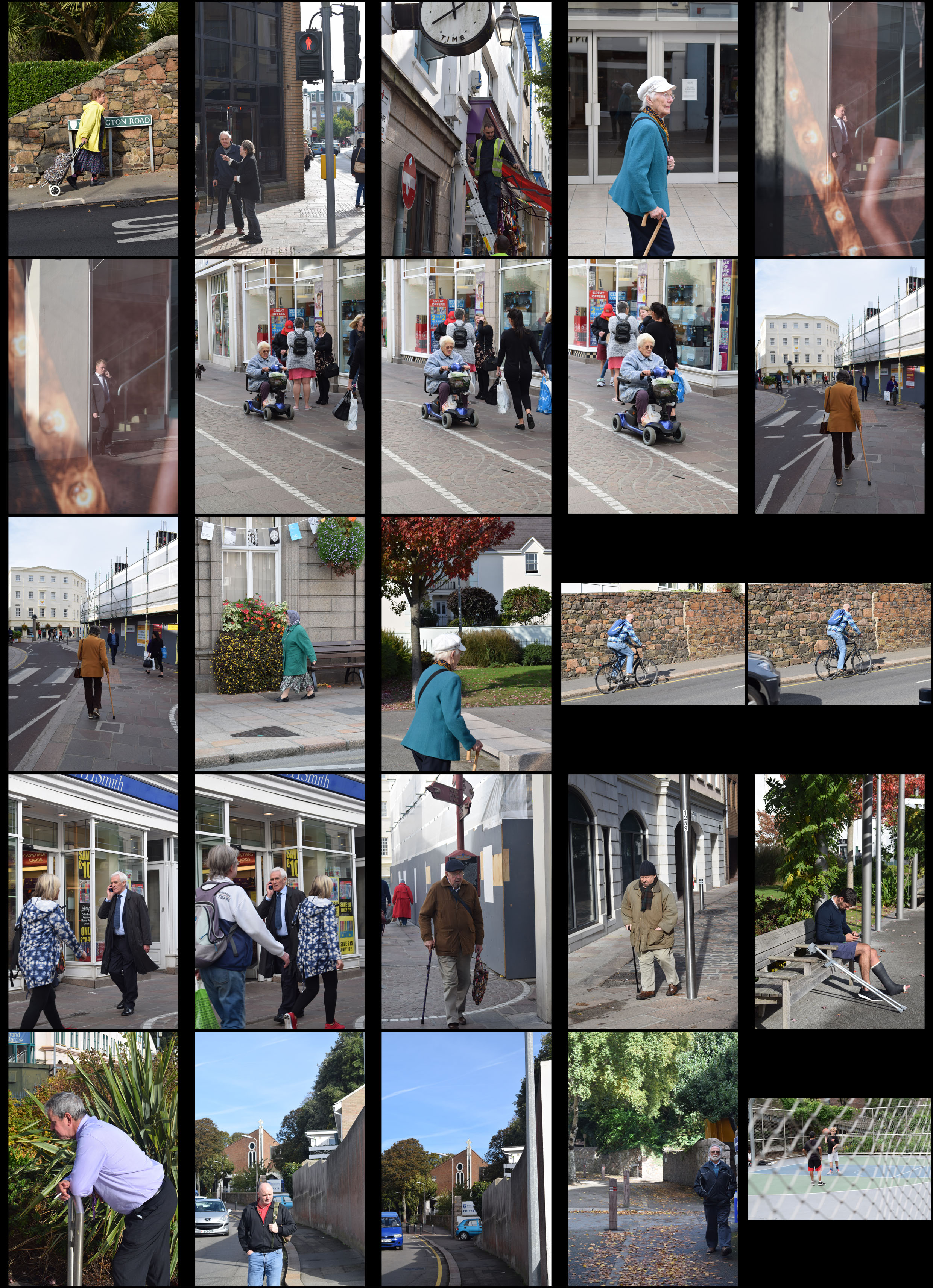
contactsheet-jersey-street-photography-edits

When deciding my favorite photos I decided to split my contact sheets into photos taken in Jersey and photos taken abroad. The first are mainly all in color because of there bright colors I didn’t want to make them black and white. However, as there were no bright colors in the photos I took in Jersey I didn’t want them in color.

When taking photos in Jersey I wanted to mainly focus on old people as I found them more interesting than other people I walked past. I felt like through their posture and the way they are dressed they were telling a story. They lived through a lot and that’s why I found them more interesting.  This is also why I decided to make the photos black and white as these are old people. Photos would have been black and white when they were children so i wanted to reflect that. I also wanted the black and white to focus on every little crease and wrinkle on their face.

The photos above were used in my summer project (apart from the last one). These were taken in NYC, taking photos there was a lot easier as there were interesting people everywhere. These were just a few of them. The colors were vibrant and loud but also industrial and grimy. This is what caught my eye when taking photos. I enjoyed capturing the humor, business but also the loneliness. When editing I increased the saturation and darkened the outlines of the main focus. In many of them I also cropped them to focus on the main subject.

Shutter Speed techniques

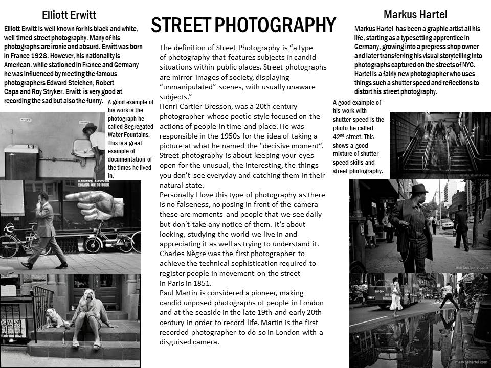
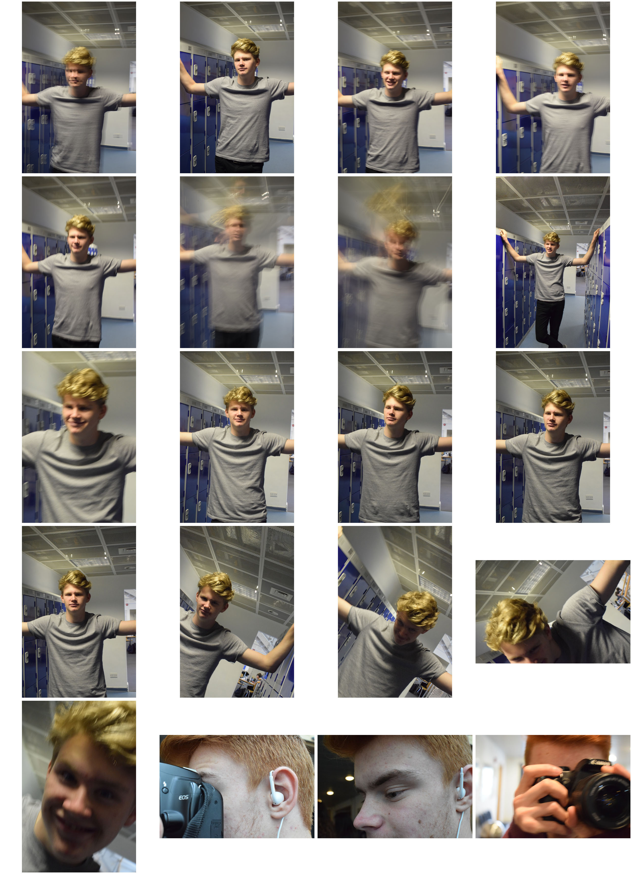
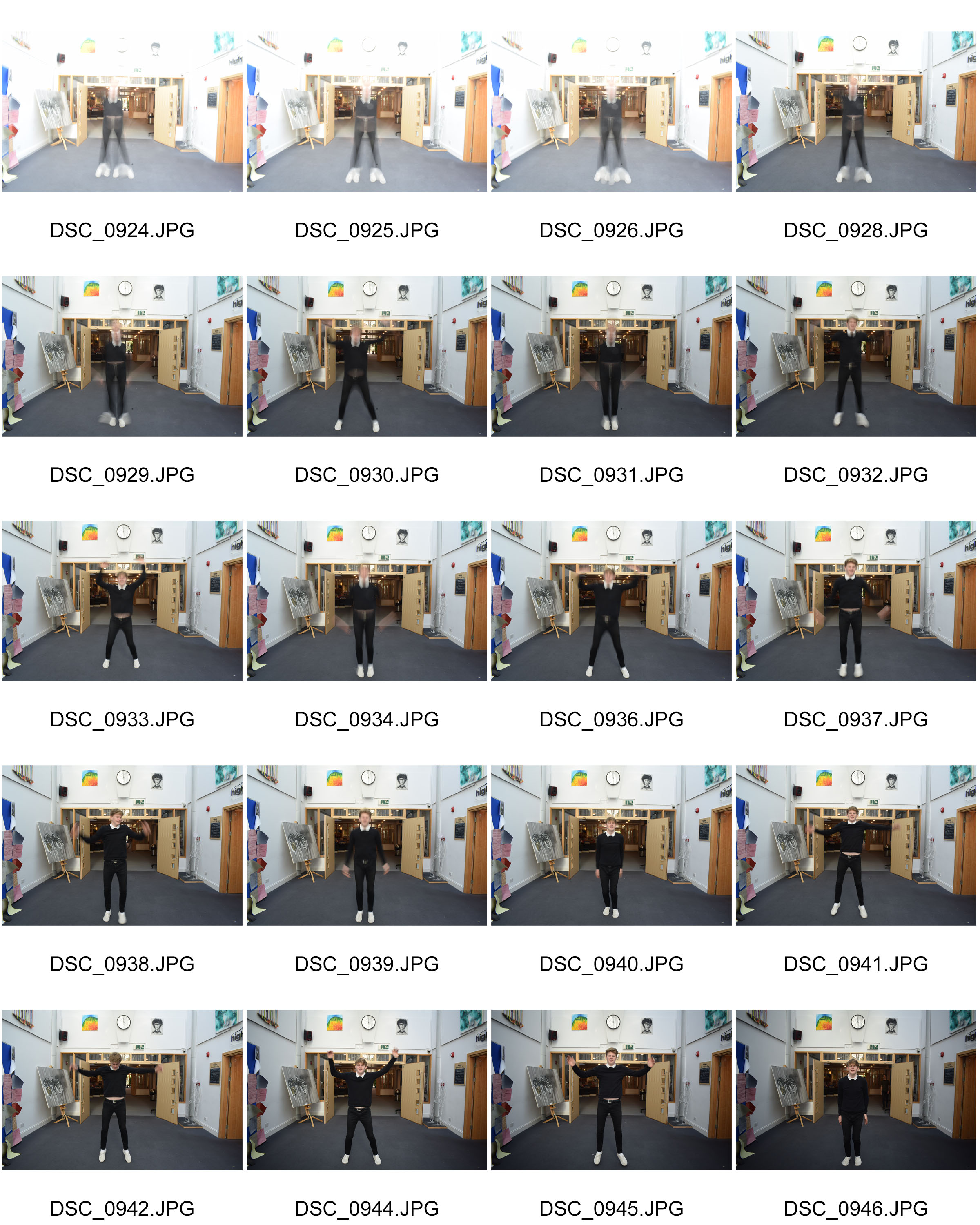
Shutter speed is the unit of measurement which determines how long shutter remains open as the picture is taken. The slower the shutter speed, the longer the exposure time. The shutter speed and aperture together control the total amount of light reaching the sensor. Zoom burst is a technique in photography. Using the technique involves zooming while the shutter is open with a relatively slow shutter speed, generally below 1/60th of a second.  Panning is very simple, just set shutter speed to a high setting 1/2000 of a second, hold your camera and pan along with moving subject.


Final Images- Environmental Portraits

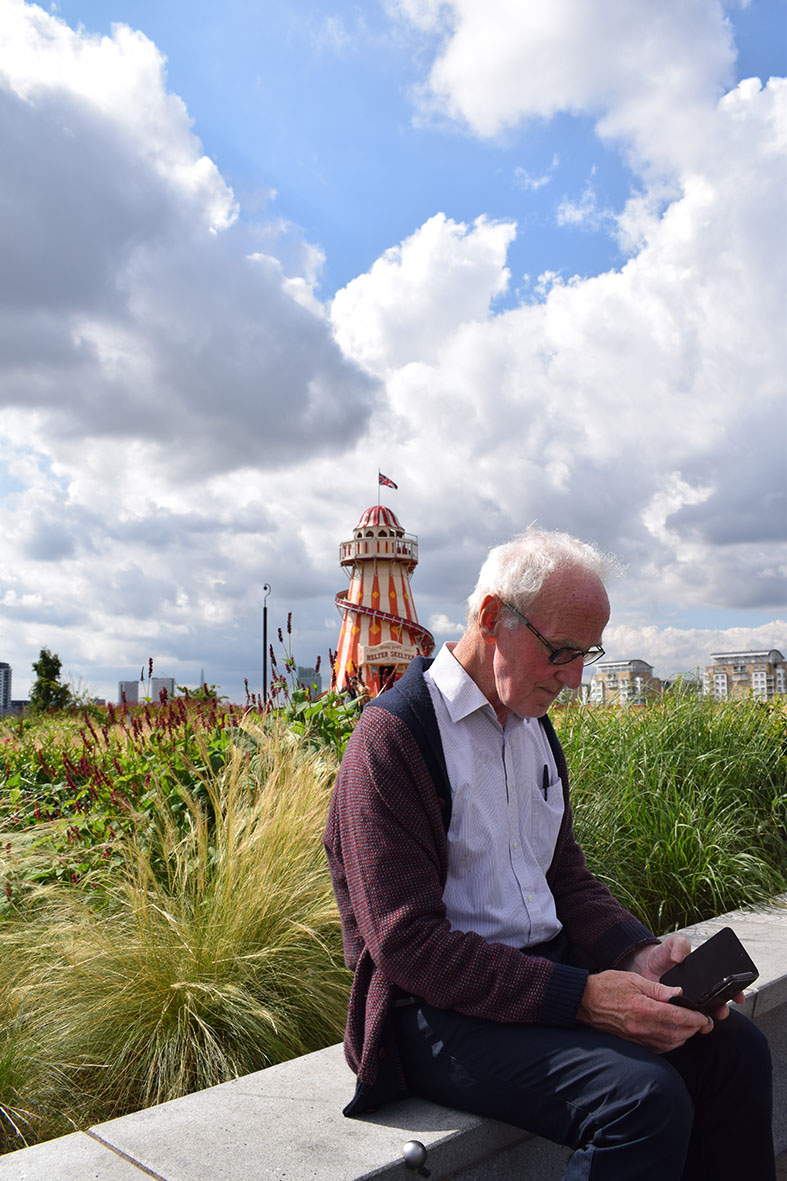
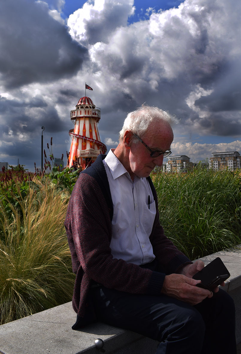
Here I have taken a picture of an old man sitting on a wall with a Helter Skelter behind him. When editing I cropped the photo so only the important objects would be in the photo. I then increased the contrast and brightness on the image. When I looked at the image I really wanted the clouds to look more dramatic and heavy.dodge-tool So I used the burn tool to bring out the darkest parts of the clouds. However, the Helter Skelter looked very dark as well as the mans face. So to add a little more light to certain parts of the picture I used the dodge tool. I also used this tool on some of the edges of the clouds to give them some light. I did no other editing as I did not want to change the picture too much.
 

Compare & Contrast

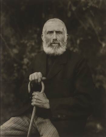
When I compare my picture (left) to August Sanders picture (right) I don’t see many similarities. The similarities I do see are that they are both elderly men who have lived many years and have seen a lot. They are both dressed fairly smartly wearing clothes that are fairly dark and holding an object that means a lot them. They are both in the center of the image as well as sitting at an angle.

However, when I contrast my picture with August Sander’s I see many differences. First of all the man in my picture isn’t looking at the camera instead the man in my picture is looking his phone. Also in August Sanders picture the background isn’t that significant and is completely out of focus. Where as when you look at my picture you see the green from the plants, the bright reds and whites from the Helter Skelter as well as the deep dark shadows from thick grey clouds with a hint on blue from the sky. Another contrast is that there isn’t much light shining on the mans face in my picture where as August Sanders picture there is plenty of light on the mans face. The differences in these photos are fairly big.

However, I think this represents the change in times. The fact that these men are about the same age in these photos you can really see how times have changed from 1910 to modern day . The man in my photo can’t even look at the camera as he is so distracted by his phone. This is probably because he found the situation awkward. In world today we can often use our devices and technology as an escape from reality. When you look at August Sanders picture he is looking straight at the camera, you can see the emotion in his eyes. His photo has so much formality to it the fact that the man is staring straight at the camera, wearing smart clothes and it’s in black and white clearly shows this. This in itself shows the difference between times.

Even though its not ideal that the man in my picture doesn’t have any light on his face I think it could represent how we can be so controlled by technology that it can almost feel like a cloud is over us and maybe once and while if we just looked up from our phones and devices  we would feel better about ourselves and more connected with the world. We use technology so much to escape the world we live in, that sometimes we miss the beauty and experiences that are in it. That’s what photography is about noticing the world we live from our own eyes and capturing it. Whether it be the good, the bad, the beautiful, the ugly, the strange, the normal.