
All posts by Peter Le Gal
Filters
Best photos-analysis
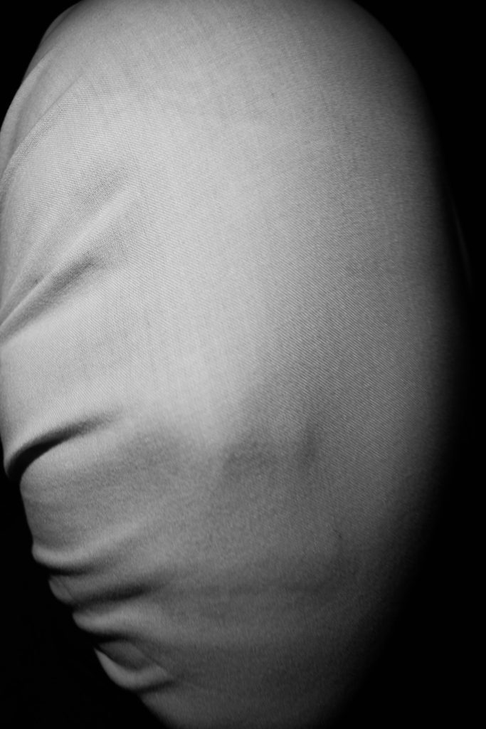
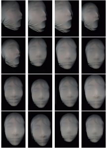
Here I have the same photo that has been edited differently. The photo on the left I have dramatically edited where as the photo on the right I have subtly edited it. I did this to see just two of the routes I could have taken. For the photo on the left I turned the original picture black and white and increased the contrast. I then used the burn tool to show more of the subjects face through the fabric. I went around the face using the burn tool where there would be the most shadows. I did this so it would look more like his face was forcing his head through the fabric, like he was trying to escape. For the right photo I only cropped the photo to make the subjects face more centered then turned it black and white and increased the contrast. I did this as I wanted to see if I had over edited on the previous photo. I also wanted it to look more calmer and sharper. 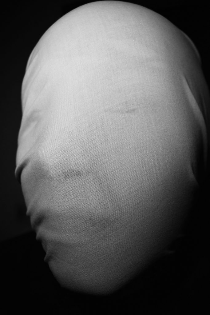 Here I took the picture at a side angle. The light is coming from above the subject but is still facing the front of the subject. When editing I lightly used the burn tool to make some of the the lines on the face more visible.
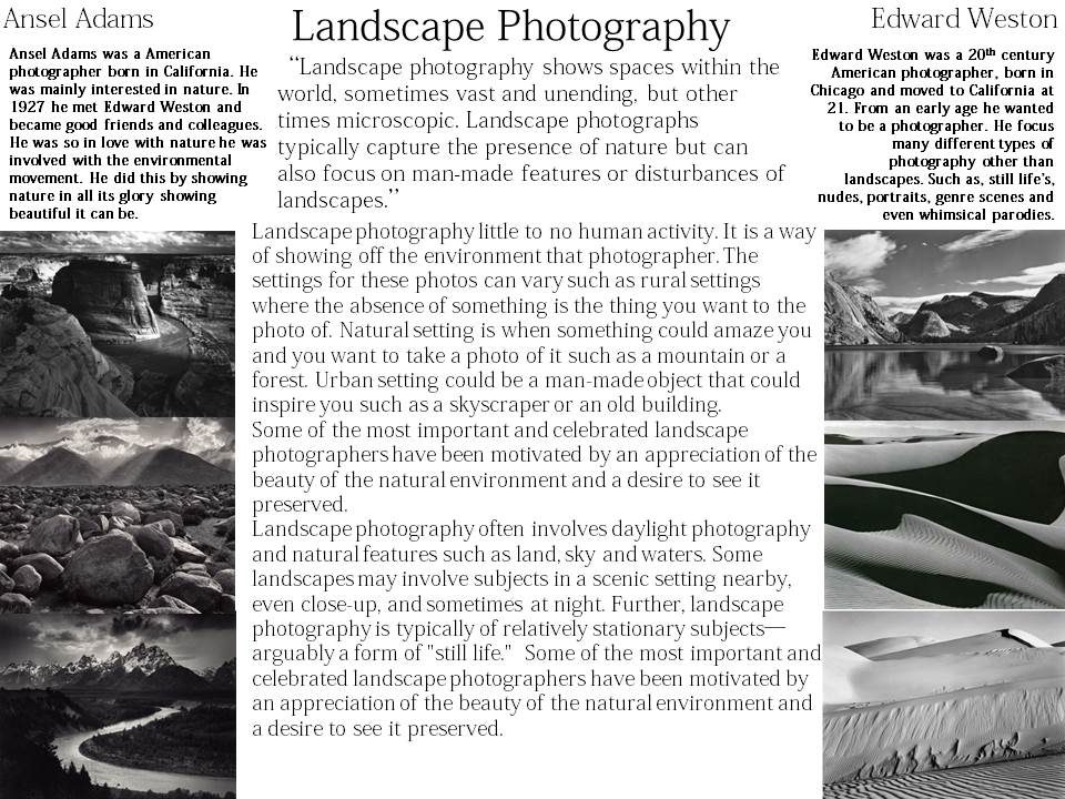
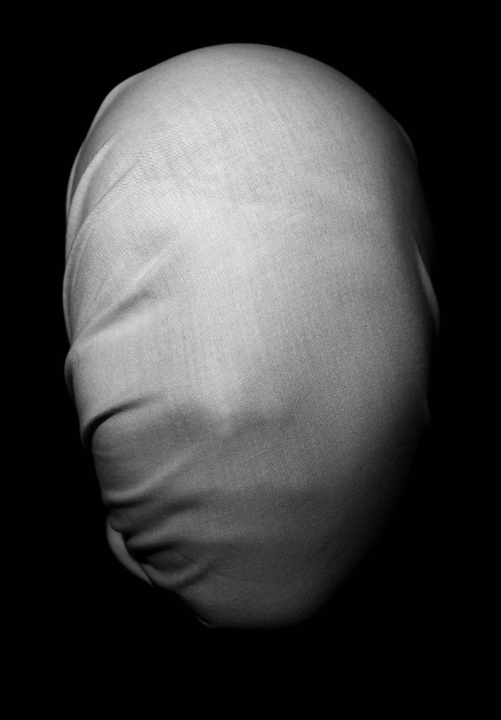
This is a close up version of other pictures that have been taken.
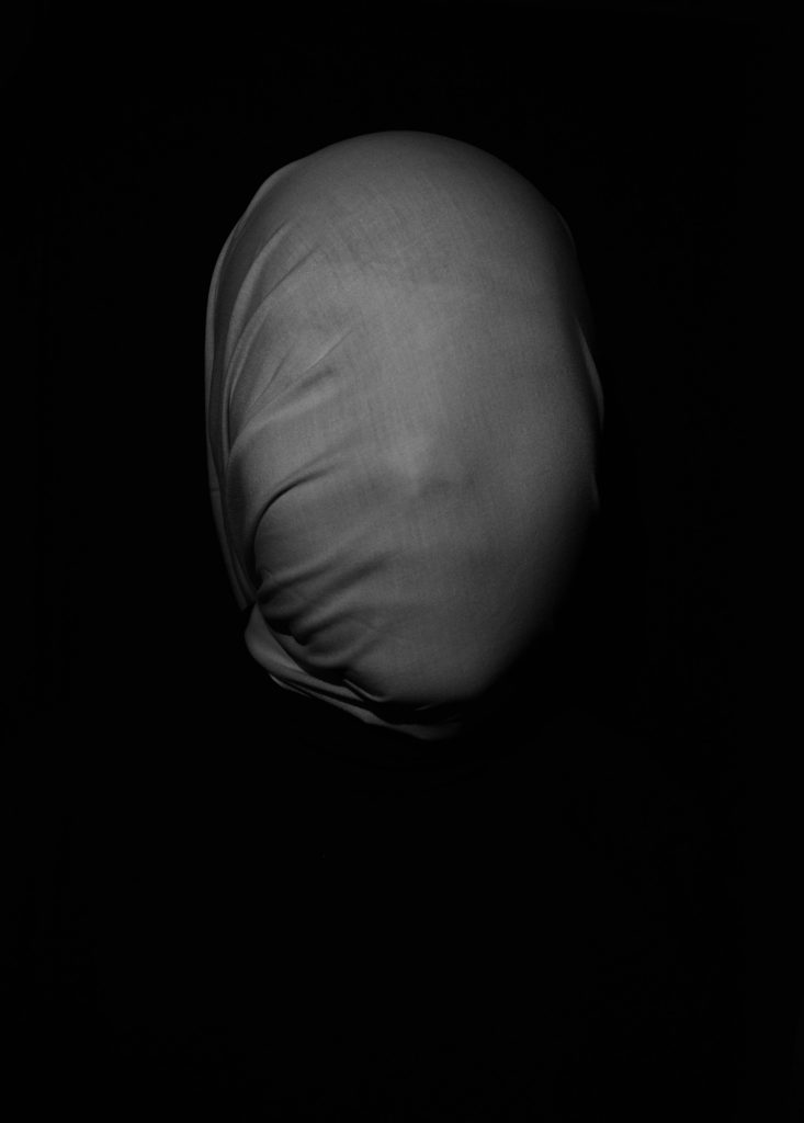
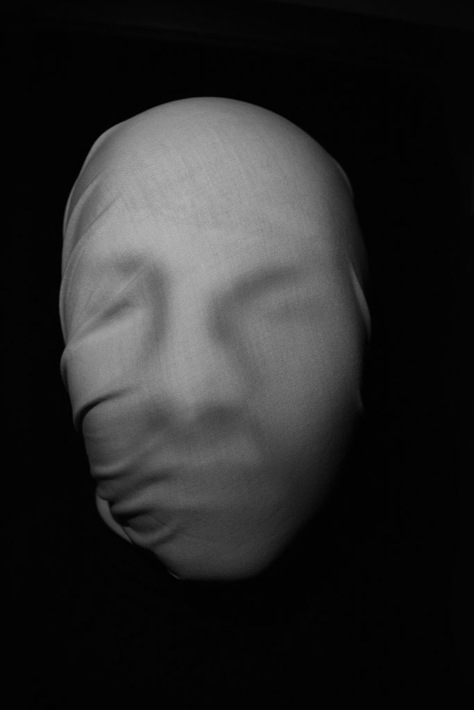
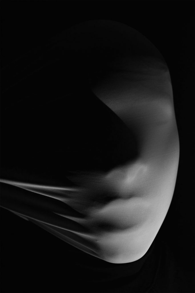
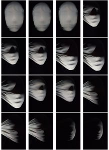
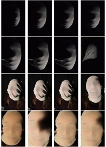
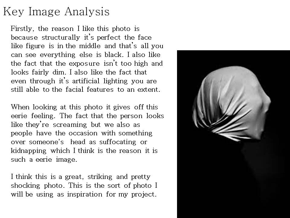
Here I have done the same sort of picture but further away and lower lighting, I did this to show a clear resemblance to the original photo by Andreas Poupoutsis. When taking the photo I dimmed the lighting and had someone hold the sheet stretched over the subjects head. Just like the original I wanted to still be able to make out some of the subjects facial features. When editing I made it black and white and increased the contrast so you could only see the head. When looking at this photo I really do think the distance helps as it gives this sense on isolation and darkness. That fact that anything could be hiding in the darkness and you wouldn’t know. I also like the way that the head is practically at the center of the photo. The creases on the sheet look like they are consuming his identity trying to make him into just another blank face.
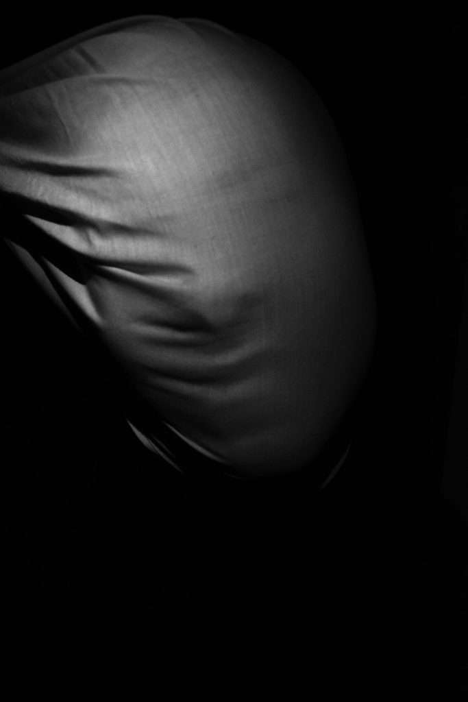
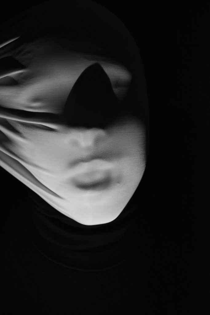
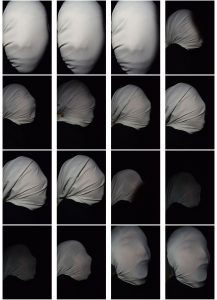
In this photo the sheet has been lifted and is being pulled upwards instead of downwards like previous photos. When taking the photo I didn’t change the direction of the lighting much from the previous photos however this time it was a lot dimmer which caused me to have to increase the exposure when editing. When taking this photo I wanted it to look like the subject was trying to pull against the sheet and escape. This came across well in the photo as it looked suffocating, almost as if he was being hung or strangled. This again is showing how identity can be taking away from you with force. In the west side of the world this is often seen as an emotional or financial form rather than physical. With these photos I wanted to show this emotional battle in physical form.
In these next photos I have changed the fabric to a more elasticated material. I did this to get a more smooth feel, a less sharp and harsh feel. This material showed more of the face/identity. This shows how the more you be yourself the calmer you are as you aren’t pretending to be someone you’re not. I also like this photo as it looks like a thin mist over the subjects face.
Here I have taken a close up photo of the previous photo. I have also placed the light underneath the subject to show more of the sheet being stretched.
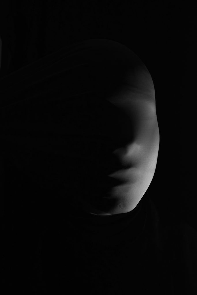
This photo is a lot more dramatic to the previous two and is following the example of the previous set of photos. This photo is more violent than the other two as it looks like the subject is suffocating. It almost looks ghostly. However, there is a shadow made by his nose that ruins the photo. When editing the photo I made it black and white and increased the contrast as well as using the burn tool to add more shadows around the subjects mouth. I think it is a shame because this would be a great photo if it wasn’t for the shadow.
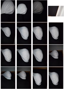
Identity shoot- Best photos
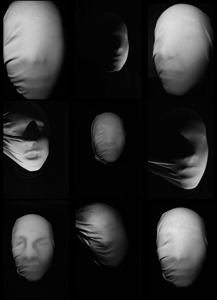
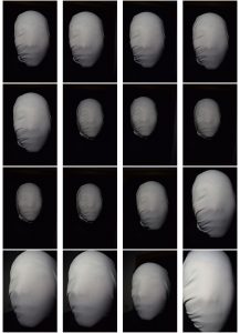
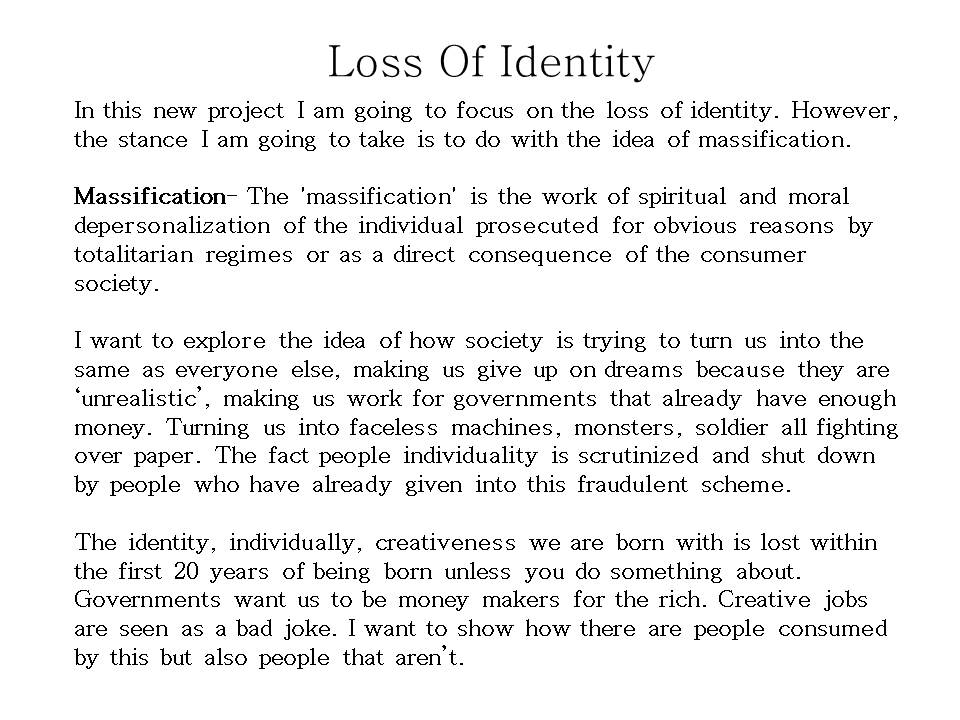
Here are my best photos out from my identity project. When taking these photos I wanted to explore the loss of identity. I did this by placing a white sheet over the subjects head. Doing this took away the details and different marks on the persons face. It only showed the facial features everyone has such as the nose and mouth. By placing a sheet over the subjects head it allowed me to change the shape of the subjects head and make it distorted and different. I wanted the portraits to look different but show elements of similarity as I wanted to explore the idea of massification and take inspiration from the artist Zhang Linhai.
When taking the photos I wanted the creepy and eerie feeling you get just like when you are looking at my chosen artists work (Andreas Poupoutsis). I used two different fabrics. The first was a cotton like fabric that gave it a more harsh flat appearance. The second was a more elasticated material that gave the photo a soft appearance. I also used different lighting to covey different moods and make different shadows. The harsh bright light to show vulnerability, the dimmed lighting to show a more sinister approach and some chiaroscuro lighting to show a more calmer tone.
When editing I made the photos black and white as I wanted the shadows and creases in the sheet to really be shown. In some cases I also used the burn to add more shadows to the face and give it more facial shapes on the picture. On every photo I increased the contrast, that way you could see more white and blacks rather than just grey’s. On the the dimmed lighting ones I slightly increased the exposure, this allowed me to see more of the subject without ruining the photo.
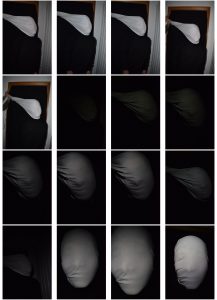
Identity Photo shoot- Contact sheets
Chosen Photographer-Identity
Artist study
Mood Board- Identity
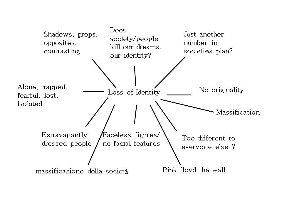
Mind map- Identity
Identity Introduction
Rankin- Best Photos Analysis
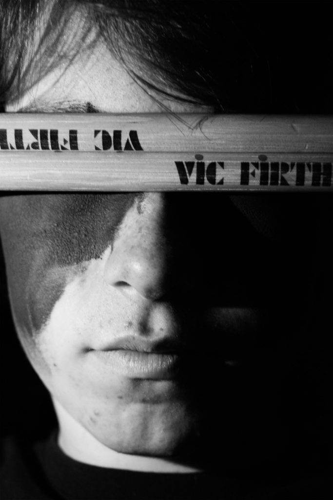
Here I wanted to use chiaroscuro lighting I did this by using the torch from my phone and held it up next to his face as I took the picture with the other hand. I also used the drum sticks as a sort of blindfold this covered his eyes. On this picture I wanted to focus on the phrase “The eyes are a window to the soul”. This photo perfectly shows my brothers personality as it shows that sometimes my brother using drumming as a barrier to talk or to talk to people. A barrier to talk about the serious stuff and doesn’t always let people see his true self but instead his talent. When editing this photo I wanted to make it black and white as I thought it would look more striking. I also increased the contrast a decreased the brightness slightly.
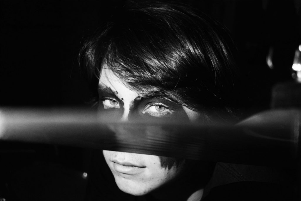
In this photo I wanted to cut his face in half using the symbol of the drum kit but also make it look like he’s hiding behind exploring the same idea as my previous photo. When editing this photo I made it black and white and increased the contrast as well as the brightness. I like this photo because it feels dramatic, it feels like he is staring into you not at you. It really has the eerie feeling I wanted it too have with the seriousness in his eyes and the dark setting behind him.
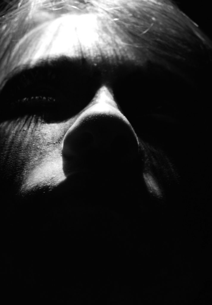
Here I used over head lighting to make this intimidating feel to the photo. I chose to make it black and white because gave the dramatic feel I wanted it to. When editing the photo I wanted only part of his face to by shown so did this by turning it black and white and increasing the contrast dramatically. This also picked up on the shadows made with his eye lashes and enhanced them.