All posts by Peter Le Gal
Filters
NYC Urban landscape/Topographic/Abstract shoot

When I took this photo I didn’t expect America would in the state it is now. With the corrupt in power America has become a divided nation. I think this represents that. The way the flag has a clear crease through the middle shows a divide representing the divide America is facing at this time. I have also edited the saturation of the picture to make it dimmer this represents the dark times America are going though. I also think the flag in the foreground juxtaposes to the picture in the background. In the background is just a part of the New York City skyline. This includes the World Trade Center, this is where the Twin Towers used to stand. The tragedy that involved those towers was horrific however America was united trying to help one other, although it was this terrible thing America couldn’t have been anymore united. This is a complete contrast to what we see today with the country divided due the President elect and I think the flag represents that.
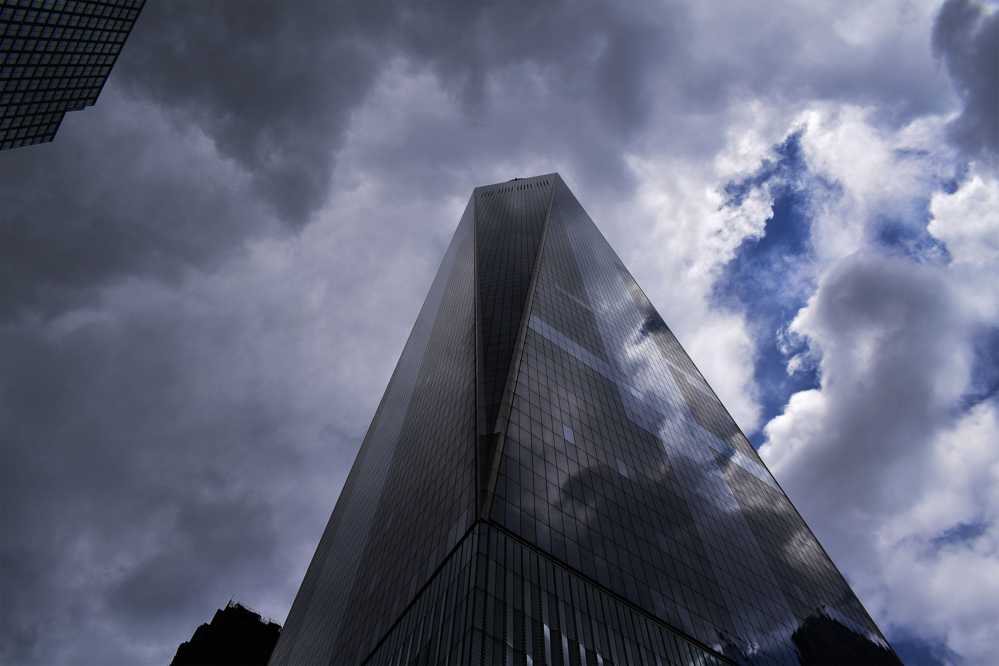
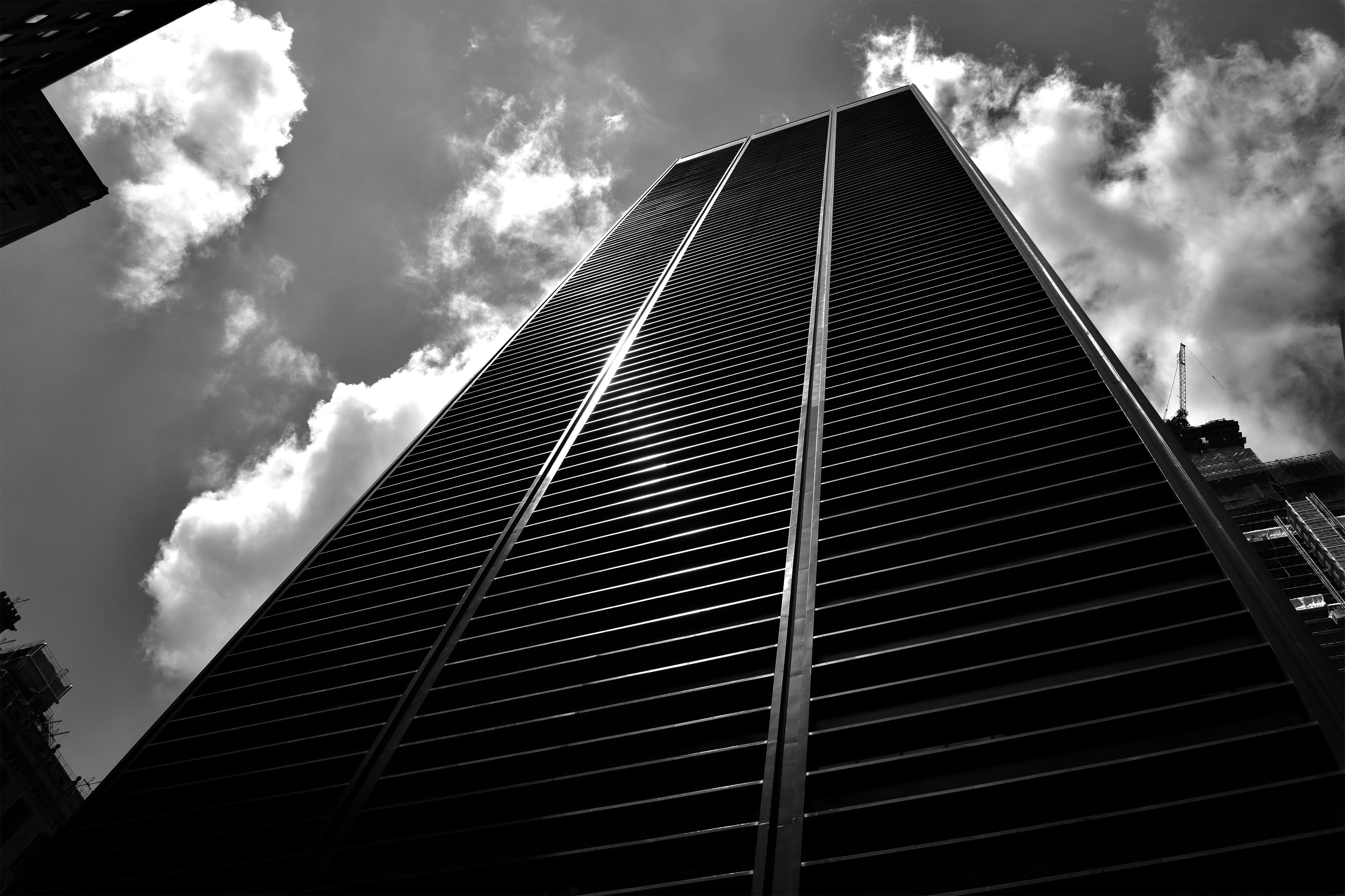
For these two pictures I really wanted to show the towering nature of these buildings and how these buildings almost look like they looking down on you. I also wanted to show some of the beautiful designs of these builds whether is be clear reflective glass reflecting the dramatic clouds or building at the bottom with the perfect straight lines leading to the top of the building.

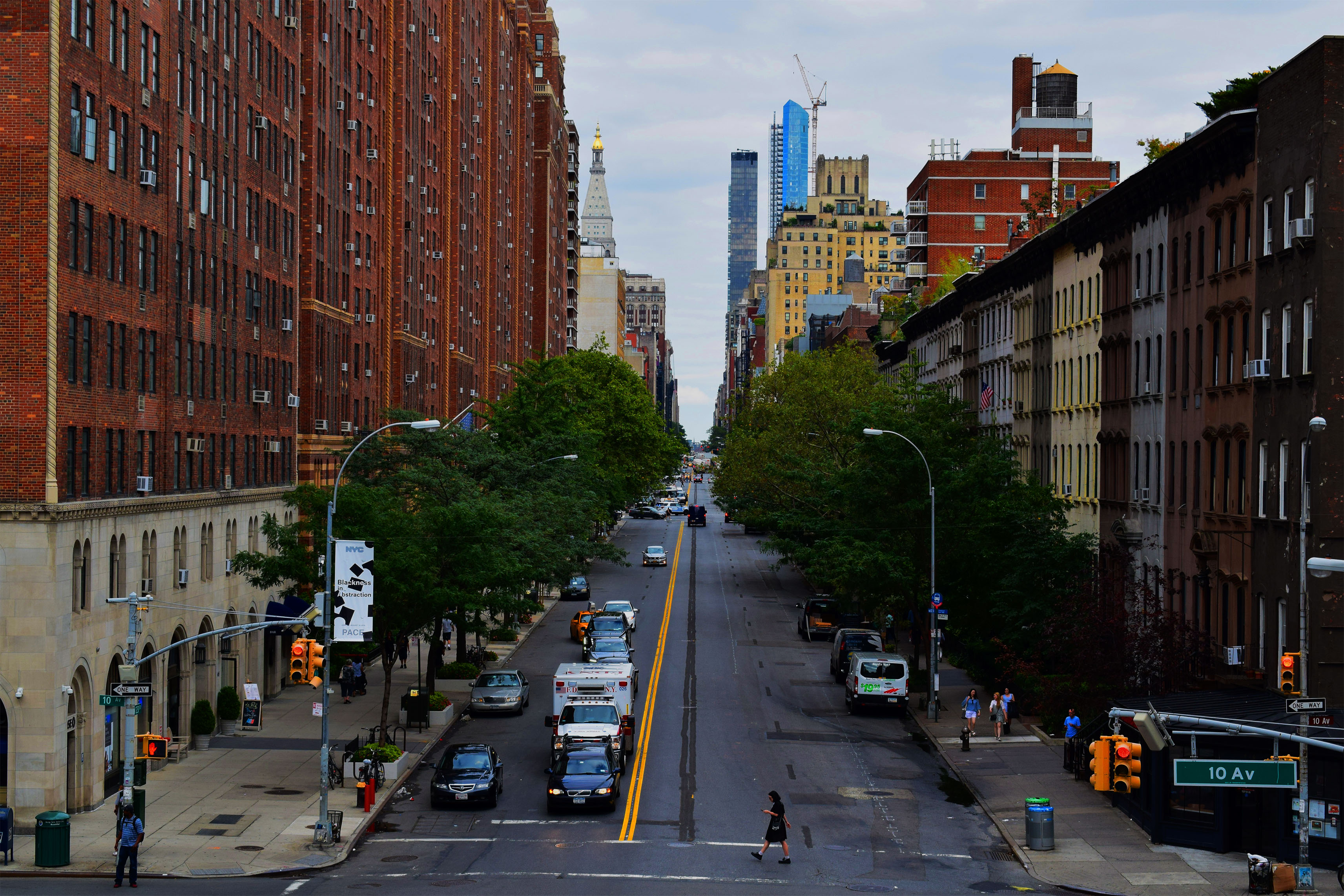
In these pictures I wanted to show the beautiful symmetry of the buildings and streets of the city. In the top picture I wanted to show off the busyness of New York with the traffic moving in the foreground. People move constantly in this city yet these massive buildings stay the same, still, constant, always there for the people to move around. To try and convey this message I even took the picture slightly tilted. The bottom picture I wanted to show the opposite of how this city can also be quite calm and tranquil however still showing symmetry. In this picture there is no sense of rush everyone is calm in the photo even the Ambulance is waiting in traffic. The beauty is also shown with the green trees leading down the street as well as the road lines leading down the street.

In this photo I wanted to show a version of my topographies. In this picture I liked the color of poster against the dull grimy wall.

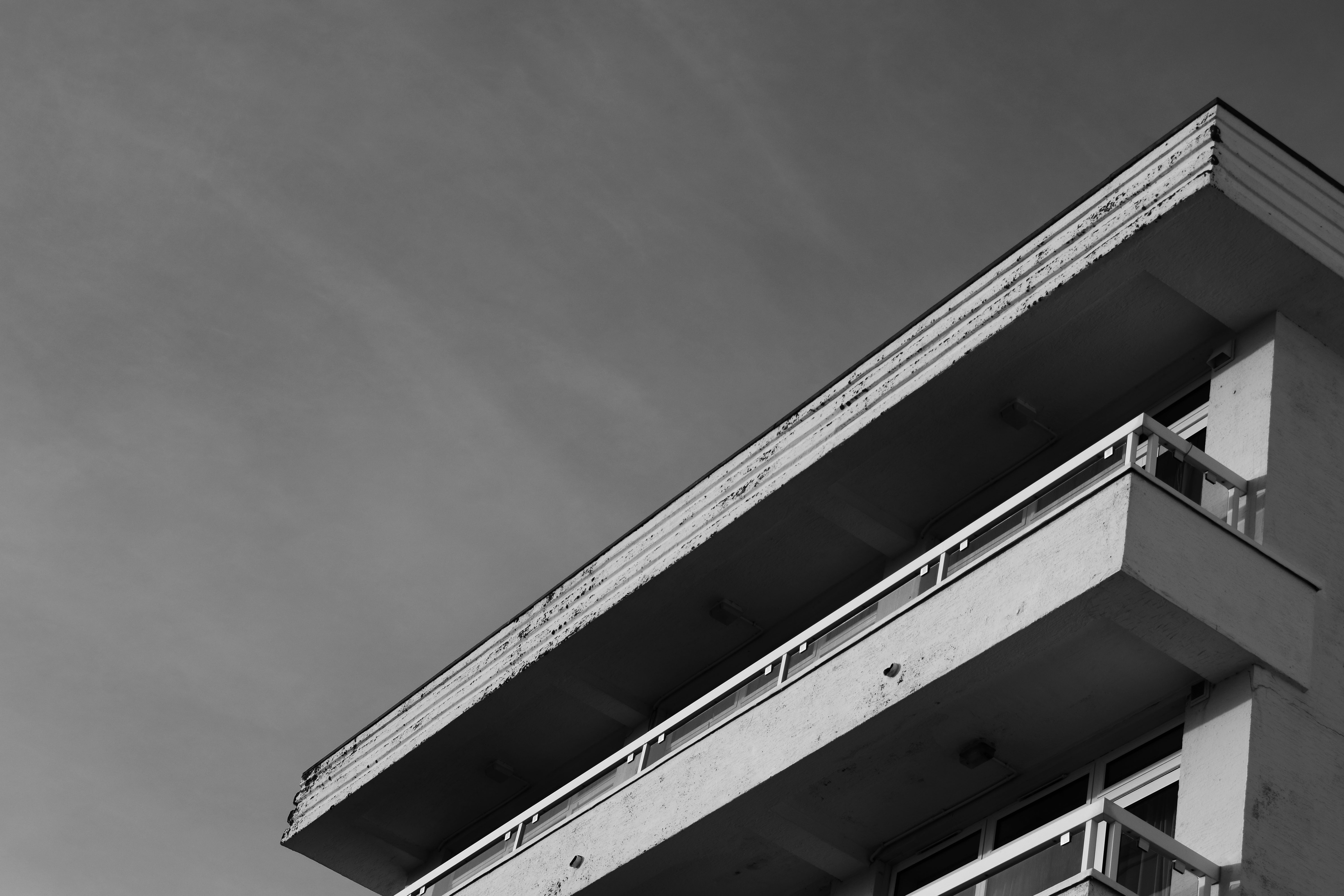
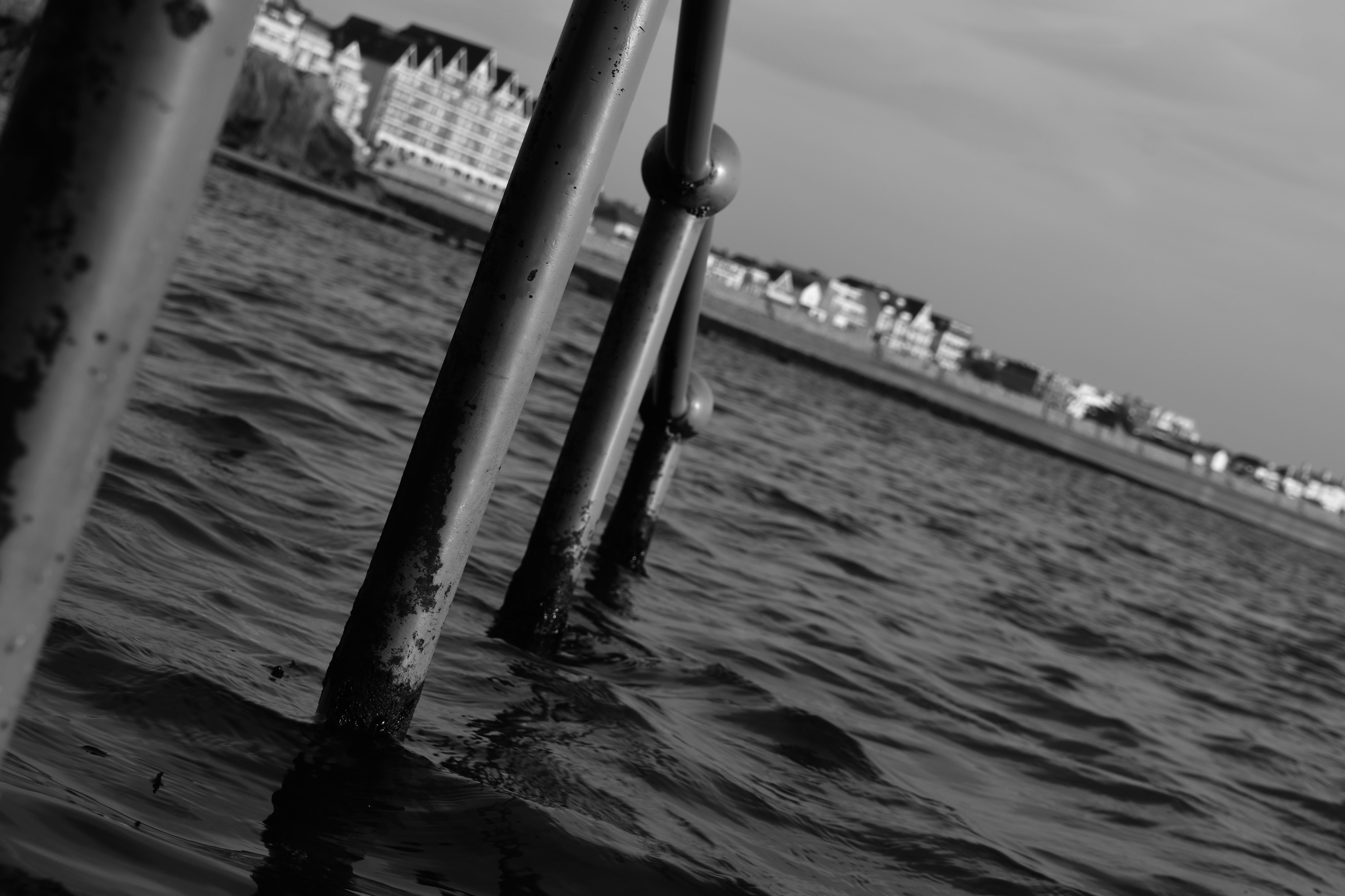
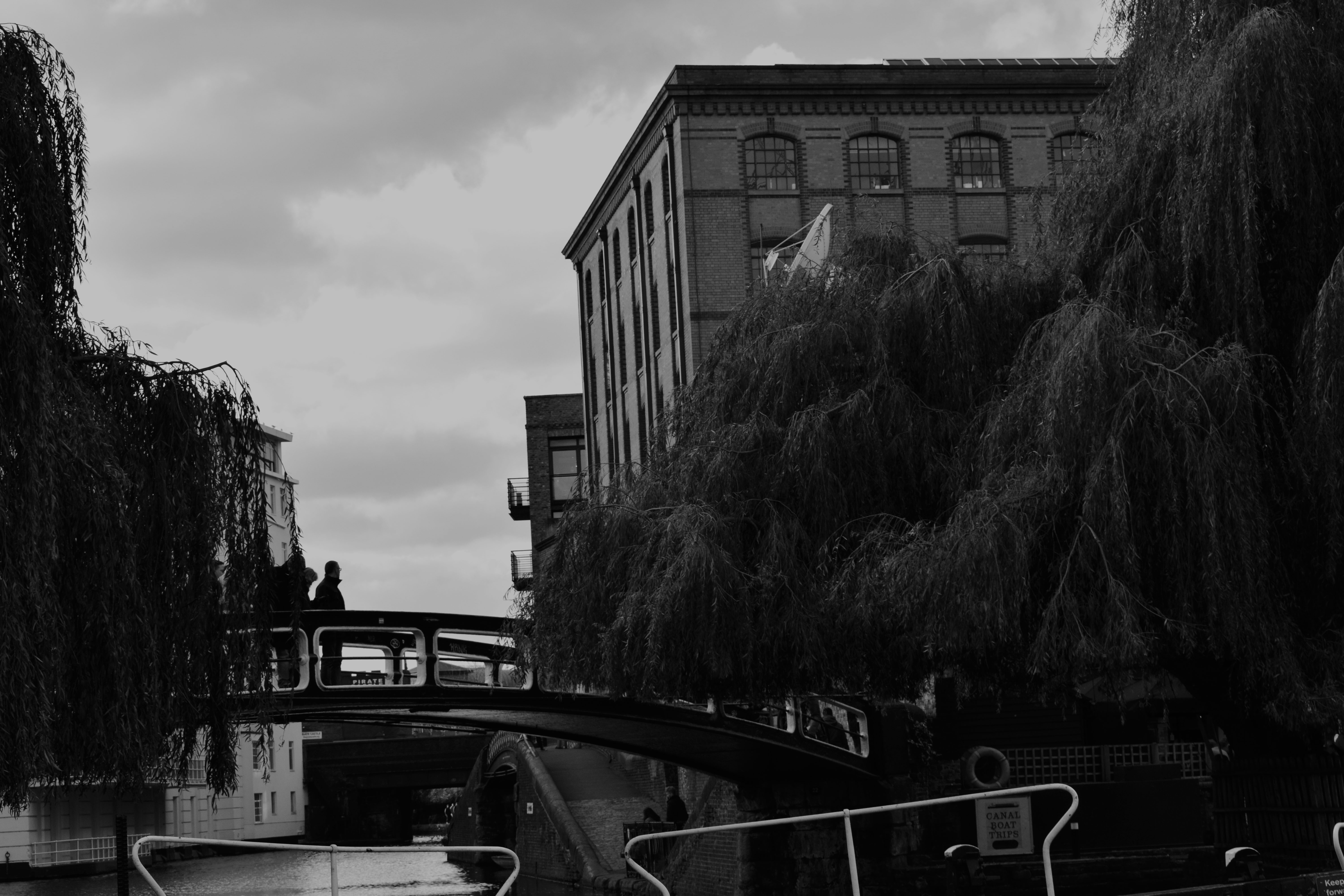
In this photo I wanted to show the vast landscape of the city showing that it goes on for miles. I chose to put in Black and White as it clearly shows these defined buildings going on for miles and miles.
Abstraction


Val de la Mare Reservoir shoot/ Best edits


Typologies

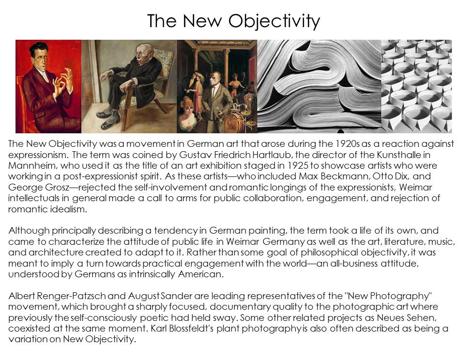
New Objectivity
Archival photos
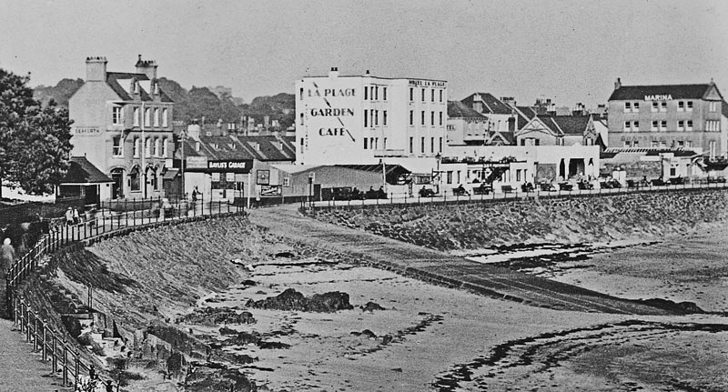
This was Bayliss’s Garage, built to house some of the earliest motorised excursion vehicles which took visitors staying in the Havre des Pas hotels on their island tours. The garage was built immediately next to the slipway at the bottom of Green Street, opposite the Seaforth Hotel, which shows clearly in the picture above.
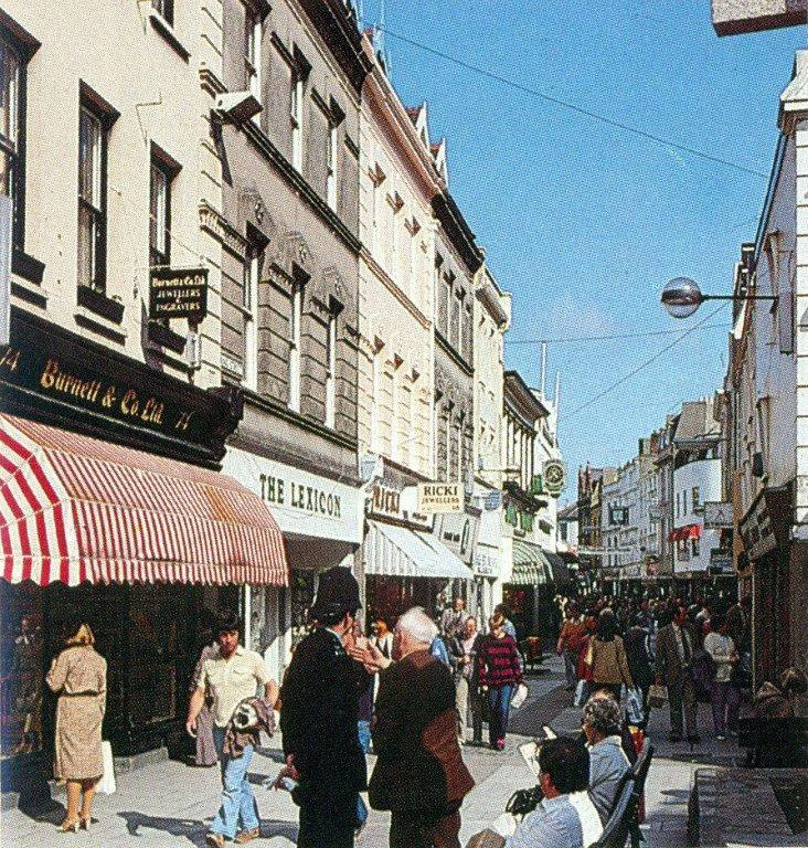
St Helier had no traffic-free streets until the late 1960s, when King Street, above, became the first pedestrian precinct, followed soon after by Queen Street, below. Jersey Tourism took the opportunity to commission these photographs to illustrate promotional glossy brochures to promote conference business in the island. Many of the buildings at the bottom end of King Street shown in the photograph had remained relatively unchanged, at least externally, and particularly above the ground floors, since they were built in the 19th century, but a long stretch of Queen Street, shown in the photograph, was rebuilt in the 1960s.
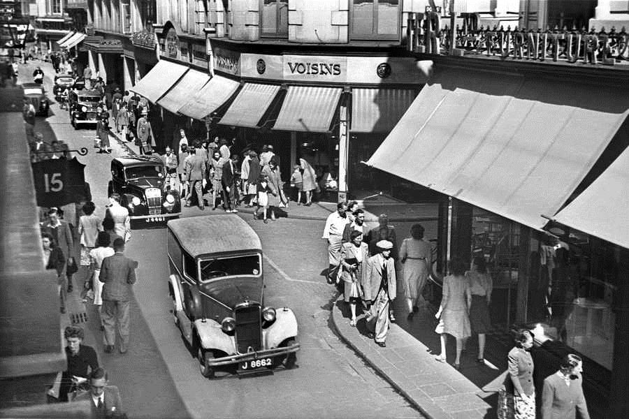
Traffic in King Street in the sunshine of July 1946.
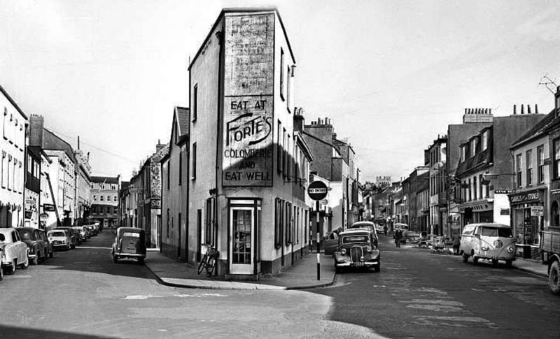
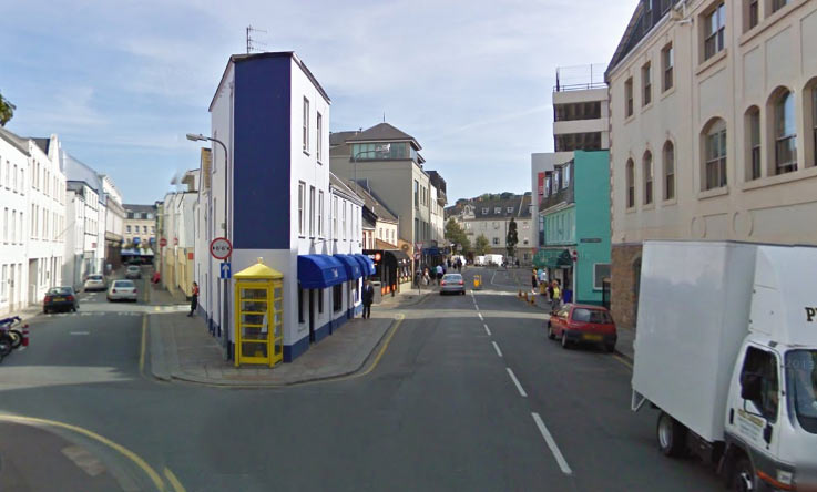
This picture taken from Seaton Place in the south of the town of St Helier shows Seale Street on the left and Sand Street on the right. It was probably taken in the late 1950s, or early ’60s, by an Evening Post photographer, and as the Google Street View below shows, some things have changed in the intervening years and some have not. The view up Seale Street towards the Town Hall, which is on the far end of the left side of the street, has altered very little, as has the unusual triangular building in the middle, still with a public telephone box outside. Sand Street, although relatively unchanged on the left as viewed in the pictures, is unrecognisable on the opposite side, mainly because of the construction of a multi-storey car park.
Weighbridge in 1921.
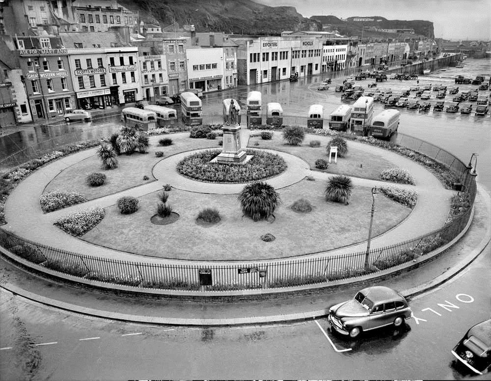
Weighbridge Gardens in 1953, seen from the top storey of the Southampton Hotel. Queen Victoria’s statue is in the center- now situated near Peoples Park.
Best edits/ landscape photography/ London
Extreme/abstract/romanticized editing


To left are some pictures that I have edited using the saturation and contrast tool. The final edits I used in my other course work are to the right. I decided to show these pictures as I wanted to show how photography is art and how with a little editing the most simple photo can become romanticized.
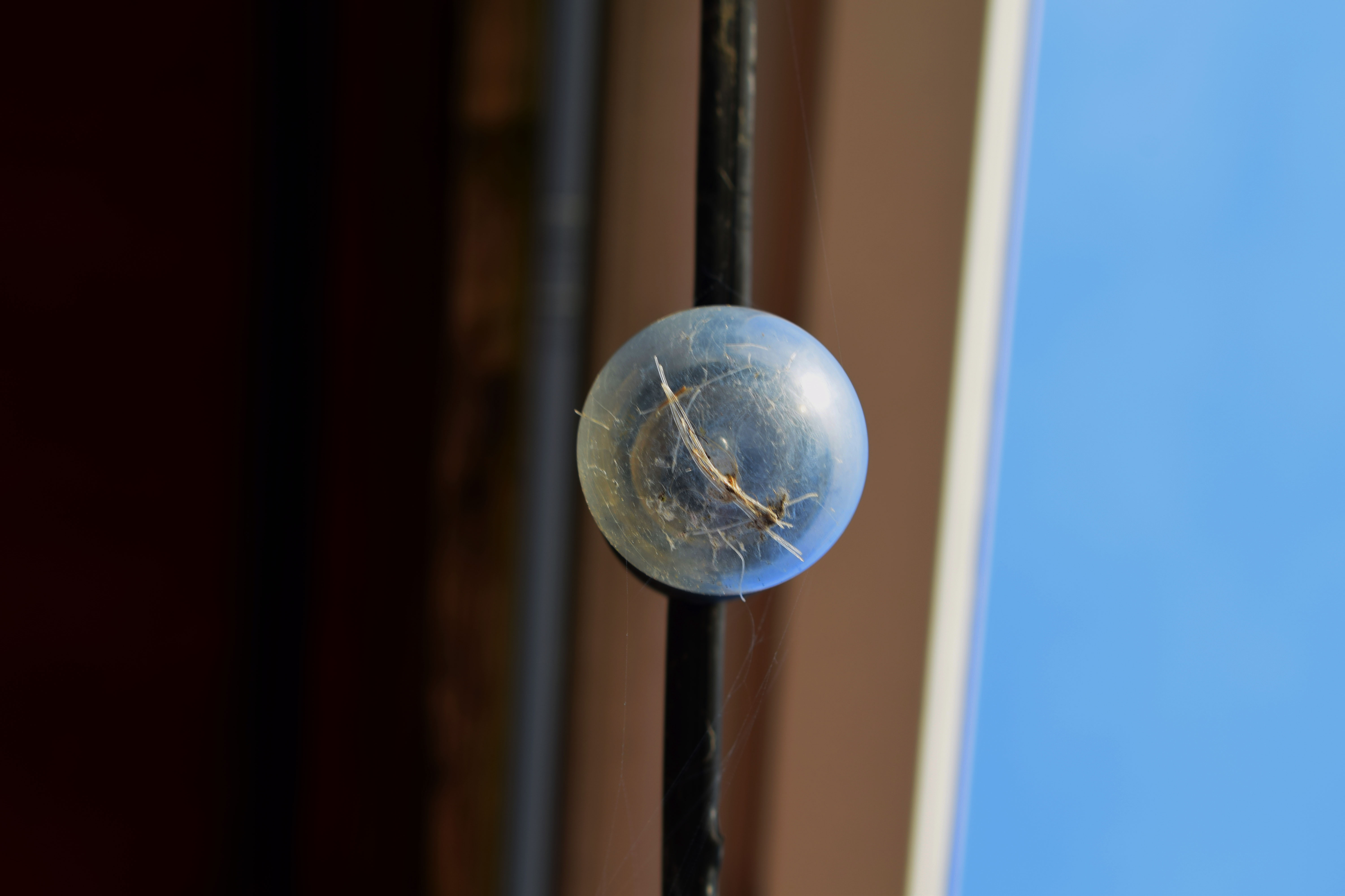
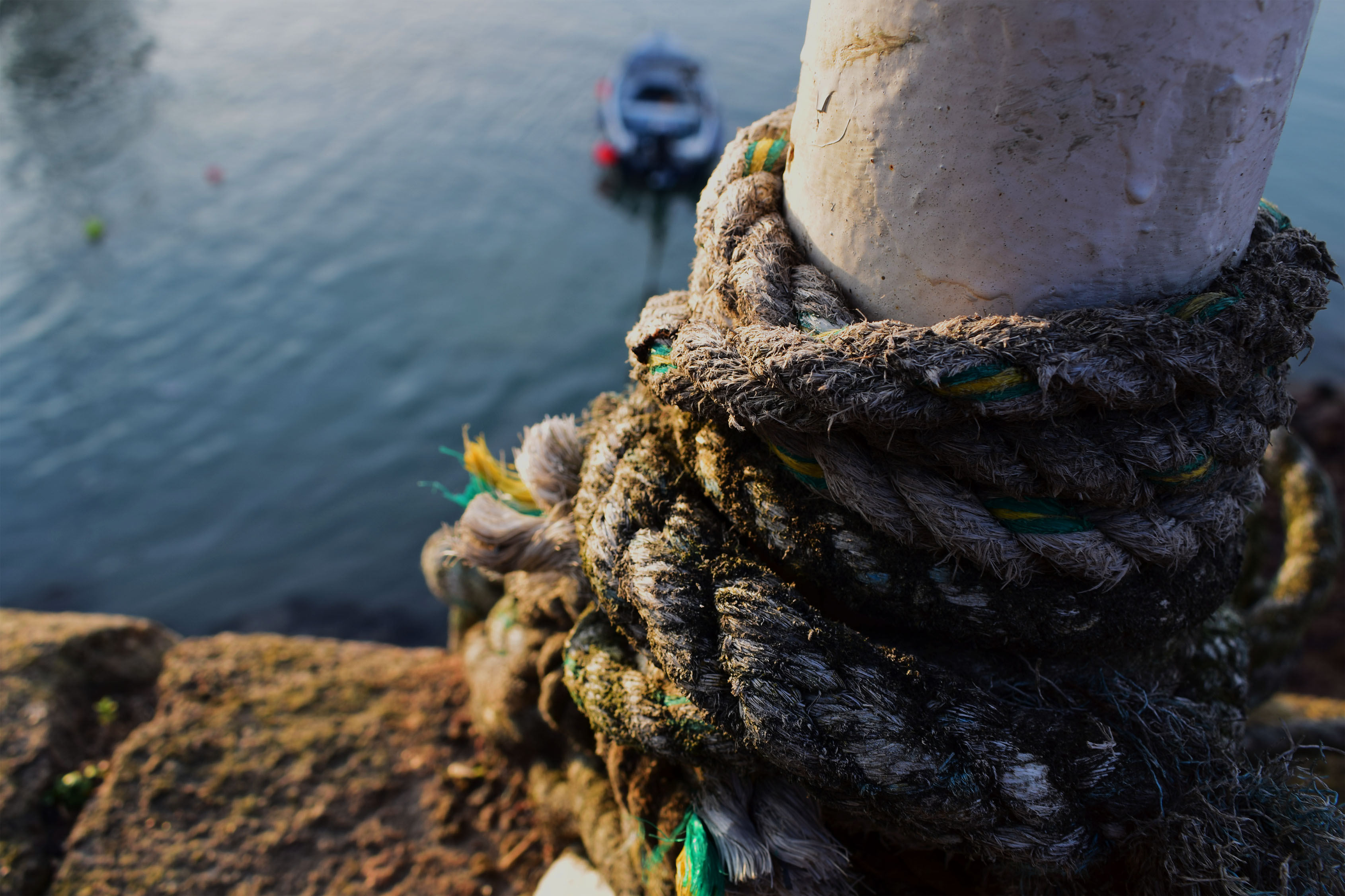
The top left photo is very abstract and almost looks as if it is a galaxy, a planet or even a unusual eye. However, it is only a bulb with some rope in it. Editing can change the whole meaning or idea of a photograph. In this photo I increased the saturation almost to the top, one side of the bulb took the colour of the sky and the left side took the colour of the wall. The orange and blues work perfectly together and brings the colours of a sunset into an fairly ugly or dull object making it beautiful and interesting. I also like the back ground; the fact that it’s split into sections of colour it works perfect with the colours of the bulb.
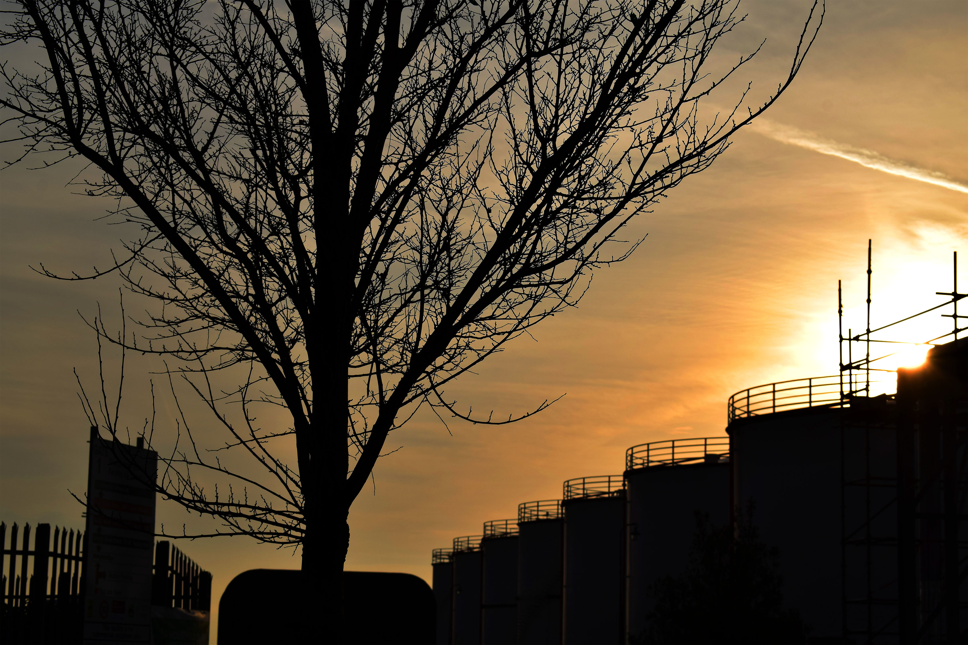
The bottom left photo is very romanticized spoiled by the industrial objects. Although it may look like the industrial objects have ruined a what could have been a natural photo I think they make the photo better showing the effects of these ugly containers. It shows how they don’t just pollute the air or the ground we live on but it also pollutes our landscapes. I think the photo is better with them there as now it has a meaning and it isn’t just a pretty photo for people to look at, it is showing the effects of humans being greedy. I also like that now I have edited it is has the bright orange cause the containers and trees to become silhouettes. It looks almost as if they are competing with each other. It looks as if the tree is showing what could have been such as a beautiful forest but it has been stopped by these industrial machines. I got the orange and silhouette effect by increasing the contrast and offset as well as the saturation.
Best Edits from Landscape photography trip