- Composition is the way in which something is made up, its layout; whether it be art or photography or food or music; composition is its overall structure or layout. The artist who took this image is called Aaron Lee Fineman. It has clearly been set up and the man is sat in the center surrounded by, essentially, lots of other different portraits. There are a couple of leading lines which are visible including the top of the sofa and the line where the lamp and mirror meet. The body language of the man within this image is very deep and can tell a story if you let it. He is in an open position and has evidently been planned out as he is looking face-on into the camera which I really like; it’s a serious and informative, in a way, of this man’s life as he sits there. It is quite dark in colour, however, there is the beam of light that hit directly onto the old mans position. I would have thought that the layout of the images in frames was thought out carefully at the same time as trying to perceive a casual look. I really like the photograph as a whole and I want to know more about it; I’m intrigued.

- The rule of thirds is perhaps the most well-known ‘rule’ of photographic composition. It is the basis for well balanced and interesting shots.

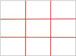
With this grid in mind the ‘rule of thirds’ now identifies four important parts of the image that you should consider placing points of interest in as you frame your image.
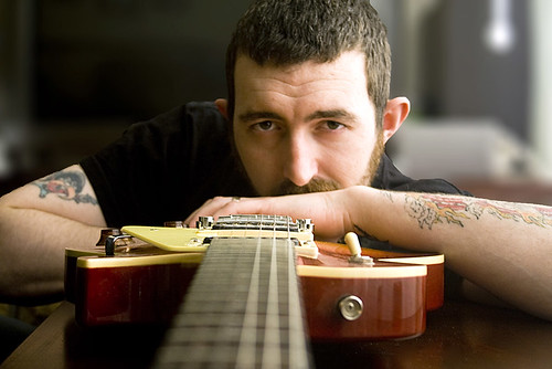
Here is a photographic example of where the rule of third has been put into place; this is particularly a picture I really like.

I like this image because once again, its seems to tell a story. I want to know more about this musician. I know that if I was to put a grid like the above onto this picture that important aspects to focus on would be situated in the region of where the lines meet and his face for example would be situated in one of the boxes.
The guitar gives the image a sense of symmetry and balance because it is in the middle. If you were to split it in half, you would get a balanced symmetrical look either side. The guitar strap hook would also be on the meeting point of the lines of the grid in the rule of thirds. My eyes are drawn to that object instantly as well as the face of the man. It is again serious, making me intrigued to know the story behind the photo but as well, making me feel a little uncomfortable to look at it.


