All posts by Jude Luce
Filters
BUTTERFLY / LOOP / SPILL LIGHTING
What is butterfly lighting?
Butterfly lighting is one of the oldest techniques for lighting a subject. Named for the butterfly-shaped shadow that forms underneath the subject’s nose, this setup is a proven method to ensure your subject is well-lit in a pleasing manner. Butterfly lighting, also known as Paramount lighting, became a staple pattern for the Hollywood photographers of the 1930s. It is produced by placing the light source above the face and in line with the direction in which the face is pointing.

What is loop lighting?
Loop lighting, which is named for the loop-shaped shadow that it creates under the nose, is the most frequently-used pattern. It is considered to be a relatively flattering and adaptable pattern that lights most of the face while imparting a sense of depth. It is produced by placing the main light above the face and to the right or left of the direction in which the face is pointing.

What is spill light?
Spill light or light trespass is the light that illuminates surfaces beyond the property line. An example is the light on a bedroom wall coming through the window.

Three-point Lighting
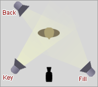 Three-point lighting is a standard method used in media such as theatre, video, film, still photography and computer-generated imagery. By using three separate positions, the photographer can illuminate the shot’s subject (such as a person) however desired, while also controlling the shading and shadows produced by direct lighting.
The main light is usually the strongest and has the most influence on the look of the scene. It is placed to one side of the camera/subject so that this side is well lit and the other side has some shadow.
The secondary light is placed on the opposite side of the key light. It is used to fill the shadows created by the key. The fill will usually be softer and less bright than the key.
The back light is placed behind the subject and lights it from the rear. Unlike the other two, its purpose is to provide definition and subtle highlights around the subject’s outlines. This helps separate the subject from the background and provide a three-dimensional look.
My Photoshoot:
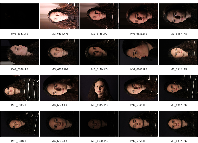
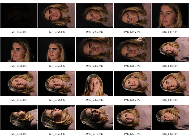
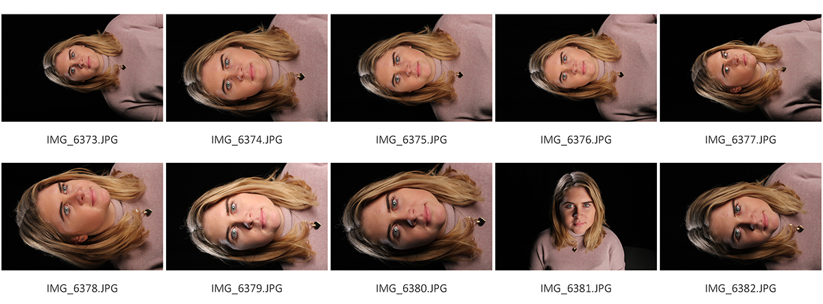
For this shoot, I experimented with three-point lighting which includes a main light, a secondary light and a back light.
I used a black back drop so my subjects stood out and to give me the best possible opportunity to get the best results and so you can evidently see the three uses of lighting.
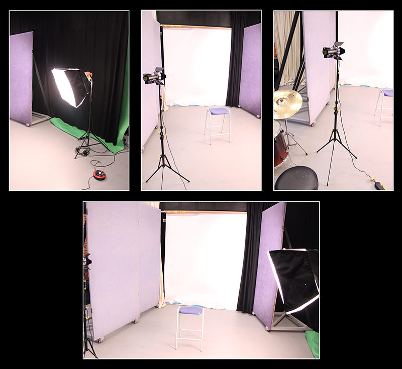
The point of three-point lighting is to create a direct, pleasing and realistic light on your subject. By using three separate lights you have complete control on how the subject is illuminated. Due to this, I found it much easier to get an even distribution of light on my model and therefore made for a better outcome because the subject’s outline was clearly evident while the technique remains relatively simple.
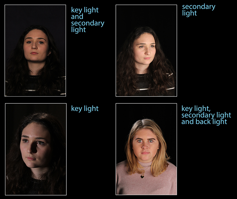
I began with just the key light to see the influence it had on my subjects appearance, however, the side of my models face which wasn’t exposed to a light was getting lost in the black backdrop so I therefore experimented using both the key light and fill light which illuminated the whole of the subject.
I then tried out using just the soft-light box – they fill light which made the face stand out but still crated some shadows without the help of the key light to drown the shadows out.
After using both the key and secondary light, I moved on to the back light which face my subject a halo-like look as the light was being cast onto the back of her head and shoulders and automatically, the subject looks more three dimensional. In addition, the audience can see the outlines more clearly and there are more highlights in comparison to the previous shadows achieved from the other lights.
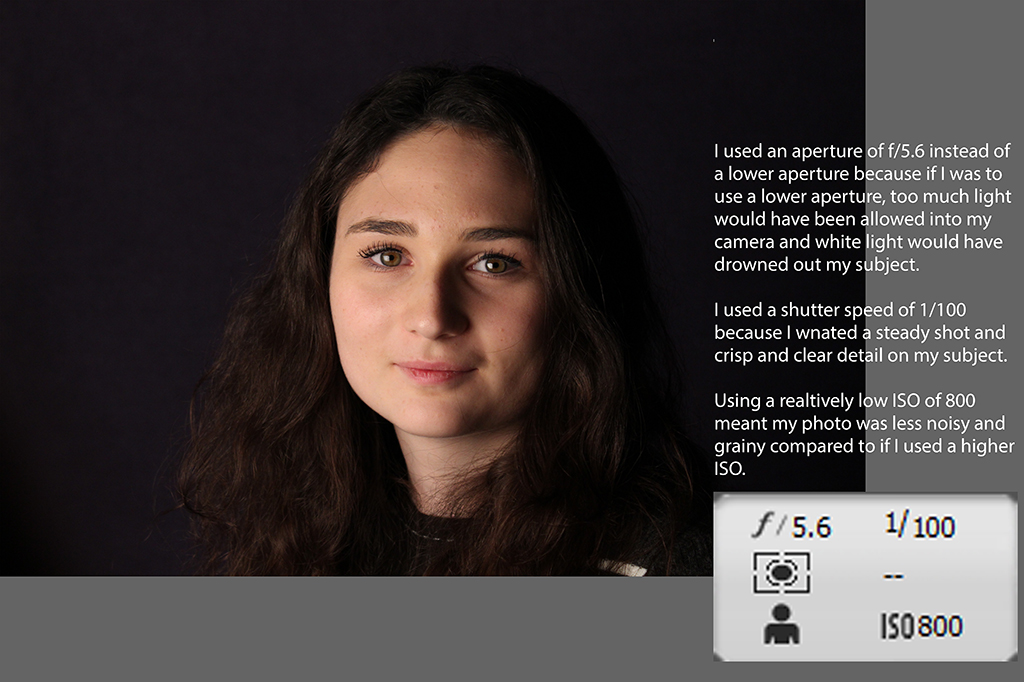
I really enjoyed doing this shoot because I now understand more about three-point lighting and what the purposes are of each light involved in the technique. I believe I need better knowledge about what settings are best for each light.
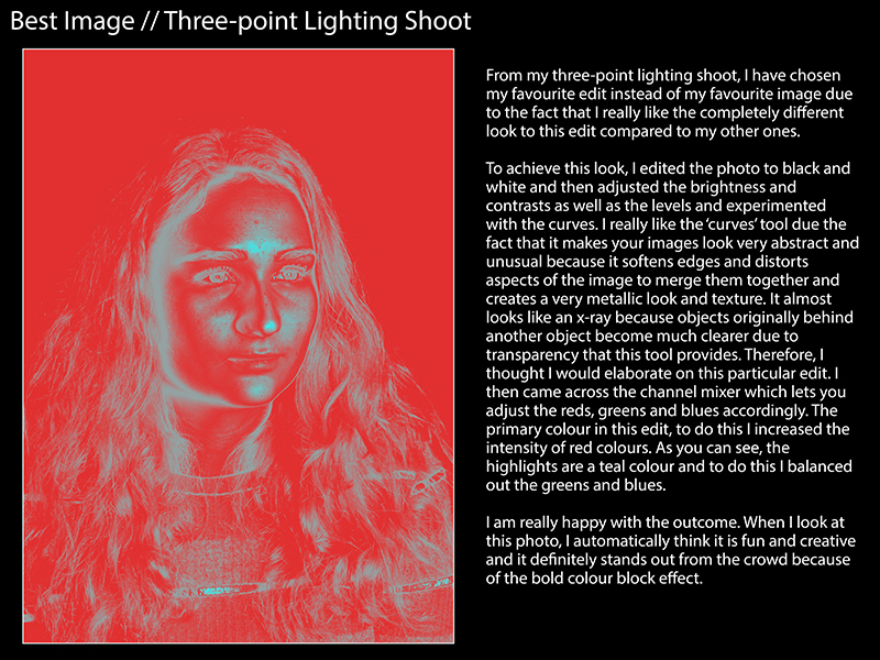
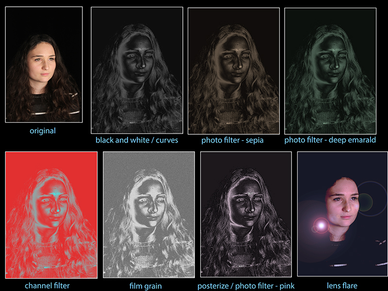 When editing these images, I experimented with black and white, brightness and contrast as well as levels but was particularly attracted to the way the ‘curves’ features made the images look. I then came across the ‘photo filter’ editing technique and really liked the futuristic look the different colours gave the appearance of each photo. They edits look very unrealistic and this is what I wanted to achieve to show juxtaposition between the idea of realism which three-point lighting gives compared to the unrealistic, futuristic look my edits portray.
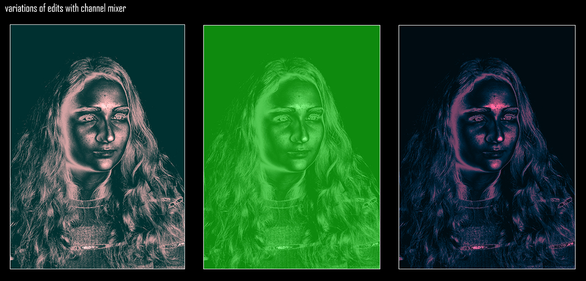
Experimental Edit:
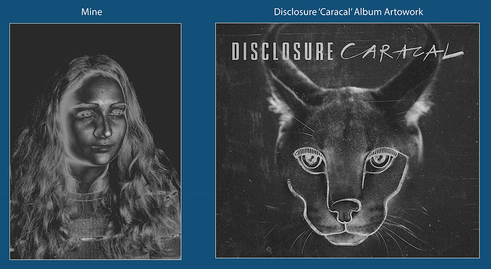
For these particular edits which look very metallic and almost like an x-ray, I got my inspiration from the house duo, Disclosure and their logo as well as their artwork on album/EP covers. The art really fascinates me and I think it is a great and unique design which I wanted to try to replicate in my edits.

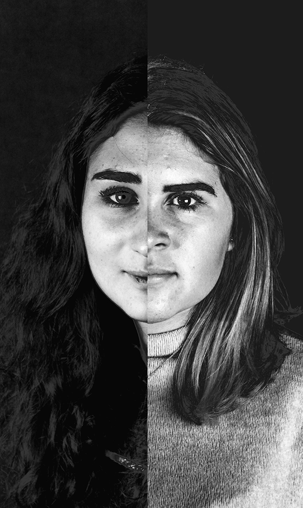
Next, I was inspired by Andy Warhol within my Disclosure inspired series. I was inspired by Warhol’s pop-art, in particular his collages of 4 images.
I wanted this edit to look very unusual and perhaps a bit uncomfortable for the audience to look at by playing around with proportions, shapes, sizes and colour pairings.
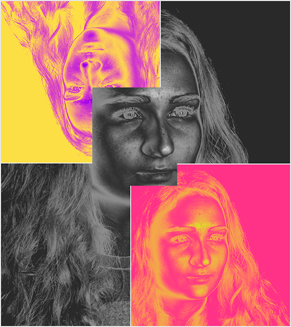
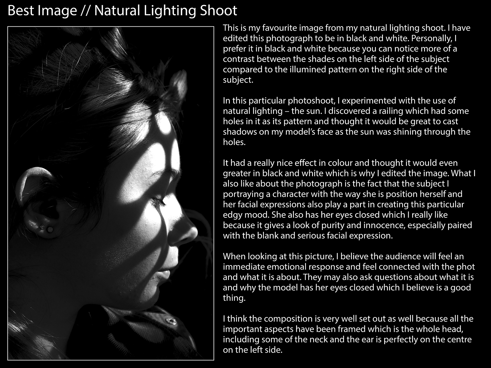
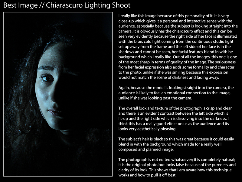
Best Images from Natural / Chiaroscuro / Hard and Soft Lighting
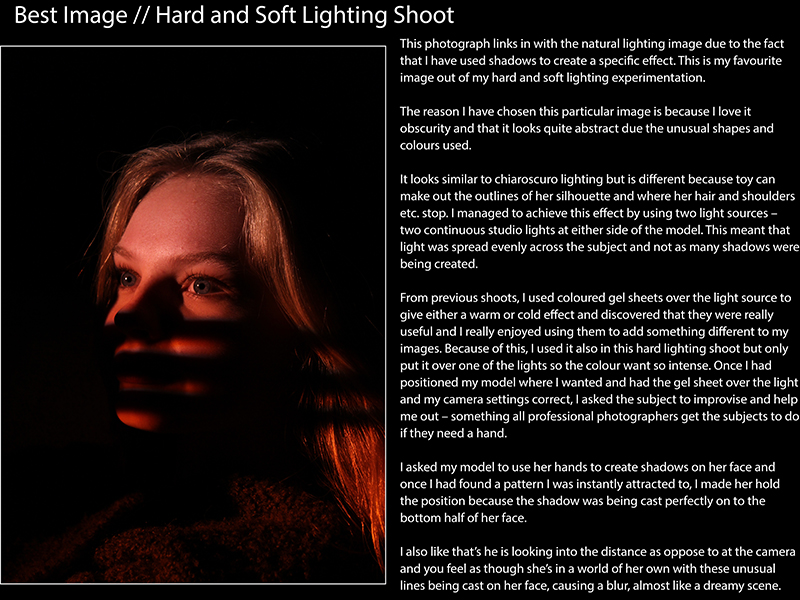
Experimenting with Studio Lighting – HARD AND SOFT
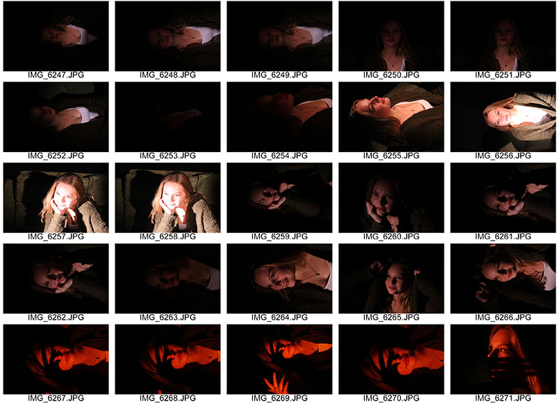
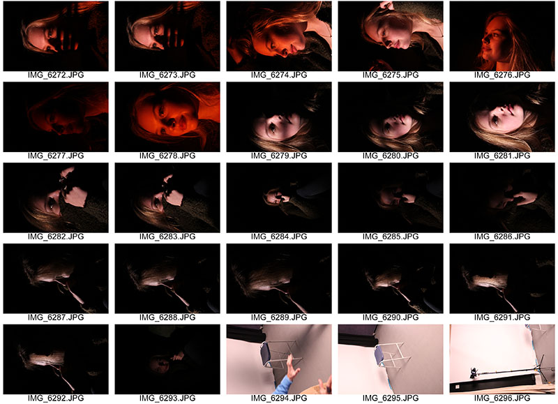
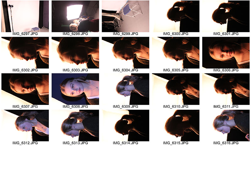 In today’s lesson, we experimented further with studio lighting and in particular, hard and soft lighting and its effect on the photograph.
- Hard light casts shadows onto the subject; the shadows produced will have ‘harder’ edges with less transition between illumination and shadow.
- Examples of hard light sources are spotlights, direct flash and overhead fluorescent lights.
- If you are trying to create a scene that is moody, edgy, or with a lot of contrast then hard light is probably what you want to use and this is what we used today as you can see in the first 45 pictures.
- In the second half of the lesson, we experimented with soft light also.
- Soft light is light that tends to “wrap” around objects, casting diffuse shadows with soft edges. Soft light is when a light source is large relative to the subject.
- Examples of soft light are: a cloudy day, a light with a shade, sunlight coming through a white curtain, indirect light.
- The general rule for soft light is that the larger the light source is the softer it is. Soft light is the most flattering type of light for portraits.
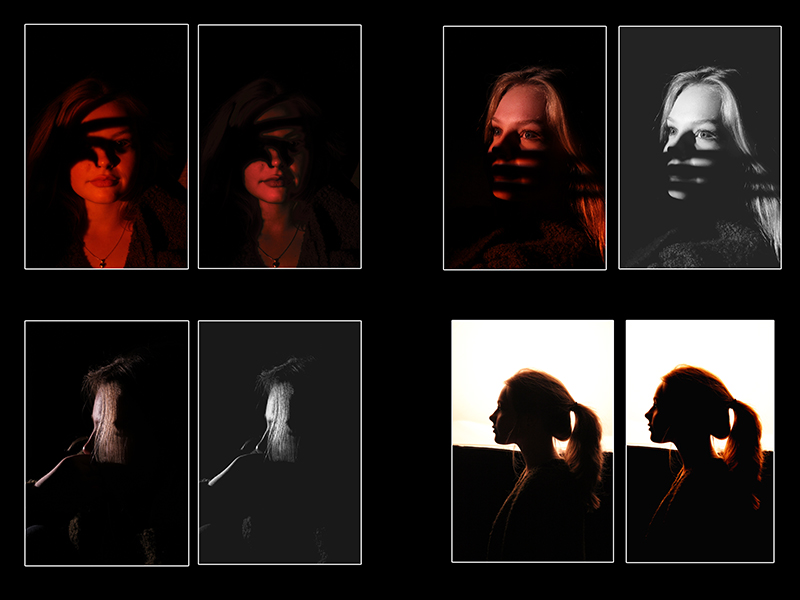
Hard light: we used a black backdrop and a two sources of studio light to cast shadows and contrasts on the models face. This created silhouettes of one side of her face and created a moody atmosphere. We then asked the model to use hand gestures to create more of a character for the images and the gestures she made cast shadow on to her face which had a great effect. Furthermore, we also used coloured gels over the source of light to make it more eye-catching and I much prefer this effect because it looks more fun and obscure. At first, we used two studio lights – one at either side of the model, however, we soon realised that this wasn’t providing us with the result we wanted because we couldn’t get the right contrast and so we removed one of the lights.
Soft light: provides a much more forgiving look compared to the hard light and the light is not as harsh-looking and therefore is not as much of a contrast which, in a way, I prefer because the mood of each image is less edgy and is more warming mainly due to the orange/brown colours achieved from this soft light.
When experimenting with soft light, we also used flash to see what the affect would be on the images. Using a flash gave an even spread and distribution of light across the subject and around the frame which also gave it less of a moody atmosphere and makes the image seem more pure due to the white spread of light. You can see the difference between hard light and soft light very evidently and they both give off very different tones and atmospheres so can be used for completely different purposes.
However, I really like the use of hard light over soft light because of the contrasts between blacks and the lighter colours of your subjects face. When using hard light, you can experiment with shadows and this is what we did in the shoot. It turned out really well and looks really effective, especially with the different colour lighting.
Overall, I am happy with the turn-out of this shoot because it has given me a better understanding of the terms soft and hard light and how to use the in photography but if I was to do it again I would look further into soft light and try to get better results because I didn’t get a great chance to capture shots with this technique. My knowledge of Chiaroscuro, Rembrandt and hard light is more advanced because they can all come under one skill as they are similar.
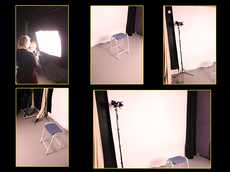
Experimenting with Studio Lighting – Chiaroscuro / Rembrandt
What is chiaroscuro lighting?
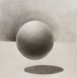
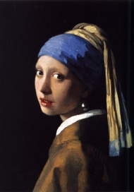
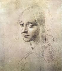
It is an effect of contrasted light and shadow created by light falling unevenly or from a particular direction on an object.
The term chiaroscuro is derived from the renaissance times; it is an oil painting technique, developed during the Renaissance, that uses strong contrasts between light and dark to model three-dimensional forms, often for a dramatic effect. An artist known for developing the technique is Leonardo Da Vinci.
In photography, chiaroscuro can be achieved with the use of “Rembrandt lighting”. This technique may be termed “ambient/natural lighting”, although when done for effect, the look is artificial.
Here are some chiaroscuro drawings and oil paintings:
In today’s lesson we experimented with chiaroscuro lighting and its affect on photography, especially portraiture. We looked at examples of chiaroscuro lighting in photography as well as drawings and paintings because oil paintings is how the technique was developed. Looking at the history of this technique helped me understand what I wanted to achieve when we went to the studio.
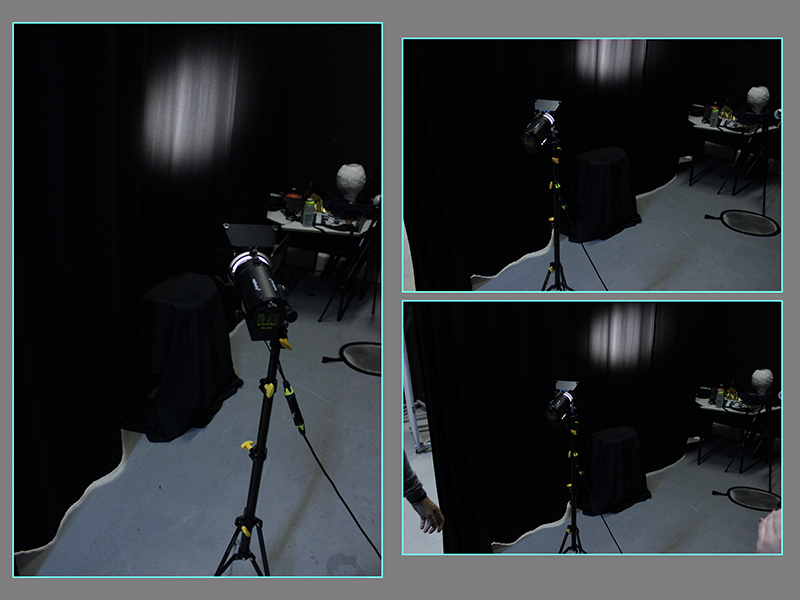
Here is the set-up of the shoot we carried out to give you an insight into how we achieved the final outcome.
We used a black curtain so the white light would be as clear as possible against it. We also used a stool for our model to sit on but covered it in a black sheet so you couldn’t notice it was there. This made the set-up look sleek and sharp and more professional. All the main lights were turned off and we were left with the continuous studio light which we would use to create chiaroscuro. You can see the light is on the black curtain but when the model was positioned on the stool, we would tilt the light to point at the subject’s face and the light would stand to one side of the model so one side of the face was illuminated and the other in darkness to blend in with the background, and, in-turn create a chiaroscuro effect.
We also experimented with different coloured transparent sheets of plastic over the light to change the colour of the model’s face which had a really nice effect as an alternative to the white light.
Camera settings used:
Manual setting for adjustments / ISO 100, 3200 / f4.5 / shutter speed 1/100 / white balance 4000K (white fluorescent), 3200K (tungsten) / no flash
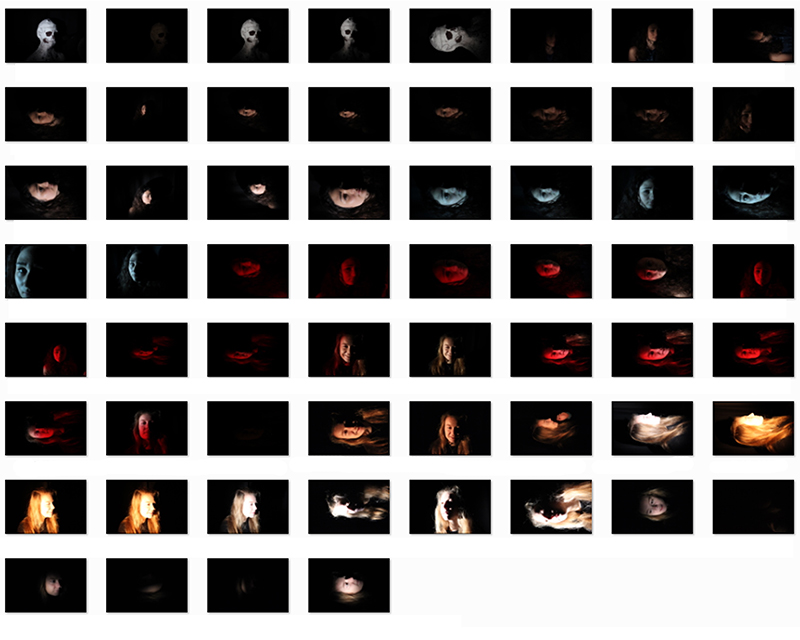
I am really pleased with how the shoot turned out. I think our experiments with lighting has shown chiaroscuro really well and I now have a better understanding of it because I have done it practically. I think the different colours of lighting used worked out very well. However, I do believe that the first 30 worked out the best because after that, I began to experiment more with white balance and I changed the light intensity more which lead to some mistakes and some not as good outcomes but overall, I think I’ve covered the criteria and made it my own by being creative with the reds and blues of light to add more character.
Best image:
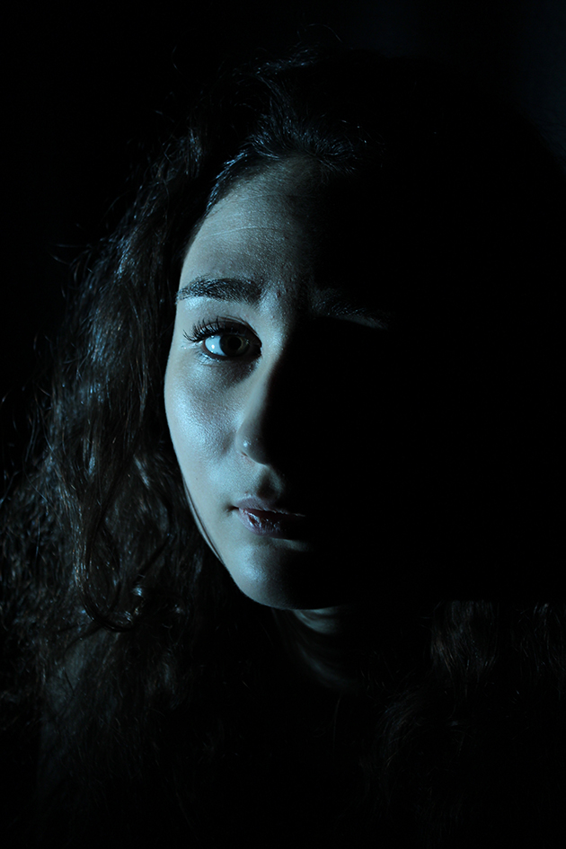
I really like this image because of this personality of it. It is very close-up which gives it a personal and interactive sense with the audience, especially because the subject is looking straight into the camera. It is obviously has the chiaroscuro effect and this can be seen very evidently because the right side of her face is illuminated with the blue, cold light coming from the continuous studio light set up away from the frame and the left side of her face is in the shadows and cannot be seen, her facial features blend in with he background which I really like. Out of all the images, this one is one of the most sharp in terms of quality of the image. The seriousness from her facial expression also adds some formality and character to the photo, unlike if she was smiling because this expression would not match the scene of darkness and fading away.
If I was to do this shoot again, I would change a couple of things. These include changing the angle of the light source. I would perhaps move the light to a lower or higher position to illuminate a different part of my model’s face to flaunt other particular features instead of just the same side of her face over and over. I would also try out different camera point of views and get my subject to pose in a rang of different positions to add variety and to tell more of a story and keep the audience interested. This would reflect Rankin’s style of work more so.
Best edits:
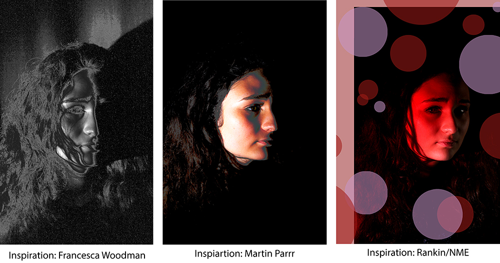
Example of Rembrandt lighting:
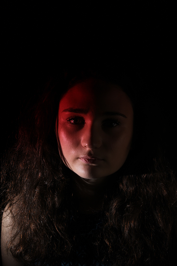
Rembrandt lighting is a well-known lighting setup that is used for portrait photography. To achieve this look one half of the models face will be in full illumination whilst the other half is in partial shadow; different to chiaroscuro lighting because the in chiaroscuro lighting, one side is illuminated and the other in full darkness, blending in with the black background but in Rembrandt lighting, you can identify all facial features. Rembrandt lighting was derived after the master himself, Rembrandt, the famous Dutch painter in the 17 century, who used this lighting technique in his art.
I achieved this affect by positioning the camera so it covered just the corner of my models face yet cast light on the whole of her face but it was soft light. I only discovered this to be an example of Rembrandt lighting after doing the shoot so it was a happy accident because I didn’t originally plan to experiment with this particular technique.
Rankin // My Interpretation: Photoshoot 1 // Studio Photography
 John Rankin Waddell goes by the name Rankin when photographing celebrities in his day-to-day life as a portrait and fashion photographer. He was born on 28 April 1966
In December 2000 Rankin launched his own fashion magazine, RANK.
In 2002, Rankin was awarded an Honorary Fellowship by The Royal Photographic Society.
In January 2009, BBC 4 broadcast Rankin’s 1 hour documentary Seven Photographs that Changed Fashion, in which he created his own tributes to the iconic images by the likes of the photographer David Bailey.
Rankin has also shot several music videos for artists such as Azealia Banks, Example and Kelis as well as a number of documentaries photographing the lives of other in countries around the world and he also teamed up with Nike to shoot a campaign to raise awareness for the disease, HIV/AIDS.
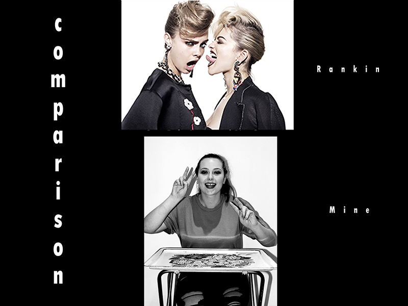
Here is some of Rankin’s work:
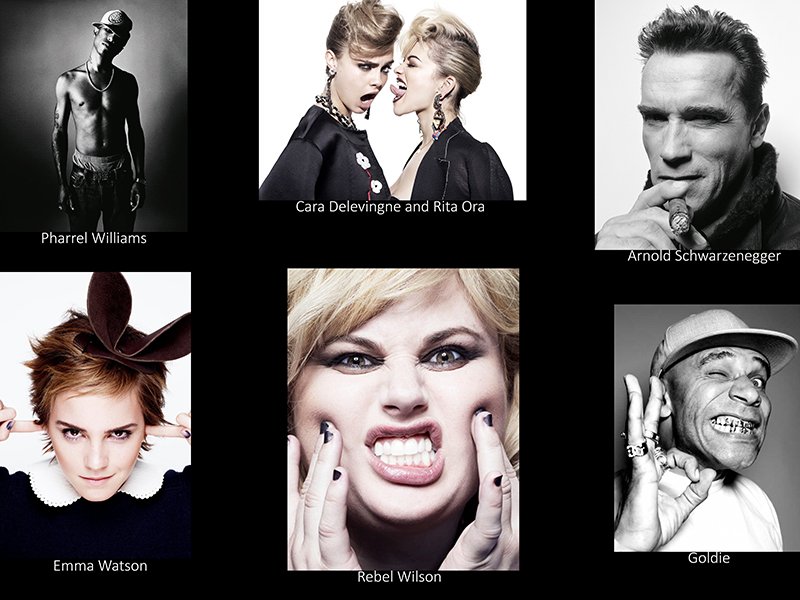
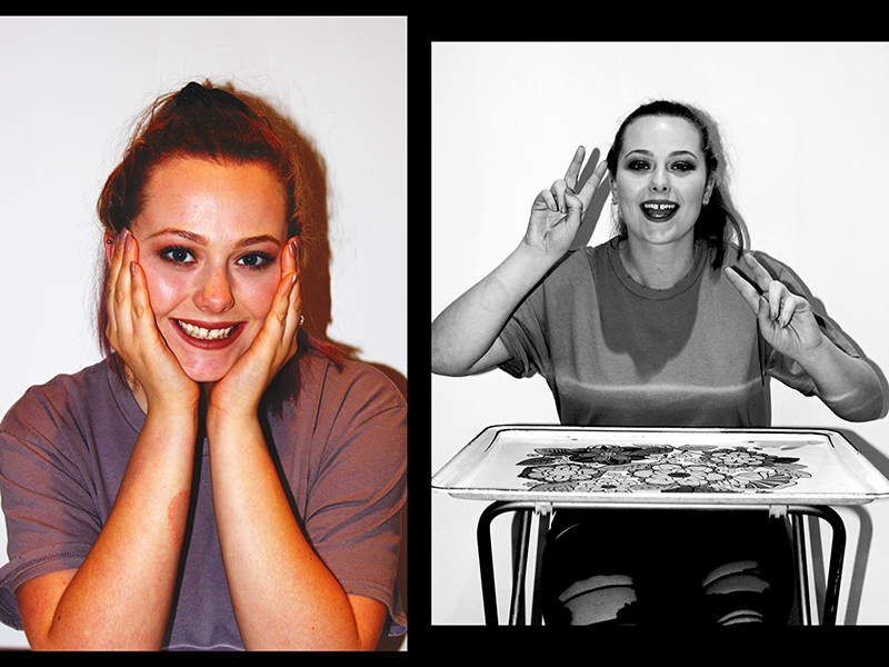
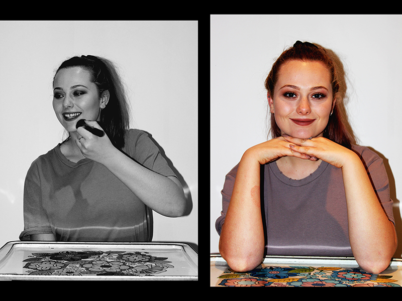
Overall, Rankin has had a very successful career so far and his photographic work has been very influential to the fashion and in modern-day world of showbiz and I carried out a photoshoot to attempt to replicate the work of Rankin and his unique style. When carrying out the photoshoot I wanted to focus mainly on the theme that runs through Rankin’s work and try to implement that into my work – which is fashion, beauty and style of today’s world.
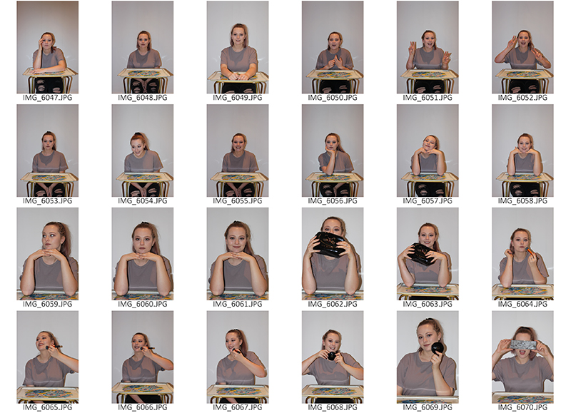
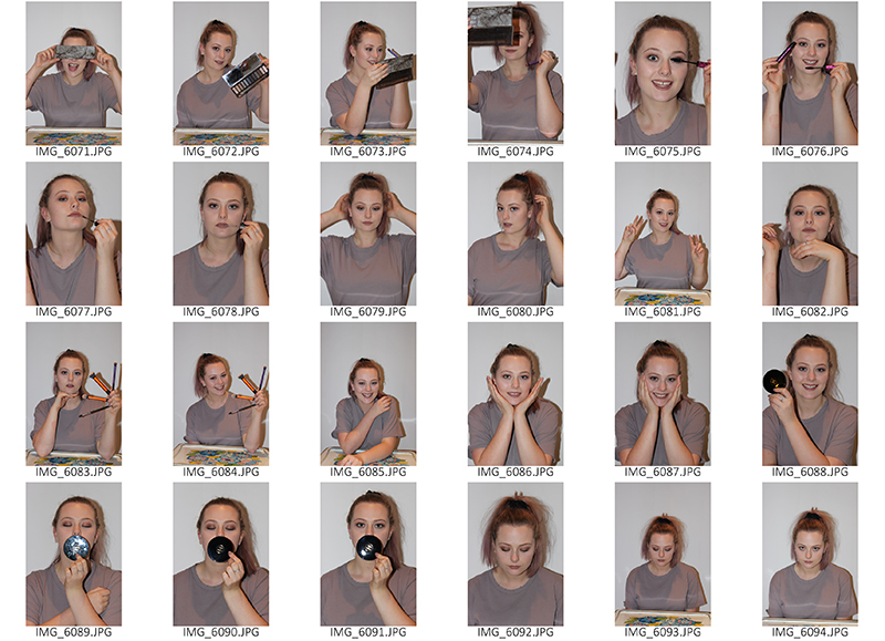
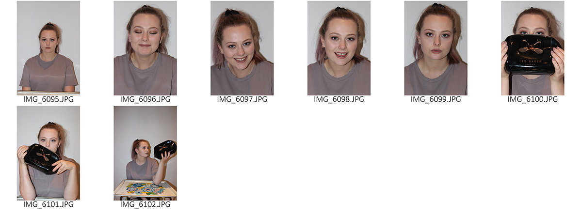
In the photoshoot I produced, I photographed my model who is a hair and beauty enthusiast and is training to become a hairdresser. She takes a keen interest in her own beauty and likes to keep up to date with newest products as well as fashion in and around the community we live in.
As Rankin tends to capture his subjects occupation or passion within his photoshoots, I thought it’d be suitable for me to attempt to do this also so asked my model so bring round some of her makeup to use as props. I planned to use a white background so asked her to also wear darker colours of clothes to contrast against this background and make her standout.
I wanted to make the shoot fun and quirky with the facial expressions and body language/positioning that my model portrayed so I made the the subject per from bold gestures, I wanted her to smile a lot but also wished to have a sense of seriousness to tell a story throughout the shoot.
I experimented with camera settings at the beginning but decided to use flash as this made certain features on her face stand-out due to the glow it gave the images and I used automatic focus on the automatic setting of my camera and this would allow for adjustments if I saw it suitable.
I really enjoyed the shoot and getting an insight into Rankin’s work and I would definitely do it again and I wish to do it again soon to improve on the primary shoot. However I would change some things; I would perhaps use a different background and play around with more camera settings. I would also try out close-up portraits and side-on views and unnatural perspectives. I would also attempt to replicate Rankin’s work to a higher standard so that the viewer could recognize that my inspiration was the world-renowned fashion artist. To do this I would experiment with face paint or make-up and maybe use more props.
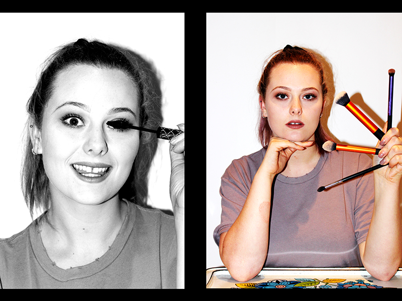
EDITS:
Experimenting with Lighting – Natural
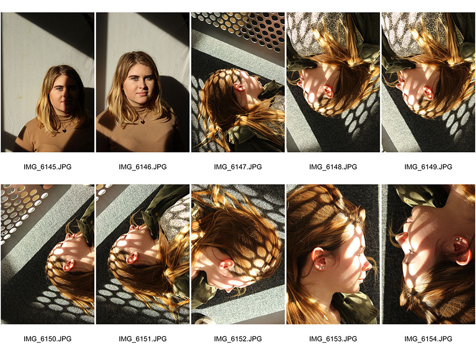
In today’s lesson we experimented with the use of natural lighting and shadows in photography and here is a contact sheet of the outcomes of the photoshoot my group carried out: in the first two images we experimented with the use of natural lighting casting on to one side of a persons face to illuminate that side in contrast with the other which s in darkness. This is very evident sand has worked out very well as you can see from the first image. We then used a reflector to bounce the light of sun on to the other side of the persons face which is the furthest from the source of natural light. This technique is used frequently in studio photography to get the best lighting as possible. In the second image you can notice that we have used the reflector as the other half of the model’s face is illuminated and the lighting is evenly sped out, however, you can still notice that the side of the face closest to the sun is the lighter part of her face. Doing this photoshoot today has helped me understand the use of natural lighting and how to enhance photos using particular techniques. I have also learnt that something as simple as a white piece of paper can be used an alternative to a professional reflector and that the best source of natural light is the sun.
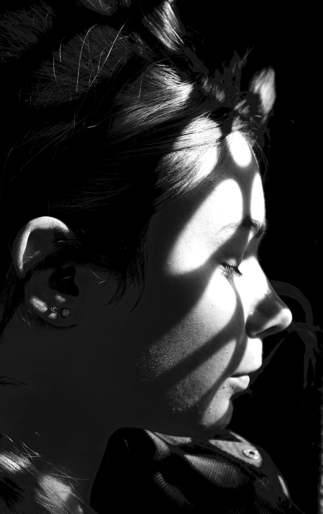
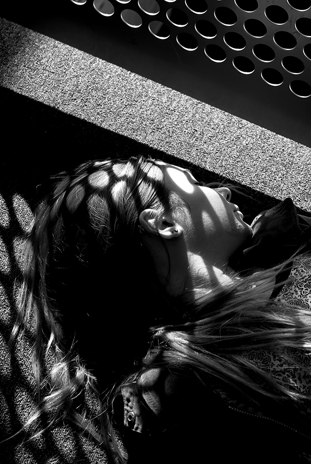
In the other photographs, we wanted to experiment with shadows, especially shadows cast onto someone’s face and we found a barrier with holes in it which was allowing sun to be cast though them and it made for a great set up for a photo. We got our model to lie on the floor so that the pattern was being cast onto her face and to add character, she closed her eyes and lied her side so we could get side view. The outcome is really good and I now have a better knowledge about how to pull something like this off!
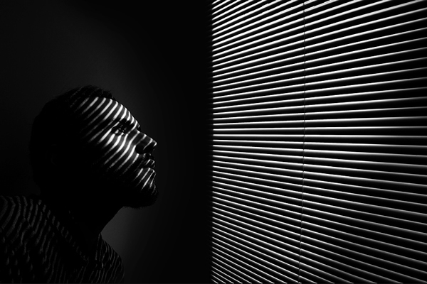


I also edited a couple of the images and in my opinion, this makes them look better and makes the pattern more a focal point and something to ask questions about due to the fact that I made them black and white – the contrast between the darker side compared to the illuminated side makes the circles bounce out at the viewer.
Depth Of Field/Aperture – Detailed Description
An aperture is an opening or a hole but in photographic terms, aperture is a space through which light passes // Depth of field is the distance between the nearest and the furthest objects in an image -essentially the foreground, mid-ground and background that give an image judged to be in focus in a camera.
Using the aperture (f-stop) of your lens is the simplest way to control your depth of field as you set up your shot.
Large aperture = Small f-number = Shallow (small) depth of field
Small aperture = Larger f-number = Deeper (larger) depth of field
For example, using a setting of f/2.8 will produce a very shallow depth of field and make the foreground of your image – the subject crisply in focus and as you look further into the photo, more of the aspects will be out of focus. While f/11 will produce a deeper Depth of field and make more of your picture in focus.
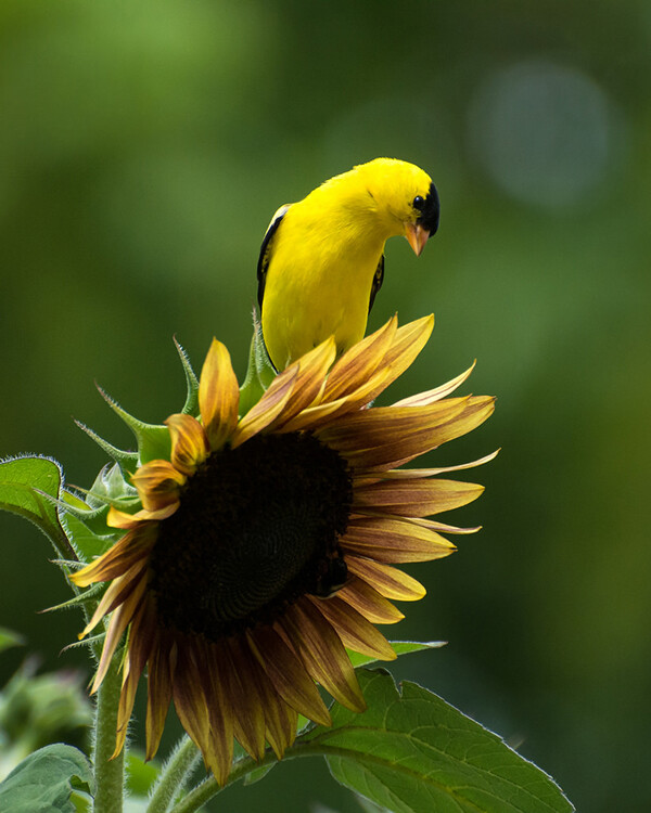
TIPS FOR WHEN TO USE SHALLOW DEPTH OF FIELD: Using a shallow depth of field is a good way to make your subject stand out from its background and is great for portrait photography. Shallow depth of field can also be useful in wildlife photography, where you want the subject to stand out from its surroundings.
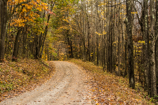
TIPS FOR WHEN TO USE DEEPER DEPTH OF FIELD: In landscape photography it is important to get as much of your scene in focus as possible. By using a wide angle lens and a small aperture you will be able maximize your depth of field to get your scene in focus.
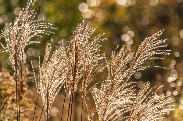
Bokeh comes from the Japanese word meaning blur. Bokeh commonly refers to the circle shapes caused by the shape of the lens aperture. Usually created when shooting with your aperture wide open, such as f/2.8.
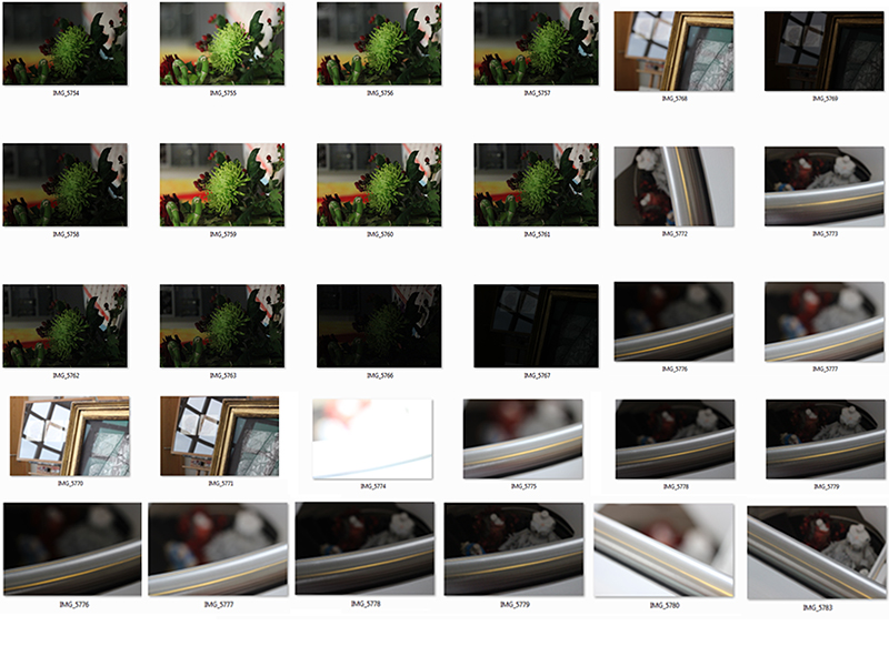 I experimented with different apertures and f/stops to see what the impact is of adjusting them first-hand. However, I realised that also adjusting the ISO is important as well, otherwise you will get a grainy look to the image if the light hasn’t been taken into consideration. If I was to do some further experiments, I would use a person as my subject as this would provide me with an outcome easier for me to see the significance if changing the aperture.
Best Edit
