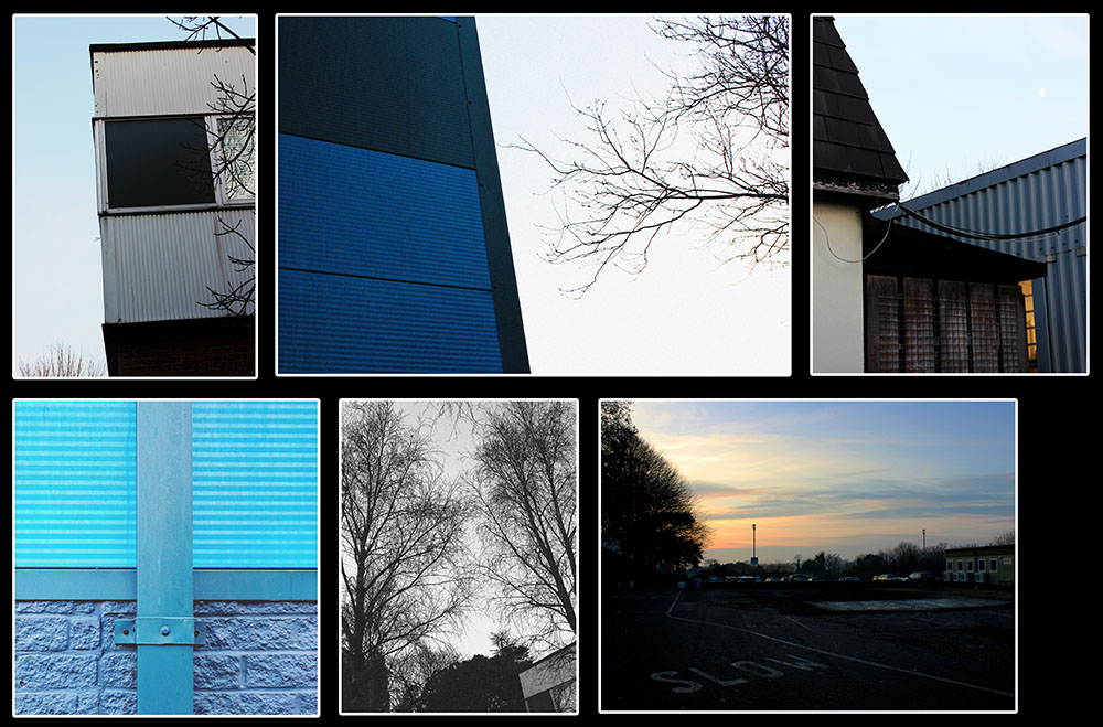
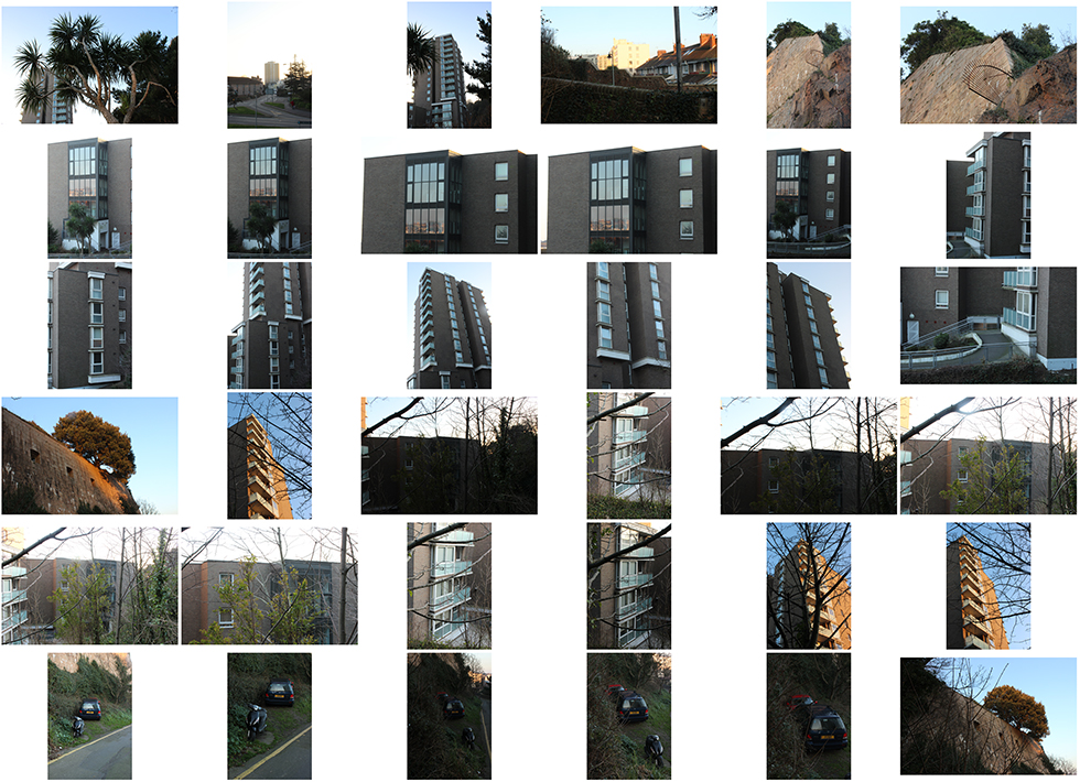
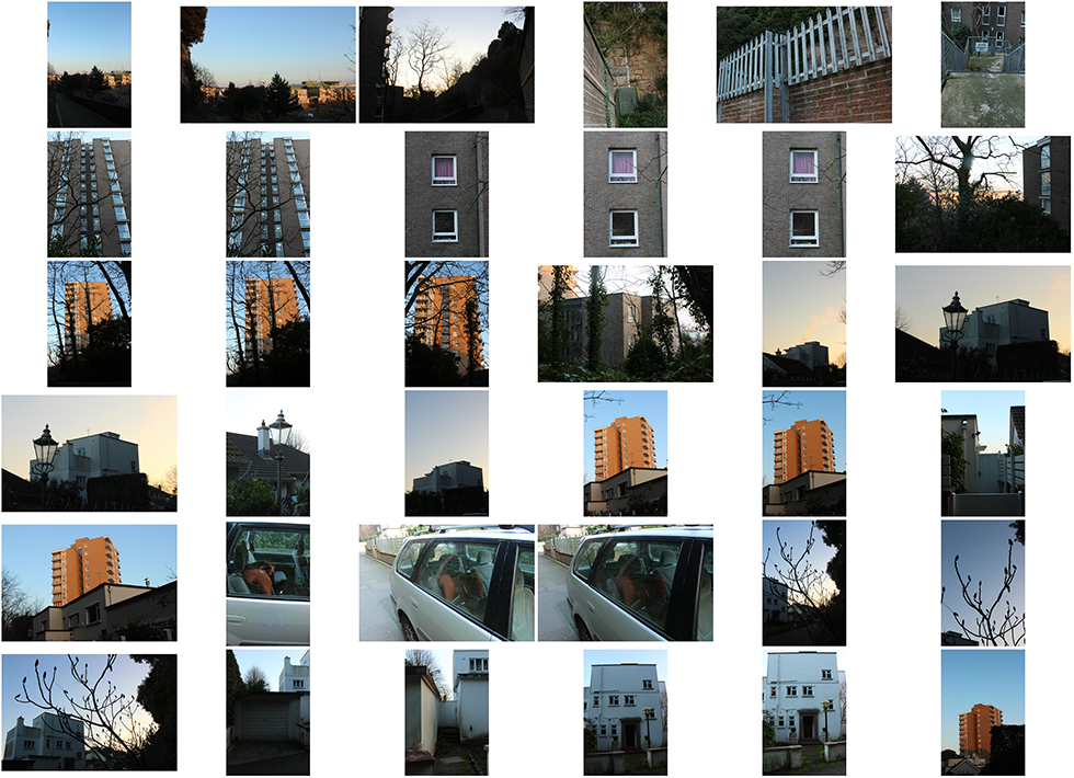
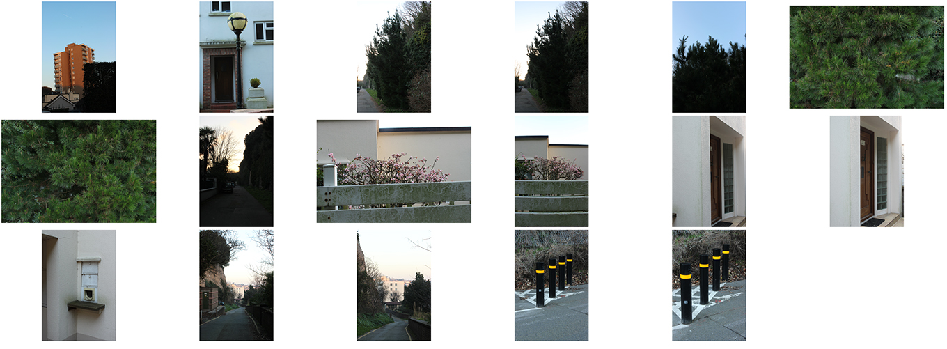
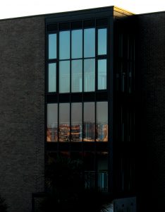
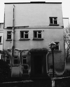
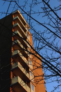
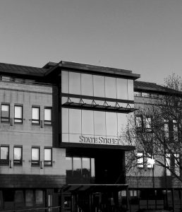
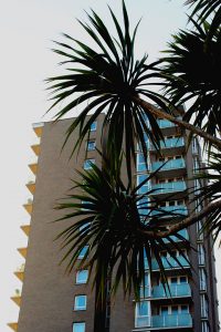
For this photoshoot, I took a walk around the area of Snow Hill and Fort Regent to attempt to capture the more urban side of landscapes. The opportunities were endless for photos because the area was the home of the tallest building in Jersey; this being a block of flats. 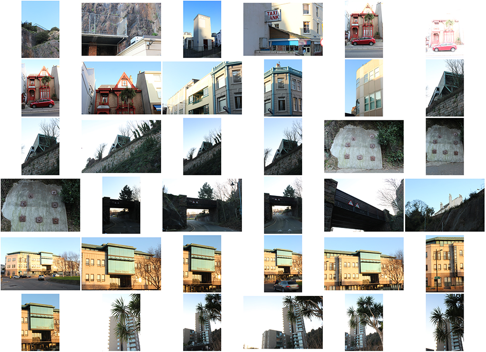
// BEST EDITS //
// Image Analysis //
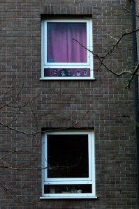
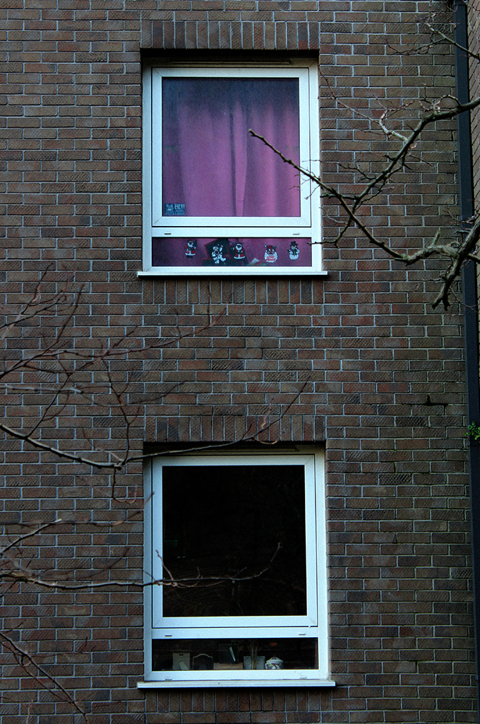 For this edit, I wanted to depict a sense of contrast between what we as the audience can see and portray from jus looking at the outsides of these two windows.
I chose very carefully to pair these two windows and make an image out of it. As the s, we can only see what’s on the outside and are limited to this view. From looking at these two windows, we can begin to develop an interest in the occupants on the inside and it provokes thoughts and the occupants inside.
As well as this, I like the irony that is the fact that I have framed two fames within my image and it crates an endless idea that our lives are perhaps held in a confined space, or perhaps ourselves are being framed.
However, my main aim I wanted to achieve out of this photograph us the evident contrast between colours and potentially lives; the top window is covered by a curtain with life and colour – it is a pink curtain. From this, we can begin to create thoughts that in this particular apartment, there is a family living inside with a little girl. There are also fun stickers plastered on the window which add to the sense. On the other and, the window below is a dark and dull, almost lifeless-looking frame – possibly framing the occupants life and the way he lives. The two flats are separated and differentiated by what we can depict jus from there windows; the top one looks fun and the bottom looks rather miserable.
I wanted to focus mainly on the context and what we can take form the image as a priority over the effects and the technicality of the images look.

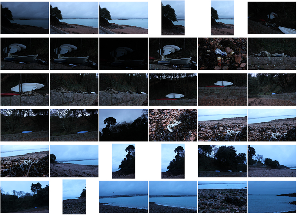
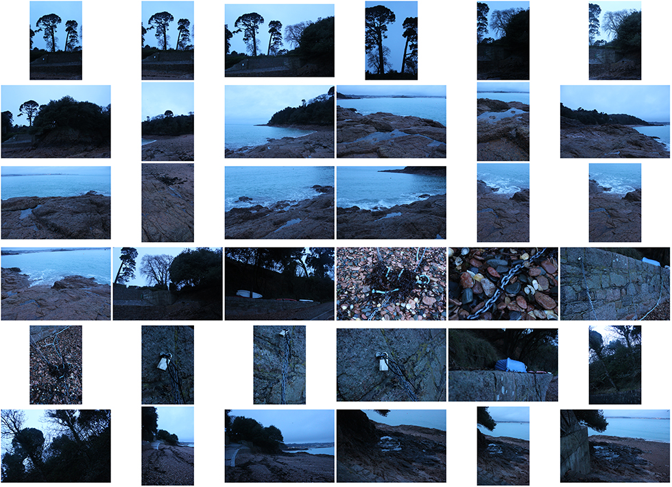
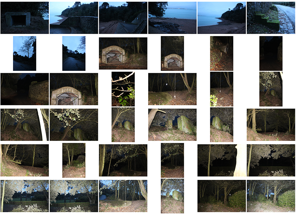

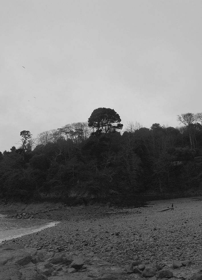
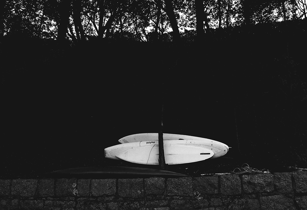
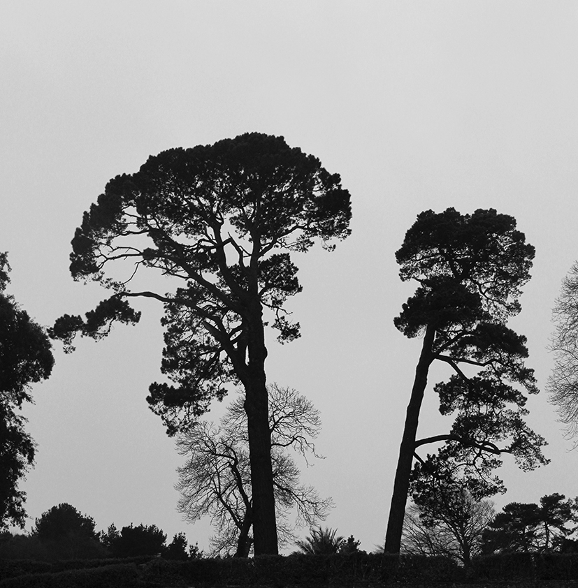
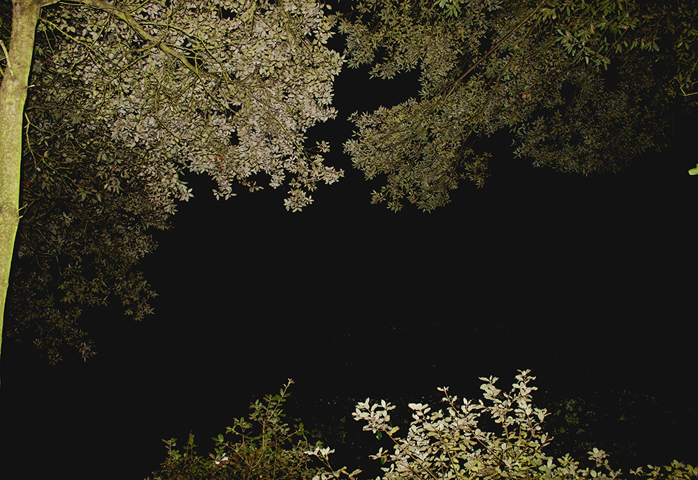
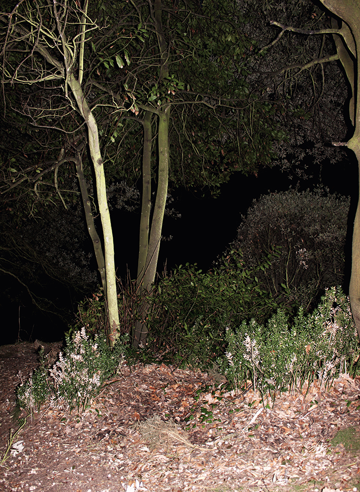
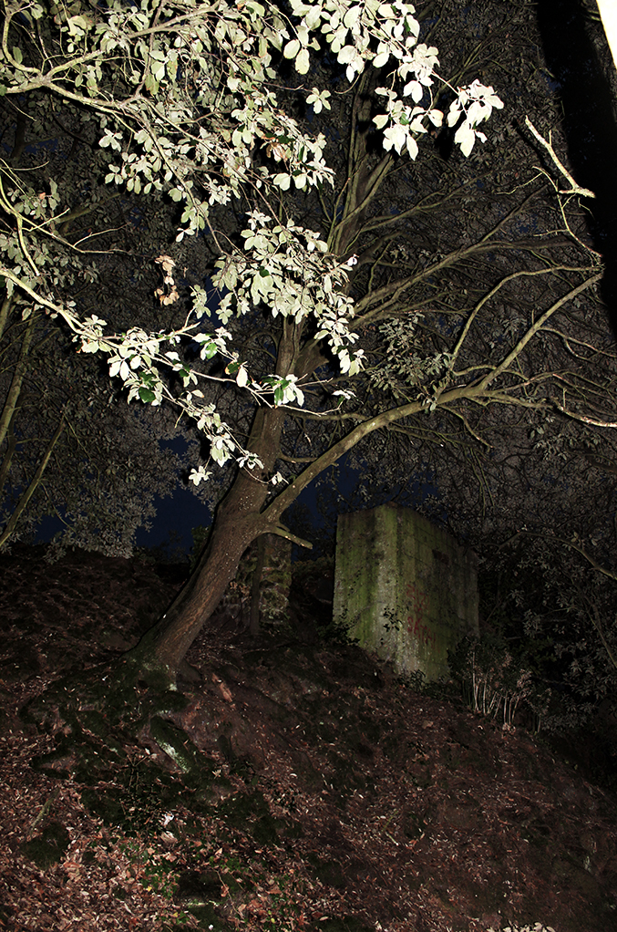
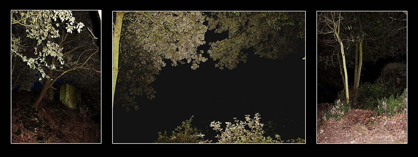
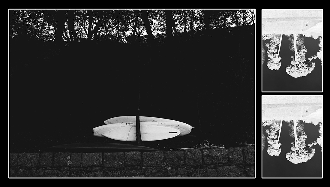
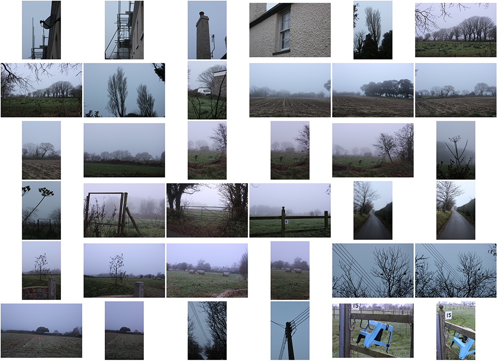
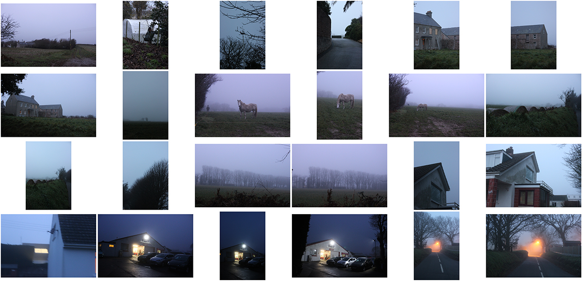
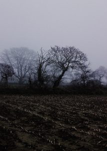
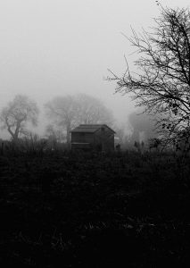
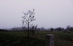
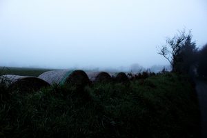
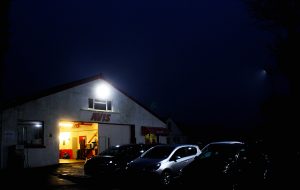
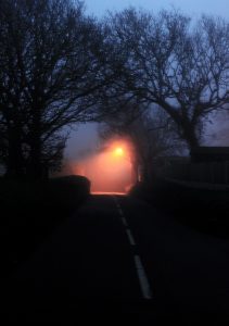
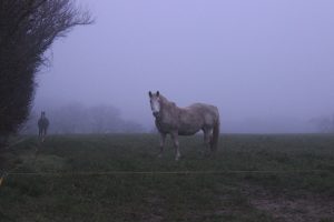
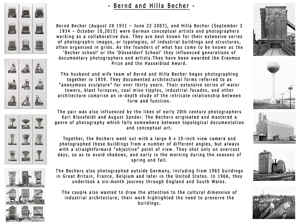
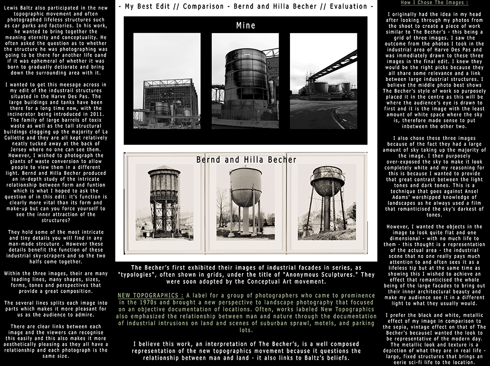
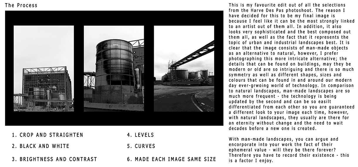
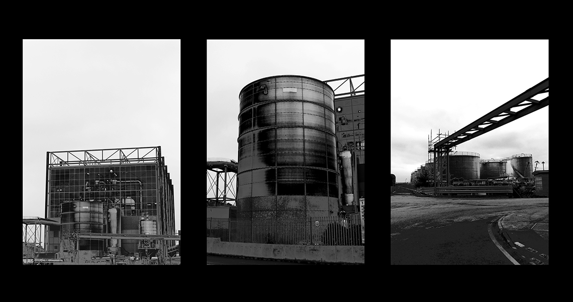
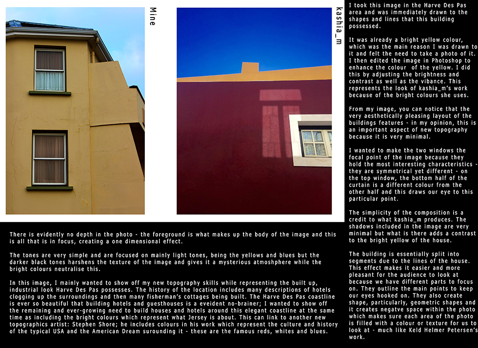
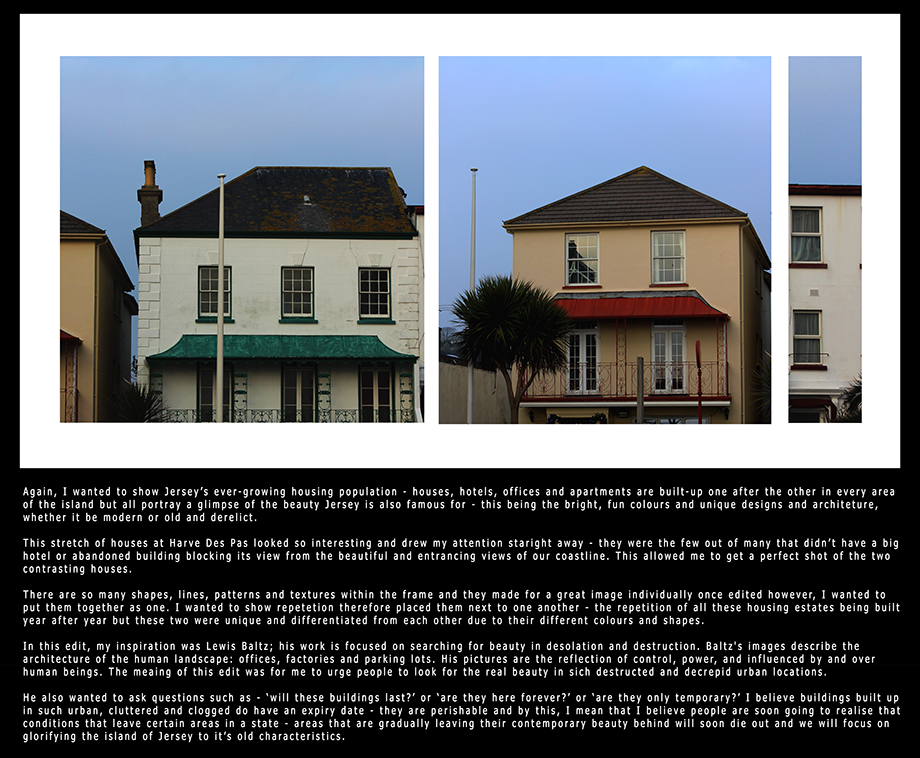
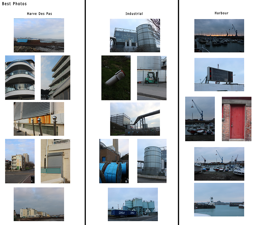
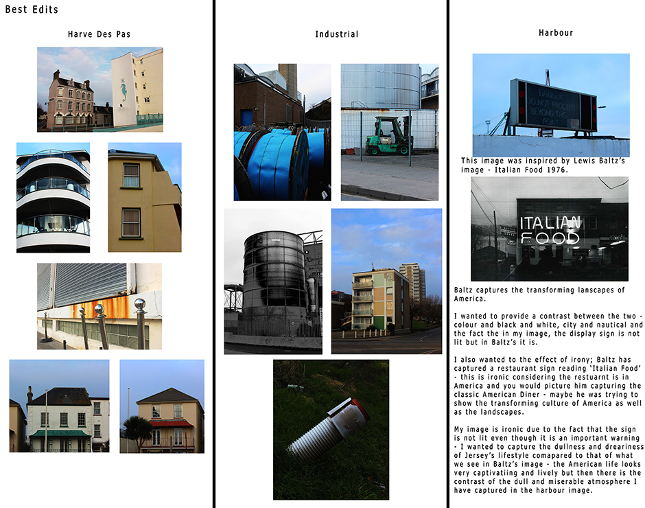
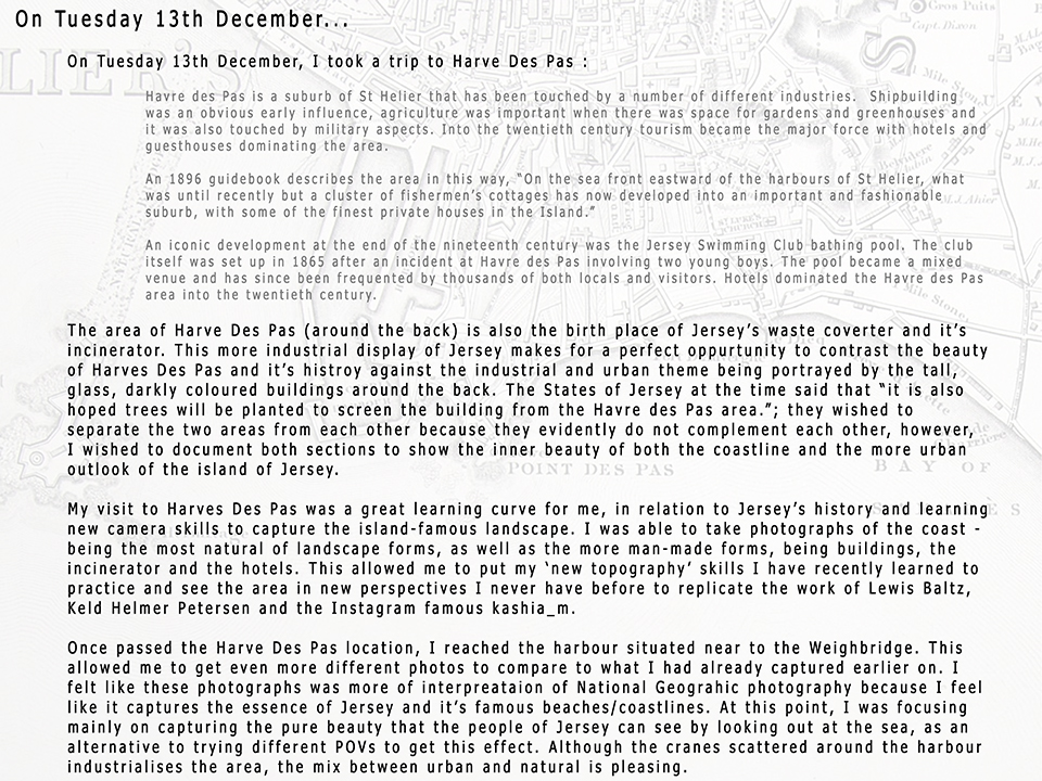
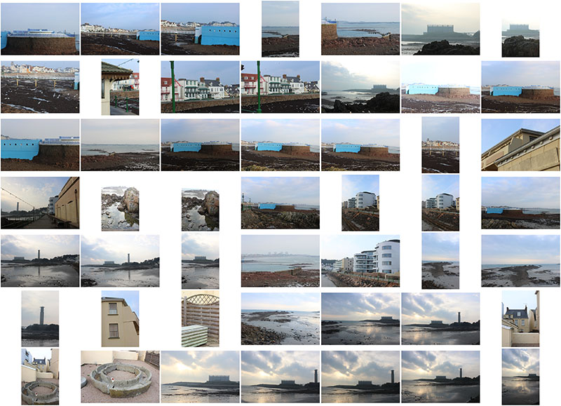
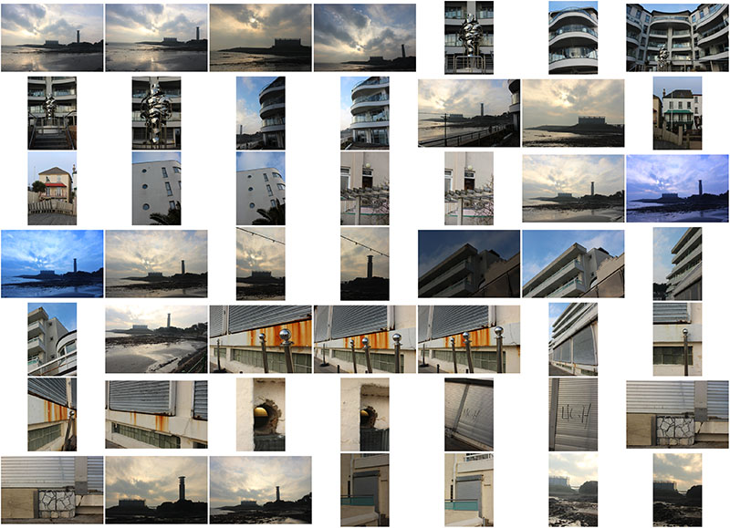
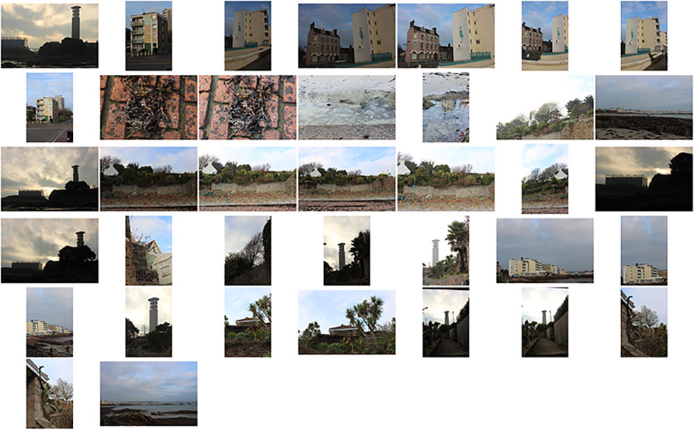
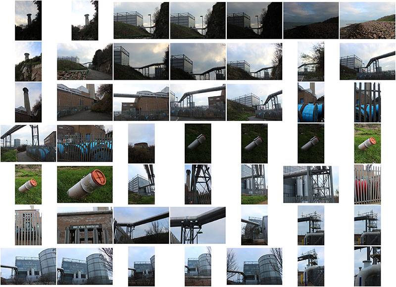
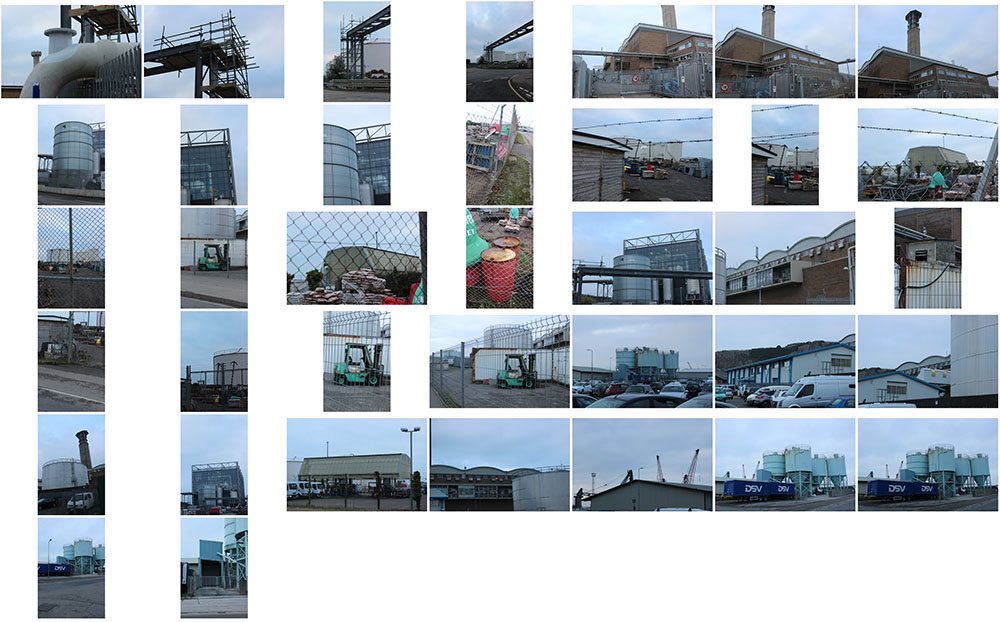
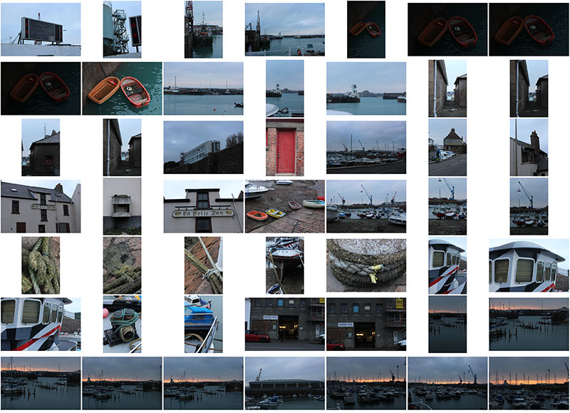

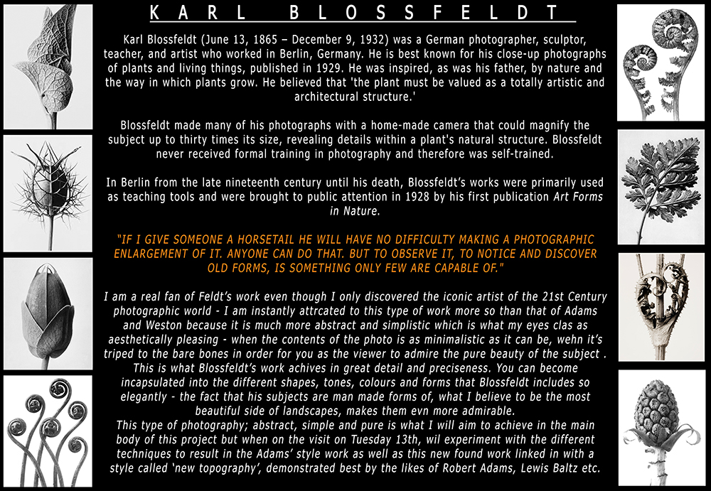
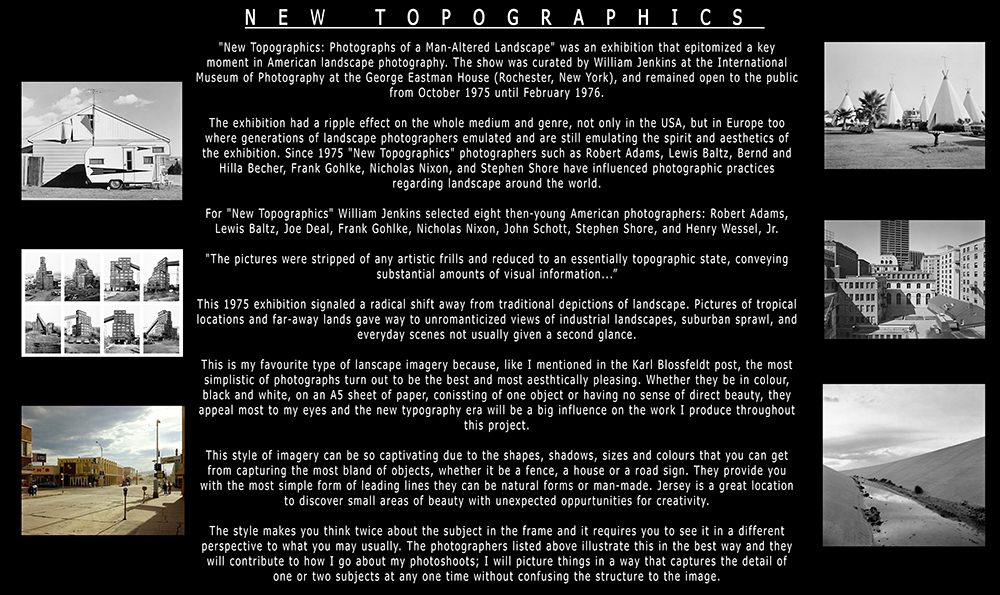
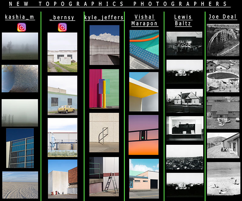
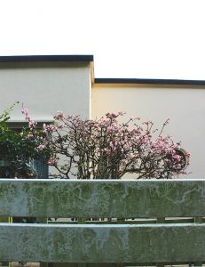
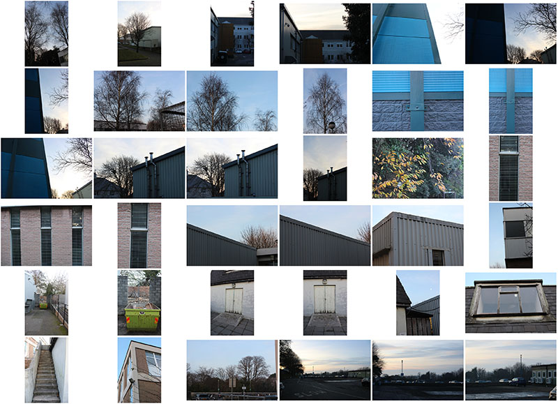 I carried out this photoshoot consisting of just over 30 images; it was inspired by the likes of Kyle Jeffers, Vishal Marapon and kashia_m. They are very abstract photographs that I believe can be put into the category of landscapes, however, in the ‘new topography’ style. I also edited some of the photos I thought turned out best. It is the complete simplicity, the combination of colours and the use of lines that bring each image together as a whole to form a landscape which provoke many thoughts – this is what I wished to achieve.