All posts by Jude Luce
Filters
Archival Imagery
Throughout many evolutions, including the German occupation and World Wars, Jersey has also become revolutionized and has developed its landscapes as well as it’s people over the years. The occupants who live in Jersey have recorded their lifestyle and how they have lived as Jersey has been developing. These personal memories have become something of the past, however are still kept safe for people to look back on re-live certain periods of time.
These records are kept in a place called an archive and Jersey has many of these to showcase what Jersey has become. An archive is an accumulation of historical records. Archives are kept to show the function of a person or organization. Professional archivists and historians generally understand archives to be records that have been naturally and necessarily generated as a product of regular legal, commercial, administrative, or social activities.
Here are some archival images of Jersey:


Records of how Jersey used to be and look like against photographic records of how Jersey is today allows us to compare lifestyles and understand more about the development of our beautiful island.
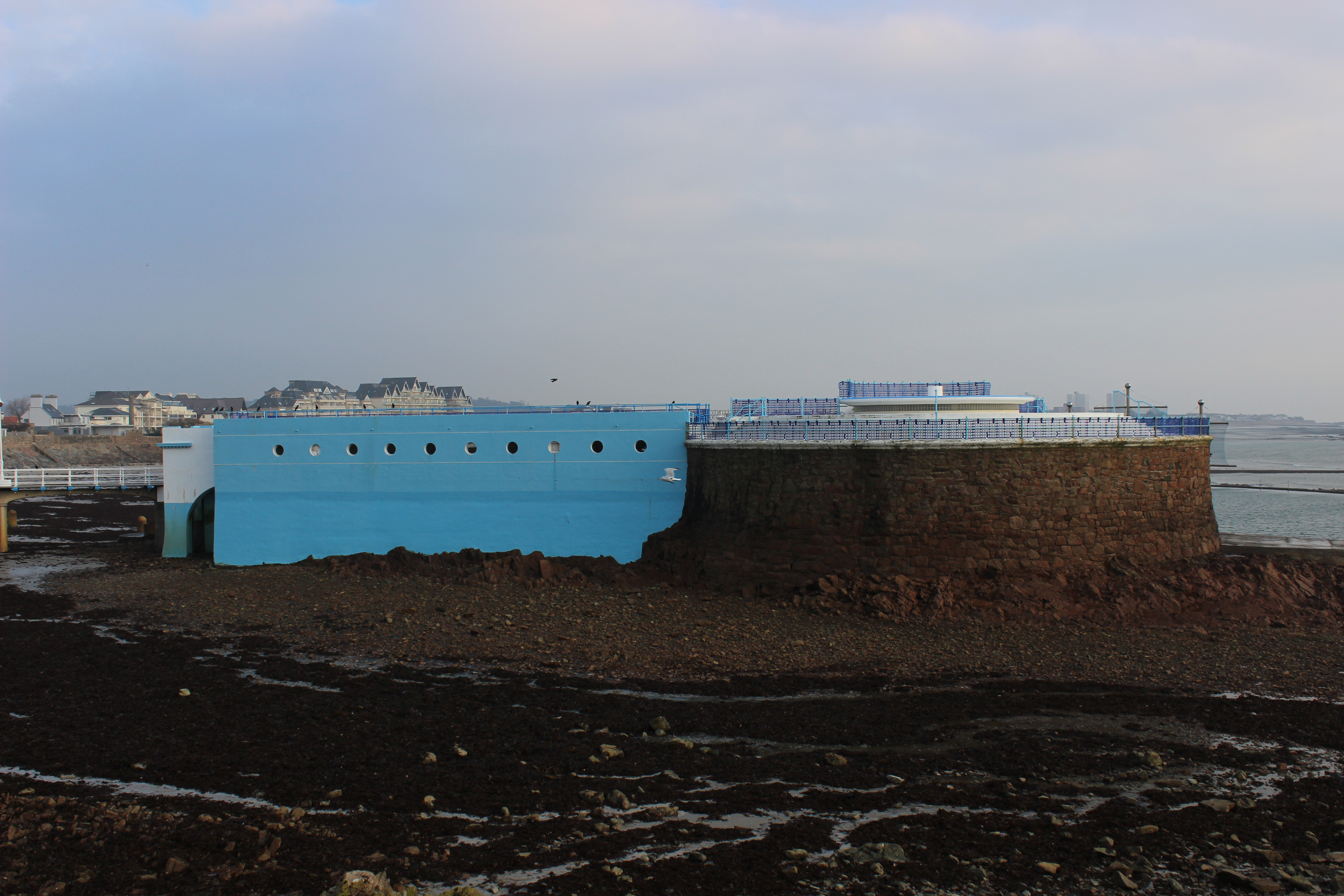
You can find more archival images of Jersey here http://catalogue.jerseyheritage.org/ and here http://societe-jersiaise.org/photographic-archive
Romanticism // Response to Ansel Adams
Romanticism (Romantic era/Romantic period) was an artistic, literary, musical and intellectual movement that originated in Europe toward the end of the 18th century. Romanticism was characterized by its emphasis on emotion and individualism as well as glorification of all the past and nature, preferring the medieval rather than the classical. It was partly a reaction to the Industrial Revolution.
In photography, photographers who took up the romanticist approach aimed to sensationalise the overall look of their mages by enhancing certain colours to make the image look almost surreal, glorified and they wanted to dramatize certain areas of their photographs.
It is said that “the movement emphasized intense emotion as an authentic source of aesthetic experience, placing new emphasis on such emotions as apprehension, horror and terror, and awe—especially that experienced in confronting the new aesthetic categories of the sublimity and beauty of nature. Romanticism was a huge step away from the subtleties of photography and instead looked very bold and striking.
In the visual arts, Romanticism first showed itself in landscape painting, where from as early as the 1760s British artists began to turn to wilder landscapes and storms, and gothic architecture, even if they had to make do with Wales as a setting. Caspar David Friederich and J.M.W. Turner were born less than a year apart in 1774 and 1775 respectively and were to take German and English landscape painting to their extremes of Romanticism.

Ansel Adams is an example of a modern day photographer who embraced Romanticism. Classed as the master and crucial pioneer of modern landscape photography, inflecting may of our great’s today, Adams used a black and white film in his images he captured of towering mountains, elegant lakes and snowy hills. This added an effect to each of images, differentiating his from others such as Edward Weston as it created a look to the sky which darkened the blue to a mysterious and shadowy, and quite chilling blackish grey colour that casted over the mountains etc. of his photographs. This is a romanticised example of landscape photography.

Charles Baudelaire also stated that,” Romanticism neither depends precisely on choice of subject nor in exact truth, but a mode of feeling.”
There are a variety of exhibitions and competitions where photographers are being asked to capture single images that absorb vision of the romantic qualities of nature within the landscape that surrounds them.

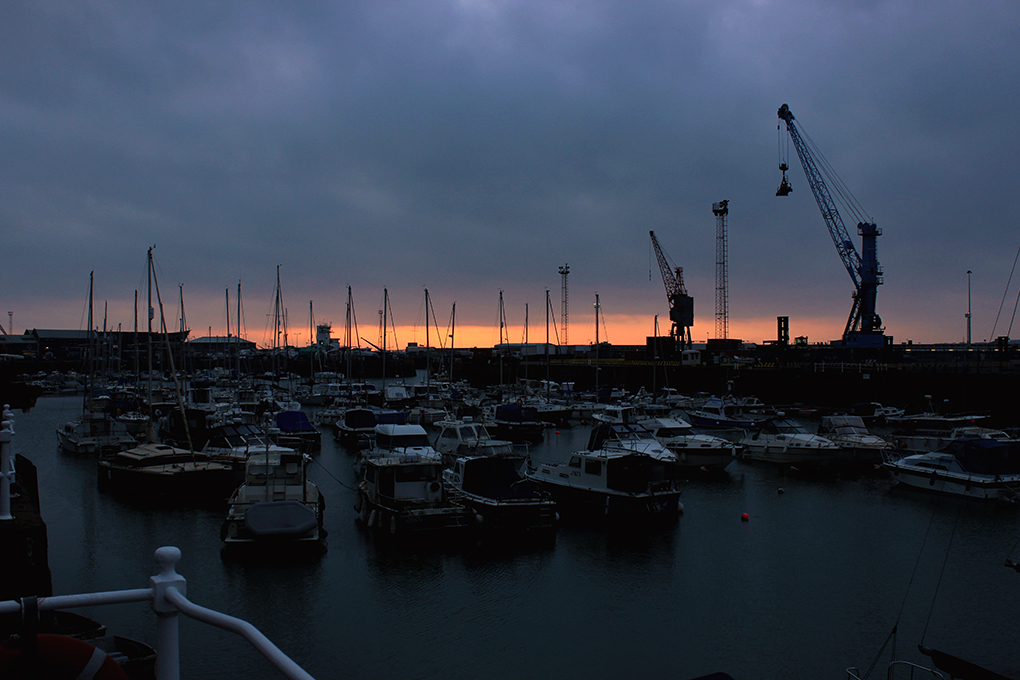
I firstly used the lasso tool to separate the sky from the land. This would allow me to work on the two aspects individually then bring them together at the end. It s easier than attempting to make the sky darker in colour with the land lighter in colour as a whole image.
I then made both aspects black and white and operated on the sky first. I used the brightness and contrast tool to adjust the overall colour as well as shadows, then the levels tool to perfect the levels of black, white and grey in the sky. I also experimented with curves and exposure. I then made the land the right style to complement the sky, much like Ansel Adams.
I finally used the rubber and blending tool to fix up the edges created by separating the tow aspects at the beginning. This made it look ore professional and slick.
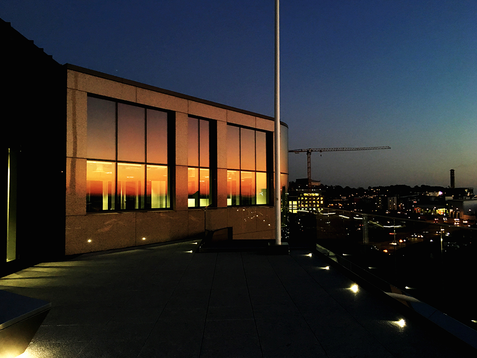
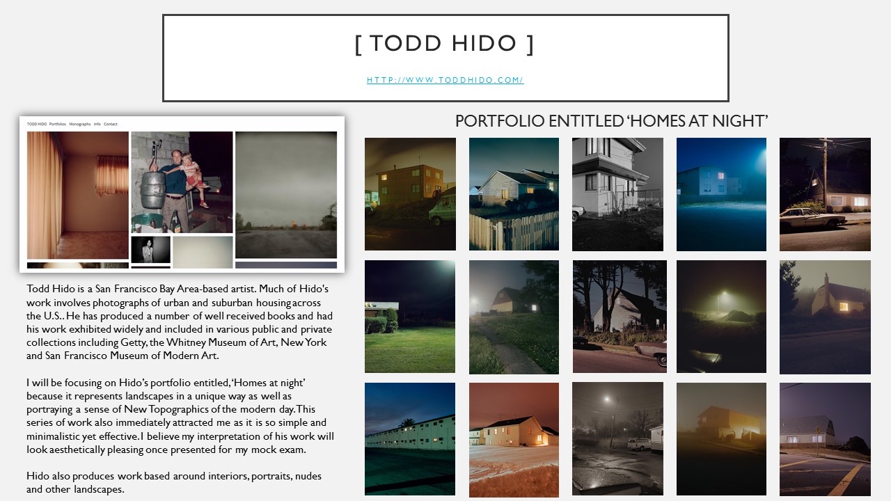
Landscapes // Mock Exam – Initial Research
POWERPOINT NOT COMPLETE
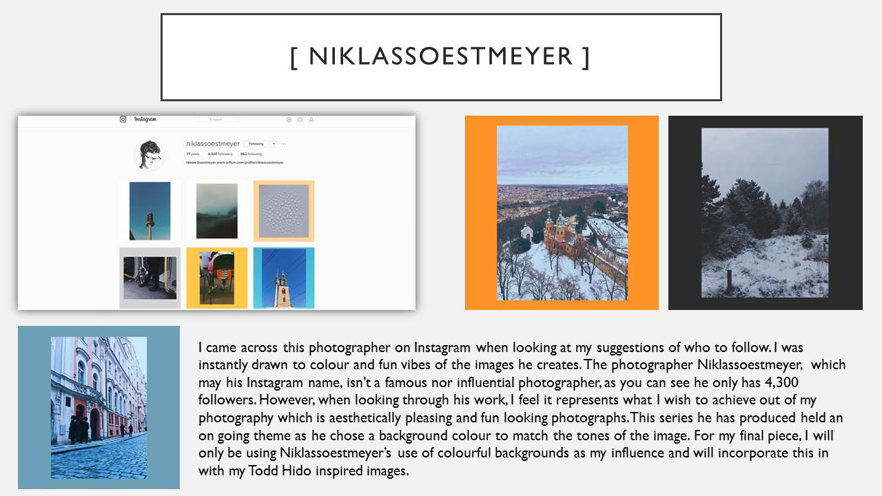
Landscape Edits // Inspiration : niklassoestmeyer
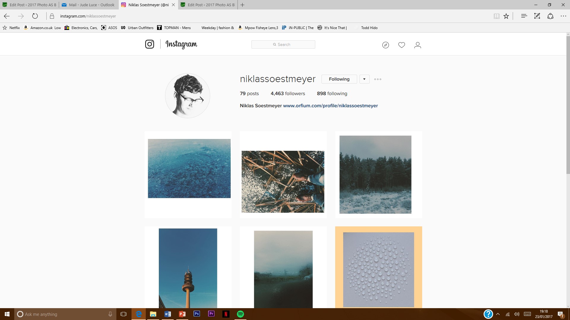
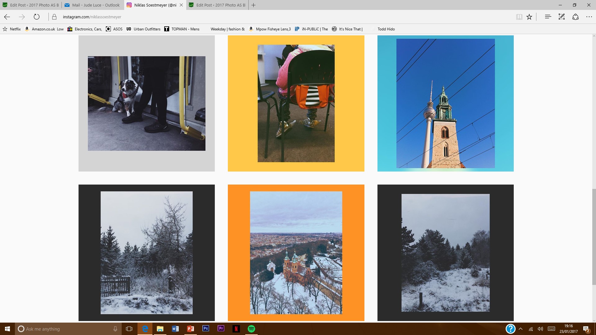
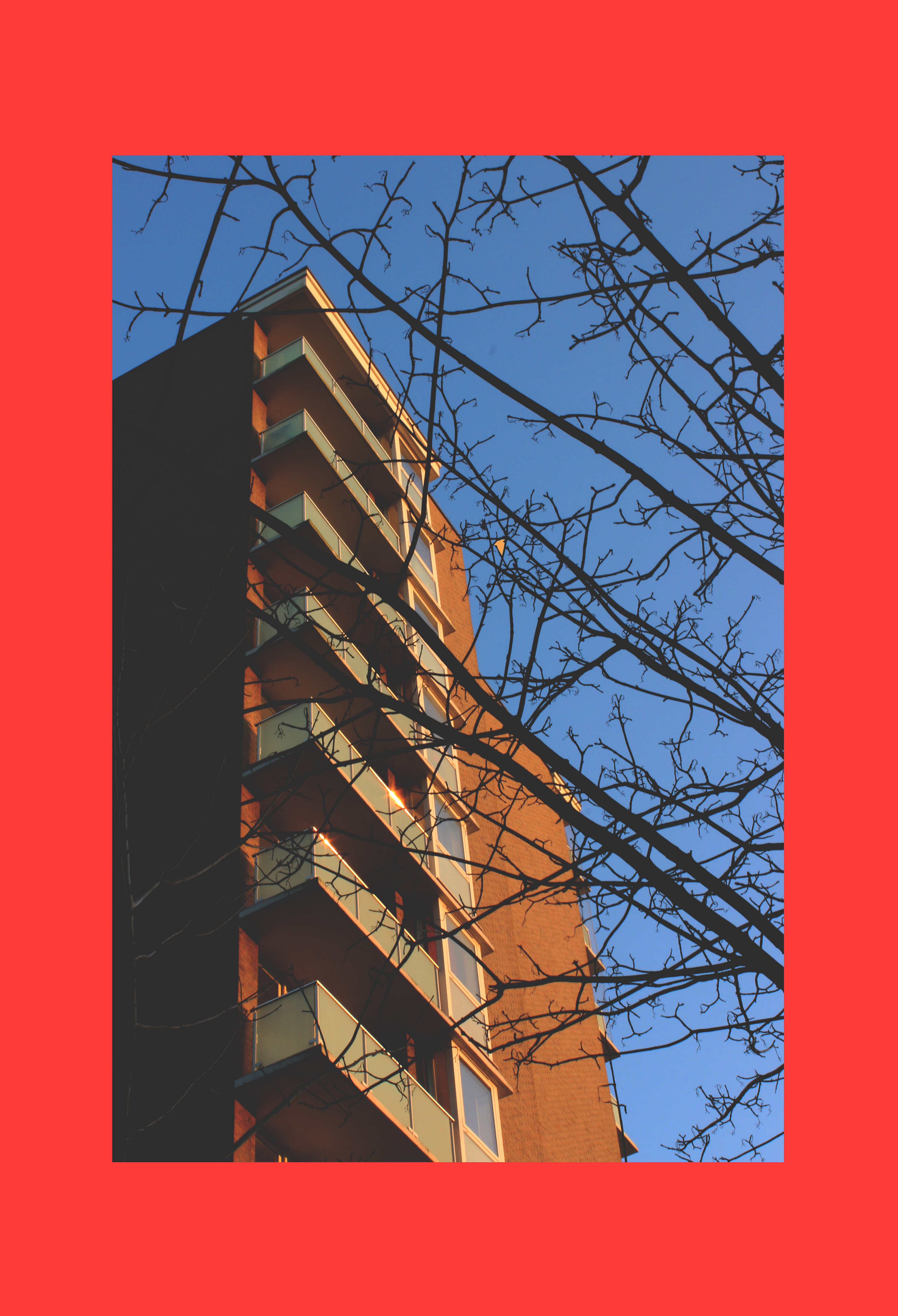
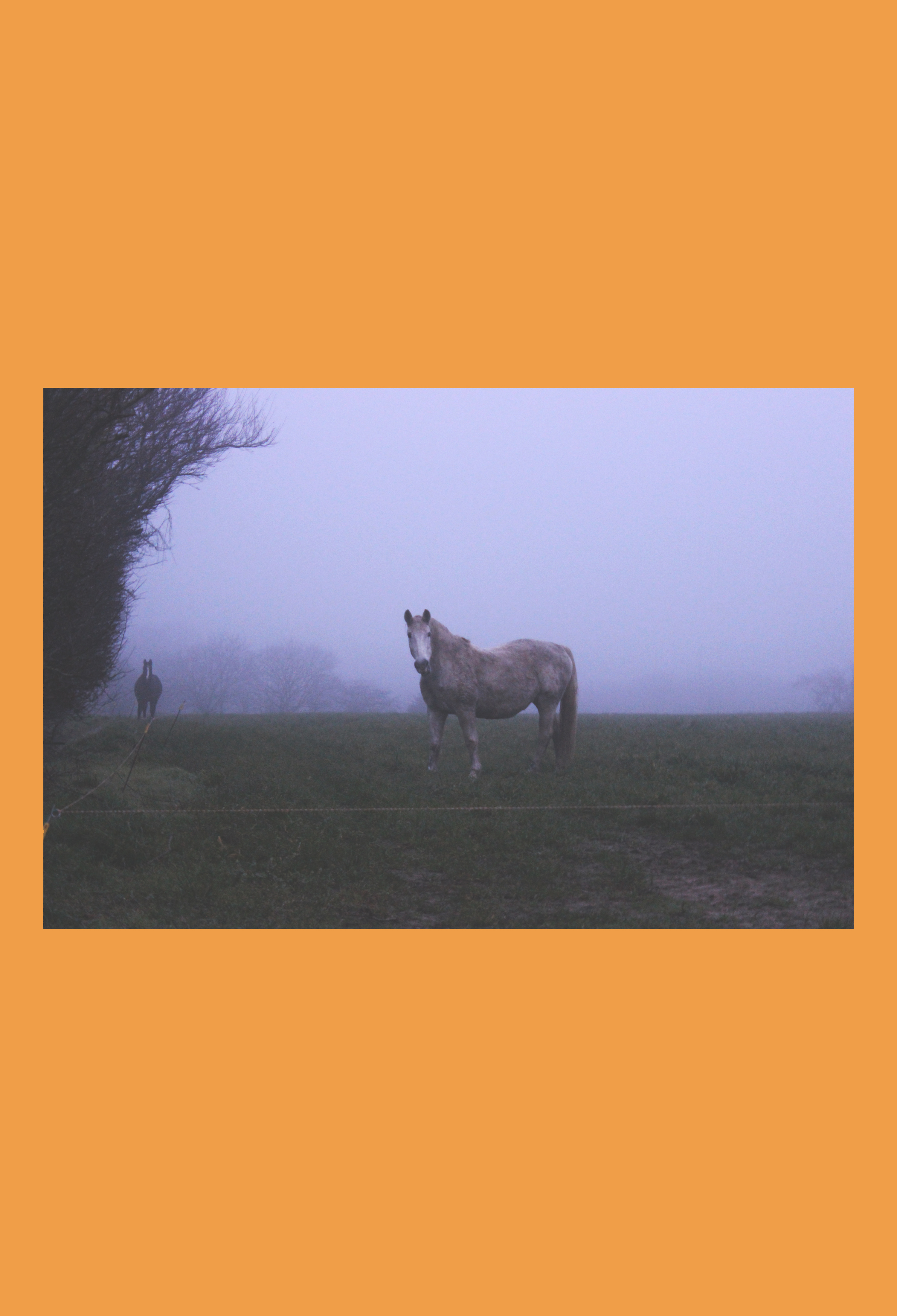
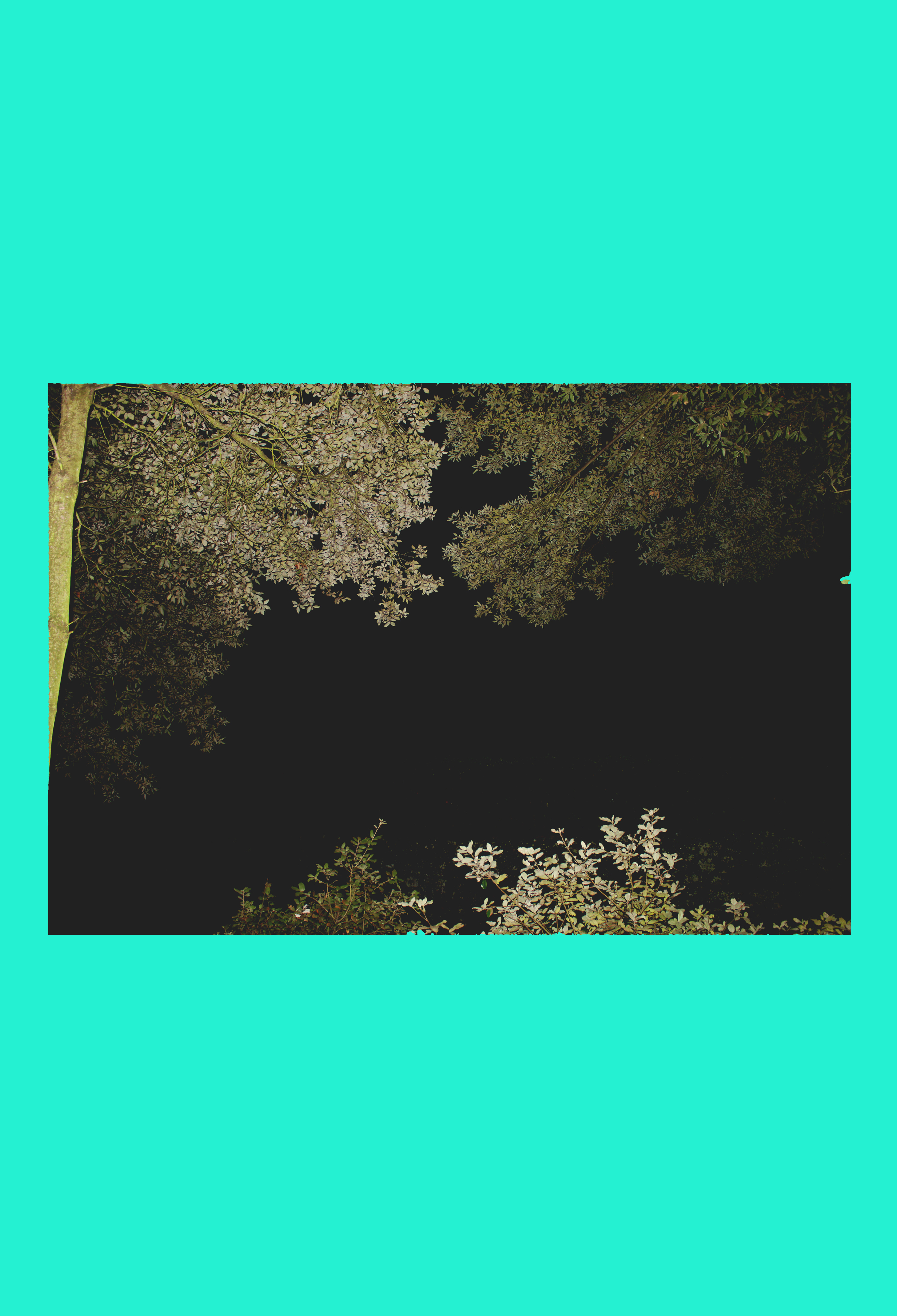
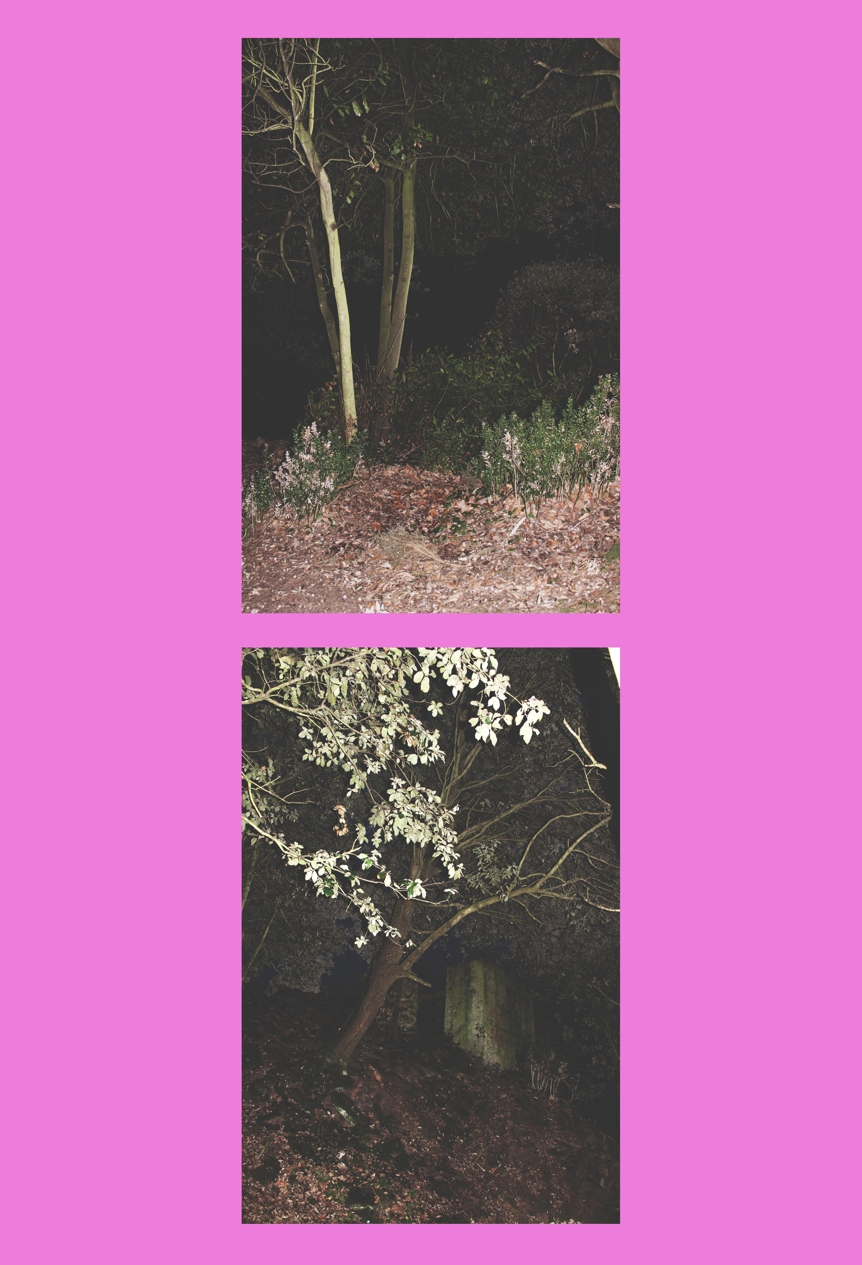 When I discovered Niklassoestmeyer on Instagram, I followed him immediately because I was instantly attracted to the bright colours he uses as background. I jus thought it was so simple and minimalistic yet effective. As well as this, the images he uses are mostly landscapes photos which are really aesthetically pleasing and have quite a vintage look to them which I really like and they are paired with the background colour very carefully as he picks out the tonal theme that is in the photo then creates a colour based on this.
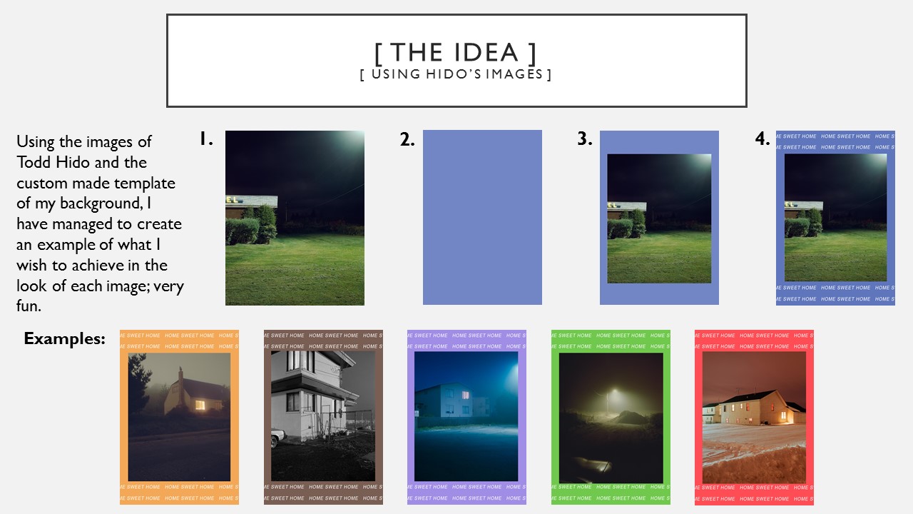
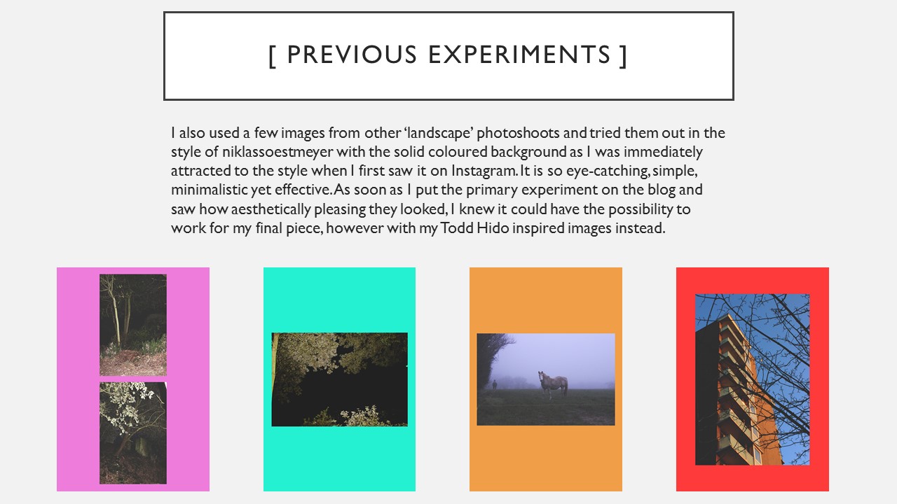
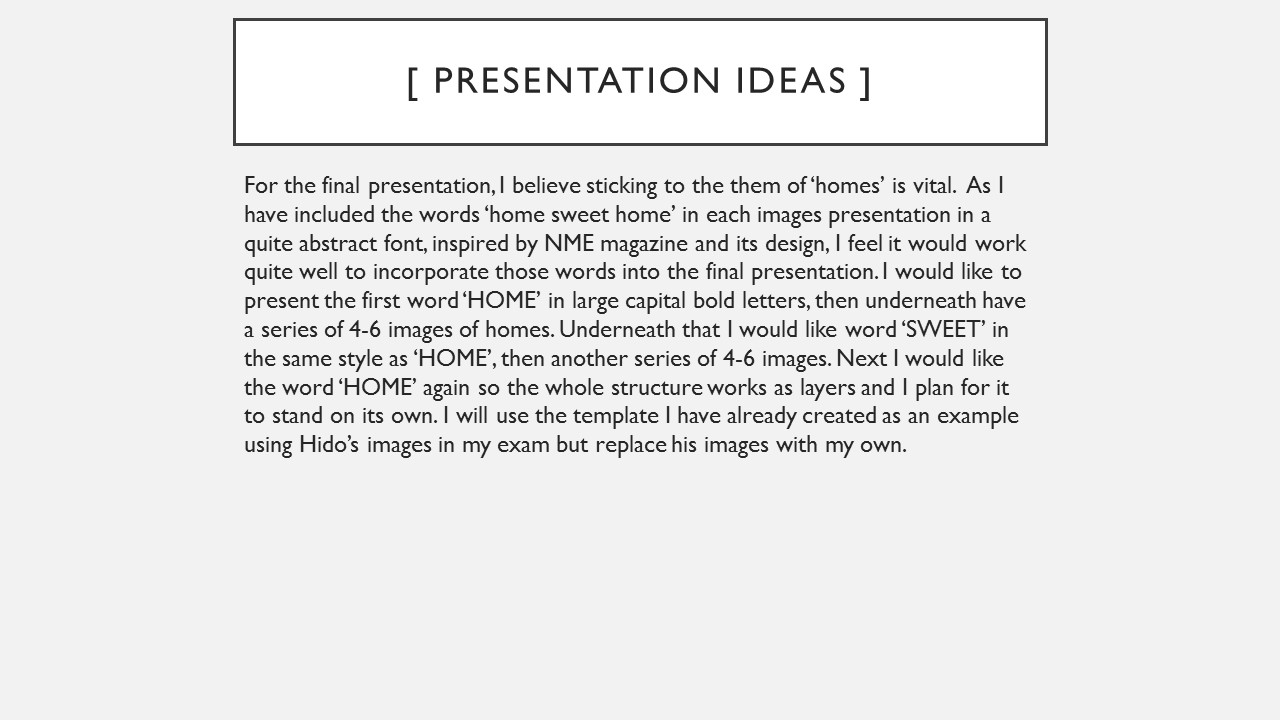
However, when producing my own interpretation of his work I would only concentrate on the coloured background aspect as I had my own images already which I had edited in the style of Niklassoestmeyer, before I had come across his work. I noticed that he mostly used bright colours as opposed to pastels to provide a strong background for his photo to stand out against. I chose my favourite images from all of my edits from my landscape shoots and implemented them to fit onto the fun colour blocks.
// Image Analysis // 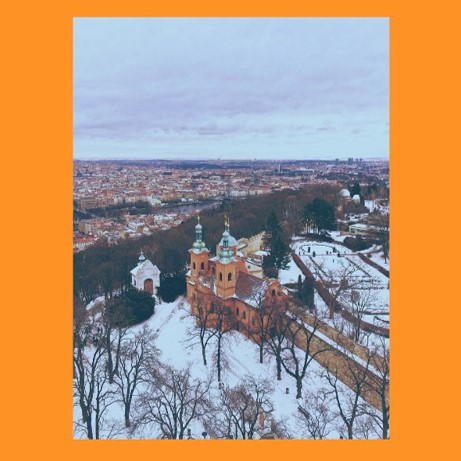 I have picked out this image of Niklassoestmeyer’s to discuss because it is my favourite of his.
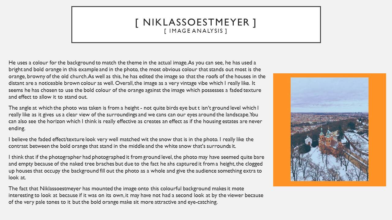
Like I talked about earlier on, he uses a colour for the background to match the theme in the actual image. As you can see, he has used a bright and bold orange in this example and in the photo, the most obvious colour that stands out most is the orange, browny of the old church. As well as this, he has edited the image so that the roofs of the houses in the distant are a noticeable brown colour as well. Overall, the image as a very vintage vibe which I really like. It seems he has chosen to use the bold colour of the orange against the image which possesses a faded texture and effect to allow it to stand out.
The angle at which the photo was taken is from a height – not quite birds eye but t isn’t ground level which I really like as it gives us a clear view of the surroundings and we cans can our eyes around the landscape. You can also see the horizon which I think is really effective as creates an effect as if the housing estates are never ending.
I believe the faded effect/texture look very well matched wit the snow that is in the photo. I really like the contrast between the bold orange that stand in the middle and the white snow that’s surrounds it.
I think that if the photographer had photographed it from ground level, the photo may have seemed quite bare and empty because of the naked tree braches but due to the fact he ahs captured it from a height, the clogged up houses that occupy the background fill out the photo as a whole and give the audience something extra to look at.
The fact that Niklassoestmeyer has mounted the image onto this colourful background makes it mote interesting to look at because if it was on its own, it may have not had a second look at by the viewer because of the very pale tones to it but the bold orange make sit more attractive and eye-catching.
New Objectivity
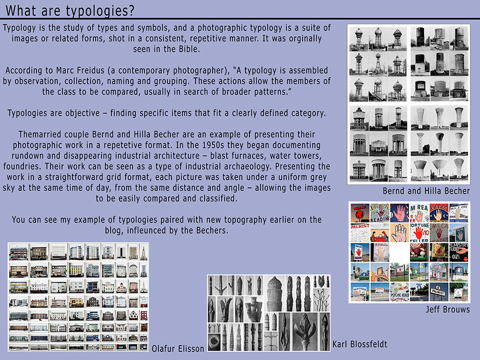
Typologies
New Topographics
Today, I experimented further with the New Topographics movement by updating my knowledge and understanding of it; refreshing my memory then taking a trip out in the playground/car park of the school as I was aware this had many opportunities for me to capture the ugliness and dullness of the mess which is hidden behind the school but attempt to find it’s indirect, inner beauty.
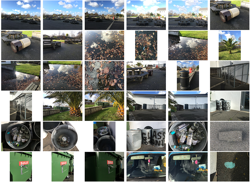
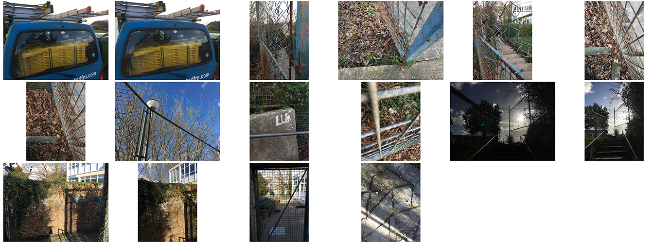 This shoot focuses particularly on the nuts on bolts of New Topography – capturing imagery of the man-altered landscapes of our world – landscapes which have no direct beauty or meaning to them, including objects like bins, glass bottles, broken fences and graffiti. I wanted it to be the simplicity of the each image, in the way it was taken that provokes the thoughts of viewers.
I took all of these images of my iPhone 6S and what I wished to achieve was a photographic contrast between natural landscapes and man-made features obstructing the beauty of them or perhaps vice versa – the natural landscapes adding another perspective to the inanimate, lifeless man-made features. The not-so-great quality of my iPhone camera compared to that of a professional Canon adds to the effect of dullness that is received on this windy and miserable day.
Alliance Franchise // Climate State Of Emergency Exhibition // 10.01.17
The Alliance Française is the leading cultural network worldwide, with 1,040 establishments in 136 countries on all five continents. Each year, 450,000 people, of all ages, attend Alliances Françaises to learn French and more than 6 million people participate in their cultural activities. The franchise has organised a photography competition every year since 2010. The competition aims to highlight the “richness and diversity” of the 800 Alliances Franchise around the world, and to give amateur photographers the opportunity to display their work to a large audience. The theme selected by the franchise was ‘Climate – State of Emergency’.
The candidates were invited to submit photos which captured the questions posed by the way climate is changing, where they live or the effects resulting from the changes.
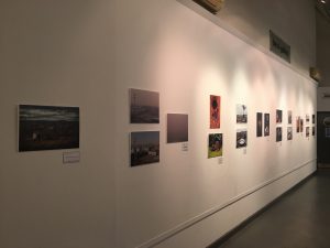
We went to The Jersey Arts Centre on the 10.01.17 to view the final photos selected by the franchise and chose my favourite images out of the 44 on show.
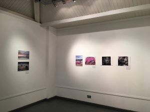
These are my favourite images from the exhibition, along with the name of photograph and the photographer:
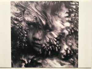
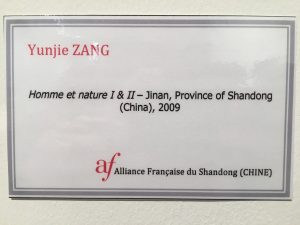
Yunjie Zang is an amateur photographer and is 29 years old. He is a teacher and does photography in his spare time.
What I like about this image:
- obscure
- unusual
- unnerving
- tells a story
- provokes thoughts
- mysterious
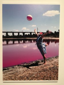
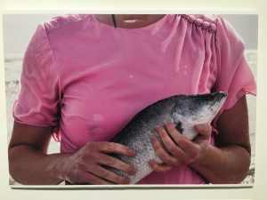
David Porteus is a 47 year old amateur photographer, employed at Melbourne Arts Centre in Australia.
What I like about these images:
- they go together very well
- metaphor of the toxic danger surrounding us
- the bright colour of pink in both images
- aesthetically pleasing
- not necessarily focusing on landscapes
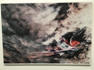
Marc Lamey is a 54 year old and is an engineer
What I like about this photo:
- abstract
- the motion blur
- moody atmosphere
- looking to tell a story
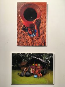
Somennath Mukhopadhyay is a 47 year old amateur photographer and is a teacher from India.
What I like about these images:
- very cultural
- lots f bright colours
- very vibrant
- bases each photo around the life of a local at the same time as incorporating the them of landscapes and, most important, climate change.
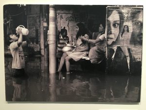
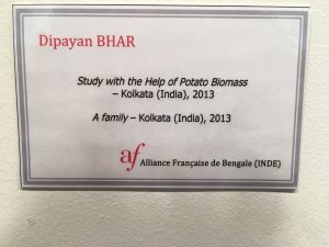
Dipayan Bhar is a 25 year old amateur photographer employed in a service sector in Bengal, India. He is also a member of National Geographic and takes images to submit to the program.
What I like abut this image:
- he is so young
- lots of focus points
- black and white effect can represent that his is how the children within the image see the world
- reflection of water
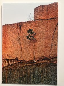
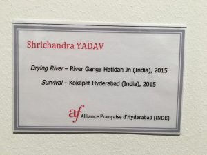
A 36 year old amateur photographer, IT engineer from India.
What I like about this image:
- very minimal
- aesthetically pleasing
- representing life where you may not think it existed
- one focal point
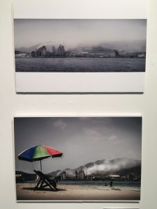
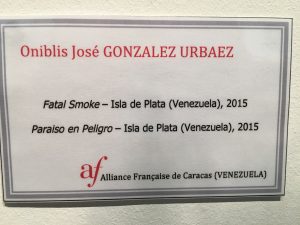
Oniblis Jose Gonzalez Urbaez is an amateur photographer from Venezuela.
What I like about this image:
- a juxtaposition between the industrial landscape and typical beach scene
- contrast between colours of beach and dull grey colours of industrial scene
- great example of changes in landscapes
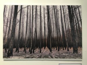
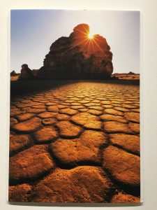
Susan Whitbread is a 63 year old amateur photographer and is a civil servant from Australia.
What I like about this image:
- many leading lines
- sense of symmetry
- repetition
- bland vibrancy
- warm and cold tones juxtaposes the image
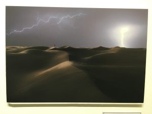
Fahran Saud Al Shammeri is an amateur photographer, 40 years of age and is a teacher in Saudi Arabia.
What I like about these images:
- the vibrant colours and simplicity
- almost looks like a computer background it is so crisp
- you can see the immediate beauty of the natural landscapes
- the shadows
My Favourite Image:
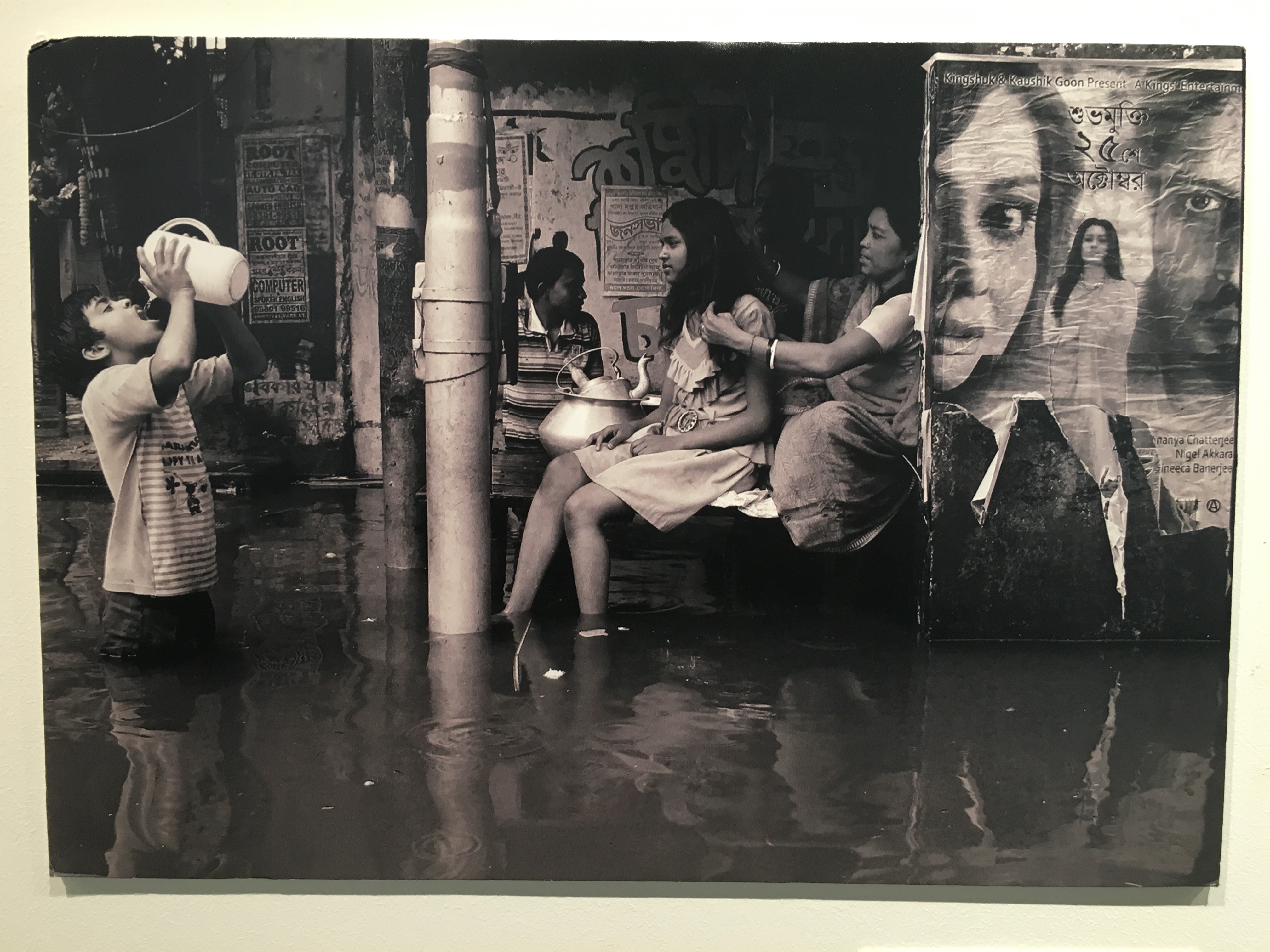
What I like about this image is the story it tells and the message it perhaps trying to portray and it had an immediate impact on me. It seems very mysterious but there are several points in the photo that us as the audience can pick up on. It is a great example of our changing world and the different lifestyles/cultures we are surrounded by – fitting in perfectly with the theme of climate change and the affects in has on us.
I also really like that it is in black and white because it may not have had the same effect if it was in colour. You can argue that the evident deprived children in the photo see the world in black and white and may not have any vibrancy in their lives as they live in the conditions we get only a preview of in the image.
I believe the photographer, Dipayan Bhar has captured an told the story well of the lives of the kids who live in such poor conditions. Our eyes are drawn to a range of aspects within the photograph. The main, in my opinion, being the little child, thigh deep in dirty water drinking from a jug of this water. The pole down the middle of the scene splits the photo in two and makes it more easily digestible for the viewers. We can then see the rest of his family sitting on a balcony who can only sit their and allow the boy to drink the water as it’s their only option.
The overall mood and atmosphere of the image is very grim and miserable and we get a feel for how the subjects are living, which I believe is what Bhar wanted to achieve.
To the right of the image, we can see what looks like a Bollywood film poster; immediately representing two sides to the area. What we originally thought was deprived, we suddenly get a sense of class as this film poster is displayed next to such poor conditions. It provides us with a contrast.
I believe Bhar would have wished to prioritise the message received from this photo over the actual quality of the image and any editing techniques, which is why he submitted it to this amateur competition.
Initial Research on Key Terms
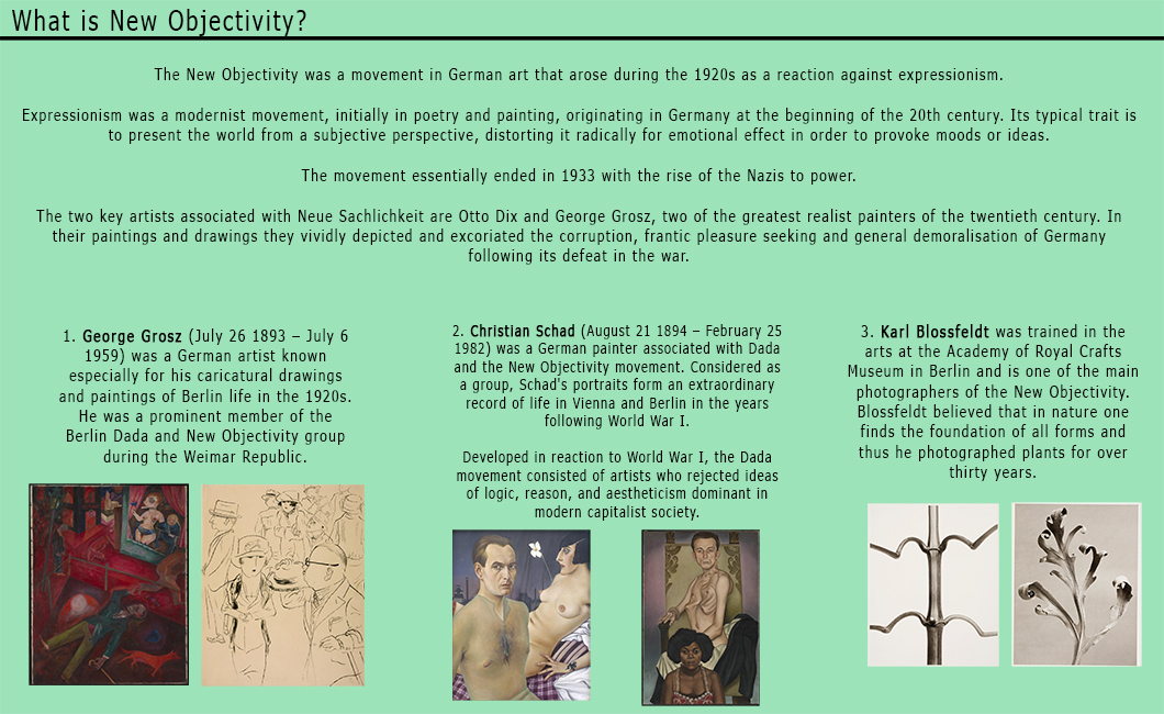
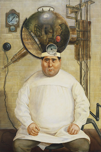
The New Objectivity was a movement in German art that arose during the 1920s as a reaction against expressionism.
Expressionism was a modernist movement, initially in poetry and painting, originating in Germany at the beginning of the 20th century. Its typical trait is to present the world from a subjective perspective, distorting it radically for emotional effect in order to provoke moods or ideas.
The movement essentially ended in 1933 with the rise of the Nazis to power.


An archival image is an image meant to have lasting value. Archival images are usually kept off-line on a cheaper storage medium such as CD-ROM (compact disc) or magnetic tape (magnetic storage or magnetic recording is the storage of data on a magnetised medium, developed in Germany) in a secure environment. Archival images are of a higher resolution and quality than the digital image delivered to the user on-screen.
Archival imagery can be historical images of iconic landscapes or landscapes with some sentimental value and often have a big difference in comparison to its new look – for example, it could be built on new land or just given an updated look. You can find many examples of developed landscapes in Jersey.
Abstract photography, sometimes called non-objective, experimental, conceptual or concrete photography, is a means of depicting a visual image that does not have an immediate association with the object world and that has been created through the use of photographic equipment, processes or materials. An abstract photograph may isolate a fragment of a natural scene in order to remove its context from the viewer, it may be purposely staged to create an unreal appearance from objects, or it may involve the use of color, light, shadow, texture, shape and/or form to convey an impression. The image may be produced using traditional photographic equipment like a camera or it may be created without using a camera by directly manipulating film/paper.
Abstract photography has rocketed during the 21st Century with the development of computers and hardware and their ease of access to people. The boundaries of abstract photography were expanded beyond the limits of film and chemistry into limitless dimensions.
Jessica Eaton
%20and%20cfaal%20115,%202011%20(right).jpg)
Barbara Rosenthal

Eileen Quinlan
%20and%20Black%20Friday,%202011,%20Chromogenic%20color%20print%20(right).jpg)
In art, formalism is the study of art by analyzing and comparing form and style—the way objects are made and their purely visual aspects. In painting, formalism emphasizes compositional elements such as color, line, shape, texture, and other perceptual aspects rather than the historical and social context.
The philosopher Nick Zangwill of Glasgow University has defined formalism in art as referring to those properties “that are determined solely by sensory or physical properties”.
A formal analysis is an academic method in art history. It requires you to describe things very carefully.
Zangwill defined three types of formalism. He described anti-formalist thinkers as those who “think that no works of art have formal aesthetic properties.”


