All posts by Adam Seal
Filters
Depth of Field – Aperture (1)
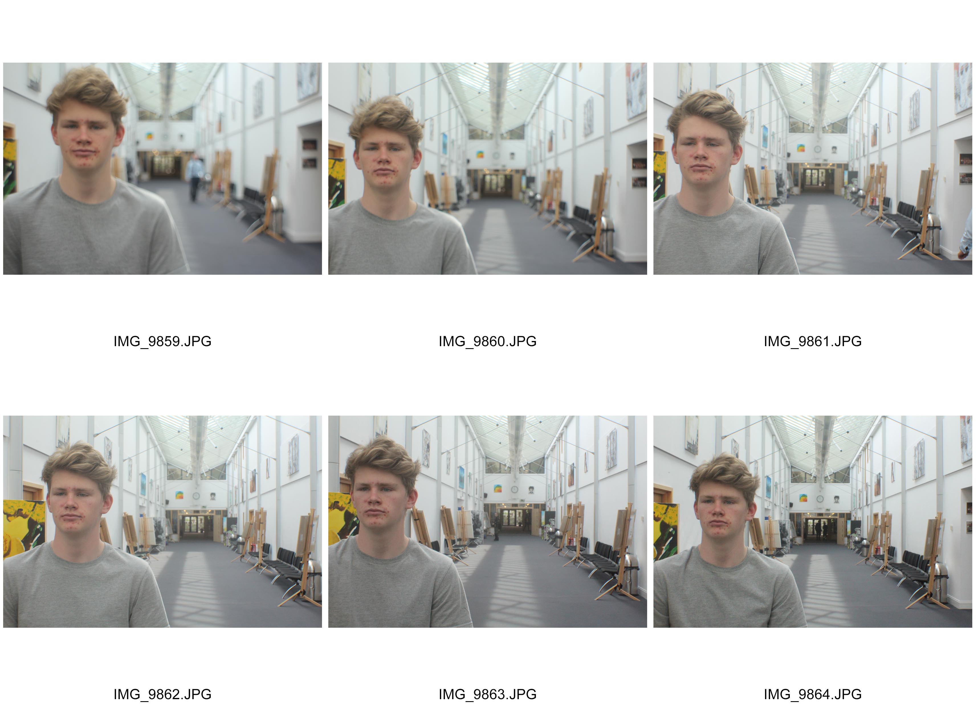
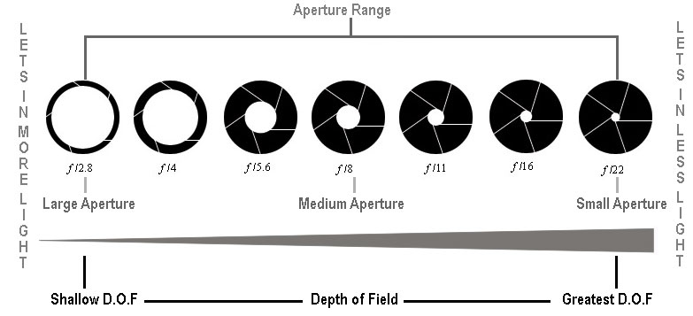
The aperture for a lens is the size of the gap allowing light in on the photograph. A lower aperture means a bigger shutter size giving the effect of an increased blur in the depth of field. A higher aperture is a small shutter size resulting in a more precised and detailed photograph in total.
In my experiment I adjusted the aperture from f5, f10, f15, f20, f25 and f30. I demonstrated how the depth of field is affected by the size of the shutter size resulting in a more leveled style of blurriness behind the person. By using this technique, we can create a more personnel and intimate style of photograph where we focus on the desired point easier.
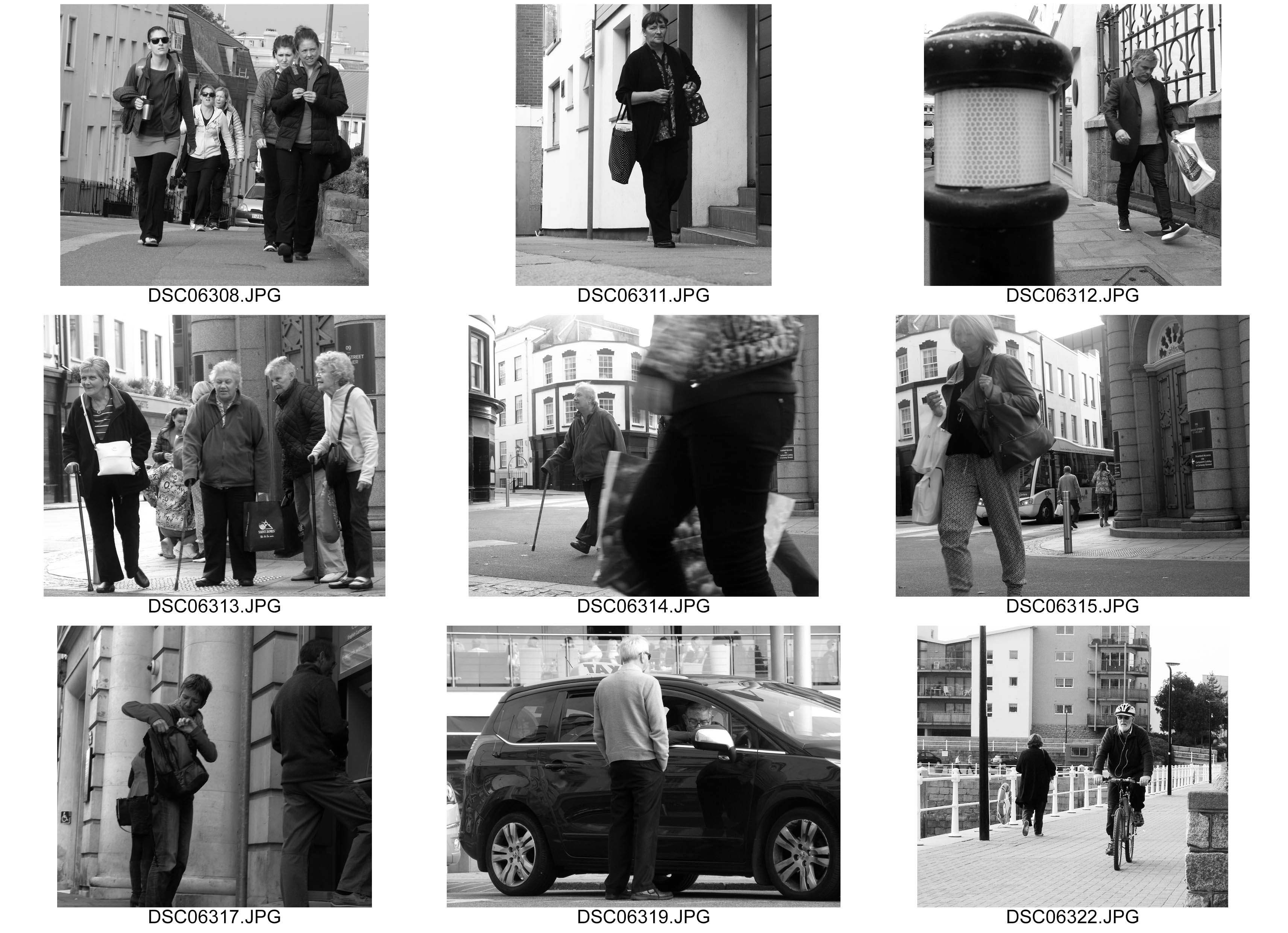
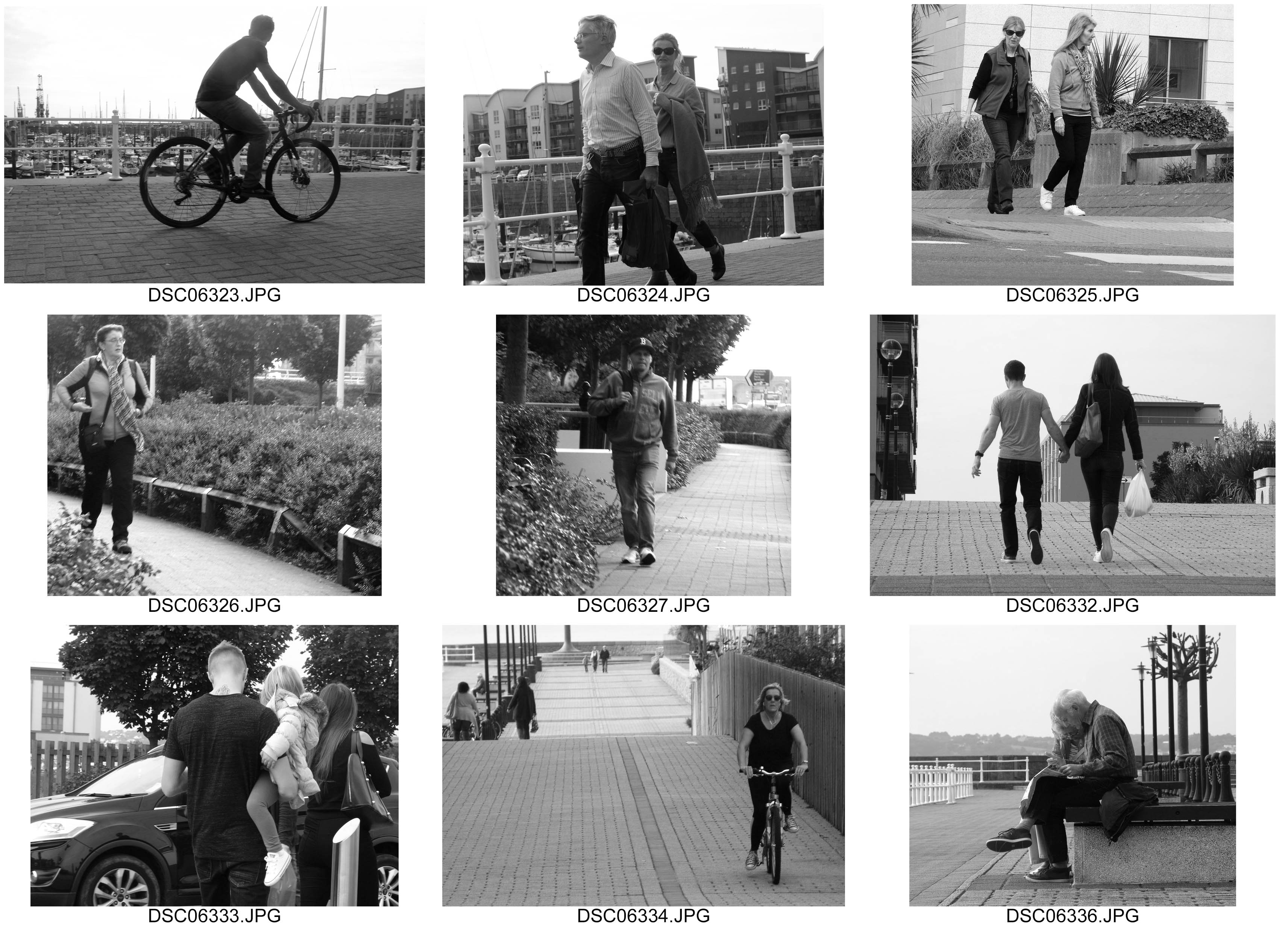
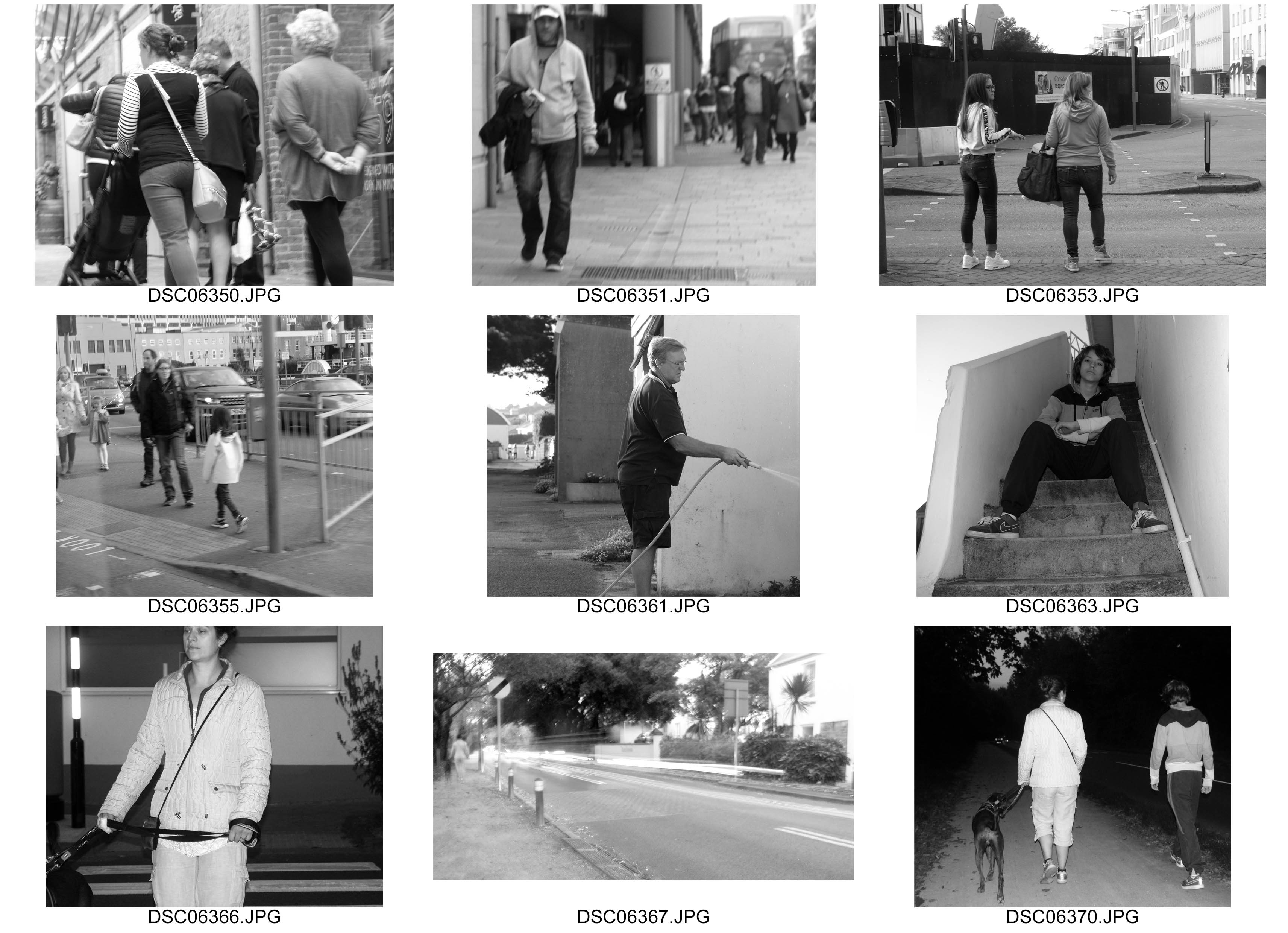
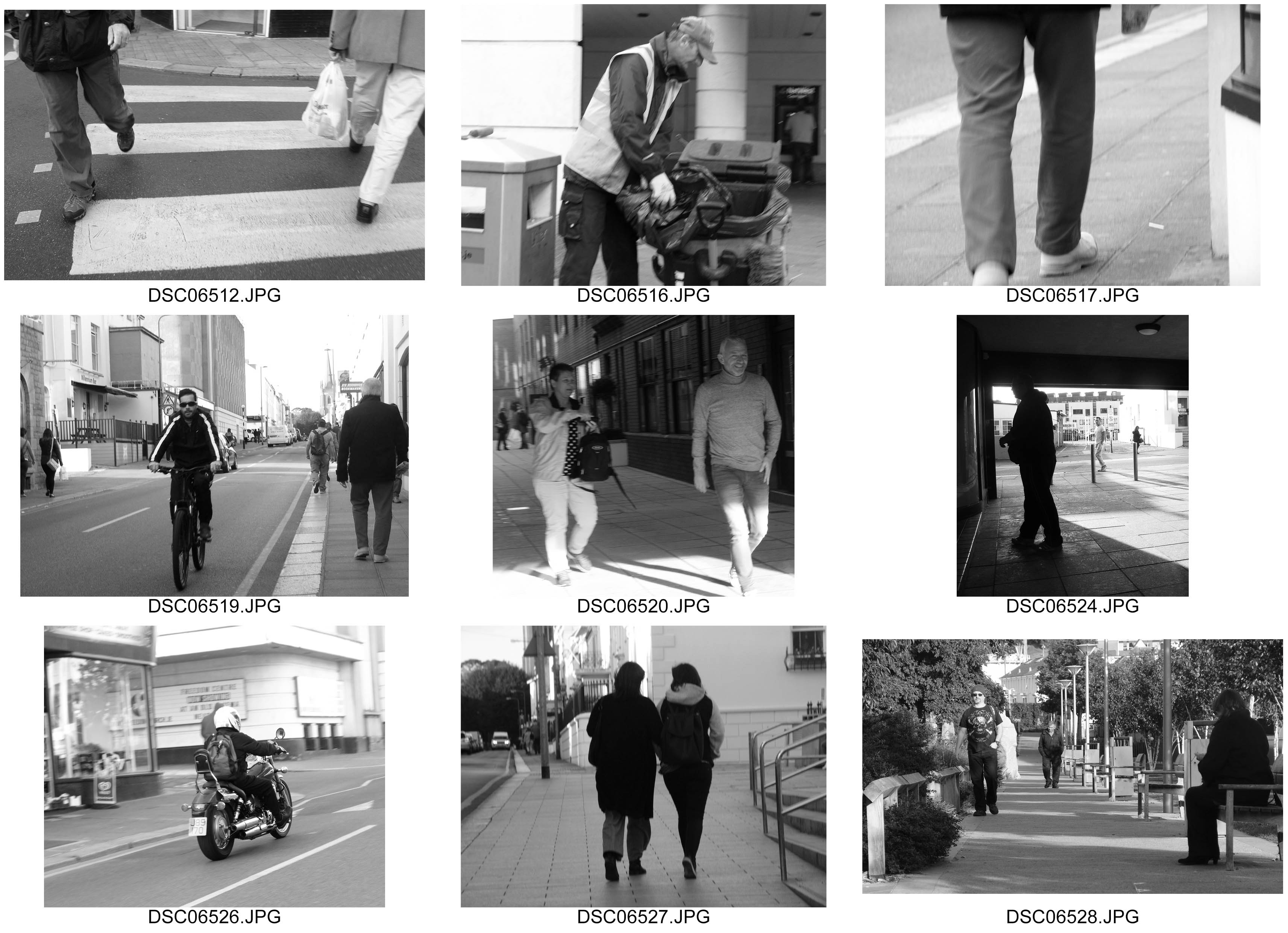
An Uncertain Walk
Types of People:
- Street Cleaners/ sweepers
- Parking offices
- Formal workers
- Builders – scaffolding/Road works/construction
- Dwellers/Homeless People
- Old People/Pensioners/unemployed
- Coffee Shops/cafes
Locations:
- Town Market
- Car Park
- Glass
- Zebra Crossing
- Tunnel
- High Street
- Outside Offices
- Park
Techniques
- Worms eye view
- Birds Eye
- Face On
- Varying Shutter Speeds
- Reflections
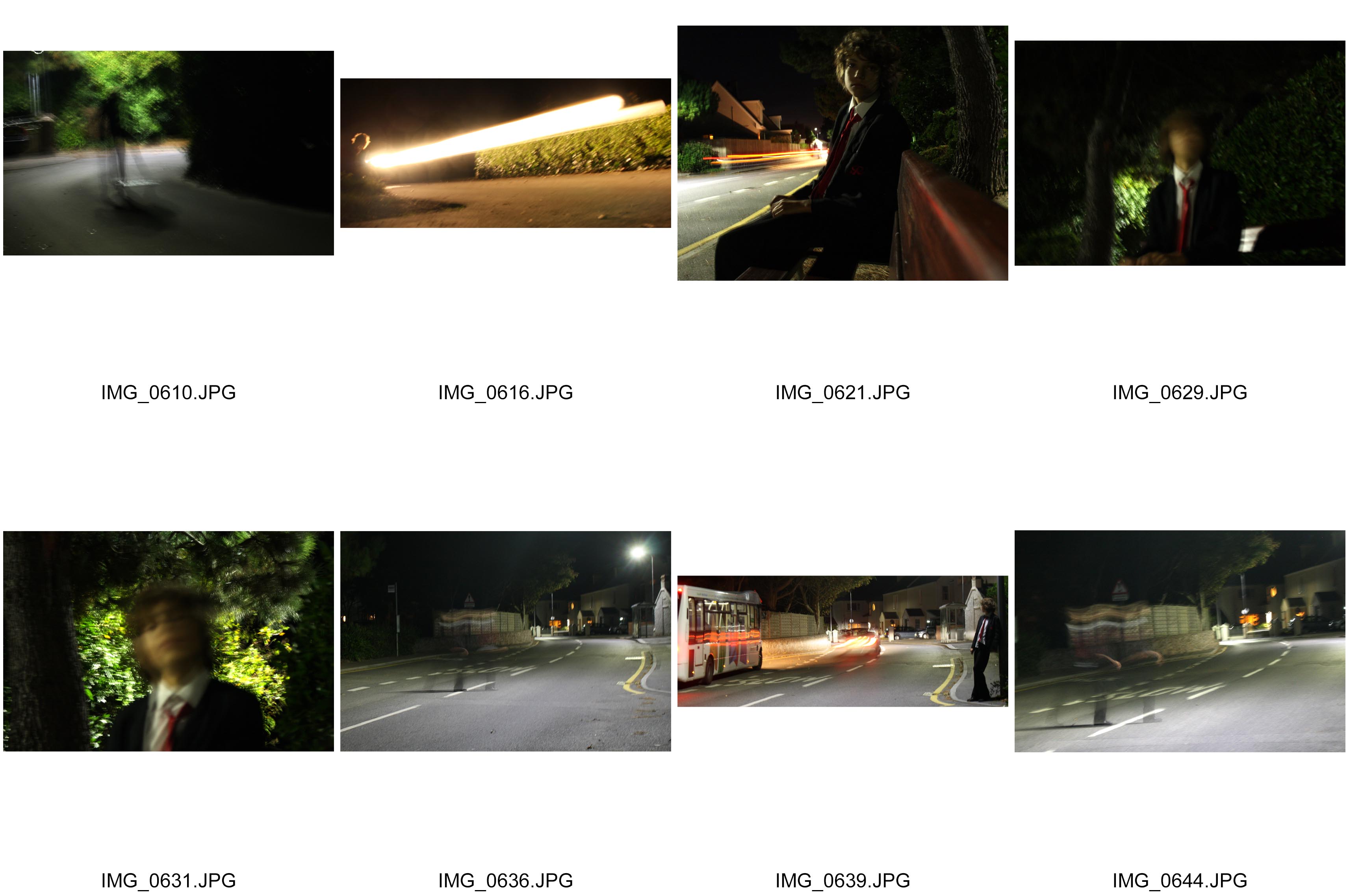
My Favourite Slow Shutter Speed Photograph
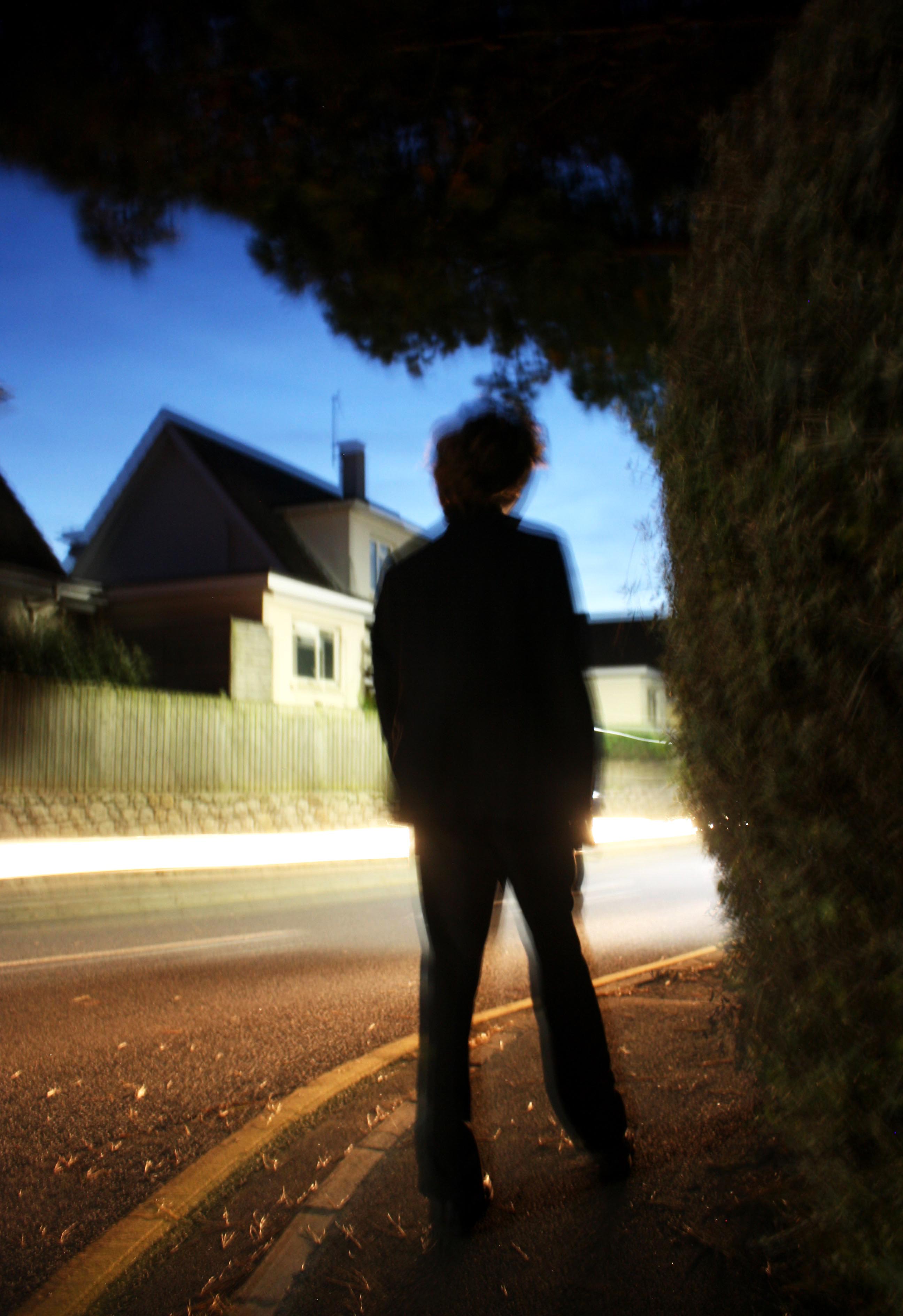
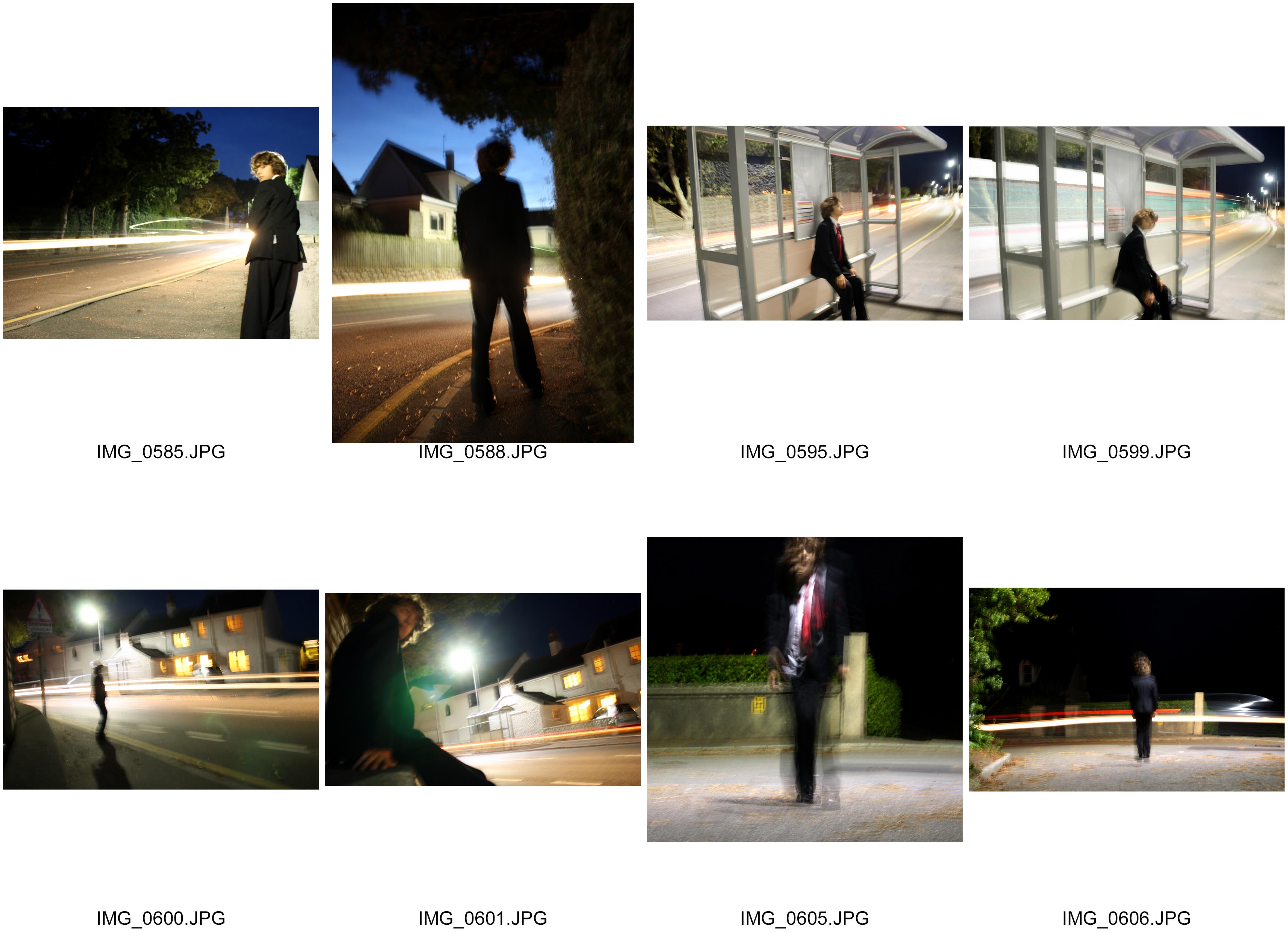
This is my favorite photograph out of my slow shutter speed photo shoot. I like particularly how the effects of different techniques work well and compliment each other in capturing the sense of movement in the photograph. For example: the rule of thirds link the person and the tree well nicely establishing a sort of connection. Also, the composition of the trees and bushes is effective in capturing the stillness of the setting of the photograph and the person. This is because the blackness and shadow of the tree is bold and therefore quite effective in enhancing the blackness on the person’s suit. As trees are known to be still objects, the fact through the dark tones we have established a relationship between the person and the trees, we start to believe the person is almost part of the tree and so his stillness is enhanced. By making the person and the surrounding objects quite still and bold, the sense of movement of the light is enhanced. Also, the angle of the lens taking the photograph is effective because again the sense of movement is enhanced. For example the fact the lens is looking slightly up and is placed on the corner gives the photograph a sense of direction. This makes the viewer curious as to what could be round the corner. I therefore like how around the corner the enhanced brightness of the street light acts almost as a light source for the headlights passing through the middle third of the photograph. This makes us more curious as to what could be round the corner. By taking the photograph incorporating the person in the middle third of the photograph, puts our questions of what is around the corner into his hoes an so we can relate to what the person might be feeling. I also like how the leaves being blown around on the ground capture the speed of the vehicle passing by, making us feel what the person is feeling with that breeze that comes after a car comes past. Finally, I enhanced the photograph by adjusting the brightness and contrast to be increased. This gave the photograph an exaggeration in emotions to communicate them more easily to the viewer.
Zoom Bursts with Varying Shutter Speeds
Zoom burst, 1 sec shutter speed: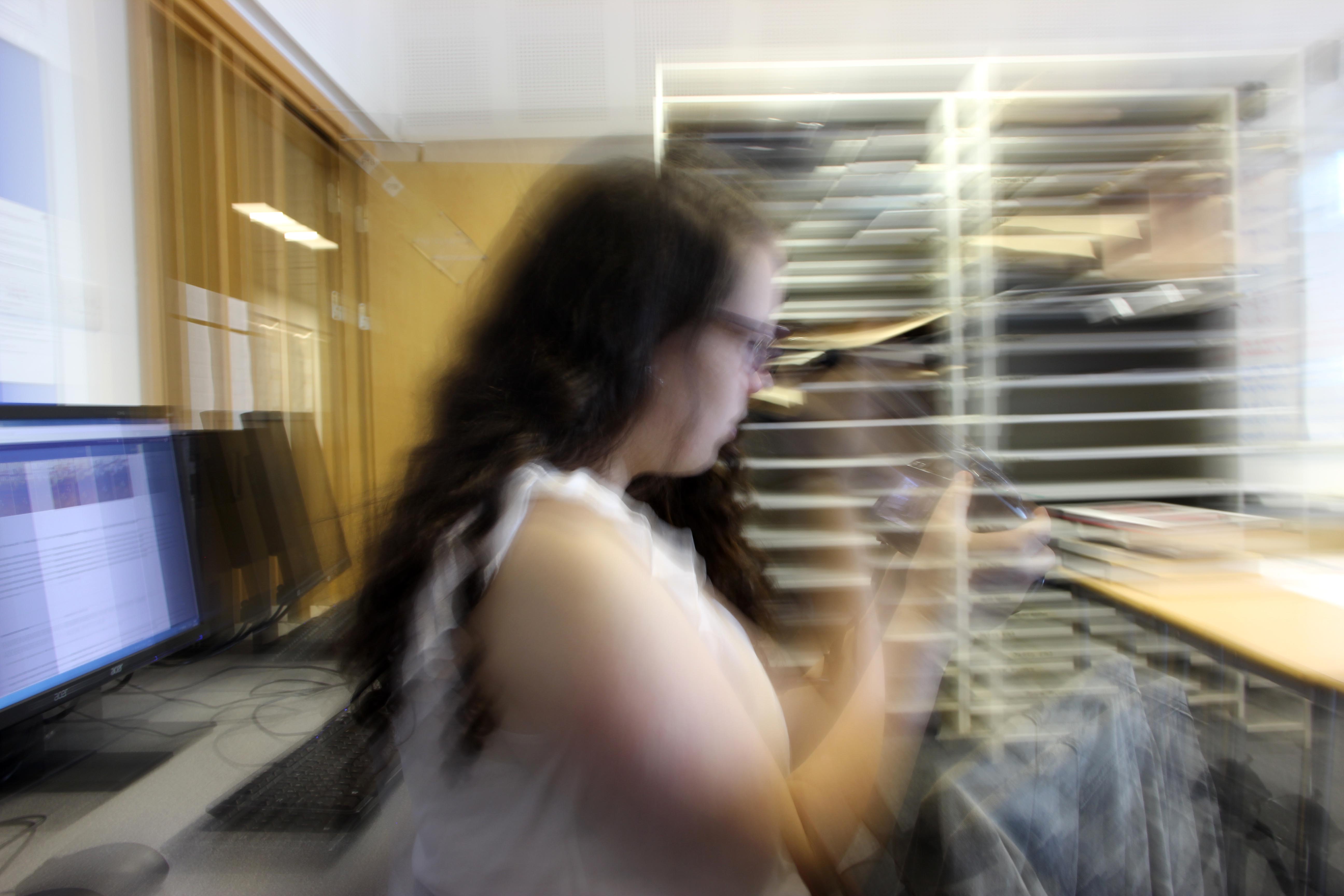
Zoom burst, 1″3 sec shutter speed: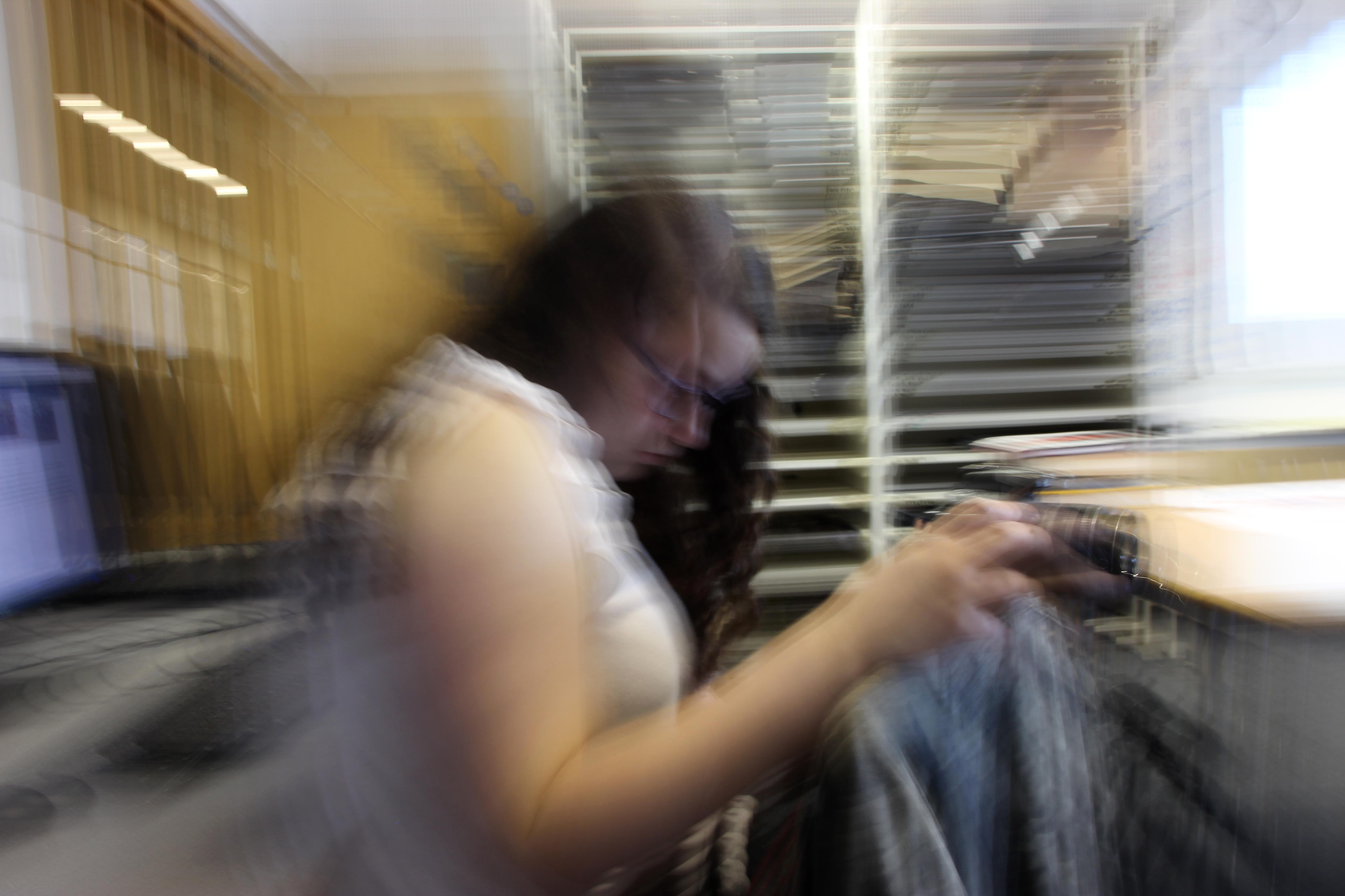
Zoom burst, 2″5 sec shutter speed: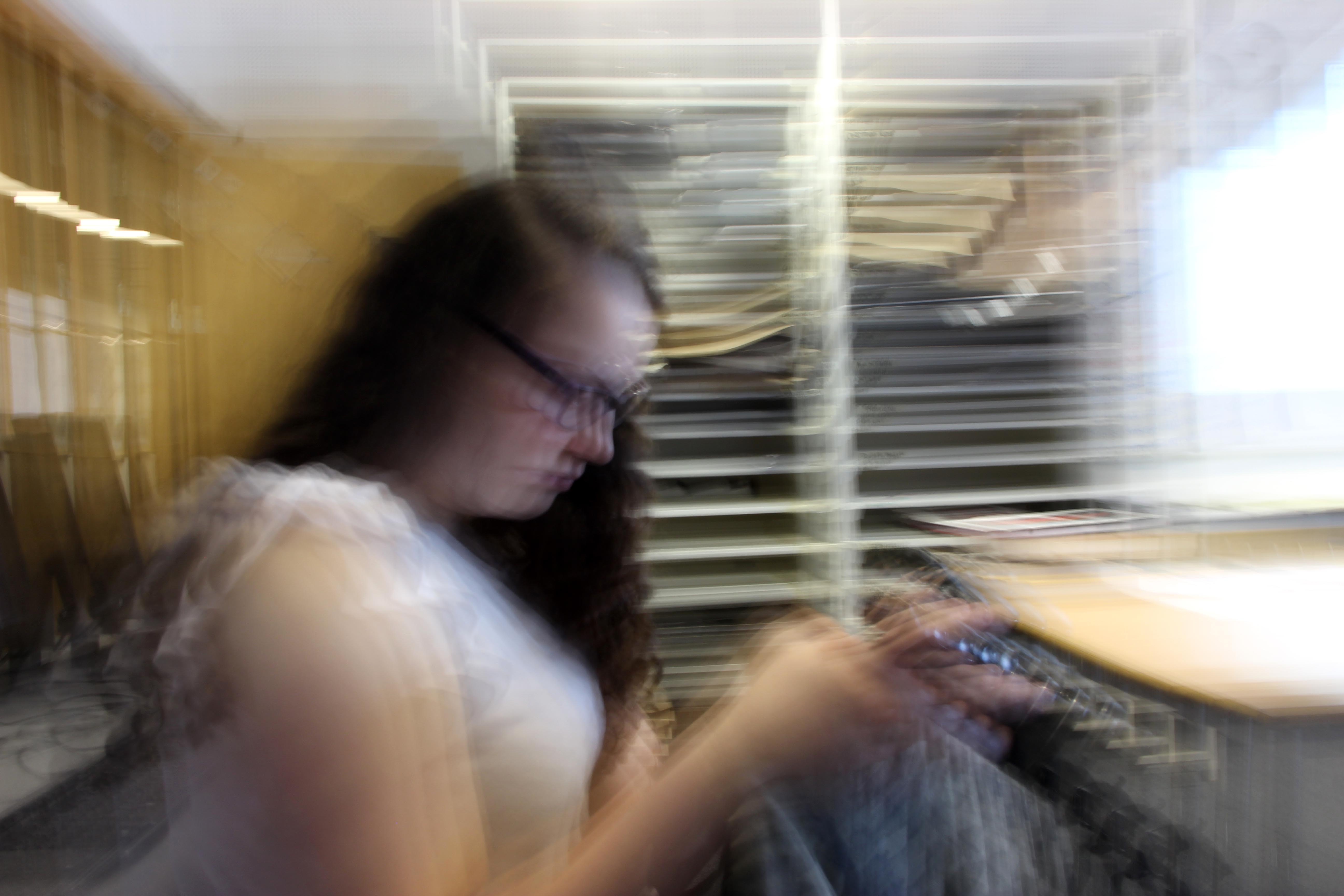
Zoom burst , 3″2 sec shutter speed: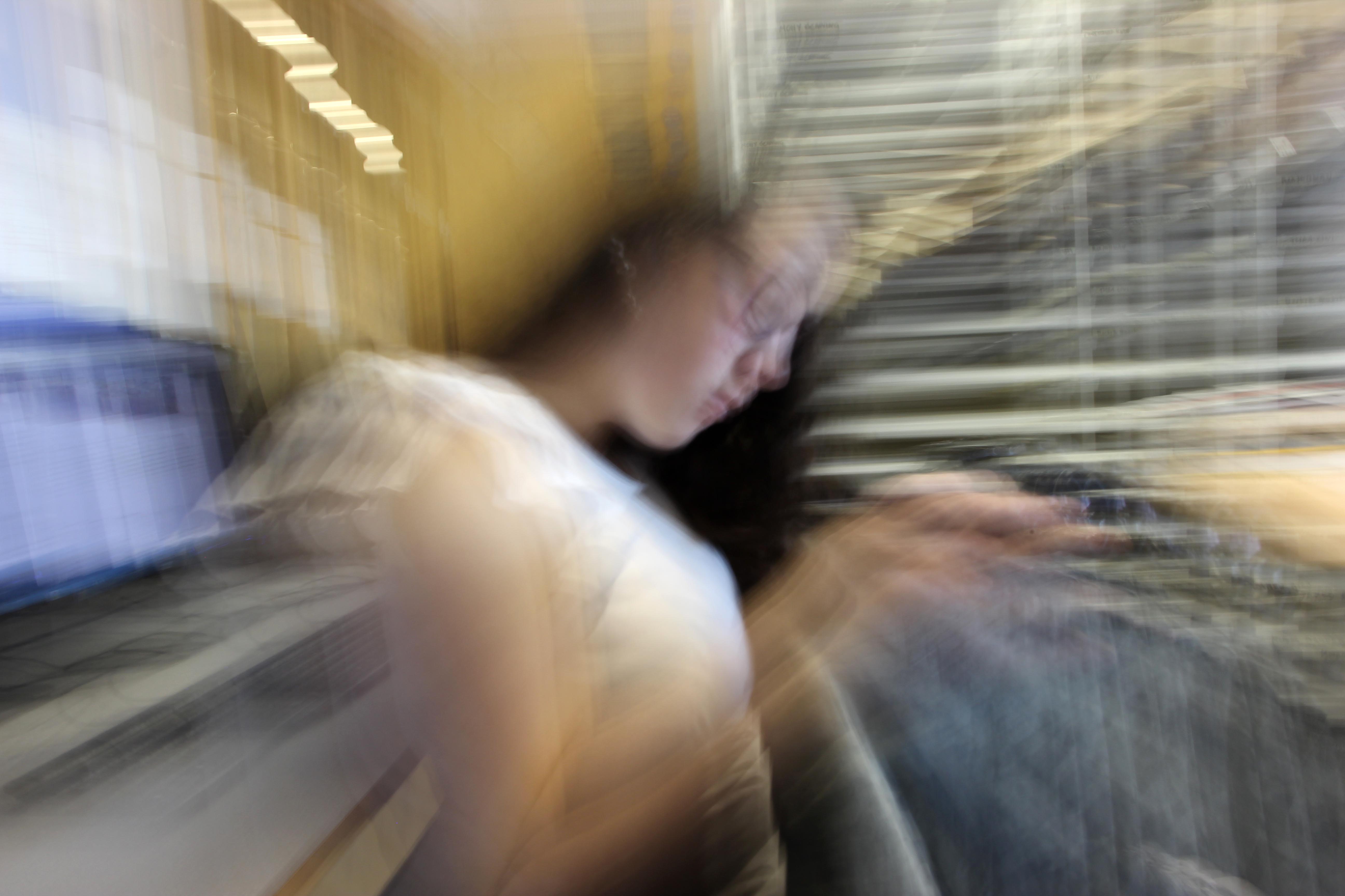
Zoom burst, 4 sec shutter speed: 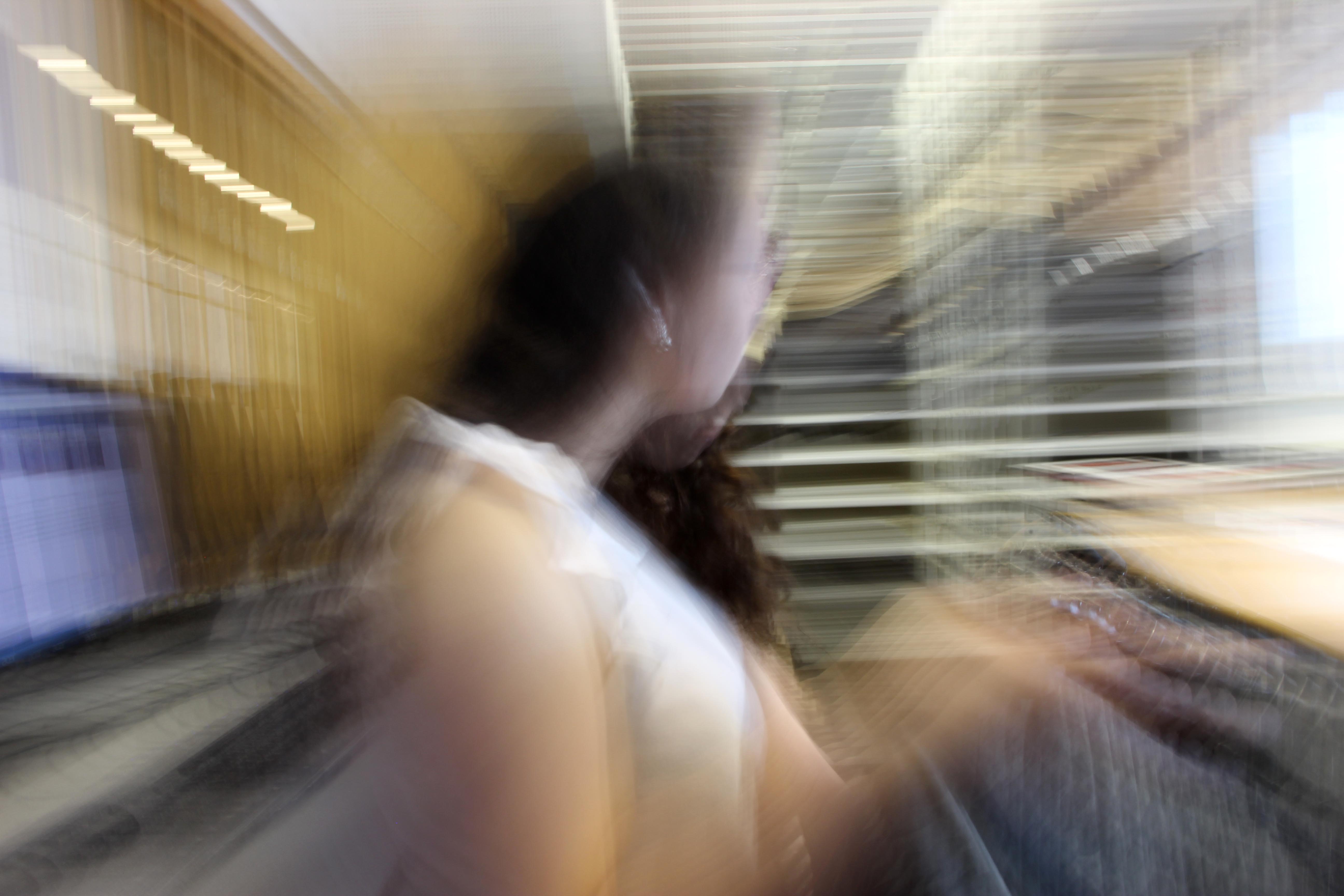
Slow Shutter Speed Shoot
Introduction to Street Photography
Definition) “Street photography is photography conducted for art or enquiry that features unmediated chance encounters and random incidents[1] within public places. Street photography does not necessitate the presence of a street or even the urban environment. Though people usually feature directly, street photography might be absent of people and can be of an object or environment where the image projects a decidedly human character in facsimile or aesthetic.”
Robert Frank – An American photographer born in 1924. He turned to photography leaving his business oriented family. He started out taking photographs in Peru and returned to the US in 1950. Frank scored a Guggenheim fellowship to tour the US in 1950. Here he focused on class and racial issues that affected the US.

The composition of this photograph is interesting in this photograph because a woman is surrounded by the various parts of a kitchen that surrounds her. By doing this, it reflects the chaos and busyness of street photography but also the hostility in the sense that there is so much in the urban setting but people often look quite depressed in these settings. This therefore creates a mood of discomfort to the viewer. This photograph is slightly overexposed through the use of the artificial lighting. This reinforces the idea of hostility in the sense the “man made” light almost tries to produce a sense of happiness to the photograph. However the photograph the fact it is overexposed is quite striking and again makes us understand how this happiness is hollow and fake. To enhance this, I like how the contrast has been increased to separate the dark and light tones. Also, the depth of where the girl is standing is of particular interest to me in the sense of how and where she is positioned. The fact she is quite far away and she has her serving counter in front of her suggests a nervousness about the way she is responding with the camera. It appears that she will only interact with us fully is if we are purchasing something. This emphasizes the hostile setting in the sense that the woman appears quite money driven and how she only wants to make money.
William Eggleston – An American Photographer born in 1939. He was inspired by Robert Frank. and Henri Carter Bresson. Experimenting with color in 1965/6 after black and white. Between 1973/4 he discovered dye – transfer printing. He has published several books describing his experiments with photography.

I like this photograph of it’s dark connotations but also how the kid is quite contrasting in terms of his surroundings. The mid ground of black car and road through the composition is interesting because they are both presented as quite dark. For example: the dark hue of the car’s paint an the grey color of the road which is complimented by the puddles displays the setting as quite negative. The fact the passengers in the car are positioned so we can’t see their faces also suggests a sense of lostness and negativity. The background is quite dark in the sense the grey clouds overlooking the land, supports the idea that we aren’t in a happy place. Interestingly, the high exposure of the light coming from the sky contrasts this as a sense of happiness is displayed. I like this because the fact it is pointing at the boy displays a sense of innocence but also it foreshadows how clearly the kid has an innocence that he wants to use to help change the negativity of the setting to being quite positive. This is further re-enforced by the fact the kid is wearing a colorful, stripy jumper which is a bit abstract. This shows a sense of rebelliousness from the rest of the photograph which shows that color and happiness can change a dark and negative situation. I like how the photographer emphasizes this by placing the boy in the middle third of the lens to allow us to focus on him and his character.
Francesca Woodman – Inspiration
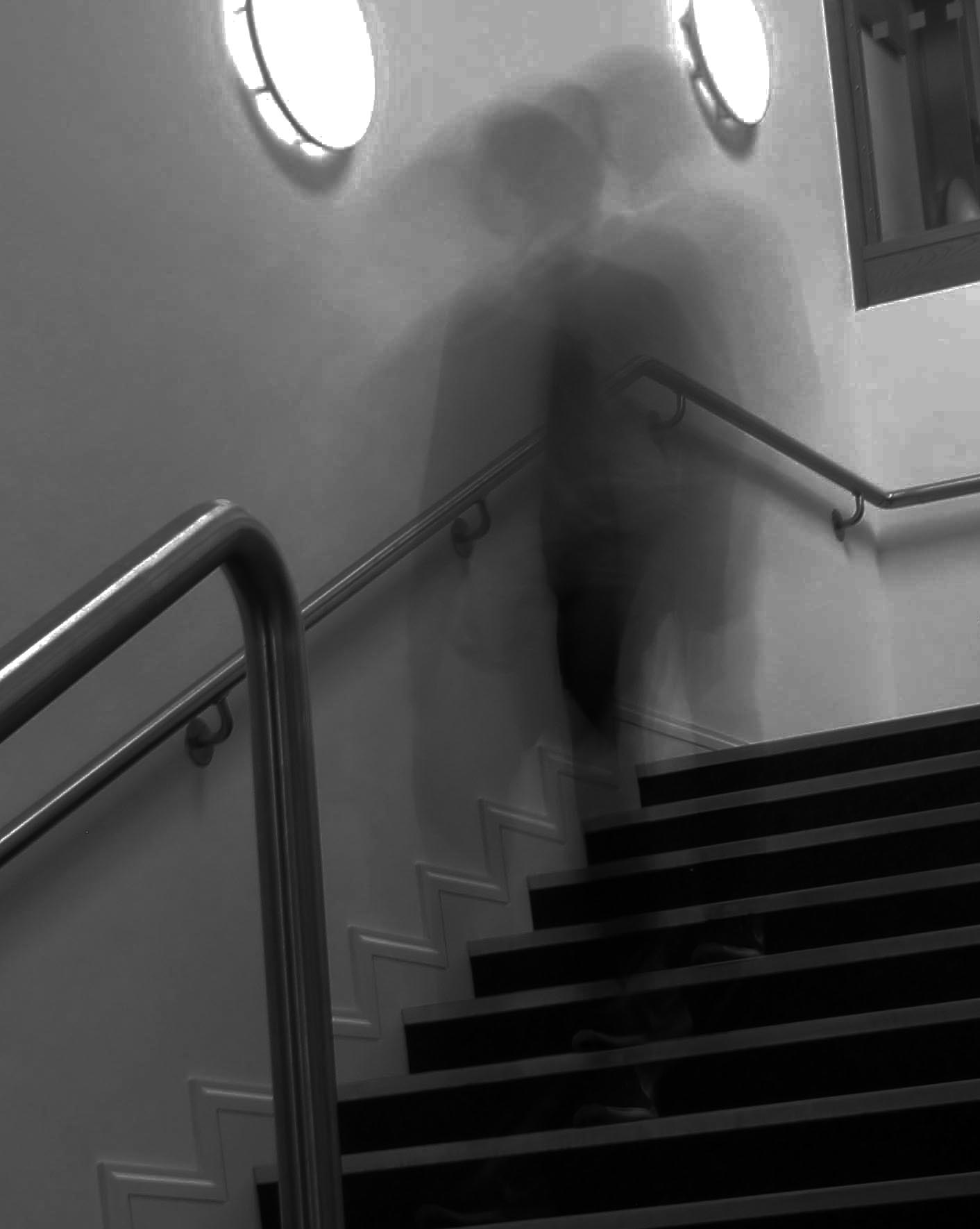
These photographs from Francesca Woodman are inspirational to me. The photos are taken at a face on angle with a high exposure. This is because the slow shutter speed takes in a lot of the light and therefore compliments the sense of blurriness. I particularly like these 2 photographs because they include a spookiness that has been well captured. The sense of depth has been limited to blank walls behind the person which successfully compliment the expressionless face.


Low/Fast Shutter Speeds
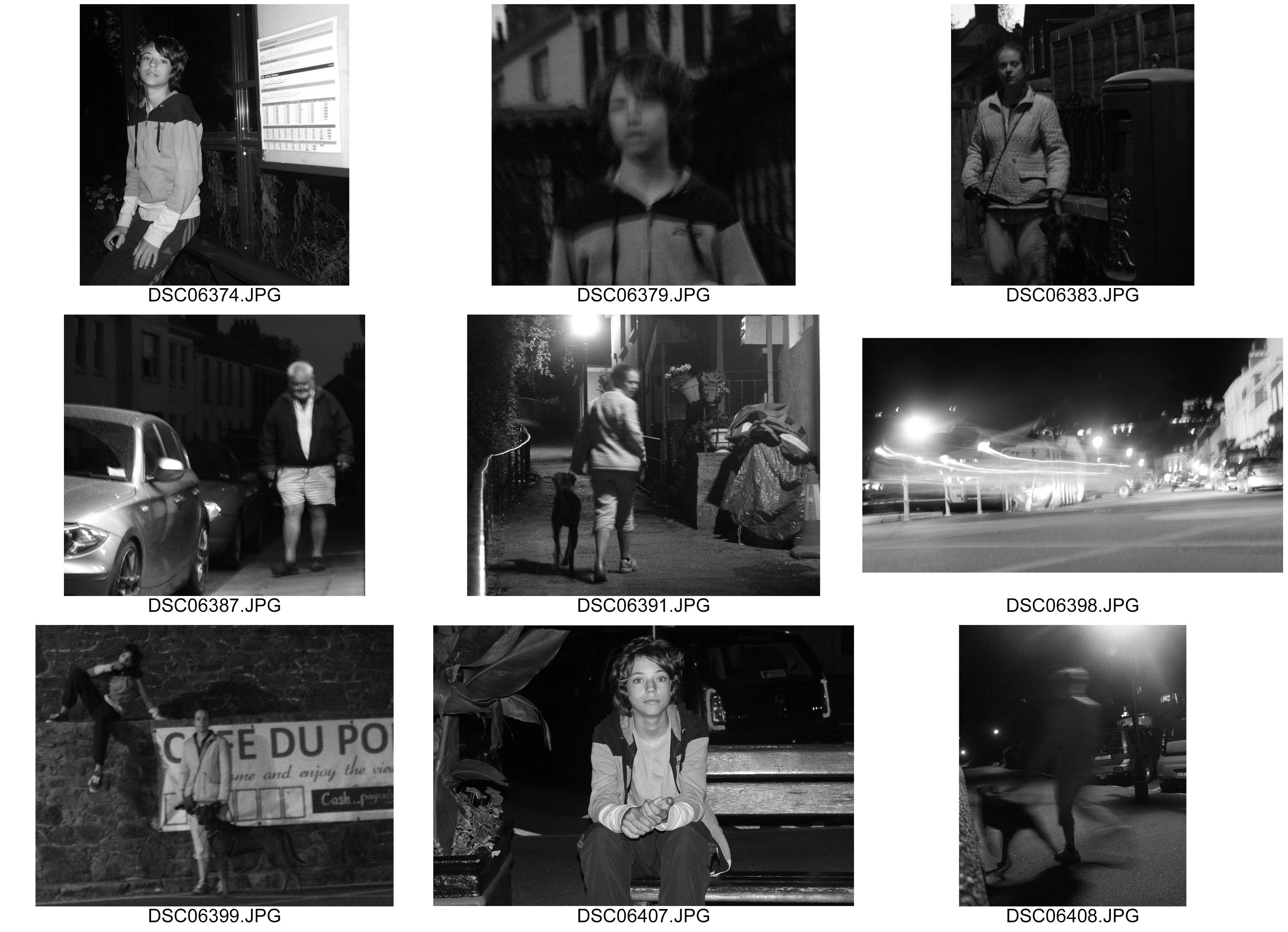
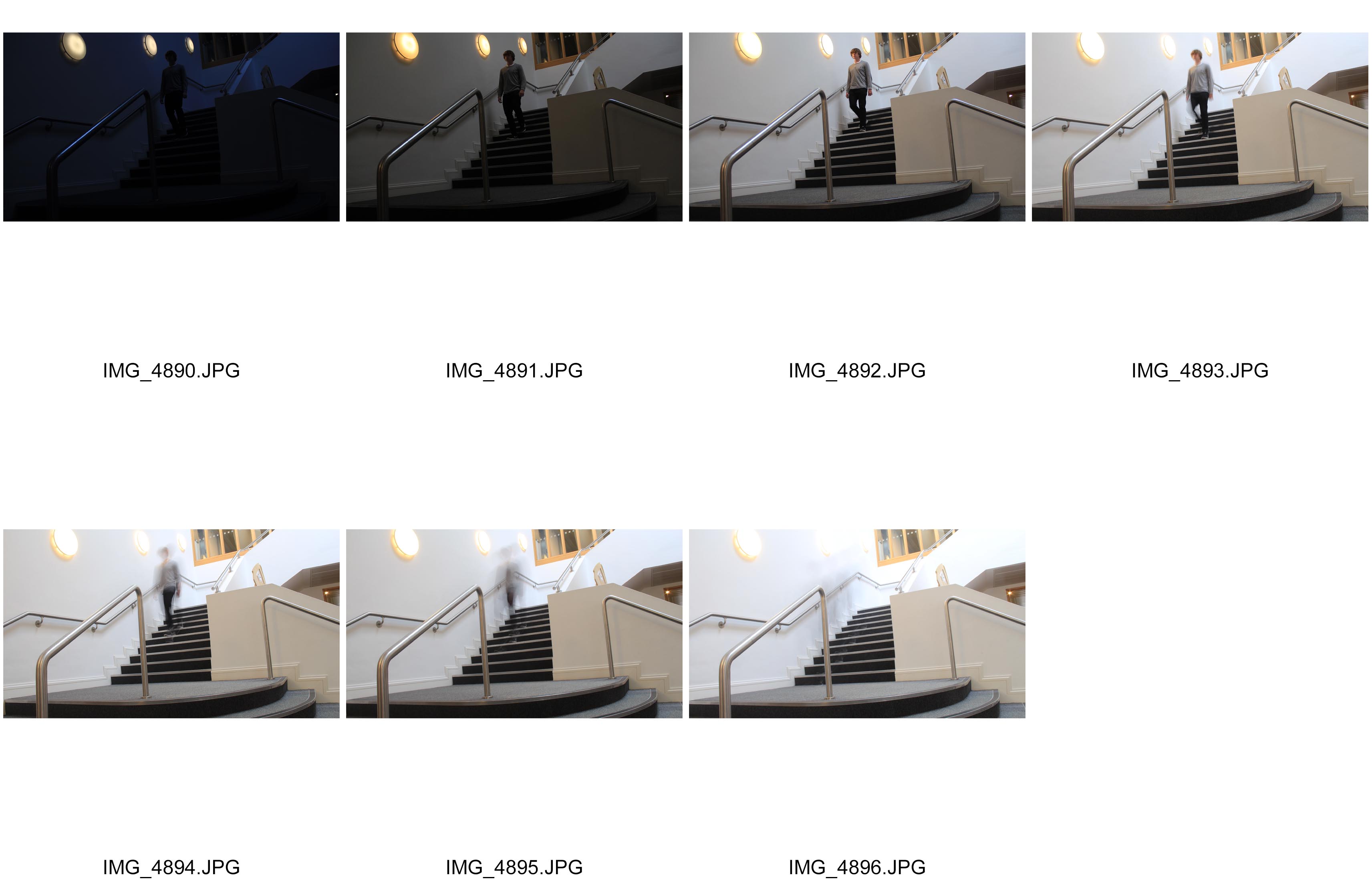
I have experimented taking photographs with varying shutter speeds. I took them at 1/250, 1/100, 1/25, 0″3, 1″, 2″, 4″. The faster speeds didn’t let as much light in due to the speed of the shutter so therefore the photograph looked quite dark. At about 1/25, the light was well balanced and the moving person is visible enough to see levels of detail. At a shutter speed 4″, the shutter is so slow, the moving person looks almost out the photograph because he moved out of shot before the lens captured the moment.
I believe that the shoot went well as I highlighted how the varying shutter speeds can affect the movement of a photograph. However I believe it could of gone better by including a wider range of speeds.
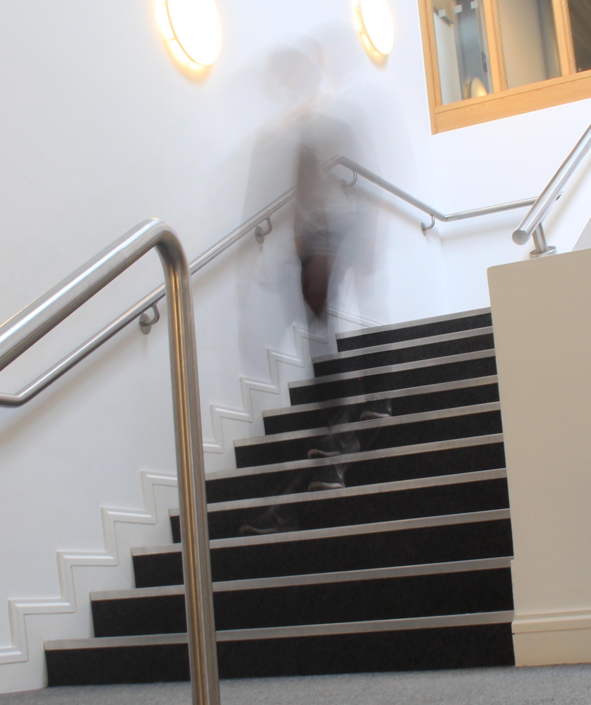
My favorite photograph is below. I incorporated the rule of thirds to allow the viewer to focus on the moving person. Also I took this photograph at a shutter speed at 2″. I believe I have almost captured a ghost – like figure through the blurred movement. The high exposure creates exaggerates this movement giving a feeling of dizziness.
This is my edited version inspired by Francesca Woodman and her work. Here I adjusted the contrast to enhance the darker shades of the moving person.
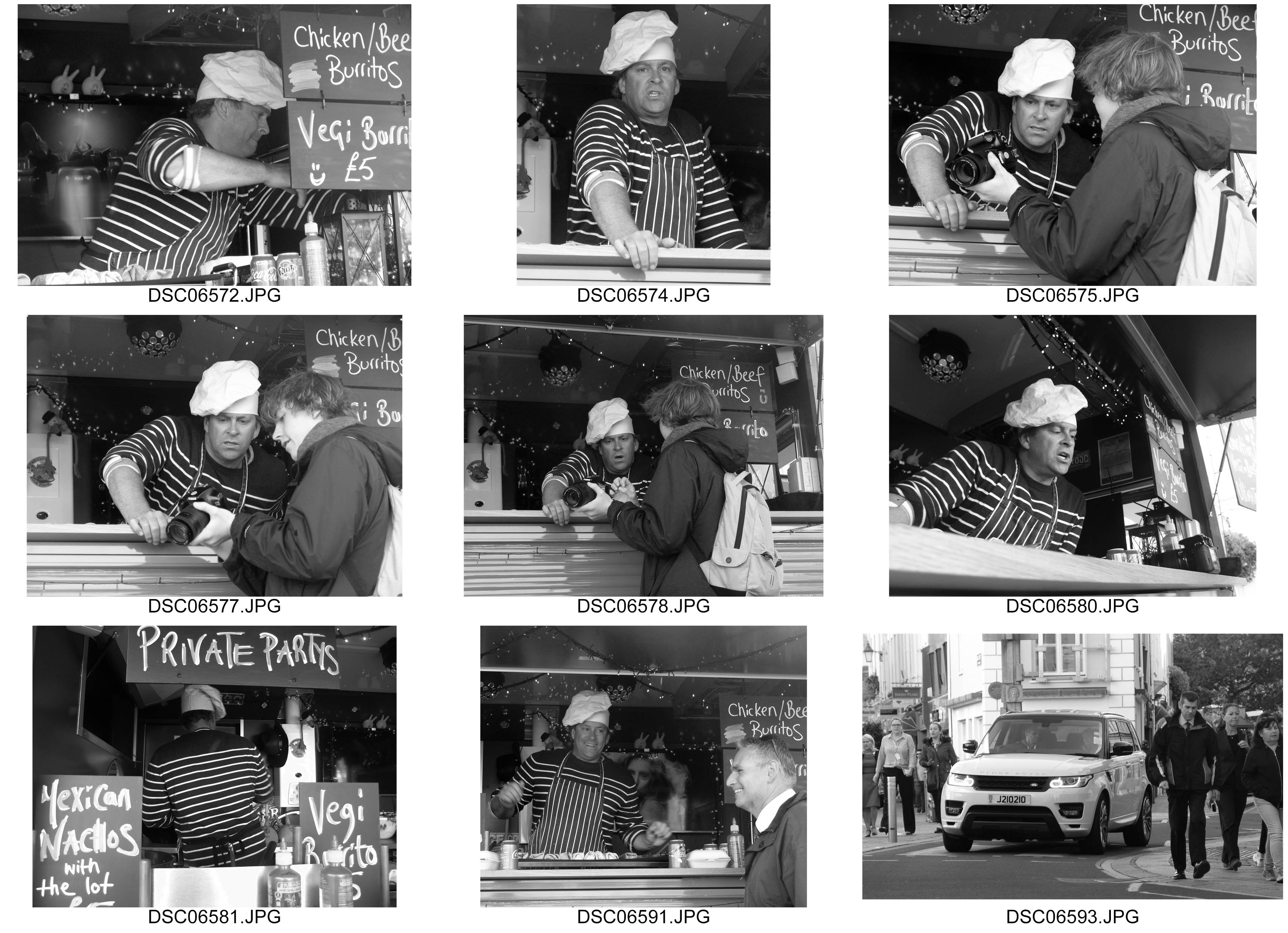
Environmental Portrait – Shoot 3
