All posts by Adam Seal

Filters

Author:
Category:

What is Chiaroscuro Lighting? Contextual Reference

Developed from the renaissance.  Artists known for developing the technique include: Leonardo Da Vinci, Caravaggio and Rembrandt from oil paintings.   This technique also may be termed “ambient/natural lighting” for photography.   “Chiaro” means light, “scuro”  means dark.   This means we can use Chiaroscuro to enhance the dark and lighter areas.  Here is a common setup for Chiaroscuro lighting:

Image result for chiaroscuro lighting setup

Why Do We Use 1,2 and 3 Point Lighting?

Often we use 1 point lighting as a very simple source of light.  We can use this lighting to highlight  a specific area of an object.  By doing this we show a strong contrast between this part and other parts of the photograph.  For this reason,  I personally prefer to use a black background as this makes the object’s dark areas such as the shadows and the background feel somewhat more connected projecting the lit up part of the photograph to stand out for the viewer.  An example of this type of lighting:

Image result for one point lighting

2 point lighting can be useful to have the simplicity of 1 point lighting but to have the 3D of the object enhanced without turning up the 1 lighting point lighting exposing the risk of having too strong harsh lighting.  This gives the photograph a slightly more comfortable and relaxed feel as the shadows aren’t as imposing as with 1 point lighting.  An example of 2 point lighting:

Image result for two point lighting

3 point lighting  is ideal for taking photographs where brighter tones of light are focused upon increasing the balance of light from the shadows.  This can be used where some people who do not appreciate the effects of a balanced lighting of 2 point lighting and want more of an extreme feel of balance to their photographs.  Having a heavy, strong presence of light impacting the object appears to be quite striking and imposing for a photograph whereas on the other end of the spectrum with 1 point lighting you have a lot of darker areas of light giving the photograph a gentler feel.  An example of three point lighting:

Image result for 3 point lighting

Low key lighting is based on conveying a particular mood through the contrast.  By doing this create a rather eeary atmosphere and therefore the environment of the photograph can appear tense.  It can be used to support a model’s facial expression or body language, props etc.  Often a great deal of the photograph will be in shadow, creating a chiaroscuro effect.  For example:

low-key-spring

High key lighting often portrays a more uplifting atmosphere to it.  This is enhanced by having an increased exposure from the already strong light.  By doing this, there is a lack of contrast.  An example of this includes:

high-key-rose


Rembrandt Lighting Effect

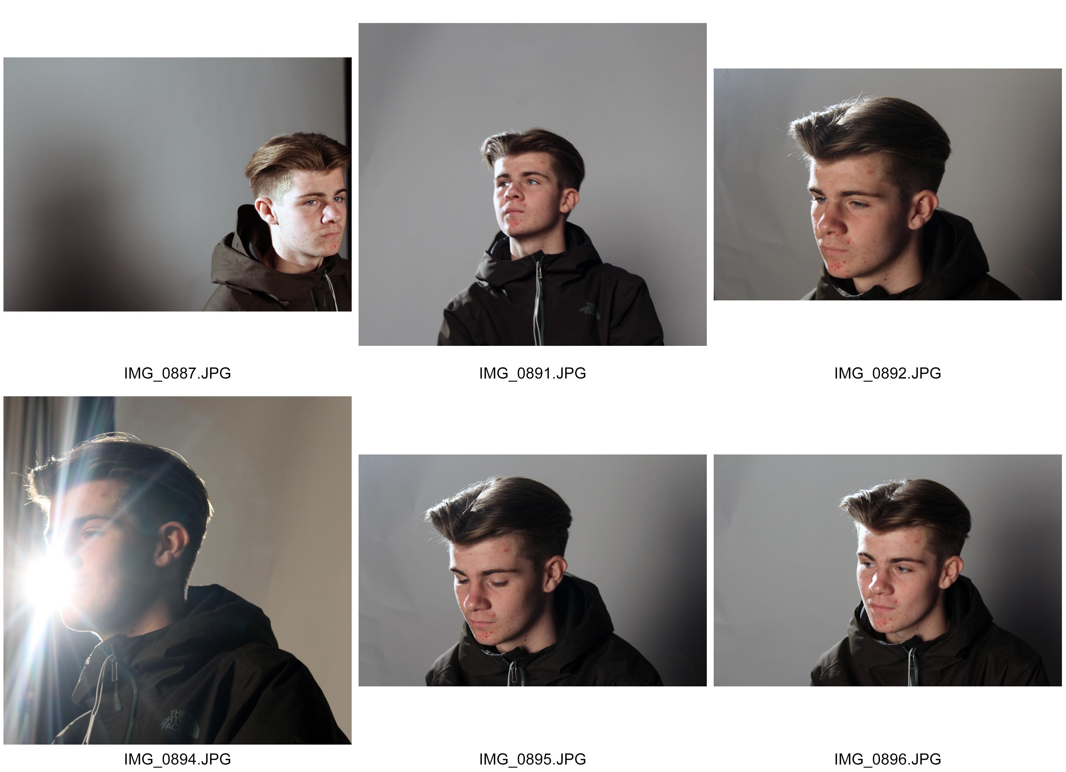
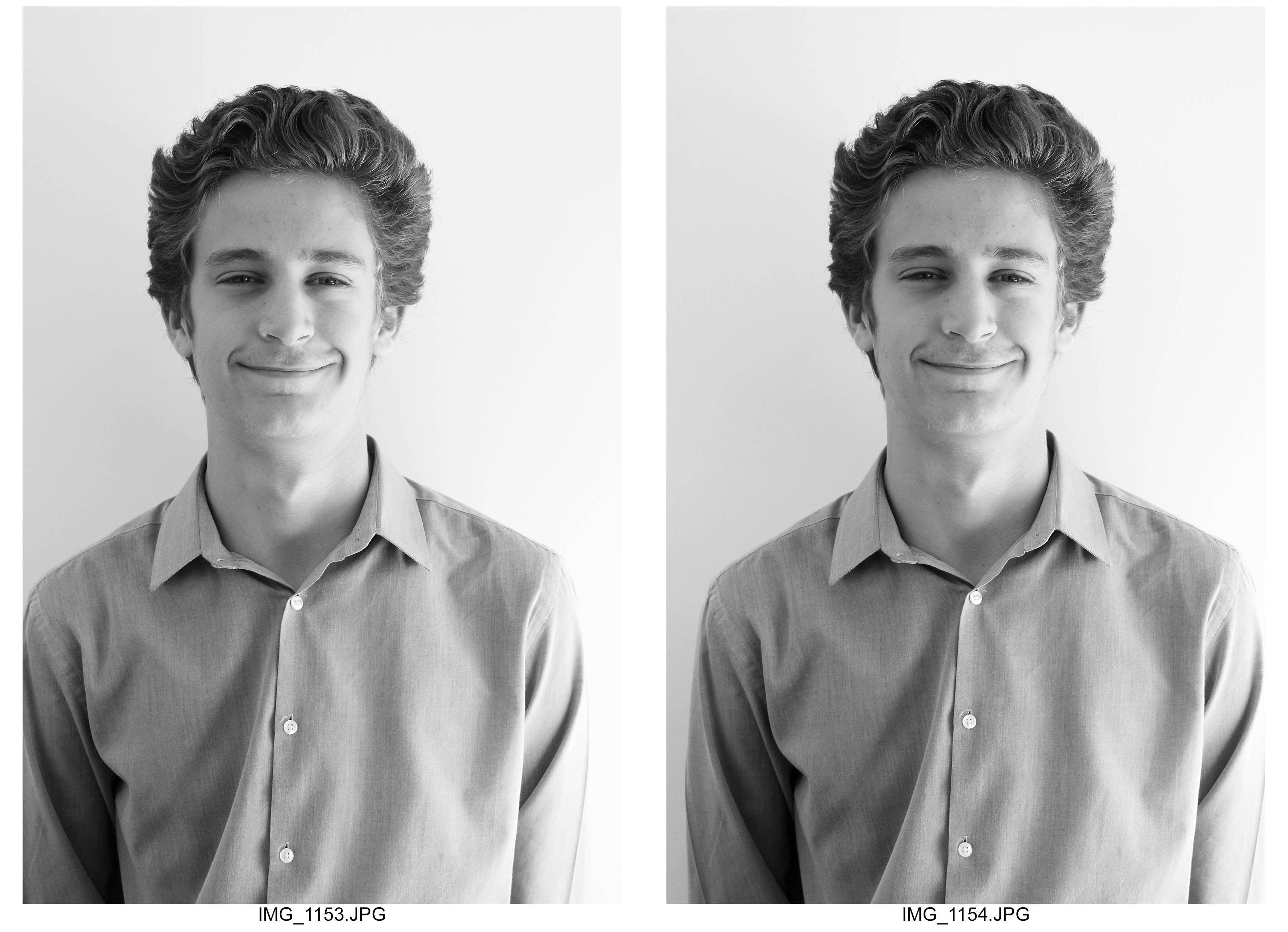
contactsheet-001 contactsheet-002 contactsheet-003 contactsheet-004 contactsheet-005 contactsheet-006

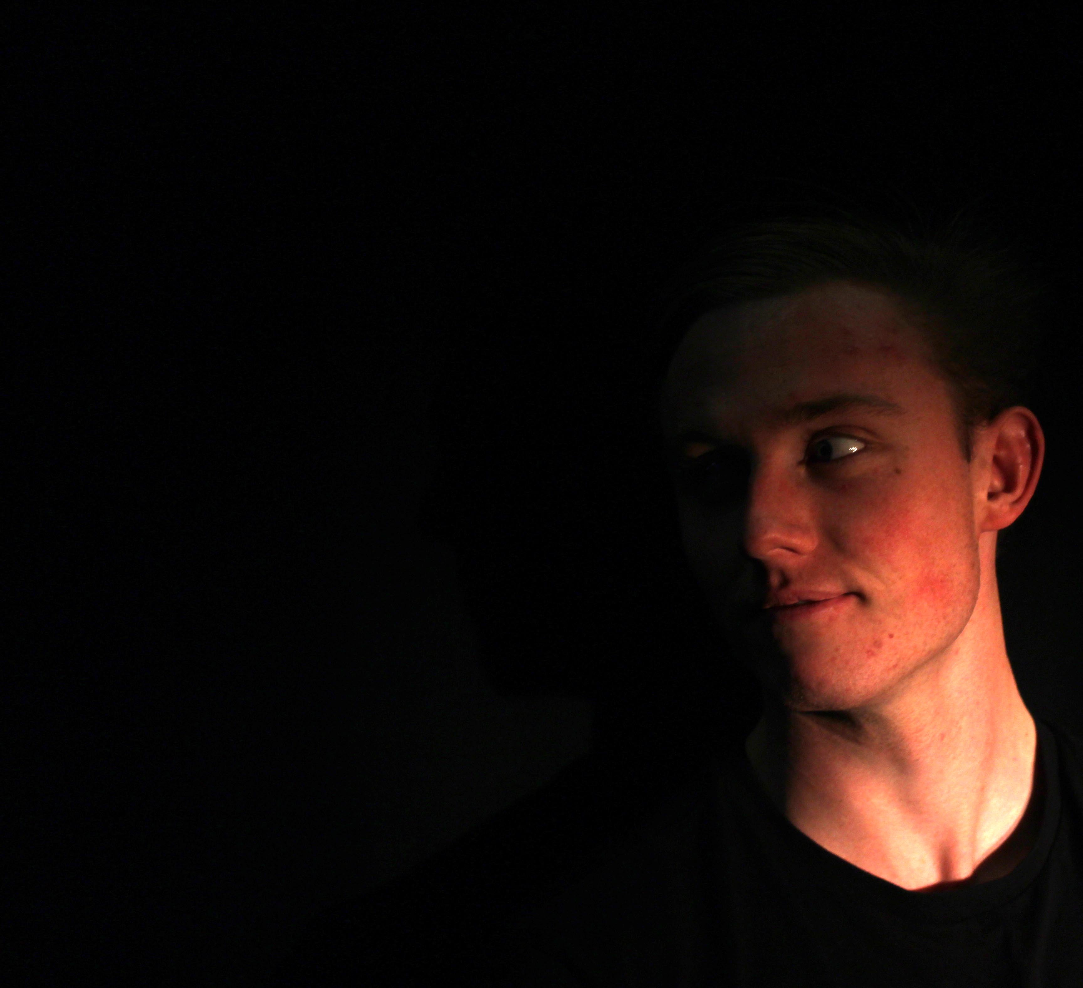
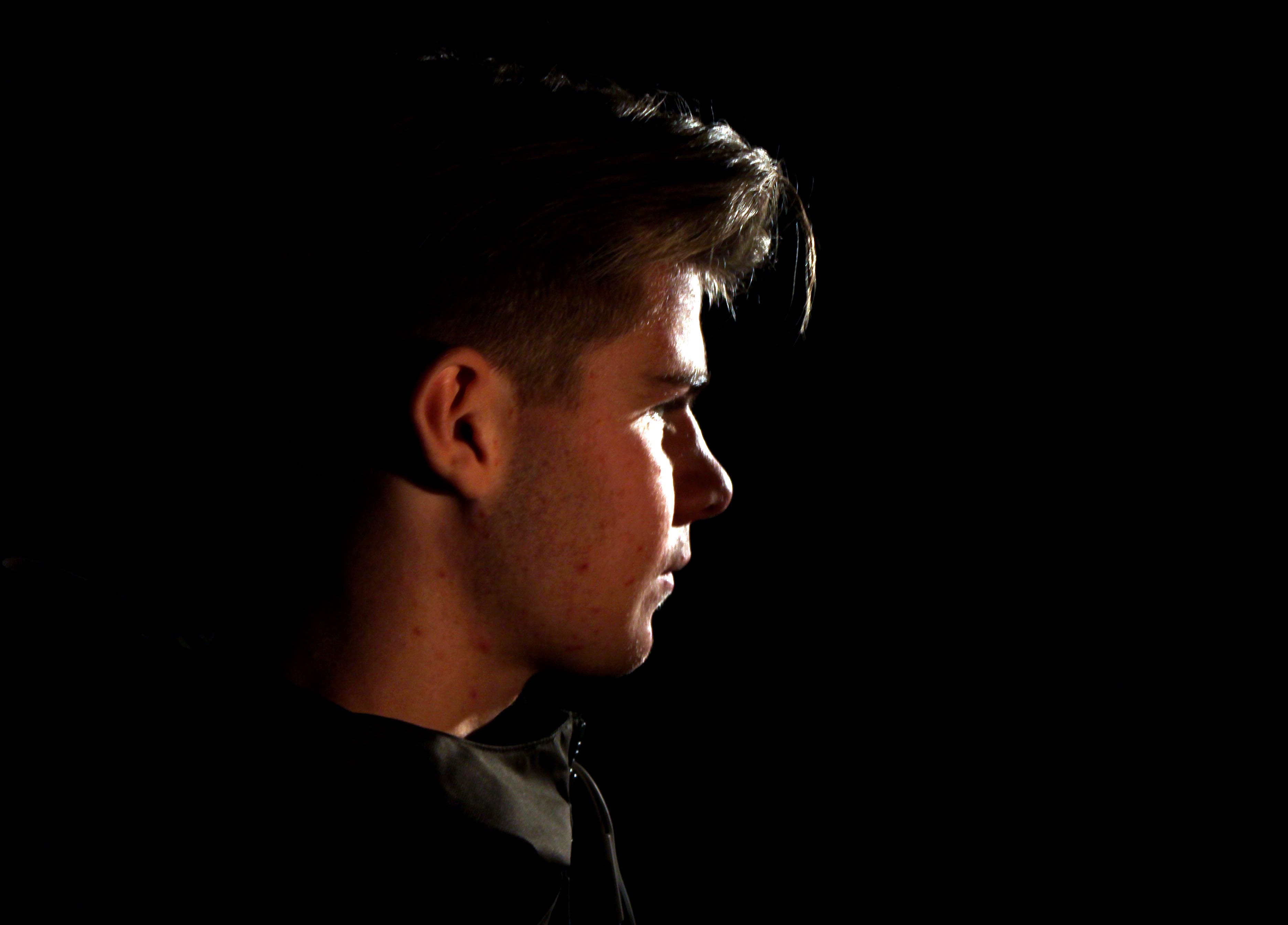
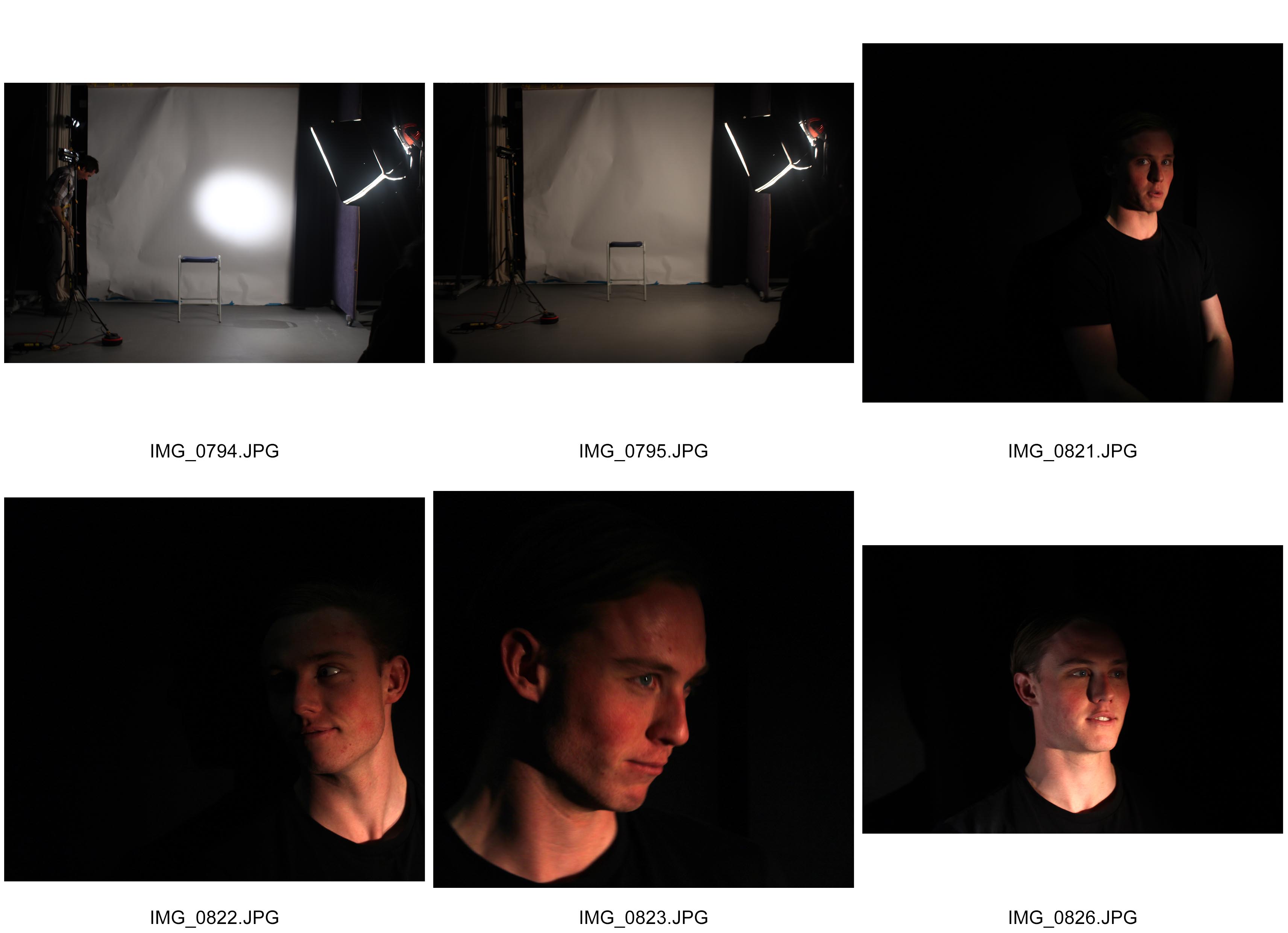
I took these photographs with the intention of creating a Rembrandt lighting effect.  The first two photographs in my contact sheet shows the primary set up for which I experimented with the lighting effects.  These lighting effects were created by me adjusting the harshness and and delicateness of the lights.  I used a primary light source and this was quite powerful in terms of supporting the main lighting.  To enhance this, another light source was used and pointed in various angles to pick out the sharper details of the object by using varying strengths of lighting.  In some cases I used a reflector to incorporate past techniques where I can get a nice balanced effect of light.  Whereas on other photographs, I didn’t use a reflector and this illuminated a section of the object up, and leaving other areas in dark.  This was effective especially where I took photographs with a black background as the darker tones of light on the objects thoroughly projected and enhanced the brighter areas.  Also, to counter the varying light angles, I sometimes took my photographs from angles such as birds, worms and face on angles.  By countering the angle of which I took the photograph with the light sources,  I could include things such as shadows, overtones, an d warmer effects of lighting.


Favorite Chiaruscoro Photograph

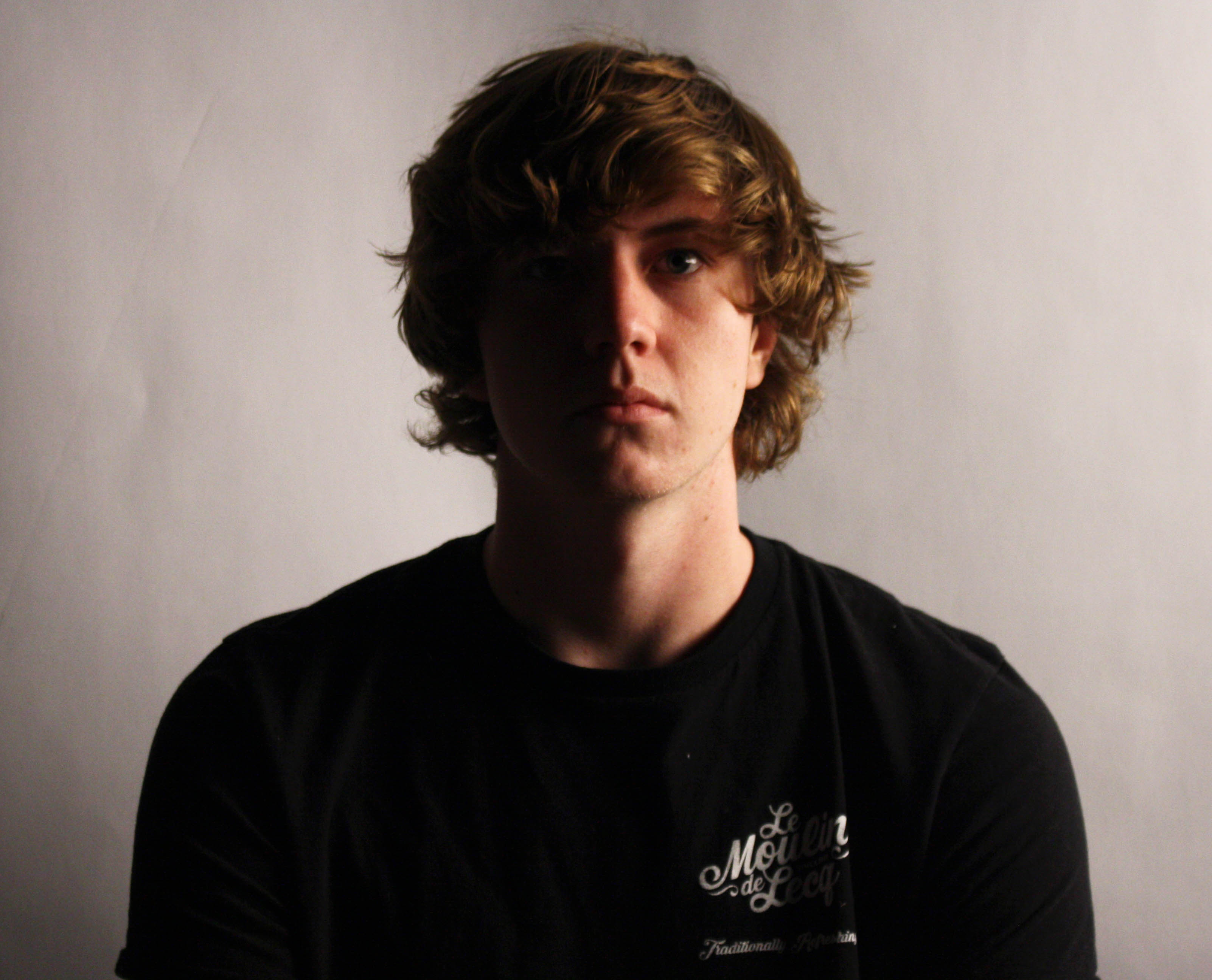
img_1472

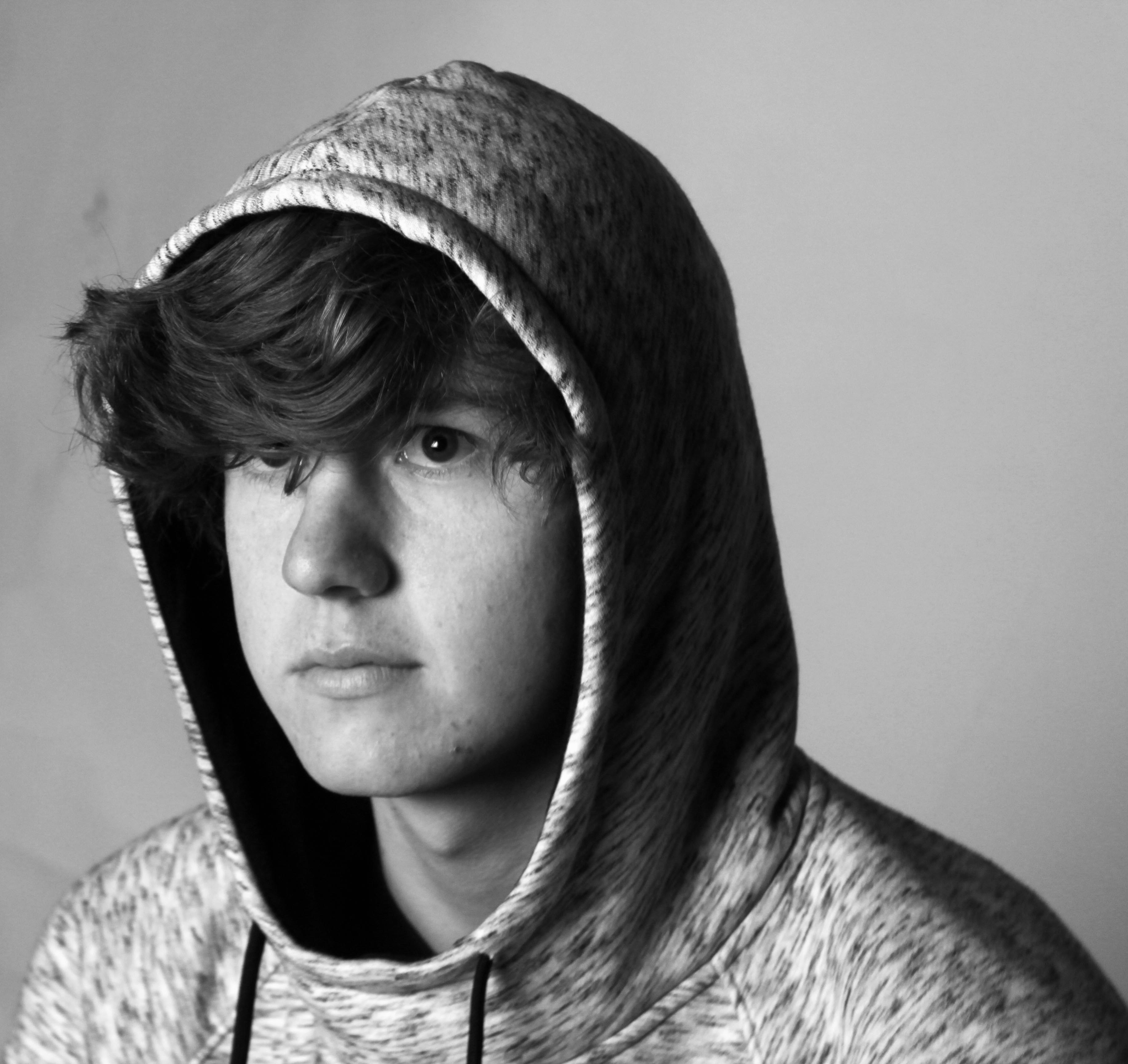
I like this photograph because the range of contrast I believe has been successfully captured. For example: The lighting isn’t too strong leading to a nice, balanced exposure and the lighting to not be too harsh. I also like how the light gradually gets darker from lighter as we go further across the objects face. This makes the lighting more sensitive in the sense that it appears more personnel. Also I like how the objects jumper compliments the shadow in the face, showing him and his clothes as one object. Also, to compliment the objects face, like how the hair color reflects the lighting effectively to have a similar shine to that of the light.

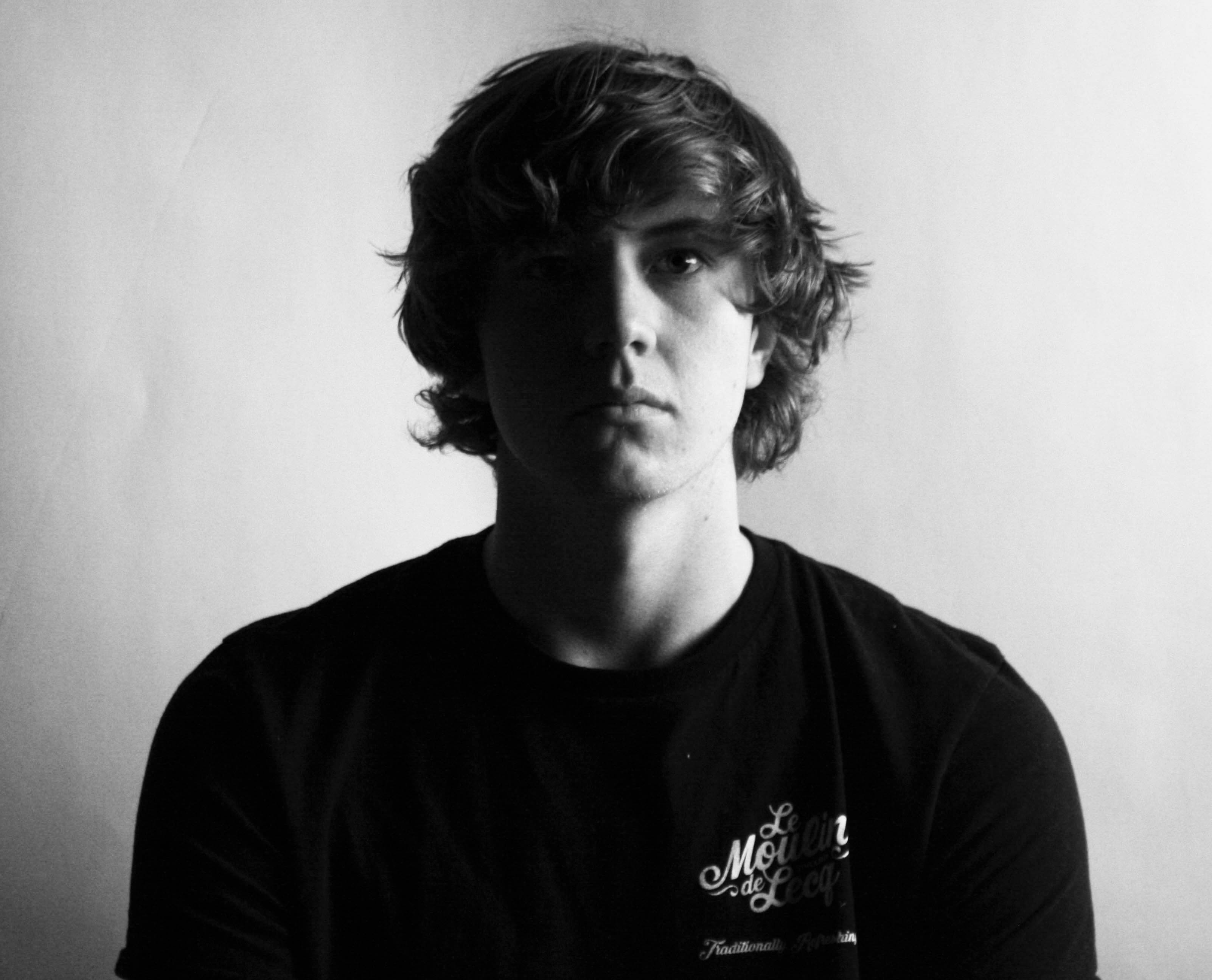
Black and white:

img_1472


Chiaroscuro Lighting Effect

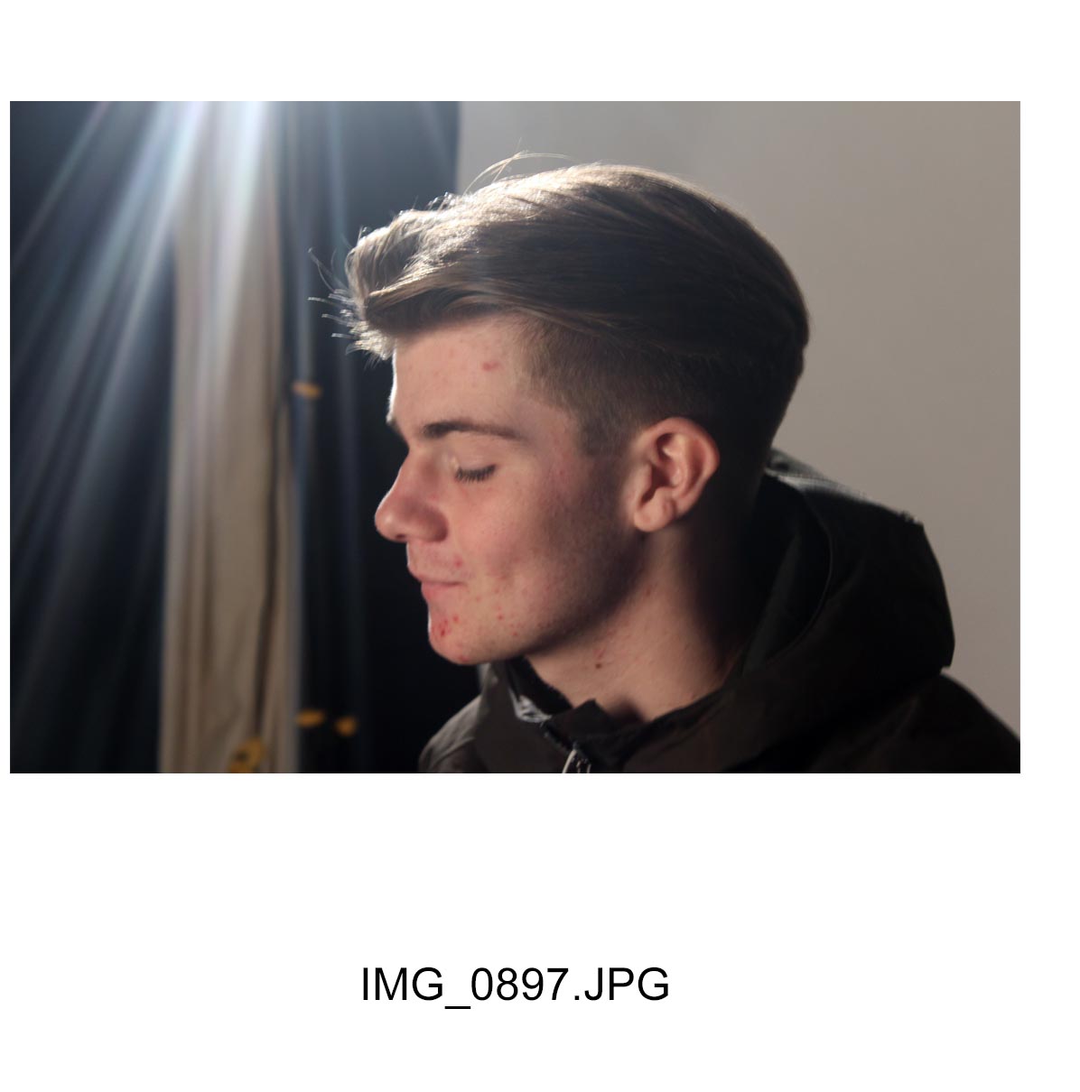
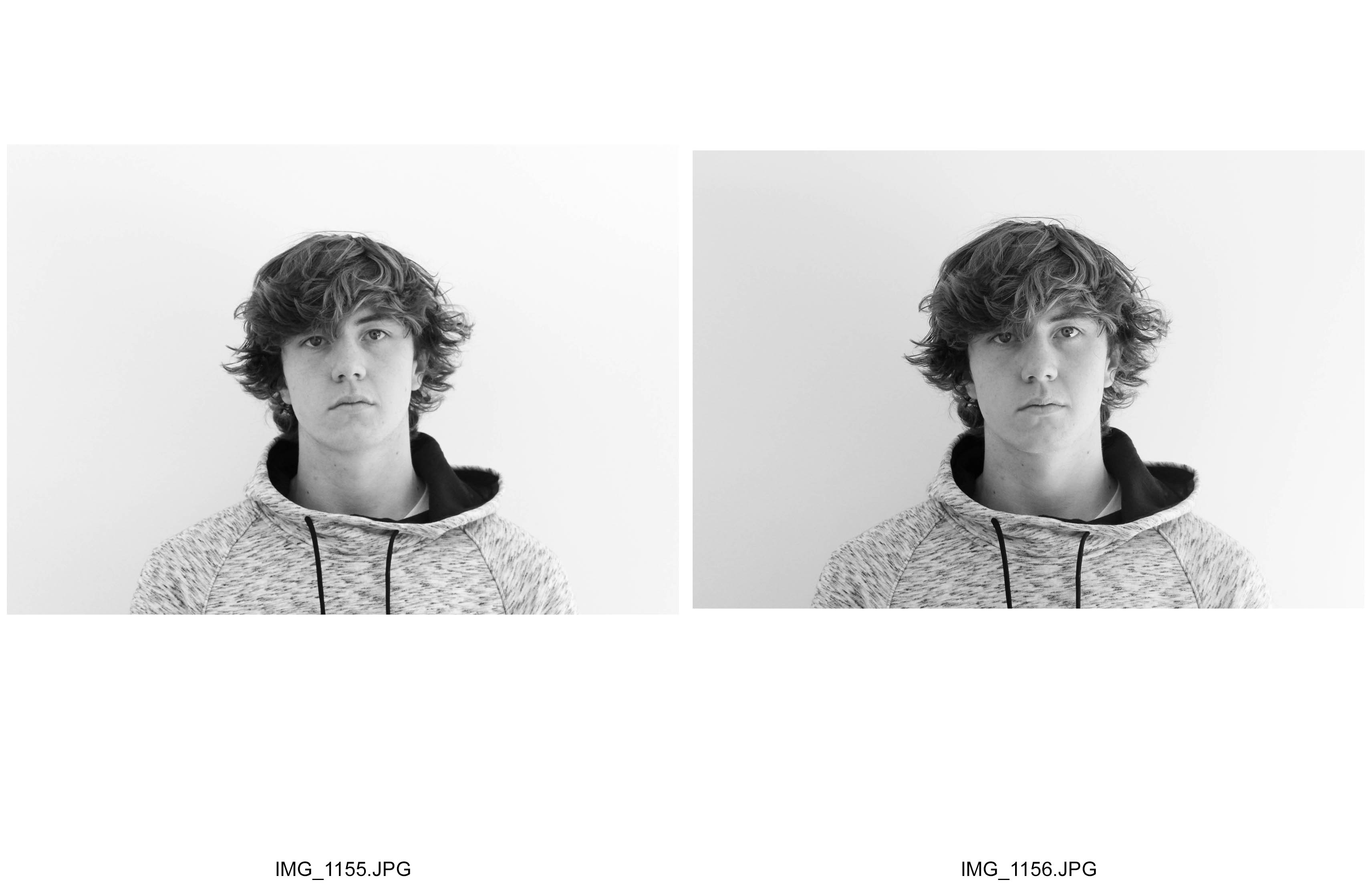
contactsheet-001 contactsheet-002 contactsheet-003 contactsheet-004

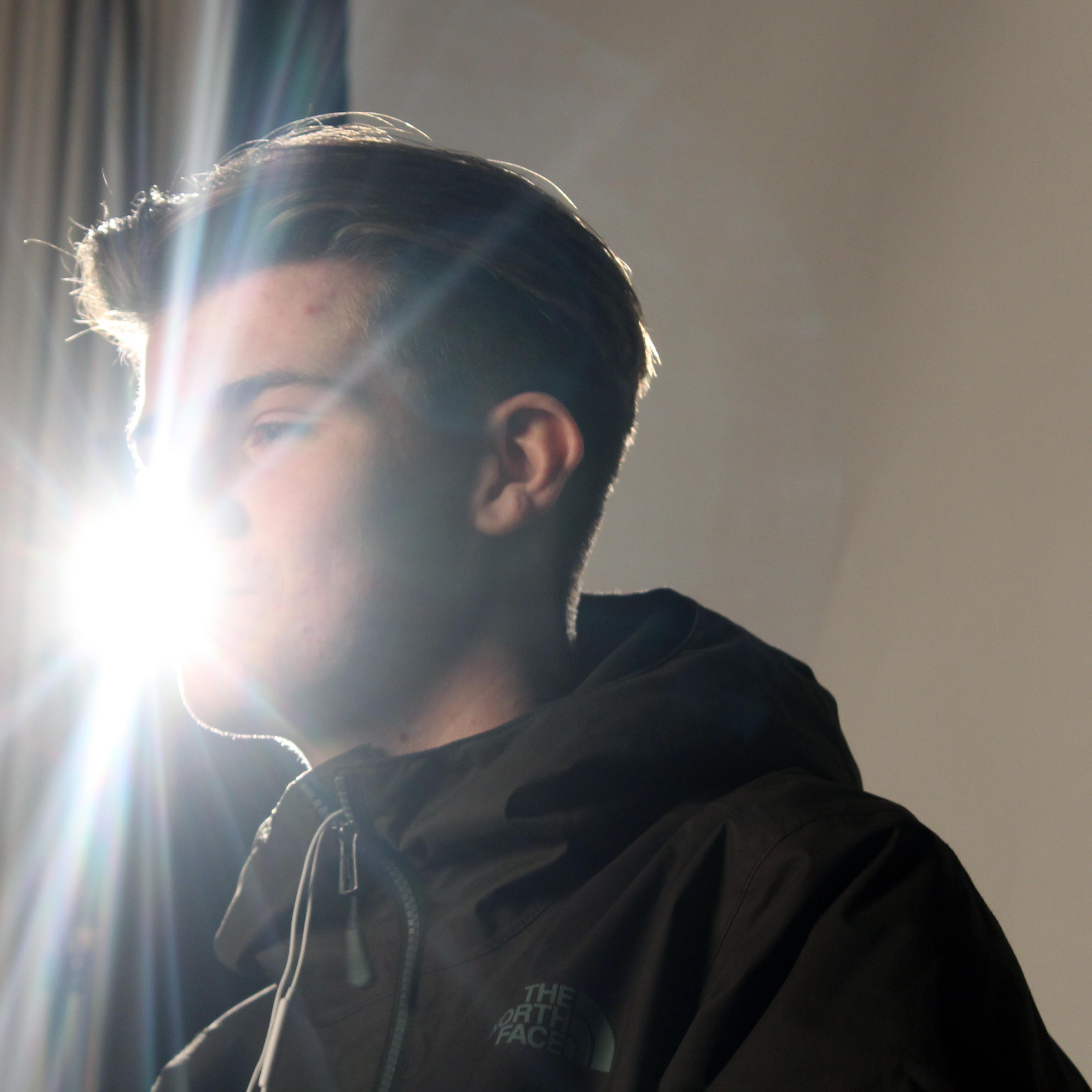
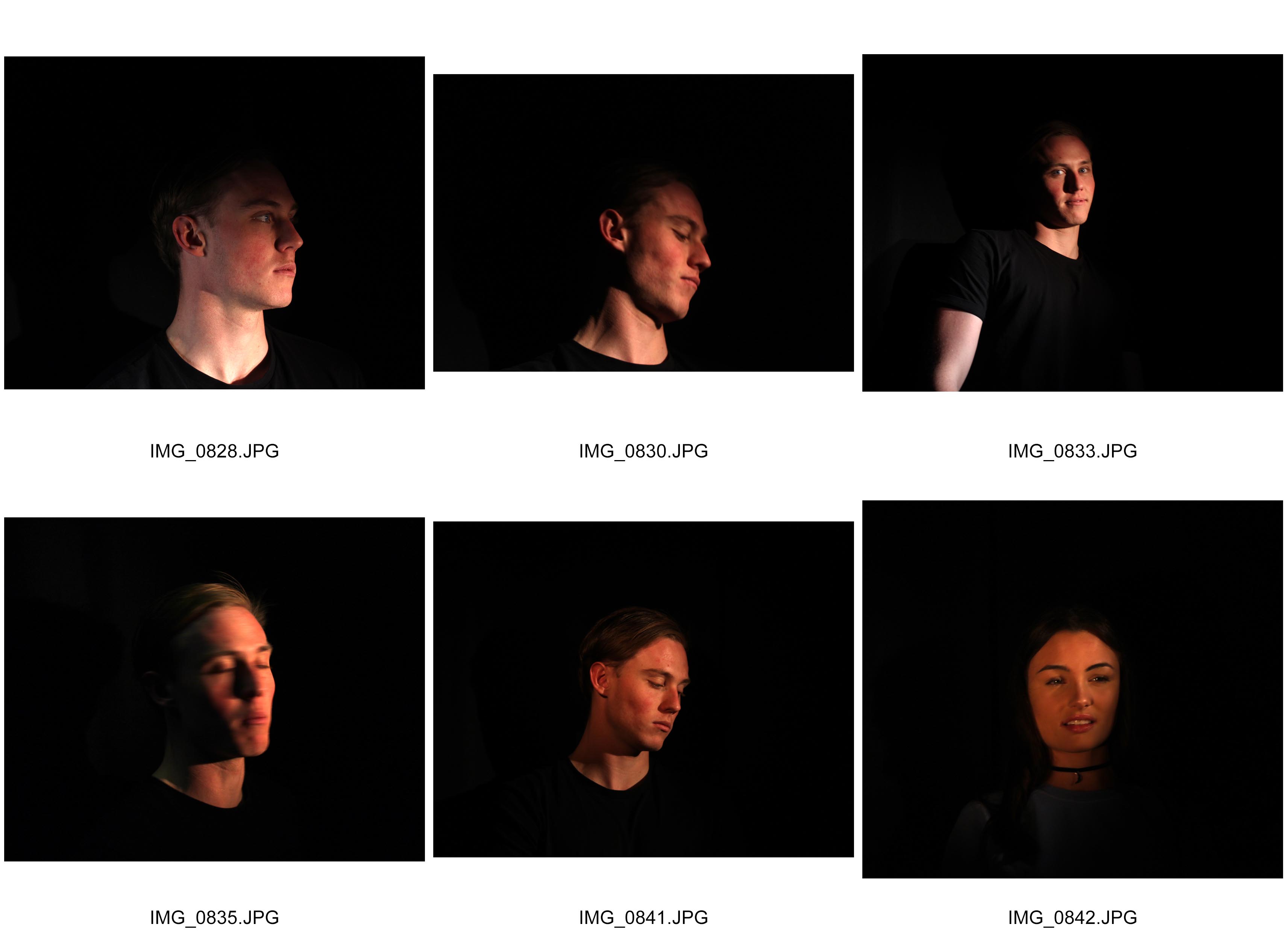
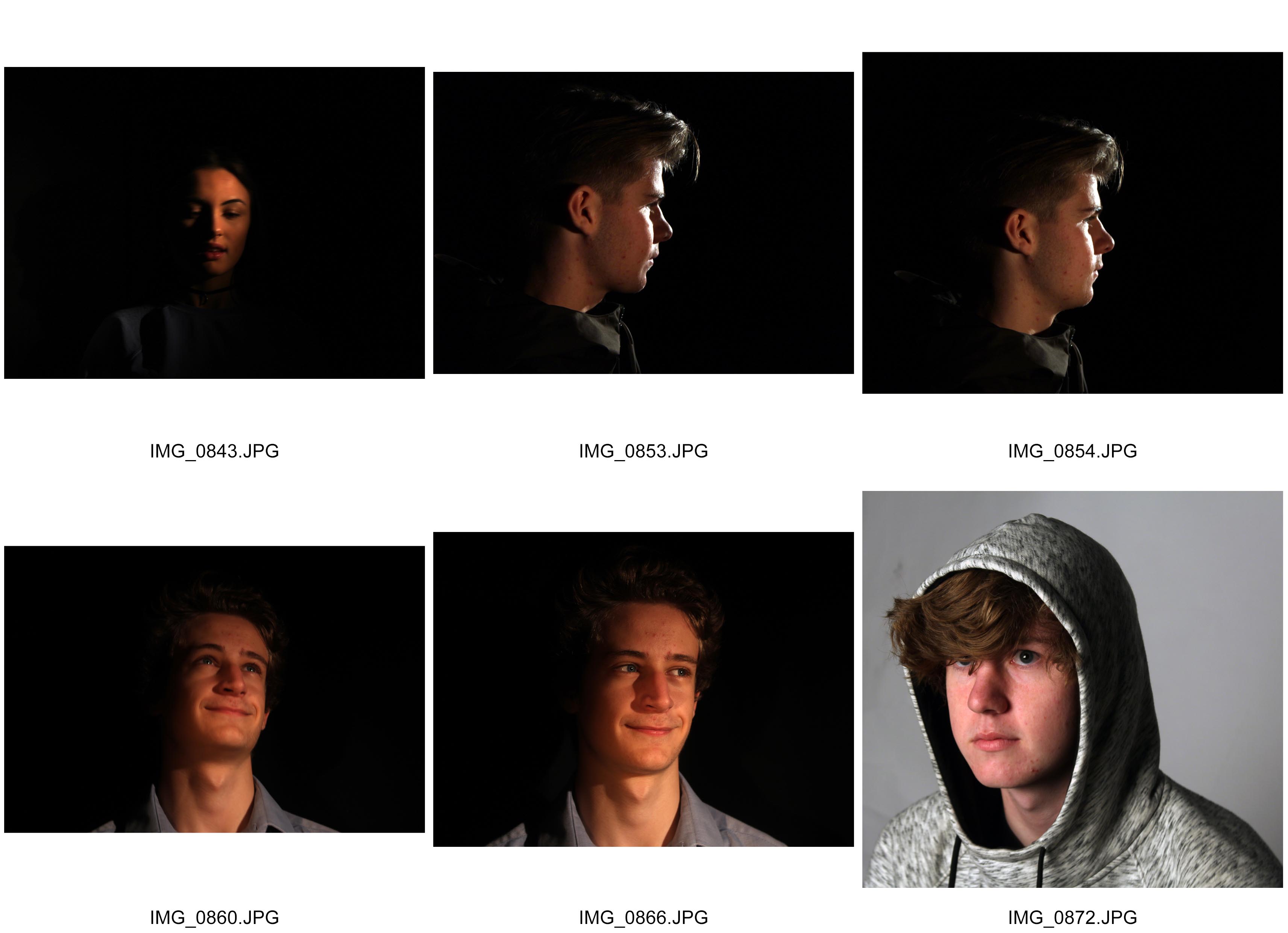
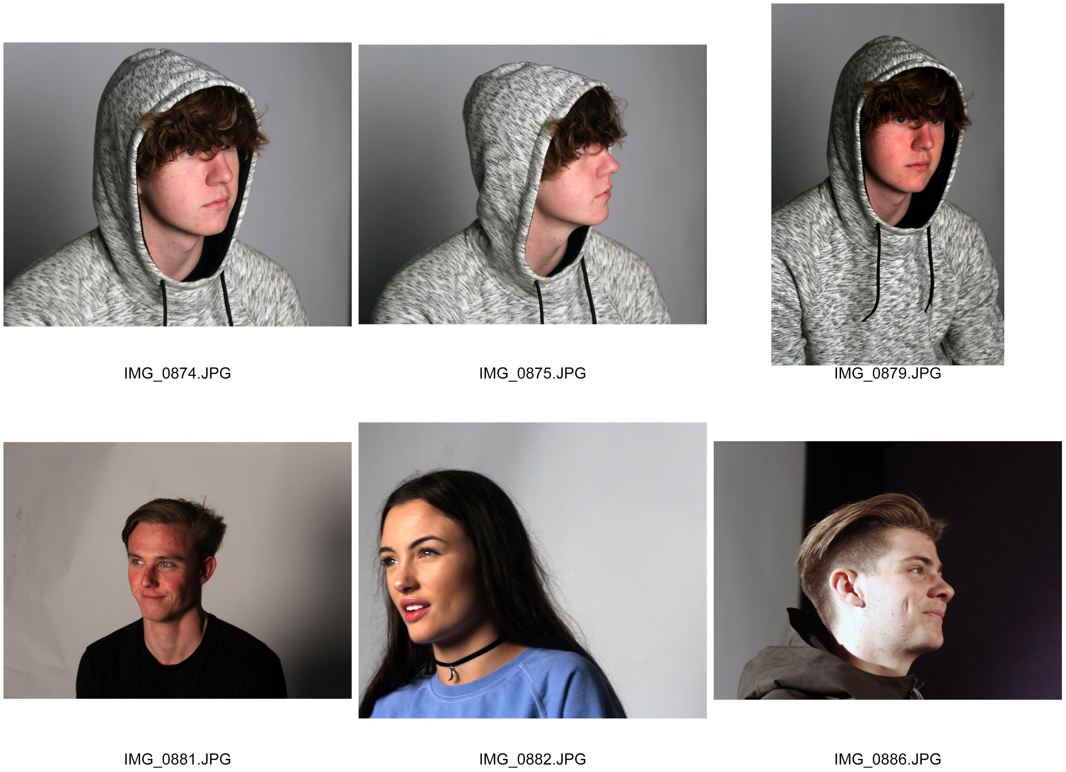
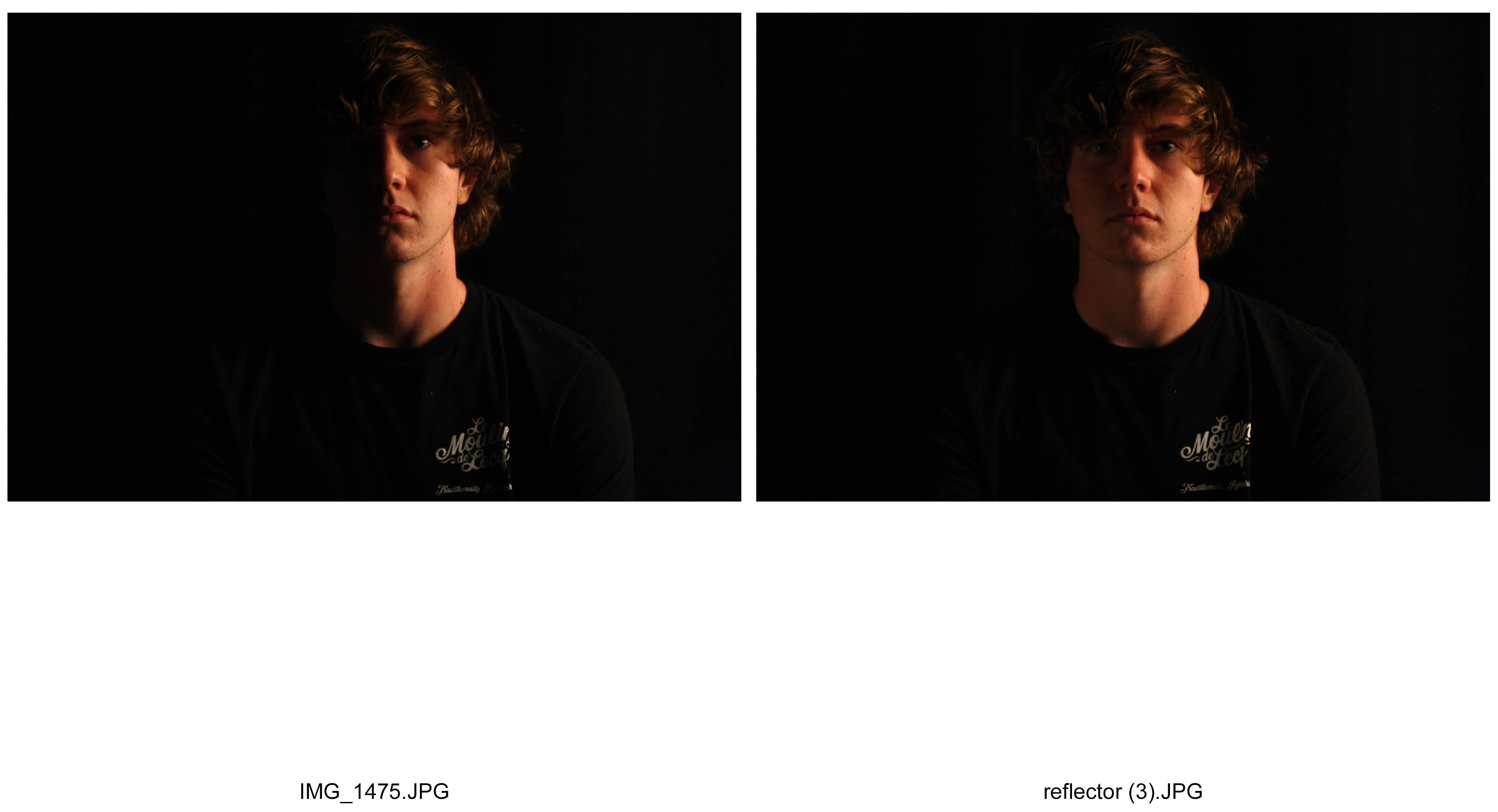
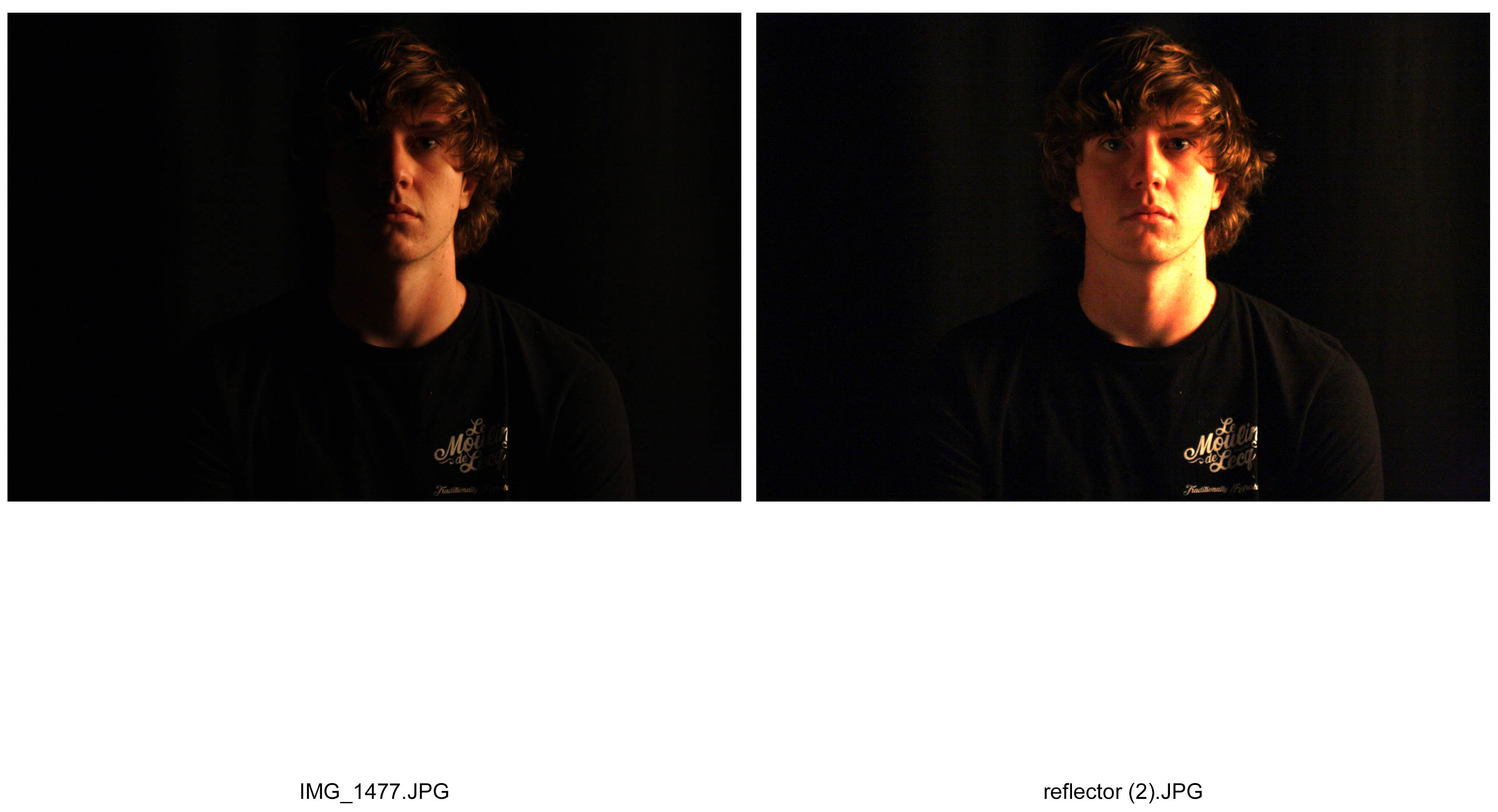
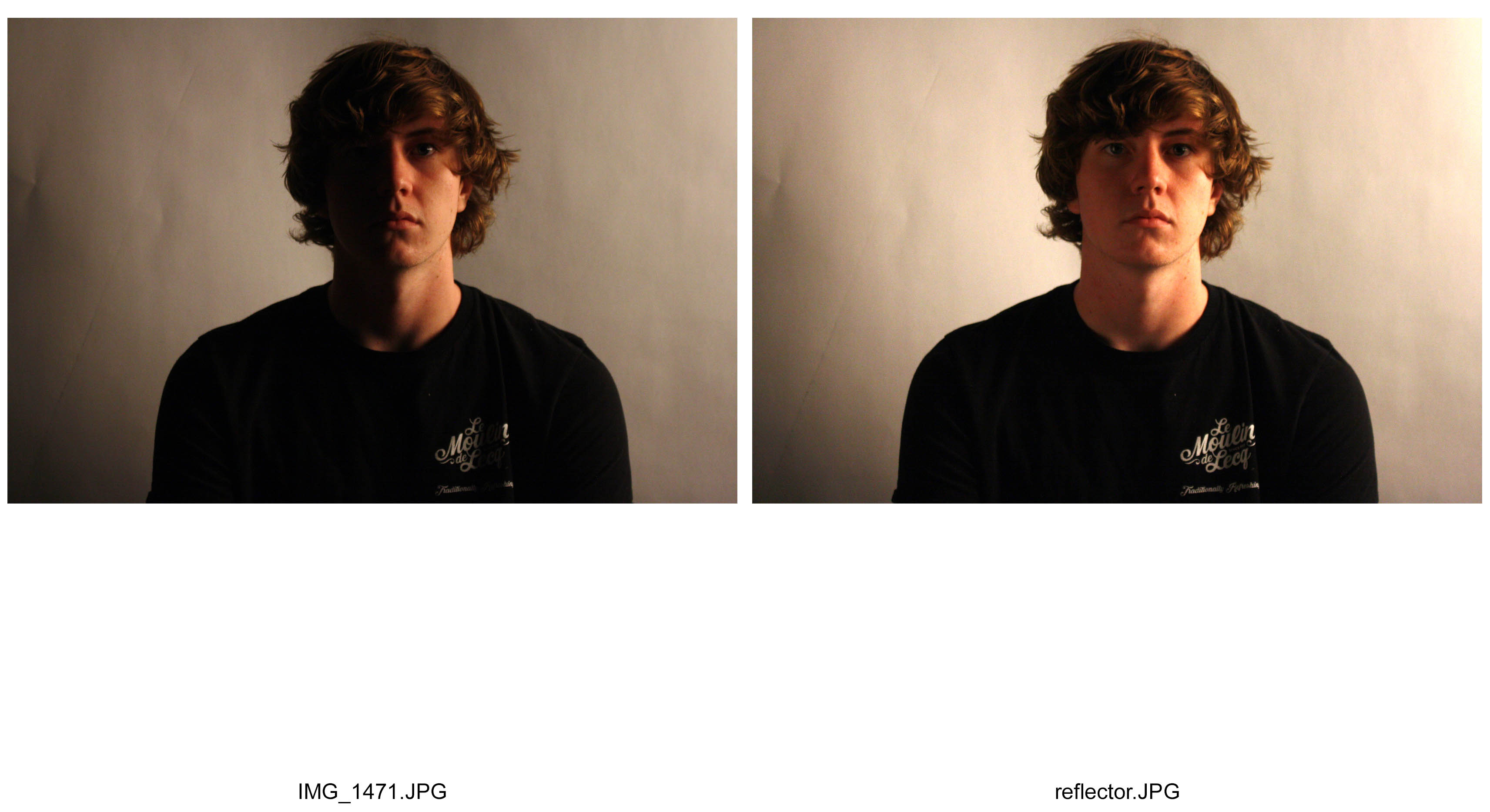
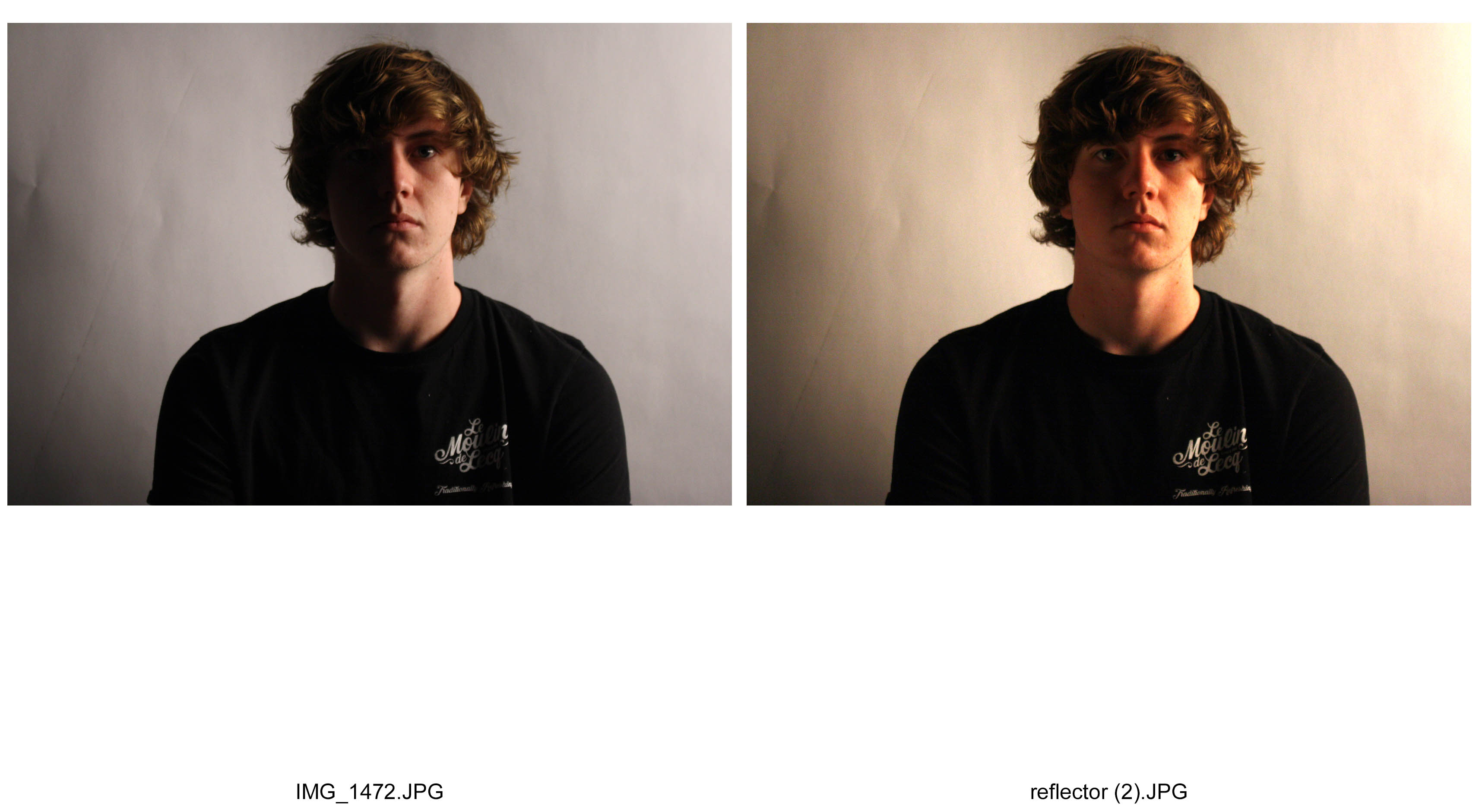
I took these photos using a chiaroscuro technique.   On the left hand side are my photos taken without a reflector to the objects face. On the right are my photographs taken with a reflector, reflecting the light towards the right side of the objects face. I experimented with varying strengths of light using high key and low key lighting and different backdrops with a black curtain and a white screen.  I took my photographs with the light pointing from the side going across the objects face to enhance the contrast between shadows and lit areas.   Also, the position of the light source was placed quite close to the objects face to create a harsh lit environment for the areas lit up, and create a further contrast to the darker areas.

Natural Light – Reflected

contactsheet-001 contactsheet-002

On the left hand side, my photos were taken using natural light coming from a nearby window.  I took the photos on the f4.5, ISO 400 and 1/320 shutter speed.  These settings therefore allowed me to focus evenly on the person without letting to much light or exposure in to give a nice balanced effect.  On the right side,  I used a reflector to balance the light coming in from the window to be reflected on his face too.  To enhance this effect, I upped the contrast to deepen the shadows.

Depth of Field – Aperture (2)

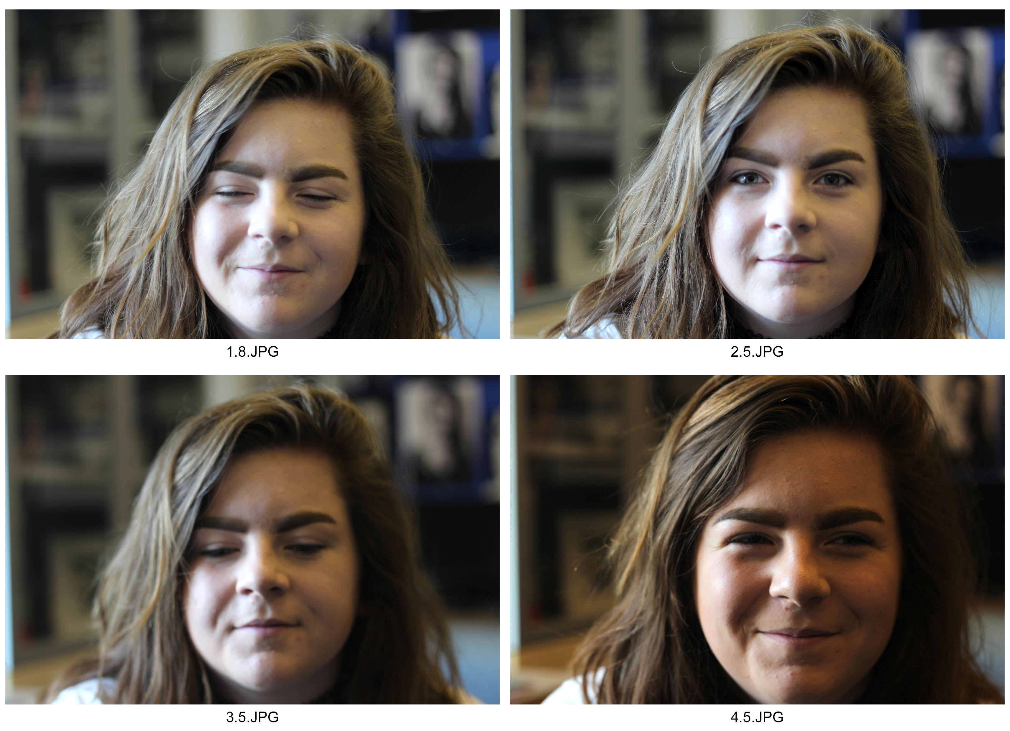
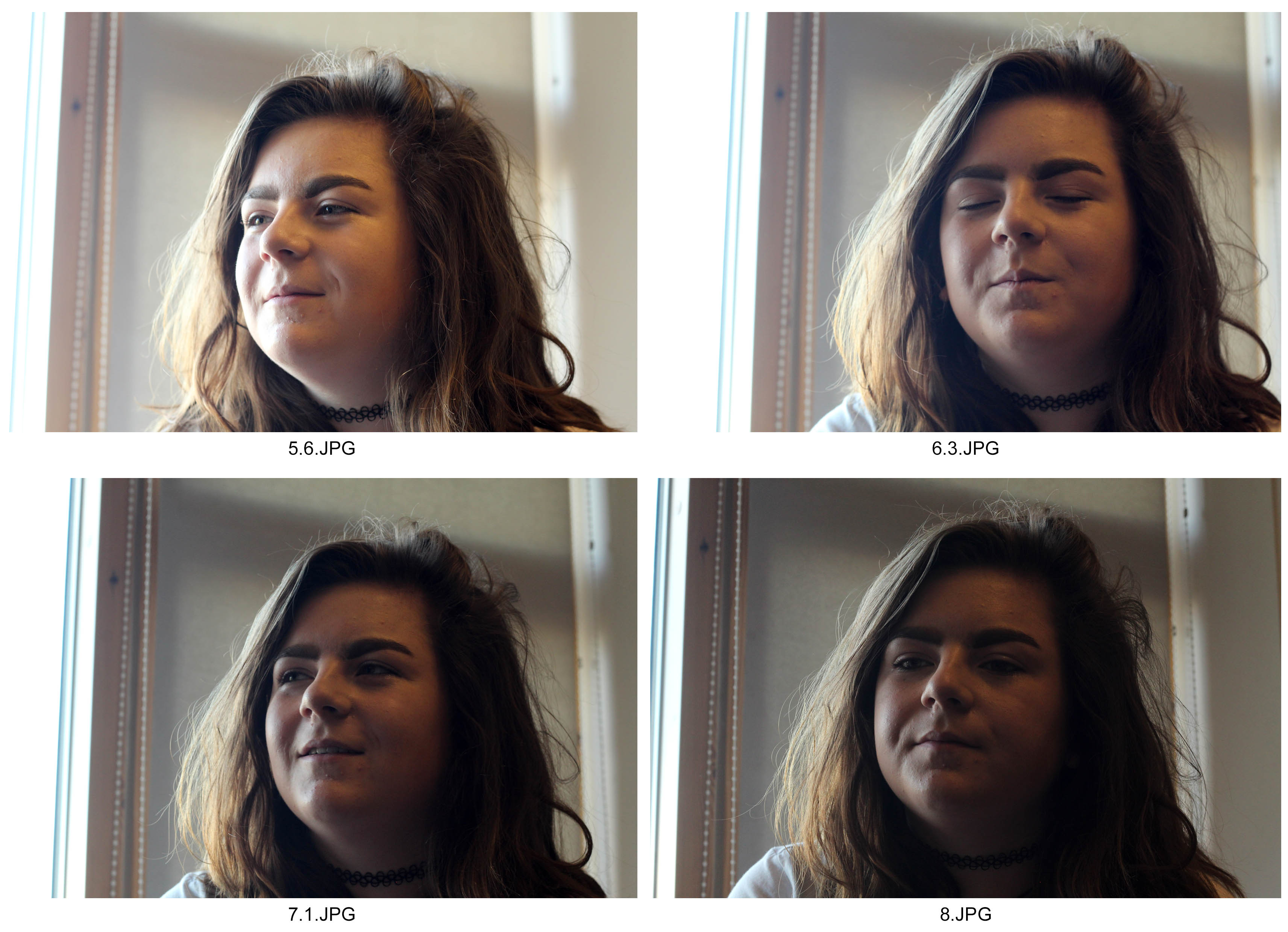
contactsheet-001 contactsheet-002

I took these photographs with an increasing aperture from 1.8 to 8.  By doing this, the depth of field increased and decreased giving the background different levels of intimacy and comfort to the photograph.  I countered with ah higher aperture, the brightness by adjusting the ISO to 400 whereas on the lower apertures it was at 200.  To enhance the levels of contrast, I took the photograph with a natural light source coming from the left.  I took these photographs on a portrait lens which didn’t have a zoom option.  However I liked the dark and white tones picked up by the lens which highlights the detail in the areas that are focused.


Comparison to Street Photographers Photographs

Robert Frank:

Image result for robert frank the americans

Mine:

dsc06572

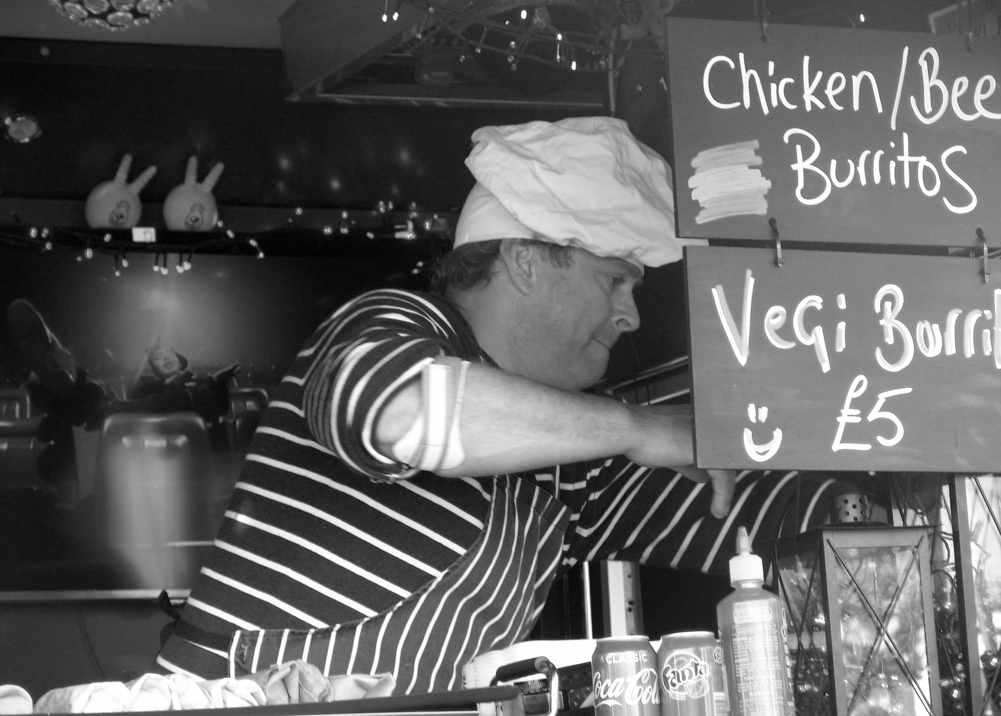
I took my interpretation of Robert Franks’s photograph using a street trader.  This photograph incorporates a sense of Environmental Portraiture as well as street too.  To create a similar effect I lowered the ISO and increased the contrast to enhance the black and white effects.  I also like Robert Frank, allowed for the exposure of light to create a similar effect by displaying a sense of business to the photograph. Also, differently whereas Robert Frank chose to create the girl to be further back, I chose to increase the aperture to create a minimal depth of field to allow the viewer to naturally focus on the man.  I also by cropped the photograph to  make the man fit in with the rule of thirds, attempting to make it easier for the viewer to focus on what the man is doing.   Finally, I took the photograph on a slightly lower shutter speed to capture the business of his hands effectively.  This started to increase the exposure but I balanced it nicely with a slightly lower aperture.