All posts by Adam Seal
Filters
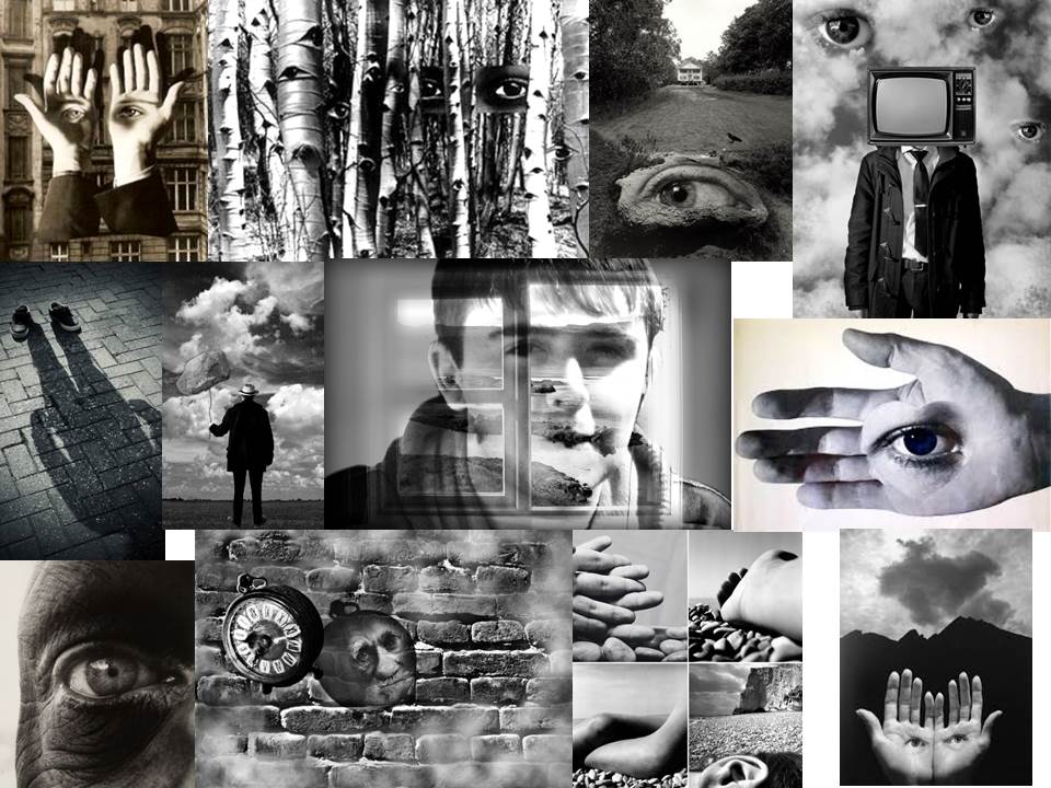
Identity and Self Portrait Moodboard -Herbert Bayer, Jerry Uelsmann and Bill Brandt
Photograph Montage
Idea 1:
Idea 2

Idea 3
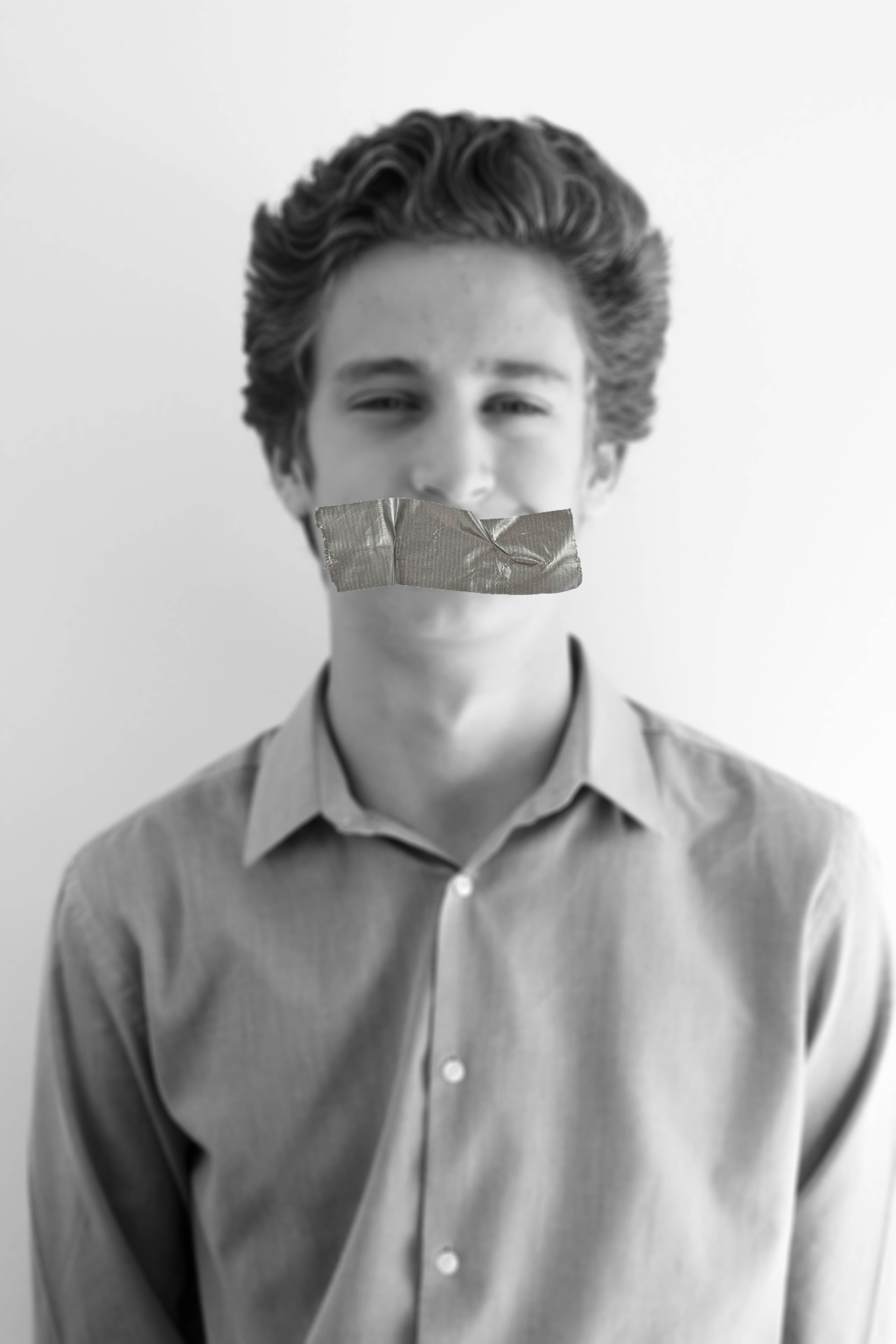
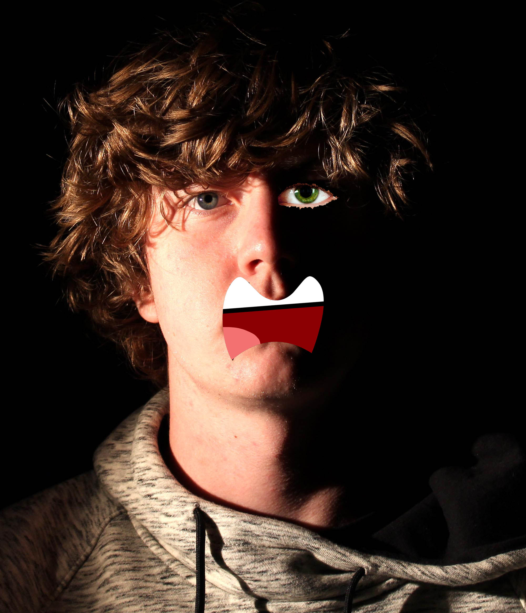
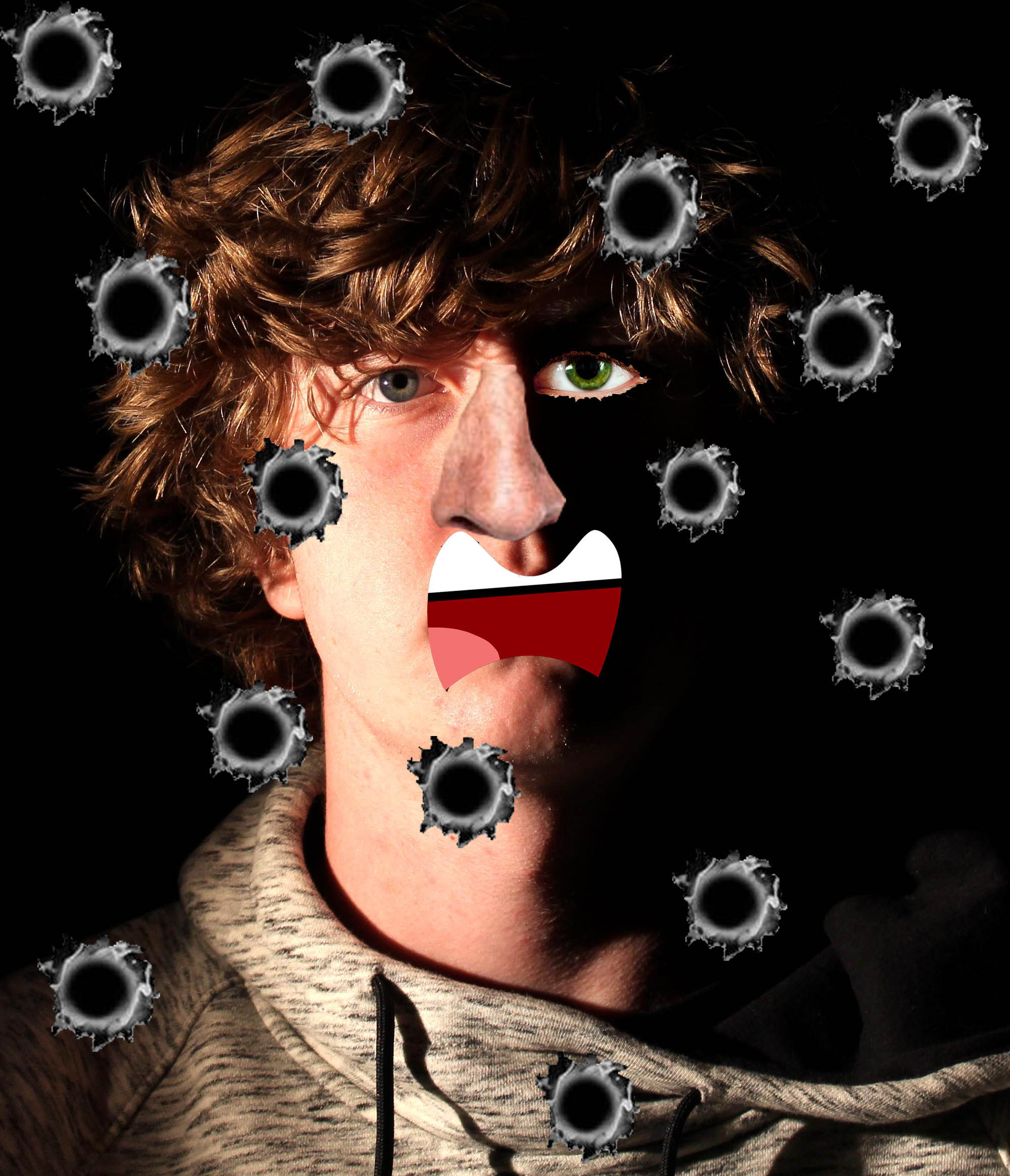
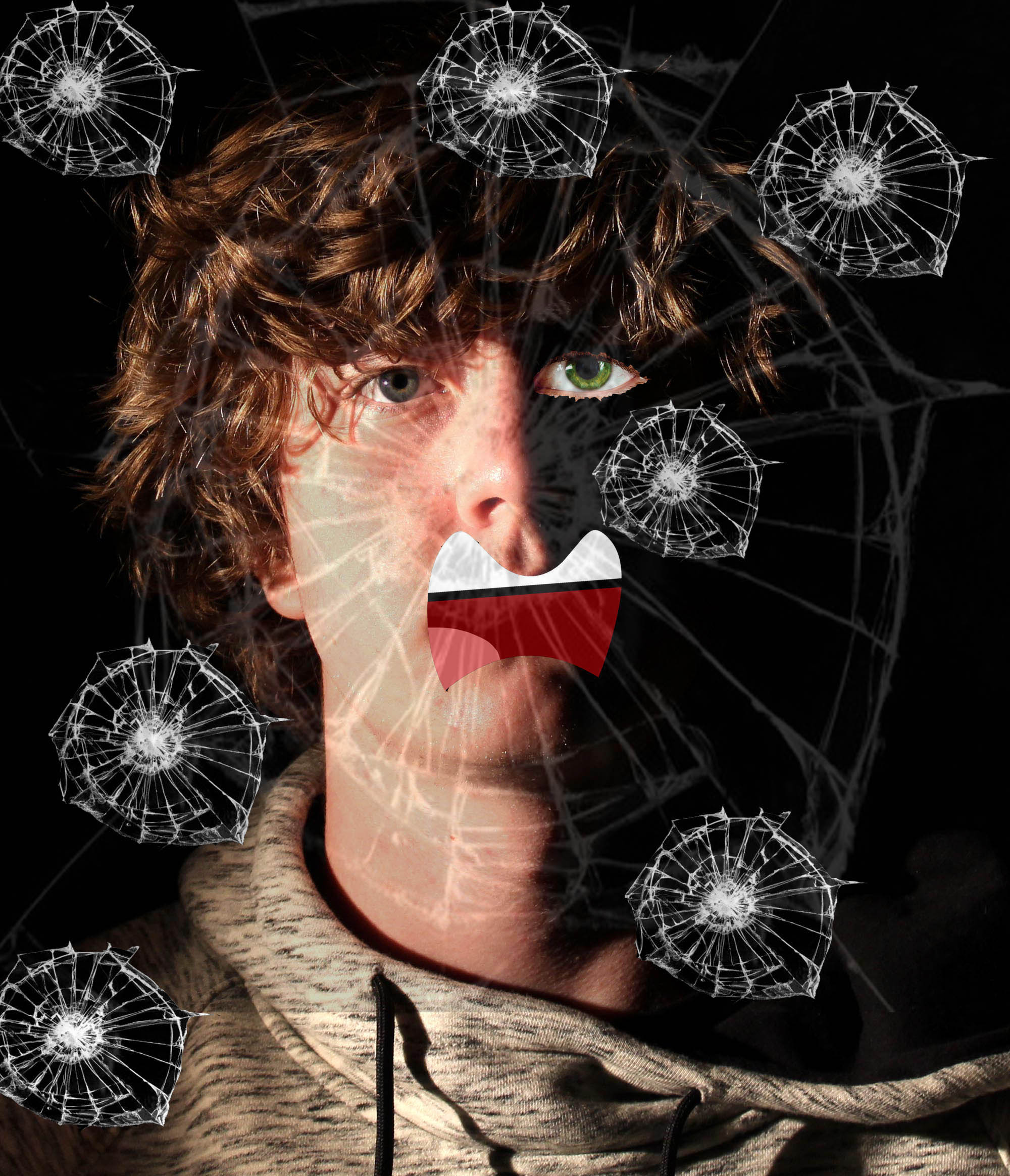
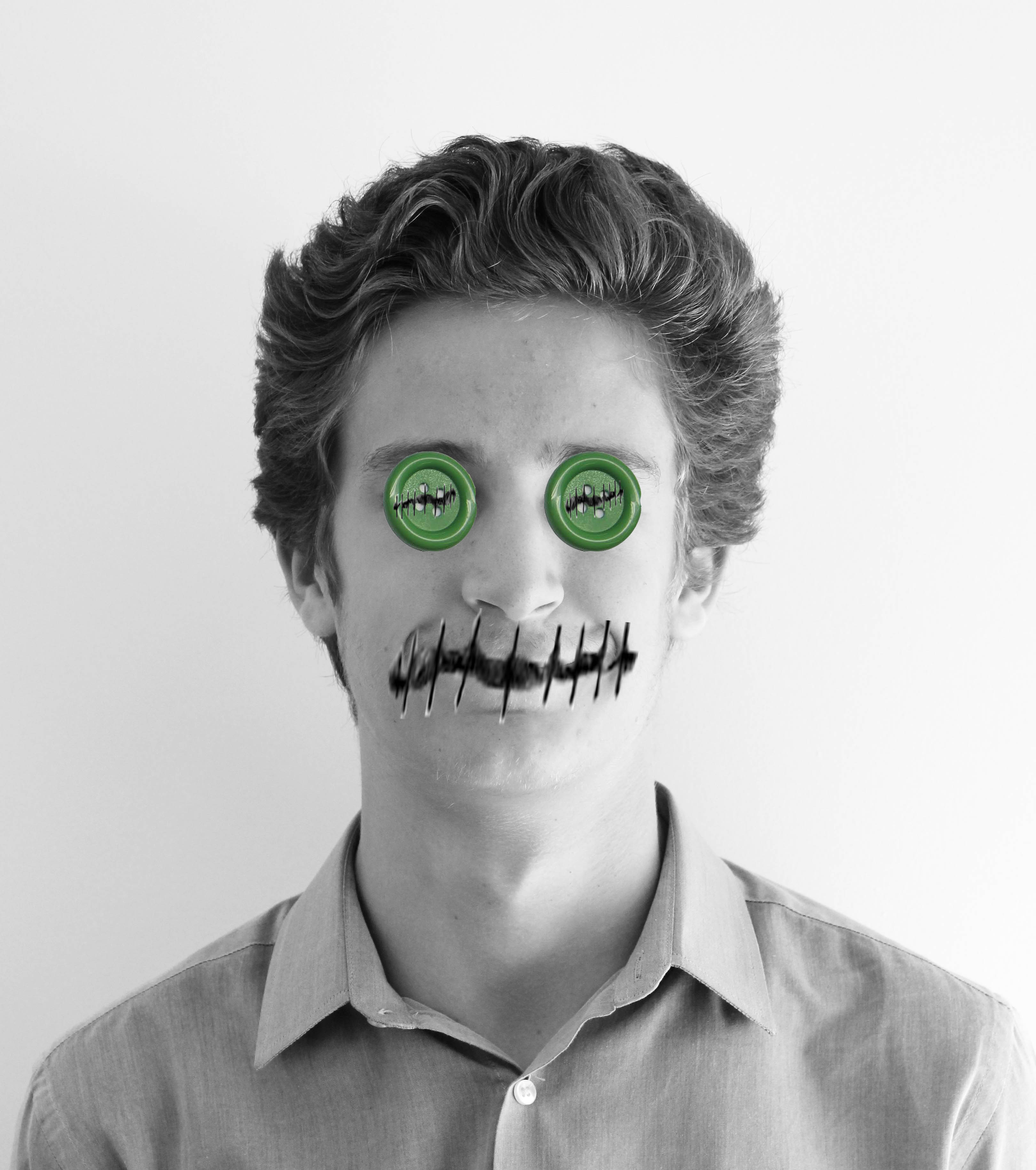
My responses are largely influenced by Hannah Hoch. However I added my own slight twist to personalize my work and make the features of the photograph more relatable to me. I have done another earlier blog post discussing how Hannah Hoch has inspired me.
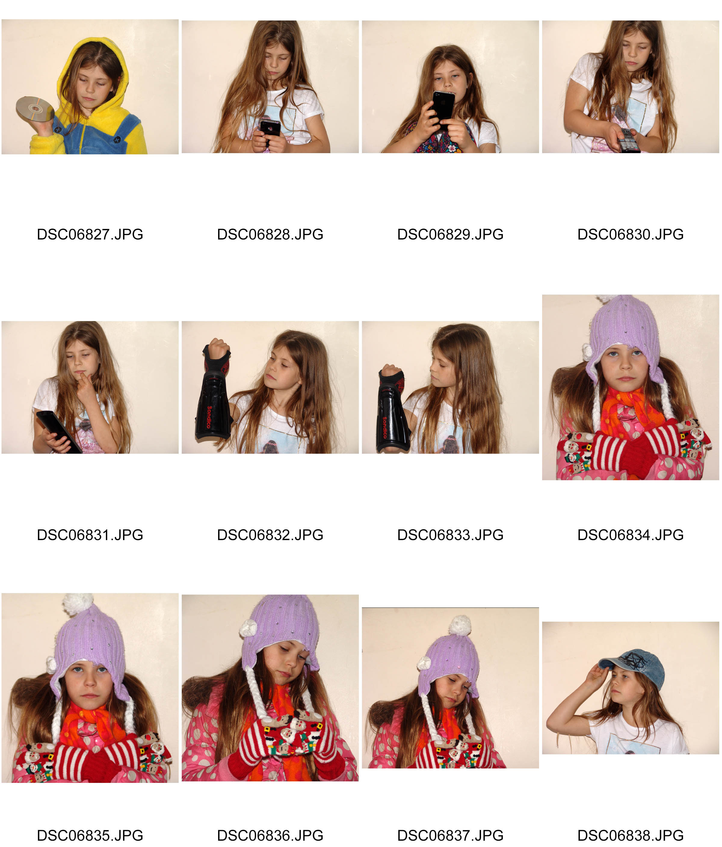
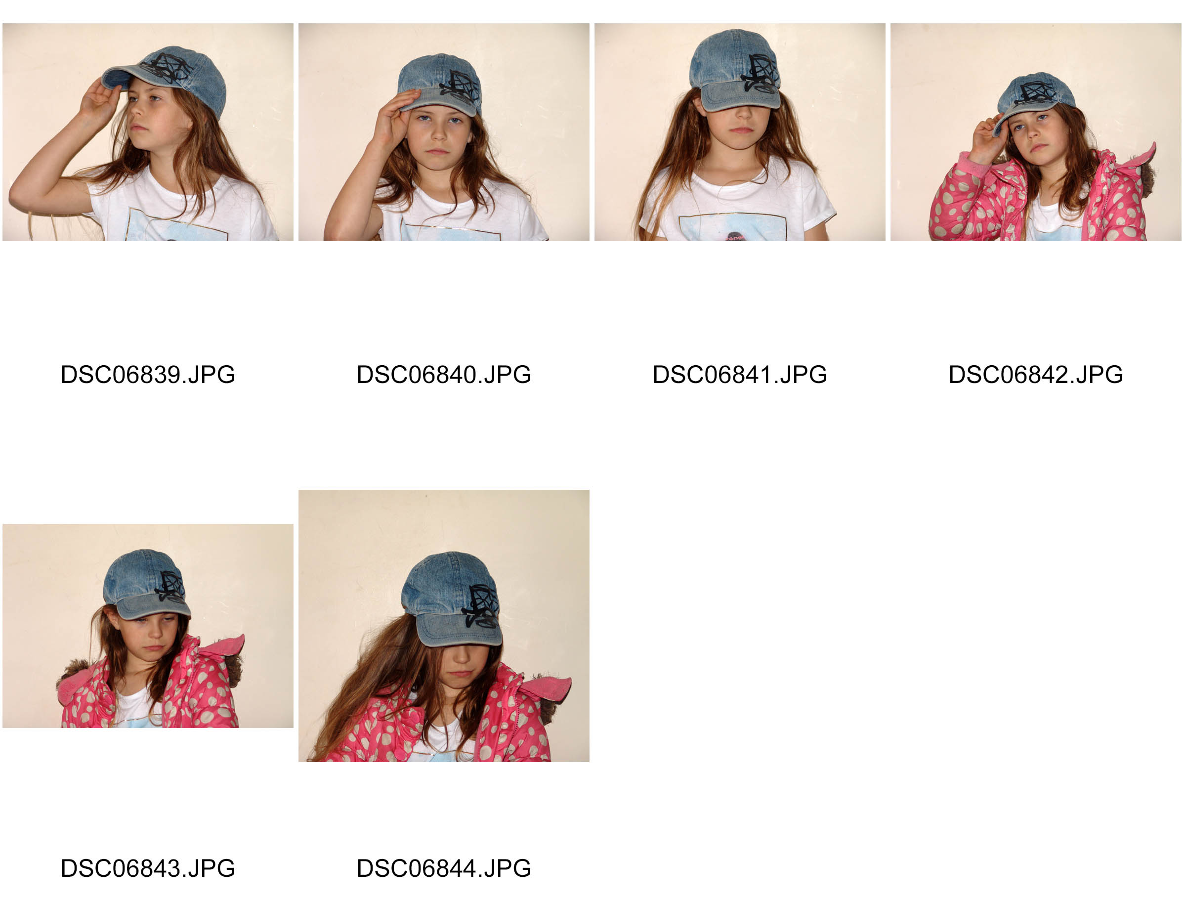
Rankin Inspired Photographs
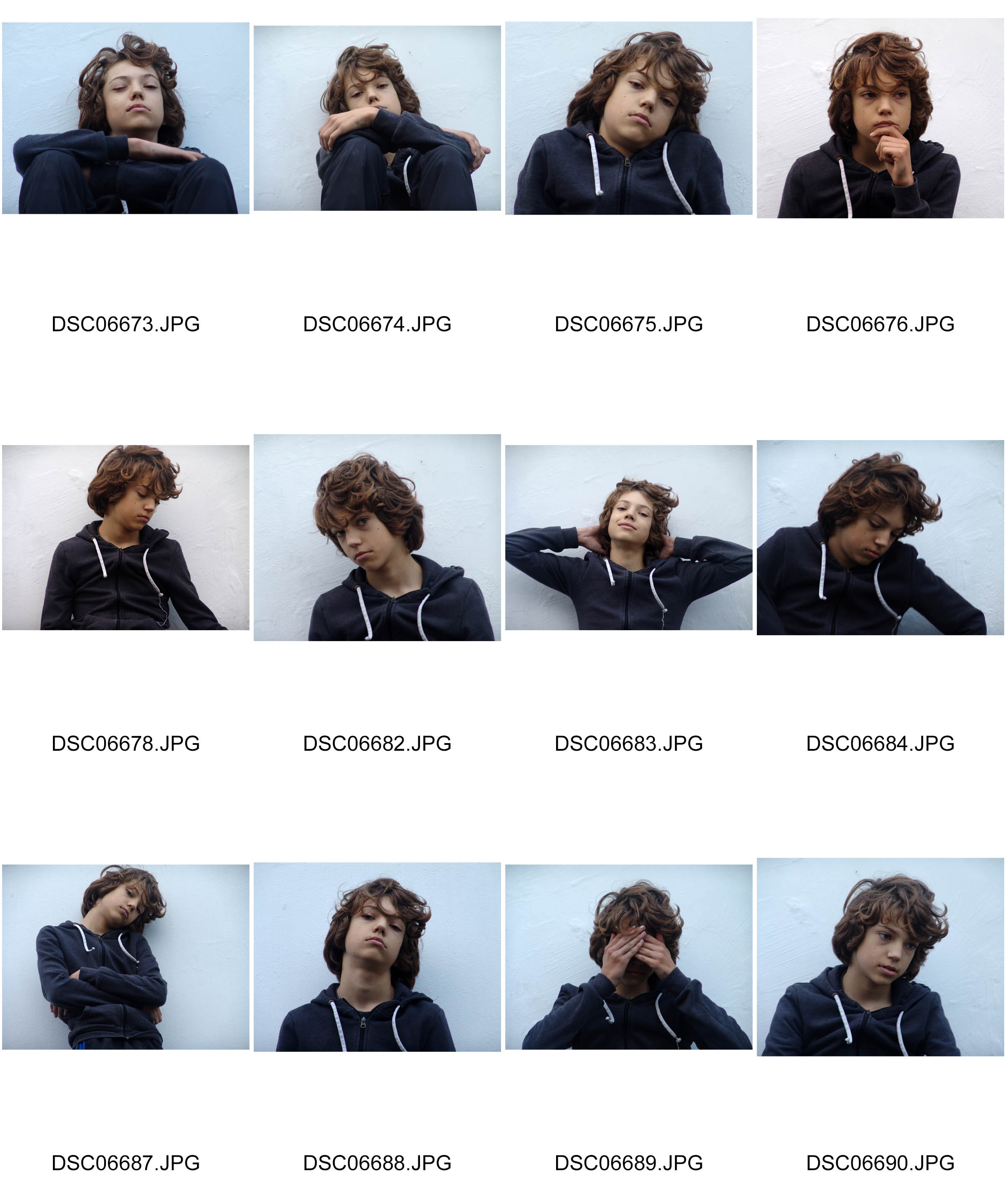
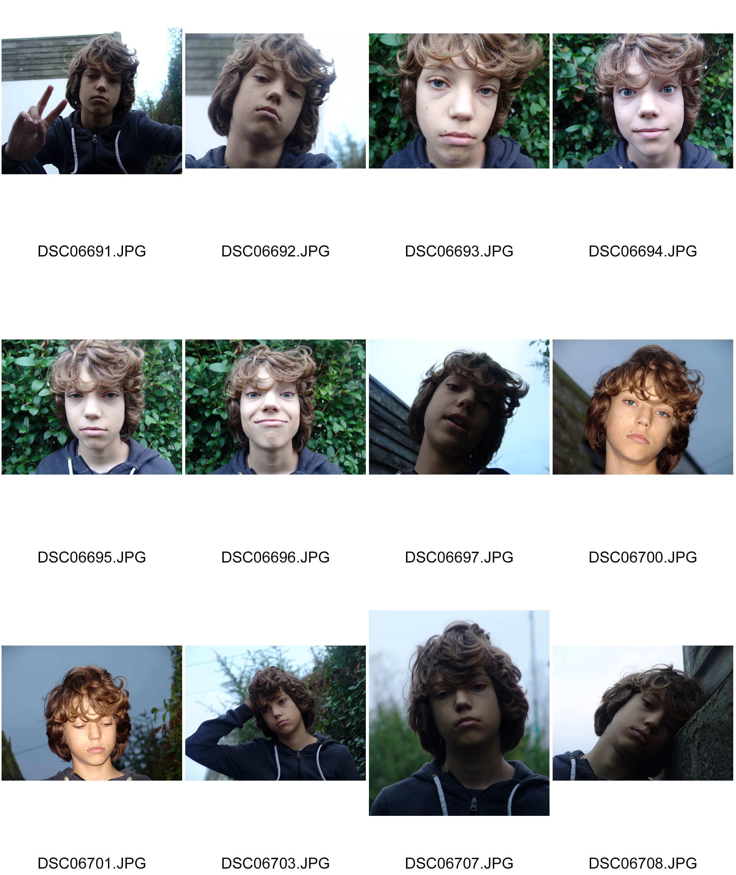
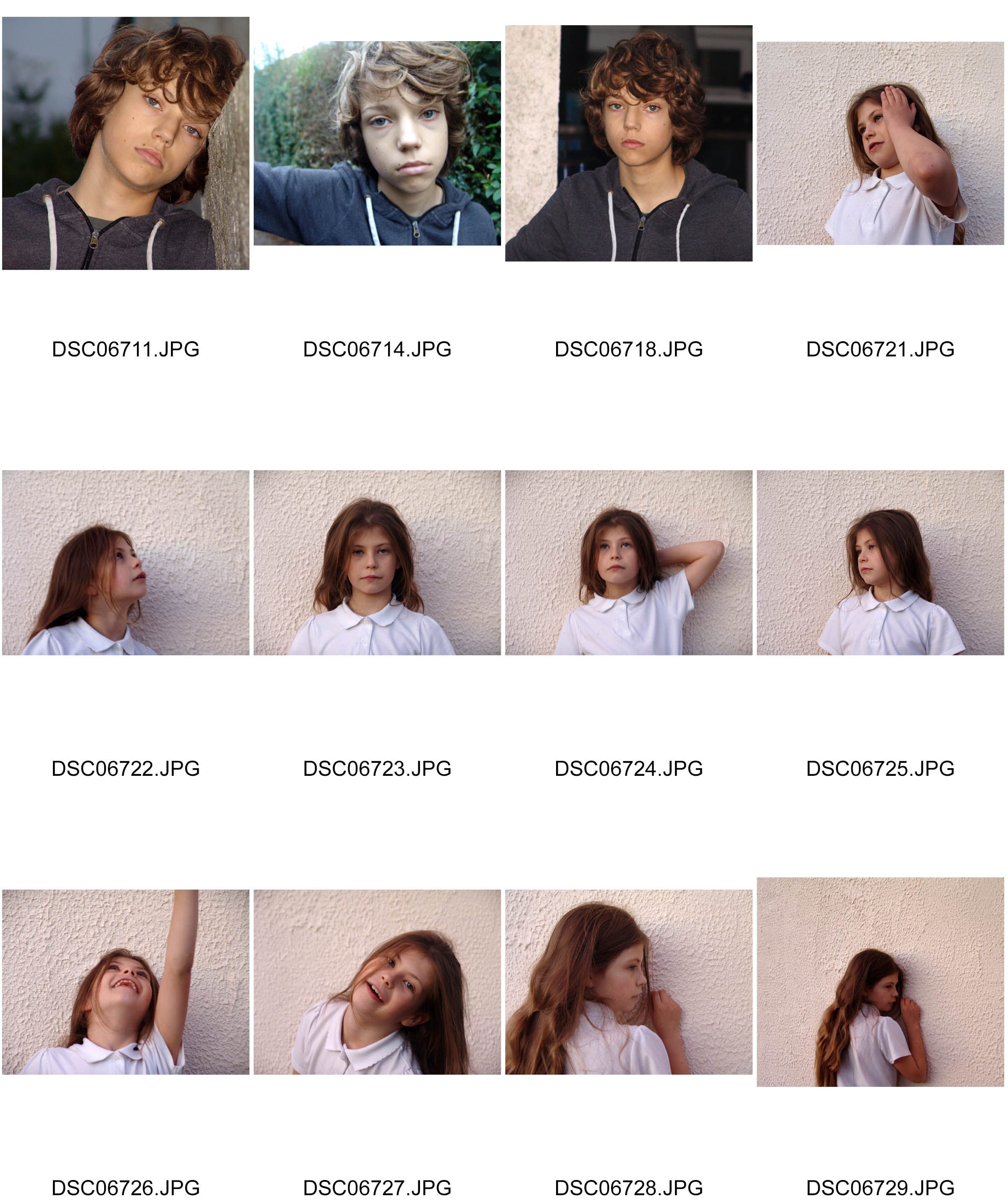
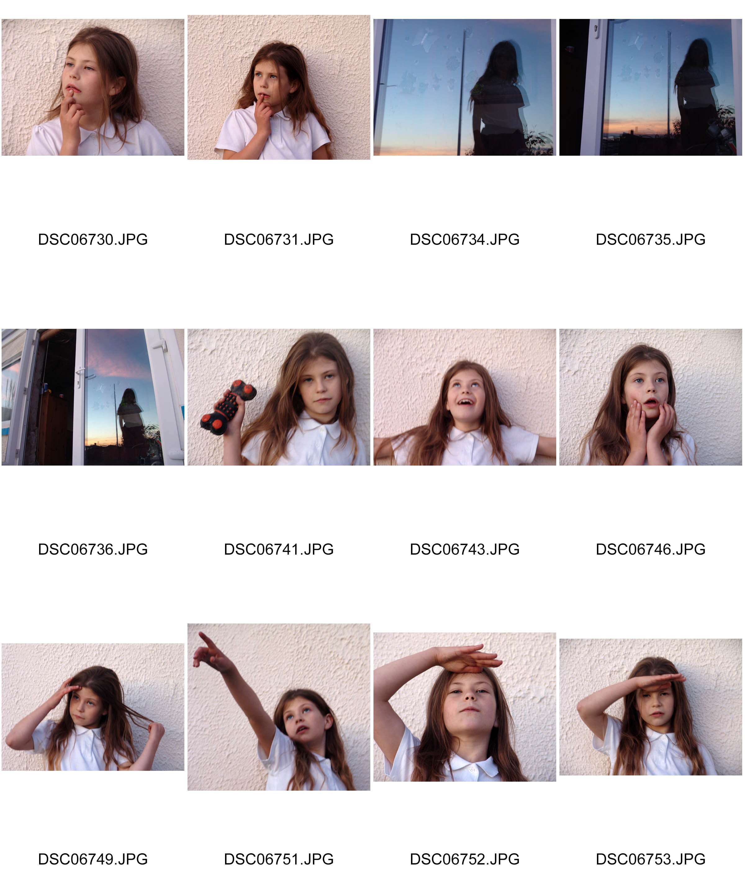
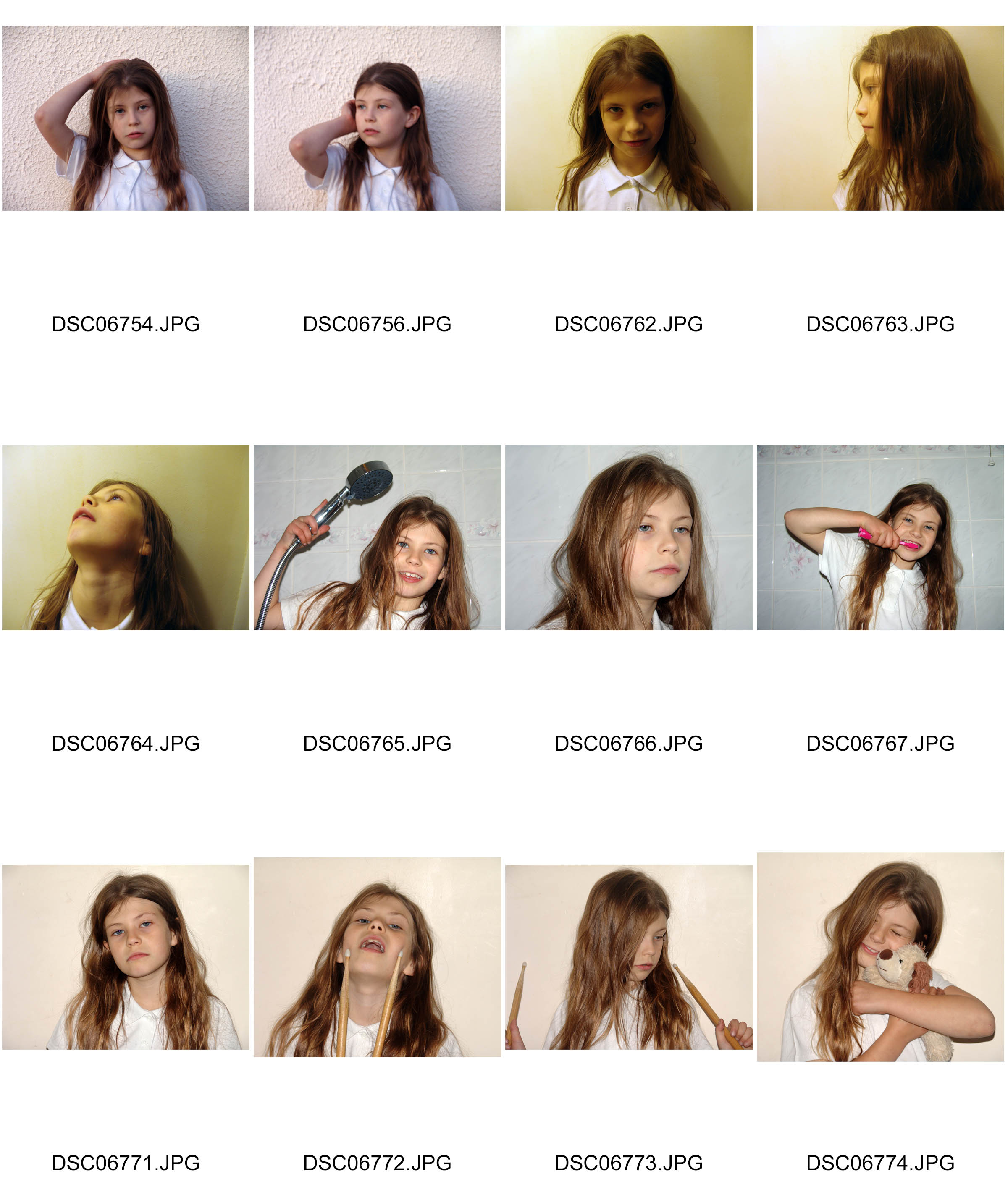
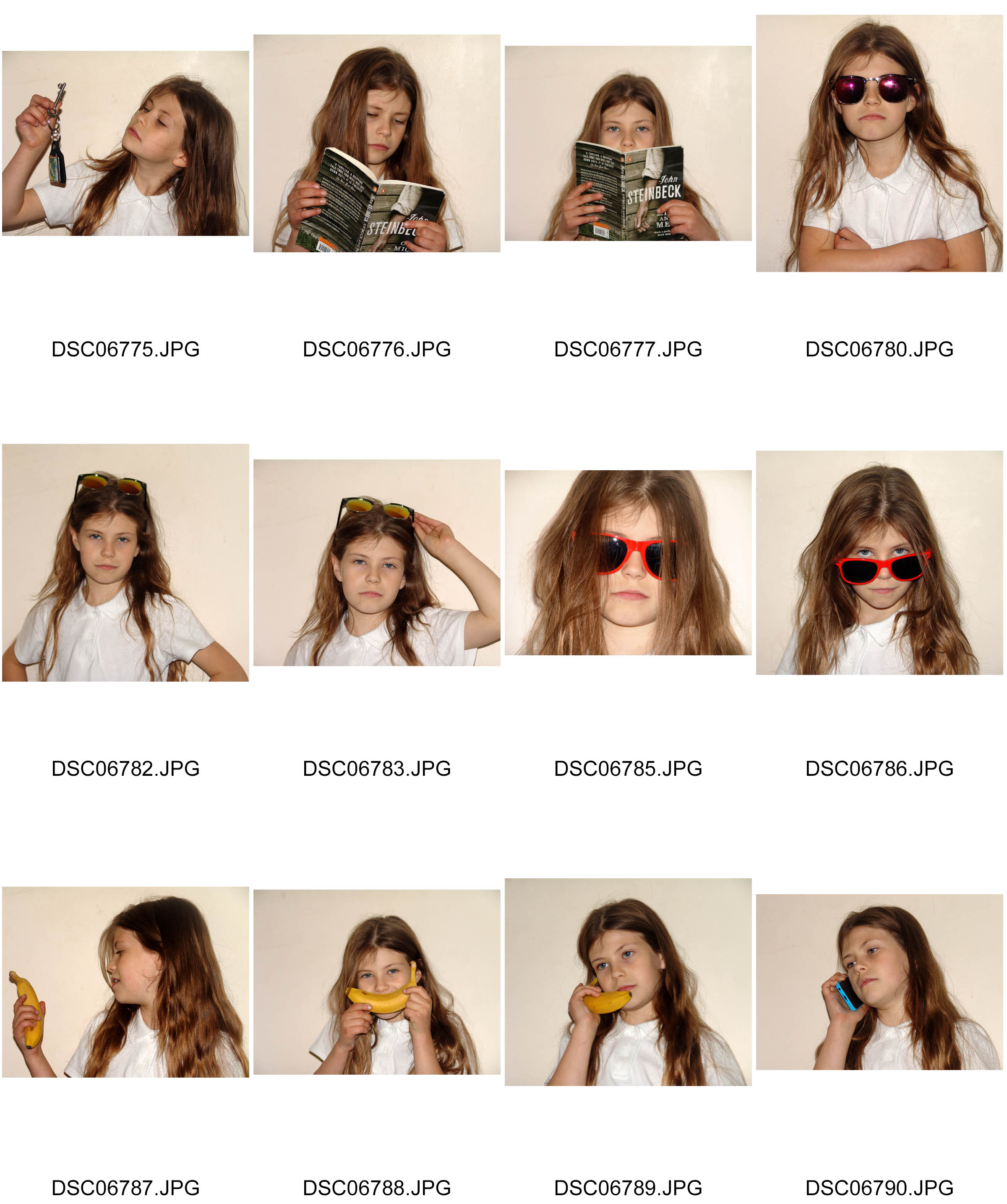
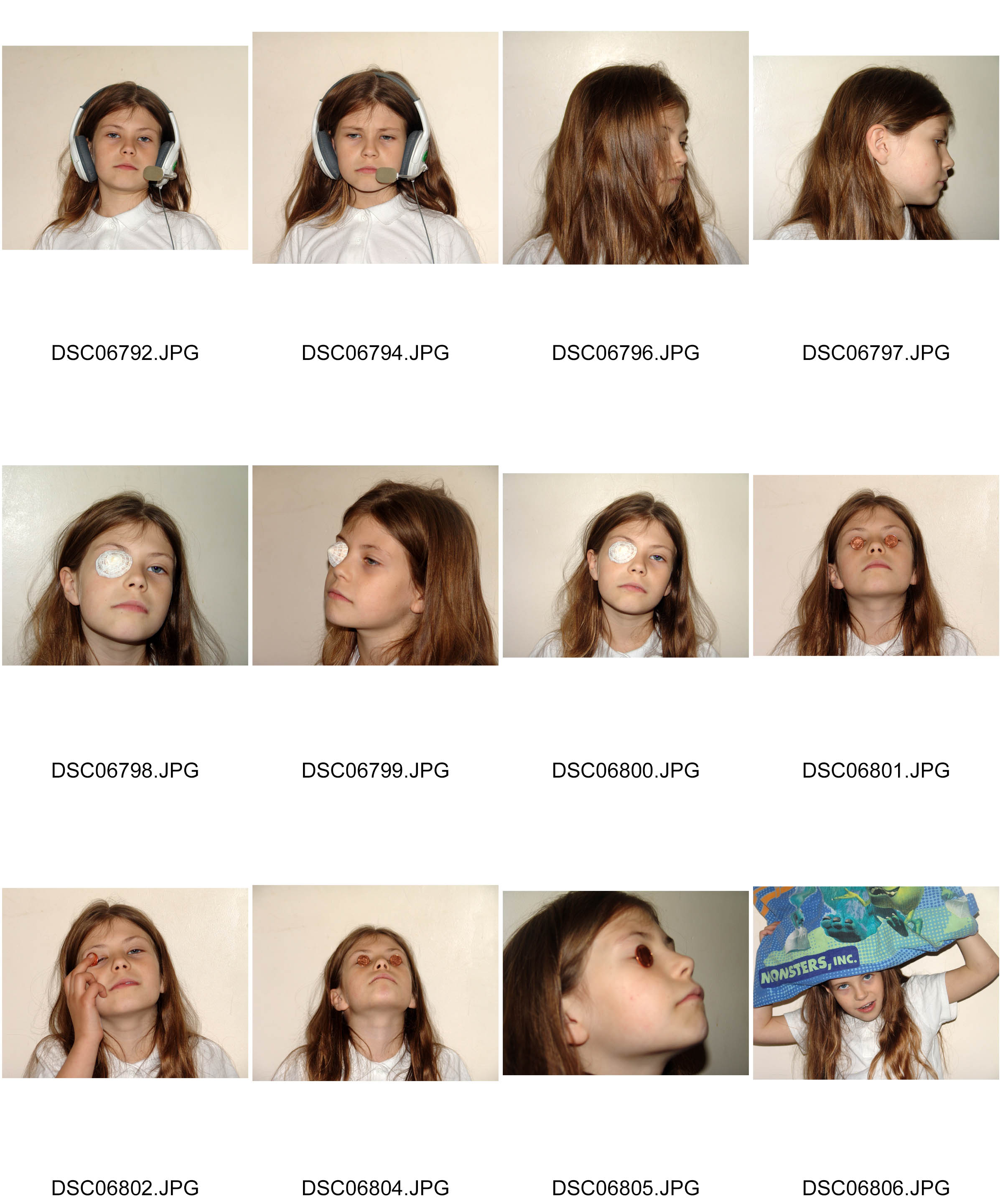
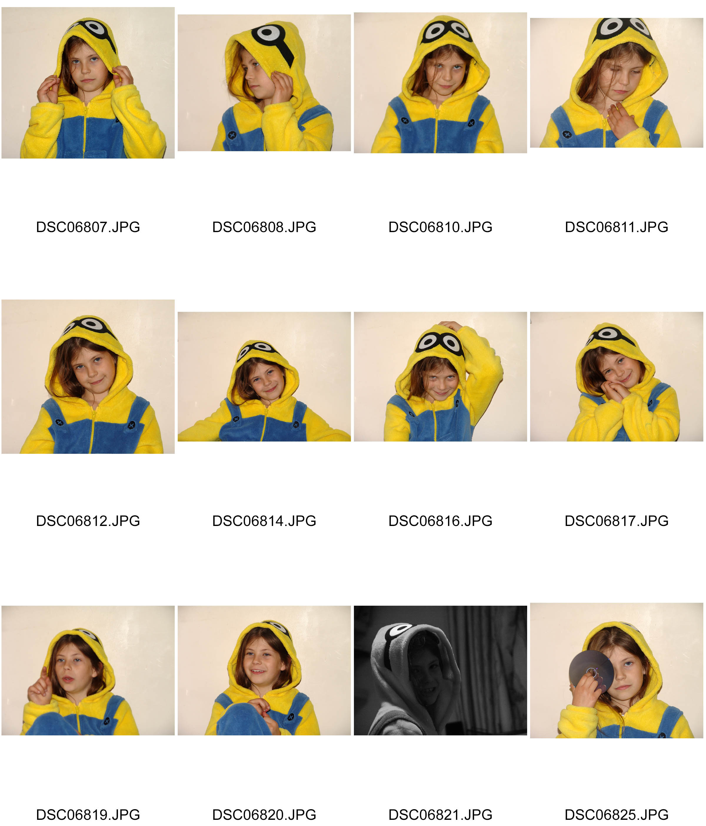
Photograph Clusters
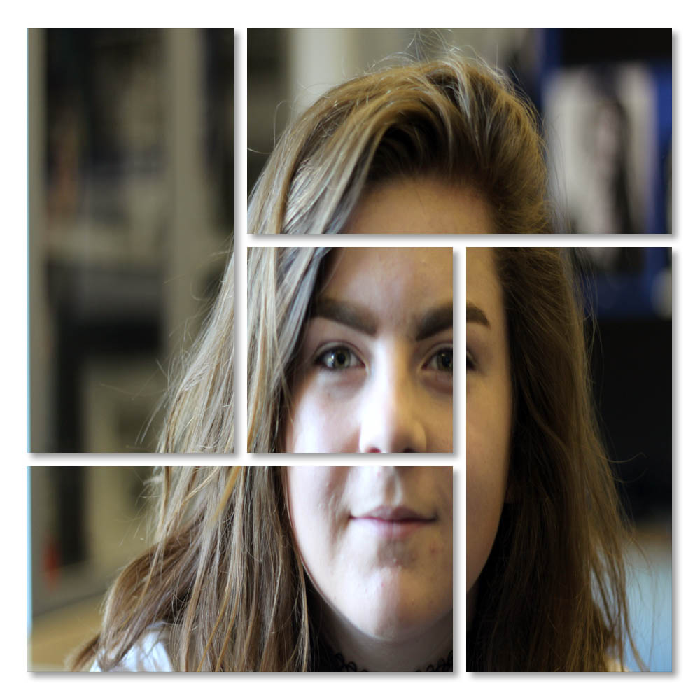
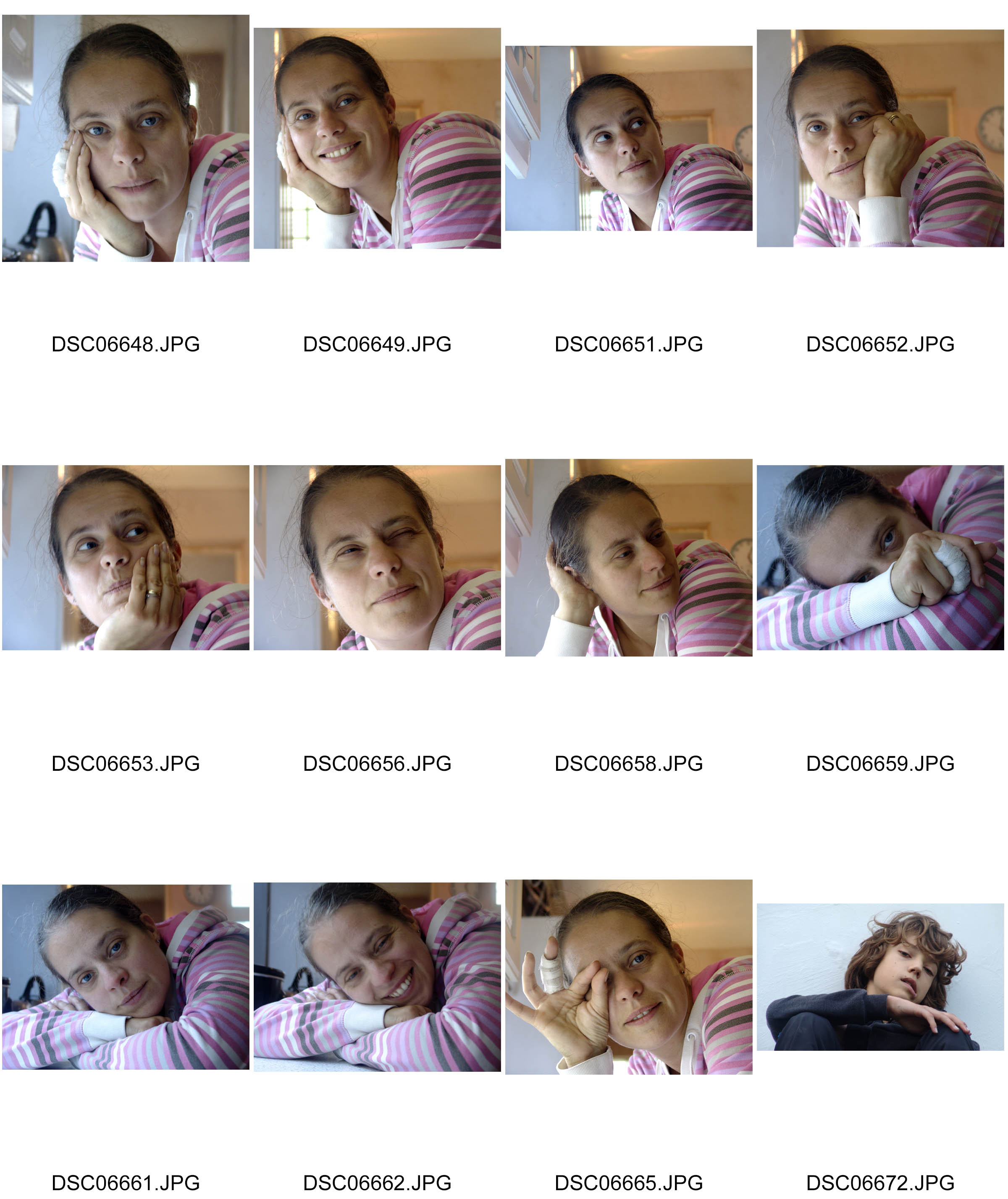
After selecting my image, I went to the edit, preference and then guides and grids option. After doing this I chose view, show and grid. After doing this I added a new layer and selected the rectangular marquee tool and drew m desired box. I then filled the box with black. After doing this, I held down my shift key and drew 10 horizontal rows and 11 columns. I deleted the selected areas and added a drop shadow . Then I opened my desired photograph. and copied and pasted it into my squares. Then, I created a clipping mask and moved the photograph in the best areas that suited the clusters.
“Photo Montage ” inspiration – Hannah Hoch
Hannah Hoch is famous for largely her works in Dada works and photo montages. Her work usually expresses her feelings towards the German Wiemar Government and the many struggles it faced making German life hard. In her works she largely focuses on feminine themes drawing inspiration from a range of artists such as: Pablo Picasso and Kurt Schwitters. This is apparent in her work as for example she sometimes introduces male features on woman and vice versa with a slightly rebellious touch by including props such as cigarettes which highlights the day to day struggles of German life under the Wiemar Government. She became a leading feminist from her montages for works such as Das Schone Madchen (the beautiful girl) in 1920.
In the top photograph, the fact new photographs that are in slightly worse condition than the background photograph and depict someone sad onto what was a presumably happy looking photograph. This is done through the fact it’s got slightly warmer colors. Interestingly, how Hannah Hoch implements these sad photographs onto happy ones demonstrates the attitude to German life particularly in these hard times through hyperinflation in 1924 where people who were happy grow old and will only get more miserable and disappointed through life.
In the bottom photograph it is evident of her demonstrating her feminist values because in Germany in this time, new fashions such as short hair, modern art, culture and architecture. The fact the object has short hair was a new tradition that was frowned upon by the upper bourgeois classes which therefore shows her sense of rebelliousness as an artist.
Examples of her work:


Color Overlay
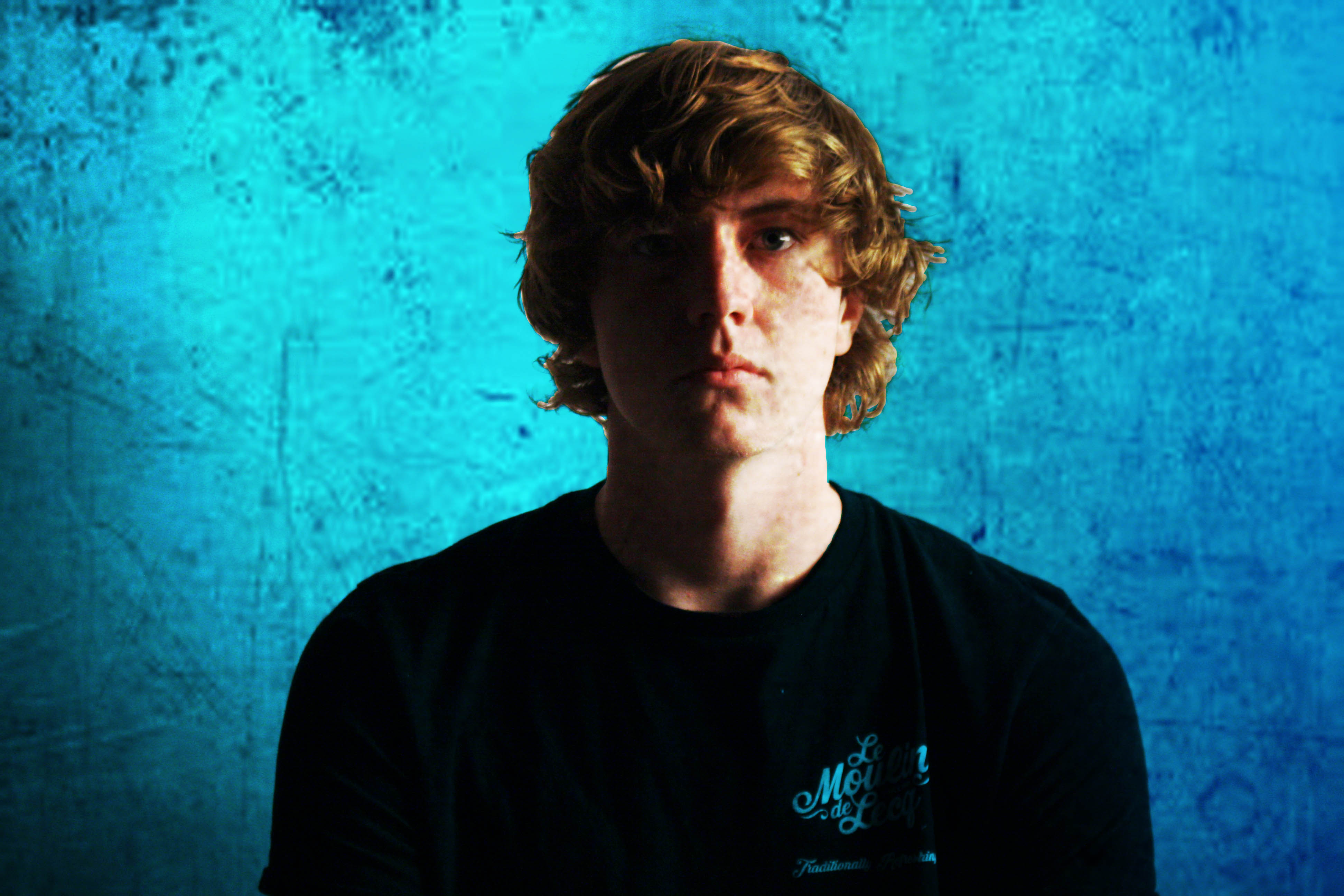
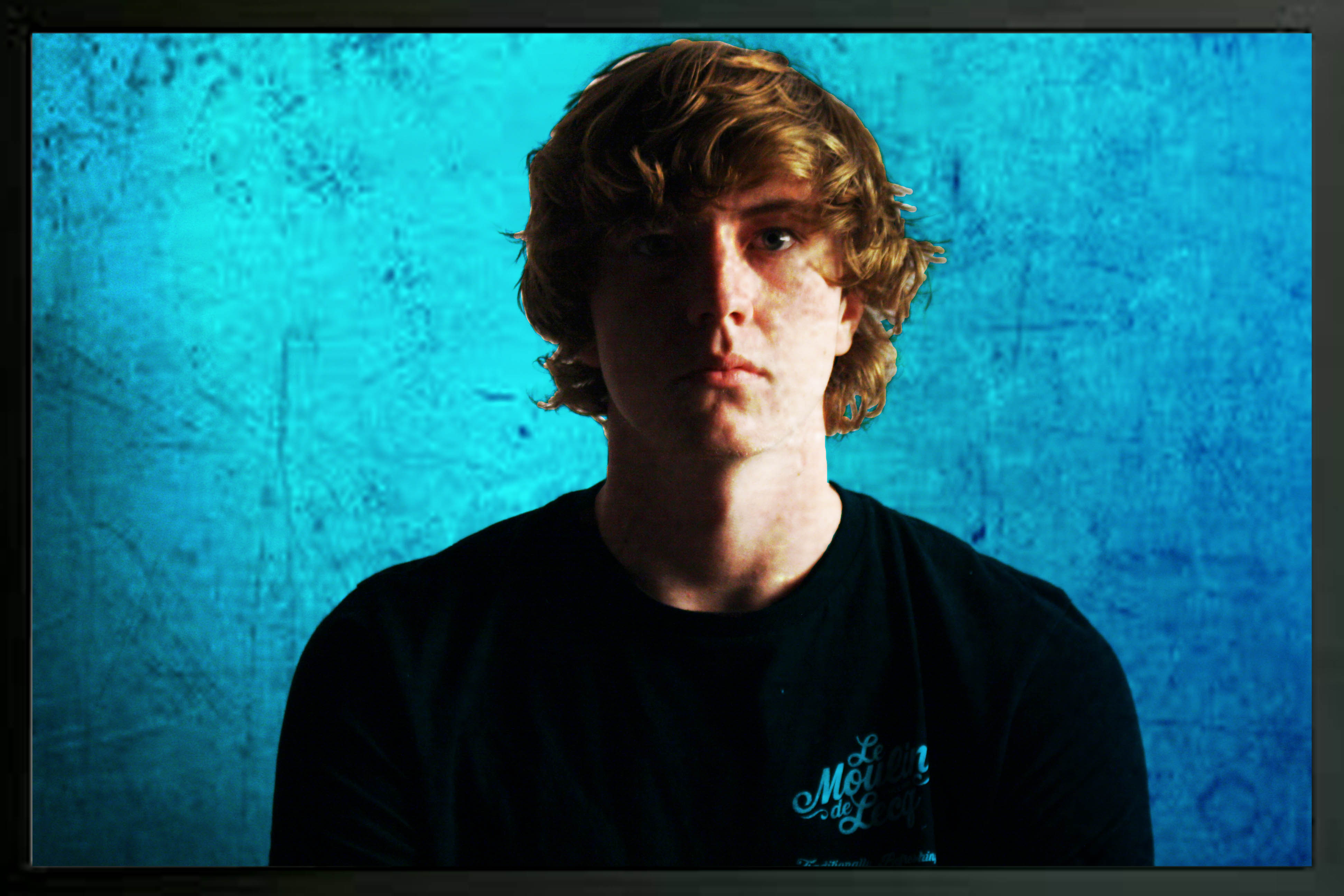
At the start chose 2 images. From here I used the lasso tool to select the objects face. Then after this, Here I selected the layer mask at the bottom of the page and selected the solid colour option with a light blue to compliment the facial expression of the object. Underneath the layers option, after clicking on the tool bar, I selected multiply. After doing this, I adjusted the opacity of each layer. Finally, I then added a black frame to the photograph to add depth.
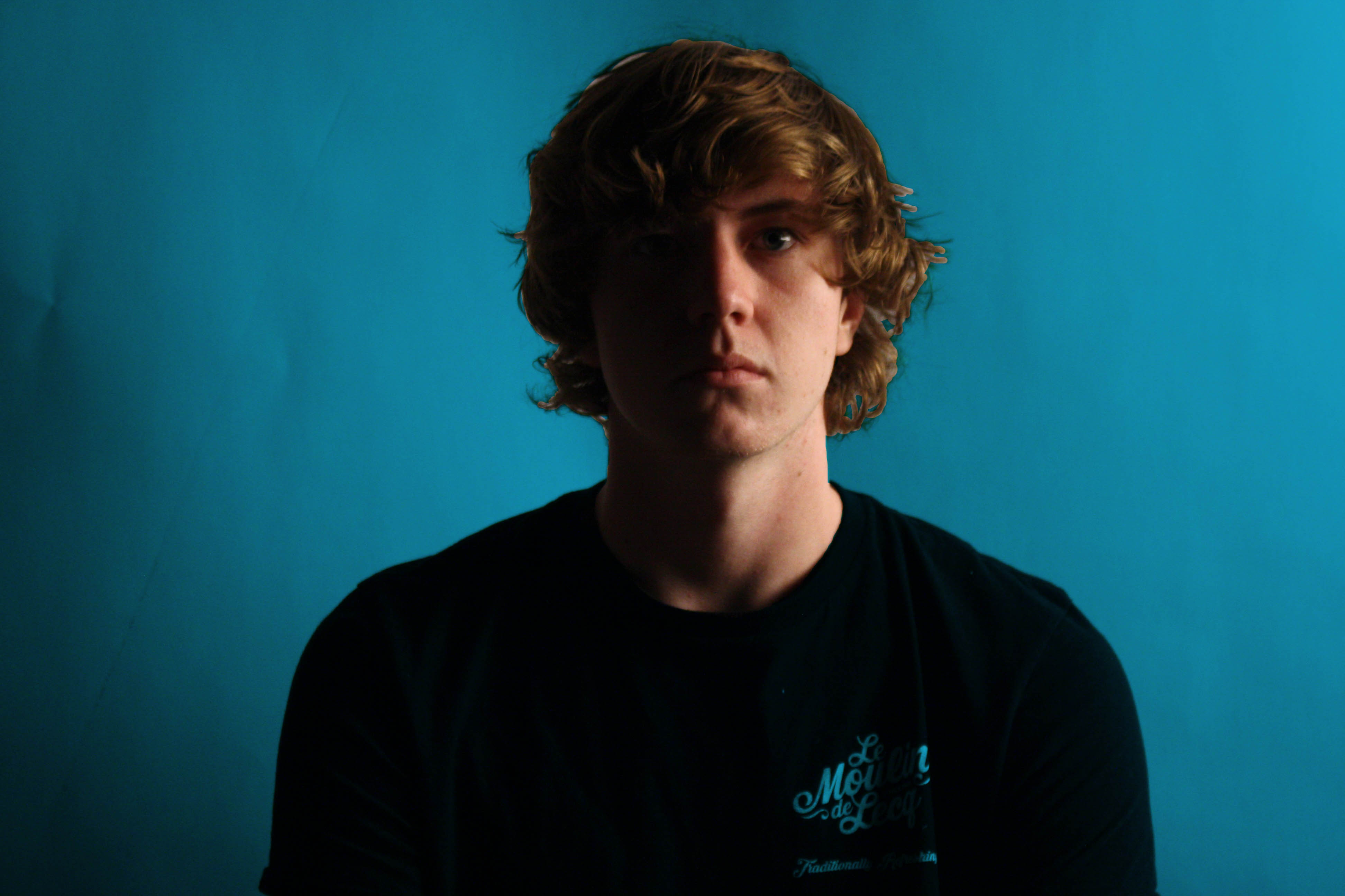
Double Exposure
My Original portrait:
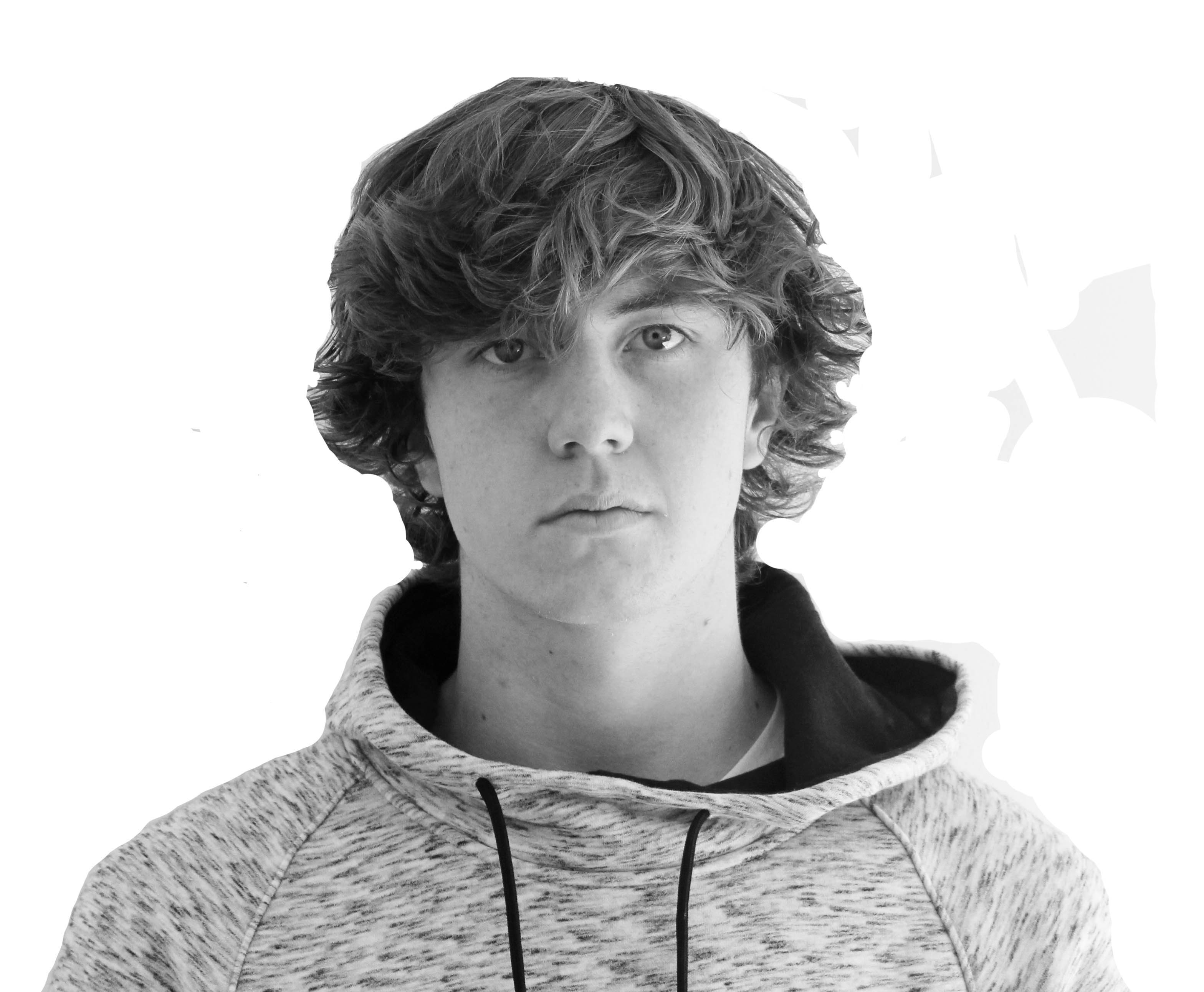
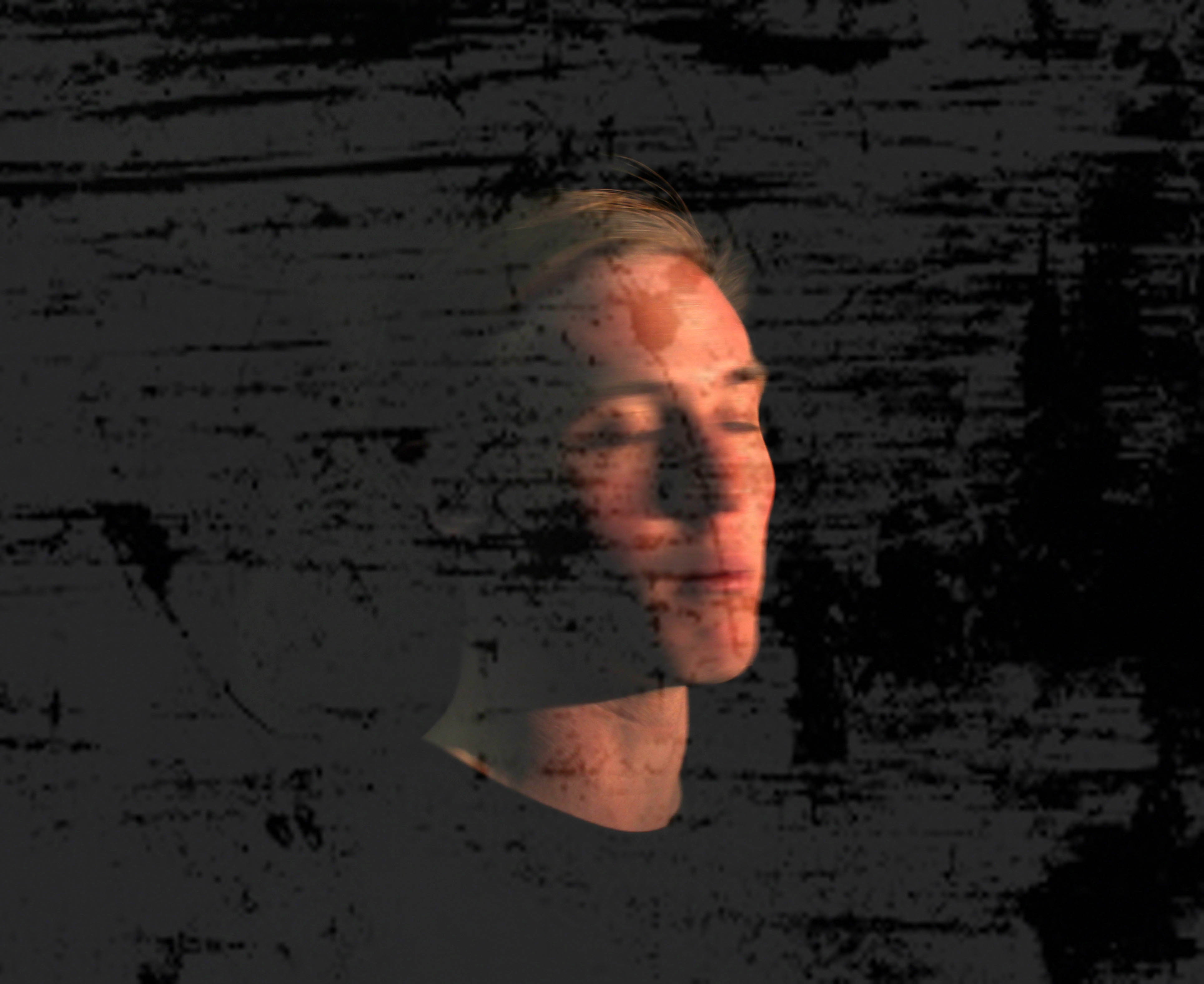
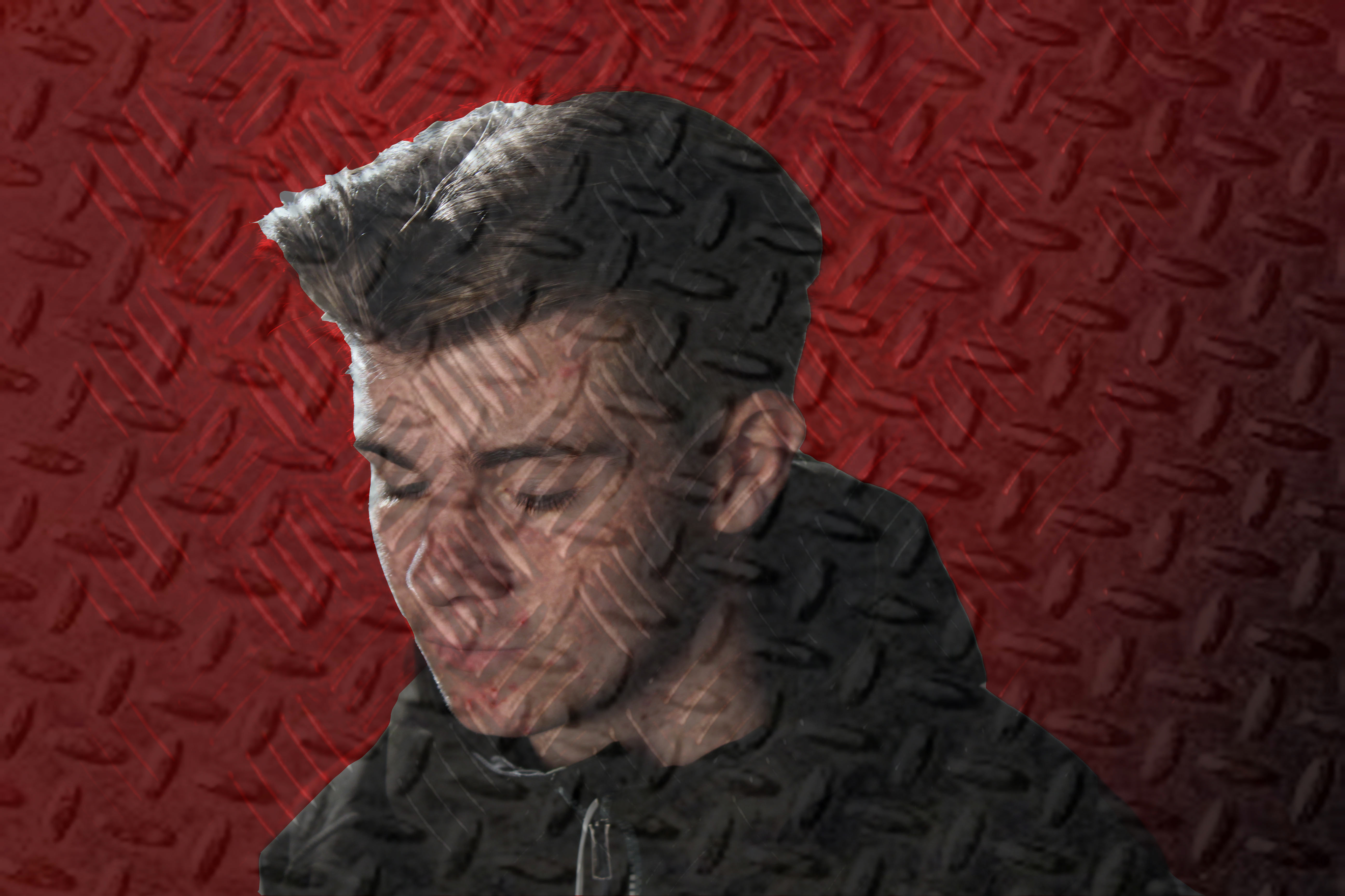
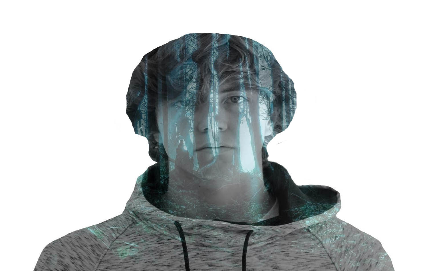
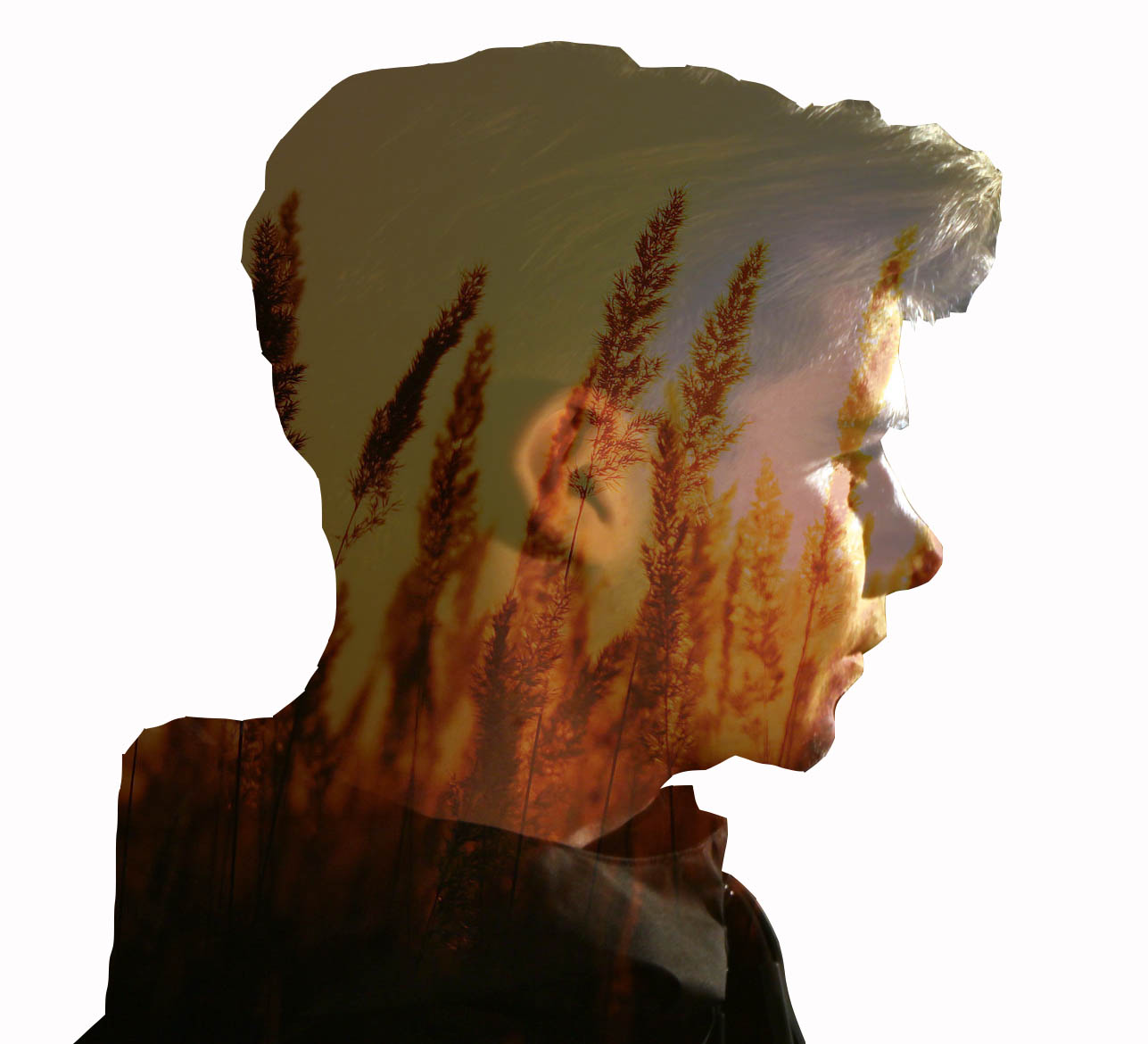
I am demonstrating my response to Adam Goldberg. The first thing I did was I chose a background and a portrait image of my choice. On my portrait layer, I used the lasso tool to select the areas I desires. After doing this, selected the inverse tool so that the other layer would be filled with the areas that aren’t white. Then on the background layer, I selected edit, fill to merge the 2 layers. From here I changed the opacity to adjust the strength . I like this photograph because the cold/dark hues complement the darker tones of shadow on the object’s face. This makes the viewer feel nervous as the cold, harsh and hostile techniques of the photograph are conveyed.
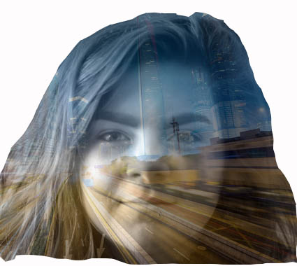
Other examples:
Three Point Lighting
Standard setup:

- Key Lighting – The Key light is the primary light source in this style of setup. It is pointed from the side of the object to create a dynamic effect of light.
- Fill Light – This light is used to create a nice balance of light so the shadows are minimal preventing a chiaroscuro effect, and creating slight “butterfly” shadows in and around the object’s face. This makes the lighting more intimate in the environment and therefore quite personnel.
- Finally, the back light is used to separate the object themselves from the background. This strengthens, enhances and above all defines the objects features to appear 3 dimensional.
How do the three lights affect a photograph?

More Chiaroscuro Photographs
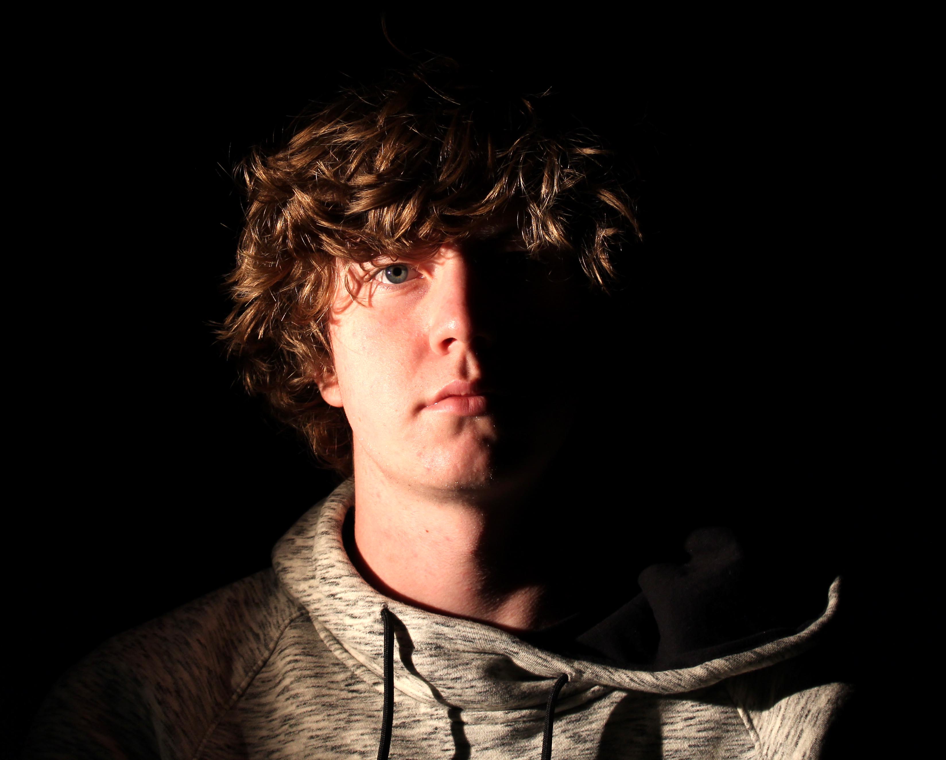
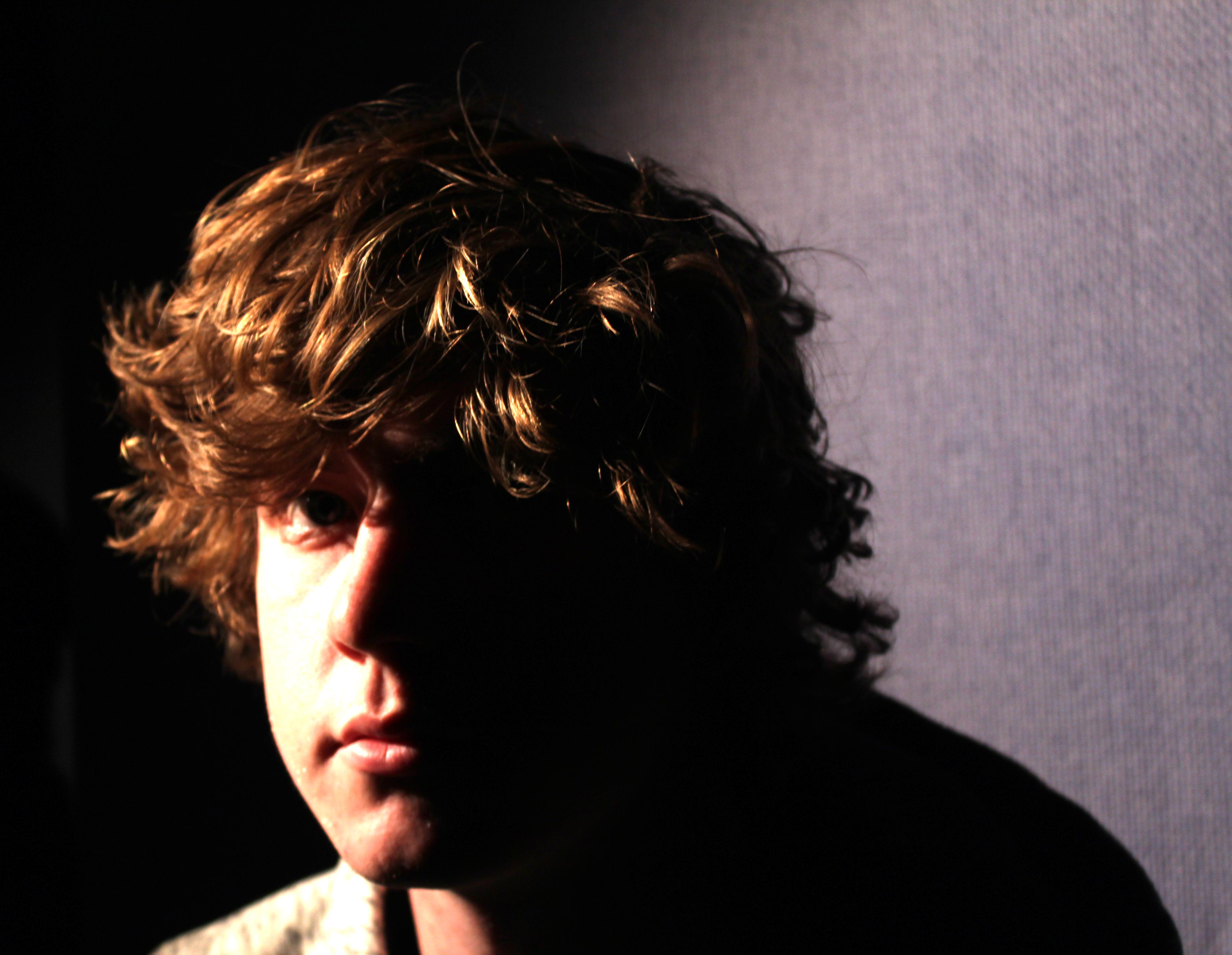
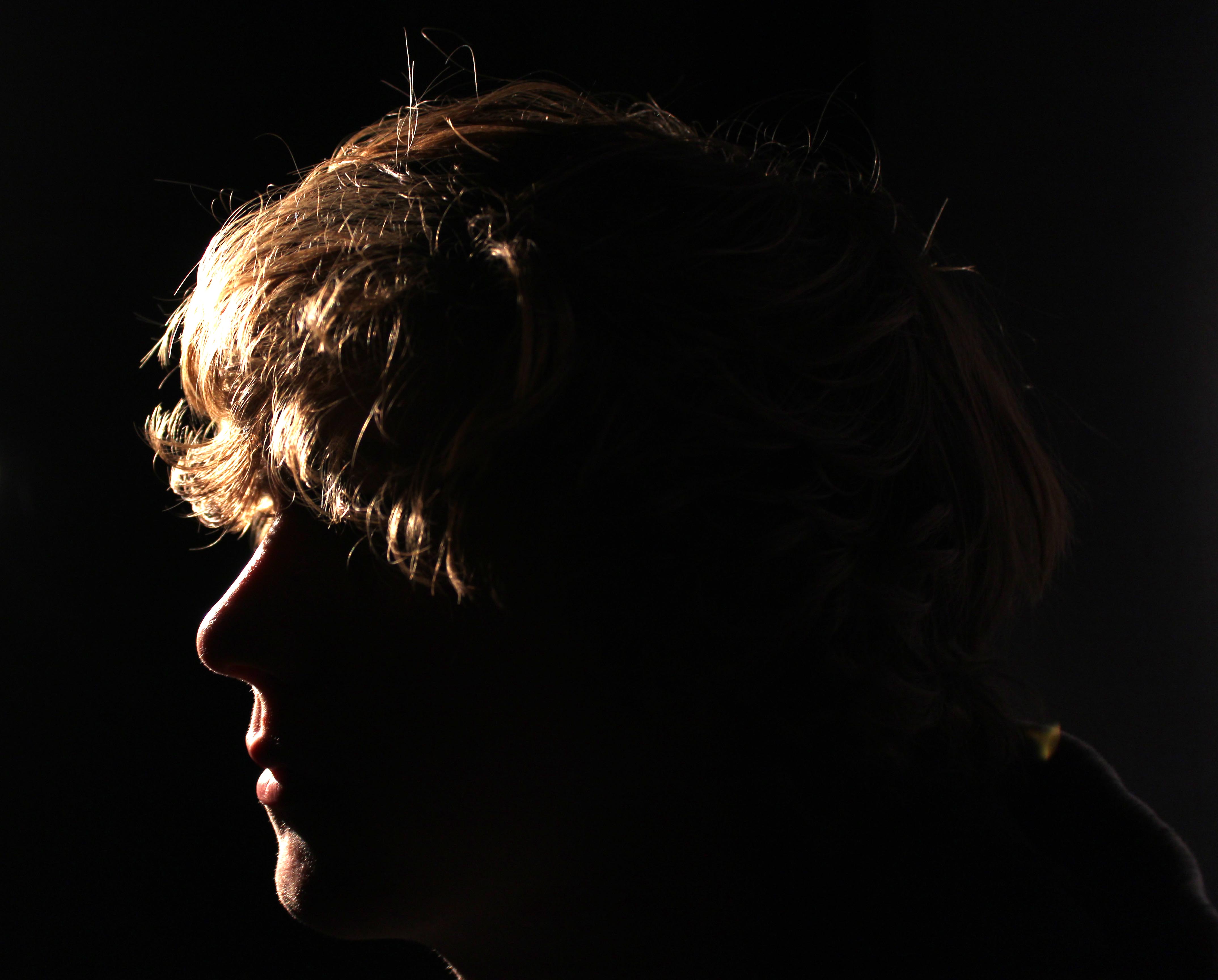
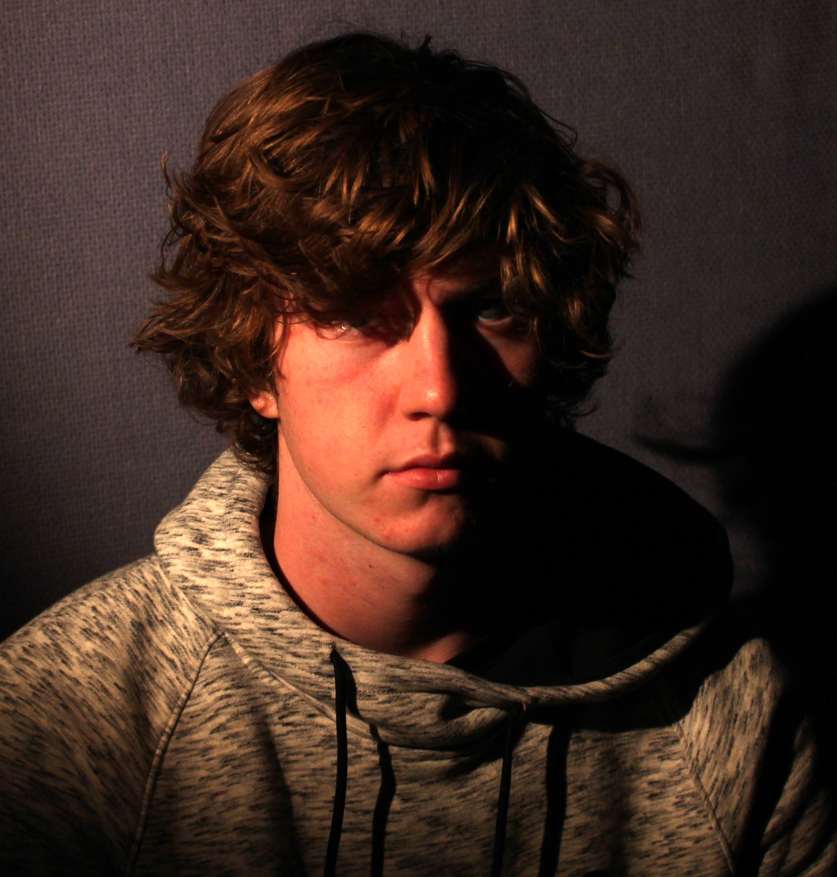
Best Photograph: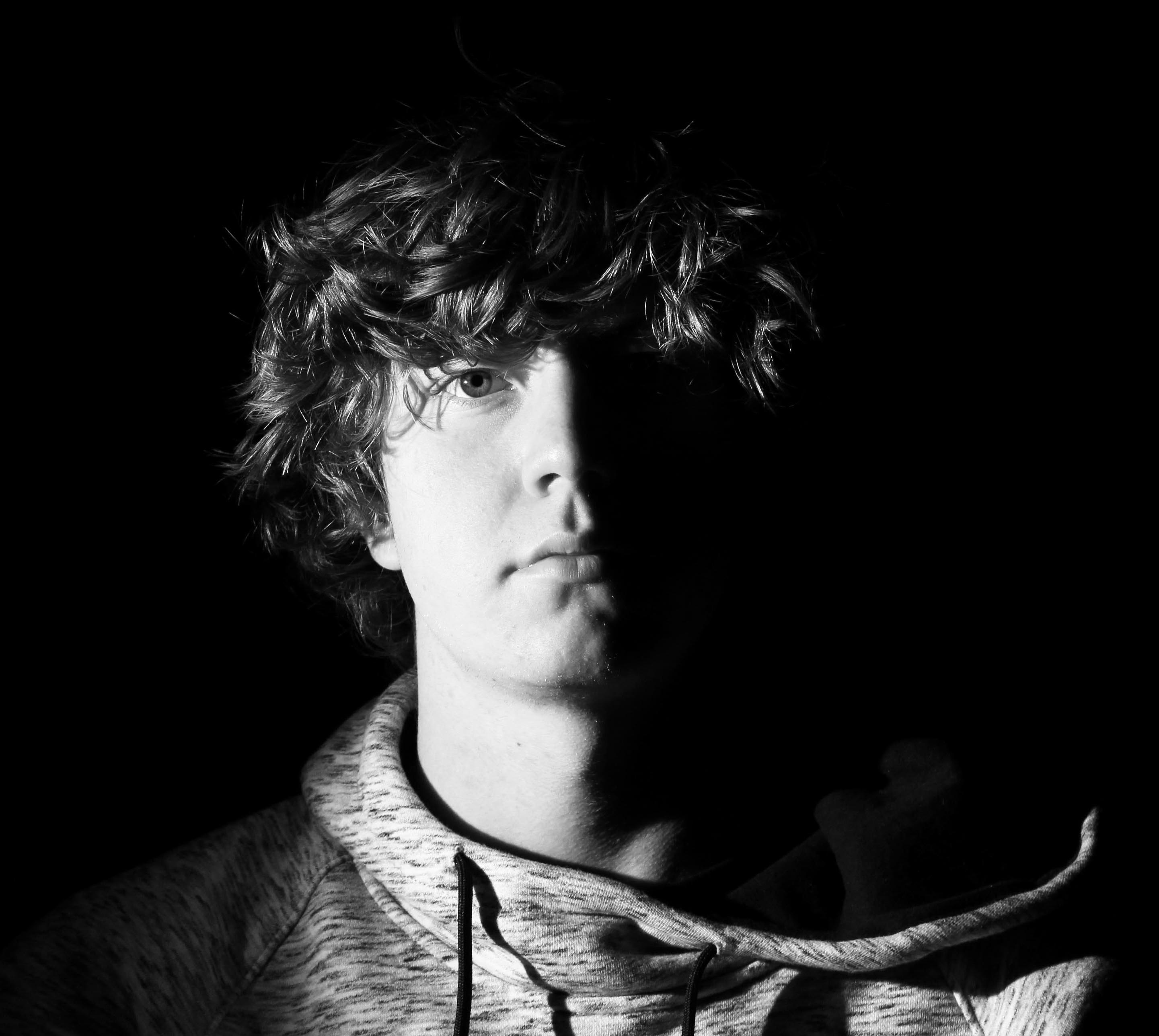
Here I used one point lighting to create a chiaroscuro effect. I like how the dark tones created by the shadows enhance the brightness of the face. I enhanced this effect by increasing the brightness and contrast on the photograph. Interestingly, what I particularly like about the chiaroscuro effect is that the fact there is no backing/fill lighting or any other forms of supporting light making the object feel at one with his background apart from his face. This gives the photograph a mysteriousness that makes the object appear quite isolated as half his face is only projected where the other half is dark. This makes him appear that there is a certain feeling inside of the object that makes him feel upset inside but suggests he isn’t comfortable expressing it. On the light source, I adjusted the dimmers at the front to pinpoint the light so the object would be fully illuminated and nothing else. This is effective because I wanted to focus on the object and let the viewer not feel distracted by the shadows, but use the shadows to compliment the background subtly.
