All posts by Adam Seal

Filters

Author:
Category:

Final Print Images and Evaluation

After completing my landscape unit I am happy with how this has all gone.  At the start of the process I aimed to develop my skills and techniques based largely on Photoshop but also a variety of camera skills too.  Using this, I could enhance and exaggerate my theme of abstraction and surrealism.  I Initially wanted to be different as to how most people look at heavily romanticized images and explore my own way to create beauty heavily incorporating abstract themes. I personally prefer having that freedom to create a beautiful image that doesn’t have arguably as many constraints as a normal romanticized image.  I believe that my work has effectively explored how abstraction and surrealism are tied together through the various abstract designs and ideas that depict a beautiful image that is very surreal.

Final Images

Exploring Abstraction in a different light

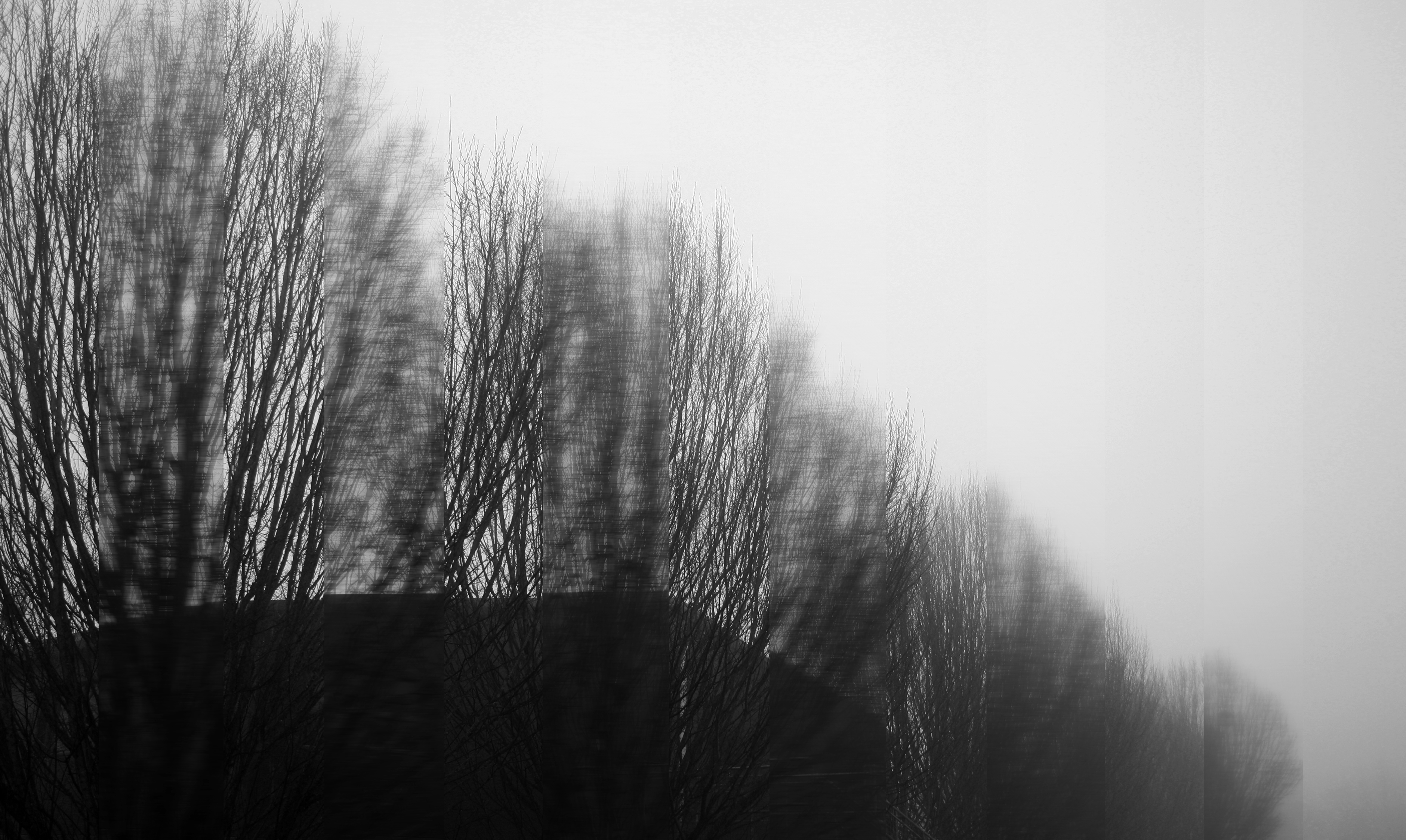
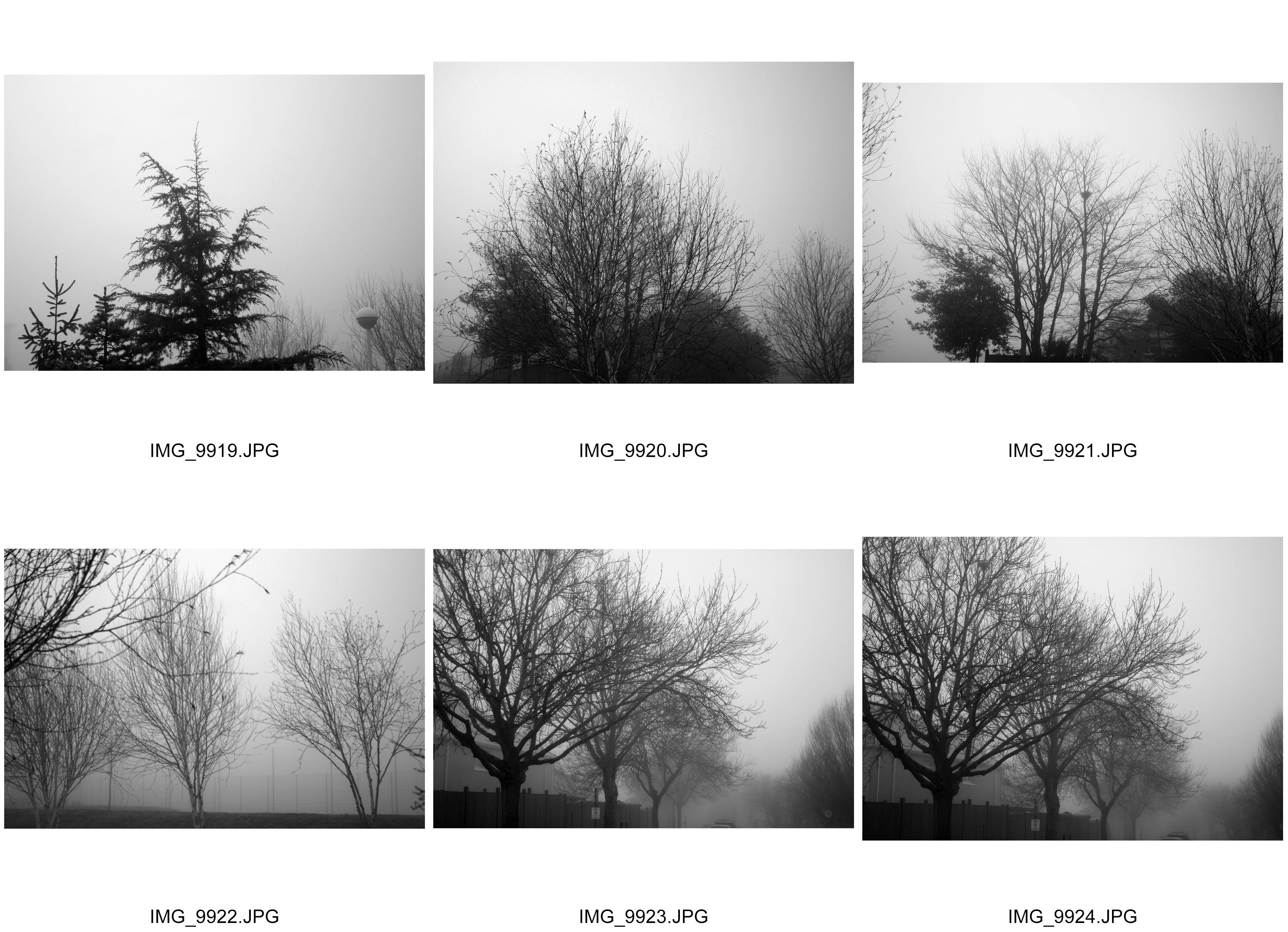
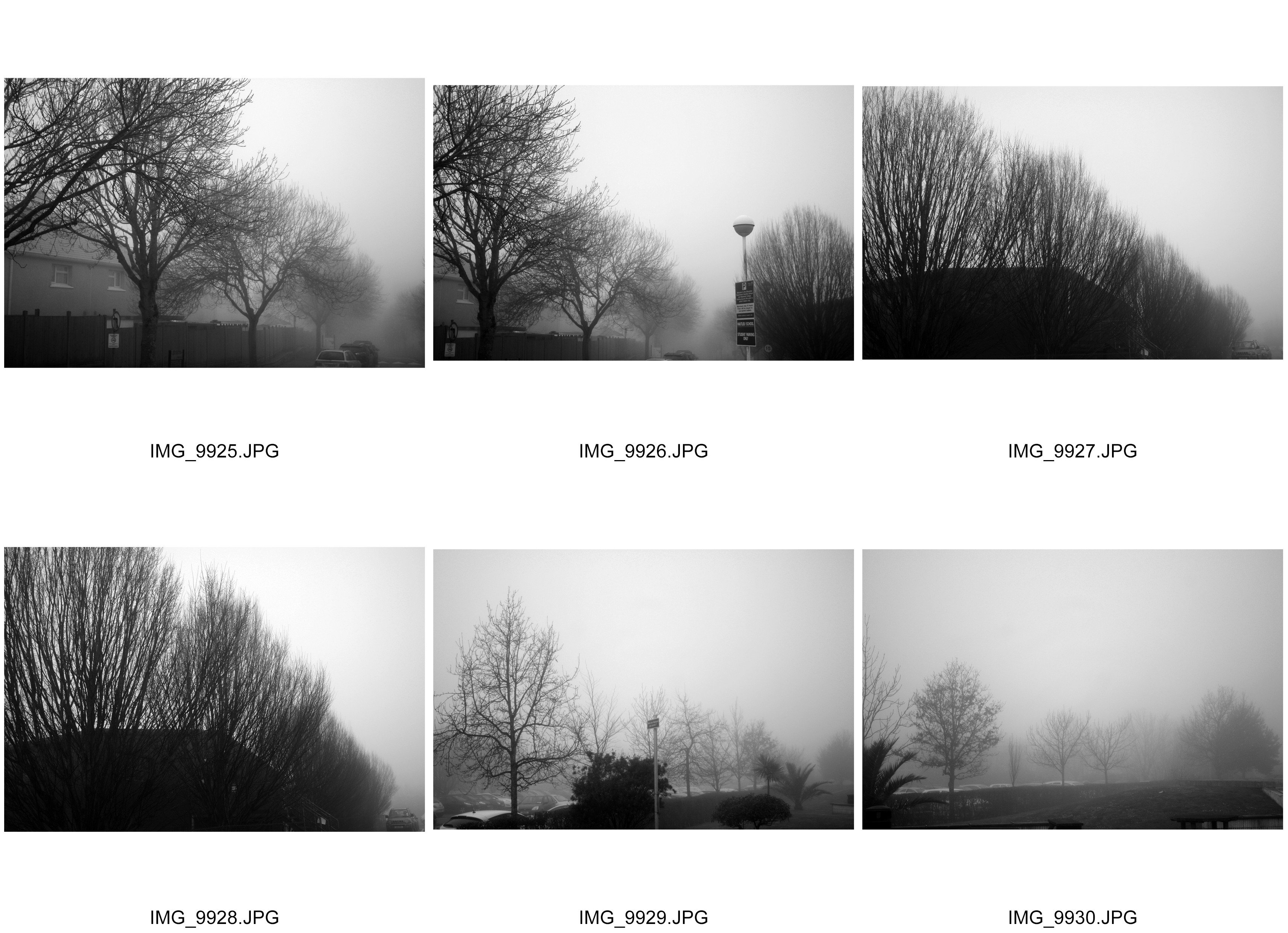
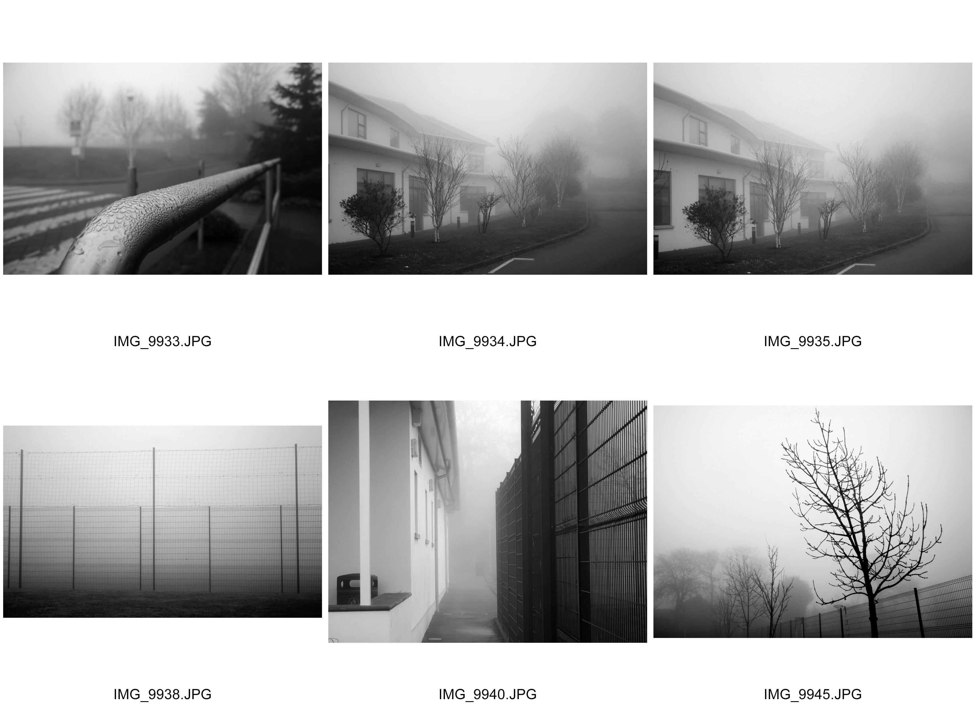
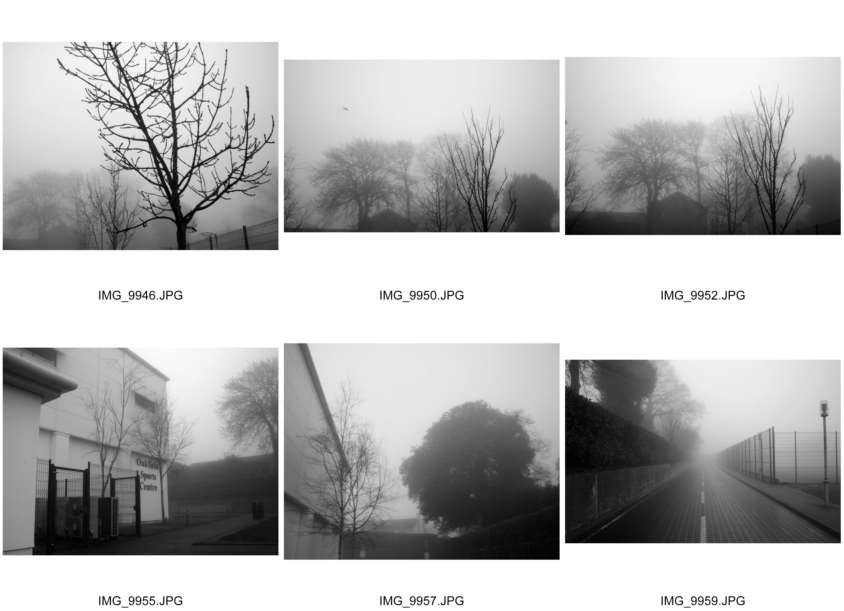
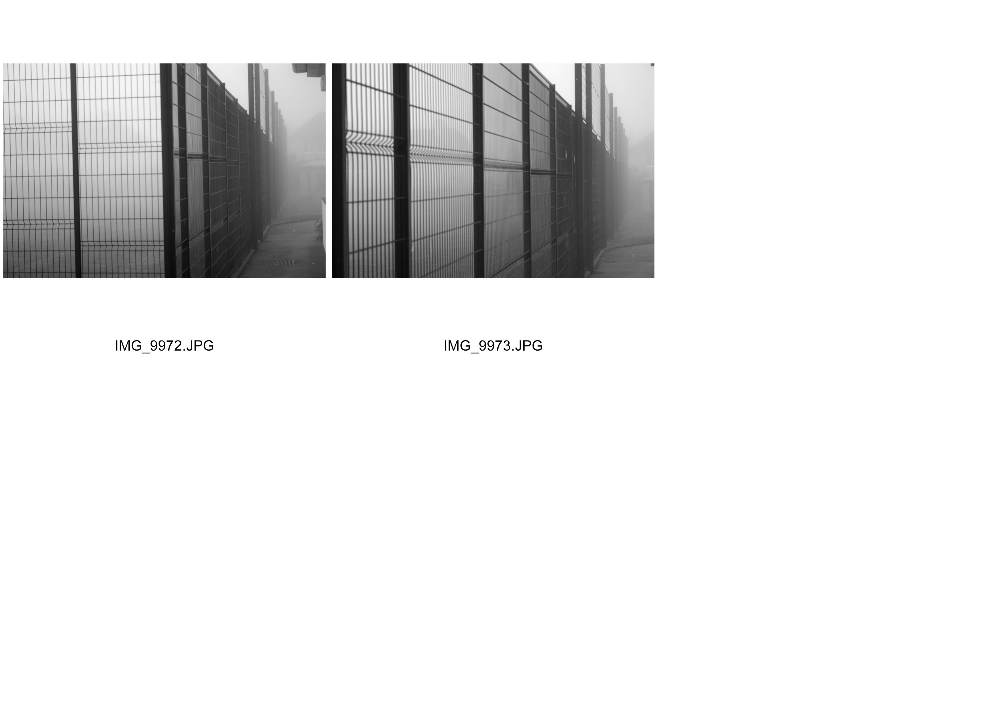
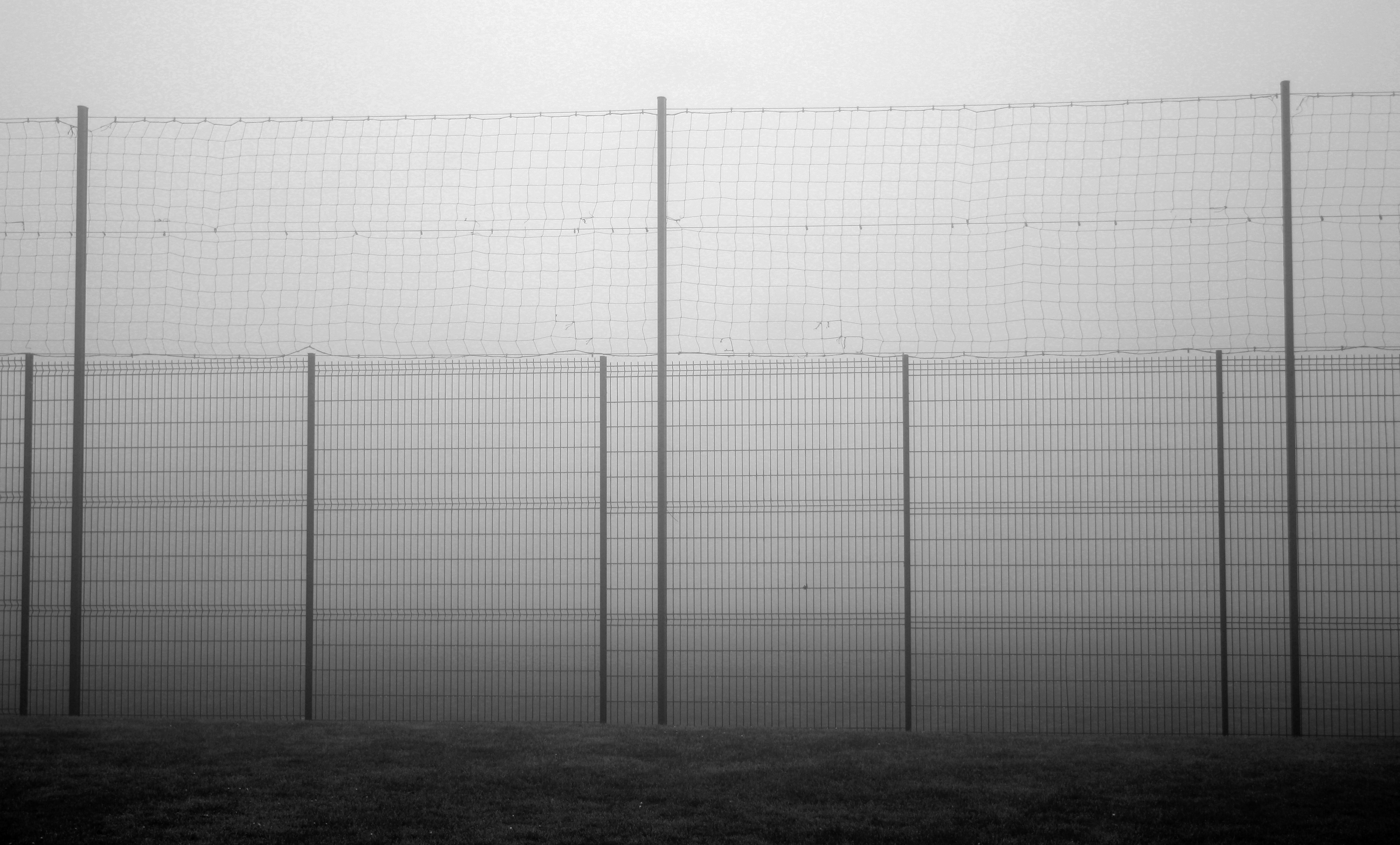
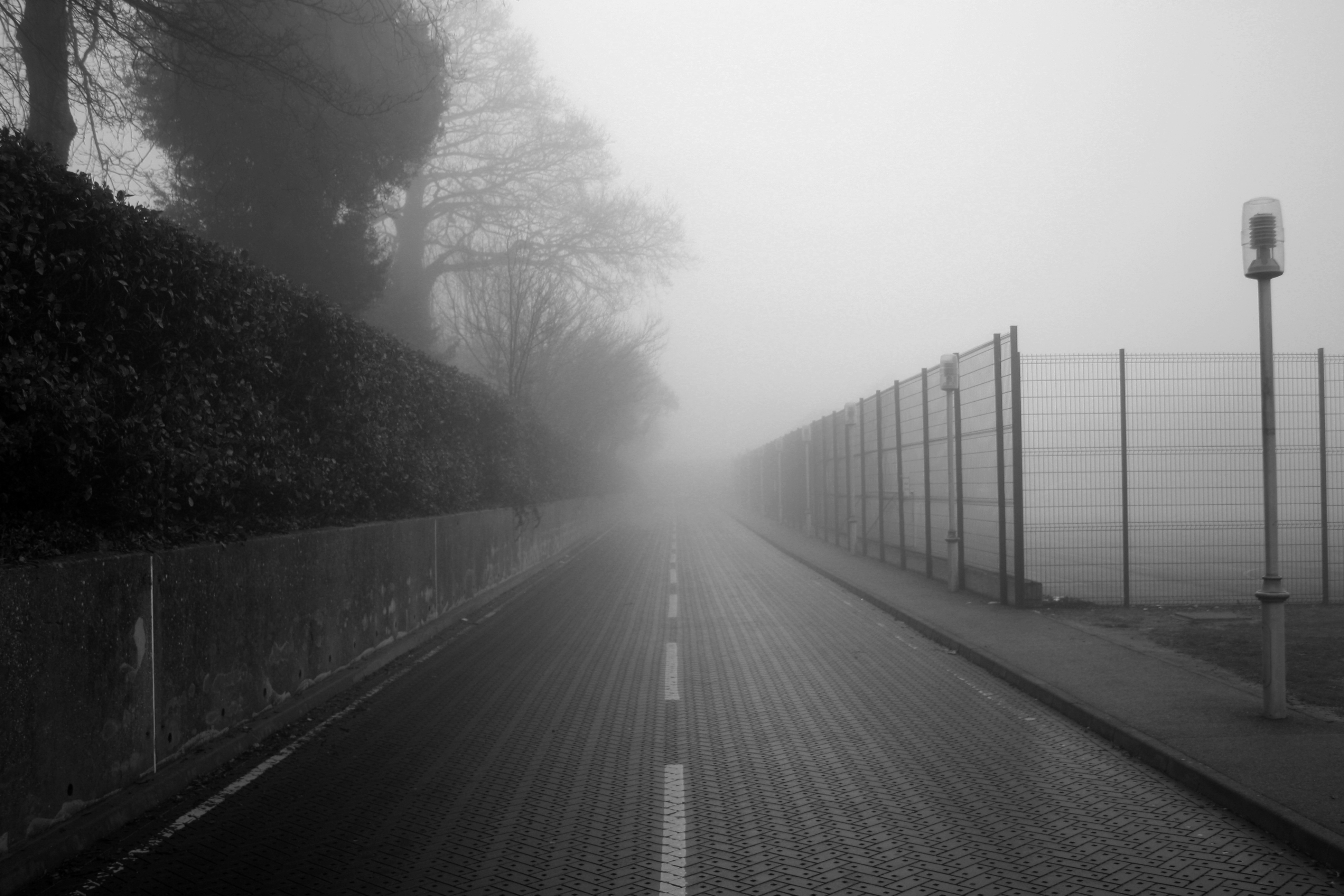
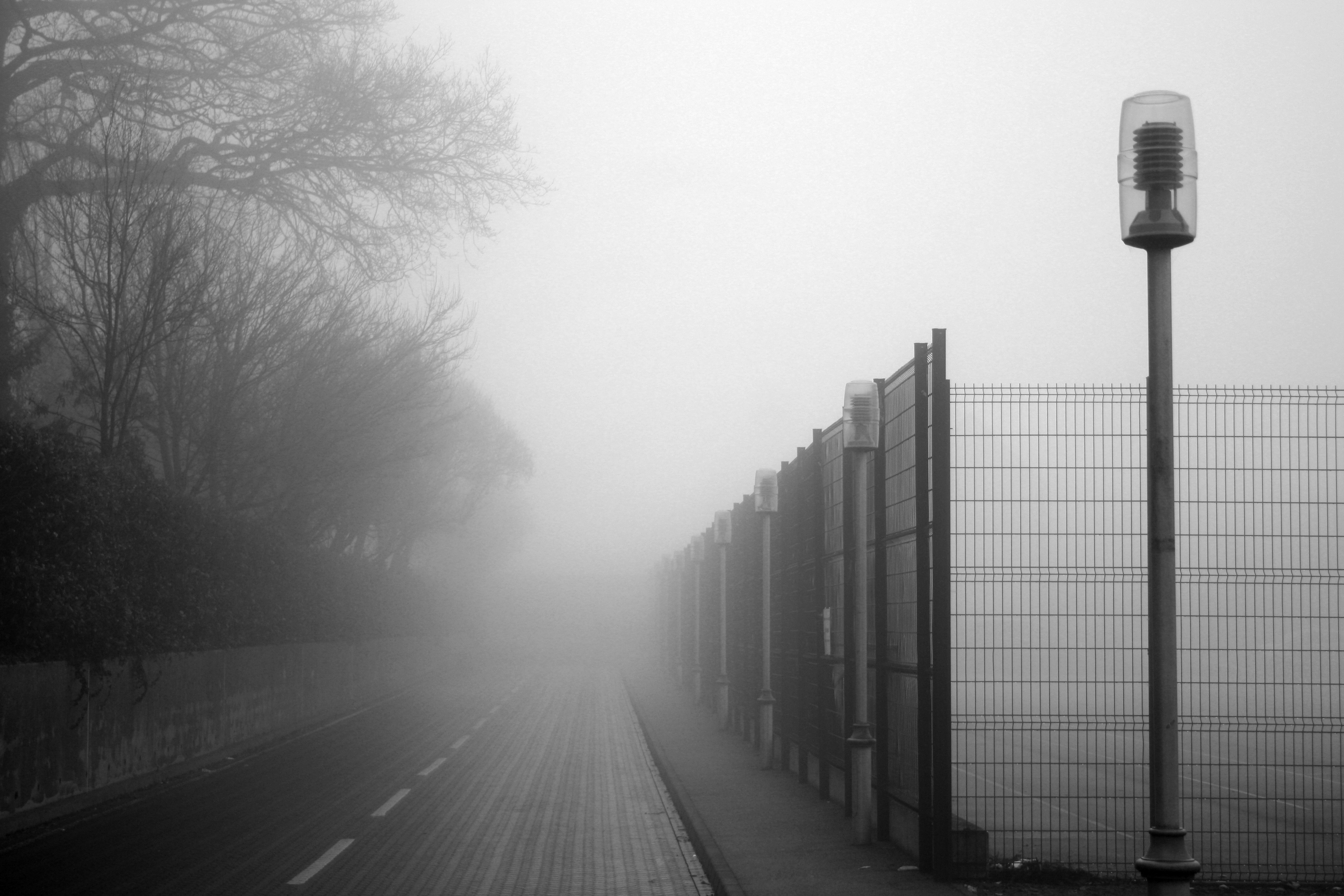
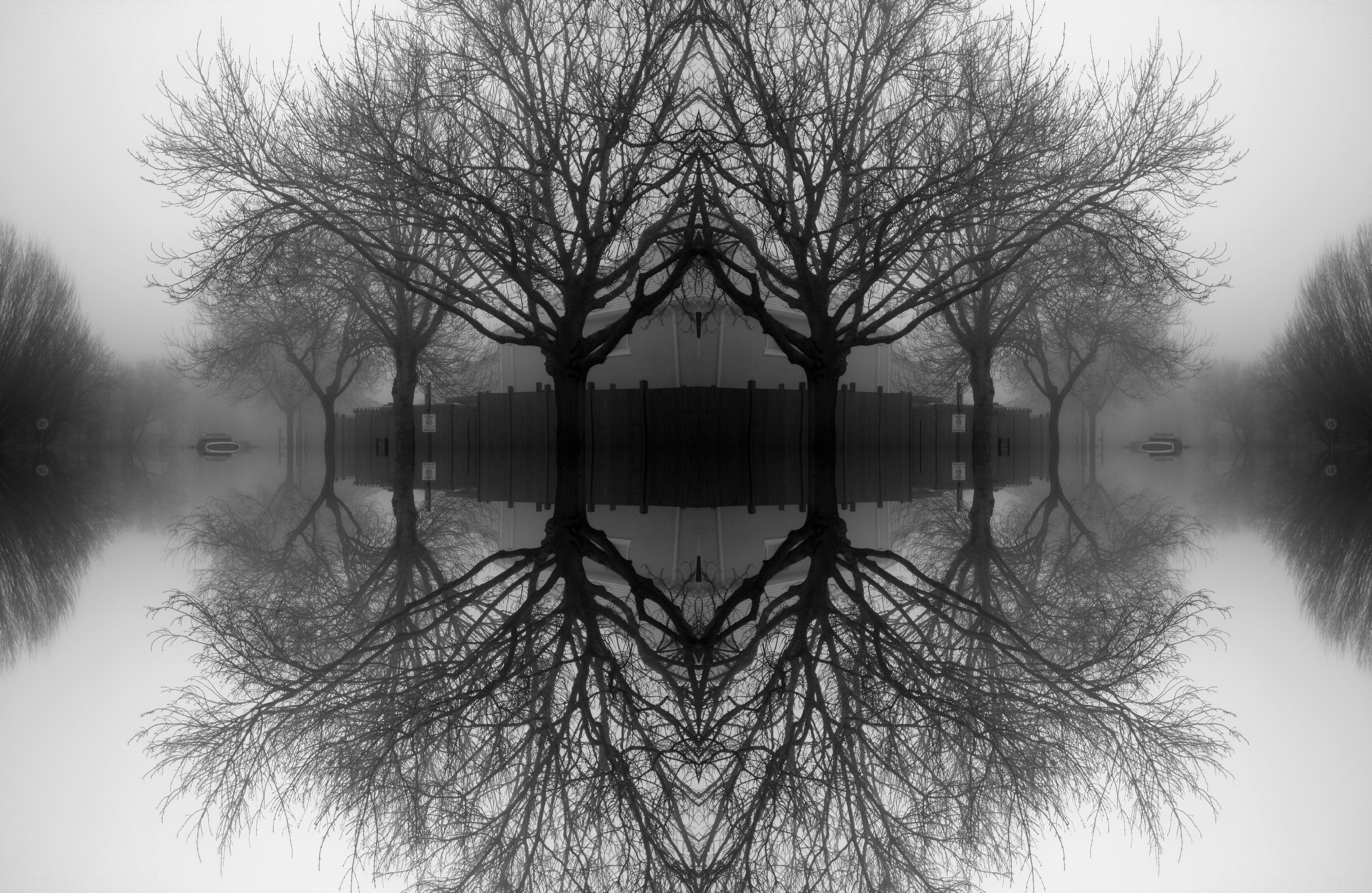
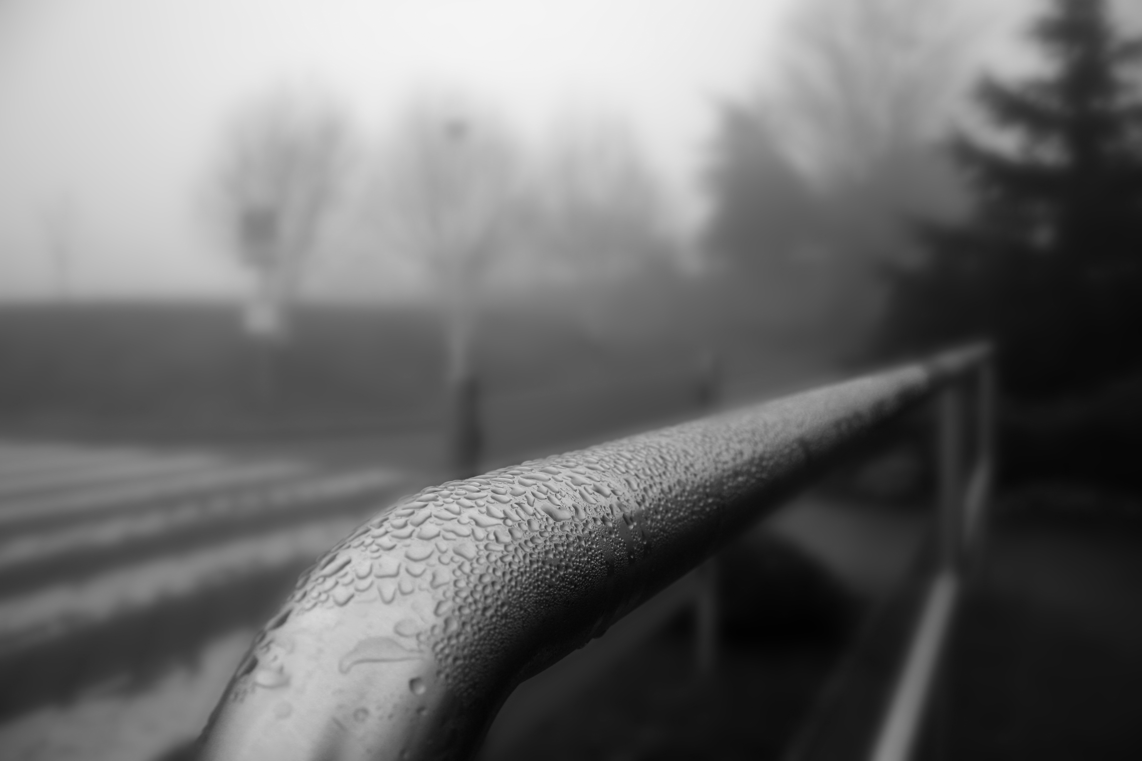
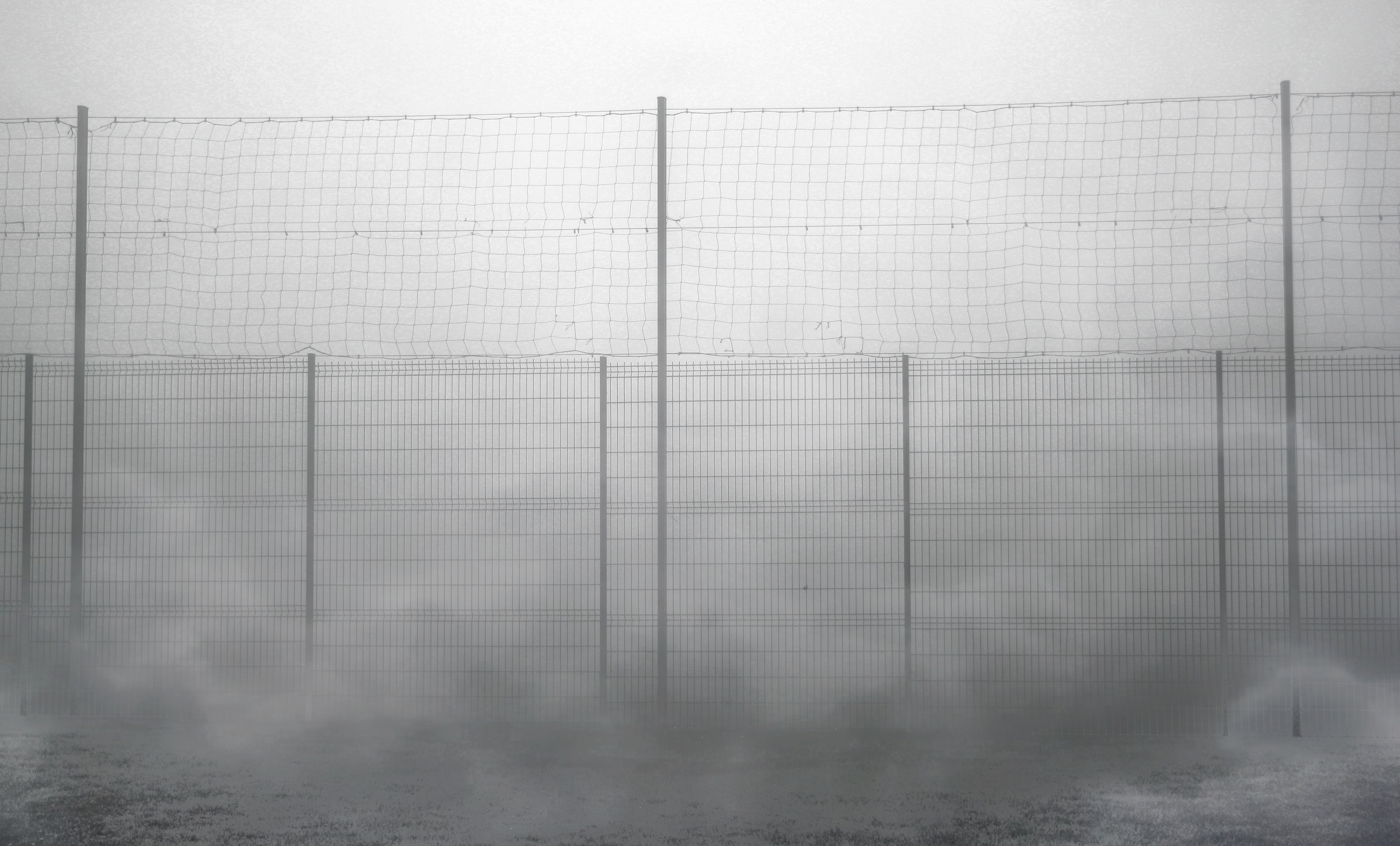
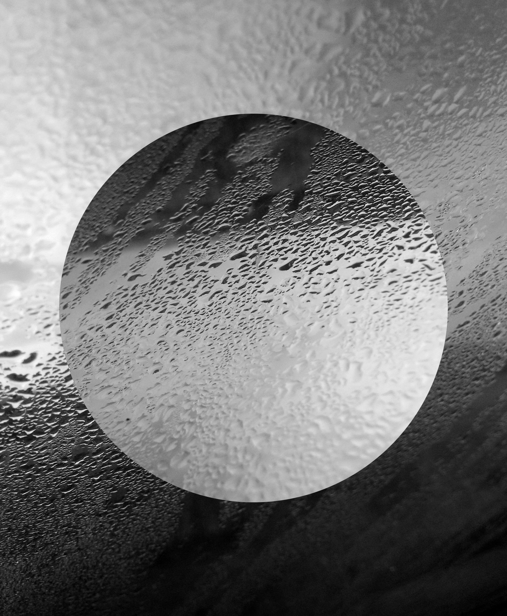
In this shoot I wanted to experiment with abstract shapes around in a very foggy environment.  This was a perfect opportunity to explore abstraction because the fog added a very surreal touch to the photographs, giving an enhanced appearance of different shapes in the fog. I enhanced the earyness of the photographs by increasing the contrast and decreasing the brightness a lot.  This way, I could make the shadows and outlines of the trees and other objects more bold whilst increasing tones of grey from the fog to compliment each other.  I believe this shoot was successful because I felt more able to explore the features of abstraction in photographs using these natural techniques.

Best Photographs:

Edits 

Abstract Panoramics

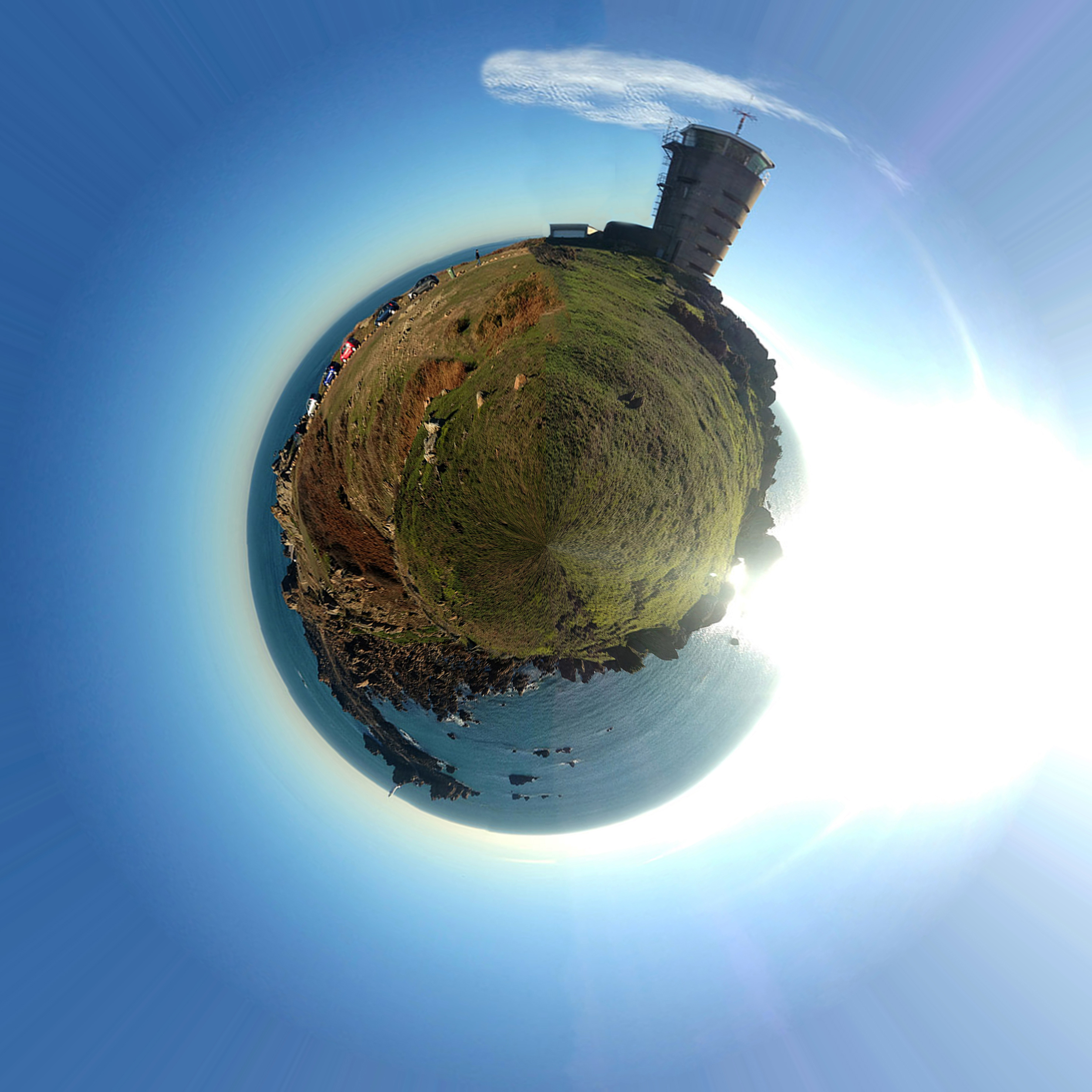
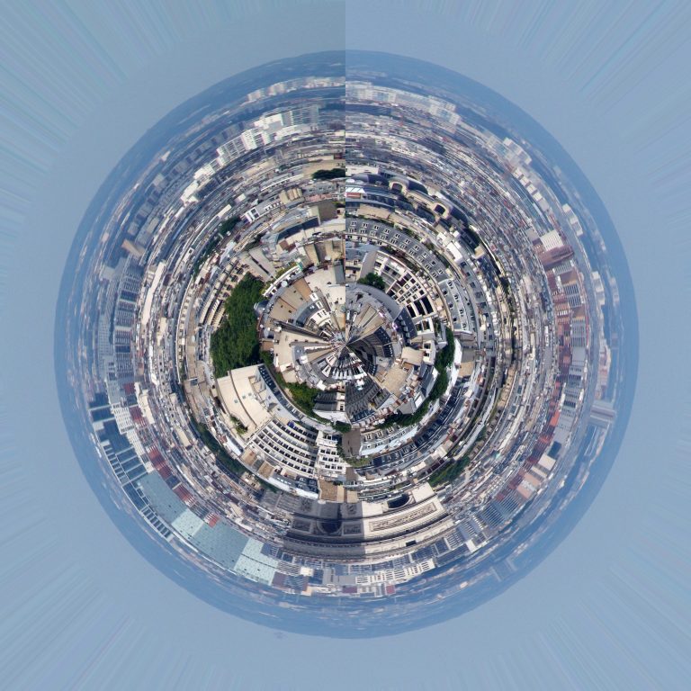
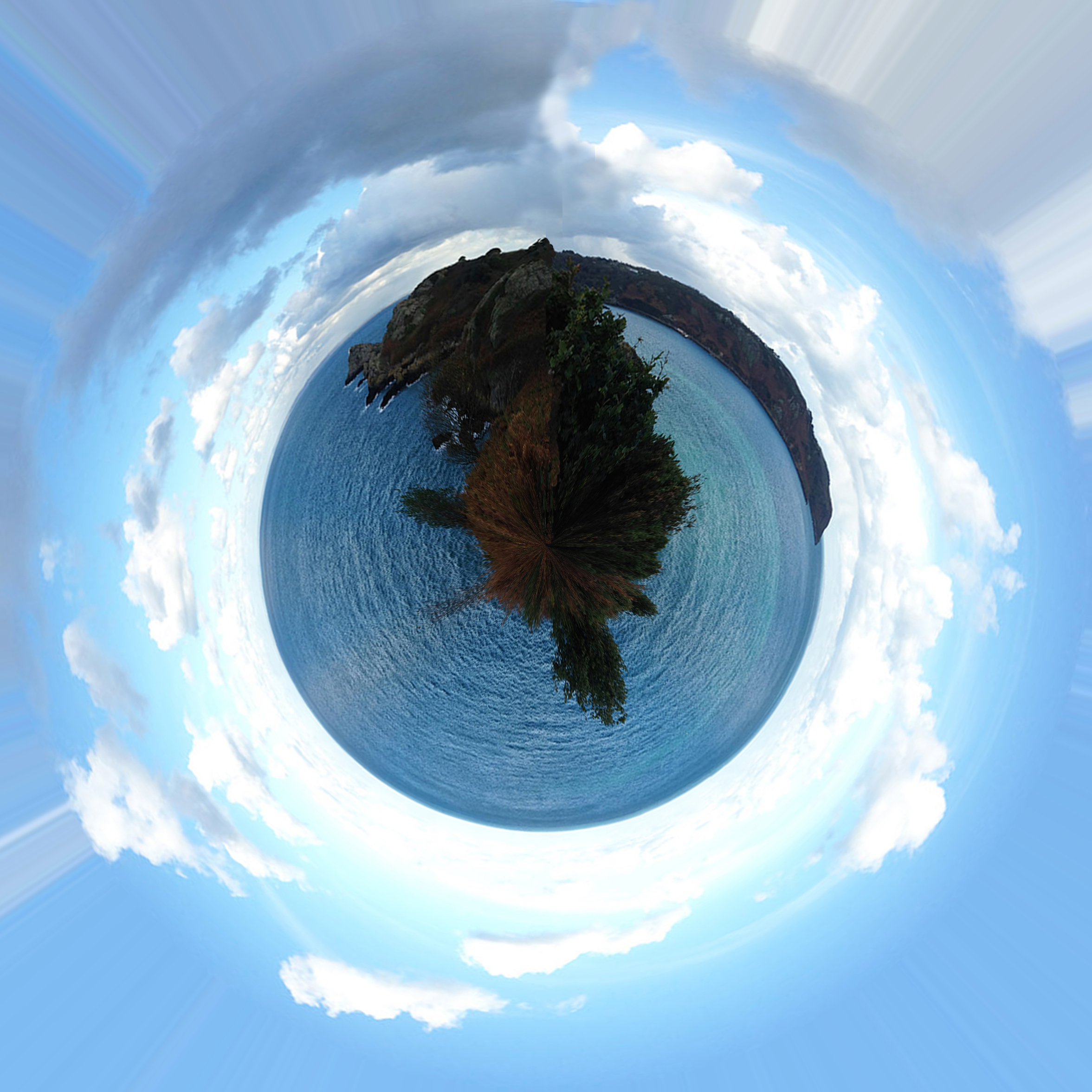
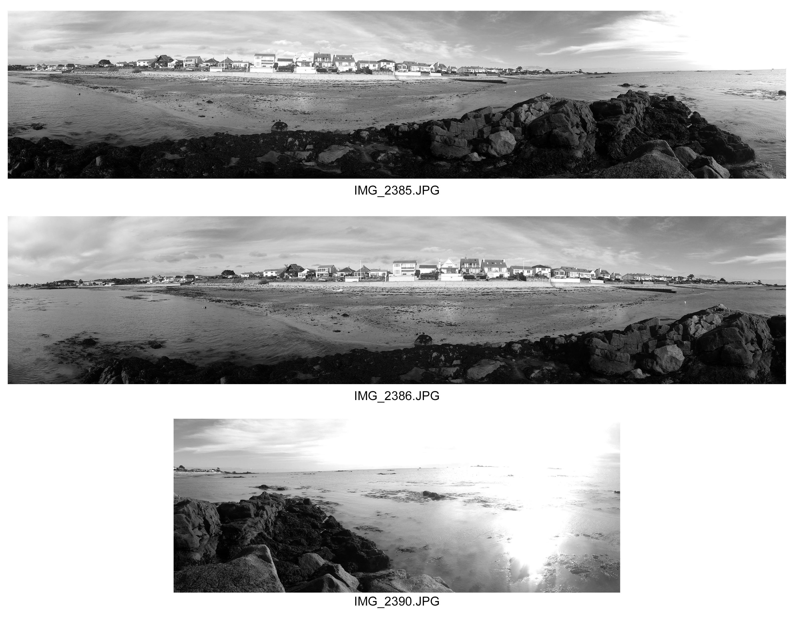
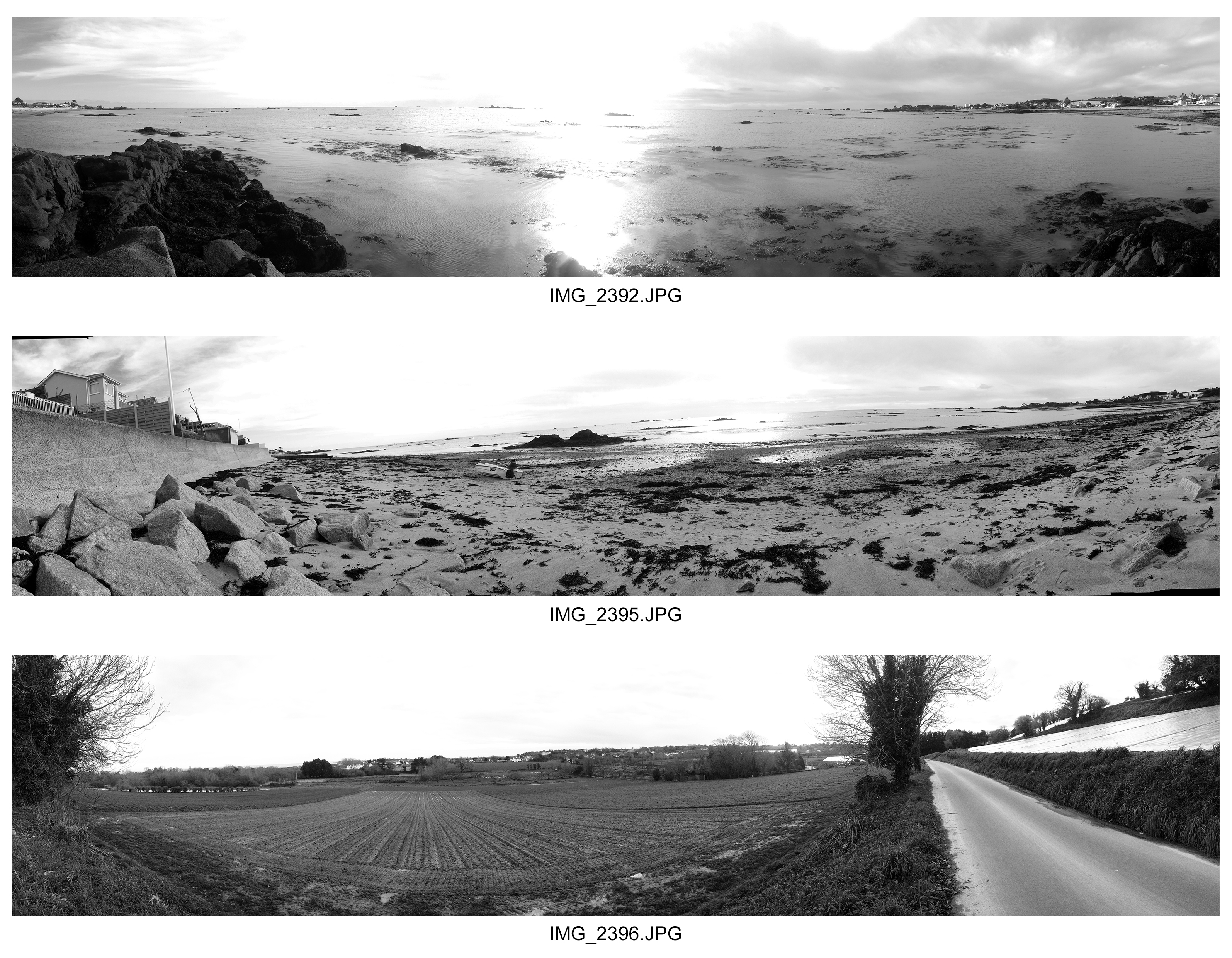
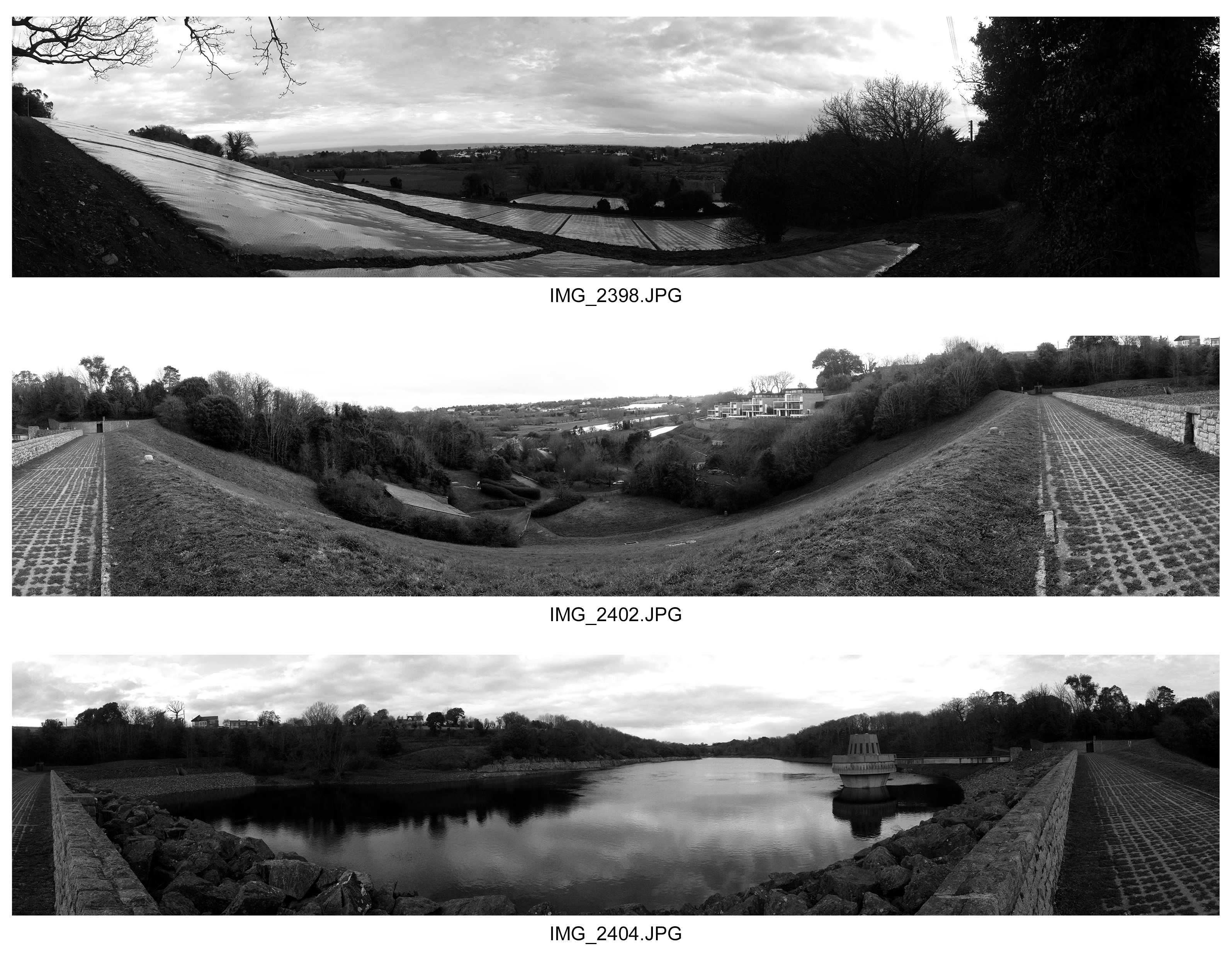
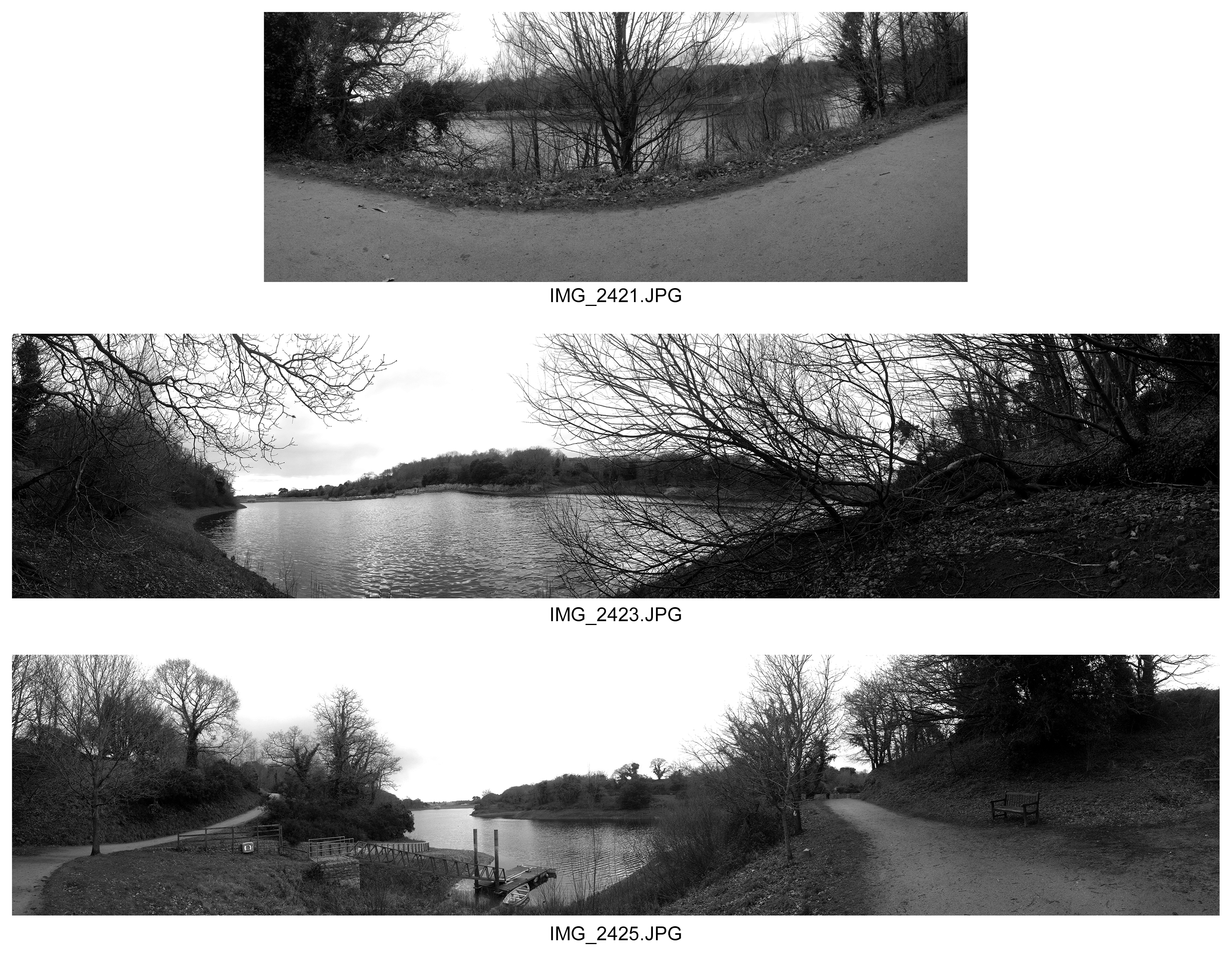
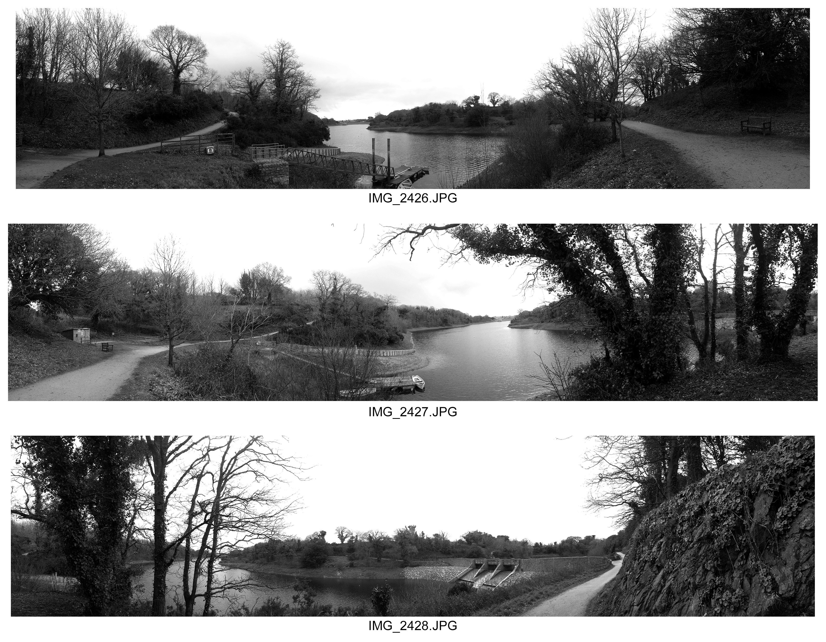
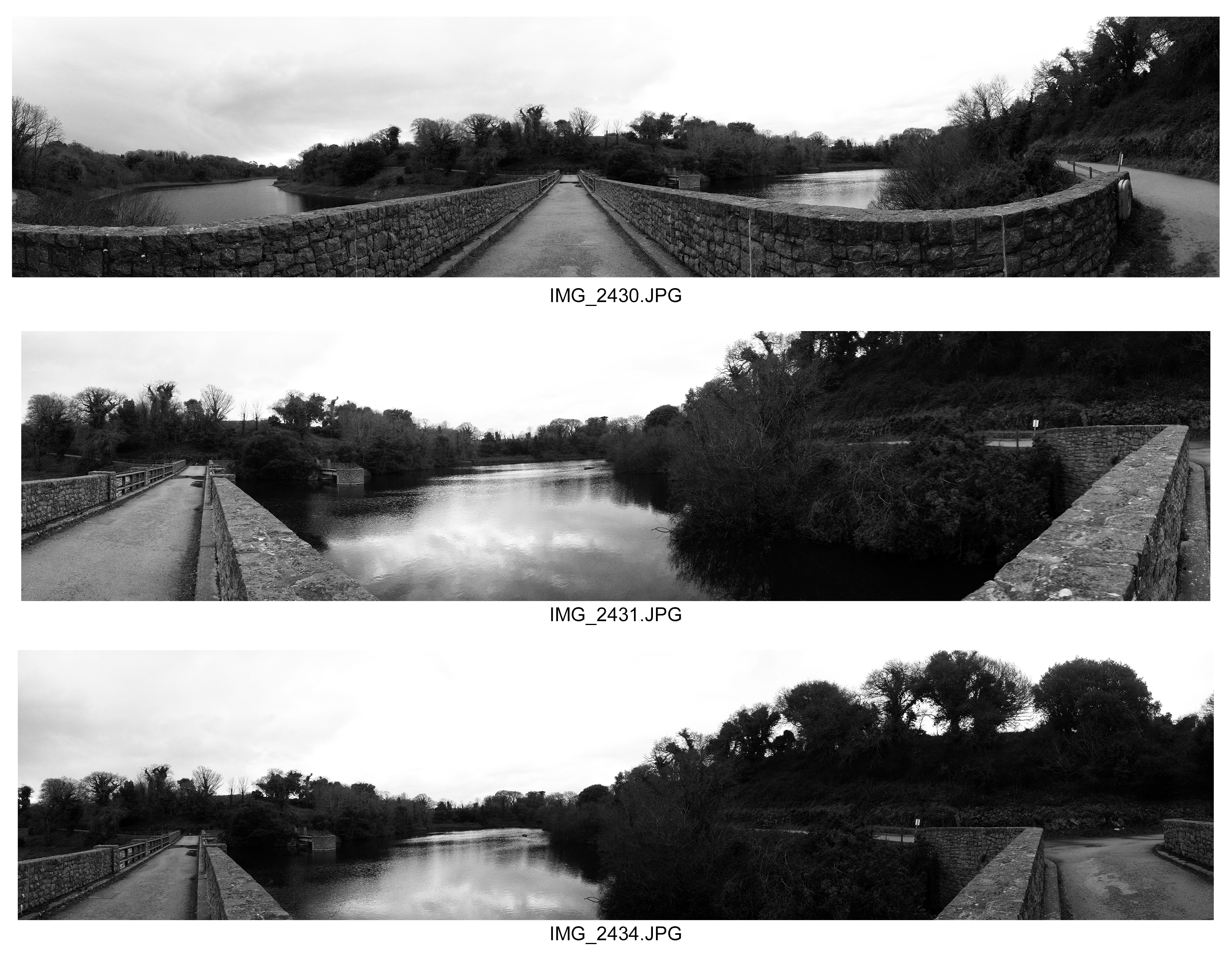
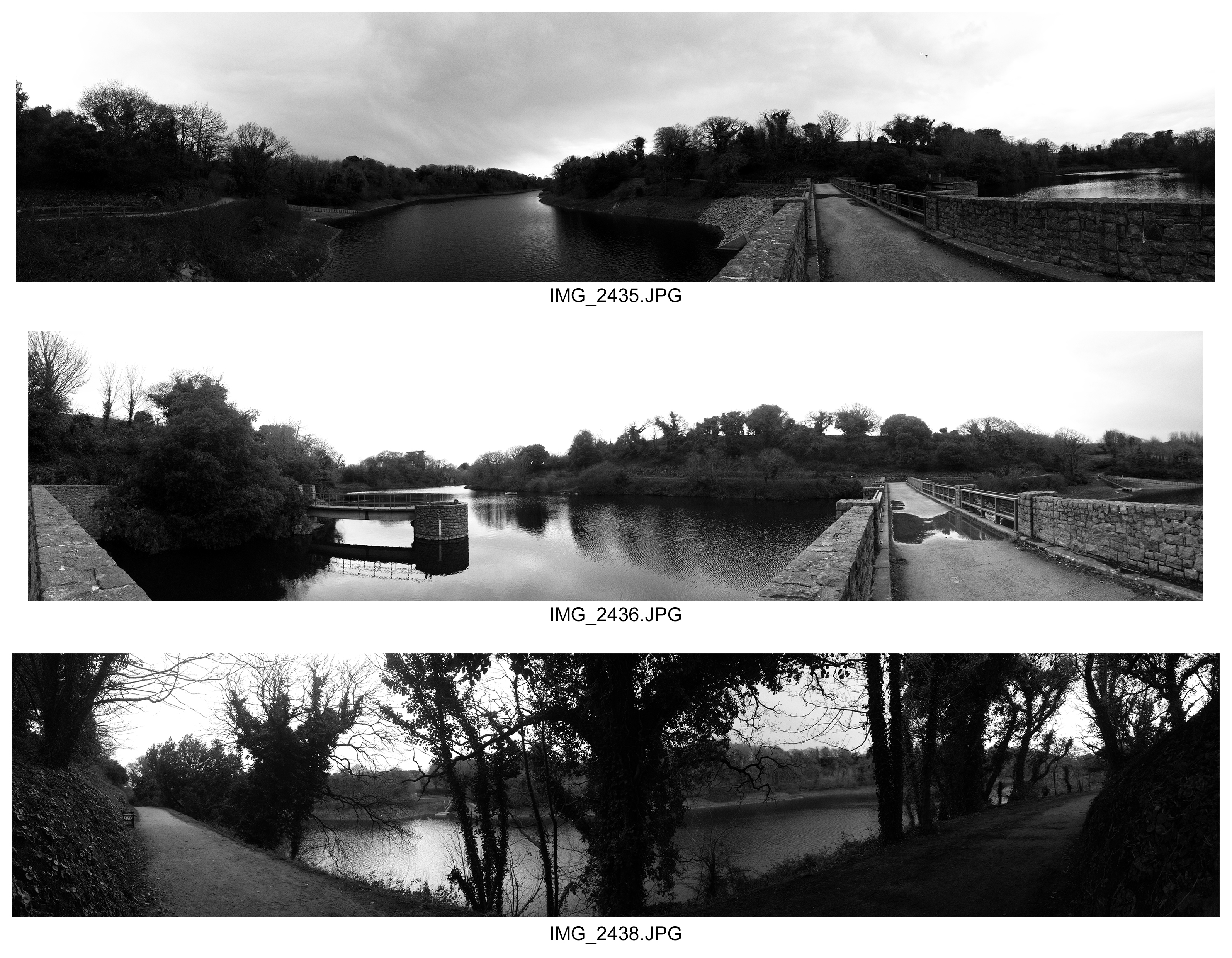
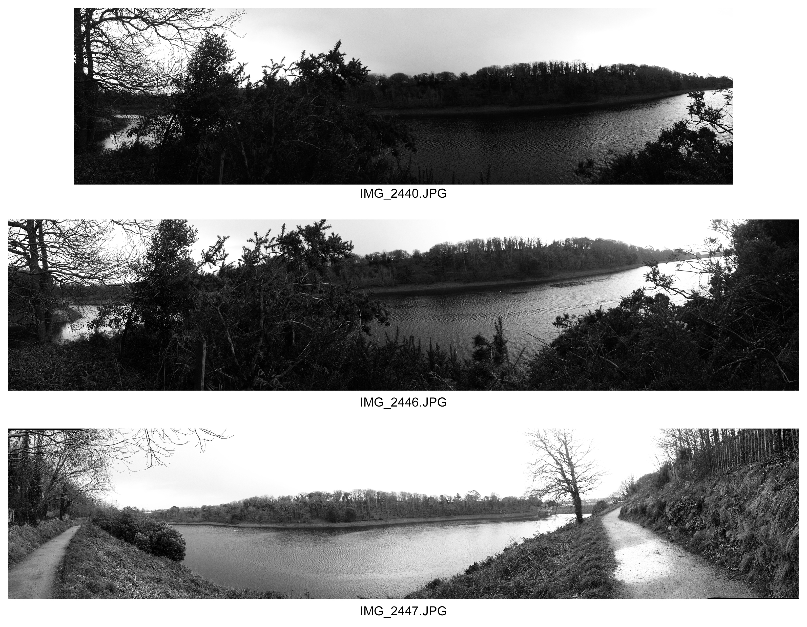
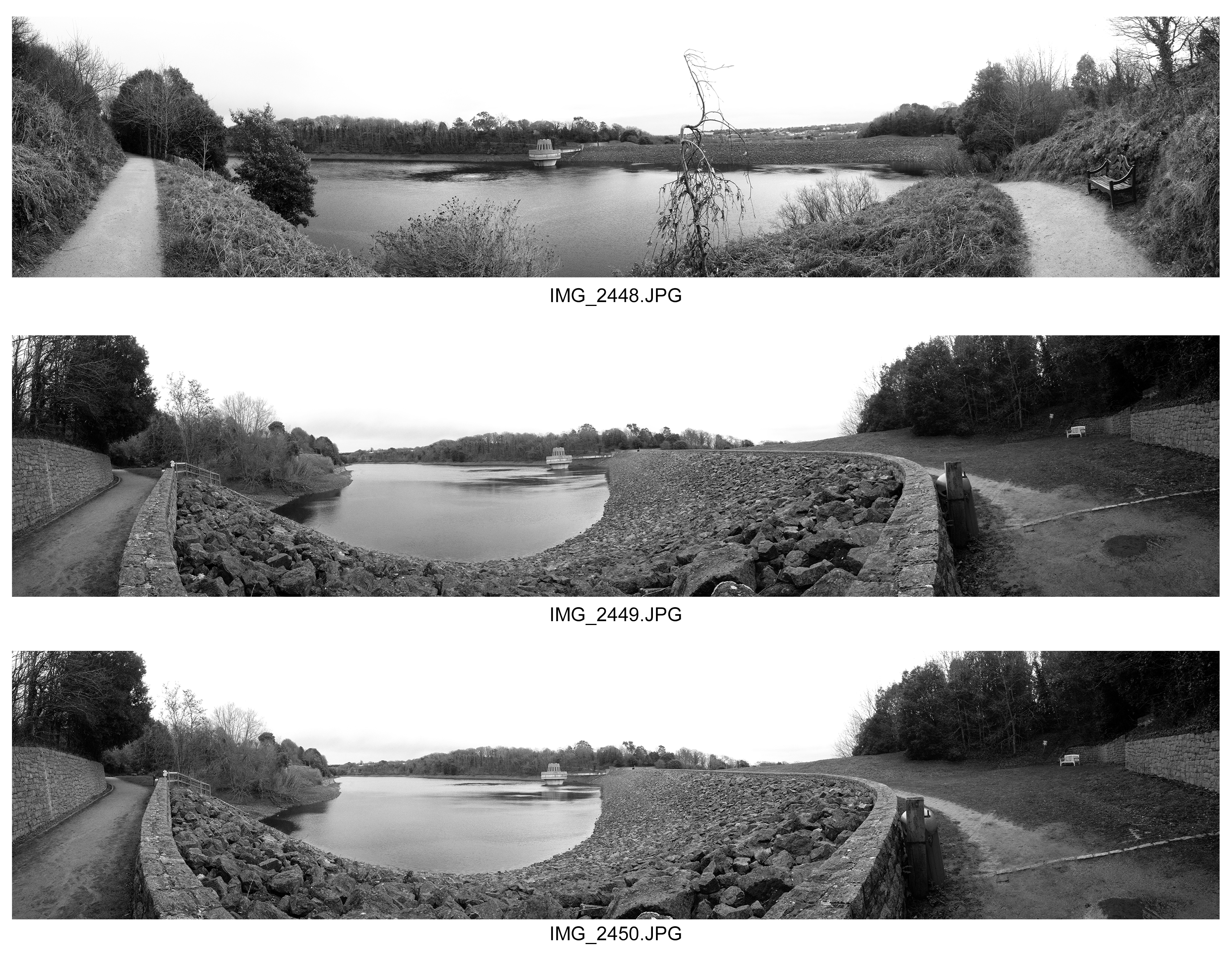
Here I took a panoramic shoot that I wanted this time to focus on how the landscape of the Earth is perceived as abstract through its shapes of rocks, trees, and various other objects.  I believe I have captured the landscape as abstract also because almost in many cases the scenery seems like an illusion  in the sense the surrounding edges of a photograph appear as part of looking forward in the photograph despite being at an angle when I took the photographs.  This is abstract because it displays the landscape as well as the objects in the land being abstract.  In my photographs I have portrayed this as the land being free to develop and move how it wants, but I have contrasted this with man made features being abstract.  This split differences allows us to compare natural and man made features of abstraction in the landscape.  I enhanced the contrast to help us distinguish the brighter and darker elements and to help separate certain features of the landscape to the others around it.  Though this sense of abstract patterns in the way the Earth is developed and of how for example 2 juxtaposing pathways that are opposite, the fact they appear as part of 2 parallel paths diverging off into their own way and the fact the lake appears very much part of a loop rather than a lake with boundaries appears very surreal.  This is because it creates a slight element of surprise and abnormality that is unseen before in the natural eye.  I did this to link back further with this idea of how the land is free to create it’s own textures and patterns.

Abstract Dispersions

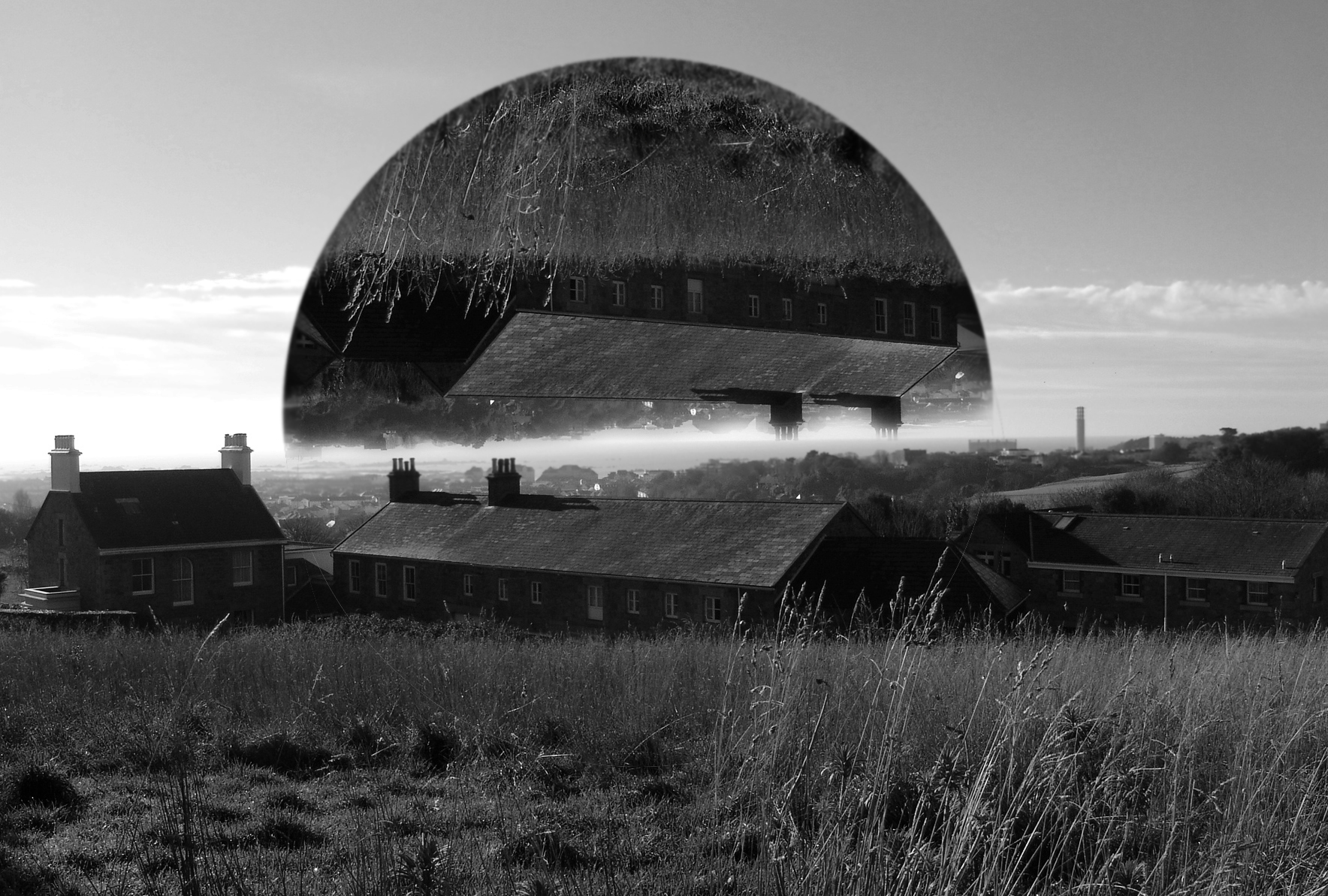
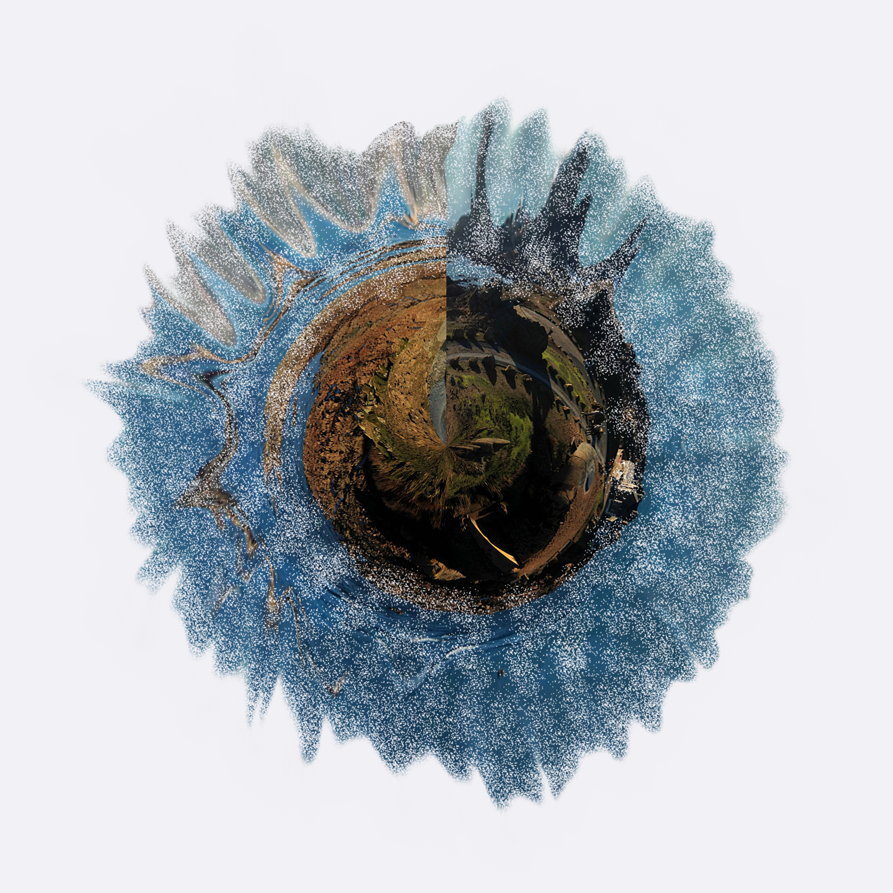
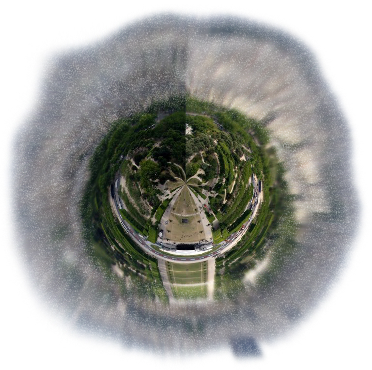
Here I simply did a dispersion effect to create an effect making these photograph appear somewhat disintegrating into the air.  Firstly I copied my planet like circle which I cut out onto a new white layer.  I then duplicated this layer.  With the original layer I clicked on filter and liquify.  From here I smudged the edges of my photograph.  After this, I added a clip layer mask onto the original layer. and using the brush tool with varying pressures and sizes selected the areas I wanted dispersed.

Here I felt inspired by the fact that often Global Warming is destroying the Earth.  I believe I have captured how the slow process of the global warming is affecting our planet.  I wanted to create these images with a direct link to abstraction through the fact I have heavily liquefied the pano-spheres  and stretched them.  This is a sharp contrast to the my previous pano spheres in the sense that before I explored an abstraction that showed a normal, ordered functioning and neat appearing planet like object.  However now I have shown the opposite, a world in tatters.  This stretching of areas of the photograph has created an effect that appears very surreal in the sense the Earth is being blown up appearing slightly scary.  I like this because its abstract qualities is opposite to this but I believe works nicely because the delicacy of the dispersed particles with varying strengths appears very unreal creating an effect of which the Earth is crumbling away in our atmosphere before our eyes and that life is continuing without people raising an eyebrow.  I feel I am hinting at what could happen if people continue to live this way, destroying our beautiful planet.


Geometric Abstraction +Responses

Victoria Siemer

Is a photographer focusing on photo manipulation using Photoshop.  Her inspirations come from various other artists since she had no formal photography training, she paid attention to others styles, for example street photographer Dave Krugman.  Her works often include a dramatic  environment with strong levels of symmetry, proving a contrast to the wild and abstract locations she is shooting in.  This part of her work is called “Geometric Reflection”.  Here include some examples of her work:

Image result for victoria siemer Image result for victoria siemer

Image result for victoria siemer Image result for victoria siemer

My own responses

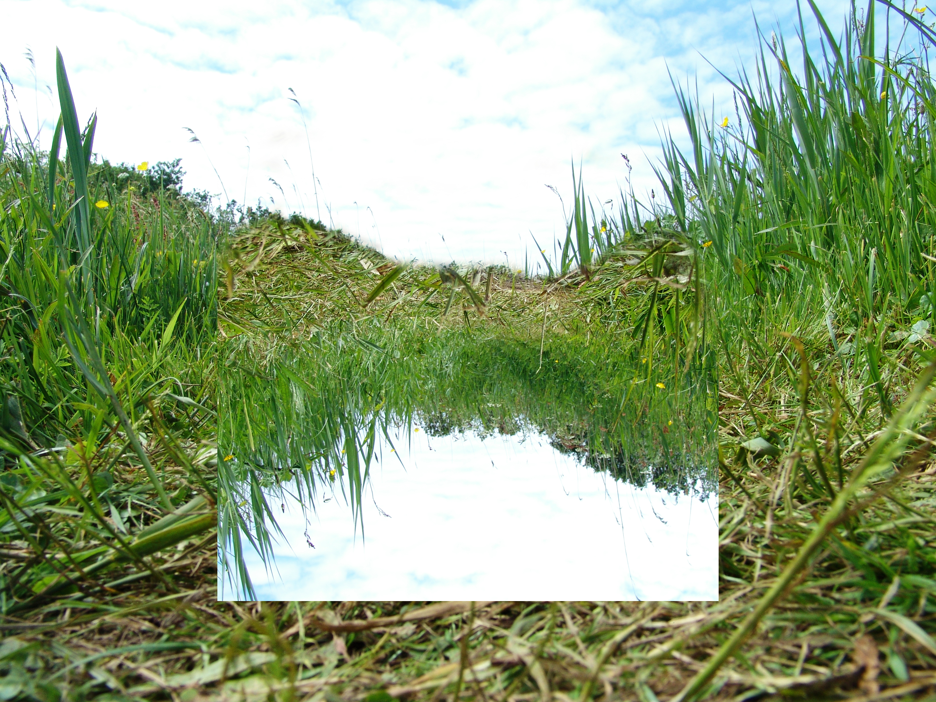
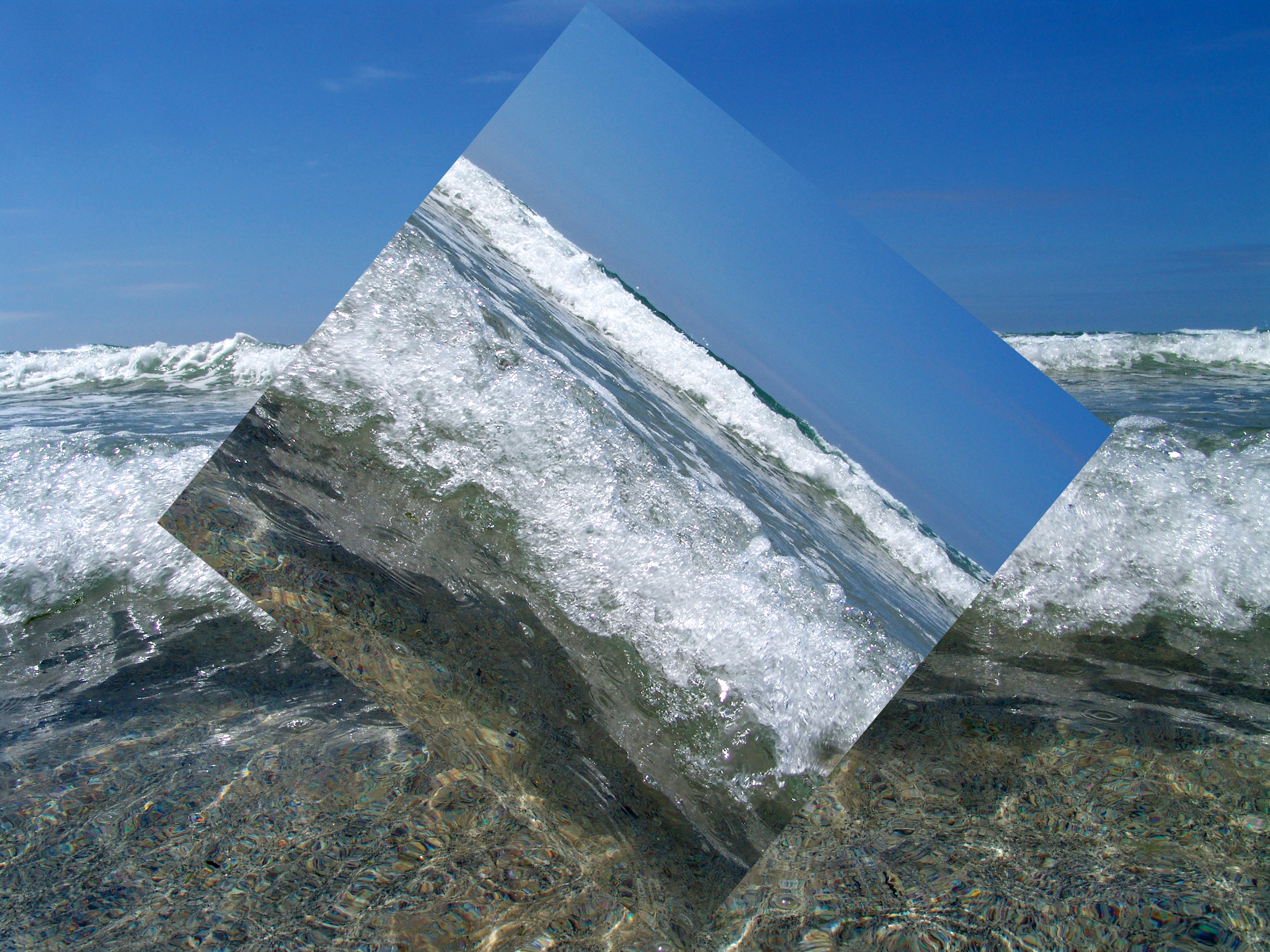
I chose to experiment with this as it linked in with the theme of abstract photography and the fact I felt inspired by Victoria Siemer.   The definition for Geometric Abstraction is “Geometric abstraction is a form of abstract art based on the use of geometric forms sometimes, though not always, placed in non-illusionistic space and combined into non-objective (non-representational) compositions. ” .  For my ideas I simply copied the layer of my photograph by pressing ctrl+J.  I then selected an area of a shape using a marquee tool and rotated it to my desired angle.  After this, I used the rubber tool to remove areas I didn’t want to capture a sense of reflection whereas in others I didn’t and simply left them rotated.

I believe this fits well into my theme of abstract and surrealism in photography because these pieces of work emphasis the abstract with the interesting shapes that look quite abnormal.   I believe I have done this successfully because they almost appear quite surreal that the abstraction within the photograph looks as if it is part of the photograph.  Here I have particularity focused on textures as they enhance many of the abstract shapes within the photograph and in some, color too because this exaggerates the abstraction so far that it appears surreal.  I personally enjoy observing the beauty of fine, particular details within a setting and by doing this, I feel inspired to isolate various parts and make them appear surreal.  This therefore poses the idea to you of how a very normal looking viewpoint in day to day life, I use for surprising and strange elements that shouldn’t fit in but do, to express how to others how I can see the world through interesting shapes, colors and textures.

Panoramic Photographers

Brad Templeton

Image result for brad templeton panorama

I like this photograph because of it’s light blue hues from the water and encircling it is the dark Forrest area around the side going off into the distance.  This is interesting to me because it appears like a sort of container to the beauty of the lake in which it is holding.  This is significant as the blue water is portrayed as almost quite precious as the photographer appears to have enhanced the vibrance, contrast and brightness.  The fact the hills in the background go far in the distance is also significant as it shows how the importance it is of preserving the lake.  I believe this is successful because it adds strength to the current wooded area that we can see close up.  I also like this photograph because of how the photograph is so calming due to it’s open space and brightened sky and land colors.

Image result for brad templeton panorama

This photograph fascinates as the large depth of field caused by the high aperture adds to a strong city line.  I also like how the photographer has strengthened this by enhancing the contrast again to strongly separate between the sky and Earth.  With these strong dark tones of the city, contrasting with the brightened blue hue of the sky, it almost appears as if the city is a dirty place and the sky i somewhat pure and clean.  This is therefore sending the message to me that we can’t let the dangers of the city’s pollution affect our natural environment.  This is emphasized by the fact the photograph is slightly overexposed adding to the theme of a harsh environment.

Will Pearson

Image result for will pearson photography panorama

I love this photograph because of it’s romanticized composition that create a panorama that to me, is very beautiful.  For example, the sunset, overlooking the sky, lighting up everywhere is beautiful, especially with the orange glow radiating off to the surrounding sky and reflected by the buildings.  To enhance this, a warming filter can be added to the photograph on Photoshop to exaggerate the mood further.  I also like the angle of which the photograph has been taken from.  For example: the fact we are high up, looking face on at the sun in the distance, with the city below  literally heightens the specialty of of the photograph in the sense that we and only a few other buildings are high up to enjoy the view with most of the city unable to.
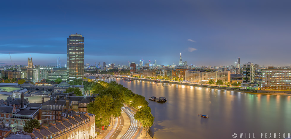
Image result for will pearson photography panorama

Finally, this photograph to me is interesting because of the fact its taken on a slow shutter speed, giving the colors subtlety and in this sense puts together a photograph of beautiful elegance.  This stands out to me because often a city is known to be very rushed and busy.  Interestingly, this photograph shows to me that if we stand back and admire the city and stop rushing around, there is lots of beauty within it.  However what I also like is how the photograph has still captured the light of the city showing that it is still alive and still breathing, not taking anything away from it.  It has done this by taking a photograph with little light but an extremely slow shutter speed and high aperture to still have that sense of busyness of a city.

Photo Safari – Abstract Shapes

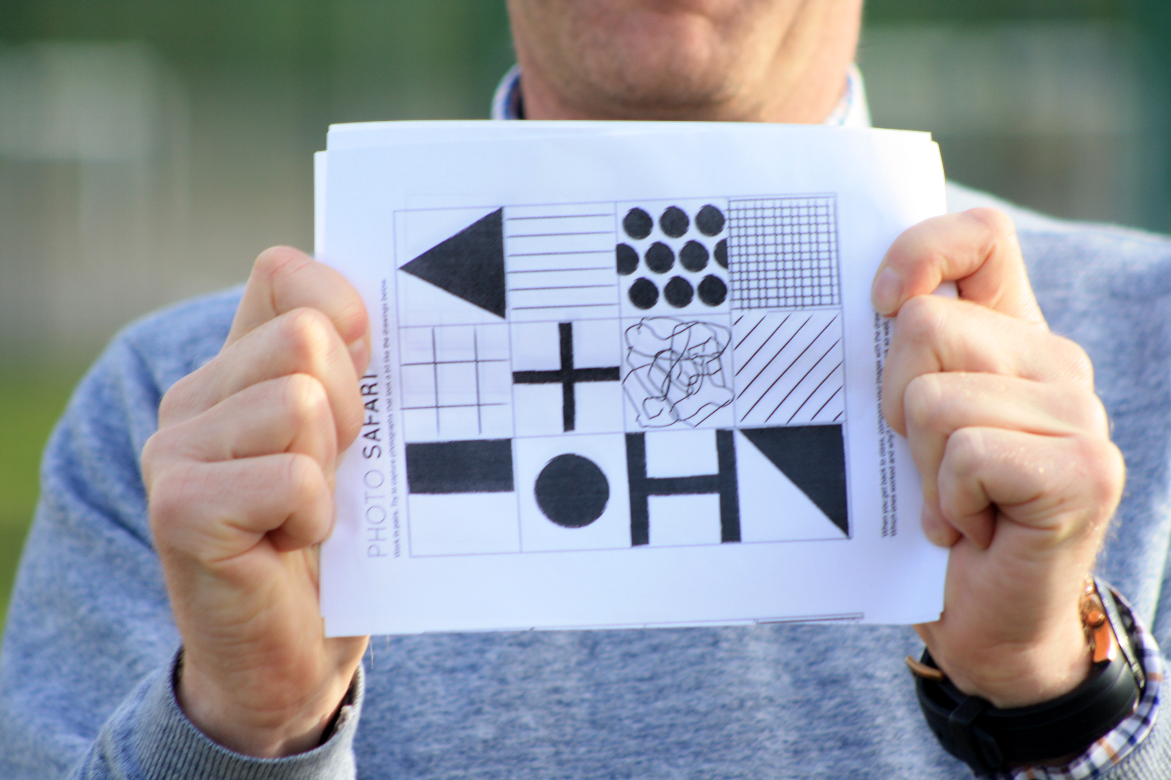
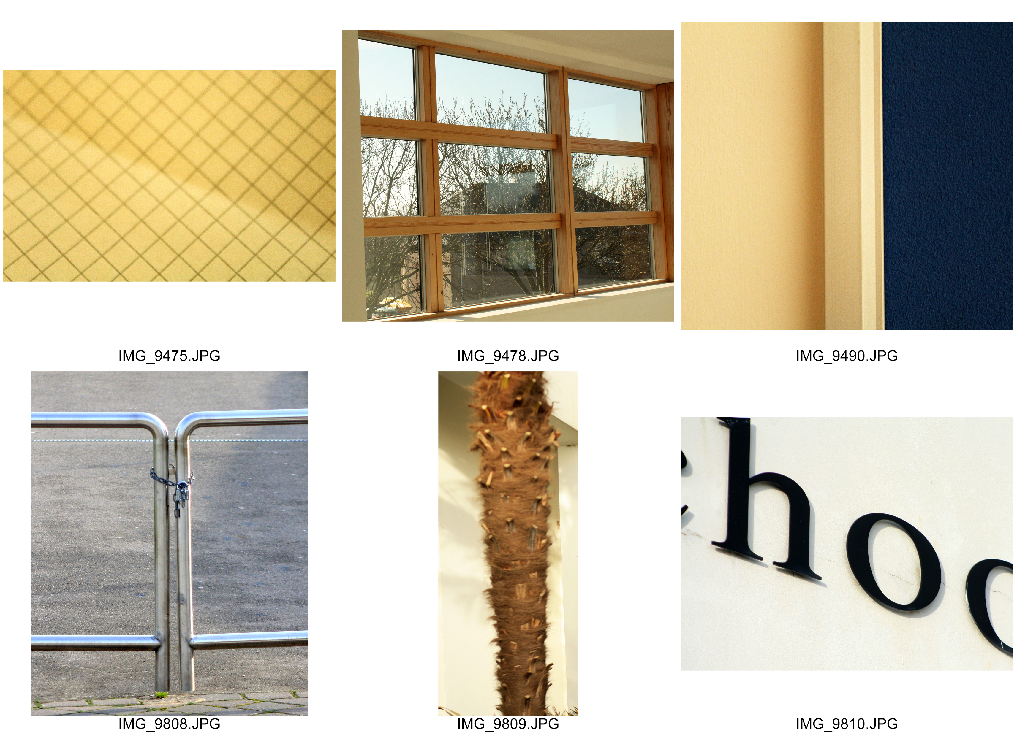
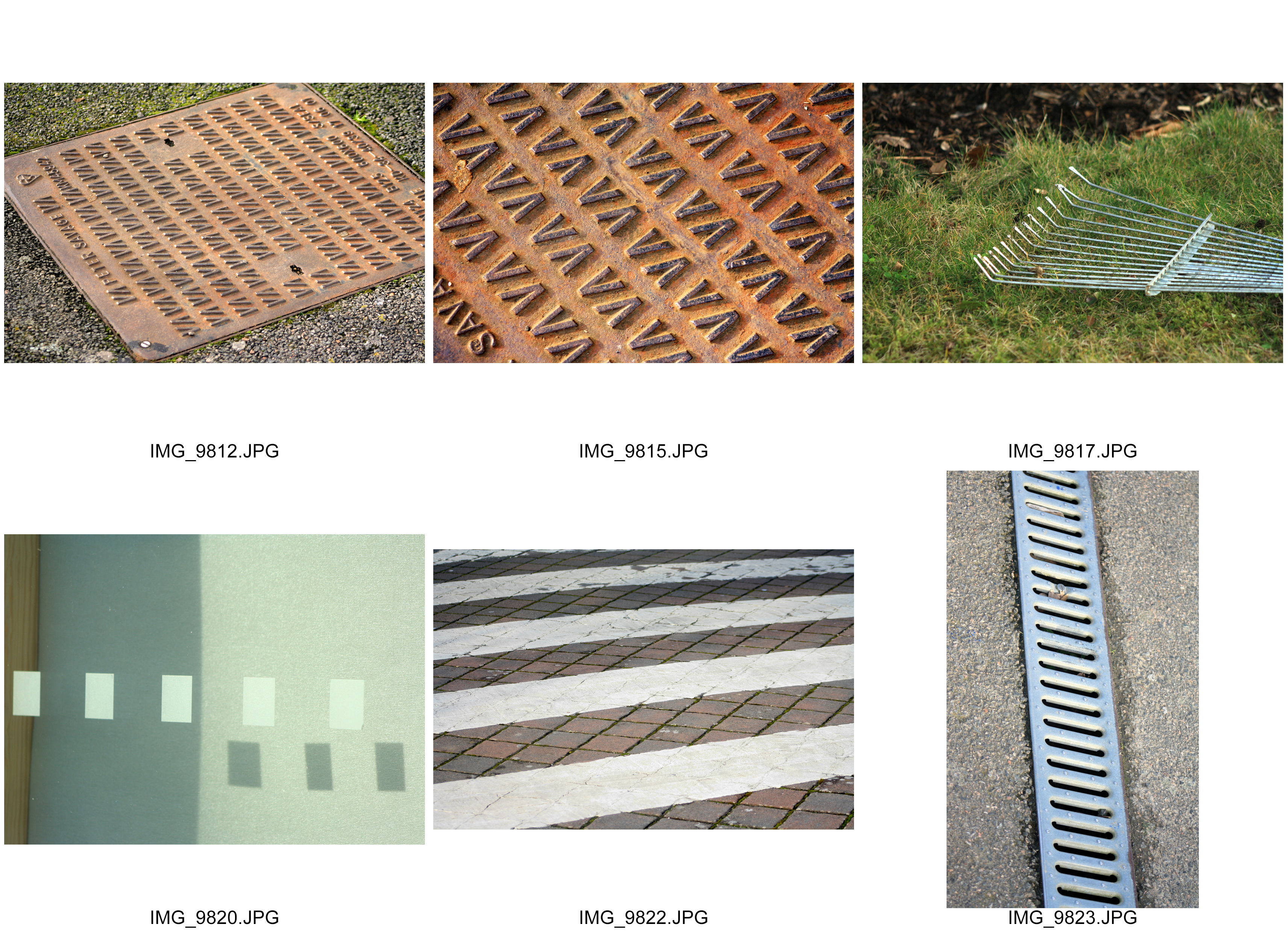
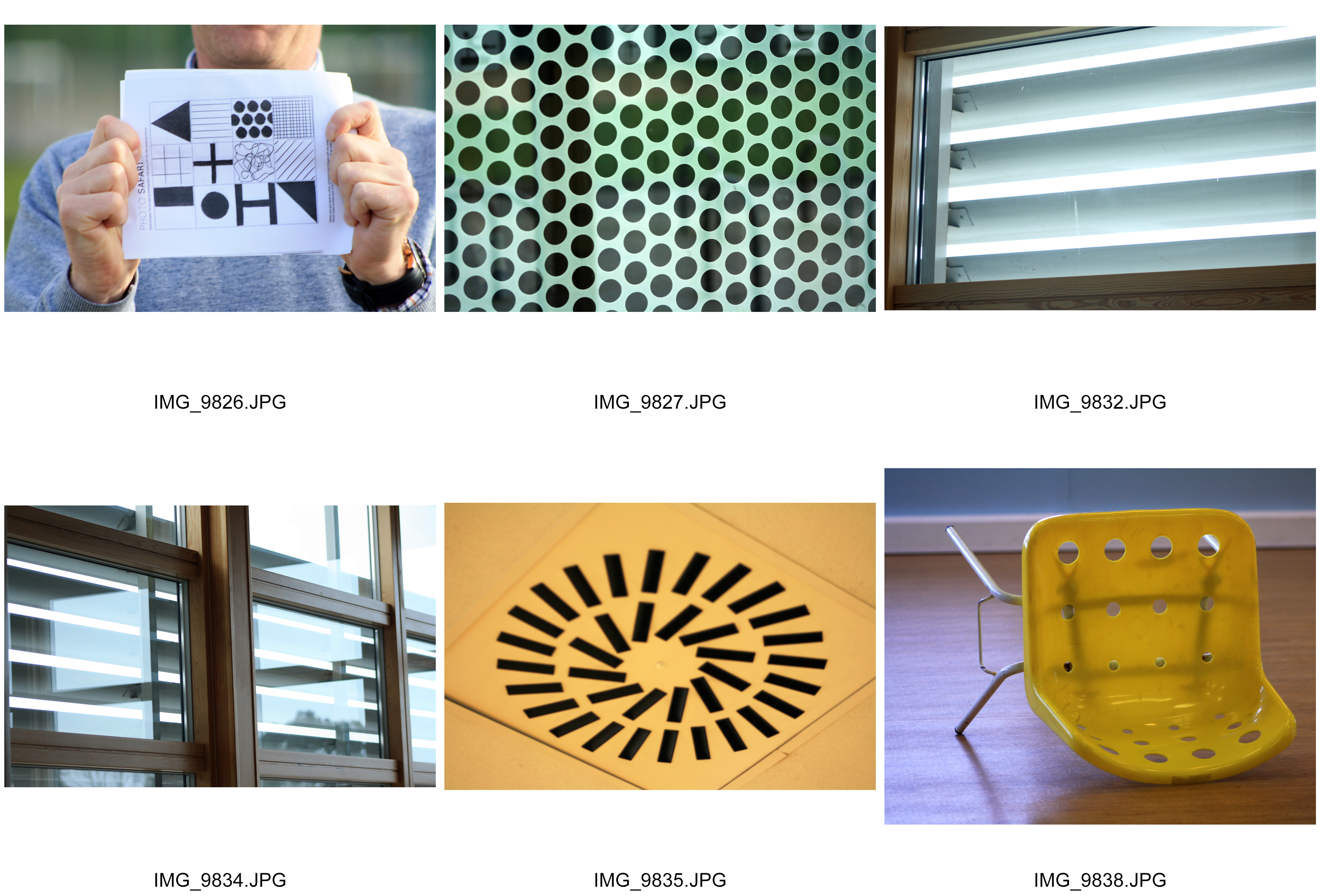
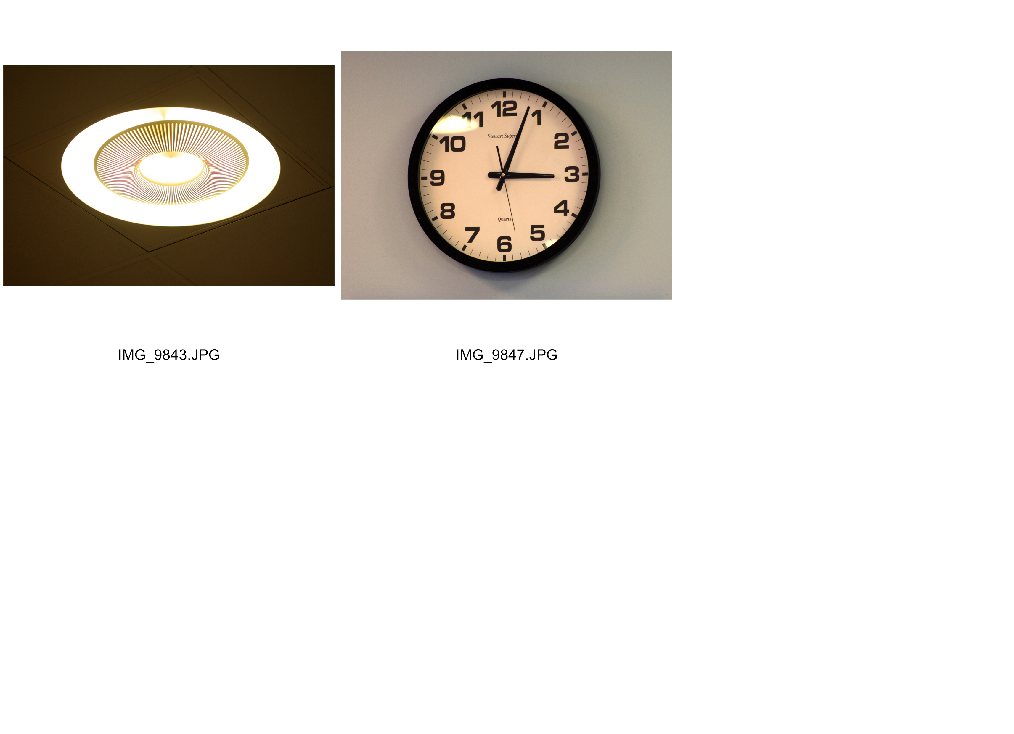
I went on a Photo-Safari around focusing particularly on shapes and patterns that I could photograph.  I chose to go on a day with quite harsh sun light to enhance the shadows and give warmth to the photograph.  I took this shoot to explore the the abstraction within objects that we pass by, see and use with with from a day to day basis.  I was heavily inspired by these patterns below:

Abstract and Formalism Photographs

Here I visited a range of locations at deferring times of the day.  I was heavily inspired by my earlier blog posts regarding Abstract and Formalism photography.  I also tried with various new ideas in creating photographs paying a particular attention to detail when it came to textures especially.  I believe these photo shoots were successful in capturing a sense of abstract and Formalism in photography.
Abstract Joiner Photography (David hockney) + Responses

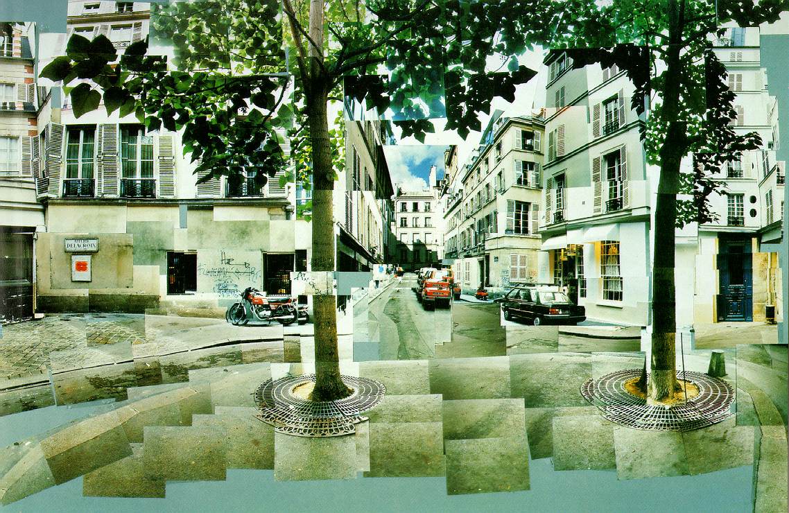
I was heavily inspired by David Hockney’s Joiner works and I wanted to produce my own responses.

Image result for david hockney joiner

I love this photograph because to me personally you strongly get a sense that it is collage-like.  I especially like how different layers have been adjusted through size, settings and position.  This way, with a number of these different layers you can create a puzzle that comes systematically together as one photograph.  David Hockney’s view of his joiners being a narrative is as if the viewer was moving around in the location.  This is linked to my panorama work as it too holds a very similar principle.  However with this, I felt inspired by it as the range of misfitting layers and other components coming together, to me shows of how whatever the camera is photographing isn’t perfect but with this it causes beauty and interesting aspects.

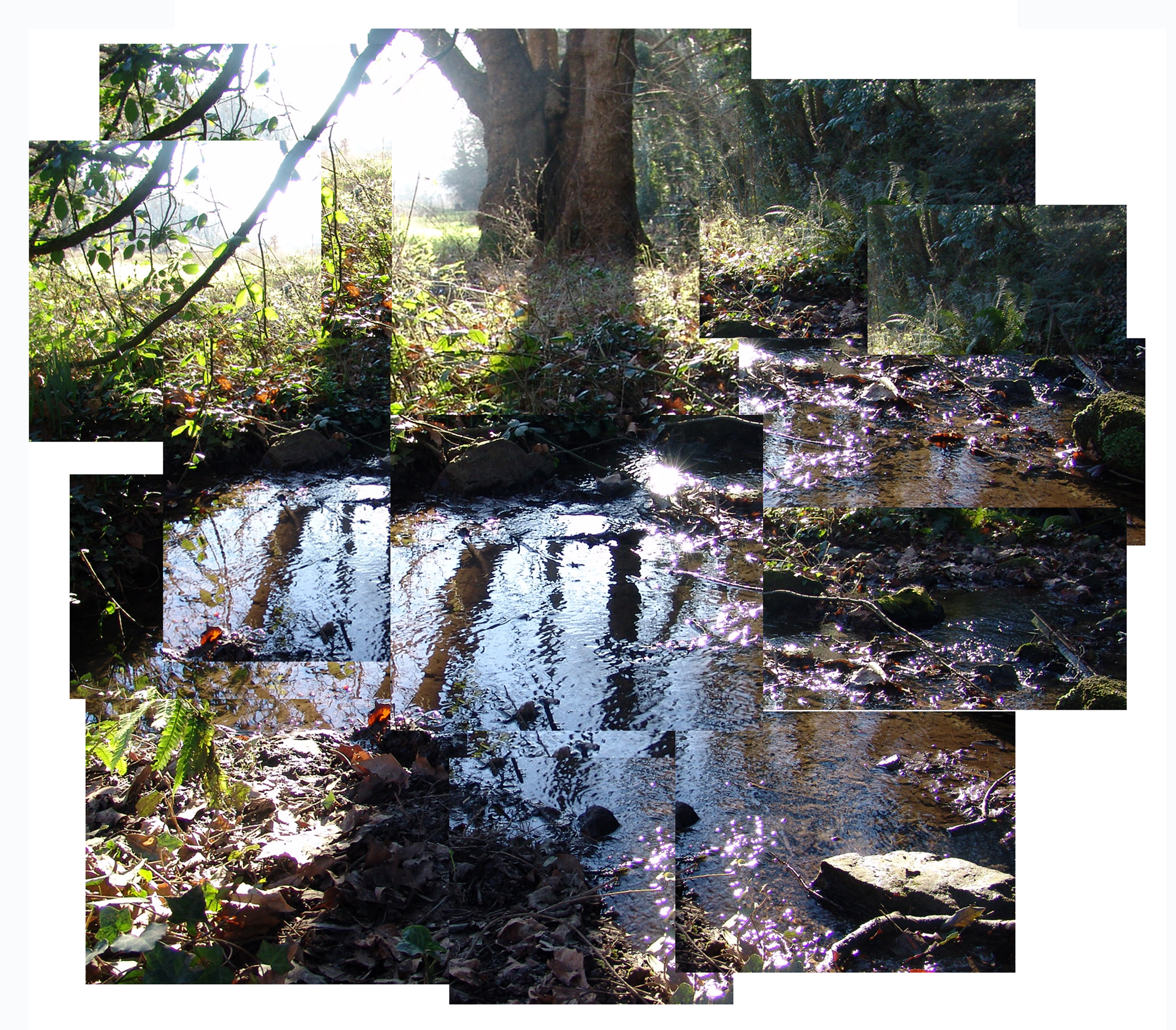
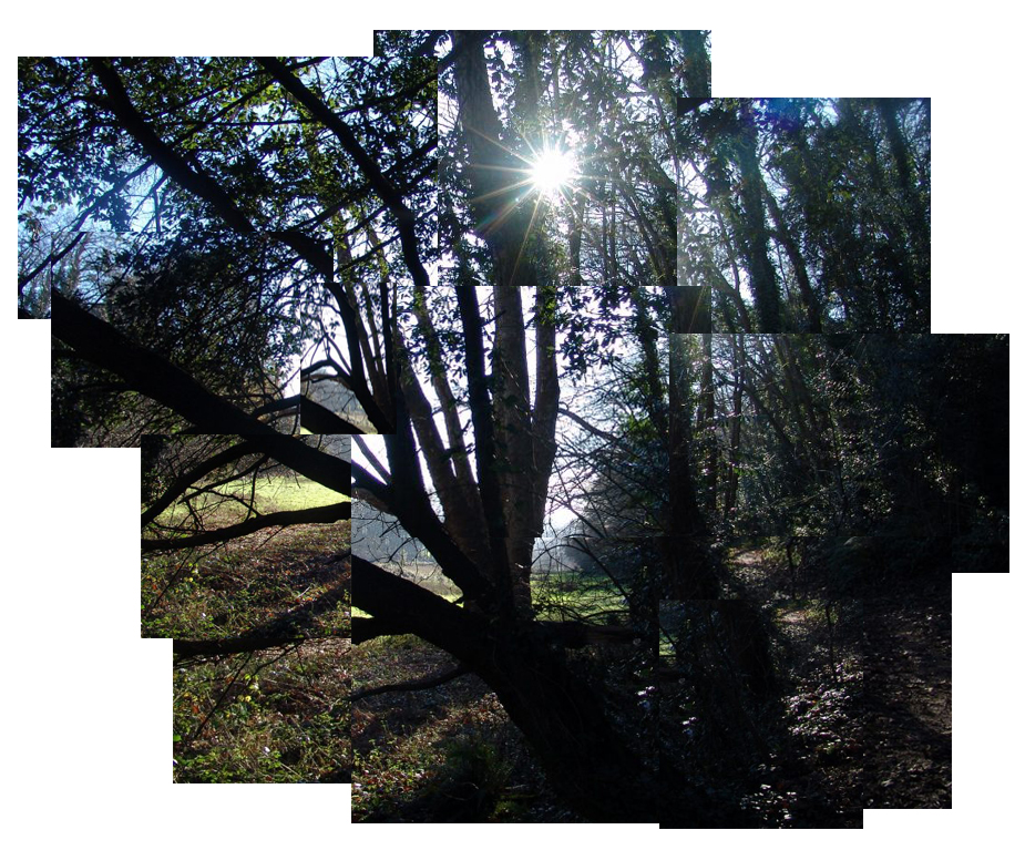
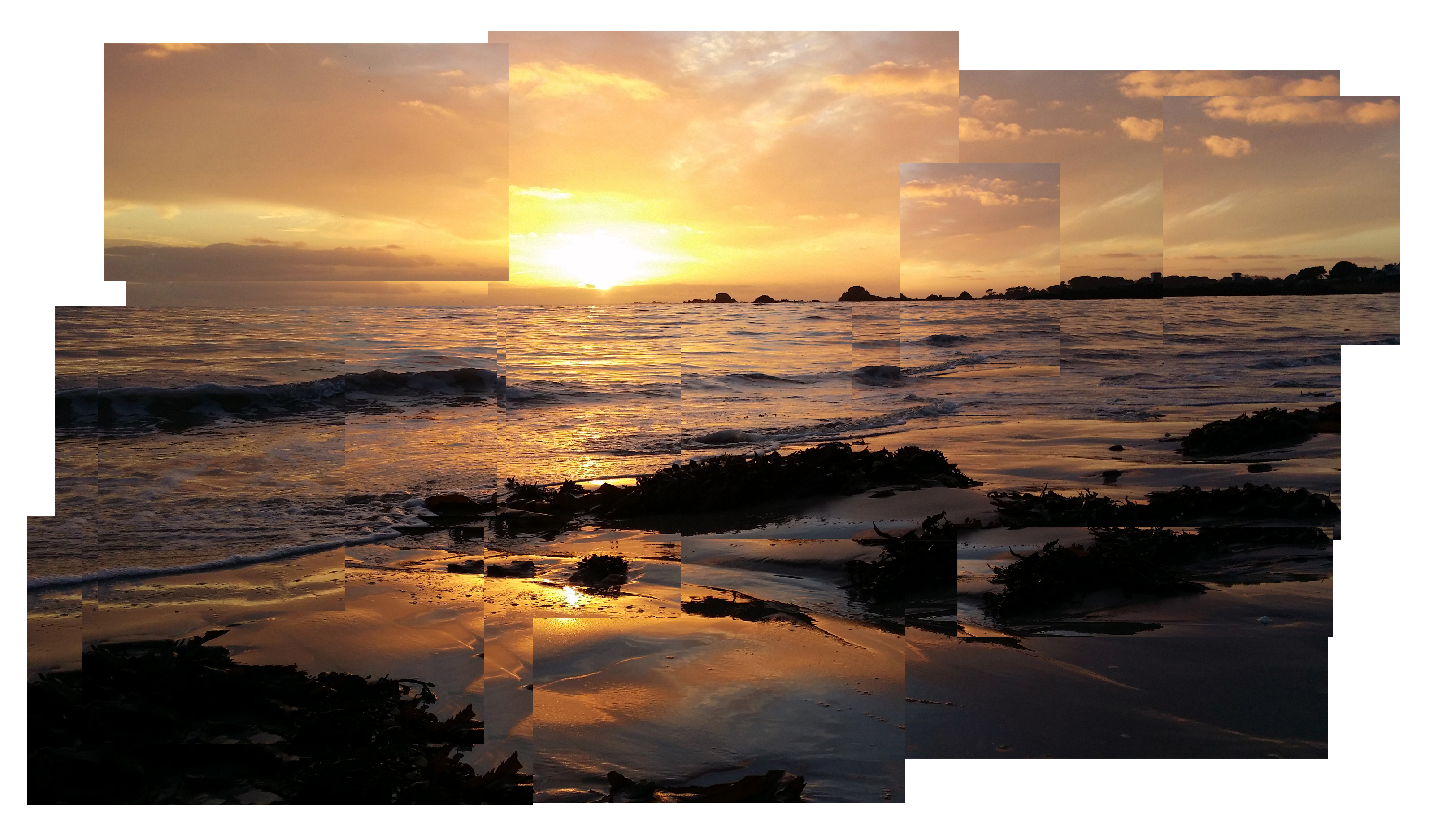
For this set of experimentation I simply copied the same photograph 12 times.  I then deselected the eye icon to look at the current layer.  Then I selected area and clicked on select, then inverse and then deleted the remaining elements of the photograph leaving my selected area.  I then repeated the procedure for the next one leaving out a certain desired area singled out.  After carrying this procedure on for another 10 times.  From this, with all the eyes selected, I adjusted the position and size of each selected are from each layer giving a basis for the finished design.  Then I flattened the image and slightly changed a few dimensions.  Finally I opened the photograph onto a new layer with the same dimensions and cropped to my liking.

I chose to develop David Hockney’s own style and apply it to my work because I believe that his work is particularly focused on Abstract work with developing a strong sense of surrealism.  For example the photographs appears quite abstract themselves in the sense that the bright, and dramatic tones of light and shadow alongside the striking contrasts appear slightly exaggerated and unreal.  Interestingly the Collage style Joiner edits enhance this abstraction as various layers imposed on top of each other creating interesting shapes that individually don’t work together, but on viewing the whole photograph, these various layers of various sizes and shapes appear very abstract.  This very surreal in the sense that unexpected juxtapositions are included consistently.  This links to my theme well because it shows that, tiny details which may not fit together, once you step back and admire the creation even if every minor detail isn’t perfectly aligned is beautiful in it’s own way.

Response 1

Response 2

Response 3


Archival Photography

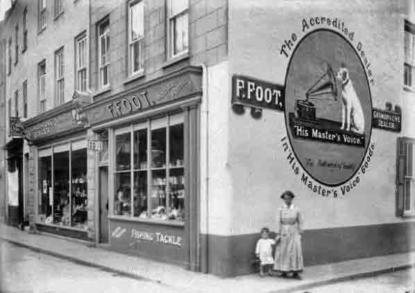
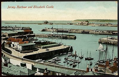
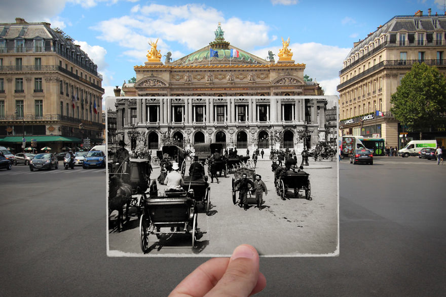
Archival Photography compares the past and present, history and now.   Archival imagery can be historical images of iconic landscapes or landscapes showing a big difference in comparison to its present look and historical look.  For example, the object could be built on new land or have more of an updated look.  Here are some examples of archival photography below:

hmvsigndumaresqst

old-rare-postcard-jersey-harbour-elizabeth-castle

i-combined-old-and-new-photos-of-paris-to-bring-history-to-life-5__880