When I took this photo I didn’t expect America would in the state it is now. With the corrupt in power America has become a divided nation. I think this represents that. The way the flag has a clear crease through the middle shows a divide representing the divide America is facing at this time. I have also edited the saturation of the picture to make it dimmer this represents the dark times America are going though. I also think the flag in the foreground juxtaposes to the picture in the background. In the background is just a part of the New York City skyline. This includes the World Trade Center, this is where the Twin Towers used to stand. The tragedy that involved those towers was horrific however America was united trying to help one other, although it was this terrible thing America couldn’t have been anymore united. This is a complete contrast to what we see today with the country divided due the President elect and I think the flag represents that.
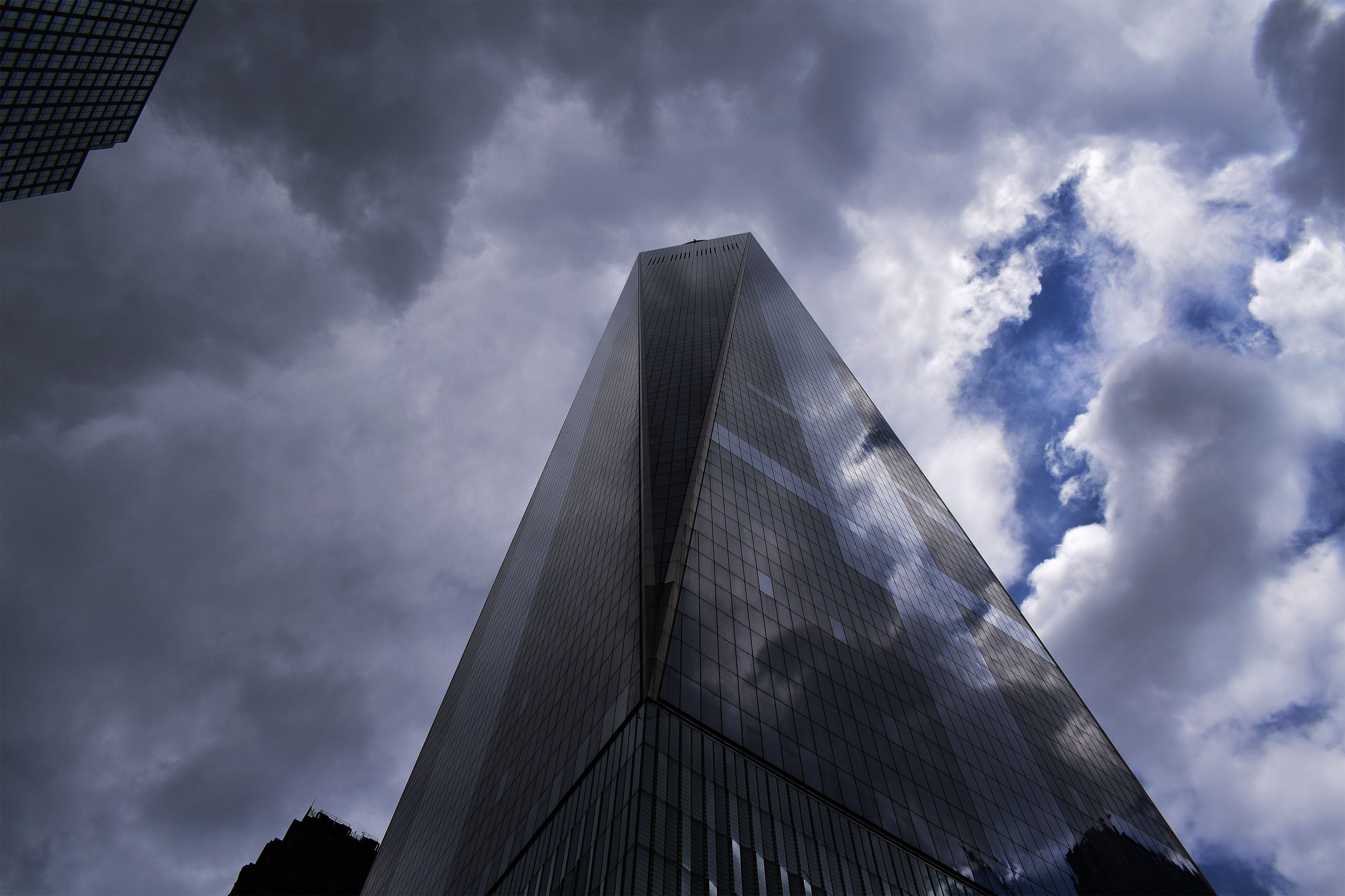
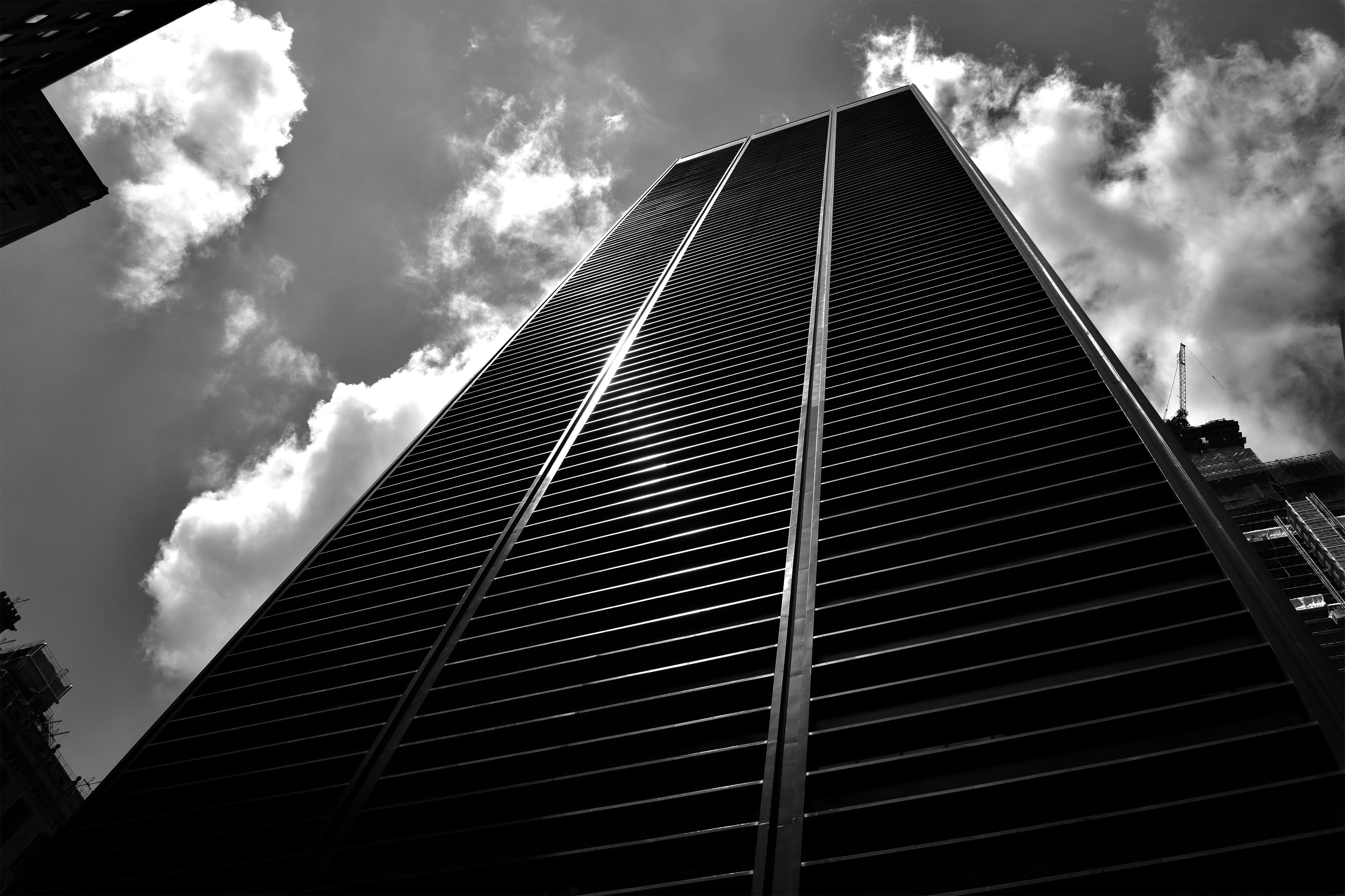
For these two pictures I really wanted to show the towering nature of these buildings and how these buildings almost look like they looking down on you. I also wanted to show some of the beautiful designs of these builds whether is be clear reflective glass reflecting the dramatic clouds or building at the bottom with the perfect straight lines leading to the top of the building.
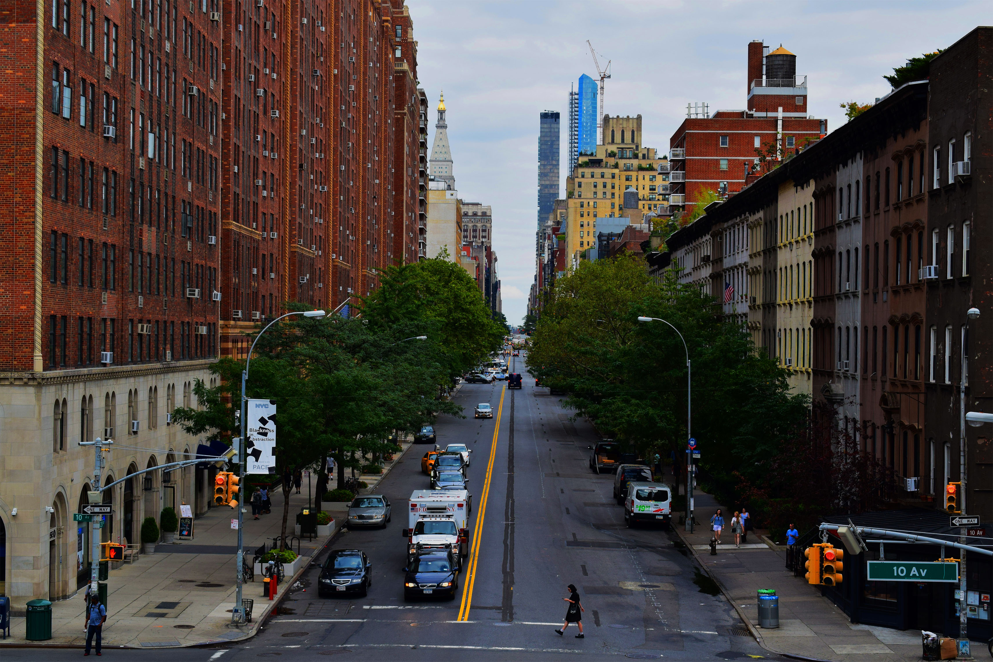
In these pictures I wanted to show the beautiful symmetry of the buildings and streets of the city. In the top picture I wanted to show off the busyness of New York with the traffic moving in the foreground. People move constantly in this city yet these massive buildings stay the same, still, constant, always there for the people to move around. To try and convey this message I even took the picture slightly tilted. The bottom picture I wanted to show the opposite of how this city can also be quite calm and tranquil however still showing symmetry. In this picture there is no sense of rush everyone is calm in the photo even the Ambulance is waiting in traffic. The beauty is also shown with the green trees leading down the street as well as the road lines leading down the street.
In this photo I wanted to show a version of my topographies. In this picture I liked the color of poster against the dull grimy wall.
In this photo I wanted to show the vast landscape of the city showing that it goes on for miles. I chose to put in Black and White as it clearly shows these defined buildings going on for miles and miles.


