
Monthly Archives: February 2017
Filters


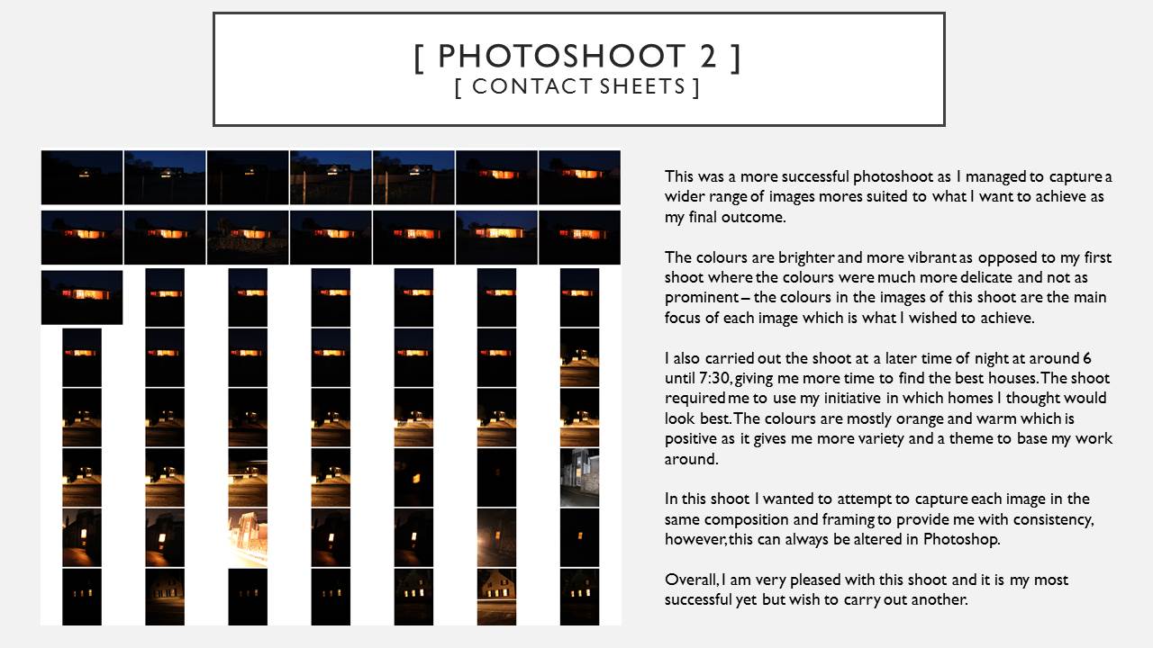

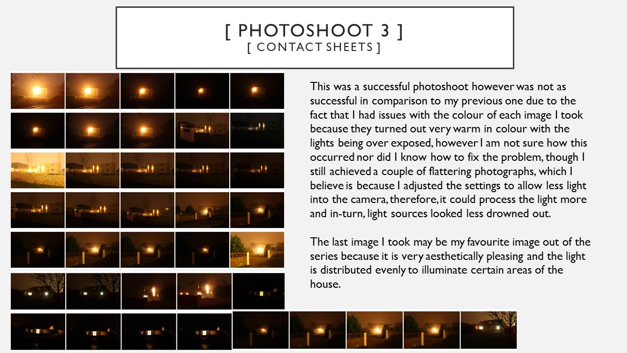

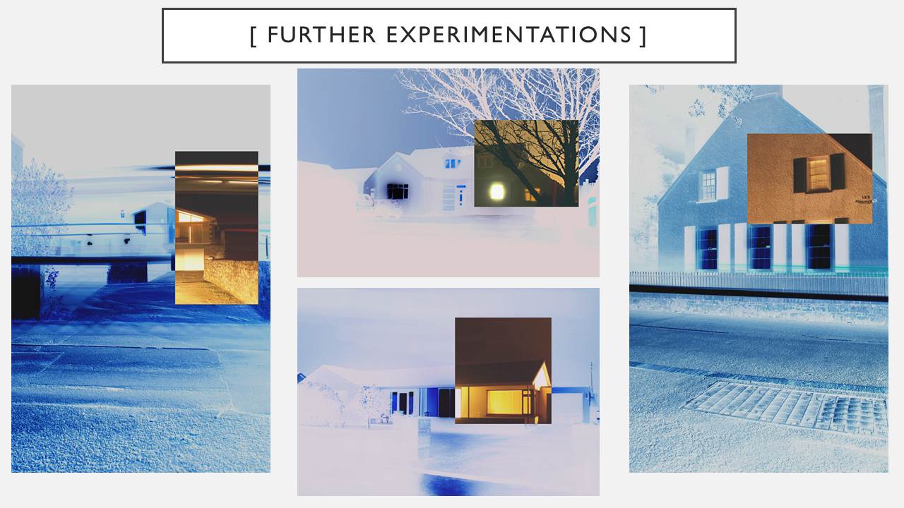
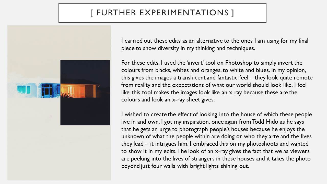
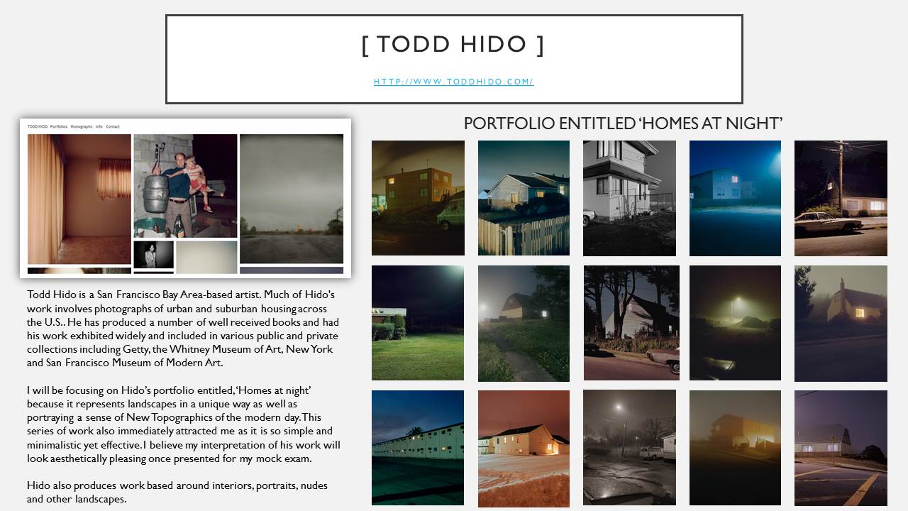
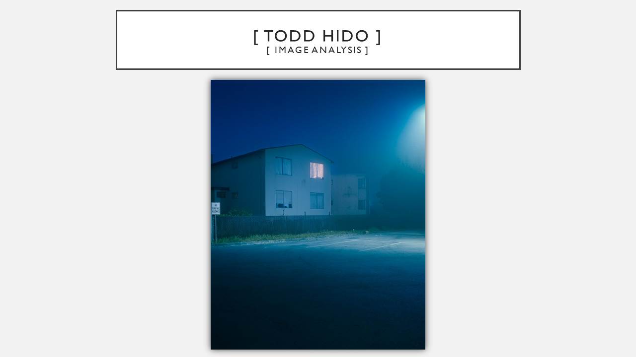
Final Images for Landscape
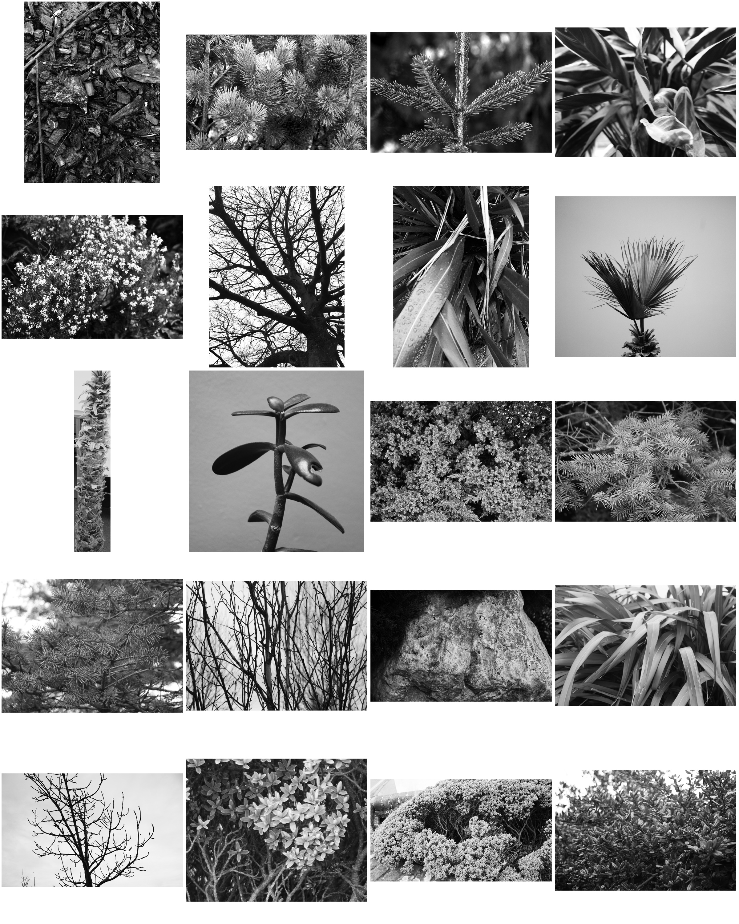
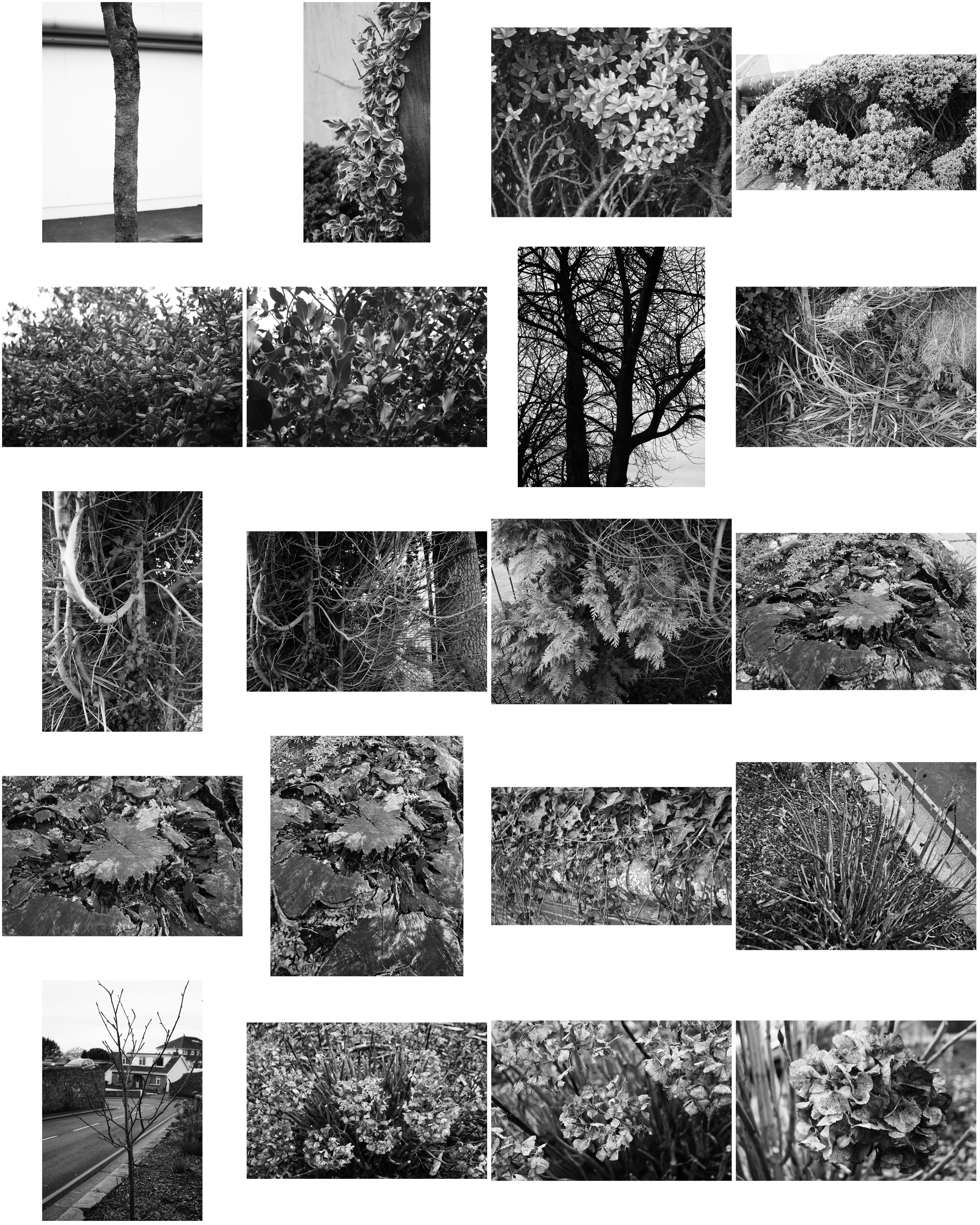
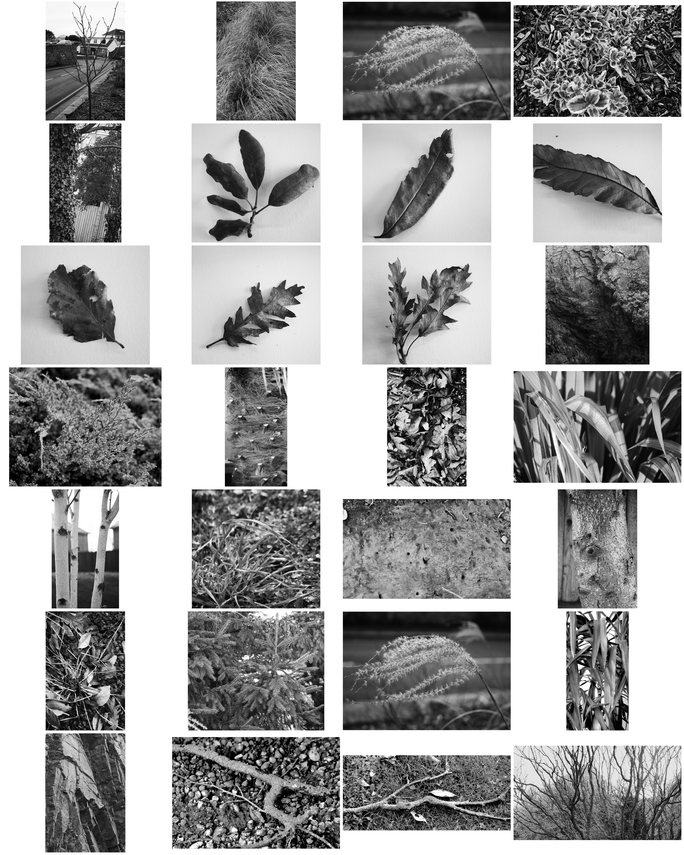
These images were all inspired by Typologies. Typology is the study of types, and a photographic typology is a suite of images or related forms, shot in a consistent, repetitive manner. This series of images I have created show the different and wide range of typologies I am surrounded by.

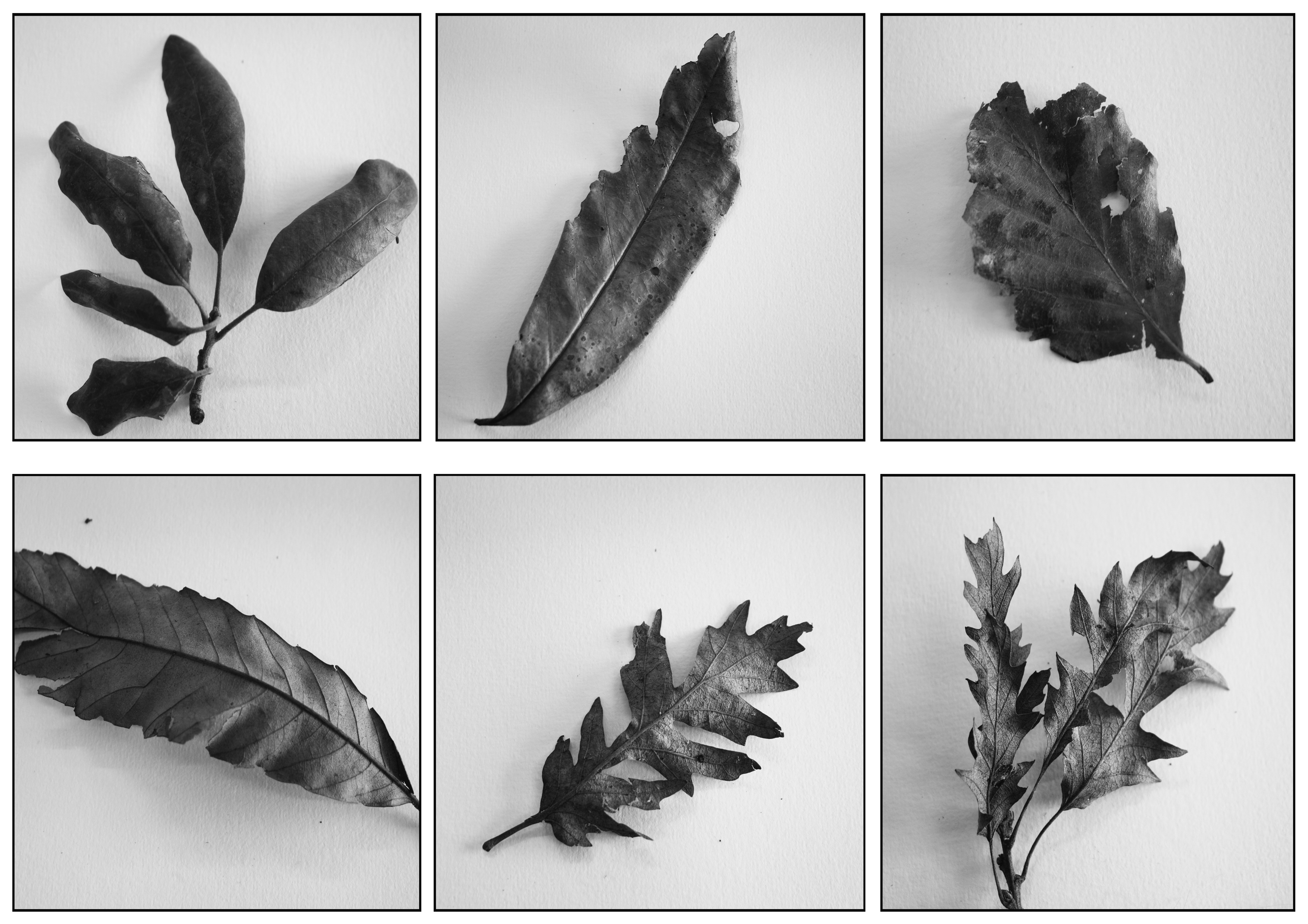
The angle of the 6 images are the same/similar. They are all taken from a high angle to show the whole leaf, showing the details within the leaf. There are shadows and highlights on the leafs where the light has been weak or intense, creating the contrasts within the individual photographs. This therefore creates a contrast between the light background and the darker images of the leaves. The positions of the leaves are all different but still look fairly similar, 2 of the leafs are directly upright, 2 are slightly tilted to the left and the other 2 are slightly tilted to the right. The leaves are exposed very gently, drawing out certain features of the leaf such as the midrib and the veins in the leaf. The light was directly above me as the photographer and the leaves, although the light is intense in parts of the photo, the light also almost seems soft and gentle on the leaves. The focal point with each individual image is the leaf, however there is no distance or depth added to the image.
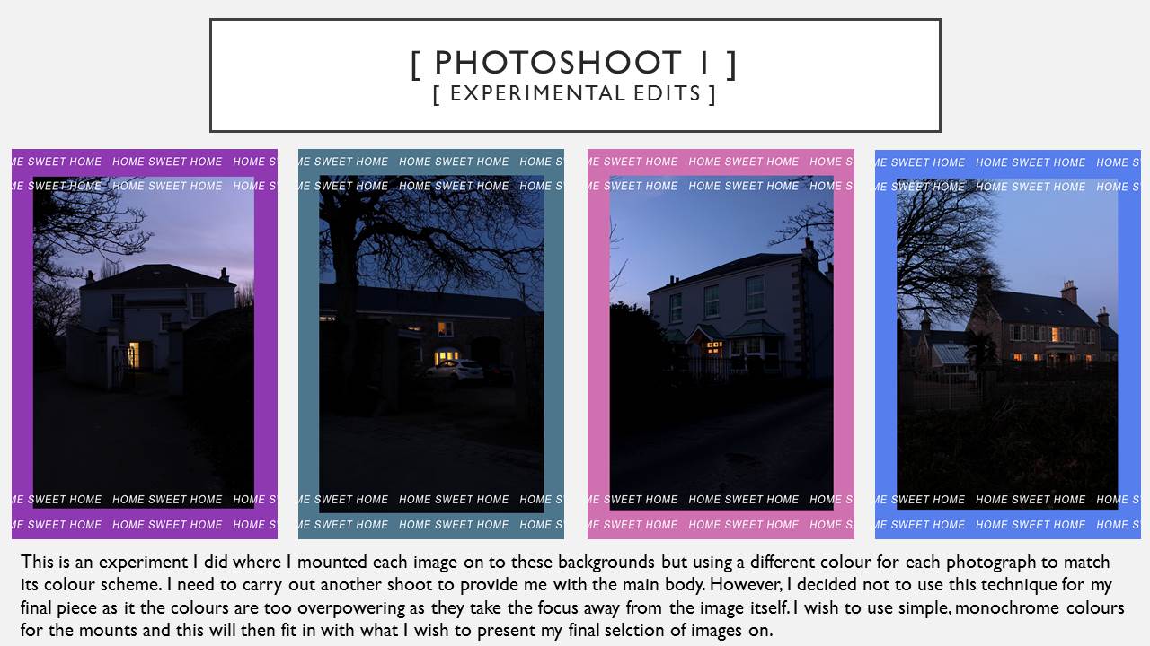
I put the images in a group of 6 as i felt that they were similar images and worked well together and was inspired by Karl Blossfelt. For my final piece i created a black border as the image is very formal and felt it suited the theme of the image.
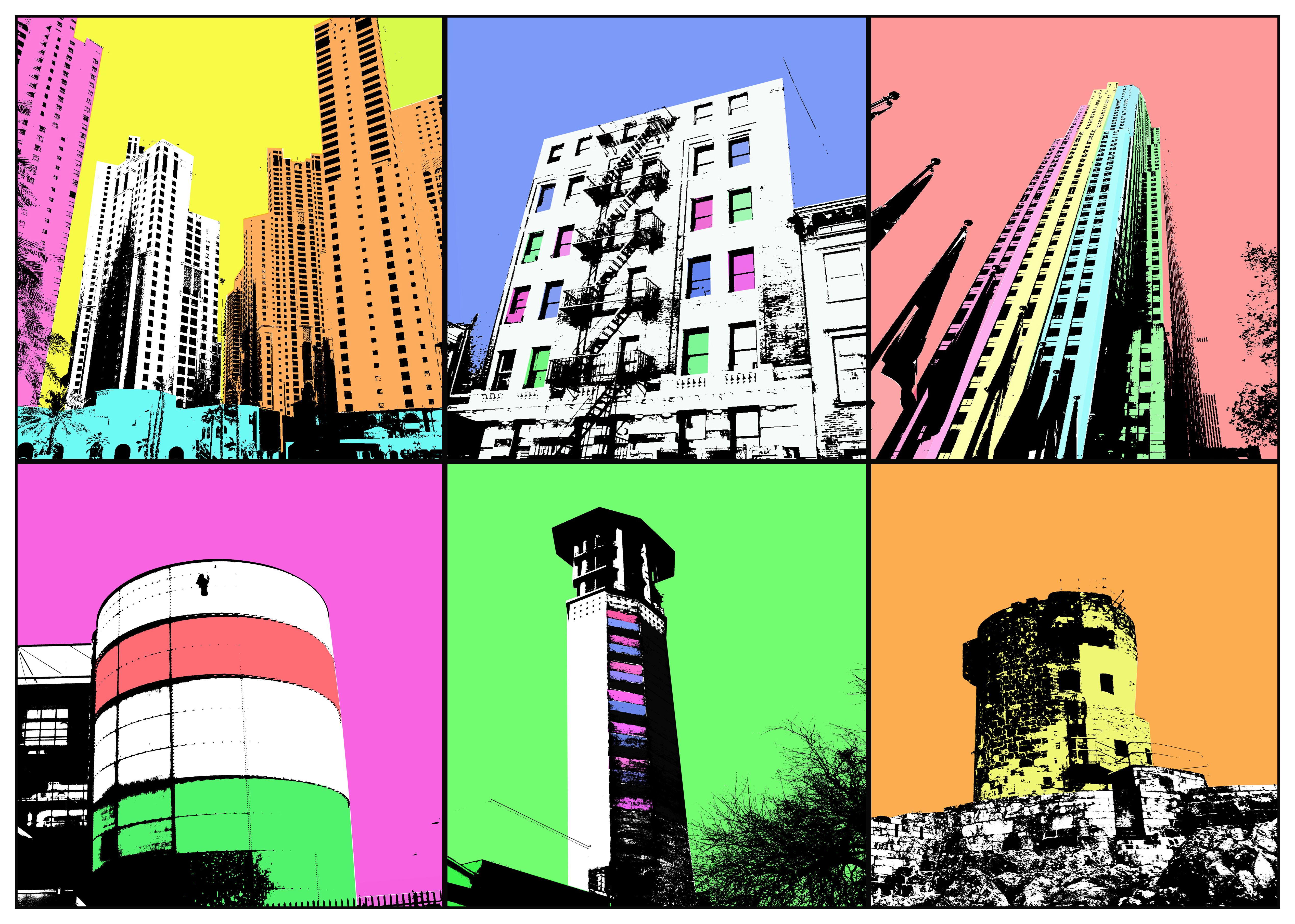

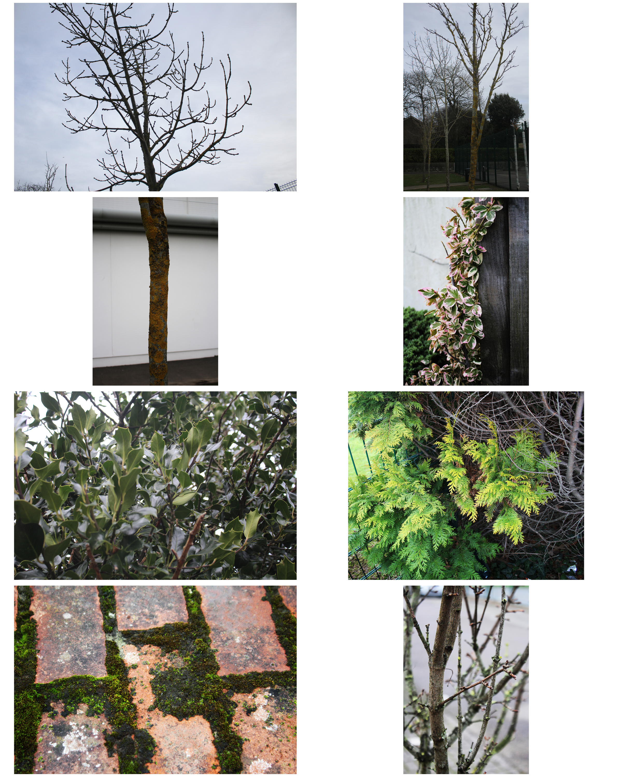
I chose these images because they contrast with the grid of 6 leaves photos as they are natural and honest. However, the images of the man-made structures are informal and more creative so this contrasts with the image of the leaves. All of the images in this group of 6 are similar in a way but also have differences within them such as: the height, the shape and the colours.

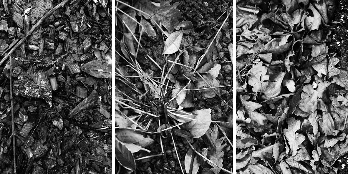
This image is similar to the first one i presented as the angles are all from a high angle, they are all images of the ground. The images are of bark, leaves, small plants and sticks. These images don’t have a particular focal point as they are pattern type photos. This image shows nature in its purest and honest form.
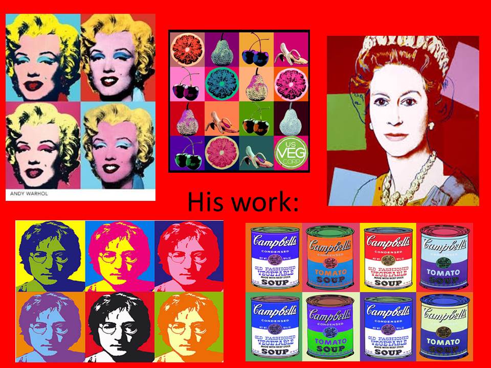
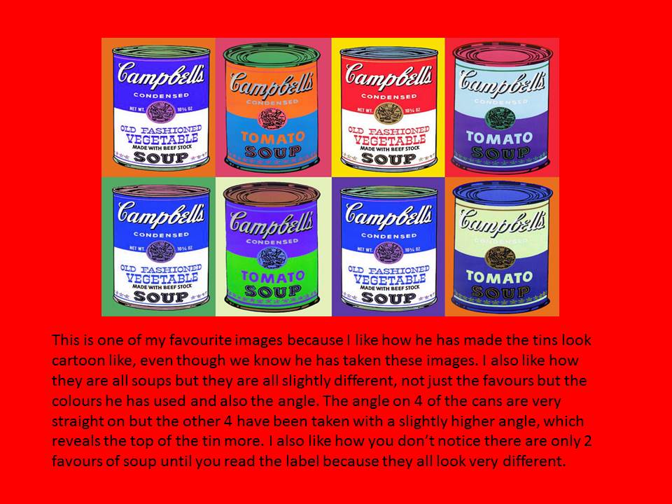
Andy Warhol Inspiration- Pop Art


Exploring Abstraction in a different light
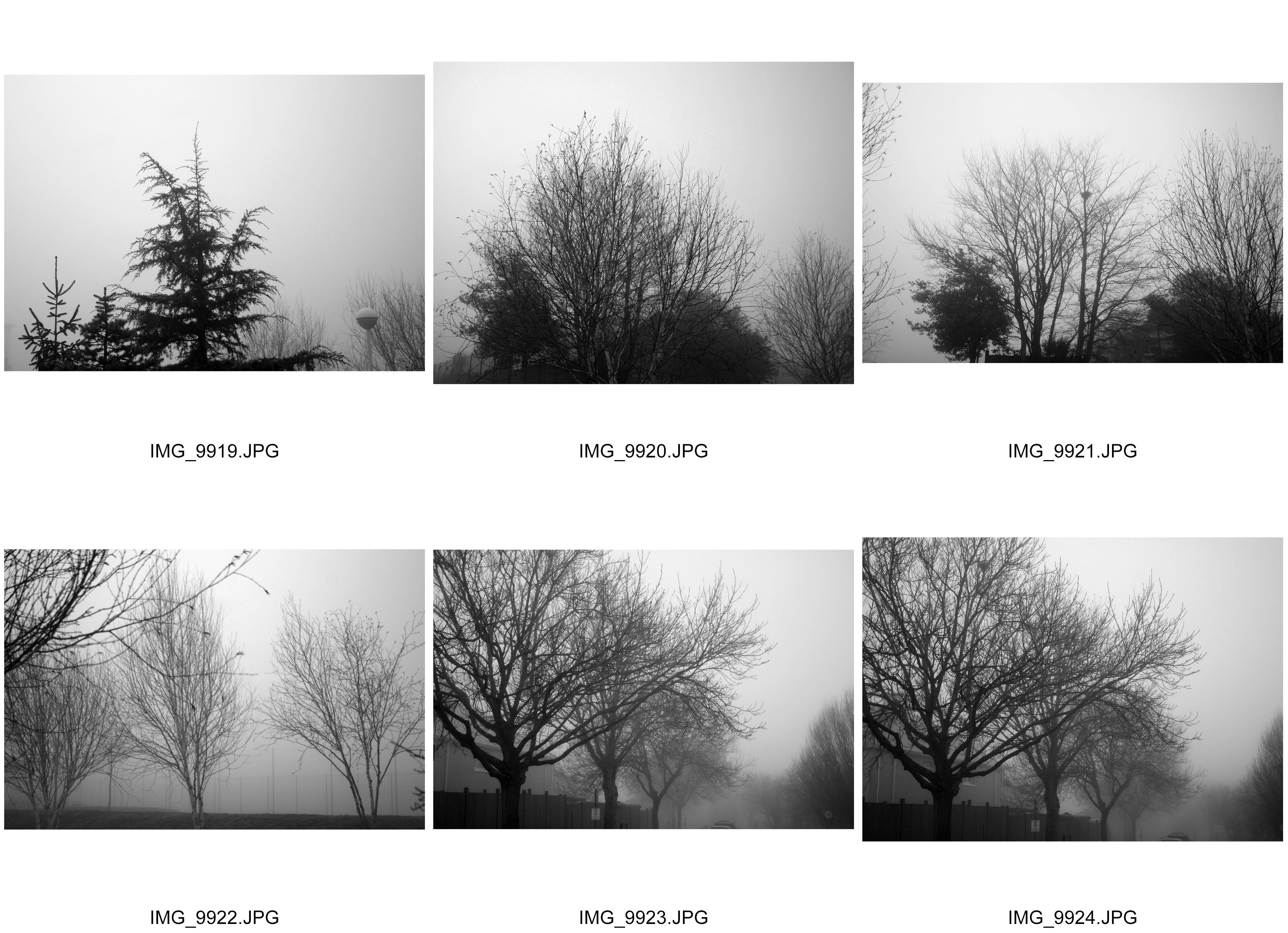
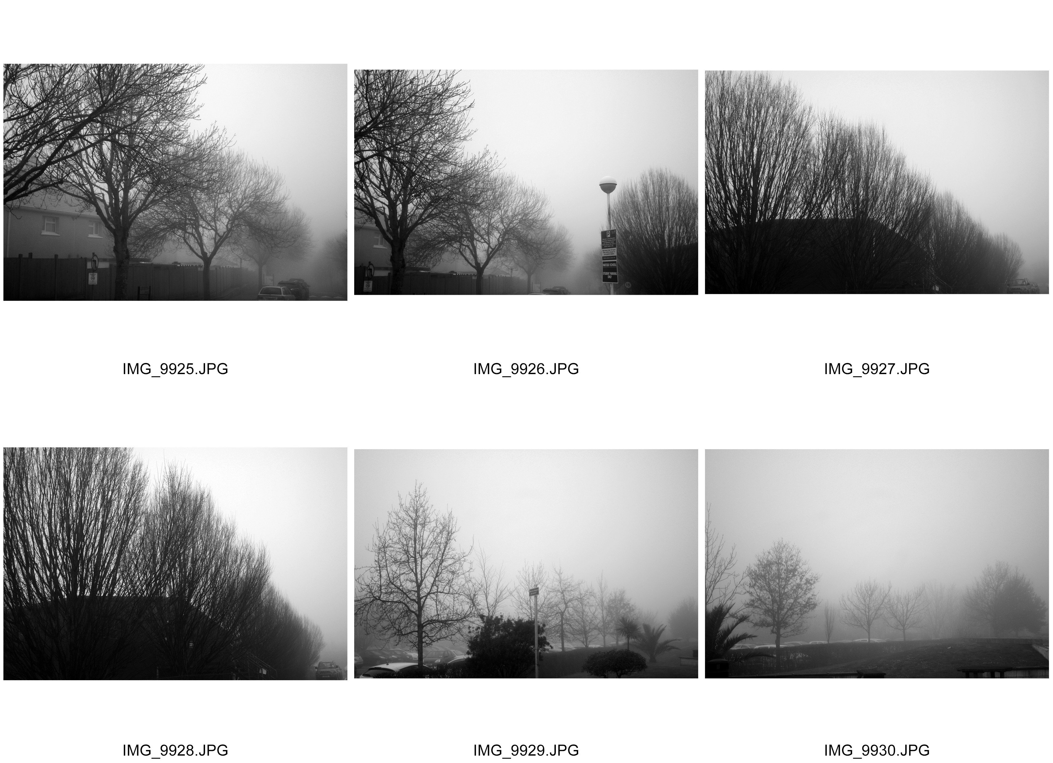
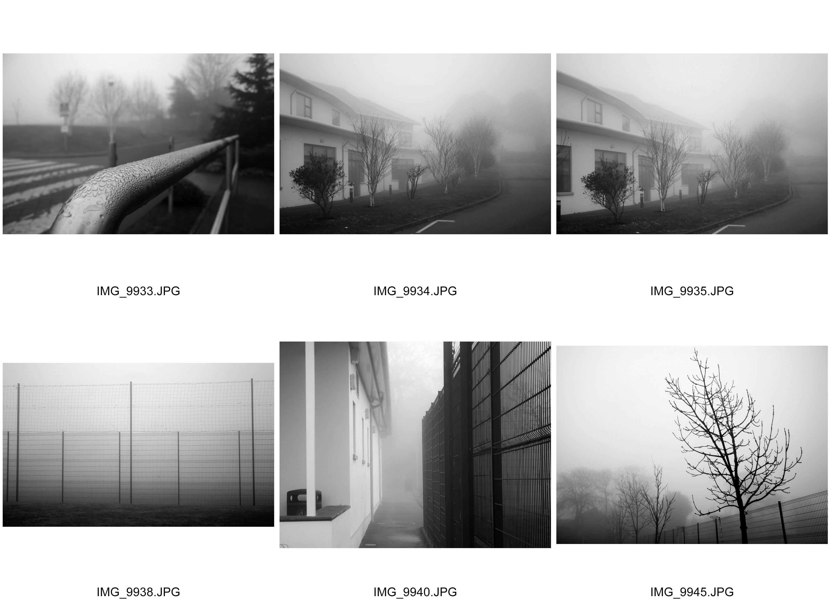
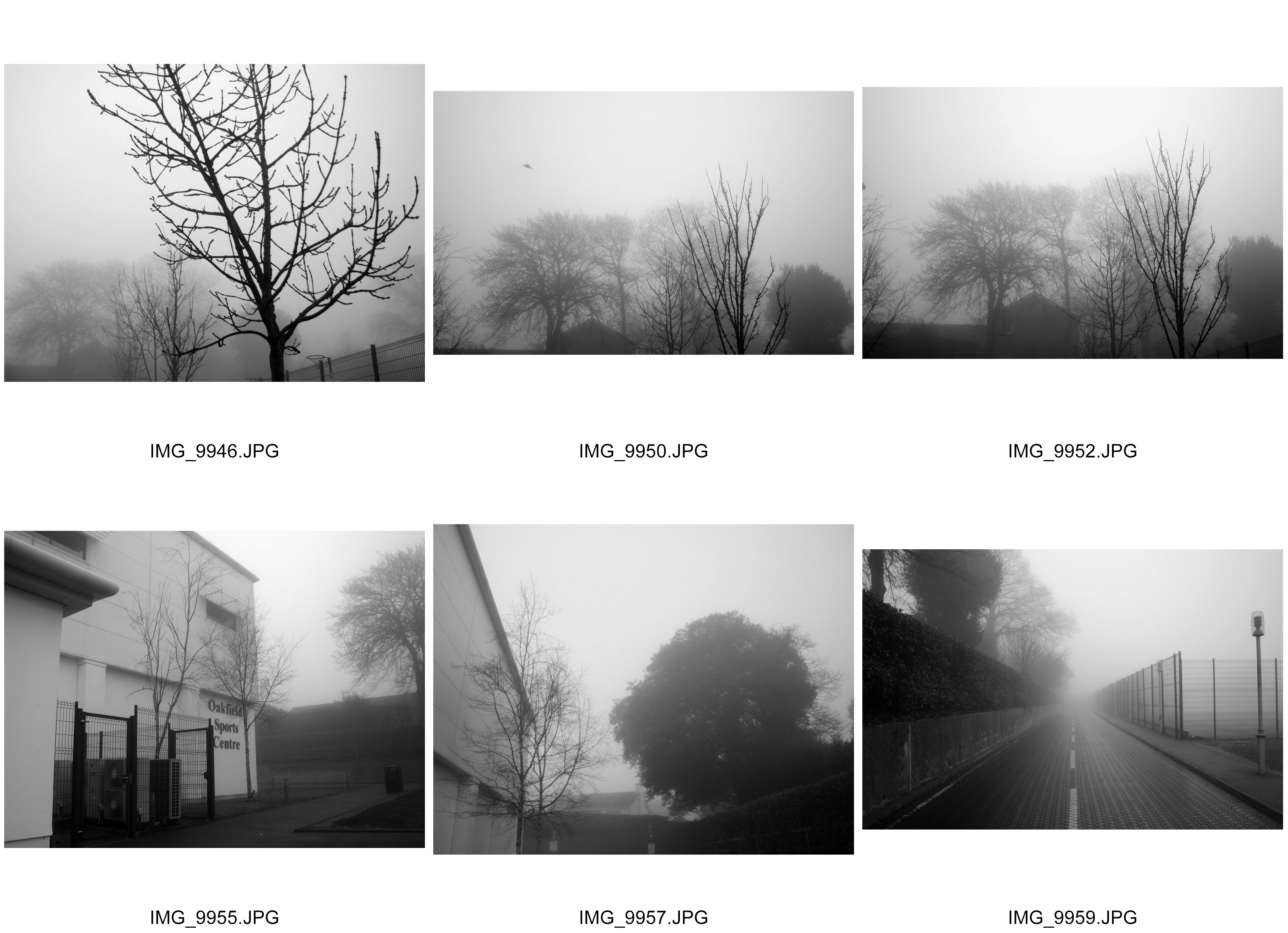
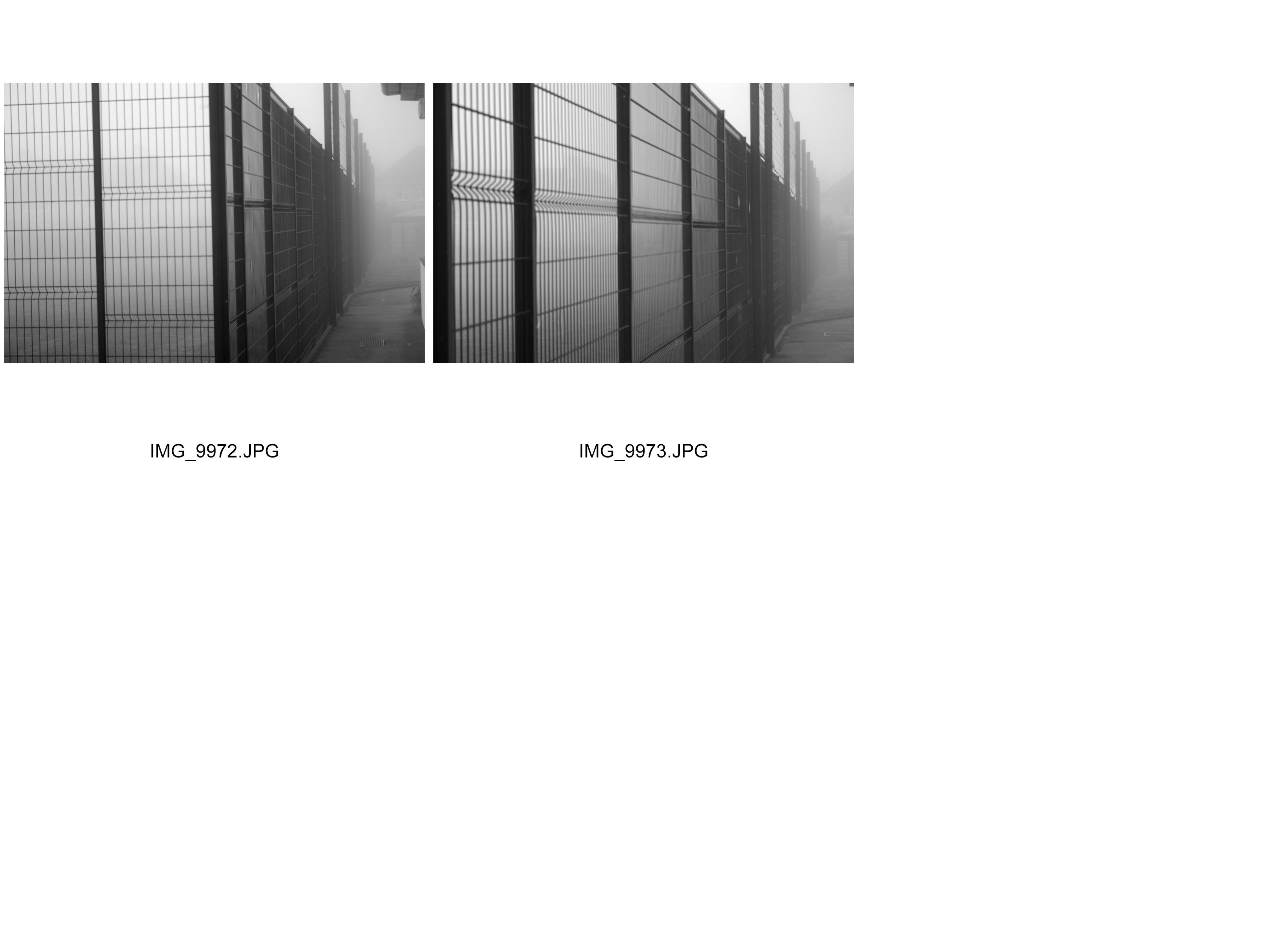
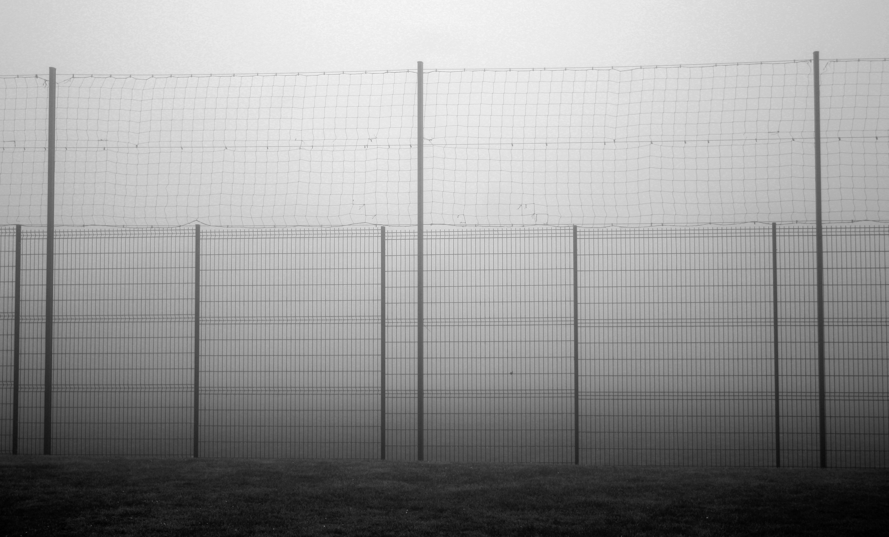
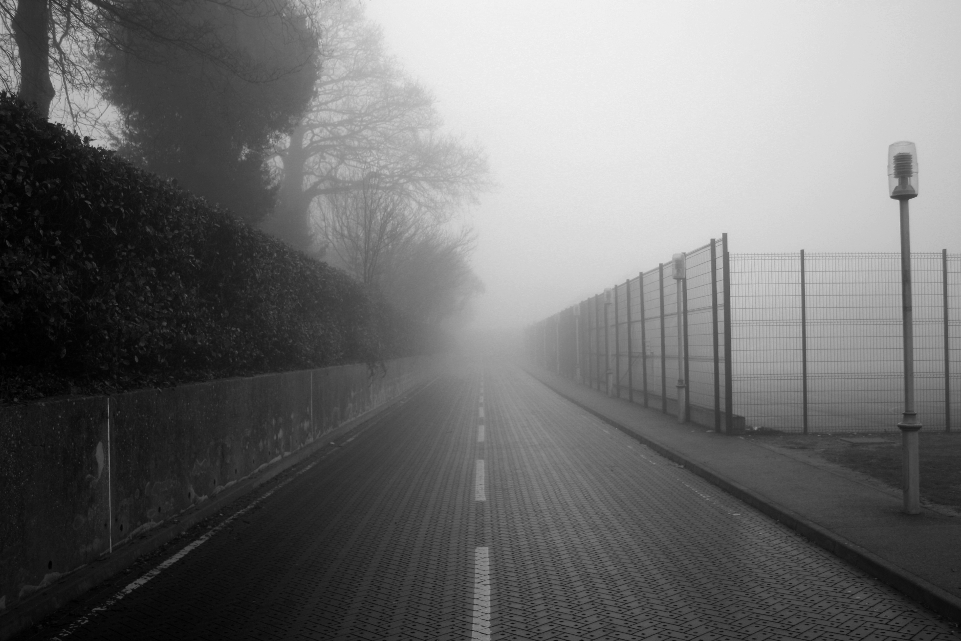
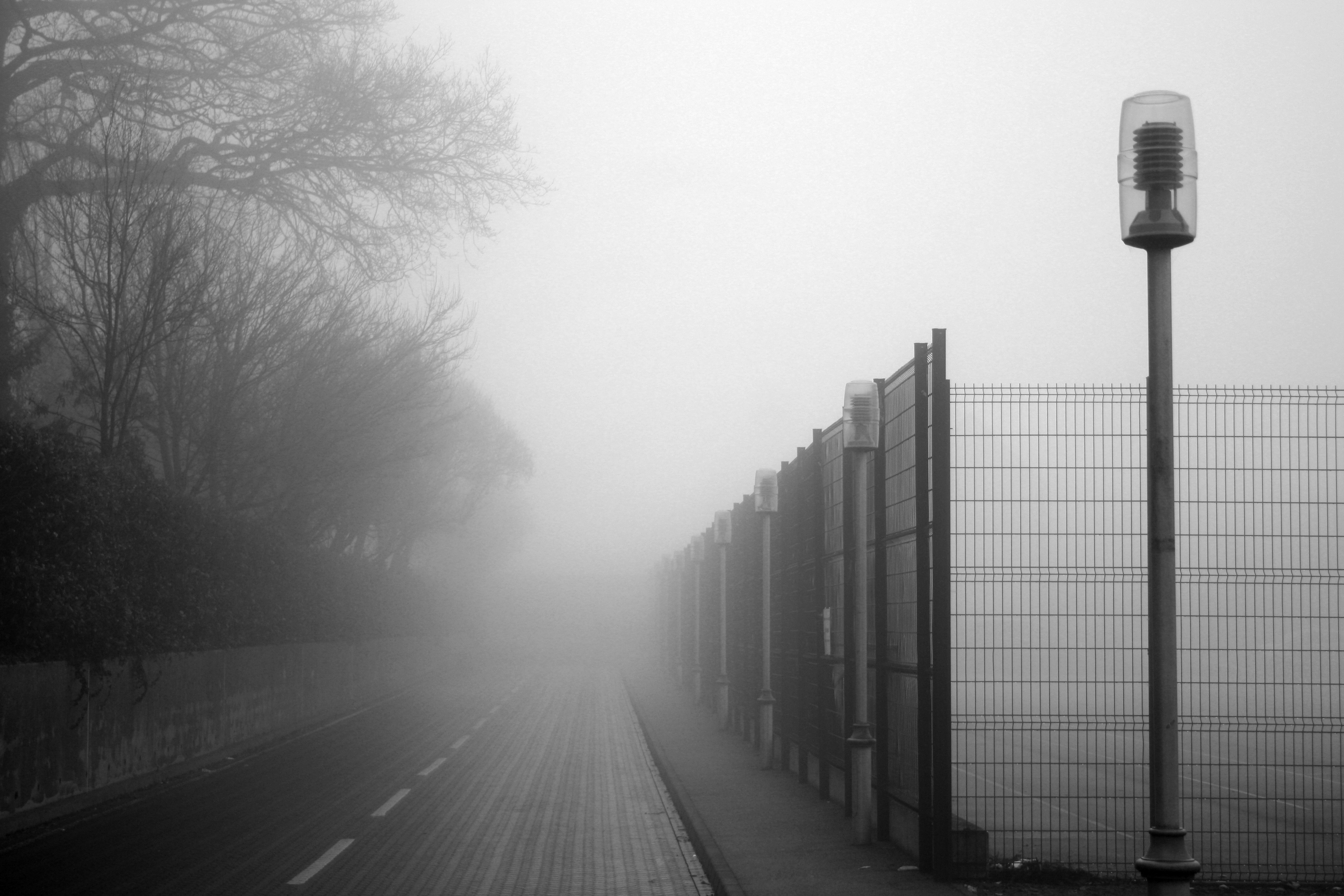
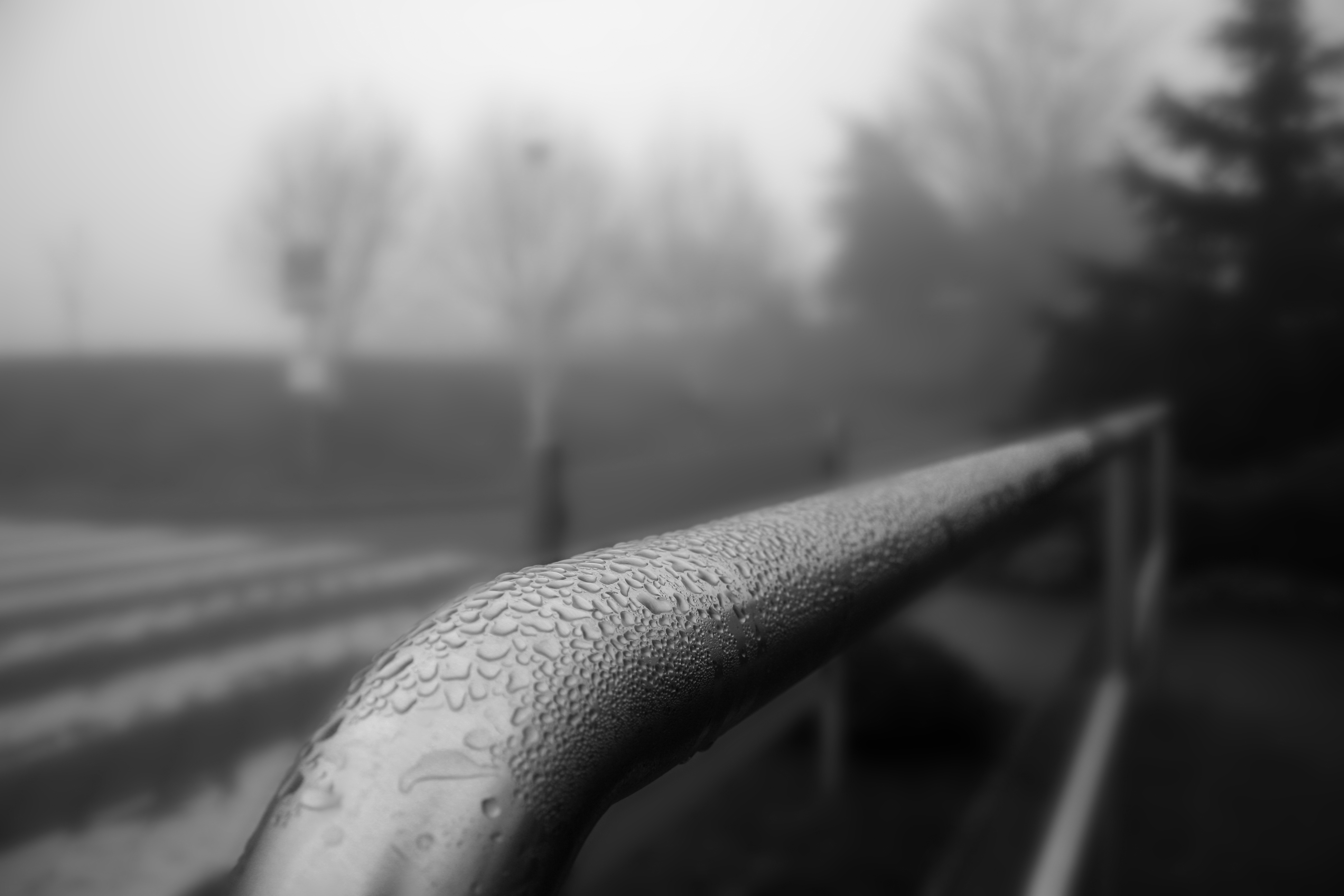
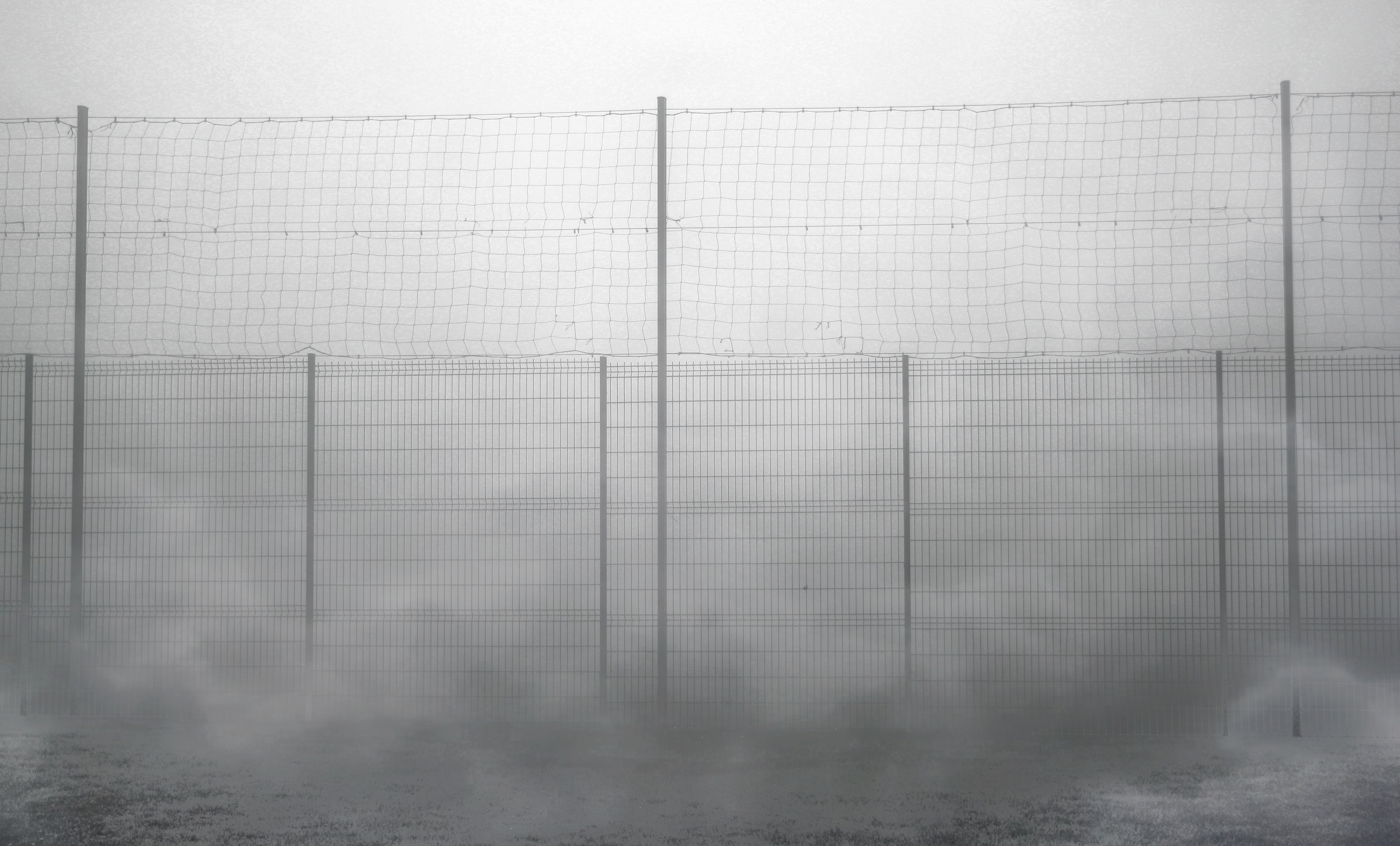
In this shoot I wanted to experiment with abstract shapes around in a very foggy environment. This was a perfect opportunity to explore abstraction because the fog added a very surreal touch to the photographs, giving an enhanced appearance of different shapes in the fog. I enhanced the earyness of the photographs by increasing the contrast and decreasing the brightness a lot. This way, I could make the shadows and outlines of the trees and other objects more bold whilst increasing tones of grey from the fog to compliment each other. I believe this shoot was successful because I felt more able to explore the features of abstraction in photographs using these natural techniques.

Best Photographs:


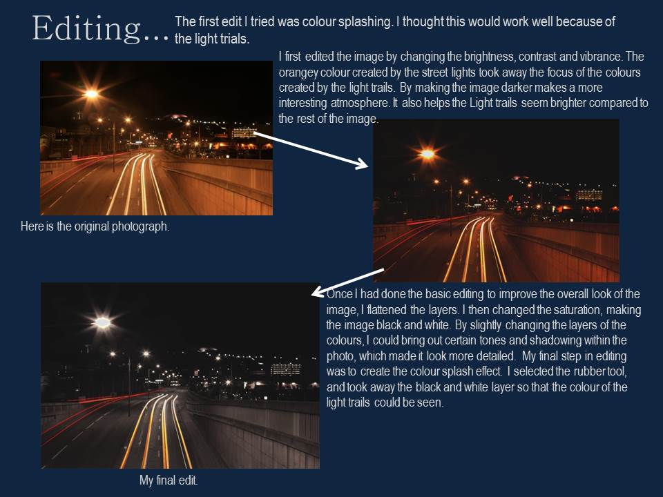
Edits 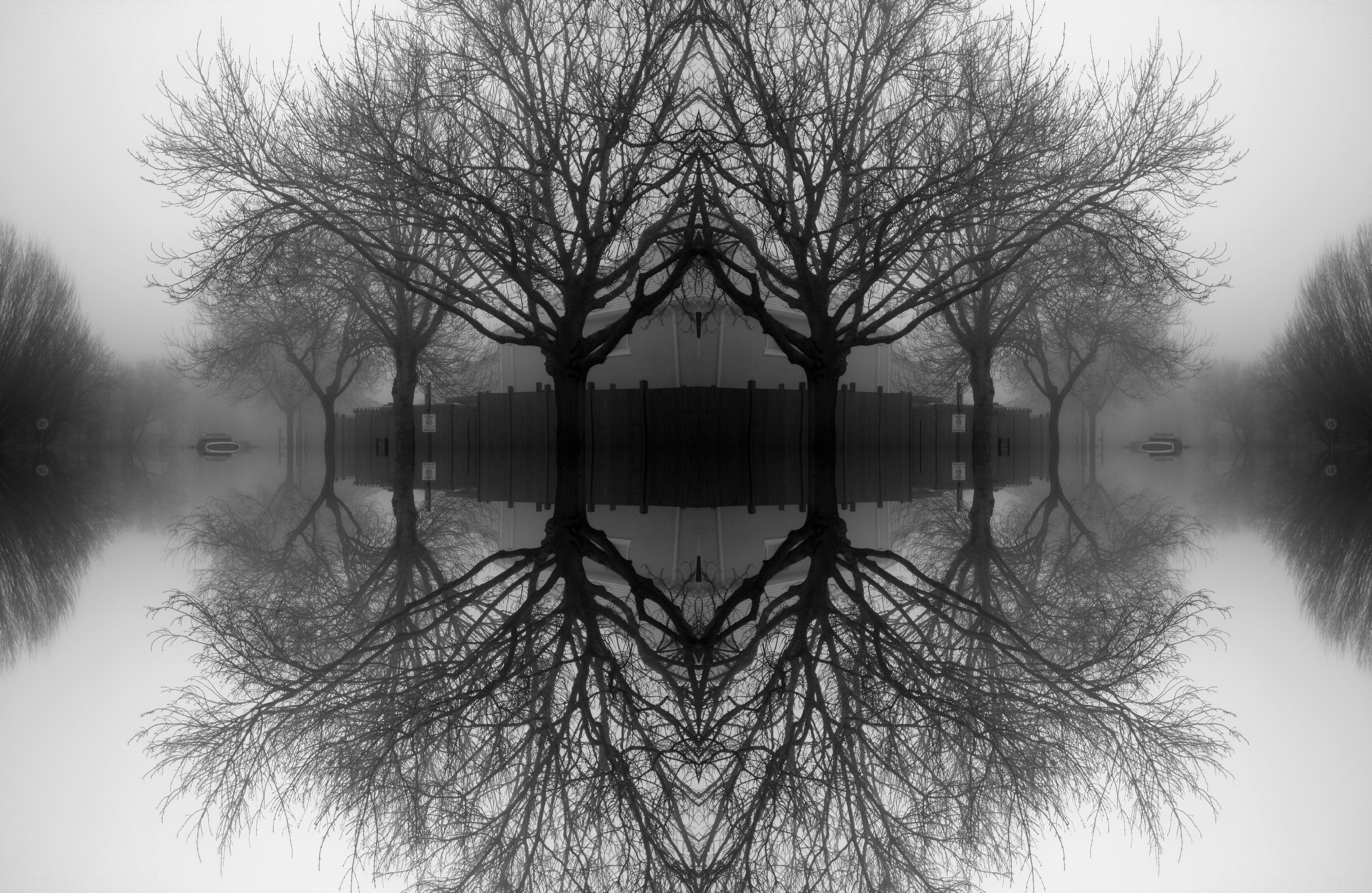

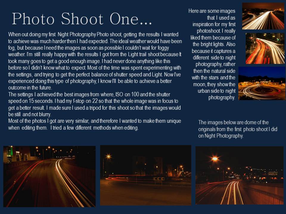
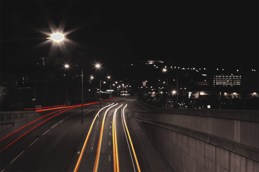
Night Photography-Shoot 1

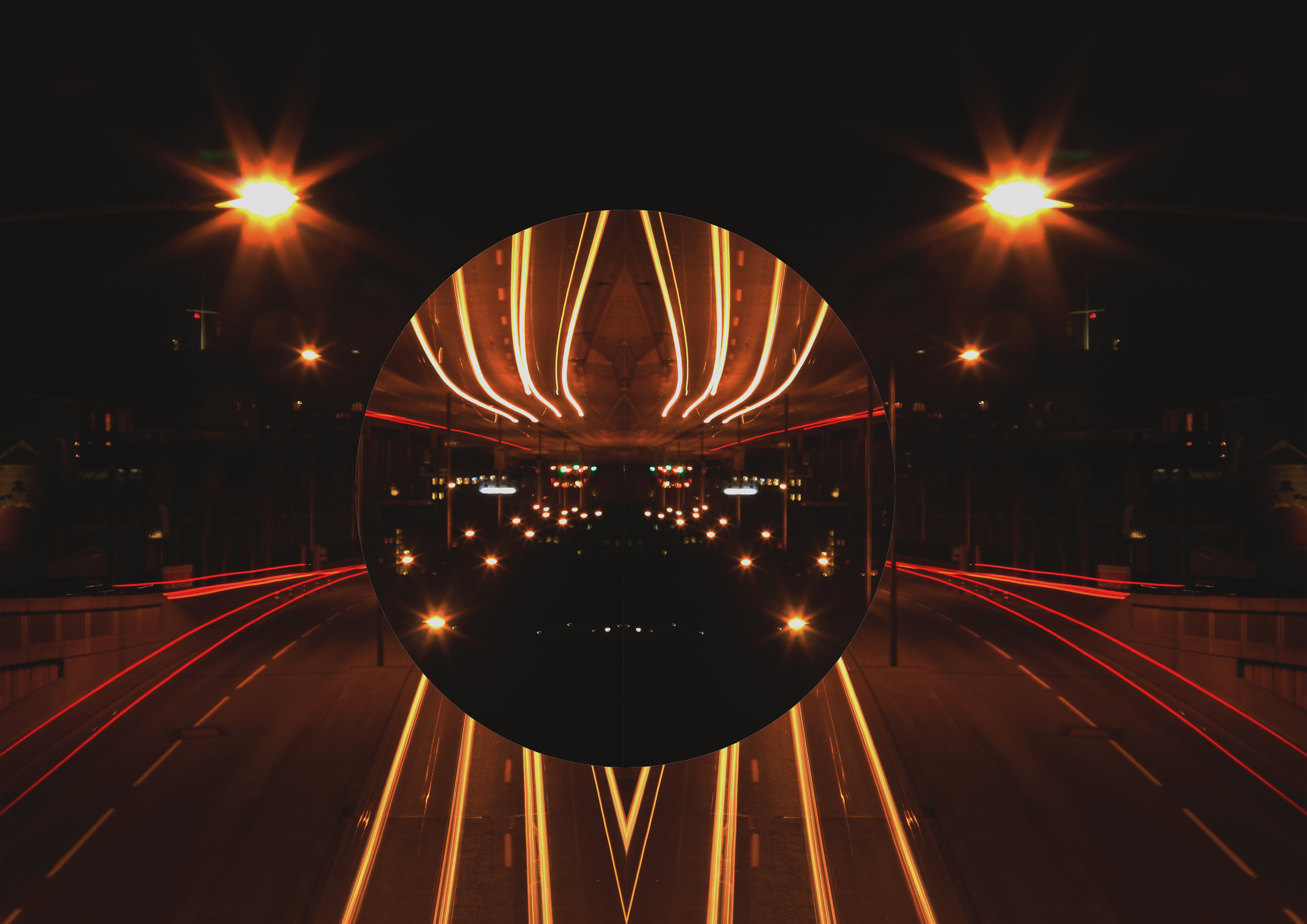
Abstraction in nature images


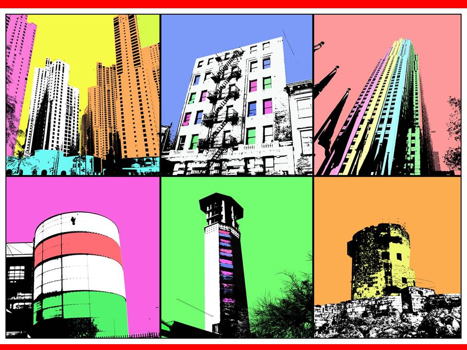
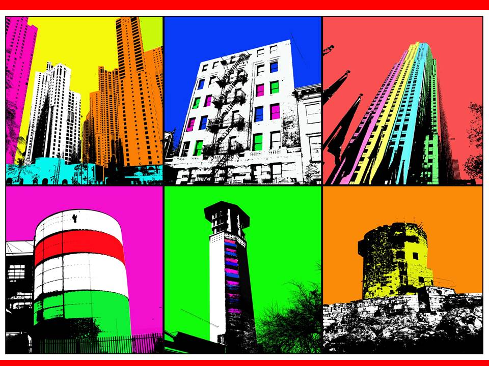
NYC Urban landscape/Topographic/Abstract shoot

When I took this photo I didn’t expect America would in the state it is now. With the corrupt in power America has become a divided nation. I think this represents that. The way the flag has a clear crease through the middle shows a divide representing the divide America is facing at this time. I have also edited the saturation of the picture to make it dimmer this represents the dark times America are going though. I also think the flag in the foreground juxtaposes to the picture in the background. In the background is just a part of the New York City skyline. This includes the World Trade Center, this is where the Twin Towers used to stand. The tragedy that involved those towers was horrific however America was united trying to help one other, although it was this terrible thing America couldn’t have been anymore united. This is a complete contrast to what we see today with the country divided due the President elect and I think the flag represents that.
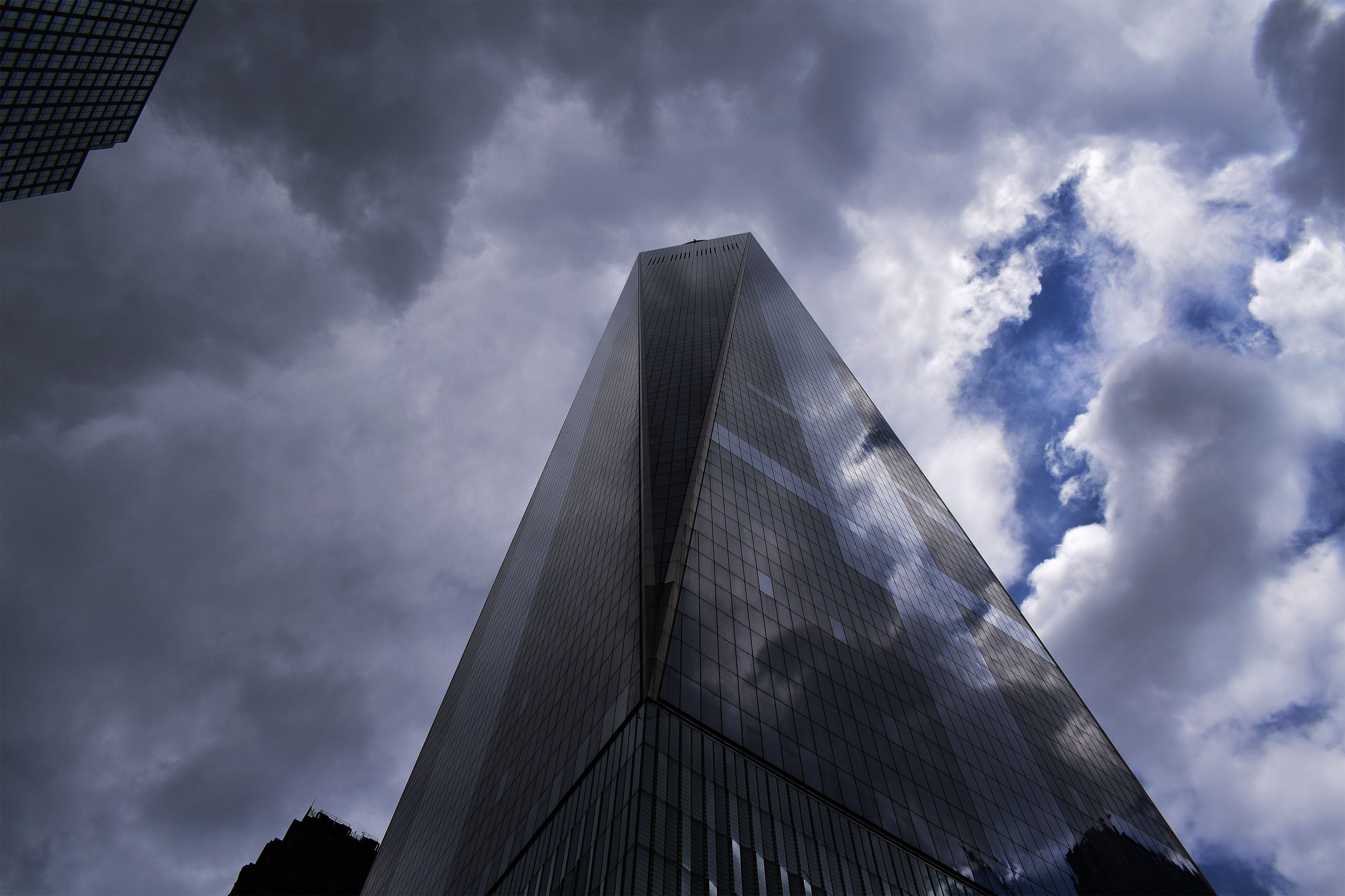
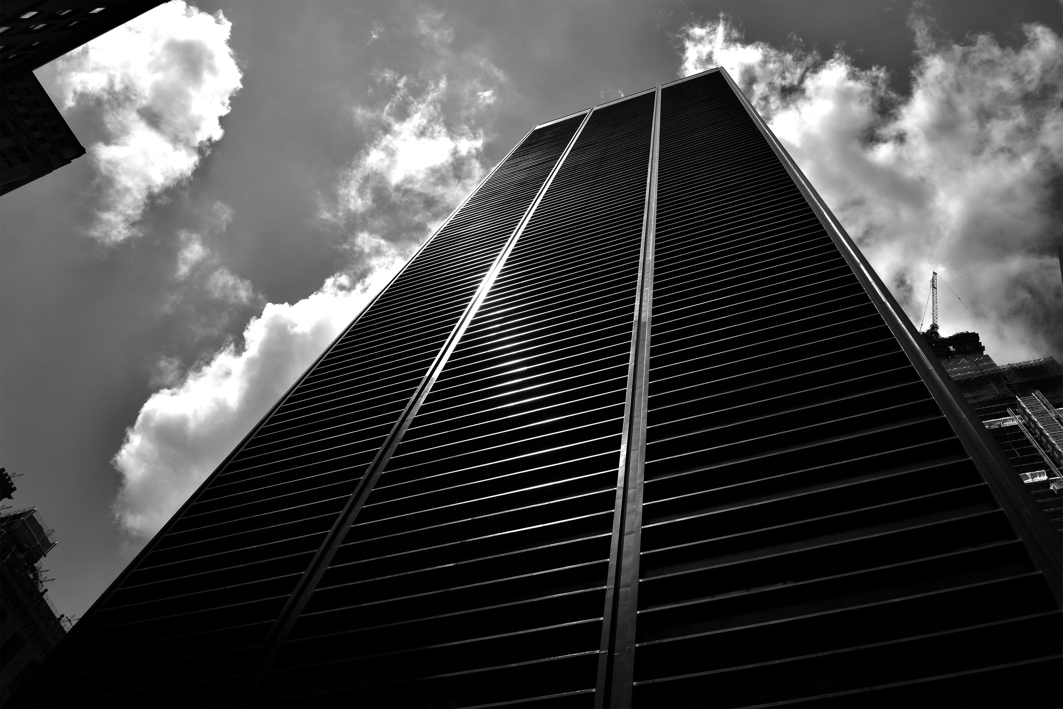
For these two pictures I really wanted to show the towering nature of these buildings and how these buildings almost look like they looking down on you. I also wanted to show some of the beautiful designs of these builds whether is be clear reflective glass reflecting the dramatic clouds or building at the bottom with the perfect straight lines leading to the top of the building.

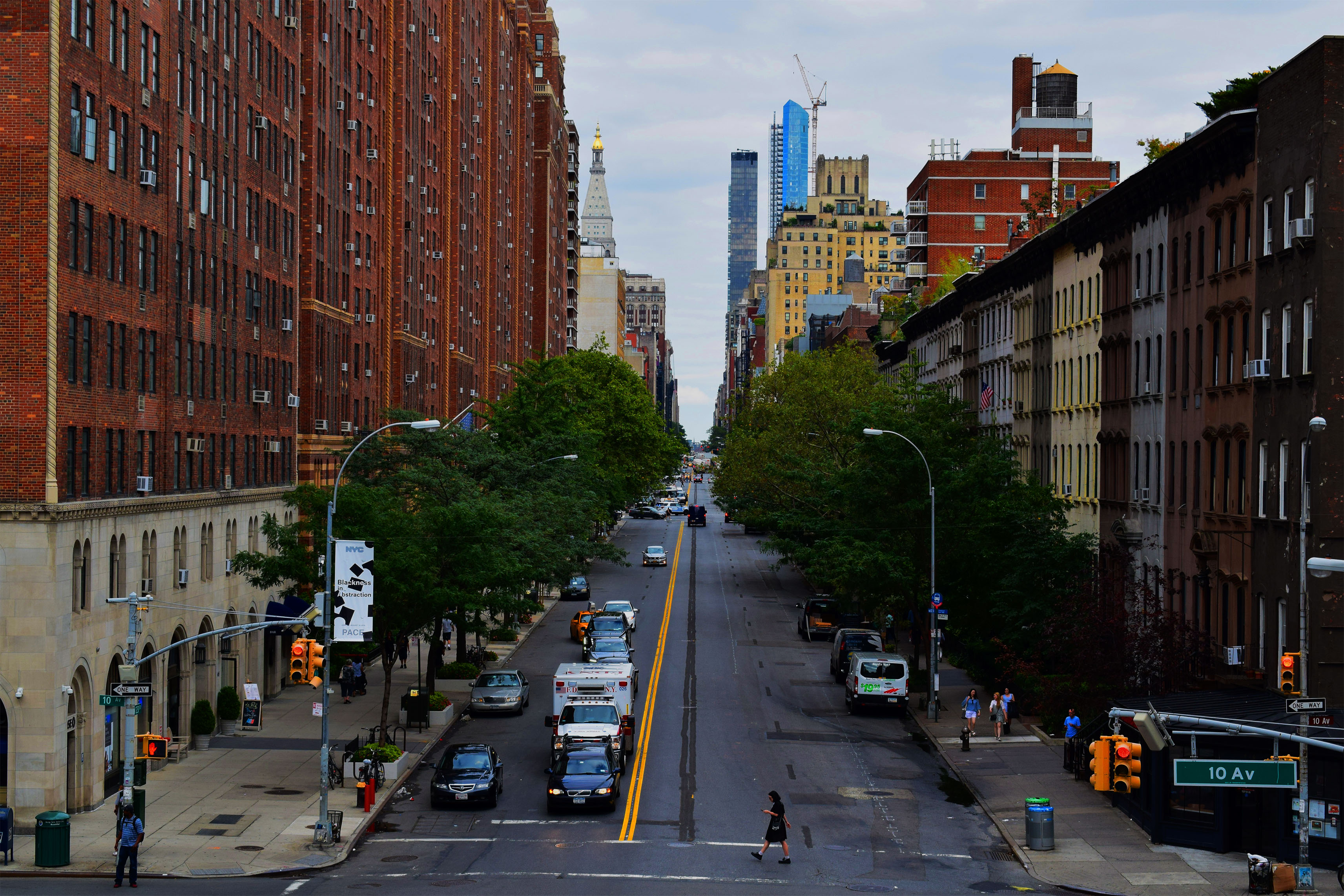
In these pictures I wanted to show the beautiful symmetry of the buildings and streets of the city. In the top picture I wanted to show off the busyness of New York with the traffic moving in the foreground. People move constantly in this city yet these massive buildings stay the same, still, constant, always there for the people to move around. To try and convey this message I even took the picture slightly tilted. The bottom picture I wanted to show the opposite of how this city can also be quite calm and tranquil however still showing symmetry. In this picture there is no sense of rush everyone is calm in the photo even the Ambulance is waiting in traffic. The beauty is also shown with the green trees leading down the street as well as the road lines leading down the street.

In this photo I wanted to show a version of my topographies. In this picture I liked the color of poster against the dull grimy wall.

In this photo I wanted to show the vast landscape of the city showing that it goes on for miles. I chose to put in Black and White as it clearly shows these defined buildings going on for miles and miles.
Formalism

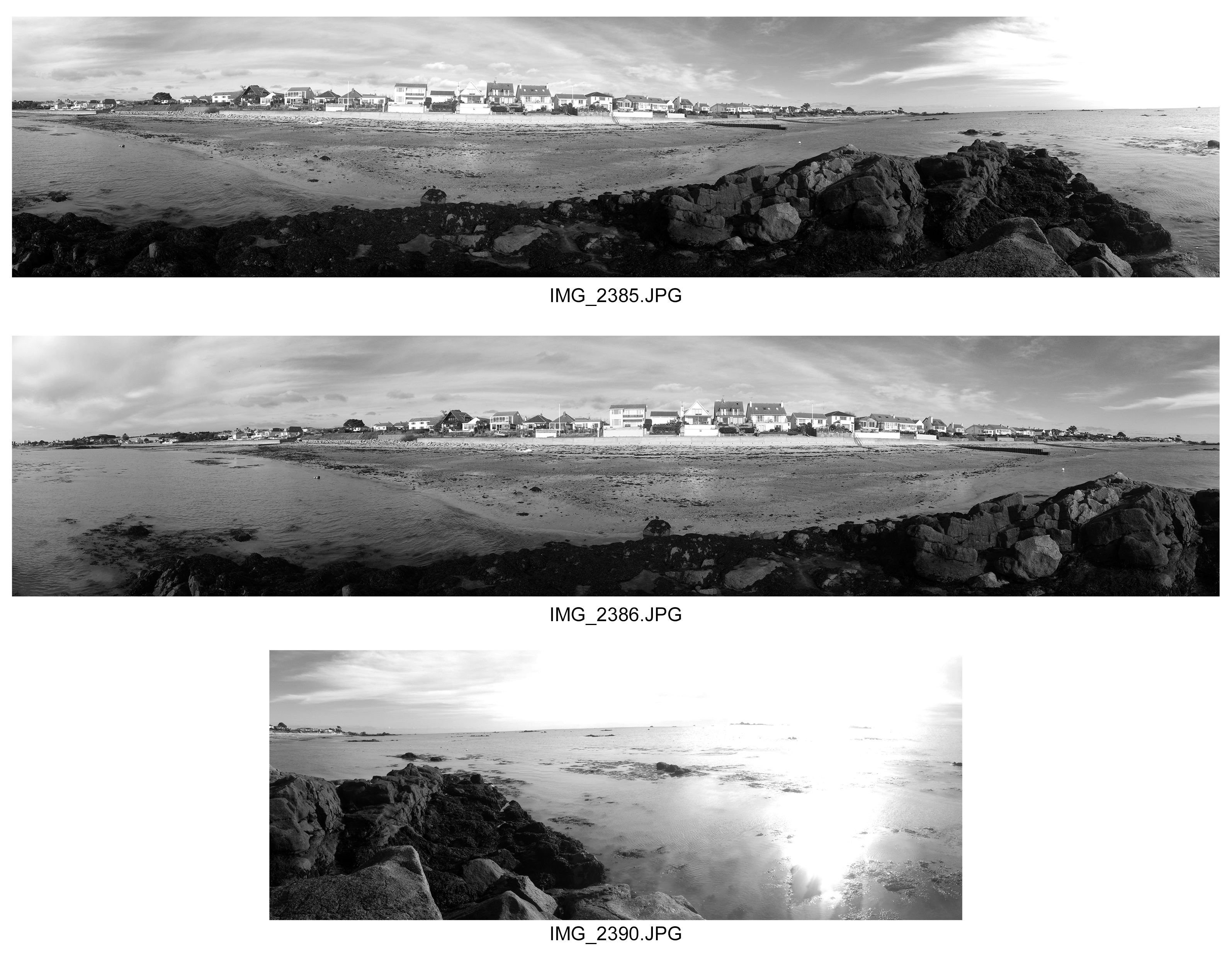
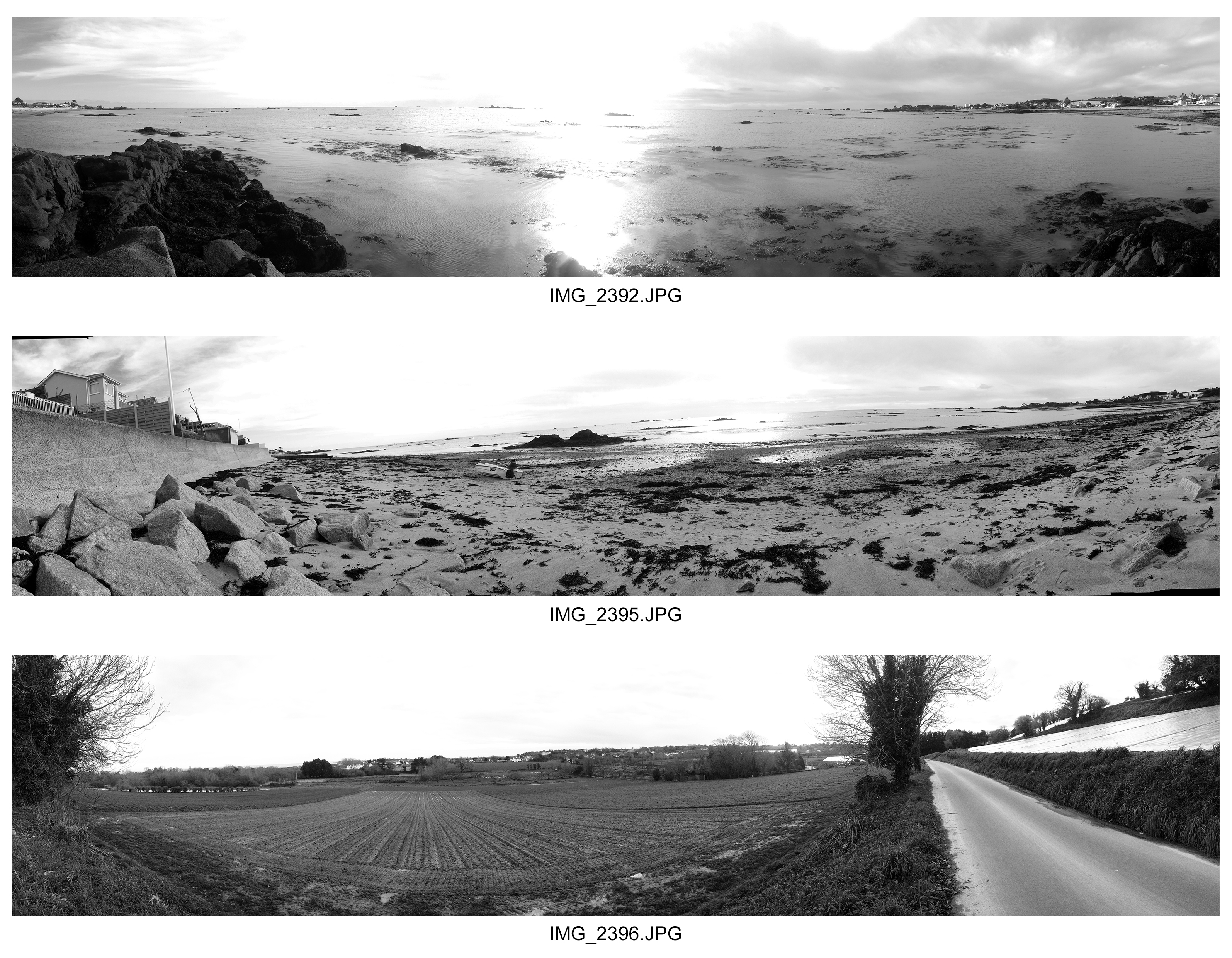
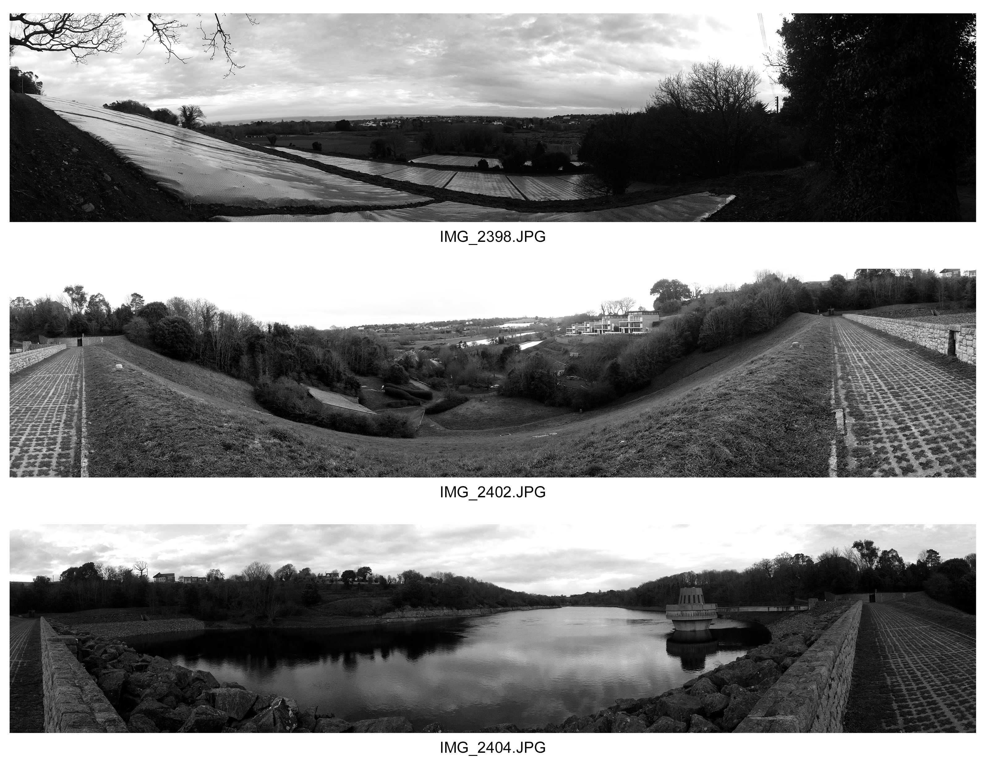
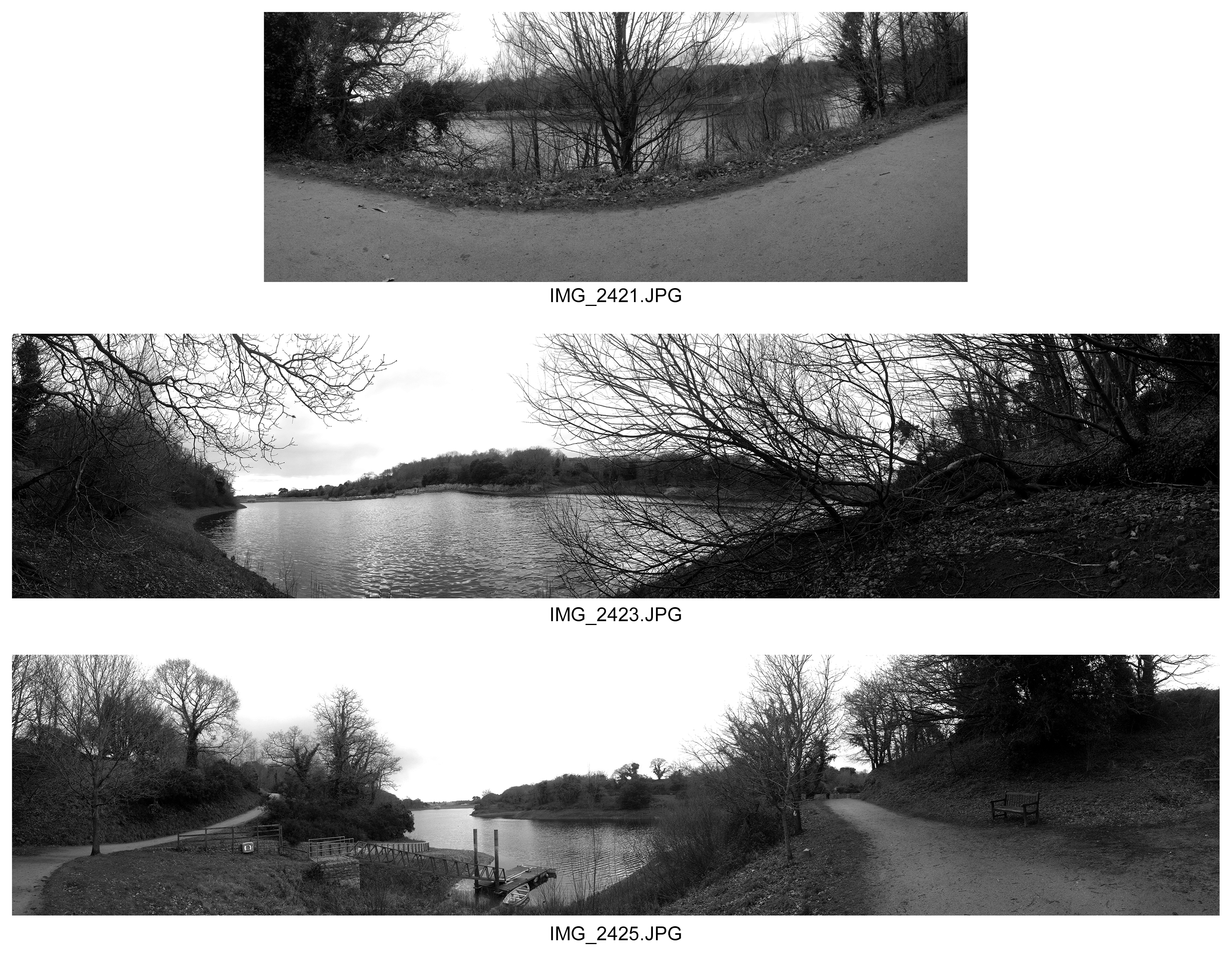
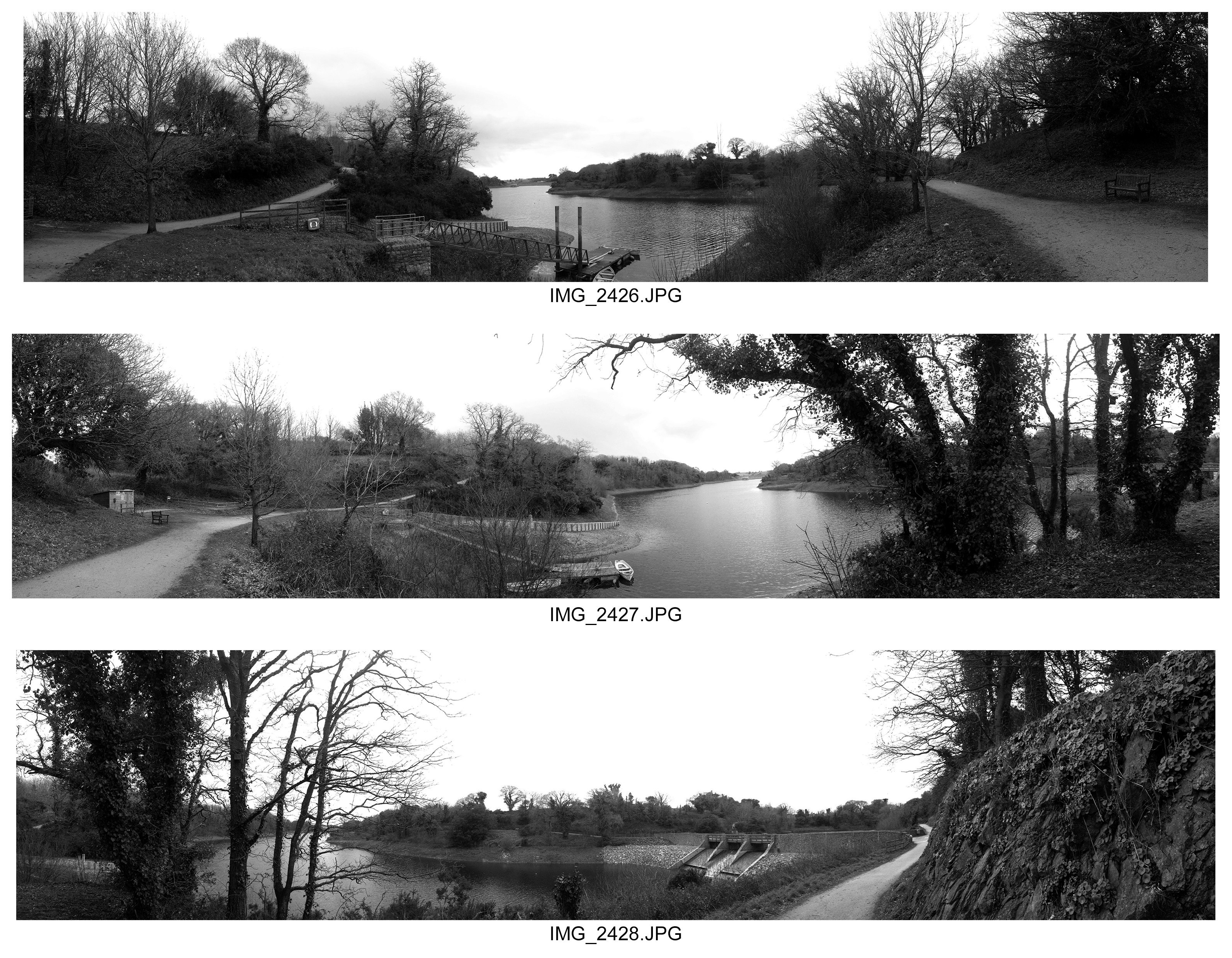
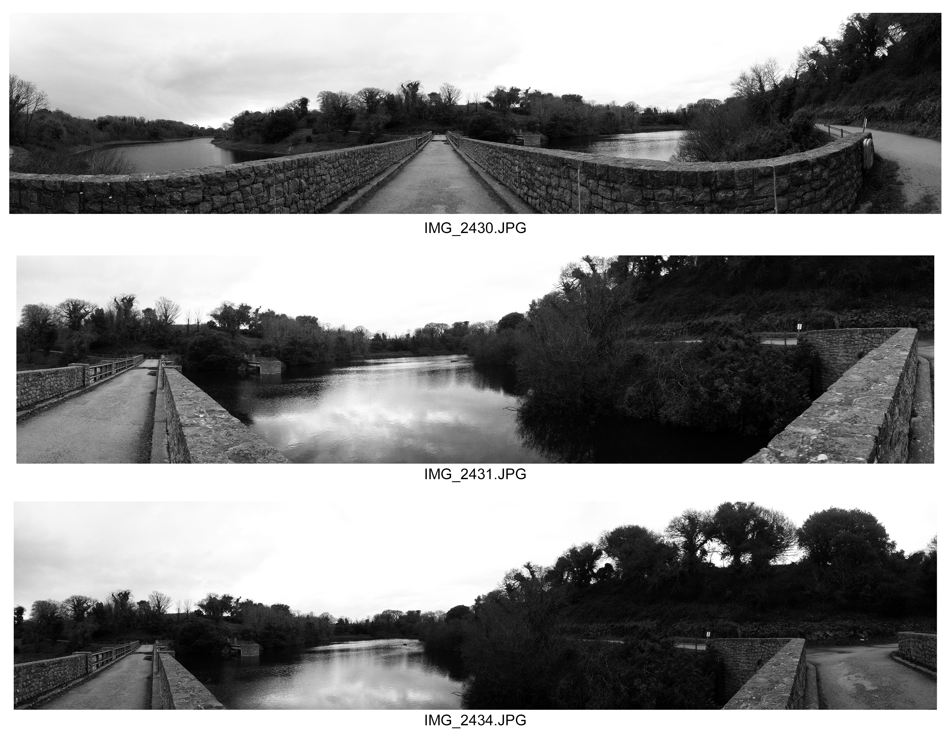
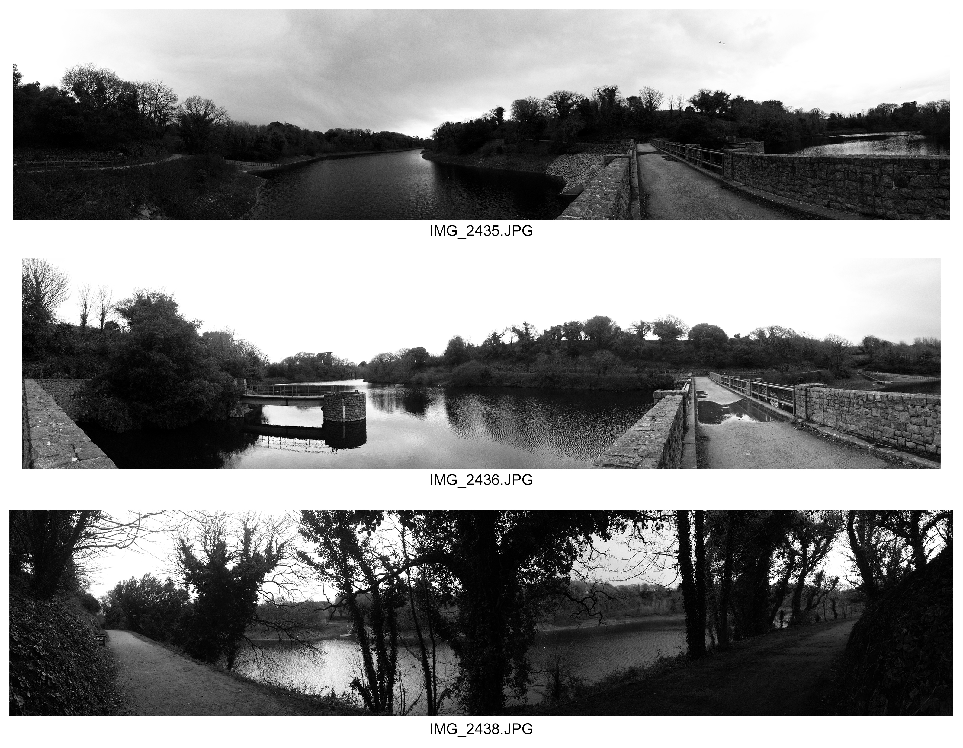
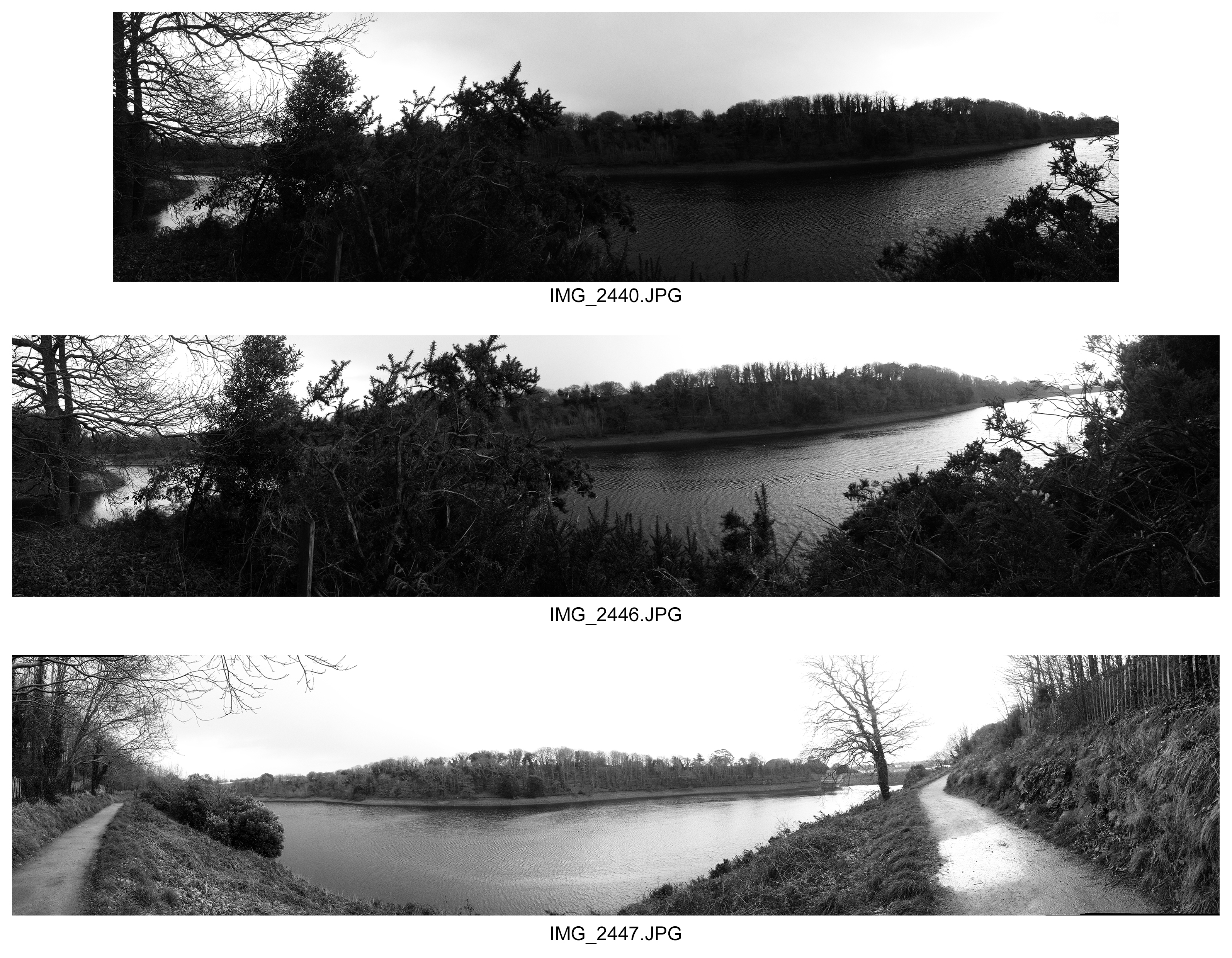
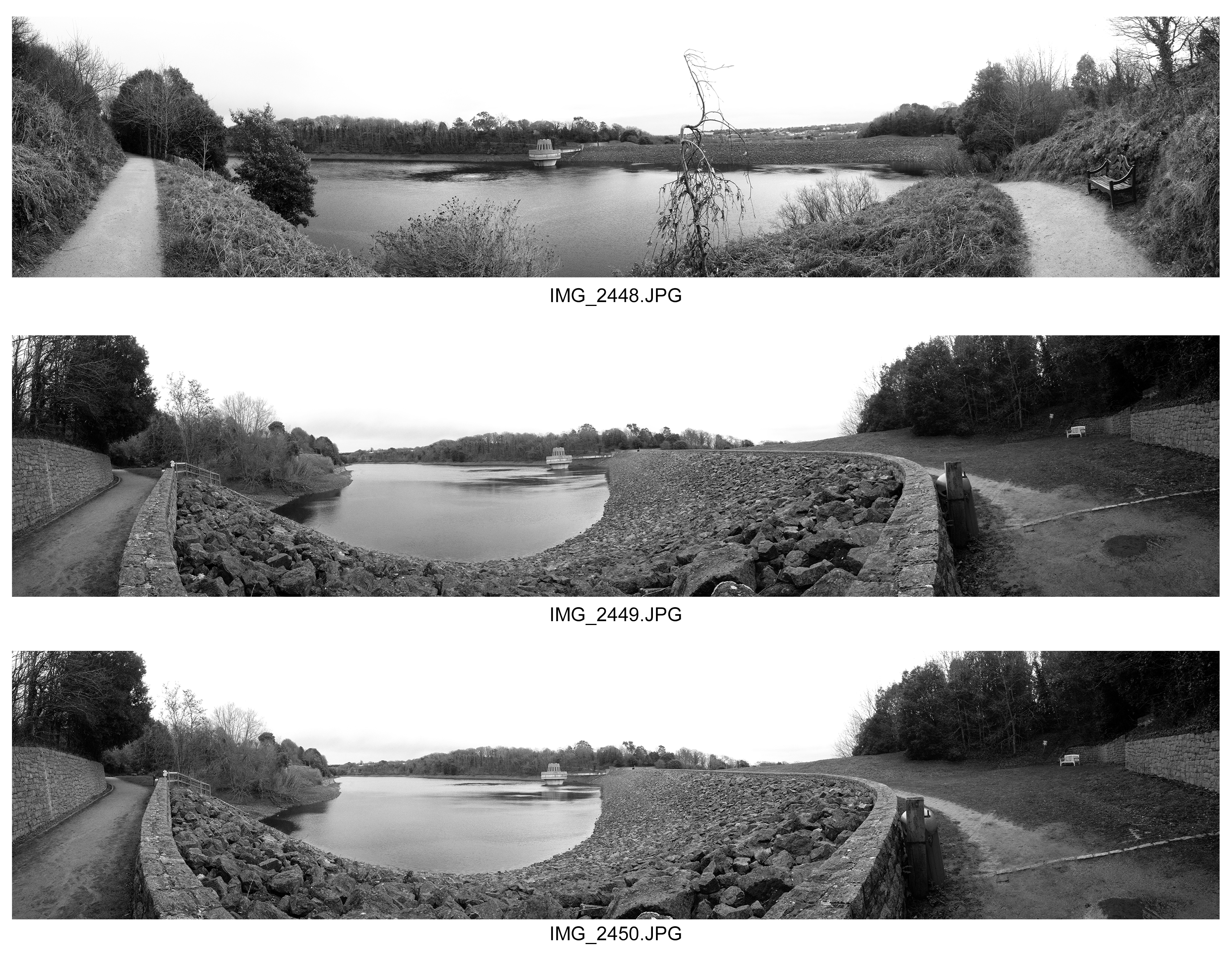
Abstract Panoramics
Here I took a panoramic shoot that I wanted this time to focus on how the landscape of the Earth is perceived as abstract through its shapes of rocks, trees, and various other objects. I believe I have captured the landscape as abstract also because almost in many cases the scenery seems like an illusion in the sense the surrounding edges of a photograph appear as part of looking forward in the photograph despite being at an angle when I took the photographs. This is abstract because it displays the landscape as well as the objects in the land being abstract. In my photographs I have portrayed this as the land being free to develop and move how it wants, but I have contrasted this with man made features being abstract. This split differences allows us to compare natural and man made features of abstraction in the landscape. I enhanced the contrast to help us distinguish the brighter and darker elements and to help separate certain features of the landscape to the others around it. Though this sense of abstract patterns in the way the Earth is developed and of how for example 2 juxtaposing pathways that are opposite, the fact they appear as part of 2 parallel paths diverging off into their own way and the fact the lake appears very much part of a loop rather than a lake with boundaries appears very surreal. This is because it creates a slight element of surprise and abnormality that is unseen before in the natural eye. I did this to link back further with this idea of how the land is free to create it’s own textures and patterns.

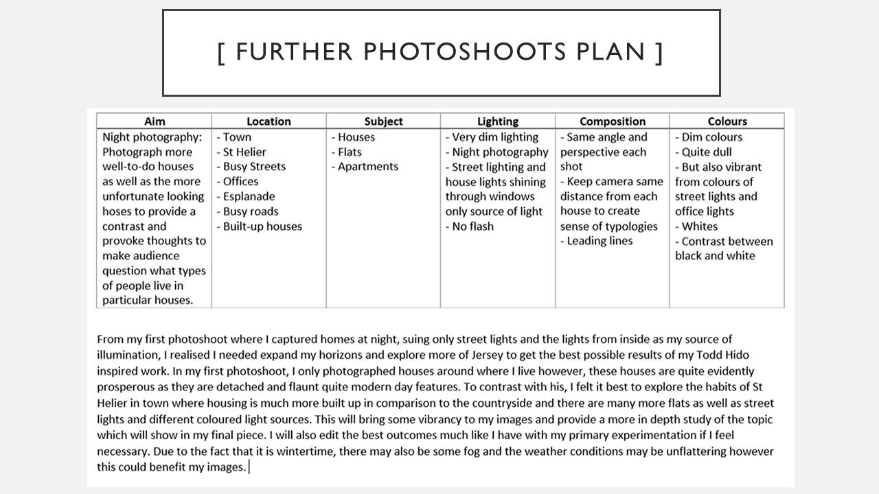
Photoshoot 2 Plan // Night Photography // Final Piece
