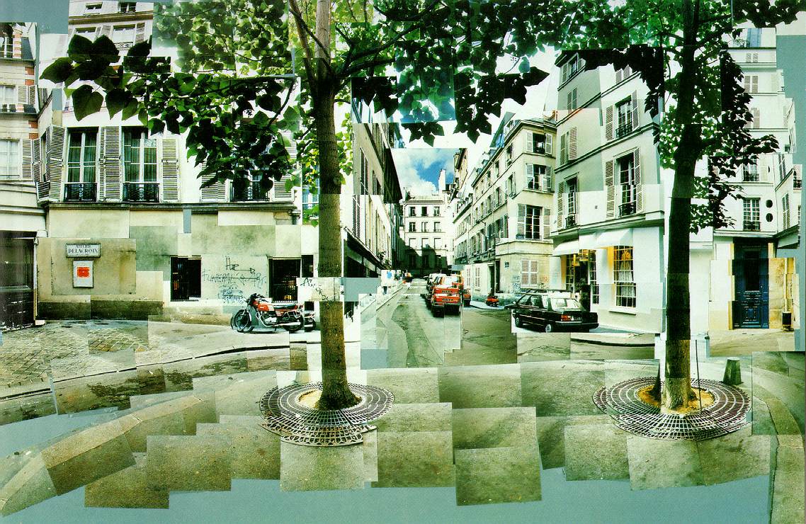
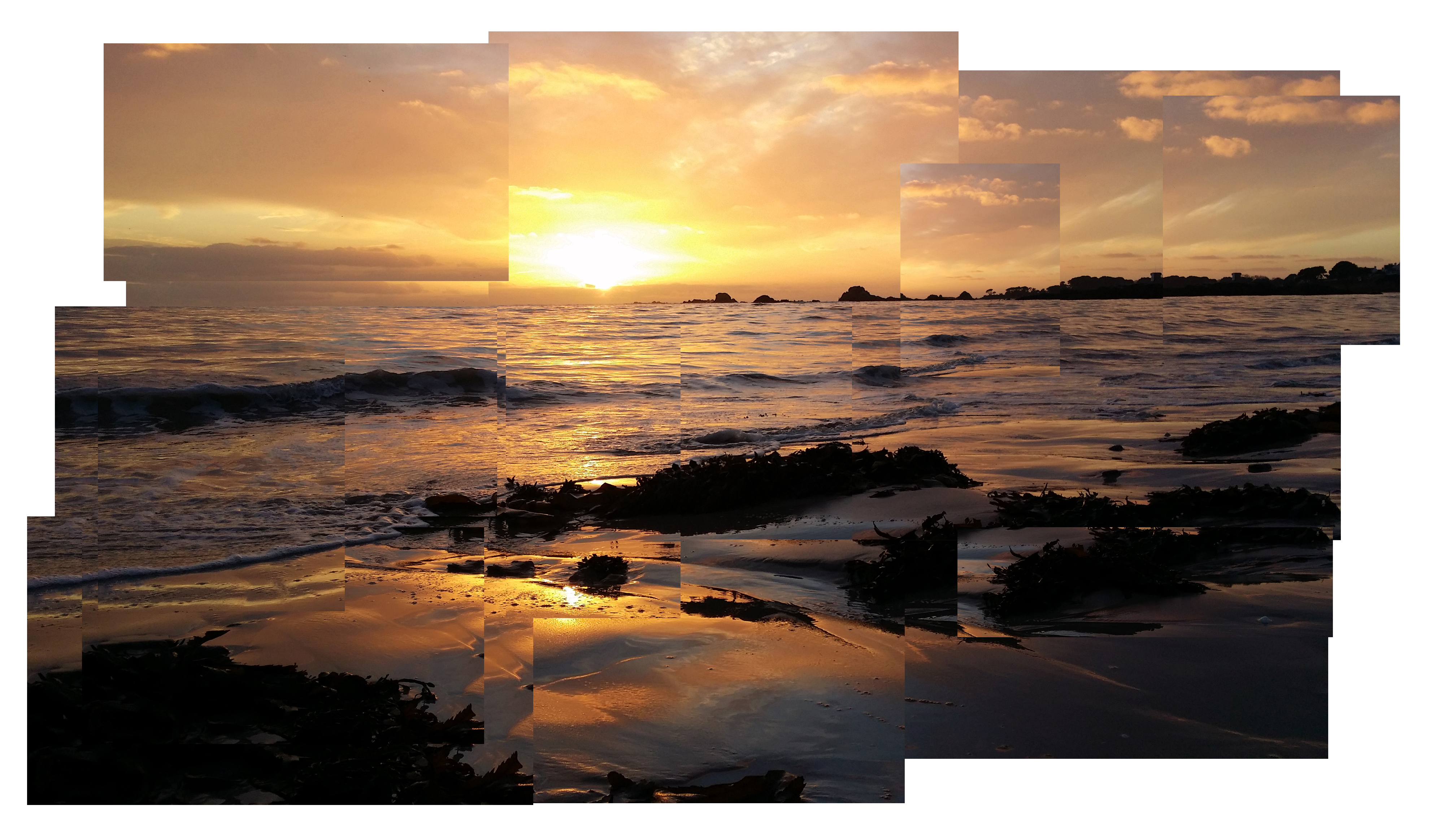
I was heavily inspired by David Hockney’s Joiner works and I wanted to produce my own responses.

I love this photograph because to me personally you strongly get a sense that it is collage-like. I especially like how different layers have been adjusted through size, settings and position. This way, with a number of these different layers you can create a puzzle that comes systematically together as one photograph. David Hockney’s view of his joiners being a narrative is as if the viewer was moving around in the location. This is linked to my panorama work as it too holds a very similar principle. However with this, I felt inspired by it as the range of misfitting layers and other components coming together, to me shows of how whatever the camera is photographing isn’t perfect but with this it causes beauty and interesting aspects.
For this set of experimentation I simply copied the same photograph 12 times. I then deselected the eye icon to look at the current layer. Then I selected area and clicked on select, then inverse and then deleted the remaining elements of the photograph leaving my selected area. I then repeated the procedure for the next one leaving out a certain desired area singled out. After carrying this procedure on for another 10 times. From this, with all the eyes selected, I adjusted the position and size of each selected are from each layer giving a basis for the finished design. Then I flattened the image and slightly changed a few dimensions. Finally I opened the photograph onto a new layer with the same dimensions and cropped to my liking.
I chose to develop David Hockney’s own style and apply it to my work because I believe that his work is particularly focused on Abstract work with developing a strong sense of surrealism. For example the photographs appears quite abstract themselves in the sense that the bright, and dramatic tones of light and shadow alongside the striking contrasts appear slightly exaggerated and unreal. Interestingly the Collage style Joiner edits enhance this abstraction as various layers imposed on top of each other creating interesting shapes that individually don’t work together, but on viewing the whole photograph, these various layers of various sizes and shapes appear very abstract. This very surreal in the sense that unexpected juxtapositions are included consistently. This links to my theme well because it shows that, tiny details which may not fit together, once you step back and admire the creation even if every minor detail isn’t perfectly aligned is beautiful in it’s own way.
Response 1
Response 2
Response 3


