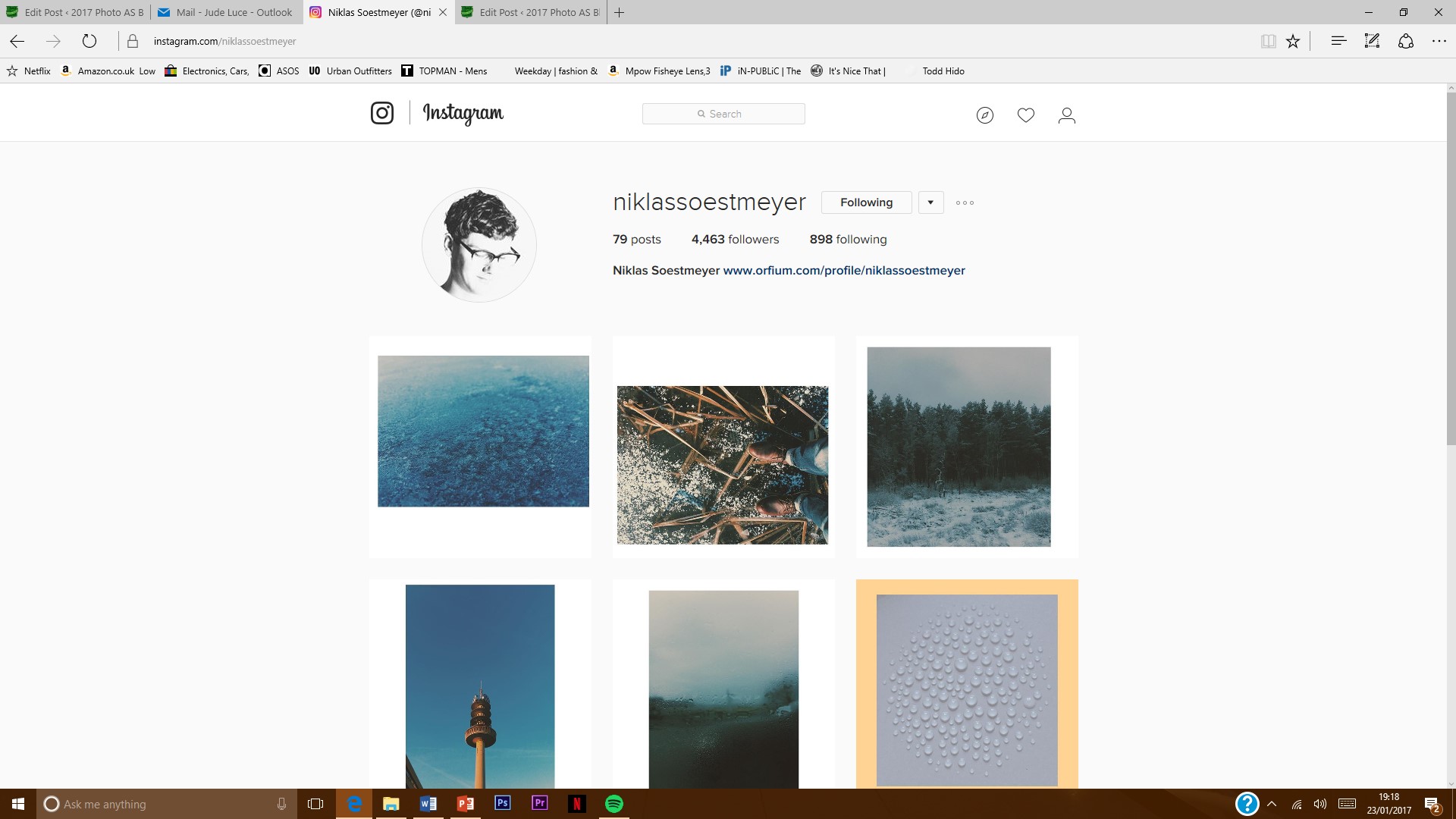
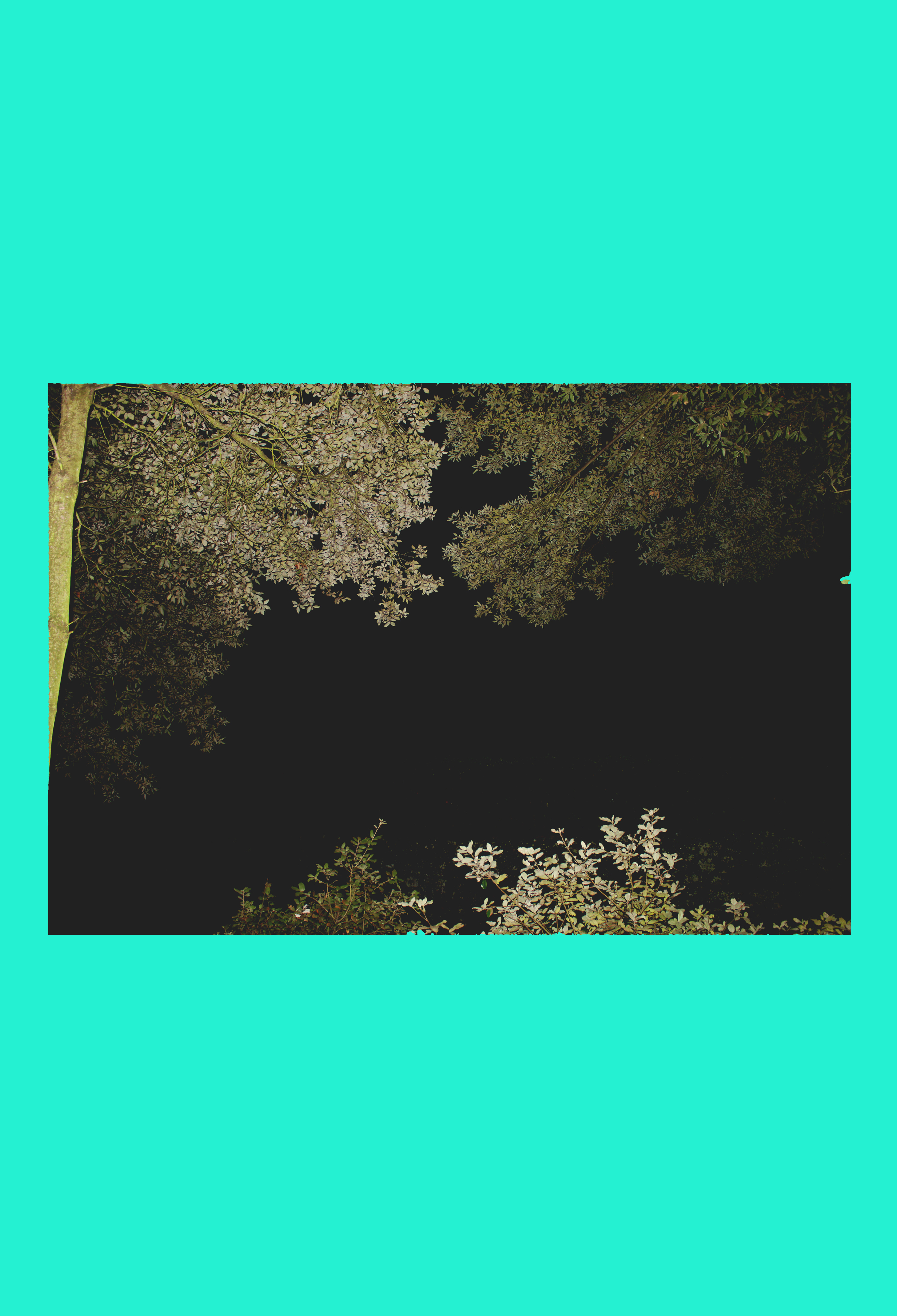
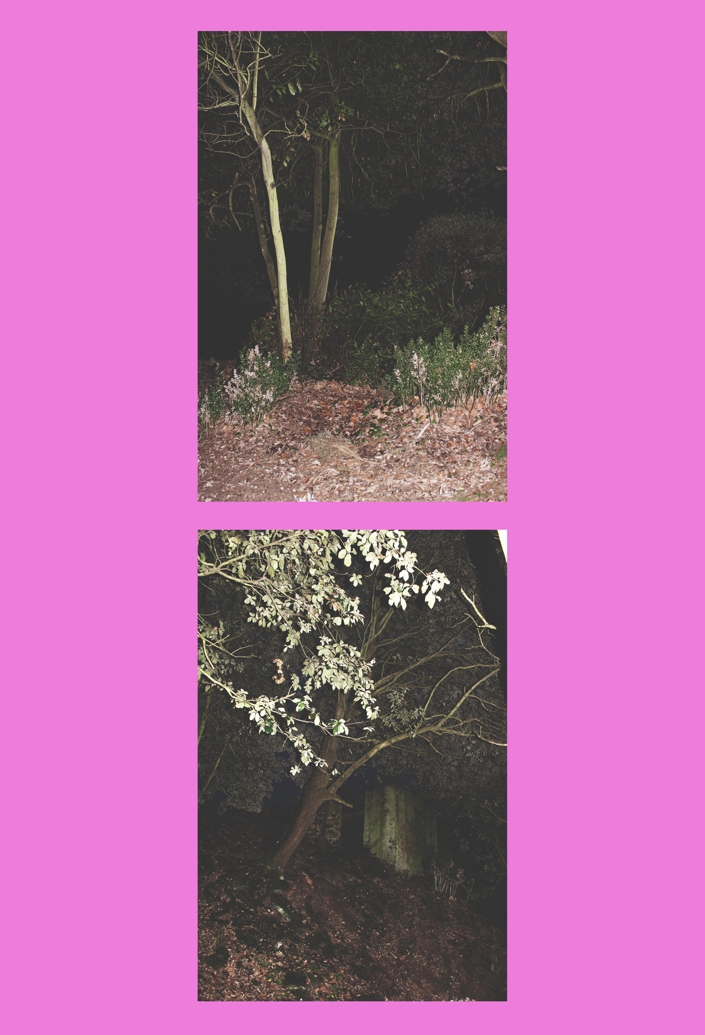
 When I discovered Niklassoestmeyer on Instagram, I followed him immediately because I was instantly attracted to the bright colours he uses as background. I jus thought it was so simple and minimalistic yet effective. As well as this, the images he uses are mostly landscapes photos which are really aesthetically pleasing and have quite a vintage look to them which I really like and they are paired with the background colour very carefully as he picks out the tonal theme that is in the photo then creates a colour based on this.
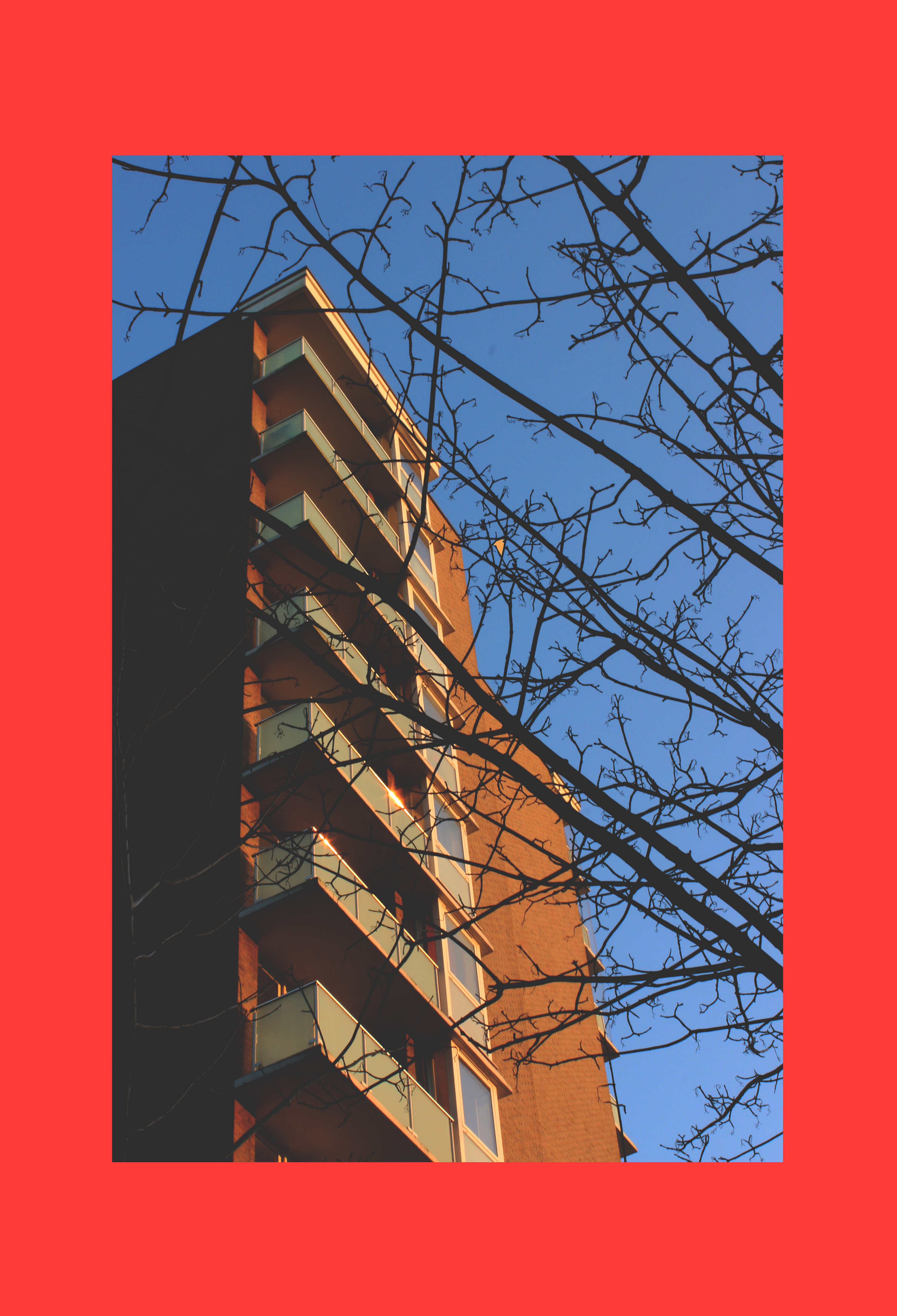
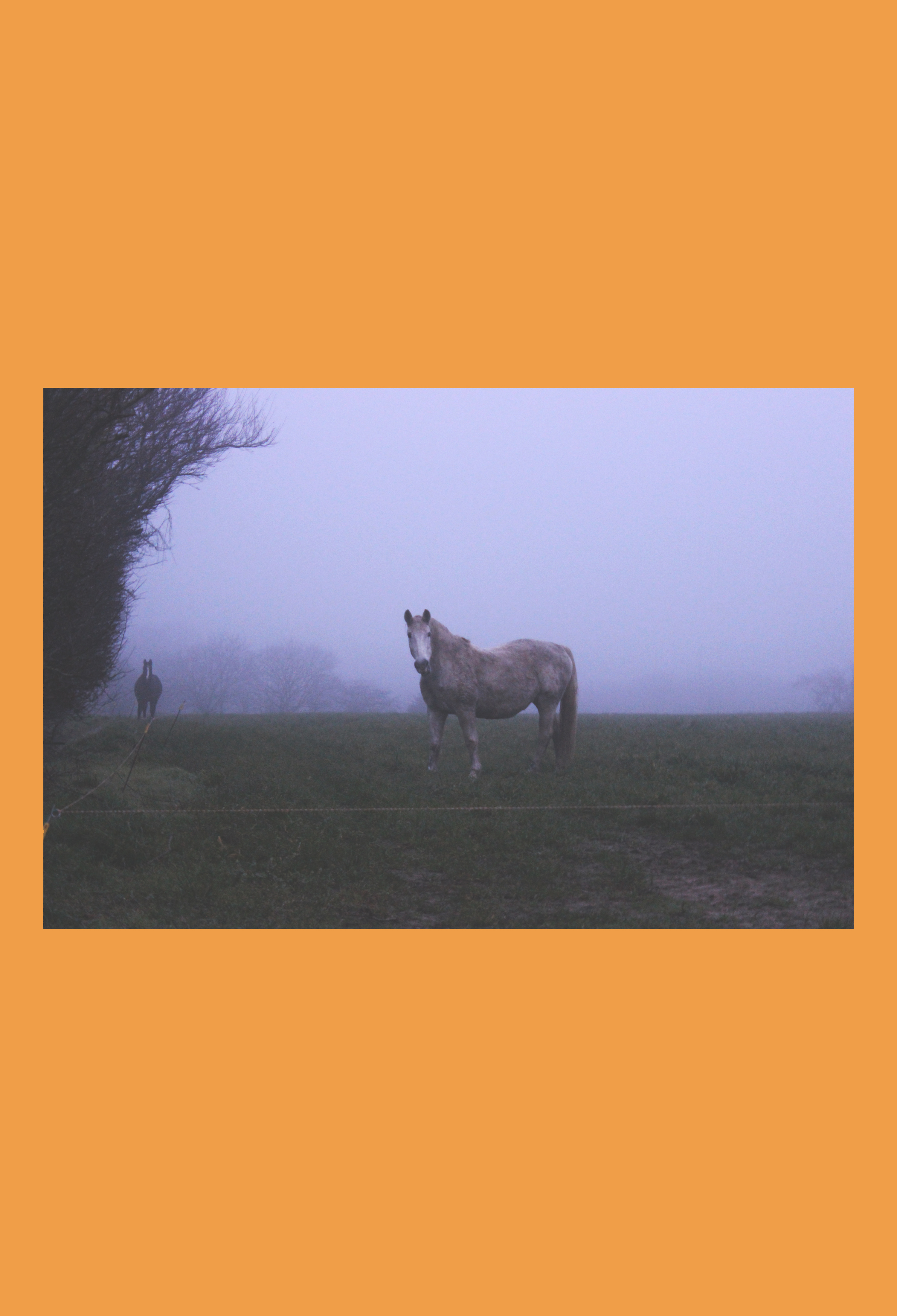
However, when producing my own interpretation of his work I would only concentrate on the coloured background aspect as I had my own images already which I had edited in the style of Niklassoestmeyer, before I had come across his work. I noticed that he mostly used bright colours as opposed to pastels to provide a strong background for his photo to stand out against. I chose my favourite images from all of my edits from my landscape shoots and implemented them to fit onto the fun colour blocks.
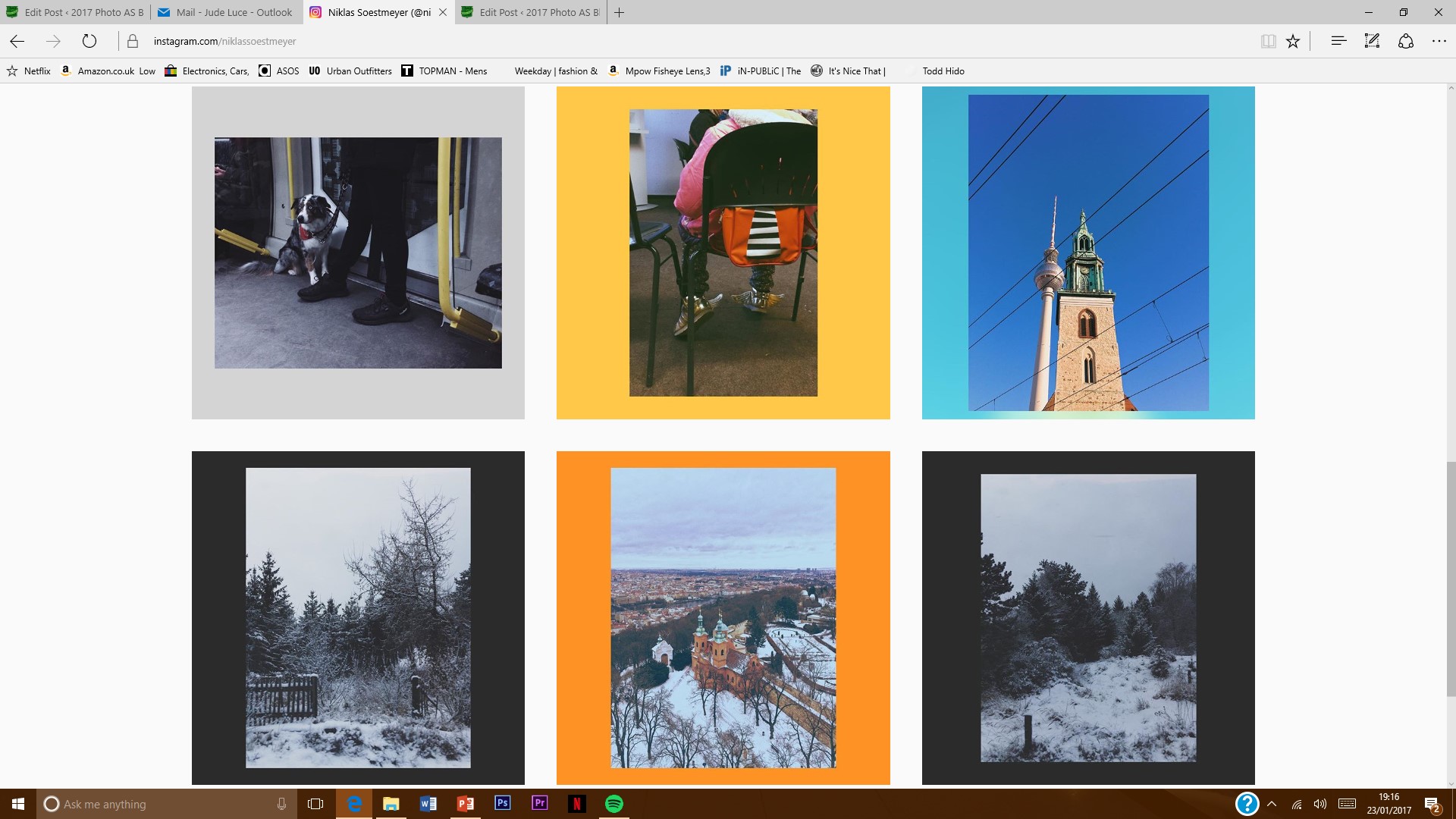
// Image Analysis // 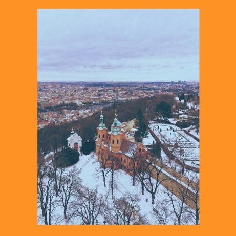 I have picked out this image of Niklassoestmeyer’s to discuss because it is my favourite of his.
Like I talked about earlier on, he uses a colour for the background to match the theme in the actual image. As you can see, he has used a bright and bold orange in this example and in the photo, the most obvious colour that stands out most is the orange, browny of the old church. As well as this, he has edited the image so that the roofs of the houses in the distant are a noticeable brown colour as well. Overall, the image as a very vintage vibe which I really like. It seems he has chosen to use the bold colour of the orange against the image which possesses a faded texture and effect to allow it to stand out.
The angle at which the photo was taken is from a height – not quite birds eye but t isn’t ground level which I really like as it gives us a clear view of the surroundings and we cans can our eyes around the landscape. You can also see the horizon which I think is really effective as creates an effect as if the housing estates are never ending.
I believe the faded effect/texture look very well matched wit the snow that is in the photo. I really like the contrast between the bold orange that stand in the middle and the white snow that’s surrounds it.
I think that if the photographer had photographed it from ground level, the photo may have seemed quite bare and empty because of the naked tree braches but due to the fact he ahs captured it from a height, the clogged up houses that occupy the background fill out the photo as a whole and give the audience something extra to look at.
The fact that Niklassoestmeyer has mounted the image onto this colourful background makes it mote interesting to look at because if it was on its own, it may have not had a second look at by the viewer because of the very pale tones to it but the bold orange make sit more attractive and eye-catching.
