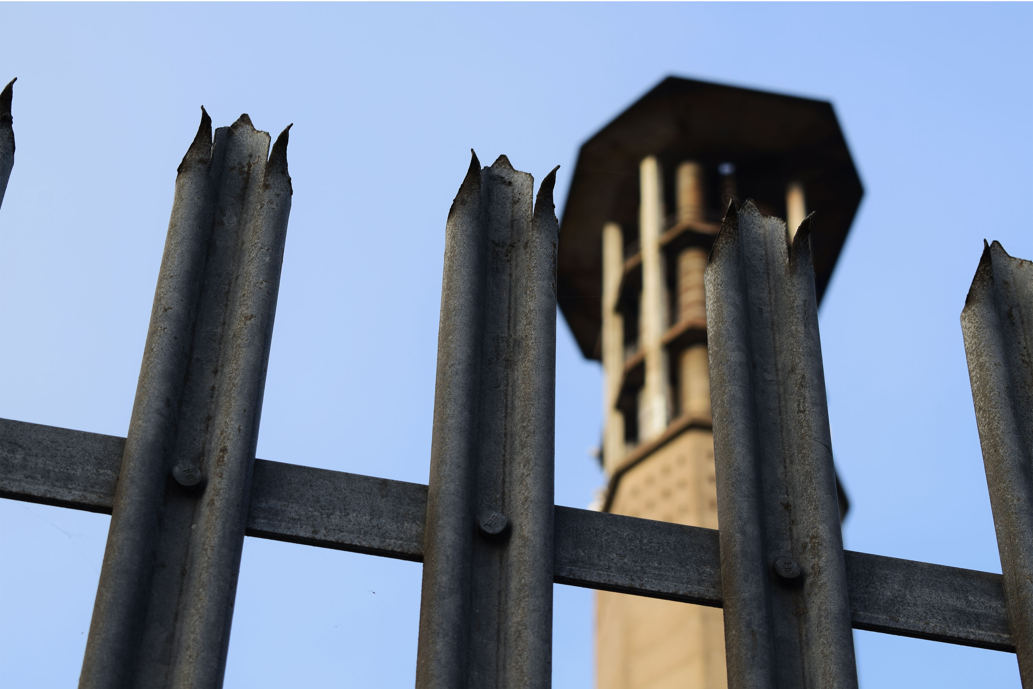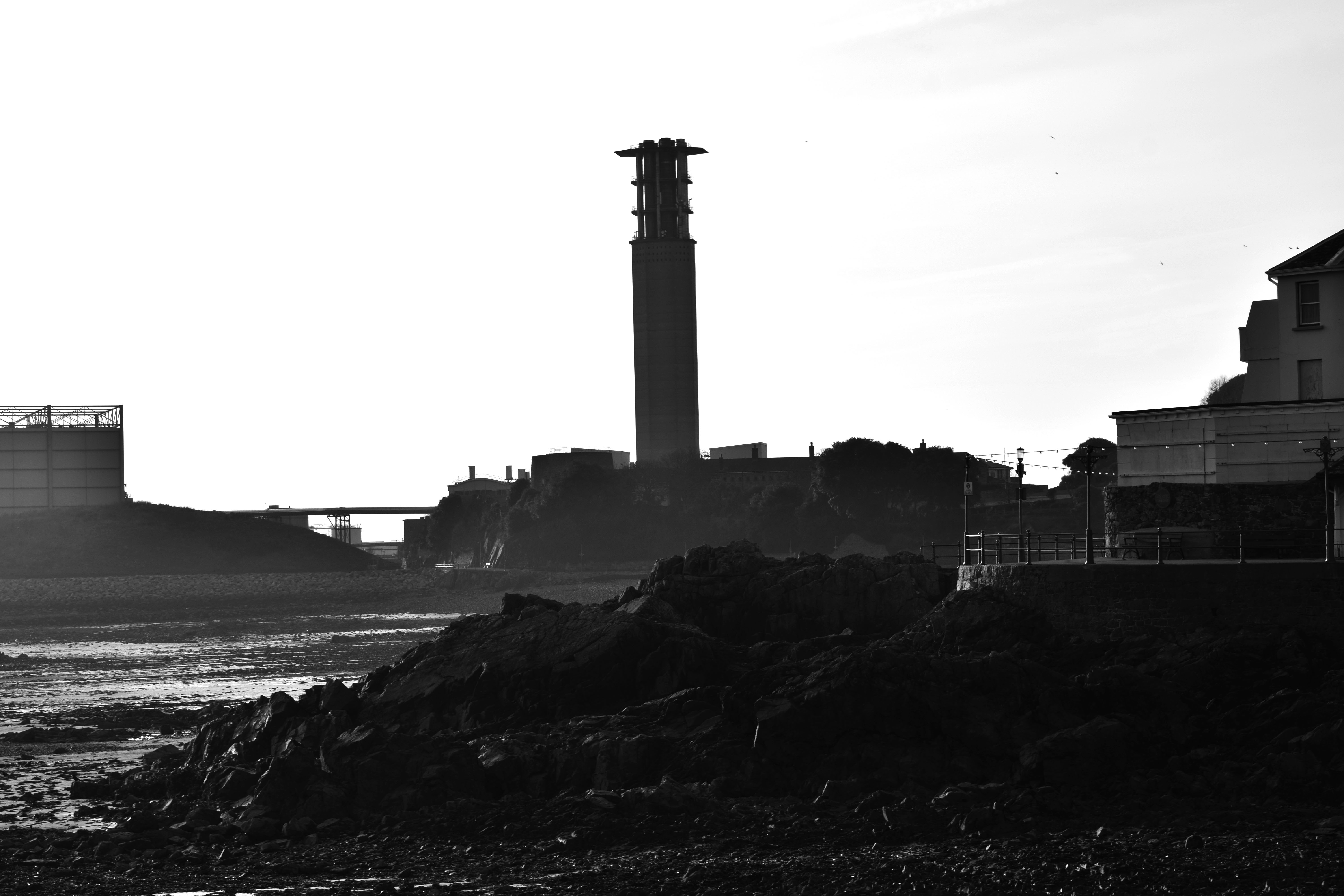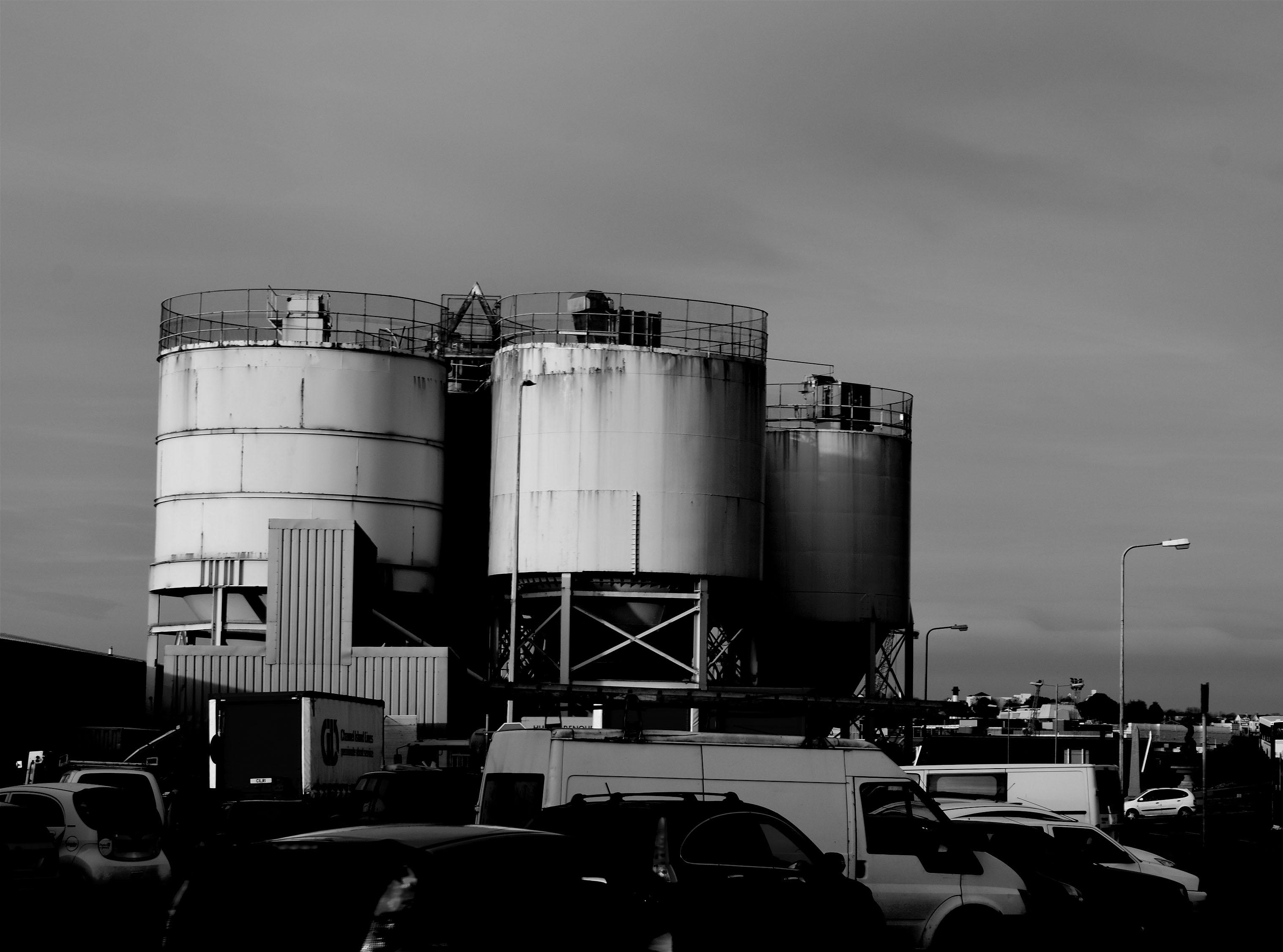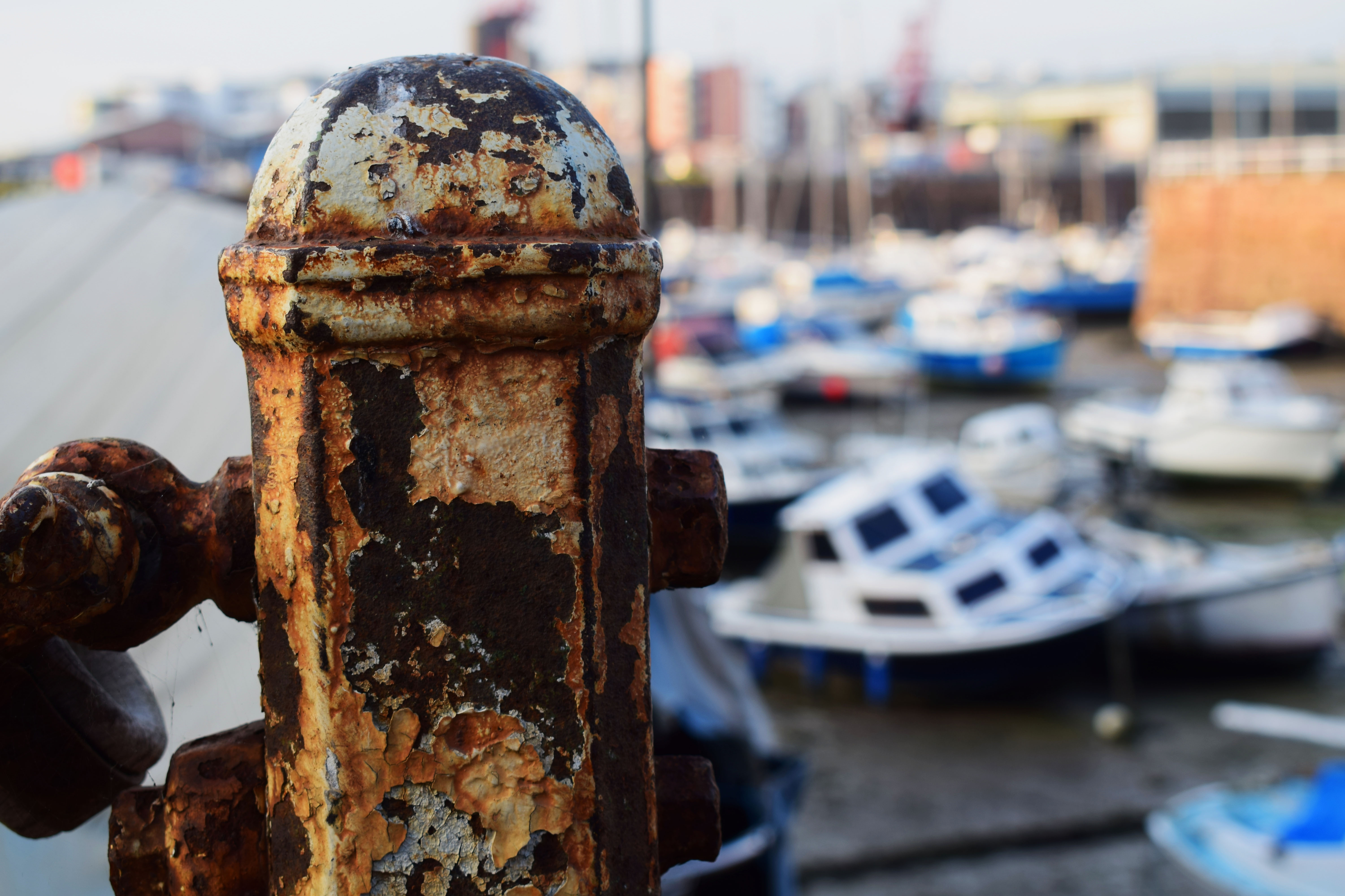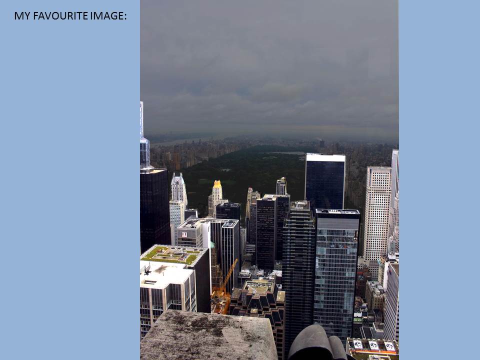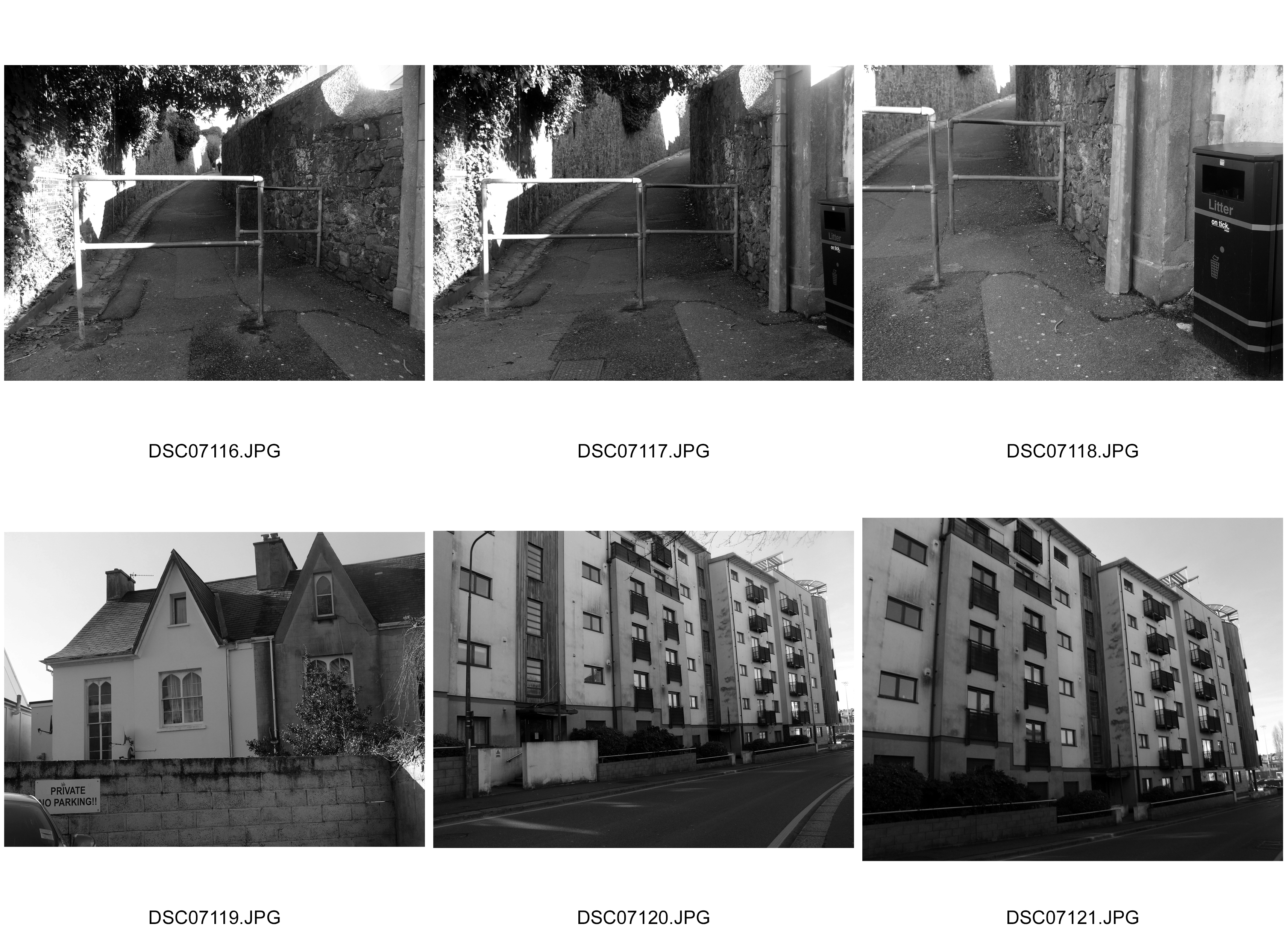
Best Topography Photographs
Best New Objectivity Photograph
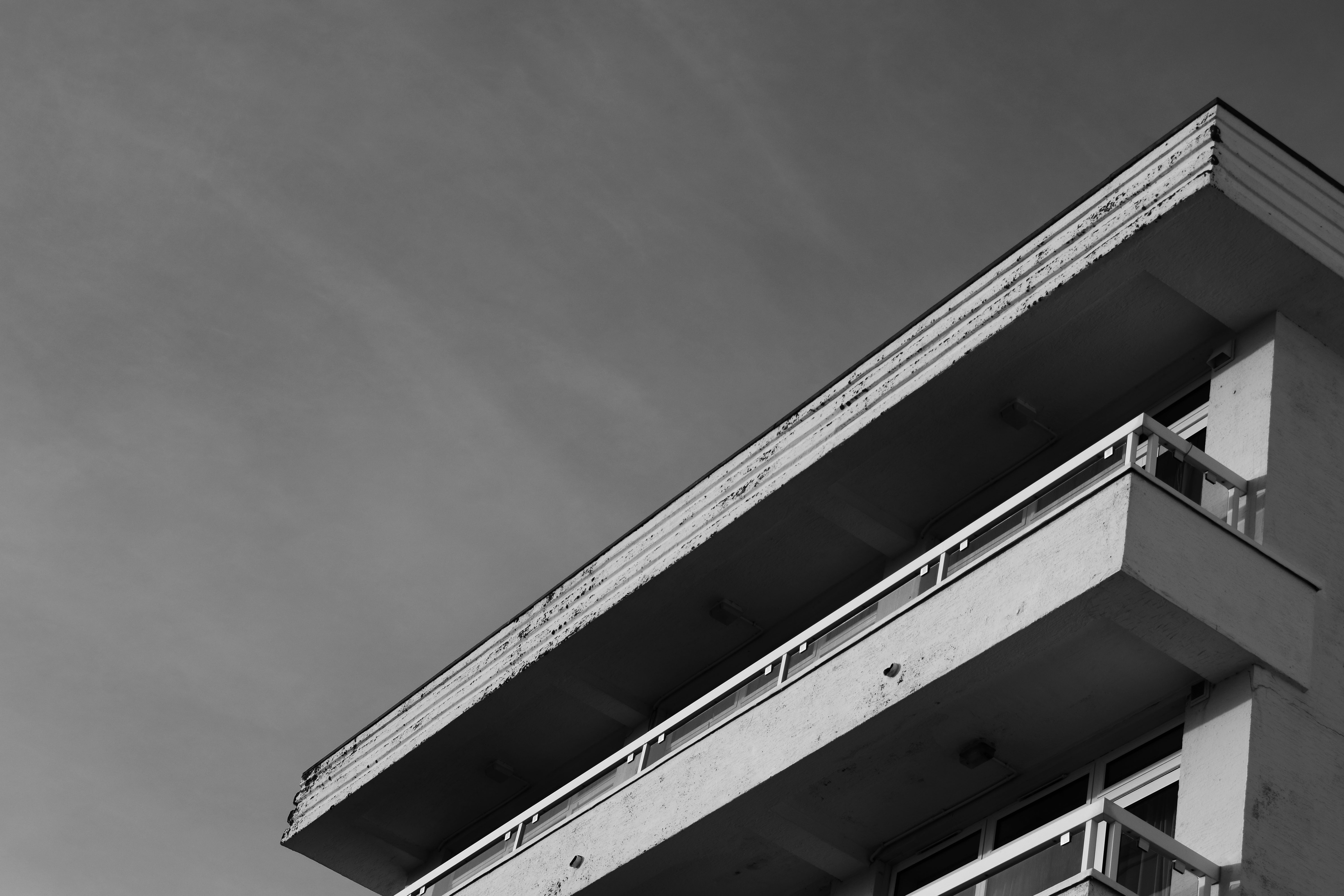
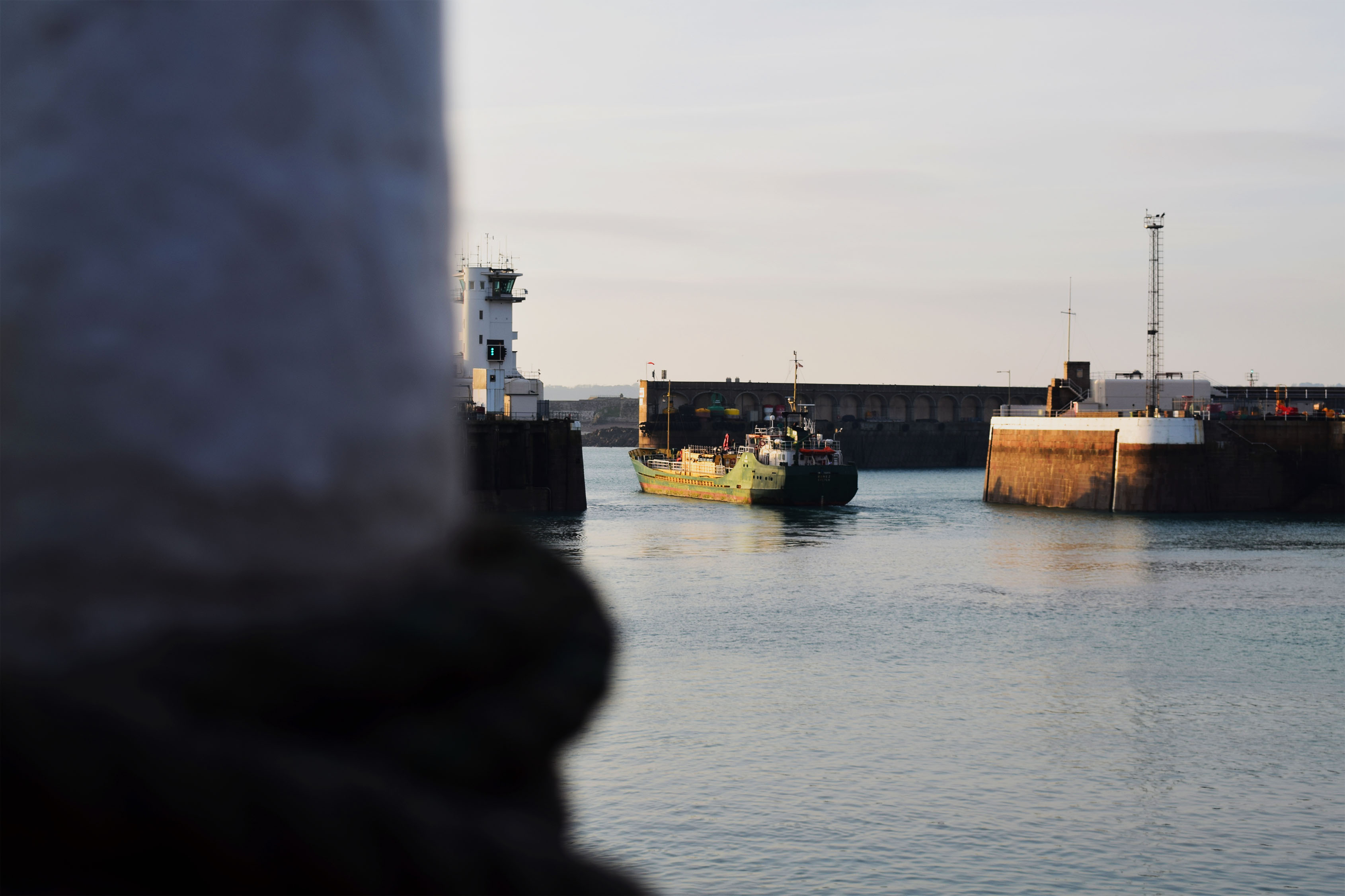
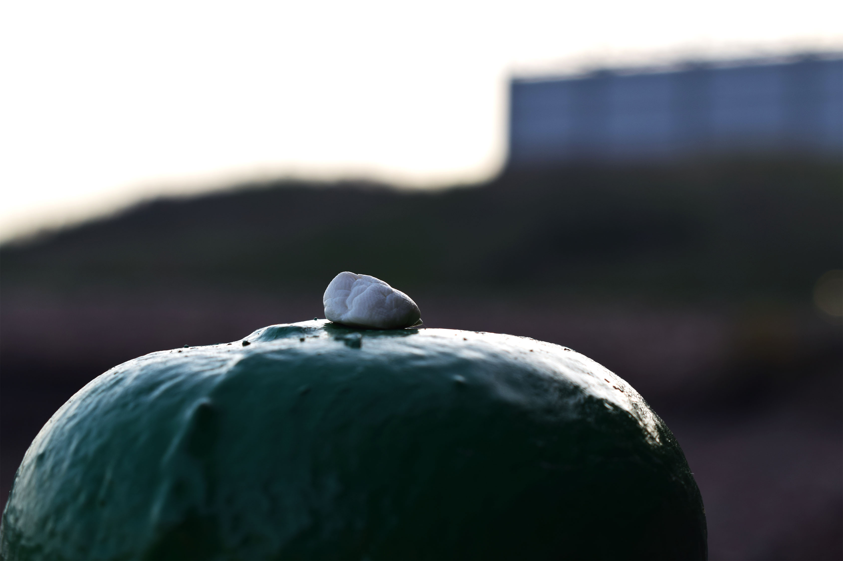
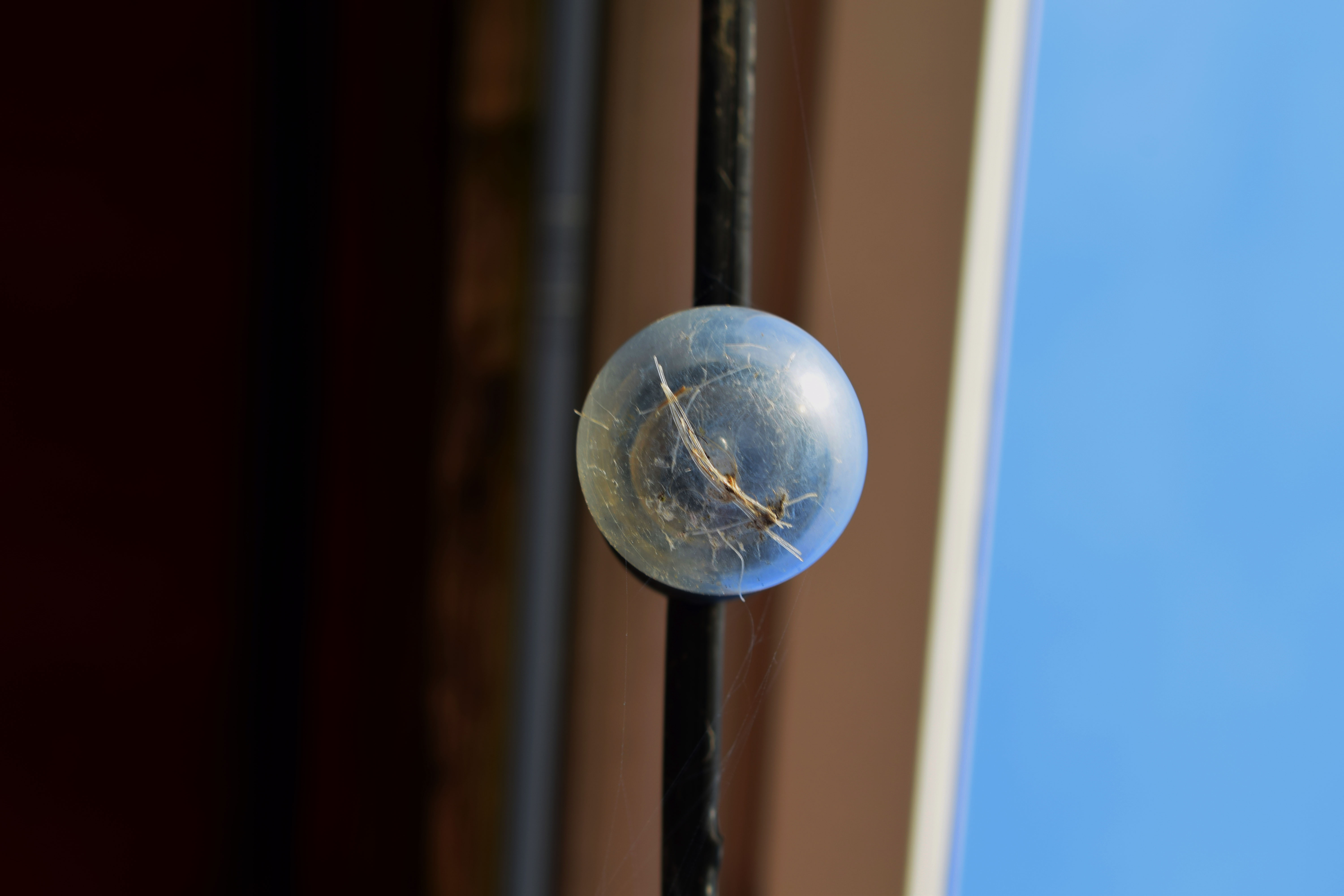
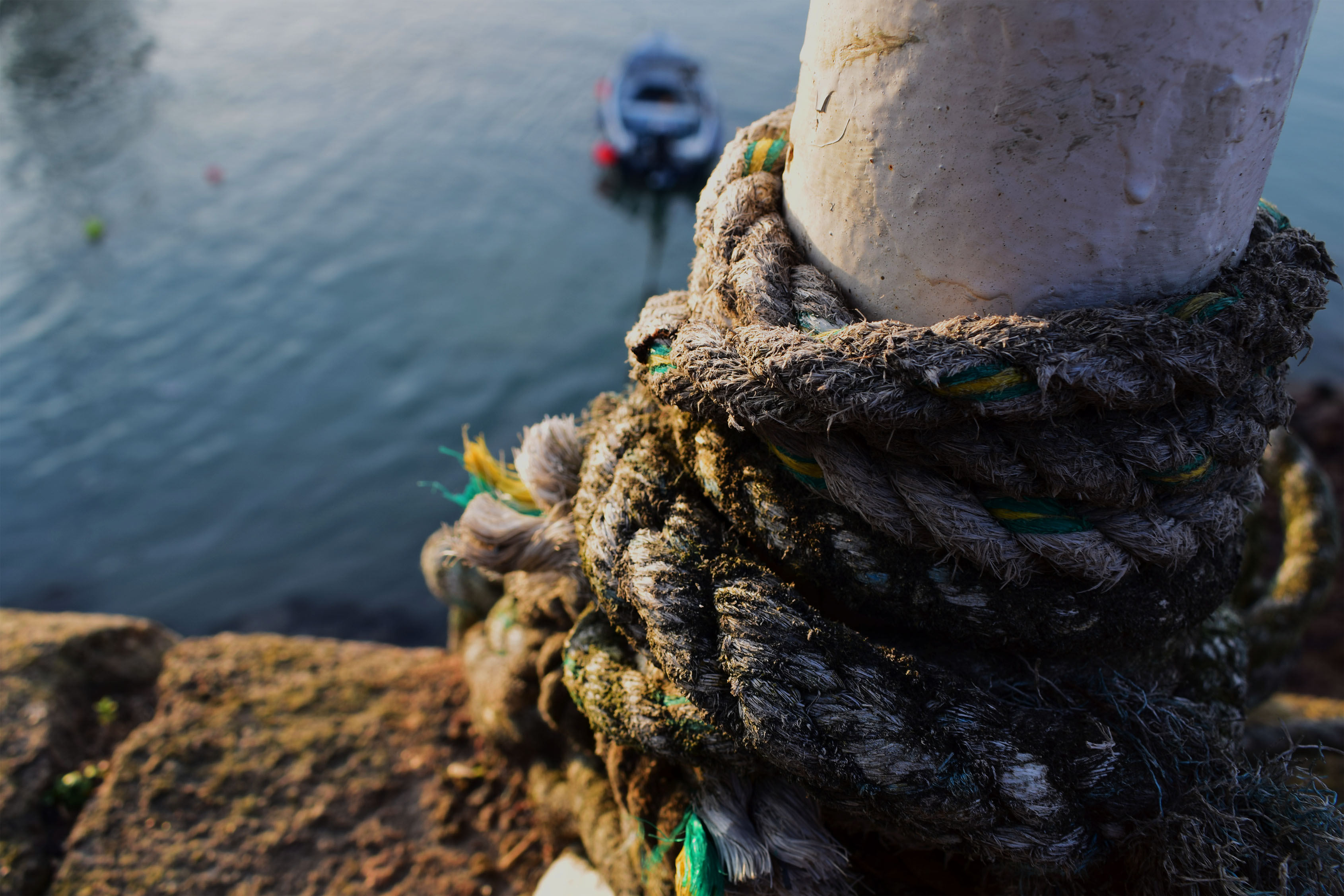
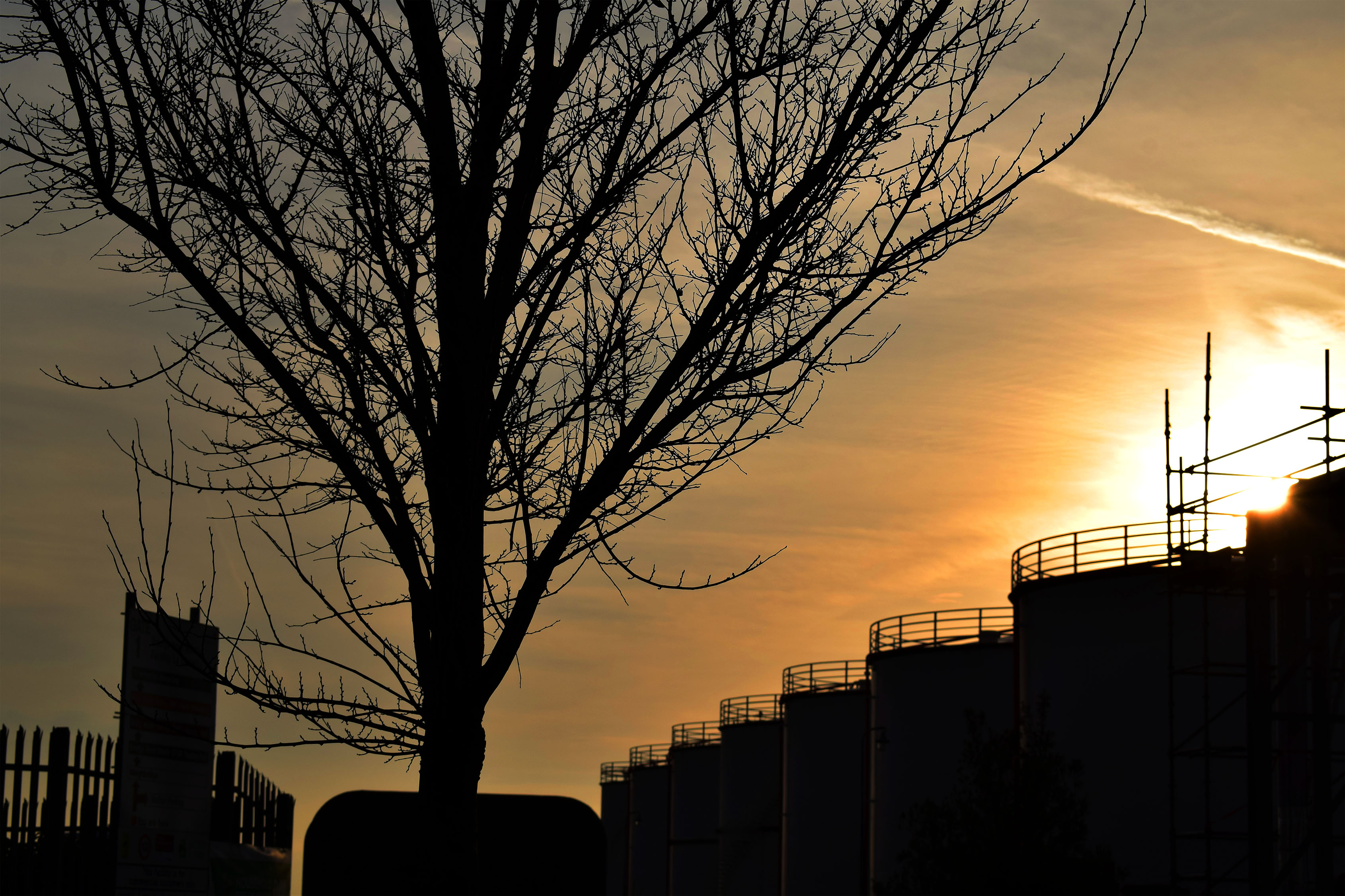
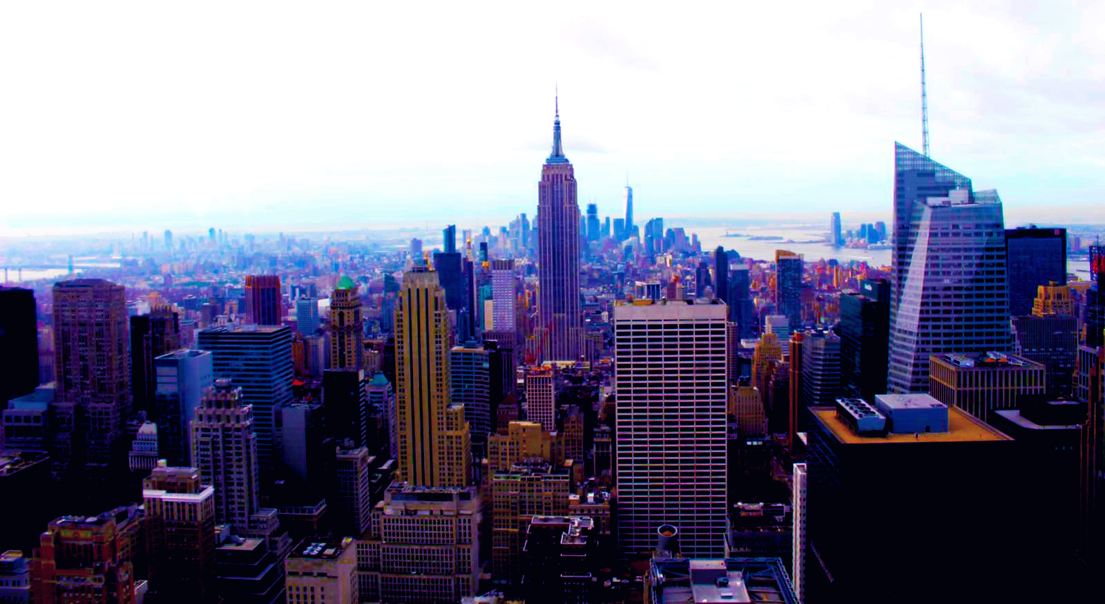
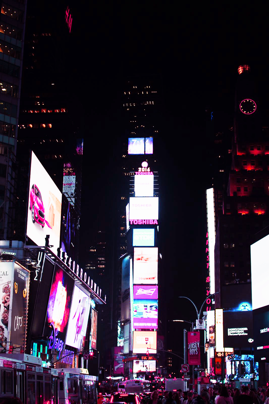
To left are some pictures that I have edited using the saturation and contrast tool. The final edits I used in my other course work are to the right. I decided to show these pictures as I wanted to show how photography is art and how with a little editing the most simple photo can become romanticized.
The top left photo is very abstract and almost looks as if it is a galaxy, a planet or even a unusual eye. However, it is only a bulb with some rope in it. Editing can change the whole meaning or idea of a photograph. In this photo I increased the saturation almost to the top, one side of the bulb took the colour of the sky and the left side took the colour of the wall. The orange and blues work perfectly together and brings the colours of a sunset into an fairly ugly or dull object making it beautiful and interesting. I also like the back ground; the fact that it’s split into sections of colour it works perfect with the colours of the bulb.
The bottom left photo is very romanticized spoiled by the industrial objects. Although it may look like the industrial objects have ruined a what could have been a natural photo I think they make the photo better showing the effects of these ugly containers. It shows how they don’t just pollute the air or the ground we live on but it also pollutes our landscapes. I think the photo is better with them there as now it has a meaning and it isn’t just a pretty photo for people to look at, it is showing the effects of humans being greedy. I also like that now I have edited it is has the bright orange cause the containers and trees to become silhouettes. It looks almost as if they are competing with each other. It looks as if the tree is showing what could have been such as a beautiful forest but it has been stopped by these industrial machines. I got the orange and silhouette effect by increasing the contrast and offset as well as the saturation.
