Biography
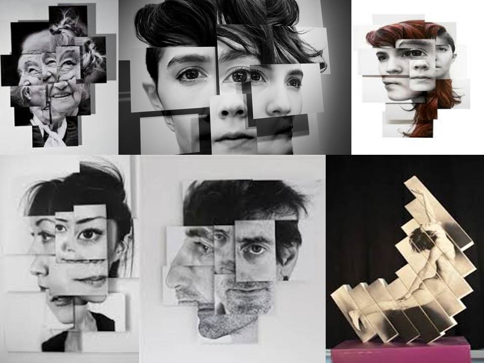
Bruno Del Zou is a French artist born in 1963. In his “photosculptures” series, Brno Del Zou uses the fragmentation of the body in order to better understand it. The body and the faces are revisited and their volumes are highlighted in order to create installations of multiple scales. These “photosculptures” suggest a clear aesthetic preference which does not hide the chaotic side of our minds.
“Beyond the body itself and its beauty, there is its unity. Fragmenting the body, in this case, doesn’t mean cutting it up in order to dissolve it, it means trying to recompose it in the hope to achieve and create unity, an identity, perhaps the fundamental one, the one that supports all the differences, all the variations, all the points of view, which is saved despite everything, despite the light variations and the positions in the space, resisting any immediate apprehension, multiplying as it wishes, without ever losing this unity without which the body itself could not exist.”
He comes into the ‘joiner’ photography category which is similar to the style of David Hockneys photographs which i have already experimented with.
Personal Thoughts
Bruno Del Zou stood out as a photographer for my identity project as i really like the message off a collage image which could symbol in terms of identity pieces the different parts of someone together which makes them who they are and gives them there identity. This wasn’t the original idea of identity i had. when i first saw this artists images i have a negative response as i saw his images being a loss of identity or someone who doesn’t know there identity as the photographer has digitally manipulated the image so that the subjects face is muddled up.
Image Analysis
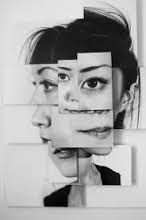
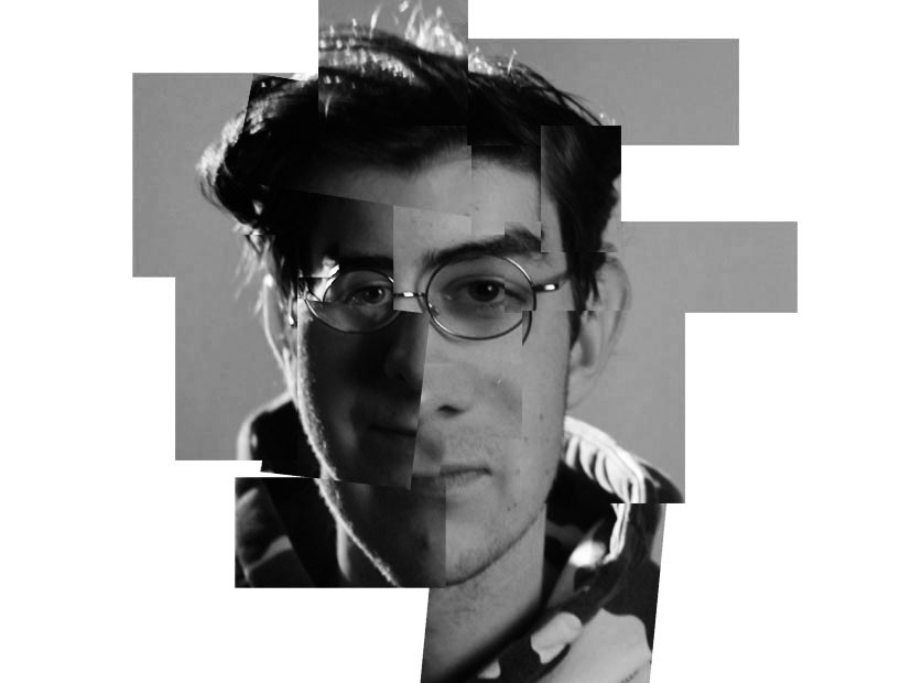
This image is of i woman which has been photographed by Bruno del Zou. to get this photographic presentation he will have had the subject stand against a plain wall and then photographed her but from different angles, perspectives and focal length. He then opened a plain page in Photoshop and started to put the images onto it created a new face. however he has not done it perfectly and this is the style of his images, he overlaps the images and puts sometimes the same features more than once, in my opinion this shows i confusion of identity and what the woman thinks about her identity. The images in this final piece have been layed on top of each other on foam board to create different dimensions to this image this has the effect of giving the image lots of depth. Each section of the image seems as if it has been framed due to the edges of the image this focuses your eye on different aspects of the image making the focal point in the image the final outcome but also each individual feature which is making up the subjects identity. The edges of each image as well as creating framing also create leading lines which guides our eye around the different sections of the image. The image is black and white which creates contrast between the darkness of the hair and eyes against the pale white skin. the photographer may have made the image black and white to show that they are not a very vibrant personalited person or maybe that they have two personalities symbolised by the white and black colour tones in the image
Photoshoot Plan
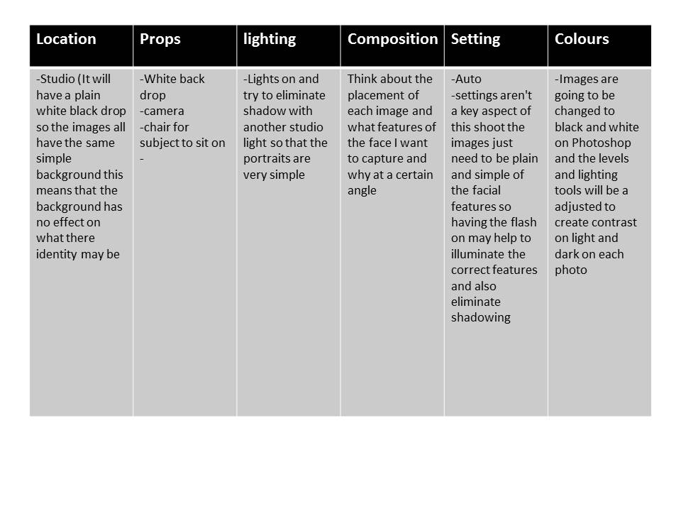
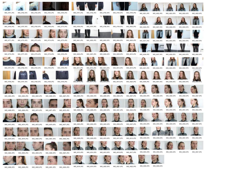
I think that this shoot went well. although i had planned to take the images in the studios, as that wasnt an option at the time i went to take the images we ended up taking the images in a well lit area against a white wall. I captured lots of images of different facial features from different angles and lengths which was the aim of the shoot. However i think that the shoot would have gone better if i took more close up images to give me more of a variety to chose from.
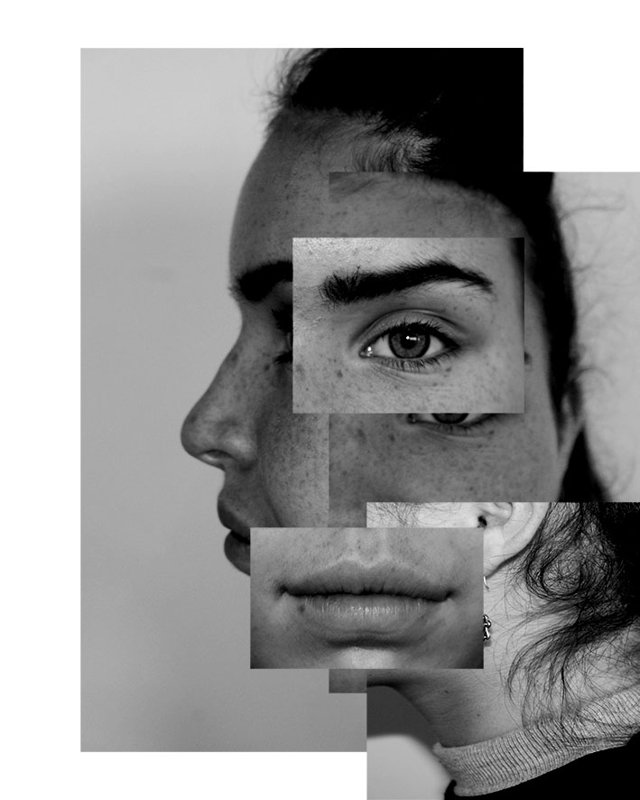
This image isnt a self portrait but still shows loss and confusion of identity through the photo montage and muddling up of the facial features to create and abstract look. i think that the message this image is conveying is that your identity can made up of lots of little factors and the loss of identity through not being about to see the whole person. It may also represent that you see different aspect of someones identity when you see them from different perspectives. The image has ended up being quite similar to my artist reference because the individual images have been layered on top of each other to create a photo montage. the separate images create multiply focal points in the image and the message behind this maybe be all the individual aspects of someones personality coming together to make them who they are. the images also creating leadign lines that carry your eyes around the corners of each image and in a way making the image very engaging with all the different things that are happening. The contrasting angles make each section stand out from each other and gives the images depth but in an unusual way and the dimensions of the image really add to the message. the lighting was hard and quite harsh natural lighting when i took the images which naturally created contrast in the image but also illuminate all the detail in the face which is similar to the artist reference. The emphasis of the collage being in black and white is that it creates a higher contrast and also focus just on the facial features and not the colours in the image.
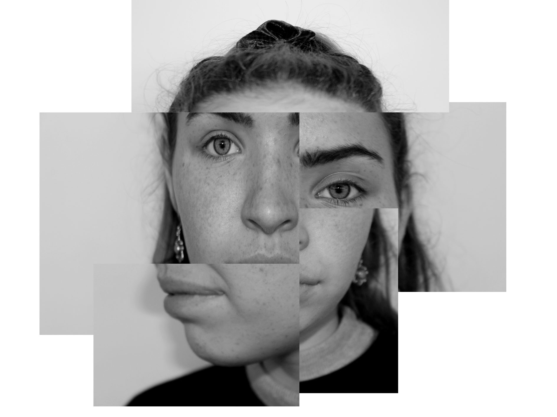
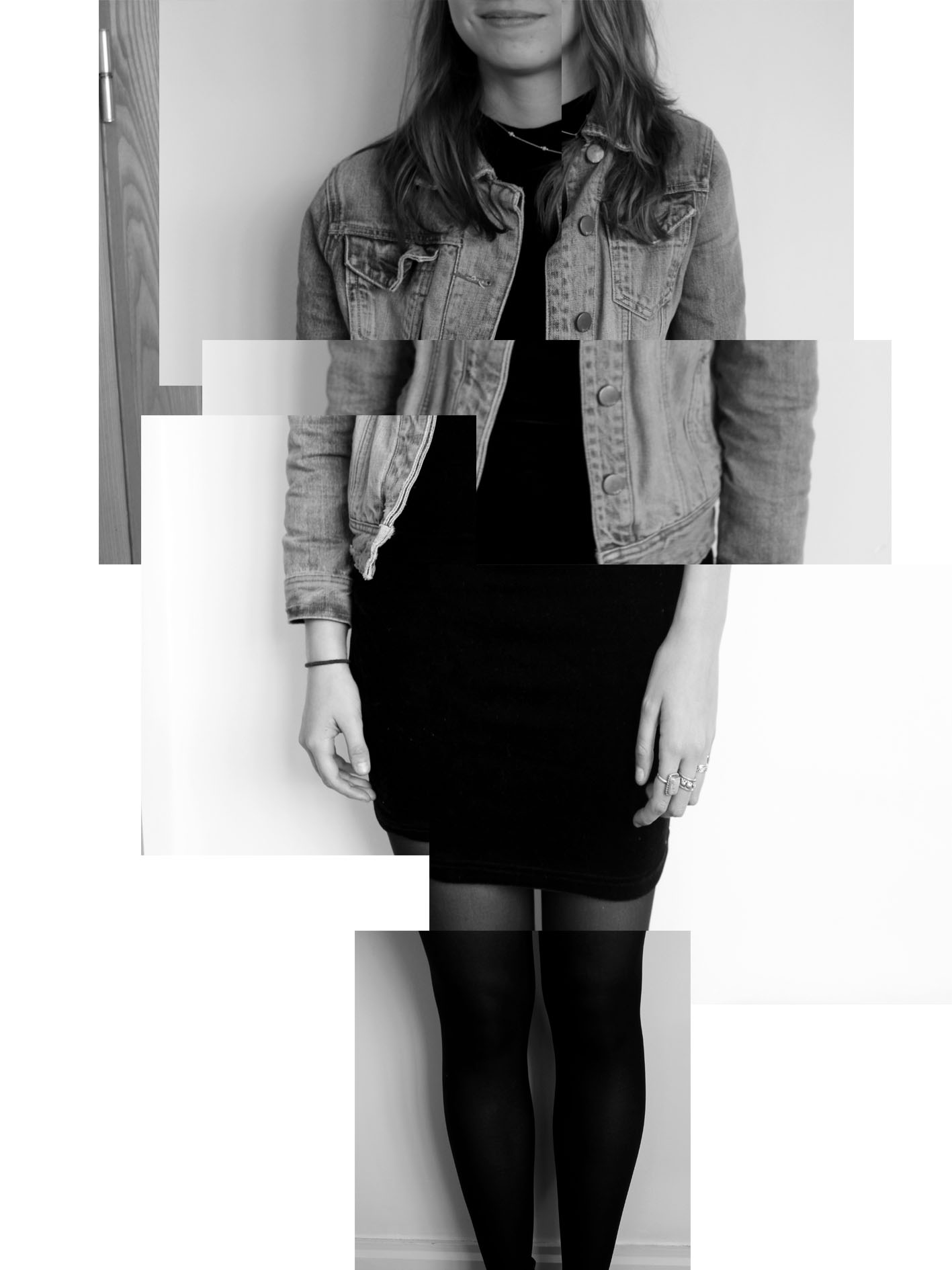
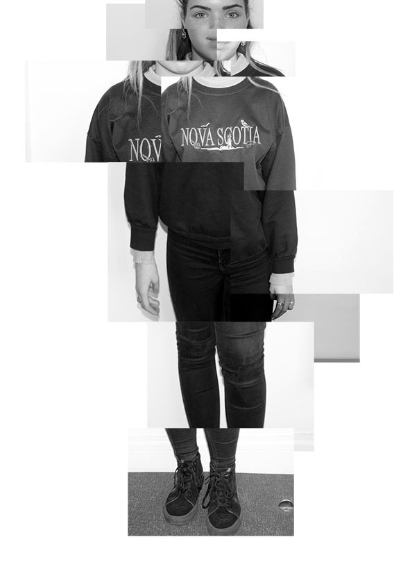
Evaluation
This shoot went well as i managed to capture images that i then digitally manipulated and create collages that look on a level similar to the work that Bruno del Zou does. I managed to create multiply images of myself to continue the theme of the project self portrait but also capture images of others to show different peoples identity’s and how the photo montages show different identity/personality hen you more the facial features around. i think in all of the image i managed to capture a loss of identity and all the images where good but i could have made a few of them better if i had captured even more angles and made a bigger contrast between white and black in the image, especially the last one seems to have a lot of grey toes which makes it flat.
