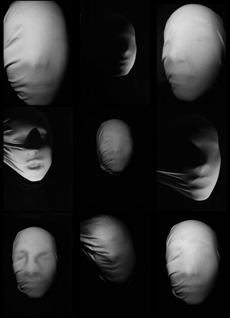
Here are my best photos out from my identity project. When taking these photos I wanted to explore the loss of identity. I did this by placing a white sheet over the subjects head. Doing this took away the details and different marks on the persons face. It only showed the facial features everyone has such as the nose and mouth. By placing a sheet over the subjects head it allowed me to change the shape of the subjects head and make it distorted and different. I wanted the portraits to look different but show elements of similarity as I wanted to explore the idea of massification and take inspiration from the artist Zhang Linhai.
When taking the photos I wanted the creepy and eerie feeling you get just like when you are looking at my chosen artists work (Andreas Poupoutsis). I used two different fabrics. The first was a cotton like fabric that gave it a more harsh flat appearance. The second was a more elasticated material that gave the photo a soft appearance. I also used different lighting to covey different moods and make different shadows. The harsh bright light to show vulnerability, the dimmed lighting to show a more sinister approach and some chiaroscuro lighting to show a more calmer tone.
When editing I made the photos black and white as I wanted the shadows and creases in the sheet to really be shown. In some cases I also used the burn to add more shadows to the face and give it more facial shapes on the picture. On every photo I increased the contrast, that way you could see more white and blacks rather than just grey’s. On the the dimmed lighting ones I slightly increased the exposure, this allowed me to see more of the subject without ruining the photo.
