
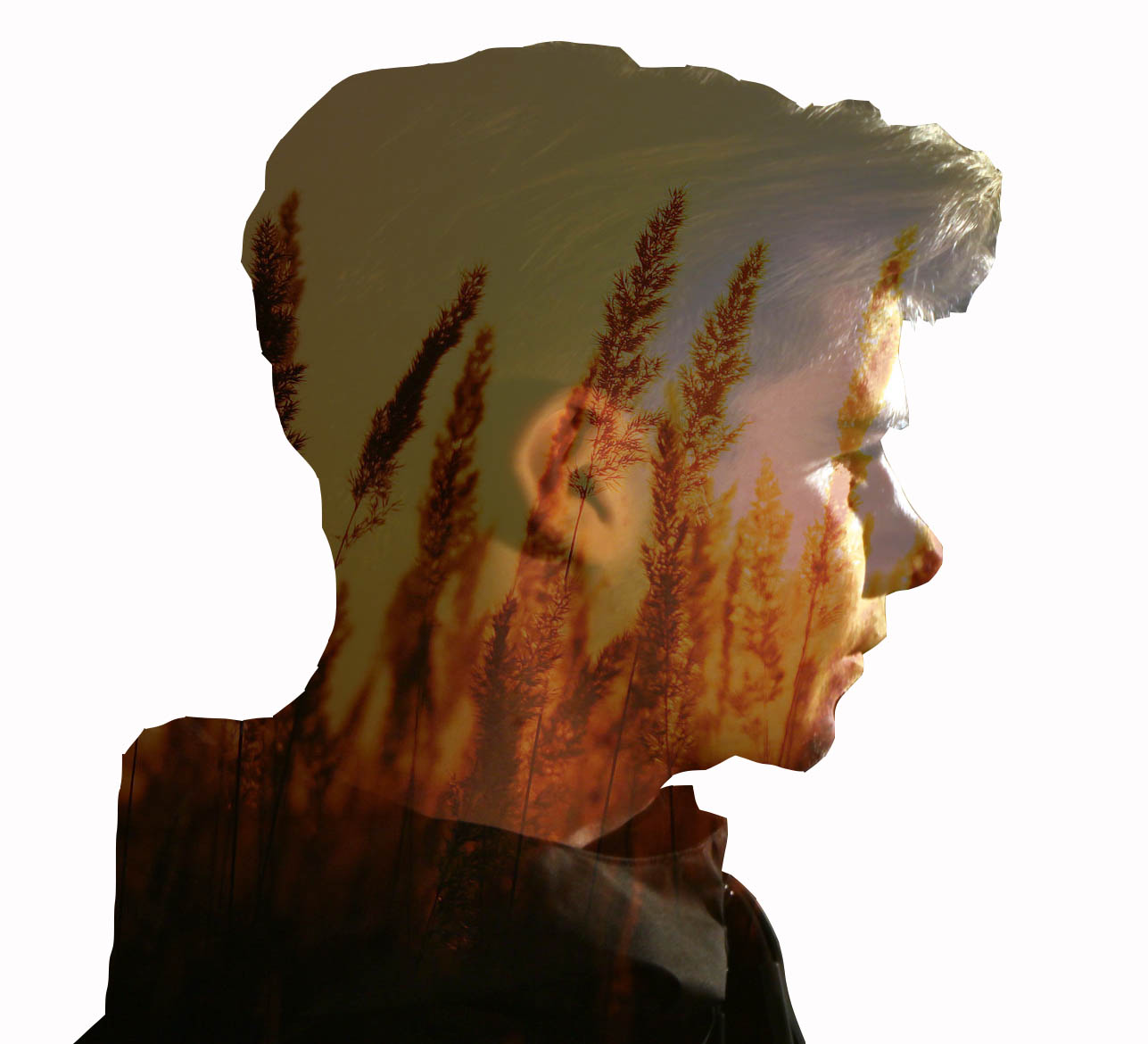
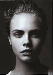
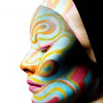
Artist Reference- Jasper James
Jasper James is a China based photographer who works in Shanghai and Beijing, shooting editorial, advertising and corporate work. His photography ranges from portrait, travel and interiors to concept driven projects.
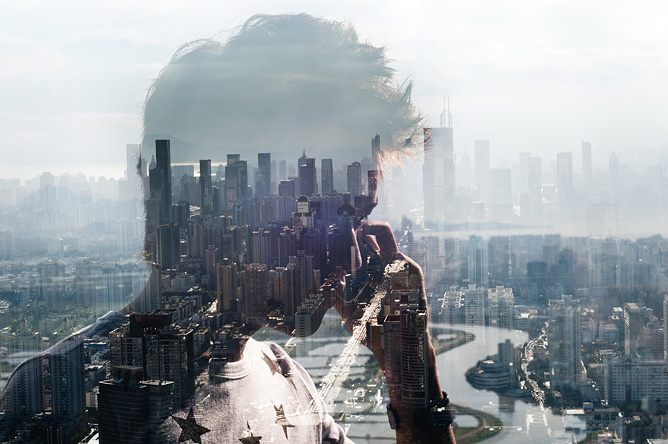
Over the past ten years he has lived and worked in New York, London and Beijing, covering assignments around the globe for some of the worlds biggest magazines, design and advertising clients. His overviews of the city life reflect interesting layers of construction and open narratives through silhouetted onlookers.
Analysis-
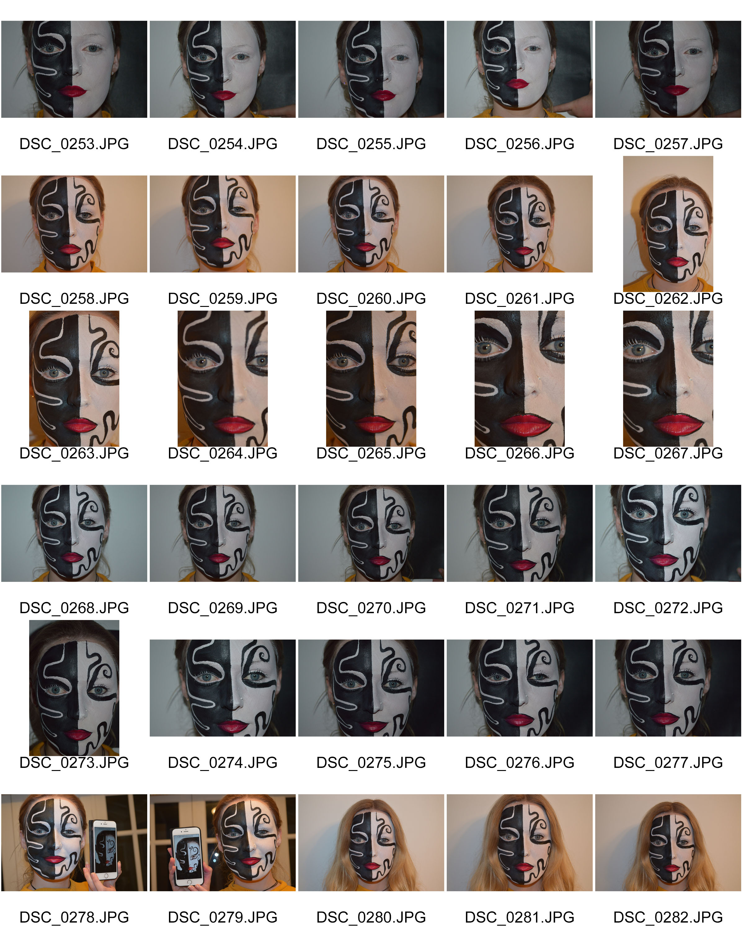
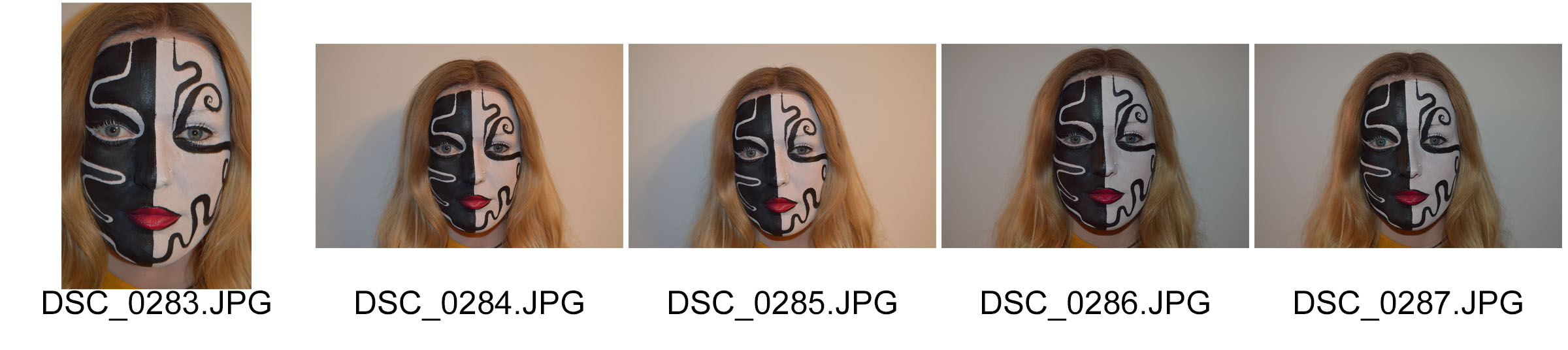
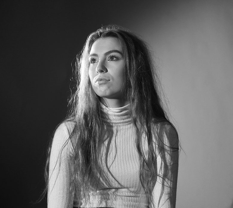
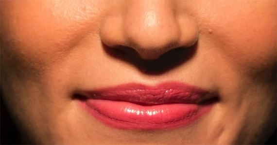
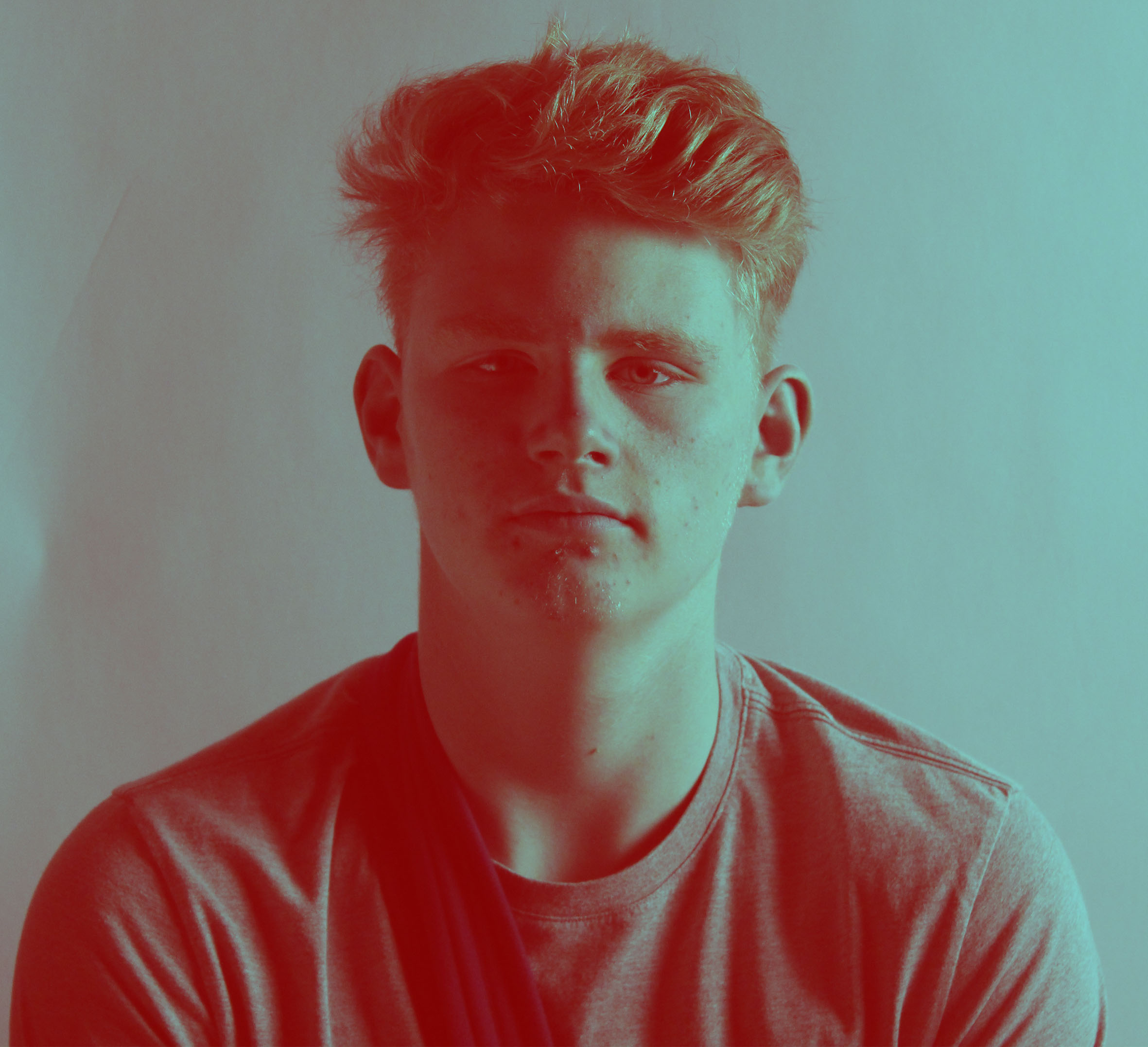
I think that everything in this photo has a purpose for being there and that Jasper James has really thought about were he was place everything in the image on purpose. I think that the man is slightly to the side of the image so that you can see the city background and he is holding a phone to maybe illustrate the busy city life. This photo breaks the rule of thirds as the man is nearly completely in the middle section of the photo. The river in the background of the photo creates really good leading lines and the fact that it is wavy makes your eyes lead up the river almost zig zagging across the bottom section of the photo. This photo does not really have any symmetry to the image and the only patterns that may be in the photo is the buildings and they are not close up they create a patterned background to the image. The view point of Jasper James’ work is normally quite similar. A lot of the photos including this one is a landscape photo of the city as the background creating a wide view. He then takes close up photos of peoples faces but has them slightly turned to the side or looking at the view. The person he is capturing in the photo has been placed there for a certain reason but has got them to be natural so that the photo is not to staged. The photo conveys a lot of depth and has a big impact on the images and all of jasper James images. The layer of the photo creates a lot of depth to the photo almost making it have another dimension. Depth is one of the main aspects in this image to make it exciting and interesting to look at. The framing in this photo is slightly different to other images with framing yet I think that photo does show framing. The darker section of the photo is the person and this is a focal point to the image as the darker outline makes its bolder and therefore I think this creates a frame to the city you can see behind the person. In addition to this I think contrast is also created by the dark shadow of the person the almost over exposed city background caused by the way the photo has been taken. I think that this photo may have been taken in the morning as the light is bright but quite soft and the city has a sort of morning hue to it. The photo of the man which was taken separately has a harsh lighting which was coming from behind him which is creating the shadow on his face and because he as shoot into the light it has created an interesting silhouette. I think that Jasper James used a DSLR camera to take the photos and used the landscape setting to take the city background and an auto setting or portrait setting to take the close up photo of the mans face.
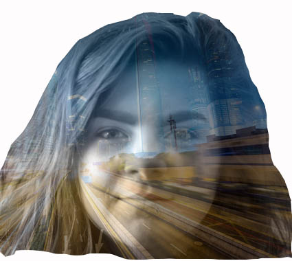
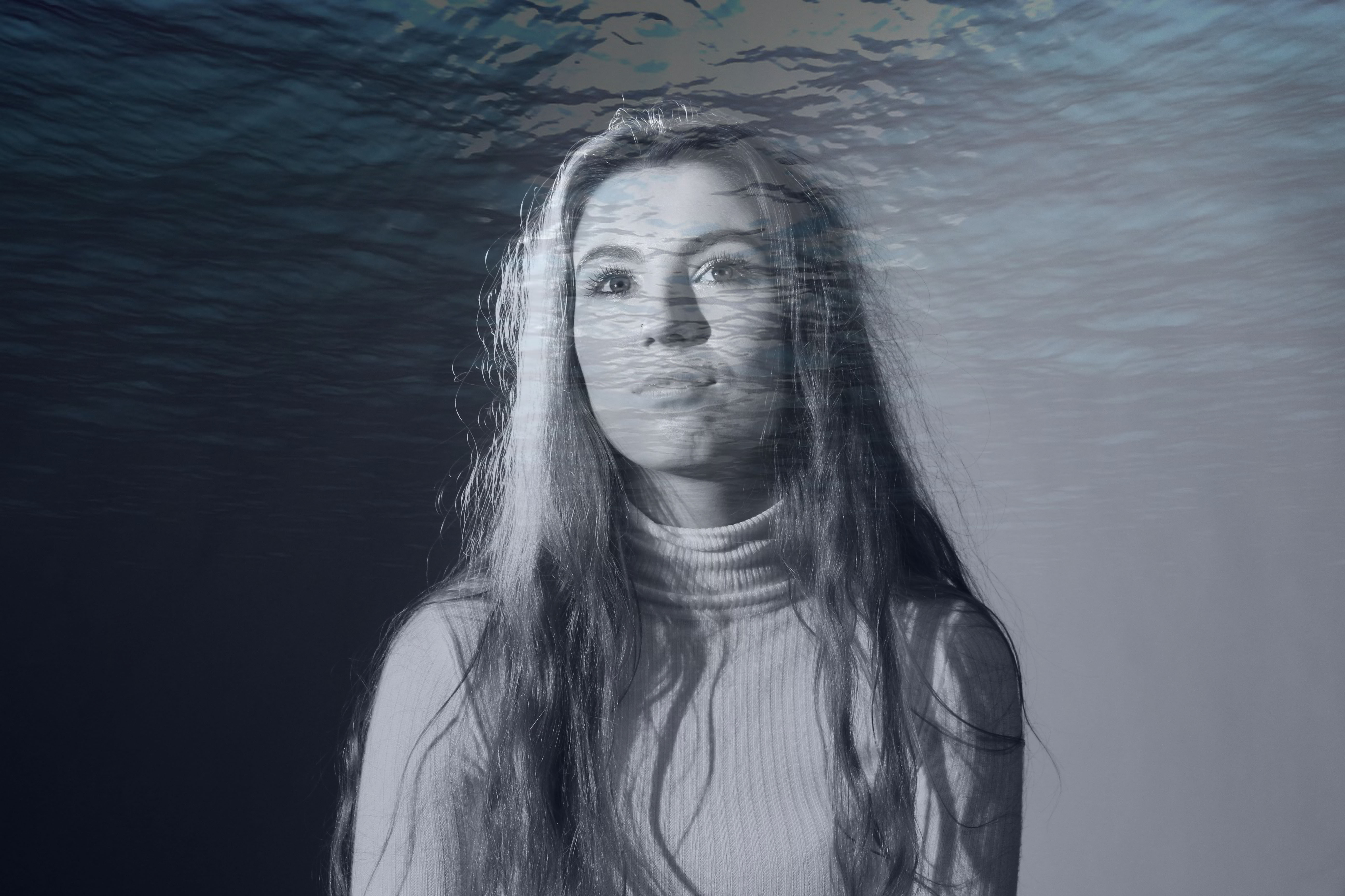
My Interpretation-
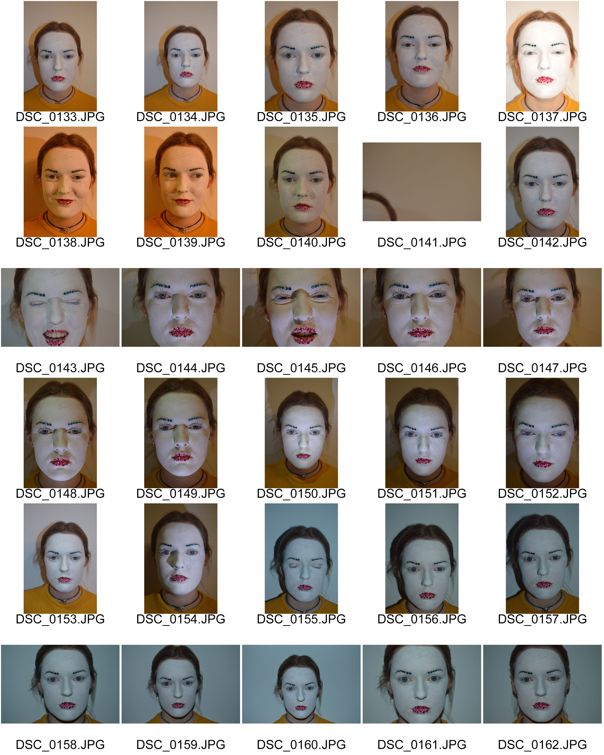
My Original portrait:
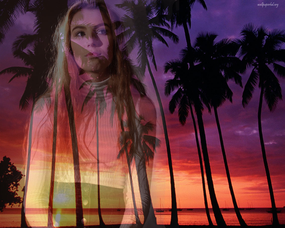
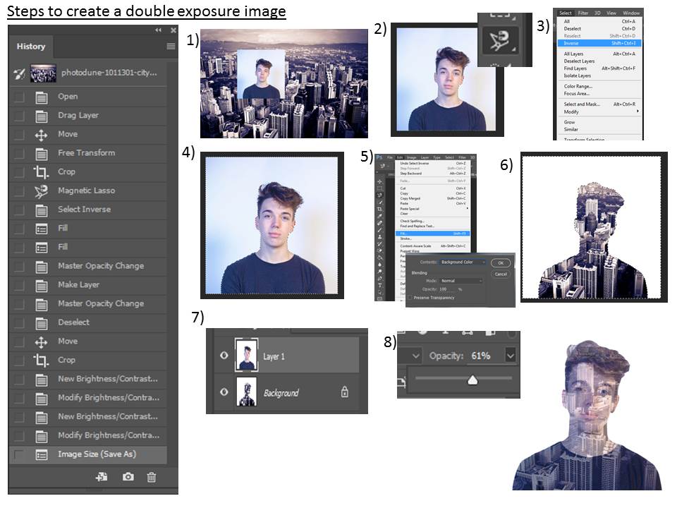
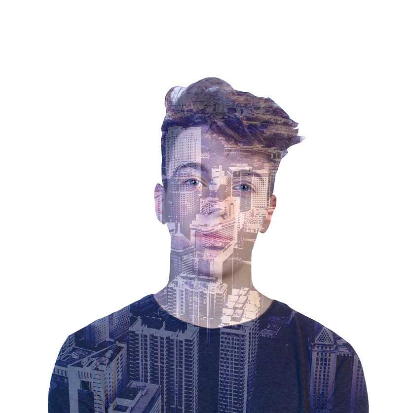
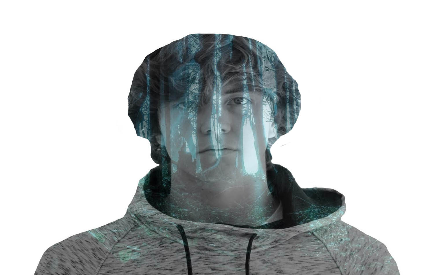
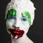
I am demonstrating my response to Adam Goldberg. The first thing I did was I chose a background and a portrait image of my choice. On my portrait layer, I used the lasso tool to select the areas I desires. After doing this, selected the inverse tool so that the other layer would be filled with the areas that aren’t white. Then on the background layer, I selected edit, fill to merge the 2 layers. From here I changed the opacity to adjust the strength . I like this photograph because the cold/dark hues complement the darker tones of shadow on the object’s face. This makes the viewer feel nervous as the cold, harsh and hostile techniques of the photograph are conveyed.
Other examples:
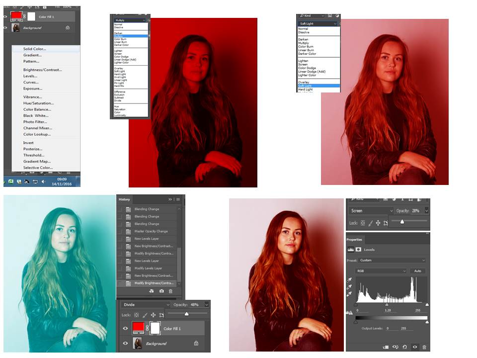
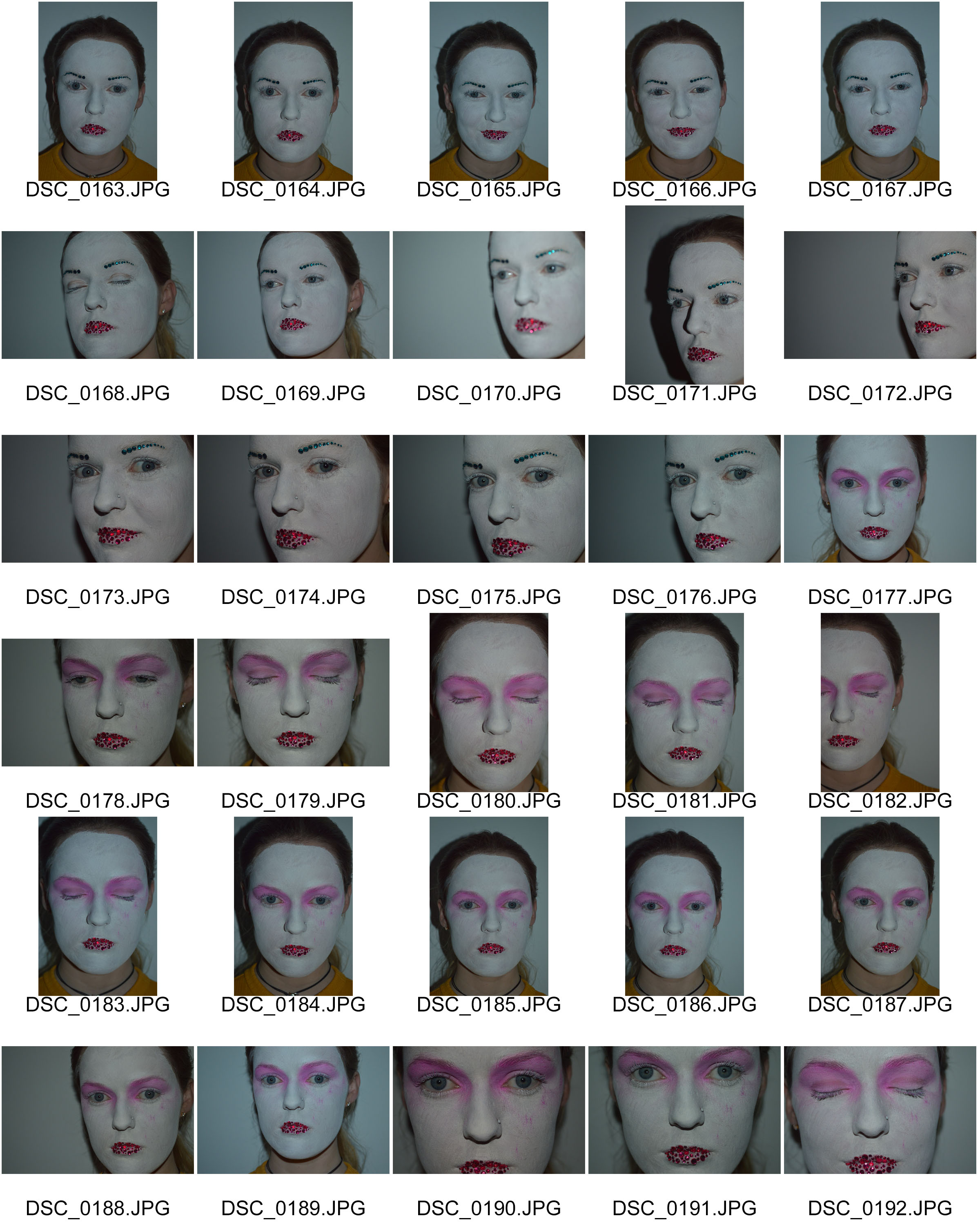
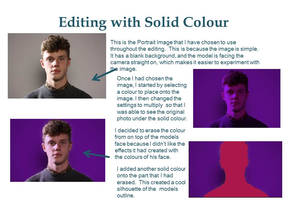
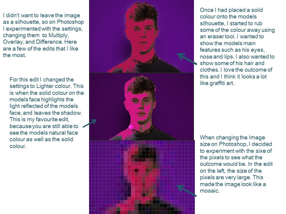
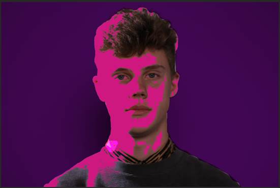
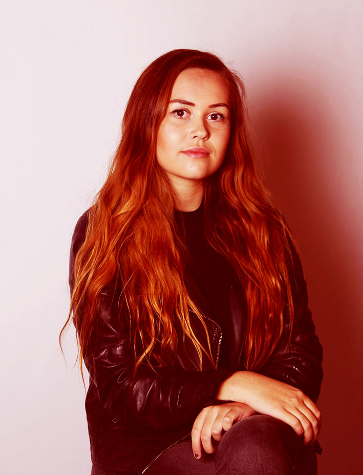
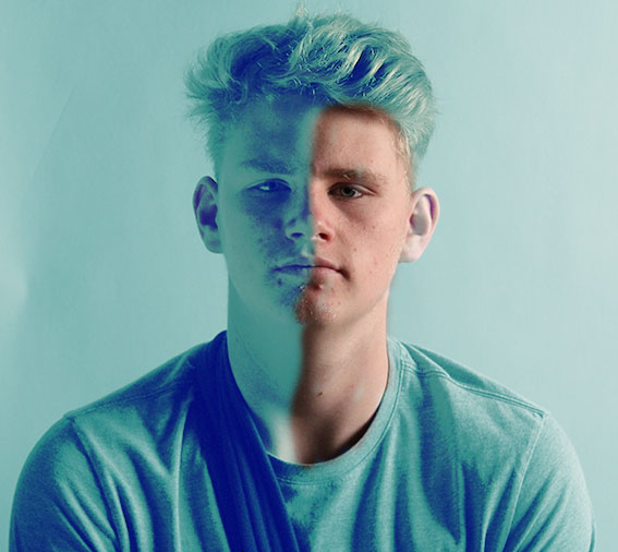
My first edits are experiments on photoshop looking at how a colour overlay can change the image. To edit in this in style i selected The circle icon at the bottom of the screen and then click solid colour, when i clicked this i selected the colour i wanted the image to be to begin with i experimented with red. i then changed the effect to ‘overylay’ and then ‘soft light’ to see how it changed the image. Below is my final edited image which has a red overlay with the ‘soft light’ effect and then i have adjusted the lighting and contrast tools.
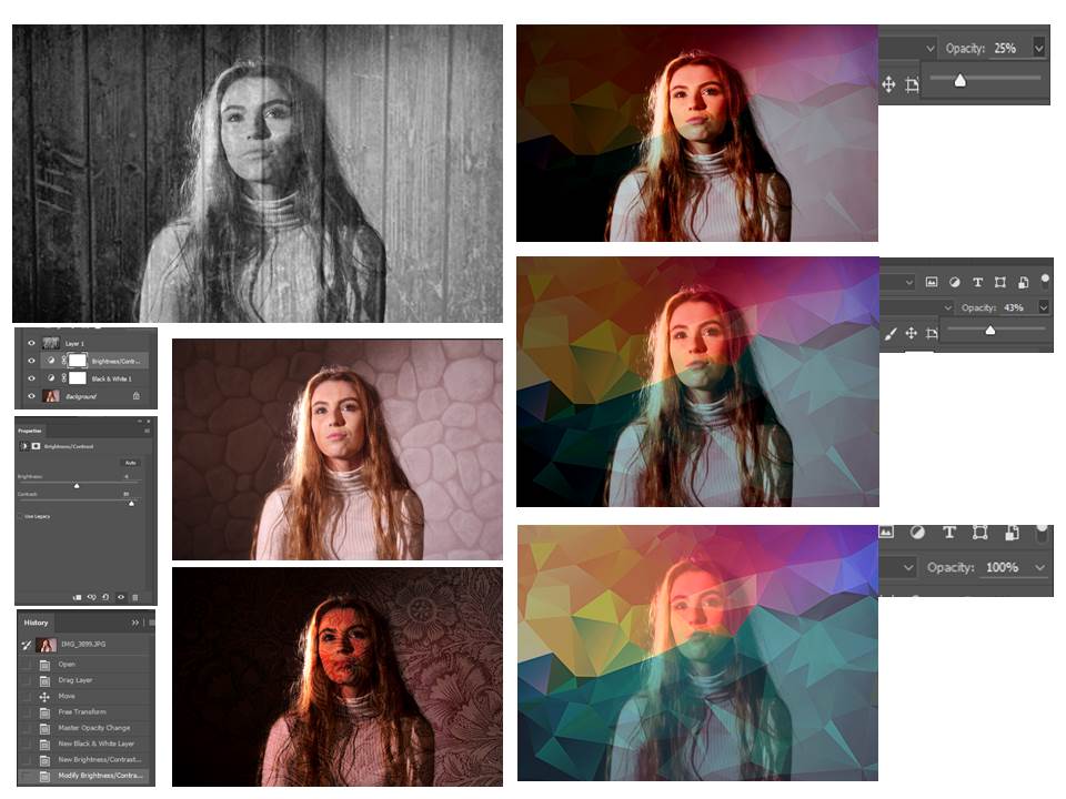
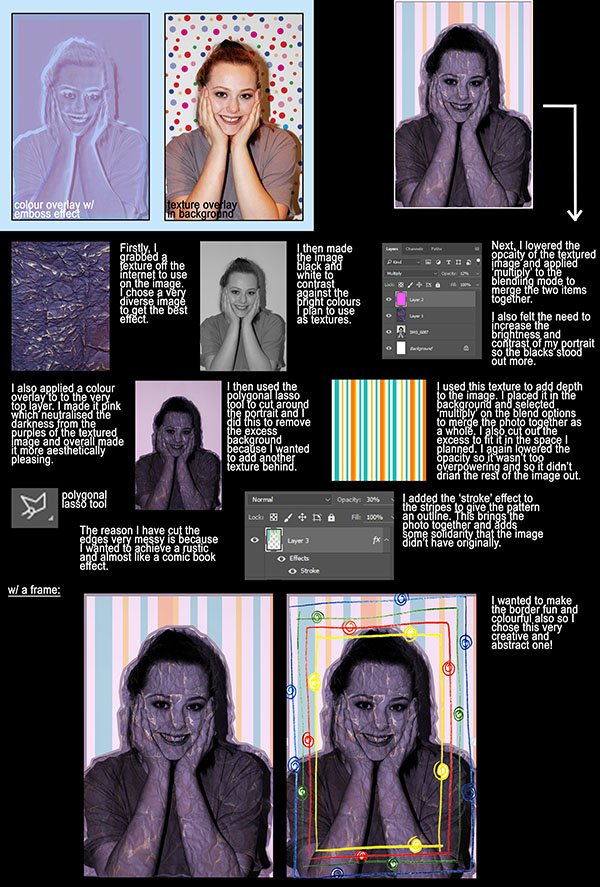
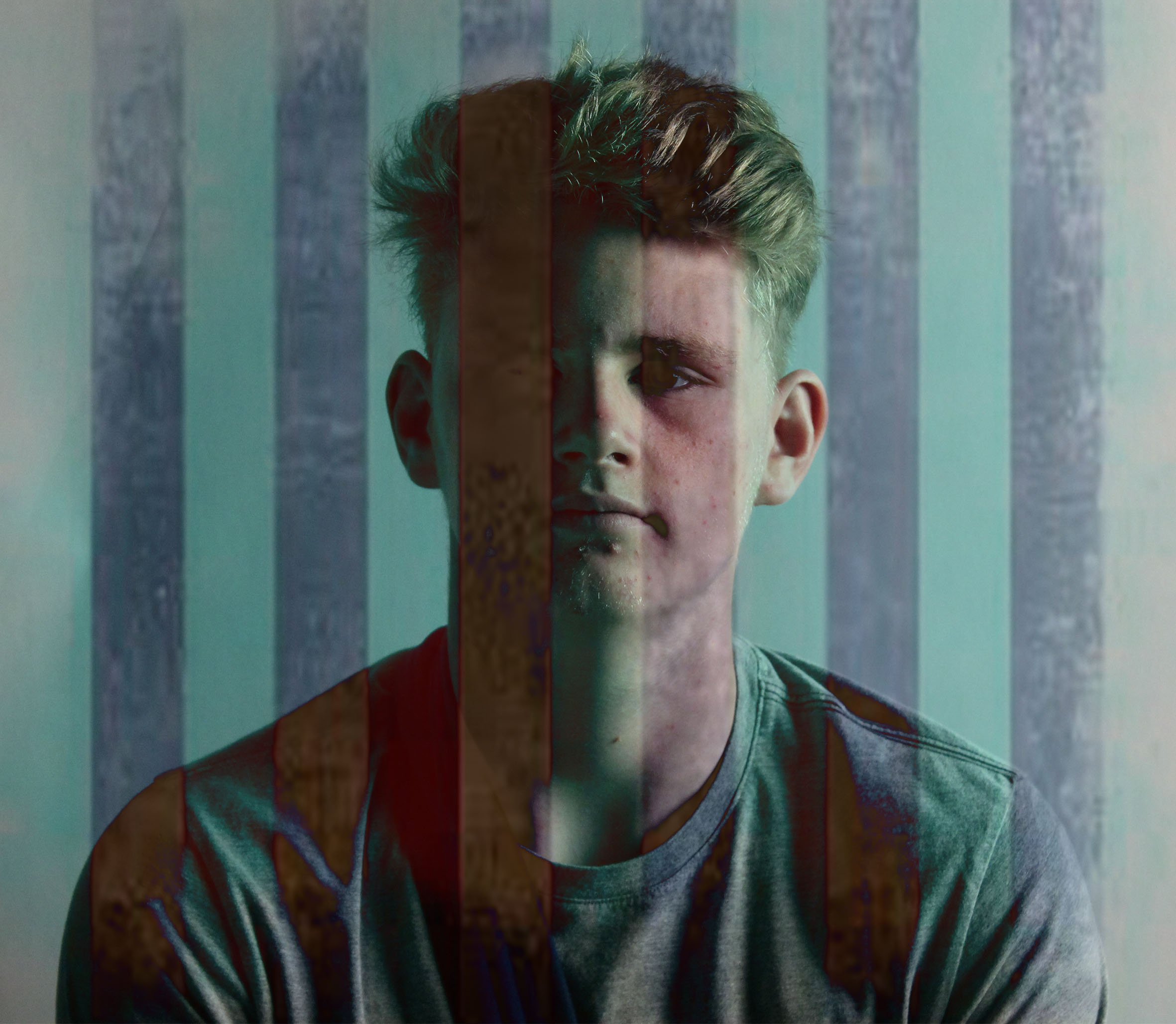
For these images i added a layer onto them. i selected a textured image and then dragged it onto the image i was using. To then blend the images together i selected overlay and then lowered the opacity so the images blended together.
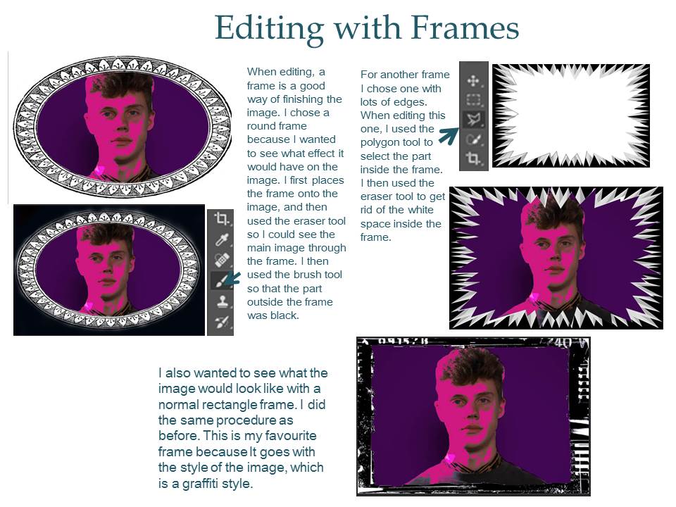
For my final editing technique i bordered images with frames i found of of the internet. I went through the same process as adding a texture but the outcome showed a different message. The digital use of framing focuses your eye of the subject of the portrait.
Rankin
Artificial light
Using flash
Fill light is any source of illumination that lightens (fills in) areas of shadow created by other lights. Most often, fill light is used to lighten the shadows created by the main (key) light.
The fill light may be used to reduce the contrast of a scene to match the dynamic range of the recording media and record the same amount of detail typically seen by eye in average lighting and considered normal. From that baseline of normality using more or less fill will make shadows seem lighter or darker than normal which will cause the viewer to react differently, by inferring both environmental and mood clues from the tone of the shadows.
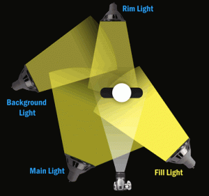
Spill light or light trespass is the light that illuminates surfaces beyond the property line. An example is the light on a bedroom wall coming through the window from the ball field across the street.

The term “spill fill” refers to fill light which results from the footprint of light sources bouncing off surfaces in the shooting environment. It can, if not observed and understood, lead to erroneous assumptions about lighting strategies and modifier choices. For example, a difference between a soft box and shoot-through umbrella of identical size used in a small reflective space is that the soft box is designed to limit spill and the shoot through umbrella to maximize it. The umbrella will appear to “wrap” the light more, but in terms of actual cause and effect the “wrap” effect results from the light bouncing off ceiling and walls back into the shadows created by the key light from many different directions.
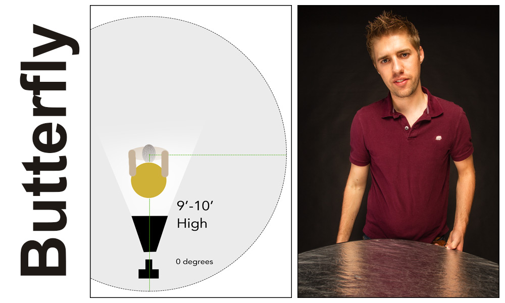
Butterfly lighting is one of the oldest techniques for lighting a subject. Butterfly lighting, also known as Paramount lighting, became a staple pattern for the Hollywood photographers of the 1930s. This lighting is characterized by the butterfly-shaped shadow that it casts below the nose. The butterfly pattern can be quite useful for a variety of faces, but is at its best on lean subjects with high and pronounced cheekbones. It is produced by placing the light source above the face (typically 25-70 degrees) and in line with the direction in which the face is pointing.
Loop lighting, which is named for the loop-shaped shadow that it creates under the nose, is the most frequently-used pattern. It is considered to be a relatively flattering and adaptable pattern that lights most of the face while imparting a sense of depth.
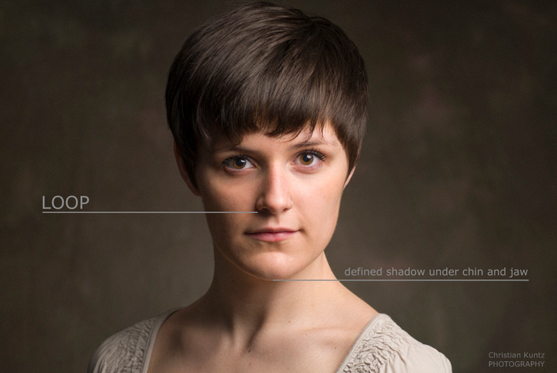
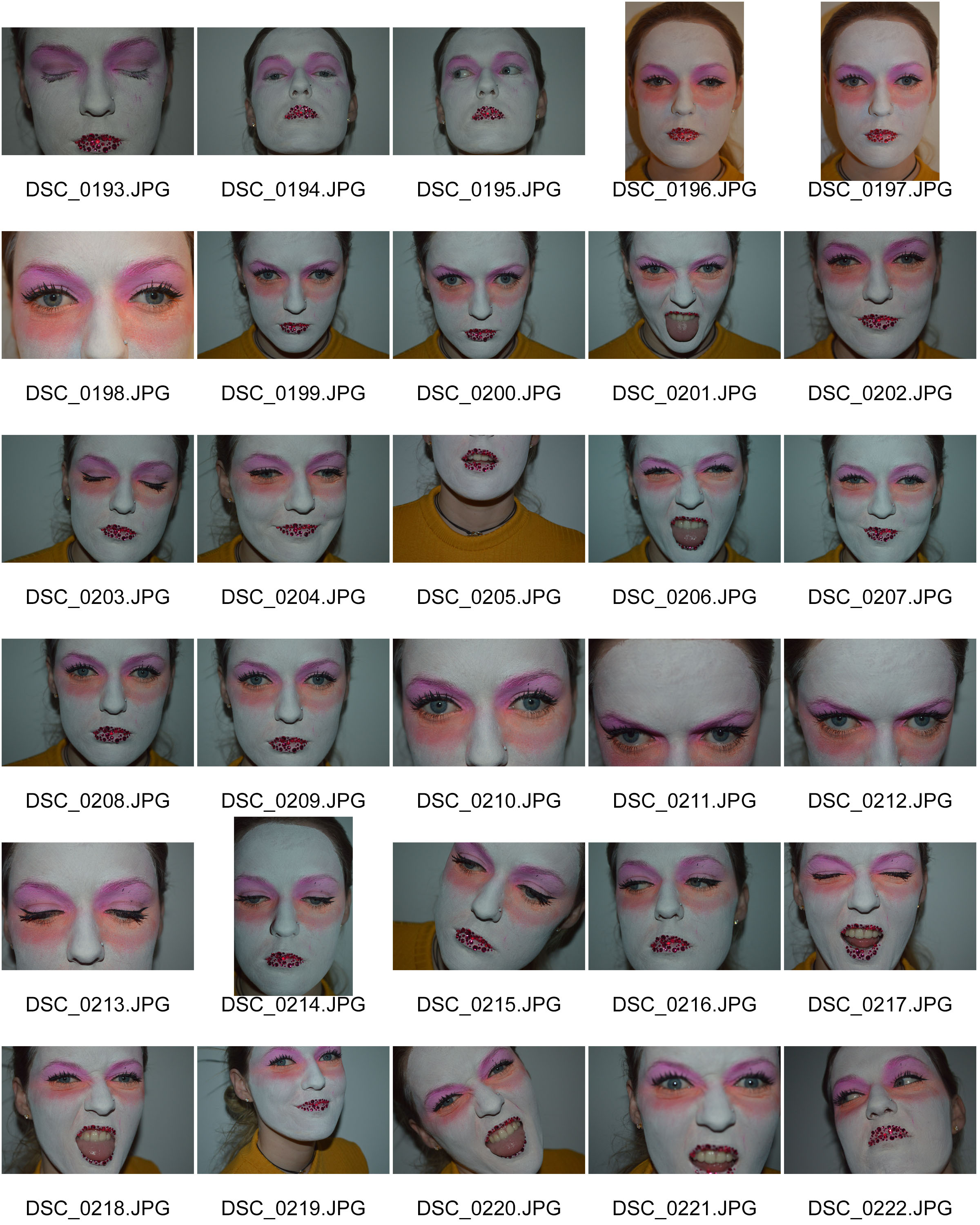
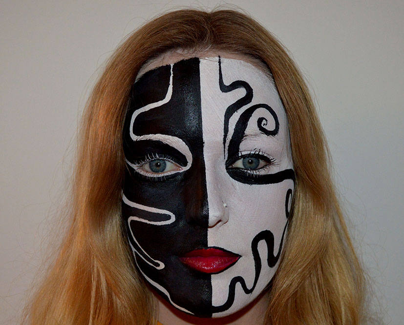
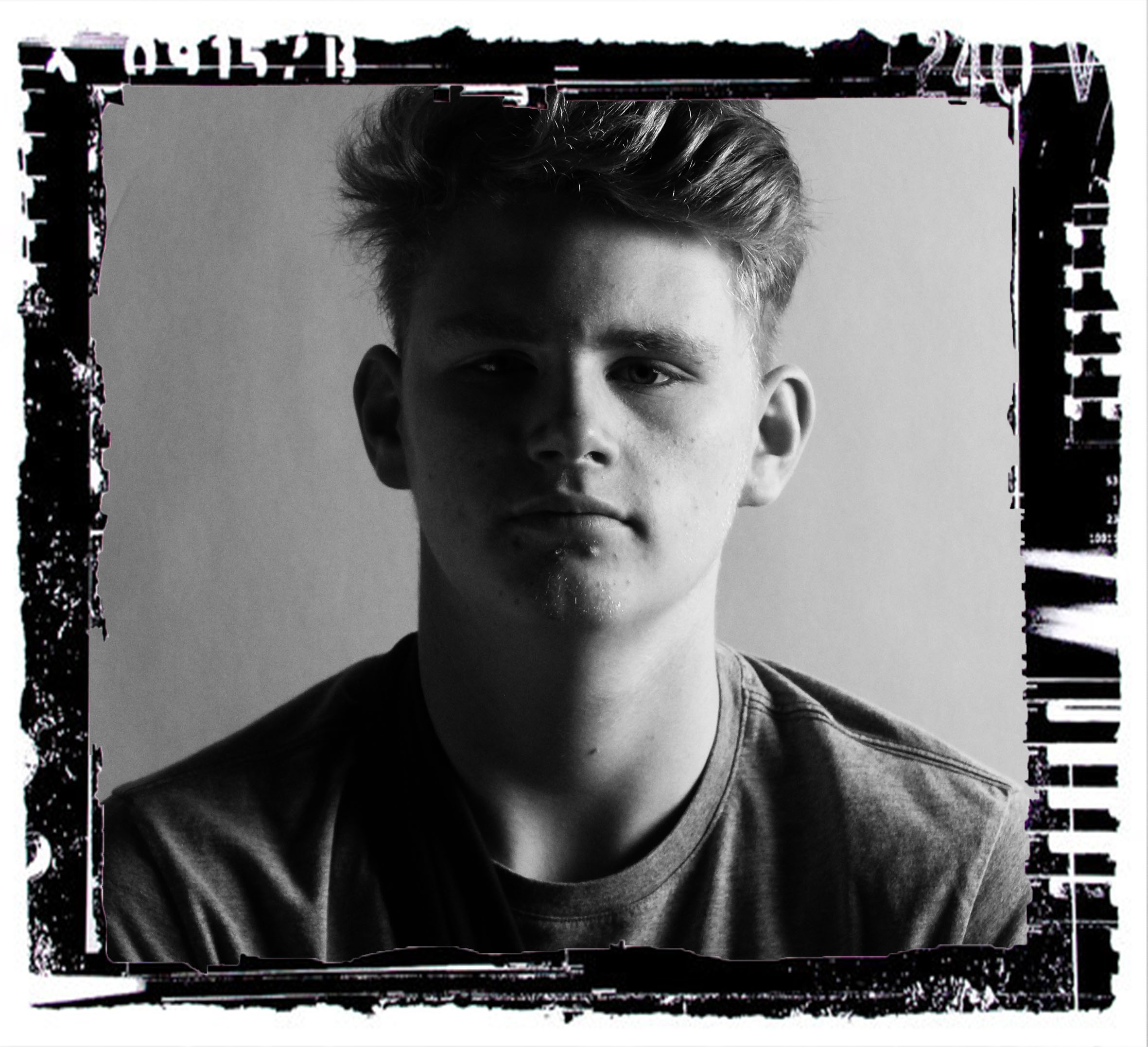
This is my image that i think i have manage to show loop light. You can see the shadow just under the nose of the left side.
Rembrandt lighting is a lighting technique that is used in studio portrait photography. It can be achieved using one light and a reflector, or two lights, and is popular because it is capable of producing images which appear both natural and compelling with a minimum of equipment.
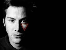

Normally, the key light is placed high and to one side at the front, and the fill light or a reflector is placed half-height and on the other side at the front, set to about half the power of the key light, with the subject, if facing at an angle to the camera, with the key light illuminating the far side of the face.
The key in Rembrandt lighting is creating the triangle or diamond shape of light underneath the eye. One side of the face is lit well from the main light source while the other side of the face uses the interaction of shadows and light, also known as chiaroscuro, to create this geometric form on the face.
The triangle should be no longer than the nose and no wider than the eye. This technique may be achieved subtly or very dramatically by altering the distance between subject and lights and relative strengths of main and fill lights.
My Response to Rambrant Lighting:

In the images you can clearly see a triangle of light on the left side of the face. To create the Rambrant lighting effect i used one key light source and that was a soft box at a 45 degrees angle so that most of the light was just on the right apart from the small triangle on the right.
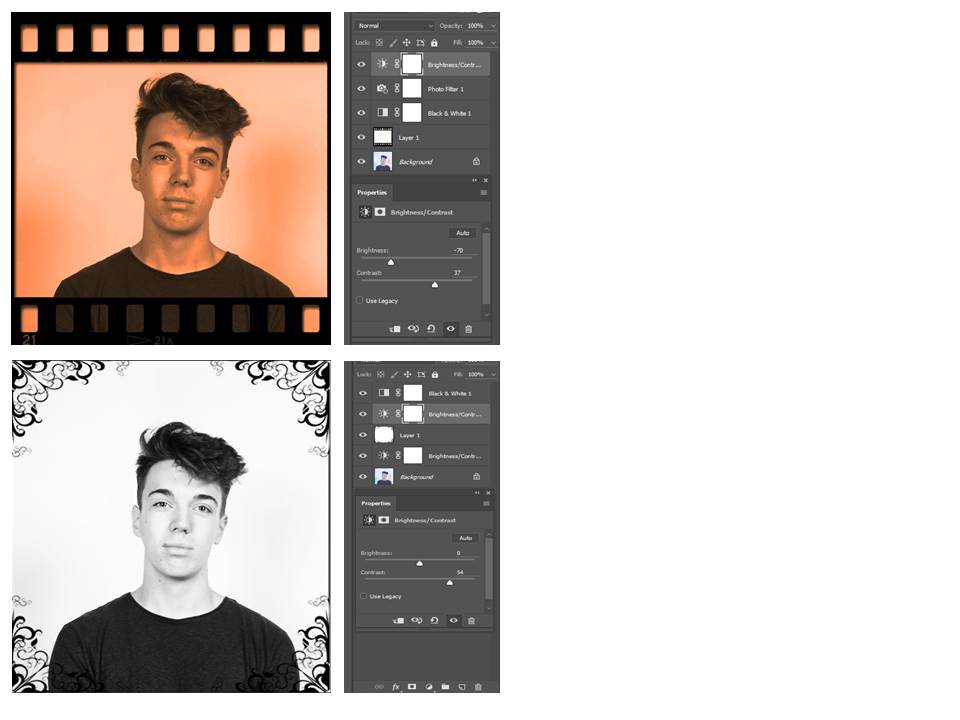
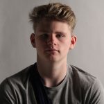
Original image i used to edit
Here I have experimented and editing the same picture multiple times. The top left corner I have used the color solid tool, chosen a blue color, used the opacity tool to decrease to 45%, then used the color dodge tool that made those colors extreme and finally I used the brush to to bring back some of the original picture on half of his face.For the top right photo I used the color solid tool, chose a light red color, decreased the opacity to 50%, then selected the difference tool. These are both types of color overlays. For the picture at the bottom left corner I got a picture of old stripped vintage wallpaper that I placed on top of the picture, decreased the opacity to 65%, used the difference tool and finally used the brush tool to bring back some of the original picture on his right eye. However, the opacity was 75% which allowed for only some of the original picture to be shown. This is is a type of texture overlay. The bottom right is my framed photo. For this photo I turn the original photo black and white then increased the contrast dramatically to match the black and white frame. I found the frame from the internet and copied it in, I then removed the background by making a new layer and deleting the original.


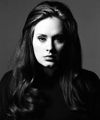
John Rankin Waddell was born on 28th April 1966 and then brought up in Hertfordshire. At Brighton Polytechnic he studied accounting but whilst he was there he realised that that wasn’t what he wanted to be doing and dropped out. He then studied photography at Barnfield College Luton and then went onto the London College of Printing. Whilst studying here he met Jefferson Hack where they formed a working partnership. Rankin and Hack decided to start a magazine called ‘Dazed and Confused’ after they graduated in 1992.
Rankin later launched his own fashion magazine in 2000. Aswell as this he was donated his services to publicity campaigns for the charitable organisation ‘Womans Aid’ and others. Following this in 2009 he created a contemporary structure design which he called ‘Annroy’. This is where Rankin keeps his own state-of-the-art photographic studio. There is also a gallery and home to his family. ‘Annroy’ holds a different exhibition each month, which features his current work.
Rankin was awarded the Honorary Fellowship by the Royal Photographic Society in 2002. Later in 2009 an hour long documentary showed him creating his own tributes to iconic images of famous figures. He interviewed photographers and used comtempary models to bring together his shoot. Further on in his career he was involved in ‘Britains Missing Top Model’ which was a reality show. It focused on following on eight young women with disabilities who competed for a modelling contract and then in 2011 He was a photography teacher on a channel 4 series.
Rankin quote: “In America the Jewish zealots are so powerful. Especially in the entertainment industry.”
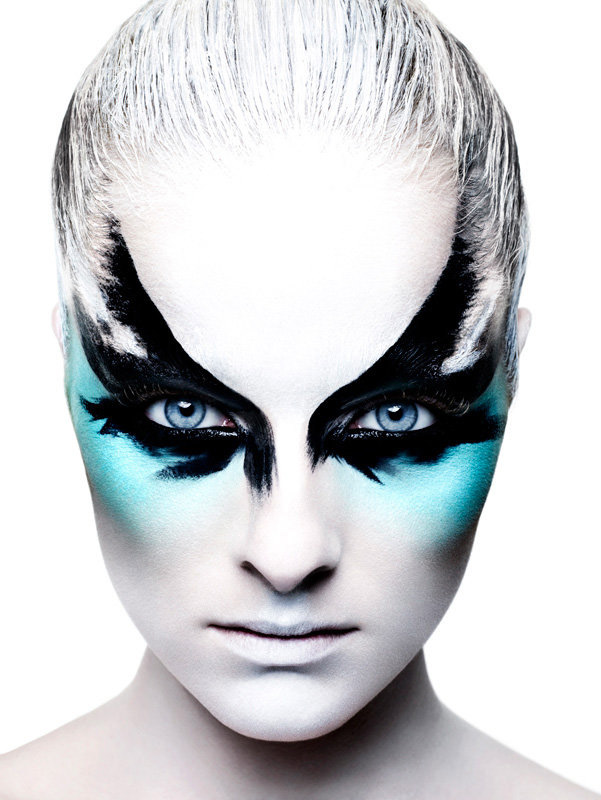
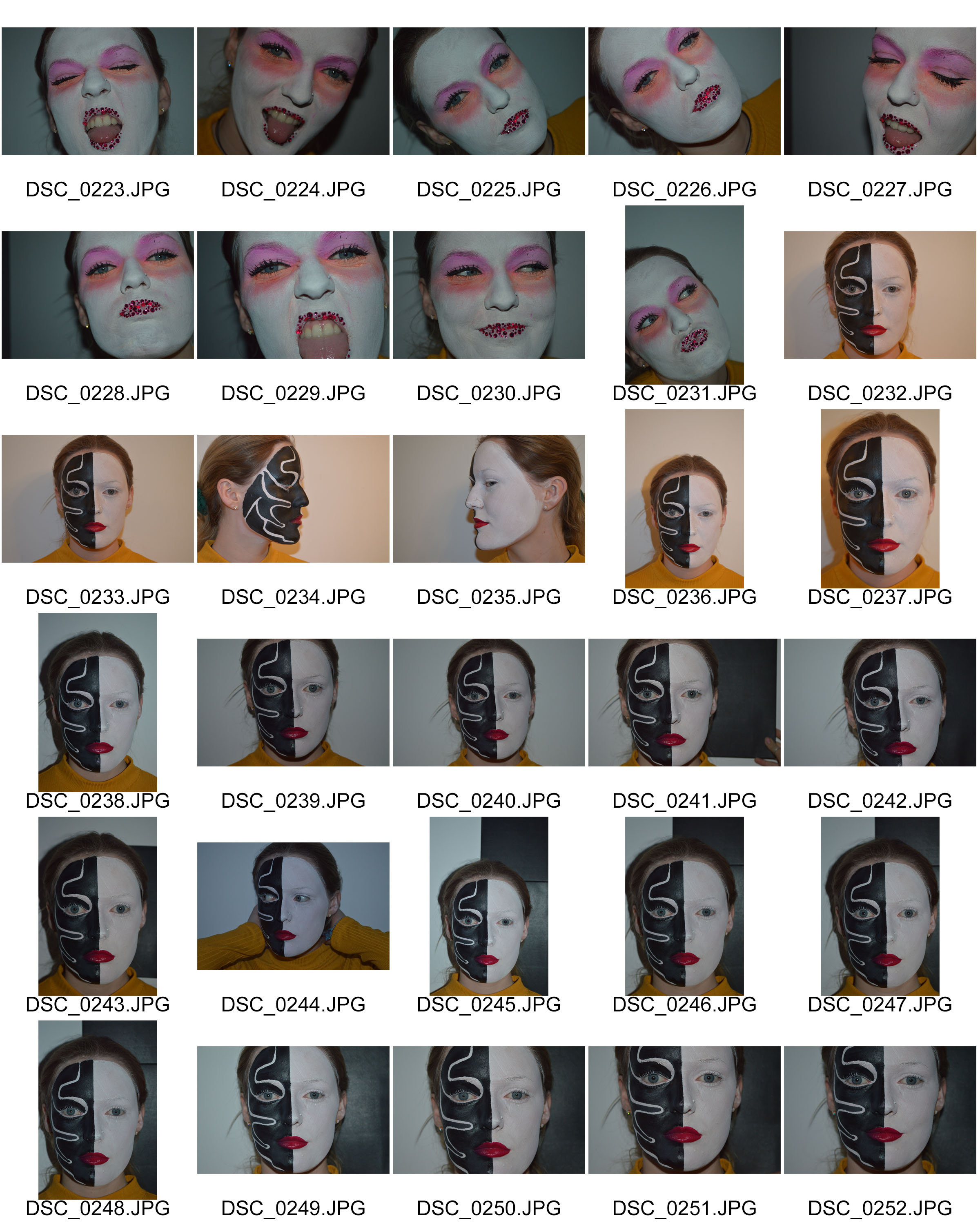
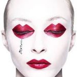
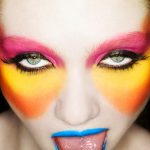
This fashion portrait taken by John Rankin is a close up portrait of a woman with face makeup on. Rankin had strong meaning when taking his photographs and wanted to capture who the celebrities thought they were, this images often represented themselves in there true form and gave them a chance to be who they were. So in my opinion i think that the message that is being conveyed with this image is that the subject thinks they are a striking character yet have a natural pure beauty. The genre of this image is fashion/ studio portraiture. The image also contains a lot of techniques that give it the style it is. The image has been set up with a white background and then well planned studio lighting so that the edge of the subject is very sharp. The mise-en-scene of this image is that the makeup is the way it is so that it shows the personality of the subject, it is also against a white wall so that the face is the only focal point and stands out in the image. The face paint is effective in the way that it creates symmetry of the face and makes the image aesthetically pleasing to look at. the strong straight angle also shows the image in its simplest form having nothing distracting the portrait. Depth and lighting are link together in this image, the light coming slightly from the left of the face creates shadowing on the right side. the shadowing creates depth on the face and makes the features stand out giving it a third dimension. This also gives a sharp but smooth texture to the image. The white background creates a frame for the portrait but also a strong contrast to the shadow and colour on the face. There is also the effect of the image being over exposed from behind the subject which makes the colour of blue in the image pop and helps the connection of the blue in the subjects eyes. The lighting quantity is bright and also a hard harsh light showing the use of equipment.
Straight away i felt a positive emotional response to this image as the image stood out to me due to the simplicity of the plain emotionless face and then the use of the eyes and blue to really bring the image to life. The images makes me feel captivated by the piercing blue eyes as when i look at it i find myself draw to the eyes and interested in why the model chose to be represented in this way.
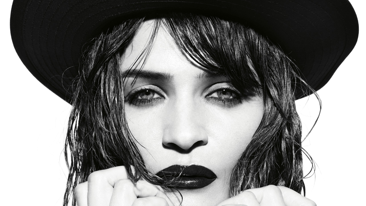
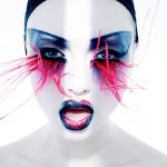
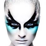
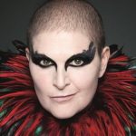
This is another piece of Rankin’s work however the subject has been asked to be photographed in a very different way to the other model. The image is still of a woman, close up and with a white background. However the message to the photograph is very different, the model in my opinion seems like she wants to be seen as mysterious but has a feisty side, i get this impression from the darkness of the image, the dark lipstick,eyes and hat. The genre of the image is again fashion and studio photography and is being taken for the celebrity to show their true self in their own eyes and how she wants the world to see her. Again this image has used technical equipment such as a white screen a professional shooting life a photography and a high focusing DSLR camera. Everything in this image has been very specifically placed so that it is giving out the correct message for example the hands and hair slightly covering the face. The hat maybe symbolising colour but not to far over the face that its covering who she is. The use of framing is very vital in this image as the hair is fitted around the subjects face framing the face making you focus on her face and for the facial features to be the focal point. The close up angle cuts out any unwanted background making it a complete face portrait so the only thing you can focus on is the subject its self and they are using only a few props and facial expressions to convey the message. The lighting is very important in this image as they have chosen the photograph to be black and white giving the idea that the photo is over exposed and also that the photo has a high contrast in it, the pure white and pure black are complete opposite ends of the spectrum making the image quite harsh.