
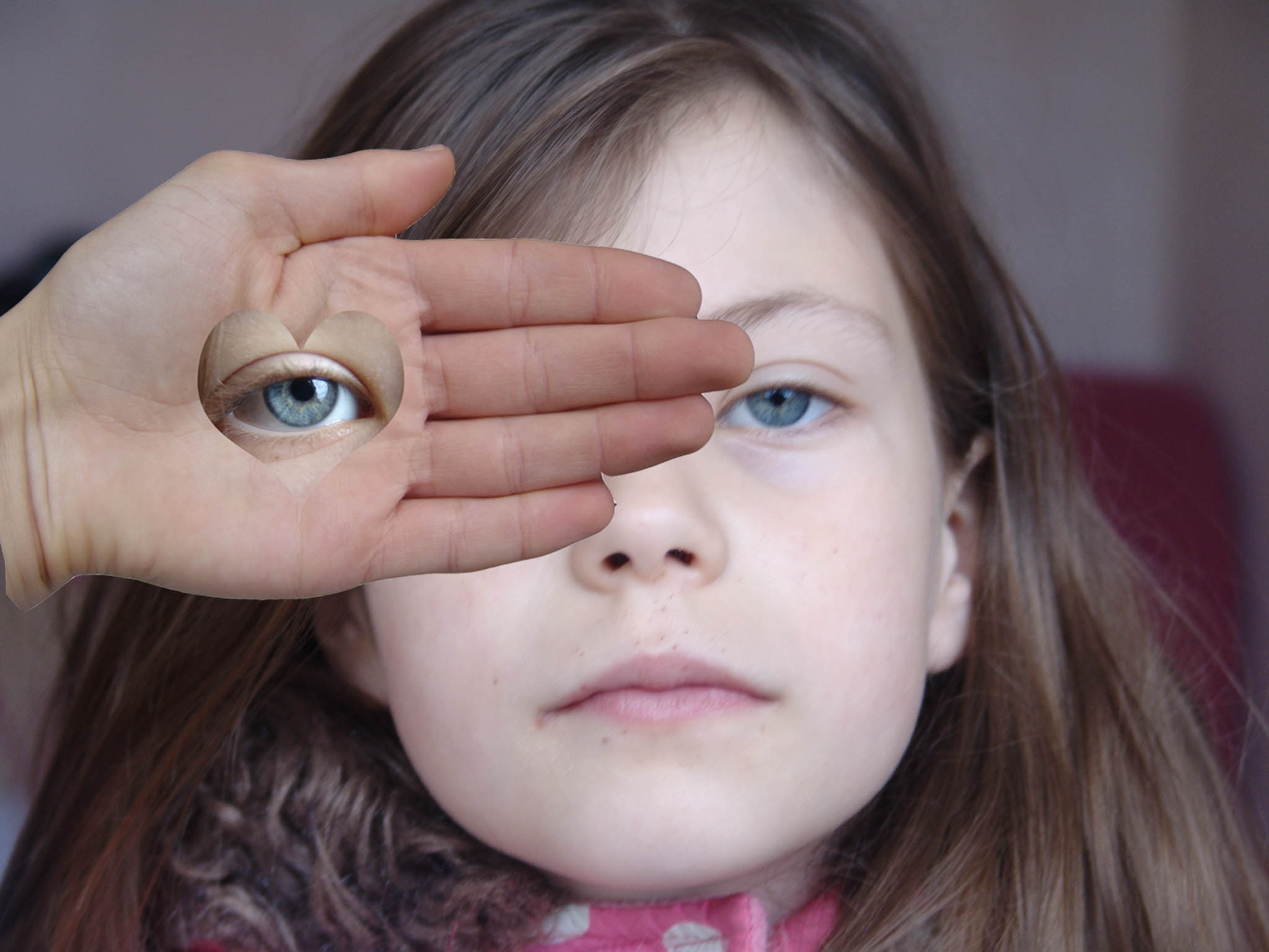
Here I took a portrait photograph of my sister. This photograph is inspired by Herbert Bayer to respond to his work. After this, I added a layer with a hand on top of the background portrait. Using the custom shape tool with a heart, I selected around the eye from another one of my photographs. From this, with the hand layer and the heart layer copied and pasted from another photograph, I merged the layers together to solidify everything. From this, I made the portrait photograph slightly blurred to give the photograph an isolated feel in the sense that the hand with the heart-shaped eye appeared better defined than the object’s face and features. To emphasise the feelings of isolation I cooled down the colors by decreasing the contrast and slightly brightening the more exposed areas. To contrast this, I slightly warmed up the colors of the hand and eye layer that would strengthen the hand up in front of the face. I feel what could of gone better was the surroundings. For example, I wanted the rawness of the bright natural light, with high exposure to be strongly present within the facial features. However the rawness of the light impacted the environment in which the object is posing making it feel somewhat out of place. Overall, I believe this was a successful response in Herbert Bayer’s photograph.
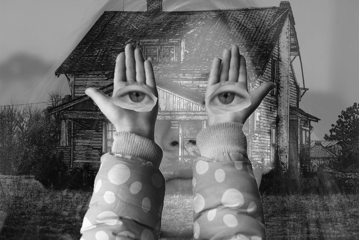
This photograph was again inspired by Herbert Bayer’s work with the hands holding eyes in front of an old, derelict building. Bayer’s work largely communicates emotions of harshness and aggressiveness. Therefore I tried to replicate this, with slight variations to increase the harshness. For example: in front of the used photograph with the house, I added a layer of a face with an opacity reduced to 23%. The hands were strengthened with an increased contrast and a full opacity, with the eyes reduced to 95% opacity to smooth the outlines of both layers. I particularly like how unlike Herbert Bayer’s work, this photograph through the composition of various layers appears as if the house is somewhat haunted and appears spooky and that the house is watching you. This makes the fell nervous, and to enhance this, I changed the image to black and white and decreased the brightness, to increase the spooky themes. This links in with the Idea of loss of Identity because it appears the apparent spookiness creates the thought that the girl through various things that the derelict house in the background has impacted her to lose her house. 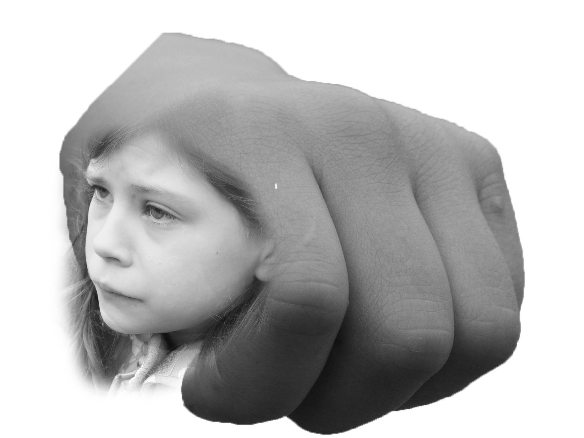
This idea is a direct response to Jerry Uelsmann’s work with the face merged onto the side of the knuckle. Here I copied a layer of a face and same too with a clenched knuckle. Jerry Uelsmann’s work largely advocates the idea that the girl is tied in or associated with some violent motion with the bigger fist dominating itself, in a violent manner. Here we see the object’s face appear sad and disheartened and looking another way with the angle of her face being at a near to a birds-face on angle. This depression makes the viewer feel sad for the object. Jerry Uelsmann, in his work, increased the brightness and exposure of the photograph using low key lighting. I on the other hand used natural lighting to have the object’s face to be all fully lit up, with a blank look to the skin, making the object appear more fragile increasing our sympathy towards the object. After copying the 2 layers, to merge them together smoothly I did 2 essential actions. I blurred the face using the gaussian blur effect and then went to select – modify and – feathered the layer.
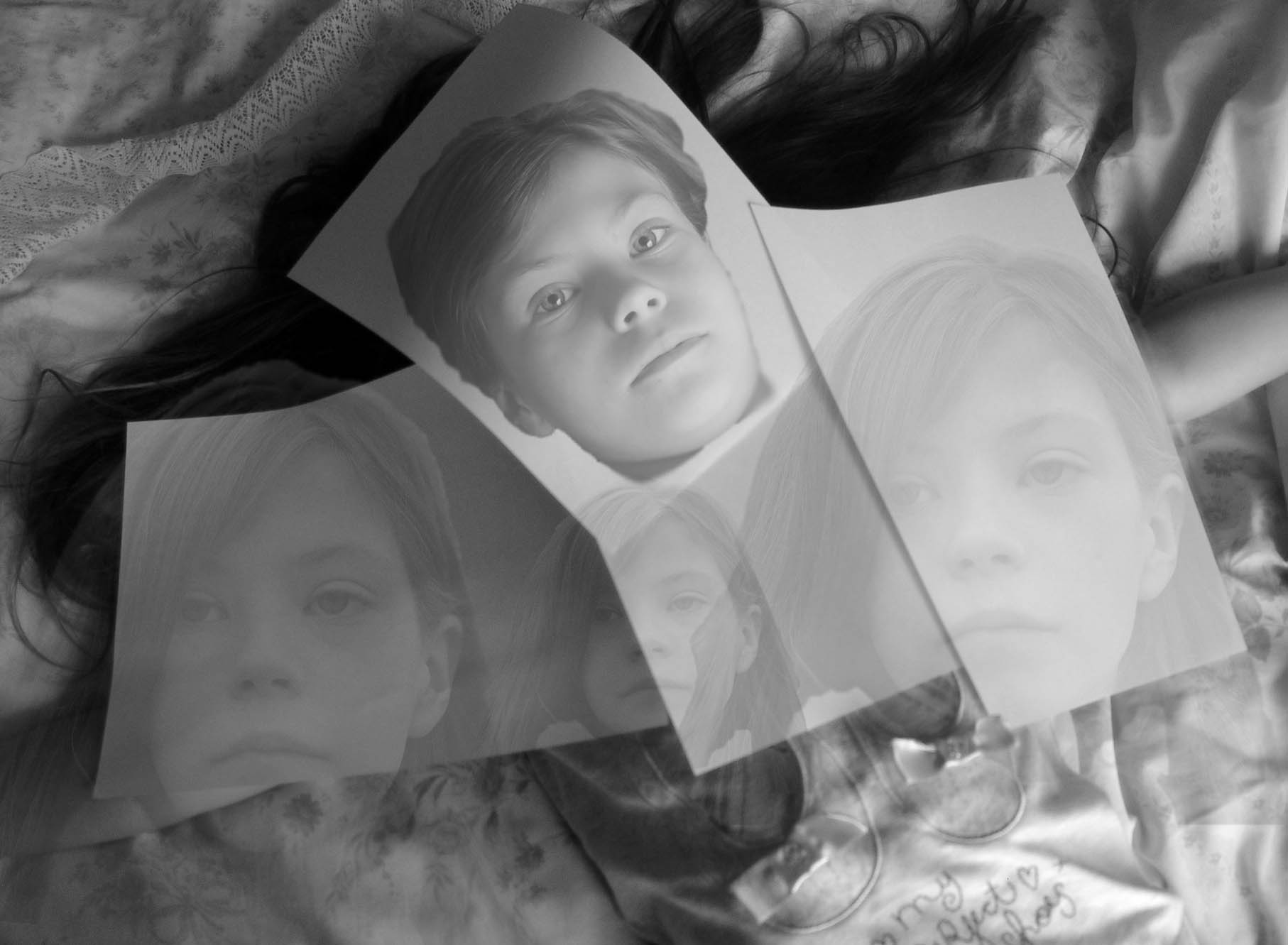
I like this photograph because it is set slightly apart from Jerry Uelsmann’s work with my own tweaks, however there are still elements that show how I wanted to create a strong response to the photographer’s work. For example: I took the photograph at a bird’s eye angle with strong dark tones that create feelings of lifelessness. The object is layed down with paper over them. I copied a layer from another photograph and placed it where the face would be underneath the paper. I then minimized the opacity by 25%. From here, I then added layers with a small opacity of 10%. This created ghost-like figures that appear quite scary. To a smaller extent, I set up a lighting system similar to the style generated by low key lighting. For example, A single, natural source from the bottom right of the photograph is entering the photograph, creating deep and dark shadows around the body. This makes the photograph look as if a terrible fate has befallen upon the object under the paper, and the paper is trying to disguise it. This is emphasized by the low opacity face over the paper, making the viewer believe that the object iws well and okay, but in reality not so much.