
Daily Archives: November 24, 2016
Filters
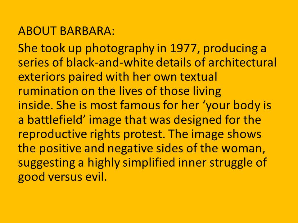
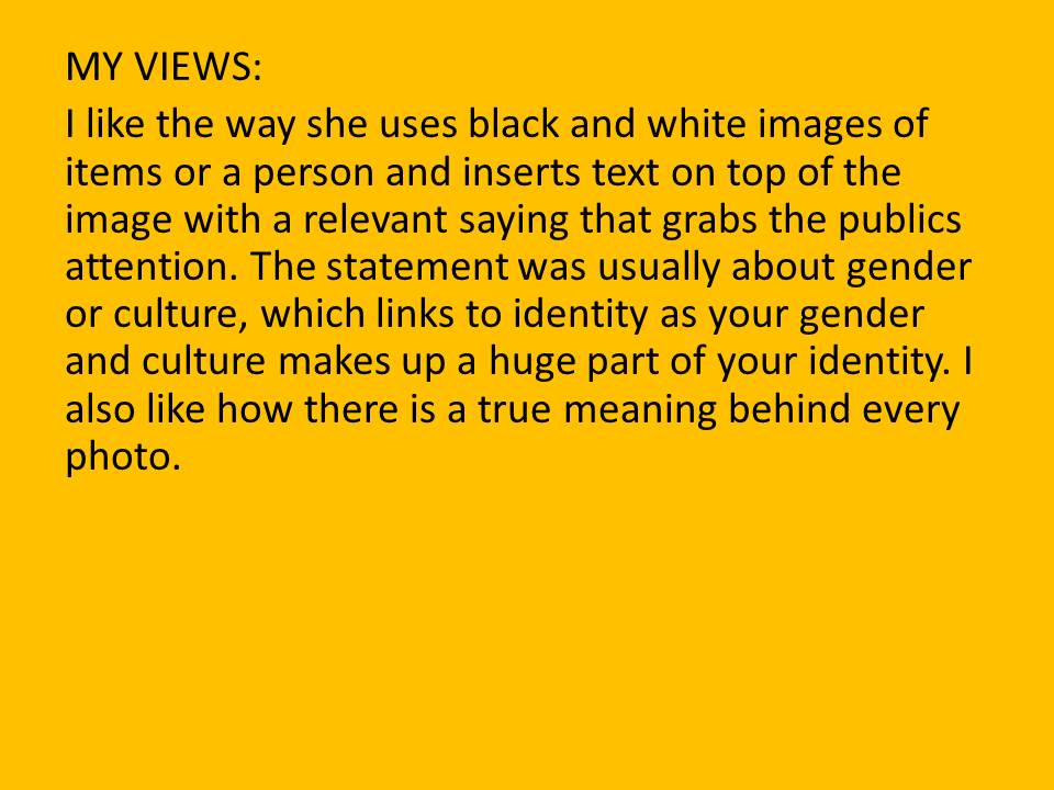
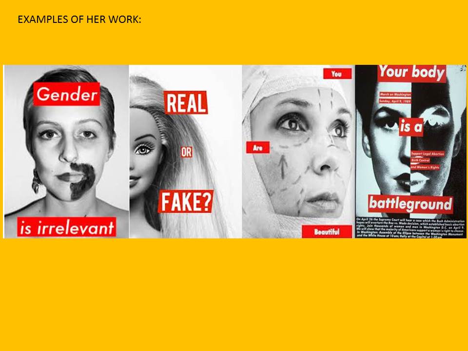
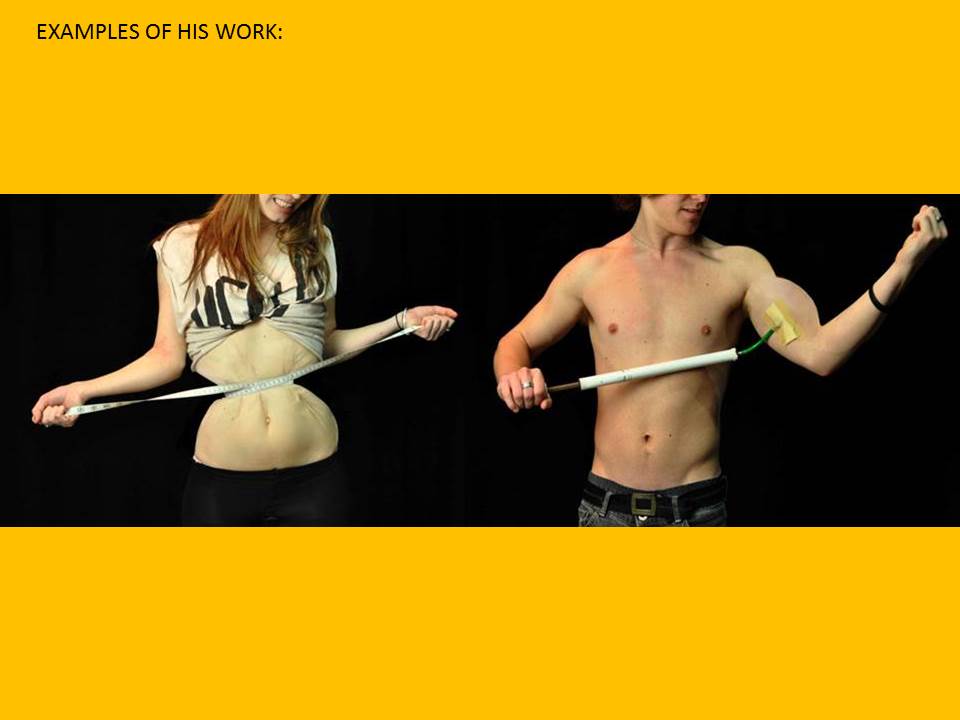
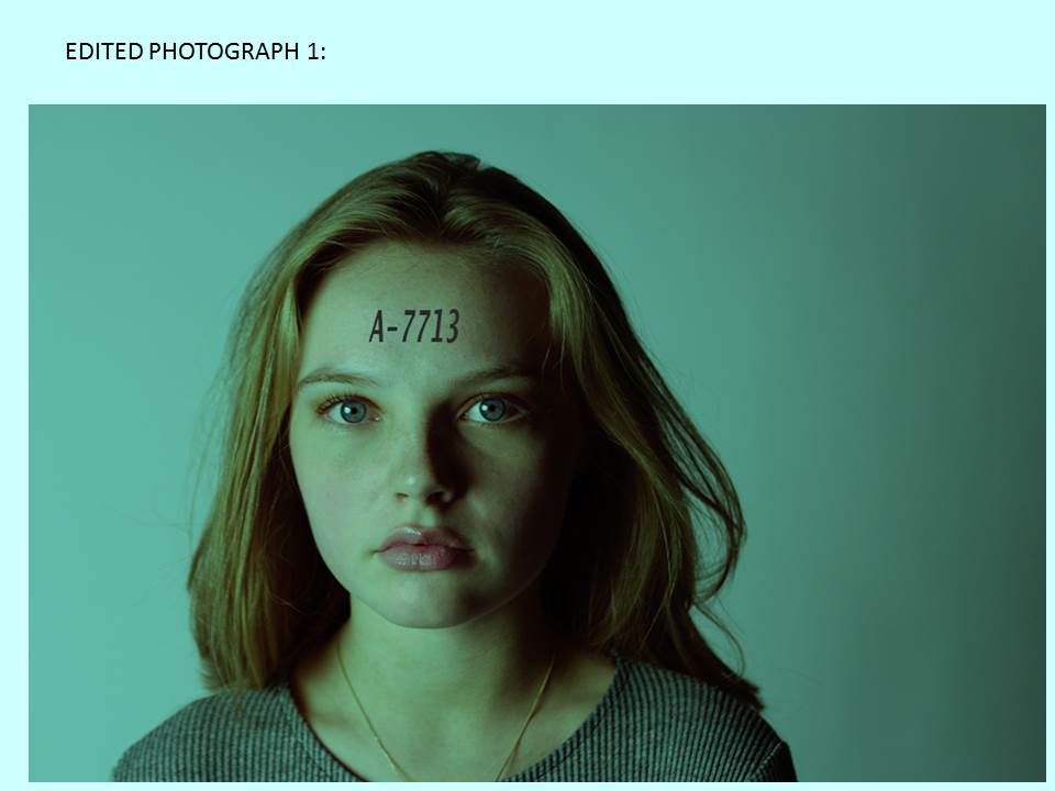
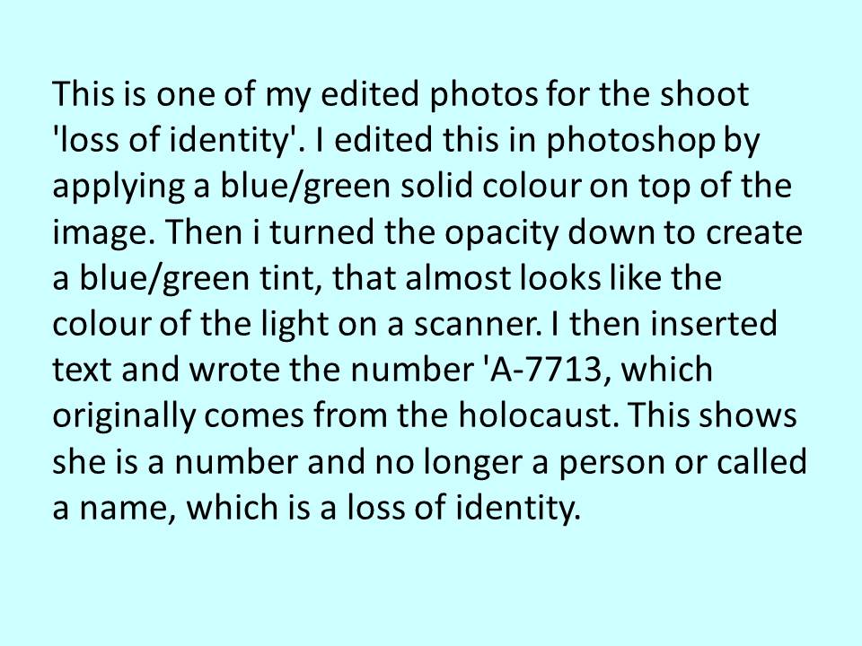
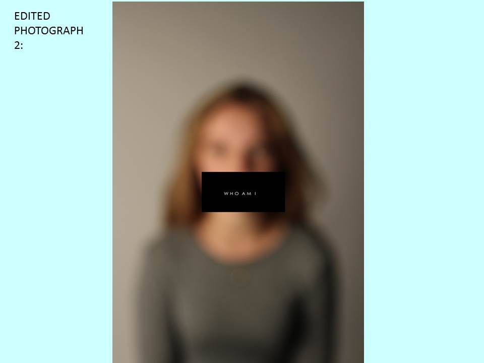
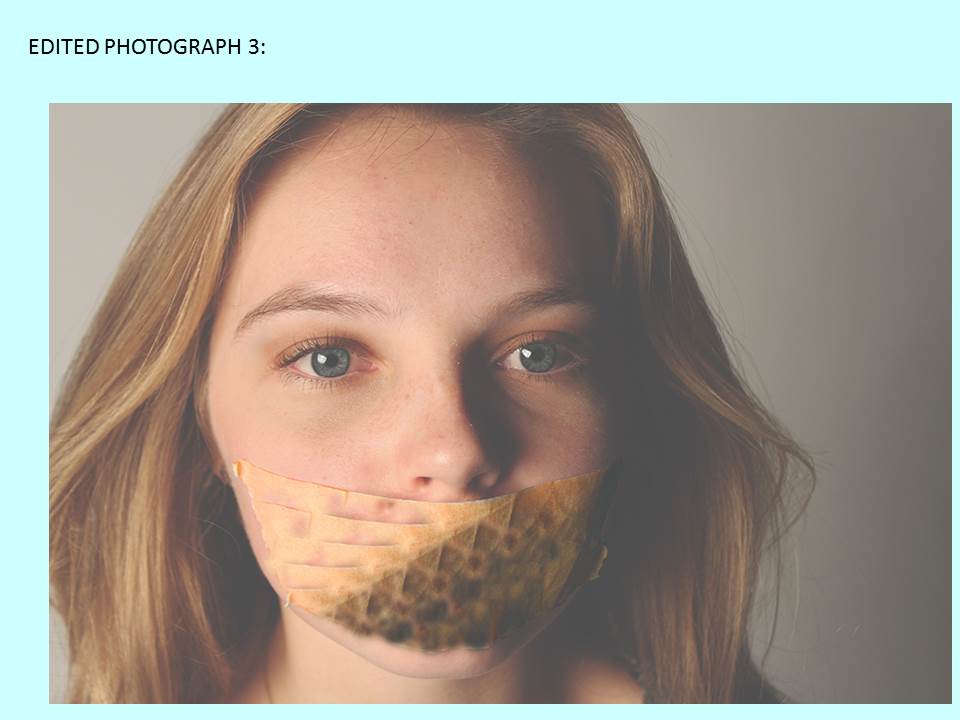
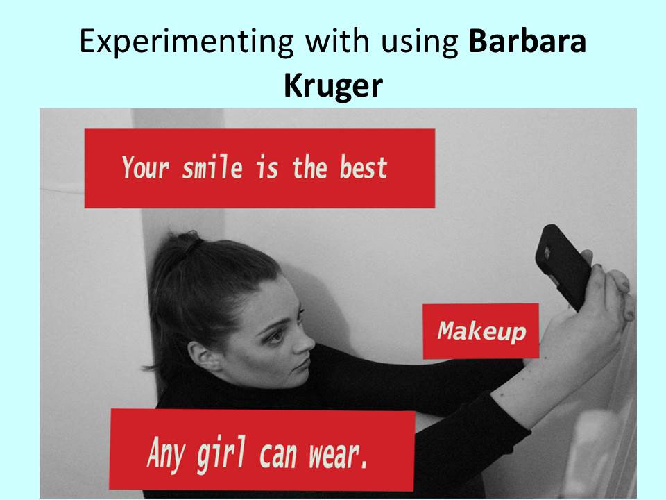
Edited photos-identity
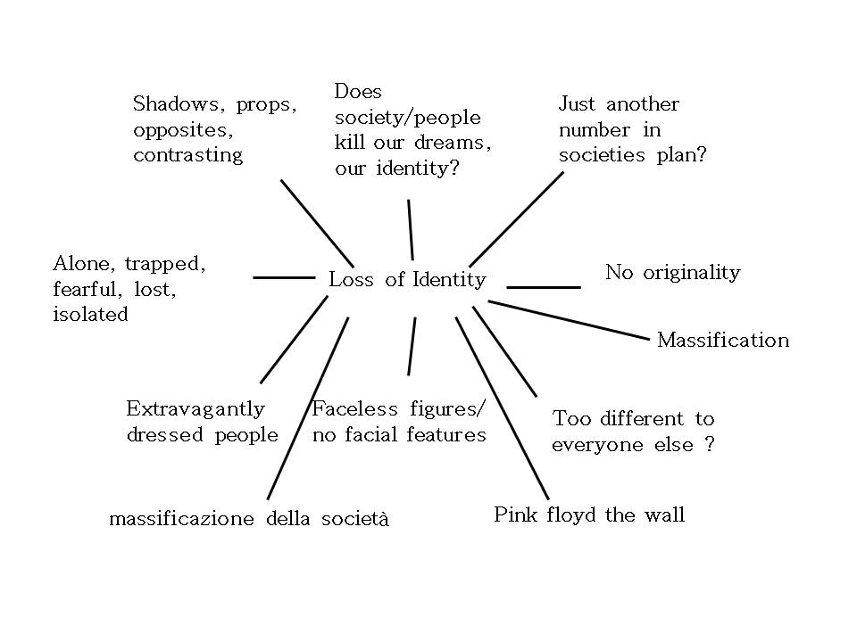
Mind map- Identity
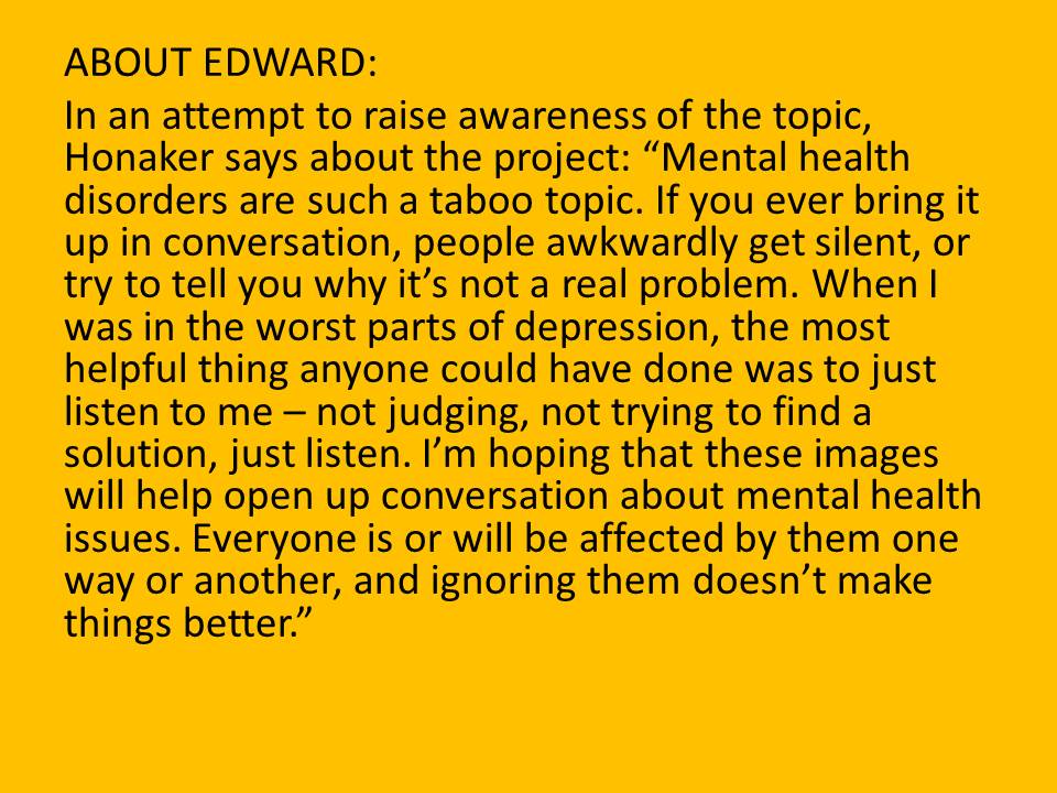
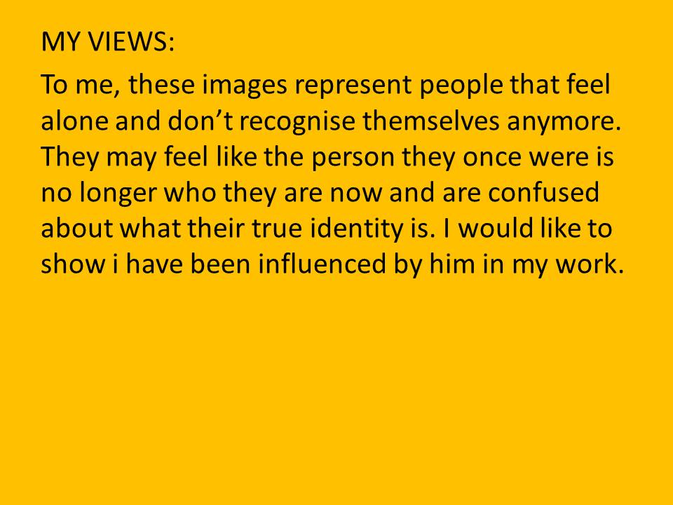
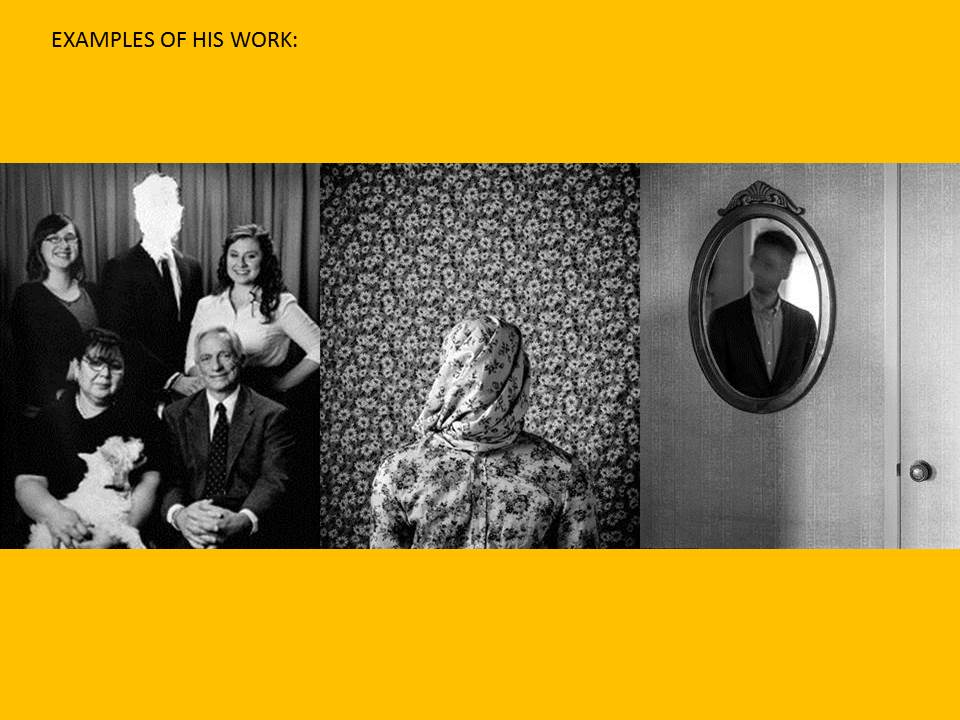
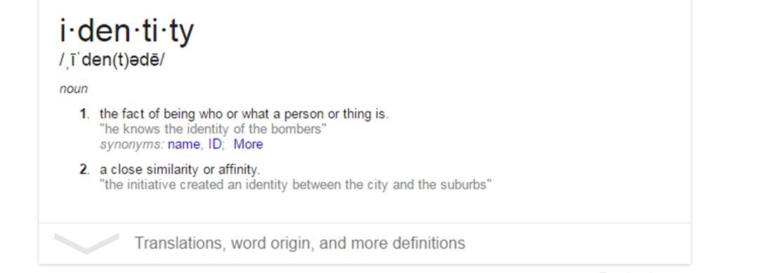
Identity Introduction

Rankin- Best Photos Analysis
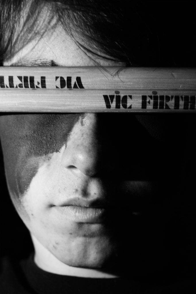
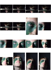
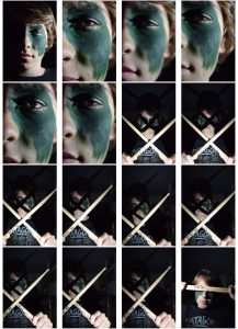
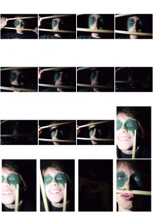
Here I wanted to use chiaroscuro lighting I did this by using the torch from my phone and held it up next to his face as I took the picture with the other hand. I also used the drum sticks as a sort of blindfold this covered his eyes. On this picture I wanted to focus on the phrase “The eyes are a window to the soul”. This photo perfectly shows my brothers personality as it shows that sometimes my brother using drumming as a barrier to talk or to talk to people. A barrier to talk about the serious stuff and doesn’t always let people see his true self but instead his talent. When editing this photo I wanted to make it black and white as I thought it would look more striking. I also increased the contrast a decreased the brightness slightly.
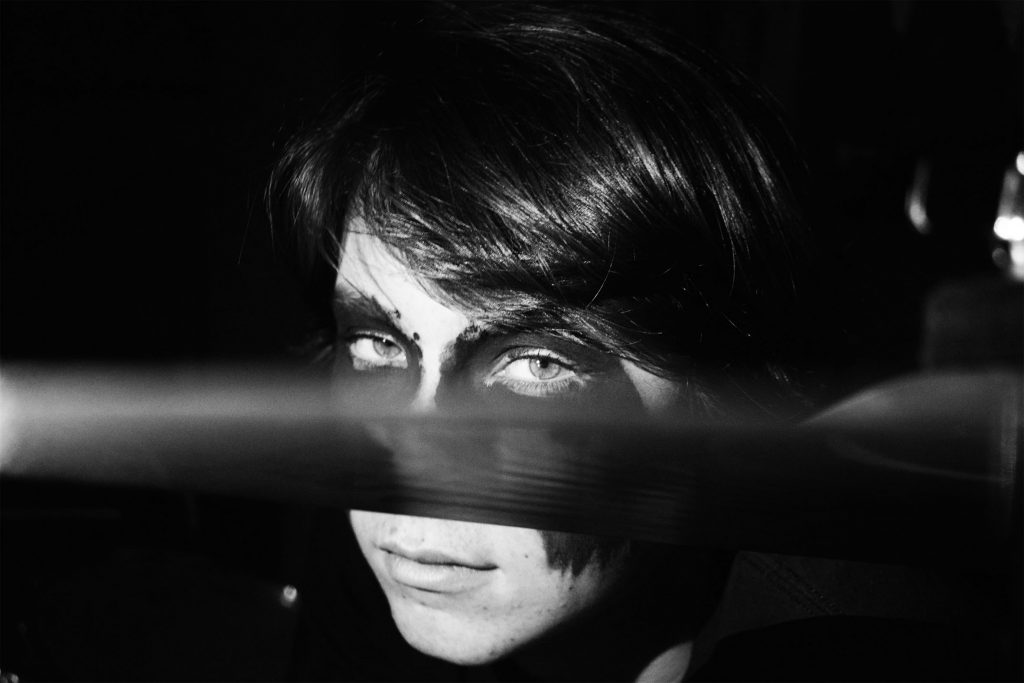
In this photo I wanted to cut his face in half using the symbol of the drum kit but also make it look like he’s hiding behind exploring the same idea as my previous photo. When editing this photo I made it black and white and increased the contrast as well as the brightness. I like this photo because it feels dramatic, it feels like he is staring into you not at you. It really has the eerie feeling I wanted it too have with the seriousness in his eyes and the dark setting behind him.
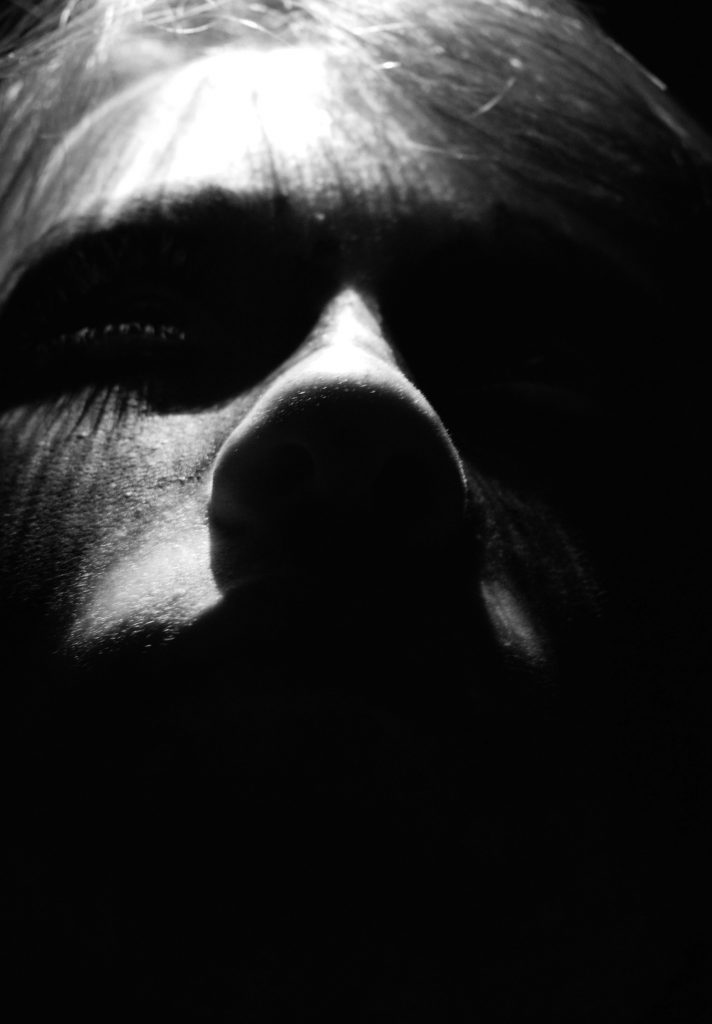
Here I used over head lighting to make this intimidating feel to the photo. I chose to make it black and white because gave the dramatic feel I wanted it to. When editing the photo I wanted only part of his face to by shown so did this by turning it black and white and increasing the contrast dramatically. This also picked up on the shadows made with his eye lashes and enhanced them.
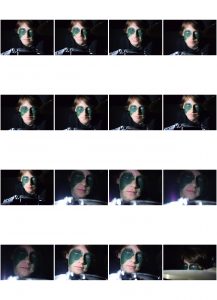
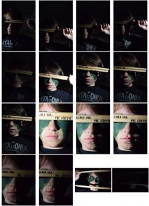
Rankin- Best Photos Contact sheet
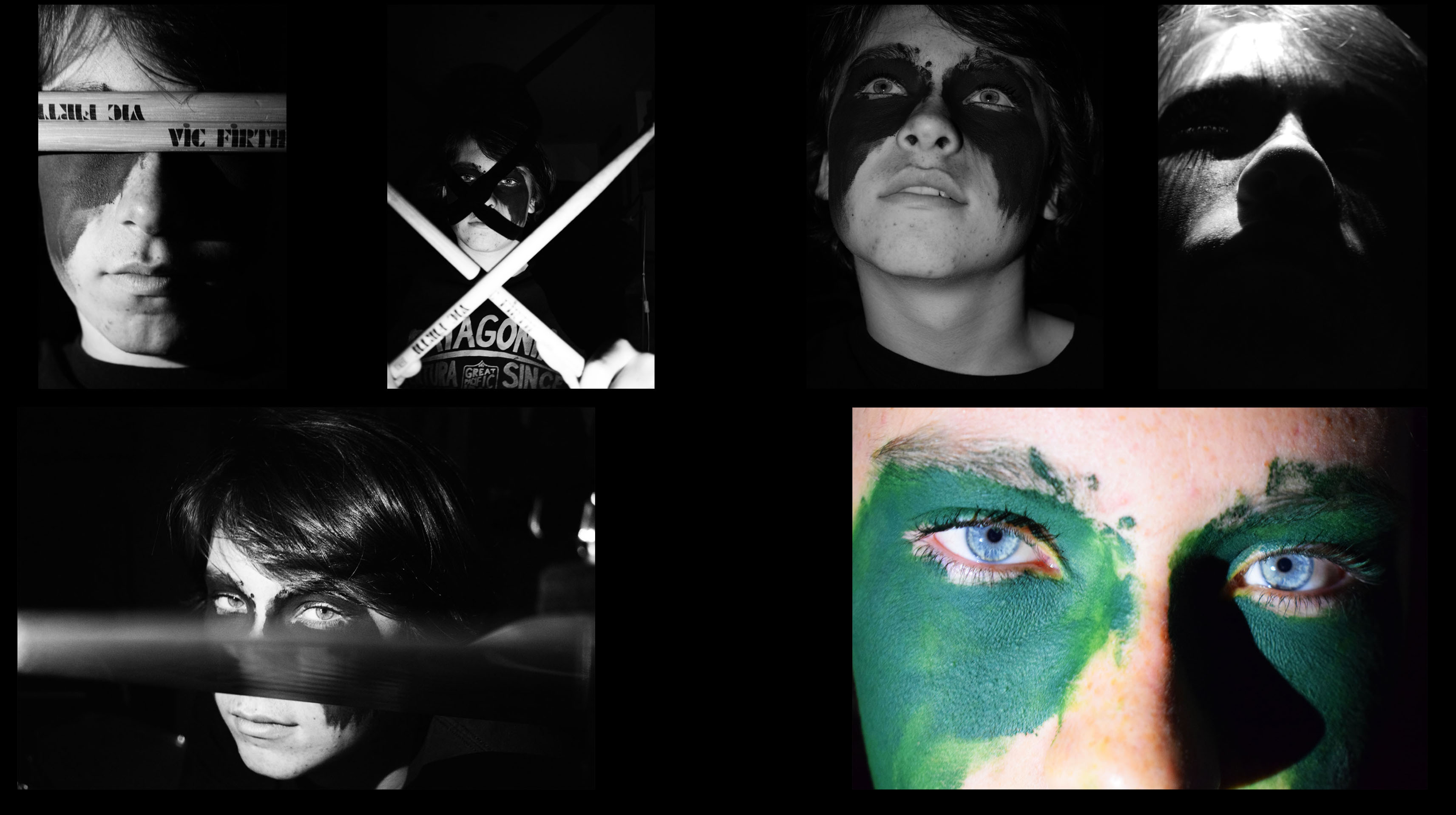
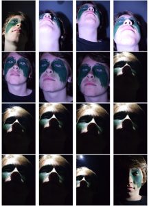
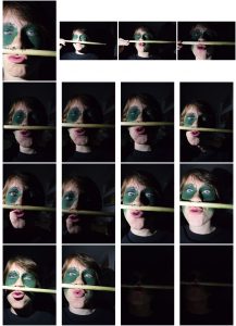
Here I have chosen the best photos from my Rankin project. When I editing these photos I wanted to make them striking, something that captures your attention. I also wanted to make it my own interpretation of Rankins photography. I wanted to show my brothers personality through the photos. This is why I did the photo shoot around the drum kit because my brother puts all his time into playing drums and puts a lot of effort into it. I also used the face paint to show my brothers personality, this why the face paint is messy war paint and looks like he has just put it on his face quickly. I wanted this to show that when he plays his drums its like a battle he puts everything into it, giving it his all. I wanted him to look intimidating but also calm and approachable in other photos.
Case Study – Herbert Bayer and Jerry Uelsmann
CS 1 – Herbert Bayer.
Herbert Bayer was an Austrian and American photographer, born on the 5th April 1900 – 30th September 1985. Bayer started his creative works in the Bauhaus years in Germany. His post Bauhaus ventures led him to designing a tourist brochure for the 1936 German Olympics. After the Bauhaus he started doing his own photography in 1928 working on his “new vision photography”. His photography work from 1928 – 1938 represented his broad approach to Art by including graphic views of architecture and most notably photo montages.
After moving to America in 1938. Bayer married Dada artist Joella Syrara Haweis, heavily contributing as a major influence to his later work. The invitation from Alfred H Barr Jr asking him to apply his theories of display to the Bauhaus exhibition at the MoMA in New York. Bayer developed this task with Edward Steichen, head of the photography department designing the Road to Show (1942).
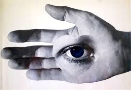
Here an eye is planted onto a palm of a hand. I like this photograph because of it’s simplicity but yet how many questions it poses in terms of what sort of identity it is. The dark shadows are powerful as they create a striking contrast to the bright light coming from a center view. The bright light creates a calm and smooth texture of the hand giving the photograph a delicate nature.
The dark and imposing shadows around the angles of the light sources is also interesting because they create a mysteriousness that is questionable to the identity of the photograph. This interestingly makes the photograph look quite abstract, manipulating the scene to suggest there is some hidden answer that can’t be seen. This is effective as it is complimented by the darker shades of the eyeliner and mascara. As this link is made, and the fact that these darker hues surrounding the eye which are associated in this context with mysteriousness, evidently suggests that the eye is all knowing as it knows the mysteriousness. This makes the viewer somewhat fearful towards this eye as how its presented as all-seeing and all-knowing is quite intrusive to the viewer.
I particularly like how the eye in the center of the palm, is heart shaped. This interestingly shows Bayer’s aim was to show that our eyes are like our hearts in the sense that our actions and who we are, are controlled and influenced by what we see that defines us. This is backed up by the fact the eye is placed in the center of the object’s hands as with our hands, we usually use to grab, pass and hold things. This suggests Bayer is communicating that people are controlled by what they want as what they see from their hands. This links with the context of which Bayer was present within the Bauhaus movement as the rise of Hitler and the Nazis gripped Germany, completely obsessed by what they wanted for their own personnel gain.
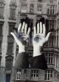
This photograph is quite similar to the Bayer’s other photograph I have analysed. Here he has used the hands to show a slightly different style of loss of identity. For example the hands are portrayed to us quite brightly and well lit. This is because hands are usually a part of our body that we can control and therefore shouldn’t necessarily be feared. How the hands with the eyes are presented as if they have their own brain, creates a stark contrast with the elements of control. This makes us feel that the hands aren’t something in control now in the picture and are almost another being, watching up at us in a cold stare making us feel nervous. This is backed up by the fact the tones of color surrounding those piercing eyes are cold and quite bold and striking.
Also, I like how the composition of the photograph, especially with the background enhances those eyes hard-staring eyes as the hostile environment makes the viewer feel particularly uncomfortable. The background’s brightness has been toned down, with a strong contrast to bring about imposing dark tones that compliment the eyes as the mood they give off, contrast the brightly lit hands. The building looks as if it has been mistreated along with the increased contrast , makes the viewer feel fearful of the environment of the photograph.
This all suggests the photographer’s view he is trying to express how if people allow for their eyes to control themselves in terms of what people want and become the center of people’s lives, then it can have disastrous consequences. This like the previous photograph links in with the context of Bayer’s experiences of the Nazis, who lived lives like how Bayer is describing, and turned Germany, what was once a safe place, a downright dangerous place to live.
Cs2 – Jerry Uelsmann
Jerry Uelsmann (1 June 1934 – present) was an American photographer and a forerunner of photo montage. He developed an interest in photography from a young age. He studied photography at Rochester Institute of Technology. He received further degrees from Indiana University. He taught photography at the University of Florida. For Jerry Uelsmann the camera enables him to interact with the world emotionally, capturing the true essence of life. He largely focuses on his work using dark or light rooms, building on darker grey tones most often. Also, he has created strong contrasts between natural and artificial elements.

I love this photograph because of how expressive it is in terms of how the lady through the violence (from the clenched fist) .
The enhanced strong dark tones of the woman’s face portrays her eyes to be very dark. This shows that she can foresee the pain she is about to experience. Also with her eyes, she isn’t looking where she is going suggesting the force of that fist is strong it moves her, and that she doesn’t have a chance to check where she is going. I also particularly like how the lighting on the woman’s faces which is associated with innocence, delicateness and beauty is somehow undermined by the grey, low key lighting of the fist itself.
Also, the fist is considerably larger than the woman’s face re enforcing my view that that the theme of violence is strong and therefore uncontrollable but also the fact the fist is so big suggests the theme of pain is a big part of her life, so big in fact, she cannot ignore it despite she may try to. Clearly the fist is preventing the girl from being who she is and we therefore feel sorry for her. Further evidence to back this up includes the composition exposing contrasting elements to the photograph. For example: the rough hairs on the fist are quite intrusive as they appear very sharp, whereas the tight and organised composure of the woman, highlighting her hair shows again how the recklessness of this fist is very intrusive.
I believe Uelsmann is communicating to us how violence from others can impact people around them in a way that brigs everyone else down, in a way which is uncontrollable despite people’s efforts to stop it. The photographer is expressing the view that violence, although it may not be directed at someone specifically, it can affect others and so the photograph is encouraging people to stop violence.
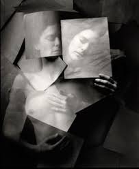
I like this photograph because it really captures the sense of emotion in the photograph of how the object appears sad and depressed from her feelings.
Interestingly there isn’t much of a depth of field with the object and the background, this merges the components as one. I like how the dark shades of within the background and the object further merges the 2 components together. This is done as the object’s body is toned down in light making it a sort of intermediate tone range between the bright face of the object and the dark background, producing a clear link. The fact the object’s face is well lit up ad strongly exposed, whereas the background is dark therefore suggesting that the object is generally quite a light hearted character who is quite a happy character. However the background which is in a dark setting suggests with intermediate grey tones being exposed around the body suggests the object is facing a particular issue that is causing her to be depressed.
I find it interesting how the photographer has taken the photograph from a bird’s eye angle, with us the viewer looking down at her. This really emphasizes the fact the object is in a “down place” and this makes the viewer feel sorry for her. Within the photograph, we see the object hold pieces of paper over her. This is evenly exposed, with a low contrast setting; producing a strong grey tone. This appears to the viewer that the object is trying t hide her issues, through weak bits of paper. We know it’s weak because the grey tone doesn’t fit in with the 2 main contrasting lights f black and white. Also, we know that the opacity has been slightly reduced to further show how weak the paper is. From this, we can see through the paper – suggesting that the object cannot hide her problems and that everyone can see them. However, how the object is in such a dark environment suggests she won’t necessarily get help for her issues which she needs to an extent bring back her identity. Therefore I believe Uelsamnn is communicating to us that people who try and suffer in silence are often ignored, despite people easily seeing that they are suffering and we need to help people like this more.
Half Term HW
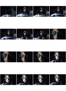
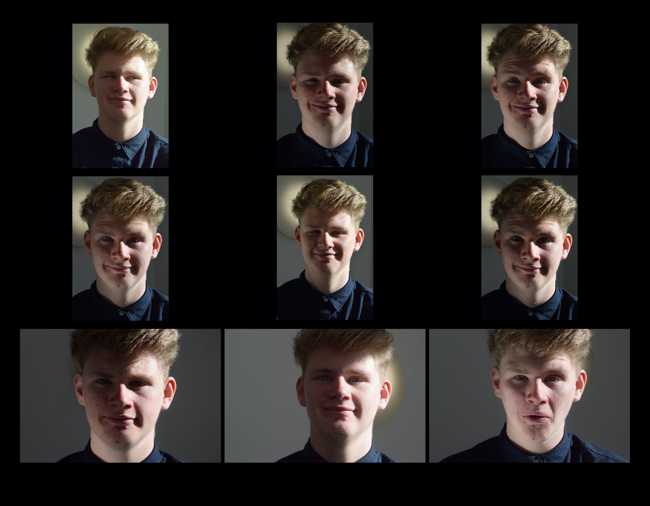
Studio lighting contact sheet 2
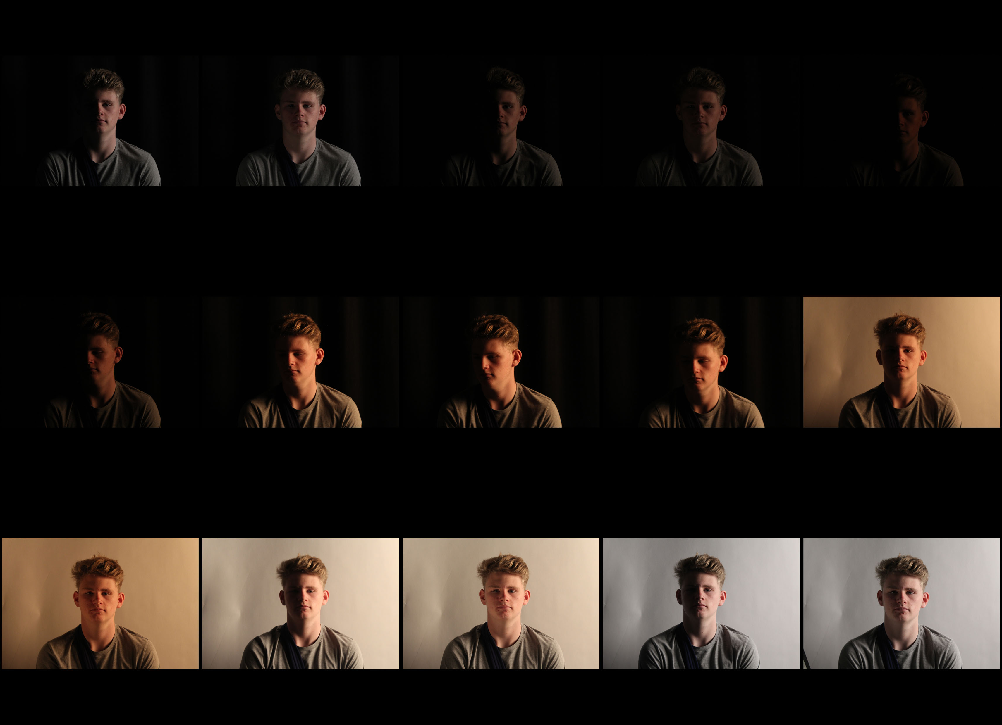
Here I have taken photos of subject with different levels of lighting and different backgrounds. Firstly I used a harsh bright lighting with a black background then gradually made the light dimmer and took multiple pictures like this. I then told the subject to look down when I did this I increased the lighting slightly this gave it a nice chiaroscuro affect. I then changed the background to white and went through the same steps in reverse order. This made the photos a lot brighter as the white background was reflecting the light rather than absorbing it like the black background.
Natural lighting
Here we are taking photos with natural lighting. When taking the pictures we got into a spot where there was a lot of light then took photos. After this, we used the reflector to get more light on the darker side of the subjects face. This allowed the camera capture more light.