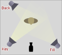
 Three-point lighting is a standard method used in media such as theatre, video, film, still photography and computer-generated imagery. By using three separate positions, the photographer can illuminate the shot’s subject (such as a person) however desired, while also controlling the shading and shadows produced by direct lighting.
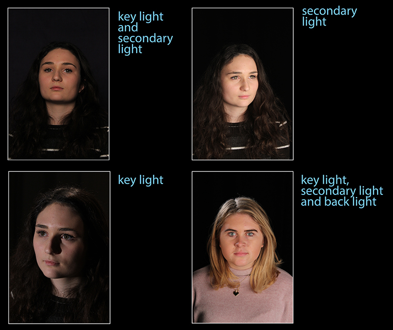
The main light is usually the strongest and has the most influence on the look of the scene. It is placed to one side of the camera/subject so that this side is well lit and the other side has some shadow.
The secondary light is placed on the opposite side of the key light. It is used to fill the shadows created by the key. The fill will usually be softer and less bright than the key.
The back light is placed behind the subject and lights it from the rear. Unlike the other two, its purpose is to provide definition and subtle highlights around the subject’s outlines. This helps separate the subject from the background and provide a three-dimensional look.
My Photoshoot:
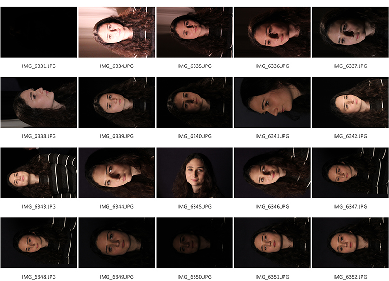
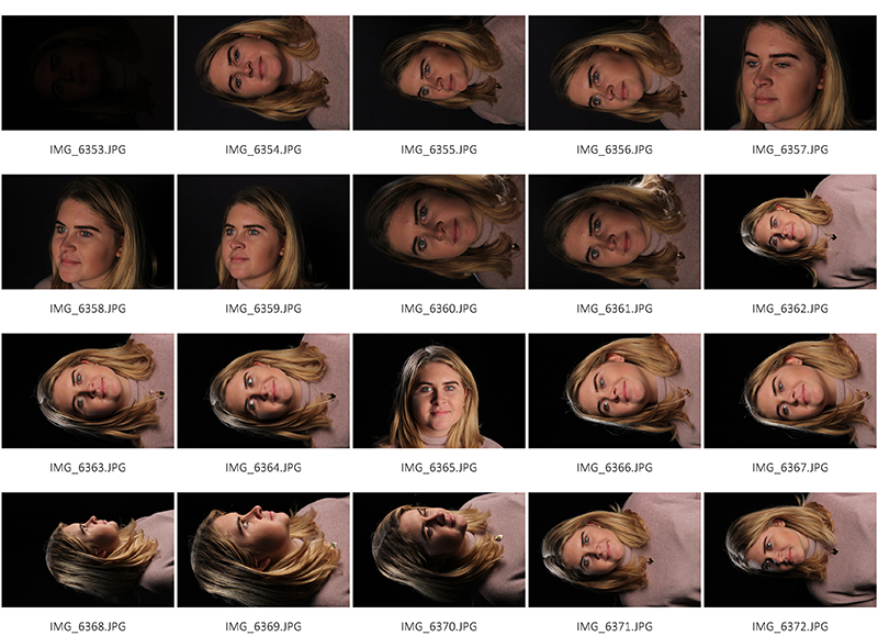
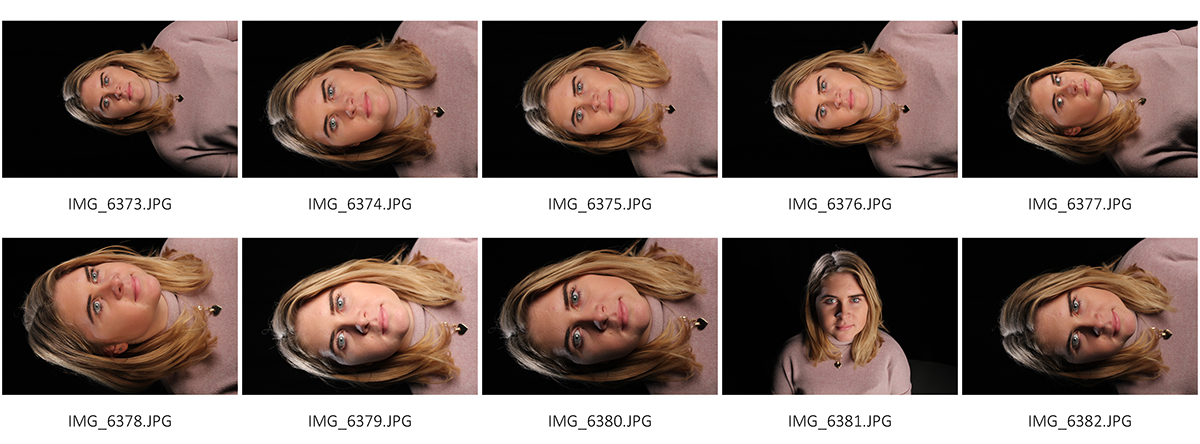
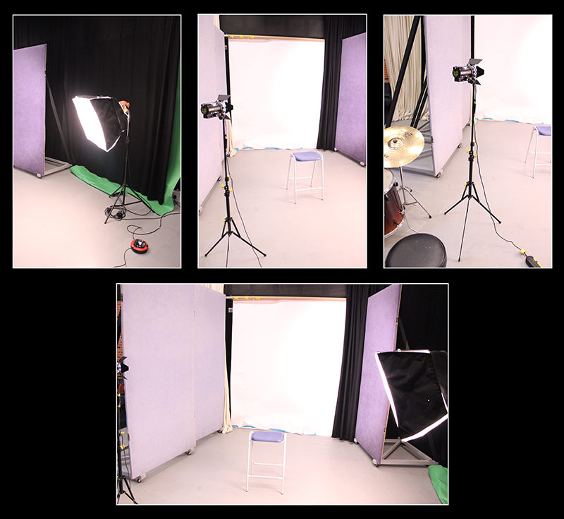
For this shoot, I experimented with three-point lighting which includes a main light, a secondary light and a back light.
I used a black back drop so my subjects stood out and to give me the best possible opportunity to get the best results and so you can evidently see the three uses of lighting.
The point of three-point lighting is to create a direct, pleasing and realistic light on your subject. By using three separate lights you have complete control on how the subject is illuminated. Due to this, I found it much easier to get an even distribution of light on my model and therefore made for a better outcome because the subject’s outline was clearly evident while the technique remains relatively simple.
I began with just the key light to see the influence it had on my subjects appearance, however, the side of my models face which wasn’t exposed to a light was getting lost in the black backdrop so I therefore experimented using both the key light and fill light which illuminated the whole of the subject.
I then tried out using just the soft-light box – they fill light which made the face stand out but still crated some shadows without the help of the key light to drown the shadows out.
After using both the key and secondary light, I moved on to the back light which face my subject a halo-like look as the light was being cast onto the back of her head and shoulders and automatically, the subject looks more three dimensional. In addition, the audience can see the outlines more clearly and there are more highlights in comparison to the previous shadows achieved from the other lights.
I really enjoyed doing this shoot because I now understand more about three-point lighting and what the purposes are of each light involved in the technique. I believe I need better knowledge about what settings are best for each light.
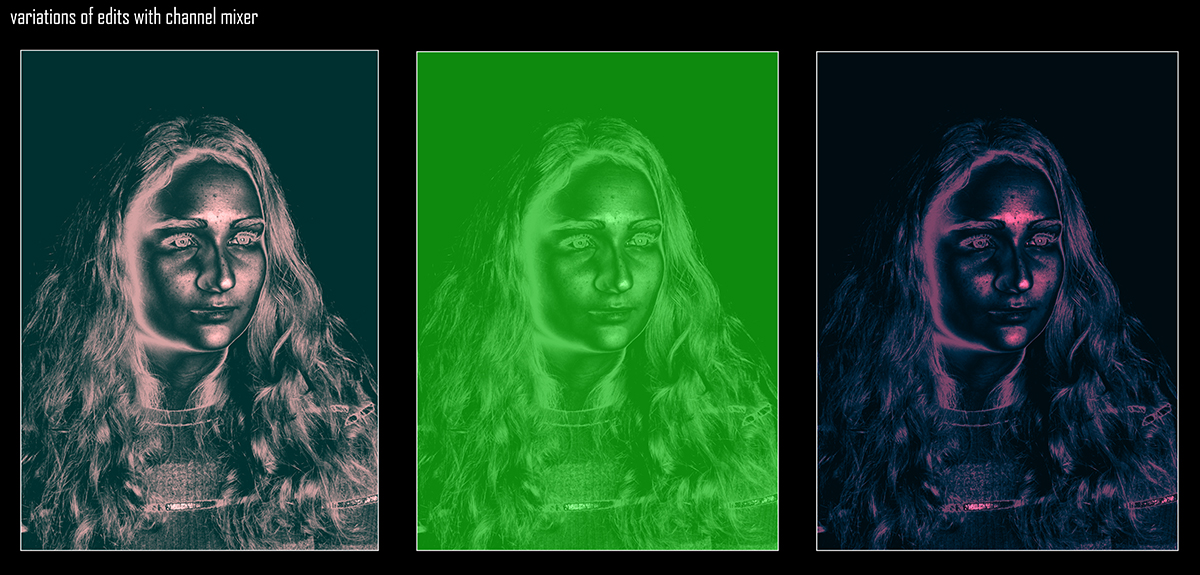
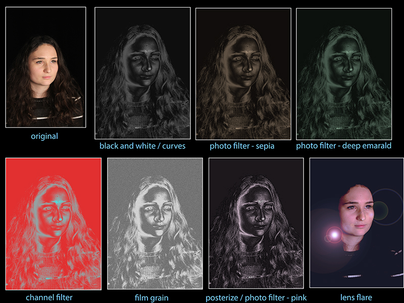 When editing these images, I experimented with black and white, brightness and contrast as well as levels but was particularly attracted to the way the ‘curves’ features made the images look. I then came across the ‘photo filter’ editing technique and really liked the futuristic look the different colours gave the appearance of each photo. They edits look very unrealistic and this is what I wanted to achieve to show juxtaposition between the idea of realism which three-point lighting gives compared to the unrealistic, futuristic look my edits portray.
Experimental Edit:
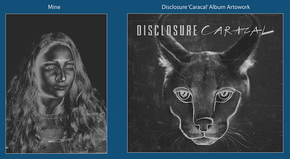
For these particular edits which look very metallic and almost like an x-ray, I got my inspiration from the house duo, Disclosure and their logo as well as their artwork on album/EP covers. The art really fascinates me and I think it is a great and unique design which I wanted to try to replicate in my edits.

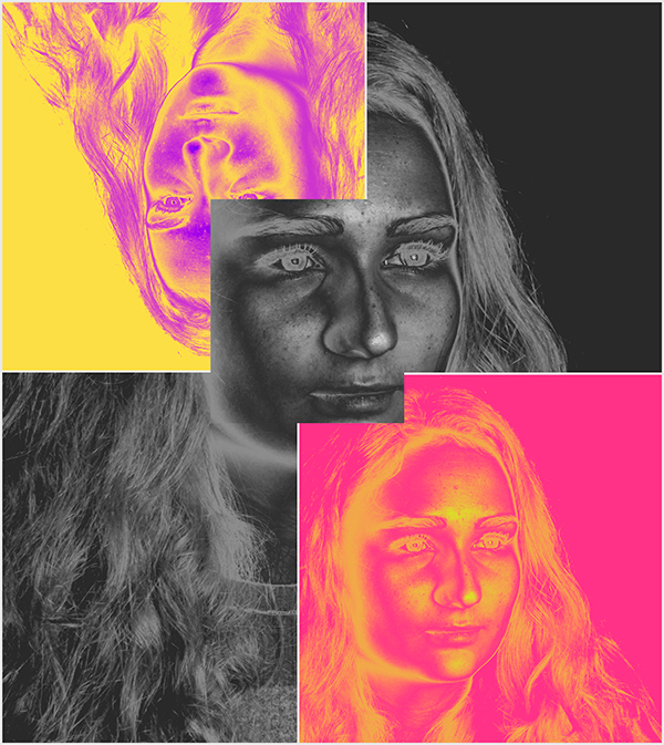
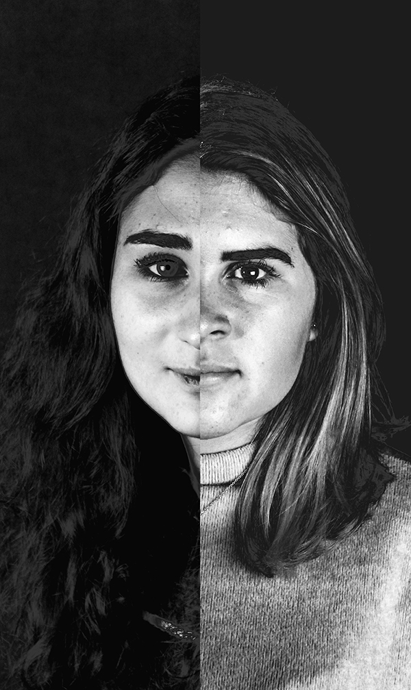
Next, I was inspired by Andy Warhol within my Disclosure inspired series. I was inspired by Warhol’s pop-art, in particular his collages of 4 images.
I wanted this edit to look very unusual and perhaps a bit uncomfortable for the audience to look at by playing around with proportions, shapes, sizes and colour pairings.