Daily Archives: November 8, 2016
Filters
Rembrandt Lighting – Best Photographs
Why Do We Use 1,2 and 3 Point Lighting?
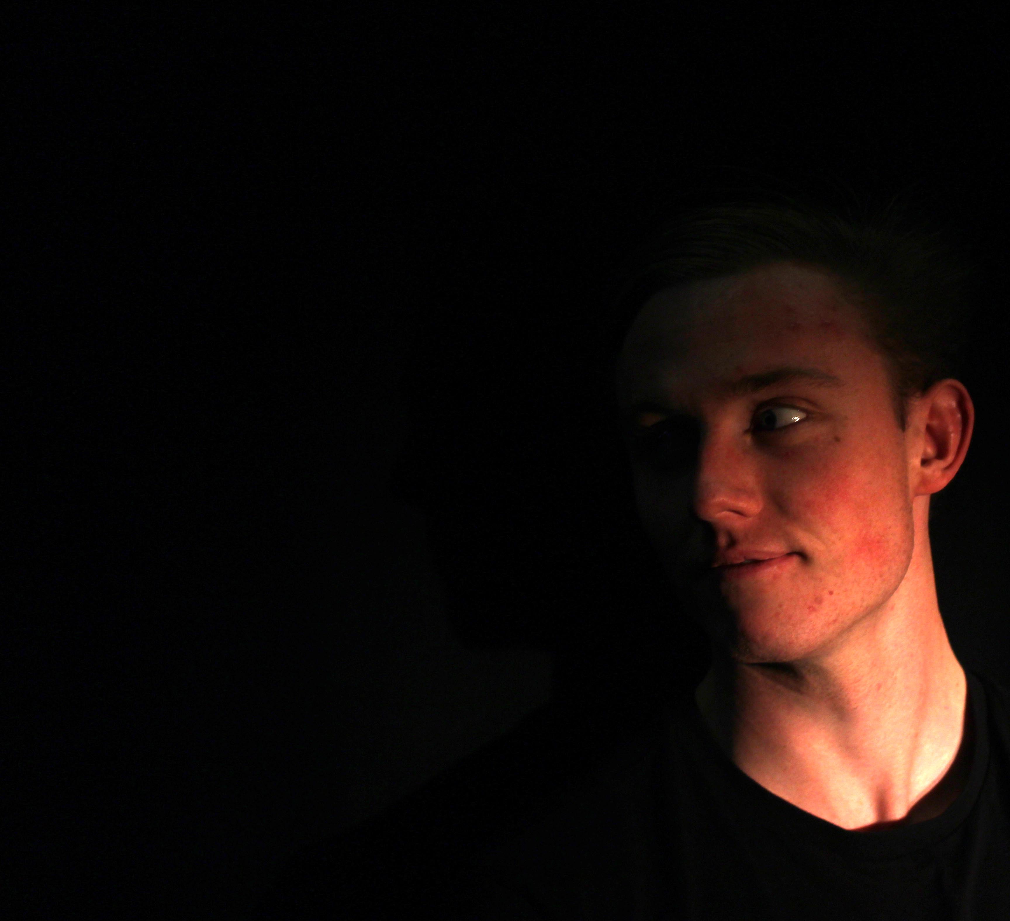
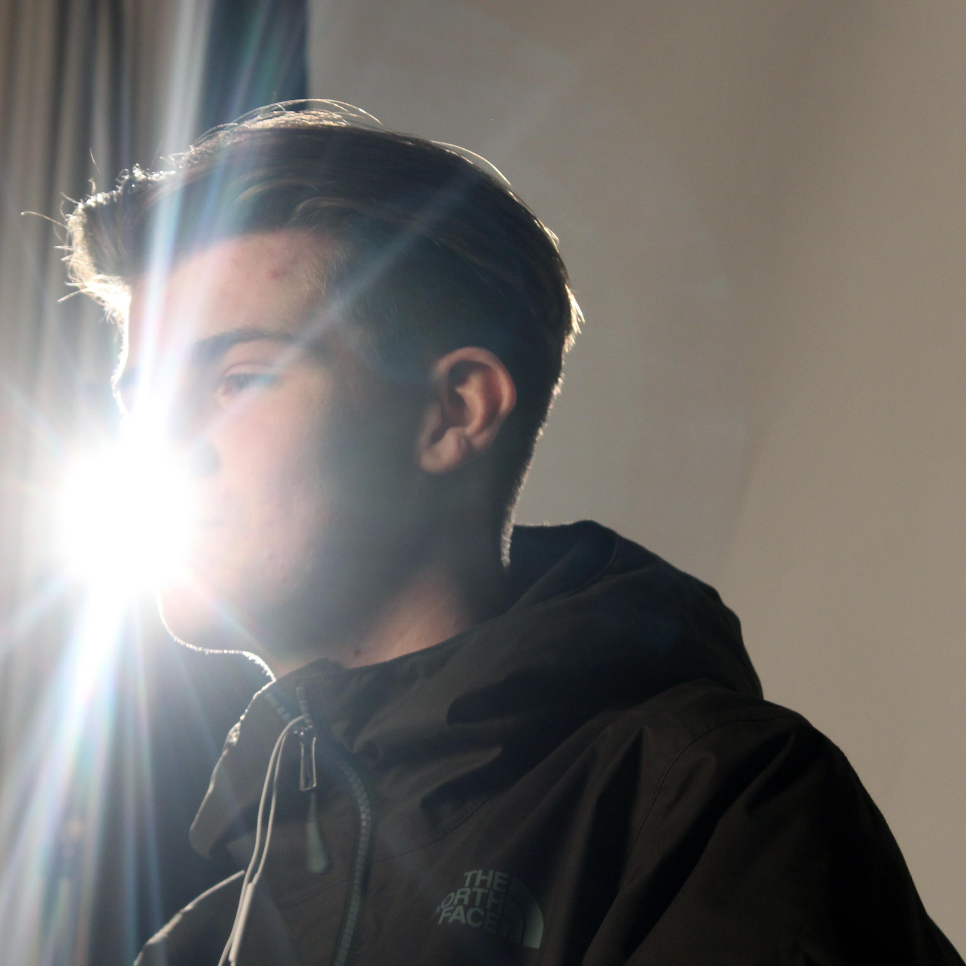
Often we use 1 point lighting as a very simple source of light. We can use this lighting to highlight a specific area of an object. By doing this we show a strong contrast between this part and other parts of the photograph. For this reason, I personally prefer to use a black background as this makes the object’s dark areas such as the shadows and the background feel somewhat more connected projecting the lit up part of the photograph to stand out for the viewer. An example of this type of lighting:

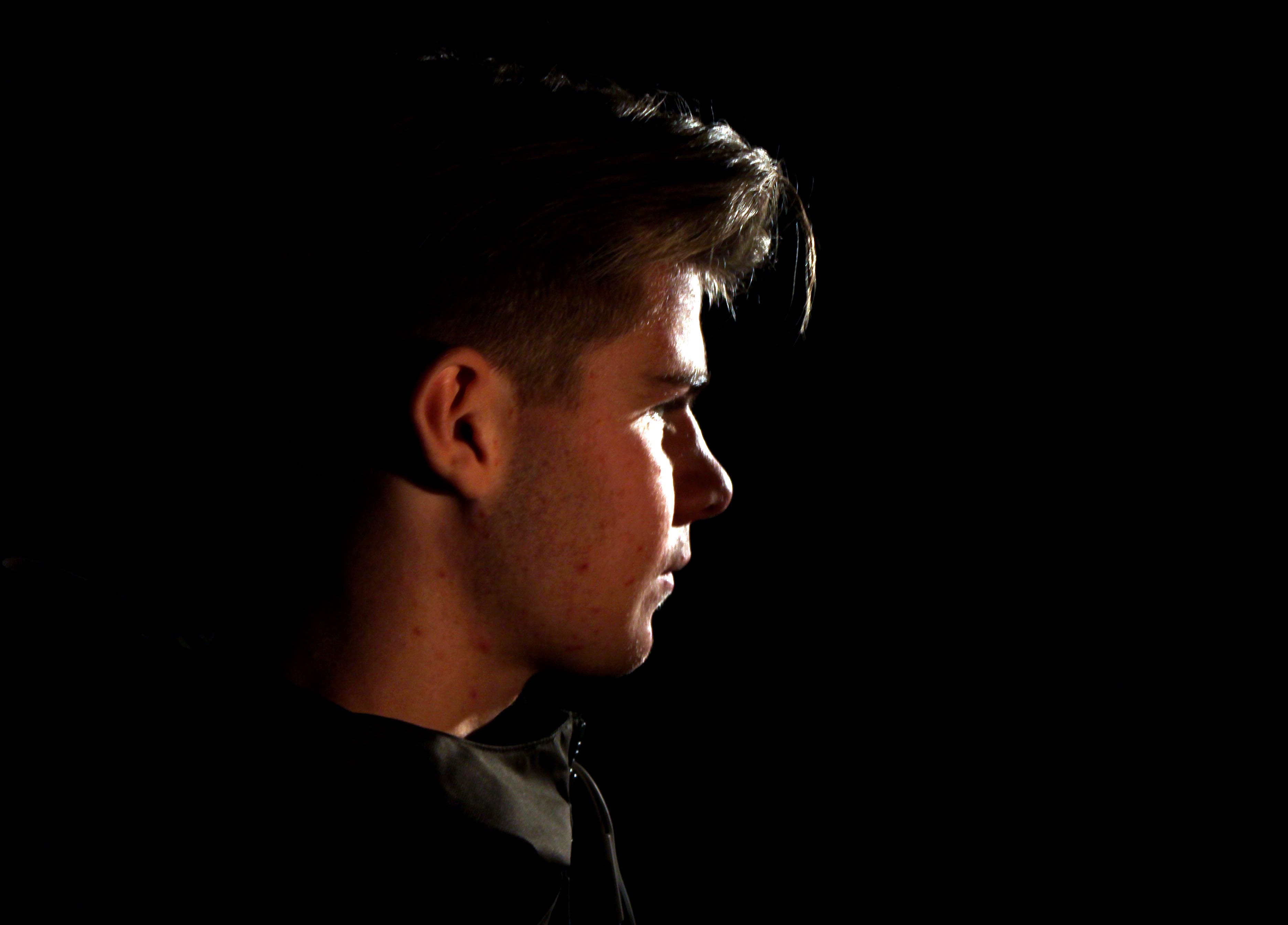
2 point lighting can be useful to have the simplicity of 1 point lighting but to have the 3D of the object enhanced without turning up the 1 lighting point lighting exposing the risk of having too strong harsh lighting. This gives the photograph a slightly more comfortable and relaxed feel as the shadows aren’t as imposing as with 1 point lighting. An example of 2 point lighting:

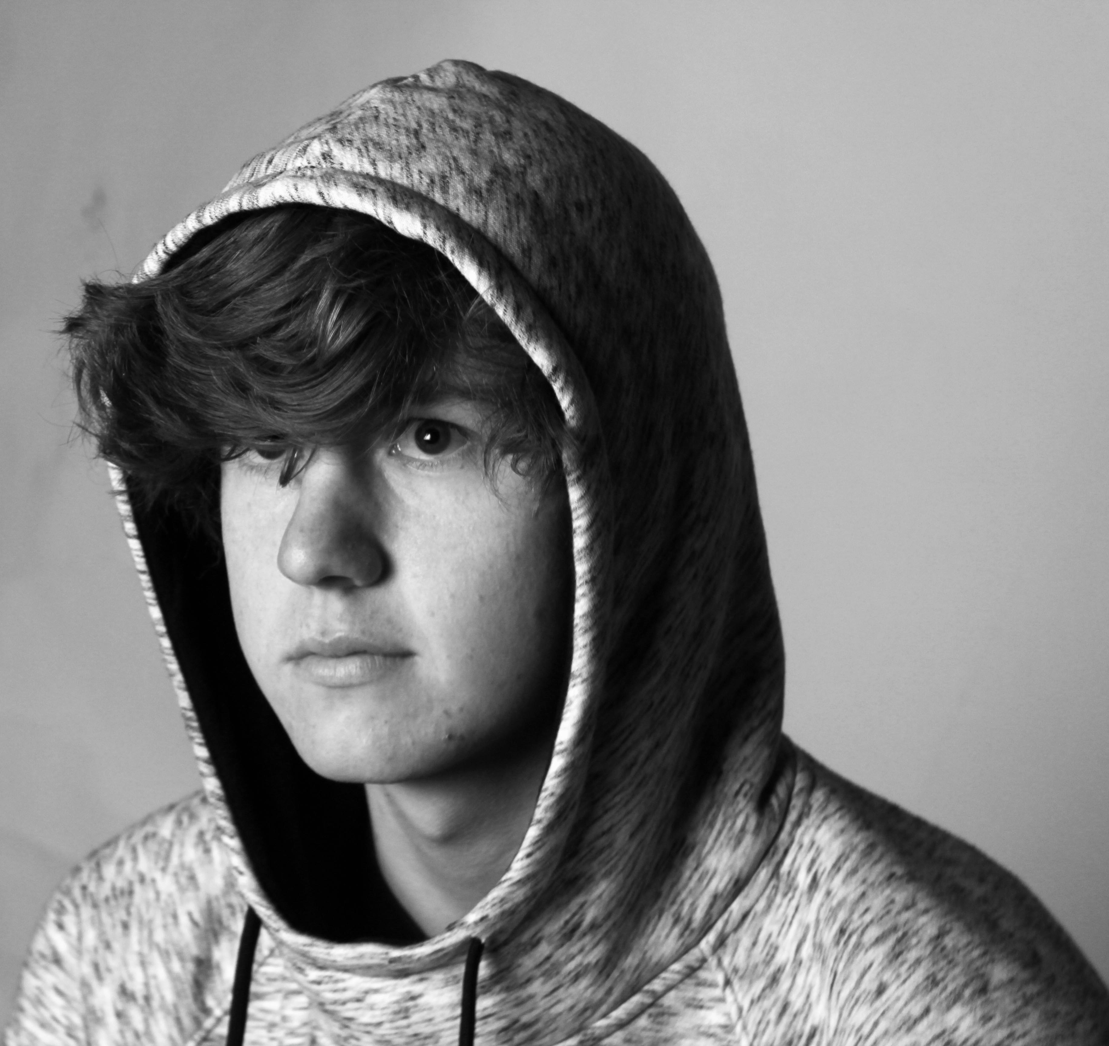
3 point lighting is ideal for taking photographs where brighter tones of light are focused upon increasing the balance of light from the shadows. This can be used where some people who do not appreciate the effects of a balanced lighting of 2 point lighting and want more of an extreme feel of balance to their photographs. Having a heavy, strong presence of light impacting the object appears to be quite striking and imposing for a photograph whereas on the other end of the spectrum with 1 point lighting you have a lot of darker areas of light giving the photograph a gentler feel. An example of three point lighting:

Low key lighting is based on conveying a particular mood through the contrast. By doing this create a rather eeary atmosphere and therefore the environment of the photograph can appear tense. It can be used to support a model’s facial expression or body language, props etc. Often a great deal of the photograph will be in shadow, creating a chiaroscuro effect. For example:

High key lighting often portrays a more uplifting atmosphere to it. This is enhanced by having an increased exposure from the already strong light. By doing this, there is a lack of contrast. An example of this includes:

Final Response of Rankin
Best Image- Street Photography
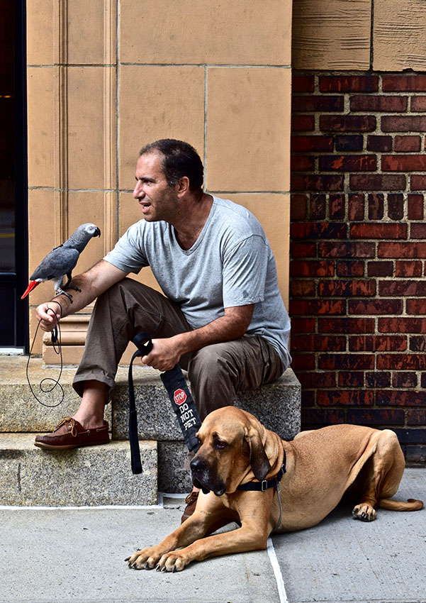
I chose this photo as my favorite because of the pure madness of it. When I first saw this pair I thought it was hilarious as well as ridiculous. The whole casualness of it was the funniest thing. They were sitting there on the stairs outside some apartments, one with a colorful parrot with a impressive a moustache and the other with a bird on his arm and a dog casually talking to each other.Also something that makes this photo special is that I almost didn’t take this photo, as I was afraid of the dog. Usually I’m not afraid of dogs but this dog looked he was going to protect his owner no matter what. However, I am so glad I took this photo, as it is one of my favorite photos I have taken.I like this photo because it shows the loyalty of a dog. The fact that the dog would not rest until he saw me gone showed how loyal he was.
I also like the colors and textures of the picture. The color of the mans grey shirt matches with the color of his bird and the steps. As well as the color of the dogs fur matches with the wall behind his owner. I also like the texture of the dog’s wrinkly skin as well as the gritty and dirty texture of the brick wall. Everything works together perfectly even the bird is facing as a perfect angle for the picture.
I went to New York looking for a strange unique photo and this fits that description perfectly.
