
Monthly Archives: September 2016
Filters
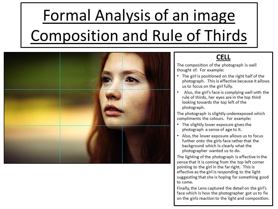
FormaL Analysis of an image…composition and rule of thirds
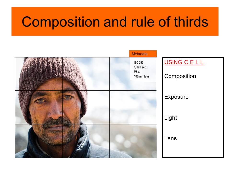
Use C.E.L.L. to help you describe and analyse images. Be prepared to discuss…
Composition : layout, structure, depth, rule of thirds, balance, symmetry, diagonals etc
Exposure ; over exposed, under exposed, sharp, blurred etc
Light : Natural, artificial, harsh, soft, overhead, side etc
Lens : wide angle, telephoto, standard, macro, fish eye, focal length, focal point, depth of field, foreground and background etc
3 Step Analysis of a photograph (emotional response)

Dorothea Lange
My initial feeling for this image is that i am interested in it and feel connected to it. I feel emotionally connected to this image as it tells a story and . The image is dramatic and immediately stood out to me due to the contrast between light and dark. The placement of the people in the images makes it have more depth and not just be a pointless photo. The photographer has placed the woman in the center, breaking the rule of thirds, so that she is the focal point to the image drawing your eye to her.

Daniel Joseph Martinez
I didn’t have an immediate positive emotional connection to this image however i was intrigue by the image as it is an abstract photo and different to normal portraits i have come across. This image contains leading lines by he scar on the mans head and leads my eye through the image. my feelings towards this image is sad as it makes me think something bad has happened to him to need an operation. the use of colour blue also indicates a cold tone to the photograph.

Cindy Sherman
I immediately didn’t like this image because the photo looks as though it is fake and the stance the woman is doing makes me feel uncomfortable. i also do not like the clashing colours that make the image bold. i feel that the whole image doesn’t fit together and there is no story behind the photograph. The photograph is breaking the rule of thirds and is in the centre of the image to capture your eye however due to the lack of depth i am still not drawn towards this image.
3 step analysis of a photograph (emotional response)
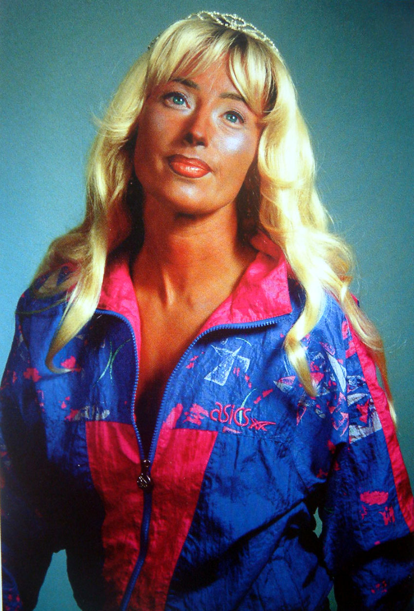
I like this photo as it looks very artificial but for a reason. The way she is positioned and the exaggerated colors make her look almost like a doll figure. When looking at her eyes, they are glazed over and looks as if there is no life in her. I think this picture represents the materialistic things that have taken over her life like the makeup and the crown she is wearing. She is more caring for the way she looks and the things she has than the way she acts. This is the reason why the colors are so saturated. Surrounded by materialistic things she looks dead.

I do not like this photo as it almost looks like a painting or a drawing. I also dislike the position she is standing in as it looks awkward and nothing like how a child would stand. It is also too perfect for example her skirt matches the green of the leaves and the background is symmetrical. The perfectness of the photo shows that it is artificial however unlike the photo by Cindy Sherman it is artificial but I do not see the purpose. The child is not acting like a child.

This photo interests me as the man in the picture looks like some kind of war hero with his old fashioned coat, scarf, haircut and pipe in his mouth. He also looks very serious. I like the long distance blurry background as it gives you an opportunity to see the range in which the picture captures without loosing the focus of the photo (the man with the pipe). Also the man looks like he is day dreaming even though someone is quiet clearly speaking to him. Maybe he is having a flashback from serving his country.
3 Step Analysis of a photograph (emotional response)
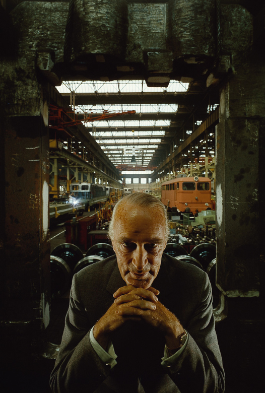
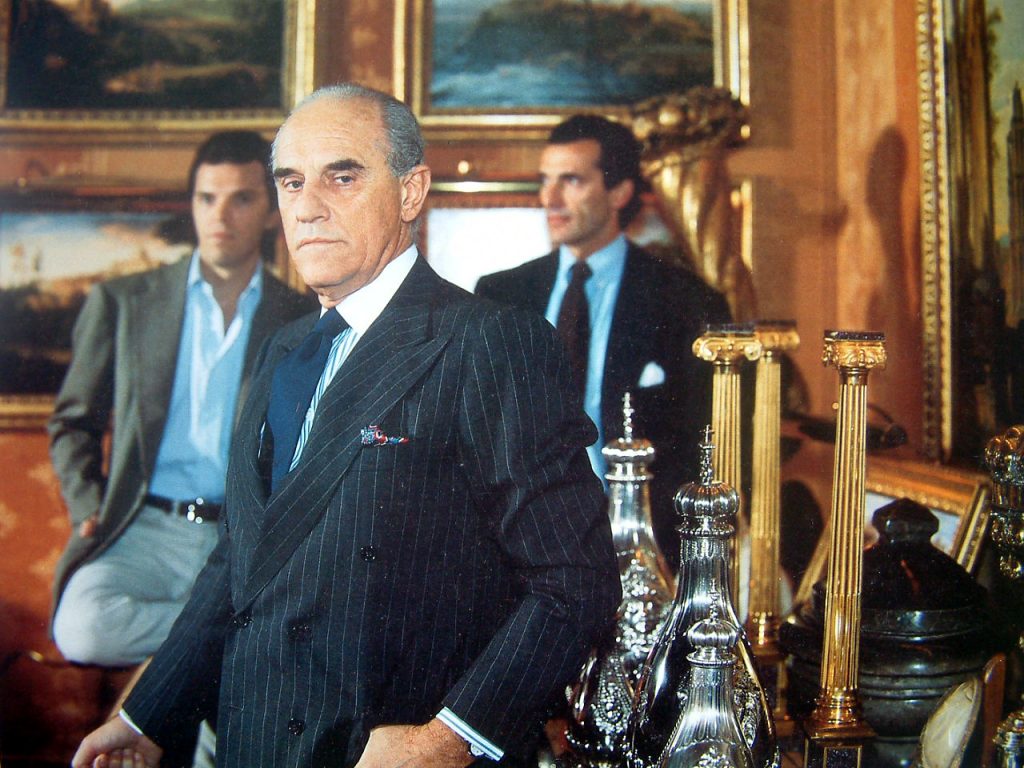 I like this photograph because it displays a sense of power to it. For example: The man shows influence in the photograph and therefore we as the viewer should almost feel nervous in his presence. To back this up, the man has got two young men behind him who convey a protective nature over the man, therefore the man clearly has influence over these men. This puts an imposing emotion on the viewer that makes us fear this man’s presence. Also, the paintings in the background show stories of the past, showing that the man is knowledgeable but also has some level of authority over history because he can look back at history the way he wants to. Also, the fact that the man has valuable ornaments emphasizes the man’s wealth in the sense that, these possessions, no matter the value of the currency, the value of the ornaments wealth will stay the same. This emphasis of wealth and power make us feel wary and uncomfortable. This is backed up by the fact the man is staring at the lens sort of challenging us.

I don’t like this photograph nor do I like it very much either. This is because the feelings of pain and other similar emotions in my opinion aren’t particularly well expressed. This is probably because the photographer wanted to communicate the idea that the man who we can’t see his face, generally tries to hide his pain. However the fact his wound is being displayed in front of the camera shows he clearly isn’t successful at this. This makes us feel sympathetic towards this man with the fact that he is trying to hide his emotions probably because that he has no one to talk to. However because we don’t see much of his face we can’t make a judgement of who he is so it is quite difficult to feel sympathetic in that respect. Therefore I feel this photograph is confusing which is why I am not particularly enthusiastic about it.
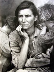
I don’t like this photograph because it expresses negative feelings to the viewer. For example: the woman is looking away from the camera. The fact she is doing this suggests she lacks in confidence to do so and therefore is afraid of interacting with us. This makes the viewer feel somewhat guilty that we can’t do anything to help her. Also, this is emphasized further with how the 2 children are cuddling into their mother’s shoulders. Children are often associated with happiness and joy, however the fact they are turning into their mother’s shoulders suggests the hostility of the setting that they are hoping to receive some sort of comfort from their mum. However we know that the mum feels the same way as her children and so this comfort from the mum allows us to understand that it is a hollow, temporary comfort that doesn’t fix the problems. It also makes us understand how the mum longs for someone to comfort her too. Therefore this negative theme makes us feel sad, and makes us want to help but we can’t.

Week 2 AS Photography
This week you will be learning a range of new and different analytical skills, and tackling a set of practical tasks as well as completing some research about various photographers.
We will introduce you to using the blog, how to create contact sheets from your photographs and how to begin using a DSLR camera effectively…
Reminder of homework task due in for Week 3 (lesson 4)
You must take 150-200 photographs of environmental portraits
Divide this up into 2 /3 photoshoots…then create contact sheets
This must then be added as a new post to your blog,
saved and published
Title = Environmental Portraits Photoshoot (1 /2 /3)
Three step Model of Analysis
FAVOURITE PHOTO
Out of the ten photos that we were shown, my favorite one was the image of the woman with the children surrounding her. When I first saw the photo, my initial thoughts where it was extremely intriguing and I wanted to know more about it. I really like the way the photographer edited the photo into black and white. It creates an atmosphere of war and hurt. The woman’s staring into the distance which also makes the image very intriguing. It seems like there’s a story behind the image with the setting and the emotional feelings behind the photo.

WORSE PHOTO
The photo that I disliked the most out of the ten was the photo with the woman at the seaside. My initial thoughts to the image is that it may have been taken as an accident, because the woman is not positioned very well, and there are things coming into the shot that shouldn’t be there. There’s a lot of color within this image that I do like, but the whole setting and style I don’t like. It makes me feel like I don’t understand what the photographer was trying to do.
INTERESTING PHOTO
My most interesting photo was the very last one, with the guy looking down towards the floor with a large cut on the top of his head. It made me feel slightly sick with the cut, but I was also interested because i wanted to know why he had the cut, and the reasons to why the photographer was taking his photo.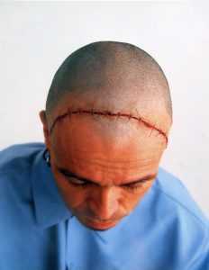
3 Step Model of Analysis / 1: An Emotional Analysis
Photograph Analysis:
- The one photograph I chose out of the ten that I really like is the last one. The obscurity of this particular image really interests me. I also really like the perspective at which it was taken at; the main focus, the focal point is on the man’s head where the scar is because my eyes are instantly drawn to this. I like the simplicity of the picture; there isn’t a lot going on and the colours aren’t too loud. This photo tells a story therefore is intriguing.
- However, the image I dislike out of the ten on show is the second. For me, there is too much going on, too much for my eyes to try to focus on. I think it is a good image for its purpose, perhaps it’s adverting for an office or an agency of some sort but for me I don’t like its set out. It’s too serious and I tend to like causal, fun-looking images with lots of colour but this photo is quite dark in colour.

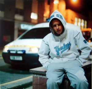
- The third image I have picked out to analyse is the second one that was displayed to us. This image is of a young lad sat in the foreground of a police car with a hoodie on. This photograph, to me, seems very cultural and that it has a hidden meaning behind it; why is the kid sat by a police car? Is it intended? Is it set up? Or is it a ‘happy accident’? I’d like to know more about this image but the overall look of it, its environment seems to be focused on a particular lifestyle.
Analysis
Analysis 1: Emotional Response
Perhaps the first way that we engage with photography is an emotional response – ‘like’ / ‘dislike’. At times we may not even understand why we like or dislike a photograph, but it will create an emotional response that is loaded with value and meaning – about us, the image, the colour, shape or form.
Emotional analysis is useful and certainly very powerful (it can override other responses, such as an intellectual response) but can be quite limited. So be careful.
Task:
- Open up the folder ‘Photos for Analysis’ in Depts>Photography>Students>AS
- Choose 3 photos
- A photo that you immediately feel connected / interested in
- A photo that you immediately feel alienated or disinterested in
- A photo that you are not sure if you are interested in or not . .
- Write up your initial feelings towards each photo. At least a paragraph/5 sentences/80 words etc
- Reflect on what you write about . . . in other words try to understand your emotional response is it a colour, a person, a memory, a look, an object . . . .
- Upload the photo and your analysis to the blog (I will help you log onto the blog, but if you can’t, write it up and post it at home)
Extension: To help you understand the more formal elements of photography look at this ppt rule-3rds-line-balance-export
Analysis 2: Formal Analysis & Textual Analysis
- Colour
- Light (natural / outside)
- shadows
- Rule of thirds
- Line / leading lines
- Depth
- Symmetry / parallels
- Balance
- Shot size (BCU, Long shot, MCU)
- angles
- Framing
- Focus
- Depth of field
- Aperture
- Posture / gesture / look (non verbal communication = NVC)
- Props
- Setting
- Sets
- Clothing
- Contrast
- Tone /Colour palette
- Shutter speed
- Cropping
- Post-production eg saturation
- Type of lens eg telephoto / portraiture lens
- distortion
Task:
Complete a Formal Analysis of 2 of your chosen photographs using at least 20 terms list above.
Analysis 3: Critical and Contextual Analysis
How to analyse a photograph critically?
During this A level you will be expected to critically – this does not mean analysing the negative aspects of the photograph. But it does mean that you are required to ‘read’ a photograph beyond the surface ie beyond your emotional response and beyond the purely technical or formal elements.
In other words, you need to think about a photograph in terms of intention, context & ideology (ie what attitudes, beliefs and ideas are held within the photograph). You should also know something of the history of photography and how each photograph fits into the overall subject.
Use the four bullet points below and the attached ppt to help ‘deconstruct’ and understand the three photos you have chosen.
“criticism is informed discourse about art to increase understanding and appreciation of art”
- Describing ~ FORM ~ What is here? What am I looking at?
- Interpreting ~ MEANING ~ What is it about?
- Evaluating ~ JUDGEMENT ~ How good is it?
- Theorizing ~ CONTEXT ~ Is it art? How does it relate to the history and theory of photography, art and culture?
Source: Criticizing Photographs: An Introduction to Understanding Images, by Terry Barrett, 1990, pg:3
how to analyse a photograph + photographic theory AS
Task:
Go back to 1 of your 3 photographs and analyse it in terms of a ‘critical & contextual study’. In other words, think about the form, meaning and context of the photograph. Is there a theoretical framework (formalism, feminism, semiotics, social/historical . . etc) for you to place the photograph and thereby understand its intention in more detail?
- Include references from other (academic) sources
- Include some a video extract that helps you to explain your analysis
EXAMPLE: CINDY SHERMAN
 I didn’t think of what I was doing as political. To me it was a way to make the best out of what I liked to do privately, which was to dress up. – Cindy Sherman – Black and White Magazine
Read more: http://www.photoquotes.com/ShowQuotes.aspx?id=227&name=Sherman,Cindy#ixzz3mStV9paP
My intentions are neither feminist nor political. I try to put double or multiple meanings into my photos, which might give rise to a greater variety of interpretations… – Cindy Sherman – except from an interview with Wilfried Dickhoff., Prospect : Photography in Contemporary Art , ISBN: 390816219X , Page: 280
Read more: http://www.photoquotes.com/ShowQuotes.aspx?id=227&name=Sherman,Cindy#ixzz3mStjestp
I have this juvenile fascination with things that are repulsive. It intrigues me why certain things are repulsive. To think about why something repulses me makes me that much more interested in it. I feel that I have to explore it.
I didn’t want to make “high” art, I had no interest in using paint, I wanted to find something that anyone could relate to without knowing about contemporary art. I wasn’t thinking in terms of precious prints or archival quality; I didn’t want the work to seem like a commodity.
So how could we interpret all of this (often) contradictory information. How does it help us to understand the changes in society that were occurring at this time – feminism, performance art, conceptual art, a ‘postmodern’ obsession with the media.
Watch above to get a better understanding of her approach to photographic form and the use of ‘performance’ in photography.
- What does this tell us about purpose and/or point of photography?
- How does this link photography to art?
Watch above from 2:00 to understand the relationship between Cindy Sherman’s character work and feminism.
Environmental Portraits
An environmental portrait is a portrait executed in the subject’s usual environment, such as in their home or workplace, and typically illuminates the subject’s life and surroundings.
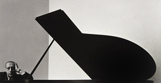
Arnold Newman (photographer) // Igor Stravinsky (Russian composer) 1946 // New York
Your homework assignment is to take 150-200 photos of a range of ENVIRONMENTAL PORTRAITS…influenced by a key photographer such as Arnold Newman or August Sander (right)
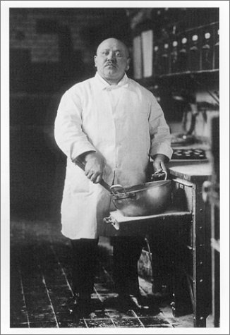
August Sander // Pastry Cook 1928 // Germany
But… you may be influenced by an alternative, contemporary photographer that you have discovered or researched so please show clearly where your ideas and inspiration has developed from…
For example…Anthony Kurtz
Good Luck
DEADLINE = Lesson 4 of Week 3 (ending 23rd Sept)