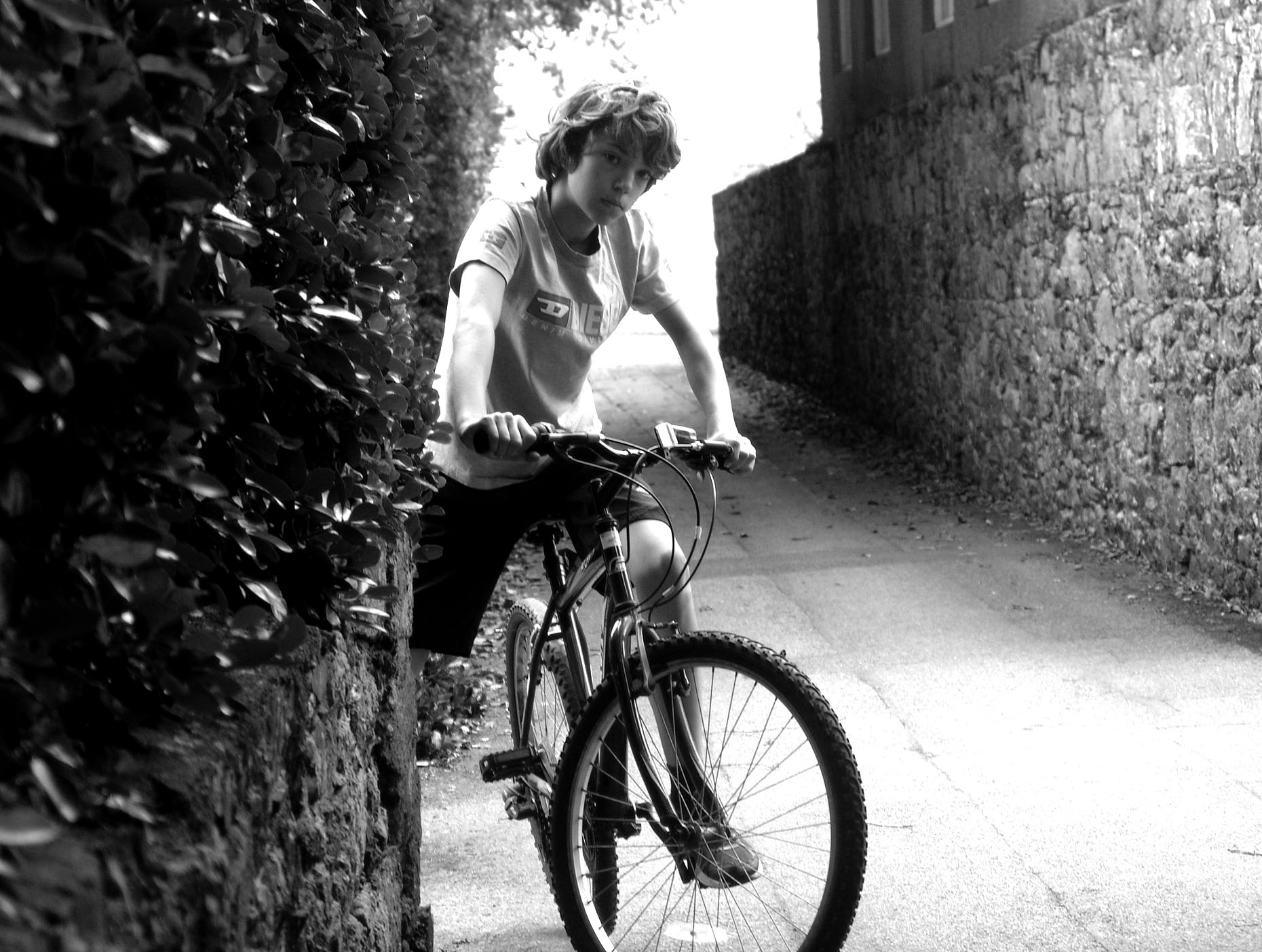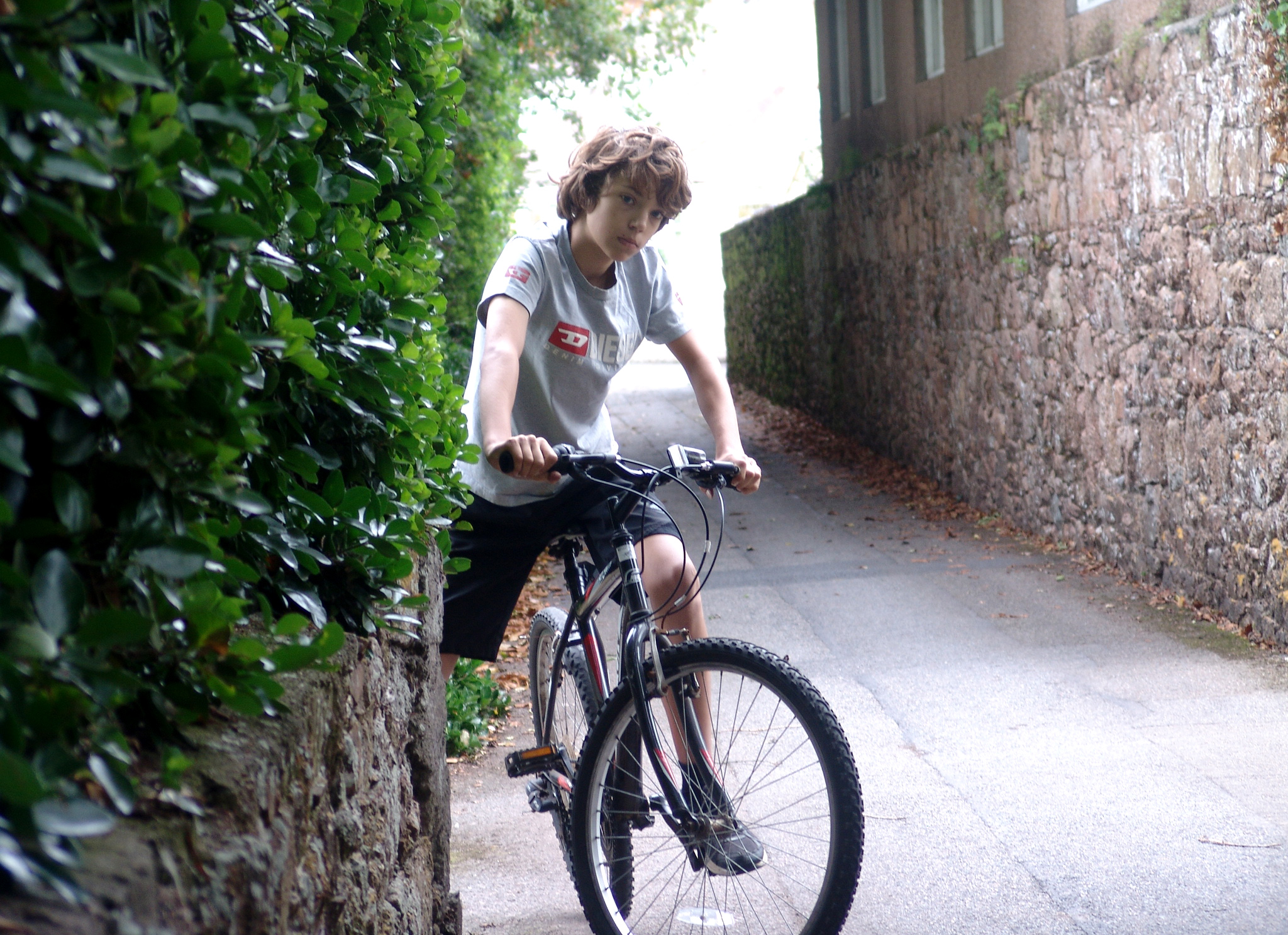

The top photograph is the edited version, and the bottom is the original.
To edit the photograph, I firstly cropped the boundaries so that composition of the photograph fits in well with the rule of thirds. I secondly, changed the photograph to black and white by decreasing the saturation to nothing. I did this because traditionally, portrait photographs were taken in black and white. Finally, I adjusted the contrast using the levels tool. By doing this, I enhanced the dark areas and enhanced the bright areas. To compliment both of these factors I then adjusted the grey scale to create a balance between the two sides of light.
