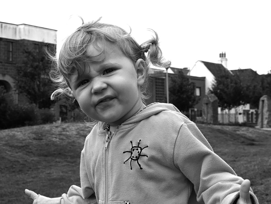
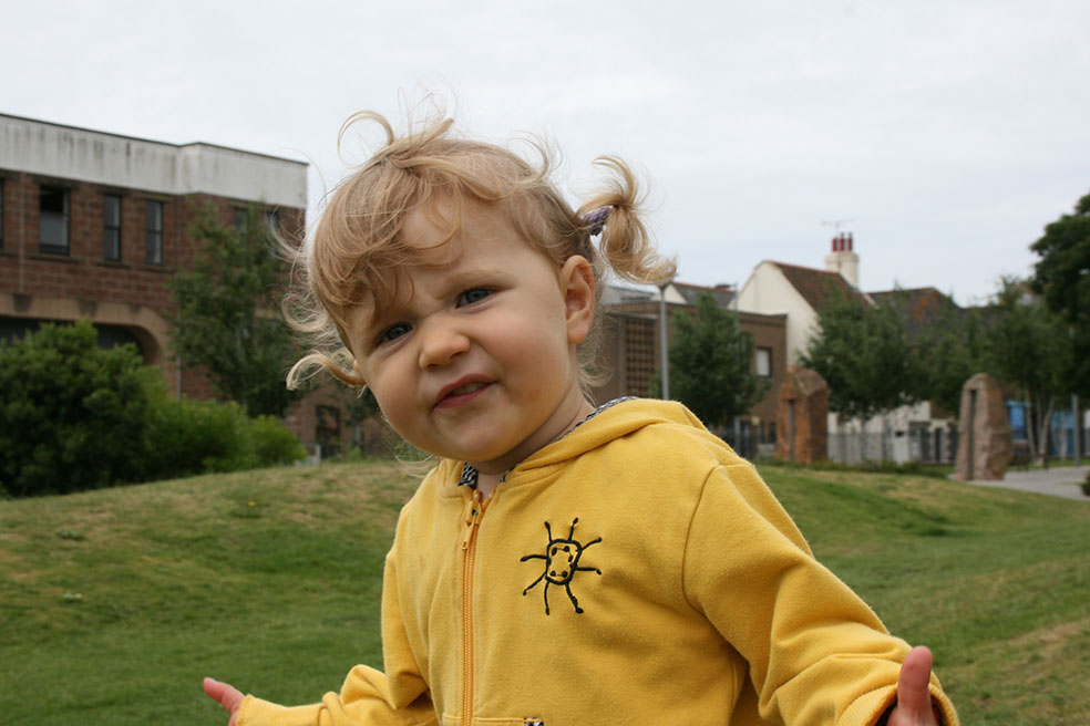
This is the original and the edited version of one of my environmental portrait images. We used the Adobe Photoshop to edit the image. To begin with, I cropped the image to get rid of some of the background, so the foreground filled more of the image. I then experimented with the saturation , by either making it more saturated or less saturated. I decided to make my image black and white, because it creates a natural vintage feel to the image. Once I had done the saturation, I then slightly adjusted the contrast of the image, so that the image looked more defined. To finish I flattened the image.
When editing my image, I tried applying the rule of thirds so that the photo looked more pleasing to the eye. I also really like the use of the natural light in this image because it softly eliminates the girls face and features.


