How fashion photography has changed over time

In this essay I will be analyzing how fashion photography has changed from the 1920s to our current decade, with reference to the book ‘FASHION CULTURES, Theories, Explorations and Analysis’ Chapter 9 written by Elliot Smedley and edited by Stella Bruzzi and Pamela Church Gibson.

‘Fashion photography emerged within and grew to dominate the commercial arena during the 1920’s and 1930’s’ page 144

the reason behind fashion photography emerging and growing to dominate the commercial arena was because the cultural movement of Surrealism had a profound impact on fashion magazines in the 1920s and ’30s. For example, paintings by Salvador Dalí and Giorgio de Chirico featured in Vogue alongside avant-garde photographs by Man Ray. Some fashion photographers adopted their revolutionary principles, attempting to give visual expression to the unconscious mind. New techniques and unexpected juxtapositions were used to challenge perceptions of reality, to amuse and to disturb. Another example of fashion photograph being influence by Surrealism was the chief photographer of French Vogue, and later of Harper’s Bazaar, Baron George Hoyningen-Huene who inspired a generation. His own work reflected a painterly fascination with light, shade and classical forms. His protégé Horst P. Horst produced similarly inventive images, fusing surreal and classical motifs.

Photography by George Hoyningen-Huene for Vogue US in 1929. 

One can see in the above image it has been influenced by the surrealism period as the below ladder has been painted on and the men aren’t actually climbing up, giving it a surrealistic effect.

Then elitist fashion imagery, which owed much to illustration, was superseded by more commercial picture. This was due to Hollywood being a large  impact on the movement of fashion photography, because films began to be produced and it got extremely popular, therefore changing the way of fashion photography;

‘Films threw up the new role models, images of a consumer society,  visually based fantasies and narratives, and new codes of representation’ (Craik 1994: 101) … most notably how they become ‘blemish free’.’ Page 145

When fashion photography was influenced by Hollywood, it was also a period of time when magazines didn’t want to show excess as it was during World War 2. In this time period Man Ray was also a key photographer as most of her photographs were social documentary as a recording of fashion, showing women in wartime Britain in every situations.

This realistic aesthetic emerged across sea’s and influenced the Americans.  Alexandra Liberman, the art director a Vogue, realised that ‘the intimacy of the unopposed news photograph could be grafted onto fashion photographs to give them a wider appeal, greater realism’ (Harrison 1991: 42). This was shown when;

‘In the 1950’s, Liberman commissioned photographers who used the techniques of social documentary, specifically Richard Avedon and Irving Penn, whose images contained contrived spontaneity.’  page 145
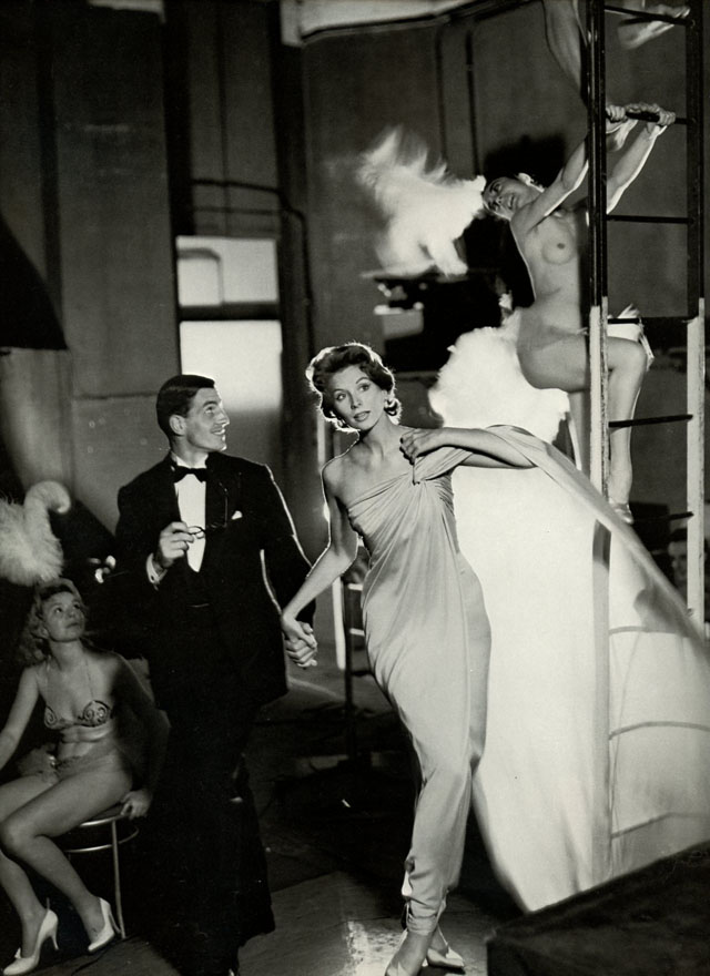
Storytelling is a strong element in Richard Avedon photographs in the 1940’s and 1950’s. Here Suzy Parker and Robin Tattersall in an evening dress by Griffe (Moulin Rouge, Paris 1957).

The reason for their work to be influenced by social documentary photographs is because they began to take their cameras outside the studio. This therefore made the images feel more realistic to the audience, however they were idealized moments that enabled;

‘women to imagine what they would look like, to men, in this situation or outfit, without having to commit themselves in any way to that situation or that outfit’  (Barnard 1996:120)

Then, in the 1960’s, there were 3 new photographs who changed the style of fashion photography;

‘The emphasis on sexuality in fashion photography was promoted by the self-styled ‘Terrible Three’ – David Bailey, Terence Donovan and Brian Duffy’ Page 146

These photographs were working-class Londoners with an irrelevant attitude to the world of fashion and the pretensions of its protagonists. Their work was a dominant theme that represented women’s independence, yet at the same time also placed value on beauty, sexuality and success.

David Bailey's best photograph … East End, 1961.

David Bailey’s photograph: an East End woman in the 1960s London.

One can see the way Bailey has placed value on beauty, sexuality and success in the above image. This is shown by the comparison of a faux girl in the background and a working class citizen in the foreground. It makes the viewer compare the women, in all of these aspects.

In  the 1970’s these themes continued by photographers such as Guy Bourdin and Helmut Newton. These photographers could barely be seen as documentary, as they were very explicit photographs. Therefore, these photographers had to suffer consequences;

‘They therefore encountered charges of misogyny and sexism; the photographers were accused of being exploitative and regressive. Here, fashion photography encountered critical discourse – and entered the public consciousness – through feminist debate.’ Page 146

Image result for guy bourdin

Guy Bourdin, photograph of Burlesque. 

Image result for helmut newton

Helmut Newton Saddle I, aus der Serie: Sleepless Nights, Paris 1976. 

As shown above one can understand why women would be offended by Bourdins and Newtons images, as their photographs are trying to make it socially acceptable to make women be sexual objects.

In 1980 there was another new style in fashion photography which is known as ‘straight up’. This style is featuring people spotted on the streets rather than using professional models. It was classed as fashion photography because there would be credits stating where the subject had bought their clothes. The style of this decade was known as ‘punk’ and ‘grunge’. Photographers such as Steve Johnston and James Palmer photographed in a ‘straight up’ style and of people dressed in the punk outfits.

Image result for straight up photography 1980s steve johnston

Image result for straight up photography 1980s steve johnston

Examples of work by Steve Johnston. 

Image result for straight up photography 1980s james palmerImage result for straight up photography 1980s james palmer

Example of work by James Palmer.

Then in the 1990s it became the decade of ‘Harsh Reality’ in fashion photography. The main four photographers of this genre were Corinne Day, David Sims, Juergen Teller and Nigel Shafran. They all shared a similar aesthetic based around notions of realism;

“There style had its roots in the insecure political climate of post-Thatcherism and global recession; there was a perceived platform for change.” page 148

Corinne Day ecompassed the mood of the new decade with a seemingly ‘unprofessional’ technique, represented by her series of photographs of Kate Moss which wasn’t currently a ‘supermodel’ at this period of time in her life. The set of photographs appeared in The Face in 1990.

Image result for the face 1990 kate moss

The Face in 1990, Kate Moss, taken by Corinne Day. 

Due to the way the model, Kate Moss, responded in front of the camera, these photographs link to Twiggy in the 1960’s.  Both models came across as ordinary people in the photographs, due to the way they smile and have squinty eyes etc. making them not look as superficial as other models, and more relatable to everyday people. The difference was Twiggys photos were taken by a man, therefore the males sexual desires were placed onto the model.

Image result for twiggy in the 1960s

Model Twiggy from the 1960s.

‘Behaving like ‘human beings’ and documenting ‘realistic’ activities became a prominent feature of contemporary fashion photography in the early 1990’s, and dominated the decade.’ escaping to reality, Elliot Smedley. page 143

In conclusion, one can see visually, there are always themes that continue to appear from past decades into contemporary work. This is due to being inspired by past photographers, and creating new themes by combining past ones. The main theme which stands out to me throughout the decades in fashion photography is trying to make the viewer feel relatable to the models in the images, and therefore they can therefore image themselves in this costume.

‘ENVIRONMENT’ – Final Piece – Initial Idea

After exploring a few ideas, to begin with, whilst starting my project, I next wanted to plan a few different ways that I could end up presenting my outcomes as a final design. As I mentioned in my last post  I would like to think of my project as a potential documentary e-book. However as I have not started yet, and am not sure how many outcomes I will be able to produce in the short amount of time given, I also want to prepare a few different ideas. The specification for this exam project is to simply produce a final selection of inspired and beautiful photographs based on our own ideas. Because my images will explore the theme of environmental awareness using a  mixture of abstract, staged and straight photography techniques I need to think of how they will work together. If I decide not to go forward with my e-book idea I will most likely be using one of the presenting techniques demonstrated below…

Depicted above is a quick diagram made in Photoshop, using many different layers, showing how I might set up my final pieces as two separate but equally as important designs. I created this simple example to show how (depending on how my images work together) it might be best to split them up into symbolism and documentary/studio and location photographs and present them as two different projects, done on the same environmental awareness subject. To create this kind of presentation I will print of my finals as a mixture of A3, A4 and A5 pieces and spray mount them onto two separate large white boards.

As well as this I really like the idea of presenting contrasted images together in pairs like in the photographer’s examples I have presented below. This technique was amazingly put to use by artist and filmmaker Luke Fowler’s who has created a series of half-frame photographs recently published in his book called ‘Two-Frame Films’.  With this Fowler explores the relationship between two juxtaposed images with naturally created diptychs that oddly work very well together. Although his images are completely different and portray non-related subjects, there is always something connecting each photograph that makes them really compliment and emphasise each other. I really like this technique and think that it may be something I explore when trying to put together a mixture of my studio and on location finals. As Well as Luke Fowler’s, on the second row of the contact sheet below, is a few more examples of this diptych presentation skillfully put together by Photographer Mike Terry. I love the way Terry has grouped his interesting photographs as some appear to be two closely related frames from the same event and others are simply united by the quality of light, subjects, colours or moods…

‘Environment’ – Initial Project Idea and Specification

For this project, which we will be working on until our exam at the beginning of May, we have been asked to explore the chosen word of ‘Environment’. Although we were given themes to start from in our provided exam papers, we have also been encouraged to interpret the word freely and really explore our individual ideas. For me, when thinking about the endless ways the word can be seen, I decided there was really only one thing I wanted to explore. Due to my future aspirations for a career in photography, I decided to concentrate this project on the wide area of environmental awareness. This kind of photography, along with conservational photography, can expose environmental problems like nothing else, it can help get people to care and maybe even make a change in themselves.

Fortunately, there is already a massive amount of research and statistics done about our local and global environment which will help inspire and inform my shoots. The specification for this exam project is to produce a final selection of inspired and beautiful photographs based of our own ideas. Although we are unsure at this time how these images will be presented, I would like to think of my project as a potential documentary e-book.  To explore the theme of environmental awareness I want to be using a mixture of abstract, staged and straight photography techniques. This is because although my main goal for this project is to inform my viewers about our islands pollution, I also want to intrigue them and make them think about our environment on a global scale. To sustain my work I will be looking at multiple resources, these not only being statistics and facts but also artistic approaches. The first artistic inspiration I will be gathering will be looking at photographers Gregg Segal and Steven Hirsch. I hope to interpret their artistic approach when also doing more serious documentary work. To also give my project more depth I will be trying to collect images from an archive to look more into the history of the subject. My initial inspiration for this project is the prospect of one day being a conservational photographer and using my work to perhaps make a difference.  Below Is a handwritten mind map with my ideas on how to portray the subject using both documentary and symbolic styles…

After figuring out what to base my project on and what to look at specifically in this mind map I next created a small mood board to show some of the subjects I want to capture and the themes I would like to represent. The hardest thing that I am going to attempt to portray is the ever-growing and terrible problem of loss of habitat. Although I will definitely still be able to show this with my receding landscapes idea, because of the size of our Island, I will not be capable of depicting it on a large-scale (like it is occurring all over the world). I hope to counteract this set back by using interesting perspectives and creating a sense of the grander scale of things outside of where we live. To do them I will be using different methods of straight and abstract photography, looking at things as they really are and creating symbols for big issues. These images below show some amazing ideas on how to beautifully portray such a grim subject. I chose to add them here to give a rough idea of how staged, and in the moment photographs can work together and give a wide depiction of these many global problems…– Mixture of stock images and other artists interpretations of this theme. 

Creative Reflection

// A N A L Y S I S //

In order to start this exam project and complete the tasks to the best of my ability,  it is important to understand the areas that have been highlighted as personal strengths. Working on a variety of coursework and exam projects over AS and A2, documentary and narrative work has taken a central focus strengthening my work and creating the majority  of my final image prints. Portraits are another strength and in particular with female figures, I have made a range of intimate images reflecting wider contextual themes. Below is a selection of my work which has had the best response – both in terms of personal happiness and academic grading.


Reflecting on this, it could be seen as logical to follow a similar route to my past projects and work on a new documentary piece reflecting the exam theme, ‘environment’. Having a relatively strong portfolio of work in this area however, I am keen to explore something new and perhaps strengthen another part of my photographic skill set. Below are some of my personal selection from my A2 coursework section on documentary and narrative.

My strongest images are from social events rather than planned shoots which I think is visible in my final image selection. Although I am confident in this area, I would like to investigate other styles of photographer rather than staying in this genre and take a few risks. Whilst this is maybe a bit nuts given i’m in the middle of A Levels, I like to think that the pressure might make me learn fast.

Environments – Starting Point

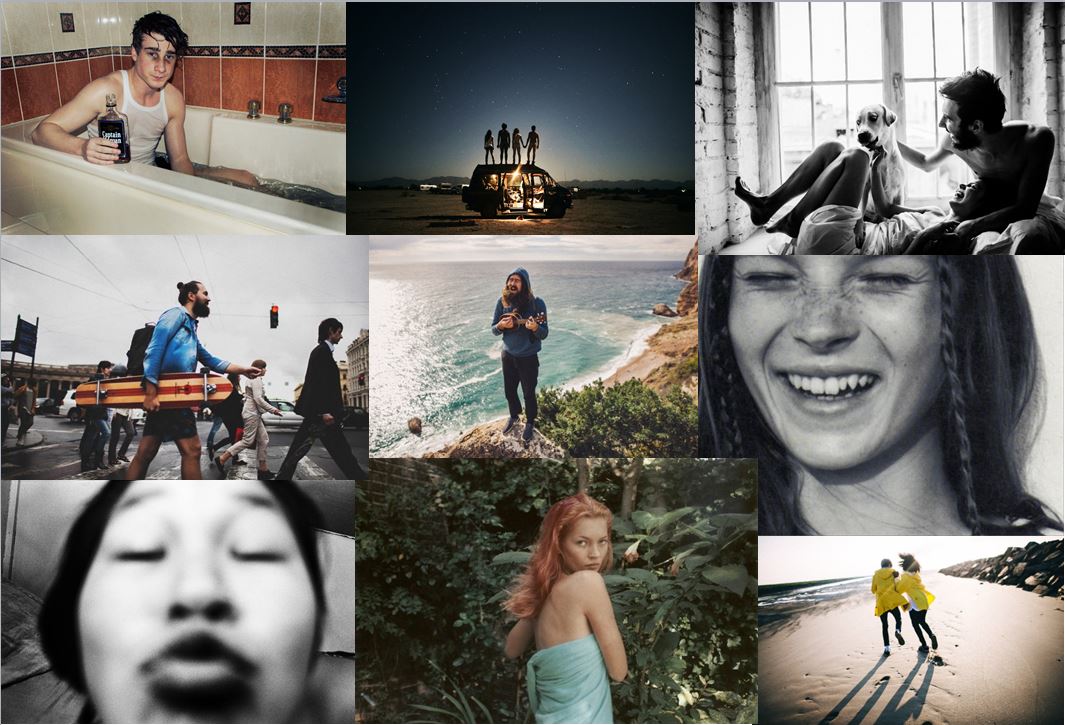
For my exam project, I am interpreting the title by photographing the environments that I surround myself in, with my loved ones such as friends and family, and the different landscapes and places I normally am in.

Therefore for this project I’m capturing the feelings, the landscapes and the people which therefore create my environment.

For this project, I will be influenced by the following artists;

  • Jeurgen Teller
  • Theo Gosselin
  • Jacob Sobol
  • Corrine Day
  • Nan Goldin
  • Ivan Troyanovsky

The reason for deciding to look at these certain photographers is because all the photographs are slightly staged and influenced by fashion photography, however they’re made to look as if it was done in the moment. This really interests, as they’re basically manipulating the viewer.

Artist reference – Christo and Jeanne-Claude

When i started thinking about my den project and how i am going to recreate my structures within an outside environment i also wanted to take inspiration not just from my old archive photographs but artists which explore the concept of adding to the environment. Christo and Jeanne-Claude are not artists which build dens like the ones i am intending to make but i thought it would be really interesting to explore their work as they add material to the environment. I want to consider how they photograph these structures that they create and how the concept behind their work isn’t just all about the final photographs but also the whole process of creating the projects. Their pieces are about the act of making the structures and the structures then being present to be seen by people and interacted with. All of the locations they build in are public places and the structures are made to be among people. This is exactly the same as my dens which are created to be interacted with and played in by children. I really really love all of their pieces of work, the photographs are incredibly captivating and i can imagine the pieces are even more magnificent to see in reality and all their scale. All the pieces come from the minds of both the artists in collaboration and they have created around 20 projects. Interestingly they have ideas for many more but the structures take a lot of time to plan and then it is very difficult to get permission to be allowed to created them. Many of their projects have been re-jected as they couldn’t get permission to create them.  The Wrapped Trees project took 32 years (1966-98), to get permission and then plan to have it created while The Gates project also took 26 years, (1971-2005).

The Wrapped Trees

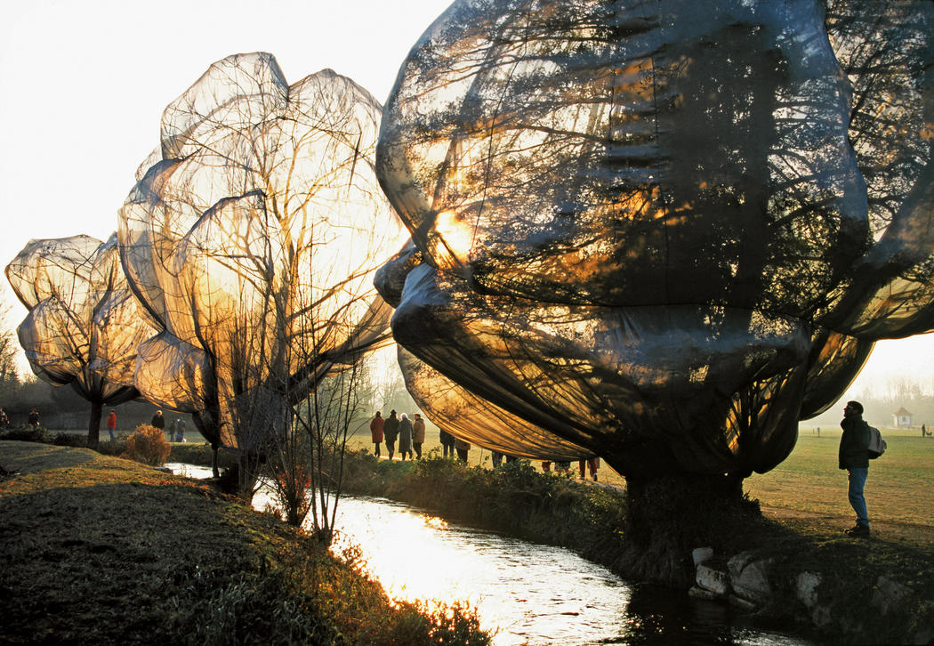
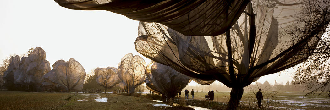
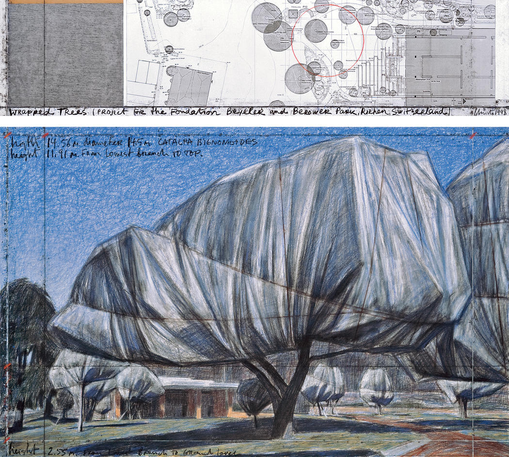
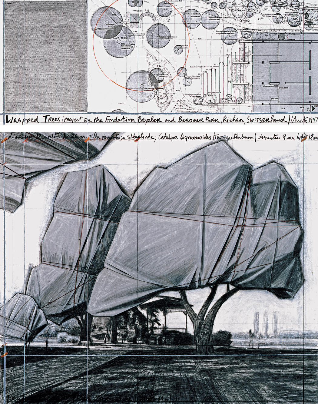
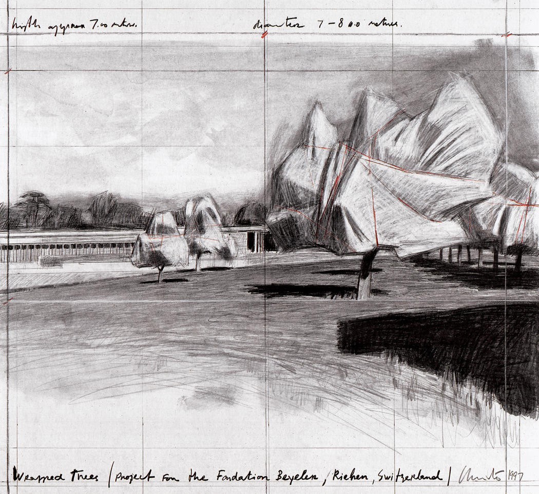
This project is my favourite of theirs as the photographs are seriously enchanting and as i love light i love the way it effects the structures. In 1998 Christo and Jeanne-Claude wrapped 178 trees with 592,015 square feet of woven polyester fabric and 14.3 miles  of rope. The trees were situated in Fondation Beyeler and Berower Park in Switzerland, a key part of the project being that people could walk along the line of trees and the structures could be seen. Each tree was individually designed to have their own pattern and eight teams of 33 individuals put together the designs. The wrapping was removed on December 14, 1998 and the materials were recycled.

I think this project is very significant to consider in the creation of my dens as i am going to have to explore material in trees to create some of my structures. I think by chance i have chosen the perfect time of year to create this project as in spring the environment is just starting to regrow but is not overgrown where it would be difficult to create structures. Christo thought carefully about this within his wrapped tree project, creating it in autumn when the branches would be leafless and therefore the material would cover a more minimal structure allowing more light to shine through the structures. He also very carefully chose to use a very transparent material when exposed to light so as to create an elegiac quality to the work. The transparent material allows for the structures, even not in bright sunlight to be transparent enough to see the skeleton of the branches underneath. This whole project to me is very reminiscent of the trees becoming like bodies, the branches the skeleton and the material becoming skin covering them. By using material as the covering for the trees it is also able to move in the wind which i can imagine gives the impression that the trees are breathing and pulsating. I would really love to be able to create this impression of movement within some of my own dens, to have flowing material which suggest a life to the structure despite the absence of people. I also really want to explore the use of semi-transparent material and light. I will have to create one of my dens on a really bright, sunny day so that i can explore taking photographs with the light shining through the material.

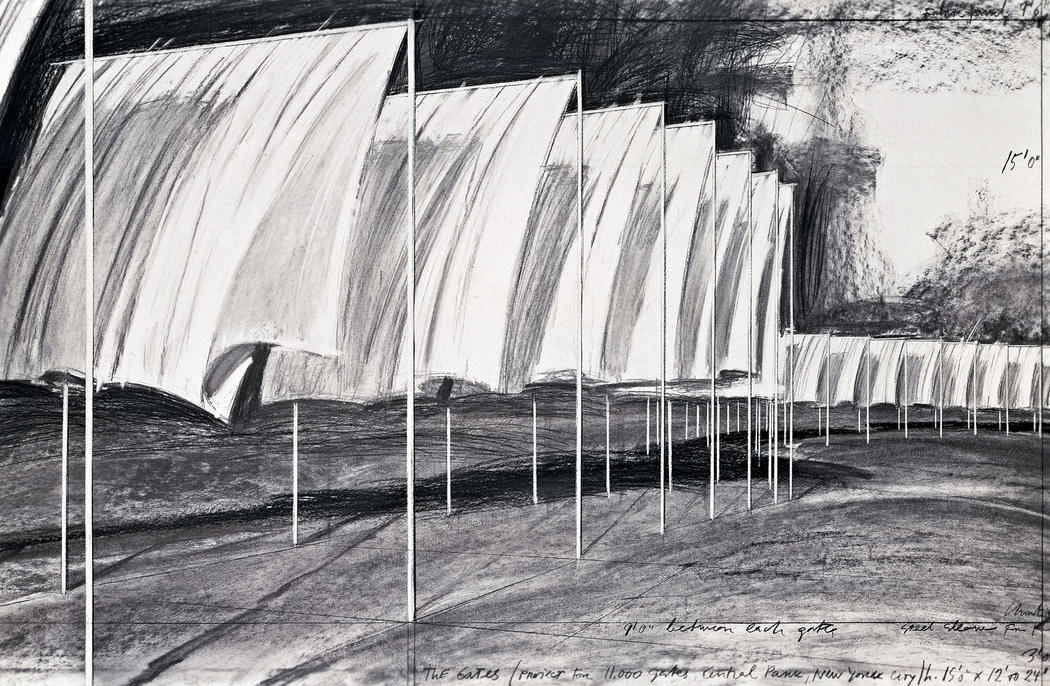
I also within his project really like the sketches he made before he created the den of how he wanted the project to come together. Alongside the photographs they create a very powerful visual image that every element was planned out and the impression Christo wanted to give with his trees was calculated. All of the photographs available of this particular project are when the sun is shinning through the branches which leads me to believe that it is probably best to photograph the material in sunlight for my project too.  I also quite like how the photographs are taken from a distance away which creates a perspective with the images of the scale. This is something i also need to consider with my project.

The Umbrellas 

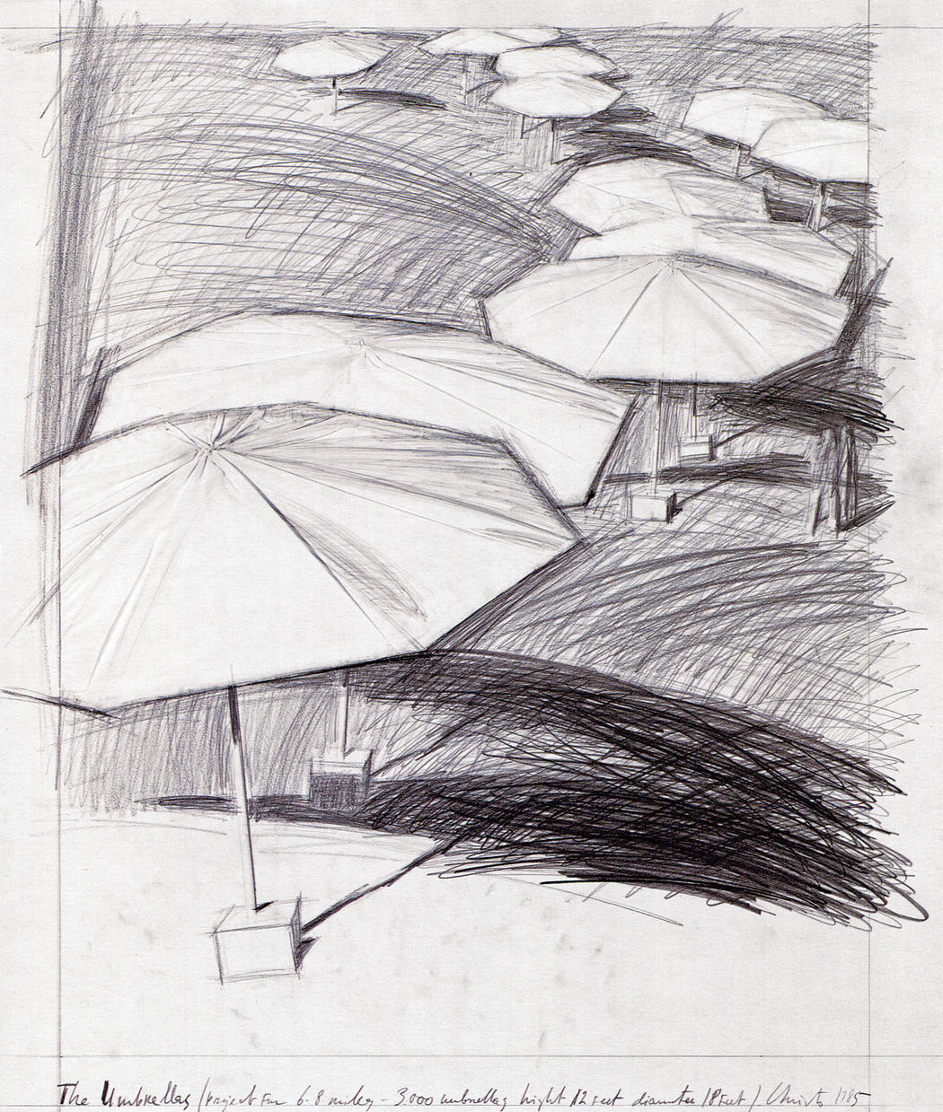
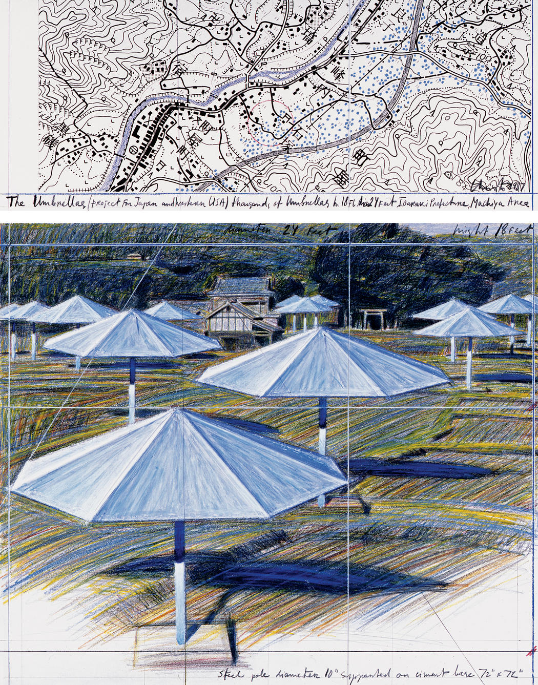
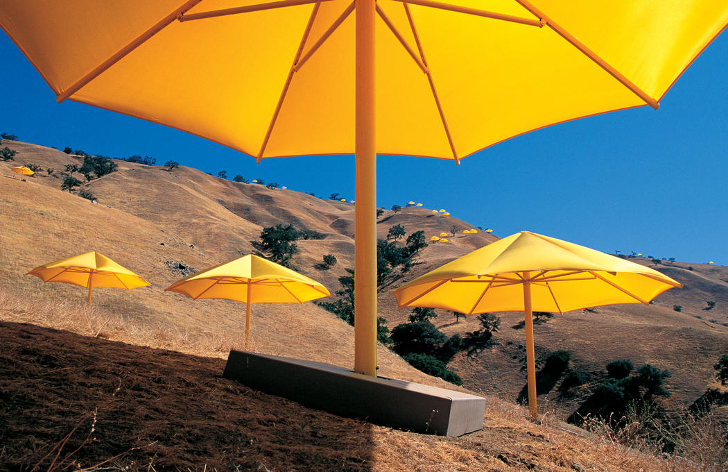
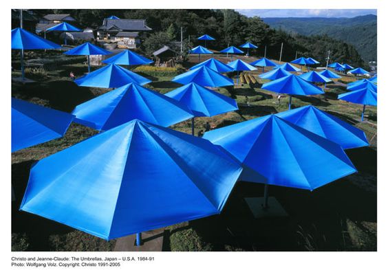
As i am considering making a structure out of umbrellas, this is another one of Christo and Jeanne-Claude’s projects which is perfect to consider in relation to how I’m going to create my own. This project was on an absolutely massive scale, linking both Ibaraki, Japan and California, America together. One artist was present at each site on October 9, 1991 when the 3,100 umbrellas began to open.  Both projects were created in similar valleys in opposite places and the project was all about celebrating the similarities and differences between the two places coming together. All the umbrellas were made in California before half being shipped to Japan. The umbrellas were colour co-ordinated, Blue for Japan, symbolizing how the land is enriched by water to grow the rice and yellow for the uncultivated grazing land of California. The umbrellas were available to interact with for 18 days, their removal beginning on October 27th 1991.

I think this project is important for me to consider in relation to how colour works within the environment. When i initially thought about building my dens i wanted to use bright vibrant colours so that they stand out against the landscape. Seeing how effective this in within this project has convinced me further that this is a good idea so that my photographs are as effective as possible. The two photographs above have also inspired me for how I’m going to take the photographs as one of them is taken from slightly below so u can see inside the umbrellas and one is taken looking down on top of the umbrellas. After seeing how effective these two different designs are i am going to experiment a lot more with different angles when photographing my umbrella den to see the different perspectives i can create.

The Gates

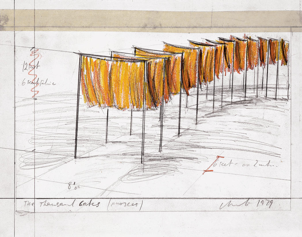
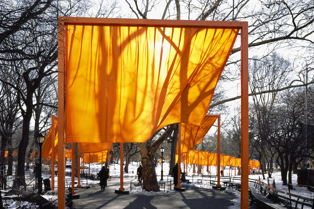
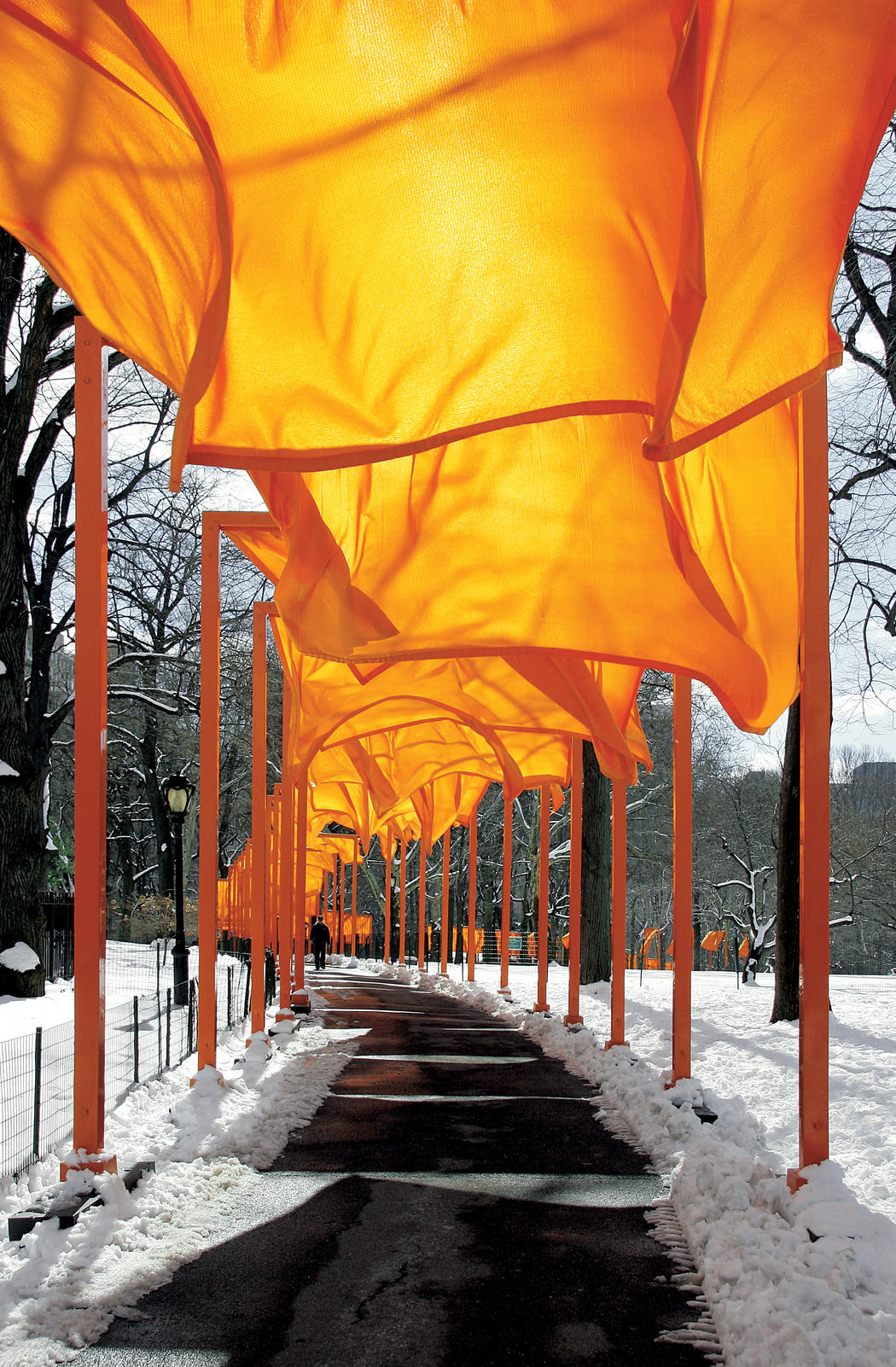
As with the other two projects these structures were also made on a massive scale with  7,503 fabric panels being put up within Central Park in 2005. The size and scale of each panel depended on the different width of the paths around the park as each panel was made to frame the walk from beginning to end perfectly. The pieces of material are free hanging from the structure to create almost like an archway as you walk along the path. The material in every panel was a bright Saffon colour and 60 miles of the material was needed to create the whole design. 600 workers were required to install the Gates. The Gate structures were created to reflect the rectangular structures of the city blocks surrounding the park and making up New York. From these high up tower blocks surrounding Central park The Gates looked like a golden river.

I think this project is really significant to consider in relation to my project because of how the material moves in the wind and this flowing quality gives a completely different presence to the structures in the photographs. The golden material which stands out vividly within the environment has different tones depending on the light shinning through it and the shape the wind has made it into. I feel like this quality gives the structures more of a presence within the photographs and is something i would like to achieve in my structures. Weird as it sounds i feel like the movement of the structures like the Wrapped Trees project is suggestive of breathing and life and therefore gives the structures a personality. I want to make each structure differently so that they do have this element of individuality and i want each to have a character to them; i feel like movement would be very helpful in conveying this. 


So after considering these projects by Christo and Jeanne-Claude there are elements of their work which i am going to strive to convey within my own. Firstly i think light is very significant in photographing the structures. The light shinning through the material creates different tones of colour which overall adds more character to each structure. Light can also allow the bare bones of the structure to be seen underneath the structure which creates very beautiful photographs. Colour is also essential; using bright and vividly coloured materials stand out a lot more against the natural environment. The colours used can also be symbolic such as with the Umbrellas project which is something i may consider with some of my structures. I was also planning to take photographs of my structures from different angles but seeing these photographs has informed me of a variety of other angles i can consider. Lastly movement of the material seems to be very important in conveying a life to the structure and a personality which is something i really want my photographs to achieve. I really love Christo and Jeanne-Claude’s work and the scale it is created is incredible. 


Photographic inspiration of childhood dens

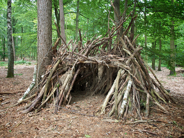
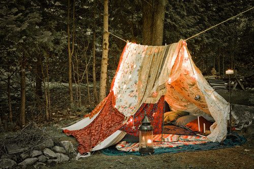
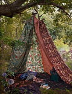
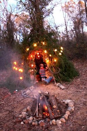
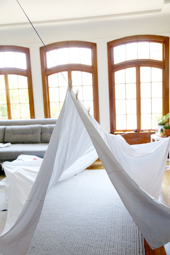
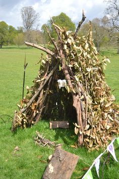
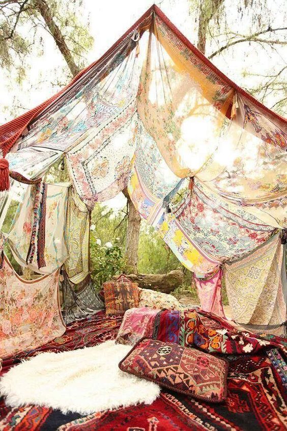
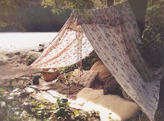
After looking back at the archival photographs of my childhood dens i also wanted to look for inspiration for my new dens through other dens made by other people. It was actually quite difficult to find photographs because i think the creation of dens are normally very much in the moment and you get so wrapped up within the game that you forget to ever take a photograph. I found this with my own archival photographs that the best dens which i can actually remember making still all this time later are not photographed. This is simply because they were very much for the moment. I remember that i have heard someone that when asked what the best memory of a persons childhood was that featured no adult interference the most common answer is den building. Within my project i am only really considering den building outside in different environments but dens could be structures built at home or built literally anywhere. I’ve created a small mood board above just to consider some of the common features of dens. 

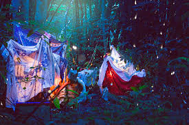
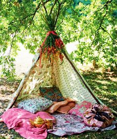
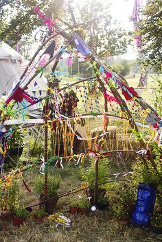
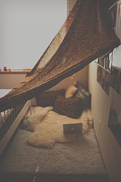
All of the dens i have seen have a roof. The whole point to them seems to be to create a space which is separated from the environment around them by a wall of material. I think a massive part to it is to create something, a space which is exclusively yours and for those others that you let inside. Another key feature seems to be the adding of blankets and pillows into the den so that it is comfy and cosy. This seems to have a lot to do with feeling safe and creating an environment in which the individuals feel protected. Most of the dens above are pretty much free standing which is why they all seem to have this tipi or tent shape to them. I’m planning on using the environment a little bit more within my structures so to have the blankets hanging off the trees and other elements of the environment incorporated into my structure. Colour also seems to be a big part of the dens, though this probably isn’t particularly planned but it is something i want to incorporate into my dens. 

ENVIRONMENT starting point

Survival Exterior  Atmosphere  Nature  Variety  Growth Imperfect  Wildlife  Vitality  Form Climate Rural Geographical Landscape Design Natural

ENVIRONMENT

Culture Development Uniformity Monotony Decay Robust Disposition Conflict Diversity Society Architecture Destruction Formation Technology Agriculture Synthetic

The word environment can be interpreted in many different ways but basically reflects ‘The surroundings or conditions in which a person, animal, or plant lives or operates’. The discussed in class how we could interpret and use this word in a our own work as well as given suggestions by the exam board. the main focus was the theme of the ‘natural world’ such as everything that is not man-made. We also discussed how this project could be based around our own social and cultural environment and even mental where we could explore our thoughts and emotions.

After looking at the environmental landscapes of photographers Richard Misrach and Michael Marten I was inspired to focus on the environment for my Exam. they focused on changes in the environments as well as how people changed the landscape. I plan on exploring the juxtaposition of the industrial and urban with the rural environment and how they effect and fight with each other. Above I have given a list of words, the first  section feature words relating to the natural landscape and the second portray how we have changed it. I also plan on focusing on how the earth re grows around and fights against man made structures, such as ivy growing over wall windows and cracks in concrete where mud and foliage has come through. I also plan on looking at the work of Joel Sternfeld who looks at abandoned and overgrown locations such as train lines thru ought America.

I plan on revisiting these photographers as well as exploring the work of photographer and artist Tanja Deman who explores the environment and the buildings and architecture of today. I think this project would be interesting to explore in jersey and the variety and culture thru ought each parish as well as explore how we have changed our island, this adds a more personal element to my project.

Physicalobserved and recorded environment

I plan on focusing on the physical alterations and effects of the landscape rather then the psychological (constructed and imagined environment). These physical changes are what is presented visually to the viewer, where everything is in front of them.

Exploring Binary Opposites

I plan on looking at binary opposites between the rural and industrial environment, I also plan on emphasizing this in over ways such as light/dark, east/west as well as colours and textures.

Natural and Synthetic Light

I plan on exploring the mix of natural and synthetic lighting in my work as an interesting example of this clash of environments.