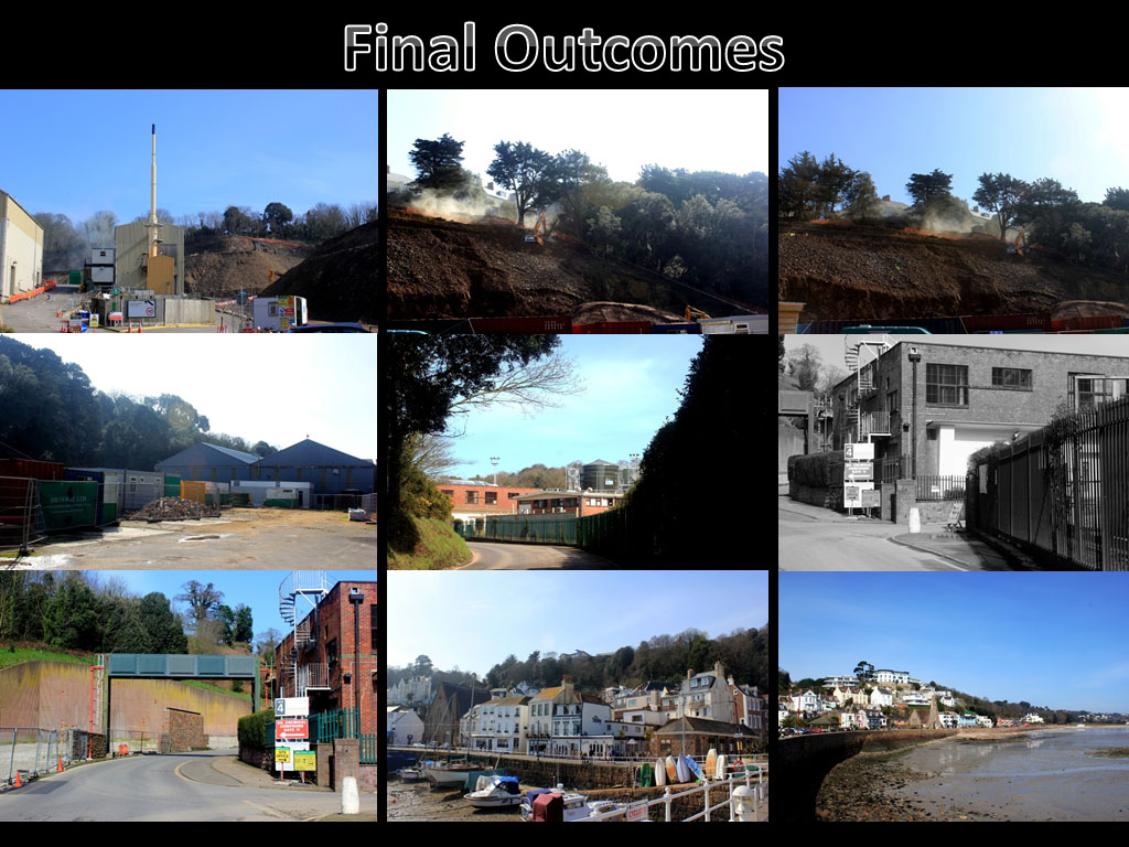
Theme 3: Miniature Scenes
Miniature Scenes
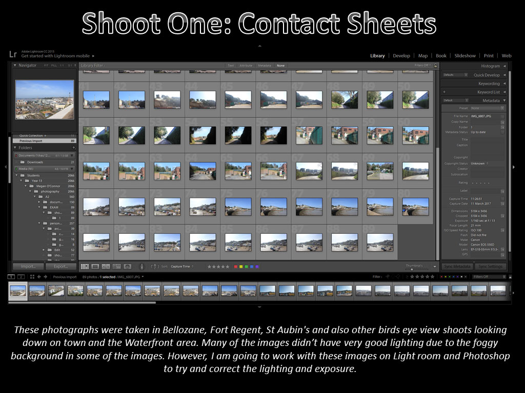
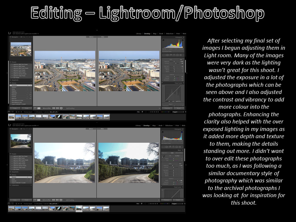
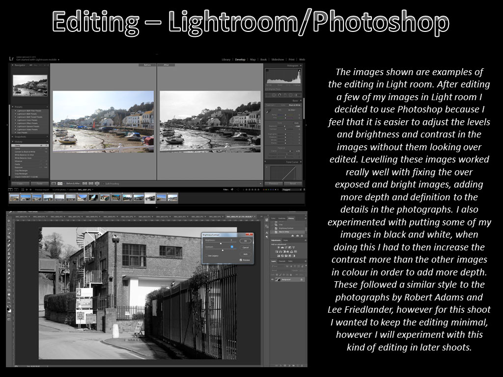
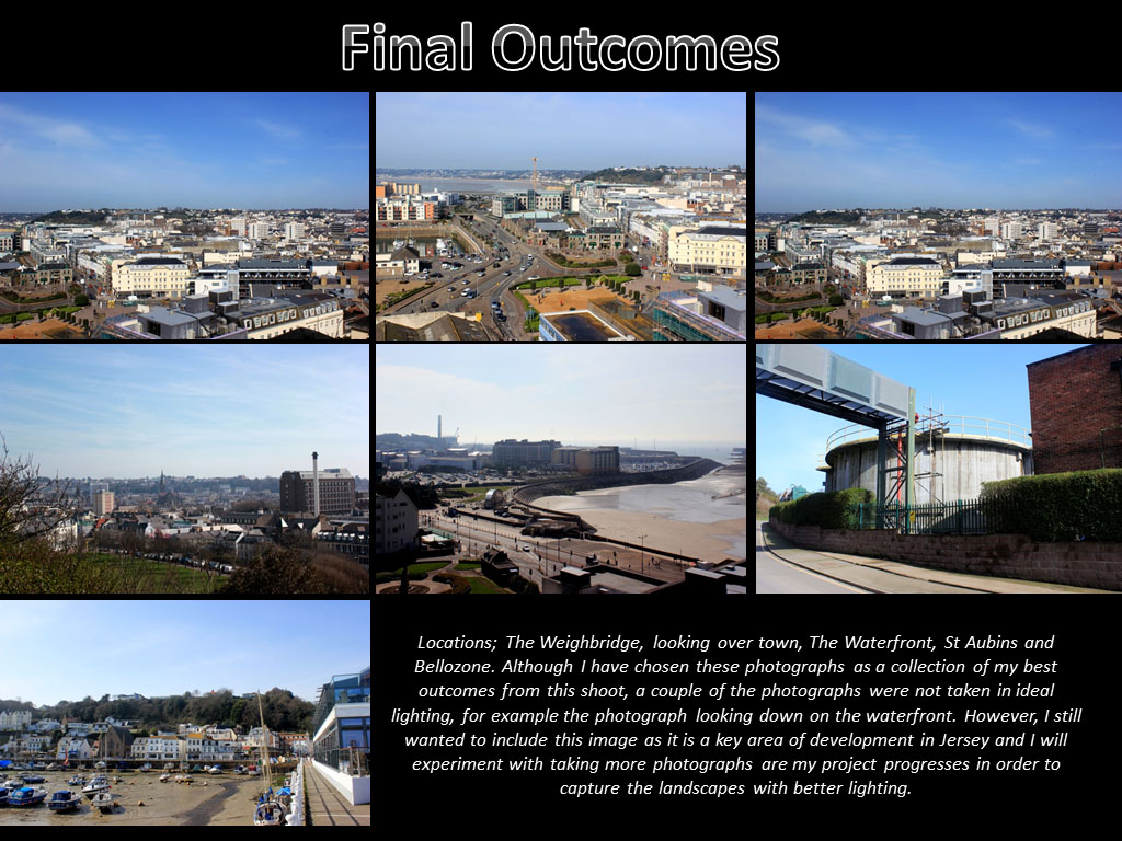
One of my first ideas that I have held on to for a long time is to create scenes by arranging small figures into their own Tableaux style scenes.
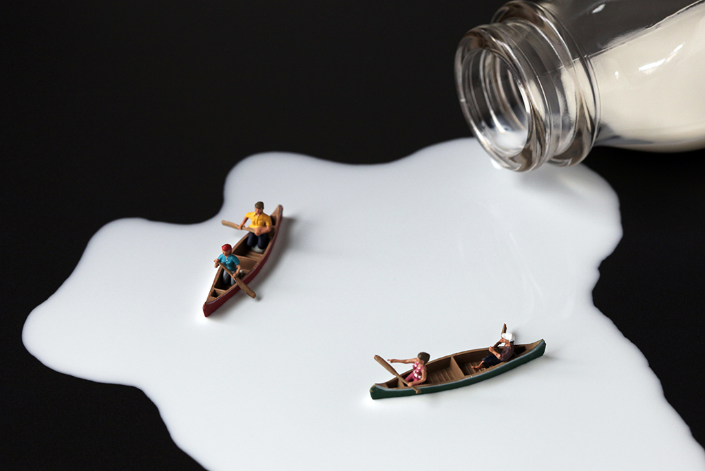
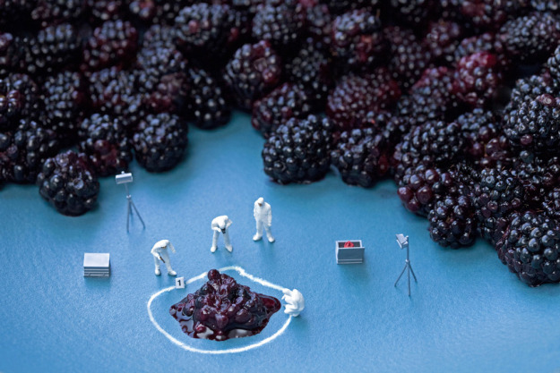
The surreal scenes often use some regular sized object to have the figures interact with. The example above shows one of these concepts. It is an interesting way to create Tableaux images and means that the artist must think about how to represent this environment, and to create it. Unless the artist has the ability to create their own figures they will also be limited by the different positions of the figures that you can use, there is a real need to plan ahead with the shoots. I like the interpretation of environment in these images, looking at full sized scenes and interpreting them in miniature is a really interesting concept. The images can have different meanings and connotations, and can be used to express certain feelings and have underlying tones, often though they are just a bit of fun.
Generally shot with a shallow depth of field there are few main elements, and several extra elements that support the scene. In the two images above the regular sized objects are not in singular, this makes it easier to understand the comparative size of the objects and figures. The surrealism of the images is expressed due to the difference in size between the objects and figures, the idea of being shrunk down to a miniature size, but still carrying on with normal ife is very interesting . I do not know if I will pursue this but the concept is still interesting and if I do not carry on with the water concept then this is something that I could carry on with, however it could be challenging because of the lack of context and amount that I could do.
Environment – Shoot One
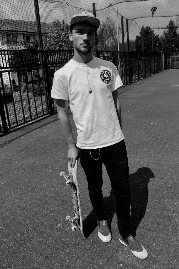
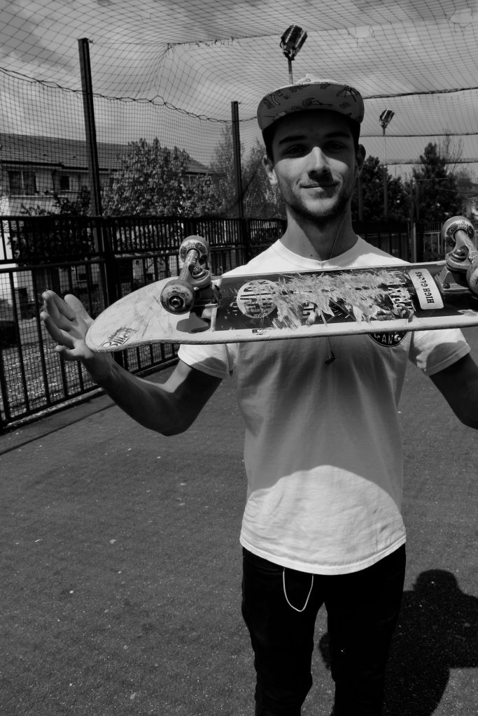
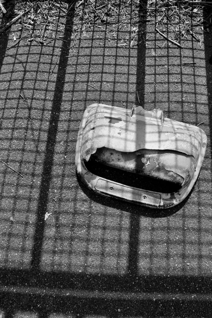
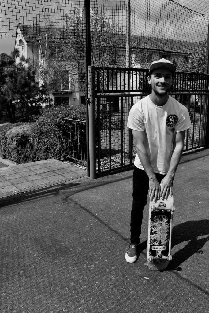
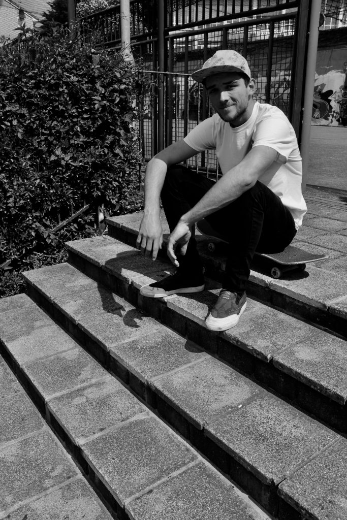
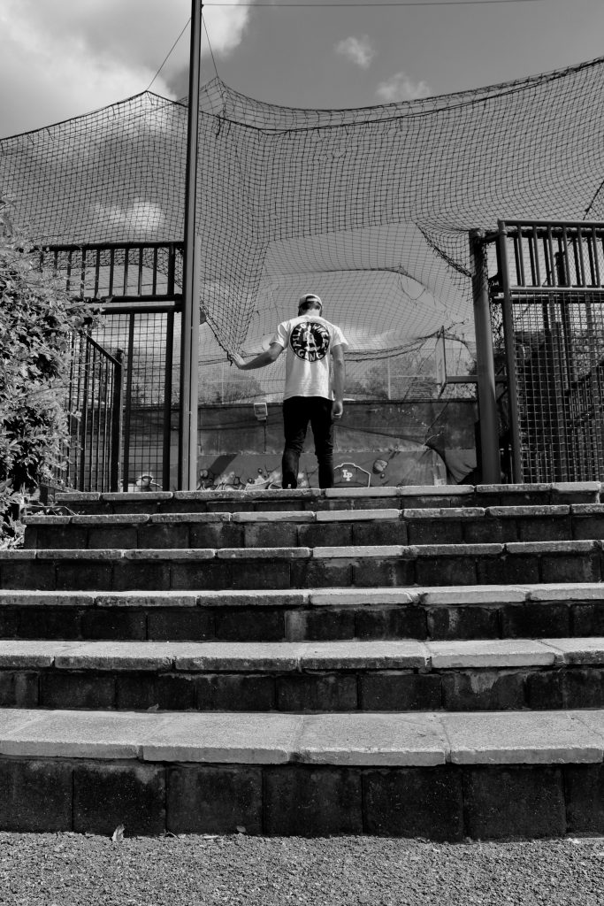
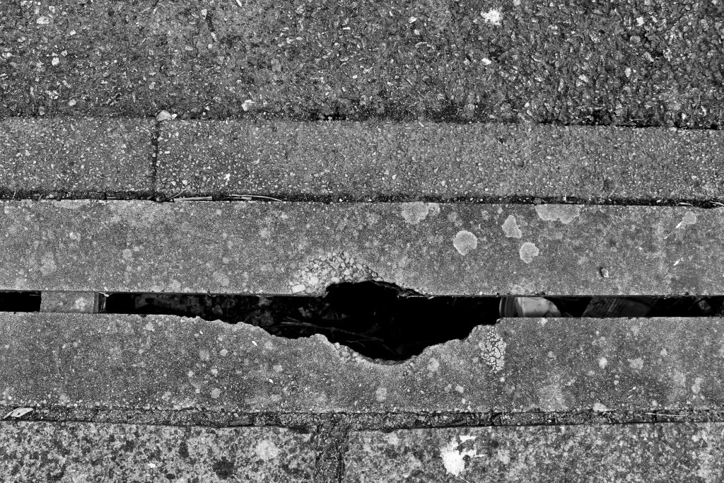
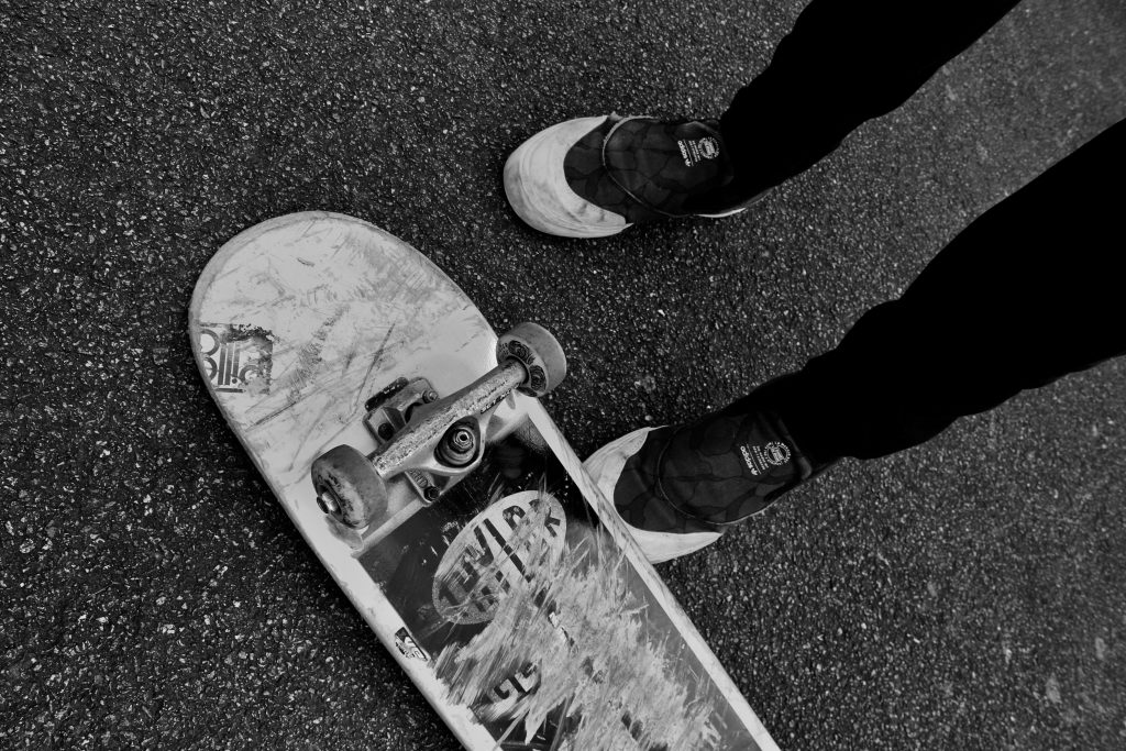
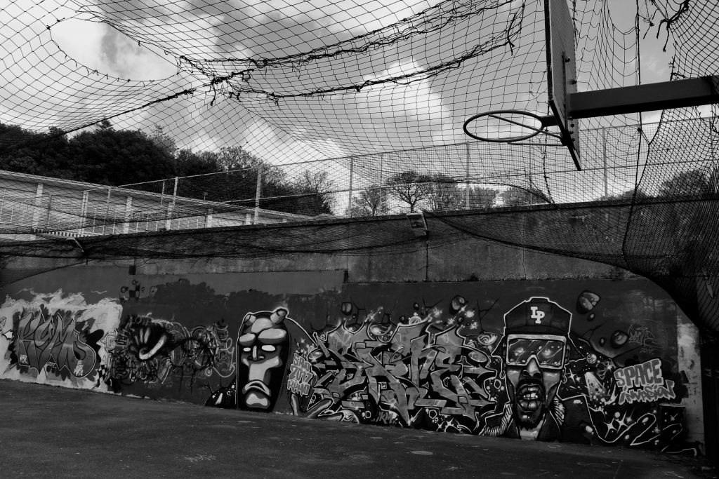
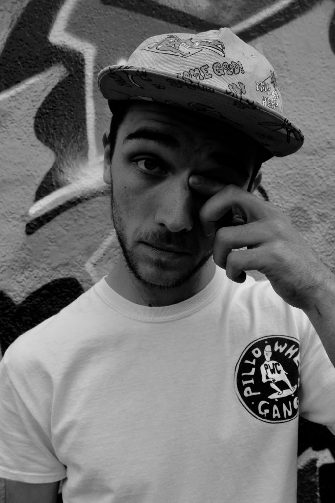
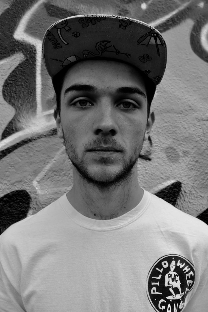
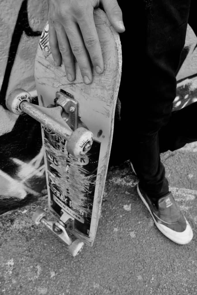
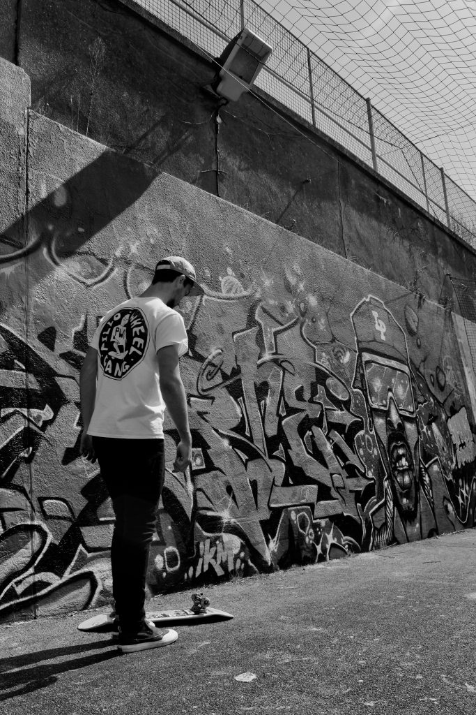
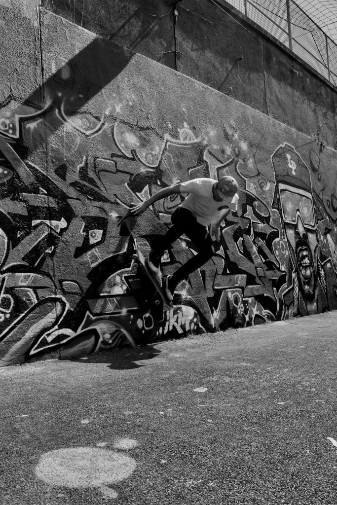
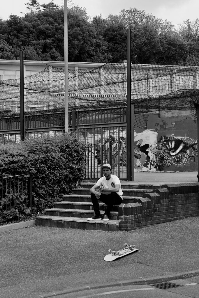
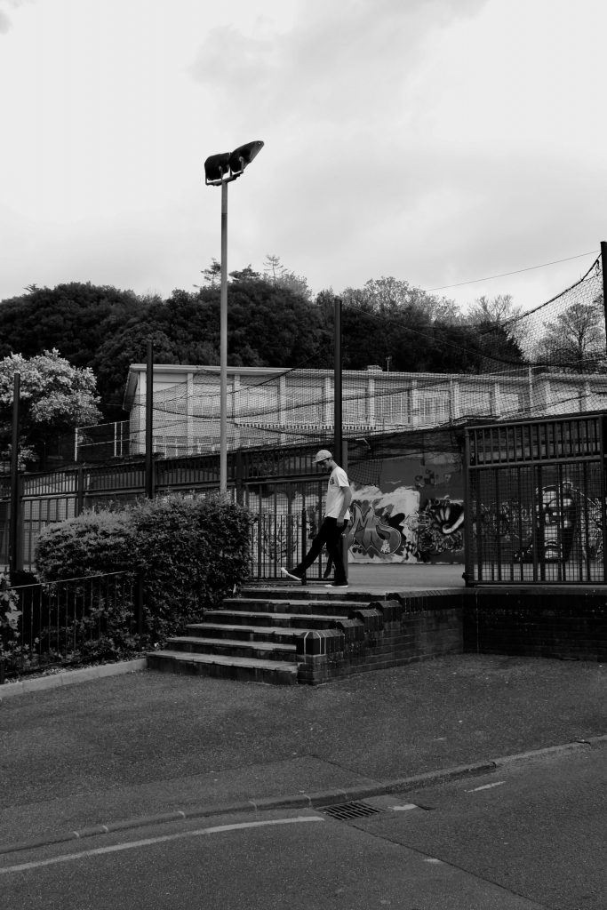
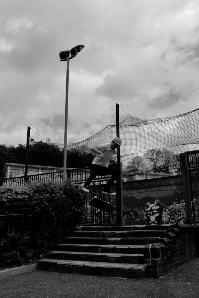
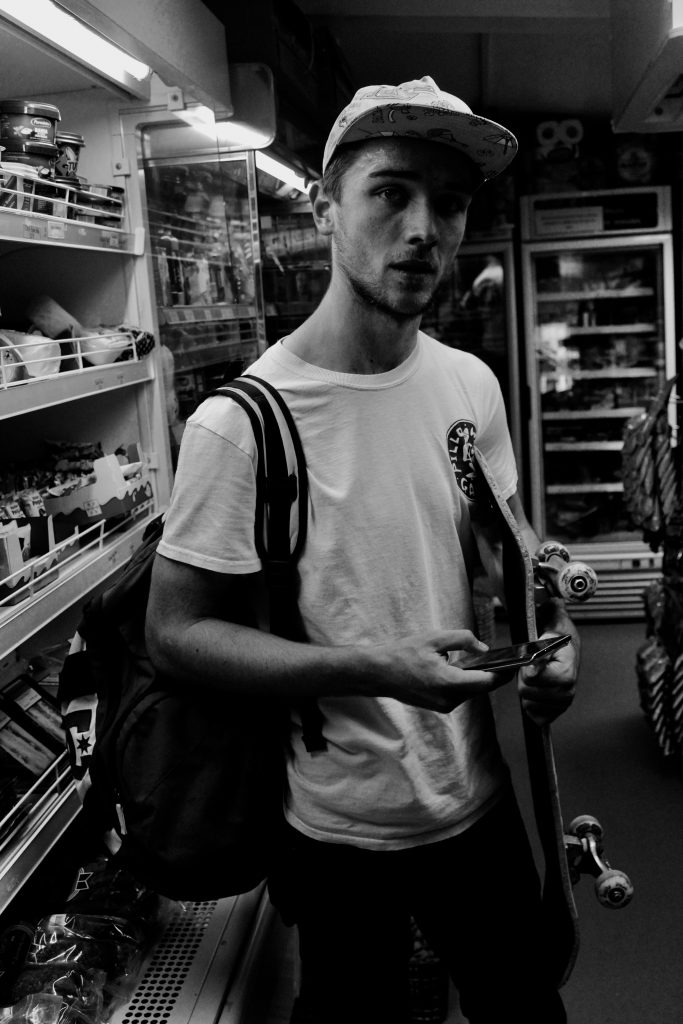
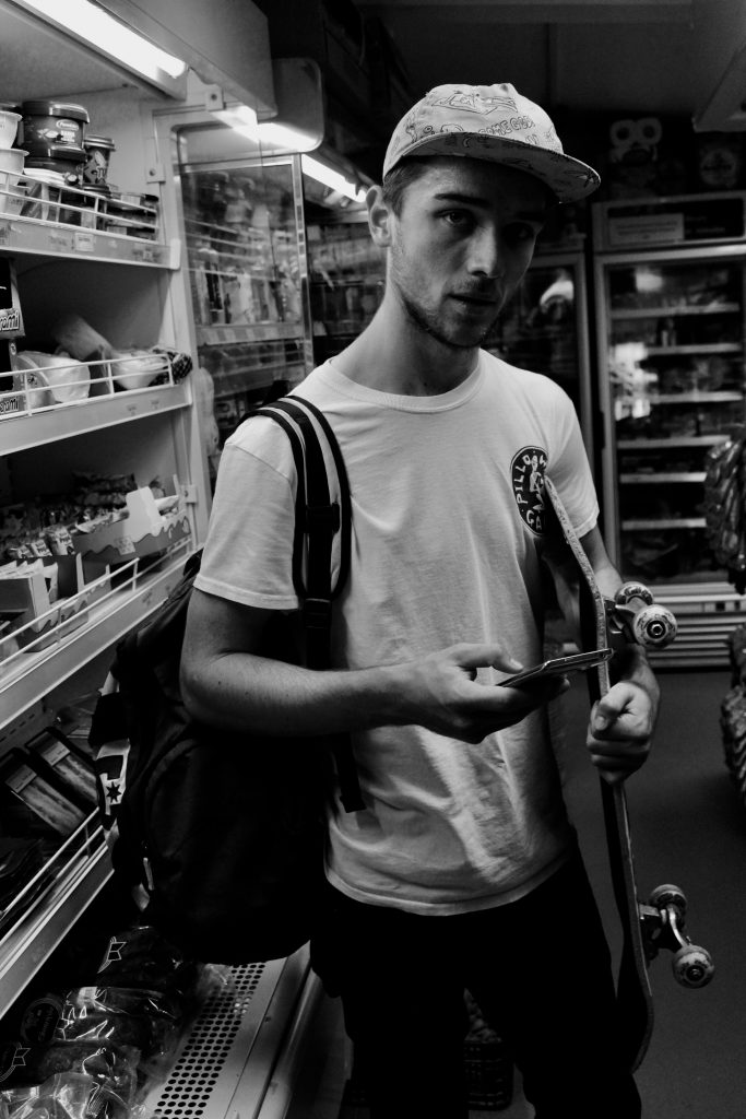
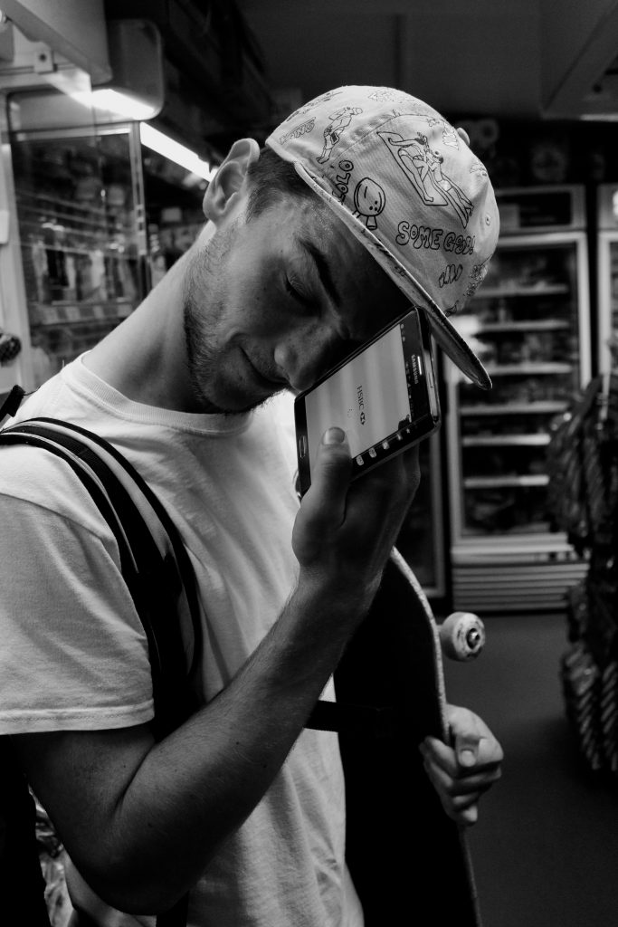
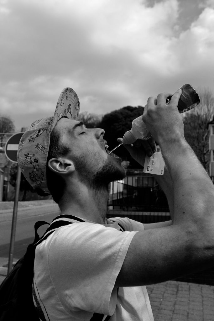
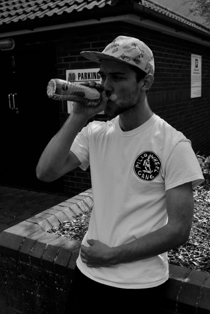
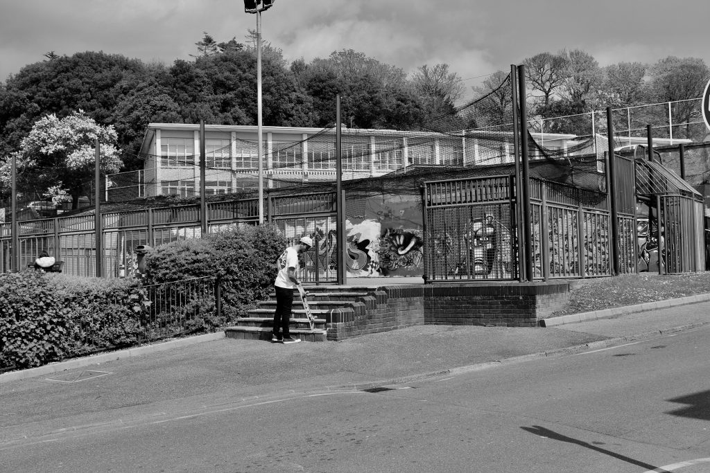
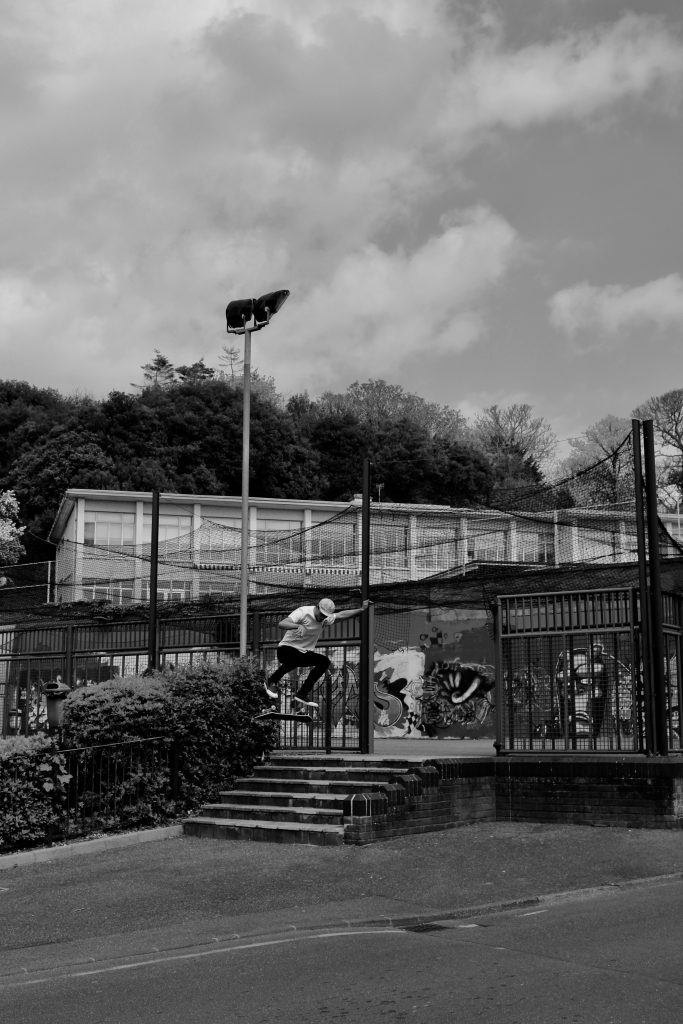
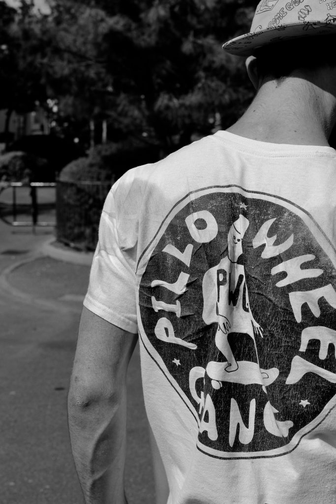
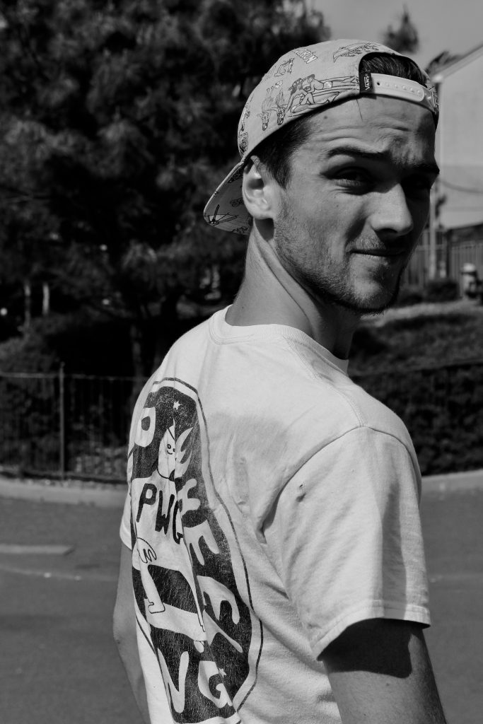
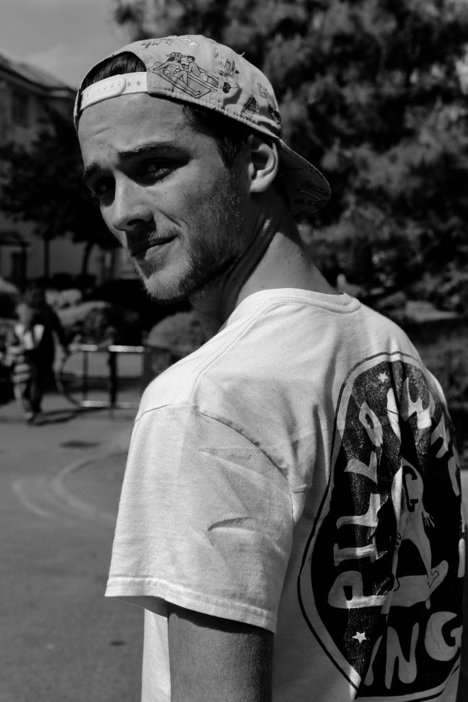
As an initial shoot, in the attempt to explore my concept of environment, I decided to photograph a friend of mine, Zac, who skates. In the process of photographing Zac, I would ultimately be investigating an area of my past which was once highly significant, my skateboarding environment. Skateboarding to me, as well as my friends, was more than just a sport, it was a lifestyle. Something that became routine, as we did it everyday.
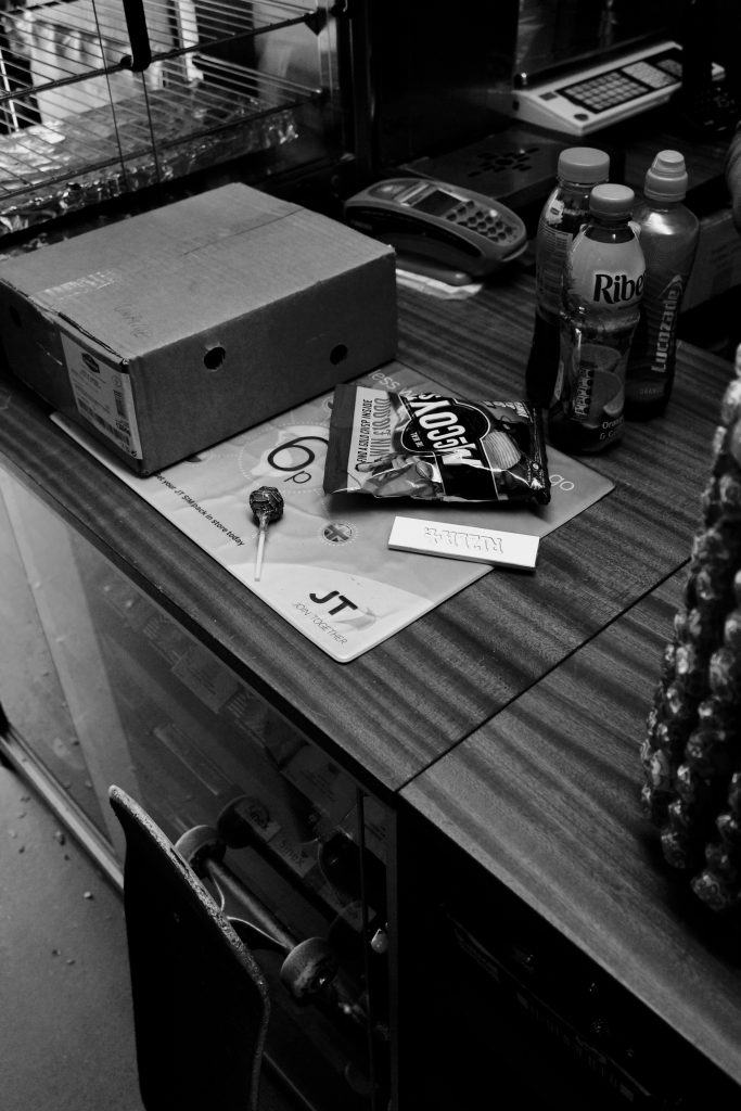
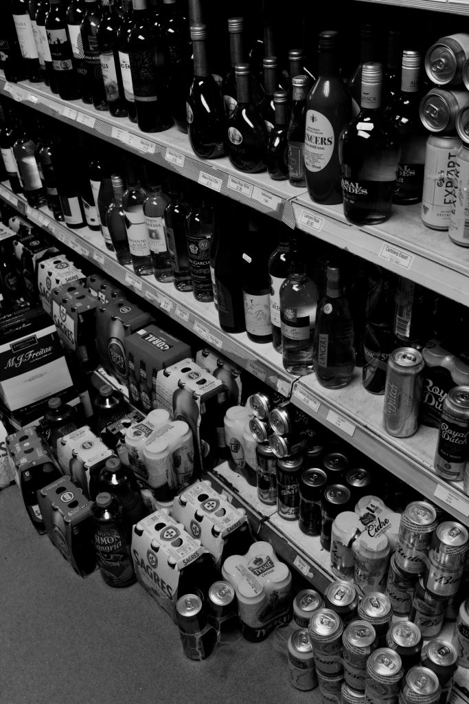
Within this shoot, my intention was to recreate the type of day I would’ve once lived, as a skateboarder. I have used Zac as an example of this. We used to venture to a location, suitable for skating and spend the day fluctuating between skating around and doing tricks, to sitting about and going to the shop etc.
I think this period of time, within my life, was where I believe I became my most independent, as well where I found myself and something that I fell in love with. Therefore my environment and my perception of it had changed, from when I was younger.




Environment – Ben Gore
As well as being a photographer, Ben Gore is also the videographer, for skate company Megenta. He films using the Sony VX1000 VCR camera, which creates an almost homemade feel to the video’s this company creates. Ben films with a loose style, very few tricks are filmed stationary and everything is focussed on motion and the relaxed style that this skate team contains.
What invites me to focus on Ben’s video’s specifically is his ability to create a mood, through his filming of both his surroundings and the people within them. Not only do we see a skate video, we see a great documentation of the area, people and architecture of each city. For example in the linked video entitled La Capsule Suisse – 242, we see a perfect example of this in the city of Geneva.
Mood Board
Mood Board (Environmental Portraiture)
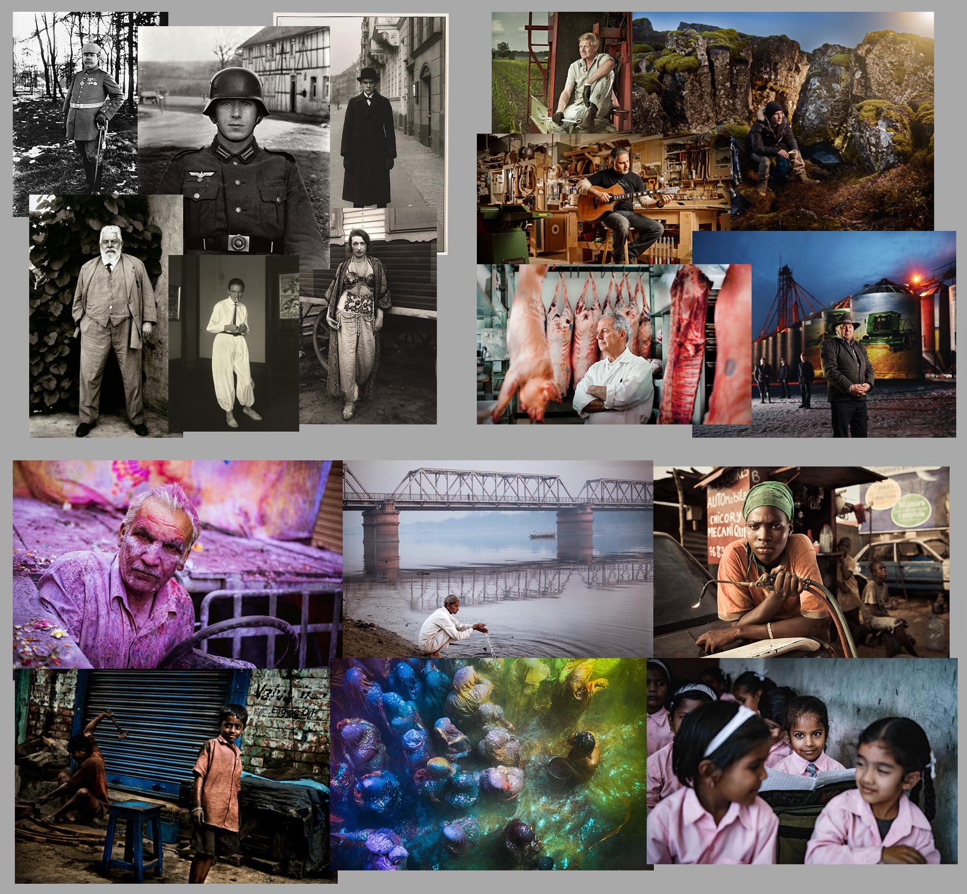
This was just a simple mood board that I have created looking at environmental portraits. I have looked at a classical example, in the form of August Sander as well as more contemporary studies from Jonathan Bielaski and Anthony Kurtz. The main concept of environmental portraits is to photograph a person in their natural environment, this has the effect of giving a whole volume of information to the viewer other than just the subject and their clothes. You get to build up a much more in-depth relationship with the subject, getting to understand a little more about what makes them who they are. You can often see a relationship between the subject and their environment, there are things in the environment that are represented in the subject and vise versa. This works very well for the keyword of this project, with more structure than simple portraits or landscapes it allows the environment to be studied and linked to a subject.
Sander’s work is the real starting point for this type of environmental portraiture, there were similar works to this but this the classic example and where the movement came from. His images are always composed well, he has the subject look directly at the camera and stand in a pose that shows off who they are. Their outfits are an essential part of the images. The Soldier shows the youthfulness of this man who is ready to experience war. Taken in a winter hamlet this is clearly not his home, he shows no connection to the location, he is simply posted there for what ever reason. His other images are in a very high contrast, this gives an amazing amount of detail to the faces, clothes and surrounding of the subjects. The detail gives a fantastic perspective of the subject, you really feel like they are standing right in front of you, staring into your eyes. There is a connection made to these people who are all likely dead now, this is what his photography was excellent at doing, making you feel a connection to these people who you will never meet, and likely will never know the names of.
Bielaski’s work is a more modern take on Sander’s. He travels to locations with his subjects and set up photos using lights and his camera almost as if it was in a studio. He uses a camera that can capture 100MP in a single photograph, this incredible detail has the same effect as Sander’s high contrast. You get to see the details in a subject’s face and clothes making it seem like you are simply looking through a window at them. Bielaski also seems to have used HDR for his images, further increasing the detail and information available to the viewer in the photograph. Almost looking like animations his images are highly manipulated, and although it makes the images look very impressive it draws away from the subject a little, the viewer does not focus on the content as much because they are dazzled with these fantastic colours.
Kurtz’s work in the mood board is kind of a mix between Sander’s and Bielaski’s. He still has high contrast to the images but they are not over the top with excessively vibrant colours, the bright colours that are seen in some of the images are a result of the subject being powder paint which in its self it very vibrant. His images are a mixture of having the subjects look at the camera and not having them look at the camera, this works well depending on the different photographs. The one of the group of people works well despite there being no specific single subject, the mass of people lends itself well to the chaos in this scene. His depictions of his subjects work well because they do not seem forced or over bearing, you see the subject and plenty of the background to give context to the subject.
Random Ideas
List of Starting Ideas
- Miniature environments
- Lego scenes made to look real with modelling clay
- Miniature figures with full size objects
- How different people see the same world differently
- Use archive images to compare with modern images
- How does environmental change cause a change in people?
- Compere Jersey’s environment to the rest of the world
- Lack of environment
- Studio
- Just focus on person
- Compare studio to personal environmental portraits
- Folding landscapes (surrealism)
- Look at natural and artificial environments
- Look at my own environment (sea)
Initial Ideas
// S T E R E O S C O P I C //
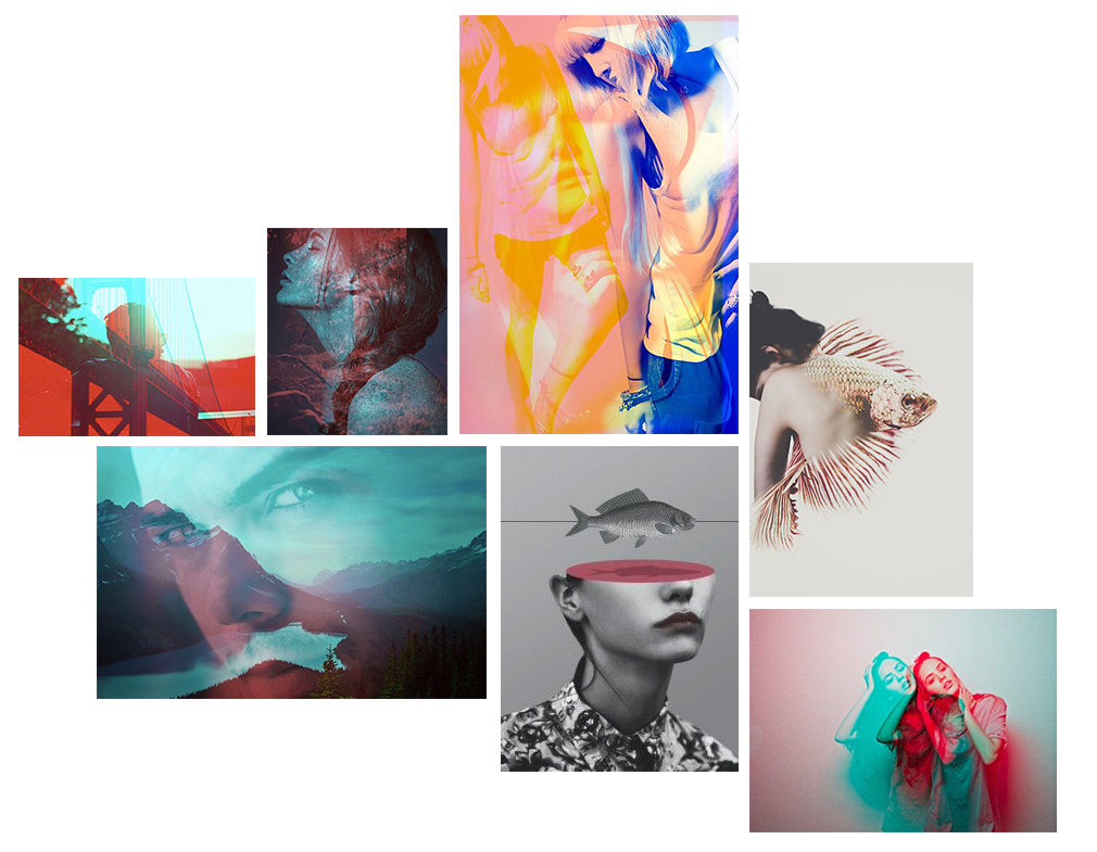
 Double exposure photography is an area which aesthetically interests me. The process of combining multiple images to create a final photo – often with colour and contrast variations – can not only be used aesthetically but also symbolically. Tying this to the theme of environment (and possibly portraiture?) could produce some graphically interesting outcomes where people can be merged with their personal landscapes. Working on this idea can involve both
digital and analogue images which I intend to take advantage of in this project. As an idea starting point – I would like to explore the theme of environment through it’s connections to people with the intended end result producing a series of portraits showing people and environments as a single concept. This may play on the idea of stereoscopic images which have a 3D effect to them, much like those below. These tend to use red and blue as colour opposites to create contrast not only in the subject but also in the presentation. Below is a starting mindmap for some basic double exposure portraits – many of which include landscapes. Animals are another theme often included and digital manipulation can be used to heavily alter photos creating surreal images (such as the fish girls)
Environment – Ben Gore
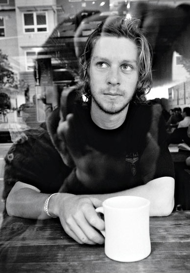
Ben Gore is a professional skateboarder/photographer/filmmaker, who bases himself in primarily in San Francisco and Bordeaux. Two cities where he most commonly creates his work, these consist of specifically skateboarding and as well the lifestyle that revolves around the culture.
Ben Gore uses both film cameras and tape recorder to capture his work, this adds to the classic skate style that is associated with coverage of the sport. Within skateboarding new technology isn’t widely accepted, people prefer the original aesthetic of a 4:3 aspect radio that condenses the skateboarding into the middle of the screen. As well as the slightly motion blurred or in crisp appearance of a photograph taken on film.
I chose to study Ben Gore as skateboarding was skate a large part of my life growing up and it was something I spent every day doing for many years. The people I grew up skating with, of all ages, became like family and I feel this is something very unique to the sport and something I wish to incorporate within my project. As at one point in time skateboarding was all that I saw and it was my environment.
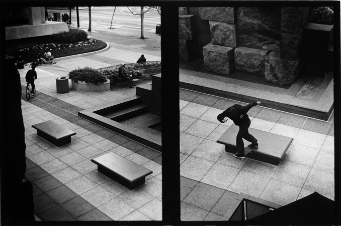
This photograph by Ben Gore, to me as a former skater, perfectly captures the perspective of a skateboarder in terms of their surroundings. From this high point of view, to an average civilian, they would see a simple concrete landscape, featuring a cyclist and some others seated, the people would most probably become their focus. To a skateboarder, architecture becomes a playground, somewhere that they can express themselves and their art form in a unique and individual form. Skateboarders appreciate such landmarks much more than the average person, who would simply see a ledge for sitting.
It becomes an obstacle to tackle and from experience you really do becomes part of the landscape, we see to the right of the image that the tail of skateboard fits perfectly onto the ledge. A satisfaction that can only be experienced through skateboarding and I feel this is very unique to the sport.
First Ideas
Environment
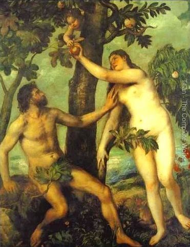
The environment is something that has always inspired artists and creators throughout time. From the very first examples of art that we have found, art emulates the surrounding environment of the artist. Cave paintings are an obvious reference to this, the earliest cave paintings found are the outlines of hands or drawings of different animals around the artists, for example this link shows the earliest known artwork found in Indonesia. Moving closer to more contemporary artists we begin to look at prominent figures like Tiziano Vecellio (Titian). Even though he mostly did not paint real life things aside from portraits he did paint lots of religious scenes, taking parts of the bible and painting them into life was for him a way to express his environment. In 16th century europe religion was one of the most prominent forces in the continent, it affected all aspects of people’s lives, they went to church often and would spend time praying. Because of this their religion was their environment, everything that they did was caused by Christianity.
His paintings often show a very positive, christian message. He romanticized the scenes to show his faith through his artwork, the opening of the heavens in David and Goliath show the positive message that is being shown, the defeat of evil and bad is praised by the Lord. He is showing his psychological environment as opposed to the people who produced the cave paintings mentioned at the top of this blog post, they are showing simply the physical environment, their immediate surroundings like their hands and arms and the external like the babirusa (pig-deer) drawing that is present next to the hand prints.
This difference between the physical and the mental environments is an area of art and photography that is also worth exploring. Although the physical environment of two people can be the same, they can be in the same environment, their mental environments can be incredibly different. It is easy to stimulate the same external environment in multiple people, what it is difficult to do is then to get them to think the exact same thoughts of this identical scene. Although mental conditioning of people is something that can be achieved it is impossible to get someone to think exactly the same. The human brain is something that can be easily controlled and manipulated to a degree but there is always the ability for the mind to wander off and do its own thing, despite being forced into this small space. Scott Berkun talks about this theory by saying that the “mind is unique in the world for its infinity of ideas, for it can be used to think about almost anything in a million different ways.”[1] Because of this the different interpretations of the same thing can always lead to different end results. In psychology there is a debate over free will Vs determinism, this is a debate over if people are completely free to make their own decisions or if everything that has happened to them in their past or genetic factors has caused them to make these choices. As with most of the debates in psychology it is neither all-or-nothing, in reality some decisions are made based on predetermined factors and some are aided by the free will of the individual. Personally I lean towards the determinism side of the debate more, I believe that although people all think differently it is due to individual experiences. Nevertheless it is still interesting to see the results of different experiences and how they can create unique people and how these unique people can create unique art.
To help me get a better understanding of the concept of “environment” I made a mind map of things that I would just come up with as we were familiarising ourselves with the task.

Although my handwriting can be difficult to read and understand sometimes hopefully this can be read. This was only the most basic mind map, based on this as a class we made several mind maps to allow different people in the class to give their input.
There were lots of different ideas that came out of the discussion sessions, one of the most prevalent was to look at landscapes in some way, to photograph the landscape of a person or group to show their environment that way. This could work very well for some projects, being able to map an environment and get an understanding for what it is really like would help the understanding of the subject greatly. The human (and animal) mind is shaped by our environment, among other things, and so there is always a link between an animal or plant and their environment. This often the physical adaptations that they have to survive, investigating these differences between different species and looking at how they fit to the environment could be a really interesting thing to explore.
One other point that kept coming up was “people”, this is an interesting thing to try and look at, again the photographer could be looking at their own environment based on the people around them. You could look at family or relationships, and how they create a social environment for people, by looking at different families and observing their differences you can get an idea for how families other than your own react to different situations in possibly unexpected ways. In the same vein, by looking at different homes an understanding of the intimate environment in which someone lives can be very interesting, seeing inside this place where they can be themselves. In a bedroom where they do not have any pressure to conform the social norms that they usually will. Inside these spaces they can truly be themselves and even though a photographer will not see this side entirely they will get a glimpse of who this person truly is.
Bibliography
Point of view
In the photograph below, I was trying to focus on the whole meaning of my photographs, like a journey of my life showing the environments I surround myself in. This is represented by the fact they were taken in a mirror in the car. One can also faintly make out that the beach is what’s in the foreground, meaning we’ve stopped to take time at the beach, however I didn’t want to capture it that simply so I thought I’d try and experiment with things such as reflection and composition.

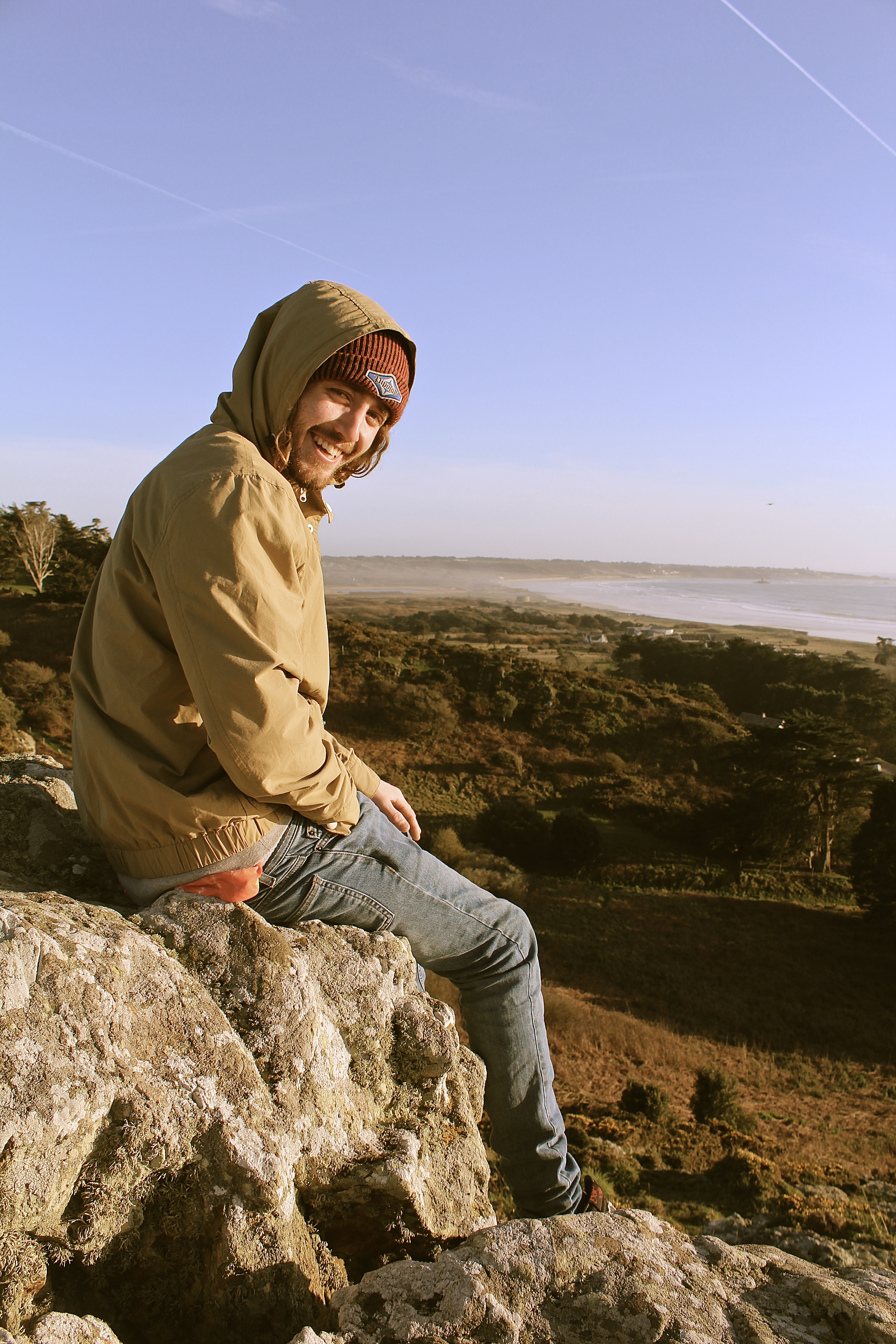
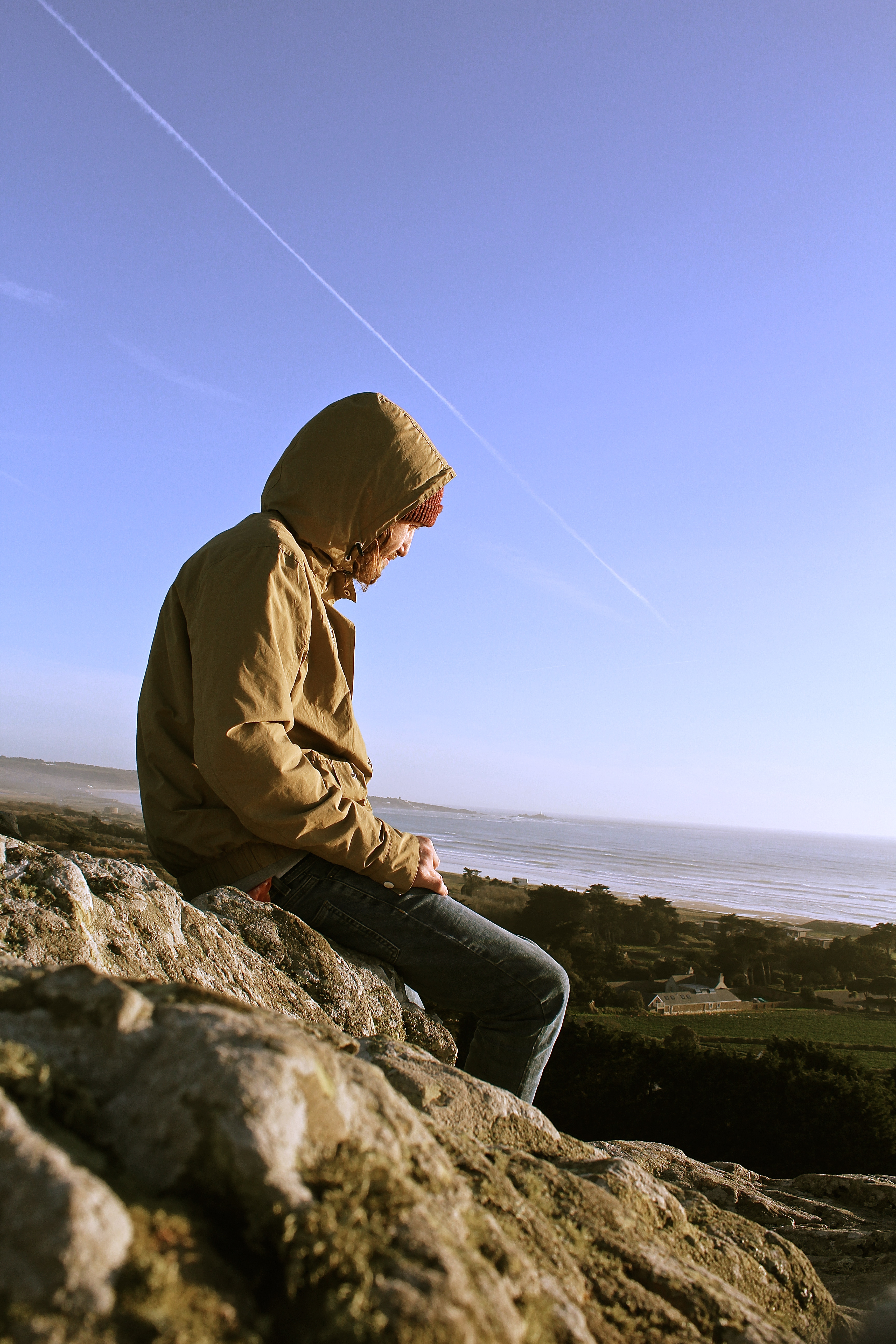
The photographs below were inspired mainly by the photographer Ivan Troyanovsky. This shoot was different for me as I used the natural lighting of the sun, rather than using artificial flash lighting, which I tended to use on my last project looking back at Helmut Newton. This makes the way you photograph completely different, as with flash you can photograph wherever as it’s going to be well lighten with high contrasts, however with natural lighting you must think about the positioning of the model before shooting, whether you will get a silhouette or too much shadow etc.
An example of the use of lighting is shown below, where the photograph is being shot towards the light, whereas in all the others i’ve shot with my back to the sun, this is because after taking this photograph, I didn’t think the high exposure on the right hand side worked that well.
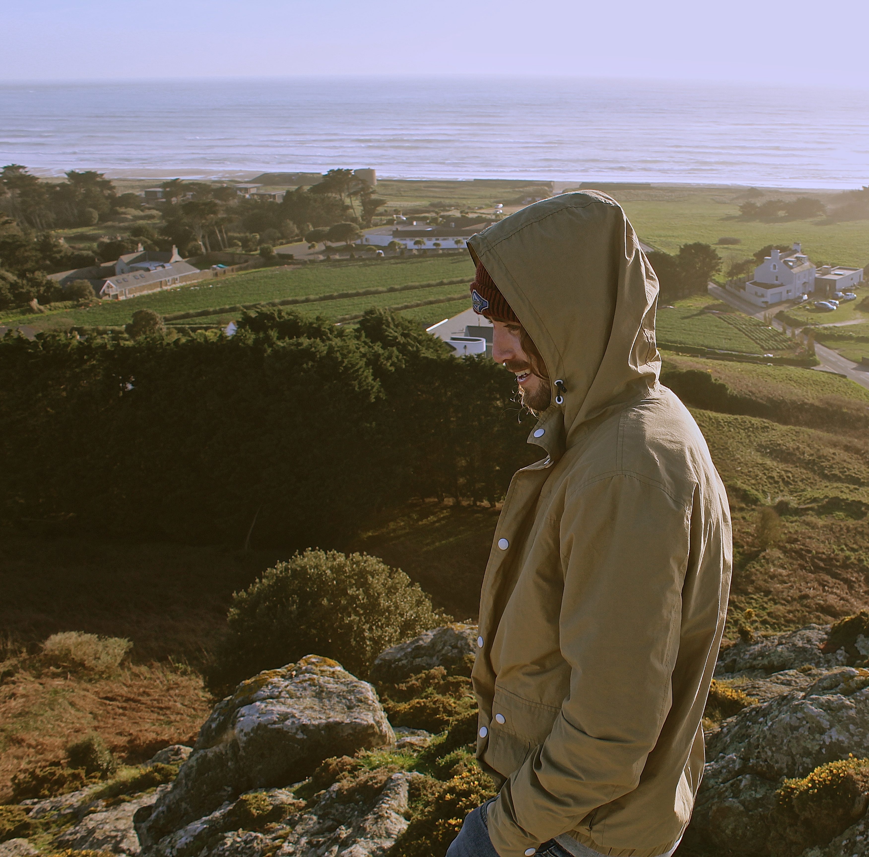
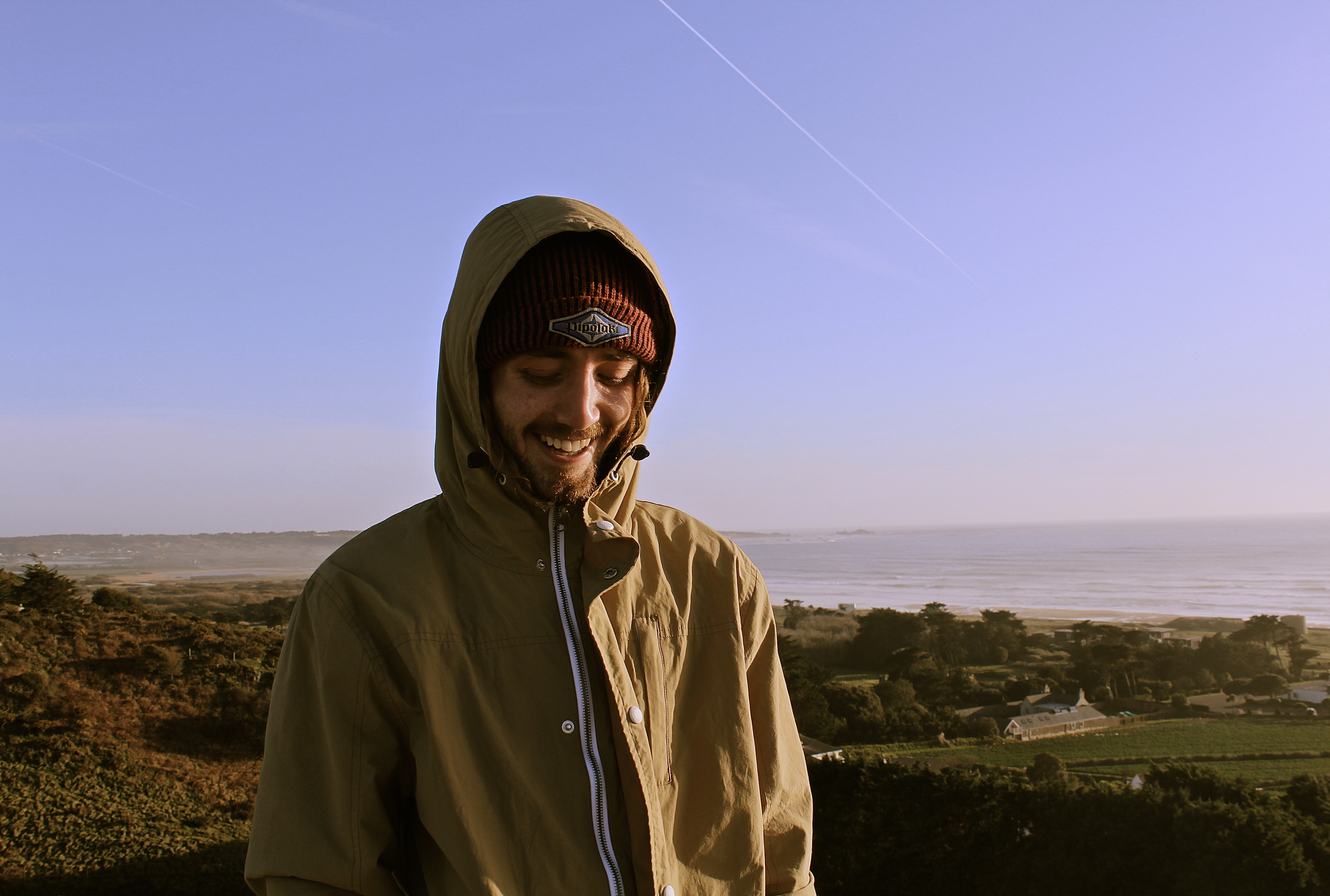
In this photograph I tried to capture the emotions behind the subject. I wanted to try and and create a natural image where in which the facial expressions of the model involved were not forced or provoked by the camera. The photograph features split organic lighting, which enhances and emphasizes the facial features consequently bringing out the smile.
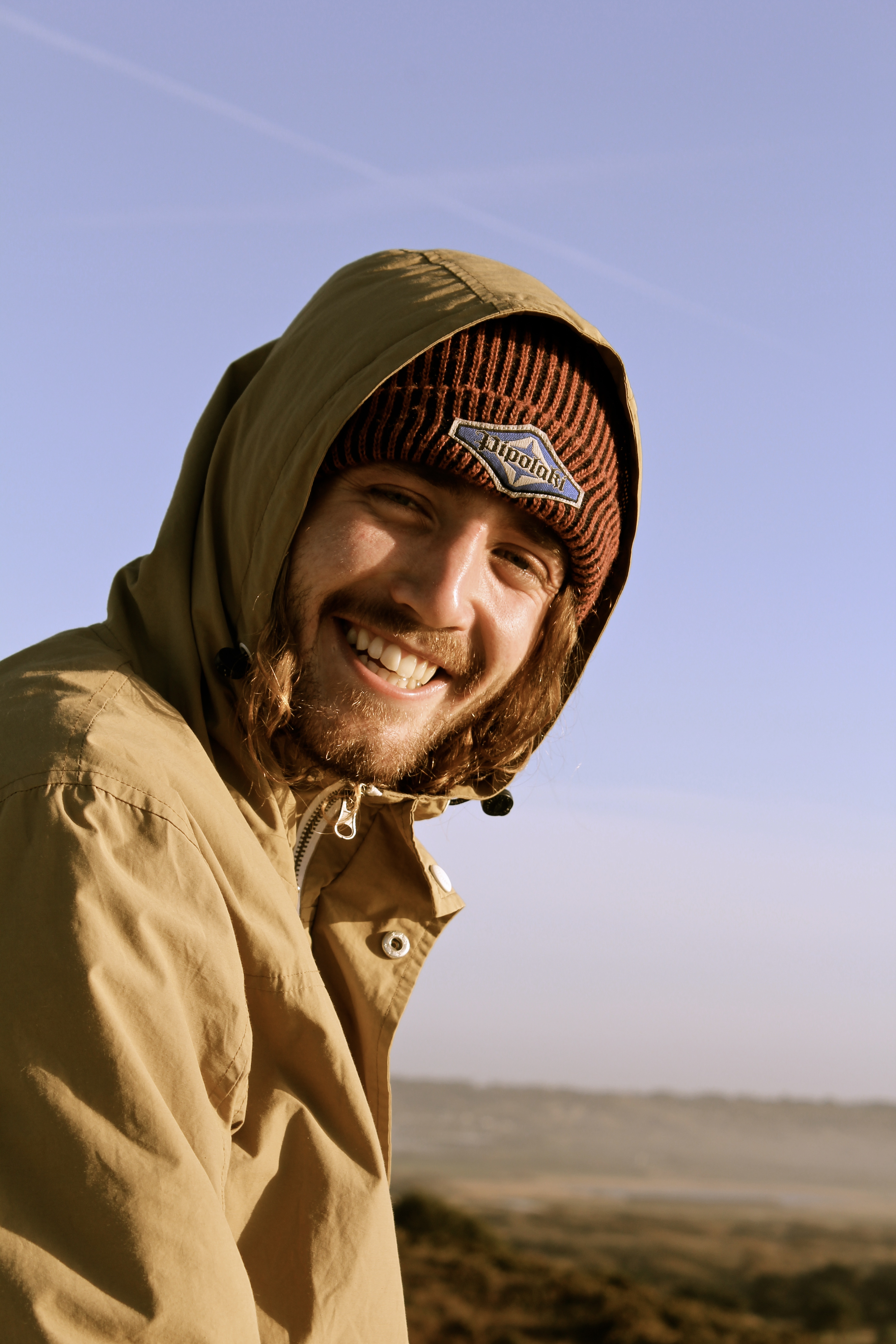
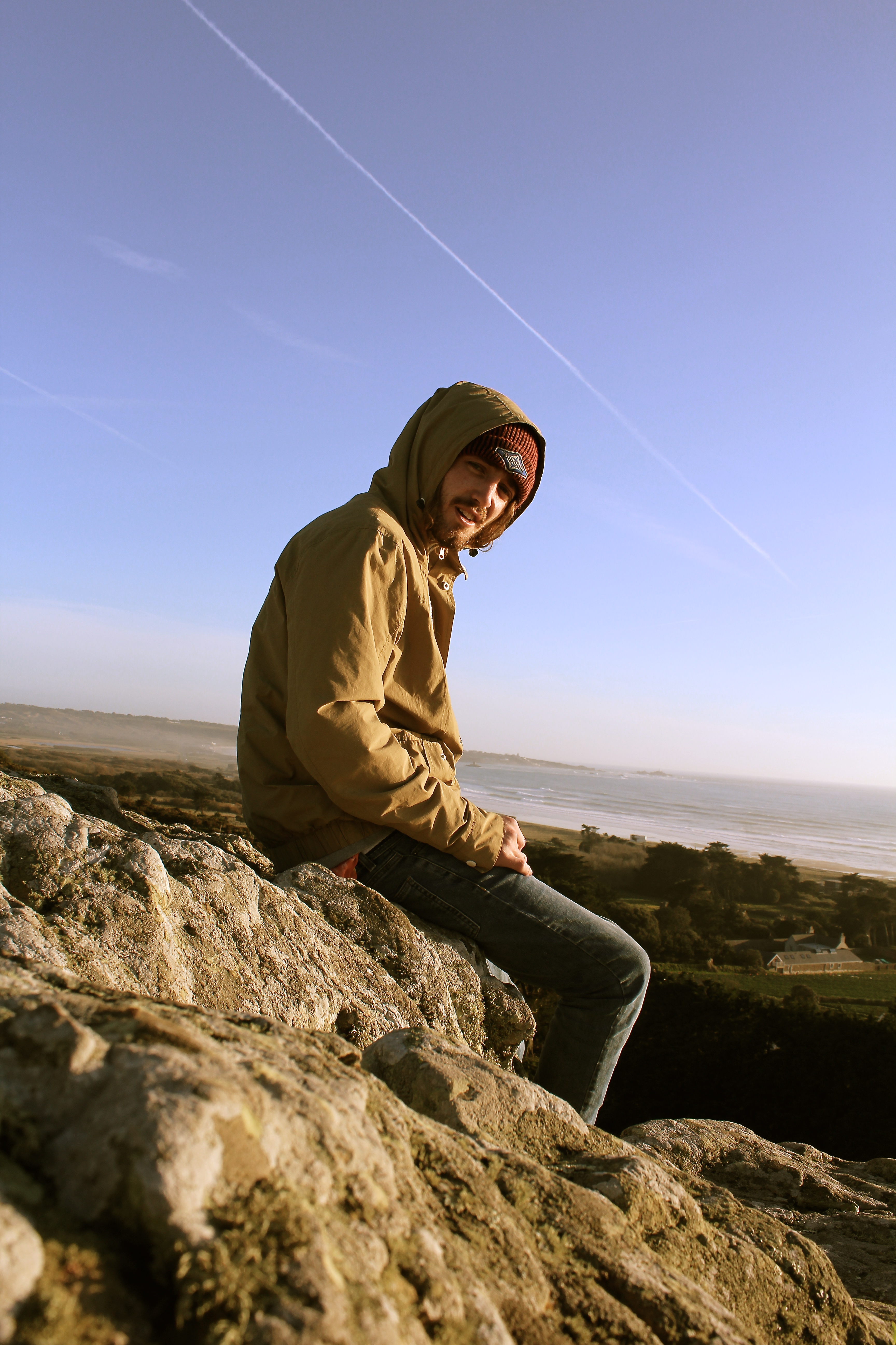
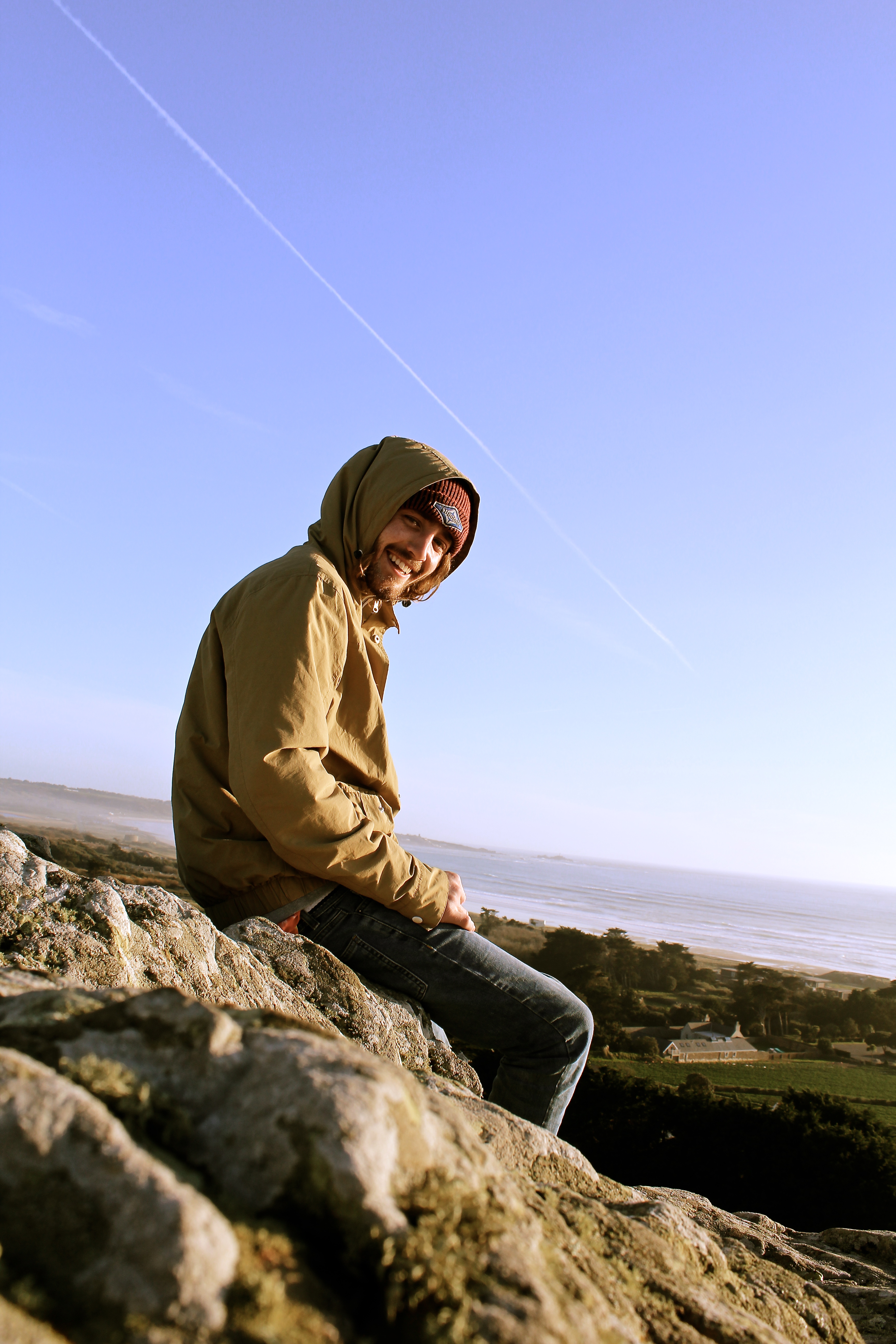
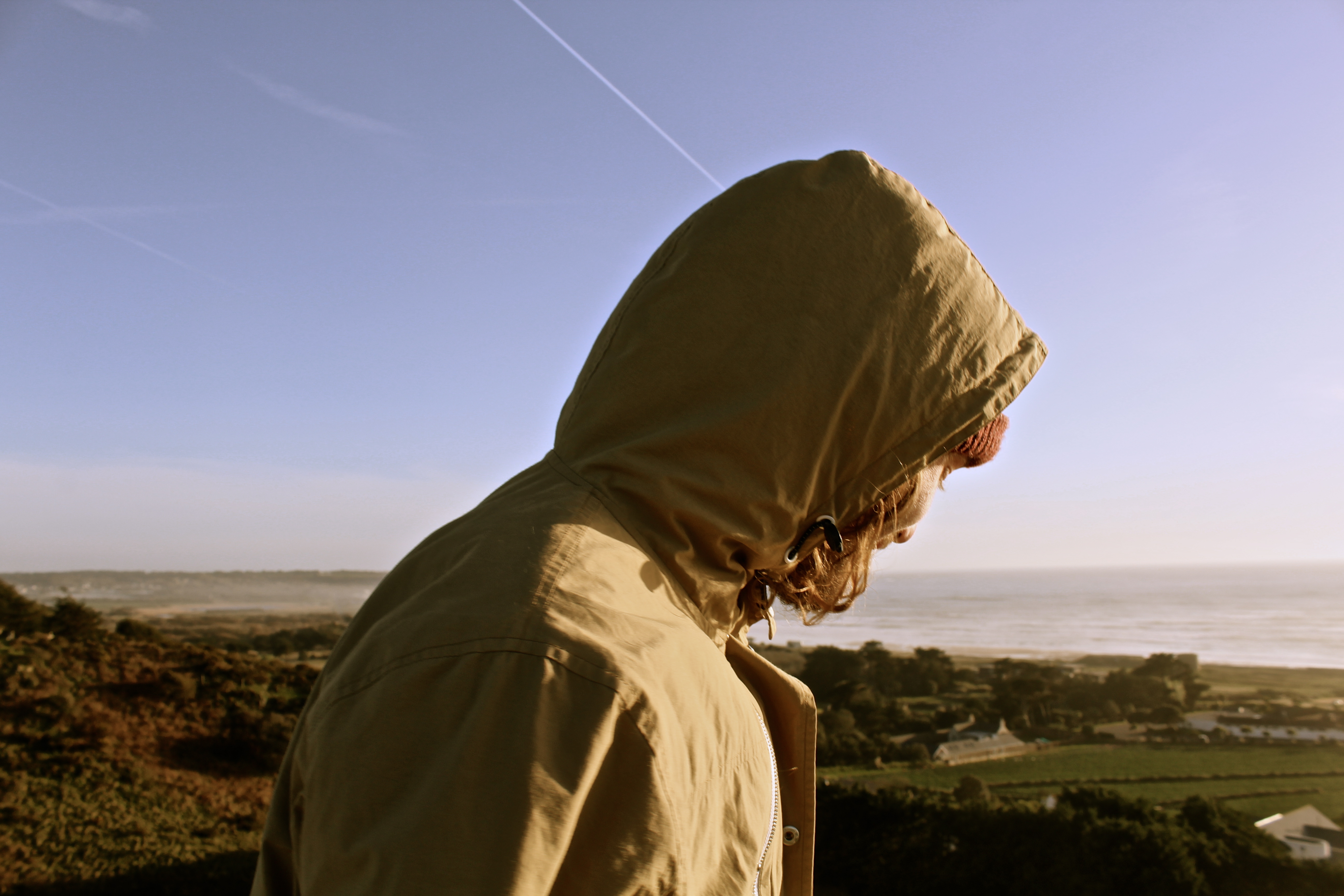
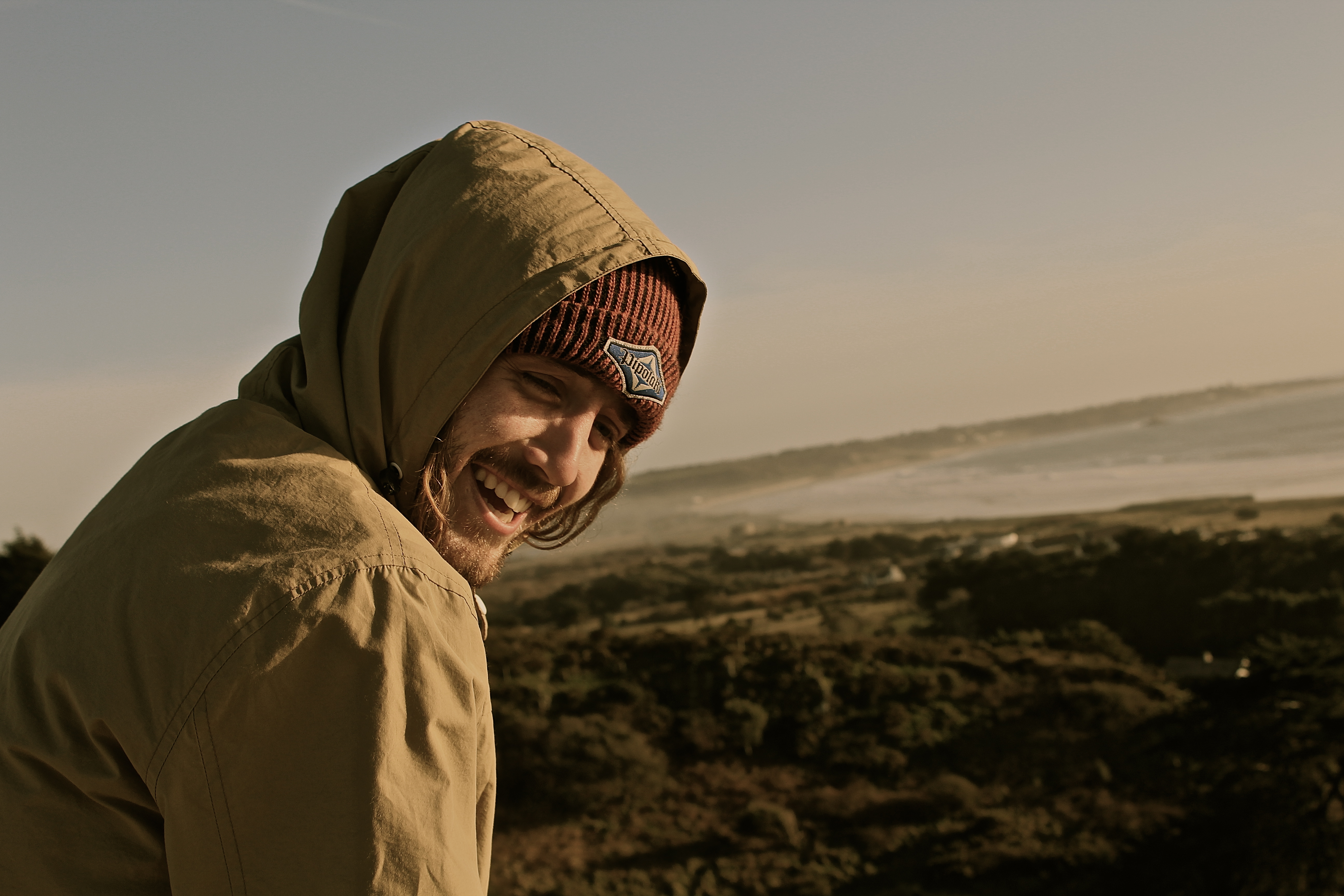
I have attempted to capture the two images below as a set as they work effectively as a pair. Both photographs tell a natural narrative, as the subject can be seen identifying the presence of a camera and producing a reaction. The composition is reliant upon a low-angle perspective which works successfully due the way it captures the subjects relaxed body language whilst simultaneously incorporating the background and landscape. This enables the viewer to establish a connection between the model and surrounding environment, hence generating an atmospheric aesthetic.
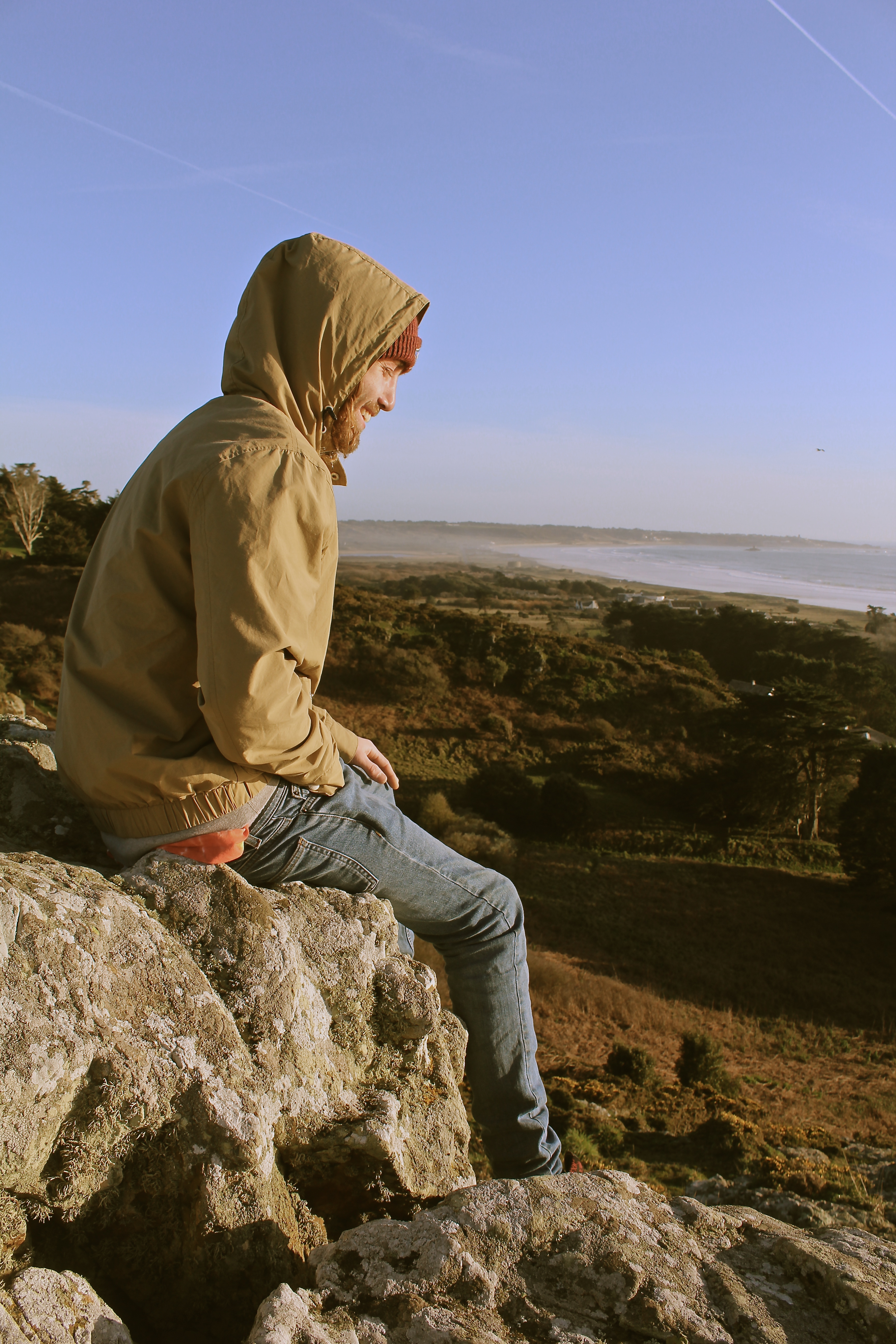
The most visually pleasing component of this image is the distortion of color tones which produces a vintage, relaxed aesthetic. This is very similar to the way Jeurgen Teller edits her photographs.
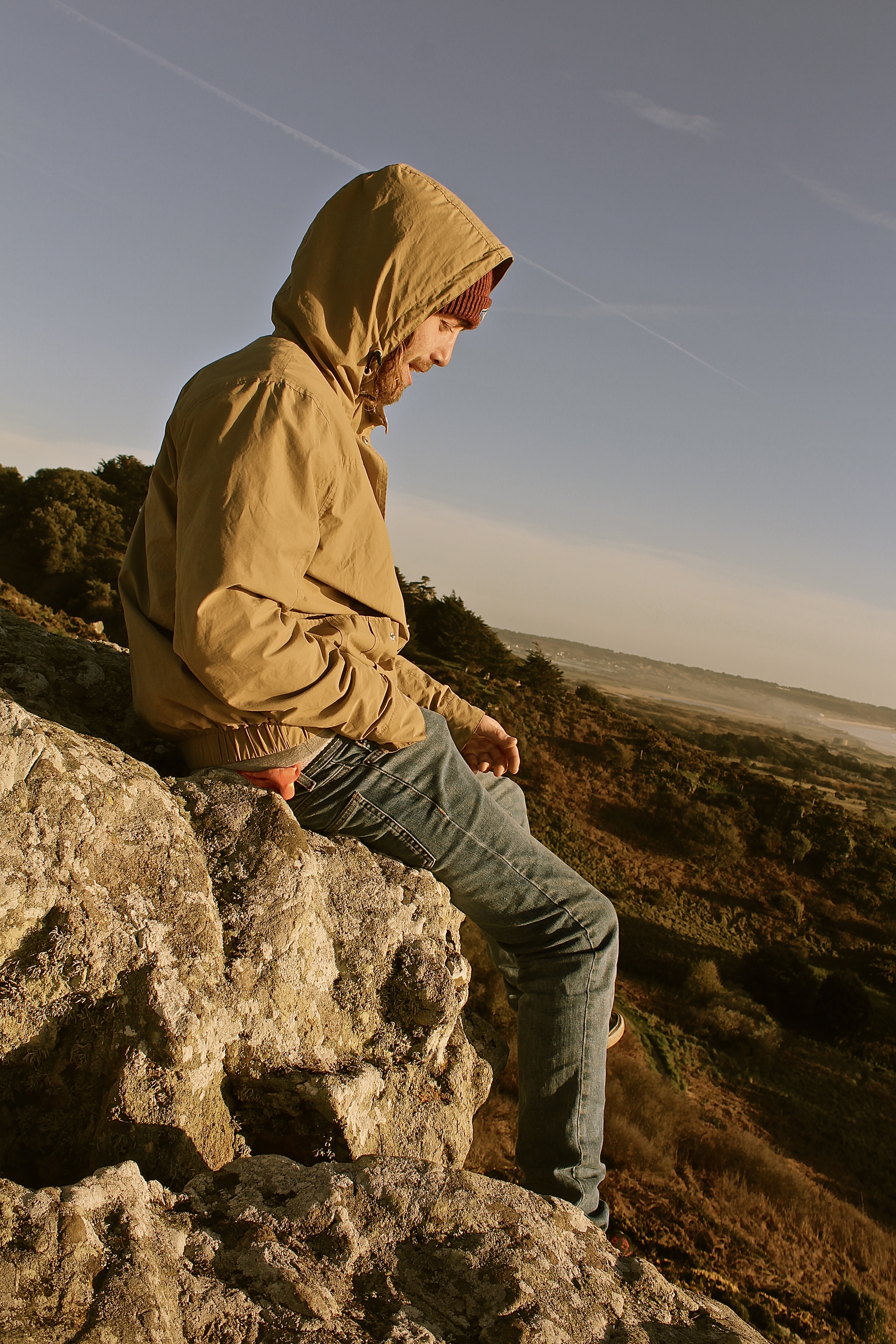
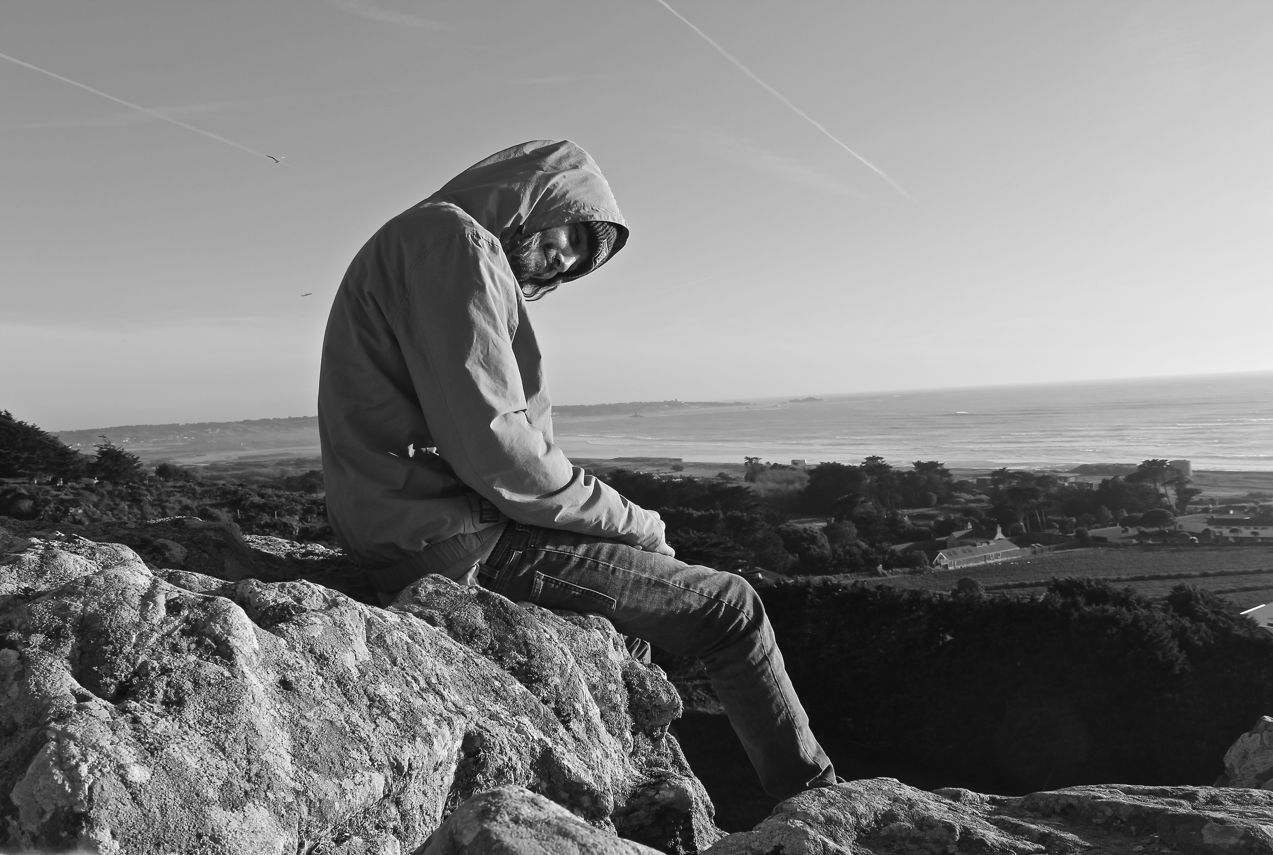
In the triptych below the composition works well, as the rock-face and the chem-trail are parallel to one another which creates a frame around the model and the landscape.
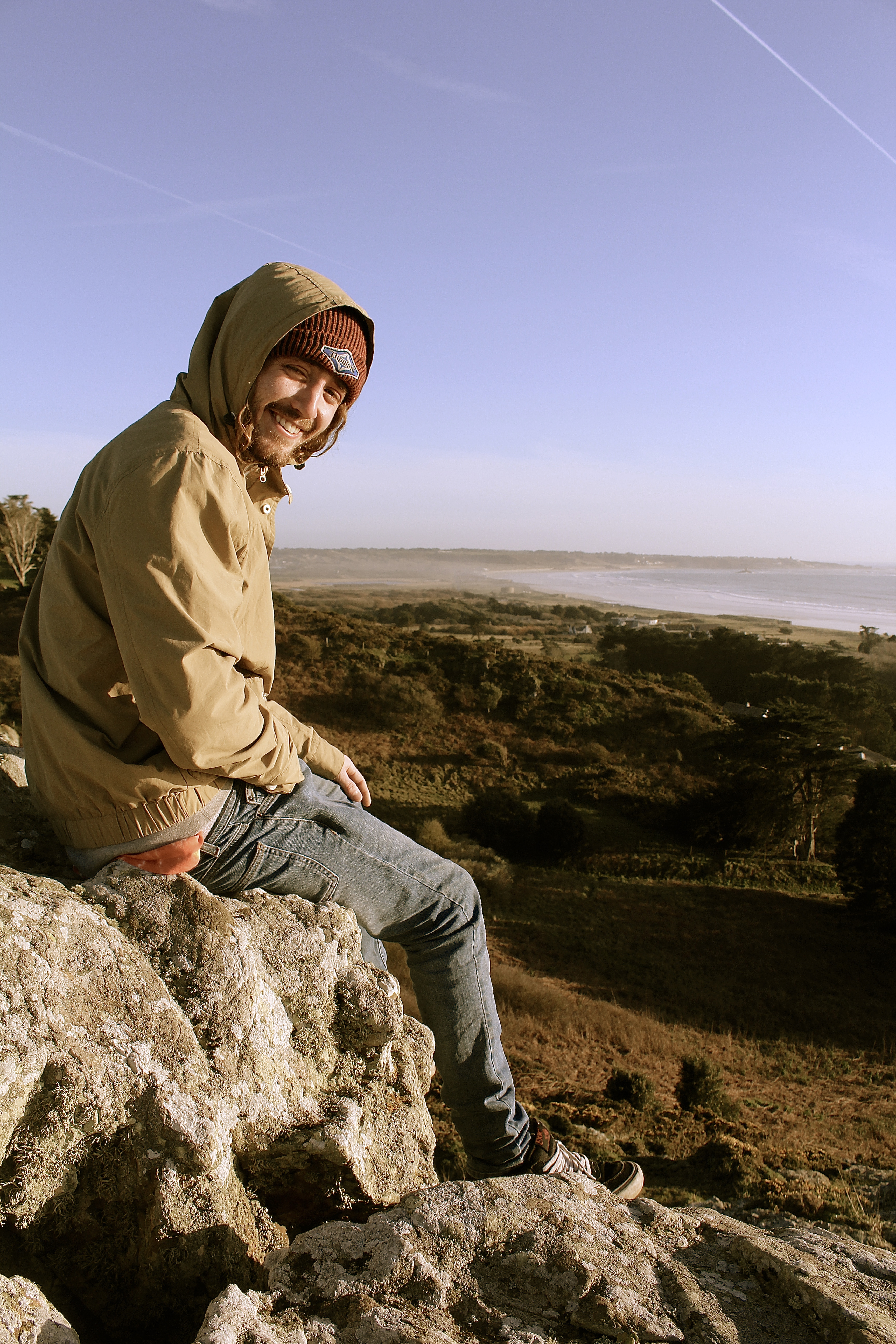
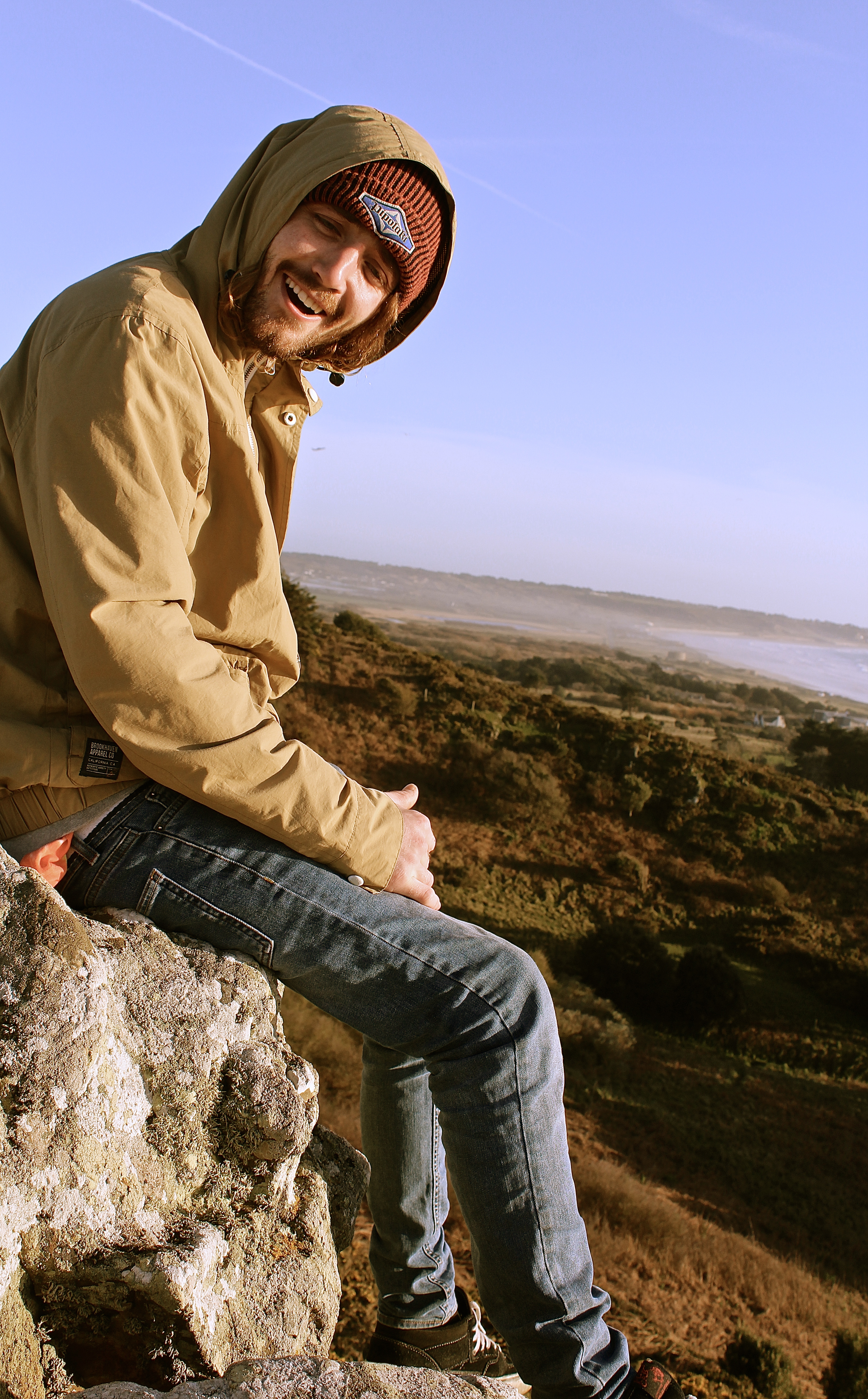
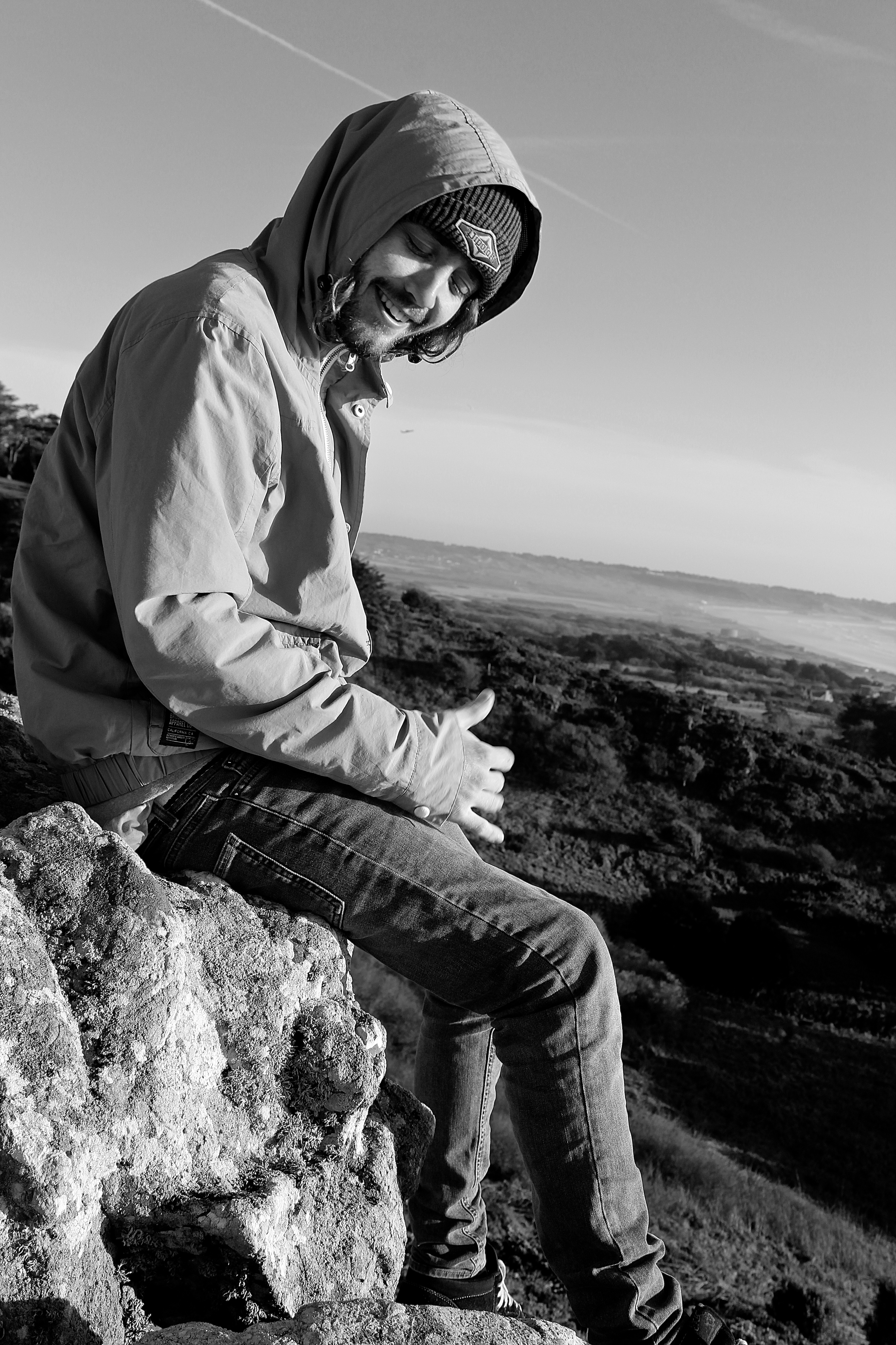
I then edited the photographs in black&white, for experimentation purposes. Personally I think distortion of color tones which produced a vintage feel were better than just the black and white, as the black and white took away from the landscape aspect of the photograph, which I believe is an important component for the images from this shoot.
Typically in portraits having ones eyes closed doesn’t work, however I believe the eyes being closed links nicely with this image, as he looks very relaxed and to say he is hanging off a cliff face shows the attitude he has to the environment he is surrounding himself in.
