Artist reference- Andy Goldsworthy

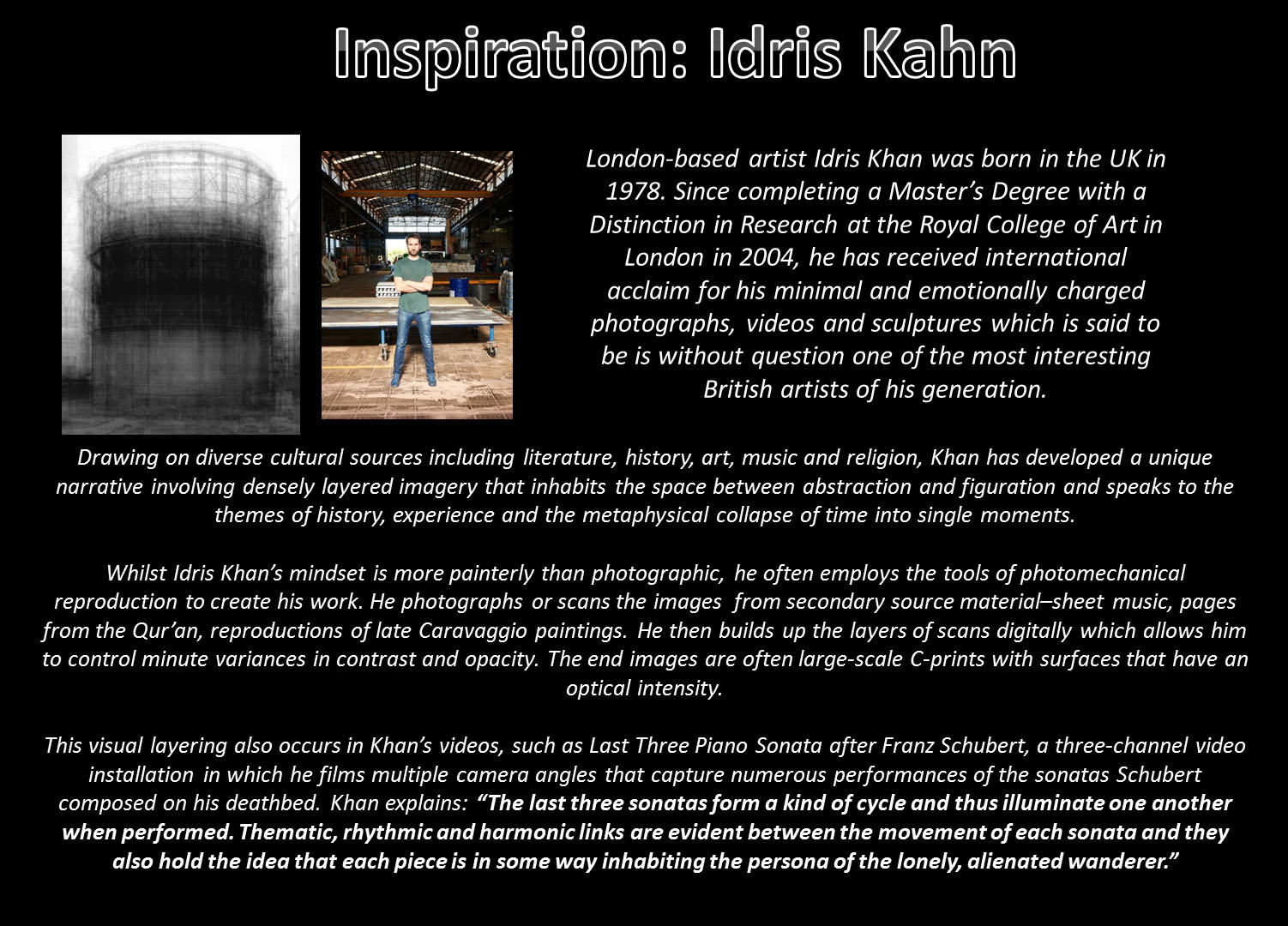
After researching the concept of ‘Environmental art’ as a movement I have decided to analyse the work of one specific artist associated with it-Andy Goldsworthy.  He is a British sculptor and photographer who was inspired by Robert Smithson and other artists from the 1960s and 1970s.

“I enjoy the freedom of just using my hands and “found” tools–a sharp stone, the quill of a feather, thorns. I take the opportunities each day offers: if it is snowing, I work with snow, at leaf-fall it will be with leaves; a blown-over tree becomes a source of twigs and branches. I stop at a place or pick up a material because I feel that there is something to be discovered. Here is where I can learn.”-Andy Goldsworthy
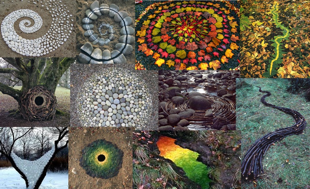
Goldsworthy crafts his artwork out of natural materials such as rocks, ice, or branches. Aware that the landscape will change he documents the resulting interventions with the land and exhibits them through his photographic prints. His art is not constructed with longevity in mind, “It’s not about art, It’s just about life and the need to understand that a lot of things in life do not last”.  This shows how crucial a role photography plays in his art as it freezes  the moment in time when his art is most alive“Each work grows, stays, decays – integral parts of a cycle which the photograph shows at its heights, marking the moment when the work is most alive. There is an intensity about a work at its peak that I hope is expressed in the image”. His photographs have an indexical relationship to the sculptures that they record and Goldsworthy prefers to use maximum depth of field in his images to focus on the surrounding environments and not always the artworks themselves. He also brackets his exposures, shooting a number of different exposures sequentially as well as normally taking a close-up shot, in which the work is centrally framed, and a shot showing the work in its immediate context.

His work has been criticised by some as being ‘Childish’ and ‘Naive’ and originally he didn’t like his work being labelled this way but since having children himself he says that he has seen ‘how intensely a child looks at things, you really can’t describe that looking as naive. My work is childlike in the sense that I am never satisfied to look at something and say that is just a pond or a tree or whatever. I want to touch it, get under the skin of it somehow, try and work out exactly what it is’. 

In his early life Goldsworhty  worked on farms as a labourer and he has compared the repetitive quality of farm tasks to the routine of making sculptures and methodically photographing them. He has also said that is is the land around his home that is the most important to him and it’s that landscape that he keeps returning to because it’s the place where he can learn the most about the landscape and his relationship to it.

Goldsworthy’s outdoor,ephemeral artworks are mostly made in private or remote circumstances but they are made ‘public’ through his photographs which are framed for exhibition or published in books. The public’s ability to access and experience Goldsworthy’s sculptures is influenced by the artist’s decision as to which works are printed or published, and by limits of the still photograph in determining how those works are ‘viewed.’

He often only uses found tools or his bare hands for creating the art which relates to the idea of working directly within the land and the tools vary depending on where he is.  For example he talks about how he likes using dry slate to draw on other pieces of slate so that it’s not just drawn on but drawn out of the slate.

As well as the deeper meanings of Goldsworthy’s work his art is also visually appealing with his use of colour, shapes and patterns. For example the two images above stood out to me as impressive because they are both similar in appearance but are produced from different materials found in different environments. Similarly both are round in shape with a hole in the middle. This could relate to the idea of the ‘circle of life’ and decay that occurs in nature. The black hole in the centre acts as a focal point and breaks up the appearance of a solid structure. The black hole is a recurring form in his work and to me this has a slightly mysterious quality and creates links to the form and shape of an eye with a dark pupil looking at the viewer. Goldsworthy has said that he began using this after he had been digging in a sand dune and the ceiling collapsed in. When he crawled out it left a small hole in the sand which he thought of as a window into the ground and the material.

The use of colour in  the structures above have been created out of different shades of the same material. This process of finding the right stones and leaves as well as separating out the colours would have been time consuming and shows the work and time he has spent on creating these pieces which won’t physically last for very long. The lighter colours in the centres contrast with the dark circles in the middle and progress to the darker border which seem to frame the structures. One of the reasons I was drawn to Goldsworthy’s work in particular was that unlike some Earth artists he doesn’t always interfere hugely with the land using machinery such as diggers to move vast amounts of material for creating wide scale interventions with the land. In the case of these two images he has used materials that are naturally found on the ground and has only created order out of the usual randomness in which they would be placed. This is pleasing to see because of the human desire to see patterns in things and create order to make sense of the world.  They challenge the viewer’s perception about the natural and the unnatural.

I haven’t yet decided the exact direction that my project is going to take or how I will combine my ideas. However I am interested in Earth art because it’s a more unusual approach to exploring environments and focusing on the smaller details that make up landscapes. I also like the idea of using techniques that reflect primitive art which could be interesting to explore with the idea of reconnecting to the land etc. I am also intrigued by the unique relationship of photography for recording ephemeral art designs and it also links to the idea of sculpture which is something  I haven’t looked at before. I may be able to incorporate these ideas into my wider project but perhaps not too heavily as it could be difficult and time consuming to get good results.

Environmental art historical context

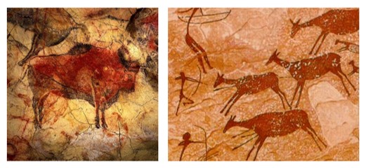
Environmental art as a movement includes a range of artistic practices such as historical approaches to nature as well as new politically motivated works which  explore the deeper relationships to environmental systems and social concerns.  The physical environment has always inspired art, for example it could be said that it began with Palaeolithic cave paintings which represented aspects of nature such as animals and humans interacting with them.

Environmental art is an umbrella term which encompasses many different art styles , techniques and objectives. The artists associated with it often share similar beliefs about  human interconnectedness  to the natural world-socially, economically or spiritually.  Environmental art contains a variety of sub movements including romanticism in the way that it seeks to celebrate the  beauty and greatness of nature and the people connected to it as well as  Eco-realism and Gaga art.

The growth of environmental art as a specific movement began around the late 1960’s and early on it was associated predominantly with sculpture and land art. It partly arose out of criticisms that sculpture was out of harmony with the environment. In 1968 Robert Smithson organised an exhibition in New York titled “Earthworks” which challenged conventional ideas to do with exhibitions because his artwork was too large to be collected. They were represented by photographs which emphasised the resistance to acquisition .

Earth art uses the natural landscape to create structures, forms and sculptures and it grew from ideas associated with conceptualism and minimalism. These were popular during the 1960’s when artists began to abandon traditional approaches and new ways of engaging with the world through art.  There was a change from representing nature in art to utilising it as a material which has connections to primitive artists who used the natural materials available to them. Although some artists such as Smithson used mechanical earth-moving equipment to make their artworks, other artists made minimal and temporary interventions in the landscape such as Richard Long who simply walked up and down until he had made a mark in the earth.

The system of presenting art went through radical change as the Book ‘The representation of nature in art’ explains, artists reject the “traditional workshop-museum-gallery circuit”. It goes on to say that Land artists are grouped together by their desire to “work on the spot so that they can leave their mark, in one way or other, on whatever scale, and for however long, without deciding in advance how their works are to be accessed. They use photographs, film, maps and drawings to describe their work, which usually remains inaccessible… these artists use nature, not to reveal its beauty and evoke emotions but rather to dig, mark, plot, and transform. In this way the sculptural dimension emerges”. It is explained that Land art is “more the result of different intellectual, sociological and artistic paths than an aesthetic manifesto. The only thing the paths have in common is their medium: nature.”

By using the most basic materials Earth artists aim to get as close to the essence of their work as possible. The often ephemeral nature of their work means that they accept the inevitability of their work disappearing which means the role of photography in recording it is very important. I find this connection between art, sculpture and photography interesting as well as the way that it is reflective of very primitive methods of creating art but utilises new technologies to record it.

First Shoot Specification

My first shoot will be situated in two places: Victoria Avenue Beach and People’s Park. I chose these places to start as they are not the most beautiful places in Jersey, however i can make them look pretty using angles and colours. These places will be my experiment areas but if they turn out well then i will use them in my project.

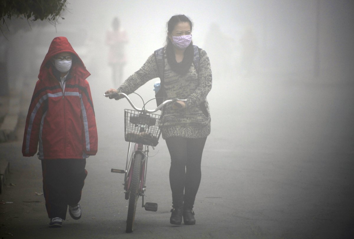
I will be doing this shoot on Sunday Afternoon (19th March), I will be using my my friend Hannah as a model and she will be wearing normal clothes to make the photo seem as normal as possible. The first image will be in colour and it will be vivid. The second image will be the same pose and environment but she will be wearing a mouth and nose mask similar to the ones the Chinese wear during days of dangerous levels of pollution.

The second photo will be in black and white but it will be soft greys more than sharp and dark black and white. This is to mimic the effects of Smog which can be seen above. The third photo will be the same pose and environment again but this time, my model will be wearing a full face gas mask which has been lent to me by a friend and this time the image will be a very dark black and white, with high contrast and sharp focus.

Victoria Avenue:

  • The model will be sat on rocks or leaning against the sea wall or rocks, this is to make it seem less staged.
  • I will be using my Nikon D3200 and i will adjust the settings to suit the environment each time.
  • The model will be wearing her normal clothes but the masks will change.
  • I will edit the photos in Lightroom or Photoshop after the shoot.
  • I may also try shoot the second and third images in black and white directly then adjust them in Photoshop.
  • I am hoping that the weather will either be sunny and cloudy, preferably both as it will give me different atmospheres for my photos.
  • If it is raining, i will use this to my advantage and make my model seem like she is raining to try get away from Acid Rain.
  • I will place her as close to the water as possible as water always seems to make photos much more interesting.

People’s Park:

  • I will position my model most likely on benches or on the hills, i may also make some eery photos using the playground, this will add variation to my work.
  • I will be using my Nikon D3200 and i will have to change the settings due to the different colours and lighting.
  • I do not think that this will be as interesting as the shoot from Victoria Avenue as i do not think that the environment is as interesting because it is ever changing.
  • I think i will do this shoot first as practice and if i do get some images i like i will keep them.

New idea:

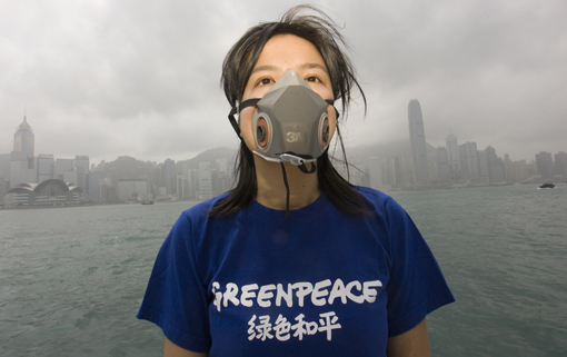
I think i will also take some images of my model just simply in the gas mask and only photograph the head and shoulders against the sky. I will then Photoshop Smog into the background to make it similar to a photograph taken by Alex Hofford of an activist protesting against the high levels of pollution in Hong Kong.

An activist from the environmental group Greenpeace wears a gas mask in front of a Hong Kong skyline thick with smog, Hong Kong, China, 23 March 2010. The city is experiencing record levels of air pollution, in part caused by dust storms coming down from northern China, but also caused by roadside air pollutants emitted by diesel vehicles and ships, as well as industrial air pollution from factories in China’s Guangdong Province. The Hong Kong Government has ordered all outdoor school activities in Hong Kong to be cancelled. EPA / ALEX HOFFORD

1st Photo Shoot (Planning)

Planning First Photo Shoot


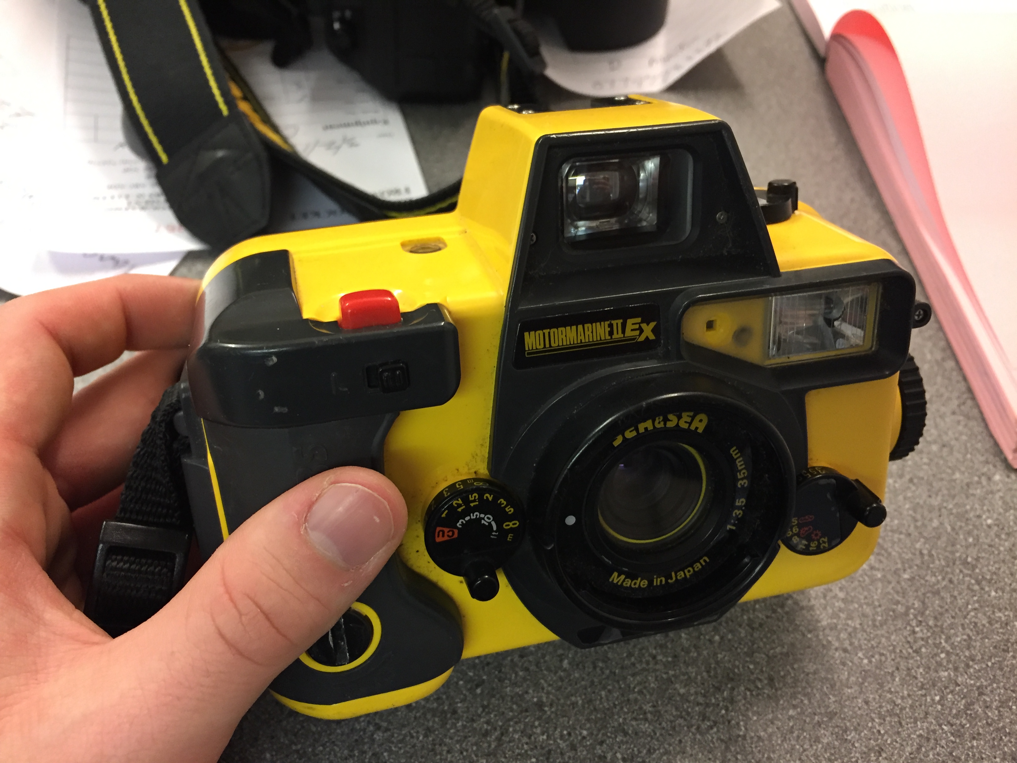
My first photoshoot will be a simple one to start off with, based simply on environmental portraits. On Saturday I am planning to meet my friend Jacob Smith, an accomplished surfer and free diver, at the beach so that I can take photos of him in his environment. I was originally planning on taking photos of him in the water as he is surfing but this weekend the winds will be too high for him to be able to surf. We may instead be able to try some free diving but I am not sure how this will turn out in underwater photographs because I am not confident with underwater photography. For on land photographs I will be using my Nikon D5200 but as this is not waterproof so I will not be taking it into the water with me. Instead I will be taking my MotorMarine II EX by Sea&Sea.

This is a 35mm film camera that I got for free and had repaired. I have had very little experience with using this camera but I have shot film before so I know what to expect from the limitations of film. Even if all of the photographs that I take with this camera turn out bady I should still have photographs that I will take back on land with my digital camera to use. In the water I am planning to be using ISO 400 film or ISO 200 depending on the lighting that day. If it is overcast or there is not direct sunlight then I will use the 400 but if there is direct sunlight then I will use the 200. For the photos above the water/on dry land I will be trying to emulate the work of Anthony Kurtz that I looked at for my environmental portraiture moodboard. His photographs are not overly set up like Bielaski and Sander’s work, the more natural feel to them is a method that I prefer. However for the photographs just above the water’s surface then I will be trying to emulate the work of Brooks Sterling. He  is a lifestyle photographer and art director living in southern California. His work is mostly centered around surfer/skater culture in Southern California and he uses a mix of film and digital. I spoke to him recently and he gave me some tips for shooting in the surf like this so hopefully I will be able to get some nice photos. Link to his website and Instagram.

As a backup for this, I am also planning to go out with some of my other friends into some environments that they are not used to. This will give me a chance to photograph people discovering new environments which is often hard to do in Jersey because it is so small. But we have previously found somewhere that we did not know existed and are going to be going back there to have a proper look around. It is in St. Aubins and is near to the beach, on the south coast like this the lighting should be very good and as I have no idea what the place looks like myself the photos will be a reaction of me experiencing this new environment too.

Photoshop Experiment and Response to Idris Kahn amd Stephanie Jung

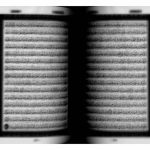
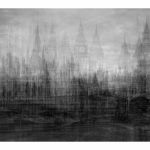
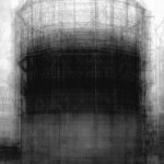
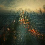
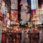
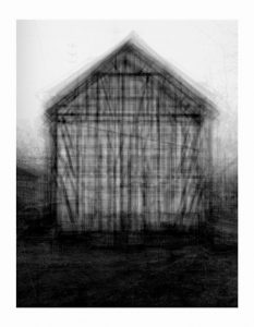
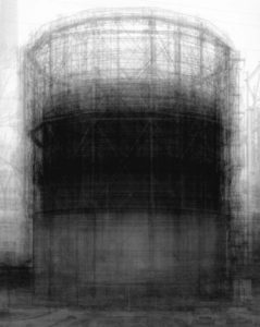
I was given a task to create manipulate and image using Photoshop while taking inspiration from the work of Idris Kahn (Image above on left) and Stephanie Jung (Image above on right) These images are created using Photoshop or a similar photo editing software where the same image is duplicated an layered on top of its self multiple times to create a dream like sense of movement and fluidity.

ORIGINAL IMAGES 

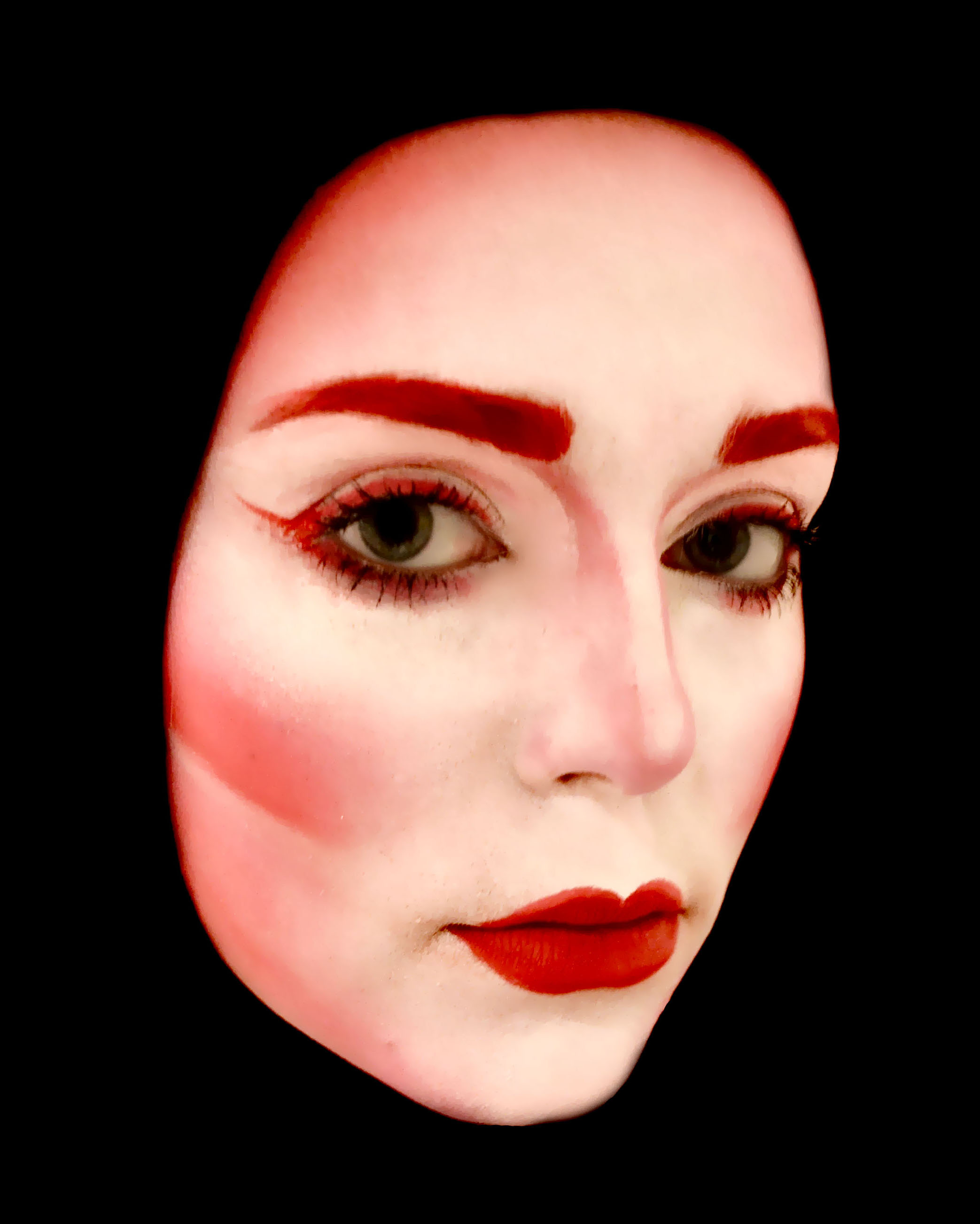
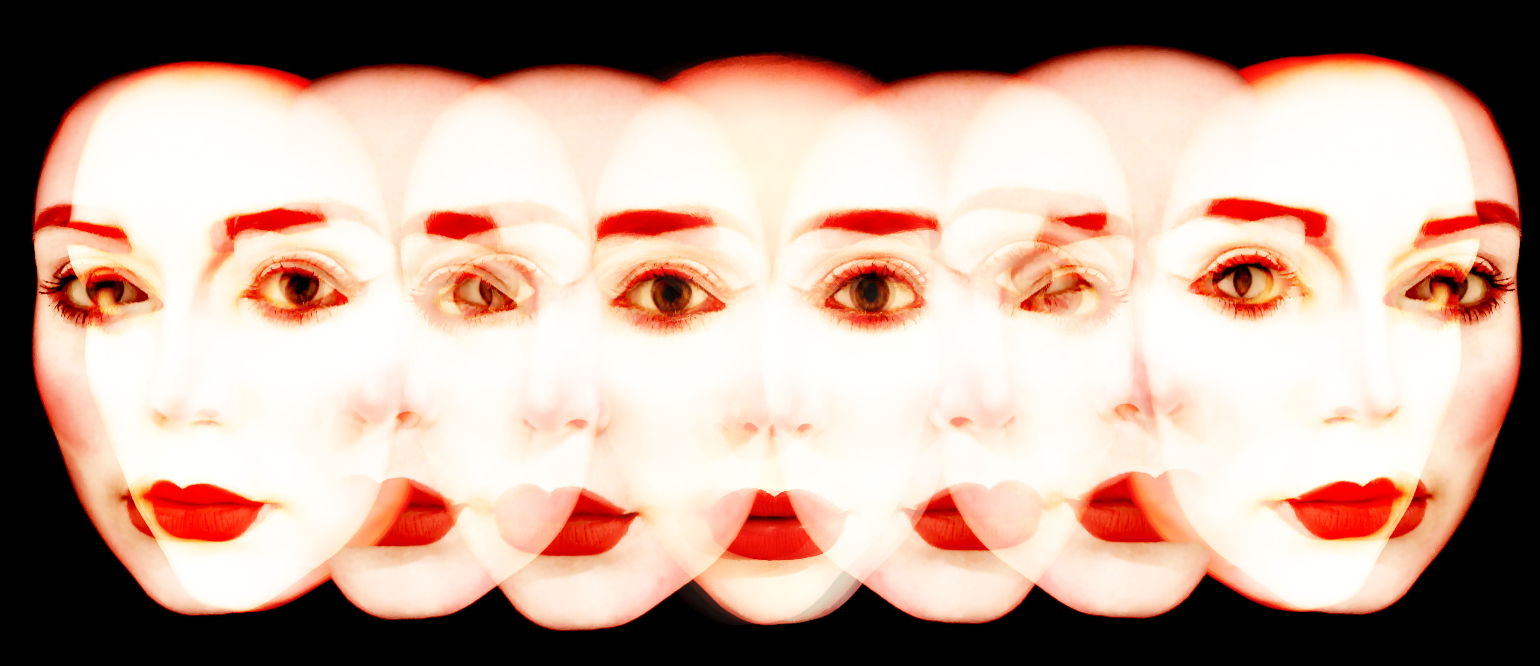
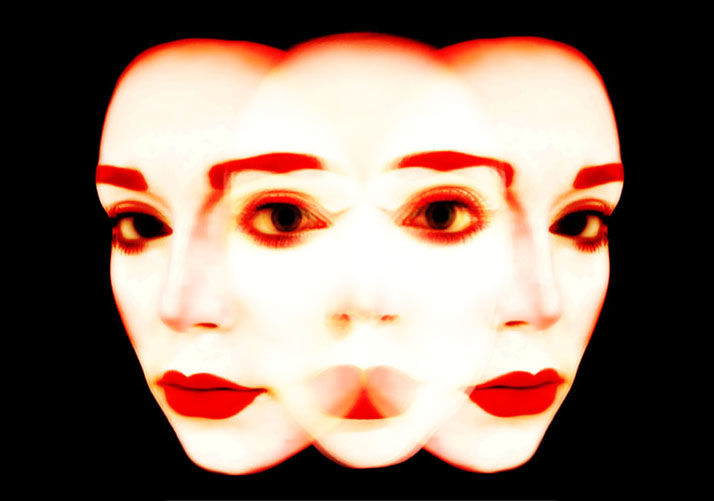
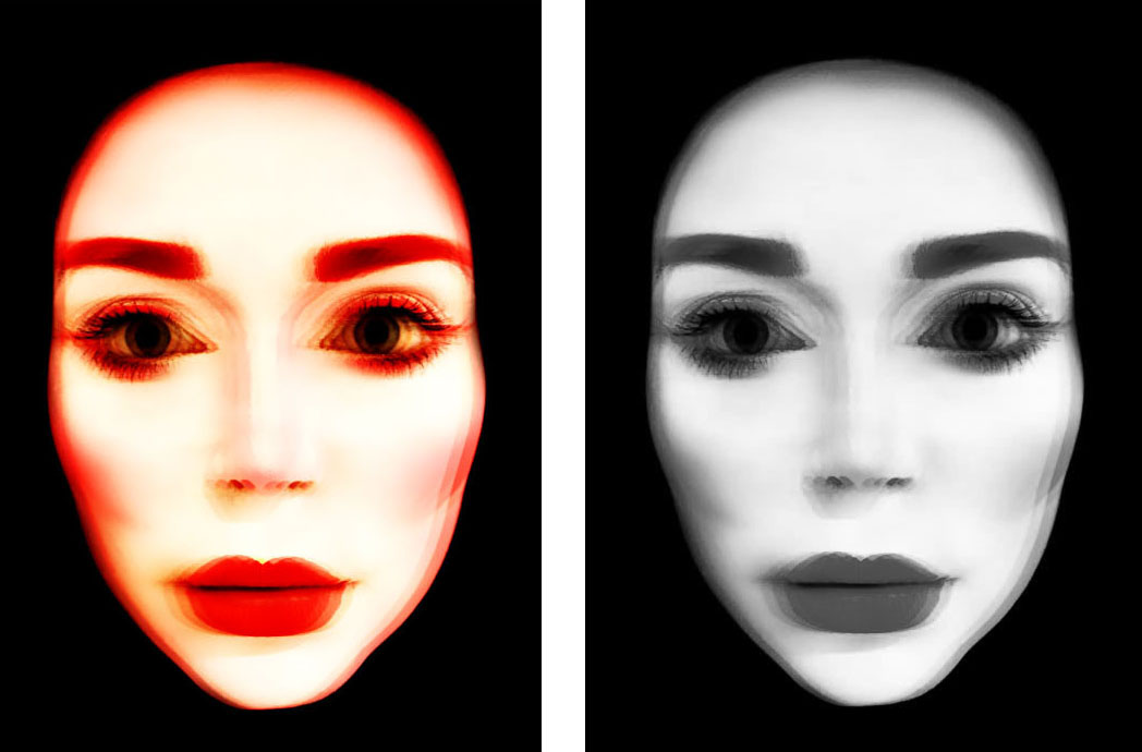
Above are the original images that I used during this experiment. These were final images for my AS exam last year and were previously presented as as series of 5 images with the second 2 image flipped on the other side to create a turning effect. For the outcomes of this experiment I used the first image several times to create a single blurred face and the turned heads both in the format above and flipped to created a more developed feel of turning motion.

PROCESSES 

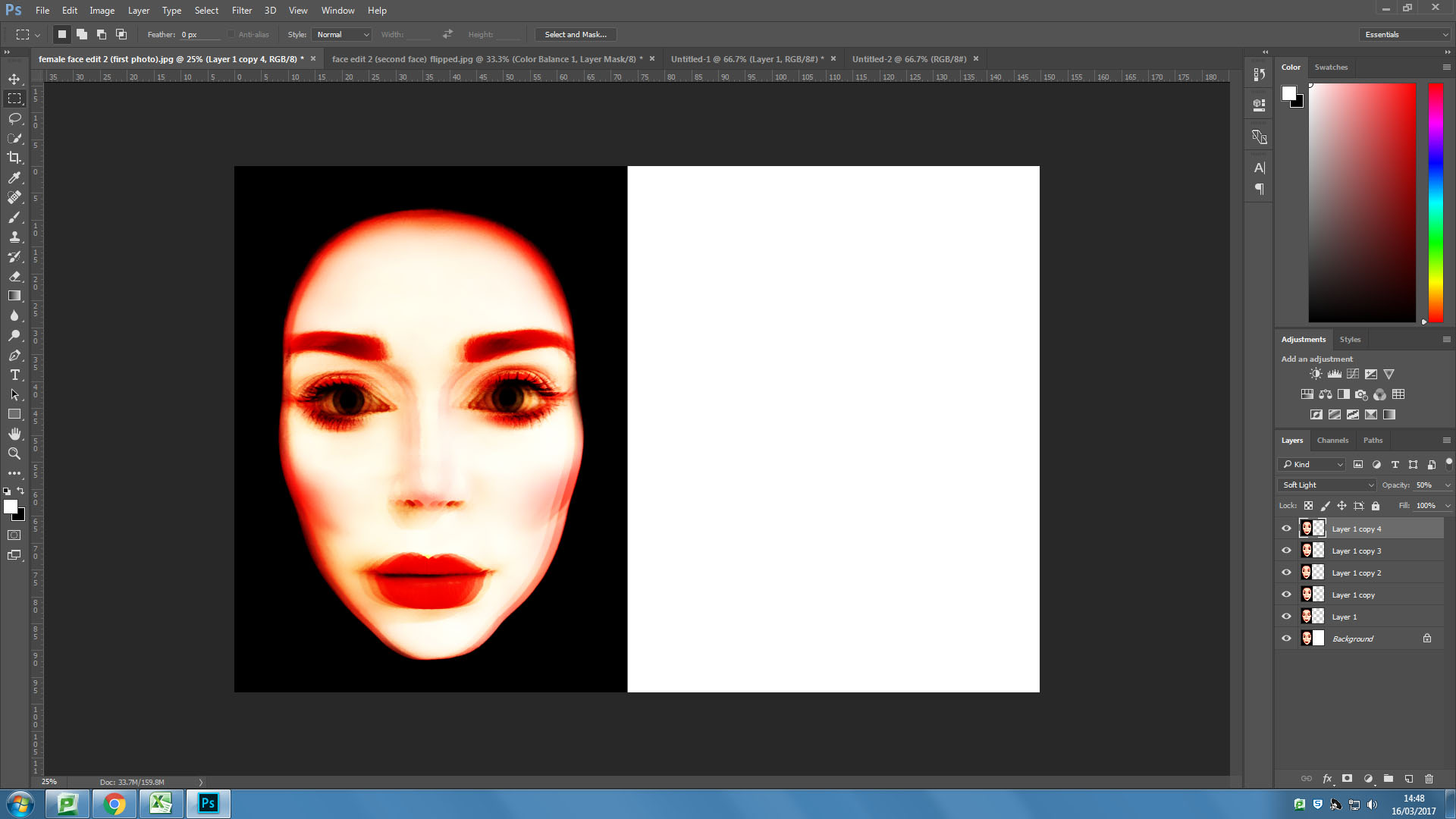
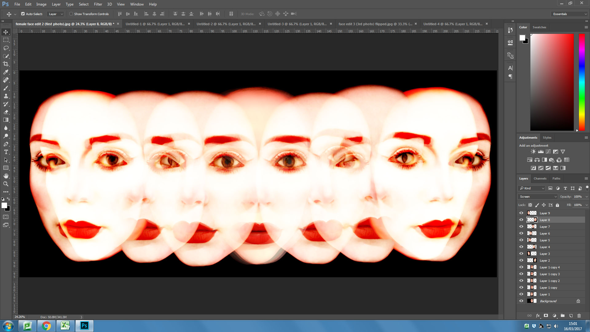
I first overlayed my front facing image six times using the “overlaying” blending filter on Photoshop.

I then tried a similar process with one of the angled faces, this one I overlayed five times, also using the “overlay” blending filter on Photoshop.

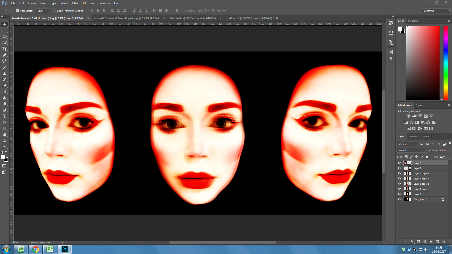
I then pasted the overlayed angled face onto the same background as the front facing face. I then flipped the image and pasted another on the other side of the forward facing face.


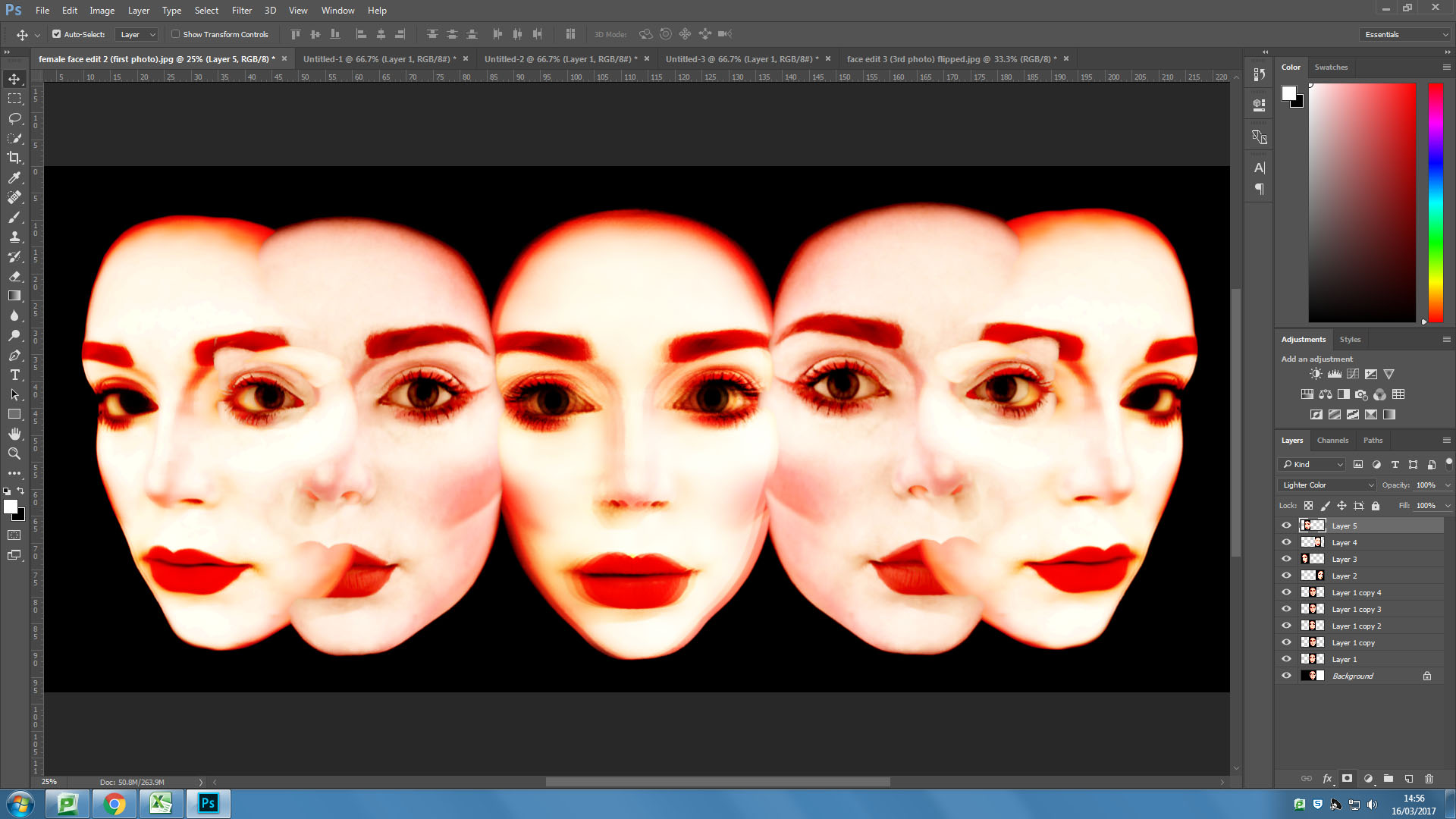
I then took the mid angle face and pasted it in it’s original format and flipped either side of the forward facing face in the centre and blending the additional faces into the image using the “screen” blending filter.

I then added some more faces over the top of the image using the “screen” blending filter and experimenting with the opacity.

OUTCOMES 

An Experiment

// M U L T I P L Y //

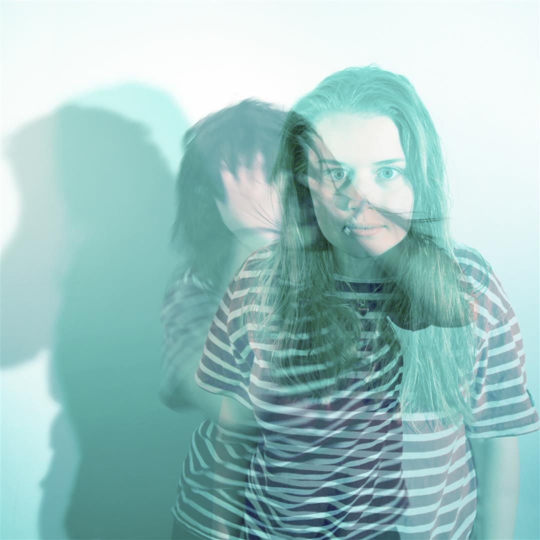
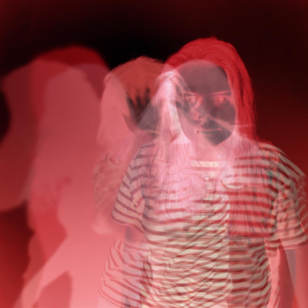
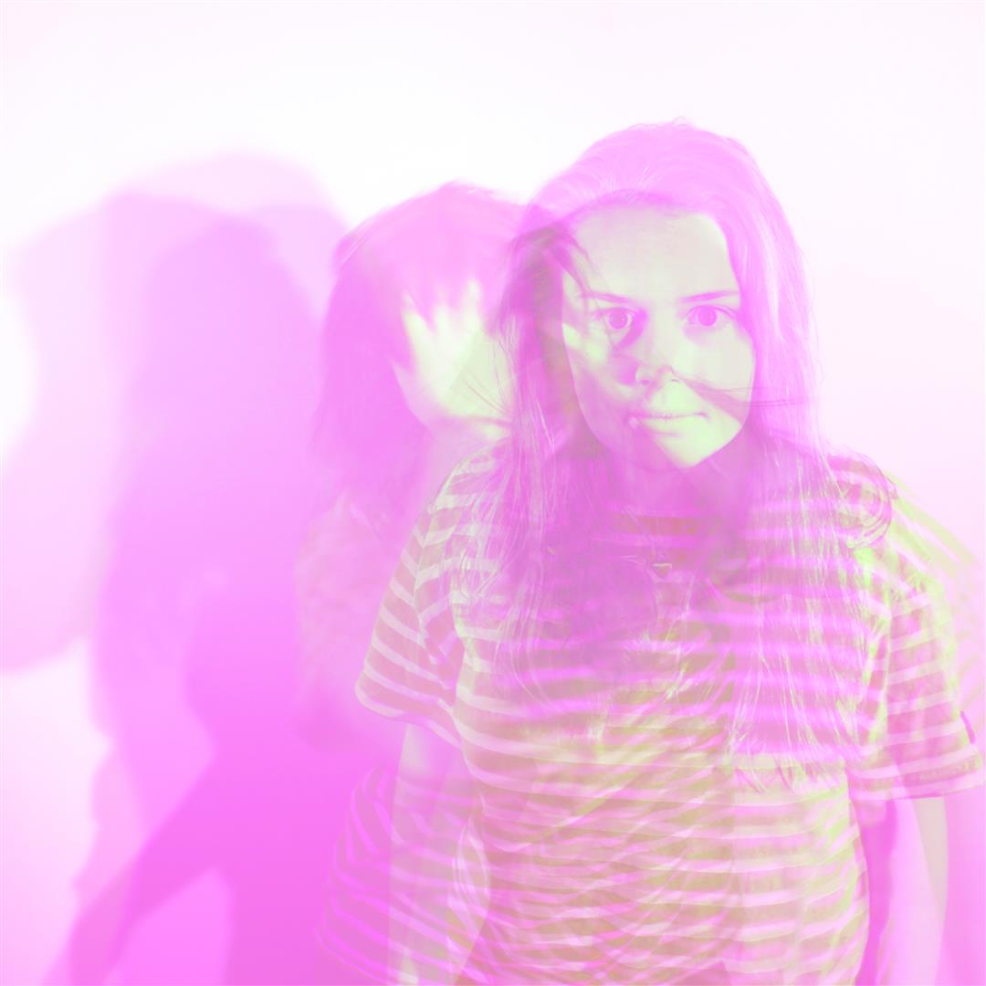
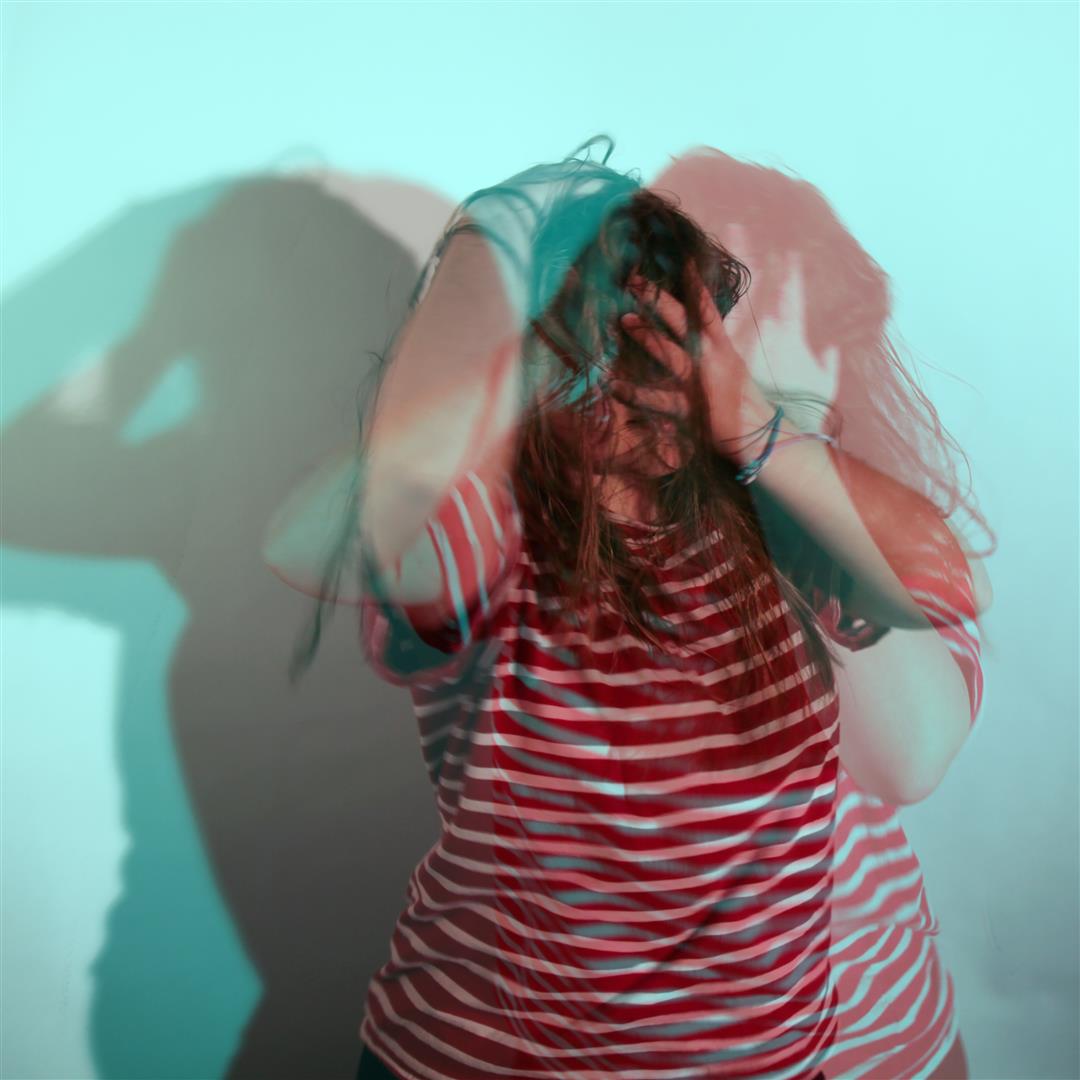
As part of a class photoshop recap session we were asked to create a series of test images to prove our photoshop skills and abilities using original photos from our previous projects and shoots. The point of this was to ensure we were confident using basic abstract editing techniques such as duplicating layers, adjusting opacity settings etc. For my images I also pre edited the images in camera RAW – in particular using the colour curve graphs – to create some more exaggerated results. These link to my previous post, ‘STEREOSCOPIC’, where I mention a potential project looking at stylized portraits which include a 3D editing technique making use of multiple layers and duplication.
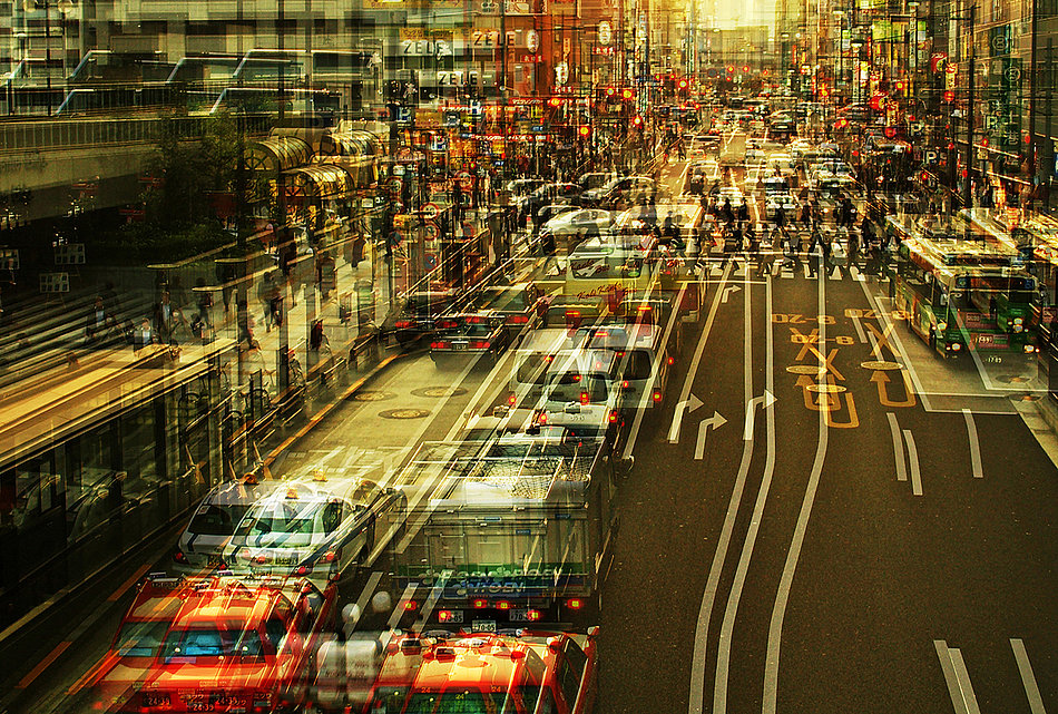
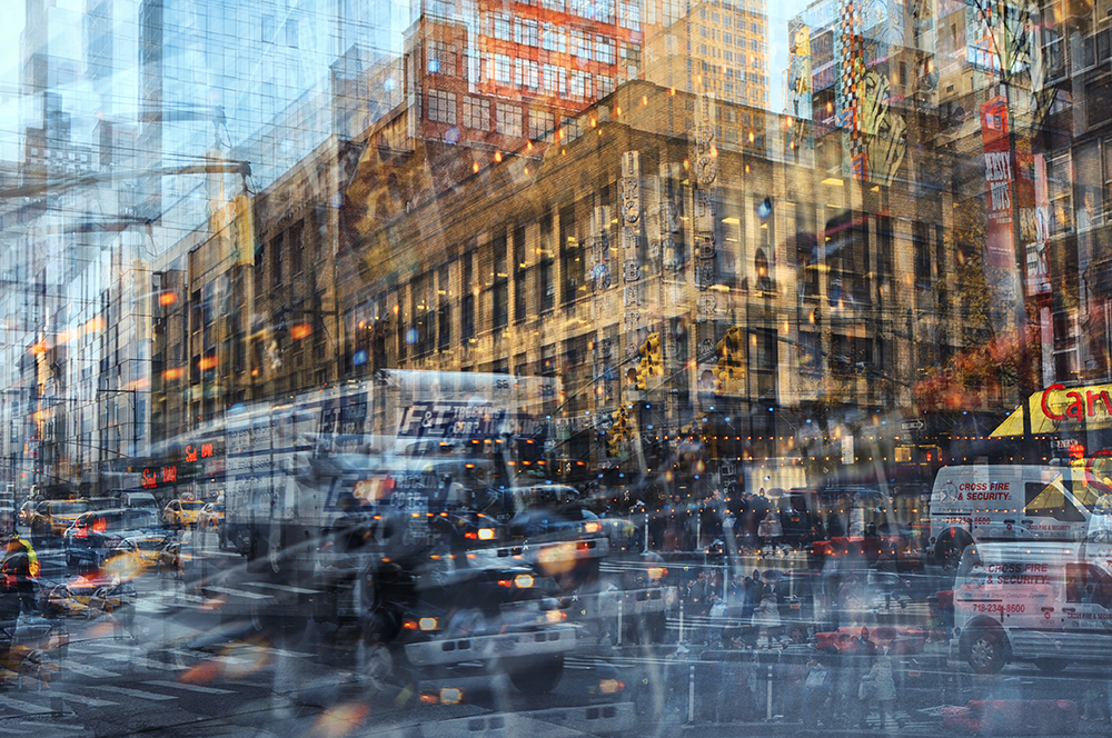
The though process behind this was to engage our own projects with abstract artists such as Idris Khan and Stephanie Jung who use layering techniques in their own work. Jung as an example creates ‘double exposure’ style pieces using layered images of cityscapes – mainly New York  – which works well to capture and visualise the sense of pace and movement from the environment.

Now for my own experiments.

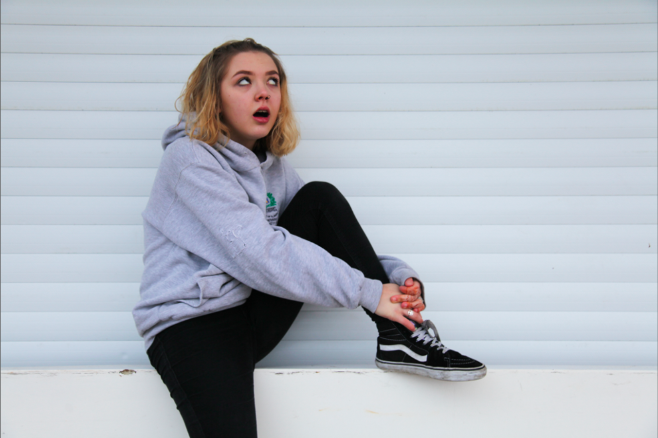
The original image features my friend Hope who tends to pop up in a lot of my previous project work. Here she is looking sarcastic on a wall wearing clothes that probably aren’t hers.
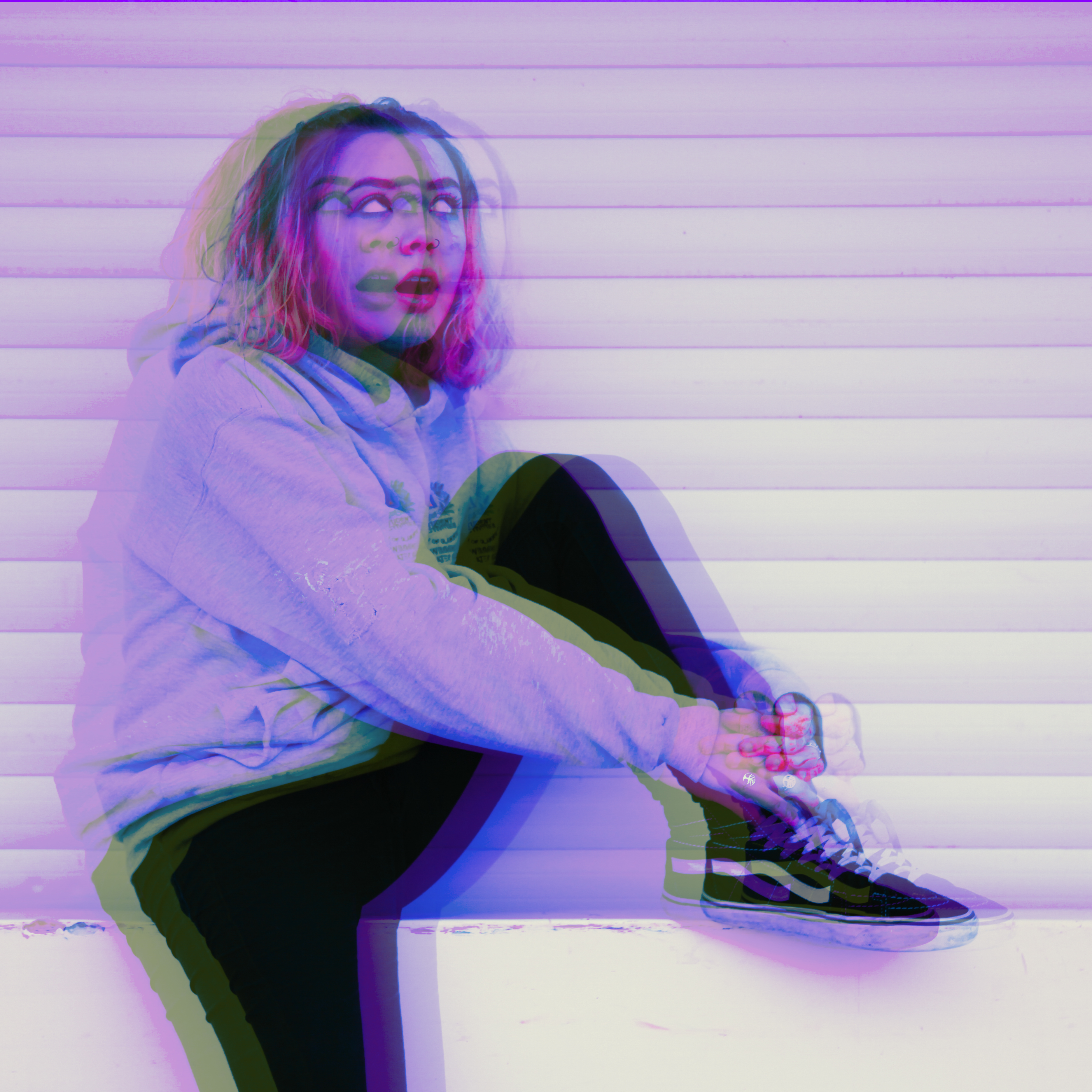
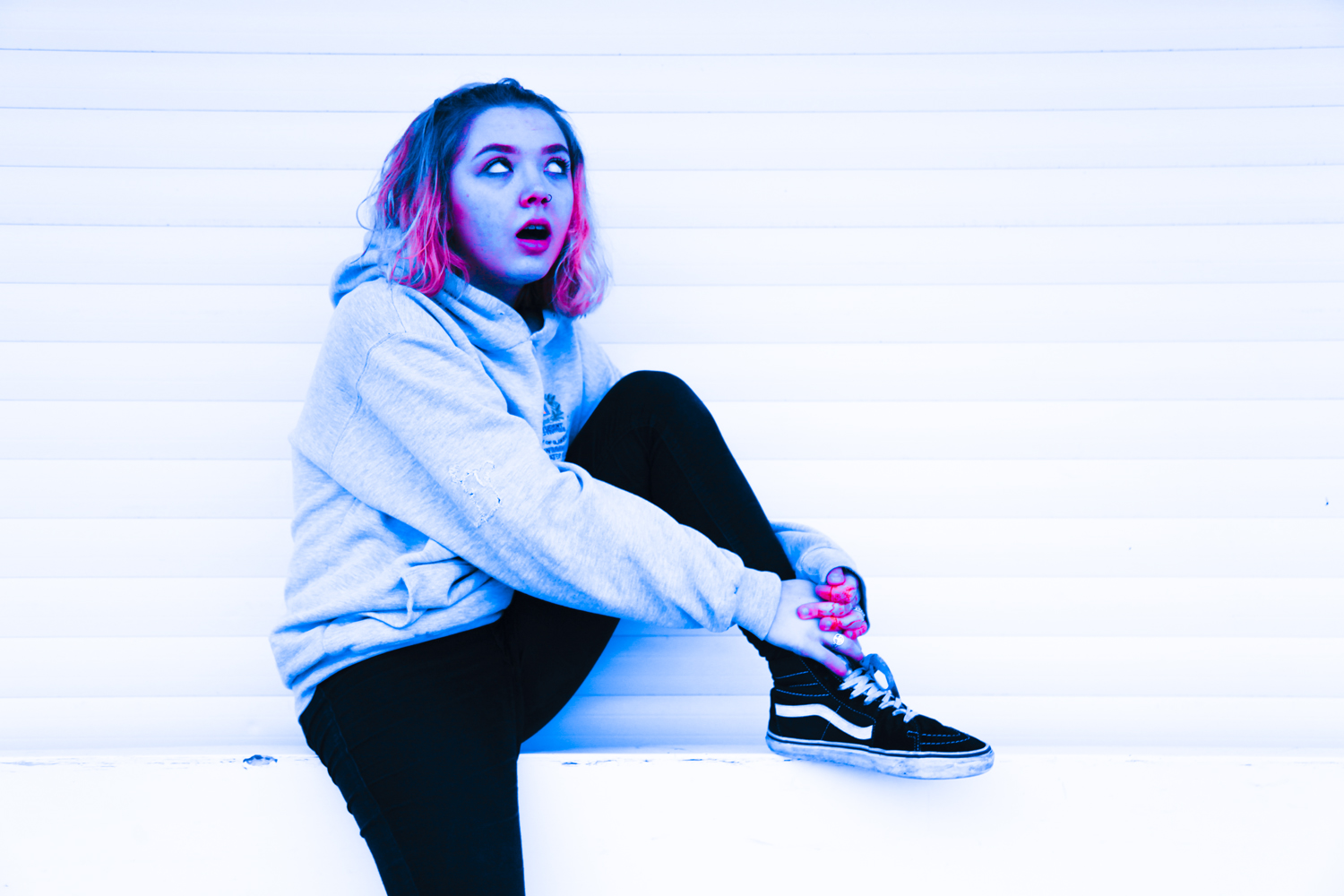
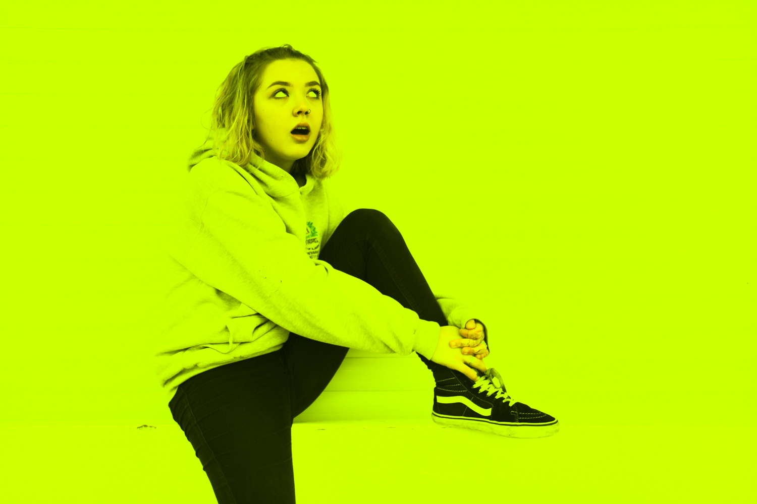
I duplicated this image three times in camera raw and edited each of them as individual pieces to ensure totally different contrast levels and colour compositions.

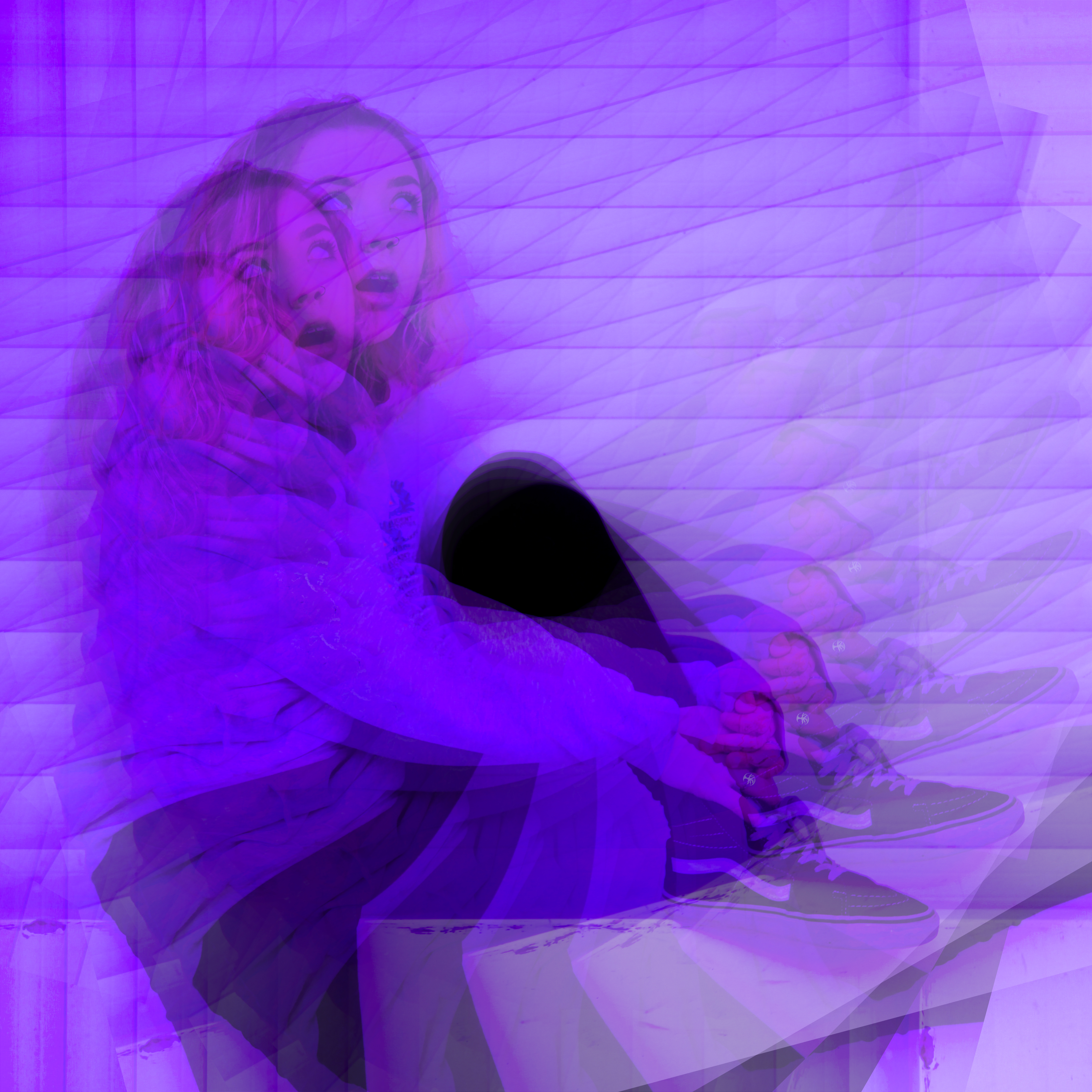
From these photos, I opened photoshop and created three different experiments. This first one is the same image, duplicated on itself using the layering technique with a 35% transparency level. Each photo is rotated by 15% to mirror her own spiralling journey into the purple world of depression.

The next is a double duplication with the image mirrored so she can be sarcastic at herself for a change.

This one is all the images together and also has a darken effect on the bottom layer. Blurring techniques were used to alter the method of blending. This image is messy and chaotic; much like Hope.

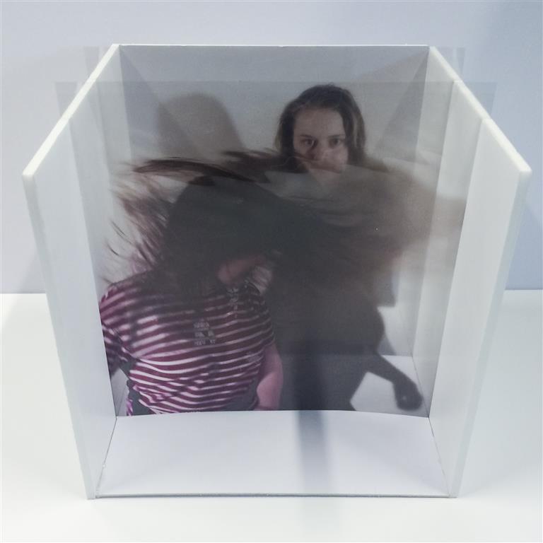
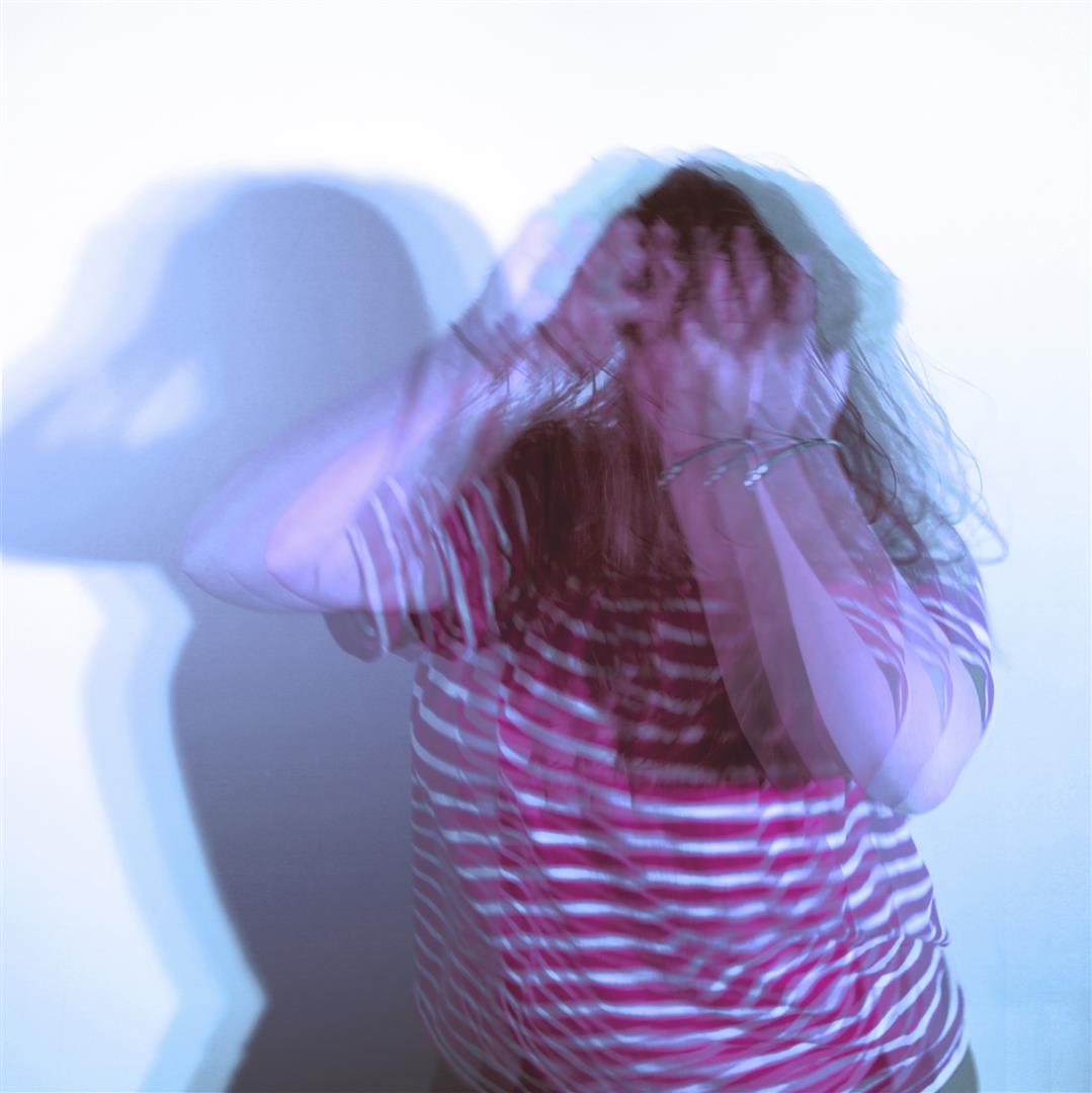
Another area we were asked to investigate is the possibility of layering these images manually – for example on glass or plastic. Entertainingly this was actually my chosen project almost a year ago now for my AS Exam where I made a photo box which would allow images to be inserted after being printed on acetate. The idea behind this presentation was to make an object that could be altered and changed to create different compositions. The original project and posts can be viewed here [X]

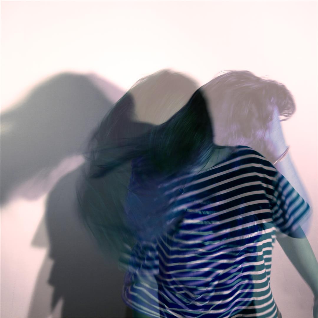
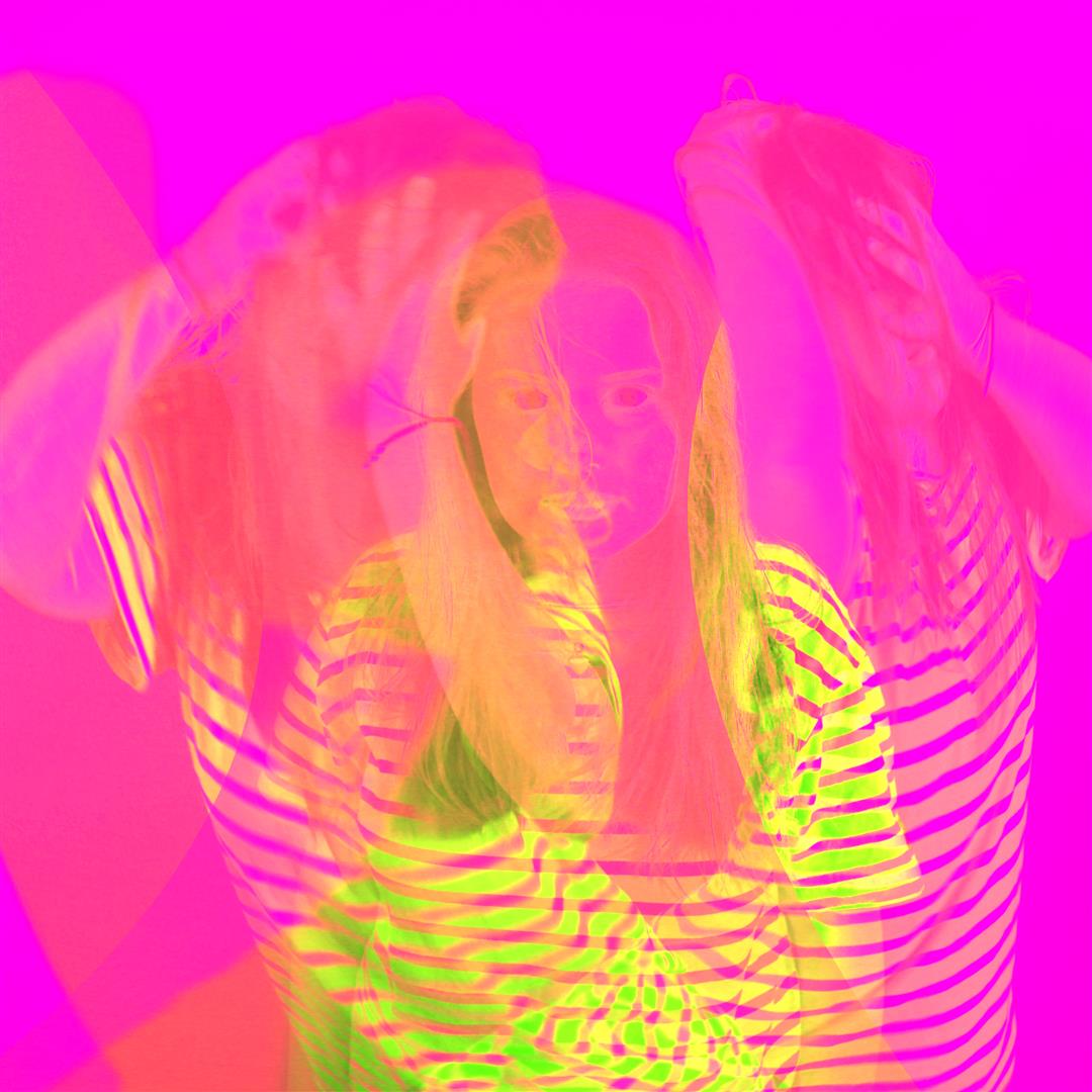
This is the final photobox with the manual compositions showing layering. below is a selection of digital experiments I produced to test the portraits I then printed for this project featuring my friend Charlotte flicking her hair about a lot.

Hopefully this proves that I can use photoshop at this level.


(thanks to Hope and Charlotte)

Environment – Skateboarding Video

The video attached below is one I created, documenting my friend Zac and a trick he had attempted on the day I also did a photo shoot with him. I recorded every attempt that he had tried on the day and edited this in a montage style, that became almost documentary. As if I were filming a day in the life.

Once edited together, I added a voice over of Zac explaining his journey of the trick itself. Ultimately I wanted minimal editing, as I was trying to focus of the battle that Zac encountered trying this trick.

IDRIS KHAN / STEPHANIE JUNG – EXPERIMENTATION

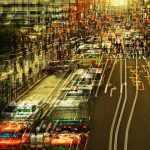
The highly experimental work of Ibris Khan and Stephanie Jung uses overlaying techniques to add a strong energy into their work. The strong use of texture give both artists work a very crowded effect. Their work evokes a very intense form of energy. The huge amount of layers creates a very provocative sense of texture. I have used my own photos to recreate something in the style of their work.

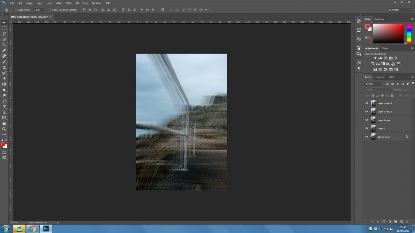
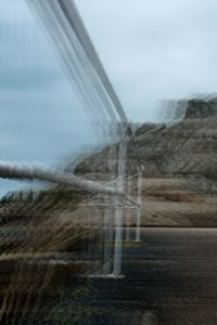
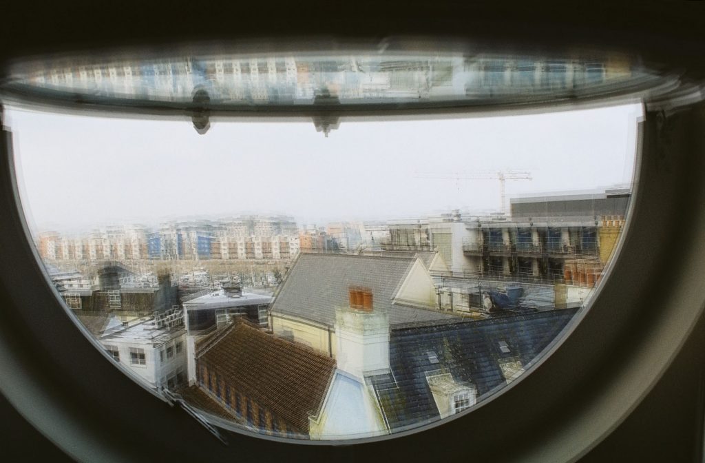
I took a photograph from my AS exam coursework that fitted with the theme of environment, it also incorporates the contrast of man made with natural. The above first image is me working in Photoshop. I first duplicated the layers and re positioned them slightly. over each other. I then brought down the opacity of each photograph. This created this blurred effect. I found I needed to make the above layers opacity lower to let layers underneath show through.

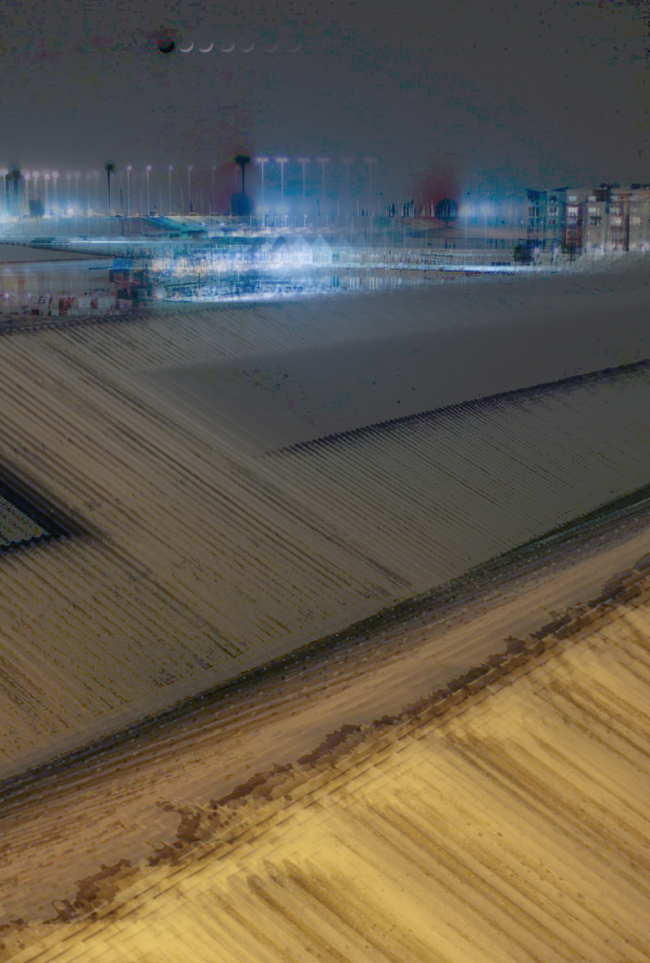
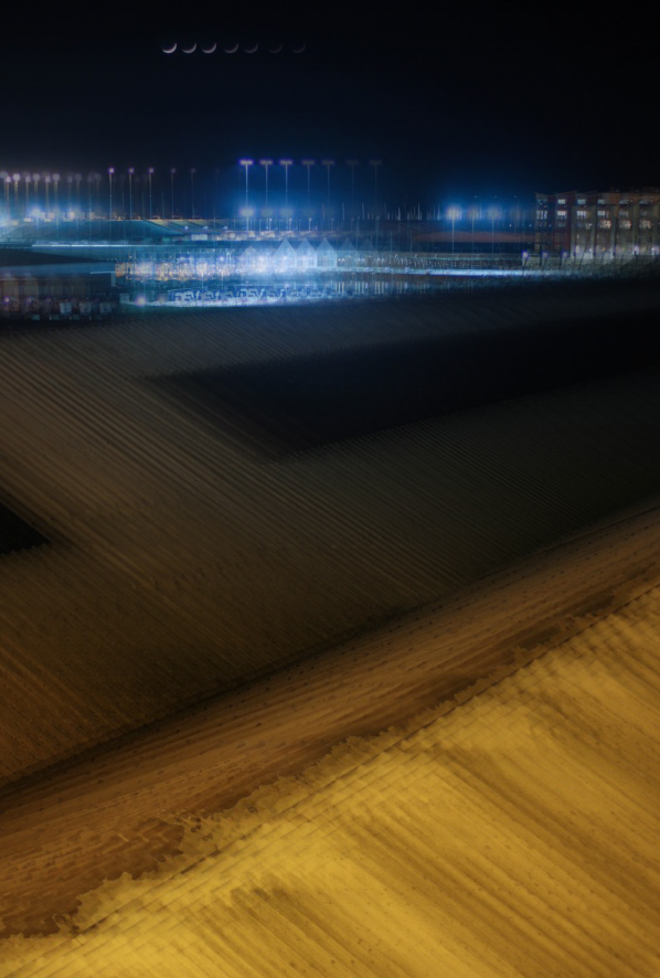
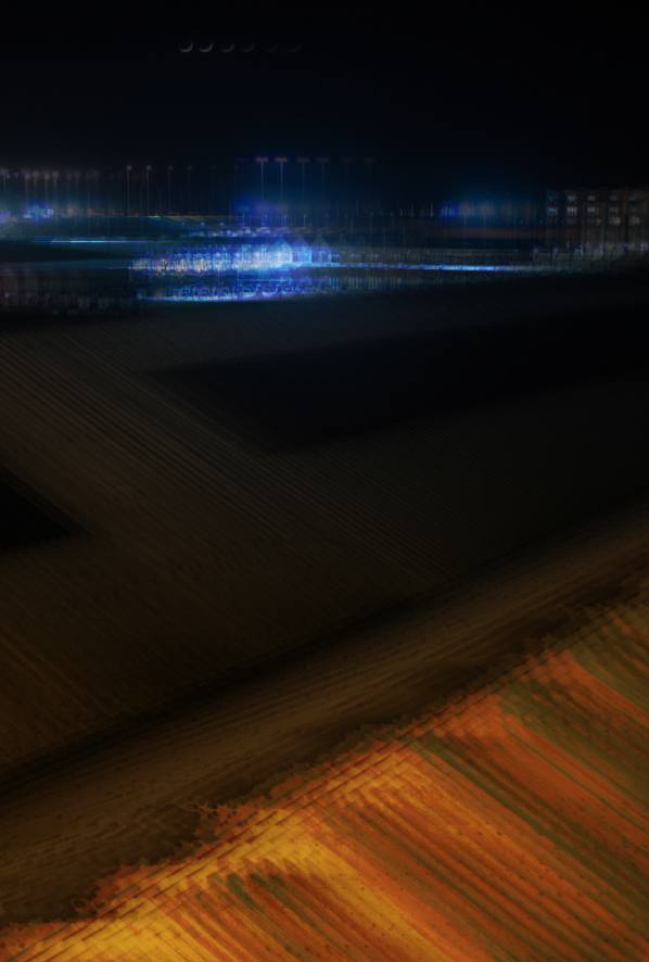
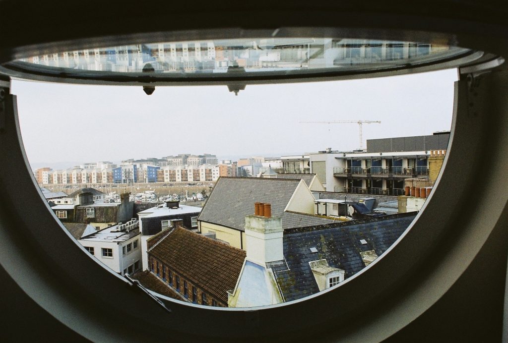
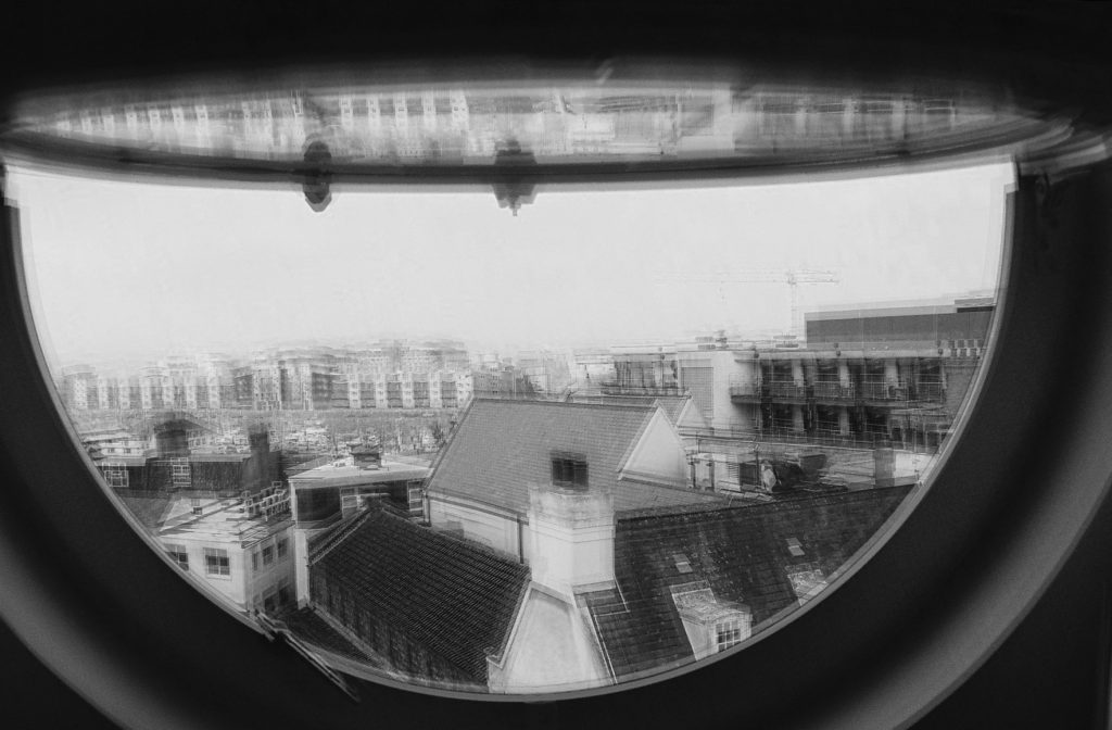
After this is found another image from my AS coursework featuring a long exposure of town overlooking buildings. I started by duplicating the layers and repeating the process for the second. I then cropped the image to hide areas that weren’t covered by another layer. I then changed the layer options such as to ‘subtract’ or ‘overlay’. I made different variations using the layer modes available to give different effects. I also changed the opacity of different layers to make others show through more. For the first one featured below I used the divide feature which created a grey feature over the top of the layer. Colour burn on the last photograph created a very rich red colour as well as darkening the photograph. Underneath these three images is where I used a variation of changed layer modes but in particular exclusion to create an intriguing textured effect. This is probably my favourite out of the selection for its subtle variety of colour in the background and unusually texture from the roofing in the foreground. It is also a lot more disjointed and out of rhythm compared to the first few for example how the moon in the first three all follow one after another and in the last one there is a lot more energy and sense of disruption instead of the neatness of the first few.


Images Inspired by Idris Khan (Photoshop Task 1)

Photoshop Task 1


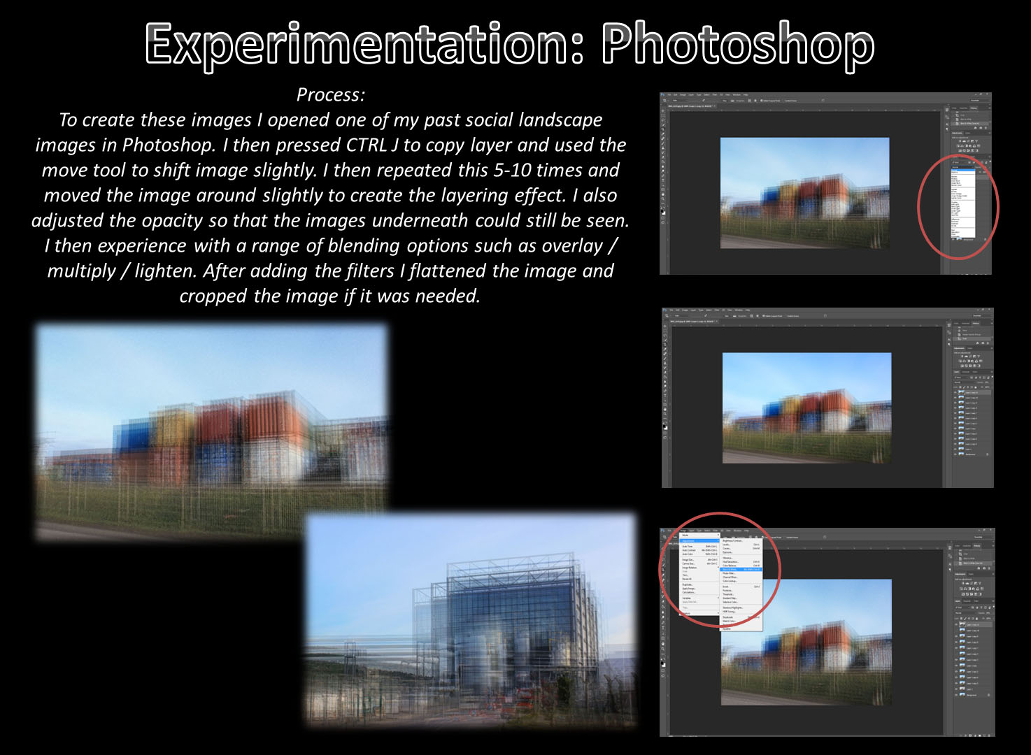
We were set the task of creating an image inspired by Idris Khan’s work with layering and shifting photographs. He does this by taking multiple images of a single object at slightly different positions and then layering them in Photoshop to create these abstract scenes of seemingly inanimate objects. Often photographing industrial buildings like oil or natural gas containers with wire frames when shifted they have a ghost like appearance to them. Incredibly dramatic they explore the environment in the abstract and unusual. it is an odd method but it works well and creates interest within the images that really helps to get viewers to look more in-depth at the images to try to work out what is gong on.

To try and emulate this to make my own image like this I used a digital technique that produces similar results and only requires one photograph to be taken. The method involves:

  1. Opening the selected image in Photoshop. For my attempt I used a photograph that I had taken on 35mm film so the quality is not too great.
  2. Copying the image a number of times. For my attempt I used 10 additional image layers and a black and white layer later.
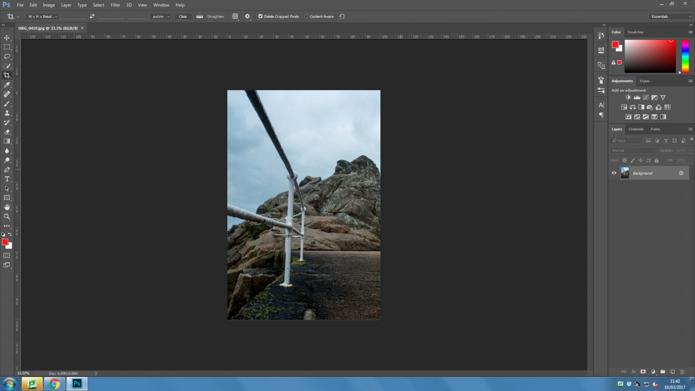
  3. Once all of the layers are in, each one should be shifted slightly.
  4. Now different blending options can be used to change the visibility of the different layers. For me this mostly involved changing the opacity but some of the images were brightened and I even made some not visible at all because I did not think that they added anything to the image.
  5. I then changed the position of some layers individually to give the image a more “shifted” look.
  6. the last process that I used was to crop the image so that there was a solid edge around the image.

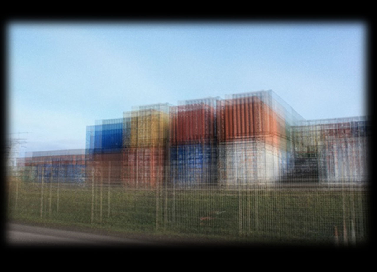
The first edit was the result of following that list of processes, it has the obvious shifting that has been done to it and the different angles also really help to give this its shaken effect. The second edit was done to try to better emulate Khan’s work, I simply added a black and white layer to the image, again in Photoshop. This gave the image a much more desirable look to it, it feels more gothic and more reminiscent of Khan’s work. Although it does not have the same feel because it does not have a framework to shift around it certainly looks similar and has the same general feel to it.

This screen shot shows the different layers and how I went through and adjusted them all individually. In this you can see the B&W layer that has not been set visible until I had the image looking good first. Although the images does not have too much distortion or ghosting to it and so is still more visible than Khan’s work I still like the way that it turned out quite a lot.