JJ Levine Artists Reference

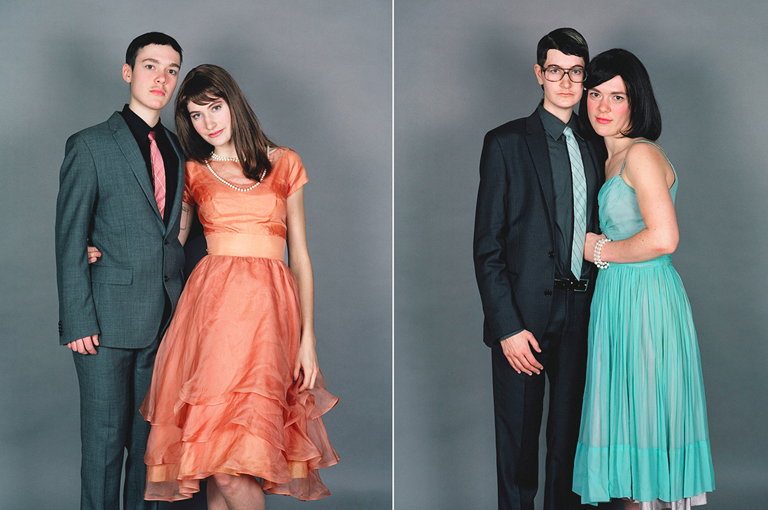
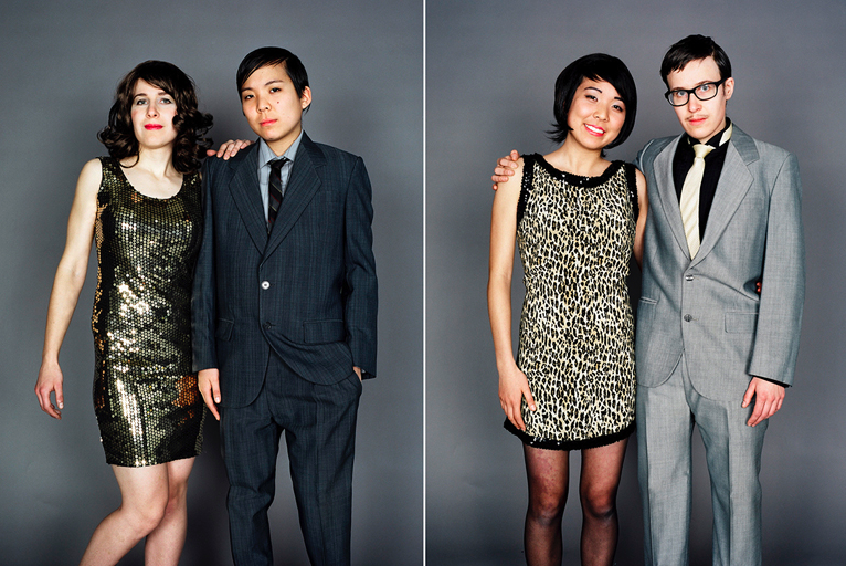
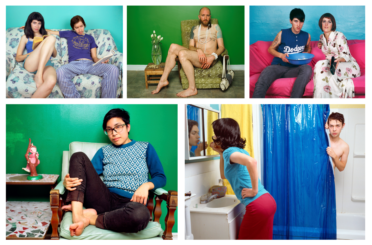
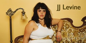
JJ Levine is a trans masculine and gender queer photographer based in Montreal who is best known for her gender bending projects such as “Alone Time” and “Switch”. “Alone Time” consists of a series of tableaux portraits that depict the same model acting out two different characters within the same scene, one character being a woman and the other, a man. “Switch” is a series of diptych images that at first glance depict two heterosexual couples in a prom style studio portrait. However, on closer inspection the images actual consist of two models rather than four. The same two models are used in both images, the couple are dressed as a man and a woman in the first image and in the second, the roles of reversed. The intriguing nature of the images is that it is unclear of what the couples actually genders are and whether or not there are a heterosexual or homosexual couple.
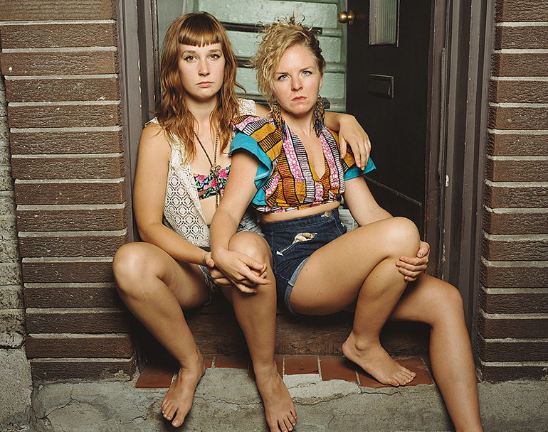
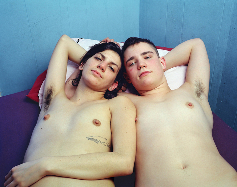
Levine’s work explores the concept of gender roles and strives to break these down but also questions the gender binary and questions whether gender is fluid and not as rigid as society has lead us to believe. JJ Levine’s “Queer Portraits” features many of Levine’s friends and acquaintances that are all part of the LGBT community which, if I am not mistaken can be considered under the umbrella of “queer”. I also believe that this title is significant as “Queer” generally means “strange” or odd” and generally has negative connotation. However, Levine’s subjects are present in a positive way that celebrates the differences and individuality of people. The descriptions of the portraits also do not also reveal what makes these people fit within the LGBT community, usually the image title consist of the name of the subject and the year the portrait was made. However, some images of more than on subject are titled differently, three examples being “Boyfriends in Bed 2011” , “Roommates 2013” and “Girlfriends 2012” (all pictured below) I think that these images are intriguing and beautifully composed.

I was drawn to Levine’s work because of her use of bright colours and striking subjects. Her work has a tableau feel due to the seemingly carefully selected colour schemes and the deliberate posing of the subjects which creates aesthetically pleasing compositions. This idealised controlled enviroment and subjects are themes that I want to include in my own work during this project. I also want to take direct inspiration from her use of colourful backgrounds and have ordered two backdrops to use in my response to her work as well as my own project.



Photoshoot 1 further experimentation

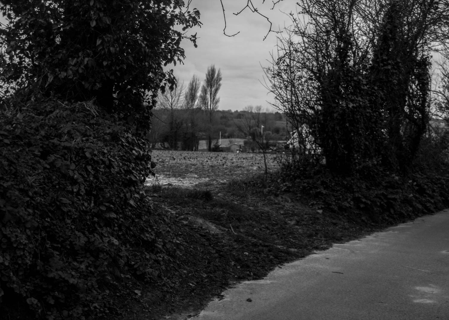
After looking more closely at the work of Richard Misrach I wanted to change the ratio of my images into something more square so I picked 5×7. I wanted to make all of them the same ratio to give them more continuity as a large series. I also feel this worked for the photographs composition. In the original edits I wanted to bring down the highlight levels which gave the shy a darker appearance, I did this to add depth and make the photographs appear more realistic as the light grey overcast sky made the photograph appear more flat, darkening gave them more life. Looking back on many of these I have made them too dark and over saturated, making them look unnatural, I increased the highlight levels in the sky and decreased the saturation levels to make them more natural.

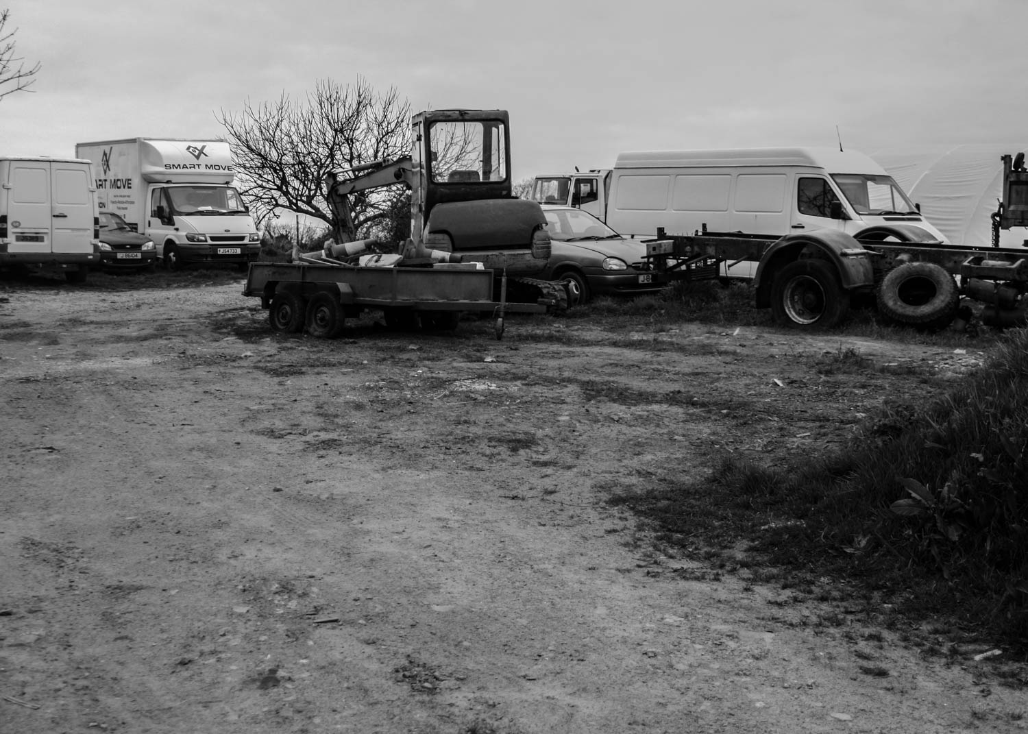
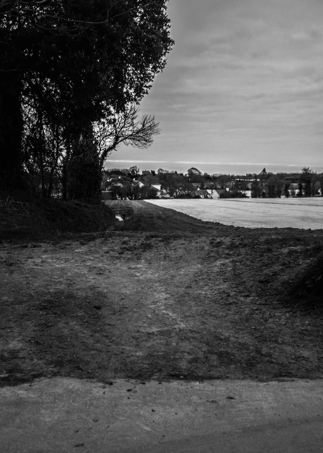
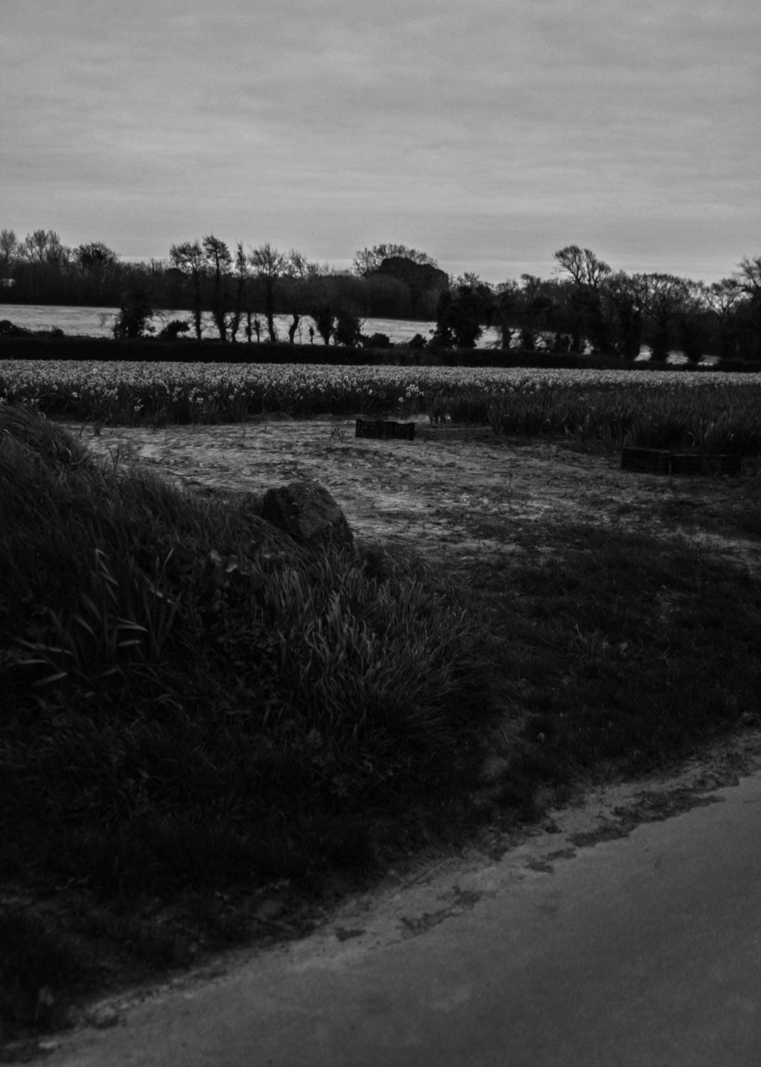
I also made black and white images. I made the images dark to give a sense of what the light was like during the time. This gives them a whole new eerie sense of ambiance. This also leaves more emphasis on the variety of textures created in the land such as the tire tracks in the mud as well as the overcast sky. This also gave the photographs a new sense of life as the images appeared flattened by the darker overcast sky. This gives the photographs more of a narrative with the dark tones.

Leaving Home

// R U N   A W A Y //

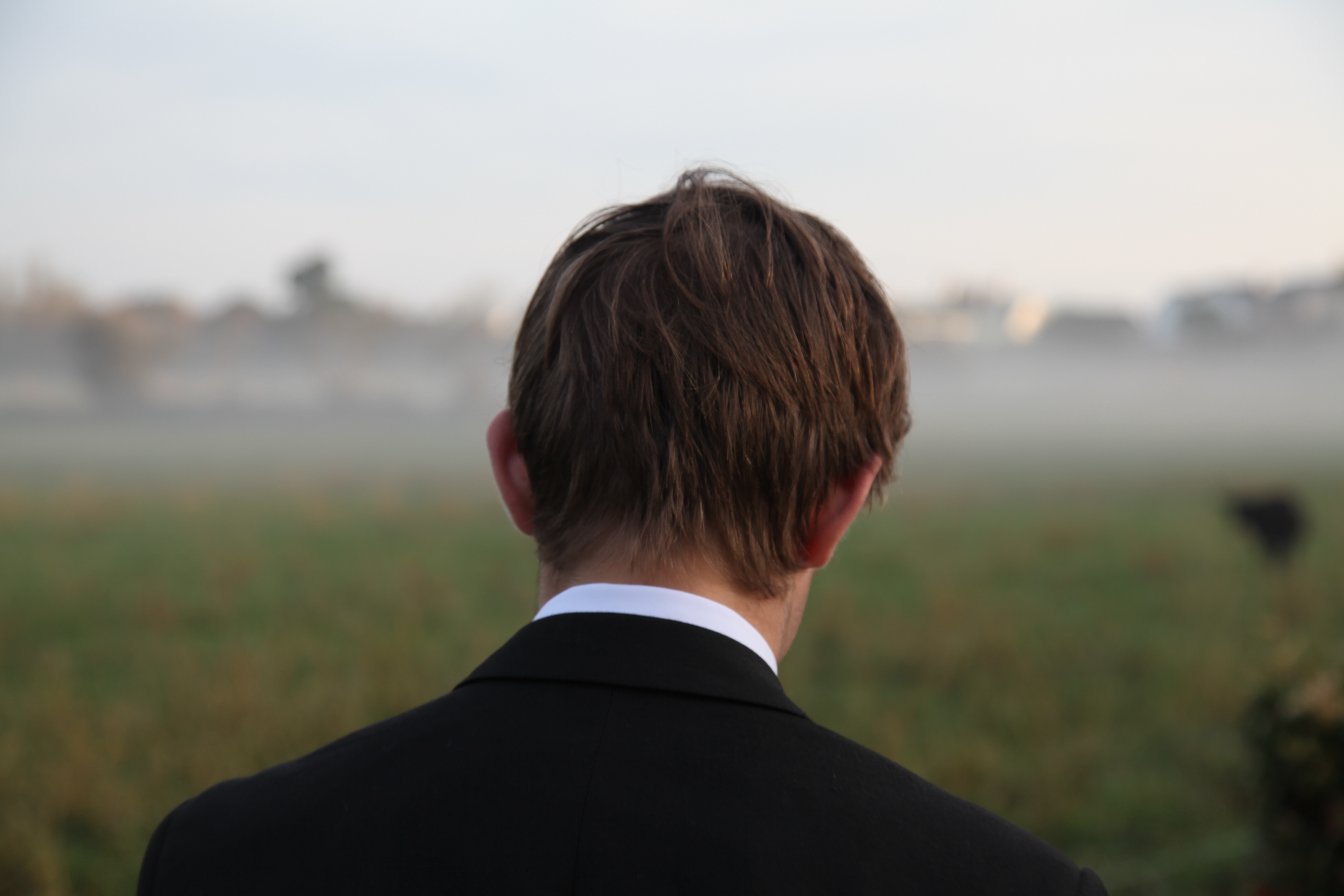
From the research on film photography, specific artists and cinematic photography; there is a particular style and quality to the images I would like to go onto produce myself. Starting with the photo below which features my brother on an especially unusual morning, the plan is to analyse the fears associated with leaving home. Assigning context to this image rather than finding it from the photo itself – there is an aesthetic quality visible which I would like to reproduce. The back of the head is not typically considered a ‘good’ image. In terms of portraiture it is more commonly seen as the easy way out to photograph from behind but for this project I think it could be a useful way to show the absence of a person. More specifically perhaps, it could be paired with a front facing portrait shot dead on to give two views of someone – potentially in the same location? The image below works well for many reasons despite the backwards angle. The lighting creates a strong image with soft shades highlighting sections of the neck and hair. With the aperture set to 4, the background is faded out allowing for a centre focus without distractions. The surrounding area is actually a field with houses in the distance being blurred out. The oncoming fog forms a barrier and cross over section between the light sky and the pale grass which connects the composition.

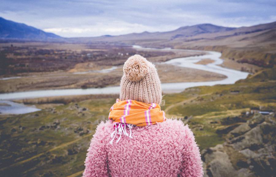
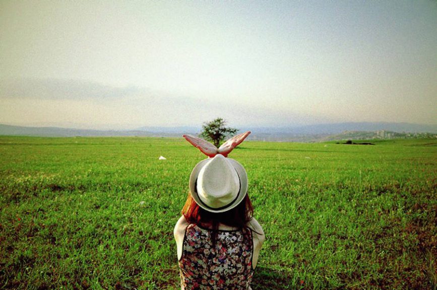
Following on from this analysis of my own image above, these are two untitled images sourced online though irritatingly without any links or credit it seems. The photos above have a similar composition to my own image but have a higher focus on the background which is something I will need to consider in my own experiments. In terms of a specification – I would like to do some individual shoots 1:1 with people and photograph them in different environments that reflect their fears of moving away. Perhaps this could be done as a way to highlight a person’s favourite area and the places they will miss the most from the island? I might also pair this with an image shot at each character’s home – I’m thinking in their rooms? – with the space that they probably spend the most time. So overall, the idea is to shoot four images for each person – two inside and two outside. Each set of images will have a face on portrait and a backwards one which will focus on the environment of the area. The thought process from the internal ones is to produce a set of well lit images showing people in the spaces that mean home to them. Contrasting these with the environmental portraits, the series will show people in their ‘home’ environments followed by the places they will miss the most when they leave home. Hopefully this will place an emphasis on the environments of Jersey that are often overlooked and forgotten whilst simultaneously showing the internal fears and anxieties of teenagers leaving their homes from the first time.

Analogue

// 35 M M //

Film photography is an area I have been experimenting with for a while now and I am keen to make use of my own film cameras within this project. Producing perhaps a mixture of digital and analogue images for the final presentation. After purchasing a Moonasi design La Sardina camera just over two years ago now, I began my ongoing obsession with film and the cinematic qualities of analogue images. This first camera was relatively simple in design and in terms of manual control options were fairly limited. While the lack of options initially proved frustrating, the simplicity came to be something I loved. Once I had accepted that my focus would never be quite right (with no preview available) and that any hope of shutter speed had fallen away, I focused on the things I could enjoy about the camera. In reality, without having to worry about excessive controls, framing became much more important to me. The grainy texture is something I have fallen head over heals for and light leaks are an area I am interested to explore.

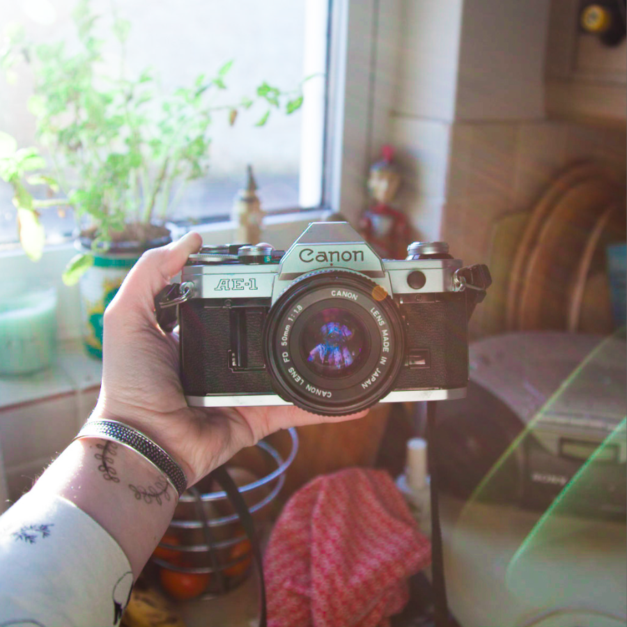
Following my love of the La Sardina camera, I purchased a Canon AE-1 which after a little fixing has produced some interesting shots. This time I made sure to check for fully manual controls ensuring I could practice using every feature available. The control on this camera is truly fantastic, once setting the ISO to match that of the film (I typically use ISO 200) the aperture, focus and shutter speed can be adjusted accordingly. The focus is controlled visually in some respects with a split image being lined up in the middle of the viewfinder to show the focal distance.

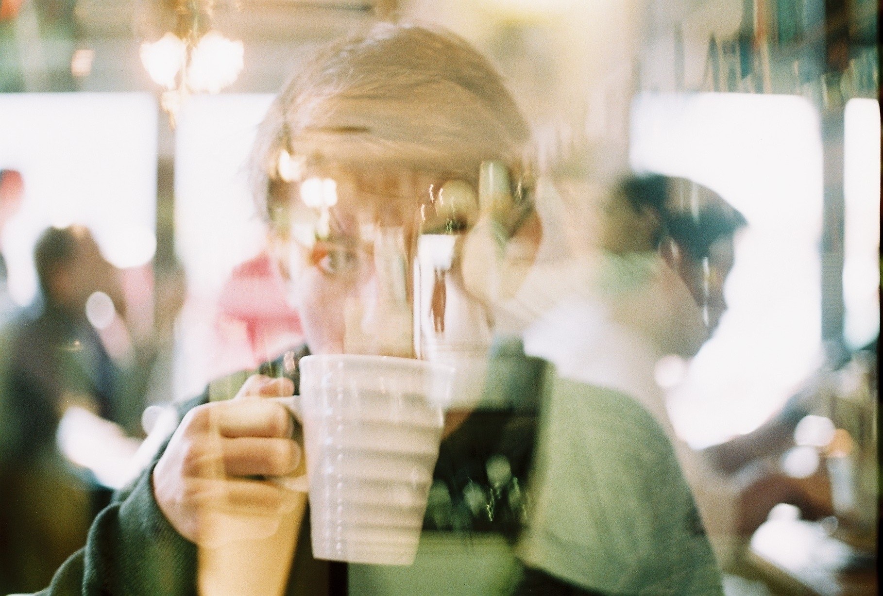
With these two cameras available for me to use, plus my digital Canon 5D mark II, I think it could be interesting to create a project which uses images from the different methods of photography. Looking at the research I have already completed for this project – on double exposures and ‘Talking to the Ants’ – there are some clear directions I would like to now follow. Below is a double exposure of my brother shot on the AE-1 as an experiment to see how the process worked on this camera.

Fynn ft. Ollie making coffee

The project ‘Talking to the Ants’ has inspired me to try out a series of natural portraits and perhaps make use of Stephan Gill’s unusual abstract techniques (such as creating compositions inside the lens). His method involves collecting things found at each site and placing them inside the camera lens. This is not something I am keen to do with my Canon AE-1 however my La Sardina camera is a little more hard wearing and could be more suitable. Ideally, I think I would like to focus this project on something relevant to my age group right now. After speaking to my tutors, the idea we seem to have focused on is a set of stylised portraits about leaving home. One thought on this is to make a set of images reflecting the fear and anxieties behind this process of moving away. I will explore this more in a project blog post as I’ve become a little side tracked from the intiial point here. So yes – film photography. Wonderful way to stay poor. 

Anthony Kurtz – Environmental portraiture.

kurtz

Anthony Kurtz is a German environmental photographer that lives in Berlin. Most of his work is based in San Francisco and in African countries like Senegal. He specialises in environmental portraiture and strives to create beautiful and unexpected photographs of people and the spaces they occupy. Combining both natural light and studio strobes, Anthony sculpts light to create a mood, an atmosphere, a photograph that tells a story and, hopefully, sparks curiosity. Similar to Goldblatt many of Anthony’s pictures are very strong and tell a story about each individual that has been captured in his images. I particularly like the clarity and quality of his images. This is because they are very sharp and make the detail of the images very clear. Lastly I like the work that Kurtz has done because many of the models in his shoots are kinky looking, for example some of his images show people wearing strange glasses or having strange props, such as a mouse.

Screen Shot 2015-09-22 at 17.53.48

Screen Shot 2015-09-22 at 18.10.20

Practice Shoot

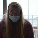
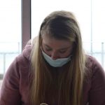
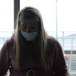
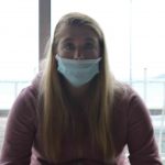
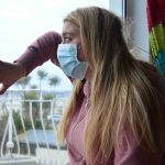
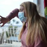
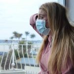
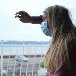
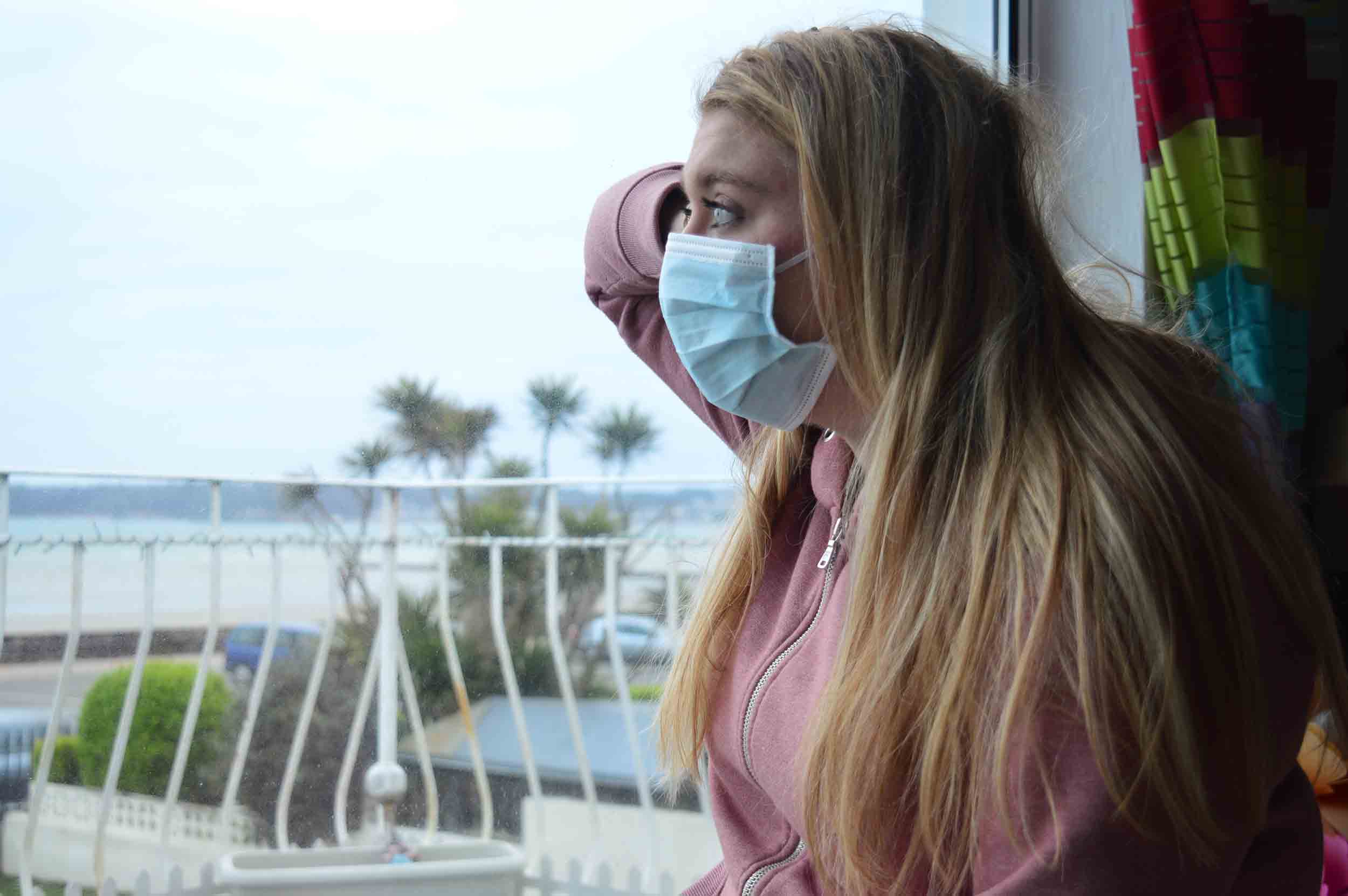
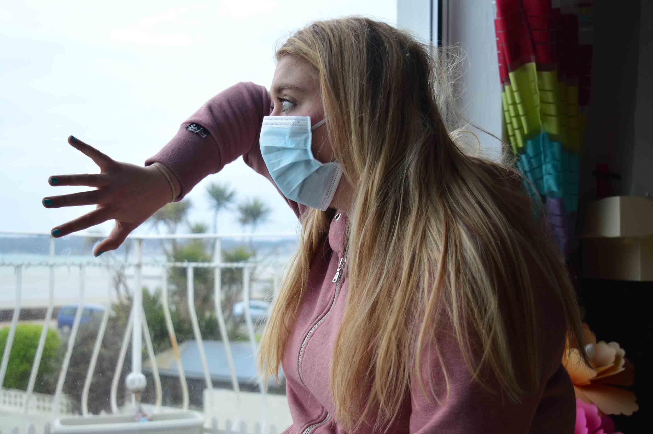
My exam is based on the high levels of pollution in China in which on a daily basis, have to wear mouth masks to help filter the toxic air. I have taken this to the extreme in which i will be creating multiple sequences of photos which the first photo will be my model happy in a beautiful environment, the second photo will be my model wearing a mouth mask and the third will be my model wearing a gas mask in a beautiful environment. The photos will slowly get darker and the last image will be a dark black and white photo to create drama.

I did a specification for my shoot previously in which i stated that i will do this shoot on Victoria Avenue beach and People’s Park. However due to weather conditions i was unable to do so which is why i did a practice shoot indoors using all the equipment necessary. I took some photos free hand, using a tripod and i used a timer due to the slow shutter speed i was using for most of my images.

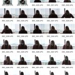
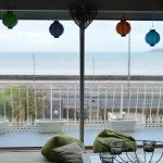
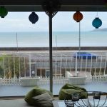
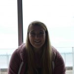
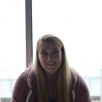
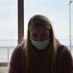
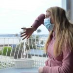
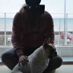
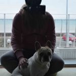
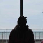
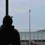
This shoot was mainly for me to practice with Aperture and Shutter speed as i am not very skilled with them. I chose to photograph against the light as it is more difficult so required work with Aperture and shutter speed. Also i could not photograph in any other place as i had furniture and it is dark in the rest of my house so i was limited to what i could do. However, i do understand that they are not well composed and i will not be using these in my project, they were simply for me to get to grips with photographing with the mouth mask and gas mask. The pole in the middle of the window was difficult to work around but i was not concentrating this as i wanted to create a sharp and crisp image before i start thinking about composition.

All of these images are experimentation as i have many of the same image so that i could see what it would look like with different apertures and shutter speeds. This is also why i practiced using a tripod and self-timer.

These are the beginning images of my experimentation:

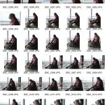
As you can clearly see, i was experimenting with aperture and shutter speed to see what i would need to do. This is also when i started using a Tripod because i was reducing the shutter speed and need to keep the camera still and level. I did this so that when i am outside, i will not spend a long time setting up as i now understand aperture and shutter.

Mouth Mask experiments:

As you can see, i was experimenting with both aperture and shutter speed as i was still using a tripod. I wanted to understand how they both worked so that my model did not have to spend very long in this mask as it is not the most comfortable thing to wear and it does restrict breathing slightly. So i had a limited amount of time as the light was fading and i did not want her to be in the mask for a long period of time. After this series of experiments, i will be able to set up my camera with the correct settings for a sharp and crisp image for my official shoots on Friday 24th March. I also tried adjusting the ISO but this made the image much darker so i left it on 100.

Experiments with self-timer:

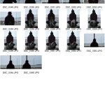
Many of these photos are blurry as i could not get the self-timer to get a focused image but the last three in this gallery are clear and they are sharp and vivid which is what i want when i go to my official shoots later in the week and next week.

The Sharp Photos:

Gas Mask experimentation:

With the gas mask, i have a maximum of 20 minutes otherwise there is a risk my model could faint due to lack of oxygen. This is why i did not do these very well as i was rushing as i did not want to put her safety at risk also it is uncomfortable to wear. The light was fading at this point and i could not get the aperture right but this allowed me to understand that if the light is dark, then the mask will be very difficult to work with, but this means that i know to photograph the gas mask first if the light is fading. I understand that it did not help that the light was behind her but it has helped me learn what not to do when doing these portraits. During these i was still using the tripod and self-timer which is why many of them are blurry and it did not help that my dog kept moving and entering the picture.

Summary:
  • I have learnt how aperture and shutter speed work and i am much better at setting up quickly
  • I understand that the light must not be behind the model as it makes a silhouette
  • I now know i will be using a tripod and most likely a self-timer to take the images
  • I cannot photograph the gas mask in fading light as it makes her eyes much darker and almost invisible
  • The mouth mask is easiest to photograph and i will have to find more interesting poses for the model when she is not wearing any sort of mask,


Photoshoot 1

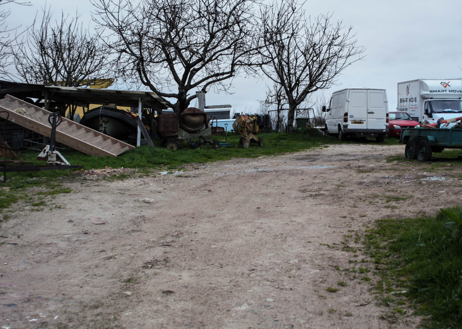
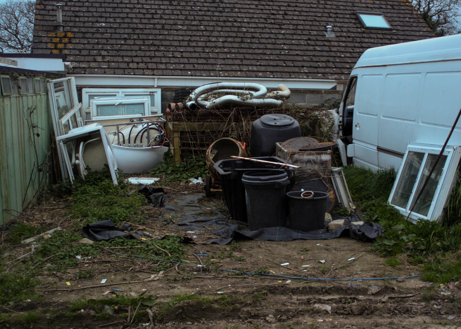
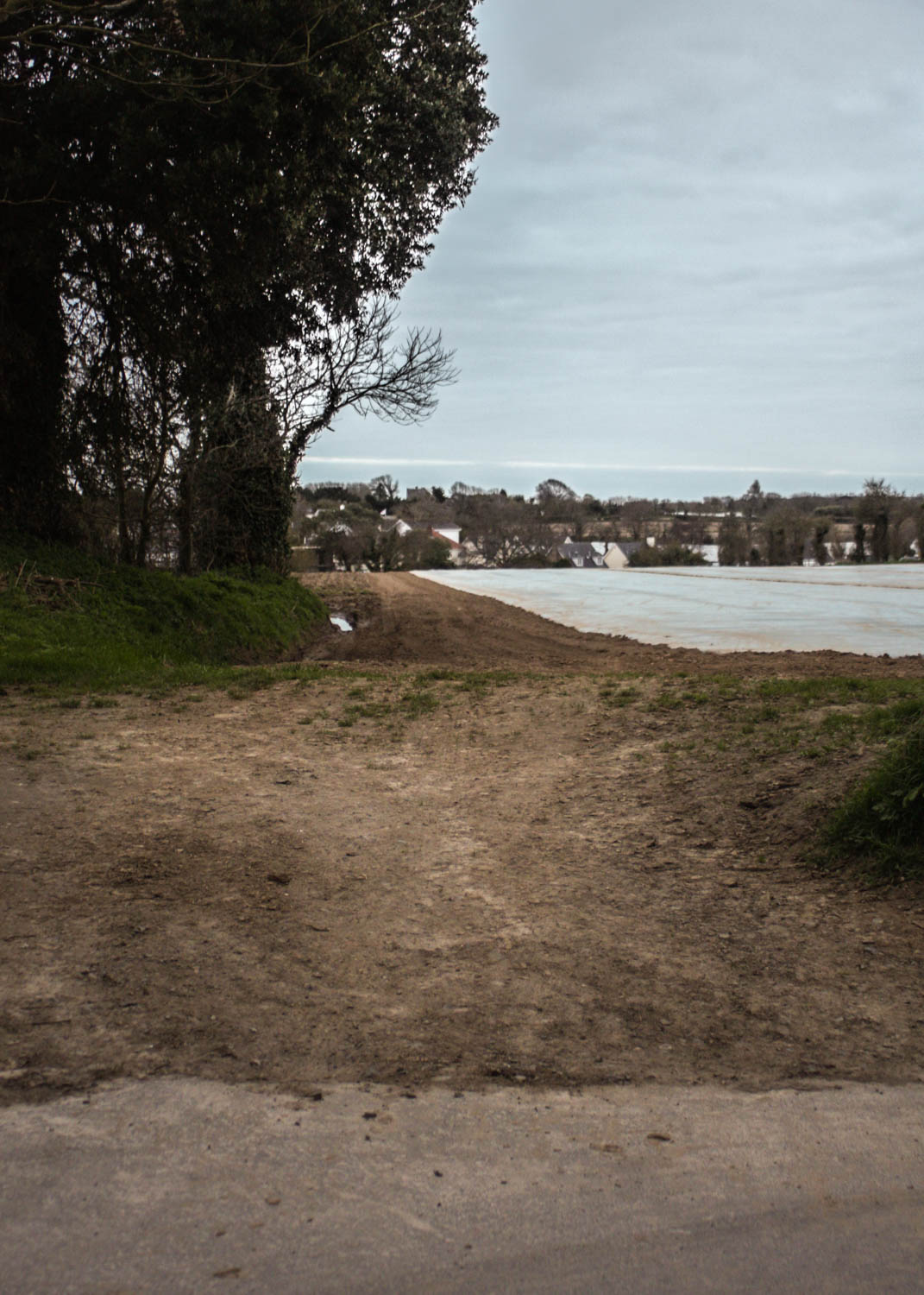
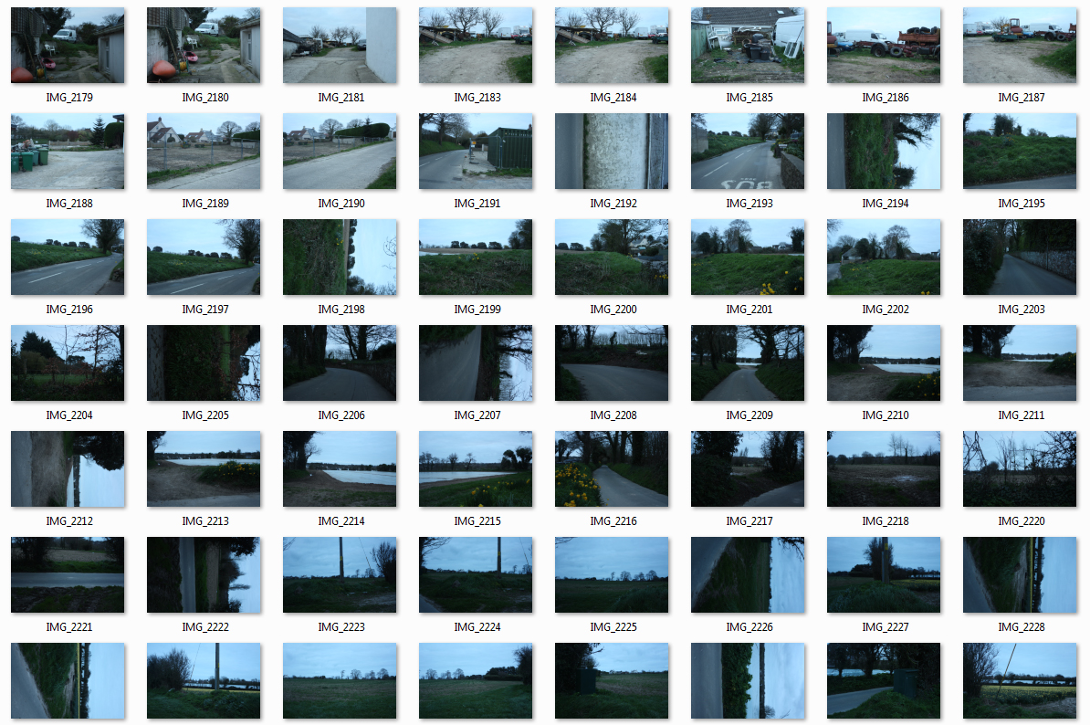
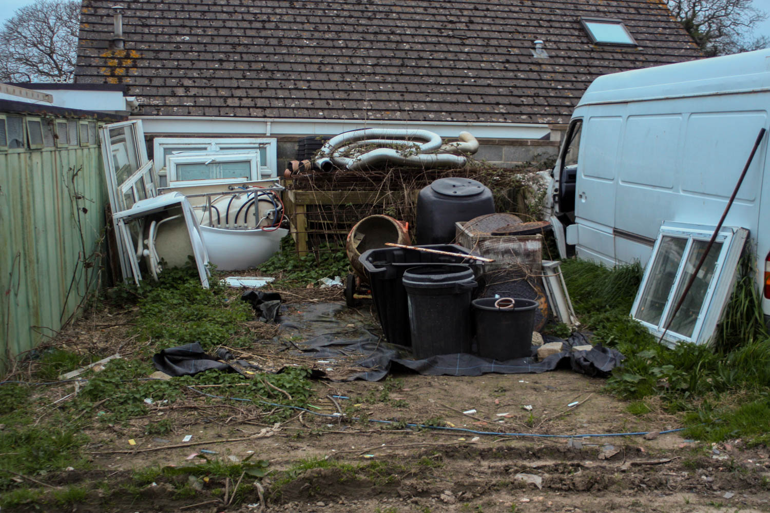
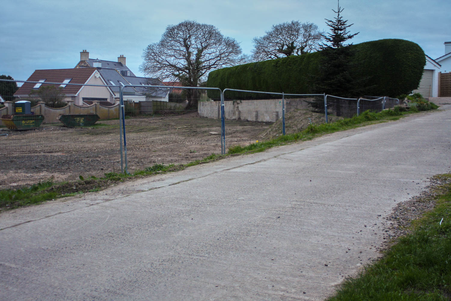
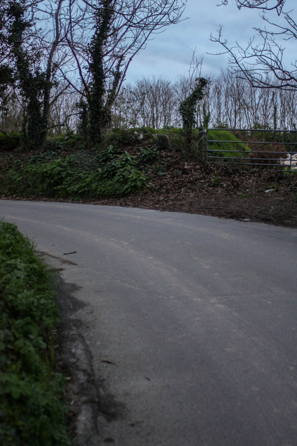
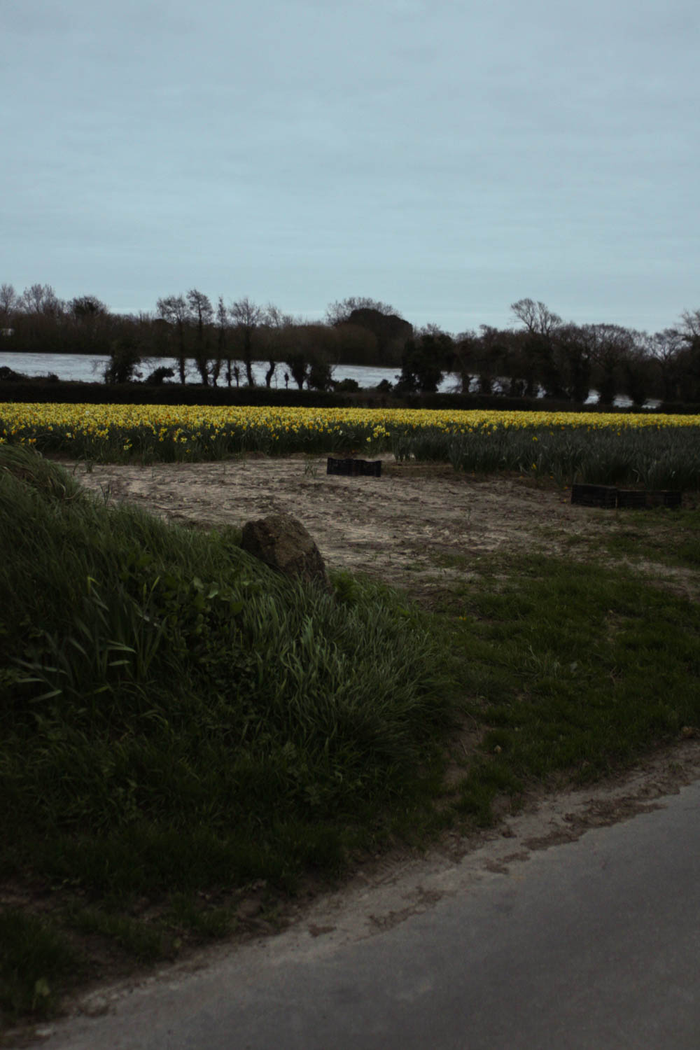
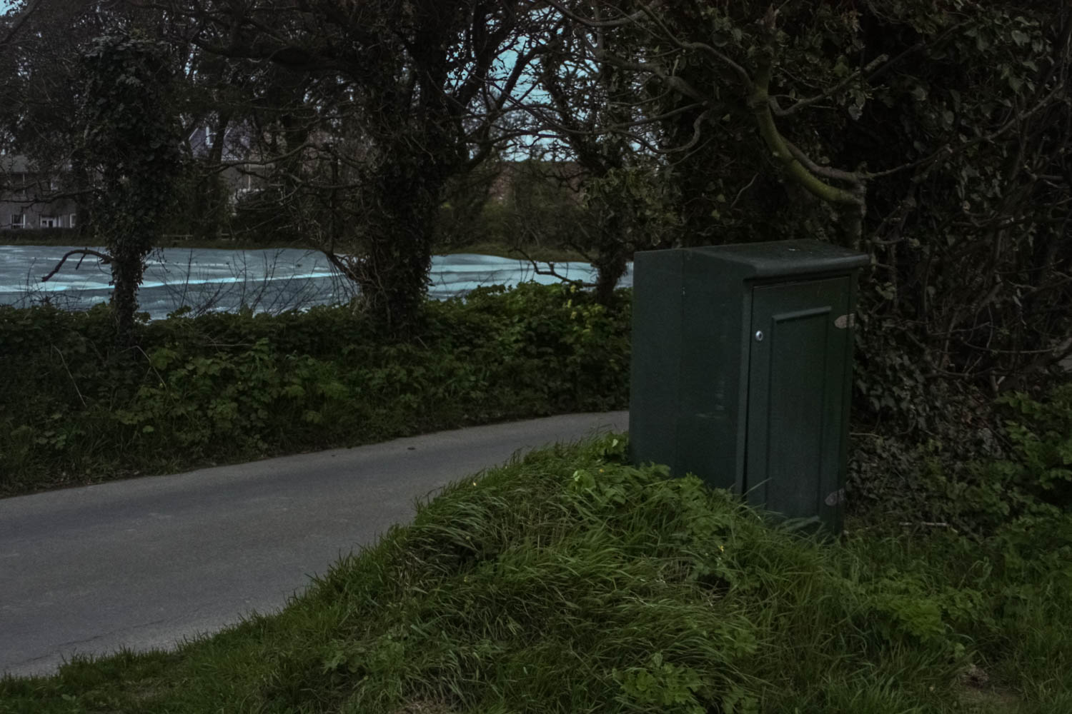
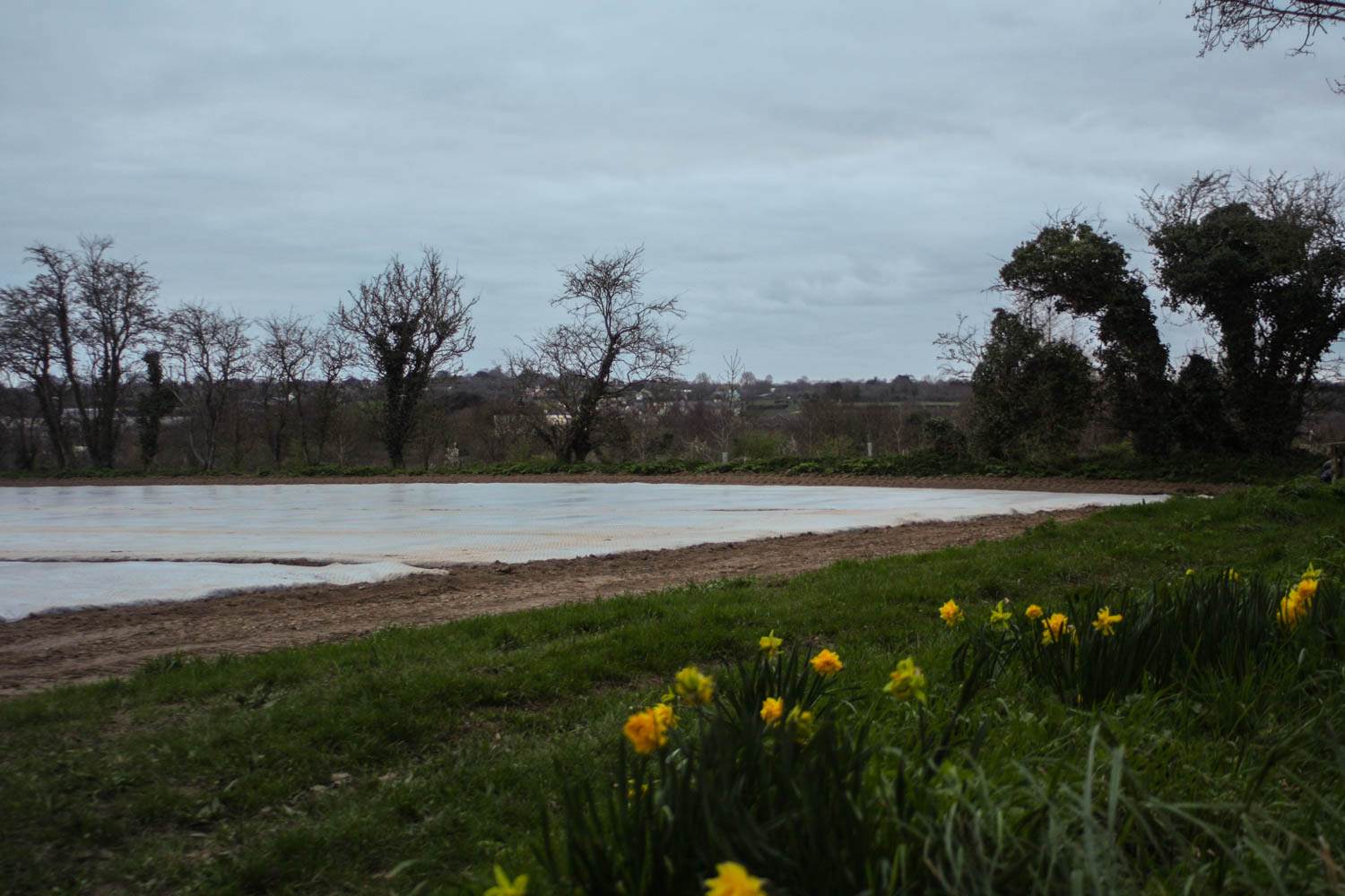
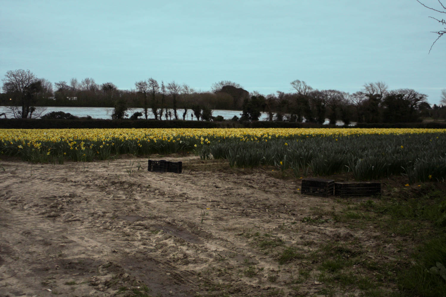
I explored the environment and area of where I lived to stat the project. This also links in to a depiction of my own environment that i am surrounded by. As I discussed in my specification, I was looking out for land and areas that showed the conflict between man made changes and the natural landscape. I picked a late time of day where the lighting was soft and natural, I didn’t use flash at all to keep the lighting as natural as possible, but with the overcast weather it made the images more flat. For my next shoot I will pick a time where the weather is sunny to evoke a brighter more intense lighting. Above is a contact sheet of the photographs. I tried a variation of landscape and portrait photographs.

In the above photographs, they were all taken in the same area, you can really get the sense of human presence in these photographs but with an eerie absence of people. I wanted to focus on roads and paths that have eroded thru ought the soil but still featuring the rich green grass growing on the sides, showing the regrowth nature creates. The overcast lighting makes the pictures appear very straight forward, leaving the viewer to focus on the physical features of the image, similar to that of a documentary image, the flat lighting stripped the photographs of any creative narrative, they work well as a series, but do not leave any mystery or sense of poetic ambiance. The photogrpah top right reminds me of the photograph by Richard Misrach ‘Abandoned Trailer’ which depicts a selection of rubbish and abandoned debris surrounding a lake. Similar to Misrach’s photograph, my photographs portrays the dramatic effects on the land caused by society. I brought the highlight levels down to bring out the texture in the sky as well as evoke a more eerie ambiance similar to that in the work of Richard Misrach.

Abandoned Trailer, Mississippi River, Near Dow Chemical Plant, Plaquemine, Louisiana, 1998, by Richard Misrach

In the above photographs I wanted to look at the harsh difference between the smooth road and the rural landscape. The above photographs work well as a series as well as evoke a narrative of travel, where the viewer follows the photographer’s journey.

The above photographs all share a romantic influence such as with the use of flowers in the last two photographs and the focus on vast landscapes. Similar to the first few photographs, there isn’t really a narrative evoked in these photographs, the photos focus on the more obvious features as opposed to a deeper narrative and meaning.

I tried a selection of very straightforward compositions that allowed for lost of information and captures the whole landscape. I used the rule of thirds such as in the first photograph above, the electricity box if focused in the third section of the photograph. I have also placed the horizon in the centre, making the photograph more straightforward similar to the genre of new topographic, which is often described to have a very formal or banal aesthetic.

The photos above show a slightly romantic influence with the use of flowers. I like the influence of people in these photographs, the tractor marks in the mud and the boxes reflects the agricultural side, the flowers add a very poetic influence. These are my favourite photographs of this shoot for the juxtaposition and connotations between the mud, which shares negative connotations of dirtiness and unpleasantness and flowers which share positive connotations such as passion and beauty.

Experiment with Photoshop

Idris Khan: http://www.saatchigallery.com/artists/idris_khan.htm

It is hard to avoid the aspect of time when producing what ones sees as o photograph… my images are something that is not a frozen moment, but an image made up of many moments and that is created over time rather than taken.

He is a British artist who is based in London. His works draws from a diverse range of cultural sources such as art, music and history and he creates densely layered imagery. His work is both abstract, figurative and addresses narratives of history, cumulative experience and metaphysical collapse of time into single moments.

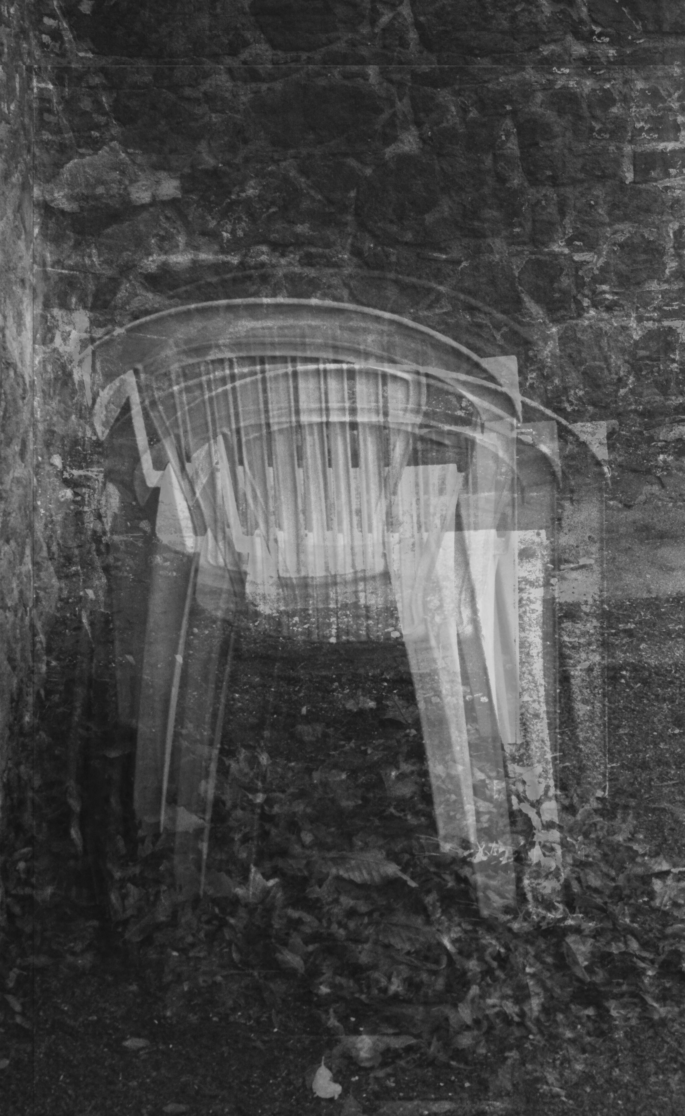
I have done an experiment to replicate his work using images from my previous project for A2. I chose a simple image of a chair and layered it 10 times and blended the image as well. It is not as densely packed as Idris Khan’s work however it is what an image of his would look like before completion.


Tanja Deman: http://www.tanja-deman.com/

She is a Croatian artist, her work is inspired by her interest in the perception of space, physical and emotional connection to a place and her relationship to nature.

She works by incorporating photography, collage, video and public art to create evocative meditations on urban space and landscape.

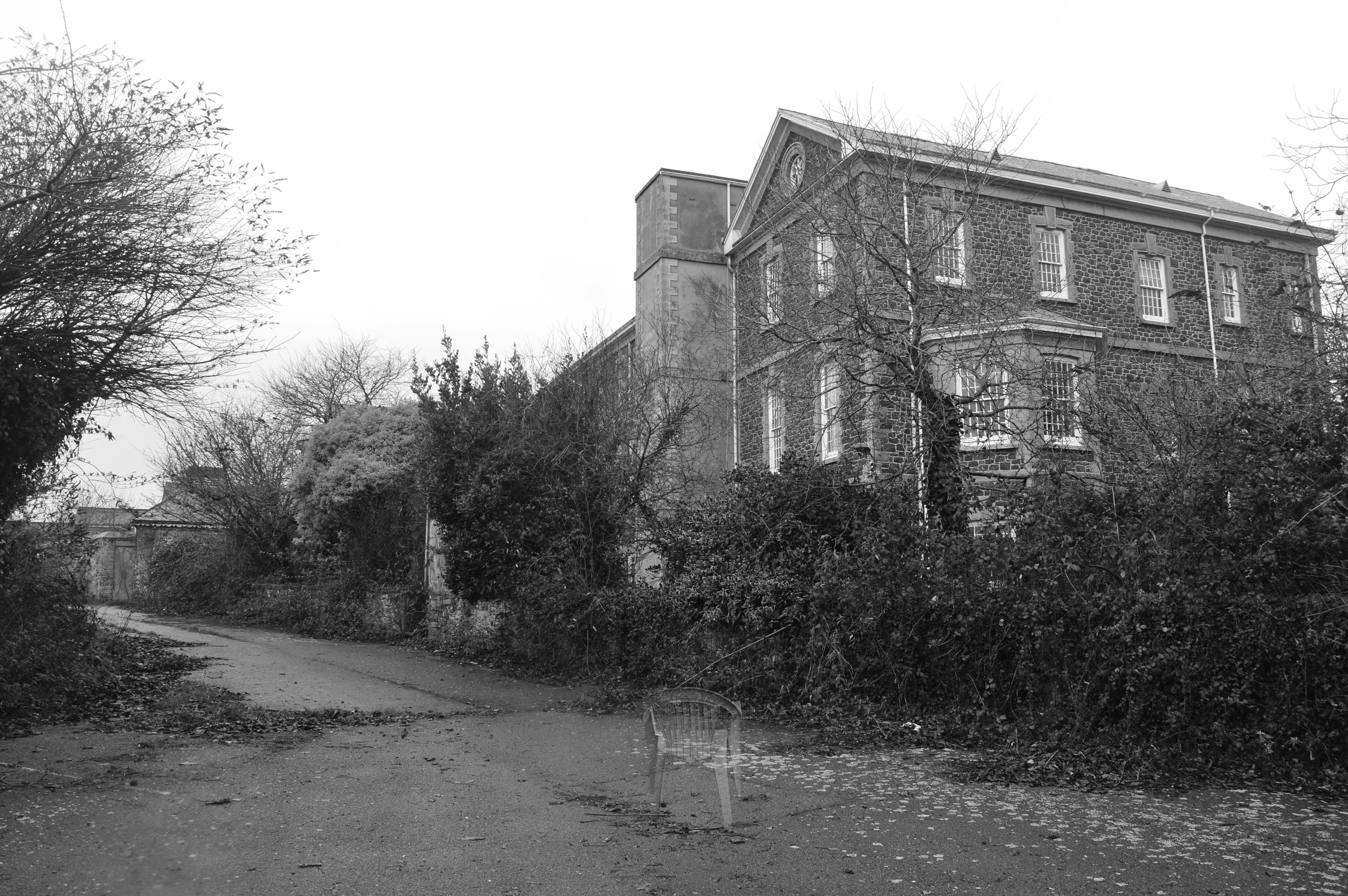
I have done an experiment using inspiration from Tanja Deman who photo shops different environments together. My experiment was based on the photos from my personal study on the Jersey Lunatic Asylum. I used a photo of the back of the building and a photo of a single chair.  I did this using layers, blending and the paint tool, i also adjusted the opacity to make it seem like a ghost chair.


Write a Specification

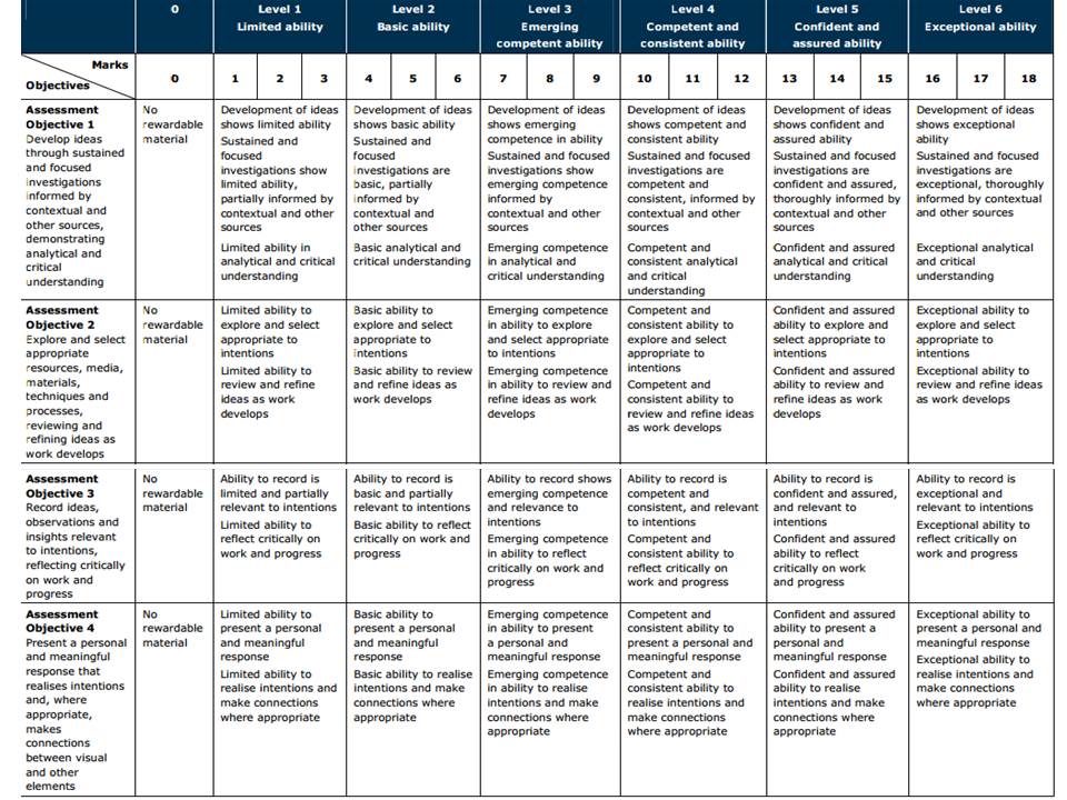
Assessment Objectives A2 Photography: (Edexcel)

AO1 – Develop your ideas through sustained and focused investigations informed by contextual and other sources, demonstrating analytical and critical understanding.

To achieve an A or A*-grade you must demonstrate an Exceptional ability (Level 6) through sustained and focused investigations achieving 16-18 marks out of 18.

Get yourself familiar with the assessment grid here:

To develop your ideas further from initial research of mind-maps and mood-boards on the theme ENVIRONMENT you need to be looking at the work of others (artists, photographers, filmmakers, writers, theoreticians, historians etc) and write a specification with 2-3 unique ideas that you want to explore furthe

Follow these steps to success!

Write a specification with 2-3 ideas about what you are planning to do. Produce at least 2-3 blog posts that illustrate your thinking and understanding. Use pictures and annotation.

  1. Write a paragraph of each idea and provide as much information as possible on how your ideas interpret the theme of ENVIRONMENT
  2. Illustrate each idea with images to provide visual context
  3. Produce a detailed plan of 2-3 shoots for each idea that you are intending to do;  how, who, when, where and why?
  4. If appropriate, think about locations, lighting and choose a setting or landscape that suits your idea. Take recce shots or experiment with different camera skills/techniques before principal shooting.  If appropriate, think about how to convey an emotion, expression or attitude and the colour palette, tone, mood and texture of your pictures. Consider mise-en-scène – deliberate use of clothing, posture, choice of subject objects, props, accessories, settings (people/ portraits etc.)