Astres Noires – Katrin Koenning & Sarker Protick shoot idea

Astres noirs is the debut book for both Katrin Koenning and Sarker Protick, artists who live thousands of miles apart whose peculiar photographic wanderings create a hauntingly beautiful dialogue. This book presents photographs taken on mobile phone cameras, devices used to capture their everyday in an impulsive and almost obsessional way, documenting life from their doorsteps to far afield. This idea of communication through photography to present their living environments interests me since I would like to investigate what the difference between the living environment in Jersey is like compared to that of somewhere so close, London. This is contrasting to Koenning and Protick’s work because they were miles apart, however my idea would use the same idea in a different way.

Social media today, such as facebook, snapchat and instagram are all social medias that allow someone to send or post images that they have taken. This fact would mean that using social media I can contact someone who may live in an urban area in London, where they live. Using this communication and social media they would be able to send me and image of their living environment, including their job or friends/family living, in exchange of an image of our island Jersey. Once these images have been exchanged over a period of time I will be able to present 2 images that contrast to each other side by side. For example I could take an image of someone I know in the middle of a country lane, and the London exchange image could be the same image replicated in the streets of London, a completely different environment.

Image result for astres noirs

These are the images that Koenning and Protick have made in their collaboration, along with many others. The images present a feeling of paranormal and a sense of the unknown. This is something that is not commonly explored or conceptualised. The image on the left was an image that was sent by Koenning and the image on the right was the response from Protick, which is a pattern continued throughout the book. In my hope this is what I would like to do when i present my work, side by side presenting two responses to two different environments. I plan to make my images high quality and set up rather than spontaneously captured images.


Image result for astres noirs


Photoshop experimentation / Layering and Blending

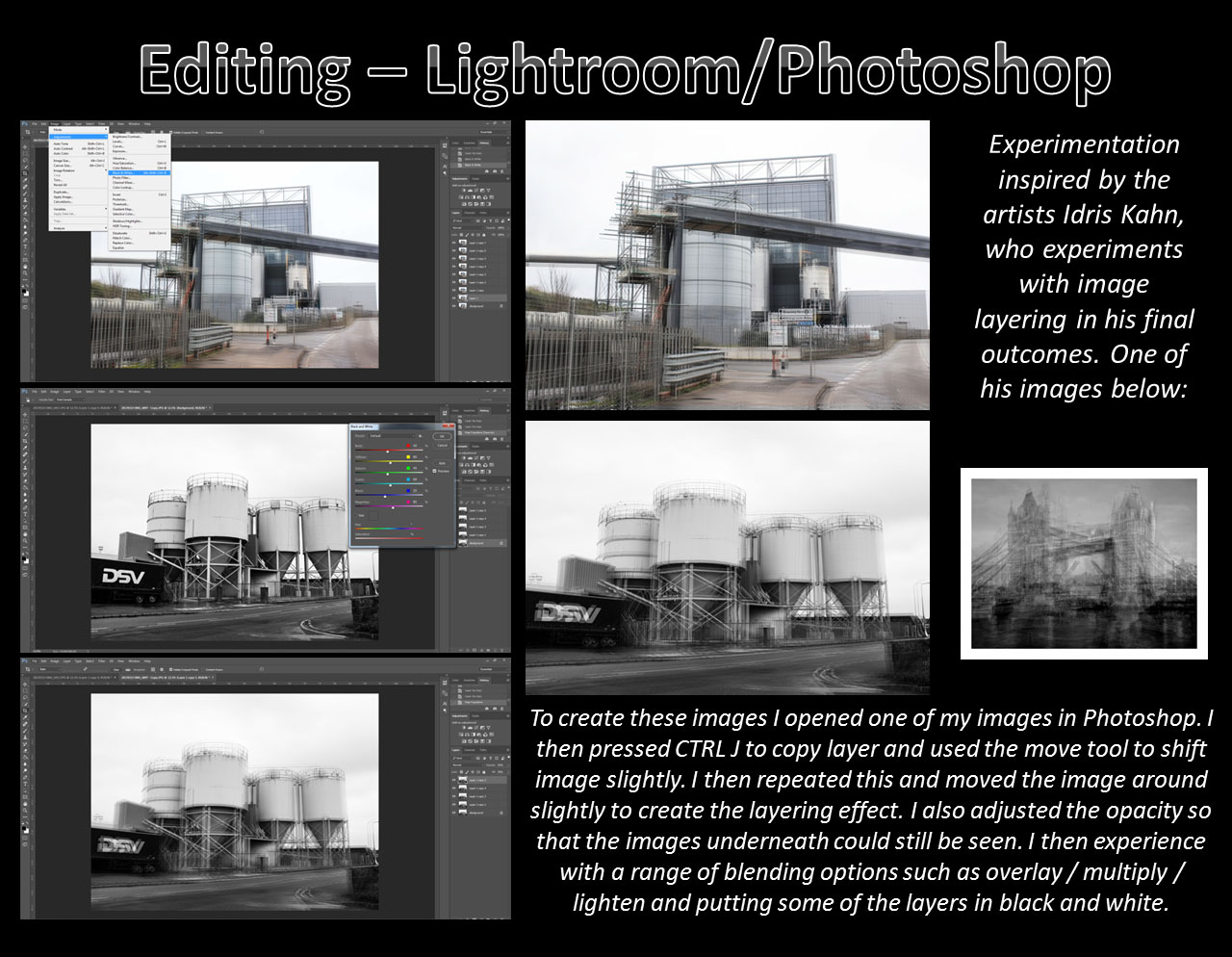
After looking at Idris Khan’s work I began experimenting with different techniques on photos in photoshop, attempting to give similar effects as to what we see in his pieces.

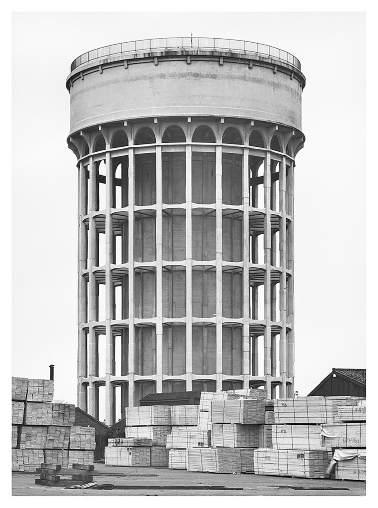
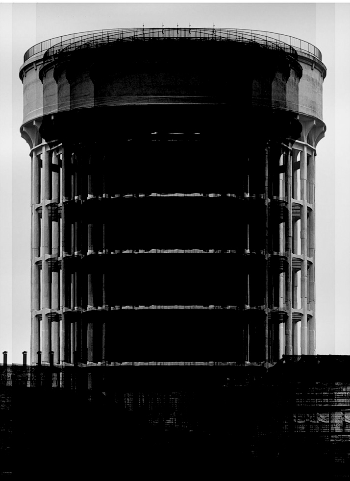
Using the image above made by Hilla Becher, I edited it in the style of Idris Khan. By taking the image and layering it multiple times, each time moving the image a few steps to the left or to the right. I then blended each layer into each other to give this fading effect.

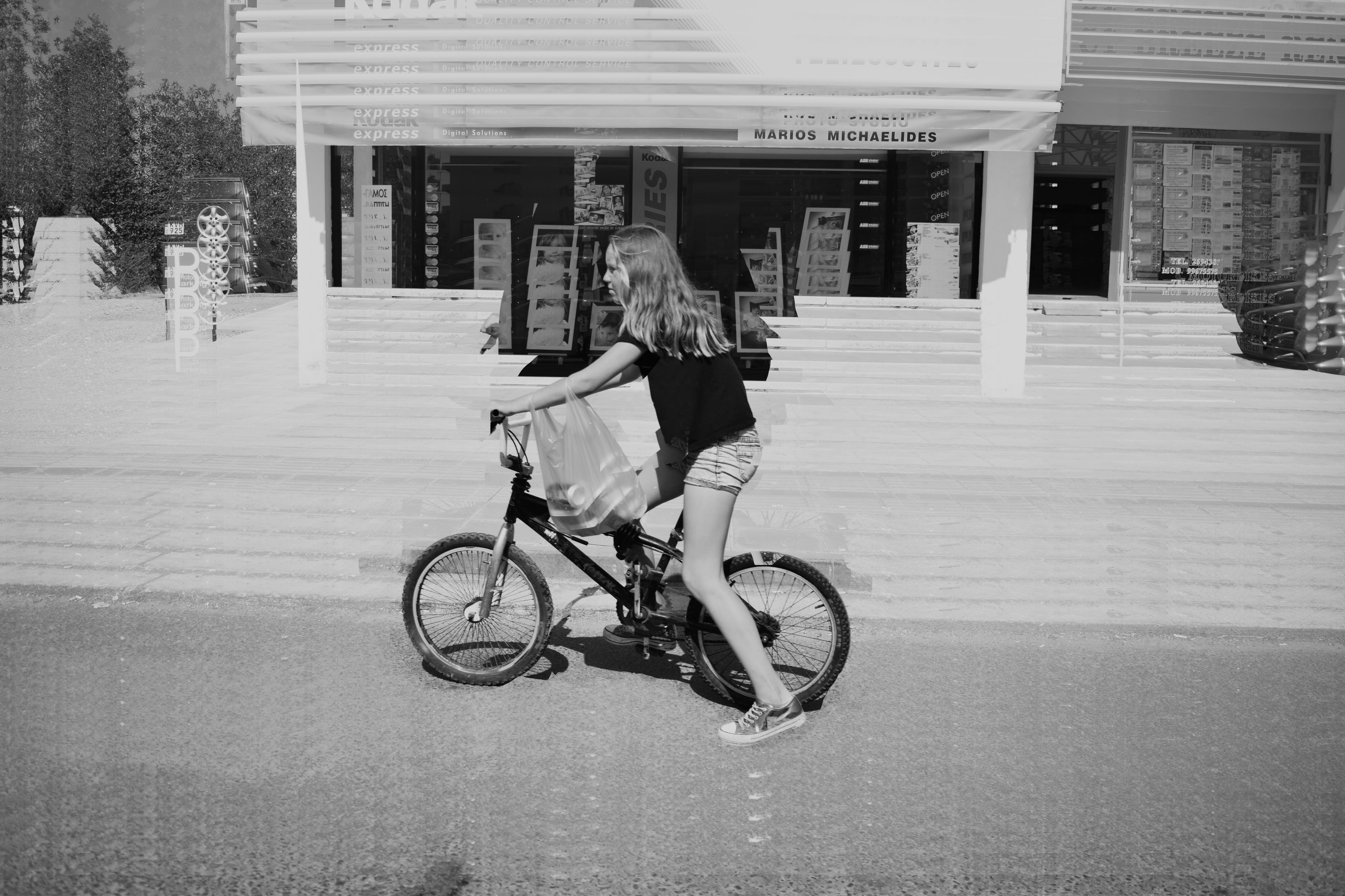
I used a street photograph i took on a trip to Paphos in Cyprus last year for my next experimental edit. I wanted to do the same layering and blending technique but in a vertical rippling motion. I also rubbed out all the layers covering the girl on the bike apart from the background layer giving a focused part of the image.

After looking at Khan’s images I noticed that many of them are edited to seem almost like a general essence of the true original images. I interpreted this into another image from my trip to Paphos. By sharply adding and blending about 10-12 layers together it created this essence effect, only revealing and repeating rough outlines of the peoples bodies.


Contrasting portraits – Shoes and Legs – Planning


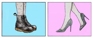
I want to create a diptych image with a contrasting set of lower legs and feet wearing different shoes. One pair with hyper-feminine connotations, sparkly silver, Cinderella style heels  on a pink background and the other with contrasting masculine connotations, black docs martens on a blue background. Another key feature of the contrasting portraits is presence of and lack of leg hair. The act of shaving leg hair is something that is considering feminine and is expected of women in our society. I have chosen to continue growing out the hair on my legs for the purpose of the masculine shoot before I will have to shave them for the feminine counterpart of the diptych. I would also like to maybe experiment with creating a portrait where i have only removed the hair on one leg to get another sense of contrast. I’m not sure if this image will be particularly successful but i think it will be worth trying.

Above is a fine liner drawing which I then altered in Photoshop of what I want to aim for when creating the feminine counterpart of my diptych. In my hyper-feminine image I want to give a sense of femininity through the use of the colour pink, feminine foot wear and a more feminine pose, the typical “popped toe” I also want my pairs of feet to be facing each other to create a sense of symmetry and contrast, although i also plan to experiment with different angles and will see which works best later on. For this image I plan to use my pink backdrop which I unfortunately ordered in the wrong size, but for a more close up image I hope that this will not be a problem.

Above is a fine liner drawing which I then altered in Photoshop of what I want to aim for when creating the more masculine counterpart of my diptych. I plan to establish a sense of masculinity by not polishing my boots for a few days before the shoot to ensure that they have a few scuffs and scrapes, the “worn” look will connotes masculinity because the wearer has clearly been wearing them regularly in not so clean environments. As previously stated, I also want to include leg hair in this image to go against the expectation that women should have to remove their body hair. I also plan to use my blue backdrop for this image, but it unfortunately was shipped to me folded up rather than rolled so I will need to find a way to iron vinyl without it melting.

Clare Rae-Performance and the Body

Clare Rae is an artist based in Melbourne, Australia but she is currently visiting Jersey as part of the Archisle International artist-in-residence program. She is here to to research the  Claude Cahun archive and shoot new photography and film in Jersey.  This week I attended a talk she gave at the museum about her photography and film. She spoke about how she explores performance and representations of the female body and her connection to physical environments. Performance photography normally involves as artist staging a performance for the camera and testing the physical and psychological limits of the body.
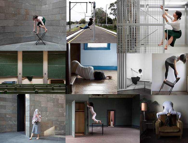
Rae began the talk by discussing the research areas that have influenced her work such as feminist theorists like Laura Mulvey. She also mentioned her artistic influences; photographers such as Francesca Woodman, Jill Orr and Cindy Sherman. She went on to talk about her own photographic methodologies and techniques. Her work is mostly self-portraiture which involves her exploring physical environments and challenging female representations of being passive by exploring things actively/ dangerously and using awkward poses. For example in her project ‘Desire and the Other’ she analysed the idea of passiveness of the female body by lying on the floor, often with her face concealed by furniture or her hair.

She spoke about how she carefully chooses her outfits before going on shoots, for example she described how she changed from wearing tights because these are a very fetishized garments but now she often wears the same green skirt because it is easy to move in.

Her projects are often captured and displayed within the same environments and she is interested in how the camera can act as a collaborator, rather than mute witness, to the performer. She is known for her engagement with domestic and institutional spaces and she spoke about how her work is influenced by notions of private and public and how her performance is influenced by the gaze of onlookers. For example she talked about her experiences in engaging with the environment of the National Gallery of Victoria in Melbourne in particular the photography and print store rooms. She explained that she was followed by a guard and a curator and the idea of being watched had an impact on her final  outcomes.

The environments she explores are often fascinating in themselves for example she has explored the site of the Magdalen Asylum which is a place where girls and women were housed whilst working in laundries. On her website it explains that, These rooms are laden with history, and provided a dense and loaded environment within which to make artwork. Using this history as a starting point,I attempted to activate these spaces using my body, gently testing the physical environment”. 

In the talk I attended Rae also spoke about her project ‘20+9+5′ which is a black and white series which she did whilst pregnant with her son. She explained that being pregnant is a very ‘feminine’ state and she wanted to explore the experience of her body. She said that during pregnancy women seem to lose some control over their bodies and she wasn’t prepared for the amount of people that commented on her bodily appearance on a daily basis and how people thought they had a right to touch her. Rae later returned to the same location that she took these images once her son was born and photographed them together. She explained that her use of a mirror was influenced by a previous project ‘Stages’ which was a collaborative project with Simone Hine and involved exploring the environment of the Rosina Auditorium and she was intrigued by the use of mirrors and reflections involved in this.

During the talk Rae also showed some of her stop-frame animation videos made from photographic stills such as the one below which I thought was particularly interesting. She said that when she is presenting her work she often leaves it playing on a continuous loop which makes it appear more and more exhausting and it grows more ridiculous every time. On her website is explains that this piece was inspired by her research into feminist theories of representation and how this often relies on binary opposites. The title is ‘The Good girl and the other’ which relates to the idea that the ‘Good girl’ is a recurring motif in culture and society but Rae wanted to complicate the traditional notions of femininity.

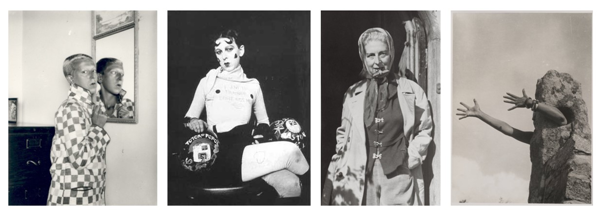
Rae also spoke about her work on the Claude Cahun archive and how she has been able to look at almost every image produced by her. She says that it was interesting to see how Cahun’s body changed and aged over time because she began photographing at a teenager and the oldest photograph of her was  from a year before her death. Cahun was born as Lucy Schwob and was from a wealthy Jewish family living in France. Her work was political as well as personal and focused on challenging traditional ideas associated with gender. This often involved  using costumes to experiment with different personalities from ultra feminine to masculine. She adopted the  gender-neutral forename Claude and by shaving her head she actively and outwardly rejected social constructions of gender and sexual identity. Her partner Suzanne Malherbe (who was also her step-sister and life-long collaborator in artistic projects)  adopted the pseudonym Marcel Moore. During the rise of the Nazi party the couple fled from Paris in 1938 for Jersey.  When the Nazis invaded Jersey Claude and Moore employed avant-garde art practices as a form of resistance. For example they created anti-nationalist leaflets mocking Nazi ideology and distributed them throughout Jersey in soldier’s pockets and on their chairs. They were sentenced to death for inciting the troops to rebellion and refused to sign letters asking for mercy, perhaps believing that martyrdom would be the most fitting end to their lives of resistance. However they were saved from execution anyway because of the Liberation of the Island.

Cahun’s revolutionary examinations of gender and sexuality were well ahead of her time and inspired many artists including Clare Rae. Cahun’s work has many connections to Rae’s in that is focuses on feminism, self-portraiture and performance.
Performance photography and self-portraiture is not something I have explored greatly in previous projects although I think it is an interesting concept.  The work of Rae and Cahun have strong links to the theme of ‘Environment’ because it relates to their psychological and personal environments as well as the politcal context of the time. After attending Clare Rae’s talk I feel I have developed a better understanding of the messages behind her art which is interesting to consider in relation to the work of Claude Cahun. If I was going to respond to this style of photography in some way I might be able to bring in the idea of the mirror from my previous project and explore ideas about self-portraiture and mirrors/reflections.

The Plan

// S P E C I F I C A T I O N //

“Write a specification with 2-3 ideas about what you are planning to do. Produce at least 2-3 blog posts that illustrate your thinking and understanding. Use pictures and annotation”

ONE

The first path I have investigated plays with the idea of techniques within photography and the way digital manipulation can advance images. Taking words from my post ‘Stereoscopic’, I explored the idea of multiple exposure images as a way to ultimately explore and expand on the idea of environment.

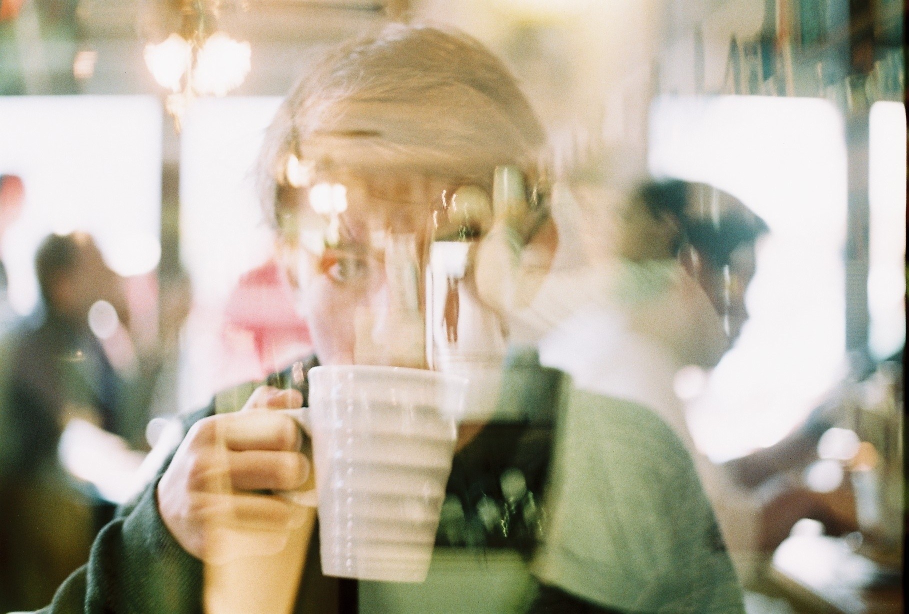
Double exposure photography is an area which aesthetically interests me. The process of combining multiple images to create a final photo – often with colour and contrast variations – can not only be used aesthetically but also symbolically. Tying this to the theme of environment (and possibly portraiture?) could produce some graphically interesting outcomes where people can be merged with their personal landscapes. Working on this idea can involve both
digital and analogue images which I intend to take advantage of in this project. 

So this pathway would involve a set of double exposure images tying people to particular environments of significance for them, perhaps showing how the environment ultimately affects the human form and body.

TWO

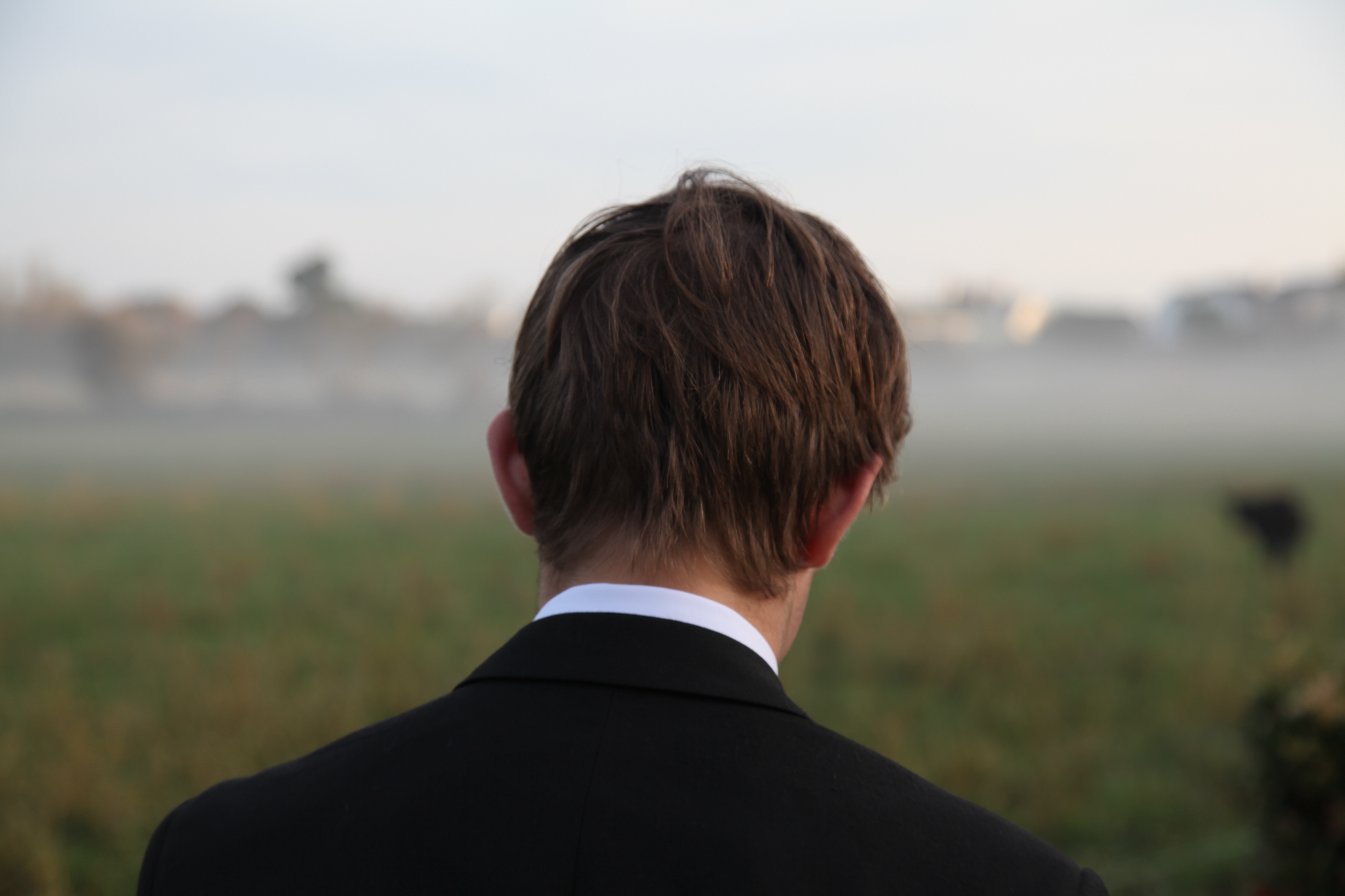
The second idea I could follow and develop further is the thought of mental effects of the environment on people – in particular playing to the idea of loss and homesickness. With so many of my peer group on the edge of moving away for university – or being on the other end of the spectrum as the ones who will be left behind – this is perhaps a more unique briefing to follow. For this idea, as explored in my previous post ‘ Run Away’, I would look to shoot a series of portraits featuring a set of characters in two locations. The first would be their home setting, most likely in a bedroom or somewhere of significance to them within the house. The second portrait will feature the same person in an environment of their choice. The point of this will be to show a particular area or landscape they will miss when they leave – most of them to university in a few months time. The images for this project will feature a mixture of front facing images and backwards portraits such as the one below which will highlight the environment chosen by the subject.

The point of both of these idea concepts is to design a project that will allow me to explore environment within a field of portraiture. One is probably more studio focused with the second idea taking me to a variety of locations which is why ultimately I have chosen to focus on this project. To start this idea, I intend to shoot one of the sets planned out in my previous blog posts as a way to test the stability of the project. This will involve a single character with photos centred around their personal fears related to leaving home. 


Clare Rae Artist Reference

Clare Rae is an Australian artist who is currently (as of March 2017) working as an artist in residence in Jersey. She is however, based in Melbourne and has produced most of her work in Australia. On the 22nd March I attended a talk directed by Rae, explaining her previous work, her interest in the research of Claude Cahun with the Jersey Archive and a brief overview of her intentions to produce some work inspired by her research. Her work explores ideas such as performance, movement and the representation of the female body. Her work is predominantly self portraiture where she is in motion or a clear, strong pose as a reaction to the environment she is producing work in. Rae has played with the idea of public and private spaces and how one uses their body and acts in different way according to whether or not they are in a public space. Rae has also spoken about how her work is affected by the gaze of onlookers, she generally produces her work in private, performing only for the camera. However, in a project produced in the National Gallery of Victoria in 2013, Rae was followed and watched by both a curator and a security guard which she admits, affected the  way the she performed and the movements and poses that she decided to use. Despite this Rae still produced the intriguing video art piece (still pictured below) where she climbs up and down a decanted rack, admitting that the climb was very painful.

Rae’s work is influenced and produced with an understanding of feminist theory, she explores the representation of the female body within the medium of art and photography, describing them as “objectifying” in the simplest way as a photo or piece of artwork is an object, if it depicts the form of a woman then she is, in turn, “objectified”. In Clare Rae’s earlier work from her undergraduate degree including “Desire and  the Other” (2007) displays the female body in a passive and acquiescent way, often lying on the floor with the face concealed in one way or another, either out of shot or obstructed by clothing or objects. In slightly later works such as “Climbing the walls and other actions” (2009) and “Testing” (2010) present the female body is a more active provocative way, although still often concealing the face with her notable short, dark bob. In these works Rae plays with the idea of suggested nudity through her use of tights and stockings which are translucent garments that cover but do not conceal what is under them. Tights and stockings are also garments with sexual connotations and Rae mentioned during this talk that she wanted to step away from her use of (however subtle) provocative clothing so that the focus was on the performance and movement, adding that her use of pantyhose could become a “slippery slope”.

Rae mentioned in the talk that during her research of Claude Cahun’s she was able to looks at almost every photograph she had produced that there was record of in the archive. She stated that it was fascinating to see her body age and her work develop from the work she produced as a young woman to the year before her death. Rae also spoke of how she felt that the bodies of older and aging women are not presented or explored enough in art and photography. A project that related to this belief is “20+9+5” produced during the months between October 2014 and May 2015 where Rae was pregnant. All of the images in the project where created and displayed in the Sutton Project Space in Fitzroy, Victoria. She explored how the pregnant female form is presented as well as her won feelings of being objectified during her pregnancy as she felt that she lost full ownership of her body due to the amount of people, often strangers, feeling as though they had a right to touch her. After her pregnancy, Rae went back to the space and created more using her son which show a sense of development. When the photos were displayed however, Rae positioned them in a way that made the images appear as if they were not in a chronological timeline.

I found the work of Clare Rae very visually intriguing but also incredibly interesting once I attended her talk and was able to understand her thinking behind her images and work in general. It was interesting to hear another artist talk about their work in a critical way, as Rae stated that some projects were more successful than others and also spoke of what she would do differently if she was to reproduce the work. I want to take some inspiration from Clare Rae’s work and as in my own project I am having to be myself or a version of myself in front of the camera which is something that I struggle with.


Matthew Lyn – Plastic pollution inspiration

Matthew Lyn is a Canadian photographer and creative director renowned for his intuitive and textured talents in the world of fashion photography. Son of a Chinese Jamaican father and Canadian mother, his visual inspirations hail from his many different homes growing up as a child. Now days Lyn, divides his time creating in New York and Montreal, Canada. His eye for fashion photography has been described as uniquely exhilarating and fresh, while holding true to a bold classic edge. Lyn started his photography career in 2007 focusing on inspirations from Jamaica’s coastal beauty. From there, he channeled his vision through experimentation, collaboration and mentor-ship from highly acclaimed visual artists. Despite no formal training, his early photographs captured the attention of industry insiders. Andy Whalen, Executive fashion director for Vogue Nippon believes, “Matt is a young talent to keep an eye on. He has a vision that I find refreshing and inspiring”. Encouraged by many creative professionals, Lyn solidified his unique style, developing the moody, gray-scale fashion editorials that have become his signature.

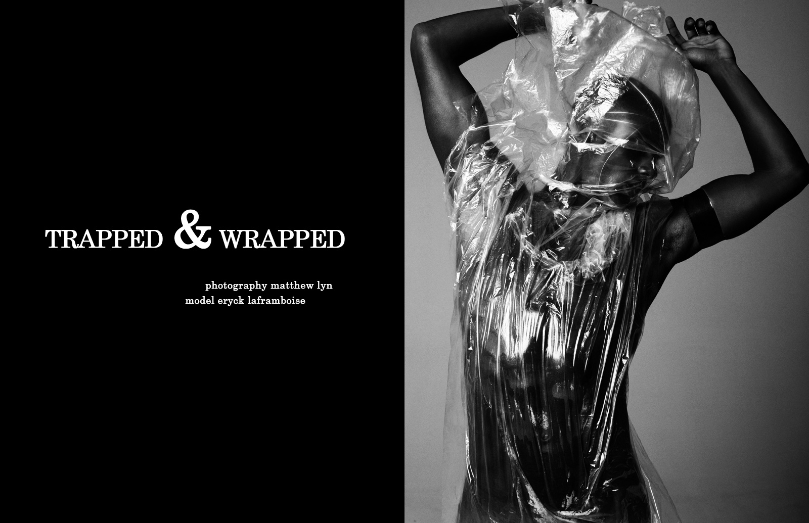
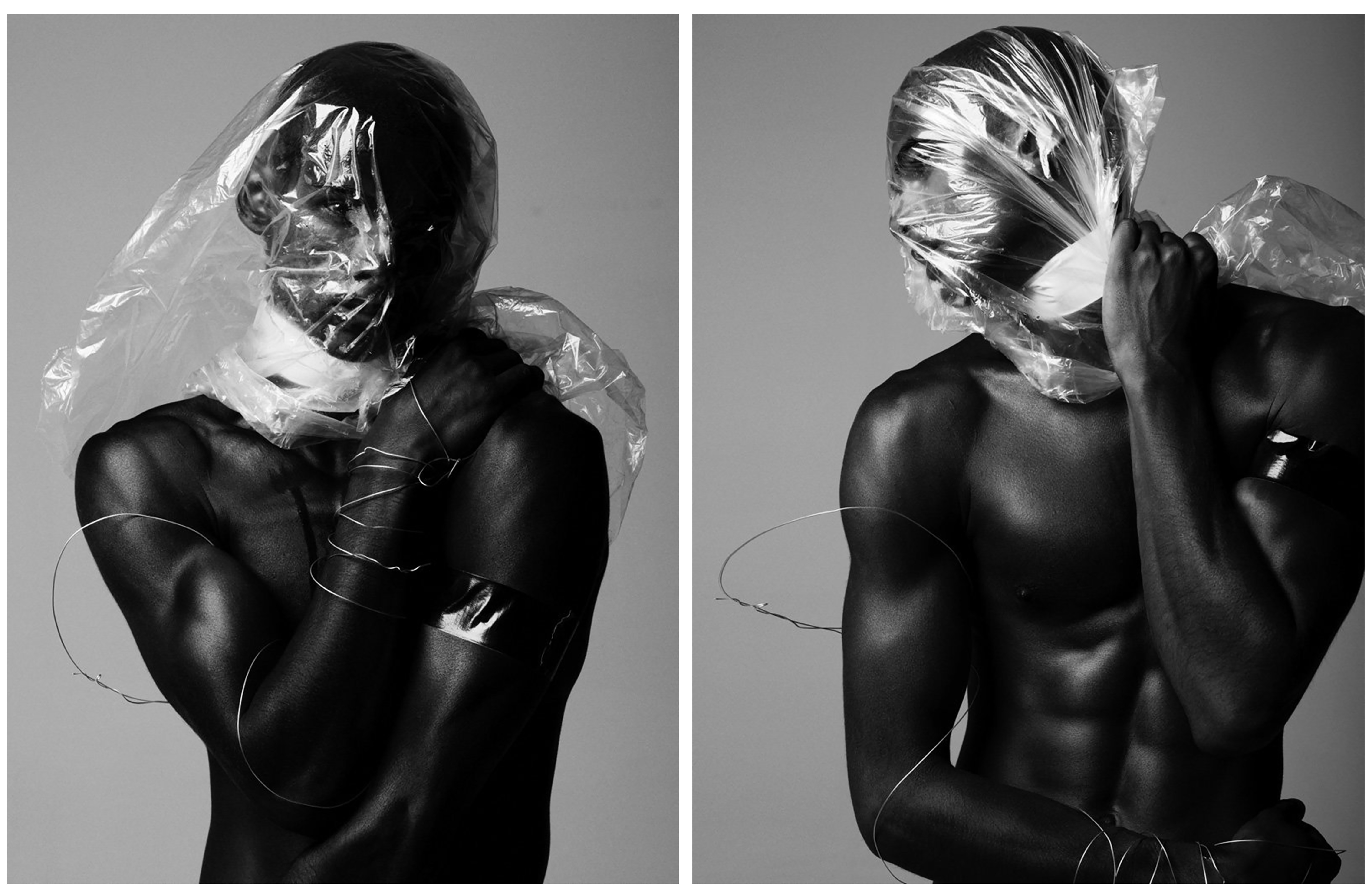
Before I move on to my own studio shoot with plastic I first wanted to explore Matthew Lyn’s amazing examples that I have presented below. Although these images are fashion photography related, their undeniable beauty and talented showcase of light and shadow on the material is enough to inspire both my next two shoots. This series, entitled ‘Trapped & Wrapped’ strips away the usual elements for a raw photo shoot. Instead of the simple portraiture techniques this fashion shoot could have contained, Lyn turns the studio into a place of pure movement and form. His model Eryck Laframboise tackles the challenge, clad in plastic and wire creating striking, unusual and emotional depictions. This title, ‘Trapped & Wrapped’, fits in nicely with my project as I am wanting to represent the worlds ‘suffocation’ from this material as well as the damage it’s doing to the environment and therefore man-kind. Although this is a fashion photography project, this series is an amazing inspiration for creating dark and emotional portraits with plastic. I love this idea he shows of wrapping the model in plastic, for me it would represent the way we do this to everything else. Below are four images from this series that I have chosen as inspirations for my next two shoots.

These first two photographs from Matthew Lyn’s collection, ‘Trapped and Wrapped’, are great examples of the kind of headshots I am hoping to create in my first self portraiture shoot. I love the black and white effect in all of these photographs, as it really emphasises Lyn’s talent for controlling light in the studio. The first image on the left shows a straightforward headshot with the model posing in a modest way, carefully wrapped in plastic and wire. Although the meaning behind this image is mainly beauty and fashion, the expression from the model and piercing eye contact creates amazing emotive qualities which can really intrigue the viewer. The image on the right depicts the model holding the plastic tight around his neck, straining as the material covers his face and suffocates him. Because of the title of these images, we are to understand that there is a deeper meaning looking past just beauty and fashion. But as it is left unexplained by the photographer, we can interpret the meaning ourselves. I will be doing this personally when using this simple idea for portraiture to symbolise the global problem of plastic waste. I hope to take inspiration from his use of space shown above, his use of the material and his beautifully crafted studio lighting.

These next two images are perfect examples of full body portraits using beautiful composition and space to capture plastic waste. These images will be a great inspiration for my second shoot, using a model and the material to show this common pollution issue. The first photograph on the left is a landscape shot showing the model breathing in the material and it floats across the scene. Although I will most likely featuring more of my model in this second shoot, I chose this image because of the beautiful composition the plastic creates as it is thrown into the air. I also love the transparency of scene with a mixture of harsh and soft light gleaming from every aspect. The next photograph on the right shows the full portrait of the model using the plastic wrapped around to cover himself. The meaning behind this image is very confusing and the pose he is performing seems unsure, yet the beauty of the light on the plastic that is distorting his body takes on a fashion orientated appearance. I if were to interpret these images with no prior knowledge of the photographer or his work I would say that this is a raw look into our dependence on this man-made material. This is because of the wire symbolising being trapped as well as the essence of the photographs directly pointing towards the effect the material has on the model.
Specification for third shoot

My third shoot will be in St Catherine’s woods and possibly the Sand Dunes if their is enough time before the sun sets. This shoot will be on Friday 24th March.

My previous shoot was unsuccessful as my practice with shutter speed and aperture in my practice shoot did not help me because all the photos which i took on that shoot are grainy. This is really disappointing as the photos do look good from afar but they appear grainy if printed or zoomed in. I will most likely redo the scenes which i think looked the best which will be in the hedges and on the rocks.

St Catherine’s Woods plan:
  • My first idea was to photograph my model’s reflection in the lake of St Catherine’s with the mouth mask and the gas mask.
  • My second was to create a juxtaposition of innocent and sinister using the swing which is in the woods.
  • I am going to make sure that my ISO is not set on auto and i will make sure my shutter speed is not incredibly high as i do not need it to be like that.
  • I will use the trees to create interesting light patterns and shadows which they can sit under.
  • I want to create a juxtaposition between the beauty of the woods and how we associate them with clean air and how my gas mask is how we will breath in 100 years time.
  • I need to be careful to not choose areas in which the light is dark as i want to make the most of the natural light coming through the trees. If the light is too dark, the mask will not stand out as much as i want it too.
  • The clothes they are wearing will be normal as i do not want to dress them up but for future reference, i will ask them to wear the same outfit for the rest of the shoots to keep a consistent look throughout.
  • I think with this shoot i will create a couple of image sets in which i have both models in the shot but only wearing a mouth masks. I also want to try create a contrast image between both models, where one is wearing a gas mask and the other a mouth mask.
  • I only have one gas mask so i can only photograph one model at a time in it
  • I want to try incorporate open spaces and water into my photos as they will make them interesting and will create different appearances in my photos.