These photographs below are the result of planning my next two shoots carefully as well as exploring the beautiful examples created by fashion photographer, Matthew Lyn. I decided to begin with this self-portraiture / head-shot shoot because I didn’t need to rely on any models at the time and created this in my bedroom using the materials I had on hand. The symbolism I am hoping to show, with this idea of using plastic waste in the studio, is the problem of plastic being used for everything (filling our surroundings), the effect it has on animals and marine life, as well as our connections to this issue.
To complete this shoot I set up a makeshift studio in my bedroom by hanging a black sheet up on the wall and using a large desk lamp for artificial lighting. As you can see below in my contact sheet of original photographs I took each shot using a very dark exposure. The reason I often do this for studio photography is the edited results always take on a contrasted / dramatic look. When controlling the artificial lighting in these images I took inspiration, from the work of Matthew Lyn, and experimented with many different angles as well as softening it using white material as a buffer. To properly get across the symbolism of this shoot I tried experimenting with different plastic waste materials using the main ideas of distortion, beings trapped and suffocation. I think the outcomes of this shoot will go nicely with the finals from my ‘Common Pollution Issues, Part 1’ as they both display dark, symbolic and dramatic qualities. Below are a select few of the original images from this home-studio shoot presented as a contact sheet …  When selecting my final outcomes out of the images above I wanted to make sure that I included a varied selection so that I can get across my symbolic point clearly. Below I have chosen four photographs (out of the 6 images above) that each show something quite different, whether it be the tone created by lighting , type of plastic material, or pose. When it came to editing these photographs the first thing I did to all of them was increase the exposure and play with the contrast. After this I judged each photograph individually and went through my normal editing routine of changing things like temperature, clarity, saturation, highlights and shadows. The reason I have included a mixture of colour and black and white outcomes is to tie into my first studio section, showing the common pollution issue of cigarette waste. Below are my final outcomes…
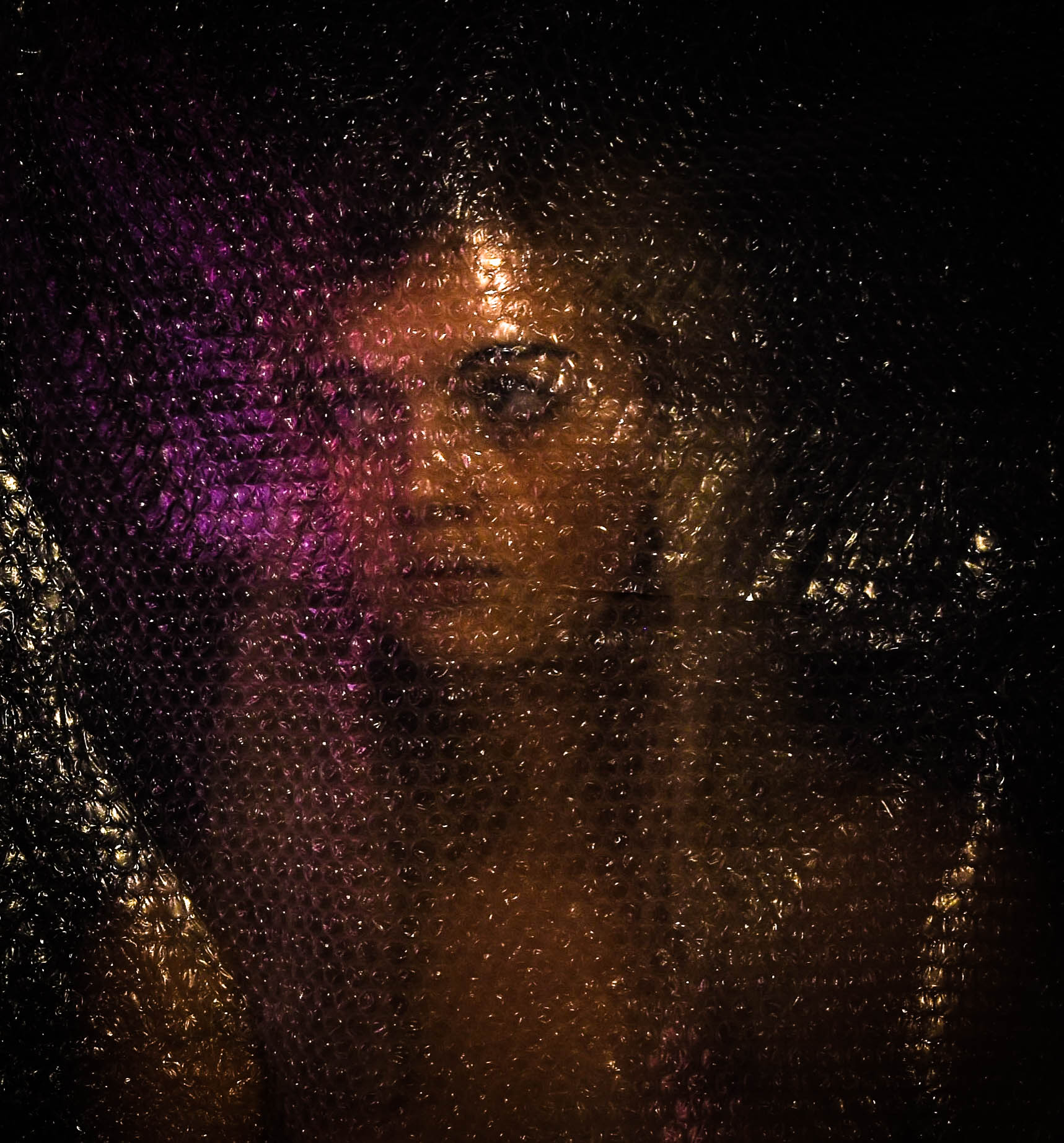 This first photograph is one of my favorites from this shoot, mostly because of the straightforward yet distorted composition and interesting light. To create this self portraiture piece I used a shutter button (to take the images), a black sheet as the background and a large piece of bubble wrapped that I have kept since last ordering something online. I like this piece as the colours and interesting light techniques shinning off the bubble wrap, reminds me of the beautiful plastic fashion photography done by Matthew Lyn. The symbolic meaning behind this image is not only to emphasis our connection to this global problem, but also to show our ignorance and how we do not allow ourselves to be affected by its gravity. This is represented by the fact I am looking away from the plastic that is right in front of my face, as well as my concentration on the pretty pink light that is being emitted from the side. As well as this, even though this shoot was purely symbolic and not documentary, I have managed to reuse a huge example of real plastic waste.
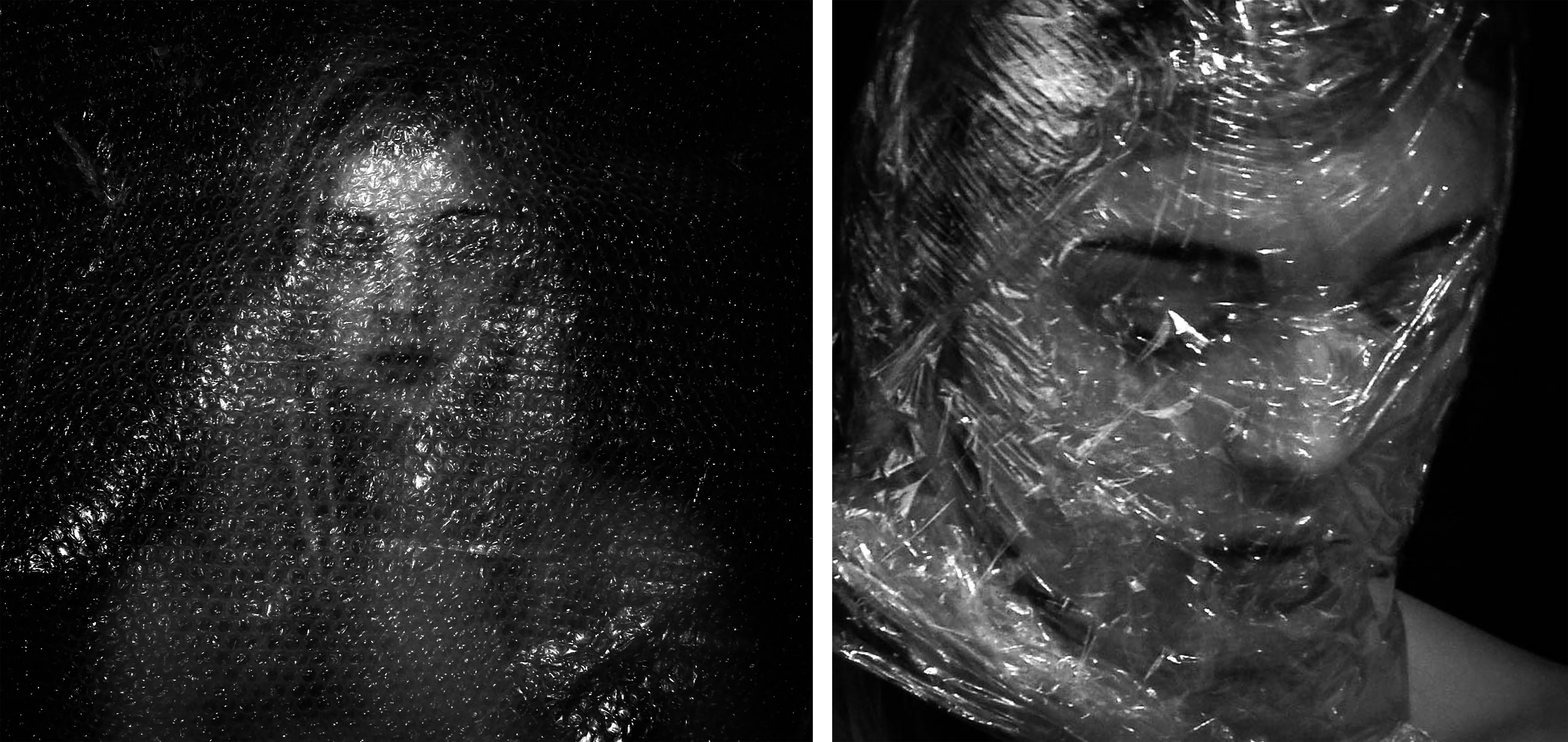 Here are two final outcomes that in my opinion, are not as meaningful as the larger ones above and below. The image on the left shows my second favorite from the bubble wrap shoot, made by simply taping the plastic above me and sitting underneath. The visual elements in this piece are a straight forward self-portrait, emphasised by dark edges and distorted by plastic. The meaning behind this photograph is linked very closely to the photograph above, showing our connection to this issue. Although the straight ahead look takes away from the representation, I do like this image for is black and white dramatic impact. The image on the right however is very different, showing one of my experimentations using cellophane instead of bubble wrap. To create this look I carefully wrapped the material around my head (making sure to create air holes as I went round) until it started to make interesting creases for the artificial light to bounce off. The meaning behind this photograph is very much to do with representing the way plastic kills animals and marine life. However the way I have wrapped myself in plastic also symbolises the way we do this the pretty much everything else. I like the clear message I can get across with this image however, in my opinion, its is not as good as the larger version I have presented below.
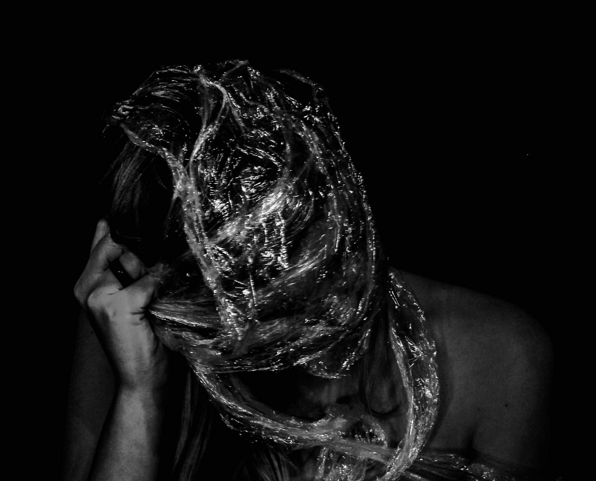 Lastly is my other favourite final edited outcome from this self portraiture shoot. This photograph depicts a very strong symbolic message using self portraiture, a home-made studio and cellophane. To create the plastic wrap look I bunched the cellophane together, making more of a textured surface for the light the reflect off, and tightly wrapped it around my head until I could pretty much no longer see. The reason I have decided to have bare shoulders in these images is because, after trying multiple tops, clothing was really taking away from the representation and making the photographs a lot less dramatic. For me, the symbolism behind this photograph in particular is very strong because of the composition, material and pose. Here I am representing not only the way plastic kills animals and marine life, but also the struggle these creatures endure. This is much clearer in this image, than it was in my last outcome, because of my visible struggle to break free, paired with the dramatic impact created by very dark contrast and 0% saturation.






 When selecting my final outcomes out of the images above I wanted to make sure that I included a varied selection so that I can get across my symbolic point clearly. Below I have chosen four photographs (out of the 6 images above) that each show something quite different, whether it be the tone created by lighting , type of plastic material, or pose. When it came to editing these photographs the first thing I did to all of them was increase the exposure and play with the contrast. After this I judged each photograph individually and went through my normal editing routine of changing things like temperature, clarity, saturation, highlights and shadows. The reason I have included a mixture of colour and black and white outcomes is to tie into my first studio section, showing the common pollution issue of cigarette waste. Below are my final outcomes…
 This first photograph is one of my favorites from this shoot, mostly because of the straightforward yet distorted composition and interesting light. To create this self portraiture piece I used a shutter button (to take the images), a black sheet as the background and a large piece of bubble wrapped that I have kept since last ordering something online. I like this piece as the colours and interesting light techniques shinning off the bubble wrap, reminds me of the beautiful plastic fashion photography done by Matthew Lyn. The symbolic meaning behind this image is not only to emphasis our connection to this global problem, but also to show our ignorance and how we do not allow ourselves to be affected by its gravity. This is represented by the fact I am looking away from the plastic that is right in front of my face, as well as my concentration on the pretty pink light that is being emitted from the side. As well as this, even though this shoot was purely symbolic and not documentary, I have managed to reuse a huge example of real plastic waste.
 Here are two final outcomes that in my opinion, are not as meaningful as the larger ones above and below. The image on the left shows my second favorite from the bubble wrap shoot, made by simply taping the plastic above me and sitting underneath. The visual elements in this piece are a straight forward self-portrait, emphasised by dark edges and distorted by plastic. The meaning behind this photograph is linked very closely to the photograph above, showing our connection to this issue. Although the straight ahead look takes away from the representation, I do like this image for is black and white dramatic impact. The image on the right however is very different, showing one of my experimentations using cellophane instead of bubble wrap. To create this look I carefully wrapped the material around my head (making sure to create air holes as I went round) until it started to make interesting creases for the artificial light to bounce off. The meaning behind this photograph is very much to do with representing the way plastic kills animals and marine life. However the way I have wrapped myself in plastic also symbolises the way we do this the pretty much everything else. I like the clear message I can get across with this image however, in my opinion, its is not as good as the larger version I have presented below.
 Lastly is my other favourite final edited outcome from this self portraiture shoot. This photograph depicts a very strong symbolic message using self portraiture, a home-made studio and cellophane. To create the plastic wrap look I bunched the cellophane together, making more of a textured surface for the light the reflect off, and tightly wrapped it around my head until I could pretty much no longer see. The reason I have decided to have bare shoulders in these images is because, after trying multiple tops, clothing was really taking away from the representation and making the photographs a lot less dramatic. For me, the symbolism behind this photograph in particular is very strong because of the composition, material and pose. Here I am representing not only the way plastic kills animals and marine life, but also the struggle these creatures endure. This is much clearer in this image, than it was in my last outcome, because of my visible struggle to break free, paired with the dramatic impact created by very dark contrast and 0% saturation.






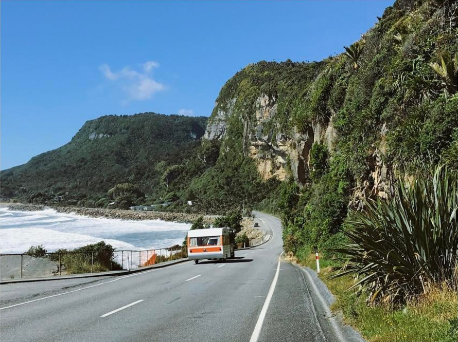
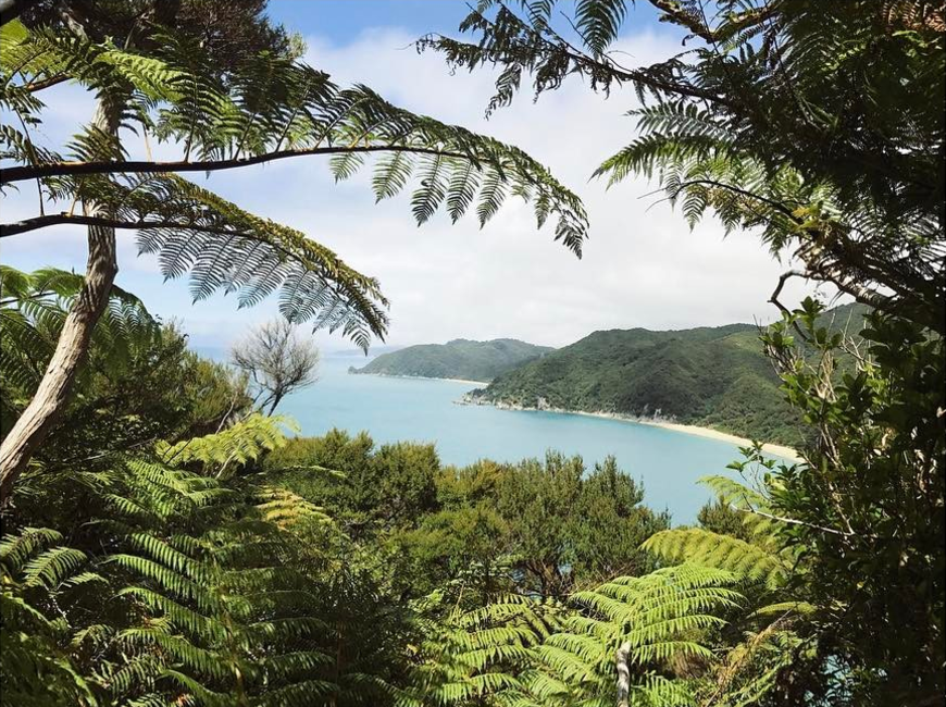
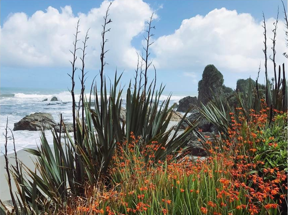 The image above features a mixture of two landscapes. You have the typical light-sanded beach scene in the background with bright greenery and red flowers in the foreground. The mixture of two environments forms a careful composition which matches colour with light and highlights the joining point between the landscapes. Arguably my interest in this image comes from the aesthetic quality of the flowers and the colour contrast between the blue sky and red plant life. With my own images, I will make sure to include elements of natural scenery to form a soft and possibly safe-seeming image. The point of the landscapes within this project are to show areas of the island we live in that people have emotional attachments to. For a lot of teenagers leaving the island, there are strong memories associated with certain places – in particular woods or beaches – which many have grown up in.



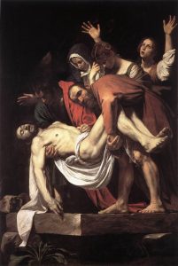 Tenebrism is a very dramatic style of art featuring a harsh chiaroscuro style as well as often evoking drama, intensity and most importantly tells a narrative. This is very present if Henson’s work with the use of black negative space and dramatic tones. There are a lot of similarities between his and Caravaggios work both visually and conceptually. Caravaggio’s work highly scandalous during his time and has been referred to as the ‘succès-de-scandale’ or the ‘antichrist of painting’. His work was highly acclaimed during his early years for his high skill level and was often commissioned such as by the Contarelli Chapel in the church of San Luigi dei Francesi. The controversy came from how he would often depict religious figures in highly realistic, approachable manor, stripping the figures from a sense of power and their religious properties and instead portraying them as vulnerable, emotional and most importantly their innate human nature, this is similar to what Henson’s was displayed in his work.








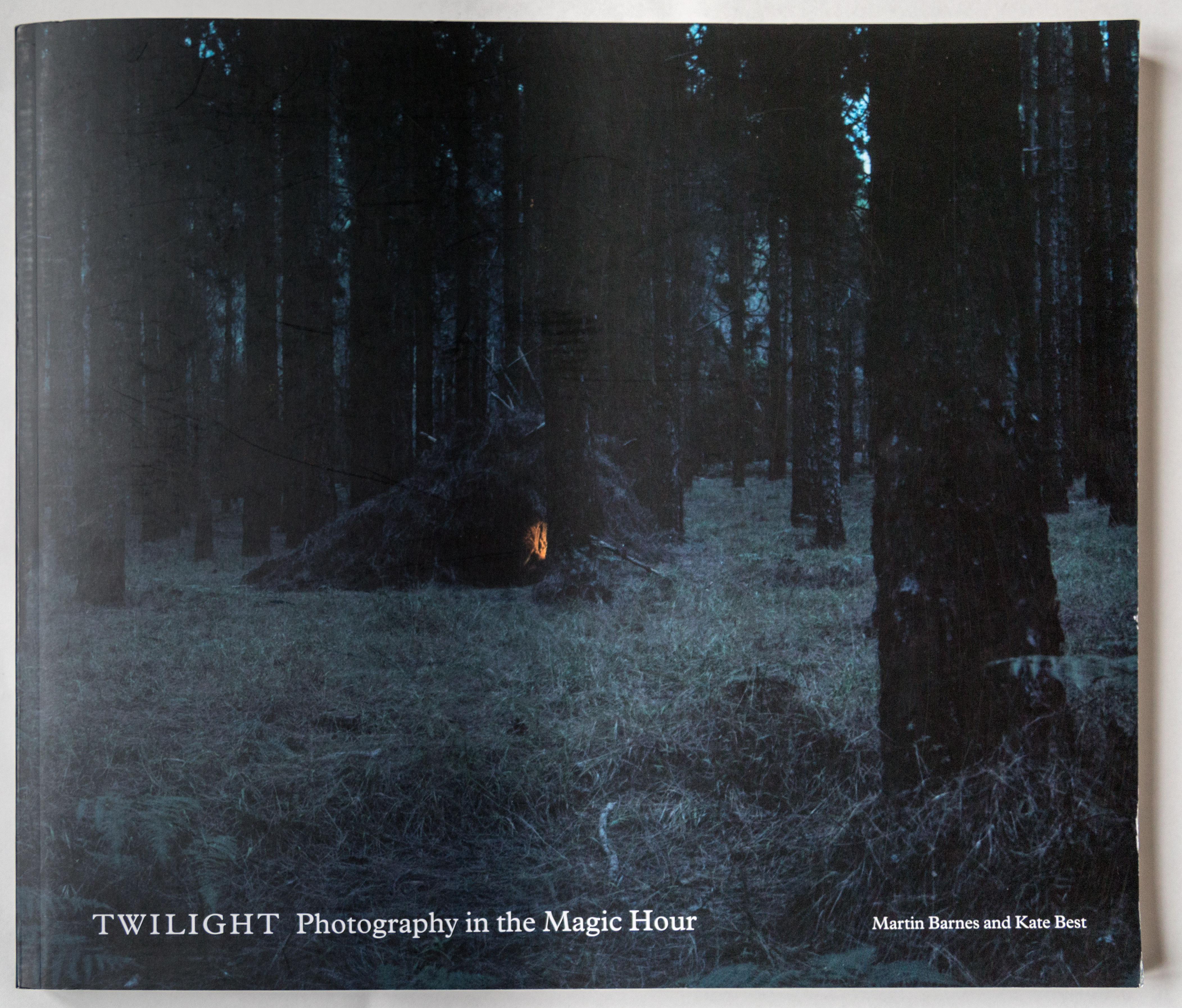





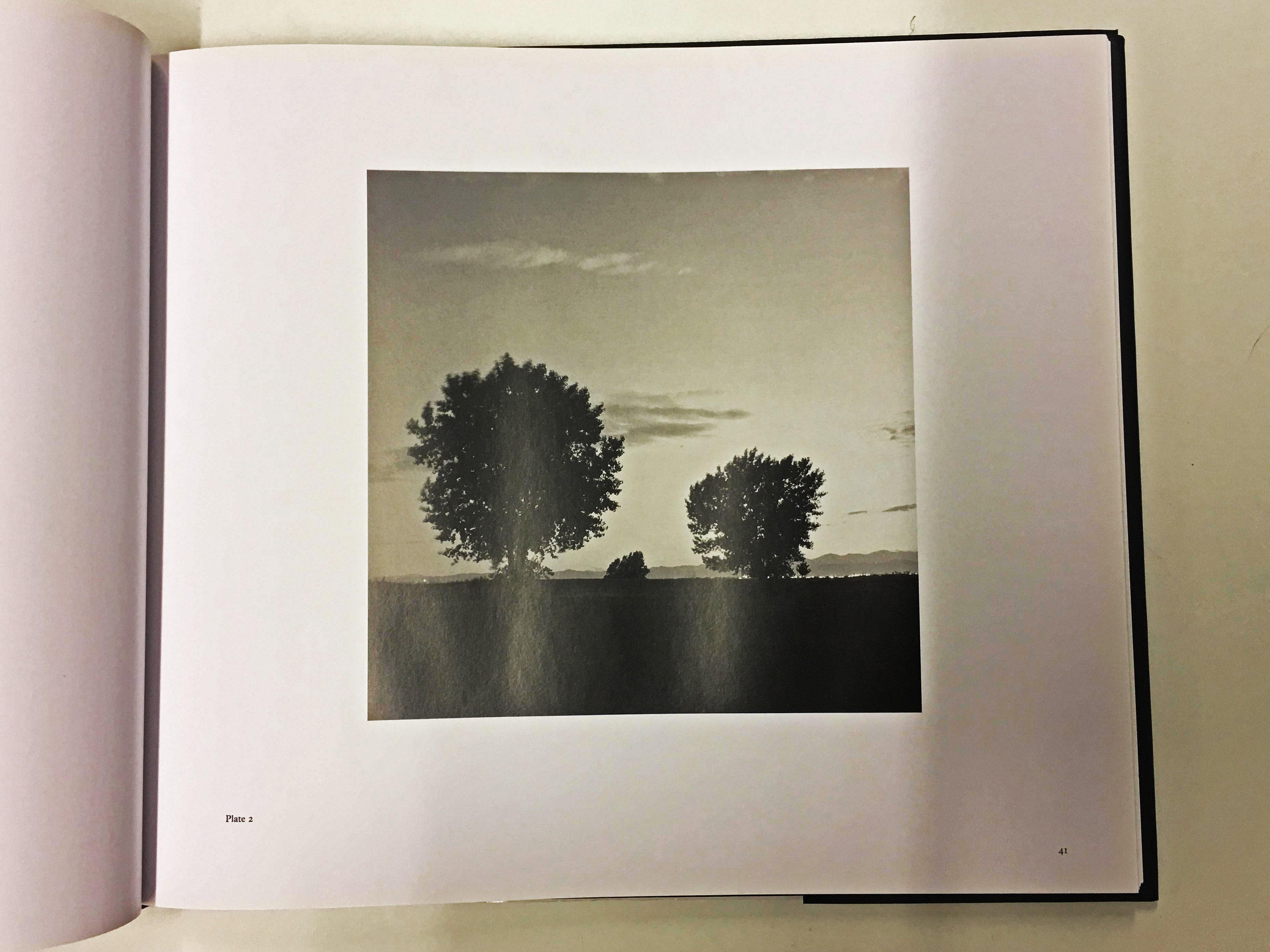

 The first essay, The Gloaming by Martin Barnes, discusses the history of twilight photography and how it develops and changes as well as the pioneers of this genre of photography. It discusses how technology has developed to create better and more experimental photographs exploring this subject. For example from the early years of early photography it was difficult to take a photographs with the correct exposure, often taking several ours just to take a single exposure. The essay brushed over subjects such as 19th century art, Phenomenalism and scientific observation. He also made reference to classical Romanticist painter Caspar David Friedrich who explored how natural lighting could elevate the landscape. e also discussed photography pioneers Nicéphore Niépce, Louis Daguerre and Henry Fox Talbot.