Christian Rodriguez

His work: https://www.lensculture.com/articles/christian-rodriguez-motobaik#slideshow

Christian Rodriguez investigates themes related to gender and identity by working with communities all over the world. His work has been published in The National Geographic, The New York Times, The Guardian and The New Yorker.

Motobaik is a term which refers to scooters in Vietnam, he has done a projected exploring Vietnamese women who wear specially designed fashionable motorbike jackets which almost cover their faces and hands when they ride. This relates to my project as i am exploring mouth masks and gas masks which cover my models face.

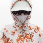
This project is similar to mine as the jackets cover their faces which is similar to what my mouth mask ans gas mask do. The women do this because they want to avoid the pollution caused by so many motorbikes and they also use it a sun protection. They do this because of beauty standards in Vietnam, having paler skin shows a higher socioeconomic status because it shows that you work in a place with no sun exposure. His photos are a mixture of formal portraiture as well as environmental portraiture, there seems to be a standard pattern for designer jacket with floral/colourful patterns being the primary design. All of his photos have a standard and consistent composition which is the same for each photograph.

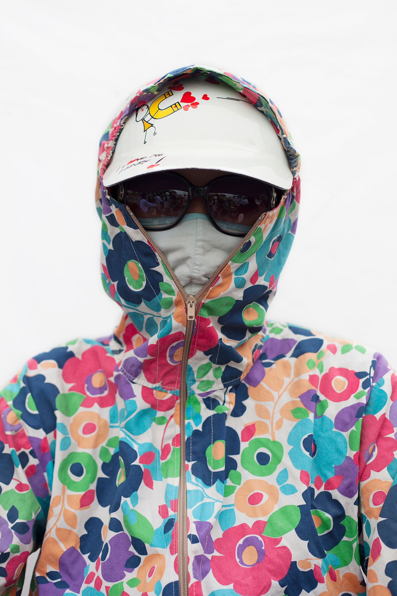
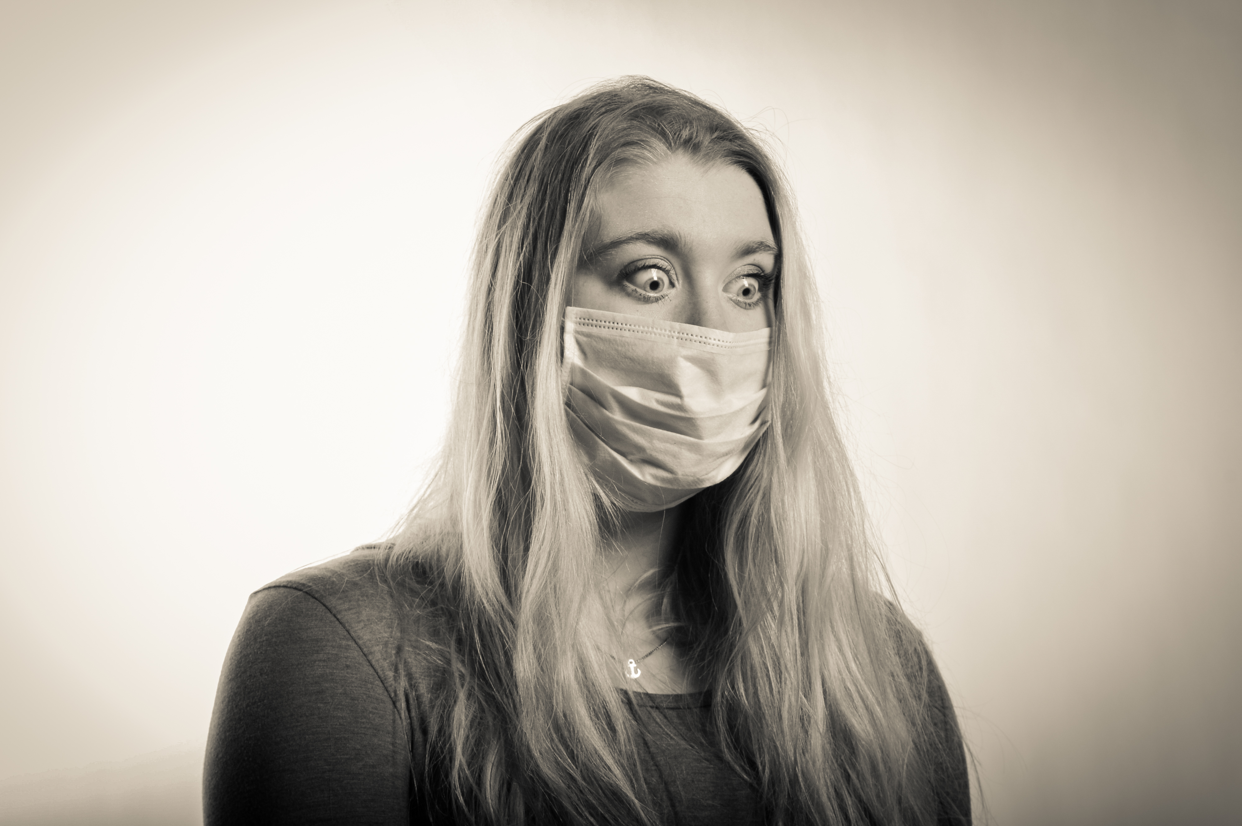
This portrait is fairly formal as there is nothing in the background to distract the eye from the women in the centre of the image, also by having a completely grey background could represent the smoke and pollution caused by the 37 million motorbikes travelling at rush hour. The floral coat stands out from the image which is what attracts the eye to begin with, this directs our vision to the full covered face on the women so that no smoke or sun can get through. The mask underneath is used for the pollution and this creates different depths to the image as the coat is on top and is what we see first then the cloth mask is what we see next. The glasses keep the anonymity of the women which makes the viewer wonder what she looks like and what kind of emotion she is showing underneath the glasses, mask and coat. The coat which the women is wearing is to protect her from the sun but it does not match her floral jacket but it blends in with the pale grey background which is why it is not noticed straight away. Within the image, there are four different types of what as there is the grey/white of thr background, the bright white of the cap, beige/white of the jacket and the dirty white of the mask. These all work together to create a consistent composition of the image. This image has no hidden meaning as Christian Rodriguez project of Motobaik is very clear and the description is clear.

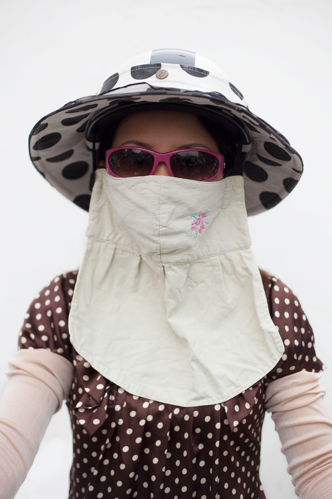
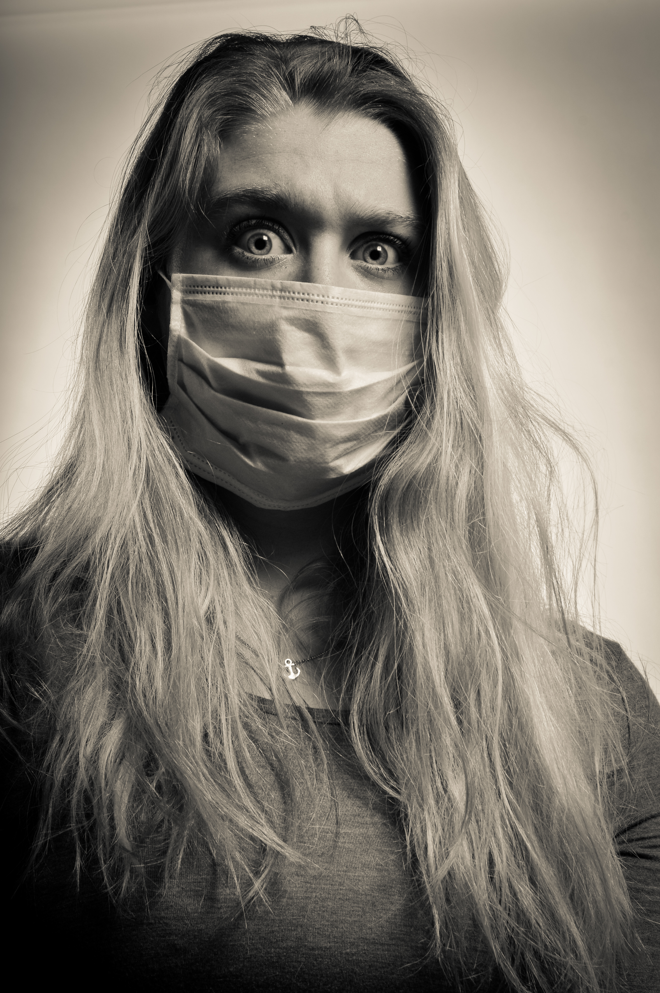
This portrait differs from the others as the women is not wearing a jacket but she is wearing a bib like cloth mouth mask to protect her against the pollution, she is also wearing sunglasses and a hat to protect her against the sun so that her skin does not tan more as otherwise it will symbolize a low socioeconomic status. Like the other images, the background is a grey/white which for me symbolizes the pollution in the air during rush hour which is caused by motorbikes and cars. The different patterns of her outfit clash which does not make for perfect composition however as this is an environmental portrait, Rodriguez does not have control over what they wear when he photographs them. There seems to be a trend with the women he chooses to photograph as they are all wearing bold patterns and it is not clear that all women wear patterns like this but it seems to be a sign of being of a higher socioeconomic status because they can afford face masks, hats, glasses and jackets etc.. This image has the same composition as all the other images when it comes to the women’s faces in the sense that almost all the women preserve their identity with sunglasses or a low hat and Rodriguez respects this and does not ask for the glasses to be removed as they also protect their eyes against the smoke and sun. This is the only women out of my gallery to be wearing a different form of hot to a cap or a helmet, this could potentially be because she is not wearing a jacket for the cap to stay on or because she does not like it.

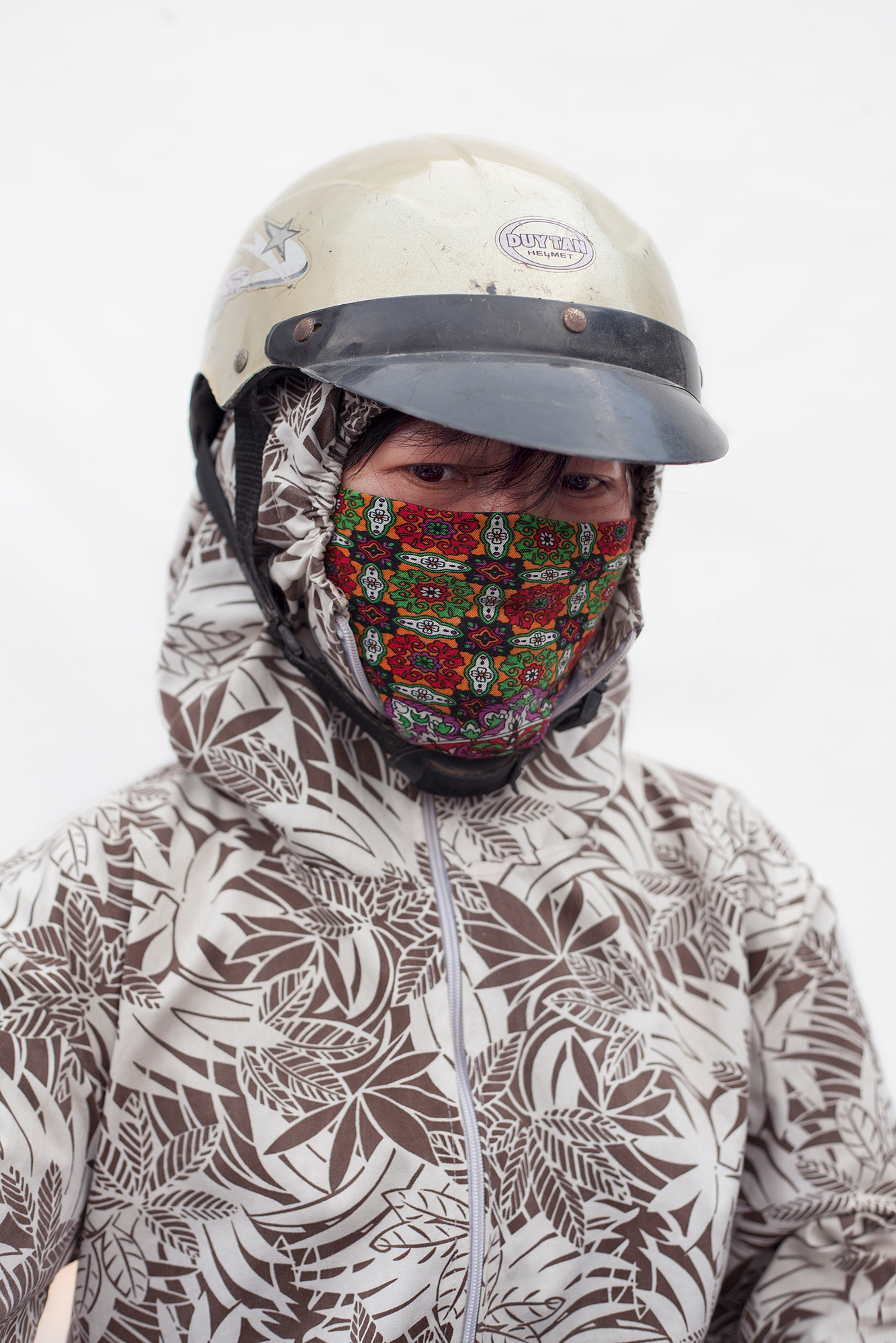
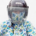
This is the only women out of my gallery of images which who has not covered her identity/eyes with sunglasses or hats. Also her jacket is not as colourful as the other women and she matches with the colours of the women above. Rodriguez has kept the same consistent grey/white background which could represent pollution. This women is the only one who is wearing a colorful mouth mask which is interesting because her jacket is lacking in colour which is why the viewers eyes are attracted to the colourful mouth mask which is protecting her from pollution. She is also wearing a helmet which is similar to a cap as it protects her eyes from the sun which is potentially why she is not using sunglasses. The mouth mask is the only colour in the whole image which is why it stands out so dramatically and makes the image much more interesting than the rest as she does not fit with all the women yet and the same time she does. The eyes of the women show lots of emotion almost sadness but we do not know, possibly because she has to wear all of this just to fit in with beauty standards in Vietnam and protect herself against the high levels of pollution during rush hour.

Final Book Design

LINK TO FINAL BOOK DESIGN

I was especially inspired by photographers Todd Hido and Bill Henson for their use of twilight lighting to evoke an enigmatic and dynamic environment with the use of natural and man made lighting. I was especially intrigued by the juxtaposition of these two features which I have explored thoroughly in my work. I also looked at the photo book Twilight: Photography in the magic hour which explores contemporary twilight photography. I was very inspired by the simple layout and its use of high concept imagery. I also looked at the work of Ed Ruscha who studied photo books and was heavily influenced my using text and literature in his work, which i plan on using by using accompanying text with my work. I did a huge variety of different shoots, 6 shoots in total exploring night photography and how it could be used to explore narrative. I used these photographs to explore mood and narrative and how it could affect and relate to the reader with their own past experiences.

I was inspired by how Bill Henson used Latin in his books to add another narrative which is how I came up with the phrase ‘Carpe Nocten’ which translates to ‘Seize the day’, an interesting spin on carpe diem or ‘seize the day’. I used font Shruti in regular.

I have also created a variety of different experiments inspired my English photographer Hamish Fulton where he used text to elevate and add meaning to his photographs. I also experimented with different techniques such as HDR and long exposure to create a more dynamic image especially when working with natural lighting.

I started with the day photograph, I wanted to use a landscape to start to establish a sense of scenery and gradually build up on the character. I picked intriguing yet perplexing phrased with could build a narrative to the reader. I made them in small size 12 font as to not distract from the photograph.

I put one image to a page but some are double spread. this is similar to the twilight book I have looked at as they often use one image per two pages.

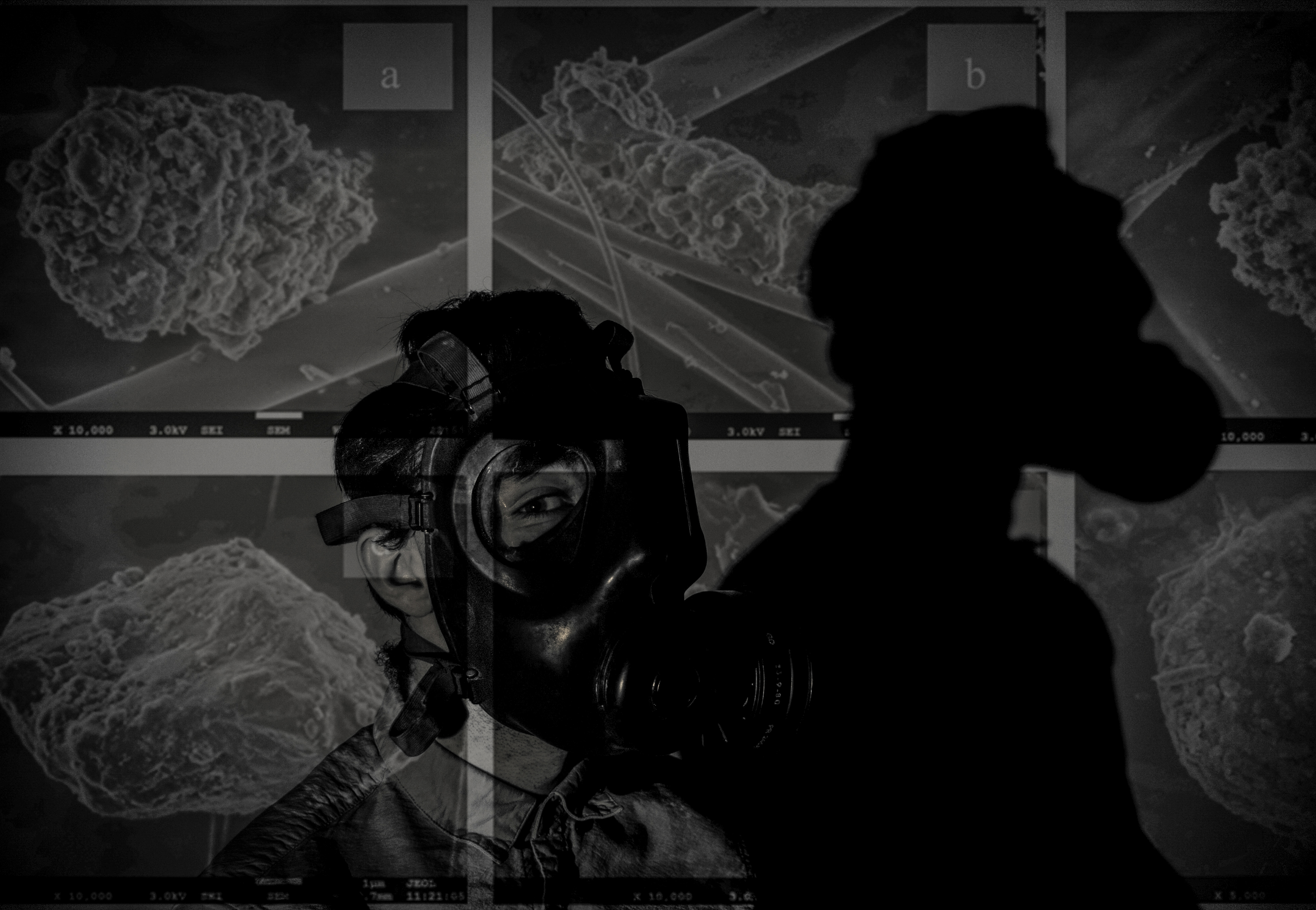
As the book progresses the images appear to get darker, evoking a more eerie narrative, making the viewer question he mental state of the character.

the images then progressively get lighter, suggesting the return of day, the book follows a fairly chronological narrative. the first image below I used a portrait photo of Ryan in his bed which is an important part in evoking the enigma that the character could have possibly been dreaming.

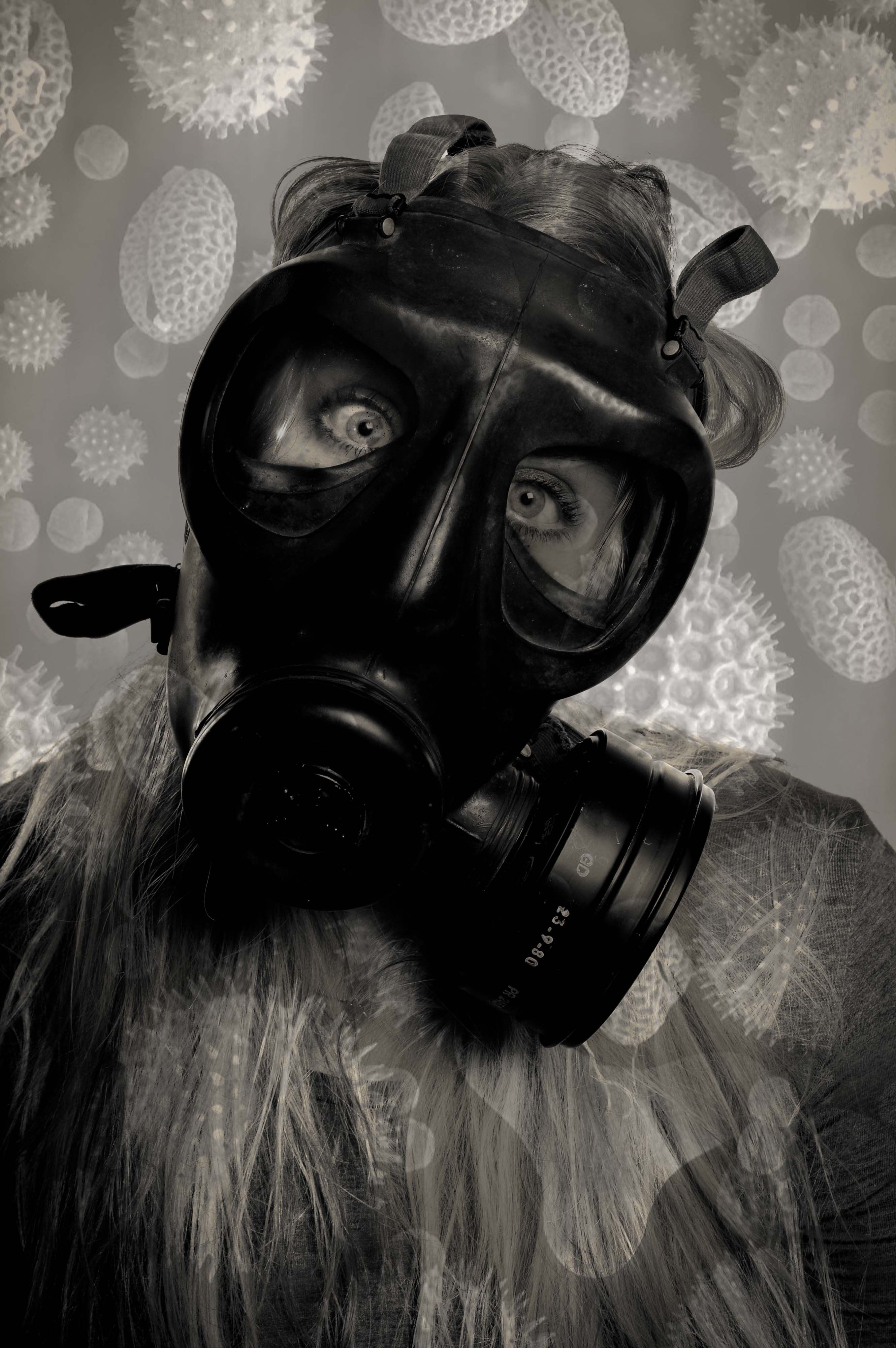
I wanted to finish the book with a closeup and picked a high contrast photograph. the book then finished with the quote ‘Carpe Noctem’, adding mystery to the viewer.

Link to my book

Below are the images I plan on using as final pieces which I plan on presenting as A1 images with white borders. I wanted an even number of portraits to landscapes to evoke the notion of contrast between nature and civilization which I discussed in my starting point. Thru ought  have tried to explore a variety of different atmospheres and lighting to create a varied set of images.

Experimentation

I wanted to create a variety of different aspects to my project and make it less direct my adding pollution particles onto my studio portraits. I believe that the images that have come from this are really strong and will round my project off nicely as i will have combined abstract photography, tableaux photography, landscape photography and portraiture in one project. I got the particles off google and many of them were in poor quality which is why when printed they may be pixelated but it could work well as it will create a different look to my sharp photos from other shoots.

To start, i turned all my particles into black and white so that they would match my photos and not affect them to much, this works well but after the merge, the photos needed to be edited on light room to make them the standard black and white so that my book would look consistent. However, some photos do have a slightly vintage colour but this could work well as it will make them stand out from the book.

This image is really strong because i used pollution particles which were scattered so that it created this appearance. The photo has a slight vintage ting but i wanted to keep it otherwise the particles would not be so prominent. This is the original image of the particles: As you can see the image is blurry which is why the photo will look pixelated when printed or in my book but this will add a different look to my images as my book is a combination of many different things which is why i want to combine many different appearances to my images. It could also represent the blurred vision of the world as the media hides the real problems by covering stories which aren’t relevant to helping the world. This is not the strongest image in this series but my models eyes make the image eye catching which is why i will use it in my photo book and it will be part of my finals.

This is one of my favourite edits because of how clear the original image is and how the particles have created different tones within the image but not covering my model too much so that we can still see her eyes so clearly which is why this image is so strong. The particles i used were fairly clear, more than the others and they worked really well with this image:

To create this photo i zoomed into the left side of the image as i already had a large photo of the image on the right. I thought this would make the particles extremely blurry but they weren’t too bad. I like the left image because it has different depths and textures which will be put onto my image making it much more interesting than if the image was on it’s own.

The particles in this image represent the hidden world which we cannot see but that follows us around. This image is very dramatic and dark because of the large particle behind/on my models head which could represent the looming danger which no one can see. The particles i used for this were the clearest but only seemed to work best on the darker images from my studio shoot:

To create my image, i flipped the particle image horizontally then zoomed in so that the large particle was much more visible in the dark image. By zooming in and cut off a few of bubble like particles but it is the large one which i wanted to focus on and it represents a danger and looks menacing in the image compared to the “bubbles”.

This image symbolize how when we breath all the toxins and particles are pulled towards us and are stuck on the mouth mask/our face. It is the most sinister image of the set because it’s meaning behind it and it is quite clear and will become clearer when the viewer knows that the book is about pollution. I will also add a quote about particles next to this image to make it much more powerful and dramatic. The particles i used for this were not very clear to begin with so i was worried that they would come out really blurry and affect the whole image but it did not luckily:

To create this image, i turned the image 90 degrees so that it was up right and i zoomed in so that the bulk of the particle was on my models face to create the impression as it is stuck to his face. This image is sinister because it could potentially represent what is really happening but we cannot see it because they are so small.

This image looks as if it projected onto my model and it does not look like it is photoshopped and that is it the original image. The only thing i would change about this image is that it is slightly slanted but it works well as i do not want my photoshopped images to be perfect and symmetrical as that will ruin the point of creating these images as they aren’t meant to be perfect. The particles that i used for this was a long image with lots of different particles and their names on them:

To create my image, i zoomed in on the image so that some of the particles were cut off creating tension in the image and this will allow the viewer to create an idea of what the particle might look like making it much more interesting and intriguing to the viewer. Also it makes the photo look like it is projected when zoomed in rather than left as the original image.

I am unsure if i will use this image in my book as it does not seem as threatening and sinister as the other images as it is not as dark and the particles do not seem as scary. I think this image works better on it’s own without photoshop because she has lots of emotion in her eyes and the photo is sharp and clear which will work well in my book. The particles i used for this was an image with all different particles of different sizes, textures and tones:

To create my image, i turned the image 90 degree to he right so that the triangular particle was at the bottom. I then zoomed in so that they were bigger and more prominent in the photo. What i do like about this image is that the particles have created different tones, textures and depths to the image which makes it intriguing.

I definitely will not use this image in my book as it is not as interesting as the other photoshopped image of this one and it does not look as sinister as all the other photos. It does look like there is something dangerous around us or something looming behind us slowly harming us and the planet. The image i used had lots of these spider type particles:

To create my image, i zoomed into the main particle in the image but the rest did not show up as much in the dark areas of the image but i did try it on different studio portraits but it did not work on them either. This is the worst out of the series of images because it just appears boring compared to the rest.


Studio

I did a studio shoot so that i could merge pollution particles with them as i wanted to keep the landscape portraits natural. The shoot went really well and i used a flash set up in which the key light was facing slightly to the right of my model and the background light faced a white background so that it would light up the back when the photo was taken. The allowed for the model to have light all around her instead of just on one side. I also experimented with using one small spotlight to create very dark shadows to add a bit of variety to my shoot.

The first few photos were of my female model with the mouth mask on, i made sure that her eyes stood out and she had strong facial expressions as these are key to the success of my shoot. Her eyes represent so many emotions such as panic, fear and anger. I think these photos are really successful as they are clear and sharp, my models hair falls well on her face creating nice shadows and the images are nice and bright which will work well with photo shopping the pollution particles on top of.

The next set of photos were taken with my female model wearing the gas mask and this is where her eyes are key as they are the only thing visible when the gas mask is on. The gas mask is much more difficult to photograph but her eyes and her poses actually worked very well and produced very good images. The best image out of the gas mask set in the last one because it is a very powerful image because it is so clear and sharp and her eyes can be perfectly seen and they are wide and full of emotion. I will definitely use this one in my book but i may use it also to photoshop the pollution particles onto as it is such a strong image. The gas mask works really well in the studio as all the details on it can be seen and her eyes are so sharp through the windows of the mask. I did not get this kind of crisp and clear image when photographing in the environment but i wish i did as my project would of been much better.

After these photos i wanted to try experiment with the spotlight as i noticed it create a big dark shadow of my model which i wanted to photograph. I had to adjust the settings on my camera but this did not take long and some really interesting photos were made. Her poses played the main part in making these photos work and she did really well. The shadow of my model represents death because pollution will kill many people and will carry on to do so if we do not change. It could also represent former people looking down on us to try persuade us to help reduce the pollution around the world. These images are really powerful because of how dark they are and how the spotlight has made my models hair shine and we can only see her shoulders in the light which adds tension as we do not know what is hidden in the dark areas of the image.

I then photographed my male model who is much stronger with body language but he did very well with facial expressions as well. His photos are very emotional and you can clearly see different emotions in his face. I experimented with photographing his face up close to create dramatic images for my book and to edit later on, this worked really well as i managed to get all the up close images in sharp focus. My male model is very good with his eyes and they also show lots of emotion just like my female models eyes. The close ups of his face are the most powerful as they allow the viewer to feel connected with the model and see what they are feeling through their eyes. I will most likely use these to photo shop the pollution particles on because they are clear and i think they will work well in my book. I also think that i want to use the close up in my book on it’s own as it is a very powerful image simply on its own.

I then photographed my male model in the gas mask. These images weren’t as successful as the photos with the mouth mask but the close up and body shot looked good and i could potentially use them to merge with the pollution particles. His facial expressions did not come through as much in the gas mask as he isn’t as good with facial expressions as my female model as he does not have as strong and bold eyes. The gas mask photos aren’t are strong and powerful as my female models which is mostly why i will only use them to photoshop onto because they are not powerful to use on their own. These studios photos do not have hidden symbolism like the environmental portraits which i have done as i did these to add a different type of photography to make project and so i could use them to experiment with and add abstract photography to my project.

Finally i used the spotlight to create dramatic shadows which could represent death due to pollution and i think these types of images will work really well on their own in my book or merged with pollution particles as there is the potential for them to be really bold and dramatic and for them to stand out from the book. My male model did much better on the shadow part of the shoot as his body language is so strong which allowed my shoot to have a variety of images in instead of just simple portraits with the gas mask on. These images have the same symbolism as my female models shadow photos but his body language shows suffering and extreme panic compared to hers which are much more formal and tame. This is why i like these photos because they are extreme and interesting. I think these photos could potentially work on their own but i think they would look much better with pollution particles on top because that would make them much stronger than simply on their own. His eye is really powerful in the first image because it is the only one we can see and for some people they will be able to see emotion in it and as we can only see one, it adds tension to the image and anonymity as we cannot see the rest of him.

Tableaux photography

I decided to look back on tableaux photography because I believe that the final images from my project use some of the ideas used in tableaux photography, it is also one of my personal inspirations towards photography and why I created the project in the first place.

Tableaux photography is a style of photography where people are staged in a constructed environment and a pictorial narrative is conveyed often through a single image.

Tableaux comes from the french word ‘tableaux vivant’ which directly translated in English means ‘living picture’. Tableaux Vivant was very popular within the Victorian era, the term describes staged groups of artists models often using dramatic costumes, carefully posed, motionless without speaking and theatrically lit, recreating paintings on stage’. In modern day photography we have interpreted tableaux photography as a style of photography where people are staged in a constructed environment, it is when you respond to a painting in the past and turn it into a photograph of your own. Therefore, as  this is how it is interpreted I will be making my own set up images based on a famous painting. Below is an example of Tableaux photography, as you can see, the top image is the image of The raft of Medusa, a very famous image. Tableaux photography has commonly been seen based around this image, also seen in the modern interpretation of the image. The modern image could also be allegorical since it does not convey the same literal meaning, however it has no meaning apart from being a funny but well crafted image.

screen-shot-2016-11-07-at-17-00-05

screen-shot-2016-11-07-at-17-01-06

Allegorical:


Allegorical is when an image has a less literal meaning than what is conveyed as it is only a fantasy of what real life is actually like. The word Allegory has the definition of  ‘a story, poem, or picture that can be interpreted to reveal a hidden meaning, typically a moral or political one.’ An example would be Allegory of Music by Filippino Lippi (between 1475 and 1500). As seen below.

screen-shot-2016-11-07-at-17-04-47

Romanticism:

I have decided to focus on romanticism as one of the isms based around my images from all of the shoots.

Romanticism was a movement in the arts and literature which originated in the late 18th century, emphasizing inspiration, subjectivity, and the primacy of the individual. In most areas romanticism was at its peak in the approximate period from 1800 to 1850. Romanticism can be seen as a rejection of the precepts of order, calm, harmony, balance, idealization, and rationality that typified Classicism in general and late 18th-century Neoclassicism in particular. Among the characteristic attitudes of Romanticism were the following: a deepened appreciation of the beauties of nature; a general exaltation of emotion over reason and of the senses over intellect; a turning in upon the self and a heightened examination of human personality and its moods and mental potentialities

In modern day it is seen that a romanticist image is a beautiful image, however in the 1800s it was seen as a painting with a strong meaning. An example of romanticism back in this age was the painting ‘The raft of the Medusa’. The Raft of the Medusa, oil on canvas by Théodore Géricault, c. 1819; in the Louvre, Paris. 491 × 716 cm.

This painting was created in France by the chief early Romantic painters Baron Antoine Gros, who painted dramatic tableau’s of contemporary incidents of the Napoleonic Wars, and Théodore Géricault, whose depictions of individual heroism and suffering in The Raft of the Medusa and in his portraits of the insane truly inaugurated the movement around 1820. As a whole romanticism was seen as a vast movement that included many mediums to present. This was just one of the most famous paintings created during the movement.


Presentation of Final Work

For my final pieces I ended up making two big boards, each with 18 window mounts so that the 36 images could be presented in the style of a contact sheet. These boards were then drawn on with chalk pens to give them the look of marked contact sheets. I really like this part of my final project. The boards are very large and the images being 6X4s are plenty large enough to be able to see in very good detail. I like the spacing of the colours, I feel like the spread of the different colours works well with the range of different images that there are on the boards. I tried to get the colours of the pens to work with the colours of the images as well as with the other pens. Frame 22 shows the red very well against the dark and the contrast between the yellow and green on frame 15 is really positive too. The placement of the different pen colours or strokes are not based on liking or disliking the images, they are an art piece and not a real contact sheet and so this is not important. I would have liked the pens to be more vibrant and a bit brighter so that they could stand out even more against the black board and the images. the board looks much better in person than in these photographs. I left the 33rd frame blank because the image was so destroyed that it could not be printed, to try and make this feel like it was a missing section of film I decided to use some slightly thin art paper and have a hole cut in the back of the backing piece to allow the light to still pass through. It was difficult to draw over the window cuts without jumping the pen, the effect would probably have looked more like the real contact sheets if it was, smoother pen strokes would definitely have helped with this. I decided to move away from the traditional style of contact sheets by laying the images in order vertically rather than horizontally which is the traditional way, this was done in part because the boards were not big enough to be able to fit the images lek this and I did not want to split one set of 6 images over 2 boards, and now the two boards can be viewed individually rather than as a whole unit at the same time.

The next component of my final project is the “slides” that I made. These can be used on a light box or they can be held up to a light or window. They really help to frame the images with all of the different types of distortion shown on them, the last 6 frames in the bottom sides show the complete breakdown of the emulsion layer in some places leaving only the plastic base of the film. The first 6 also show the real difference from the others. These ones were completely bleached and so the emulsion layer is a light beige colour instead of the dark brown of the rest of the negatives. These are my favourite part of the final results, they add something really tactile and get the viewer to interact with the images and therefore the environment. Originally they were simply going to be placed on the light box flat [1/4] but I decided that this was not the best way to display them so I made a frame for the light box to make it look nice and hide the unattractive edges of the light box [2/4]. After this i decided that it was a little difficult to lean over the light box to see the images face down so using three small pieces of foam board for each slide I propped them up so that they could all be viewed at one angle [3/4] [4/4]. This really helped them to be easier to view and makes the presentation of them a lot nicer to look at, the foam board pieces do not look good but even when viewing the slides from the side they are difficult to see and so should stay hidden. The element of them that I like the least is the first slide, it is so faded that it is difficult to see against the bright background. If I was going to do this again then I would try and use something to make these easier to see. I would also try and create a viewer that the slides could be placed int to be viewed, acting like a mini light box the slides could be exchanged for one another to be viewed one at a time.

Overall I am very pleased with the final outcomes of this project, it took a lot of time and effort to do because it involved using film but it was definitely worth it because the results would not have been achievable without using film. The different colours and effects that came from them is fantastic and turned out much better than expected.

Process of Making Final Pieces

Making Final Display


Because of the different parts of my final project there was a lot of work that I needed to do to make them. The first element that I started working on was the slides. I knew that I would need to have some way to keep them flat but still be able to see them clearly.

The photo above shows me testing using two pieces of acrylic to look through, one either side of the negatives. The back piece is tinted slightly brown, this was because I knew what It would look like with just clear acrylic or glass there so I wanted t test to see if this was any better. As it turned out it wasn’t, the main problem was that you could see shapes and things from behind the negatives, this made it difficult to see the images properly.

To try and beat this I tried using a piece of frosted acrylic instead of the clear one. Ths as it turned out worked really well for what I wanted as seen in the above photo. It just helped to soften and distribute the light while the light colour of the acrylic helped to let as much light through as possible.

The next step was to make a frame for the negatives. I decided to use a window mount for each of the strips, the first tester one that I did had to have a white background but I made some different variations to test and see which one I liked the most (these can be seen below). The different versions are different colours and some have beveled window mounts and some are just simple cuts. In the end I decided to go with the bottom one as the final version, the contrasting white against the black worked really well and helped to lead from the dark into the light of the negatives (the second last one is the template that I used to mark out the final ones.

Once I had cut all of the frames out I needed to cut the acrylic. The pieces that I used for the backs in the end were not the same colour as the part that I tested, this was because the school workshop where I got the acrylic from did not have any more of that colour. As it turns out though the lighter turquoise colour worked better for what I wanted and made it easier for the negatives to be seen. I cut the acrylic to the same size as the outside of the frames so that it would fit flush with the card.

Then the negatives needed securing to the frames. The side of the negatives that holds the image on faces away from the outside of the frame and touches the acrylic, this protects the images a little and makes sure that the viewer is not looking at an inverted image when they hold it up to the light.

Securing the negatives was done with just some small pieces of masking tape, this was so that if I wanted to I could remove the negatives at some point or reposition them without damaging the film. After this I just placed some double sided tape on the card and used this to hold the acrylic in place and secure the images.

All of the final mounted negatives. This was just keeping them still so that there would be no issue with the tape sticking, i was not taking any risks at this point.

The next thing to do was to make the big boards, although a lot less fiddly and delicate this was the part that took the longest to do and was the most challenging.

The first step was to mark out all of the sections that I would need to cut out. This entailed working out the size for the frames and then marking out this on the two large boards. This marking process took a very long time to make sure that I had got every measurement correct. I completely did one board first before I did the other Incase I decided that i had done something wrong on the first I would not have to remark and cut both boards.

Cutting out the boards took the longest (I did use a window mount cutter it’s just not in this photo) out of all the different parts to this because it was the most important that I got right. I had several scares that I had messed some things up but in the end they all were cut just fine.

The next challenge was to decide how to order the images on the boards. The image below shows how I originally laid them out,meant to be viewed from the left side of this image I decided against this because most of the images are landscapes so most would be at an incorrect angle.


The image above here is the next layout that I tried. This one was better because the majority of the images were orientated the correct way but then I thought about the contact sheets that I had based this on and thought how it was just too different from them. The issue also arose of how the two boards would work together, in blocks of six images they did not work as well.

This layout was the  one that I went with in the end, It works in columns in the order that the images were taken. this way your eyes can follow one column and then go onto the next, seeing the effects of different water damage in each one.

Once laid out they were then taped onto the back of the boards inside their window mounts, again I used masking tape so that I could remove the images without damaging them if I needed to. The tape held strong enough to keep the images in place permanently unless they were intentionally removed.

Making the  other board was exactly the same aside from the missing frame. for this I used some art paper that lets light through quite well in lieu of an image.

To finish the boards I mounted them with solid backing pieces of card to help protect them and keep the a little stronger, for the missing frame (33) I cut a corresponding hole in the backing for this so that light could still pass through.

I bought some chalk pens for writing on the images and boards. I tested them on some spare photographic paper and on the off cuts of card. I tested if they rubbed off, and tested out some brush strokes and just generally got used to using the pens.

Then I wrote on the numbers of each of the frames, this i felt was necessary because it gave the boards more of a feel of the traditional contact sheets while still being my own interpretation of them.

The final works with the drawings with coloured pens on can be seen on the final evaluation and display post. I am happy with how the boards and slides turned out and I feel that the time that I put for them was worth it.

Artist Reference – William Klein

Artist Reference – William Klein


William Klein is a photographer whose work has spanned decades. He has worked with many different subjects and has captured all different kinds of scenes from photojournalism to fashion and even some street photography. Due to the time that he was working in he shot almost all black and white and on film. Recently he has taken a look back at some of his most famous images and the contact sheets that go with them, he has then painted over the image, similarly to how people would mark contact sheets to identify good images and poor images, there is not much reasoning behind way he has done this further than:

“The idea for the colour and graphics comes from the red lines
photographers put around their choices on a contact sheet.”

The massive size of these images once blow up makes them really impressive and striking, the contrasting colours really help to accentuate and frame the images and makes them really standout. I really like this idea and I think that I am going to employ this for the presentation of my final project.

William Klein : “Painted Contact Sheets” Series

https://petapixel.com/2011/08/31/the-stories-behind-photographer-william-kleins-contact-sheets/

Don’t just take, make

‘Environment’ – finished project evaluation

For my final outcomes from this project I have managed to produce 8 presentations of my favourite photographs along with a carefully designed photo book. To begin my project I started with the idea of spreading environmental awareness through photography. This type of conversational photography has been used to advocate environmental issues since the 1860’s and is a powerful medium for influencing positive change. When I started I used the rough headline of ‘environmental awareness’ but as my work has progressed over the exam it has been changed to the preferred title of ‘Pollution in the Channel islands’.

As the world’s pollution issues are already vastly documented and recorded there was a large amount of artistic and written research done around this topic which helped to inform and inspire my shoots. The main inspirations I have had for my project are photographers who have looked at pollution from an artistic and symbolic view-point. These include Gregg Segal and his ‘7 days of garbage’ project, Steven Hirsch with his work; ‘Off The Water’s Surface’, and Goussin and Hortense’s beautiful examples of ocean pollution. By researching these photographers I was influenced to make many of my final results a beautiful mixture of symbolic and abstract representations. The specification for this years exam was to create a sustained exploration of our given word, ‘environment’, resulting in multiple final presentations. Over the time we were given I have created beautiful symbolic, abstract and documentary images portraying environmental issues as well as inspiring messages and visual encouragements for positive change. By demonstrating a mixture of photography techniques I have really expanded my skill set and provided my viewer with an engaging and interesting project. This exam project, in my opinion, has been very successful, one because I have found my chosen subject so inspiring and informative, and two because I made sure I used careful planning and organisational skills for each one of my shoots. Overall I am really happy with my photo book result as well as the final layout of my 22 favourite images, paired and presented as 8 designs.

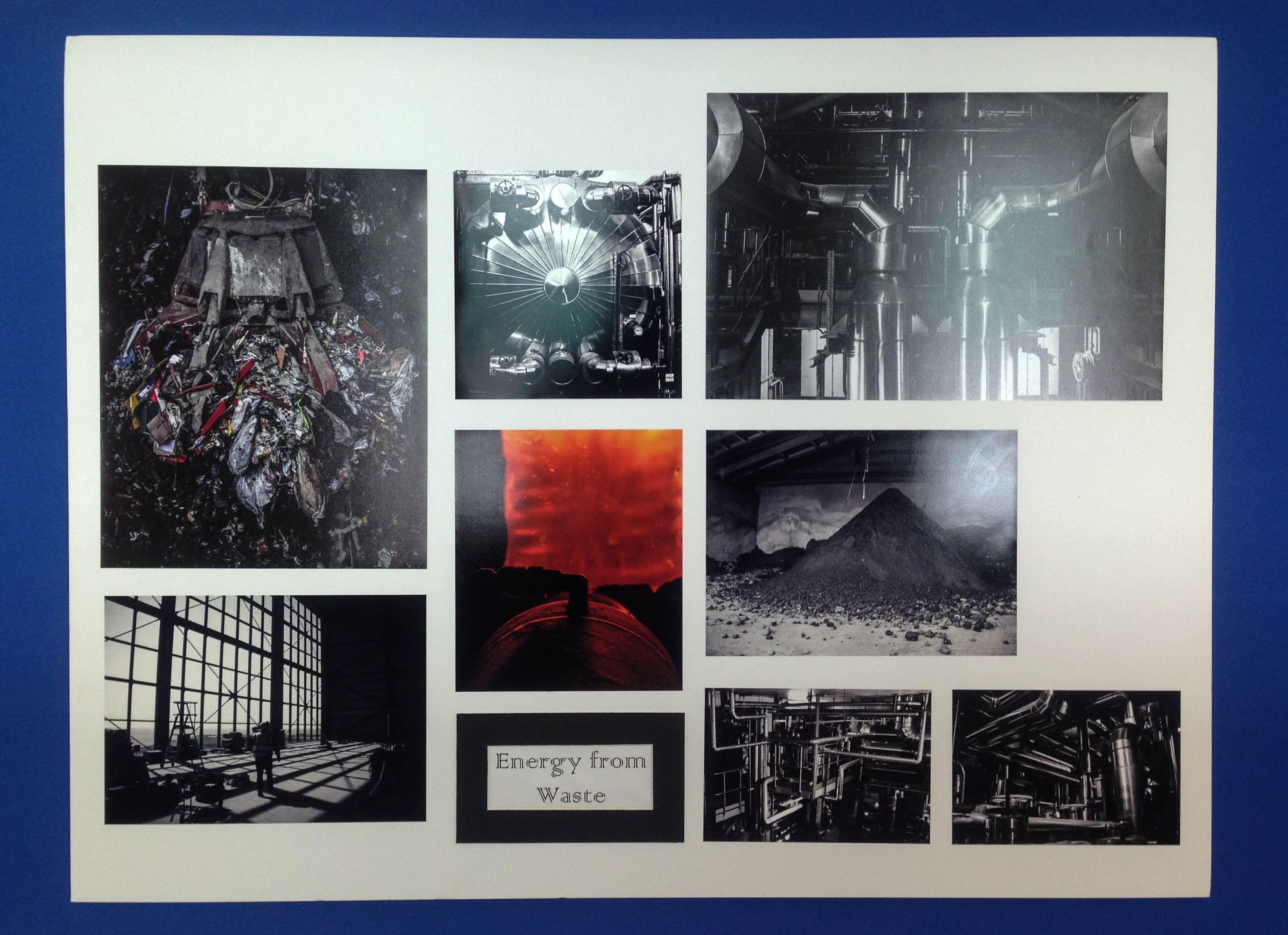
Above I have added a few images depicting my finished final presentations of my favourite outcomes from this project. I love my use of window mounts, story boards, triptychs and diptychs to present my work and feel as my outcomes really extenuate the meaning behind my project. What I think makes this collection so successful is that each set of images displays a different message and is presented using a different type of photographic practice. This variety has produced a really interesting and intriguing project, with something that hopefully every one can emotionally respond to. My favourite outcomes above are my large collection of waste to energy images because of the precise way I managed to fit each one together in a story board. As well as this I also really like my documentary plastic pollution outcomes on the bottom left as the double window mount technique has produced very professional and clean looking outcomes.

Online Book Preview: http://www.blurb.co.uk/books/7926770-pollution-in-the-channel-islands

Lastly I have presented my final photo book layout as an online link and contact sheet above whilst I wait for the physical copy to come down in the post. The reason I decided to create a book as well as many final prints is because I think it is a really nice way to bring all my outcomes together, showing my journey as well as thoroughly getting across some environmental awareness. I love the layout I have created above as I have really showed how each shoot works together, getting across the same message in different ways. The facts that I have gathered from my previous research throughout this project give some amazing context to my images as well as emphsising there meaning and the harsh truth of our environmental impact.