Book Specification

After looking at the books, monographs and other published work of my chosen artists and photographers, I have been inspired to create a book with a compilation of my photographs from this project.

The book will explore the way the environment can change and how lighting ant atmosphere evokes narrative and emotion as well as the use of natural and man-made components especially natural and man-made light and the contrast between these. It will also feature the juxtaposition of a natural human being and how they are influenced and affected by their environment as well as how they interact.

I started looking at the work of Todd Hido and his 2001 monograph House Hunting which explored America from a very candid perspective as well as the suburbs and homes which people lived in, this took a selection of photograph from his portfolio Homes at Night. I then looked at the photo book Twilight: Photography in the Magic Hour which was based on the 2006 London exhibition featuring artists such as Bill Henson and Philip Lorca Dicorcia. Exploring this nocturnal theme is also something I plan on referencing in book as with how it evokes atmosphere and narrative into the environment. I then looked at Bill Hensons alluring nocturnal book Lux Et Nox. His book explored the notion of nature and civilization and how they effect each other, which is a key theme in my work, his work also looks at negative spaces and transitions in the atmosphere.

I then looked at text and graphic design based artists Hamish Fulton and Ed Ruscha who used text to elevate the meaning as well as add new context. I have experimented a lot through my coursework with testing different fonts, colours and compositions but plan on recreating new designs with my photographs for my book to create a more consistent theme for the book. I also plan on having a variation of two page spreads and single spreads with complementary text opposite the image.

I plan on using Lightroom to upload and compose my photographs into a book format and will add text over the images using Photoshop, to publish my book  will use the publishing website Blurb.com. This will be done during my exam.


Wild child – ruby

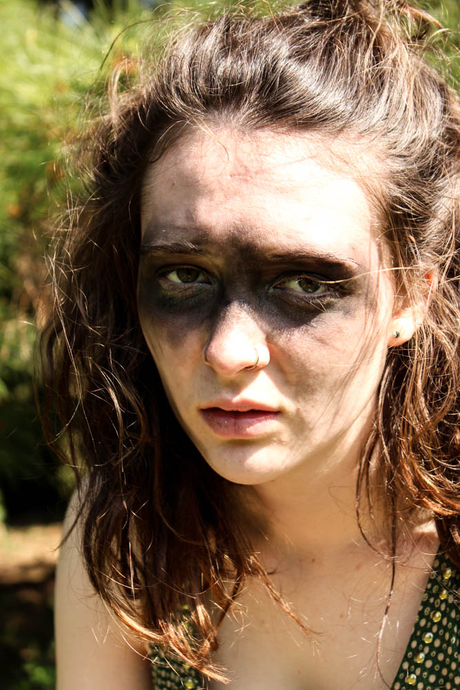
This was my second photo shoot in which i created a potential character which lives within the den. This one was to correspond with my wood den and therefore i decided to make my subjects face look muddy and dirty as if she has been living among the woods. I got her to dress up in a a green dress as i wanted to continue on the idea of camouflage which this den revolves around so much. Overall i think the images work really well. For this particular shoot i decided to use my sister as my model as she has green eyes and i thought that this would correspond further with my den.  I defiantly think i have got some images from this shoot which i can use. 

The above and below images i took in a portrait framing, the light in both images coming fromt he right hand side of the frame. Both images are very similarly composed, it is simply the slight angle of the subjects head and the expression which differs. The angles of the subjects face in the image below appear a lot sharper and therefore cause the subject to have a tougher impression. The top image is a lot softer as the subjects face is facing towards the camera directly. The light in both images is quite a harsh light which contrasts which the dark marks on the subjects skin and also the subjects skin being very pale. The skin almost becomes washed out to a bright vibrant white by the light. The subjects hair in both images is very wild and therefore frames the face well as it blows in and around the face in a natural way. I used a narrow depth of field in the images so as to blur the background behind the subject. I quite like however how you can still tell clearly that the background is filled with pine leaves. This then links the location directly to the den images and creates a link between them.  Something which i had a problem with was that i couldn’t take a picture in which my subjects eyes had the sunlight illuminating them without washing out the entire of the subjects face and creating terrible images. I therefore opted that for these images i would focus on the lightning of the face rather then the eyes. Overall i think i prefer the below image for a photograph which shows the whole of the subjects face in a more formal portrait.

I also took some more abstract images as you can see from the images above and below. Above i experimented a bit with focus, having the focus in the background rather then the foreground to add mystery. I think the outcome of the images turned out okay. I like the below image best because of the contrast between the sharp lines of the light and the dark shadows of the rest of the face. The brightest point of the image is where the light from the right hand side cuts lines across the face. The subjects hair which then blows across their face creates a wild impression and also adds flicks of light as the stands capture the light. The image is composed so that one of the subjects eyes is directly in the center of the frame. I quite like the abstract nature of the image.


The above image is one i managed to capture which had light in the subjects eyes. I really struggled to get my subject at an angle in which i could easily show the light colour of my subjects green eyes. I think this image only really works because the background is such a light green colour that it brings out the lighter green colour of the eyes. I used a really narrow depth of field in this image to blur the background but keep the foreground in focus. This blur causes the subjects hair to look straggly which was the impression i was going for with the whole wild look. Only the immediate foreground of the eye was in clear focus, the black mud on the face contrasting with the white skin of the subject. I quite like how the blur of the rest of the images means the little details of the hair of the eye brow and the eye really stand out.

Tribal wild child – jess

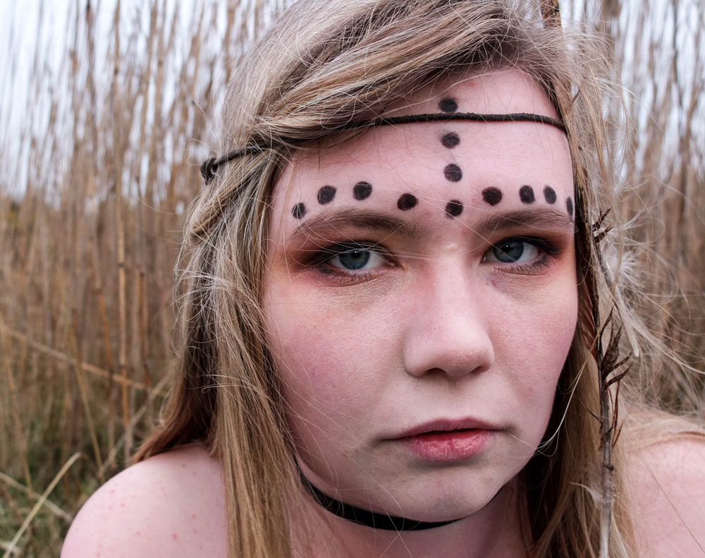
The below photographs are my first attempt at portraits which link to my dens. When i was doing my den shoots there was defiantly a theme to some of the dens and i want to be able to incorporate that into my portraits. This first set of portraits is for my field den. When i took those photographs there was a distinct African vibe to the den, both in the landscape i took the photographs in and also the materials i used for the dens. I therefore translated this into my photographs.

I decided to photograph my subject on a fairly overcast day because i want these portraits to almost act as a link in between the day dens and the night dens i am going to photograph. The day photographs are intensely bright and i didn’t want to have too much glare on the faces in my portrait so that was also another major factor in why i decided to photograph my subjects on an overcast day.  I also chose my location carefully considering how it linked directly to my den. I decided to use tall yellow grass as i felt like that linked directly to my theme. You can also see in the photographs of my den this grass within the background. The photographs were taken in the same location just not exactly the same area in which i took the den images.

Over all i composed the majority of my photographs fairly close to the face of my subject on landscape mode. This is because i wanted to take the pictures fairly close to my subjects face in order to capture an intensity in her gaze. In all of the photographs i used a narrow depth of field so the background is always out of focus to emphasis the subjects face. Overall i think i have two outcomes from this shoot that i am really happy with. For each set of portraits i do only need one photograph for how i am intending on displaying my photographs so overall the shoot was a success. 

In the above and below photographs i decided to use a landscape composition to include more of the background of the grass in the frame. I really like the similarities between the subjects hair and the grass as they are both very similar colours and they are both fairly straight. This creates a link between the subject in the environment, another connection within my images. The feathers in these images also blend quite well into the hair but then also add another texture, particularly in the below. I quite like both the above and below photographs but for different reasons. The hair in the top image adds a lot of movement and creates a more dynamic image blowing across her face. Her eyes are also more narrowed in staring at the camera, as if questioning or challenging rather than gazing passively. In the photograph below the eyes have the opposite effect, they look more haunted. Her eyes are a lot wider and while she is once again staring directly at the camera i feel as if this whole image is a lot more passive and the face has a lot less character in it. I therefore prefer the above photographs of the two as it conveys a better sense of a wild child behind the face.

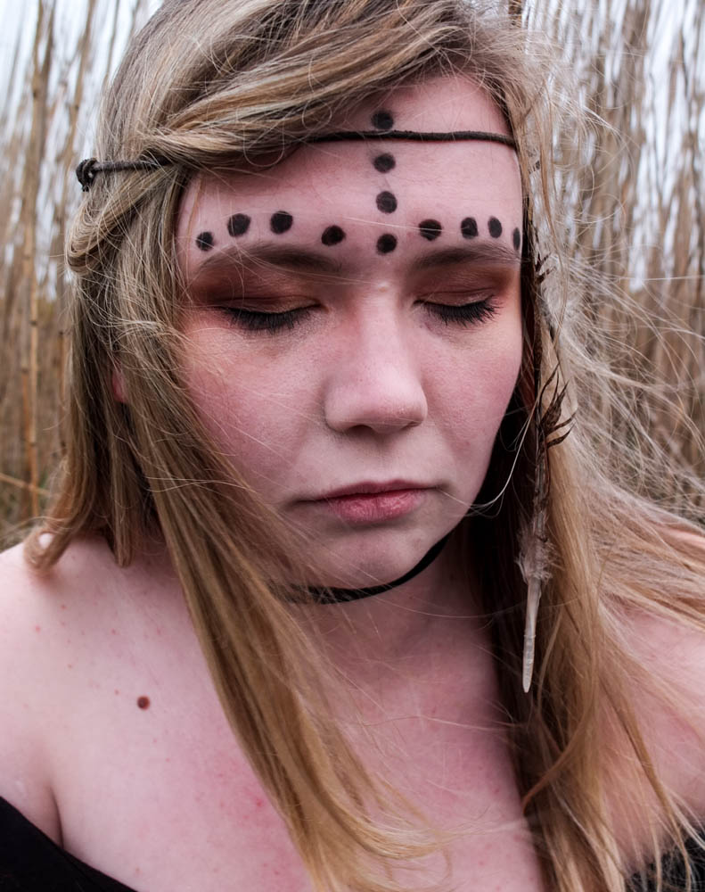
I wanted to try a couple of portrait compositions as well as landscape to see which ones worked best. I also directed my model to close her eyes to see what impression it would create. While it does work i think i defiantly prefer having the eyes open as eyes and expressions of people faces add a lot of character to an image. I think you lose this a lot in this photograph because her eyes are shut .


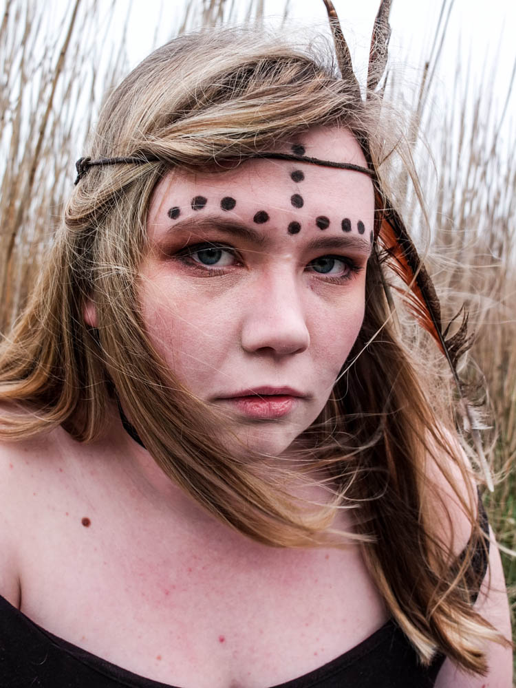
The above photograph is the best photograph from my shoot and i think that it has defiantly incorporated all the elements of the other photographs which i like so much. This photograph is composed to be portrait and therefore it includes less of the environment then some of my other images. The main light source comes from the top right hand corner and shines directly onto the left side of the subjects face. This photograph is better lit then the rest of the images, i think this is because of the portrait composition including more of the sky and therefore the image appears brighter through the white sky. In this image like in the others the subjects hair matches the colour of the environment behind. This creates more of a sense of unity between the subject and the environment but the subject doesn’t become lost in the environment as i used a narrow depth of field so as to separate the two out. In this image the subjects hair is blowing over her face to the perfect extent. In the other photograph her hair covers her face perhaps too much. In this photograph however her hair blows not obstructing any element of her face and the small wisps which do blow over her face actually add to the wild impression of her. The fact that all her hair is blowing in the same direction works quite well as it almost leads you around the image. You start with the bright white light of her hair which then leads you into following the direction of her hair which leads you around her face.  Her hair ends up framing her face really well. The movement of the feather along with her hair is also very suggestive of being wild and adds to the loose feel to the image. The photograph feels less rigid and staged as the feather is also following the direction of the hair. The expression on the subjects face also works really well in this photograph as the angle of the subjects face turning towards the camera is suggestive of challenging and being confrontational. The eyes do gaze more passively then the first photograph but the overall impression of the image is still a wild child. Overall i think this photograph works the best because the lighting is brighter and the composition of her hair and face is very effective in conveying the impression i was intending.

These last two images were experimentation’s with using one of the blankets from the den i built within the composition of the portrait. I decided to simply wrap the blanket around the subjects shoulders and i think the final outcome actually works really well. I composed the images as landscape as it allowed me to convey how the blanket was wrapped around the subject better. These photographs are also very well lit as the sun had broken through the clouds a bit. The compositions and angles of the subjects face towards the camera is slightly different in both photographs. In the first image the top of the subjects head is cut off just above the subjects hairline which includes more of the blanket itself within the frame. The subjects face is then turned almost directly towards the camera. The position of the subjects head within the frame is also a lot closer to the edge of the frame. The second composition includes more of the top of the head, the head being center more towards the middle of the image and including less blanket. In both pictures once again the wind blows the subjects hair slightly across her face . This composition also allows for the background of the grass to be seen clearly. I think i prefer the first image, even through the second includes more of the head. 

Tribal Portrait plan

Before taking my portrait photographs i need to plan exactly how my subject is going to look. The whole point of these portrait’s is to recreate my childhood friends looking like the characters we used to pretend to be while playing in the dens. I have started to see a pattern of each den having its own identity and character to it, which is what i want to reflect in the appearance of my portraits. The first portrait i am going to take is the ones which correspond to the den in the field down St Ouens. This den had a distinctly tribal feel to it so i began looking for inspiration of exactly what look i wanted my friend to have.

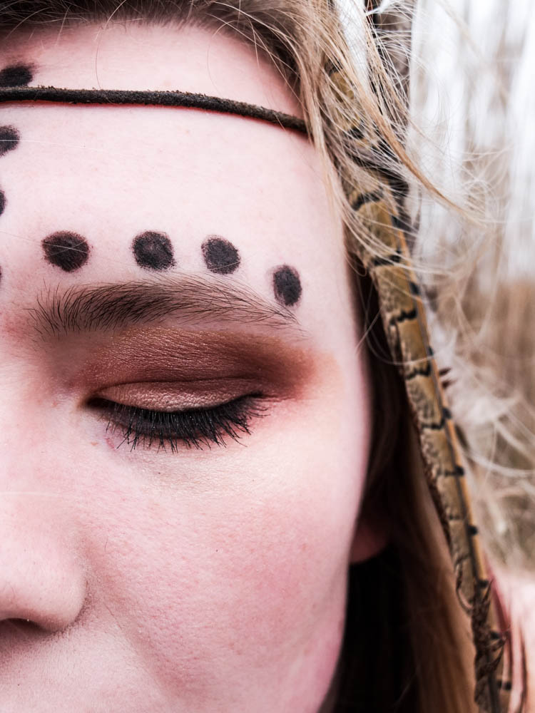
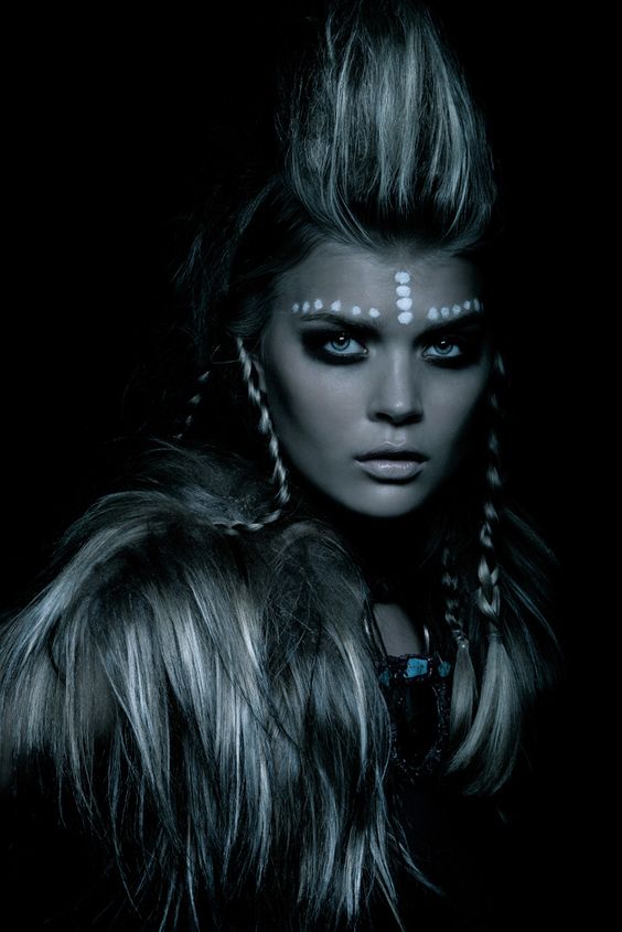
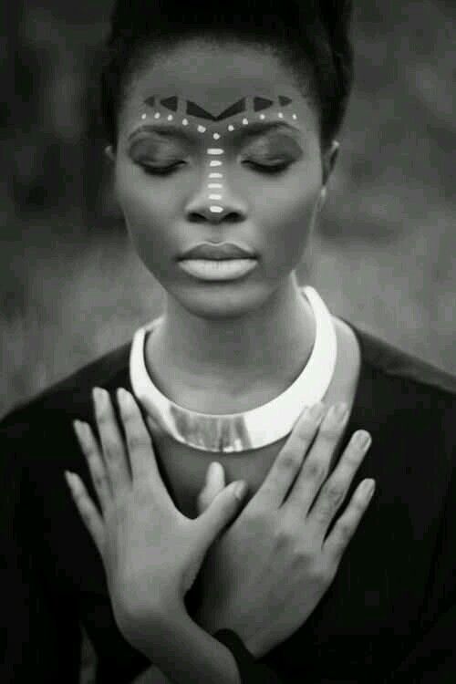
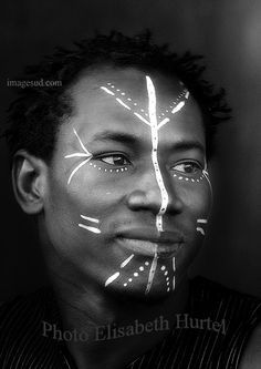
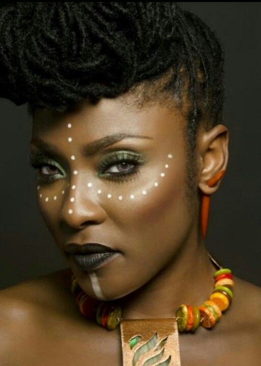
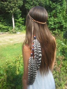
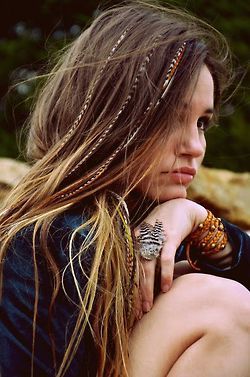
As i have spoken about i wanted to create a clear correlation between the den and the portrait’s so as this den was made up of oranges i decided that Orange was going to be the main colour colour used. I am therefore going to direct my subject to wear orange eye shadow shades to establish a link between the den and herself. The overall character of the den was also distinctly very tribal and African. I don’t want my subject to look too artificial and almost dressed up by using loads of face paint or anything but i do want to also create a tribal look to her appearance. I therefore looked at tribal face designs which you can see above for inspiration of adding some little touches that would convey a tribal atmosphere. I think i am going to go with the dots because they look somewhat understated and enhance the tribal feel to the image without going over the top. Lastly i wanted to make the hair appear a bit more dynamic so as you can see below i took inspiration from stereotypical feathers. Tribal is normally quite suggestive of being animalistic and close with animals and nature so i though that by adding a feather to my subjects hair would tie together this impression further.

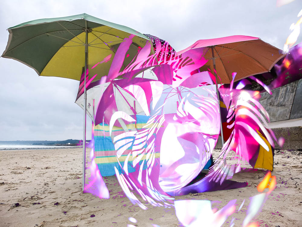
Layering paper and dens

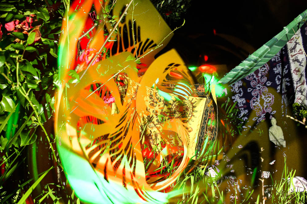
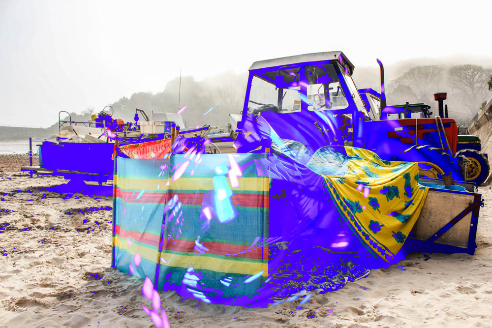
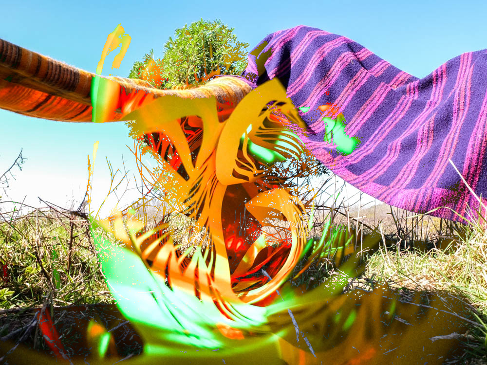
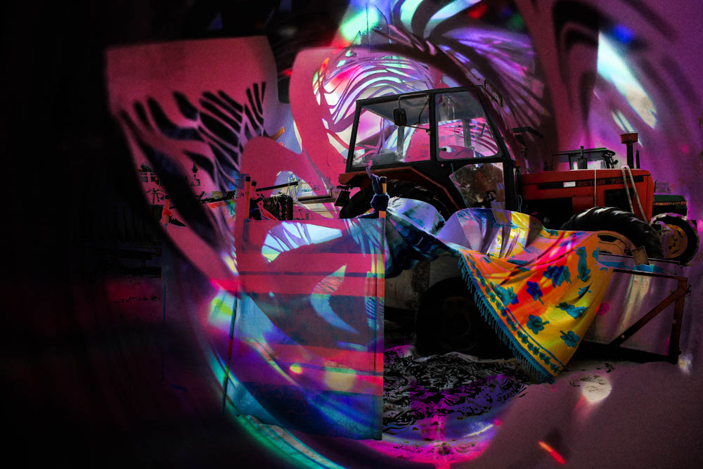
These layering images have defiantly worked the best of all my experimentation’s. After taking the photographs of my paper sculpture i decided to experiment with layering them over my den images as they were so abstract i thought it could create some interesting patterns. The concept of those images was all about the transitioning between the game world and reality through falling asleep and so these abstract images which combine den and abstract spirals aim to convey this transition. As the images i combined are so completely different the combining of the images actually worked really well rather then just being a bit of a mess like some of the other images. The spirals being composed at the center of the image is suggestive of the den coming out of the spirals. Overall i really quite like these images and i’m glad i did the abstract shoot of images to explore the idea of falling asleep. 


Paper cutting photography

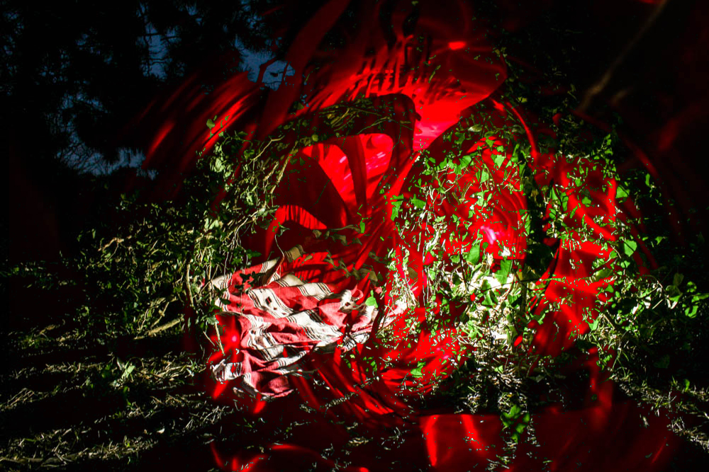
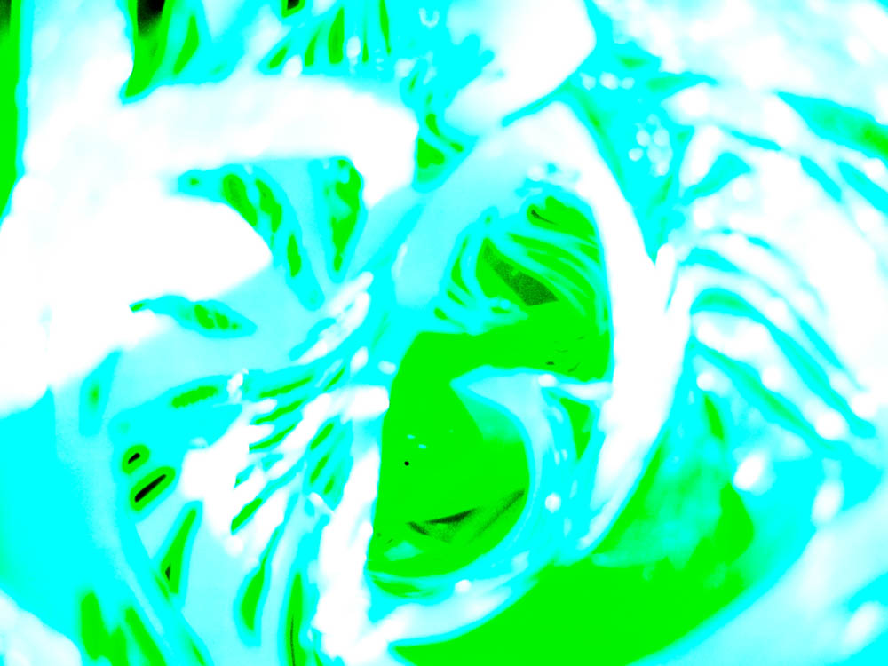
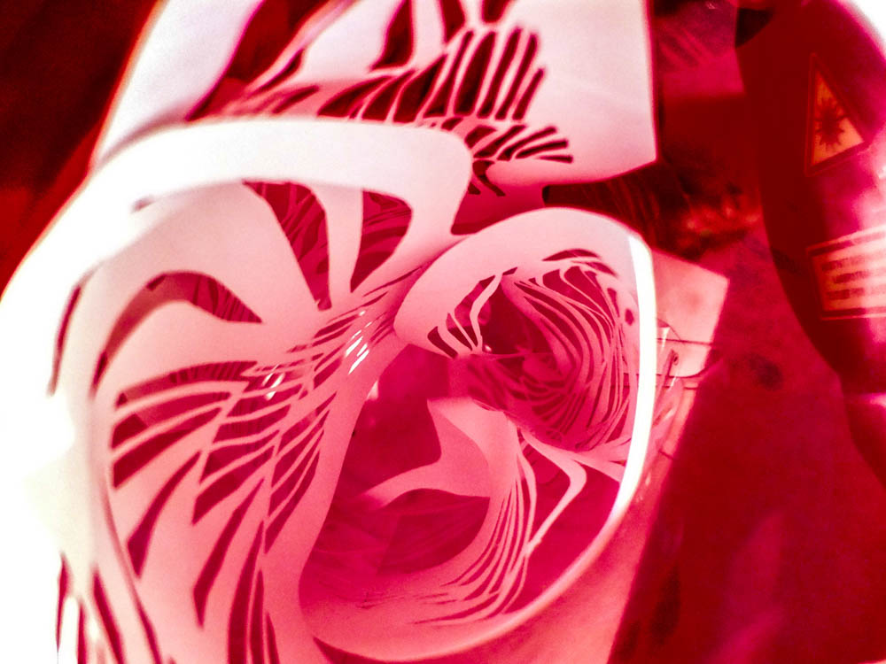
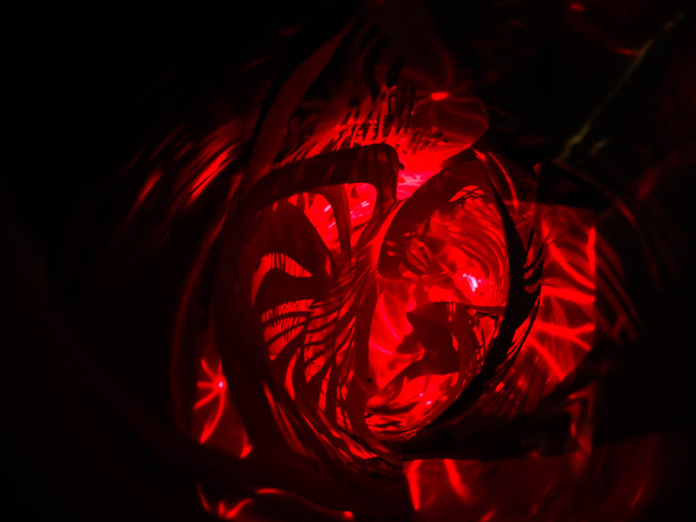
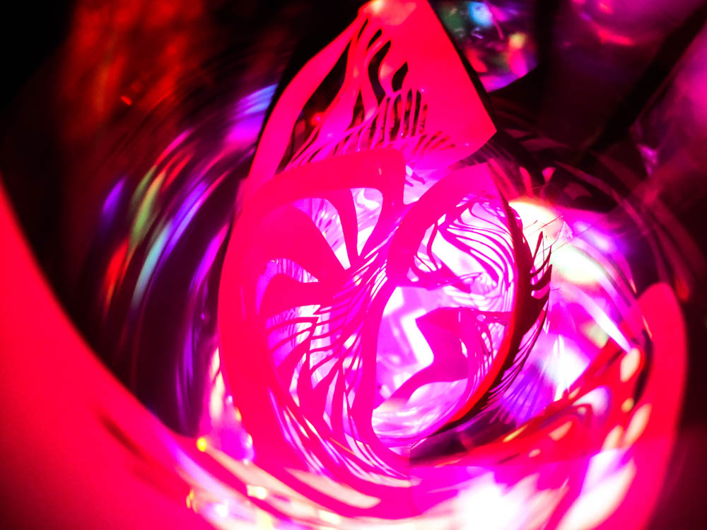
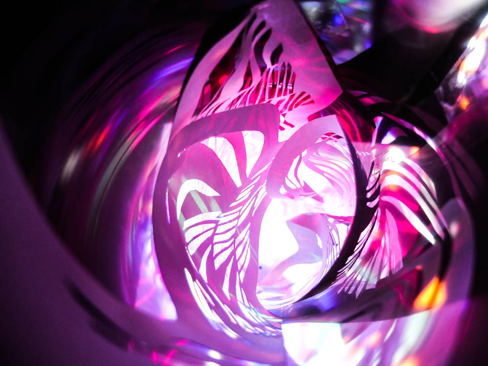
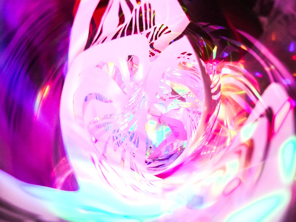
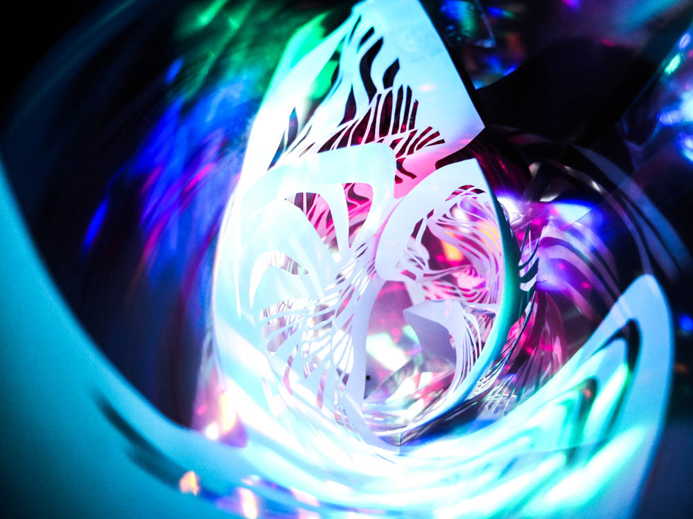
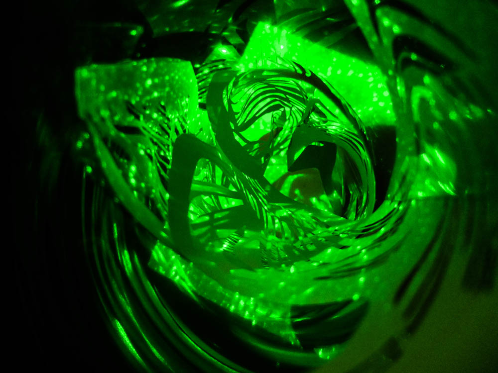
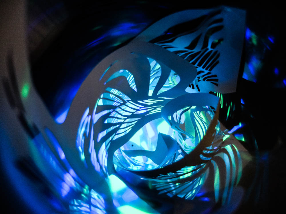
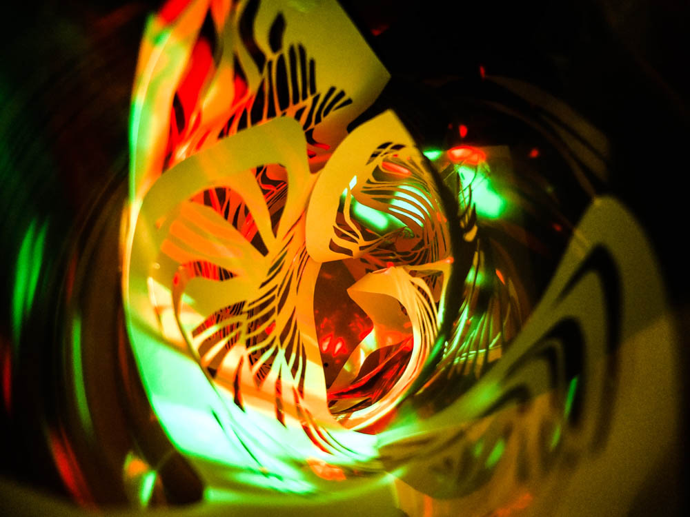
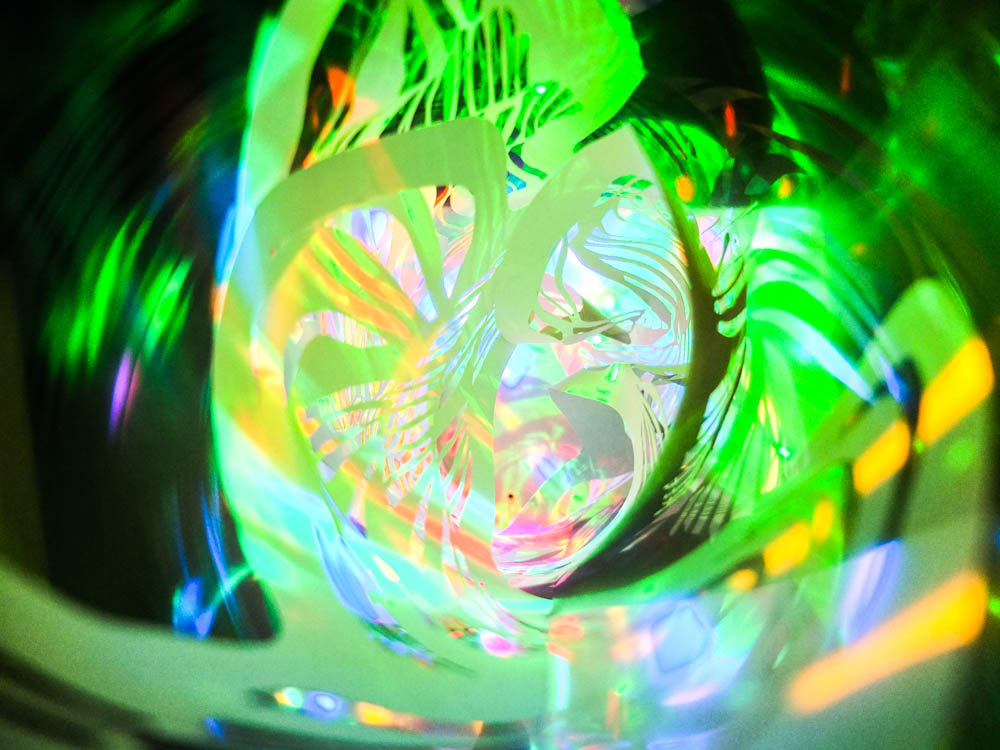
As i have been considering with my stories/ games i played at childhood how the dens completely created another world for a couple of hours i wanted to take some abstract photographs to convey this. As i started thinking about how in my random scribbling’s we always had to go to sleep to wake up in reality from the game world i wanted to explore this idea by creating some abstract images.  I decided to create a sculpture made of paper which i could shine bright multi-coloured lights onto to create psychedelic patterns. I wanted to create images which play with your mind a little bit. I made the sculpture by cutting patterns into paper and then twisting the paper together to form a spiral. I thought the idea of the photographs being circular was quite important as it normally causes your eyes to travel inwards along the spiral and you become slightly lost in it all. I then shone a disco light which was flashing multi-colours into the center of the sculpture and this created the images below. I am defiantly going to use these photographs juxtaposed with my dens in some sense. 

Overall i think they worked better than i expected. This was just going to be a quick experimentation in which i considered this small sub section of my project but overall i really love the effect that the images have.  There is something very other worldly about the photographs which draw you in and almost suggest a portal to another world. This was exactly the impression i was going for with the images and so i’m glad they turned out so effectively. I did of course increase the contrast and saturation in all of the images, wanting bright and vibrant colours to add to the overall effect.

The two above images were blurry photographs which i took of the sculpture but i still really love them. The blurred nature of them actually adds to the surrealism as there is nothing to focus on completely. I quite like how with a lot of the images the composition of the photograph is exactly the same it is just the colours which have changed. 

The completely contrasting colours of the photographs also works really well as some images have completely different moods to them. The red photographs appear angry, all of this occurring due to the association of colours and feelings within our own minds. 

These pinks and purples in these photographs create a completely different impression, more of a magical impression. 


My own stories, find books of random scriblings

So in thinking about the new direction that my work is going to begin to go in revolving around the inspiration of Yury Toroptsov’s work of taking photographs at night, i also wanted to consider the impact of association. With Toroptsov’s work, the way in which the audience interprets the work is significantly influenced by the title “The house of Baba Yaga”. In knowing this story and all its creepy details we began to project our own impressions of these stories onto Toroptsov’s photographs. I think this becomes even more significant in considering how this story in particular is more of a tale then a real story in how it can vary depending on who’s telling it as it has been passed on by word of mouth. There is no official one version of this story, instead there are loads of different versions which all come together to create an overall impression in which you can take from the story what you want. This lack of a defined story causes individuals to be able to imagine in more detail the different elements of the story and in a sense gives the imagination more creative license. I think a child’s imagination takes this form as well, the ability to completely make a story their own from a basic well know story into a complete crazy spin off which is there own adventure.

Below are some of the books that i remember reading as a child and influencing games i played. If i’m honest there were sooo many more that i can’t even remember because the games would change depending on what i had read that week or what films i had watched. I have always been a person who is absolutely obsessed with stories in absolutely any form. I am constantly watching films and dramas on tv, i love any kind of theater production and my room is filled with a ridiculous amount of books. While i think about it quite  few of the games i played as a kid were based on CBBC shows. These days i constantly listen to audio books when doing my art work so i’m not distracted by looking at something but can still be listening to stories. This complete immersion in stories from an early age has defiantly influenced me and i think is one of the central reasons to why i built so many dens as children. I loved spending time outside and as i always had one of these stories on my mind i would pretend to be a character for hours and hours while building dens and living my life as these characters.  I even have some of the random stories that i wrote as i played the games for a period. They however only reflect a very short period of my life playing in dens as it was a new notebook i wanted to just write in, normally i was too busy in the games world. I think the main thing about playing games is that i wanted to be someone else and to be in that magical world for a little while.

Below are the most rememberable of the stories that influenced my games:

  • The spiderwick chronicles
  • Golden Compass
  • wolf blood
  • Famous Five
  • Doctor who
  • M I High
  • Lemonny Snickek
  • Harry Potter
  • Ink Heart

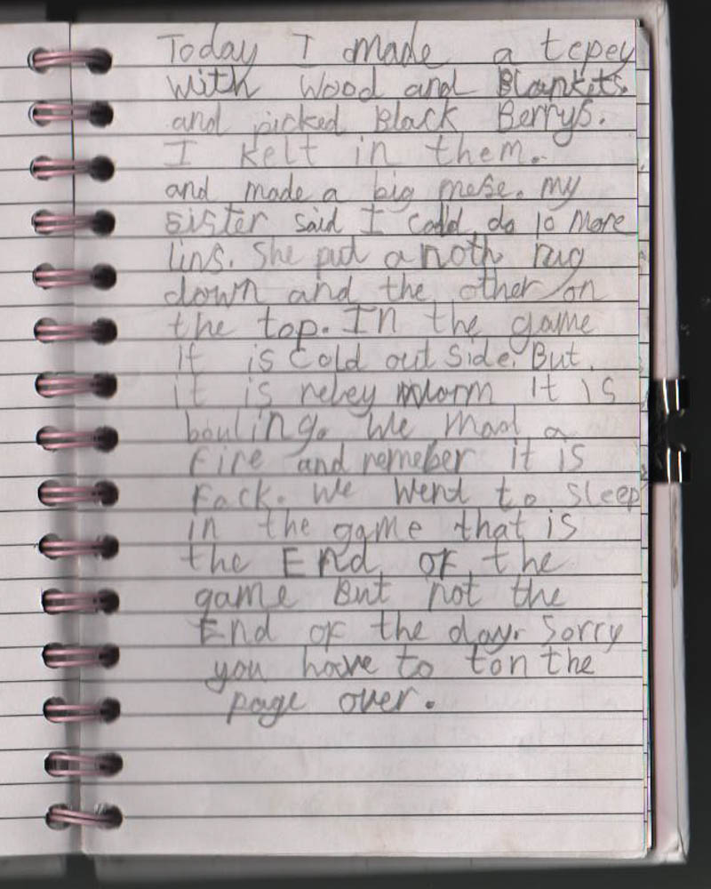
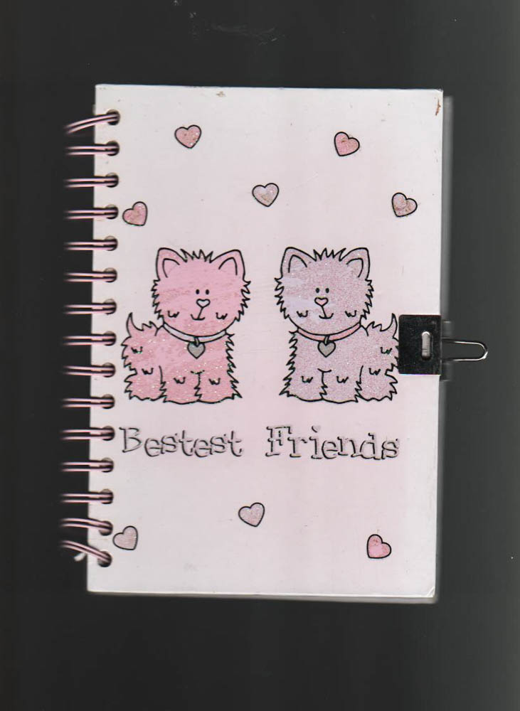
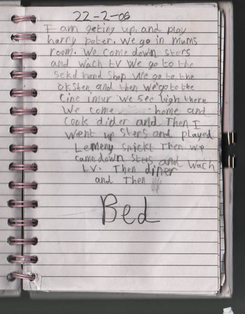
Below is a photograph of the book that i wrote some of my games in as i played them. I was given this book for my 6th birthday by my best friend so all the scriblings were written at around that time in my life. In quite a few entries i even wrote the exact date. Forgive my spelling as it has always been seriously terrible. I think it is quite interesting that this is the only book i have in which i wrote down stories that i played. I think this is mainly because i got so into the games that it never occurred to me to really record what i was doing. This book acted as a record of some of my games as well as a diary towards the end of just my everyday random actions. It was really interesting to read because in reading some of the things i wrote i actually remembered elements of my childhood that i had forgotten and even in some cases remembered playing that exact game.
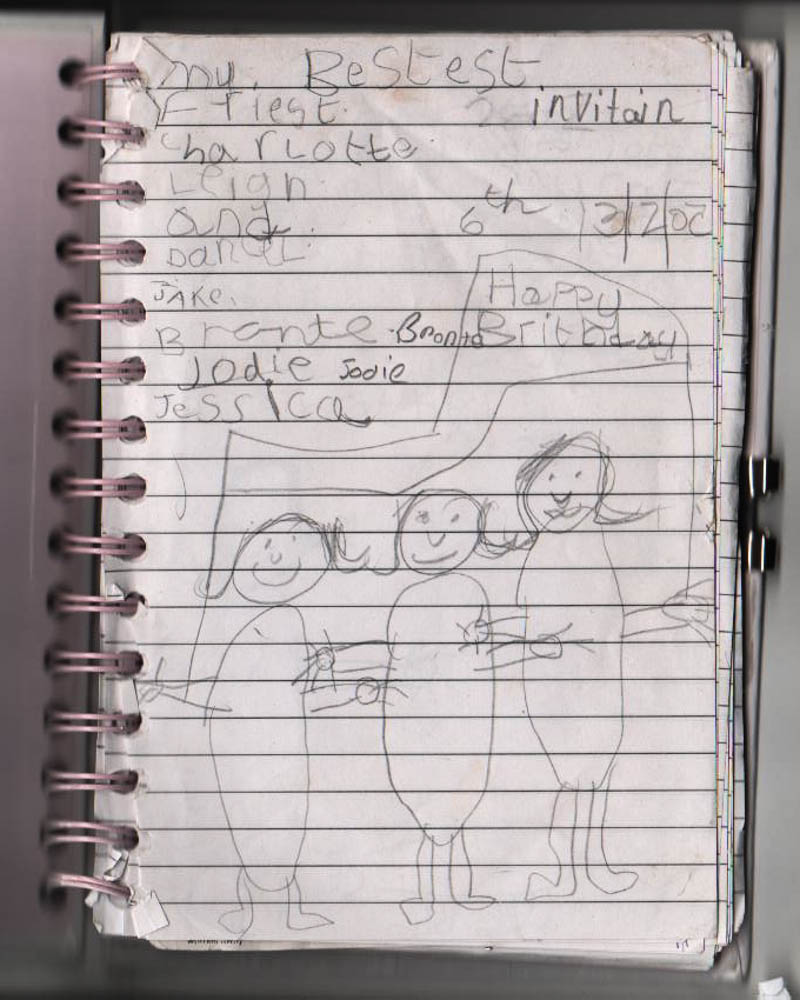
The above photograph i think is actually a really significant page of my scribblings. When i researched why children make dens one of the key reasons is because it gives them a degree of control in deciding who can go in the den and who is privy to the secret of the den. I wrote directly in this book in which i recorded my games within my den the list of people who were allowed in them, even using the word “invitation”. (though spelt horribly wrong) I think this conveys the almost sacred nature of these games and dens, that to the children who make them they are seriously significant. One of the main things i found out in my den research was this notion of no adults and only select children. Children like the independence of being able to choose who they allow in their dens as it gives them a power to exercise their own control and make their own choices. That is essentially what i was doing with this list, making my own decisions about who i would allow in my dens. I think it could be quite significant to come back to this notion of inclusion and exclusion when considering my dens and why children build them. It can be in a sense taken as quite a nasty feature that some people are allowed and others not. When considering it now slightly older it was perhaps really harsh but then when i really think about it i think it was more about adults against kids rather then excluding other children. I think this could be quite a key entry to consider in putting my work together at the end in a final display of images.
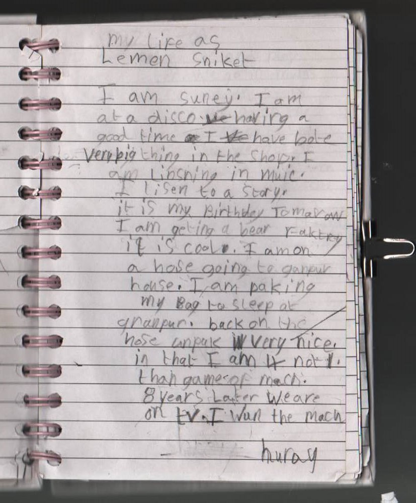
As you can read above all of these entries make very little sense in following a coherent plot line and are the crazed, terribly spelt rabblings of a 6 year old. I think however that it is interesting to consider them in relation to the dens to give an idea of the type of games i used to play. The main concept of the games seems to be that i just take the characters and their characteristics and then develop the game completely away from the normal story line. I think this is quite important in leading on from the consideration of Toroptsov’s work as the “Baba Yaga” story develops out and is exaggerated from the original story each time it is retold. My games revolved around the same concept of taking the basics and then making it into my own story.

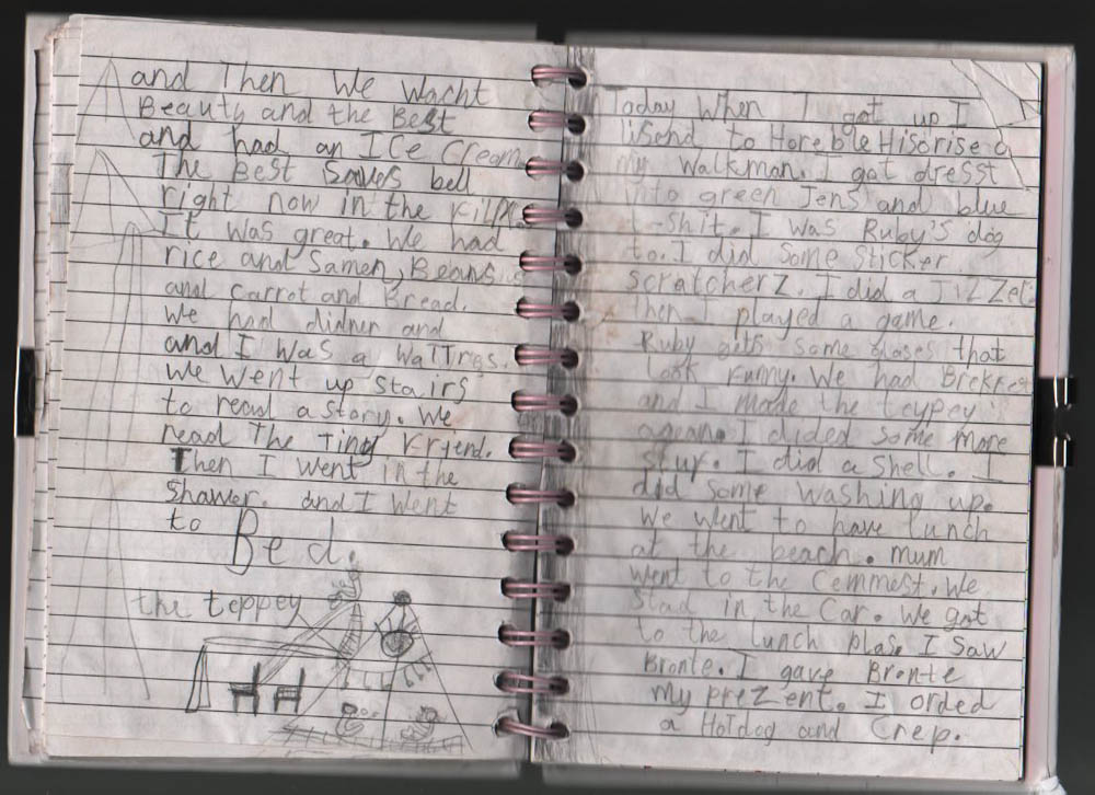
Below you can see more of an exact diary entry within the same book. The way i arranged the book was to have the front of the book as my games for my dens as we played them and then at the back of the book i had diary entries of my everyday life. Because i recorded both it is quite interesting to have them juxaposed opposite each other, the reality of my day Vs the fantasy. I think again if i come to use these writings in my final display of work then i could have these displayed together maybe as a contrast.
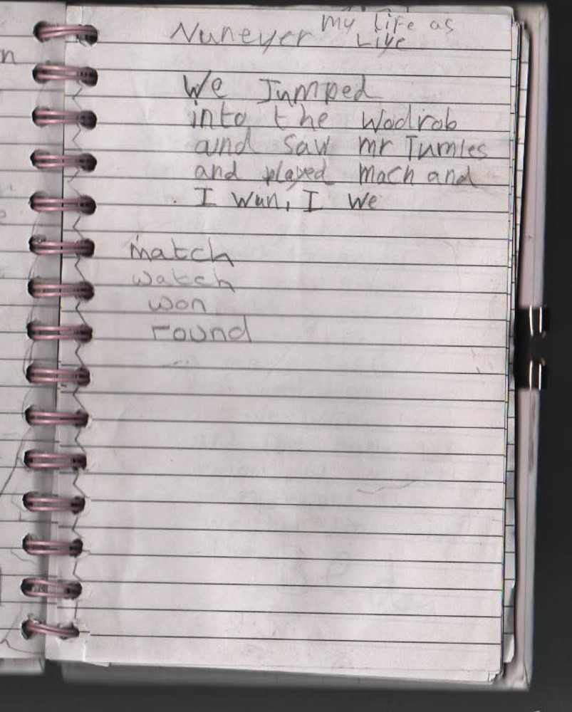
The entry above is also another key entry as in it i describe the difference between reality and the game. This entry was a really random one as it is written without a date, so not like the other diary entries but then it does discuss the reality of my day. I talk about here the building of a den in my garden and the contrast between the game world and the real world. I think this acknowledgment that we are playing a game and that the den is central to the game is a really important element to consider, particularly juxaposed with the other writings and the photographs of the dens themselves. It causes you to consider the boundaries of the games and where a child defines these boundaries when playing the games. I had never really thought about it before but i always remember that when playing the games i would always go to sleep before the game could end and reality could begin again. The game world didn’t end until i fell asleep as that character to wake up in reality again. I think this is a really interesting concept that would be interesting to explore later on in more detail. The question is really did i think i was waking up to reality or how much of the game did i carry on into real life? I remember as a really young child i really wanted to be able to do magic to the point where i almost convinced myself i could. Where did i draw the lines? All this began with the building of the den to create a place in which this character could live. Could it in a sense be interpreted as the building of the dens was to make physical a corner of my mind in which i wanted to be this character? That the building of the den gave me a space and a time and place in which pretending to be this person was okay? Obviously children are very influenced with role models and the people they surround themselves with so was i in a sense trying out all these different personalities by pretending to be these characters? 
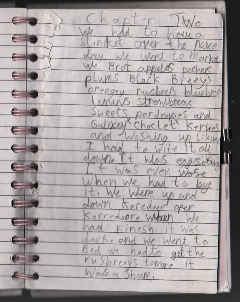
These next set of writings change again to become chapters, almost as if i am writing the game as a book but then towards the end of chapter 4 reality and fantasy mix again and i bring in what i actually was doing. This mix of the two is really intriguing particularly when you read it. I always write about how the day has ended within the game but in reality  the real day is still going.

In the above extract there is a drawing of the exact tepee that is in the game and i also mention the process of rebuilding it. As many of the dens were built from blankets, every time we wanted to re-create a game we need to re-build the den as we had to take it down and put everything away at the end of the day. That was one of the conditions of den building. My mum would let us build dens where ever you wanted and out of whatever we wanted as long as we put all the blankets and stuff back where we found them at the end of the day.
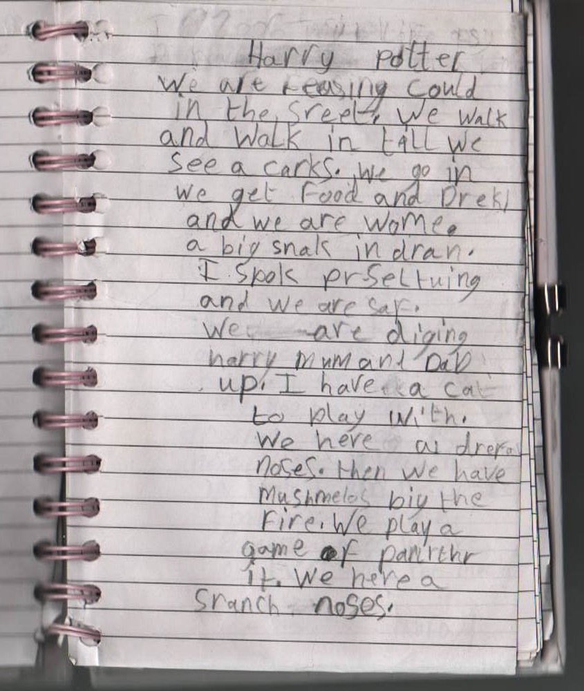
After re-reading all these ramblings of my den building i defiantly want to incorporate these writings into my project somewhere. I think juxaposed with the photographs they create a really interesting element to the dens which wasn’t previously a part of the photographs. As the photographs of the dens themselves are devoid of any people, these childish ramblings create a voice to the dens and begin to tell a story about their creation. I think i also really want to explore this difference between the reality of the den and the fictional world of the den. I think that i might try and do this through art, illustrating the den to include elements of the story world actually within the photograph. I might not be able to do this for all the dens but it is defiantly an idea that i want to explore. Like with  Toroptsov’s photographs being associated with Baba Yaga has such a massive influence on how you perceive the photographs i want these writing to cause people to question my photographs or at least interpret them in a different way. If you just saw the photographs themselves you may not consider how they are childhood dens being made, but the writings and ramblings of these photographs convey that the dens are childish through handwriting ect. I think they add a valuable element to the photographs to make people interpret them in more depth.



Music Video Wild Child influence

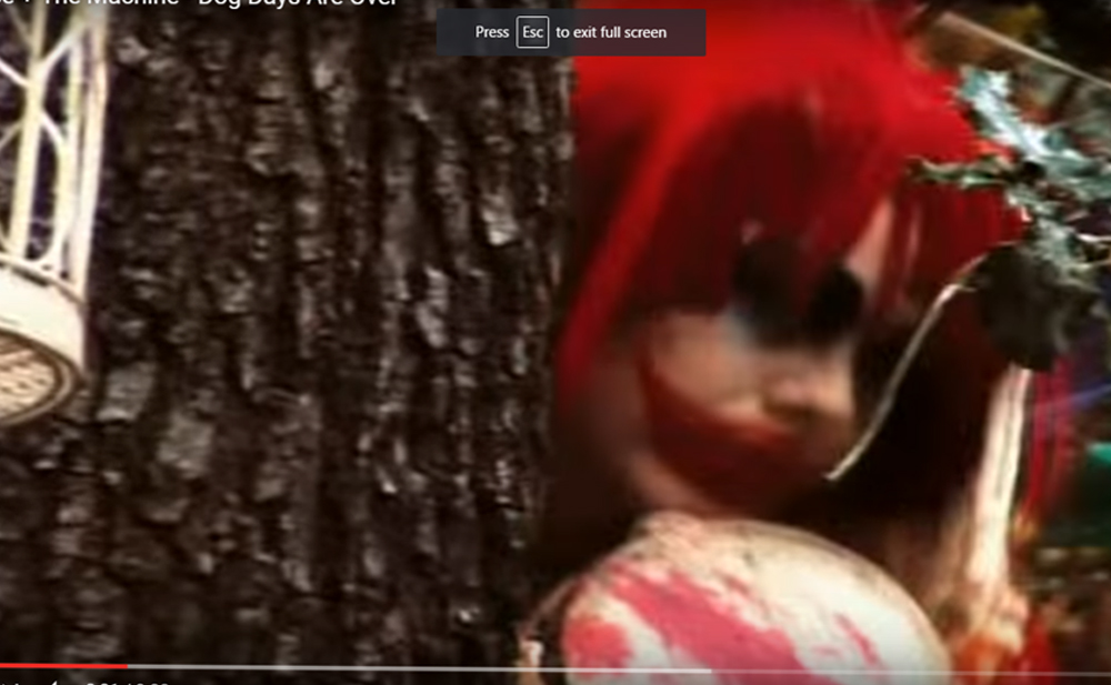
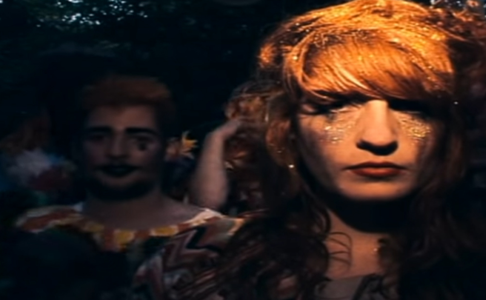
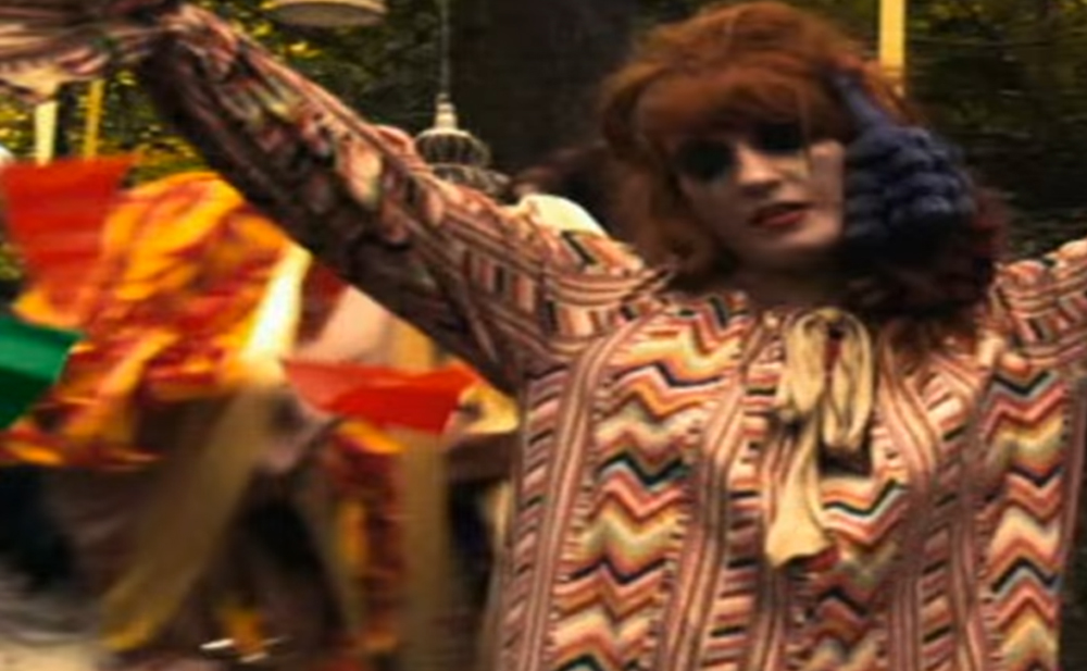
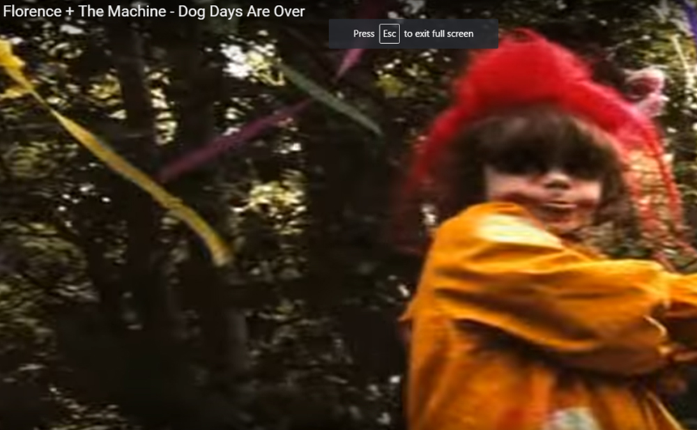
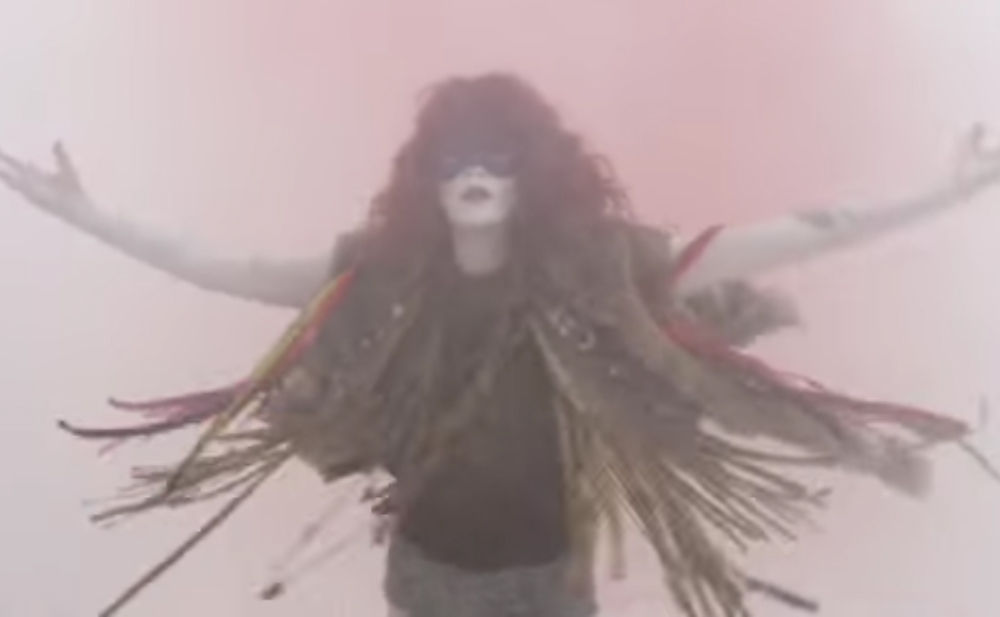
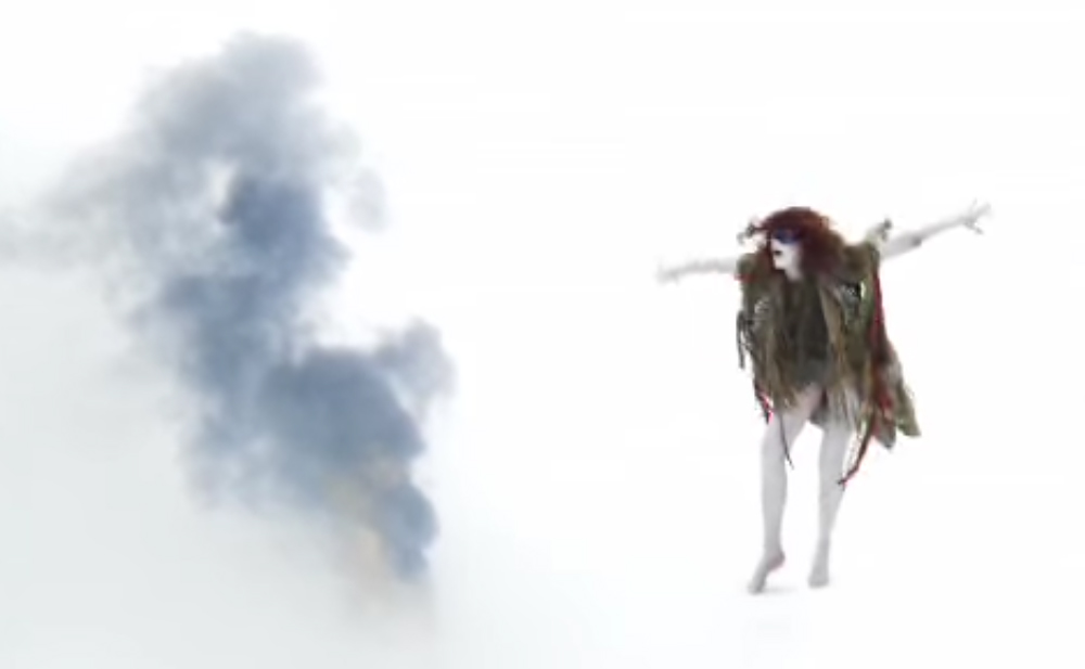
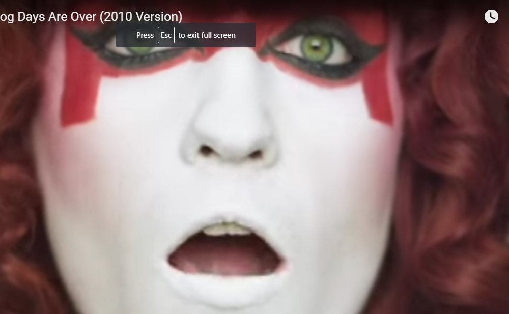
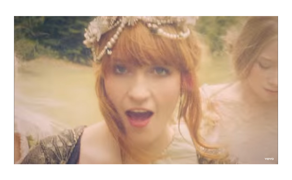
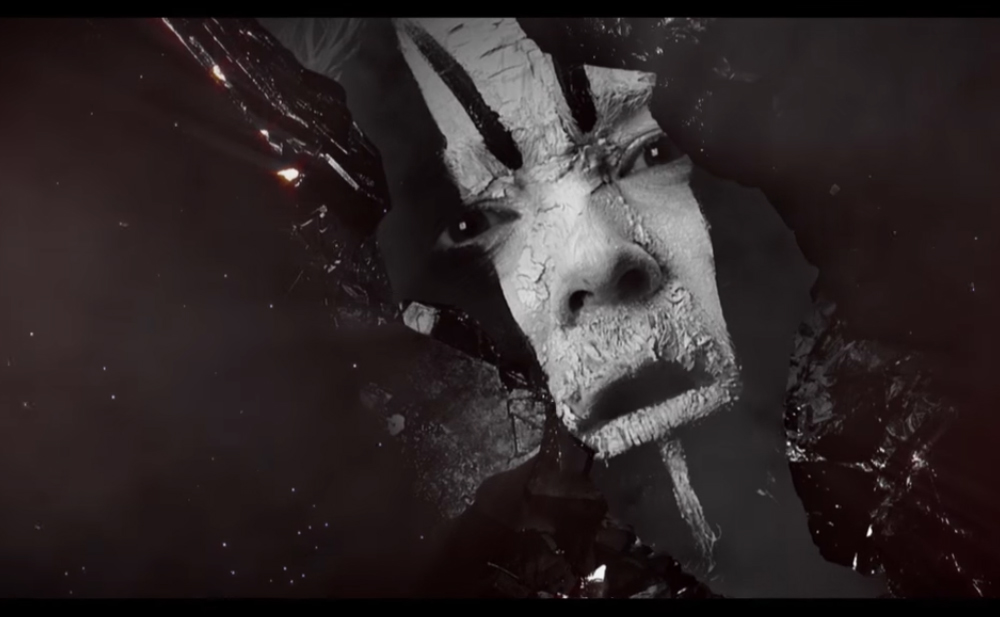
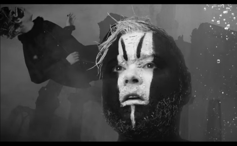
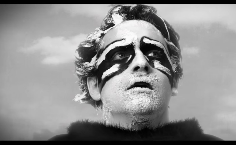
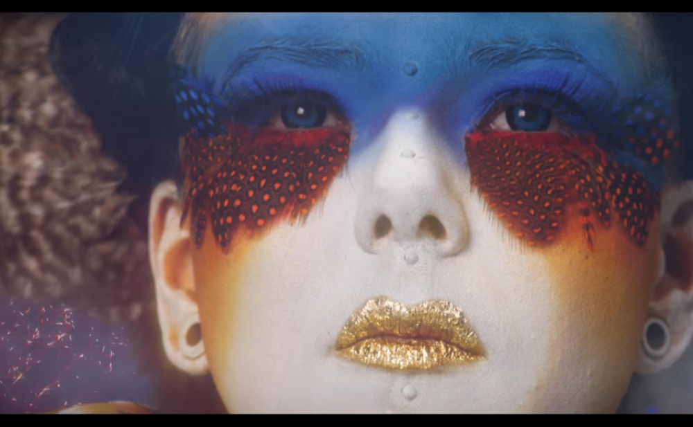
In considering both how i am going to photograph my “wild children” and how to style them i thought it would be good to take inspiration from the music video’s of Florence and the Machine. Her music video’s are often completely crazy and the style of madness and wild nature of the people is what i would like to capture in my photographs.
The first video is “The Dog Days are over”. Basically it revolves around the plot of this group of wild people having captured a sane person and they slowly get her to let loose and join them. All of the costumes in this video are completely bizarre and weird which is what i think really makes a difference in making the people themselves appear so crazy. Colour is a key focus in the the costumes of the people. They are dressed and painted in bold, bright primary colours which make them stand out vividly against the natural environment around them. I think this is important to consider in creating my “wild children” as the dens i am going to be creating are going to be made up of bright and vivid colours and therefore this should also be reflected in the costumes of my portraits. I feel like as i am going to be taking the two sets of photographs separately i can colour co-ordinate elements of the “wild children’s” costumes to the dens, which could look really interesting when the images are juxtaposed together. I think my wild children costumes are probably going to be more subtle then the boldness of the face paint in this music video but it is interesting to consider the impression all bold colours together give. These people look very vibrant and there is an energy to them because of the colours used. I want my wild children to present this childish energy and i think using bright colours is a key way in which to do this. Material also seems to be a very key element of their costumes and crazy hair. I think again it might be quite interesting to have this link between the photographs of the dens and the portraits by including bits of material in the subjects hair or somewhere within the frame. I think it will help establish a further link between the two photographs.

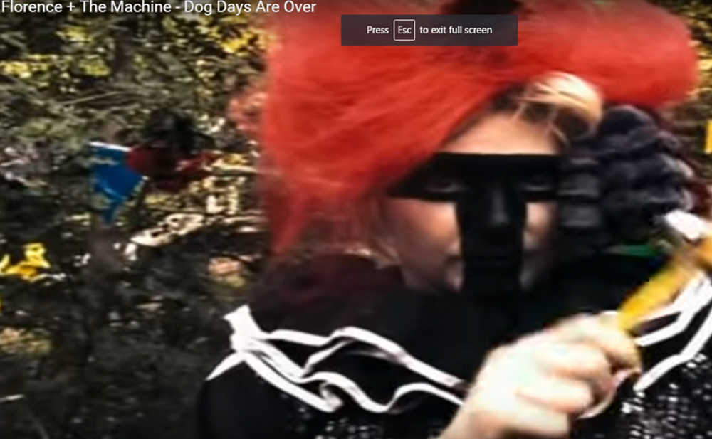
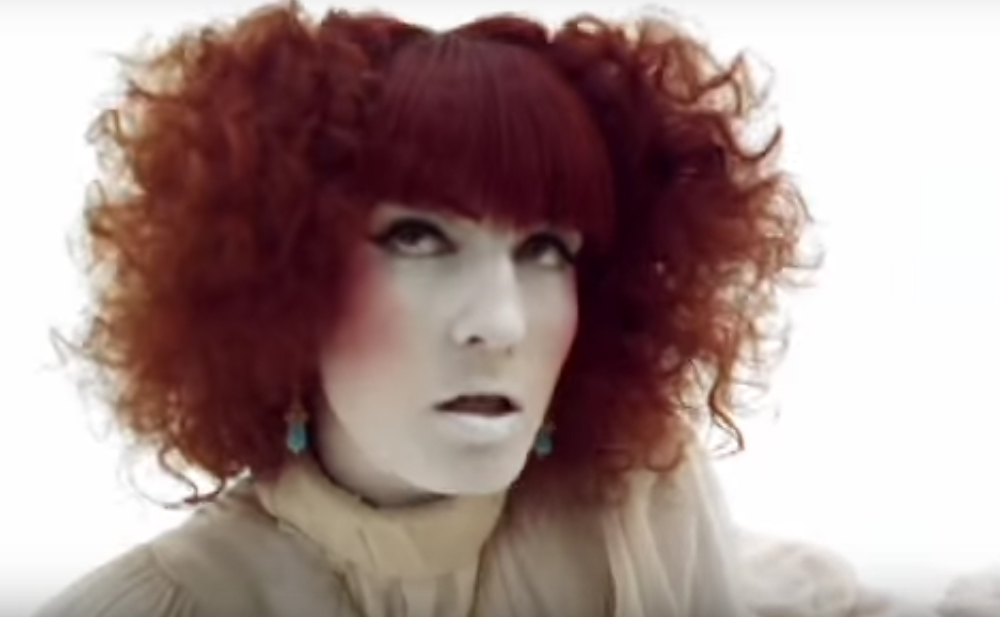
Above is the second music video for “Dog days are over” which i have also taken inspiration from. It is a lot more abstract then the other video through there are some key parts i have picked out to consider. I was planning to mainly photograph just the faces of my subjects and maybe there shoulders. I hadn’t really considered photographing the whole body of the subject but after considering this music video it might be quite interesting to photograph some kind of movement of my subjects. As i have taken the photographs of my dens at night on a low shutter speed it could be quite interesting to take photographs of my subjects on a low shutter speed as well with slight movement. These photographs could then be juxtaposed together or layered and it would create more experimentation towards my final idea.  Also in this music video they only use one colour for the subject, a red for both her makeup and her hair. In the above video i was considering using all bold bright colours and i could experiment with the difference of using one bold bright colour to using several.

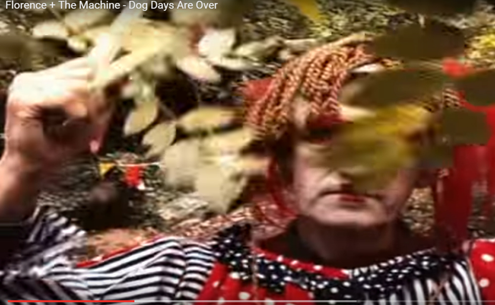
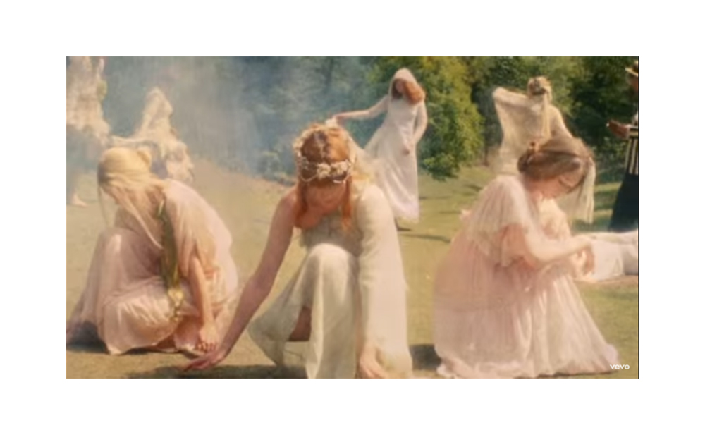
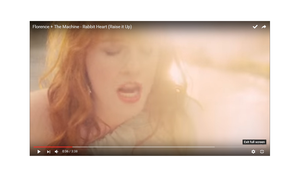
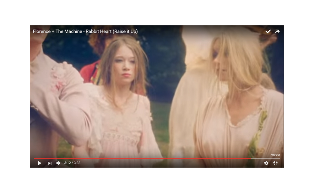
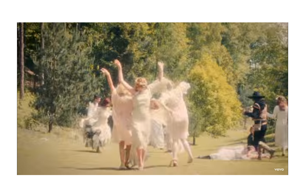
The above music video i considered because of the effect that light has on the portraits and also again it features movement but this time within an environment. The light in this music video is very bright and abstract to the point that the face shots become blurry with the amount of light. I quite liked this effect of the environment influencing the portrait. It got me thinking how i could alter the photographs so that they are more influenced by the environment to use the effect. Also again the movement in this video works really well in conveying a childish, possessed atmosphere. Material and clothes in this video is also again significant as the flowing material creates a real sense of movement. I feel like if i’m going to take photographs of the whole body of my subjects then i really need to incorporate in this sense of movement and widl attitude and i think this can be done by using material.


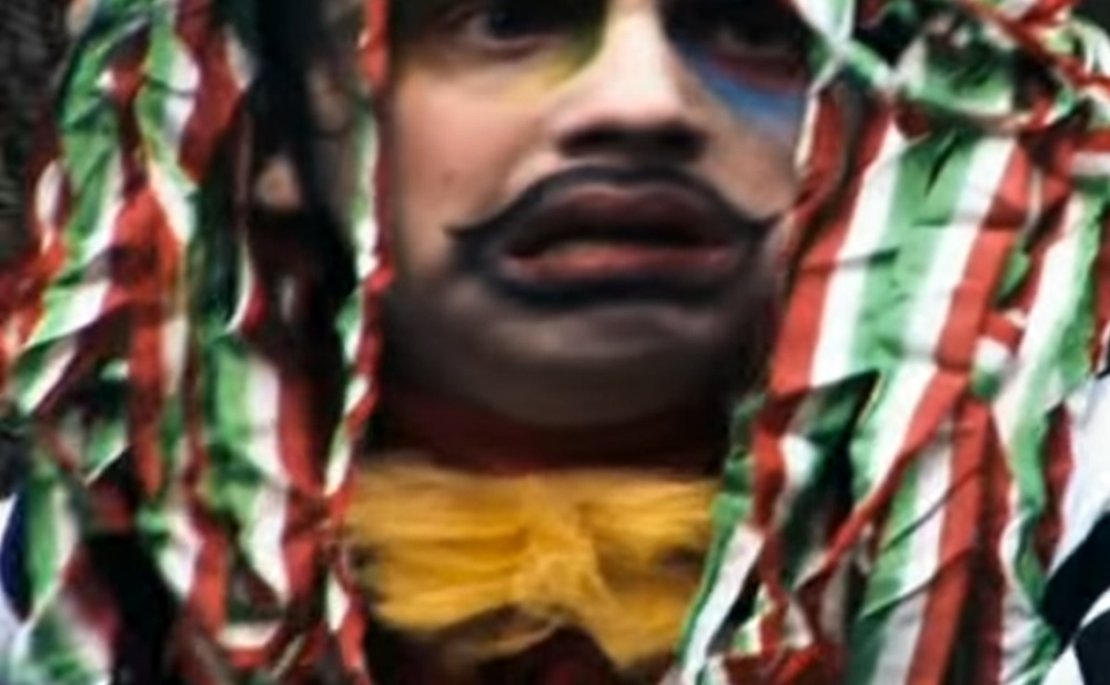
The last video is completely different but i wanted to consider it in the sense of how it tells a story. I want my final presentation of images not to tell a story exactly but to have elements of a story. I feel like by including people into my den project it has more connotations of a story and then people can make up their own interpretations. 

the story it tells on the screen is like the games palyed, the made up elements

Inspiration for wild child look

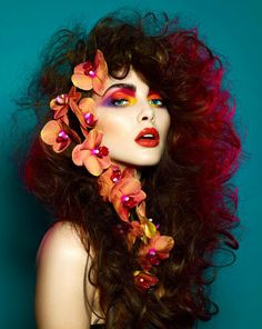
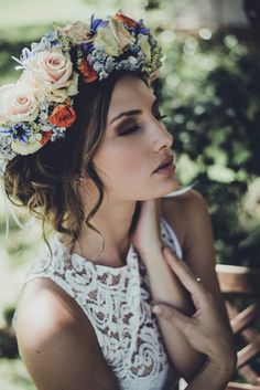
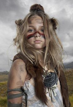
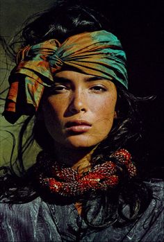
So after considering the stories that i used to weave into my den building games i thought it would be good to create a mood board of the kind of “look” that i used to imagine when playing these games. In the games my friends and I would completely become these characters we were imagining and therefore completely reinvented ourselves in order to fit the way we imagined the characters. Depending on the game the characters would have different elements to them but they always seemed to be pretty wild looking, at least in my own head. Above are photographs which are along the lines of what i used to imagine. Colour seems to be a really important element to the “Wild look”.

I think that i have begun finding with my different dens that each den has its own colour scheme that is different from the others. I think in creating my wild people i am going to try and harness this to have the colours of the den linking to the design of my wild children. I almost want to have one portrait to every den and i think i  can create a link between them by using colour. I think colour is a really simple way to unite the dens and the portraits together as it is instantly identifiable rather then to have a conceptual link. I might even goes as far as to use the same materials which are in in the dens within the portraits in some way, this creating a very strong link between the two.  I think i’m mainly going to focus on photographing the faces on the subjects rather then full body images. I might also experiment with movement  and a low shutter speed to link to my photographs of the dens at night. It might be quite interesting to explore the movement within the same environment the den is built but with the den absent. I think once i do a first experimental shoot i can then access exactly what works and how its going to come together.

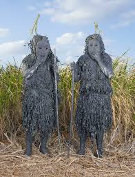
Artist Reference- Charles Freger

“I found myself in front of something very radical, no face … it was more of a character with a mask and a focus where the body is more important than the face itself,”

“For a few nights you can behave like a goat, drink a lot and forget about being civilized. You can be a wild animal for three days and then you go back to controlling your wildness.”

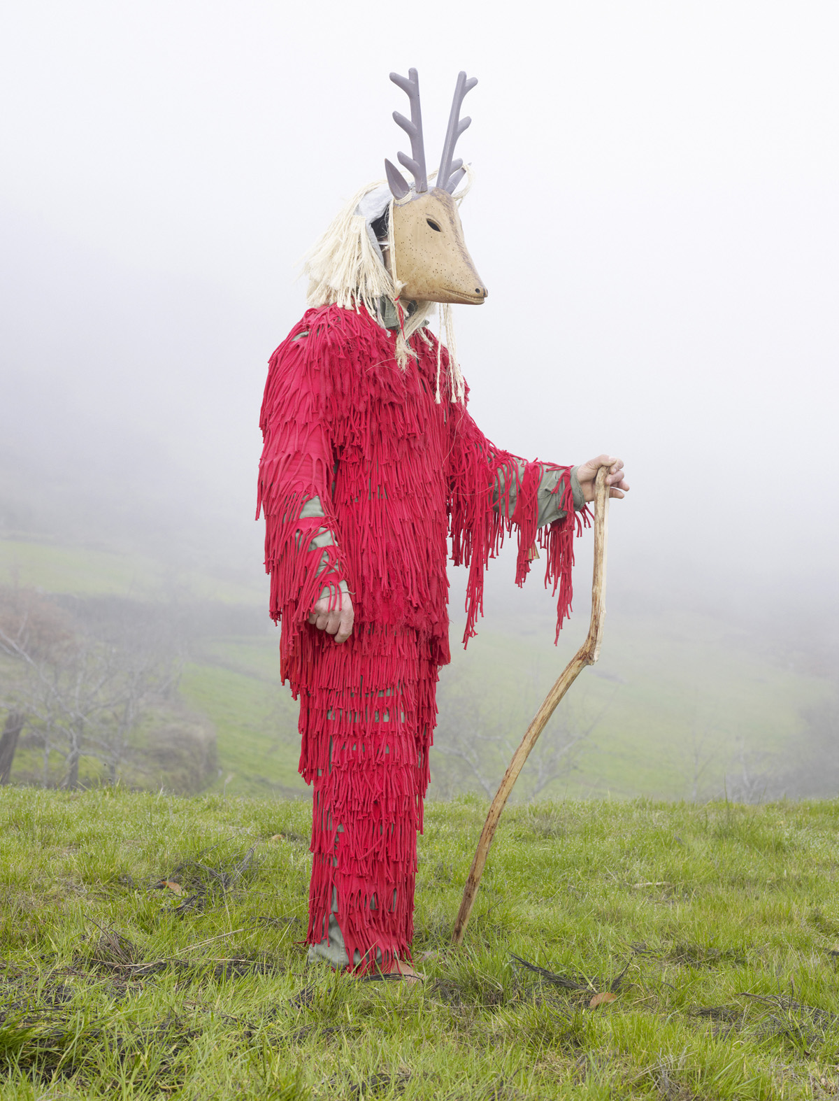
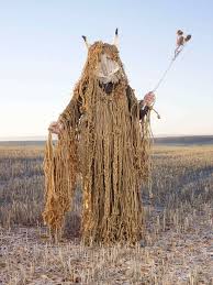
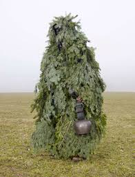
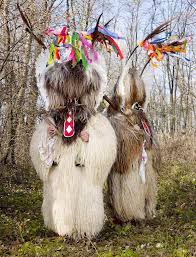
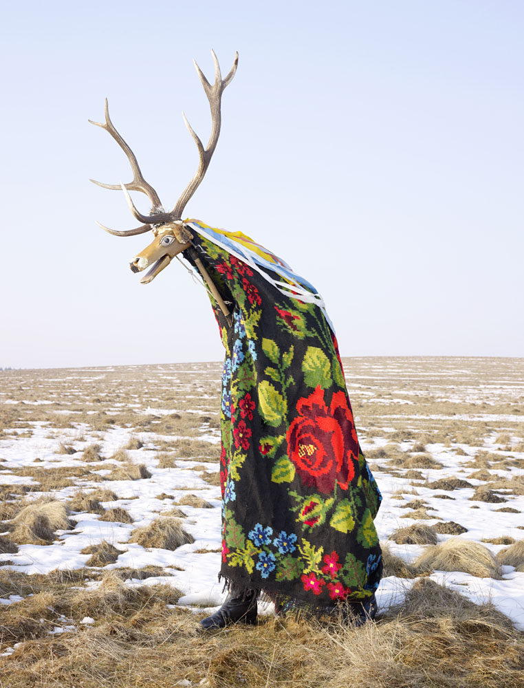
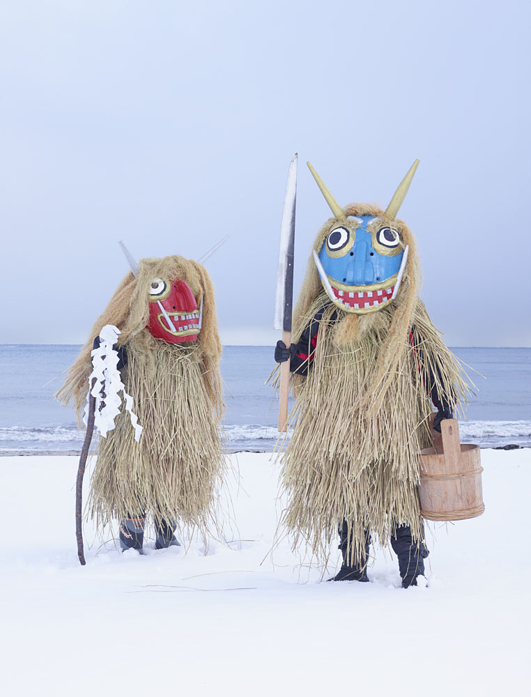
Charles Freger is the perfect photographer to consider in the next stage of my project, photographing my childhood friends as “wild things” that play in the dens. Freger is a French photographer who has traveled to 19 different European countries where he has explored the tribal spirit of the people. He would organize his visits months in advance so as to time photographing his subject just before or after the festivals the costumes were designed for so he could accurately capture the weather of the time. Freger particularly likes photographing his subjects in the snow as many of the festivals are to welcome in spring. The actual photographing of the subjects then normally took him only one day, photographing his subjects both in poses and then also dancing within the environment.

“Letting go” for a couple of days every year to dress up as monsters and let out your inner “wildness” seems to be a common phenomina of human behavior. The rituals in which Freger has focused on are tribal rituals which revolve around the winter solstice and spring renewal. The majority of them have some form of pagan roots. These traditions date all the way back to neolithic times and the behaviour of early men. I have already made a link between the act of den building being an innate form of survival for humans in the past, as they would build dens to live in within which ever environments they found. When playing games as children this is normally the same principles the den building revolves around, building a den so that you can live in the environment, making it a kind of home. I think you can also link Freger’s photographs to the concept of “shedding your skin” and becoming someone else for a while when you dress up in a costume. As children when playing in the dens you play games which make you into a different person and its the same concept of being someone else by dressing up in a costume for a festival. Particularly in the pagan rituals which Freger has photographed the celebrations and dressing up are an opportunity to be someone different for a while. 

“There was a slight touch of universality because a lot of the groups were doing something similar without knowing one another.”

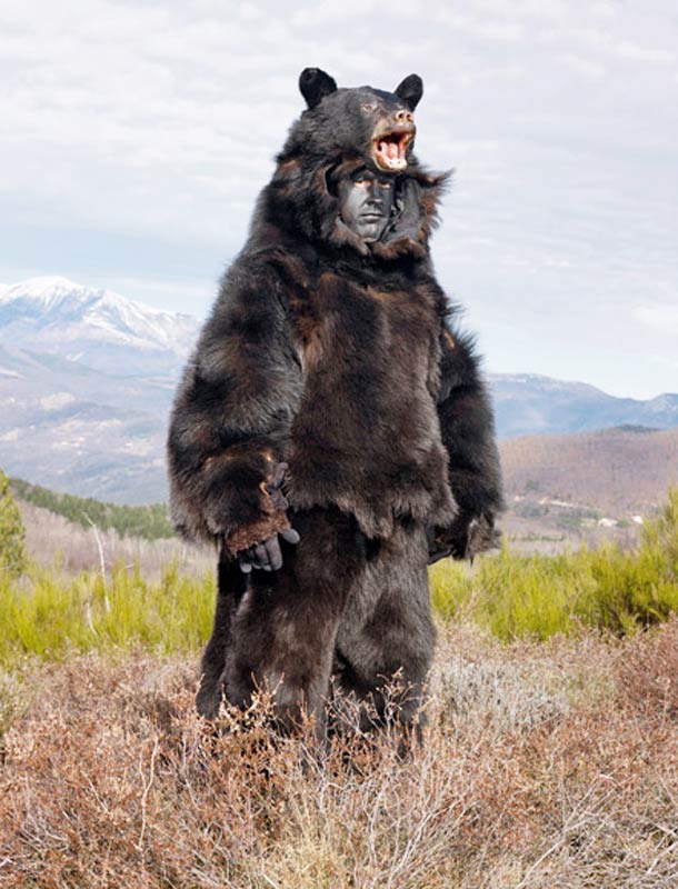
Freger has explored how the rituals of dressing up as these “wild men” often reflect the complicated relationship between nature and the life of the people within the environment, whether this is a celebration of the two coming together or event to ask nature for good fortune. Fregers work explores the contrast between cultures exploring these very similar concepts in very different ways, some costumes made of animal fur and others of flowers but both made to symbolise the same thing. He says the majority of celebrations focus on animals and vegetation. By dressing up as animals it is symbolic of  fertility and freshness in the coming spring. Bears are very common as a costume design or concept as before Christianity the pagan God was a bear like creature. A figure like a bear existed in almost every country he visited through of course there were slight variations. In Germany, the Reisigbar is a bear dressed in twigs and a wooden mask. In Poland, the Macinula is a clown-like figure covered in strips of multi-colored rags and paper. And in Spain’s Basque Country, people dress as the Zezengorri, a bare-skulled beast who carries around a pitchfork. This is a concept which really struck Freger when creating this project. While there were these differences of exploring similar concepts in completely different ways, Freger was also struck by the similarities. He mentions how all these different groups of people without having any real knowledge of each other are celebrating really similar ideas through their festivities.  I think again this relates to den building in the past as a means of survival. People all over the world built dens for the same concept, as a home to live in and yet they didn’t communicate with each other to create a universal den but still there are distinct similarities. They also used whichever resources they had anyone them to build the dens, which is also a similar concept to the costumes as Freger also remarks how the majority of costumes are made only days before the actual celebrations. The people who perform these celebrations are normally farmers and so use the farming resources around them and therefore the costumes are made out of simple materials made to look complex and beautiful.

“Watching humans undergo the transformation from person to bizarre beast is an interesting sight, but it’s even more fascinating once you realize how intricately gorgeous each of the costumes are.”

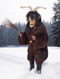
The very first costume and pagan story Freger explored was the Krampus which was a beast like creature of pagan folklore from Alpine countries. This creature was to look after the naughty children while Santa looked after the good children. It was his exploration of this beast creature which led him into his entire project and even to extend the project to cover more countries. The whole project took Freger two years to complete as he traveled to 19 different countries. Freger was really stuck by the complete contrast between the costumes and what they symbolise. He loved how beasts with sharp teeth and claws were actually created to welcome in spring and new life. I really like this concept of juxtaposition between real meaning and perceived meaning due to lived experiences. I think its something i might experiment with in my dens, like the concept of having these dens but then not people in or around them. The whole point of a den is to act as an inhabitantance for people and yet in my photographs i don’t think i’m going to take any with both dens and people in the same frame. I think with Fregers work it is also really significant how he has photographed peoples costumes and celebrations which normally wouldn’t be available for other people to see. Normally celebrations of carnival culture and these festivities are only seen by the people present as they are symbolic. Freger however is bringing these costumes to a wider audience of people and allowing an insight into this previously unconsidered culture. I think den building again follows a similar mentality as dens are built for the people present at the time and even looking through my own archive, are very rarely photographed because they are created for the moment.

Considering Fregers work has been really important in thinking about how the next stage of my project in which i am going to photograph people is going to translate. My childhood friends are going to be dressing up in ways seriously similar to the people Freger has photographed, they are dressing up to symbolize their inner wildness of being a child, symbolizing how we all have this childlike nature that loves to build dens. All of Freger’s photographs revolve around how people love to become wild things and my photographs are recording the same purpose. My photographs are just slightly different in that they are considering the wildness of childhood rather than considering the pagan roots of the community. I think analysing his photographs below will help me even further in the creation of my own images. 

“It is not about being possessed by a spirit but it is about jumping voluntarily in the skin of an animal. You decide to become something else. You chose to become an animal, which is more exciting than being possessed by a demon.”


IMAGE ANALYSIS


The composition above includes two figure who are strategically placed within the frame for maximin impact. Freger carefully crafts the composition of most of his photographs so as to create an impact behind the people and the costumes. In the frame above, Freger uses depth by having one subject in the foreground and one in the background, balancing each other by both together occupying the middle space of the frame. The two subjects then stand in very similar poses, almost acting as mirrors of each other which adds to the eerie nature of the costumes. Both have there legs apart, backs to the camera and face inwards towards the negative space in between them.  This creates a very sinister impression that these two characters are hiding something by facing away from the camera. This creates intrigue for the viewer who wants to be able to see the costumes in their entirety. Freger however by directing the subjects to face inwards is hinting at the masks worn by the individuals without completely revealing them. The photograph appears as if the subjects are just about to turn round completely and reveal themselves and therefore they appear more intimidating.  As well as colour, composition is also very important in the above photographs as Freger has chosen to place the brighter coloured costume in the foreground while the darker is in the background. This works well in your eyes beginning with the brighter figure in the foreground and then moving into the background with the darker figure.  I have noticed in Freger’s photographs that he tries to keep the background as made up of very neutral and natural colours so as not to take away from the bright colours of the costumes.  I think in this photograph having such a plain background is really important as it allows not just the colour but also the pattern of the costume to stand out within the environment. Overall the photograph is a fairly formal composition but Freger has thought really carefully in order to create intrigue for the people and costumes he has photographed.

Quite a few of Freger’s portraits are composed to only include one figure like the above composition. As my compositions are only going to include one figure i thought it would be a good idea to consider some of his photographs in which there are only subject. The above photograph is composed so that the subject is in the dead center of the frame. The entire of the body is within the frame so that Freger can capture his entire costume. With my compositions I will of course experiment with taking photographs which are full body and then just faces but as my people photographs are more about the faces i don’t know whether i will be using the full body photographs. Freger has then directed his subject to stand at an angle facing towards the right hand side of the frame. This causes the head of the bear to be facing away from the camera which creates an eerie contrast with the face of the subject staring directly into the camera. The eyes of the subject stand out really vividly against the face of the subject as they are really bright and this lighter colour brings out the face of the bear as well. The background is also made up of really light colours which causes the darkness of the bears costume to stand out more. The costume is the darkest part of the photograph and therefore stands out vividly against the paler natural tones of the background. The background is made up of really light blues greens and golds which allow the black to stand out. The background compliments the costume by being in layers which look very much like the layers of the furs. The whole composition of the photograph is really significant in making the costume and subject look really powerful. By having the mountains in the distance which we associate with being a really powerful element and then to have this in contrast with the bear costume as the mountains are small in the distance it makes the subject look more imposing.

Below is a video which shows Freger at work directing his subjects into positions. I think after considering his work it has been really useful in thinking about how dens are a form of reversion to childhood and letting to to embrace your inner wildness. I also quite like his formal and straight on photographic approach as i think it allows you to really consider the person and their costume rather than being distracted by a complicated composition.