// J A C K PART 2 //
The second shoot with Jack was the external environment which was selected by the model, Jack. I asked each participant three questions before I planned out the shoots which are shown below.
Where is home for you? Why is this place home? Are your family there? Do you feel safe here? What is it that makes this particular place home?
Home is wherever my family is and a place that I feel comfortable. It normally tales me a while to settle in somewhere, but I always have family and friends and try to stay positive and surround myself with positive people. Anywhere can be home as long as I’m happy.
What makes Jersey important to you? Do you have good memories here?
Jersey is the place I have grown up, it will always he special to me. It hasn’t always been easy, but then again it isn’t going to be easy anywhere. I have made so many amazing friends and happy memories here. I’ll never forget this lil rock and the awesome times I’ve shared here with my friends and the little adventures I took to find quiet places to relax and unwind.
Where in Jersey holds the best memories for you? Why is it positive for you?
My favourite place is actually a newly discovered area. It was previously the top of the hill in St. Brelades (just beyond the wayside cafè). My mum took me up to Val de la mar reservoir and I immediately fell in love with it. There are so many paths and unique plant life in the separate areas. Parts I like most are the Australian and Japanese sections. But my absolute favourite part is just above the Japanese section where there is an incredible view over the reservoir and St. Ouen’s bay.
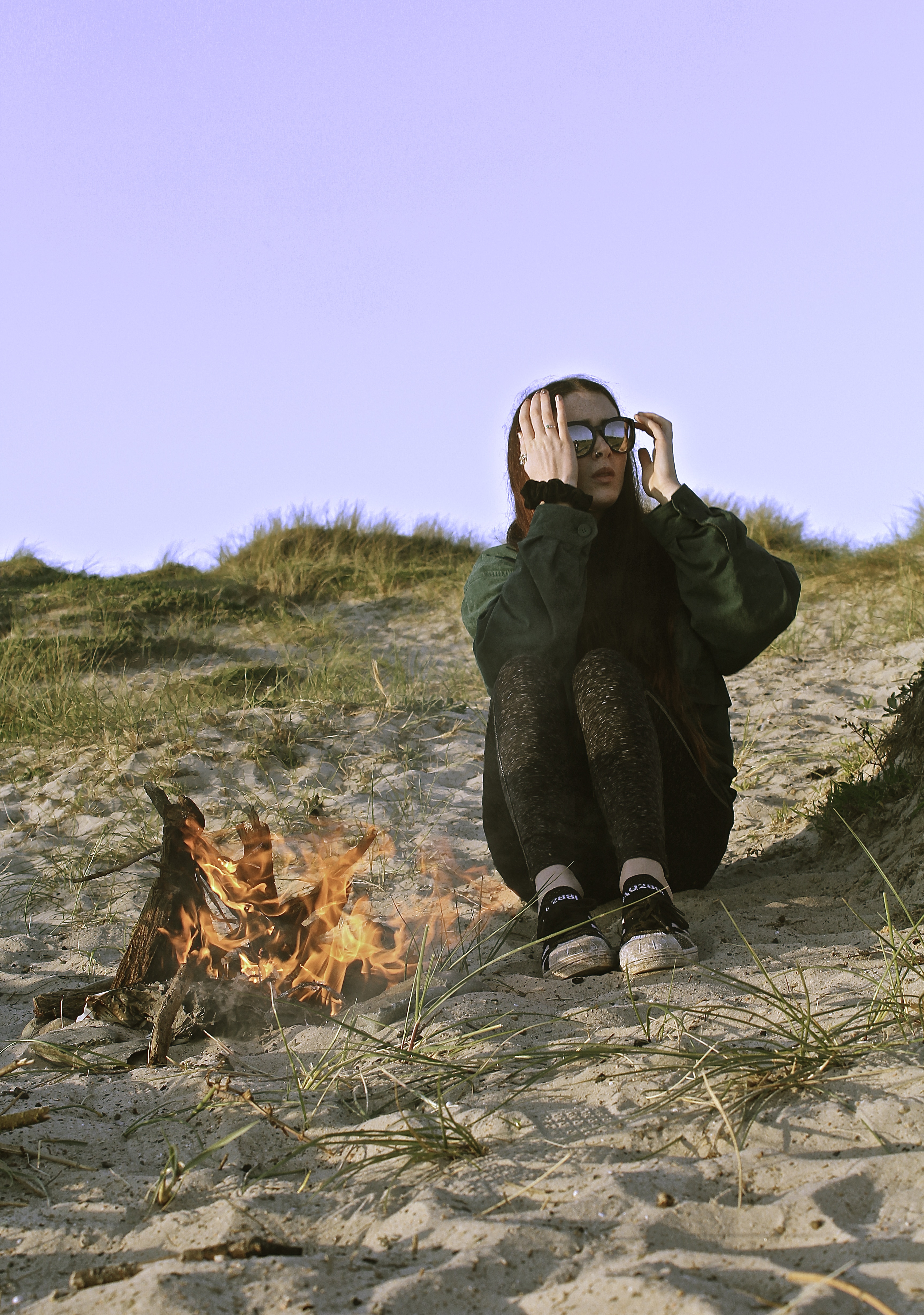
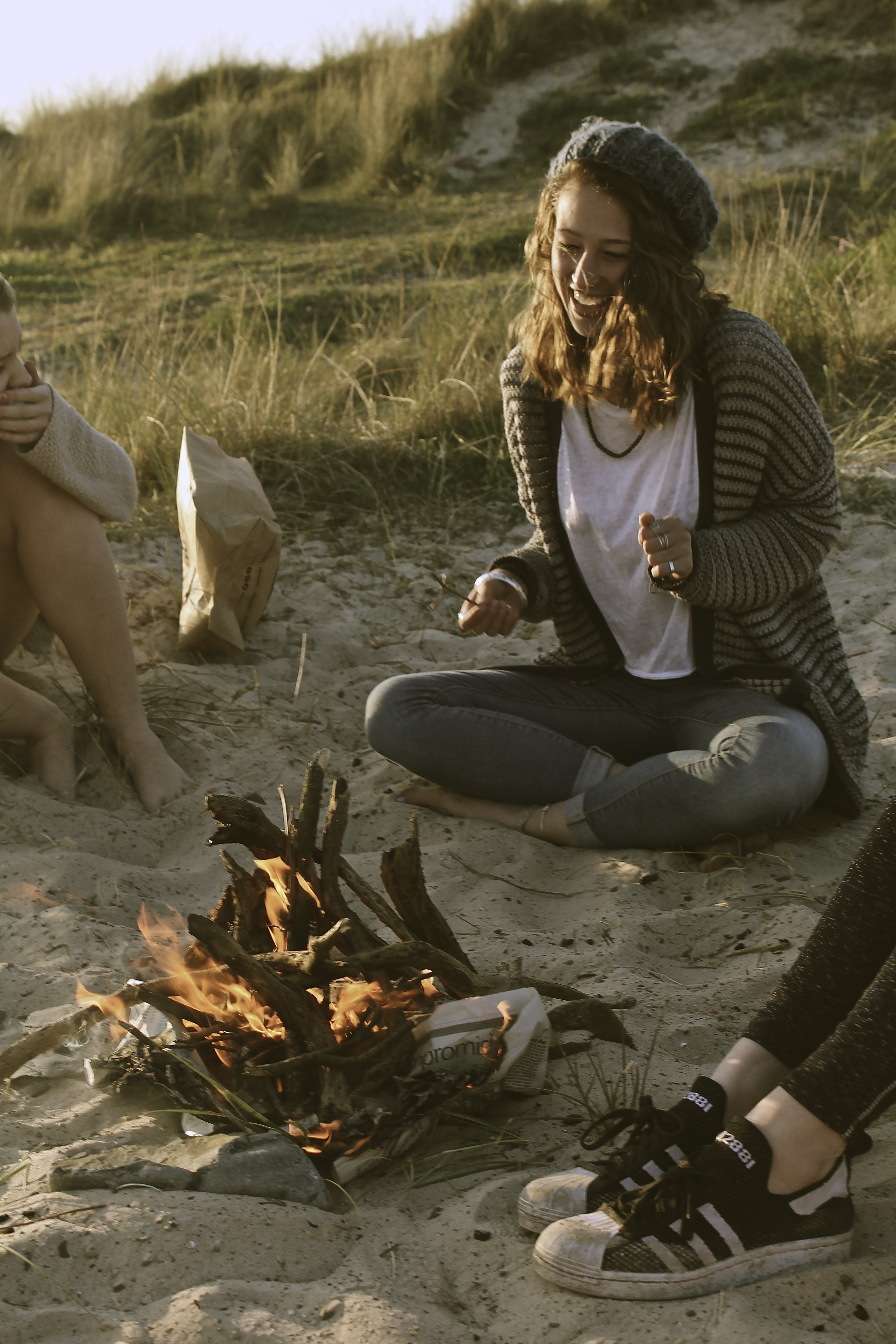
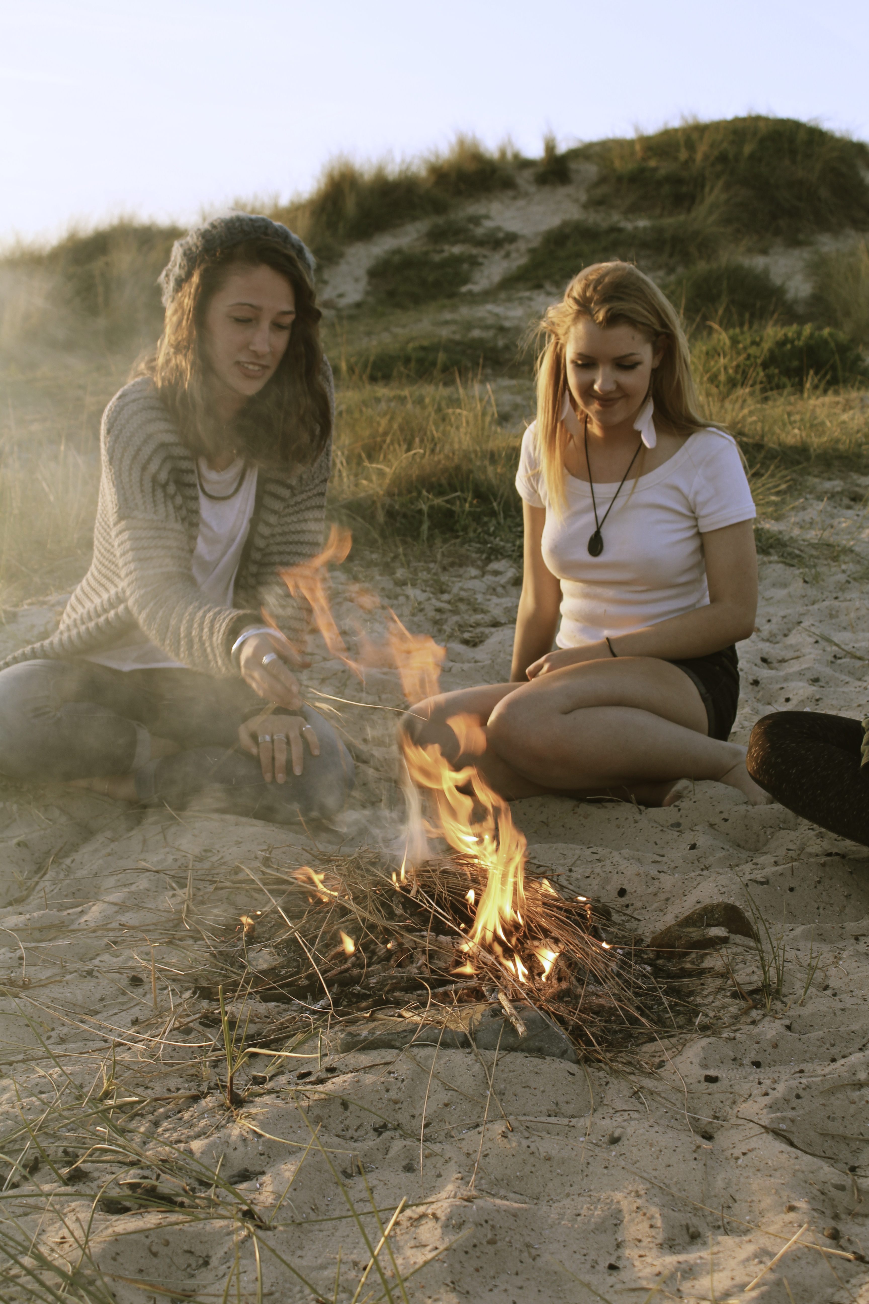
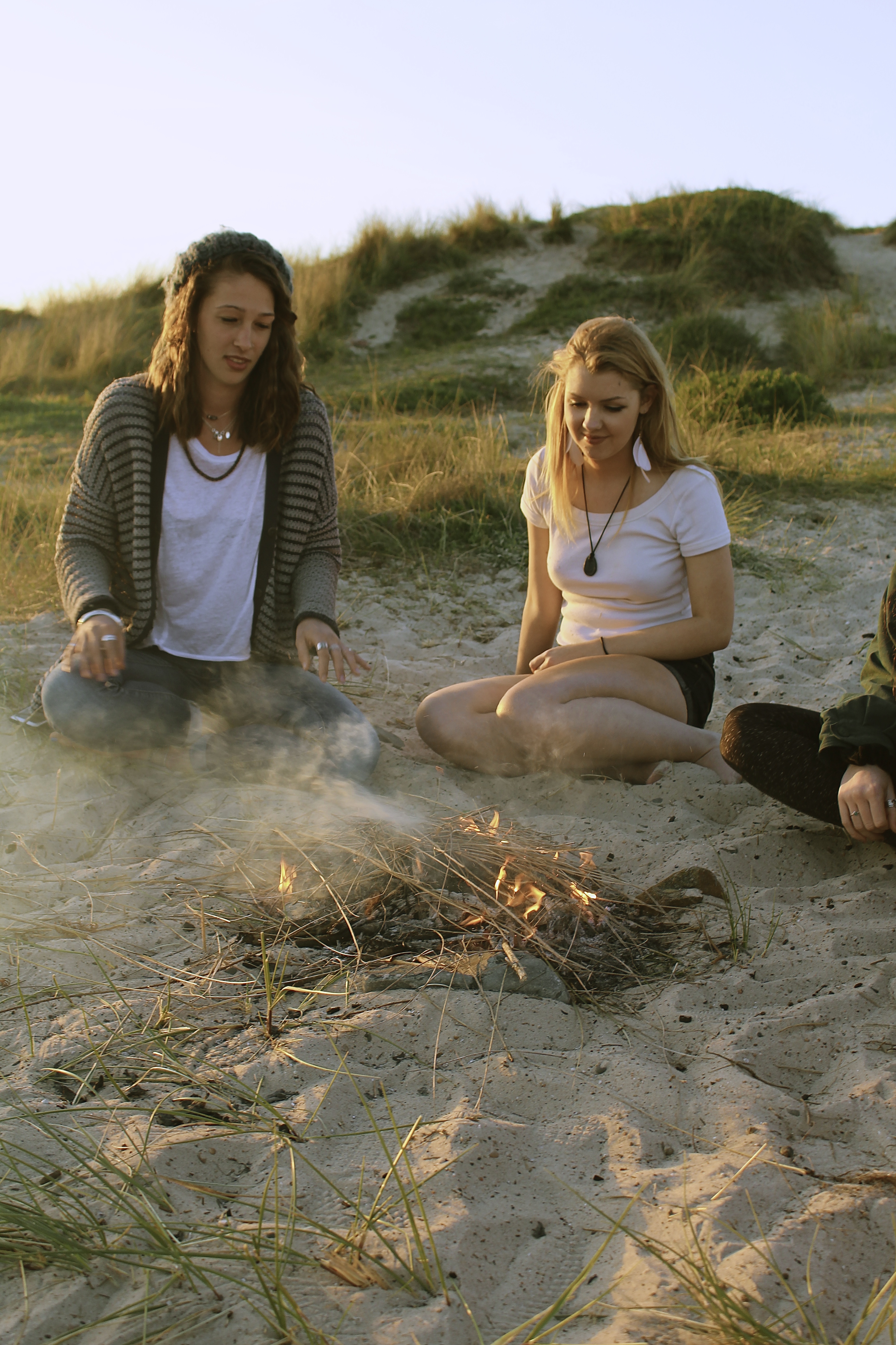
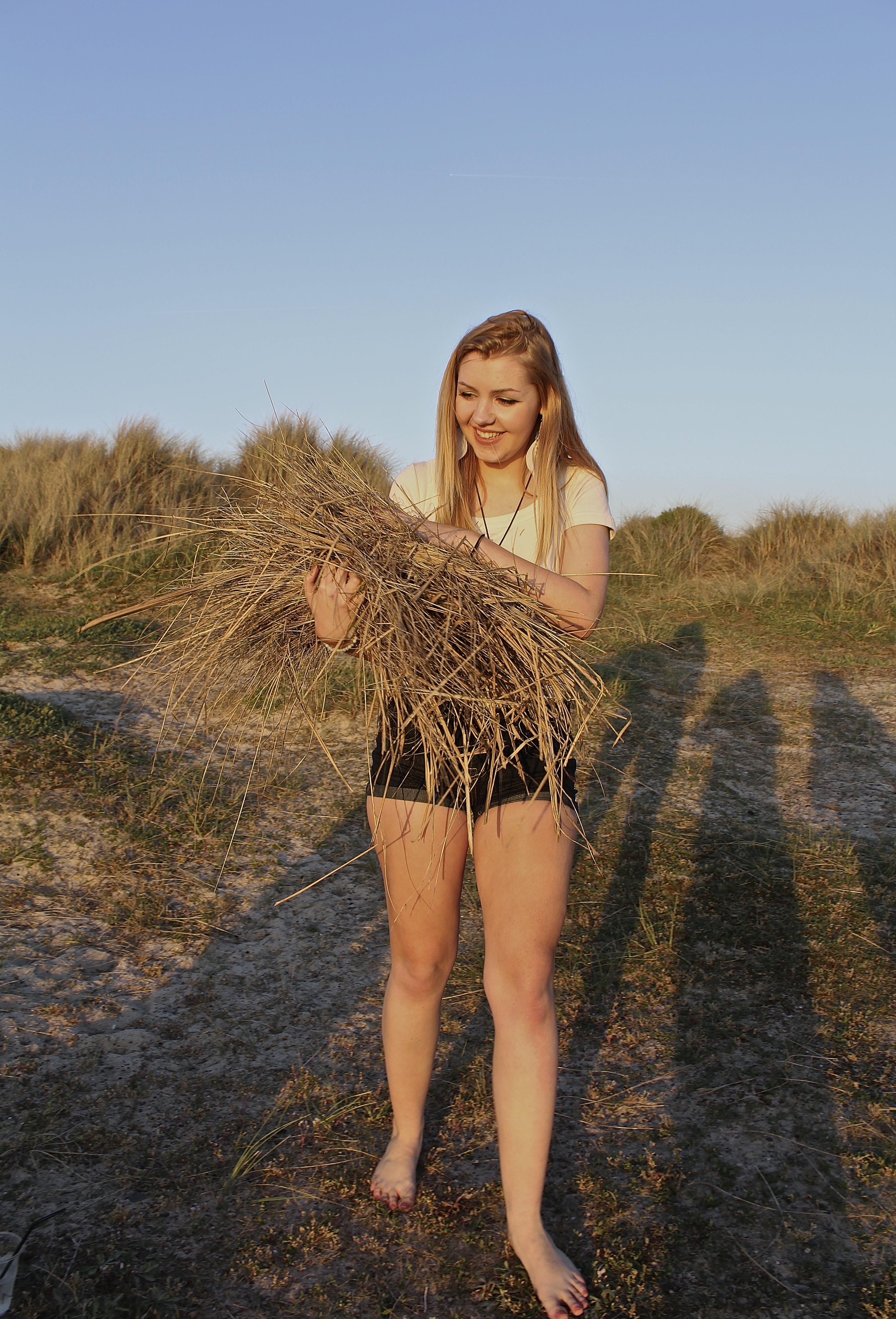
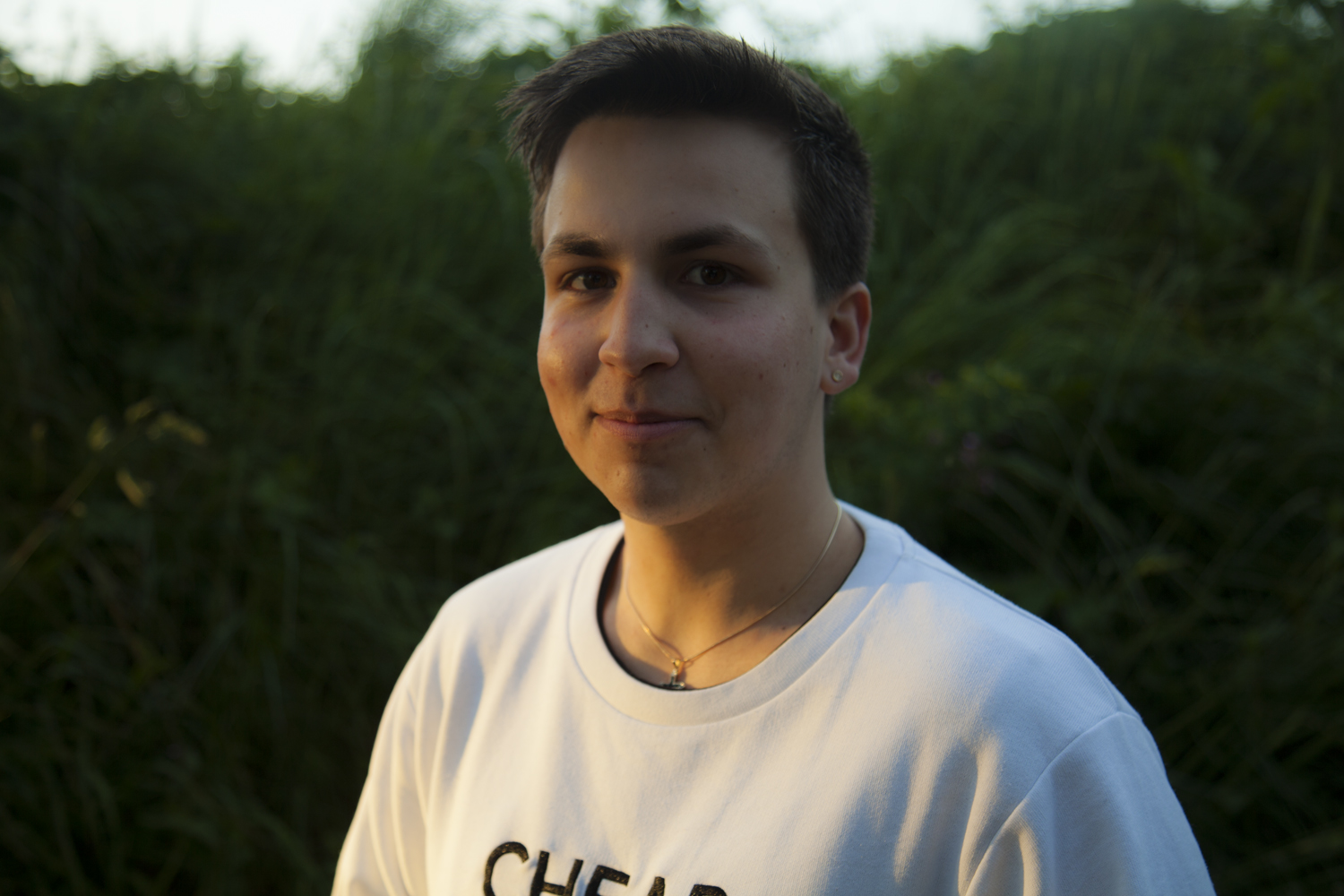
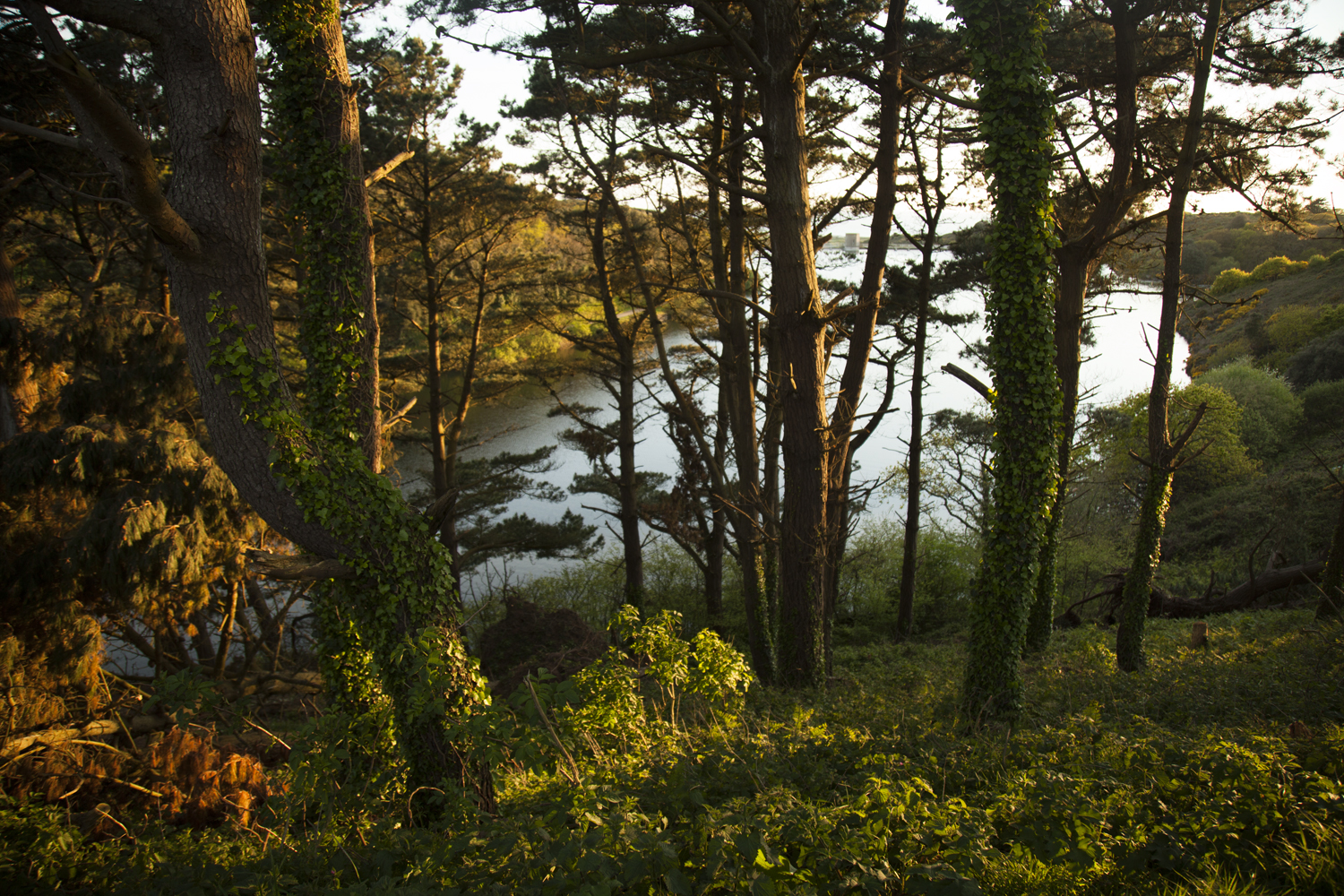
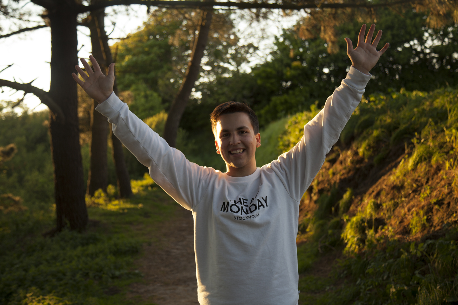
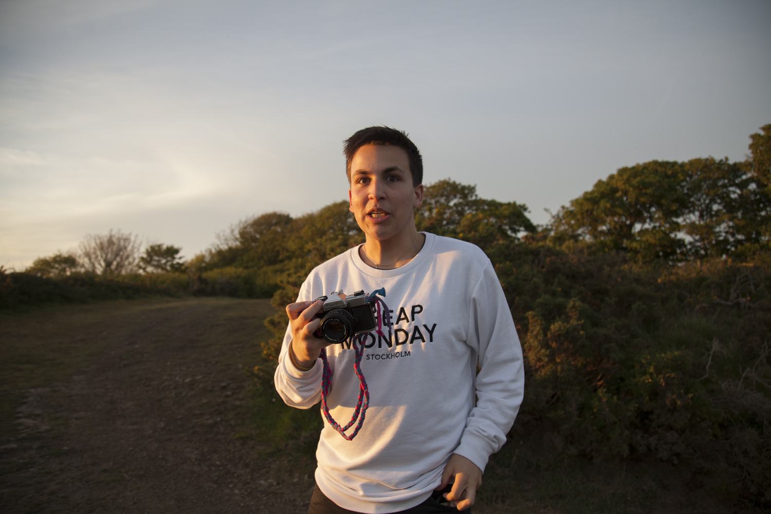
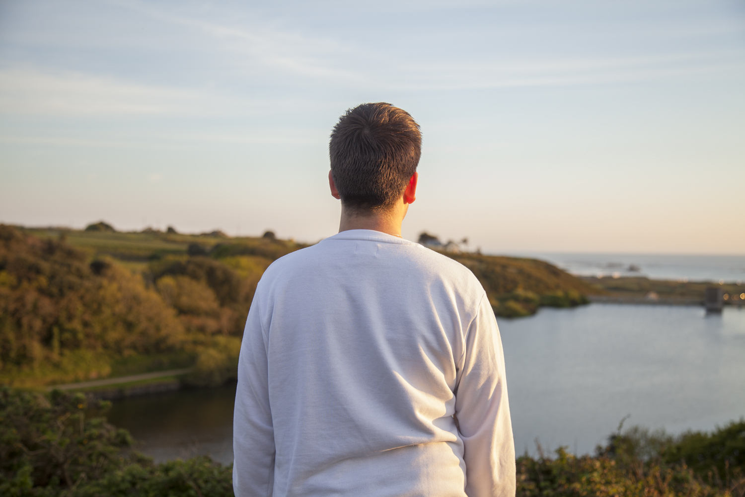
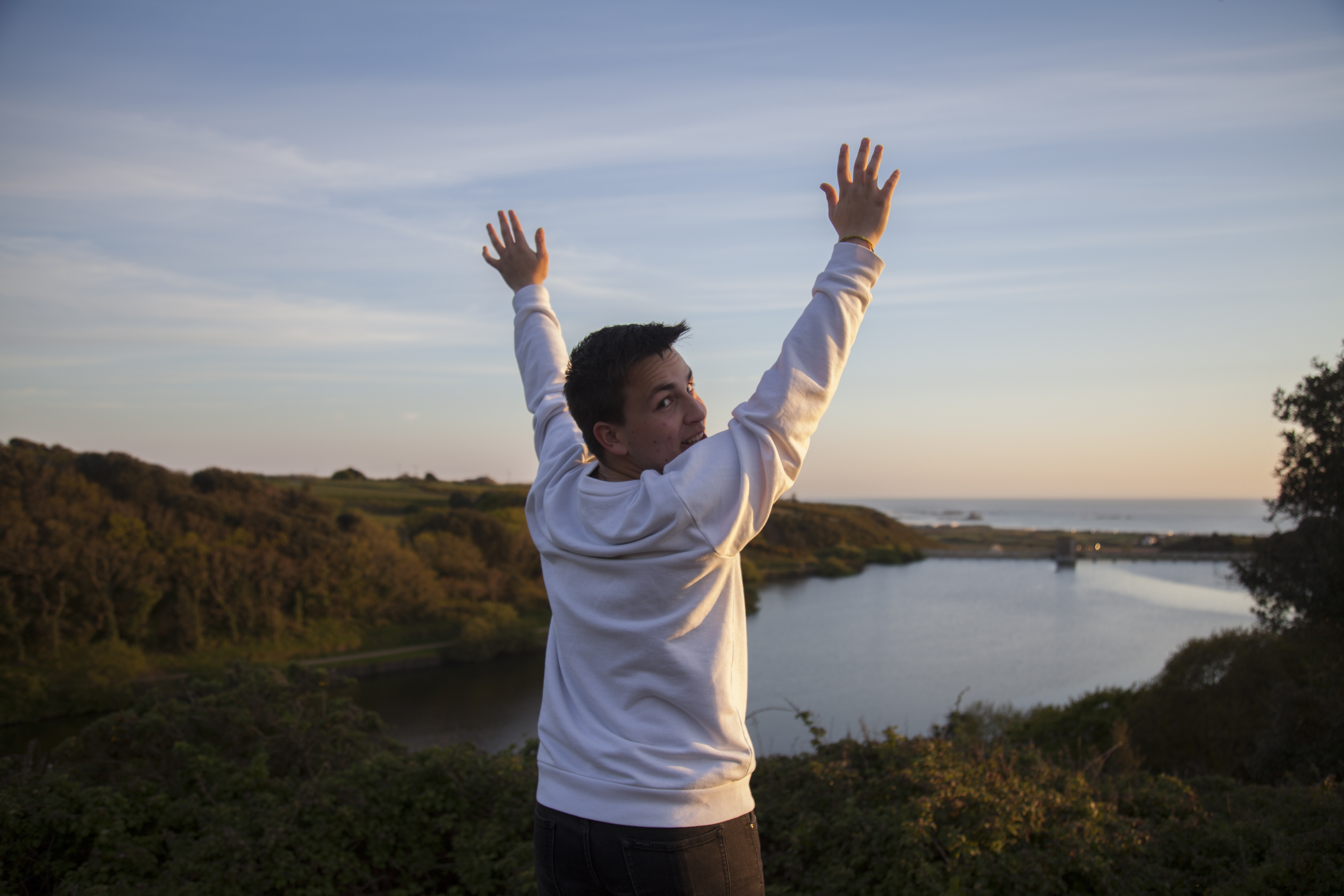
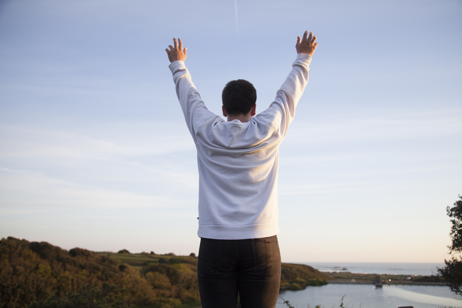
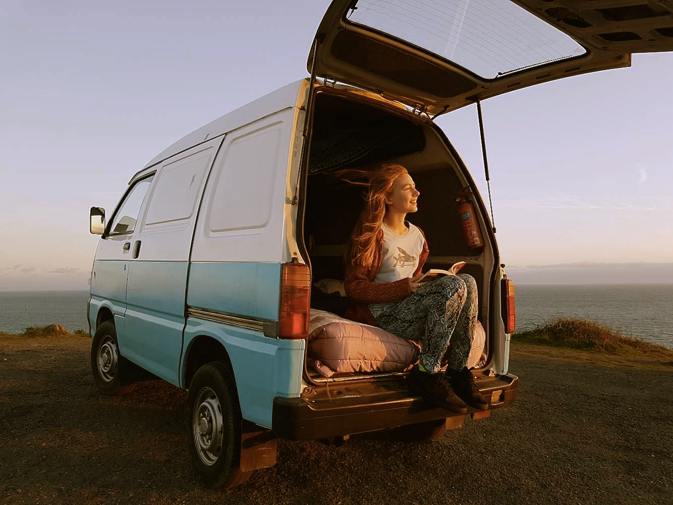
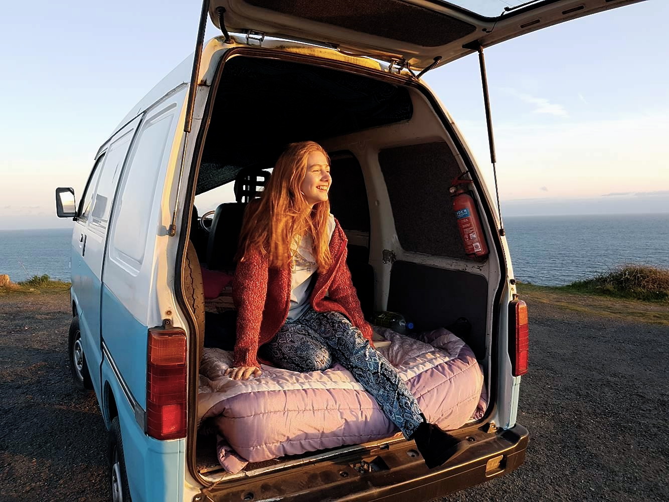
With this response from Jack to work with, we went up to explore around the area and shoot in each of the places previously mentioned. Below is a small selection from the session.
The images above are from the walk we took and show a more varied selection of photos facing different angles with changeable lighting. Below are a selection of images which might be suitable for the final picture of this project section. The portraits are stylized and feature people looking at a particular landscape from the back. details on the body are limited – so no facial features are visible – and there is a much higher emphasis on the area itself. Contrasting this with the inside portraits which feature characters looking strait on, there is a bigger focus on the environment rather than the person here.
J A C K
The two images I have ultimately selected for this project share a continued line of similarity across their compositions and photographic structure. The first from the home shoot is exactly what I was looking for. A blank expression that shows the figure in their home environment around the things they have grown up with. For many of my models they are still in rooms which they have had since they were very young which is visible in the images. There is something surreal about the contrast between the figure and the backdrop. It is more than typical to surround yourself – and in particular your room – with things that mean the most to you. In a way these portraits are reflective not only in the character shown but also in their room which is ultimately a self portrait of their attitude and emotions.
The internal shoot produced this outcome below which shows the character, Jack, sat in his bedroom at his mum’s house. There is a lot happening in the image so to highlight the central figure I adjusted – mainly through trial and error – the lighting and curtains in order to alter the natural highlights produced across the face. The duvet and blankets mirror several of the colours featured in the background a






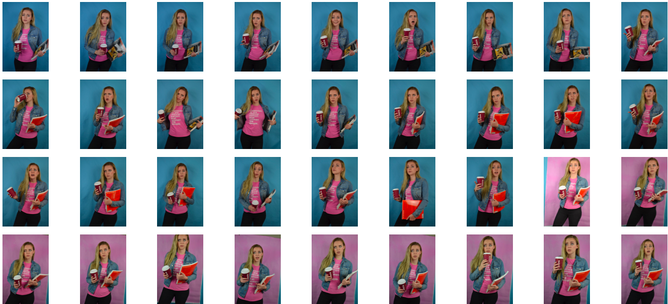


 When selecting my final outcomes out of the images above I wanted to make sure that I included a varied selection of each subject I have created. Below I have chosen five photographs (out of the 12 original images) that each show its subject matter either from a different viewpoint or in a different light. When it came to editing these photographs the first thing I did to all of them was make them more dramatic and eye-catching by playing with the exposure, shadows and contrast. After this, I judged each photograph individually and went through my normal editing routine of changing things like colour, temperature, clarity, saturation, highlights and blacks. The reason I have decided to keep all these outcomes in full colour is because they are aimed to catch my viewer’s attention and really stand out.
 The final outcome above is my favourite result from this creative symbolism shoot. To create this subject matter I used a black sheet of fabric I had at home as well as a Nutella jar lid, some old fishing rope and loads of plastic bottle caps that I found on a few of Jersey’s beaches; ultimately arranging them into the shape of a fish. Although abstract and eye-catching the context of this image is to spread awareness about something very bleak. The reason I have created a fish is because it is a good symbol for the ocean and its ecosystem and can give the viewer an idea about the wider message I am trying to get across. I love how I have captured the composition of this subject matter and enhanced its dramatic intensity by manipulating colours, contrast and highlights.
 The next final outcome displayed above depicts a jellyfish made with blue rope creating movement in the background, bottle caps forming the shape of its head, and separated strands rope as the tentacles. Although I was not really planning on creating this subject matter, as jellyfish are not really symbols of the whole underwater eco-system, I have found that this idea has, in fact, worked very well. The meaning of this subject is to show a futuristic world where all marine life has been replaced by our waste. This is futuristic tone is emphasised by the neon colours I have created and the black dark ocean background. Overall I think this abstract piece has a really strong centred composition and I have managed to create a really intriguing yet ominous tone.
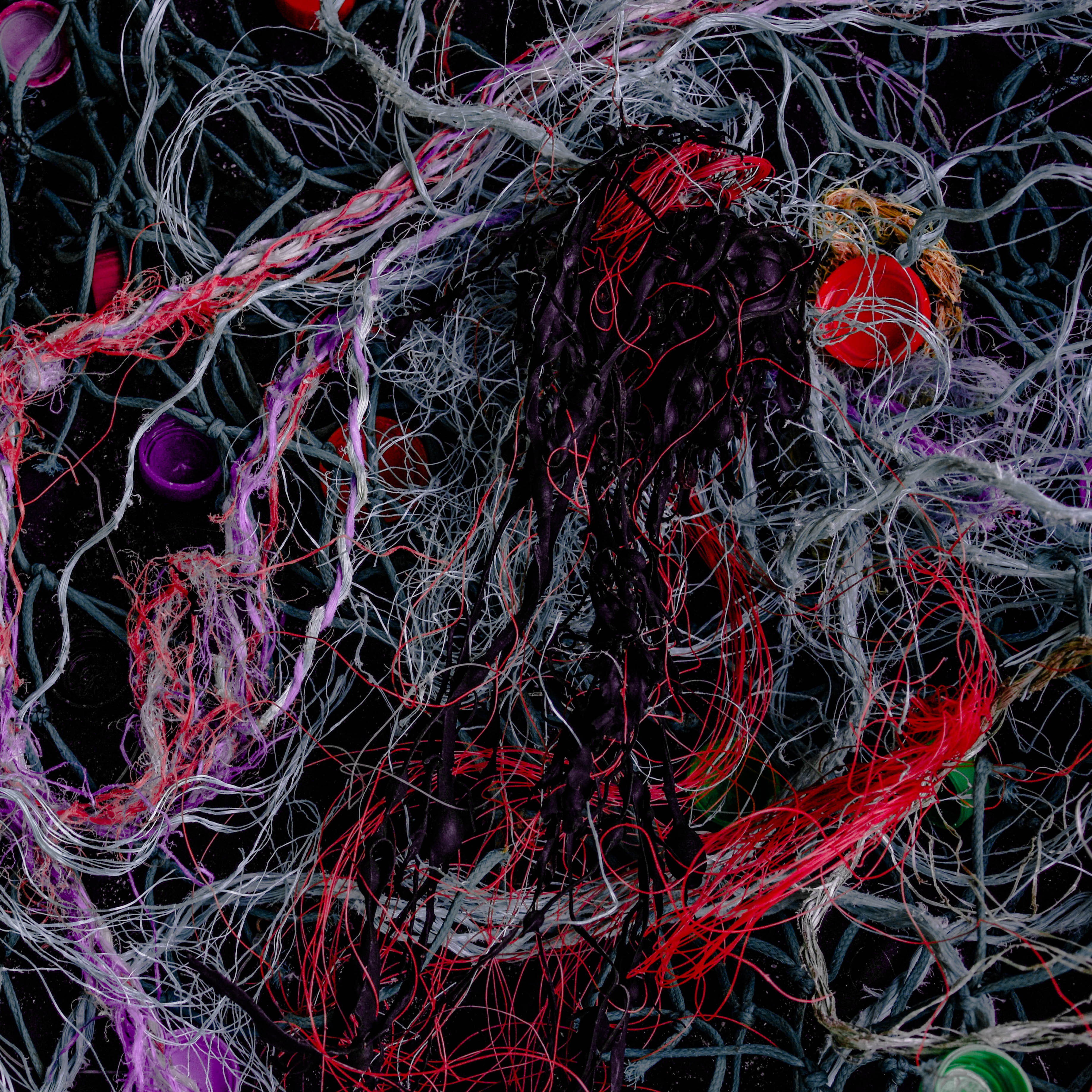 Next is an abstract image that has a very different subject matter to all my other final outcomes from shoot. This photograph depicts a massive amount of material and plastic fishing ropes/lines along with bottle caps and an oddly shaped piece of seaweed in the middle. The shocking thing about this, for me, is the how easily I managed to source these discarded materials washed up on a few of Jersey’s famous beaches. The symbolic message behind this image is pretty much a realistic version of the final above, where a jellyfish-shaped creature is being engulfed and tangled in pollution. The reason I chose this as final outcomes is because of the intriguing way I have managed to digitally manipulated the colours of certain ropes/lines and toned down all the rest.
 Lastly are two more images that are aimed to give an insight into the problem of ocean pollution and hopefully make the viewer think twice about how they discard their waste. The meaning behind these two photographs is quite similar in that they both show a futuristic ocean scene that has been completely taken over by synthetic substances. The first piece on the left is simply a differently captured and edited version of the larger final outcome above. I have chosen to add this to my results blog post as well because I love the dramatic effect the subject has it fades into an ominous black border. The last image is of my fourth subject matter that I had previously planned out to depict a wave created by pollution. I love this outcome as I think the message is really clear as well as the composition of materials showing movement and intricate textures.


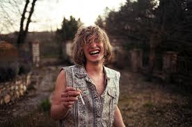 – could also look at the social environment of skateboarding, and photography in both the style of tradiotional skatboard documentation as well as more modern cinematic skateboard documenting styles – looking at the sport and culture around it itself.

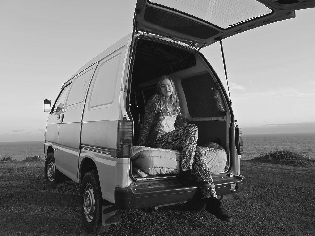






 My plan of action for this next shoot is to use the designs I have drawn out above, a ‘home studio’ and interesting compositions to capture this pollution issue in a colourful, eye-catching and insightful way. To complete this shoot I will be using the materials I have already collected during my previous beach clean ups, black fabric as the background and a mixture of artificial and natural light. My goal is to produce emotive outcomes portraying marine life and ocean scenes by only using the pollution we cover it in. I have decided to use a fish as the subject for this shoot because, much like with the sculptures from ‘Washed Ashore’, I want to put across that it’s the sea life that is most affected by pollution. The fish is the most common creature found in the sea, hence why I will be using to symbolise my message about marine life. To create fine details and make the subject stand out more I will also be using salt as an ocean themed artistic material. For the waves design, I am aiming to show that this problem is very condensed and will eventually effect ‘every wave in the sea’. I love the examples I have managed to find and present for inspiration on how to create this kind of inspiring art. When the element of photography is added to capture the subject properly, I think this idea will produce some really nice emotive outcomes.
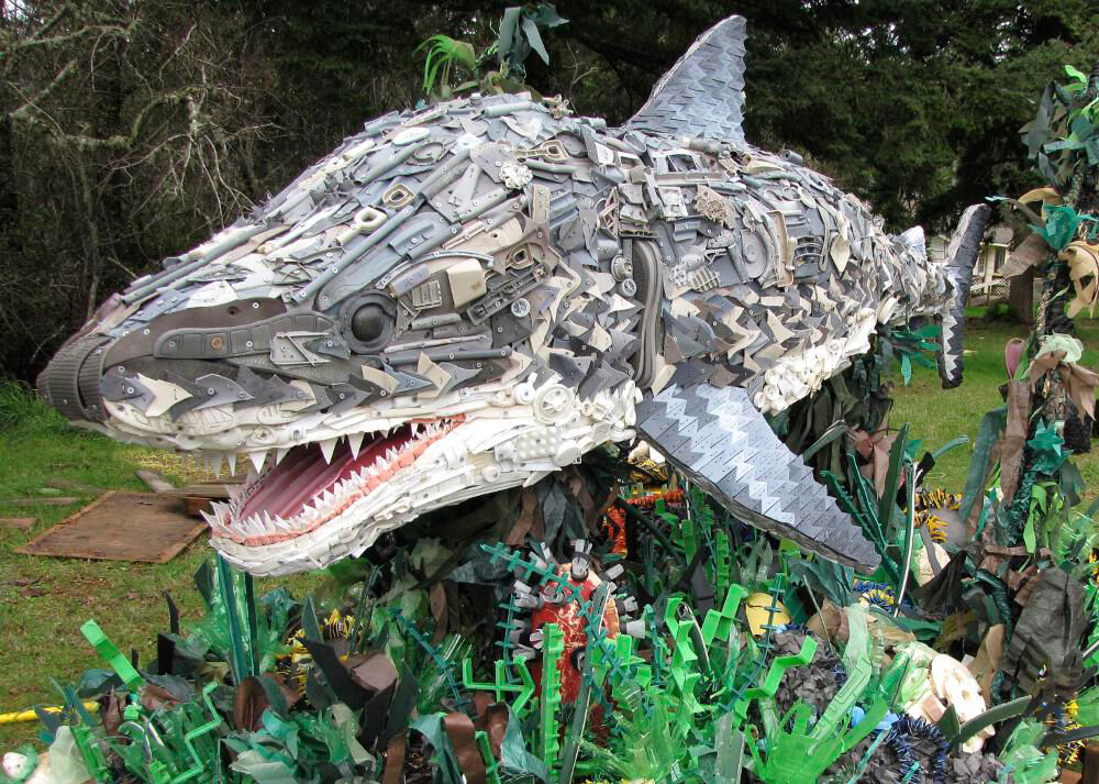 Above is a huge sculpture depicting what looks like a great white shark created using an array of different discarded materials. To put these masterpieces together the ‘Washed Ashore Project‘ volunteers collect rubbish that has been removed from beaches through community cleanups. This pollution is then washed, sorted and prepared for the creation process. Each sculpture is designed and directed by a professional artist and then formed through a collaboration of Washed Ashore team members, volunteers and students. The meaning behind these sculptures is to symbolically present our ocean pollution crisis and inspire change in our modern consumer culture. I love the use of small plastic items to collectively display such a textured and detailed masterpiece. The size of the shark and its surroundings, plus the sheer amount small and dangerous pieces of plastic collected from the beach, really make this piece something to think about.
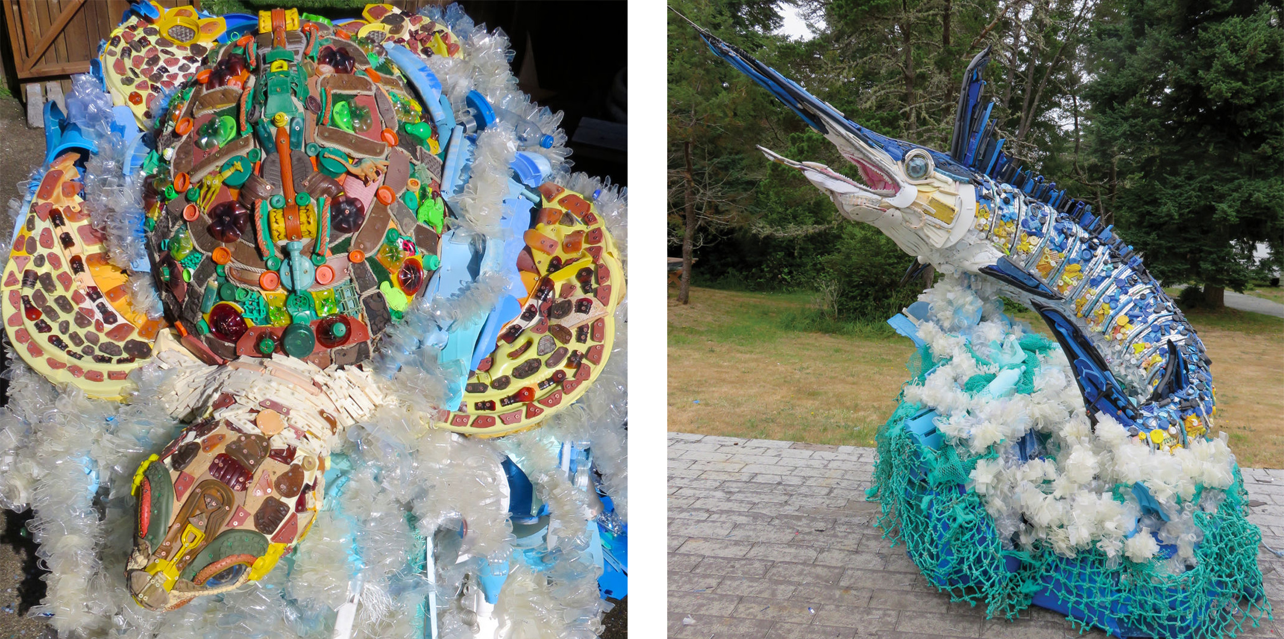 The next two photographs depict other transportable and inspiring pieces of art that portray a few creatures who are most affected by ocean pollution. The first sculpture on the right shows a carefully crafted sea turtle put together using discarded materials found on the beach such as water bottles, boots, shotgun shells, detergent bottles etc. The sculpture on the left depicts a Marlin fish created using things like sunglasses, toothbrushes, fishing lures and a toilet seat. I love the textured effect these creatures are given by being made up of such tiny pollution elements as well as the array of colours that can be presented. The size of these sculptures, along with their beautifully thought out structure, can definitely emphasise this pollution crisis and give the public a good idea of just how massive it is. All artists, volunteers and designers involved in the creation of these pieces will have been influenced by our current consumer culture. The sculptures’ construction is truly a community effort, with volunteers collecting, cleaning, sorting, and building the sculptures together.