Shoot Five



Artist Reference: Ansel Adams
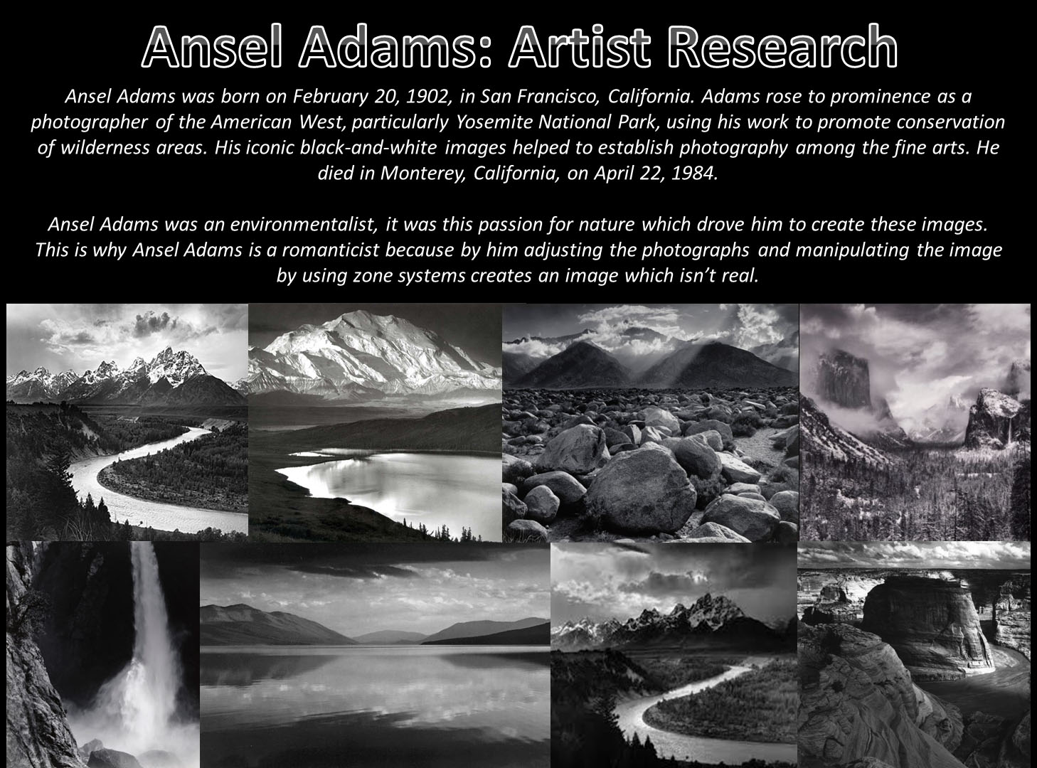
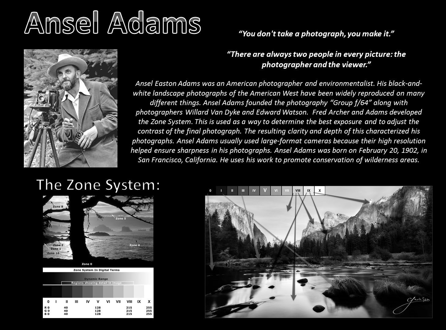

Shoot Five: Contextual Study
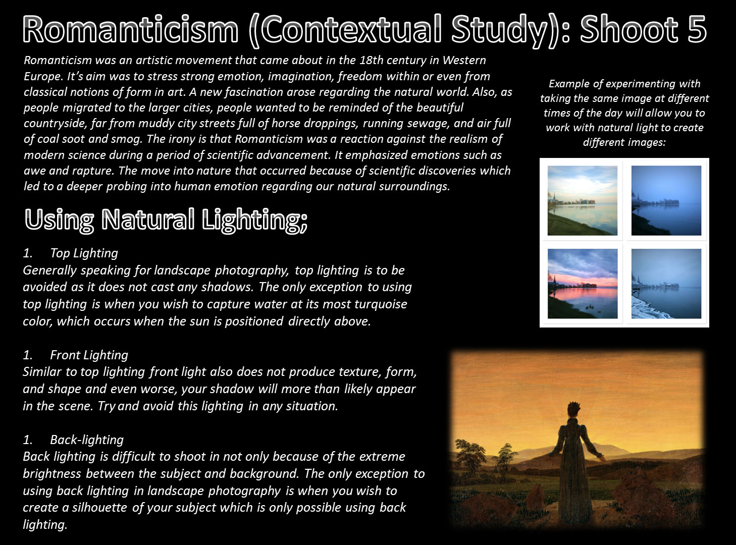
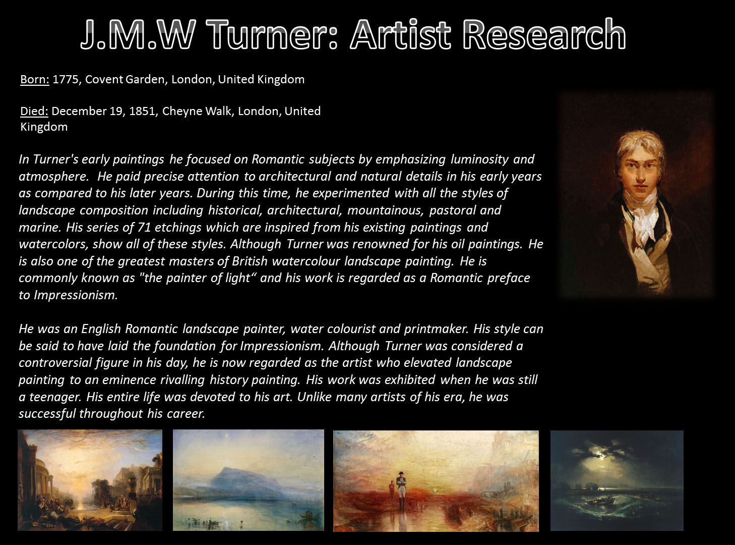
Shoot Five: Specification
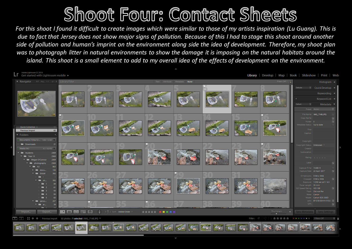
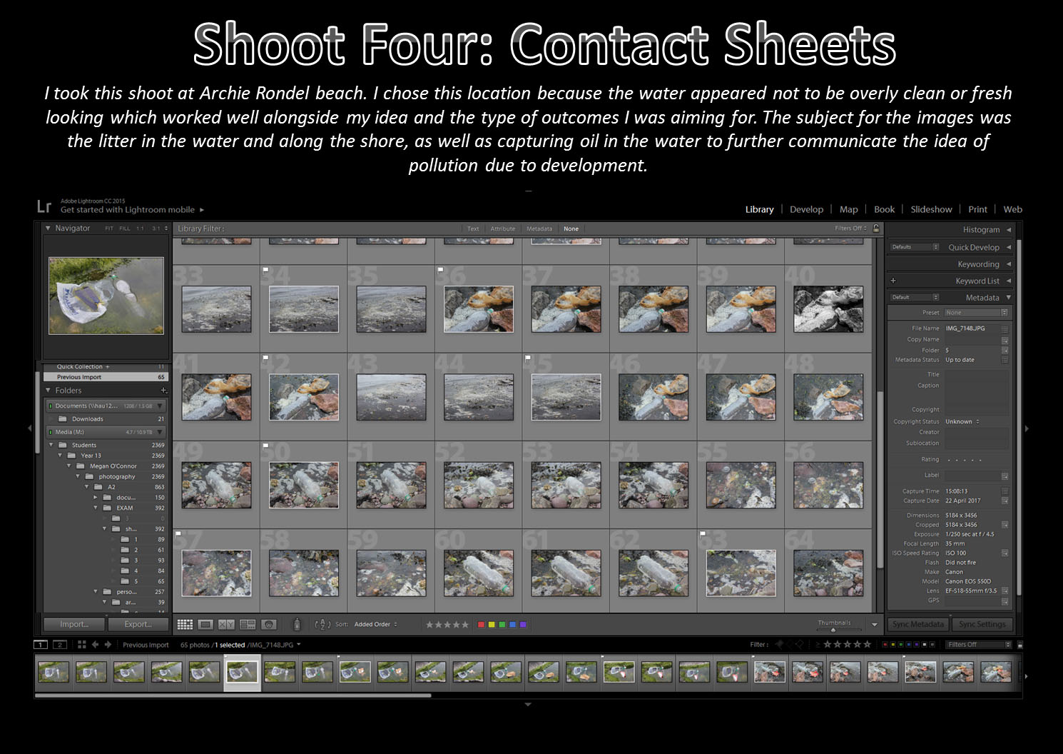
Shoot Four: Pollution
Third Shoot idea: St Brelade
My third shoot is based on the same thing as the second shoot, however it will be shot in a different location. The third shoot will take place in St Brelade’s in the woodland area on the left side of the bay. I have decided to take images in this location to create more variety of images for my London connection photographer, this way it is easier to respond to the images that I have taken.
Art Student shoot 1- Editing
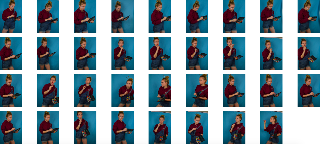
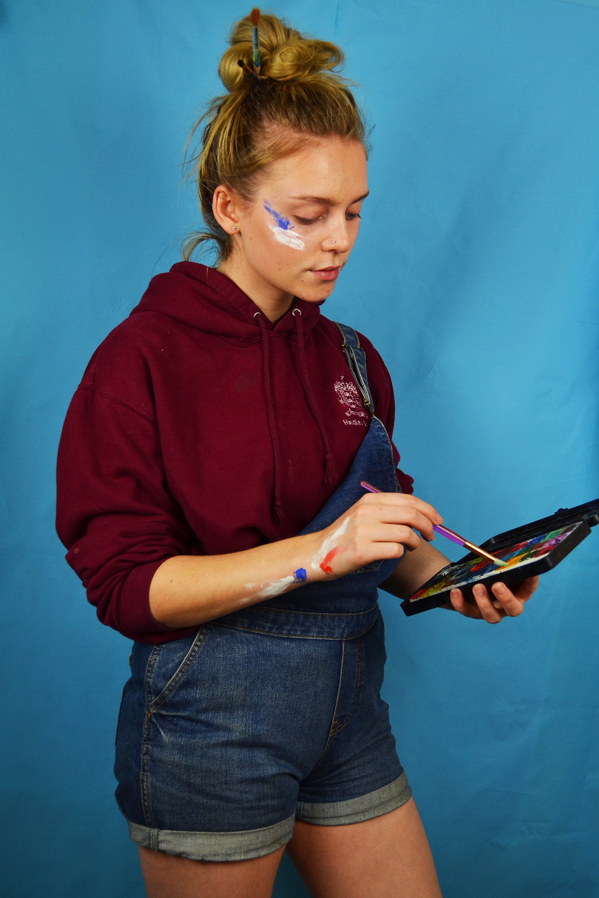
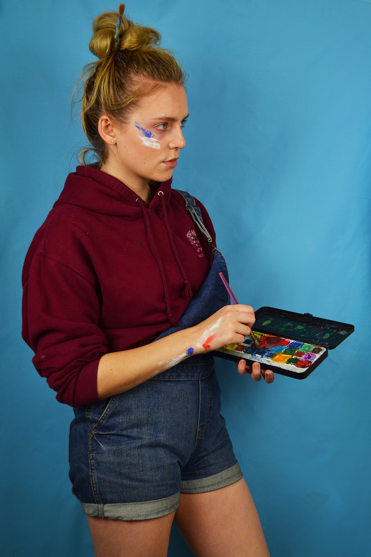
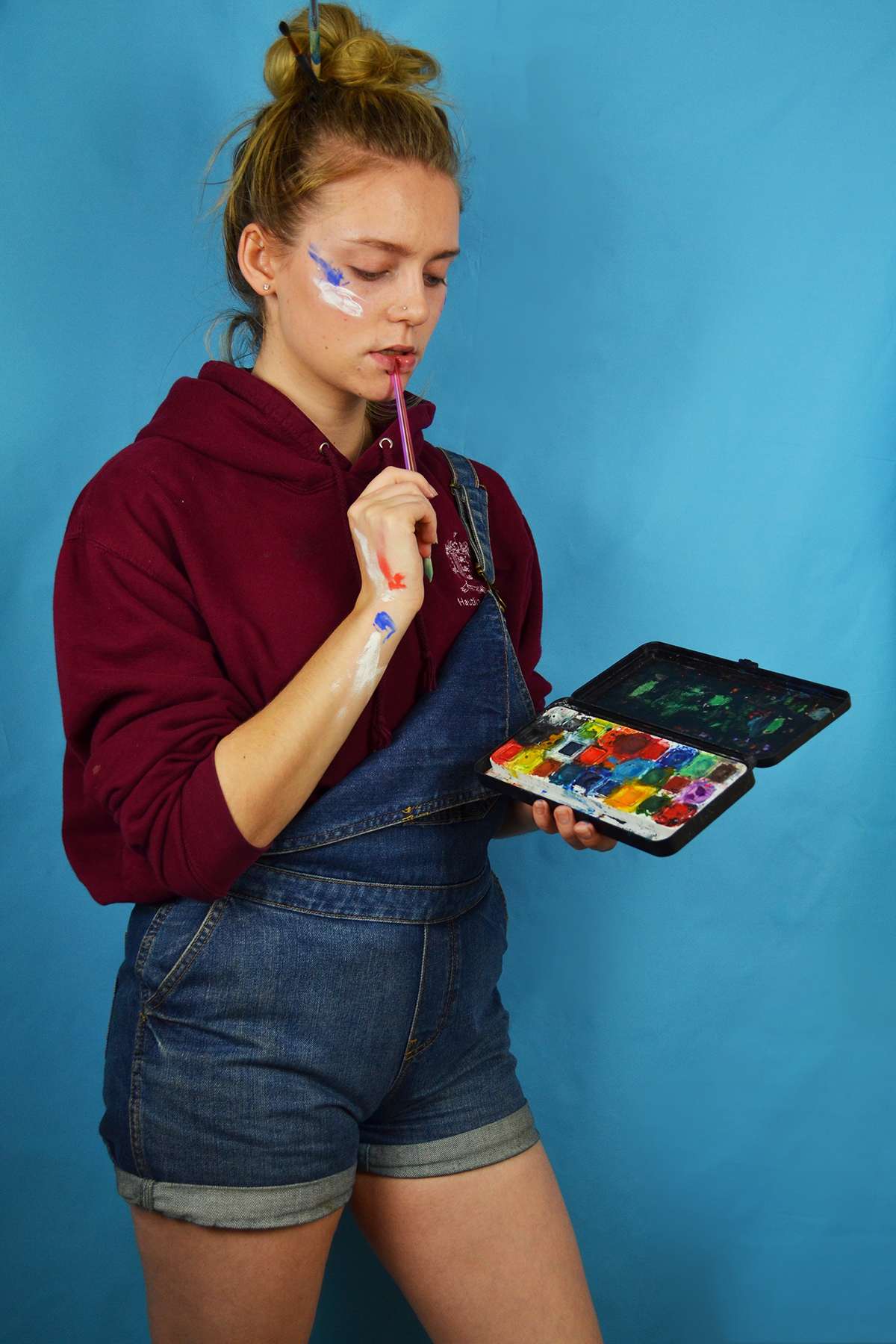
Above is the initial contact shoot from my first art student shoot. I made the decision before conducting the shoot to only use my blue backdrop because I felt that the maroon colour of my hoodie would clash with the pink background. I also felt that the masculine connotations of the colour blue would work better with my scruffy artist look. I also decided to wear no makeup for this shoot despite including an image of dark lipstick in my mood board because I felt that this was more realistic as I don’t really wear makeup on the days when I am home just doing art. I experimented in the shoot with different poses although they are relative predicable and similar, I am assessing a hypothetic piece of art, mixing paint and miming making brush strokes.
I shortlisted these images for my scruffy art student shoot because I felt that these three images depicted three different moments and feelings I experience when painting or working on a piece of art. The first image depicts a sense of contentment and flow, I sometimes experience this when I really get into the flow of a piece, although this doesn’t happen very often. The second image depicts a sense of concentration which is definitely something I experience often, when working at home my family often make fun of my frowning concentration face. The last image depicts a moment of pause where I appear to be considering what colour to use of what action to take next, this image really shows of the colours in my water colour palette nicely. In the editing process I cropped the images as a appropriate and adjusted the brightness, contrast and levels. I also used the spot healing tool to remove a large blemish on my chin.
Second shoot idea:
In my previous year in AS level photography we were given the task to present images based on 100 years of history in Jersey through a teenagers eyes. My focus on this topic was to create a scenario of a young gambler. This is something that I would like to continue in my A level photography, however this time the images will be taken in the outside environment showing the islands natural beauty. The use of wearing typical gambling suits and black and white attire is to present the concept that our gambling has an effect on the nature around us. This links to larger problems of global warming and how we are causing this problem as man.
My plan was to take the images for my second shoot around the lanes of St Lawrence, a relatively un photographed area of natural beauty in the island. St Lawrence is filled with small country lanes and fields that present the opportunity for me to place my subject into the environment. I will be using black and white filter to present the images to make the subject stand out in the environment, also it follows the images created by artist I have made references to previously.
To create the effect of a side by side response I have sent a message to a UK resident in London to respond making his own version of the image but in his living environment. This also portrays how our gamble of construction has become in previous years showing how London looks compared to the natural beauty of the countryside. However if this plan does not work I will take similar images in St Helier to present the same idea.

Jonathan Bielaski
Environmental portraits are a very involved type of portraiture that is a very slow and methodical process requiring interviews and understanding of who the person is. In the end, it requires the photographer to deliver a product that tells something specific about who the subject is.
Jonathan Bielaski has been doing this for years, and knew that he wanted to be a photographer from a very young age. He is based in Toronto, Canada and some of his clients include, Maple Leafs Sports and Entertainment (Toronto Maple Leafs, Toronto Raptors and TFC), Sports Illustrated, Billboard Magazine, T+D Magazine, Bard Valley Dates, California Peach and Pear Growers, Home Depot, Lucas Oil, Hydro One, Ontario Pork, Dairy Farmers of Ontario, University of Waterloo, Sheridan, Laurier and the list goes on.
Bielaski said about his own life, ‘When I started out in photography I did not enjoy making portraits and was attracted to still life photography, I now know that it was my attraction to lighting and with shooting these types of images I could master light and its effects. But something was missing–when I was photographing custom motorcycles and custom made products the story about the makers became a huge interest to me. Who they were and where they lived or worked fascinated me. I wanted to capture them in their workspace. People have a story as well as their space, together they complete a visual story and you can capture who they are and what they do in a signal frame’.
I have focused on some of the work that is created by Bielaski because in my opinion it is easy to depict that the subject of focus is a type of environment, I have analysed his work to gain a greater understanding of the concept, environment. Bielaski is a perfect example of someone who captures work environments. In my study I would like to focus on the opposite of working, using the concept of leisure.

This image shows a man in his working environment, from the image we can clearly outline his occupation that is a printer and painter. The image was taken using a high quality film camera in order to pick out the vibrant display around the room. Bielaski uses the rule of 3 to make his images stand out. For example this image is sectioned into a left, middle and right side. On the left we can see the practitioner himself, middle being his working tools and the right being his working station. It is clear that this man is at work due to the way the image is presented. It is often found that the subjects of Bielaski images are found on the left or right side of the image, not often central. This gives a wider display of what is going on around the working environment.

One of Bielaski’s main inspirations is Benrd and Hilla Becher, this is because he believes that the ism they focused on was important to how photography has shaped itself today. Again it is clear that Bielaski uses typography to present his images since all of the images he creates are based around the same thing being working environments. Similar to the above picture this image shows a man in his working environment, however the man does not look so content with his job. The image below shows a happy man. This could be the concept of how content people are with their working environment.


