“Breaking” Film Negatives
Going on from looking at using film I have looked into different ways that you can distort film negatives. By distorting the negatives and rescanning/printing them you can get some incredible results that are completely unpredictable. I have looked at a lot of different ways of distorting and destroying negatives. One source that I looked at first was this article. It talks about many different ways of distorting the images that are stored on a strip of negatives and how they can have different effects. One of the more abstract results that they show are by the artist Phillip Stearns.
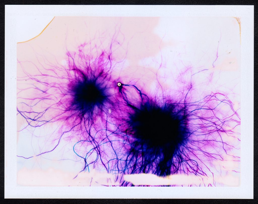
He creates his pieces in an unusual way that even different to the other artists that manipulate film. Instead of taking images on the film (Fujifilm FP-100C Color Instant Film) and then messing with the negatives, or messing with the film and then taking the images, he simply messes around with the film and then those negatives are the final pieces.
The video above shows him using some of his techniques. He uses many, many different ways to edit the negatives, including different chemicals, high voltage electricity and even common house salt but in the video we only see him using 15,000 volt electricity and comoun bleach. He never knows what the images will look like until he opens the negatives and sees the final result, this sense of the unknown and anticipation is what I want to achieve with my project, due to these both being properties of water. Stearns talks about why he has chosen this as a project that he pursued on his blog here. He says that
“I was struck by the similarities between the layering of materials in the film and the layering of cells in the [retina]… the similarities were striking.”
He goes on to talk about how the camera is the extension of the eye and looking more into the links between the images that he is creating and the different things that are going on in the human eye. Stearns mentions that with digital photography there has been a loss of connection between the eye and photography and so he is almost creating these images that bring back that link between the eye and photography. To link further to this he says:
“I find it curious and exhilarating that the impressions left behind after developing these extreme exposures so perfectly resemble networks of blood vessels in the retina.”
The two images above demonstrate this visual relationship between his creations and the physiological structure of the retina. They both have these large spots of darkness, in the retina these are the optical nerves or the Fovea centralis, and in the artwork they are the epicenter from where the electrical current touches down on the film. The “veins” that come out from here also look very similar to each other and really lend to this connection between the eye and his artwork.
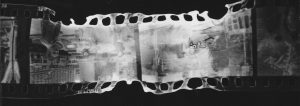
A similar idea but more connected with my project is “Fox River Derivatives” by Peter Hoffman. In this series of photographs Hoffman traveled along Fox River in Illinois with a medium format camera taking images of the river and it’s immediate surroundings, he then takes the negatives from this and sprays them with gasoline before throwing a match into the pile of images and gasoline and dousing them with water before they are completely destroyed. He talks about his motivation for the project being that
“our consumption habits—specifically dealing with precious natural resources—are out of control and unsustainable.”
He talks about how the next generation will not get to see what we get to see and so to highlight this he did not just want to make photographs of the river, he wanted to have an element of destructive chance being applied to his images.
“I wanted to transfer that feeling I had, which was maybe something like a sense of powerlessness or dread, to the image making process. I wanted to lose control, having the resulting work border on ceasing to exist in any recognizable form.”
The surreal bubbly effects, often obscuring other parts of the image show the rapidly disappearing natural landscapes that are almost hiding behind the destruction. By using gasoline he is using one of these natural resources that we are using up and exhausting to destroy the natural landscapes he is showing the volatility of the environment, and the randomness with which it is disappearing.
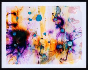
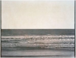
But out of all of the different examples of what other artists have done this kind of film manipulation the one that I connect with the most is the work of Matthew Brandt. He has made lots of different bodies of work and there are several of them that are relevant to my project. The first is titled “Waterbodies,” in this series he takes a number of images of different bodies of water, often oceans, and collects water from them. He then uses that water as part of the development process to create the final images.
He has not produced many images via this process but it is very interesting to see what the images have turned out like. This concept of using parts of the environment to create these images is a very interesting idea to me and even though they are not the most visually impressive the concept behind their production is really fun and suited well to my project. I looked for the conceptual reasoning for why Brandit did this particular project but could not come up with anything in particular. My interpretation of it though is that to create something then you need inspiration and resources. He already had the inspiration for these images but for the resources he decided not to use the standard salted water for the development process, instead allowing the environment to leave even more of its mark on the images. A truly personalised image that is perfectly customised for the environment.
While he was taking the exposures of this project he came across the idea to do another project, Lakes and Reservoirs. This body of work does not involve using the water to create the images, instead it involves using the water from the environment to destroy the images. Finding out the reasoning behind this project was not what I expected ether and may explain the lack of information about the previous project. In an interview with Brandit for Dazed Magazine the article states that:
“The creative process of his latest series shows that he clearly understands the art in photography, although Brandt himself insists it is merely a representation of what he sees in front of him.”
Later on he talks about the hiking and climbing that he needed to do to be able to take the images that he used. and how even though the images were being taken to be destroyed he still spent the time to get into good position and to properly compose the images.
“For these ‘shots’, I was looking for the most calendaresque view I could find. A view and composition that was the most encompassing to visually represent that lake and/or reservoir… to me, I enjoy the perversity in subverting all this photographic labor by later degrading it with the lake water.”
This is definitely something that I am going to look into for my project. There are a lot of different water sources around Jersey and it would be interesting to see the difference in effect that this could have on the images. I will be updating about my process of altering the negatives in another blog post.
More links to pages that I found interesting:





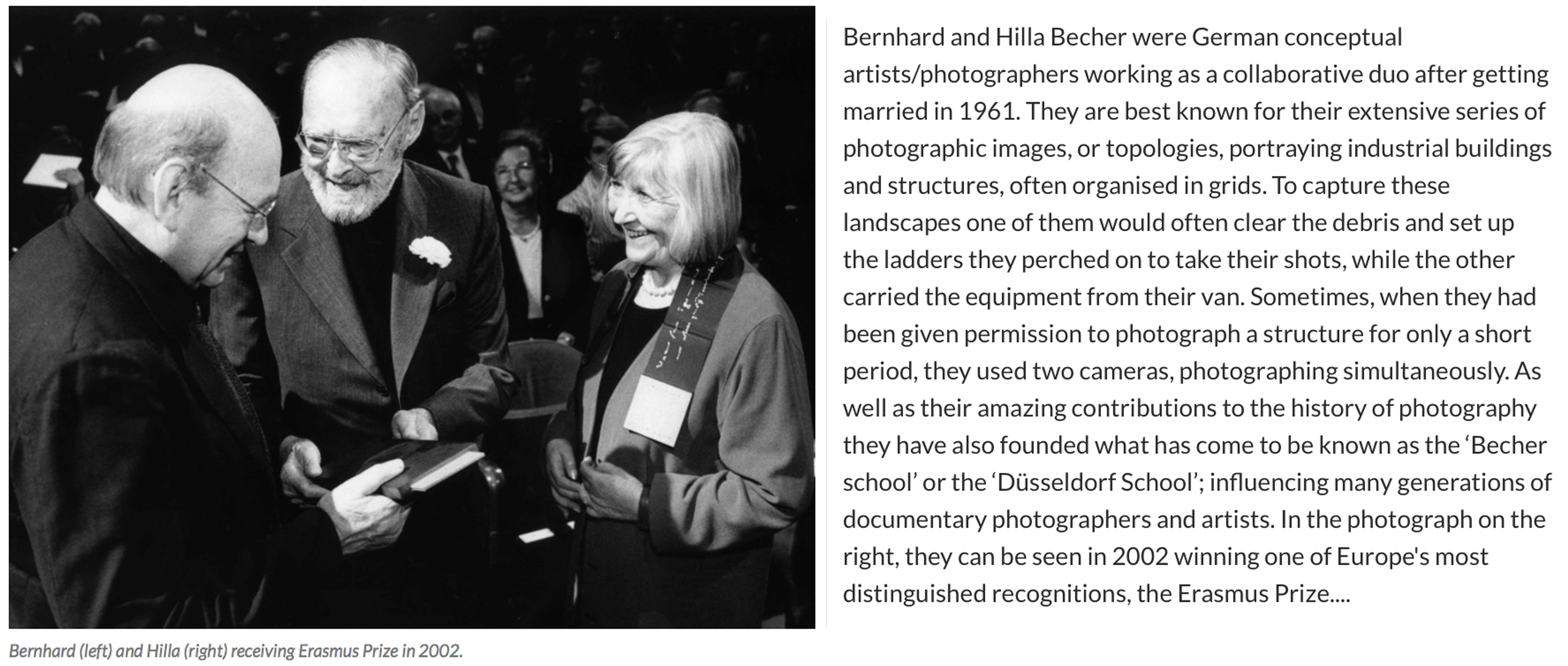 For over 40 years the pair used an 8×10 large-format camera to capture the architecture of industrialisation: water towers, coal bunkers, blast furnaces, gas tanks and factory facades. They did so in an obsessively formalist way that defined their own unique style and made them one of the most dominant influences in contemporary European photography and art. In the early years, with a young son in tow, they travelled across Europe and later the US for weeks at a time in a Volkswagen camper van, cooking and eating by the roadside. When asked in a recent interview why they only photographed industrial structures, Hilla replied: “Because they are honest. They are functional, and they reflect what they do – that is what we liked. A person always is what he or she wants to be, never what he or she is.” For Bernhard, the process of photographing and therefore fixing these brutalist structures forever was rooted in his love of the landscape he grew up in as a child. The huge buildings that dominated and defined his childhood in the Ruhr began to disappear rapidly in Germany’s postwar economic period, and he rightly sensed they would disappear elsewhere – across Europe, Britain and America. I have chosen this amazing couple as an inspiration for my next shoot at the ‘Energy from Waste’ facility because I absolutely love the simple yet fascinating way they have captured these artificial contraptions…
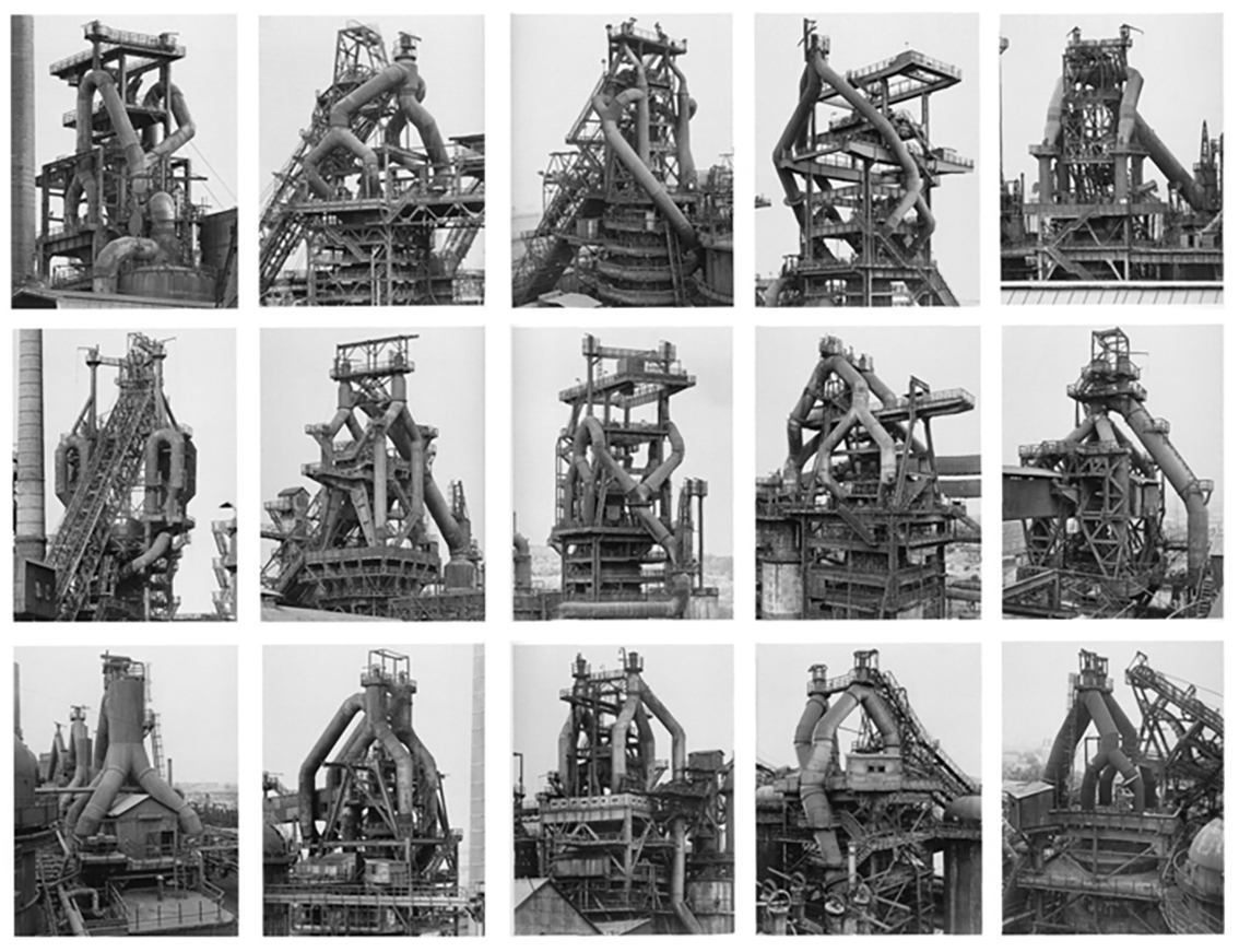 The Bechers were, first and foremost, formalists. “We want to offer the audience a point of view to understand and compare the different structures,” they once said. “Through photography, we try to arrange these shapes and render them comparable. To do so, the objects must be isolated from their context and freed from all association.” Much like the majority of the Becher’s work, this collection above depicts many different blast furnaces in different compositions, all printed in black and white and arranged in grids that emphasised their resemblance – what Hilla once called their “universality”. The meaning behind these images is to create straightforward historical documents of these vanishing industrial structures as well as beautiful topographic images. Although I will not be seeing this type of arrangement when visiting La Collette, I will be taking inspiration from the intricate way they have captured the angles and compositions from in between the pipes and framework.
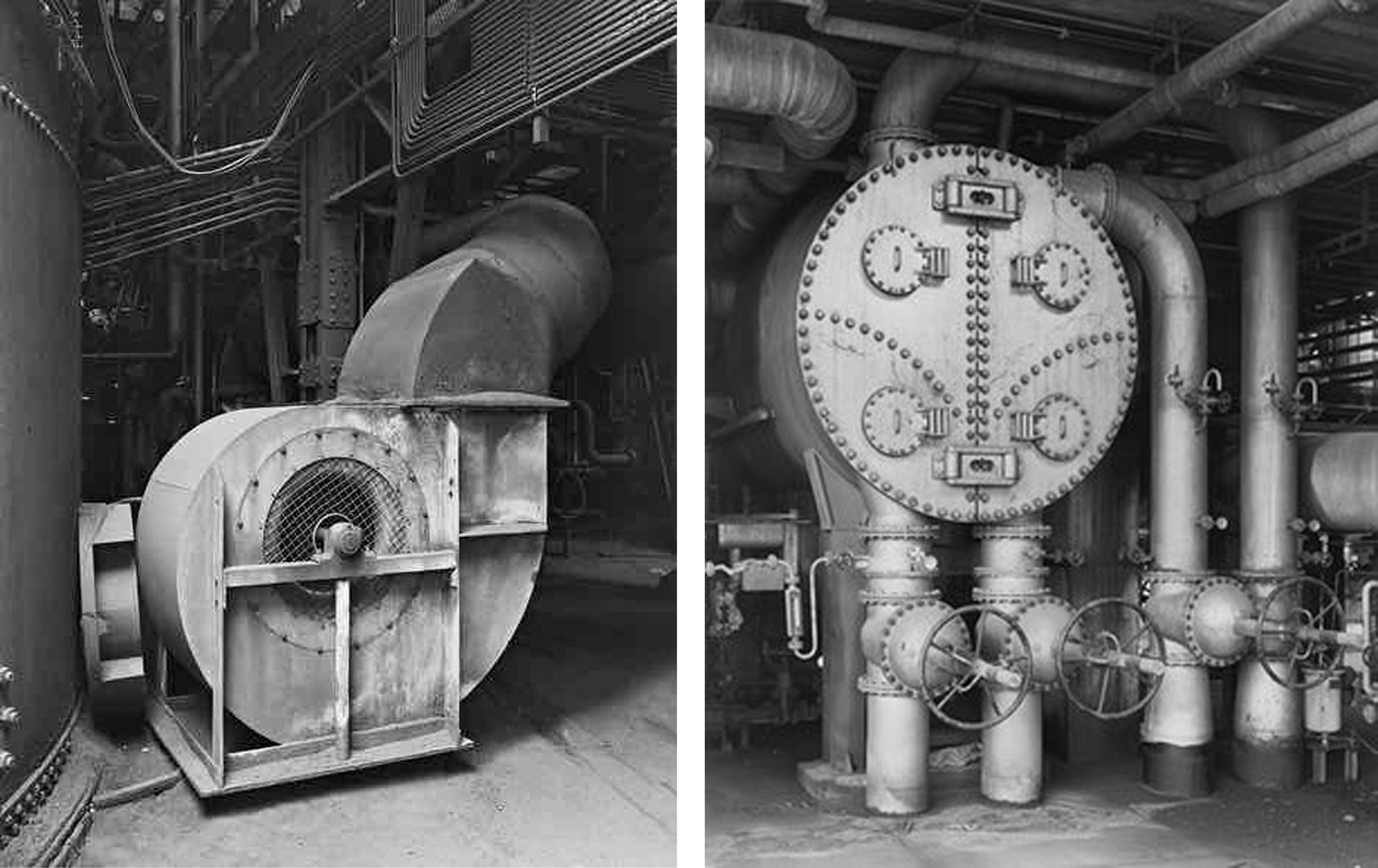
 As well as looking at the Bechers grid style outcomes I will also be taking a lot of inspiration from some of their more simple, close up work. The two photographs on the top row of the contact sheet above show detail captured from a Petrochemical Plant in 1983, Wesseling, Germany. These images depict some of the scenes I expect to find for my next shoot in the ‘Energy from Waste’ facility and I love their dynamic and structural composition. Below them, I have added three more industrial landscapes captured by the famous couple that was originally part of a much larger grid. These images depict old Stonework and Lime Kilns strategically captured against their environments. Alongside her late husband, Hilla saw structures that others might have dismissed as ugly, even threatening, and made them unforgettable.


 Since receiving the email above I have been in contact with the ‘Energy from Waste’ facility and have arranged to meet with them on Thursday the 20th of April at 10:45 am. My plan of action for this shoot is to record the site from an insider’s perspective using topography and documentary photography techniques. Whilst there I will be taking as many images as possible, attempting to capture some interesting compositions and angles to draw in my viewer’s attention. All I will need to complete this shoot is my camera and the safety equipment that will be provided upon arrival. My goal for this opportunity is to truthfully present what happens to Jersey’s un-recycled waste, as well as the elements that go into the transforming it into energy.

