I have been experimenting with the use of a mirror in relation to environment and performance. I have also seen how they have been used by artists such as Francesca Woodman, Claude Cahun and Clare Rae as well as many others who have utilised reflections. Psychologically mirrors attract viewers attention because they reflect the “another us” and gives the impression of having a “perfect” twin. I have done some more research about the symbolism of mirrors in culture focusing on art, literature and mythology.
Physically mirrors reflect light and the surrounding environment which has connotations of illumination and truth. Mirrors have often been compared to the human mind with the Greek root for Plato’s word idea ‘eidos’ literally meaning not just ‘image’ or ‘likeness’ but an image reflected in water or mirror. Mirrors in art suggest that the viewers should turn inwards to gain self-knowledge rather than outwards to the natural world.
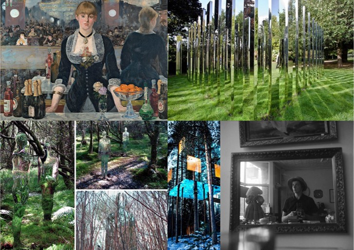
Reflections are central devices in some of the great European paintings. A famous example is Jan van Eyck’s Wedding Portrait of Giovanni Arnolfini from 1434. Here, the mirror is situated centrally in the painting, directly above the clasped hands of the wedding couple. The mirror has a slightly curved form that not only reflects the objects in the room, but things happening beyond the picture’s frame, as well. The mirror shows a clear view of the couple’s back and two witnesses standing in an open door frame. It presents something that would be occurring where the viewer is ‘standing’ and therefore they assume the position of witnesses. The mirror removes the gap between the pictorial space and the viewers space and makes them appear part of the story. 

This painting is likely to have influenced Las Meninas by Diego Velázquez from the year 1656. This shows a large room in the Royal Alcazar of Madrid during the reign of King Philip IV of Spain. The Infanta Margarita is in the middle of the picture surrounded by her entourage. Above her head on the back wall of the room, is a mirror, although opinions vary on this and some people think it could actually be another painting . The artist himself is standing on the left side of the painting at his canvas and the painted surface is facing away from the viewer. The mirror could be reflecting two figures standing outside the picture’s borders. This would be King Philip V. and his wife Marianne, at whose court Velázquez was employed as a painter. If the royal couple are standing in front of the mirror, then they must be standing where the viewer is so that the viewer becomes part of the painting in a similar way to in that of Jan van Eyck’s Wedding Portrait. The interplay between observation and ”being observed” is caused. The king and queen are supposedly “outside” the painting, yet their reflection in the back wall mirror also places them “inside” the pictorial space. 

The Rokeby Venus by Diego Velázquez depicts the goddess Venus lying on a bed and looking into a mirror. She is often thought to be looking at herself in the mirror however this is physically impossible since viewers can see her face reflected in their direction. This is known as the ‘Venus effect’ which is also seen in film when an actor will be shown apparently looking at themselves in the mirror. What viewers see is different from what the actor sees, because the camera is not right behind the actor, but the position of the person is normally chosen so that their image is correctly framed in the mirror for the camera.

Mirrors were significant for the development of self-portraiture in painting and were also used for this purpose in the early days of photography . For example the photograph below is from the Edwardian period and shows an unidentified women using her dresser mirror and a box camera to take a self-portrait.
Vivian Mainer is also well-known for her street photography from the 20th century and many of her photographs are self-portraits which were taken on the street using the reflections of windows in buildings.

I also came across the use of mirrors when researching Earth Art as an approach to the theme of ‘Environment’ for example by Robert Smithson. He critiqued art history’s ability to create static objects and remove them from the real world context to museums or galleries. His project ‘Yucatan Mirror Displacements’involved arranging mirrors in various landscapes. The mirrors reflected and refracted the surrounding environs, displacing the solidity of the landscape and shattering its forms’. The purpose was to contemplate the moment with the mirror recording the passage of time and the photograph suspending time.

Smithson also created sculptures using mirrors such as the example below. He thought that taking natural materials out of their original contexts abstracted them and in this example coral has been arranged with mirrors so that it is multiplied and fragmented in the reflections. These reflections change in relation to the position of the viewer, so no two people experience it in precisely the same way.

Mirrors have also been significant symbols in literature. For example “The Lady of Shalott”, by Alfred, Lord Tennyson was a poem that inspired many artists. I came across this when studying the Pre-Raphaelite movement for an earlier project featuring some contemporary responses to this style of art. The poem is about a woman who is condemned to watch the world indirectly through a mirror that shows to her the changing scenes of Camelot. The reflected images are described as “shadows of the world”. If she does look at the world directly she will be cursed. One day the Lady sees the reflection of a man Sir Lancelot and breaks the rule and looks out of the window. The mirror cracks and she realises the curse has come true and she escapes the tower she has been living in and gets in a boat but dies before reaching the town. This representation of women has been viewed by some in the context of changing women’s roles in the 1880s and 1890s and it has been suggested that this served as a warning of imminent death to women who stepped from their restricted roles and explored their desires. William Holman Hunt has depicted the moment when the Lady turns to see Lancelot in his painting and some of Waterhouse’s most famous paintings were based on scenes from this poem. I think it is interesting to consider these connections between art and literature because in my own work I am considering combining by images with writing for the final presentations.


The Picture of Dorian Gray, by Oscar Wilde is another famous example of literature with the theme of a mirror. The character Dorian takes a mirror up to the locked room containing his portrait and compares his reflection with his painted portrait which ages instead of himself. When he realises the person he has become, he smashed the mirror “He loathed his own beauty, and flinging the mirror on the floor, crushed it into silver splinters beneath his heel”.
In the poem “Mirror”, by Sylvia Plath the object is described as uncanny. “I am silver and exact. I have no preconceptions. / Whatever I see I swallow immediately / Just as it is, unmisted by love or dislike”. The poem describes the life of a young woman growing older as she looks into her mirror. The poem could span years or alternatively the women could be seeing a reflection of her future self. It appears that she wants to discover who she is by looking into it.
Stories about mirrors are also common in mythology and folklore with the well-known example being that if you break a mirror you will have seven years bad luck. This superstition dates back to the Romans, who believed that life renewed itself every seven years, and that breaking a mirror would damage the soul it was reflecting at the time for that duration. Many cultures believed mirrors reflected the ‘shadow soul,’ and could show the true nature of the person being reflected. This contributed to the legends about vampires having no reflections as they are said to have no souls to reflect. Ancient Chinese believed that mirrors frightened away evil spirits who were scared by their own appearance. In Greek mythology there is a man named Narcissus who falls in love with his own reflection in a pool of water and unable to leave the beauty of his reflection loses the will to live. Narcissus is the origin of the term narcissism (a fixation with oneself and one’s physical appearance and/or public perception).This myth has inspired several artists as well with the most well known example by Caravaggio who painted a young man admiring his reflection in the water. Other artists who have explored this myth include Dali and Waterhouse.


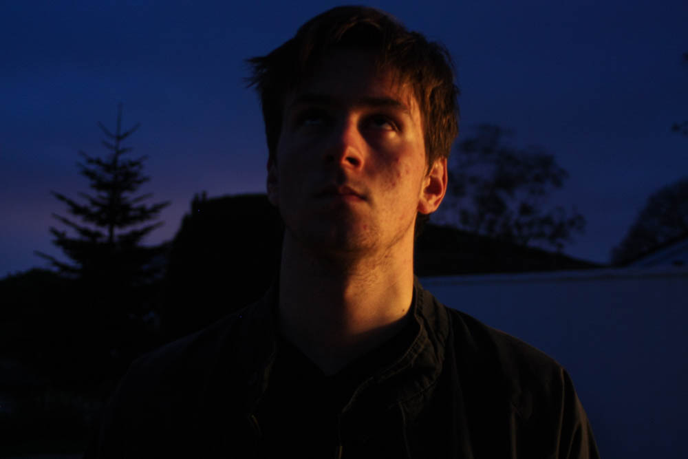


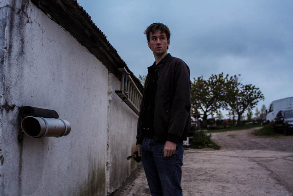
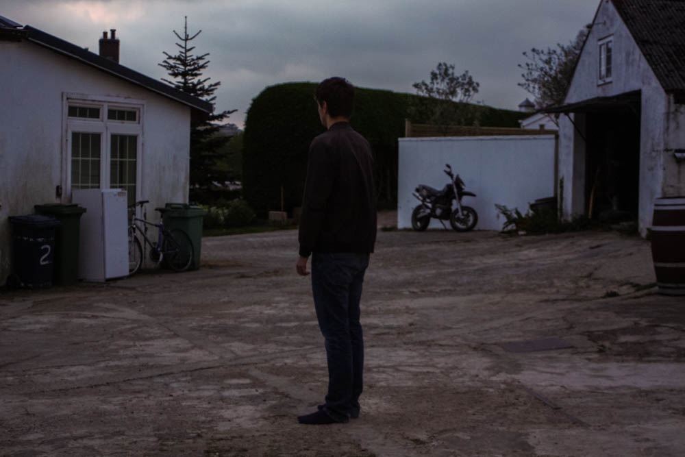


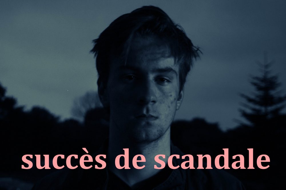




 Because of my original plan to take as many photographs as possible of every aspect I was shown, the contact sheet above only shows 47 out of the 500+ images I took during my visit. To narrow down my outcomes from this selection above was quite difficult as I really liked many of the angles and compositions that I managed to capture. Below are the 14 images I have chosen as my final outcomes, although I won’t be using every image in my end result, I wanted to include them in this post for future reference to my efforts. As well as this, as requested by the manager of the energy from waste facility, Ian Williams, I have edited and saved about 16 more images to send to the department for unknown reasons. This shoot, much like my previous documentary shoots, shows a mixture of colour and black and white photographs depending on their style. Below I have displayed my final 14 outcomes along with four other images presented at the bottom that helps me to tell this documentary narrative…
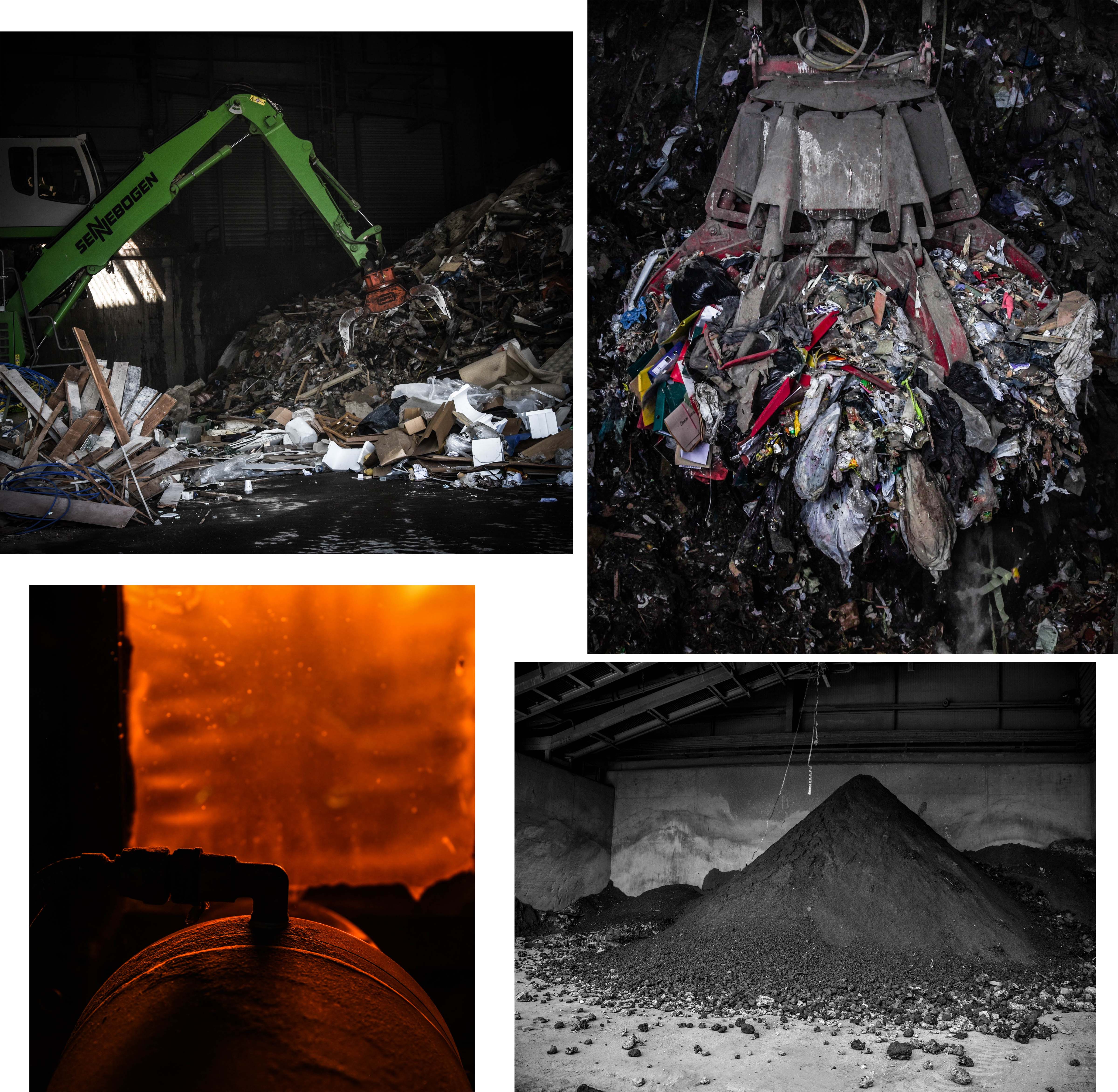 This first group of my final outcomes above depicts the waste before transformation, the burning of the waste, and the ashy result of the process. The first two images on the top row depict the difference between the amount of household and commercial waste produced on our Island. The image on the left presents an average sized machine transporting commercial rubbish from one spot to another whereas the image on the right shows a gigantic claw machine, capable of moving up to 3 tonnes of household waste. For use in my project, I love the photograph on the right because of it dramatic intensity as well as its ability to give my viewers an idea of how much we produce. This image is one of my favourites overall and was taken through one of the ‘rubbish shoots’ after the operator kindly positioned the claw for me. The two pieces on the bottom row can show what could be seen of the burning process alongside with the final outcome of this waste. I love the orange glow and intriguing composition/aperture of the image on the right whereas the one on the left shows an important part of what happens to Jersey’s un-recycled waste. – this ash is actually re-purposed to be used in Jersey and England to create buildings and roads.
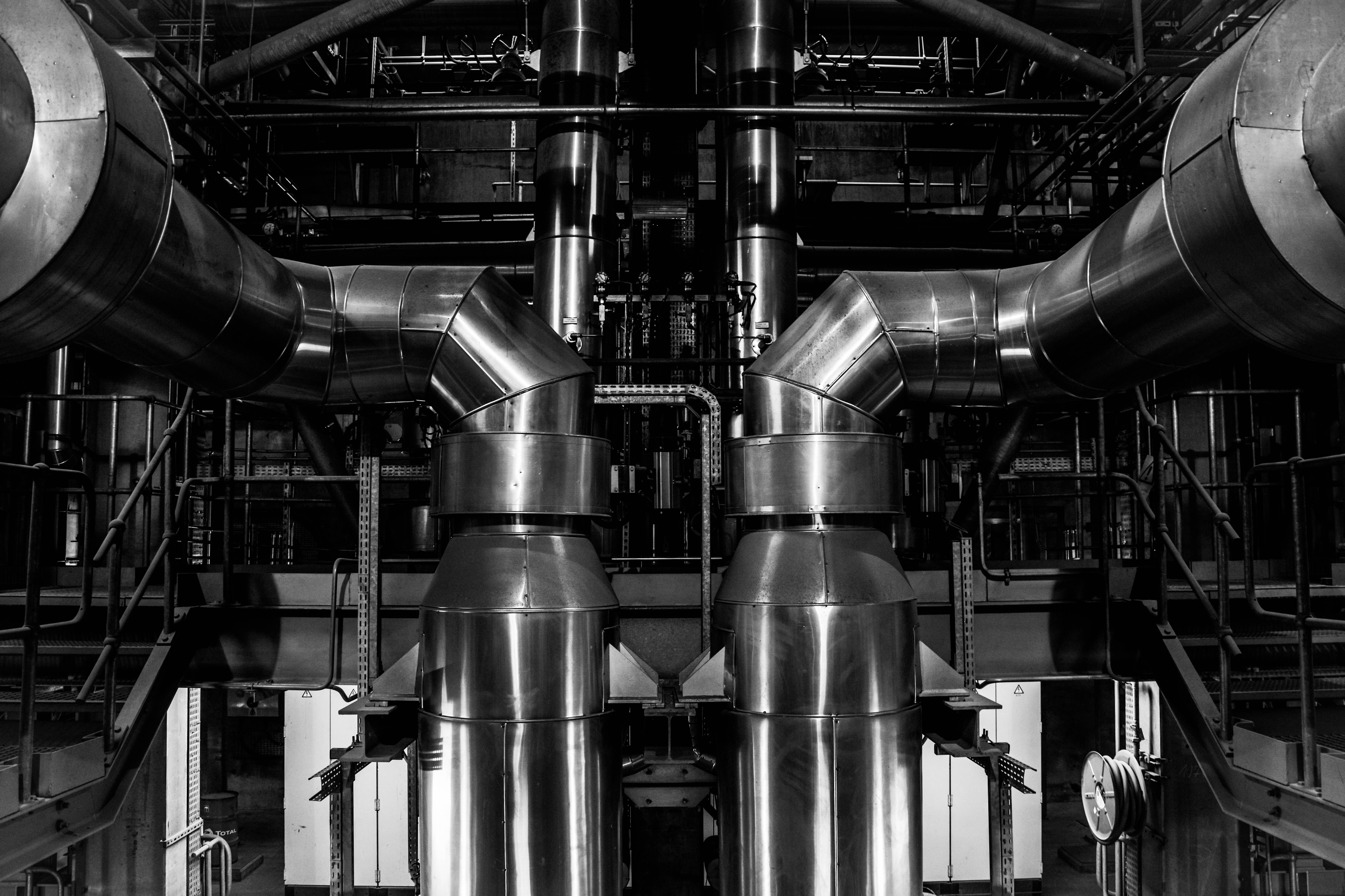 This next image is one of my favourite topographic style outcomes which was taken from inside the ‘Energy from Waste’ facility during my tour. This image depicts two massive pipes coming up from a lower floor and curling around the edge of my composition. I love the perfect symmetry I have captured in this piece and the topographic/straightforward style it was taken in. The reason I have decided to edit this image in black and white is to emphasise it dynamic features as well as resemble the many blast furnaces captured by my inspirations Bernhard and Hilla Becher. The meaning behind this image is to show a specific section of the massive machinery that combined, works to process the safe disposal of our island’s waste and turn it to clean energy.
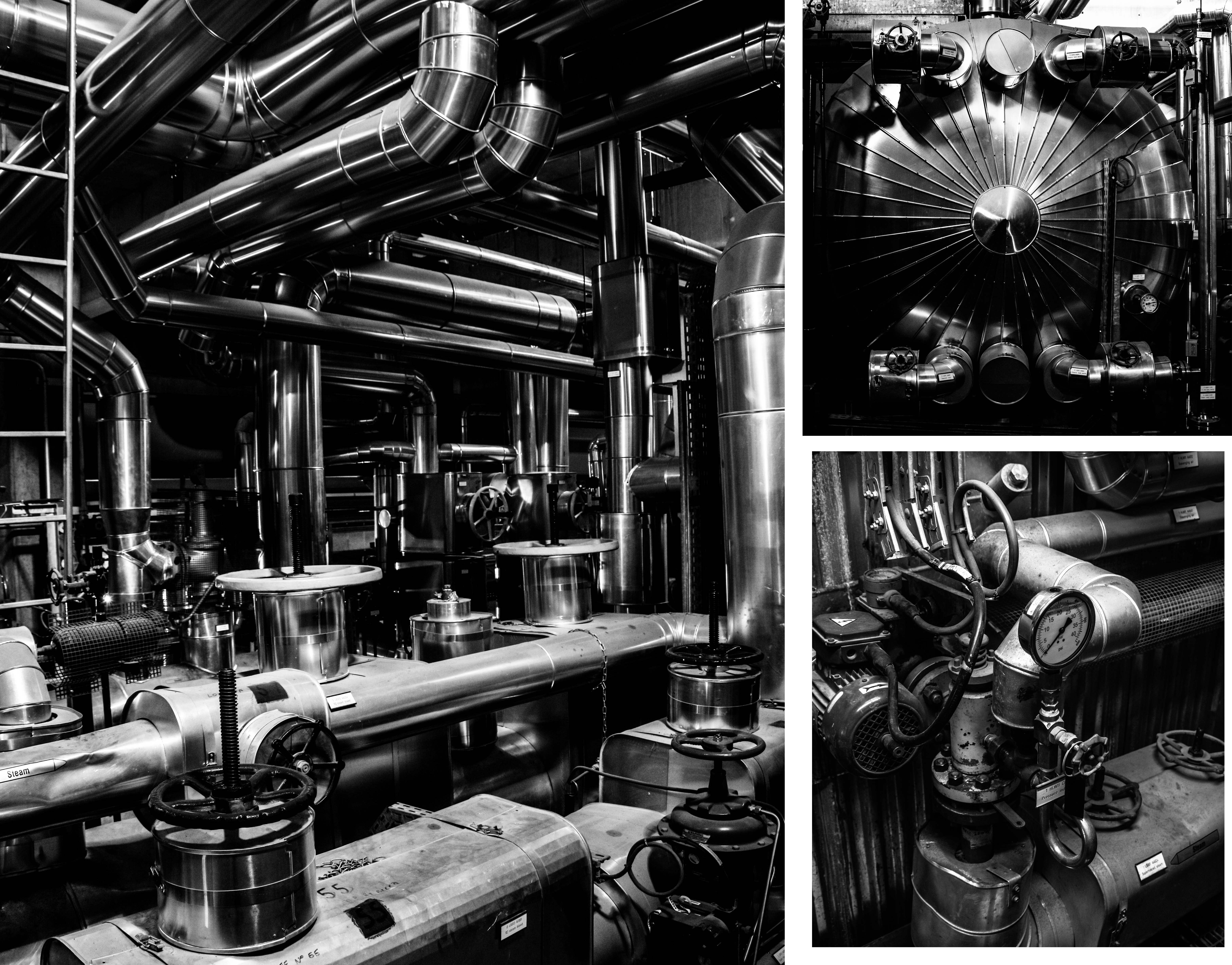
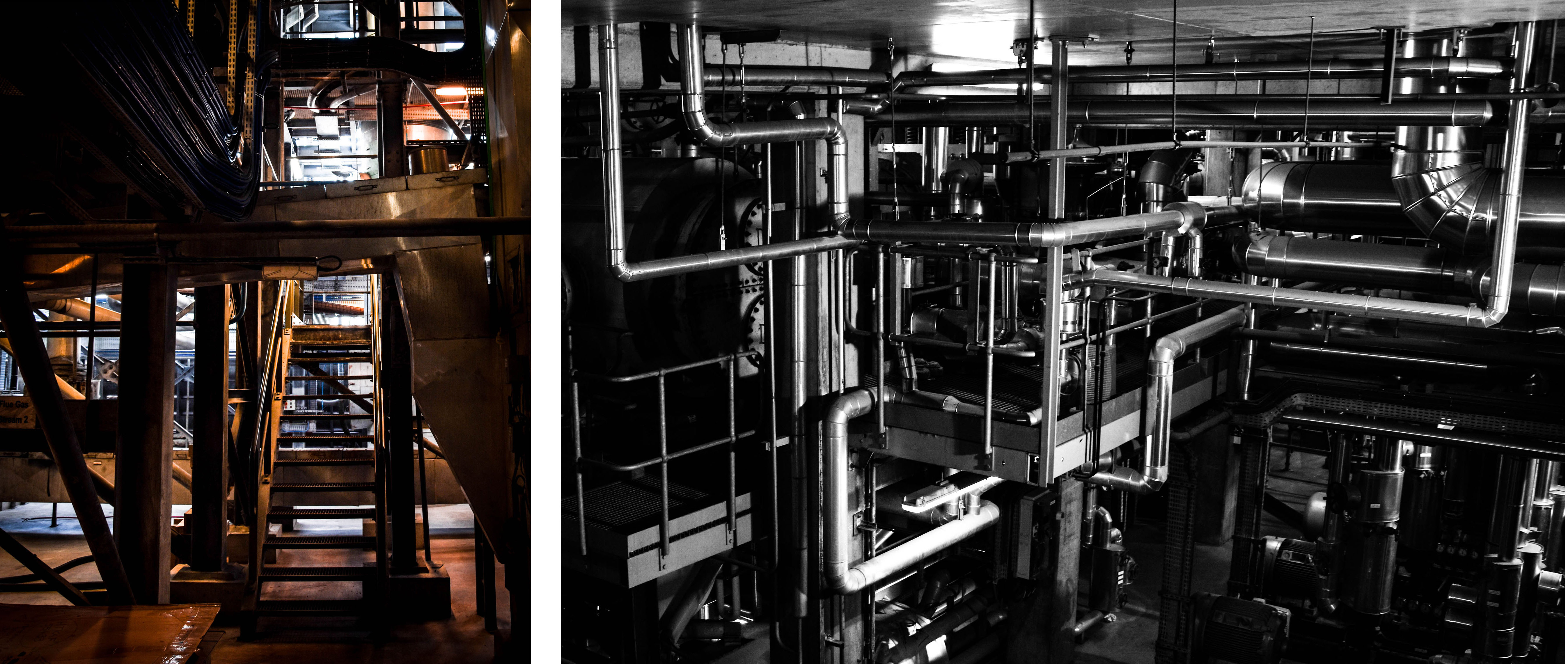 These next group of final outcomes from my shoot show more specific details from inside the ‘Energy from Waste’ facility. The meaning behind these images, along with the final outcome above, is to show exactly how much work and complicated technology goes into this process. These images can give an idea of just how difficult it is to cleanly produce only 7% of our island’s energy at the same time as disposing of our waste. The first and largest image on the top left is my favourite from this and depicts a scene through the building completely filled with pipes and machinery. I love the high contrast and dramatic overtones of this image and I think the intricacy of the pipe work really helps prove my point. The next two images on the right of this piece depict a few close-up detailed shots of specific parts of this extensive setup. I love the simplicity of these images as I feel they share a very strong topographic style. Lastly, the two photographs on the bottom row depict some amazing shadows and angels looking through the facility as well as more intricate pipe work hanging down from the ceiling.
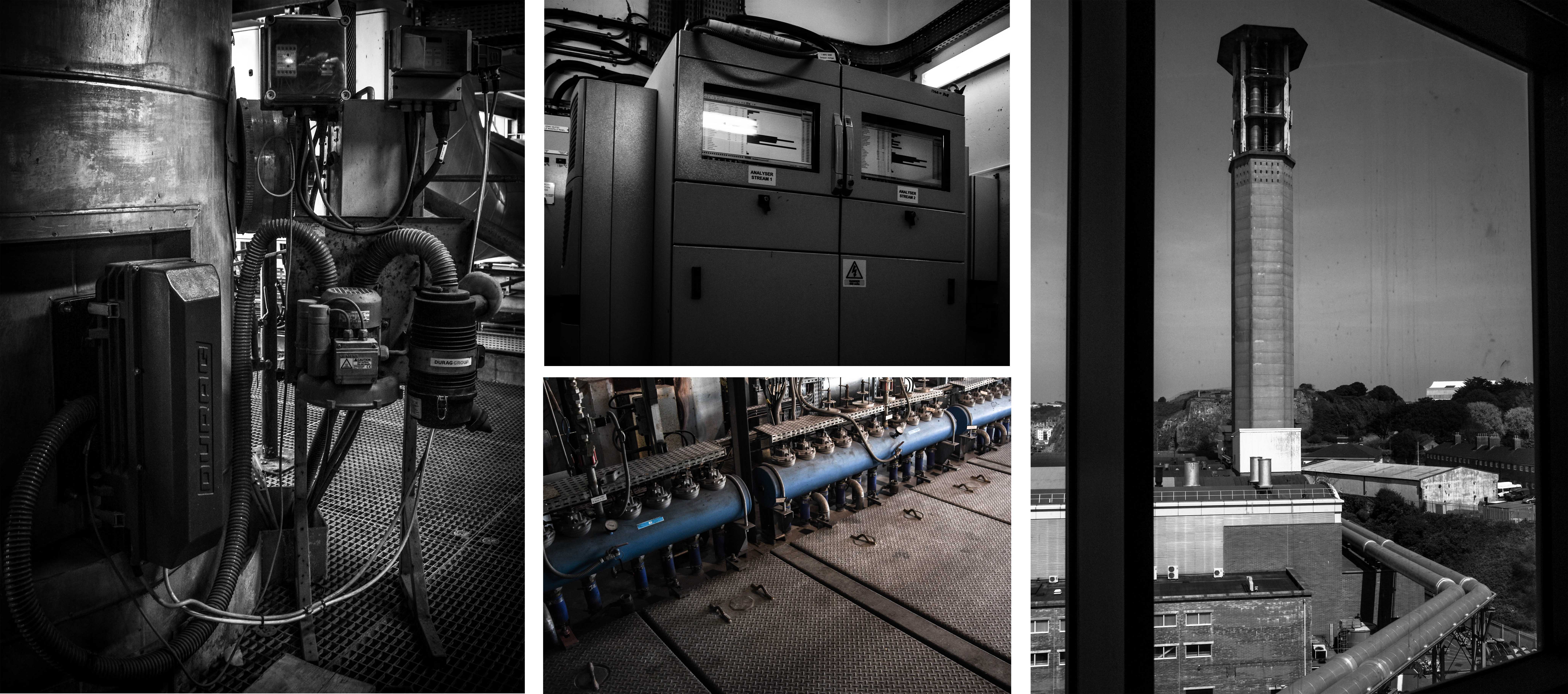 Next are some important outcomes depicting a few of the elements that go into the purification of the smoke produced from burning the rubbish. According to CSBC, the La Colette ‘Energy to Waste’ facility meets the highest air quality standards in the whole of Europe. If their emission levels are outside of the licensed limits the plant is shut down and any underlying problem is rectified before the plant is started up again. The fist three images on the left depict some features that help keep track and purify the smoke before it is released. First is the point where samples are taken for testing, next on the top is a monitor for viewing the levels of each element and finally, the bottom image shows a very small part of the machine that acts as a filter. Lastly, on the right of this contact sheet is the view from outside the window looking up at the JEC chimney and the pipes that connect the two facilities.
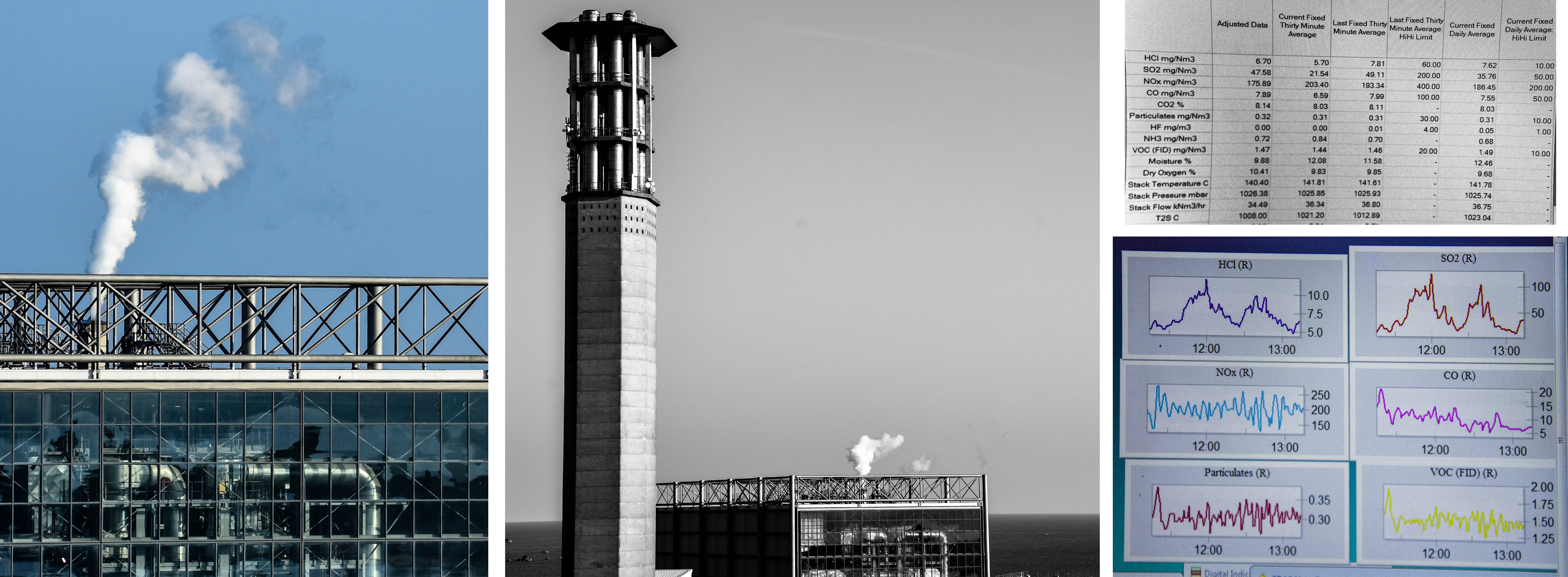




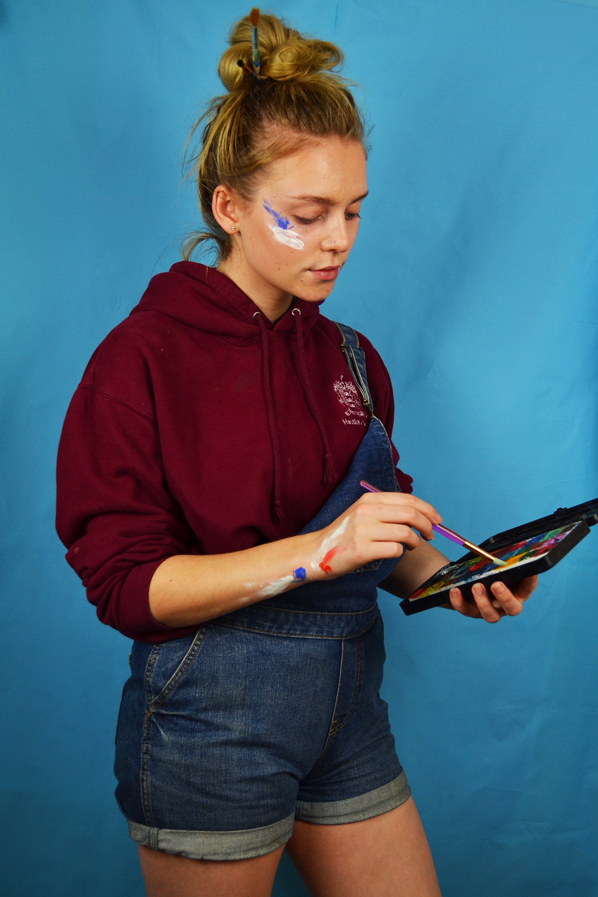


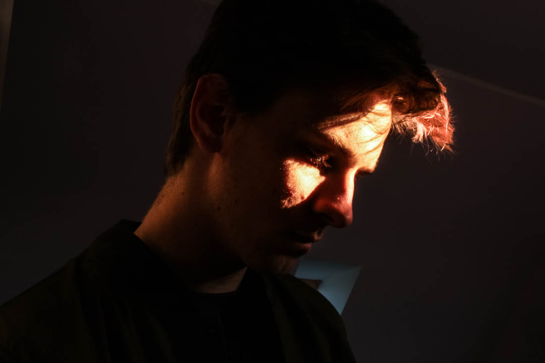
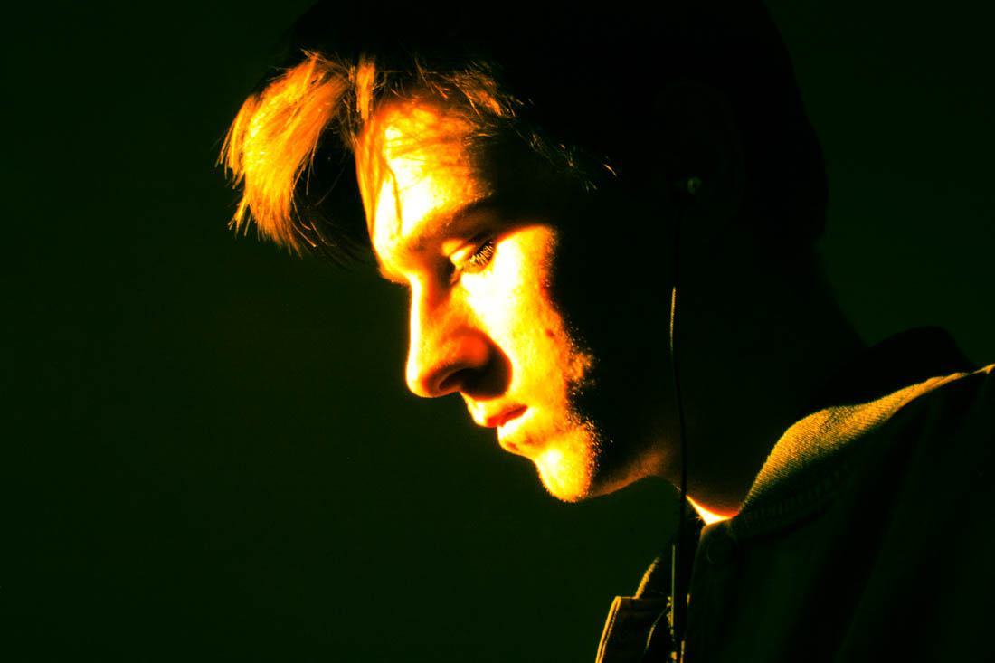
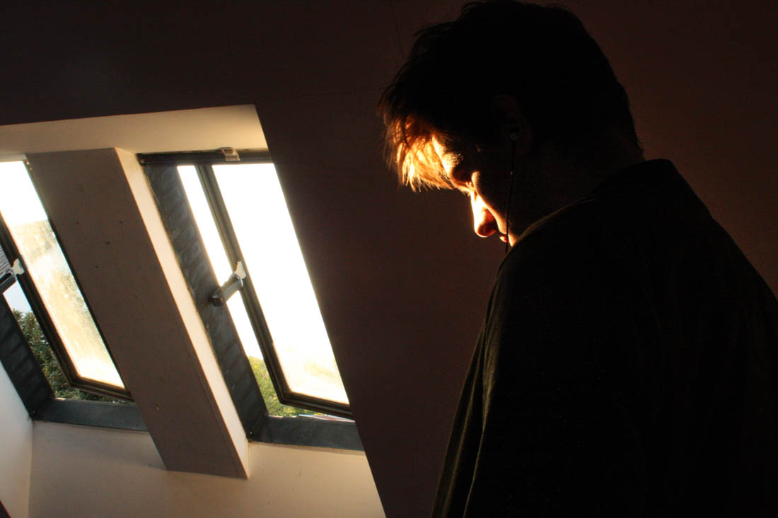
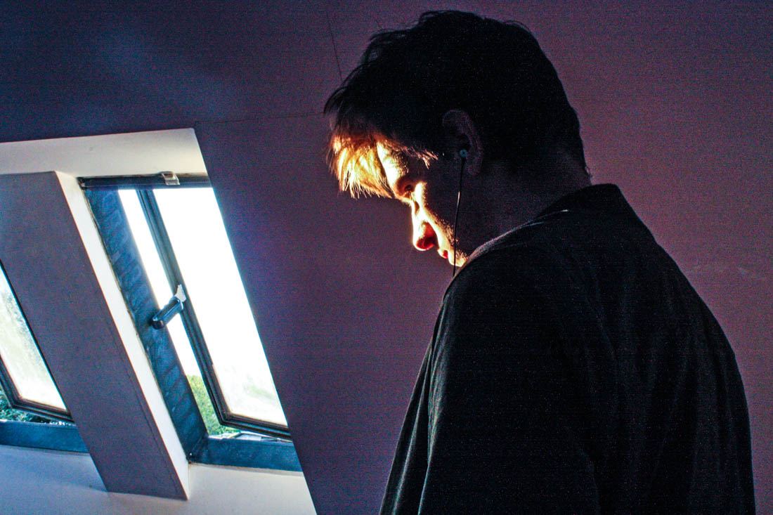
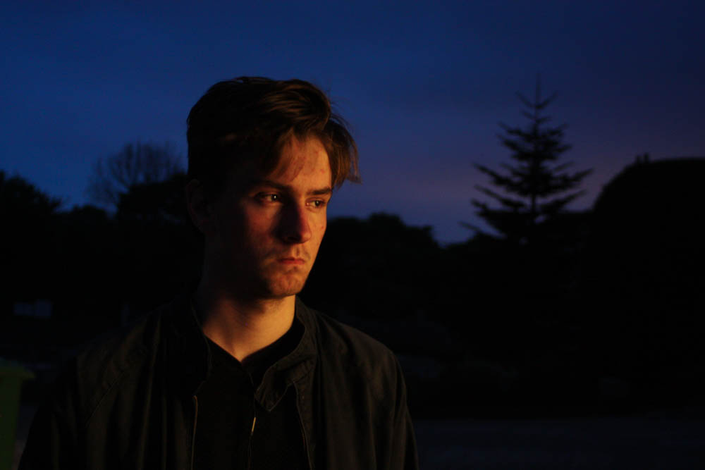
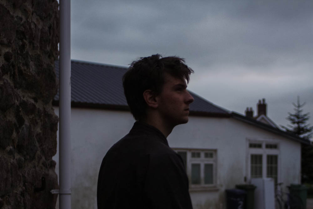
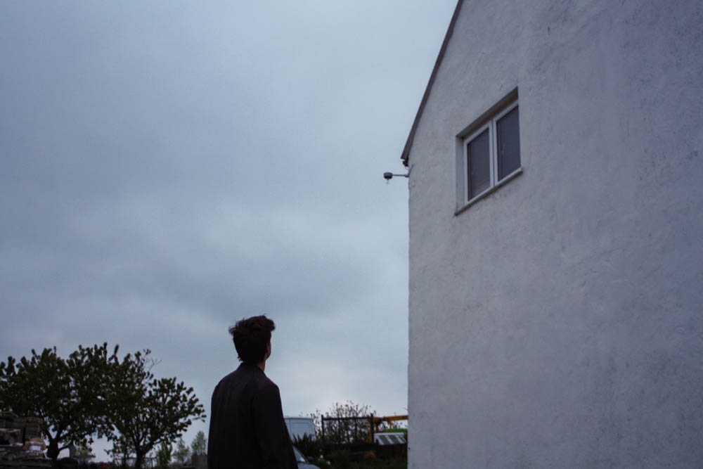
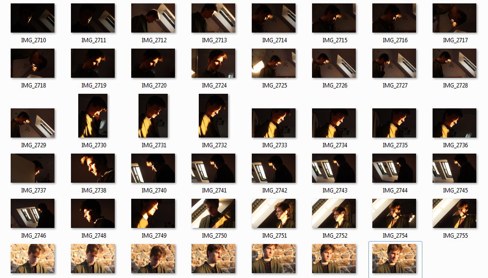 In response to Bill Henson and Todd Hido’s portraits, I wanted to explore the use of interior scenes and the use of natural lighting to build narrative and add emotion and feeling. In relation to my starting point, the natural light contrasts the dark spaces created by the walls and small light sources. I took over 50 photographs, each experimenting with different ISO’s and exposures and I also left it on auto focus, this evoked a sense of depth without creating overly blurry photographs, I also tested long exposures to give the photos a ghostly effect. I did not use a tripod and in hindsight this would have been more beneficial for creating a sharper image especially when working with longer exposures. I decided to not use multiple exposures or HDR techniques unlike many of my previous landscape photographs as I wanted to keep the strong contrasts of dark space with the warm light. The composition of the photographs features closeups as well as shots that feature more of the open space which reflects a bigger sense of environment. I have also made the compositions to work with a book layout so they could possibly work with a double page spread but also just on a single page, complimented with a text on the opposite side.


