Dawn Final photoshoot specification/plan

After looking through my previous shoots and the layout for my book I noticed the photos seemed to follow a fairly chronological narrative, moving from evening to night and back to morning. I wanted to do a final shoot focusing on ‘dawn’. I also wanted to explore the character I have build thru ought the book. I decided to feature my brothers room as a scene. I plan on taking these photographs early in the morning to truly capture the effect of early morning. Similar to previous shoots I plan on using as much natural light from windows as possible, Ryan’s room has two large windows and a window on the opposite wall which reflects the early morning light into Ryan’s room.


Documentary: Recycling Centre – Results

The images below show my last planned shoot for this project, taken at the newly opened La Collette Recycling centre. These images are a follow-up to my last shoot depicting where Jersey’s household waste is taken and what happens to our un-separated rubbish. The new La Collette recycling centre opened on Monday the 16th of January this year and replaces the old household recycling centre at that was located at Bellozanne. Here you can bring household waste and recycling as well as donate anything and everything that could be reused by someone else. Below I have added the long list of the types of waste that can be recycled instead of burned at the La Collette facility…

After completing my previous research and shoots looking at the different varieties of waste pollution, where it’s found, and where it ends up. My last shoot for this project, presented below, portrays the options we have on our island and how easy it is to make a small difference in our lives and use it. Although I was planning on simply taking a documentary look at Jersey’s new and improved facility there were also a lot of beautiful and abstract features which I couldn’t help but present below. When completing this shoot I had to come back on two different occasions due to the workers there being instructed not to allow any unauthorised publicity or photographs. On my second visit, I was instructed of some safety features, giving a high visibility vest and asked to sign in and out in order to be allowed to continue. Apart from this slight set back all I needed to complete this shoot was my camera the location, as it is usually found, and natural light from the sun. The location is key in this shoot as my goal for these images is to simply spread awareness about this new facility and hopefully encourage my viewers to use it. Below are some of my original unedited photographs displayed in a contact sheet…To chose between these photographs and produce my final outcomes, I was particularly interested in having a mixture of dynamic straight photography as well as abstract photography to intrigue my viewers. When editing the landscape documentary photographs I experimented with the highlighting to really emphasise the dramatic sky. With the more abstract pieces, however, I concentrated on really bringing out the vibrant colours and brilliant texture. Unlike with most of my previous shoots, I have decided to keep all of my finals in colour. This is because, unlike my previous shoots, these images attempt to show something good and hopeful towards the environment. Below are my final chosen and edited 6 outcomes for this last shoot in my environmental project…

This first piece above was created by stitching three separate photographs together to make one easy to read piece. I have put them together because the ‘reduce, reuse, recycle’ sign featured at the Recycling centre is situated all in one long, hard to capture horizontal line. I love the effect of this sign that has been created using recycled items and kids toys to create a textured, colourful and inspiring outcome. The meaning behind this photograph is obvious as I am simply getting across this clear message from a straight forward perspective. The final result of this, I believe, emphasises the written message and brings out the beautiful and striking details.

These next two outcomes are my more abstracted results featuring some beautiful and inspiring artwork I captured when visiting the location. The meaning behind these two photographs is to intrigue the viewer about the recycling centre itself as well as spread the message of its importance. The first outcome on the left depicts a beautifully crafted recycling symbol made from a vast amount of green and red discarded children’s toys. I love the depth and contrast between the tiny objects as well as the vibrancy and texture of the whole piece. Next is a more abstract piece featuring the side and rooftop of the decorated facility building along with part of a growing tree. I love the strange symbolism in this piece and I like how, without context, the audience is forced to come to their own conclusions.

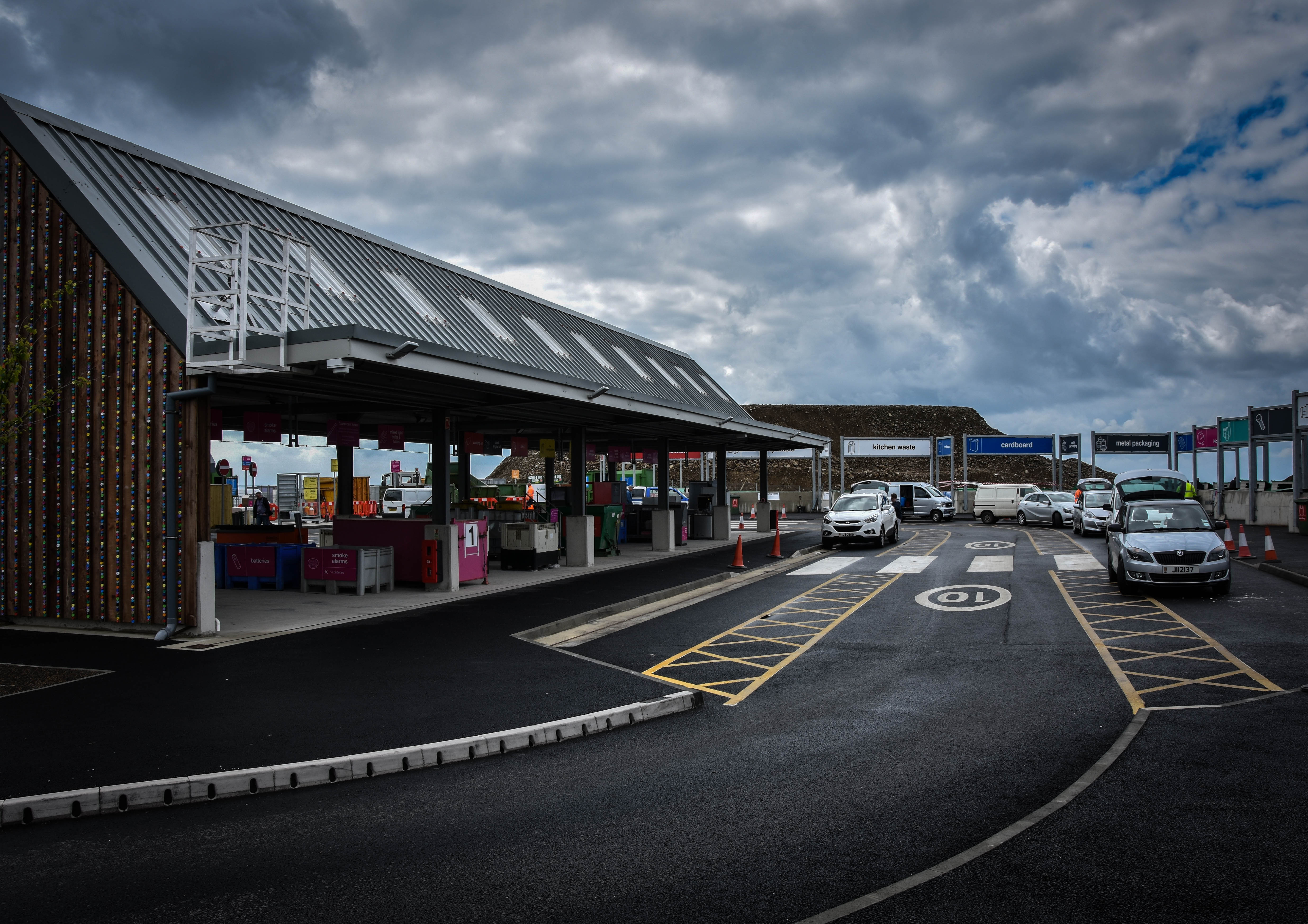
For this next documentary look at Jersey’s new and improved recycling facility, I have attempted to capture the location featuring as many important aspects as possible. My outcome above portrays the main recycling building on the left, the elegant car system running around the facility and a few of the many many drop-off points for waste that continues all the way around. The meaning behind this image is to show how the recycling centre now works and how effortless it is to drive around and dispose of our pollution safely. I have chosen this image as a final as I love the angled perspective of the facility and the dramatic overtones created with the contrast of the sky.

Lastly are two more of my documentary outcomes depicting the main features of the new recycling centre; the variety of different drop-off points. The meaning behind these photographs is simple as, like with the outcome above, I am trying to show the extent as to which they have improved Jersey’s recycling facility and made it as easy as possible for the public to use. The first image on the left depicts the electricals, mixed glass, metals and bulky waste containers with two members of staff in high-visibility jackets who are happy to help. Next, the image on the right depicts the same signs and more along with a member of the public discarding something into the bulky waste container. I like the perspective of the drop-off points in this picture and the contrast of the facility against the dramatic yet natural sky. 

Performance/reflection Shoot outcomes

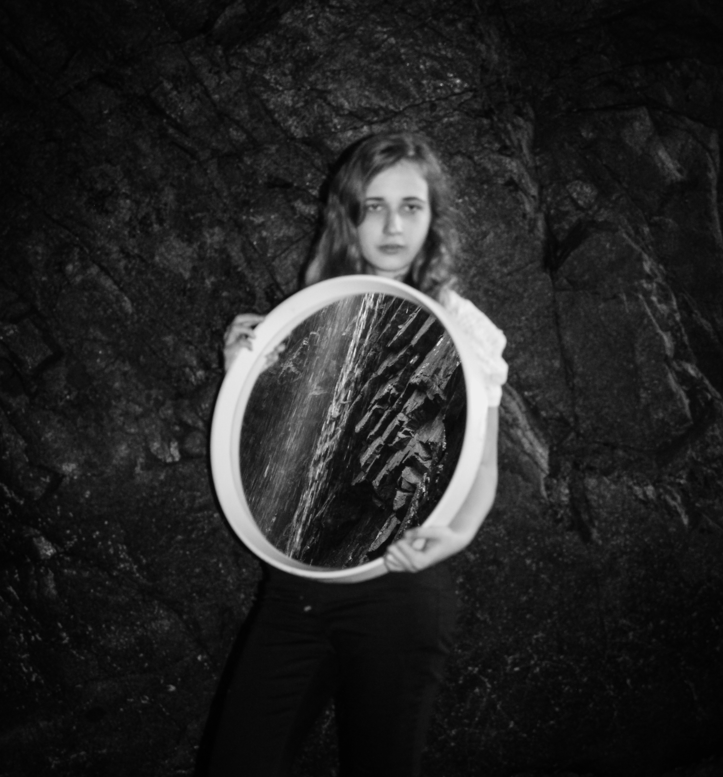
I have continued to experiment with more shoots based around performance and the use of reflections and shadows.  As with my earlier shoots the aim was to explore human relationships to environments and the process was fairly spontaneous. I have continued to use myself as the subject in many of the images as well as my younger sister, Lillian. I wanted to try and develop the idea of collaboration in reference to performance artists such as  Claude Cahun so I occasionally allowed my sister to help direct some of the photographs or press the shutter for the pictures I had set up involving myself. Once again I have made basic adjustments to the images in post-production to improve the colours, lighting and clarity.

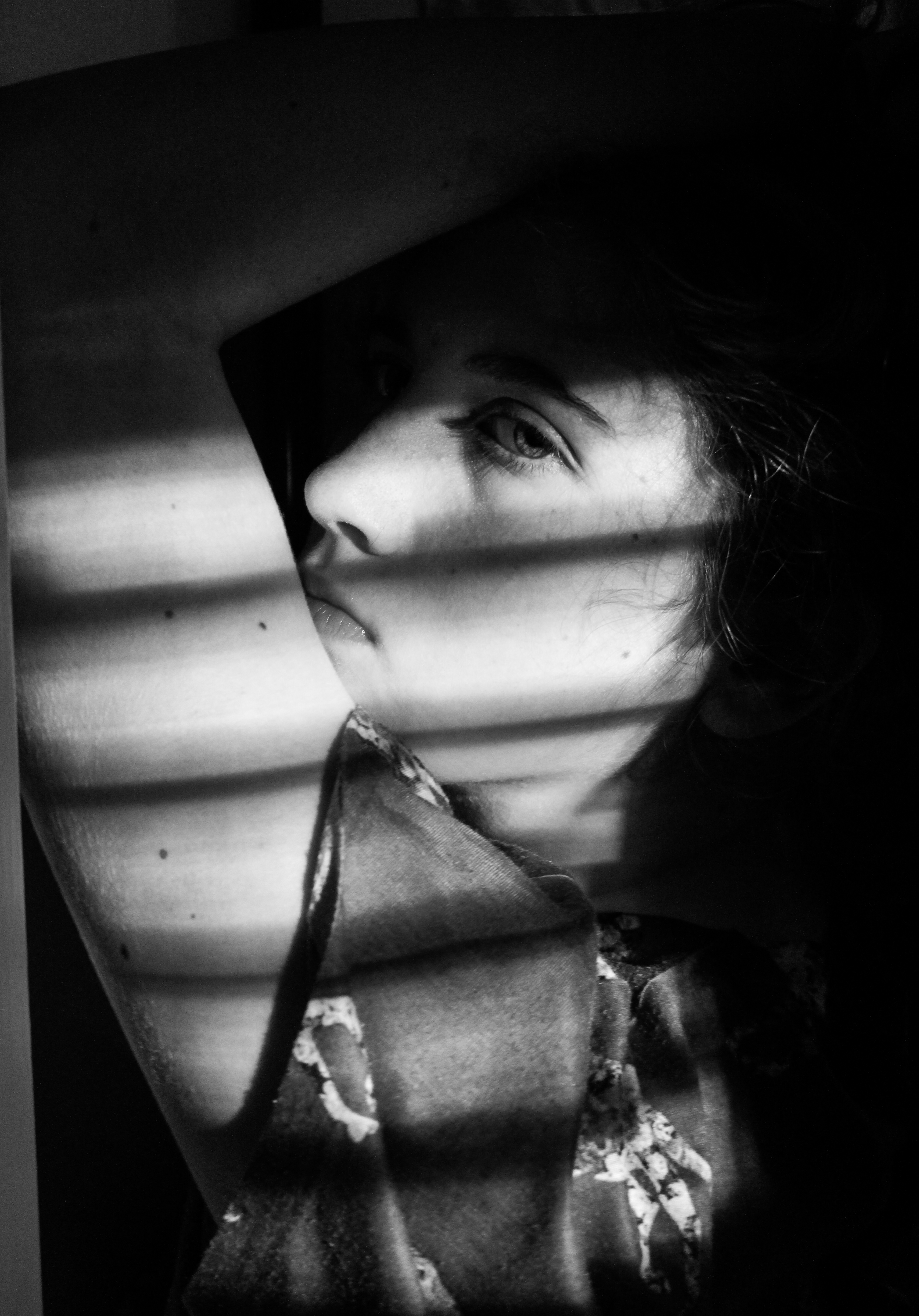
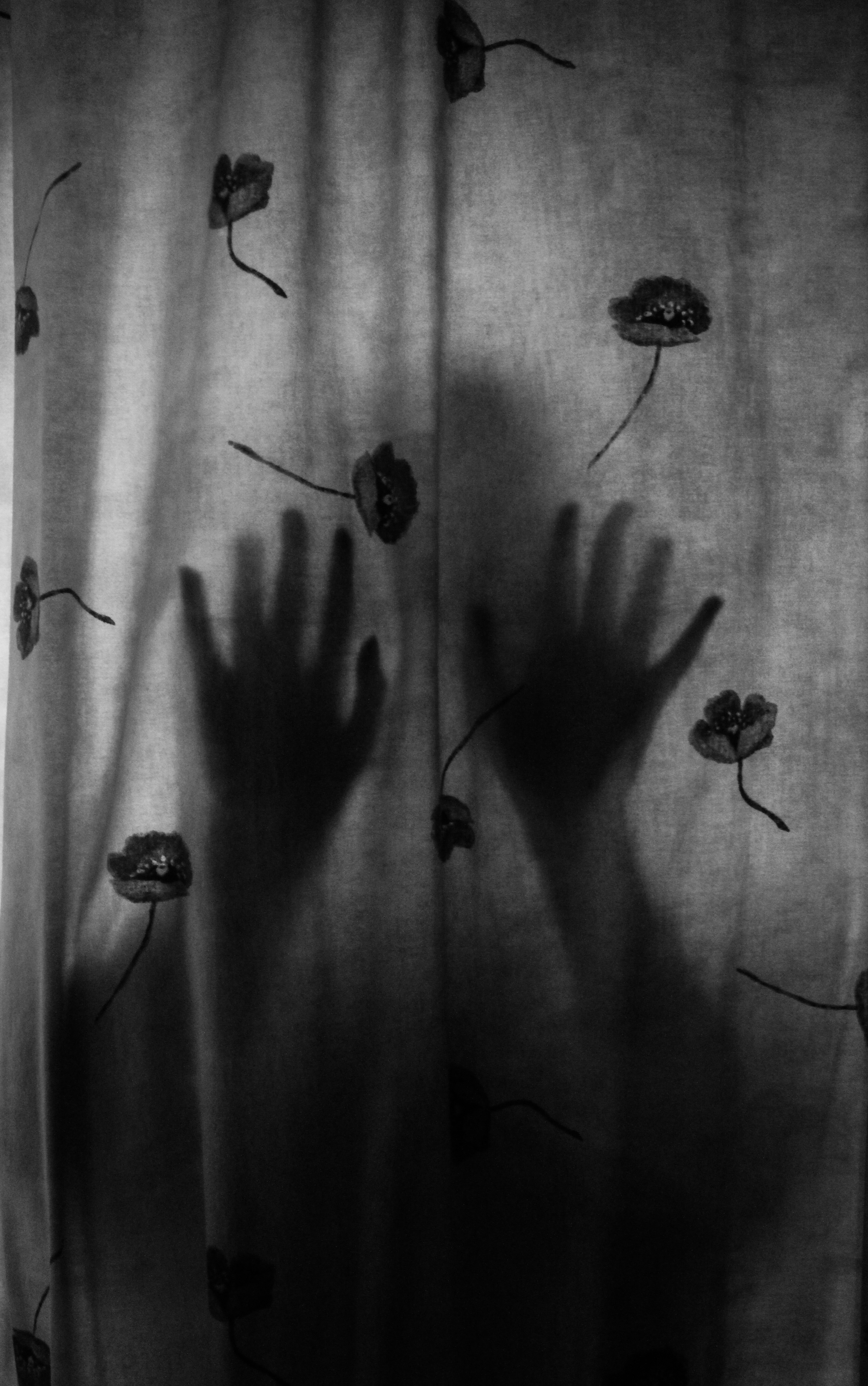
I wanted to try and explore interior environments specifically focusing on shadows.  I didn’t have many successful outcomes from this and for this reason I decided to base the rest of my shoots in natural, outdoor locations. However, I was pleased with the two examples below and I am planning on using them as final pieces.  I like the first because of the interesting combination of light and shadow created by the strips of light and the position of her arm so that it frames her face, with the dark background also meaning the viewer’s attention is drawn to her. I  think the second image with her silhouette visible through the curtain is also quite interesting and has an unusual, eerie atmosphere. I edited both of these to black and white to emphasise the qualities of the shadows for a more dramatic appearance because I felt the colour detracted from this.

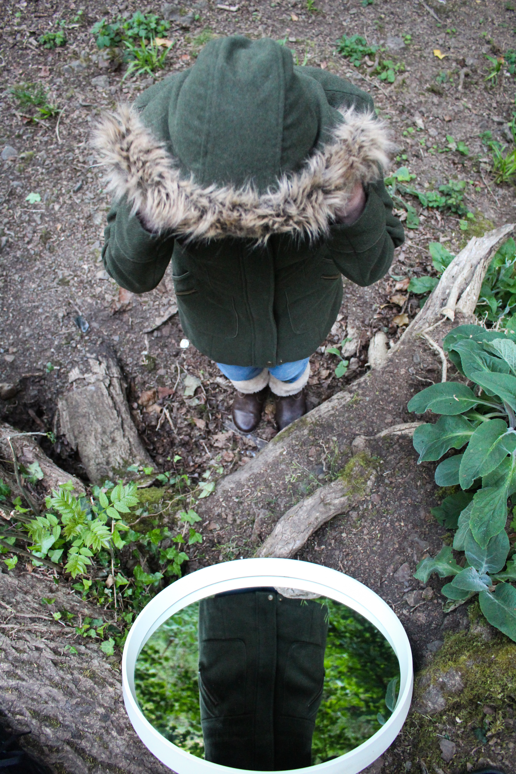
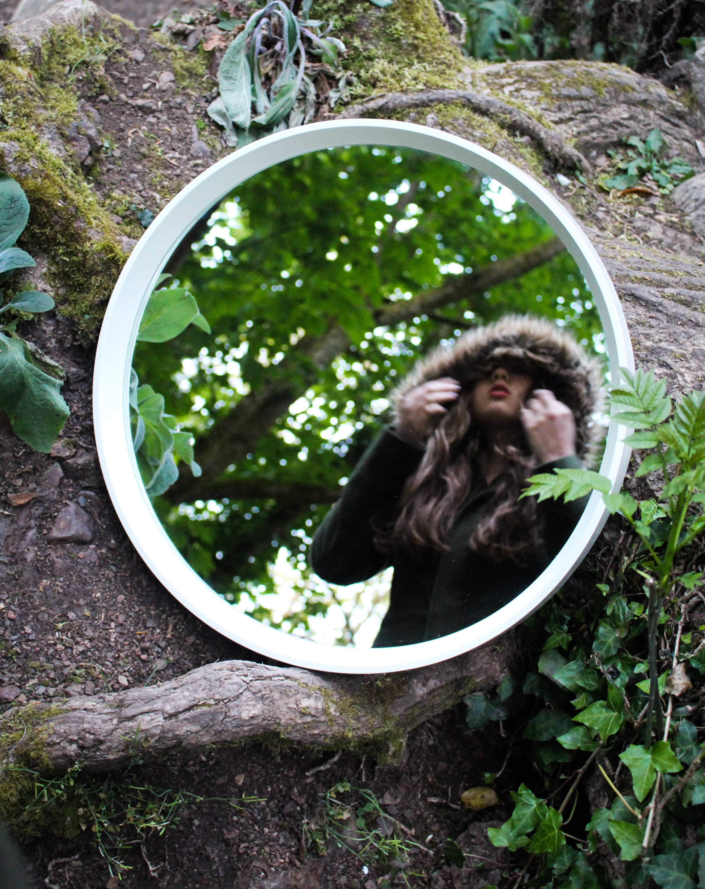
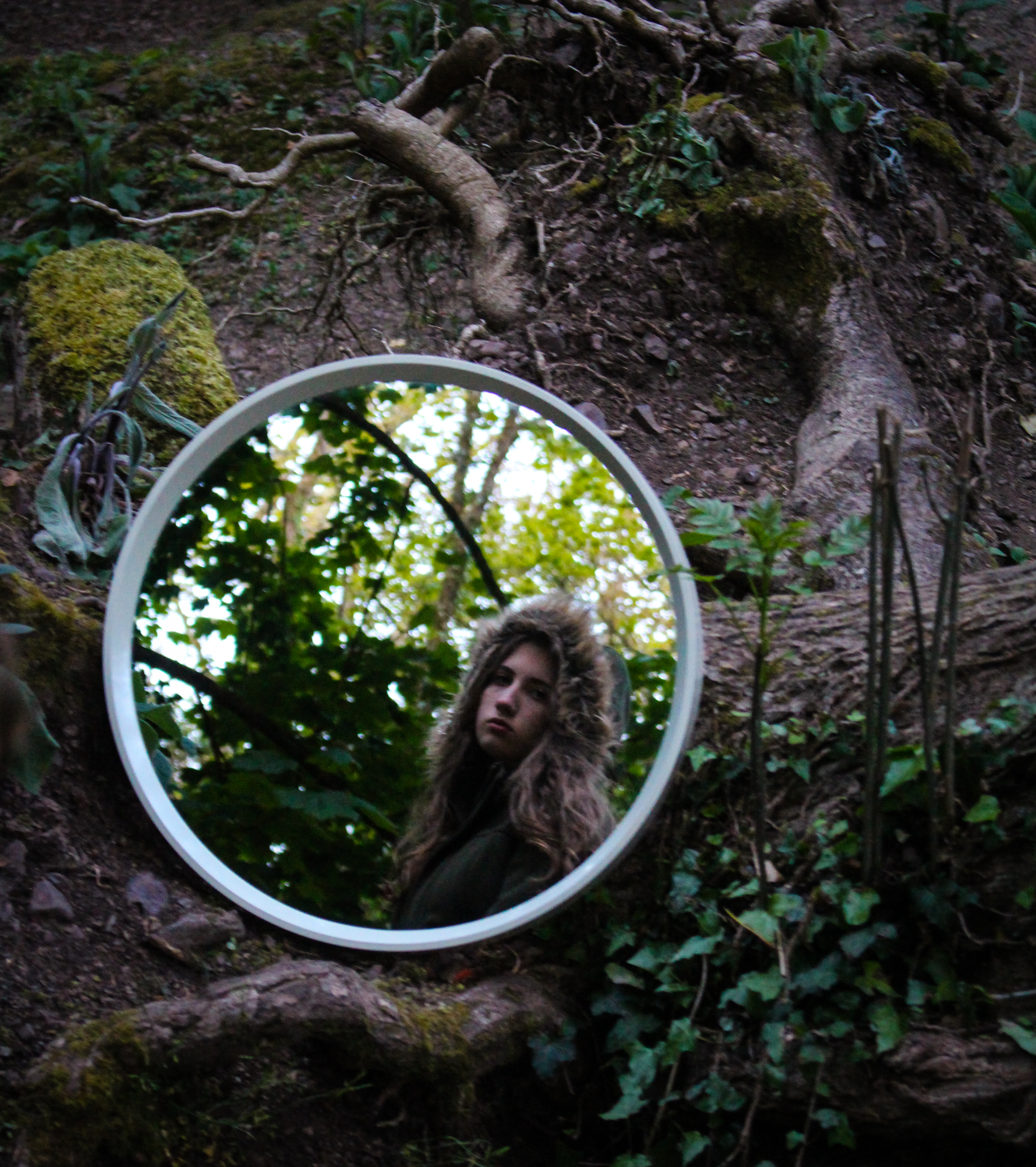
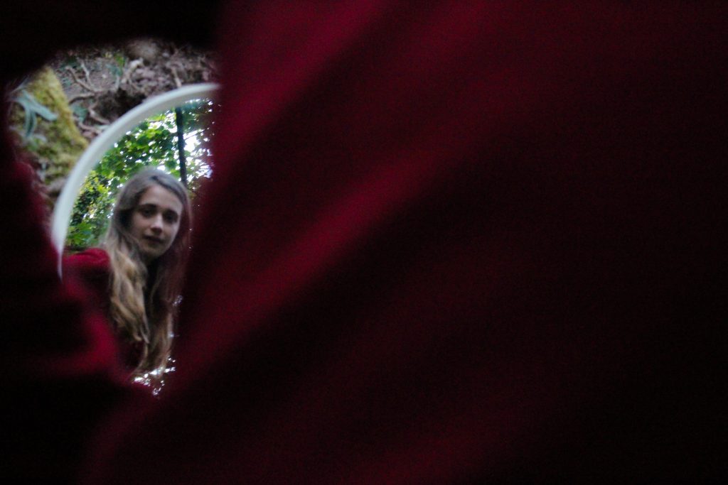
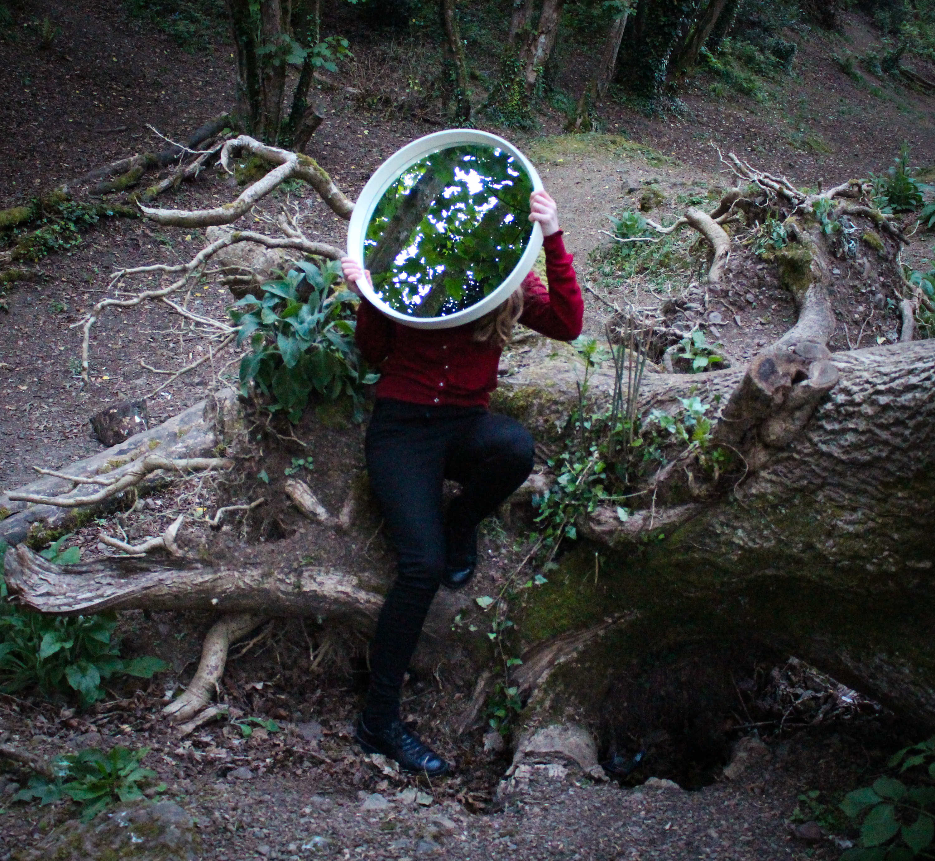
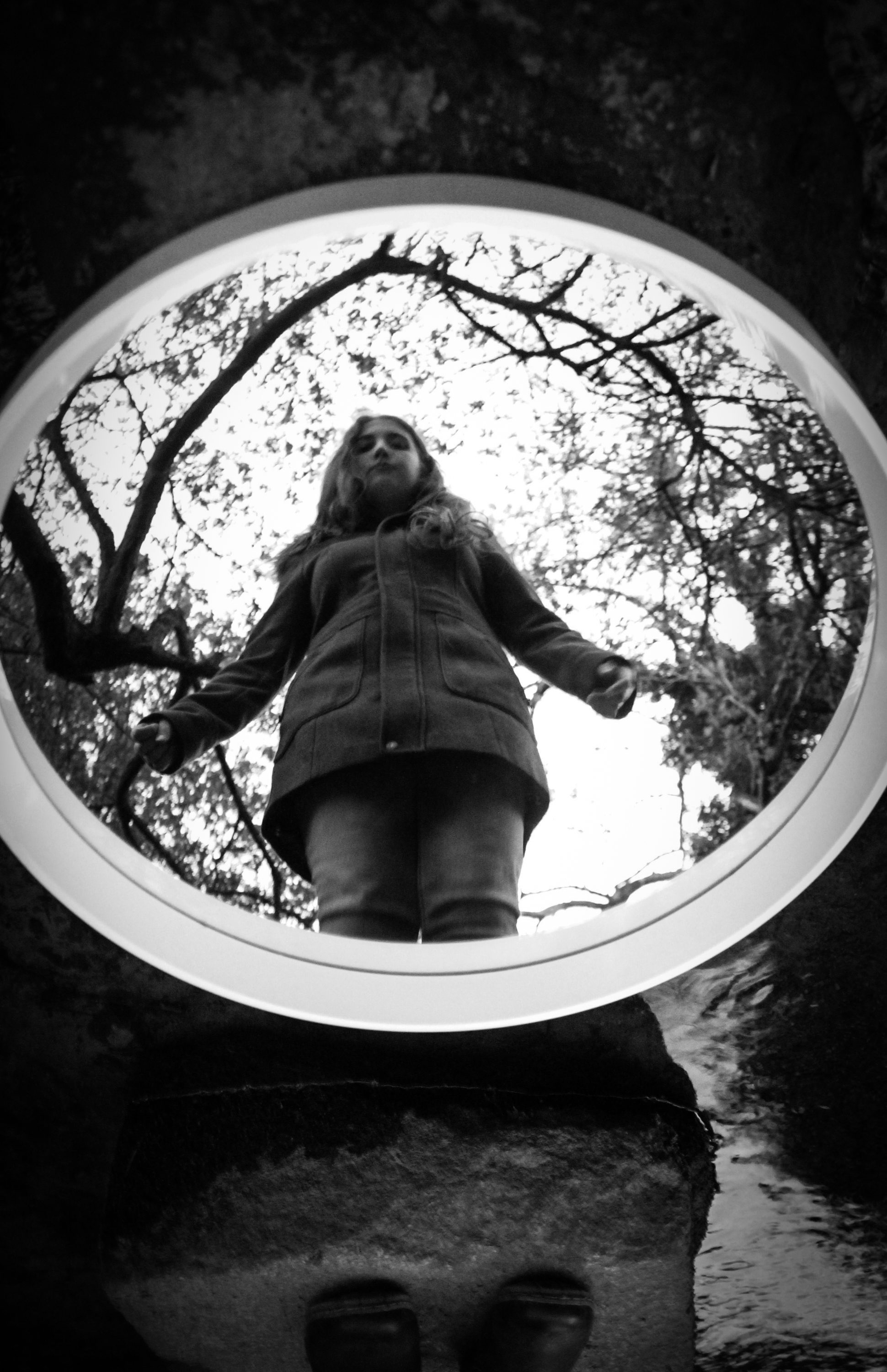
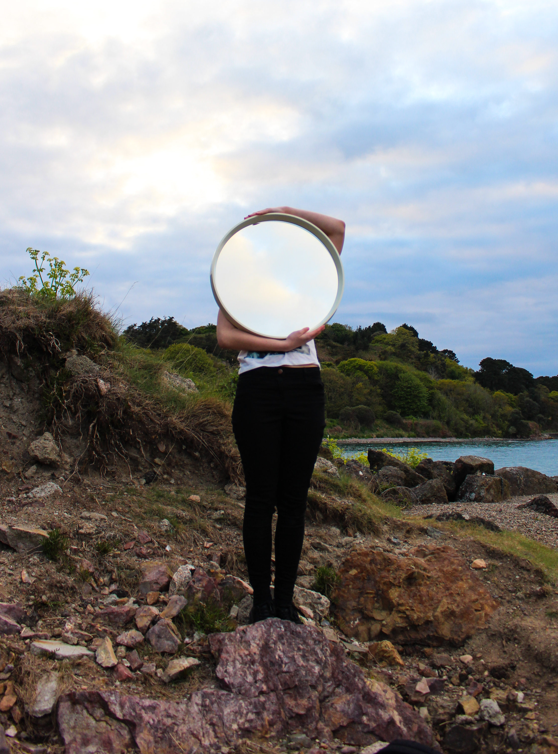
The next few outcomes are from a shoot I did in a different wooded location. I also experimented using a round mirror rather than a rectangular one. This allowed me to experiment with different techniques because it is smaller and has a thinner frame. I think this one stands out more within the environment because it’s round shape often contrasts with the other shapes in the image. However, I did like how the rectangular one echoed the shape of the image itself. My sister was wearing green with a brown fur hood which blends in with the naturals hues and tones of the environment. Contrastingly, I wore red which complements the green and stands out.

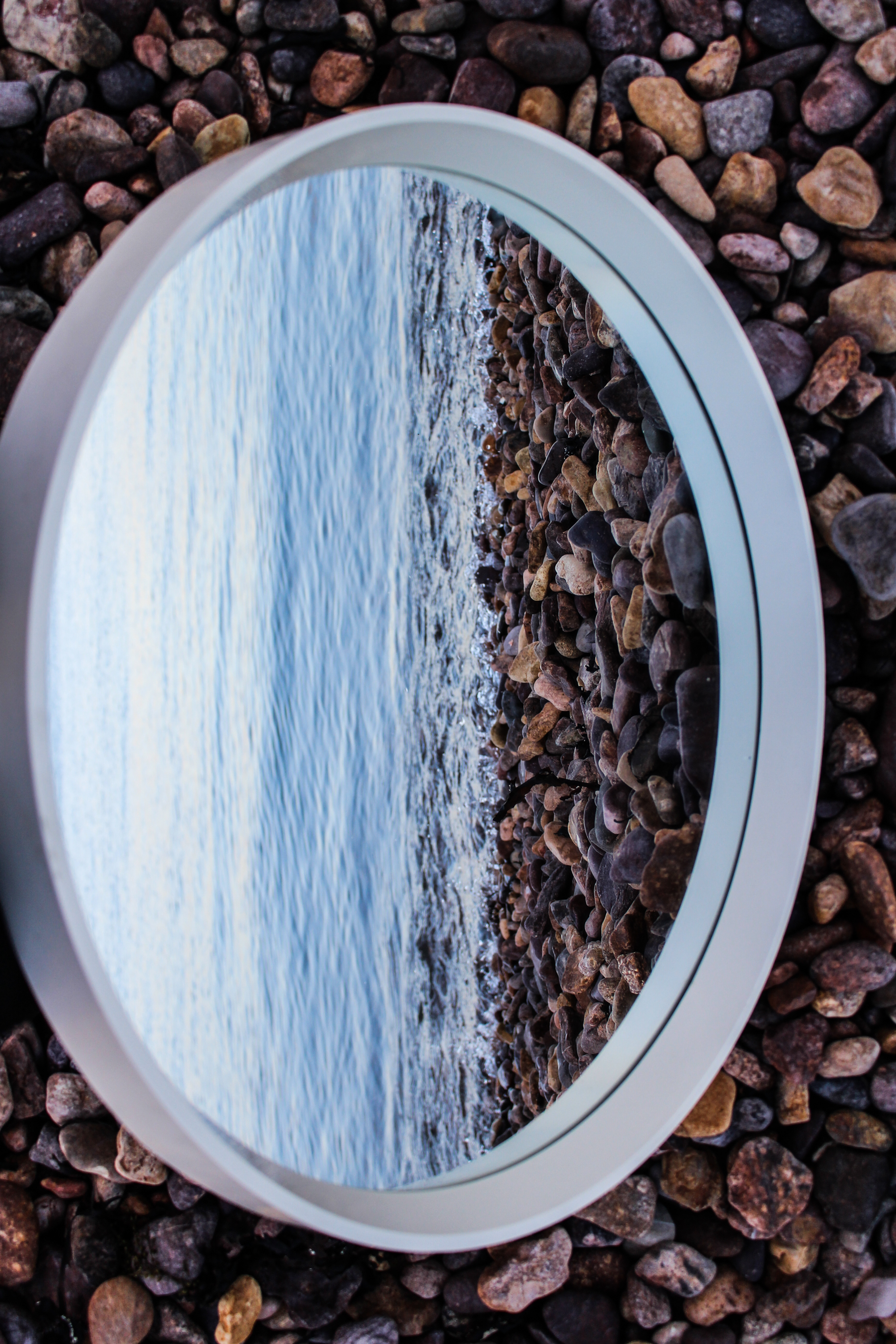
I also did a shoot at a beach location and made some landscape images without people with the use of the mirror. I don’t think these are particularly exciting but I  think the second example below is effective because of the dramatic sky and the way that the arms follow the shape of the mirror.

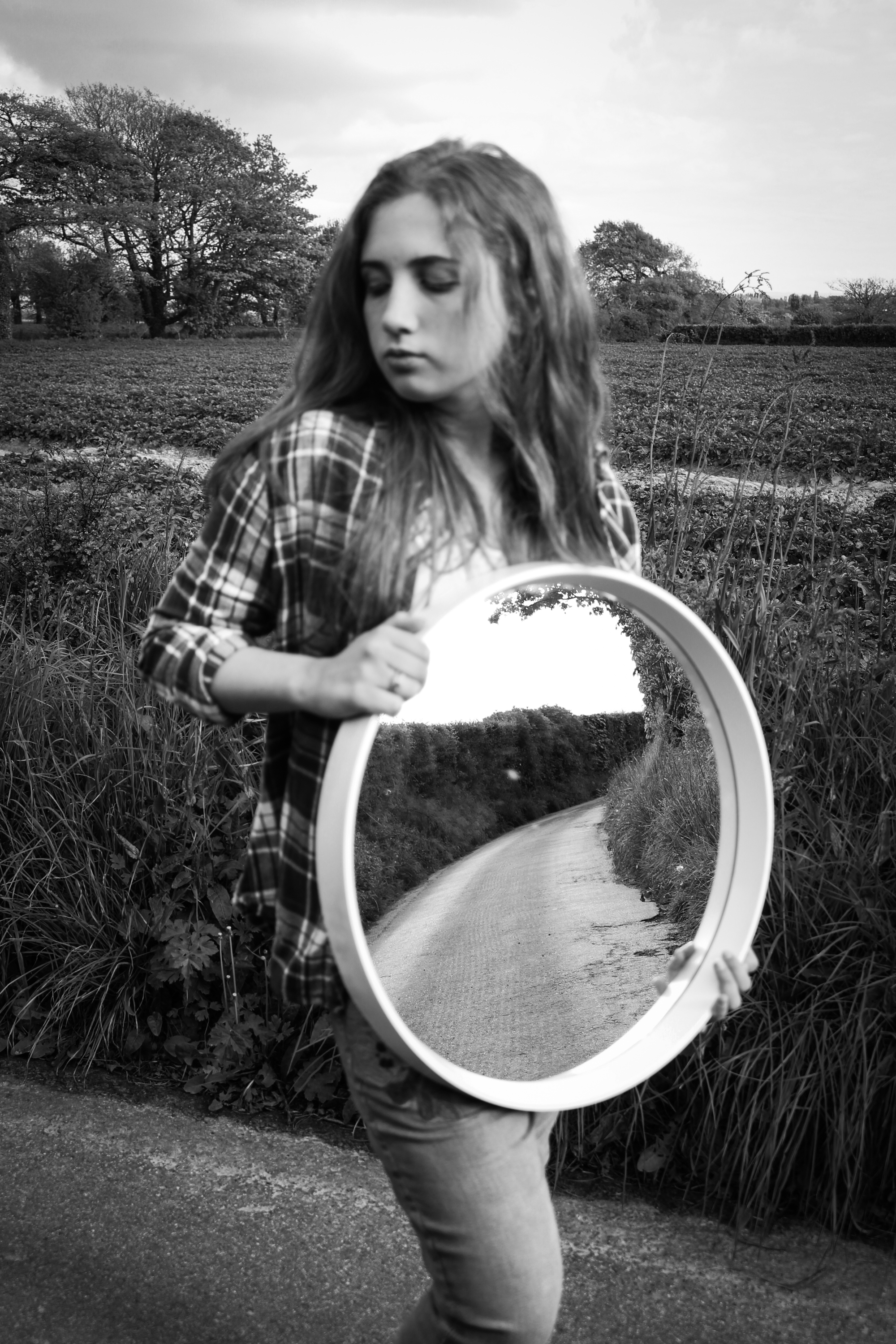
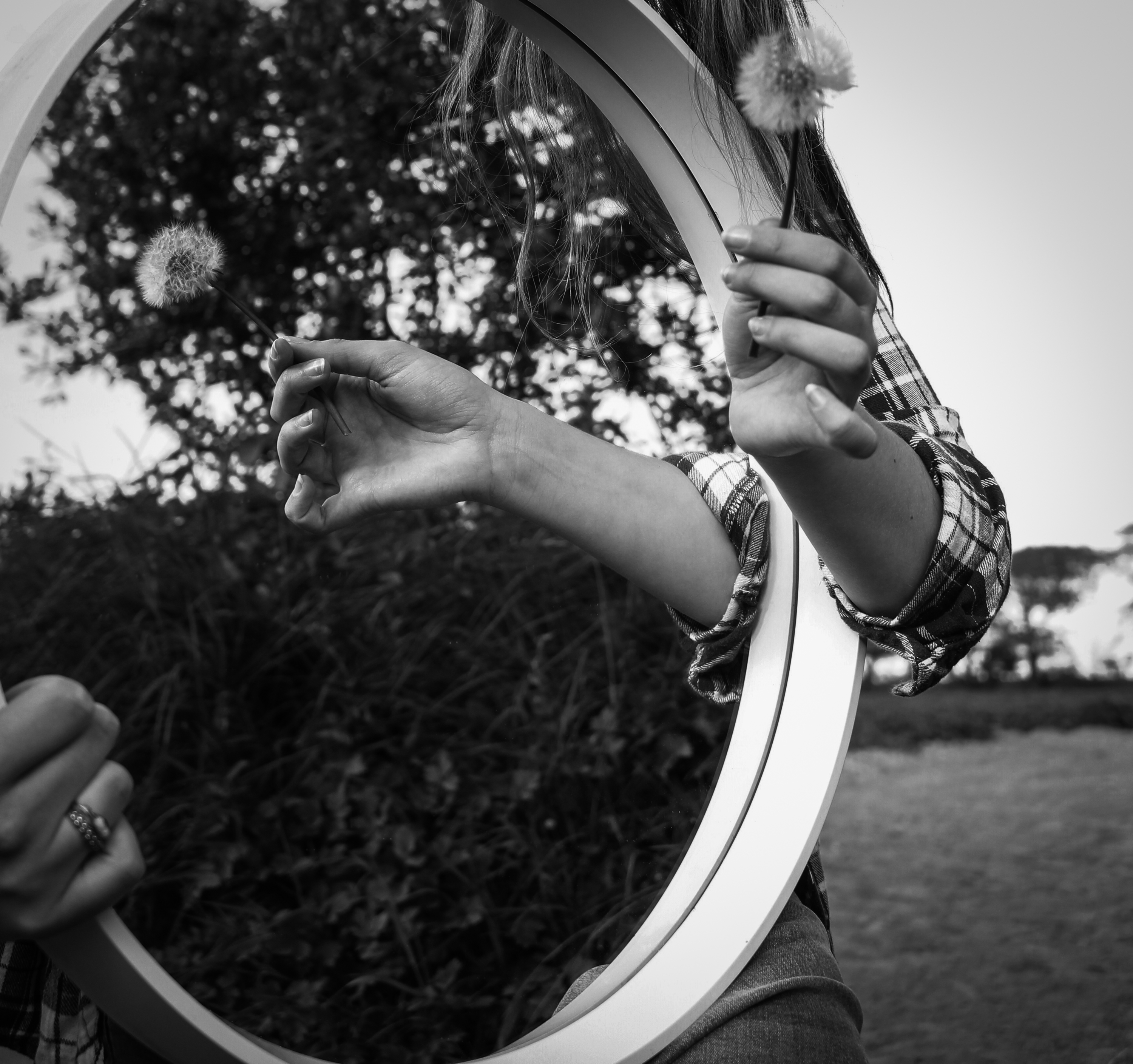
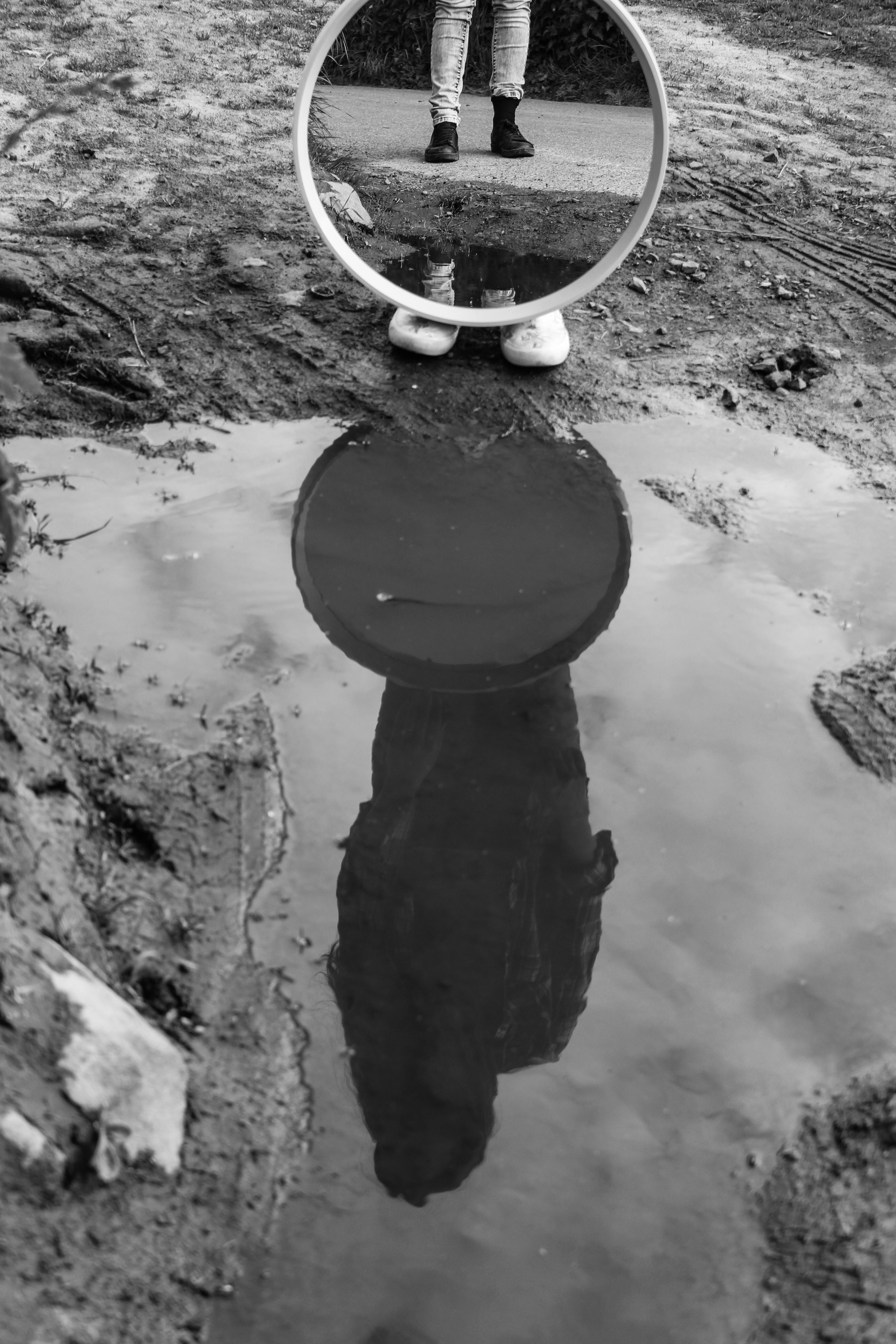
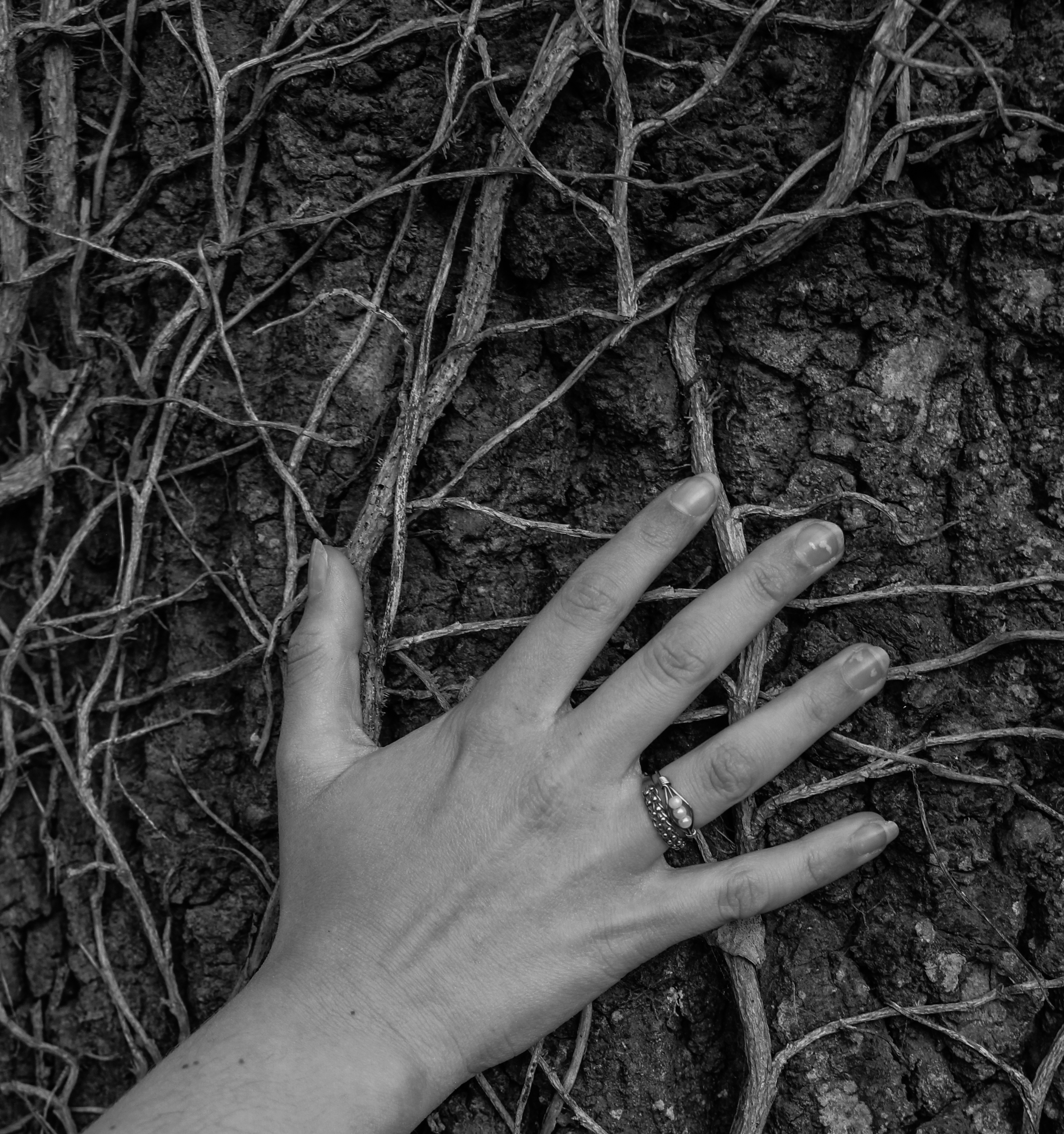
These images are from a shoot I did around some country lanes. I prefer the shot of the mirror working with the reflection in the puddle and I also like the shot of her hand on the tree because of how the veins show the similarities between humans and environments and how they can blend together.

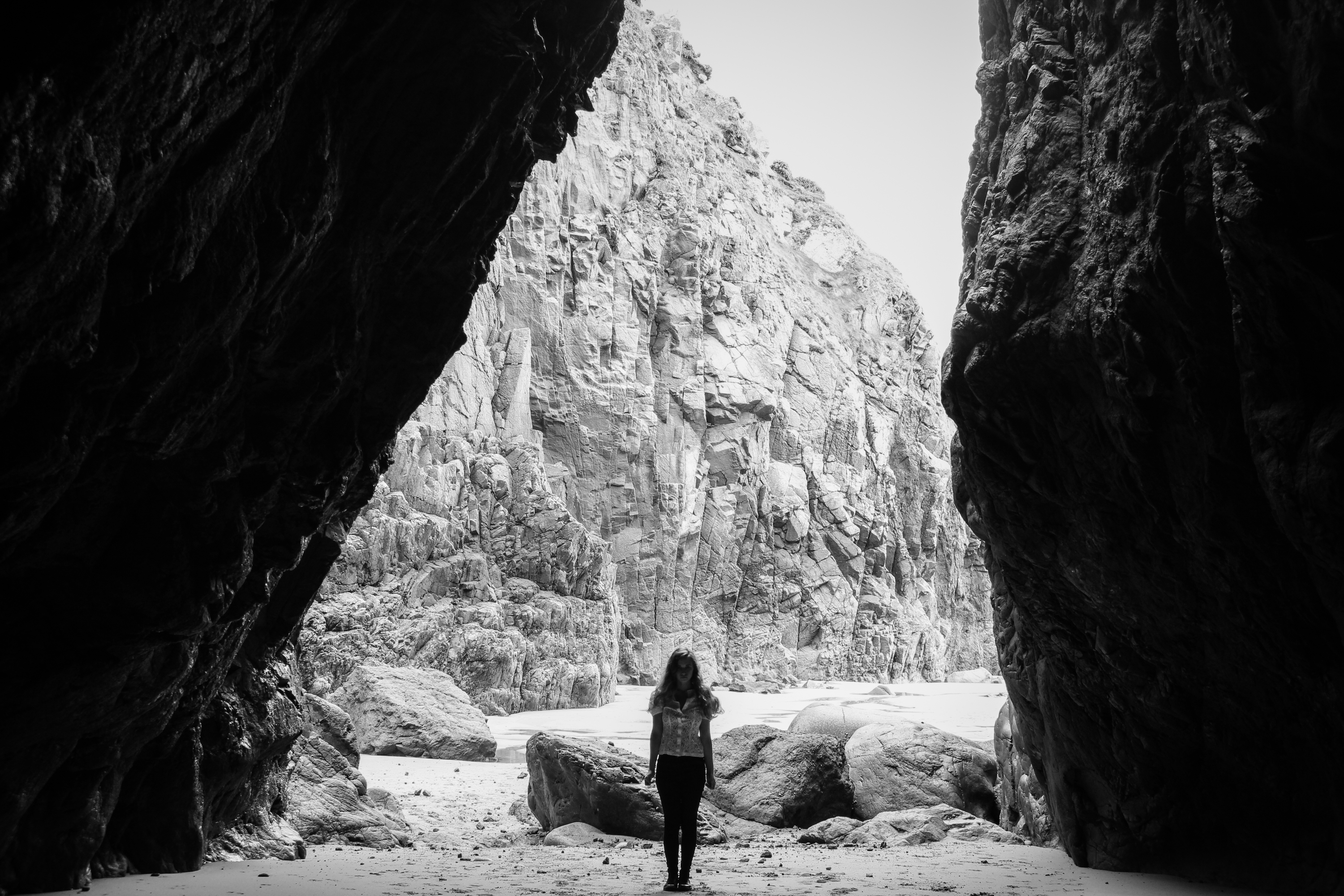
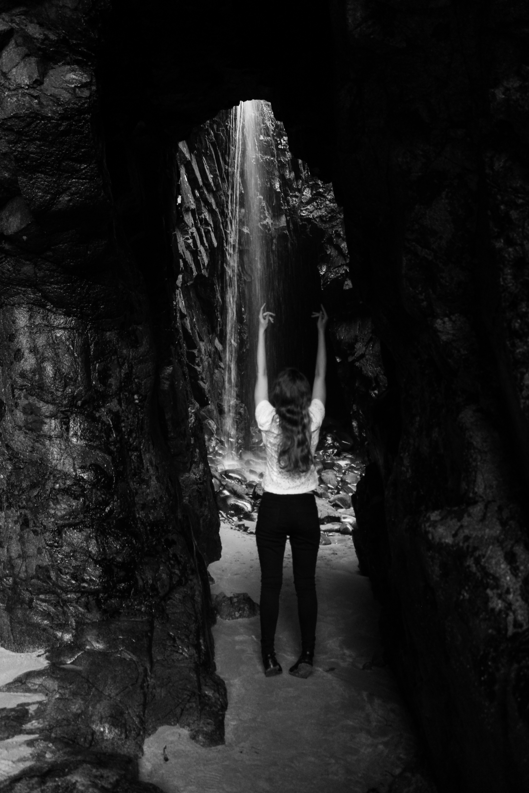
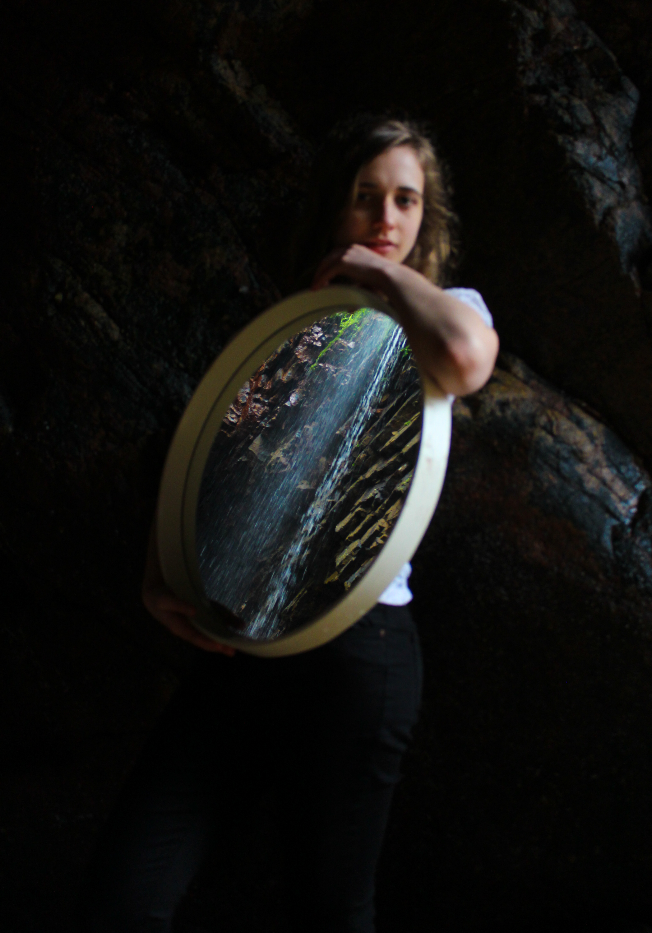
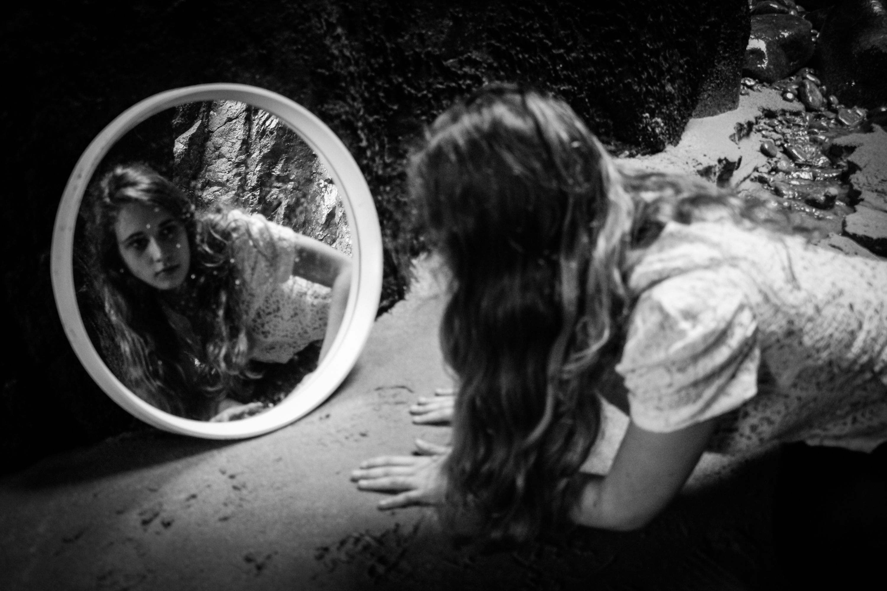
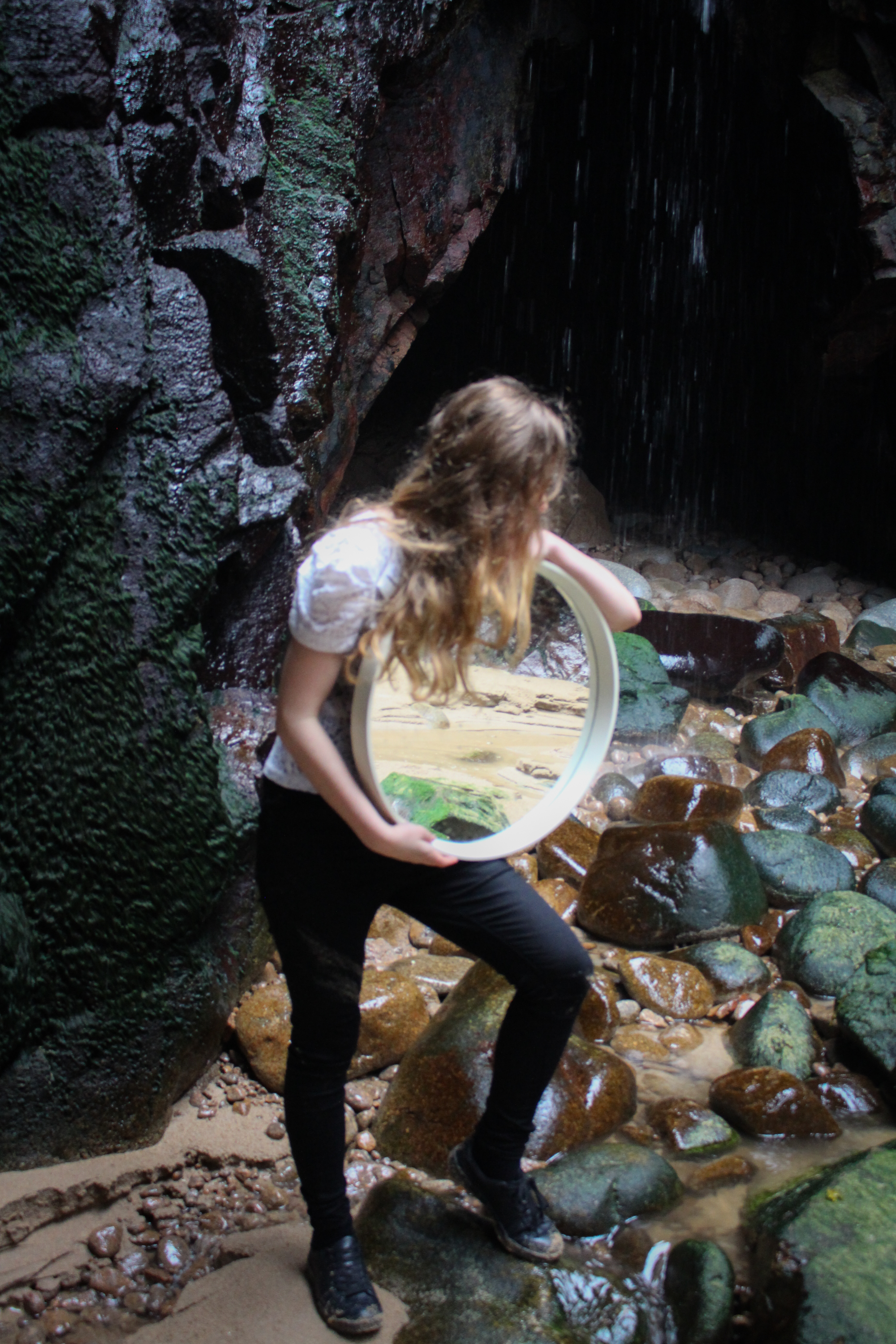
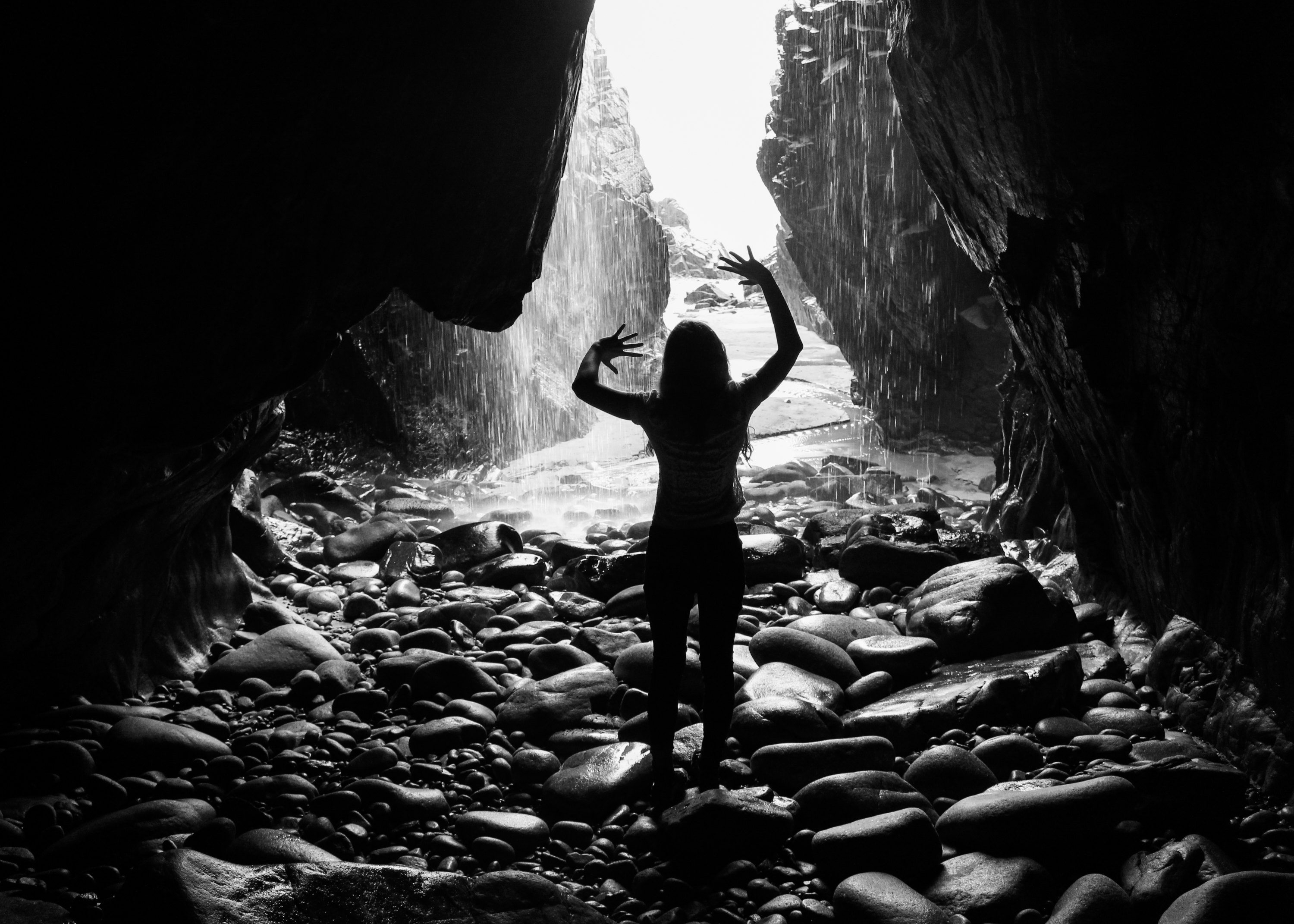
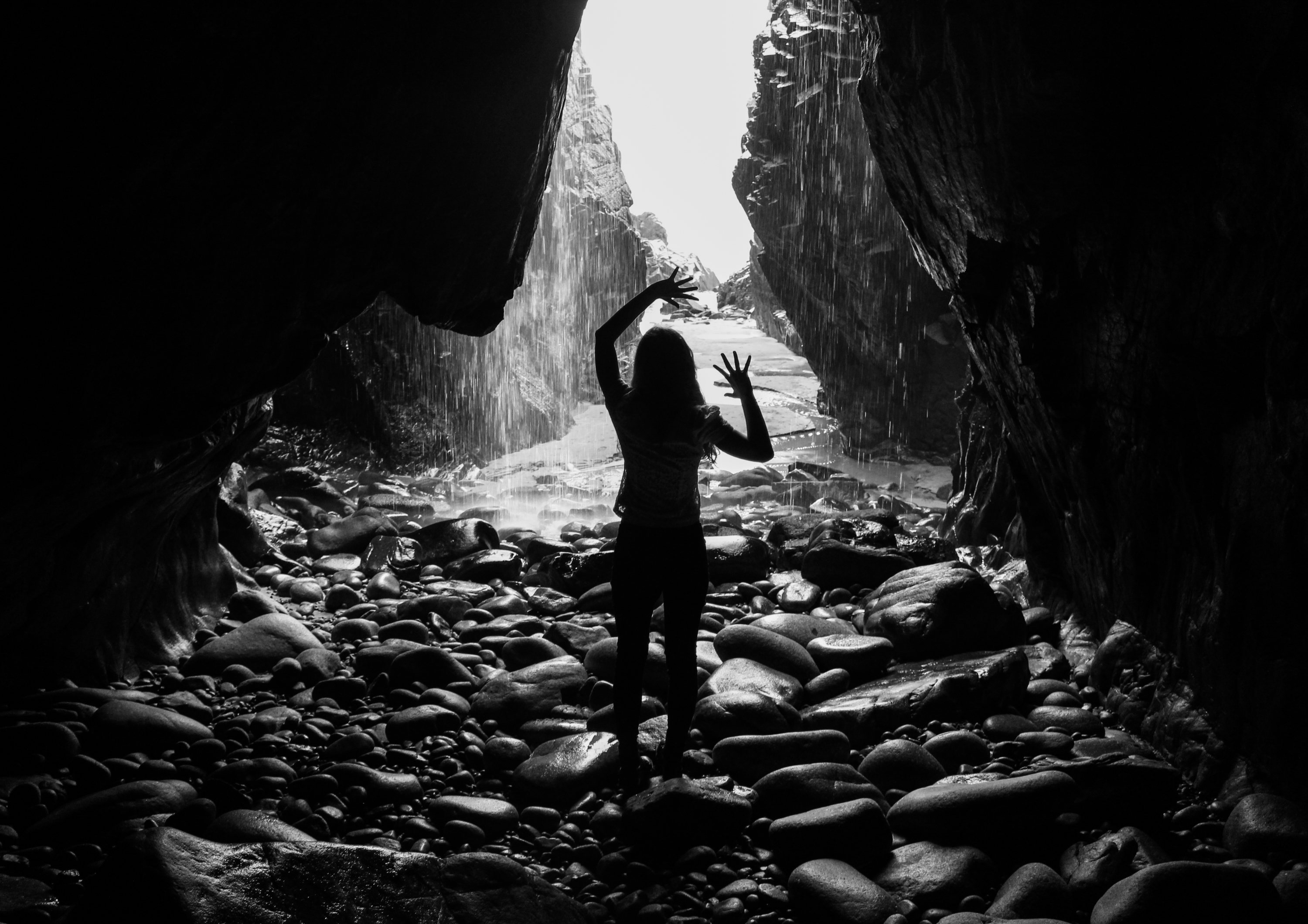
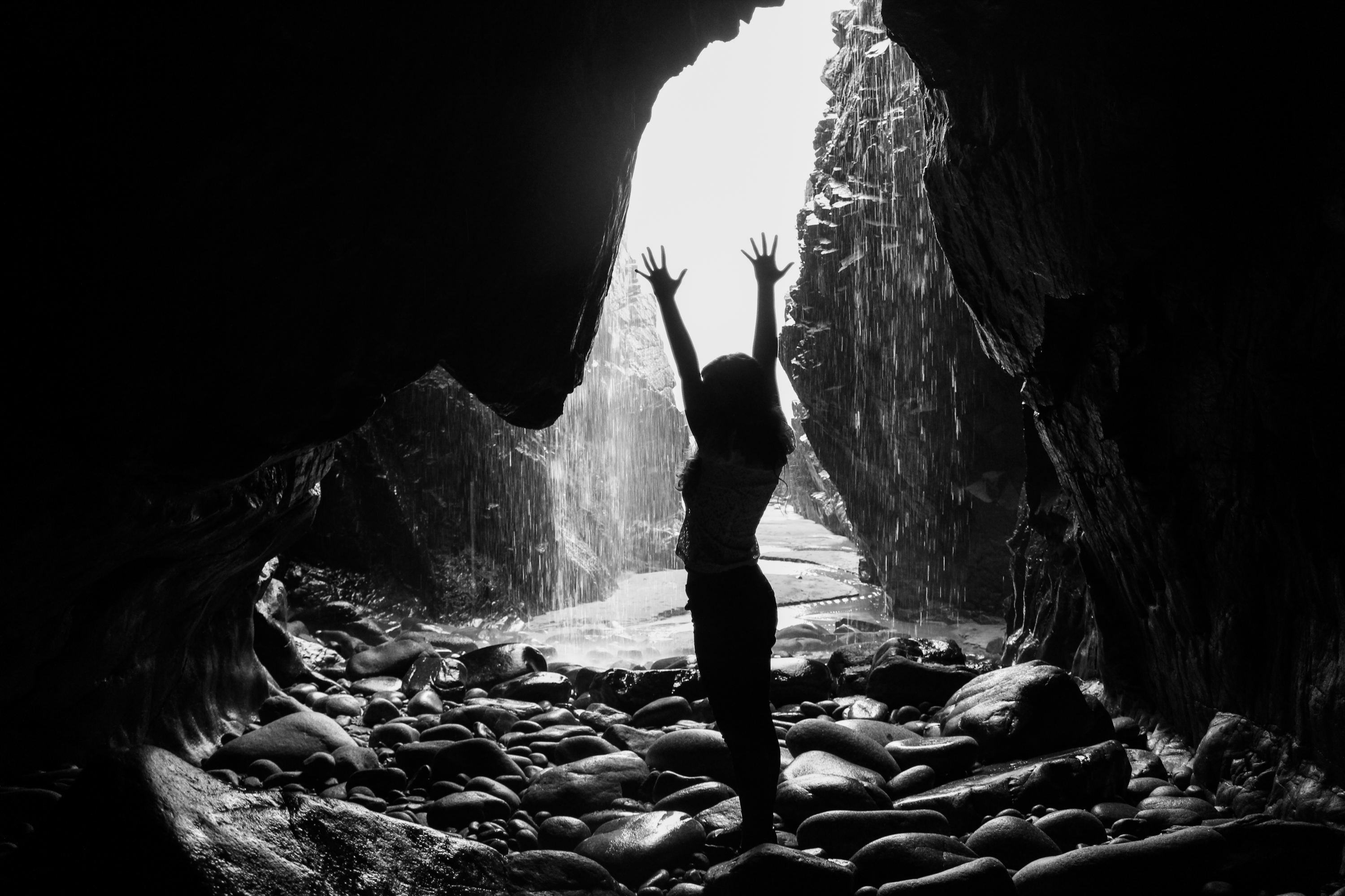
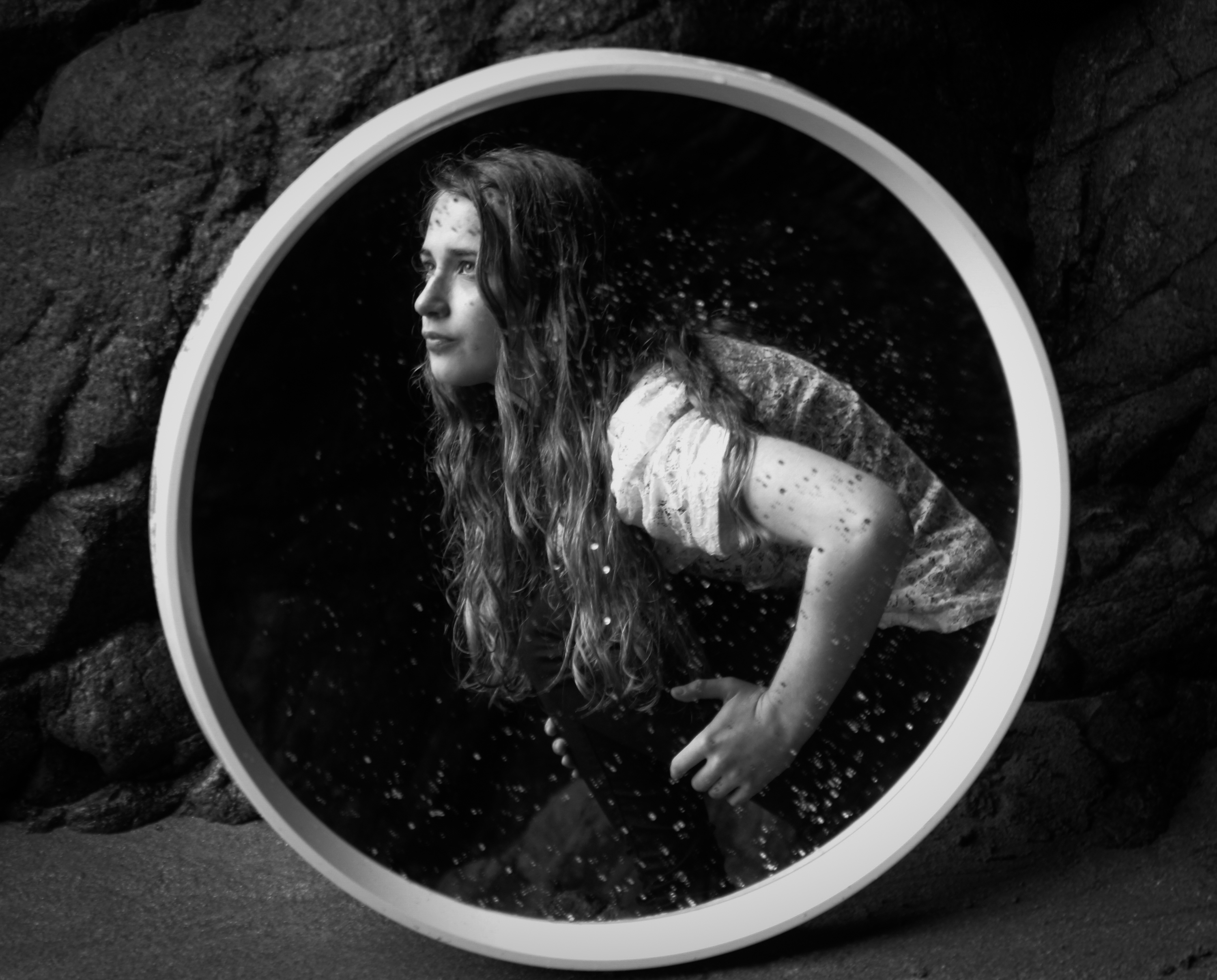
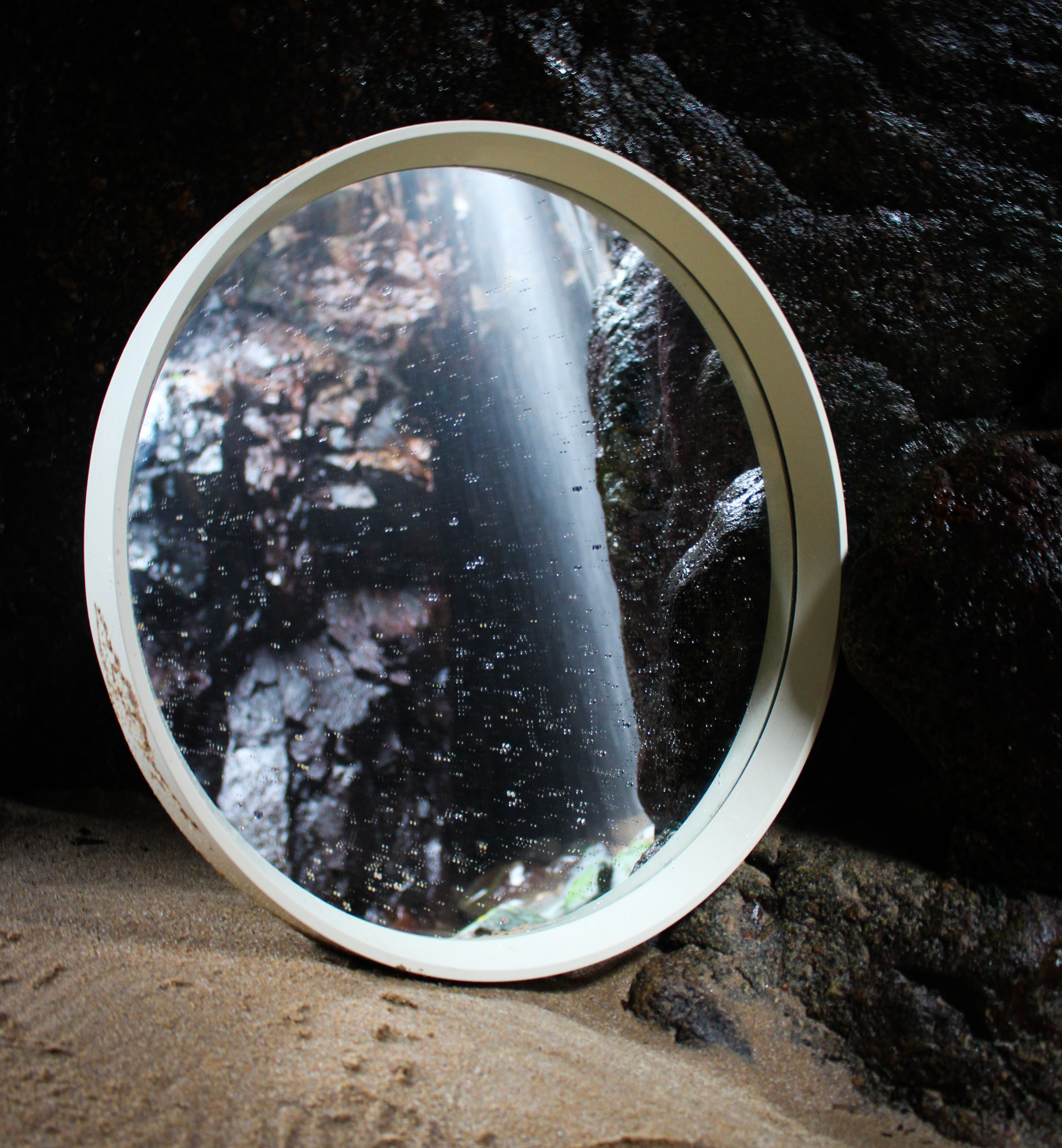
The outcomes from this final shoot were taken in caves. I chose this location because I wanted to base my exploratory performance shoots on interesting environments to respond to. This landscape was quite different to some of the others I have used and I think it has dramatic qualities. However, I also faced some technical problems here such as difficulty in access and low levels of light. Nevertheless I have some outcomes that I am happy with, I especially like the silhouetted ones with the cave entrance acting as a frame and the waterfall providing an interesting backdrop.

Oh Look More Images

// E M I L Y //

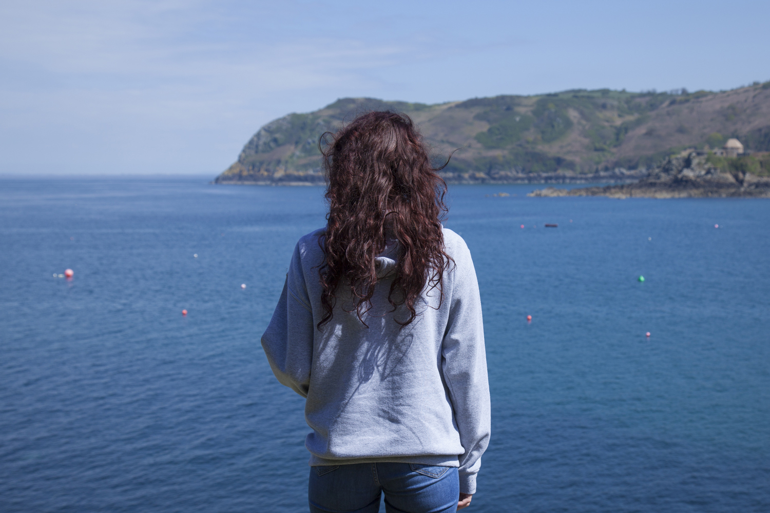
The next model for this project follows my friend Emily in the location of her choice; Bonne Nuit. When asking why she liked this area it was mainly about the size, isolation and close proximity of the rocks, bay and beach. The area itself is somewhat remote giving a feeling of isolation. Even when the sun is out it appears this isn’t a particularly busy area adding a level of serenity to the scene. The images I shot of her here follow the same formatting as the rest of this series. Bright colours were highlighted as points of interest and I took a selection of images of the figure around the area exploring different sections of the space. The main image I needed to produce was the backwards postcard shot which will ultimately make up the front of my card. Below is a small selection of images from the day where we adventured around the beach and over the rocks. There were two selected images for this which I will discuss further below. The main question was about the level of detail I wanted in the shot and how it changes the overall image.

For this feature image – which will ultimately create the front of my postcard design – I took two ‘final’ images to select from. In reality there were over 50 different angles but these two were the ones I was most confident with. The main difference is the level of detail included in the image which is mainly through the addition of the green tinted rocks in the foreground. The model’s rich purple hair works brilliantly to juxtapose the blues and greens of her chosen landscape.

Final image – Emily

The final image selected from this shoot was the less cluttered figure shown below which does not have the extra detail in the foreground. This image shows a crisper final print and will work more effectively as a postcard image. Shooting the second part of Emily’s section for this project may be difficult as she is limited for the number of visitors allowed in her physical home. Because of this, we also shot in a second location which she said was important to her just in case of the impossibility of shooting in her home. Though straying from the stylized portraits in other shoots for this project, the image below was one of my preferred from the day and offers itself to a lot of experimentation. I aim to explore the images taken on this day further to produce some stamps for Emily’s section of the project.

Artist reference-Duane Michals

“I think photographs should be provocative and not tell you what you already know. It takes no great powers or magic to reproduce somebody’s face in a photograph. The magic is in seeing people in new ways.”

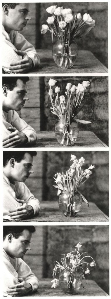
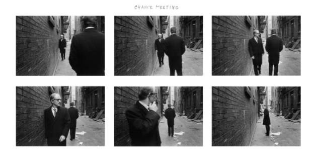
Duane Michals  is considered to be one of the great photographic innovators of the last century and is well known for his work with series, multiple exposures, and text. I have decided to consider him as an artist reference because I am thinking of taking inspiration from his methods of presenting images in series combined with handwritten notes to add a new layer of meaning to the images.

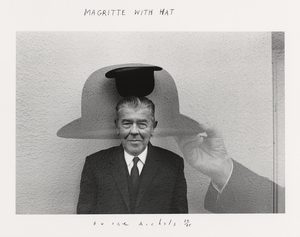
On this website it explains that he “was a pioneer in the 1960s when he broke away from established traditions of documentary and fine art photography”. Rather than following the recognised methods of presenting images by focusing on them individually he created sequences of multiple images to convey visual stories using a cinema frame-by-frame format. He also incorporated text into his work with handwritten messages and poems on the paper’s surface. He said that rather than serving an explanatory function the written text adds another dimension to the images. These messages are often poetic, tragic or humorous and he has said  “My pictures are more about question, not about answers.” He has also said that William Blake, Lewis Carroll, and René Magritte are influences on his work which would suggest a more surreal approach to his art.

His staged photography, often includes elements of other genres, including film, theatre, and literature. He utilises cinematic language but his images also contain blurred figures which implies movement in each frame.  Unlike film his images are open to individual interpretation and don’t have an overarching story-line. Initially critics were confused by his work because they reject the notion of the  “decisive movement” and the popular glorification of single images.  Nowadays his work is praised for this because he is considered an expressionist constructing images of the mind and exploring unseeable themes. His work is often of a personal nature, and Michals relies on his own history as subject material. They are also fantasies with a sense of absurd humour. Michals has said, “No one can reproduce my handwriting, but someone else can always make a new print” which shows his deliberate attempt to create one-off pieces which restricts the value of reproductions. This makes each piece unique, and increases the rarity of the work.

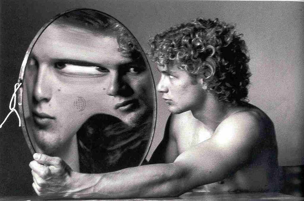
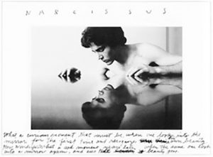
I was also drawn to Michal’s work because of the ways in which he has used reflections. He has explored the idea of mistrusting appearances and the truths that lie beyond the surface. Like mirrors cameras recreate a chosen subject ‘truthfully’ onto a flat surface by redirecting beams of light. Michals has stressed his suspicion of the purely visual to the extent of even abandoning the lens-based image in favour of purely verbal description. He has said ” I am a reflection photographing other reflections within a reflection” which suggests an unease with the process of trying to trap appearances. His work focuses on exploring invisible and internal themes and his use of mirrors could relate to the introspective nature of his work. He also connects his work on this to things such as mythology and literacy such as the example below which references the Greek myth of Narcissus.

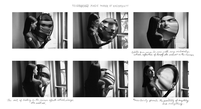
The famous example of his work shown below was created for French Vogue and was intended to illustrate a feature on quantum physics. The series is based on Werner Heisenberg’s uncertainty principle which basically said you can’t predict with certainty the position/velocity of a particle but they instead interact in chaos.  Michals has said ” I’ve always been interested in physics and I like trying to photograph things that seem un-photographable – rather than looking at reality, I aim to get deep inside it and explore”. He explains that he bought the convex mirror in an antique shop in Bath and was intrigued by the distortions it created. He used this to illustrate Heisenberg’s principle because it transforms everything in front of it. When the model moves the image changes completely which creates a powerful energy to the series. Displaying them together this way effectively presents this and in the last image, when the model is looking at the camera and her cheek appears in the mirror so that there is no face at all it demonstrates a  “blank slate” of pure white energy. Technically the individual photographs are also well captured with what appears to be natural light from the window and the black and white emphasising the contrasts and forms. 

The series below called ‘Alice’s Mirror’ is presumably based on ‘Through the Looking-Glass’, the sequel to Alice in Wonderland. In the novel she considers what the world is like on the other side of a mirror’s reflection and steps through the mirror into another world. I like Michal’s use of miniatures in this series to distort the viewer’s perceptions and create a surreal piece and I would be interested in exploring something similar in my own work.  

More Shoots

// JOE + BETH //

The next shoot was with two characters, Beth was the subject I had intended to shoot with but the addition of a second figure (Joe) worked very well in the images. Below, as before, is a set of images showing a variety of shots from the shoot which took place at Beth’s location of choice – Green Island. These photos were taken just after golden hour making use of the eery blue lighting and it’s soft, pastel effects. With enough light to shoot but limited colours and shadows there is certainly something beautiful in the muted colour palette. I selected two external images, one which just showed Beth overlooking the bay and a  second image featuring both Joe and Beth which provided a varied alternative to this themed project. Ultimately, it was the single figure image I was after so that one came out on top.

As with all these shoots, I asked the model [Beth] to answer a series of questions about the location [Green Island] she choose.

Where is home for you? Why is this place home? Are your family there? Do you feel safe here? What is it that makes this particular place home?

Home is at my house in my room where I can be with friends and just chill. Stuff is less complicated there and I can block out school and shitty people and relax a bit. 

What makes Jersey important to you? Do you have good memories here?

Jersey means friends and friends are home. There are lots of important places here which mean a lot to me. Because I can drive now there’s lots of places I can get to which I didn’t know about before. It also means I can walk my dog in new places which means i get to see a lot more of the island and don’t have to rely on other people to drive me.

Where in Jersey holds the best memories for you? Why is it positive for you?

My favourite on island place right now is Green Island beach where I can walk my dog in the evenings. The sky is normally lighter around there and the sunsets can be really nice. If it’s high tide you can walk along the path at the top of the beach and sit on the benches which overlook the sea. It’s a good place to be on stormy days when the sea is high aswell.

Environment – My Book Layout

Here is a link to my Blurb photo book:

http://www.blurb.co.uk/b/7937421-are-you-even-cool

After the refinement of each of my photo shoots, I came to the realization that I had a large amount of strong images, in which I would have been happy to present as finals. With this in mind, I therefore decided to create a photo book in blurb to present these images more intimately.

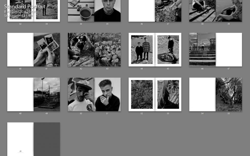
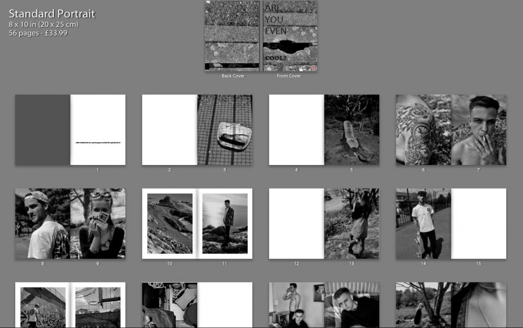
Below shows a thumbnail view of my final book layout. I feel that this thumbnail view gives a stronger perspective of the layout as a whole, in comparison to the individual pages, as it is much clearer to see the overall aesthetic of the book and why I made certain choices with the layout.
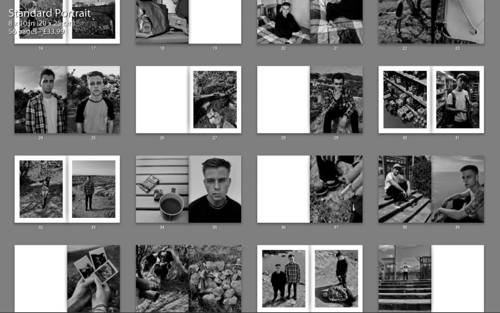
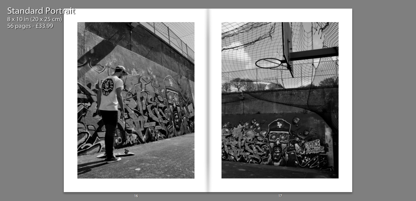
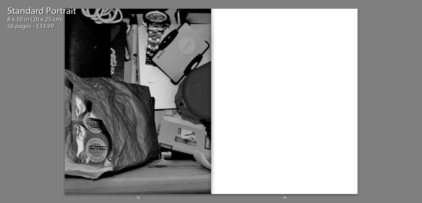
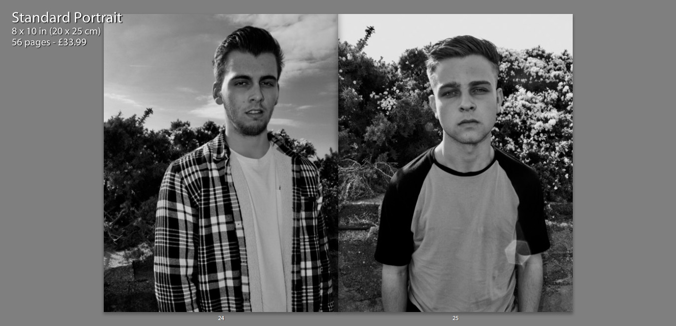
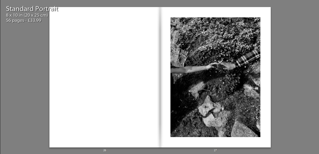
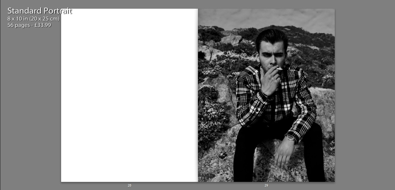
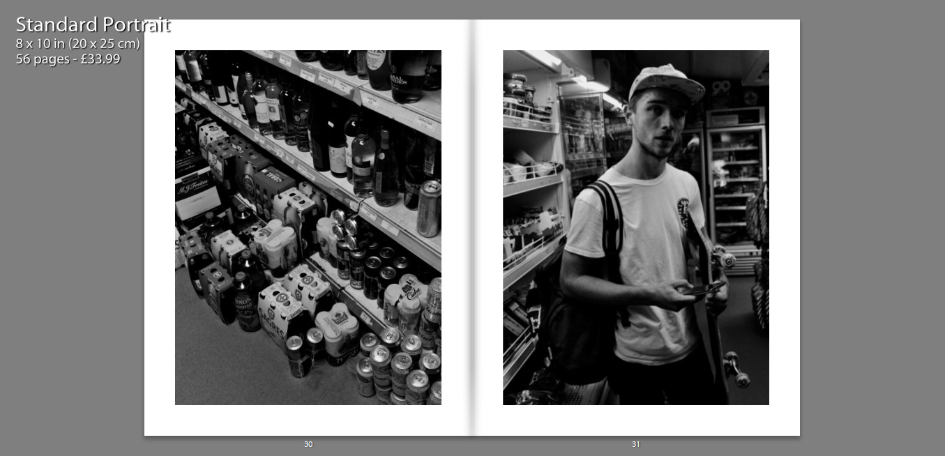
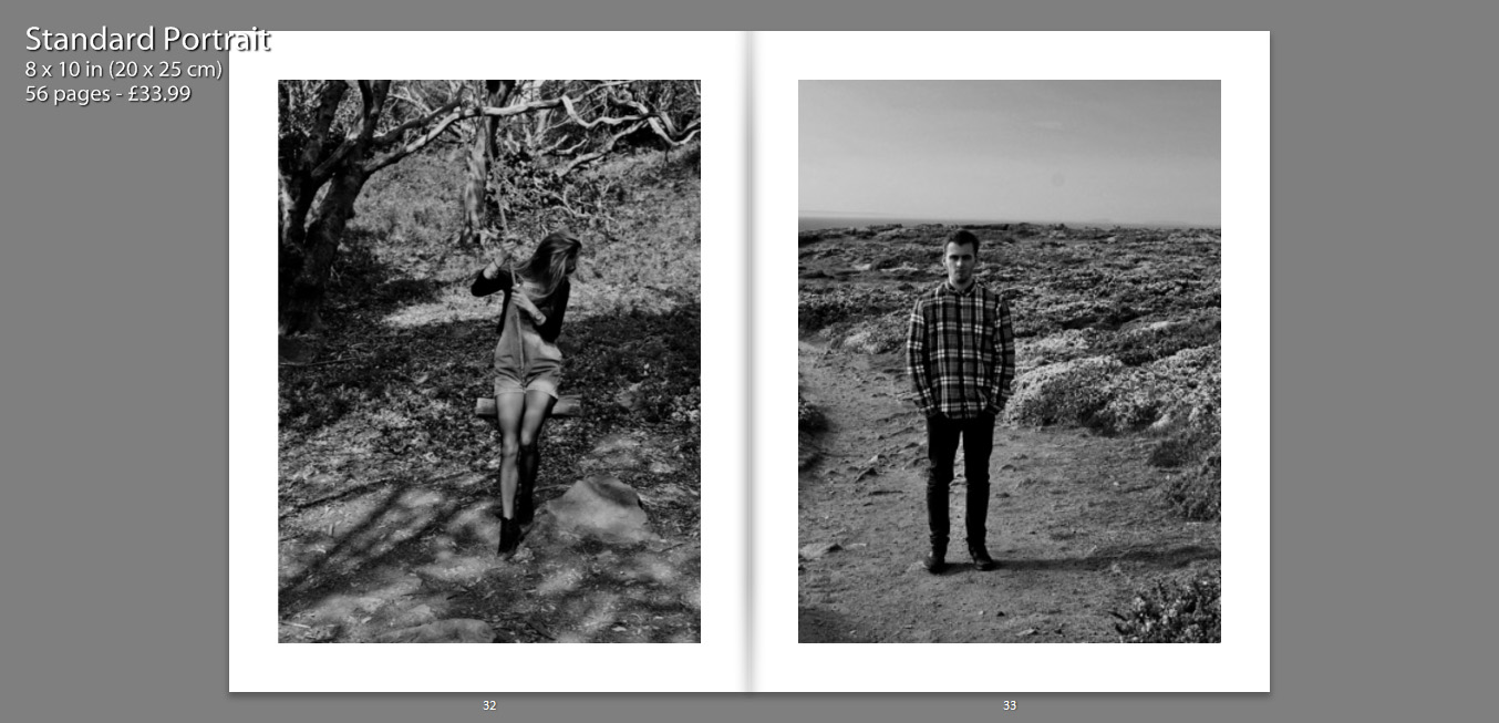
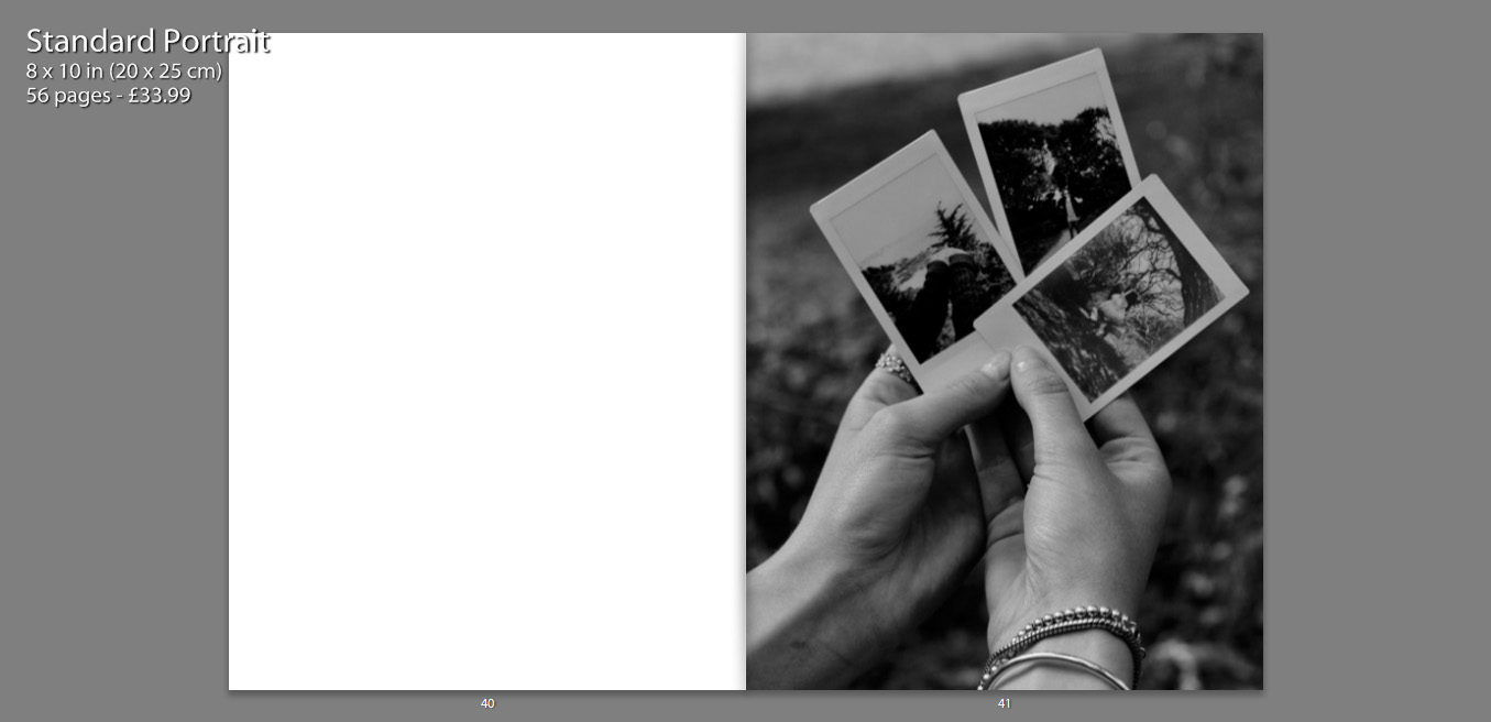
The following print screens, show my book layout as double page spreads, this way we can see images and the specificity layout more closely, as well as how images have been presented effectively.


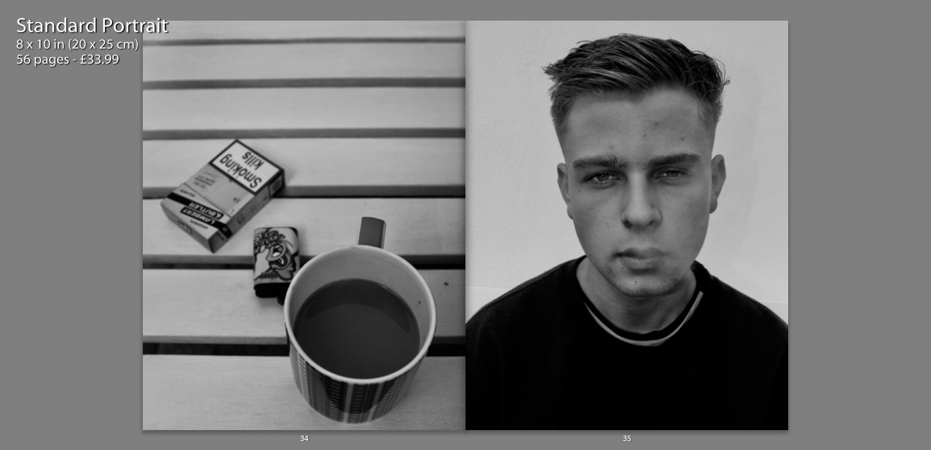
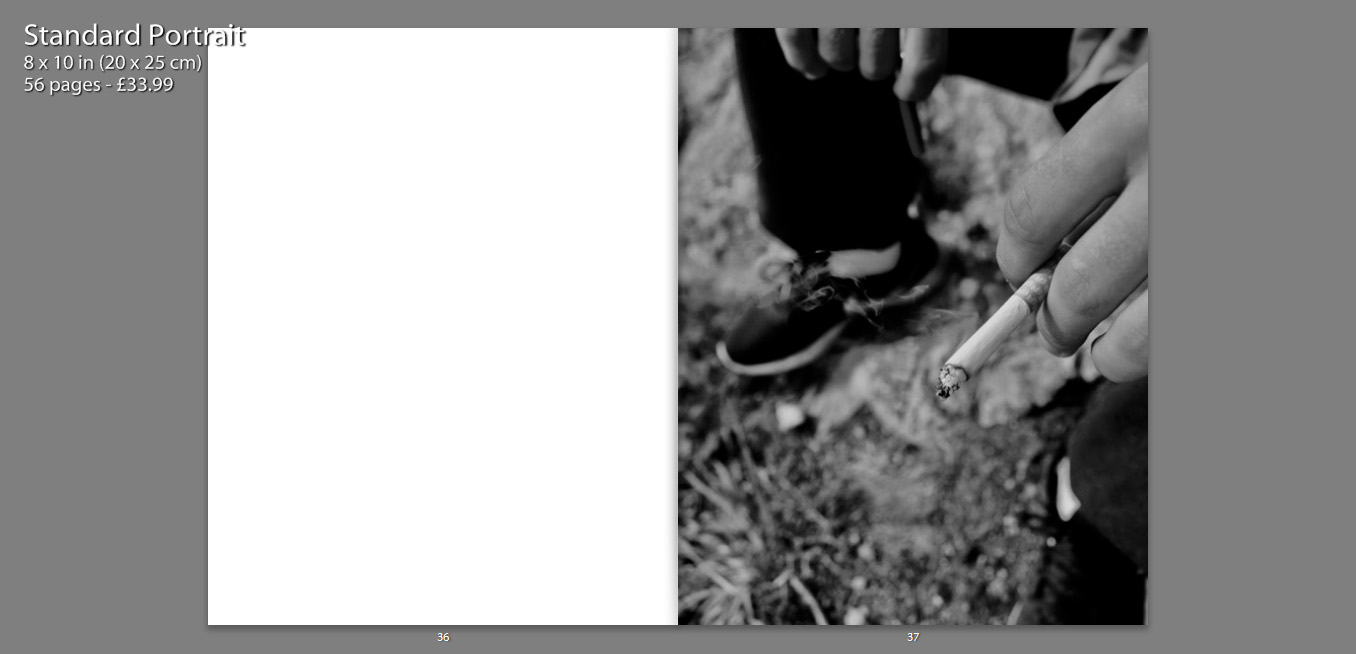
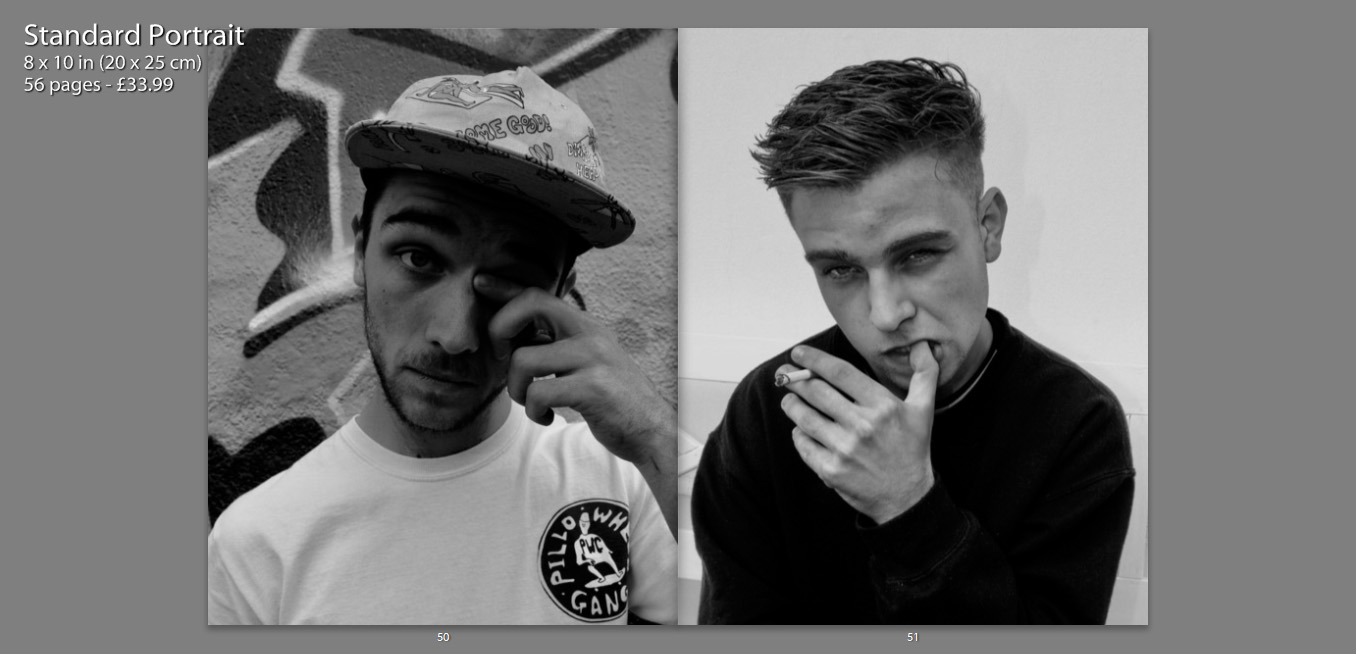
I decided to title my book ‘Are You Even Cool’?’. I titled the book this, as I feel that in a modern day society, especially within the age confinements of an older teen, there are many expectations as to what we should be doing, or looking like in order to fit this idealization of ‘cool’. I feel that my book contains many of these aspects, such as smoking, skating, having a boyfriend/girlfriend, sex, alcohol, drinking coffee and tattoos. I think that this title enables the reader question the book as well as themselves, making them want to open the book and see what is contained. It also creates a more personal title as I am asking the reader a question, it is also as if I am asking the characters in the book the same question.
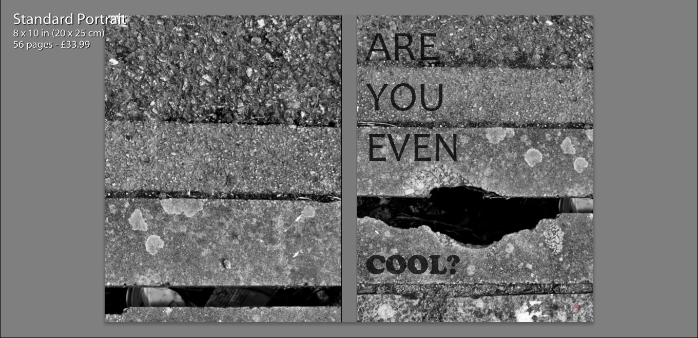
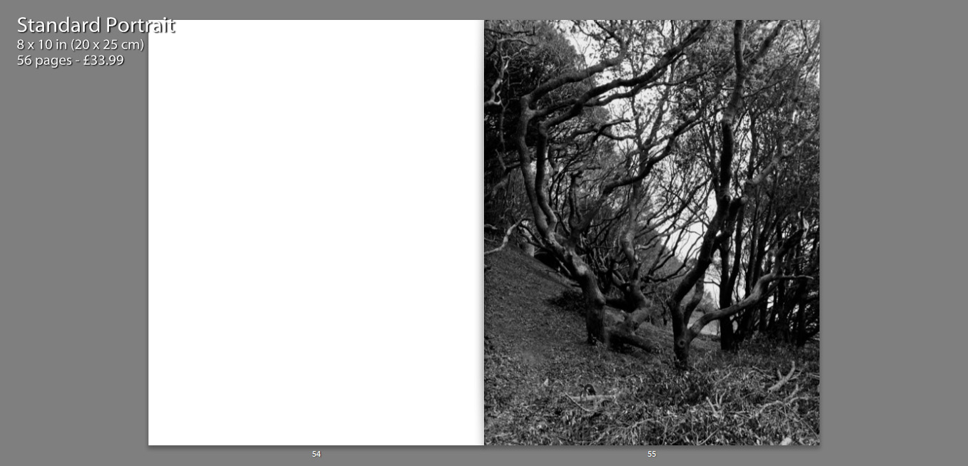
Initially we see my front and back cover, as well as the book title. I chose to use the same image for both the front and back cover, zooming in and aligning them differently, so that they appeared to be two separate photographs. I felt that use of this image was almost a summary of my book. Very gritty and in many ways unpleasant, but as well see a very interesting texture alongside well positioned lines which in some sense convey beauty. So more simply put, my book is a contrast of beauty and ugliness, making it rather controversial.
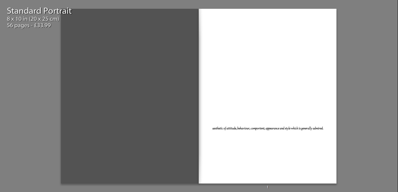
I also include a quote on the first page, how the Urban Dictionary defines the word ‘cool’. I felt that this was relevant as I wanted to include a sense of what the world defined the word as, a ‘style which is generally admired’ is a common theme running through a modern day Jersey. So many children are concerned with living up to social expectations and imitating others and their styles.
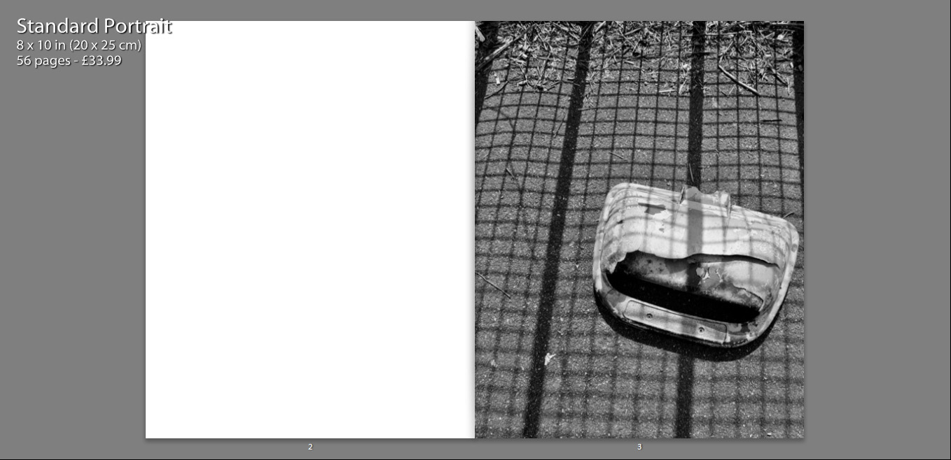
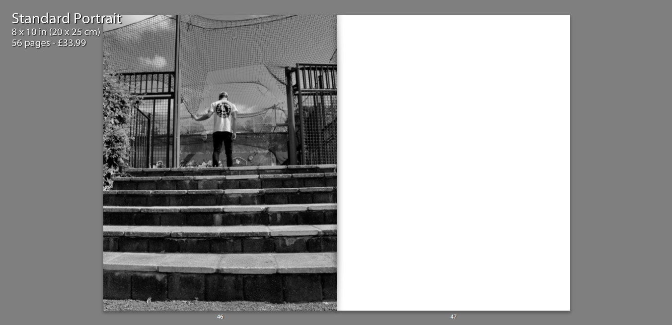
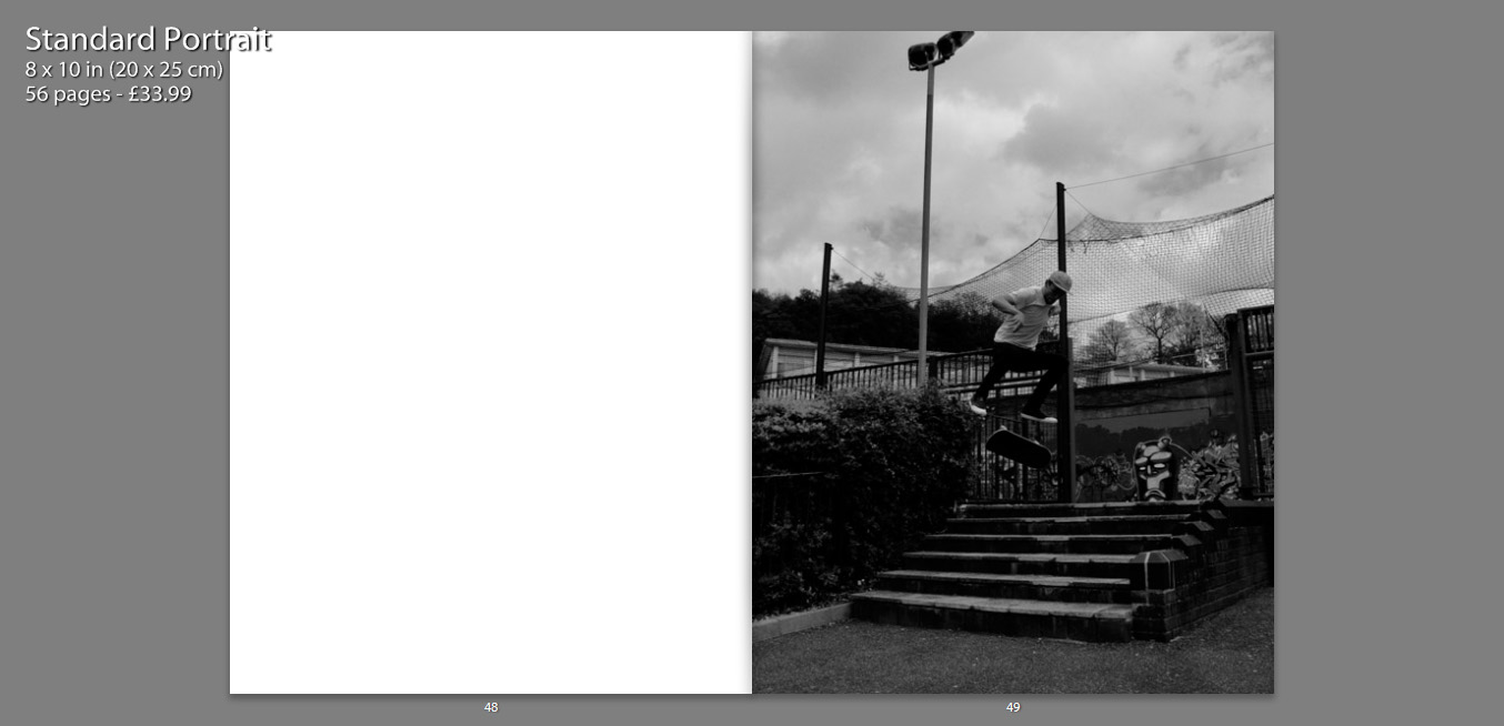
In terms of imagery, within the book we firstly see an image standing alone on a single page. My intentions with this are largely to provoke thought, what is this? What does this mean? Why is this the first photograph?

As well, I feel that an image which appears alone becomes more poetic, as we only focus and analyse this one photograph and it is not particularly related to anything else at the time we view it.
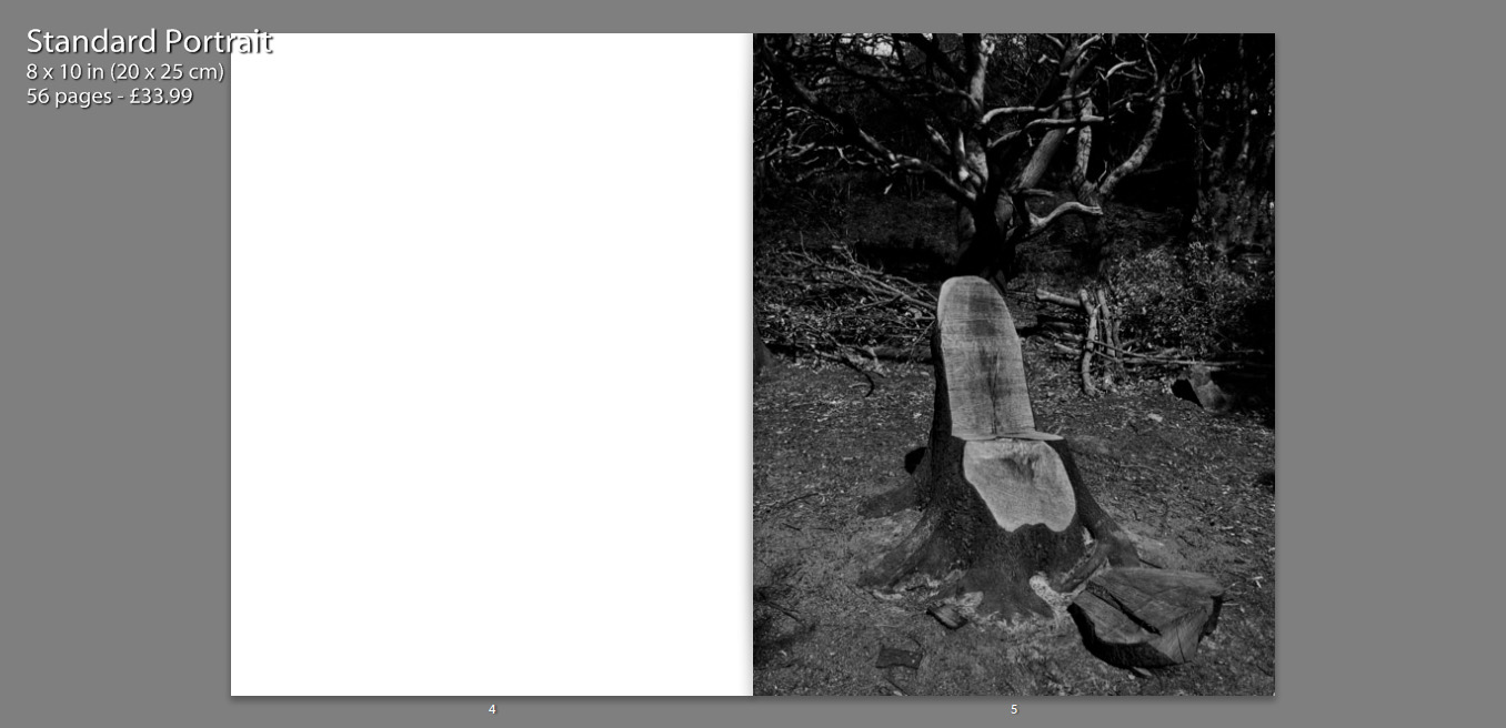
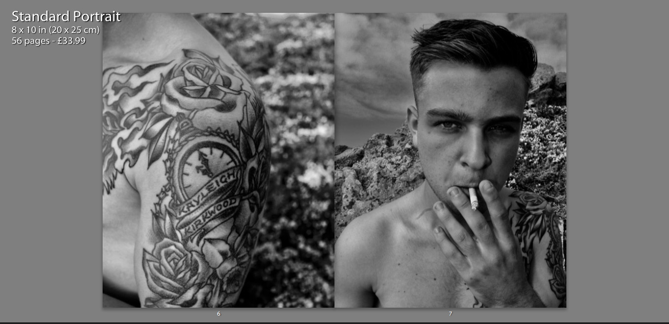
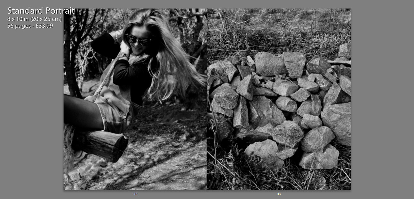
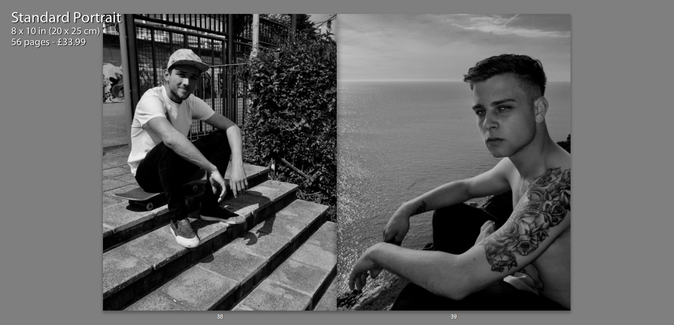
On a large amount of my pages I feature two full page photos on a double spread. These images often juxtapose one another and create meaning, as well as contrast. I chose photos of similar form and aesthetic, which means they fit well together and almost appear to be one photograph.
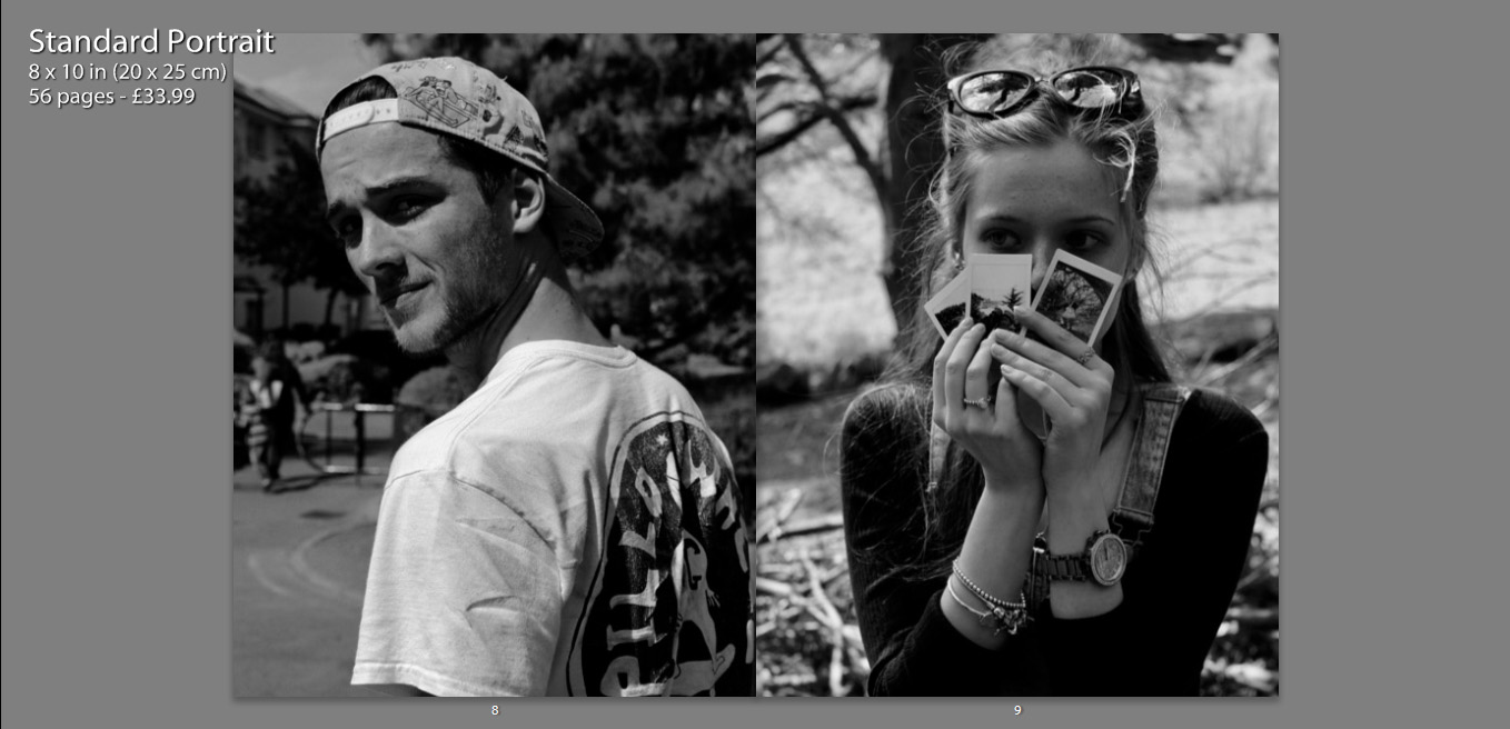
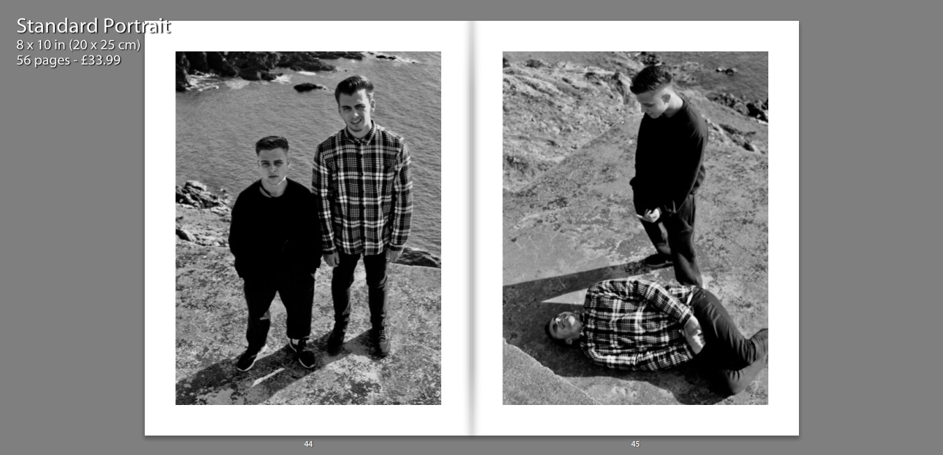
Another way in which I have presented my images, is contrasting other charters within the book on opposing pages. I placed images of similar composition and pose next to one another, which I feel creates a relationship between the two characters as they are shown in a similar perspective.
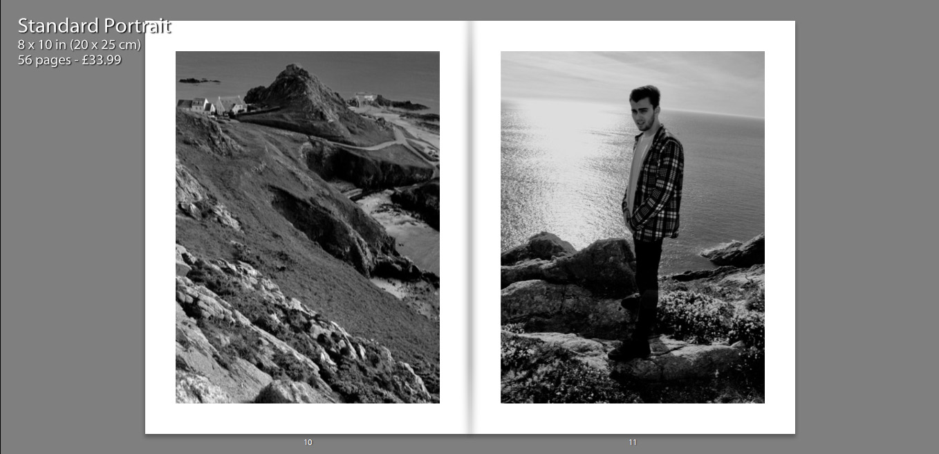
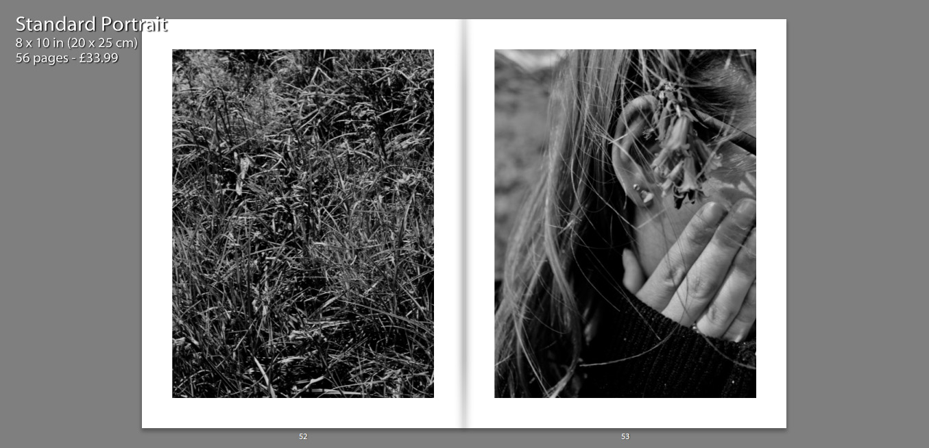
Some images have also been resized, so that they are not full size, as I felt that having a boarder allowed the details of the image to be more dominant. It also condenses the photograph which helps to bring focus to the subject also.
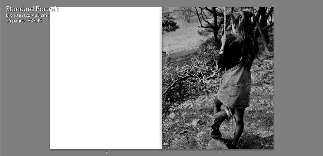
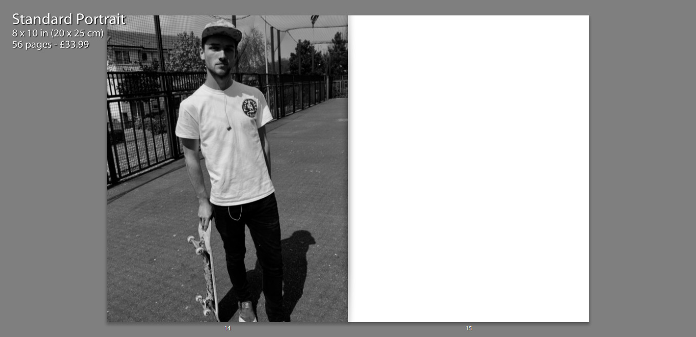
The inclusion of various still life photographs, that appear on their own in the boo, as well as alongside other images, allow the book to become more personal. We are also able to gather a better understanding of the characters and their interests.
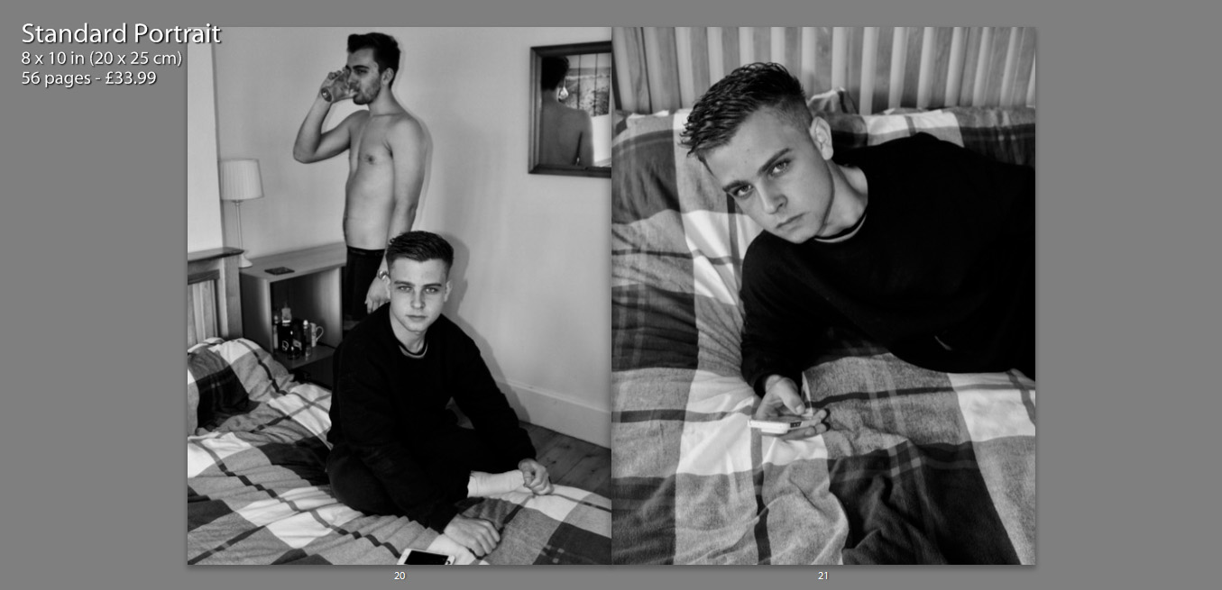
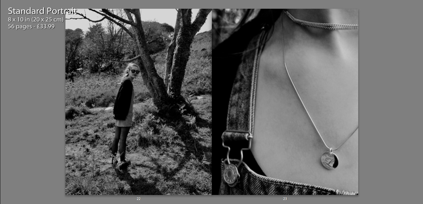
My layout of my book is in simple terms attempting to present images in such a way that they tell a story. Some images stand alongside others, juxtaposing one another, whereas others stand alone so that the viewer can gather some sense of emotion of relationship with the image. This book is a personal insight into the relationships I share with my close friends, as well as a representation of what my life and environment is and once was.

Pieter Hugo Inspired Photo Manipulation


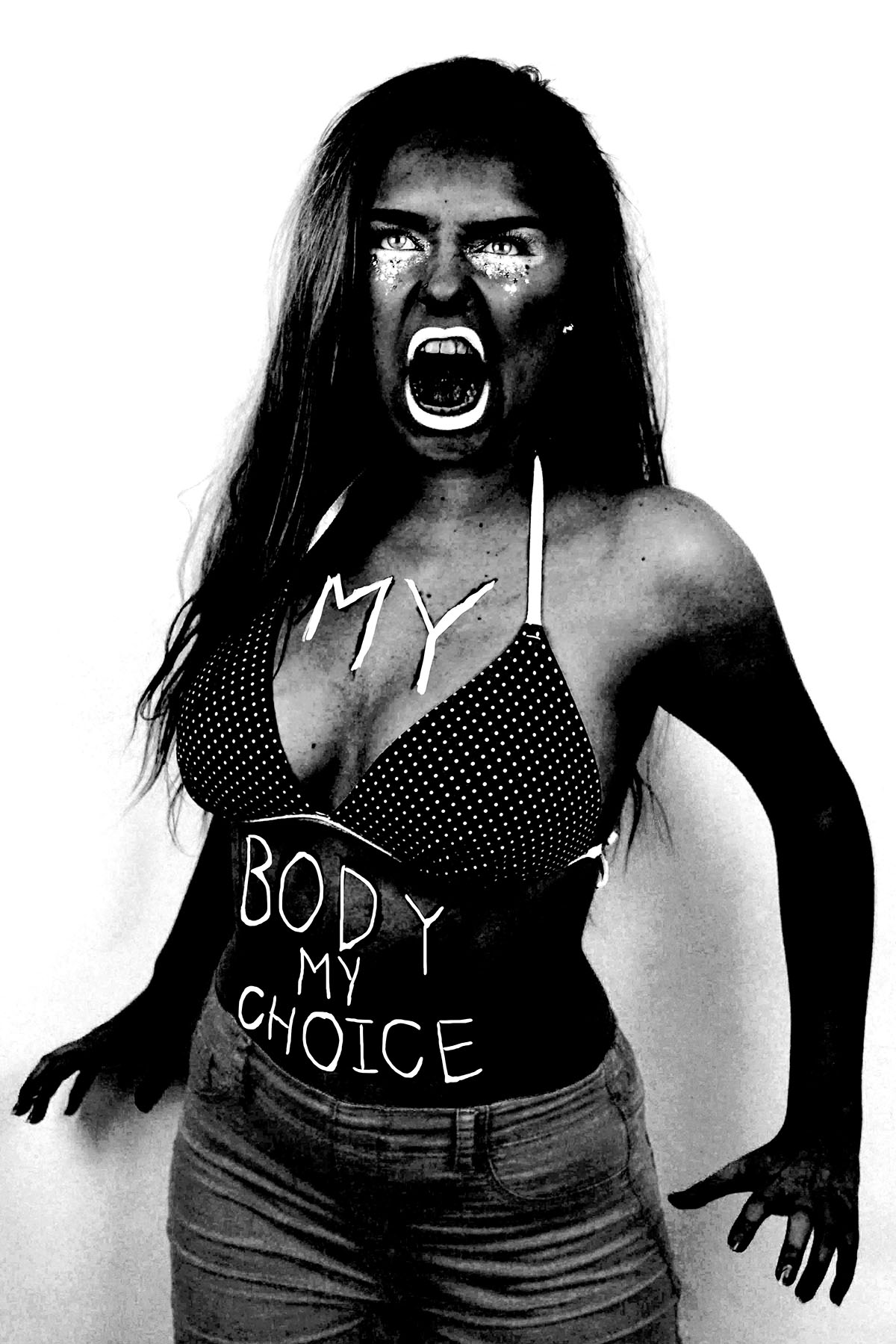
Here are three images (and their originals) from my angry feminist activist photo shoot that I manipulated in way that was inspired by the photo series “There’s a place in hell for me and my friends” by Pieter Hugo. I created these images  by placing a black and white filter over the images and adjusted the colour channels. I made the reds much darker, which made the red tones in my skin appear darker and more intense. I slightly adjusted the yellows to be darker to make the yellow tones in my skin darker, I didn’t make them as dark as the reds because i still wanted the high points of my face to be light to get a sense of depth and contrast. I didn’t adjust the greens because it didn’t make any different to the image due to the lack of green tones in the raw images. I made the cyan’s much lighter to make the background of the image white, which created a dramatic outline and sense of contrast to the figure. I also increased the brightness of the blues and magentas to make the pink makeup under the eyes, the straps of the bikini top and the lipstick white to make the eyes and the mouth, thus the facial expression more intense. The white straps of the bikini top also draw the eye up towards the face.
I also experimented with painting over the writing on the raw photo with white, as most of the text was lost when the yellow and red tones of the skin were darkened. I initially used the regular brush tool to write over the top of the text but for some reason, the airbrush edges didn’t look right. I then used the brush tool with the solid edges but I couldn’t get the flow of the accuracy needed to make the text look right. I then tired using the 48 brush which is an angled brush with long flexible bristles that are sensitive to how much pressure is applied in the stroke. This tool helped me get the rough, uneven lines I was aiming for. 

I then experimented with combining the images together, to create a small group of angry feminists. I think these images are strong as when the images are displayed together there is a primal sense of anger and intensity. The combination of the different stances and expressions make it appear as it they are ready to attack. I combined these images by using the lasso tool and dragging each figure onto the same canvas, I used the lasso tool as opposed to the quick selection tool as I wanted to make the figures relatively close together and I didn’t want the white edges of the original images to overlap. I made two version of all three images together, I also experimented with cropping the images to focus on the faces, I had to move the images closer together so that their bodies overlapped to create the intensity needed for the cropped image.

I then used the same 48 angled brush tool that I used to paint over the text in white in one of the images over to add some text to the cropped image of just the faces. I tried to make the writing both raw and rough, as if written with a sense of anger as well as legible, which is why I decided to use block capitals like the text written on the torso of the original photographs. I then used the lasso tool to more the words and sometimes individual letters into place as the white background allowed me to do this easily. I then decided to try adding some texture to the image to give it a different effect that connoted ideas of violence and anger. I experimented with a scratched texture that I blended with the image on photo shop.

Contact Sheets

Contact Sheets


Sometimes called “contact prints” contact sheets were used much more frequently in the past world of photography than they are today. A contact sheet is a single piece of paper that is used to show all of the images from a roll of film or for single large format images. For 35mm and 120 film the developed negatives are placed on photographic paper and are then exposed onto the paper. This leaves a trace on the paper of the whole of the negatives, chraceristicaly leaving the sprocket holes and film data on the image also.

Contact sheets were a way for a photographer to be able to view all of his/her images in one place and be able to make easier comparisons between individual frames. Often using pens they would annotate, circle and frame certain images to denote if they are still useful or not, this is similar to how photographers do this today with digital images. When using Adobe Bridge or Lightroom you can go through your images and separate out the ones that you do want and don’t want using colours or numbers, by colour coding using different pens on a contact sheet the images you can do this also. Each photographer had their own method of doing this, come used an X to mark out images, others would put borders around images in different colours to denote different meanings, and some would circle specific frames.

This contact sheet above is of Marilyn Monroe, the flow of the images shows the method of the photo shoot. After processing and creating a contact sheet Marilyn herself has gone through the images, presumably with the photographer Bert Stern, and she herself has crossed out the images which she does not like. There are several contact sheets similar to this with her starring in them that she has also marked. The contact sheet below is another of these. This one is composed of a series of medium format negatives of the star, probably wanting to protect her personal image she has crossed out all of the 11 images, the publication of this image defeats the purpose of her crossing out the frames in the first place but that is beside the point, the fact that the contact sheet gives you a view into the mind of the photographer (or in this case the model) is very interesting. Normally the only image we see from a photoshoot is the one final image, but with this we really get to see the process of the photographer, we get to understand why they chose that one specific image to share over the others that they had available.

One of the most interesting things about a contact sheet is often why a particular image is chosen and why others were rejected. In the youtube video above Elliot Erwitt talks about his feelings towards contact sheets. He starts off by stating that a photographer should never show the world his contact sheets. This is not something that I agree with, I feel that sometimes the context behind why a photographer took certain photos to be one of the most interesting parts of the image. An example of this is “The Magnificent 11” by Robert Capa.

This set of 9 images from the D-Day landings were taken by Capa when he landed with the second wave of assaulters on Omaha Beach. There were meant to be three rolls of images that he sent back but instead these are the only images to exist (frame 9 is published in many different places but the negative itself is missing). There are different theories as to how these other images were destroyed but that is not particularly important, however they were lost it is a great shame that they were. This contact sheet shows the surviving negatives and although small shows a really incredible insight into his short time on the beach. This is why having contact sheets is so important, if only the published images were shown then we would not see some of the other frames, the smokey, shaky, out of focus images that show Capa’s own fear.

This video above is similar to the first one but shows the works of William Klein instead. One of the specific points in the video (6:03) he talks about taking photos of a shop window, a person approaches the window and stands there “it’s a photograph” then the person starts pulling faces and it’s ruined. This ability to capture “the decisive moment” is often not thought about enough, because today we can snap away at crazy speeds we capture every moment and look back later, with film this was harder and so seeing how this perfect moment was captured is often very important. Klein also talks about the amount of time of a photographer’s work that is seen.

“The picture is taken at 1/125 of a second. What do you know of a photographer’s work? A hundred pictures? Let’s say 125. That comes out to one second. Let’s say, more like 250 photographs? That would be a rather large body of work. And that would come out to two seconds. The life of a photographer — even of a great photographer, as they say — two seconds.”

he mentions this because although the work of photographers takes a lot of time to set up in the end often is is only a second or so of their work that we really see. This makes being able to expand upon these single images so important, understanding an image takes more than simply seeing it. Thought has to be given to the background of the image and why we are seeing it over the other images that were likely taken at the same time.

This link was really useful for me in looking at how photographers mark their contact sheets. the hand written nature of the marks on the images really lends a touch of personality to the images. Not only has the photographer taken the image they are leaving this personal mark on them. The different colours work really well against the black and white images, they highlight different elements of the sheet to be looked at closer. Sometimes even making notes on the image or highlighting areas of the images for post processing.

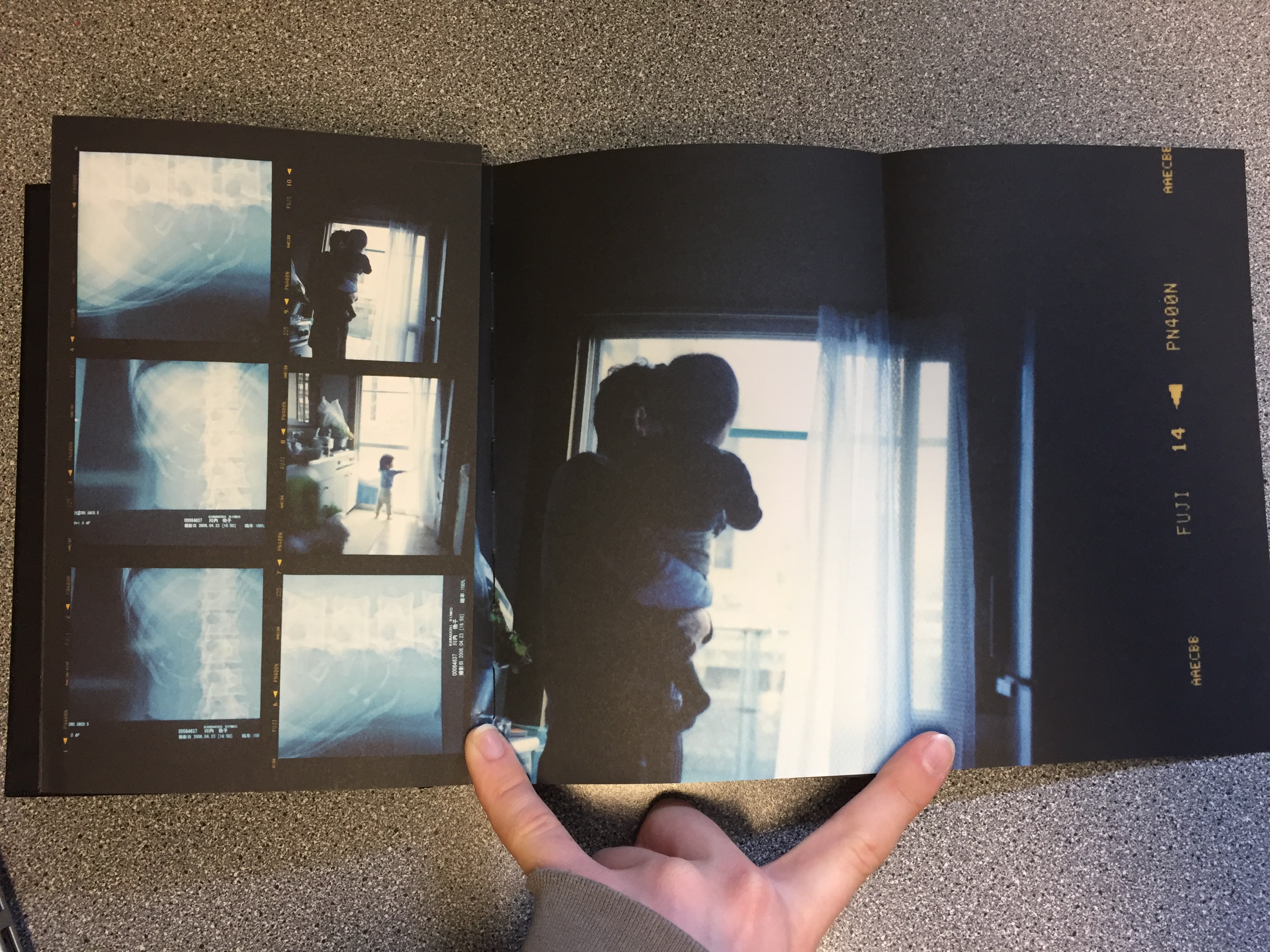
The book Sheets by Rinko Kawauchi is another example of this artistic use of contact sheets. Although the images  are not in the traditional contact sheet style they do show the progression of work that has happened throughout the life and work of Kawauchi. With folding out pages with larger images it is almost the same kind of thing as writing on the images. Attention is drawn to the photographer’s favourite images, and the other images are still there to give context to the best images. The book is fantastic because it not only shows the work of her for one project but it shows most of her work over her lifetime. Although more of an artistic book it is still a fantastic thing to behold. This link goes to the page for her book and this one to another page that shows some more of the pages.

Because I am using film for my project I could possibly look at making a contact sheet from the negatives and blowing it up or I could use larger printed images and make a background for them. By drawing on the images using different coloured pens I can create different effects, drawing attention to the different images and annotating them. Alternatively I could look at using the colours to complement the colours of the images, I have looked at the work of Klein briefly and will do in more depth but specifically his contact sheets project. He uses coloured paint on blown up negatives to create art pieces, the paint is not usually denouncing images but just to act almost as a frame for the real images.

This link also shows some other examples of famous contact sheets.

Environment – My Book Idea

As an idea for a photo book, I decided to combine the styles of two artists I had researched, Jacob Sobol and Theo Gosselin. Two books of theirs particularly inspired my own ideas, these were ‘Sabine: A Love Story’ by Sobol and ‘Sans Limites’ by Gosselin.

Sobol’s book,  which documents his experiences living within his Greenlandic girlfriend Sabine and her family in 1999, was taken over the course of three years. Sobol’s book records both in photographs and in narratives, his encounters with Sabine and their life on the east coast.

Many of the photographs are very intimate and personal and would may only really contain relevance to the couple themselves. Which is ultimately the aspect of this book that I want to focus on within my own, the personal qualities, that will only be sentimental to myself and the subject.

The photographs from Gosselin’s book, were taken on various road trips in the US, Scotland, France and Spain. His images are full of youthful energy which captivate the viewer with stories of freedom love and friendship.

The book reveals his attempt to communicate the actual visual conditions seen at the time of the photographing. This is similar to how I wish to portray the images within my own book. I am showing the viewer a scenario of raw emotion, which is real as it’s exactly how it was at the time.

I am venturing with my closest friends to locations that are full of life and freedom and capturing them as they act in their youthful ways.