Category Archives: Uncategorized

Filters

Author:
Category:

Le Cœur de la Mer

For this shoot, I wanted to represent the obscure places the friendship group would find, just from driving around with one another. This shoot was inspired by Ivan Troyanovsky and Theo Gosselin.

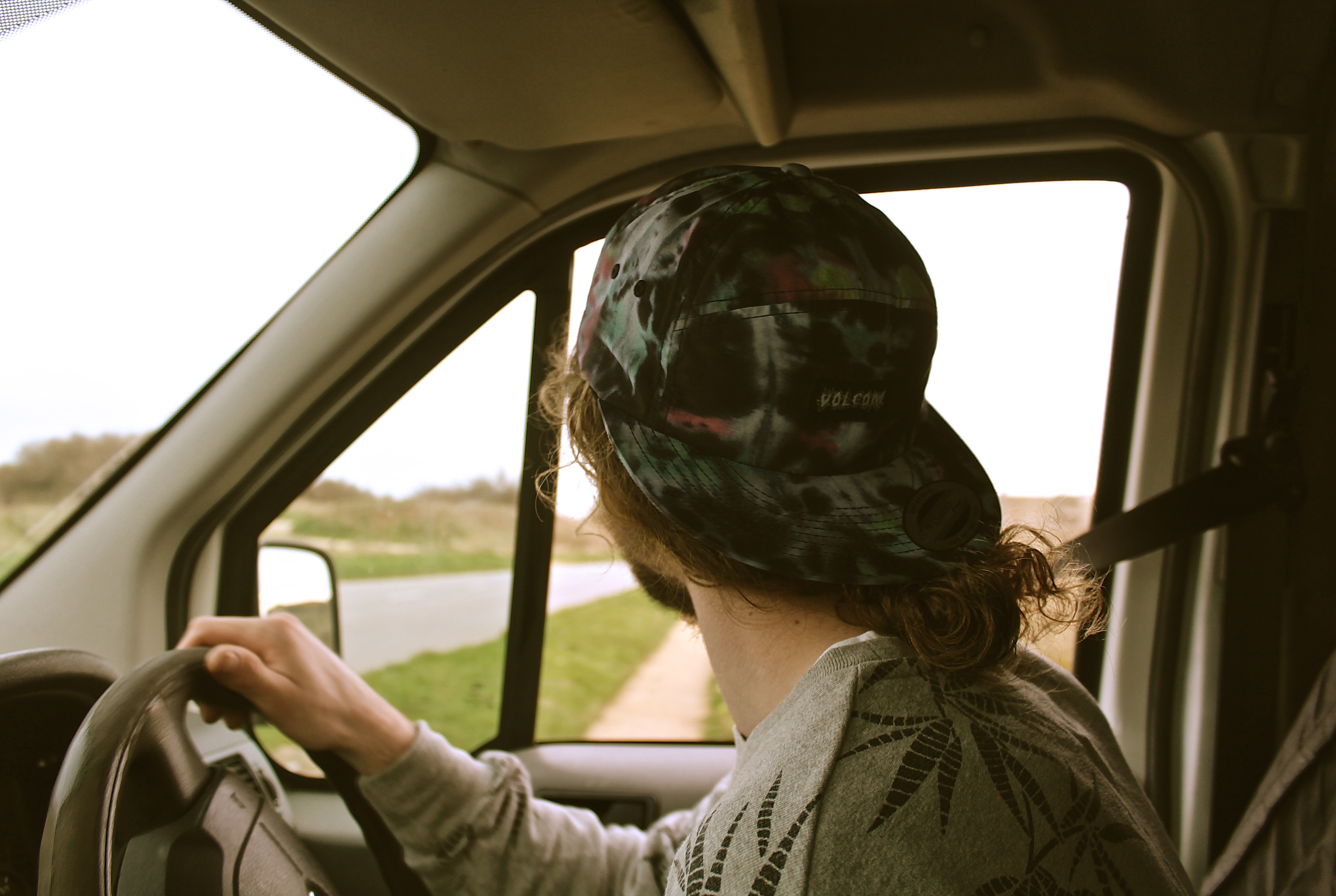
The image below reminds me of Theo Gosselins work as Theo tended to capture people in cars driving, as a way to represent the road trip that he’s on whilst taking his photographs. Therefore, I took a photo of the model driving to the location. This photograph worked well because we were driving up a hill, we were above sea-level and therefore one can see the sea out of the window, which shows the viewer we’re very close to the sea. The natural light coming through the window, adds a bit of light highlighting his silhouette which makes him stand out.

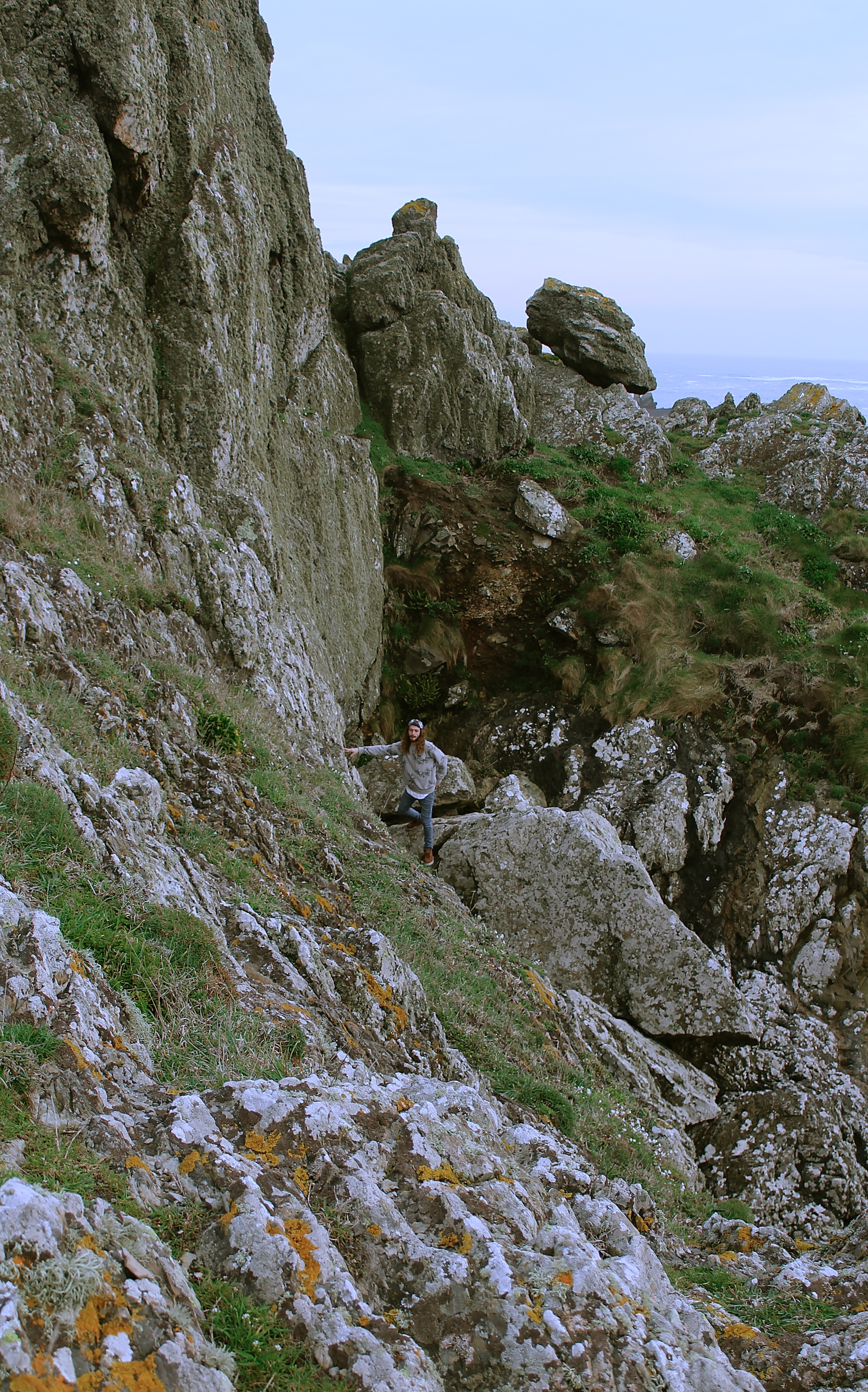
When taking this photograph, composition was key, as anyone can take a photo of someone standing on a beach. However,  understanding how to make it different from your stereotypical image was important. Therefore, to achieve this image I climbed up this wall so I could be a lot higher than the model, yet because it was high tide the model doesn’t appear to be too far away from the camera lens. This image represents how small we are, in the world that we live.

I love the colors of these two images, as the models hair and shoes are a very similar color to the seaweed, and the grey jumper matches the grey rocks surrounding him. Therefore they’re all the same colors just slightly different tones. In the image on the right as well if you look really closely the model has green eyes, and he’s holding up a piece of sea glass covering his eye, which is bright green

The image below reminded me of this quote from my artist research;

“When I photograph, I try to use my instincts as much as possible. It is when pictures are unconsidered and irrational that they come to life; that they evolve from showing to being.” Jacob Aue Sobol 

This quote links to the below image because if I was to stage a shoot, where I had the models to pose for me down at the beach, the outcome would be completely different, for example the body gestures would be perhaps more tense. As the viewer can see this is a moment which has been captured rather than set-up, it makes the viewer imagine the moment more, and therefore become more connected to the image.


I love this image, as it shows a lot of the landscape which is important. When looking at this image your eyes are immediately drawn to the wave which is crashing in the background ,therefore creating white wash surrounding the coast, and therefore your eyes follow from the left where the wave is crashing to the left where there is white wash and therefore one can see the person standing up on the rock.  I love the expression of the model, as he’s looking directly at the camera, it looks as if he’s implying ‘common lets go.’ yet there isn’t really anywhere else you can go.


The concrete wave

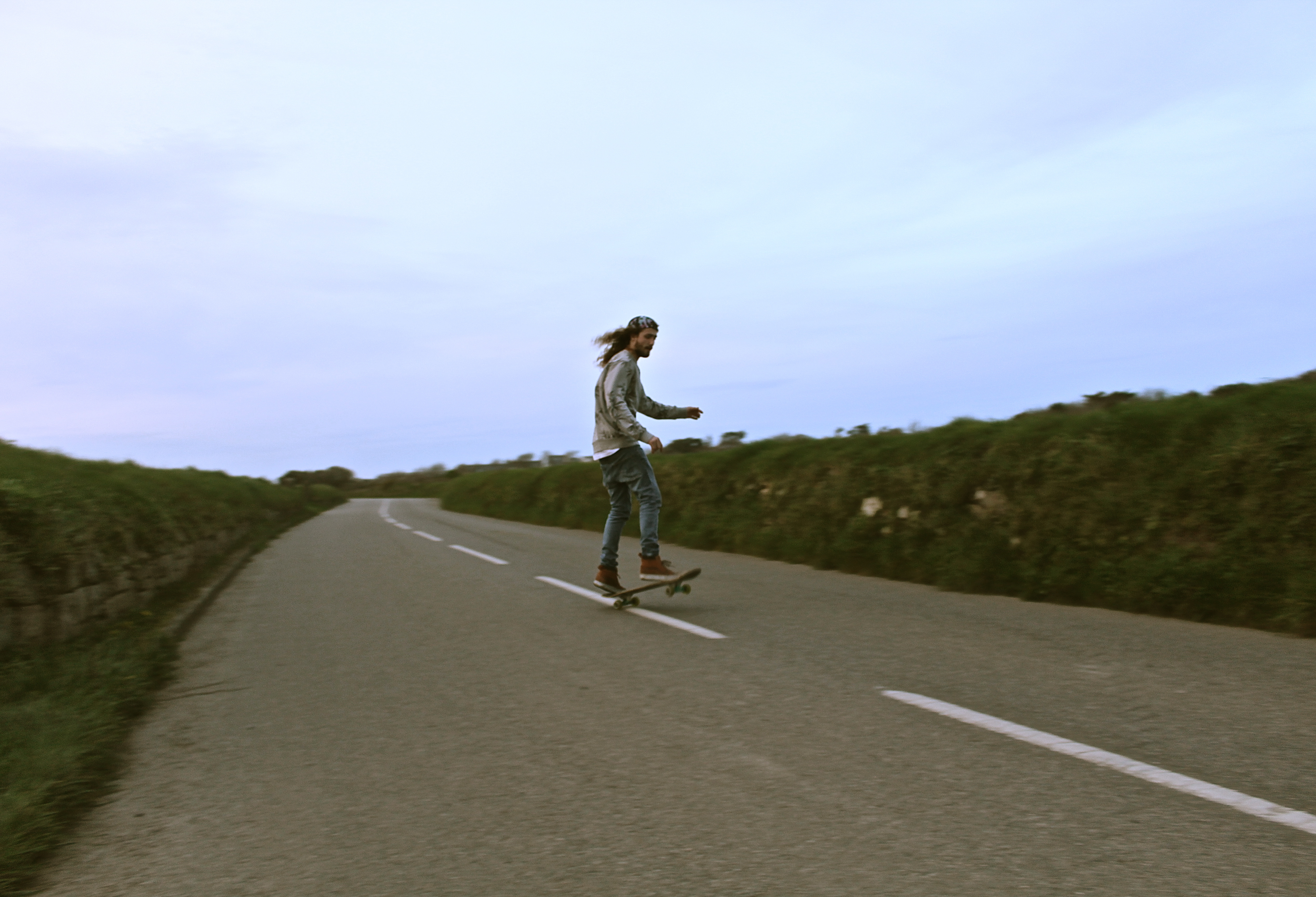
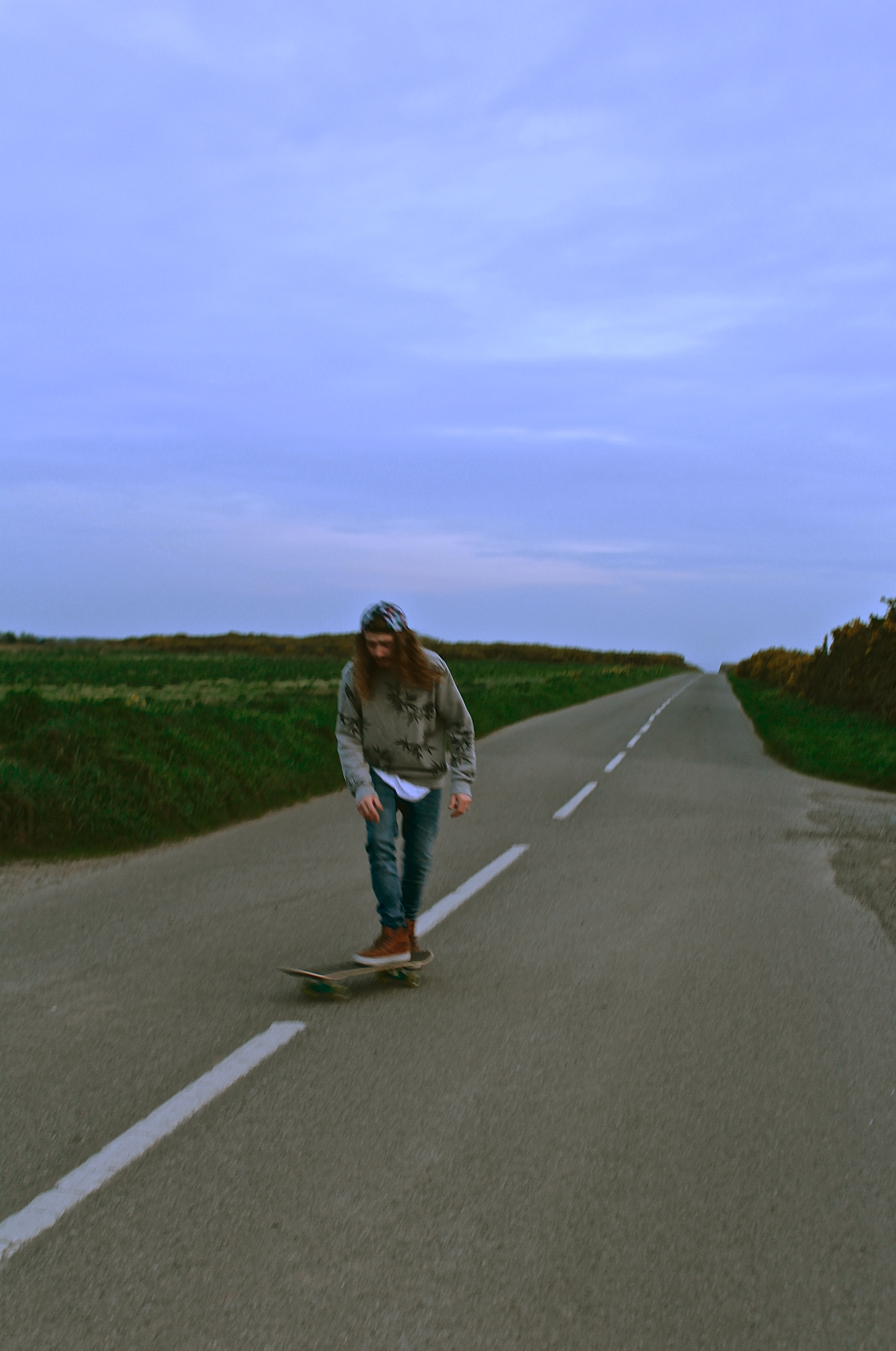
This shoot was because skating is a form of travelling, without harming the environment and often one see’s travelers with skate boards when exploring new places nearby to their camp set-up.

The reason for capturing the model driving, is because I didn’t just want to capture the moment, but I wanted to capture how we got to that place, the journey that happened to live these moments. This represented how I went from one shoot to the next, as if it was a journey I went on, and not staged shoots.

The image below works well as the focal point is on the models head/hat, this shows his long hair which he’s covering by the hat, but also focus’ on the tye-dye which is on the hat, both of these aspects tend to be associated with people who are free spirits etc. therefore representing the people on the journey to the viewer subconsciously. The negative space on the windows, caused by the over exposure from the lighting outside, creates a frame around the model and therefore isn’t too distracting from the image.

This image works well as he’s skating along the white line in the middle of the road, therefore drawing your eyes to him immediately as he’s in the center third and he’s breaking up the white line which your eyes are drawn to. For this image, I love the style as he’s doing a skating trick and therefore showing that this is a hobby of his and he’s not just got on a skate board for my shoot. He’s the most detailed subject in the image, and he’s the most important, which was hard to capture as he’s the subject which is moving in the image yet the road and the banks are the aspect which are out of focus.
The image below is one of my favorite photographs from this shoot, this is due to the composition, as I was sat down on the bank on the side of the road I was taking the images from below. Therefore it made the road look more interesting, as it looks as if the white lines are merging into the sky, and therefore looking as if the road takes you into the sky, this is just due to the angle I’ve taken the photograph and the way the road goes up and then down. Also the image works nicely, because of the composition the models head is against the negative space (the sky) and therefore making one focus on his face almost immediately as the brightest space is where you immediately look which is the sky and then your eyes go to him.


The Daughter of Nature

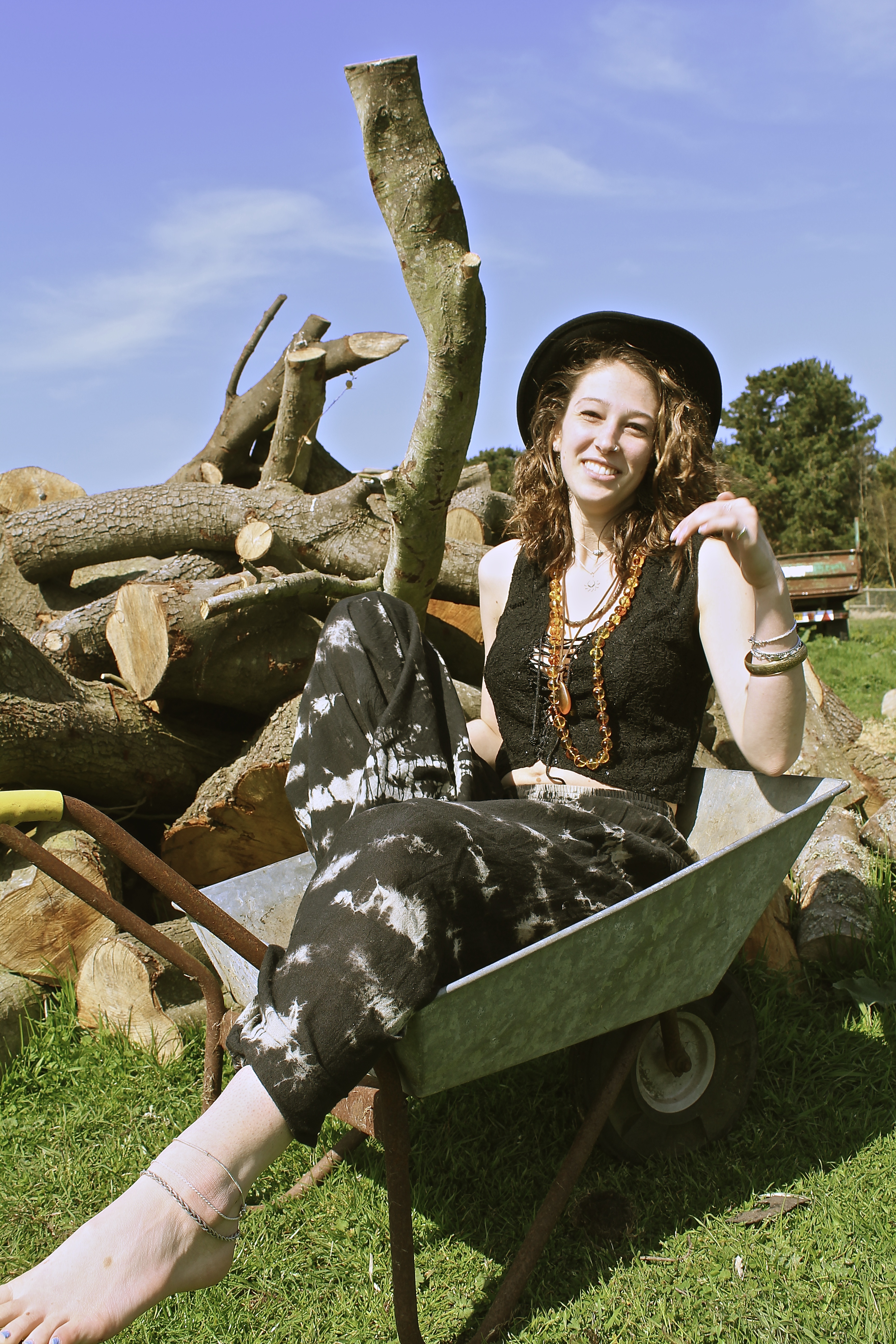
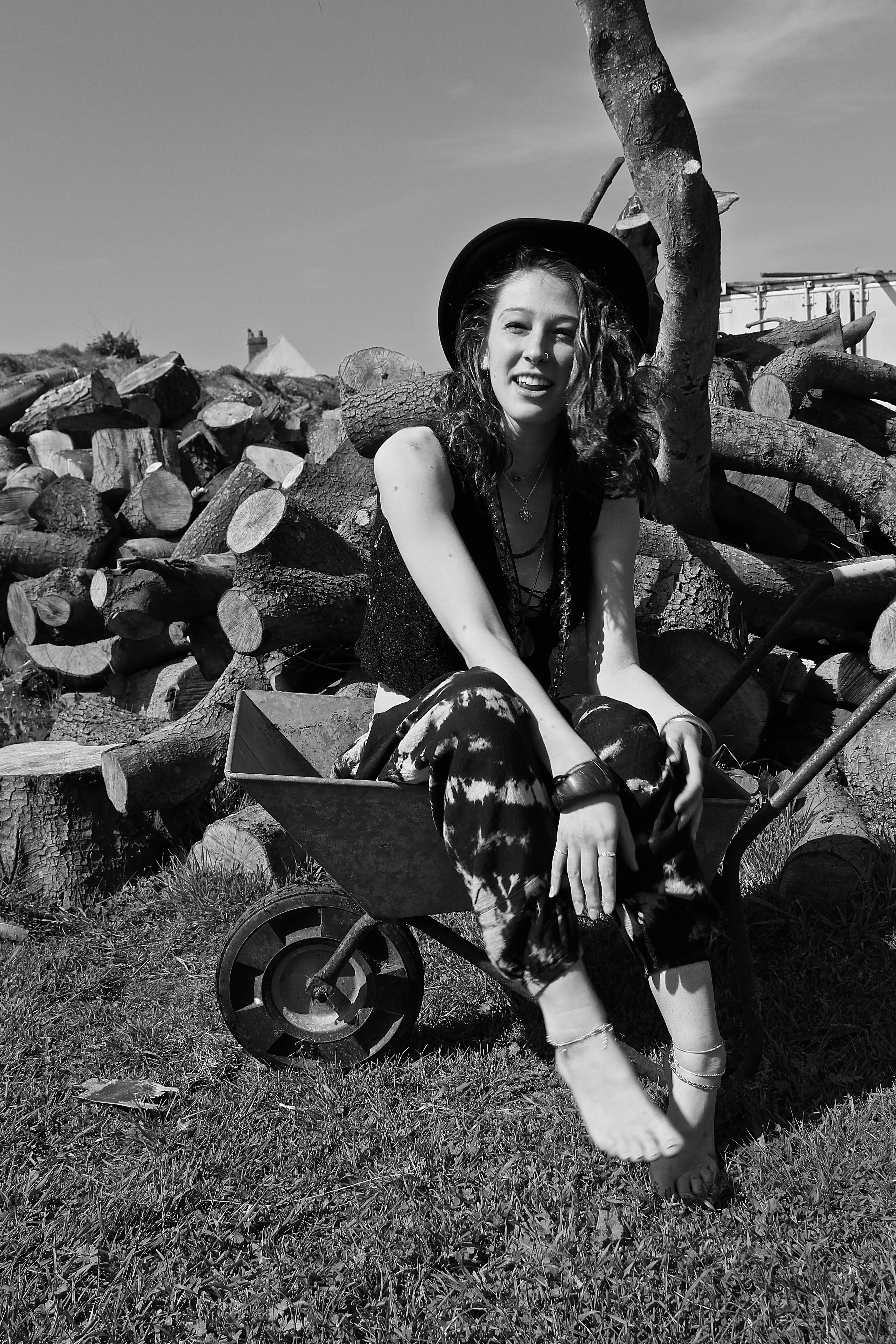
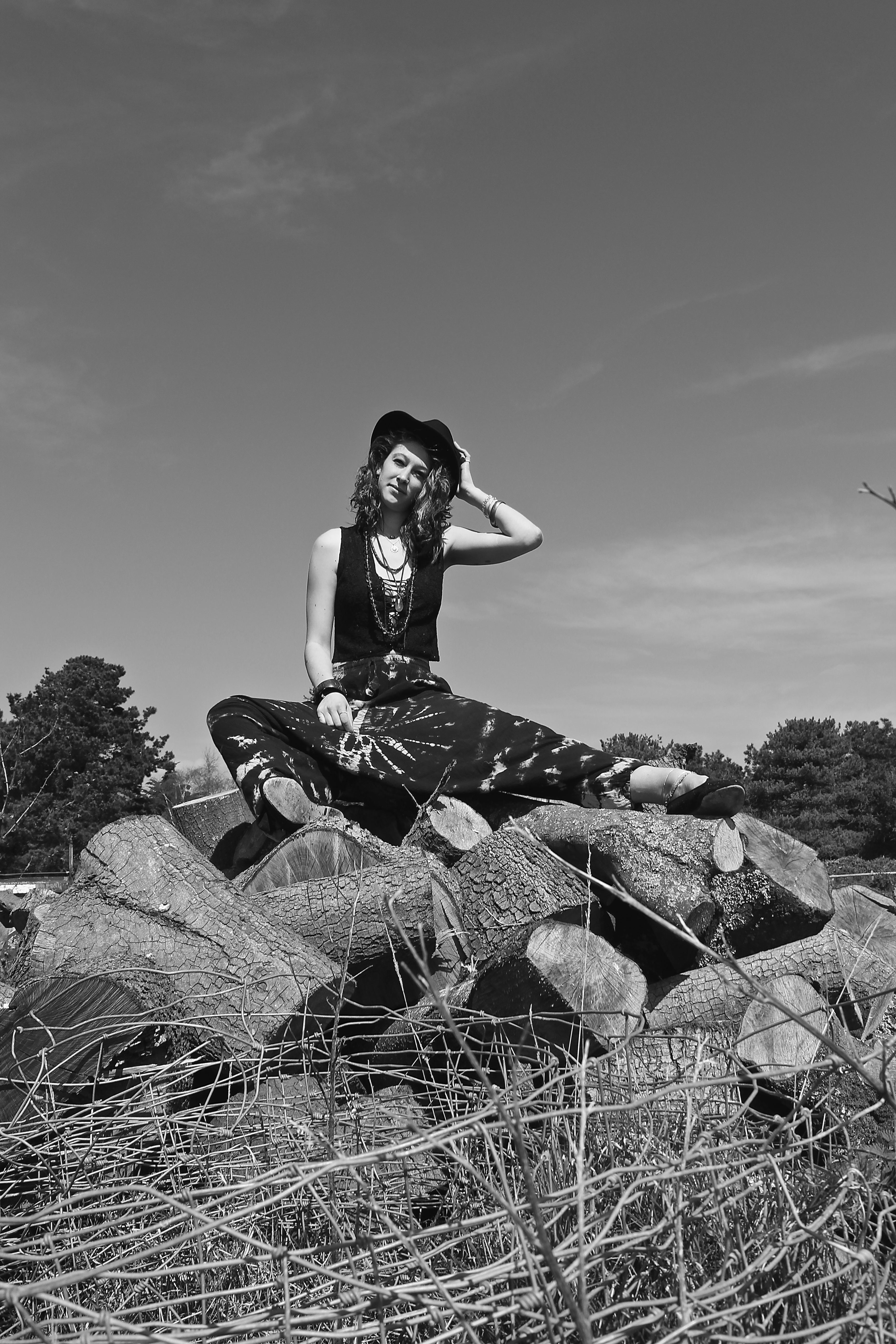
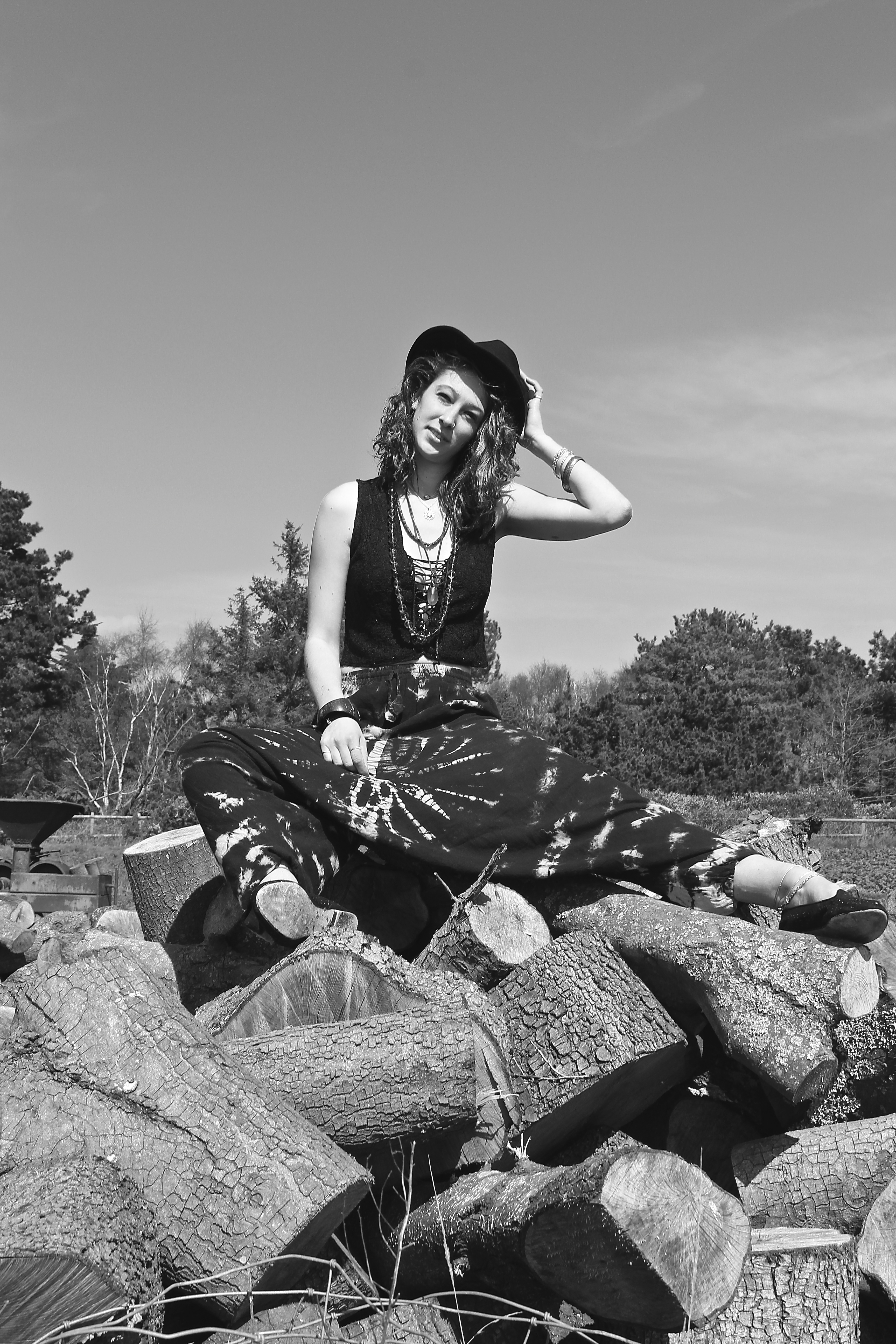
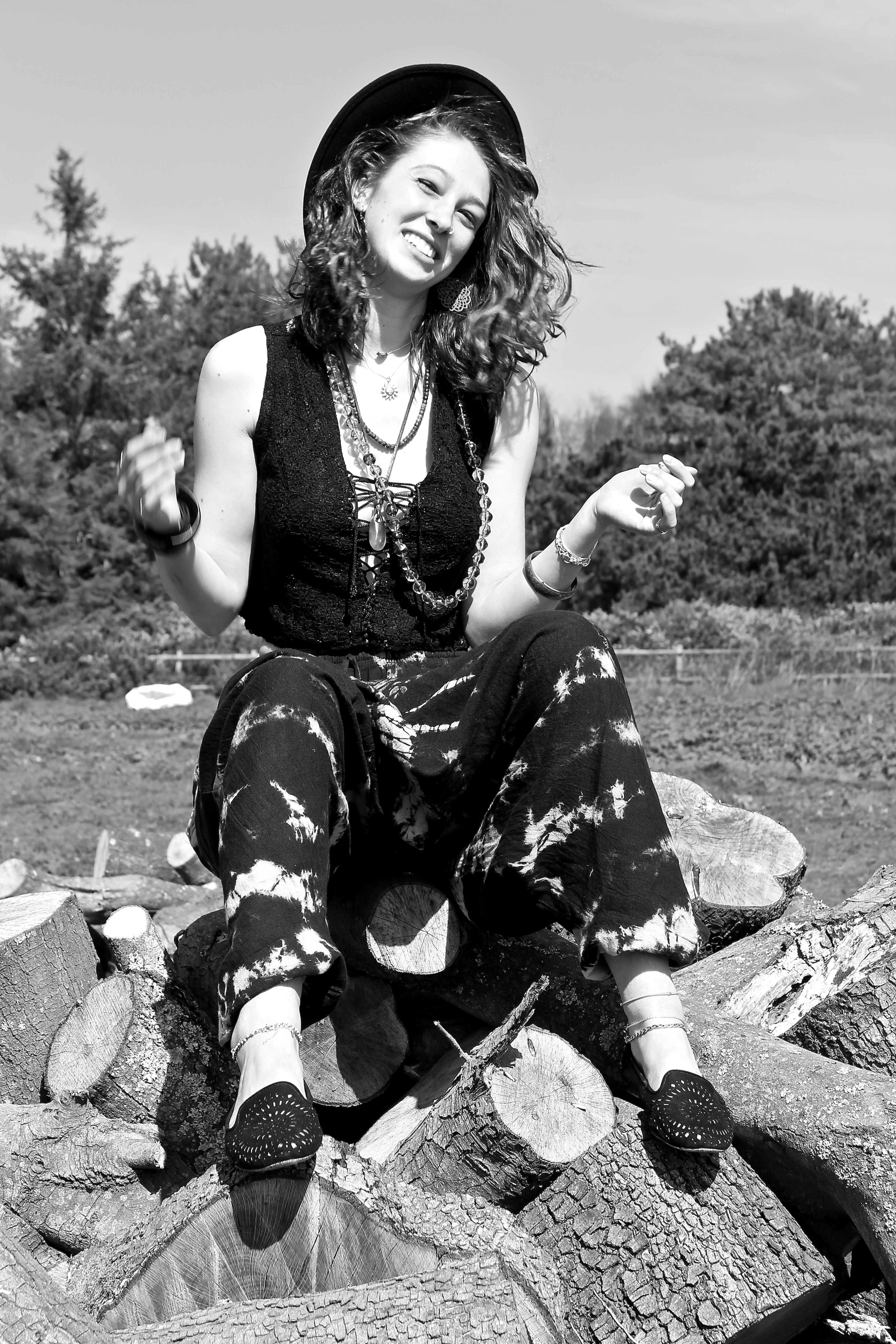
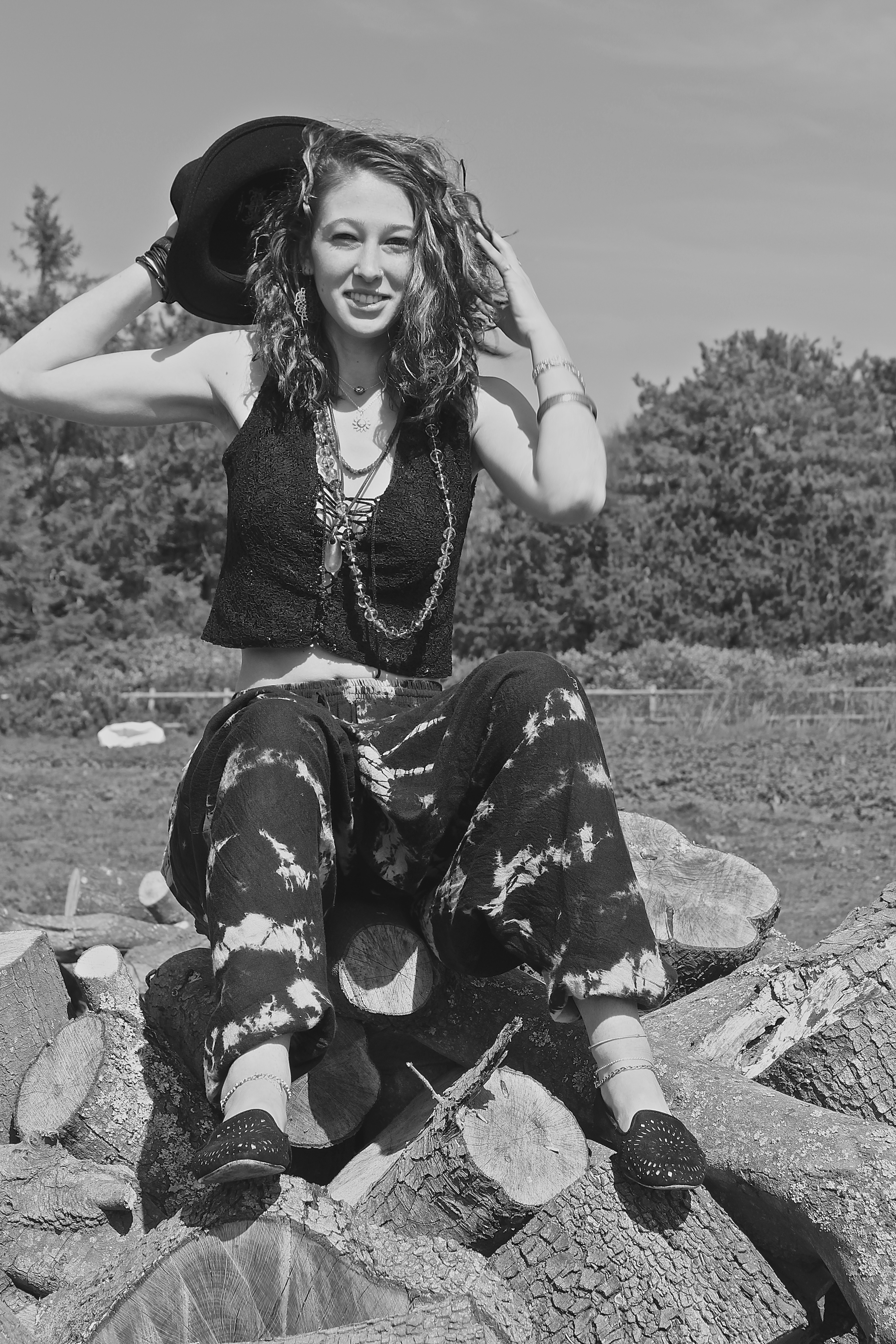
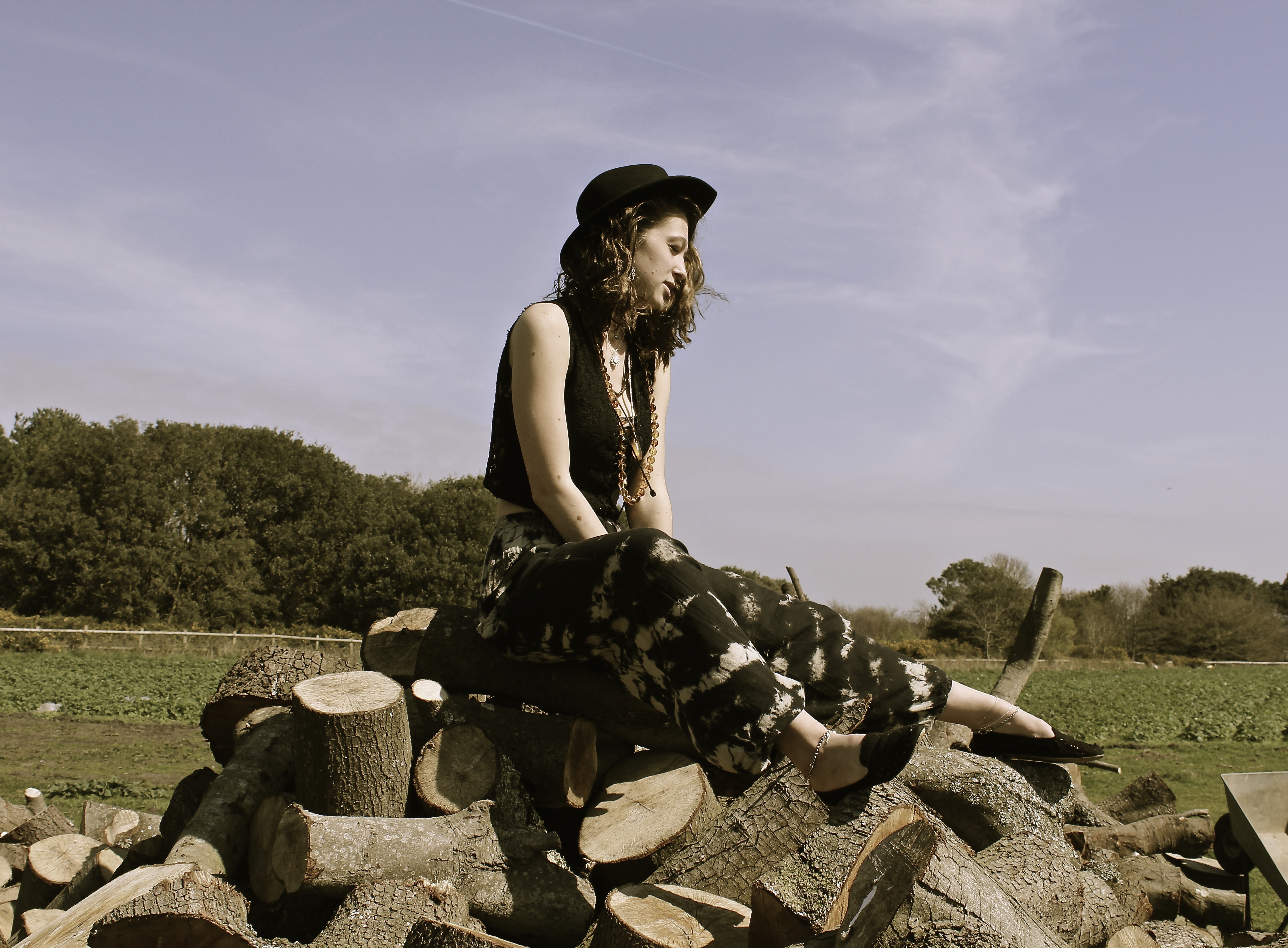
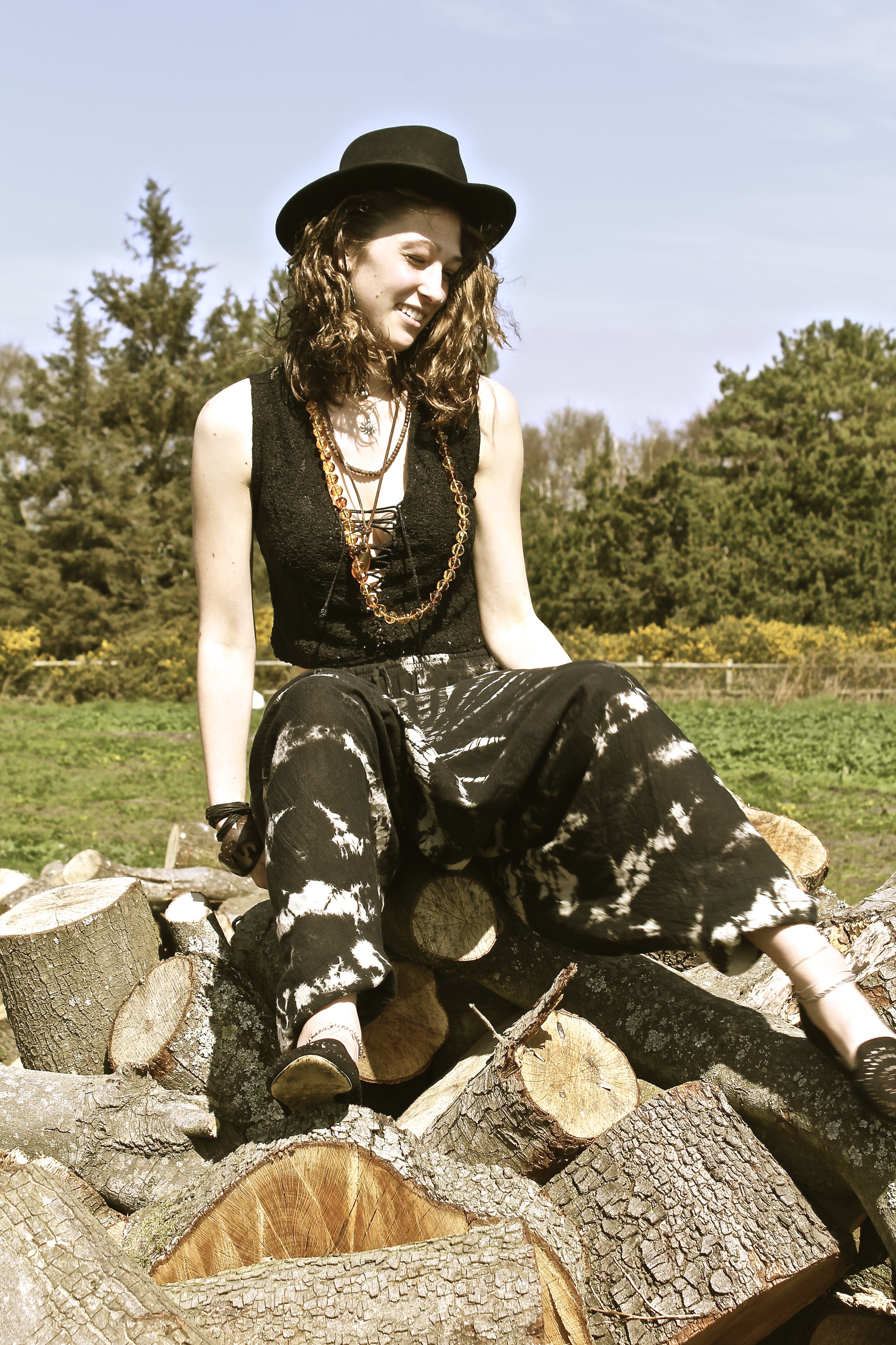
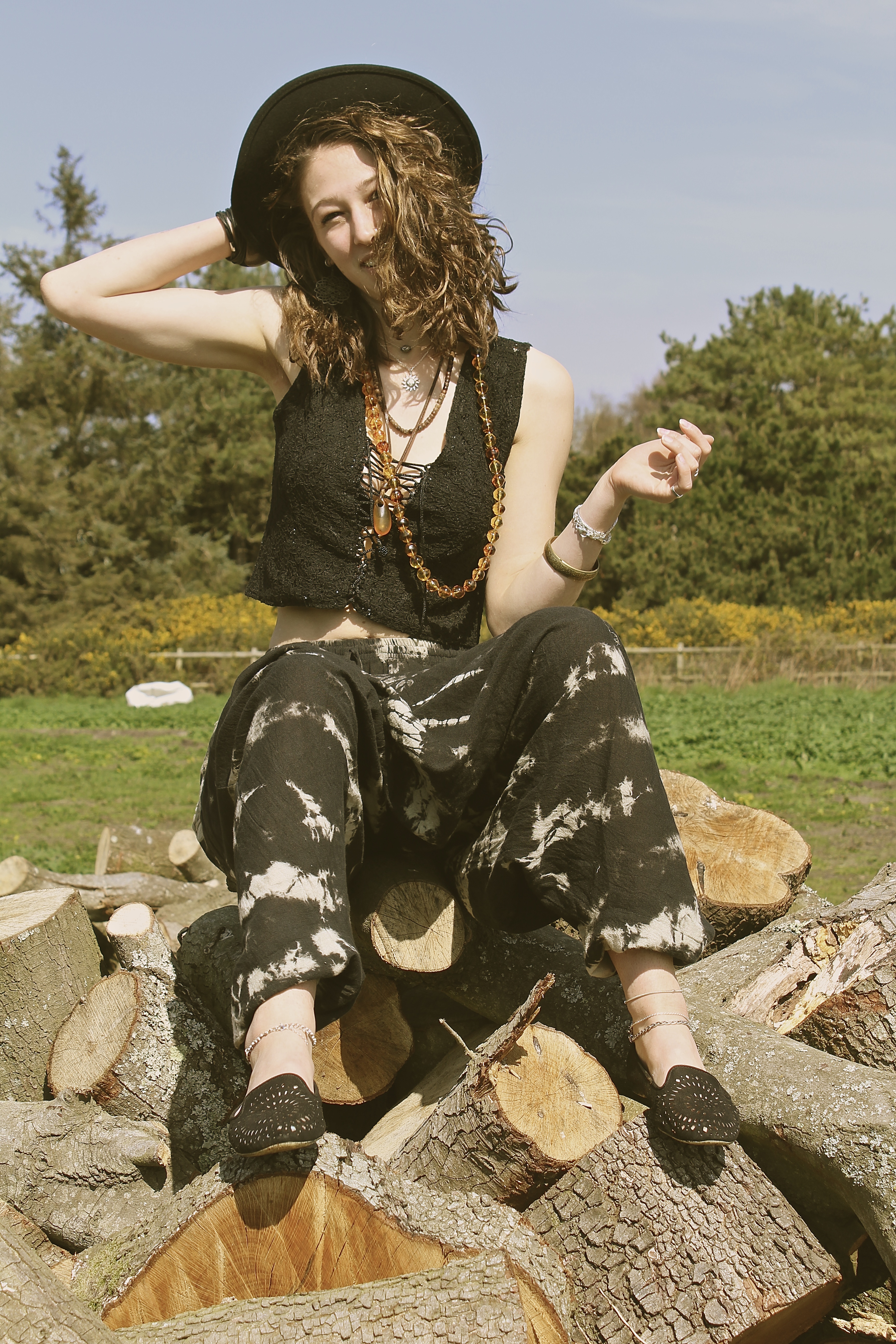
This shoot was inspired by the photograph taken by Juergen Teller of Kate Moss in the wheelbarrow. However, we got to the location with the wheelbarrow, and I ended up being more intrigued by the log pile behind it. The reason for this is because I was trying to represent with these photographs how humans are such consumers, as one can see the trees in the background which perhaps will soon be knocked down and made into this piles of logs – like the ones the model is sat on – this is us ( the consumers) can use them to our advantage, therefore destroying the beautiful land around us. This is why the trees are slightly out of focus in the background as we put ourselves before the world we live in and believe we’re more important than nature, which isn’t true as we need trees to breathe. This is what I wanted to represent through the use of the model, as one can see she’s dressed in a ‘hippy’ style, and hippies are referred to as tree huggers  which is kind of a metaphor as she’s sat on a pile of logs, the message I was trying to get across is we’re destroyed the world that we live in.

“I’m not a political artist in any way, but if an idea takes me somewhere or something is emotionally impactful, I find a way to make a painting that encapsulates it.” Idris Khan 

Even though I preferred the log idea, I still managed to caption some photographs of the model in the wheelbarrow, inspired by Juergen Teller. As shown below;

I love this image below, because the way the models looking directly at the camera, smiling but showing a bit of tongue making it look a bit provocative, also by the way she’s bending over in a low cut top. It makes it look slightly suggestive without intentionally doing this. The way the foot on the left is slightly blurred actually gives it more of an effect, as it looks as if the photograph was taken on a old film camera, which is the same style as Juergen Teller.

The composition of the image below works well as I have taken it from below angle, therefore creative negative space behind the models head and therefore not having anything in the background which is distracting. The model and the log pile appear clearer than the background of trees, this works well as they are the main subject and what I want the viewer to look at more.


Derelict Dreams

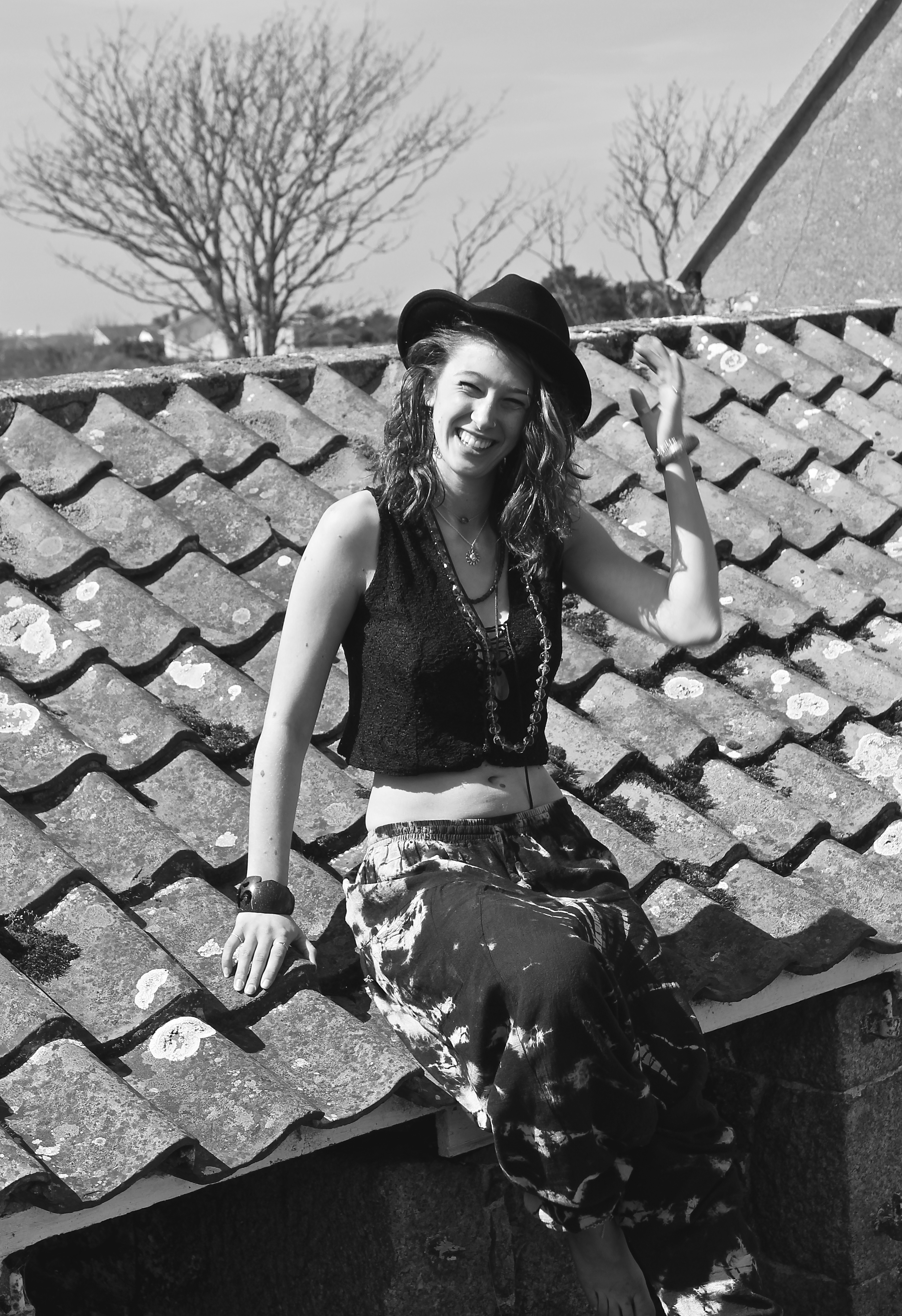
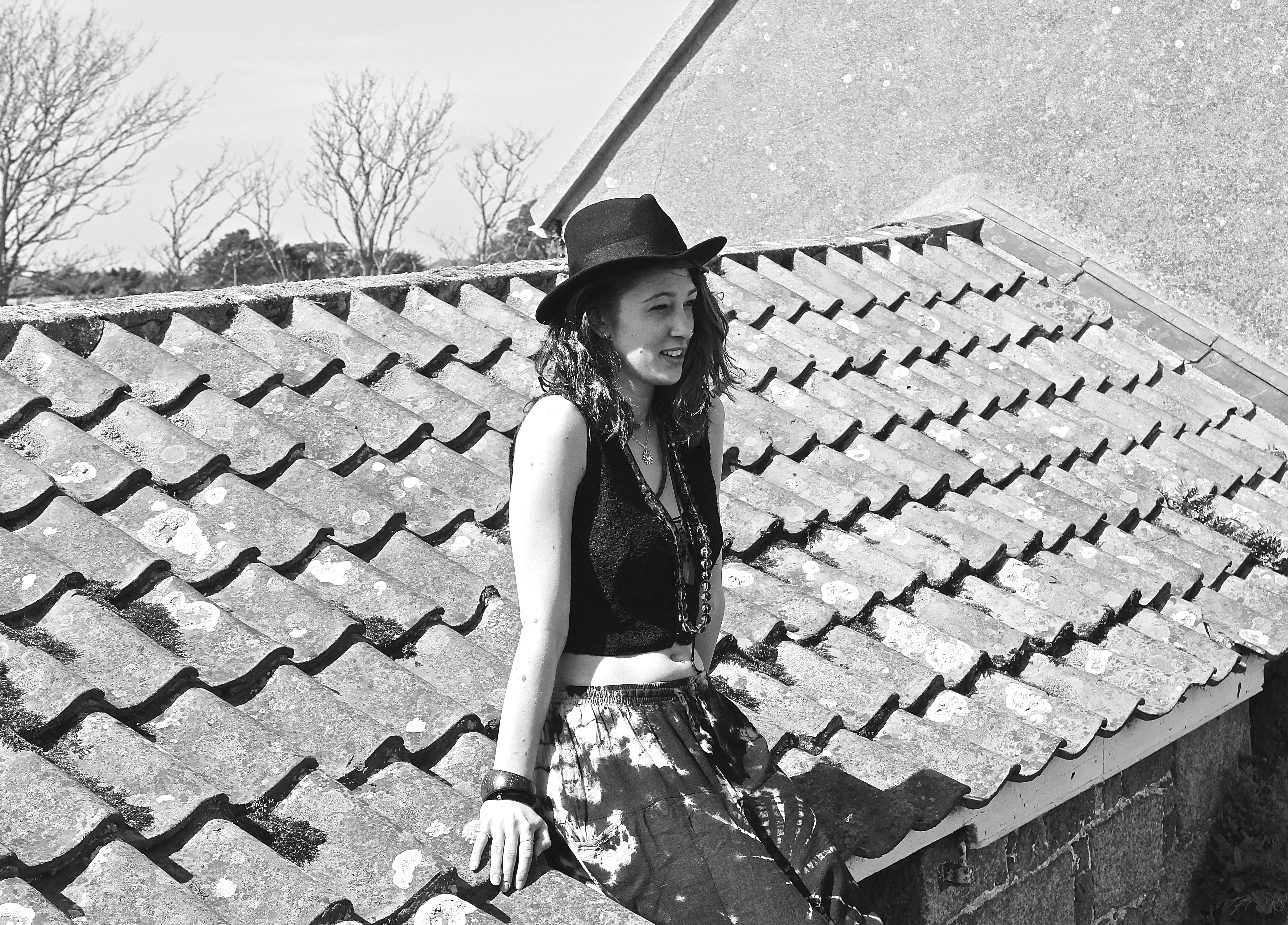
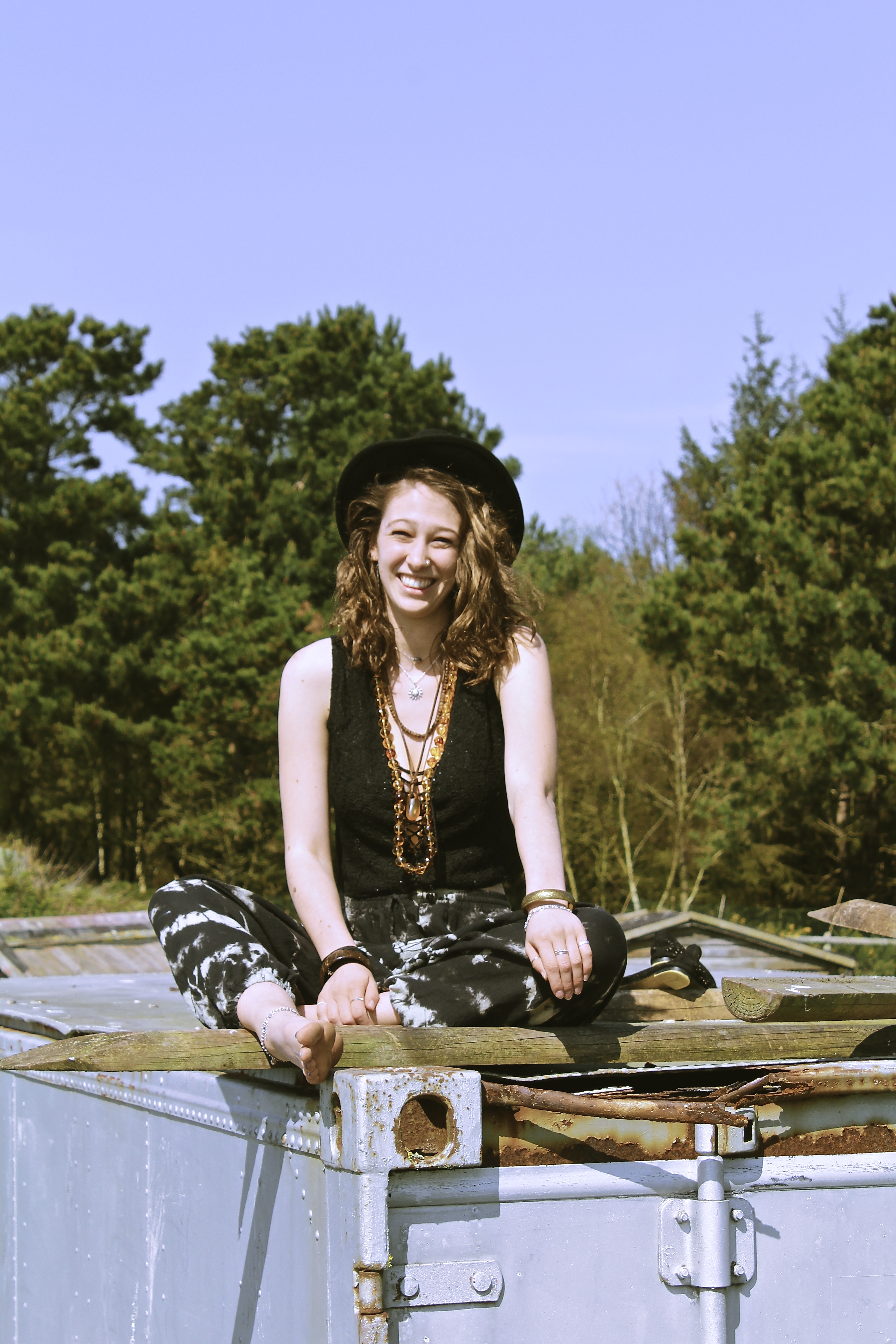
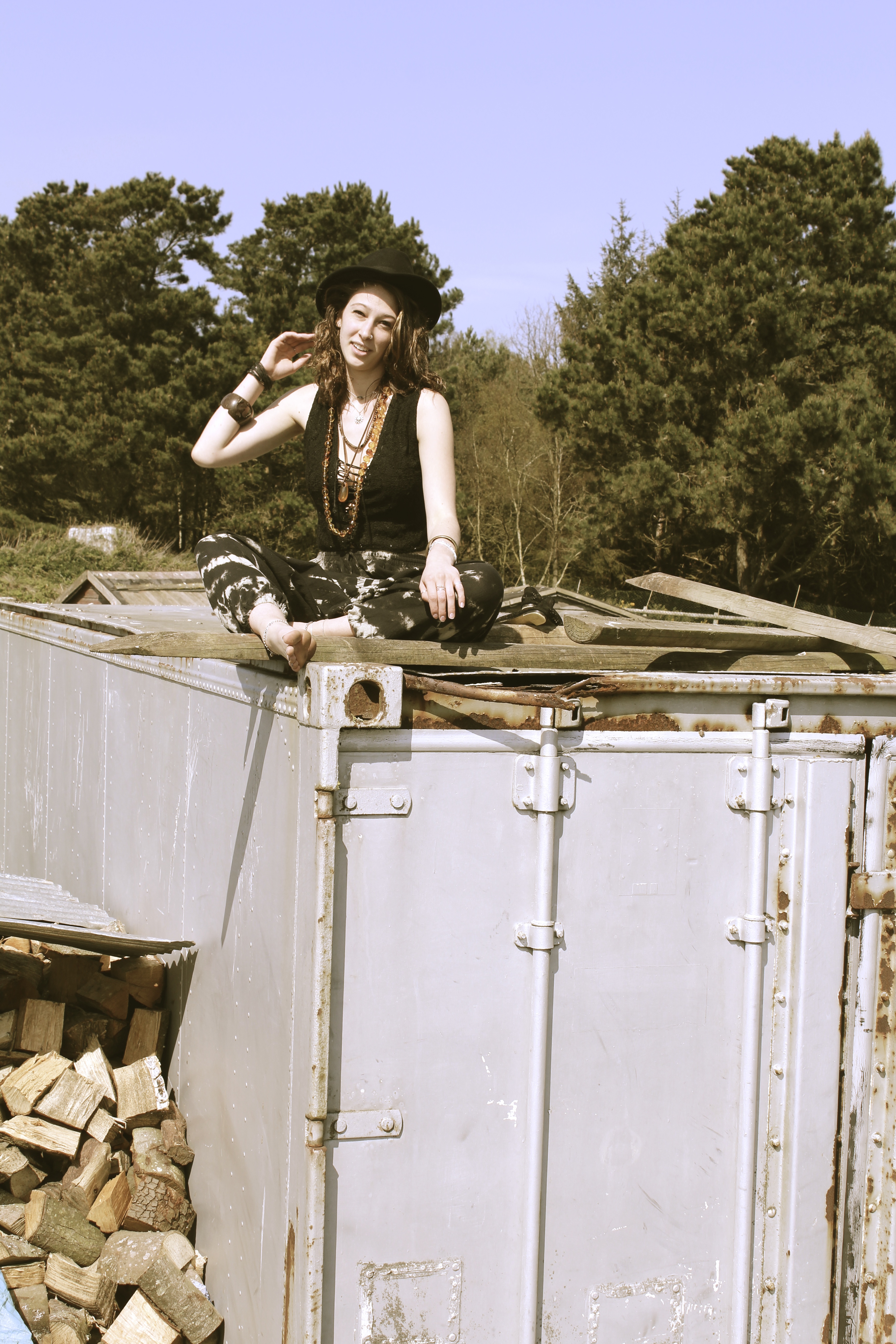
This shoot was initiated because it was to represent how the travelers would go on adventures and would end up doing something peculiar like climbing up old derelict buildings. Their adventurous exploring sides would come out, and they’d get the best views and sights because they were high up on the roof of somewhere remote.

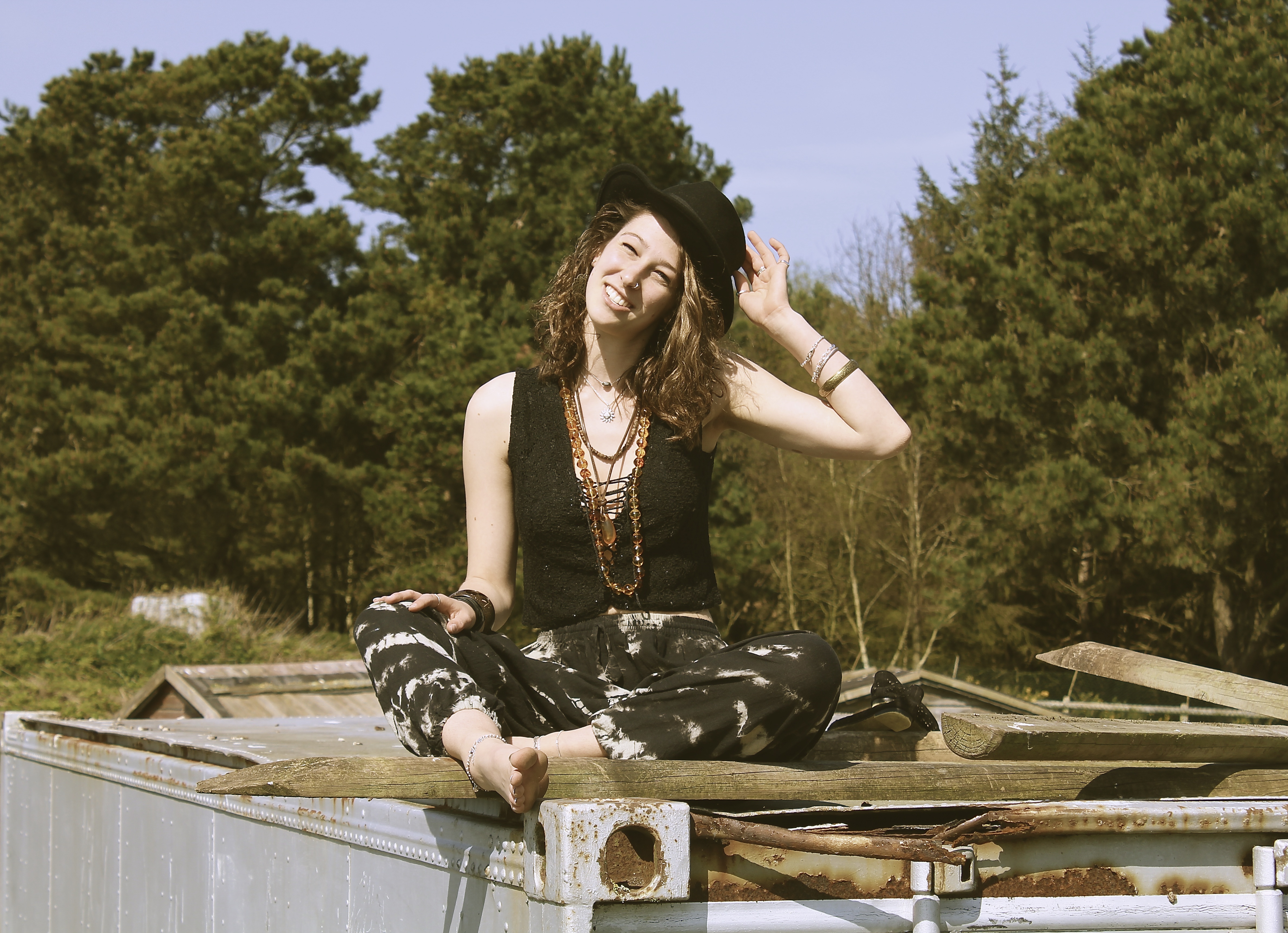
The image below reminds me of the series of Kate Moss  by Corinne Day, ‘The Third Summer of Love’. This is due to the model being smiley and squinting her eyes, very similar to how Kate Moss posed before becoming a Super-Model with Day. It also reminds me of that shoot by the use of accessory’s such as the hat and the necklaces. It is also taken in black and white like Days.

I like the image below due to the compositon, as the camera is looking up at the model, which usually tends to be an unflattering angle. However this technique works well here, as it creates negative space in the background, making the model be the main focus of the image. The color tones for this image also work well, as all the colors are a blue or brown, for example the rust on the container brings out the necklace and highlights in the models hair. The use of the natural lighting also creates and interesting shadow on the models neck, which makes the image look more fascinating.


Fields of Melody

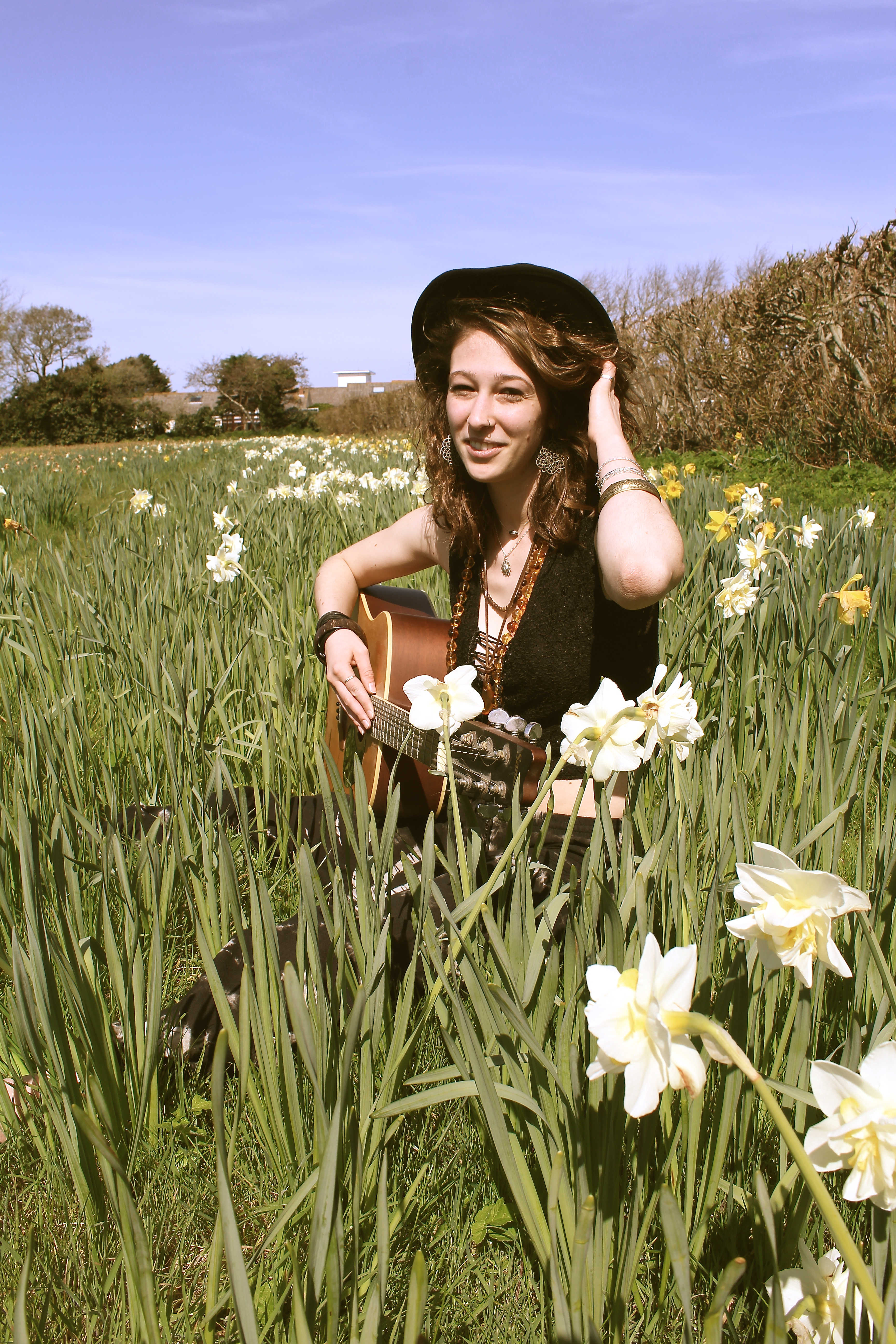
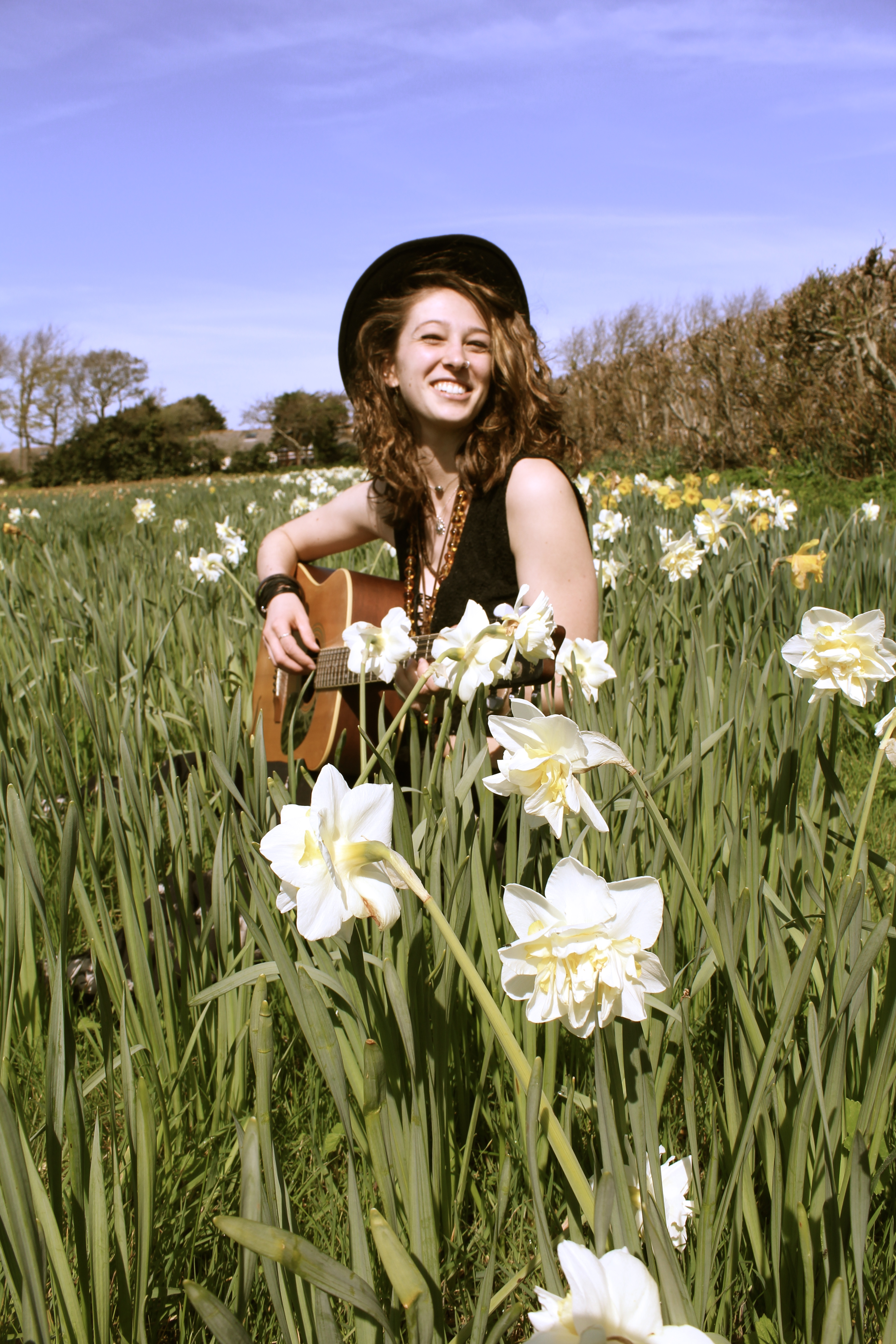
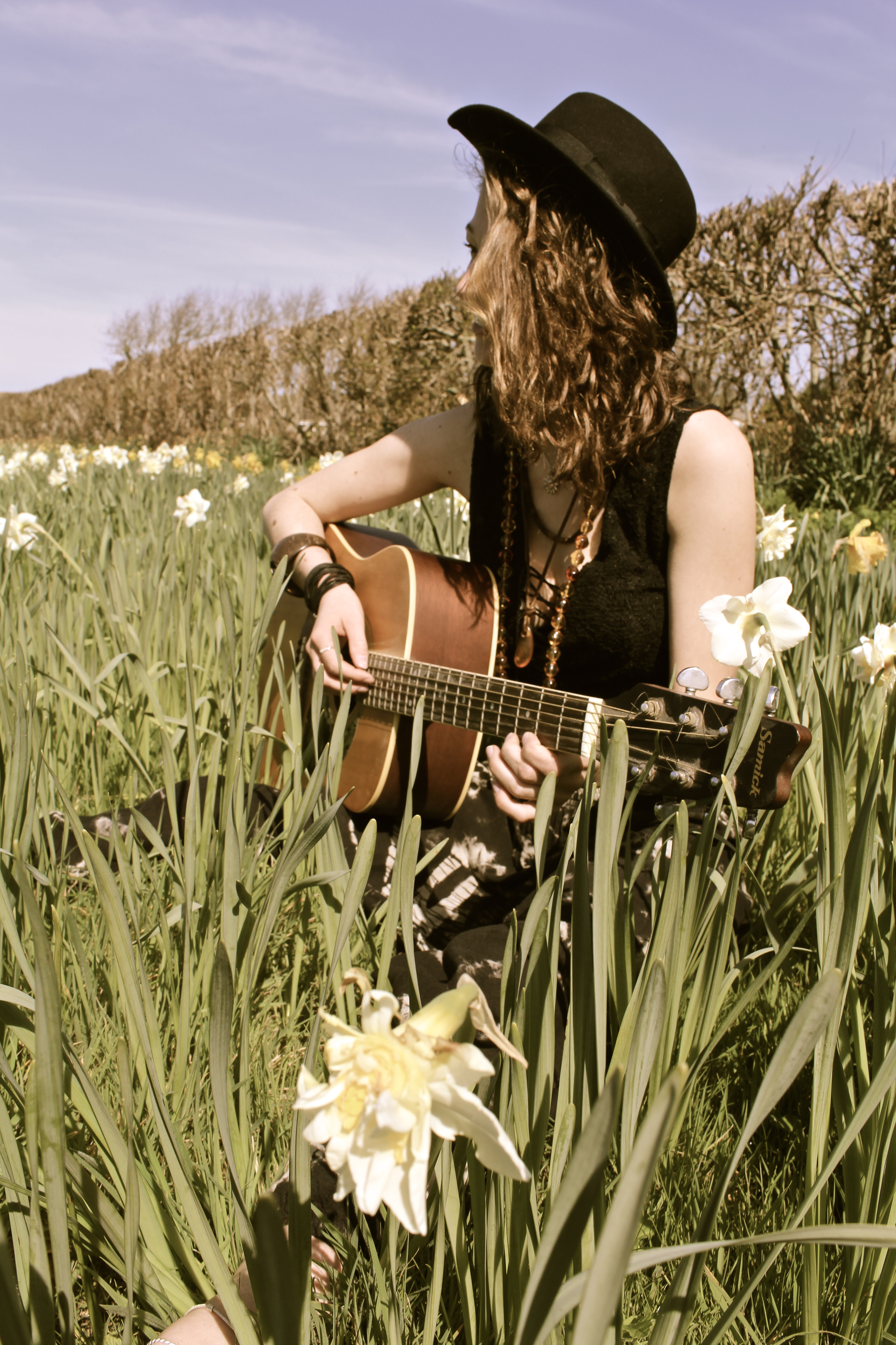
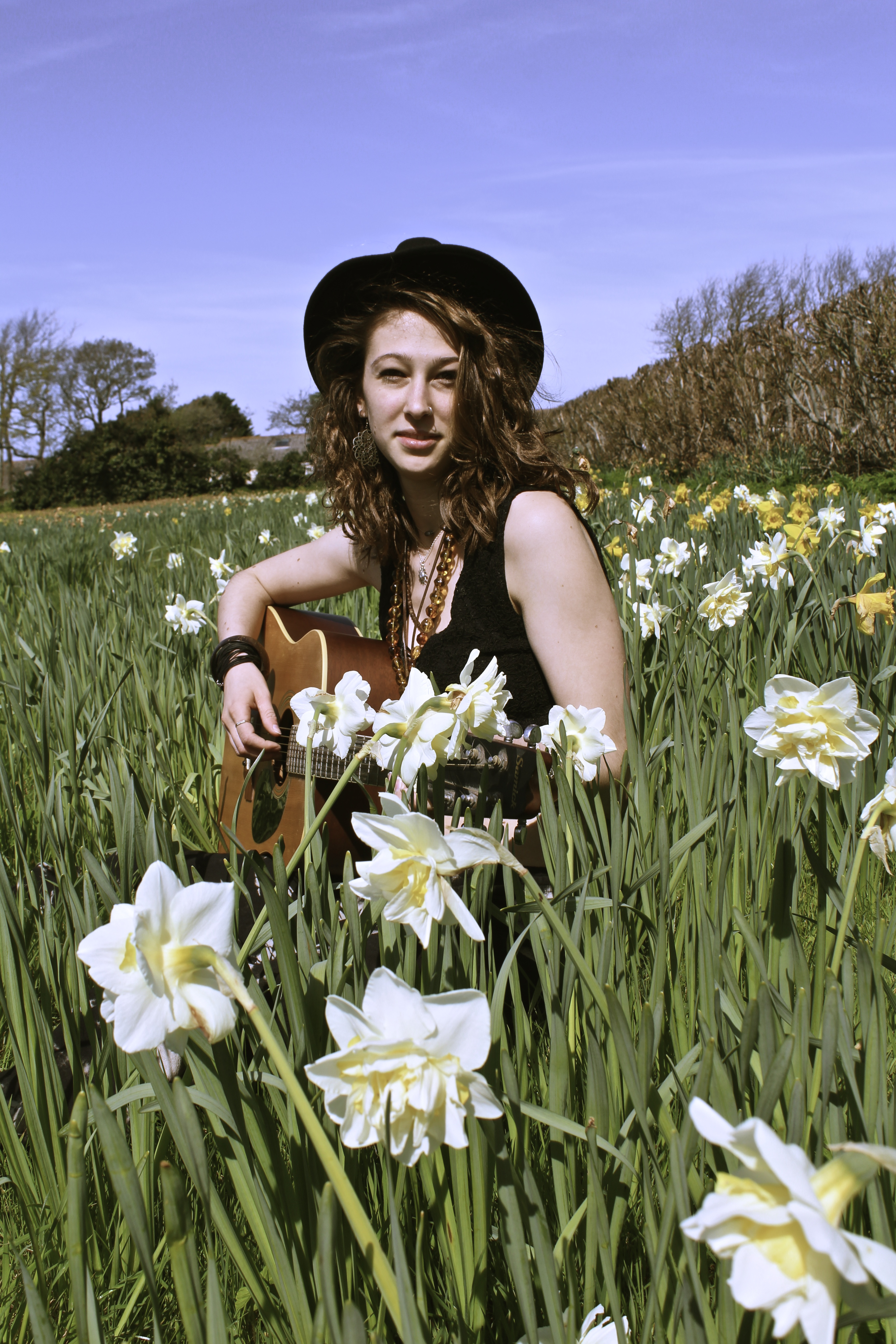
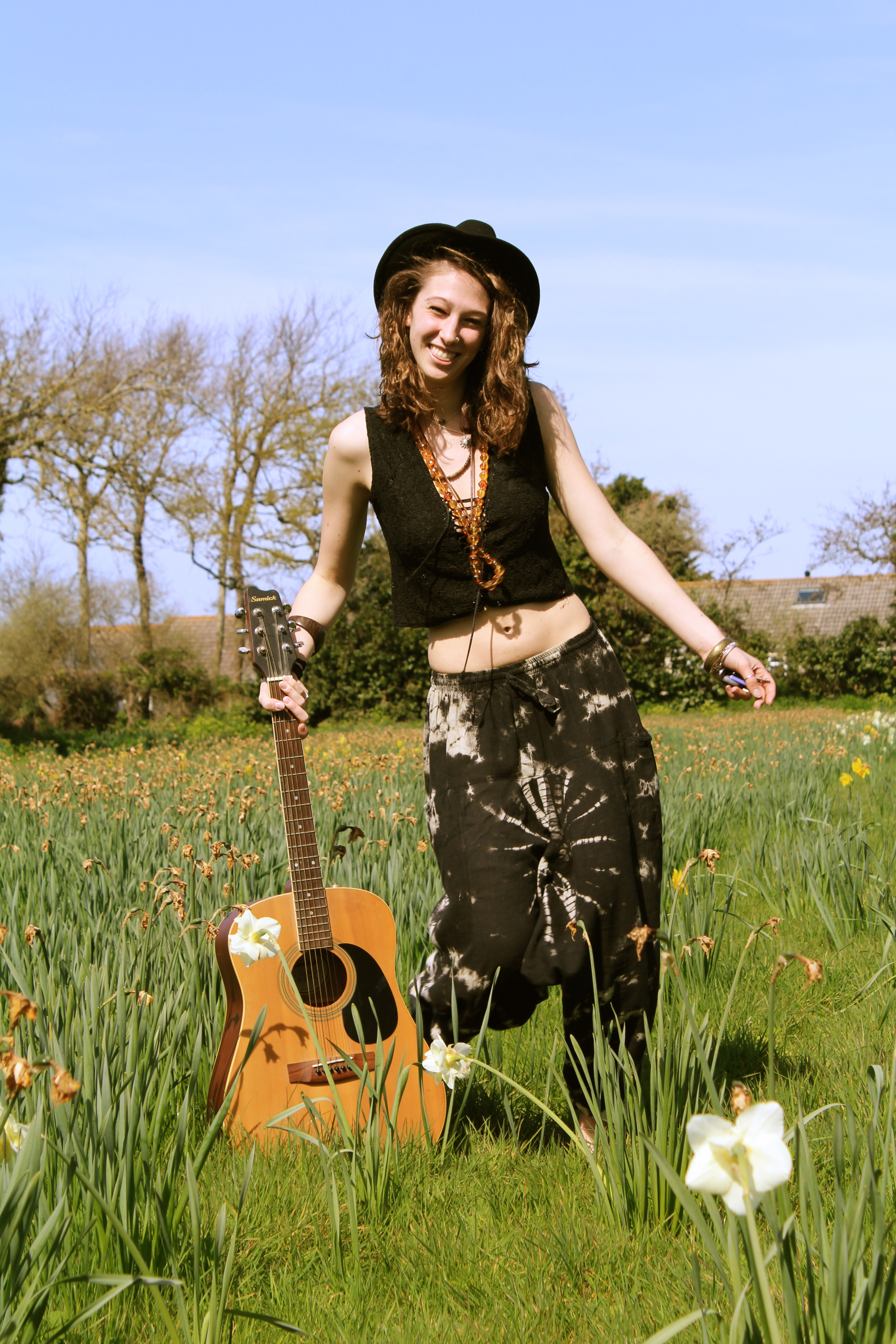
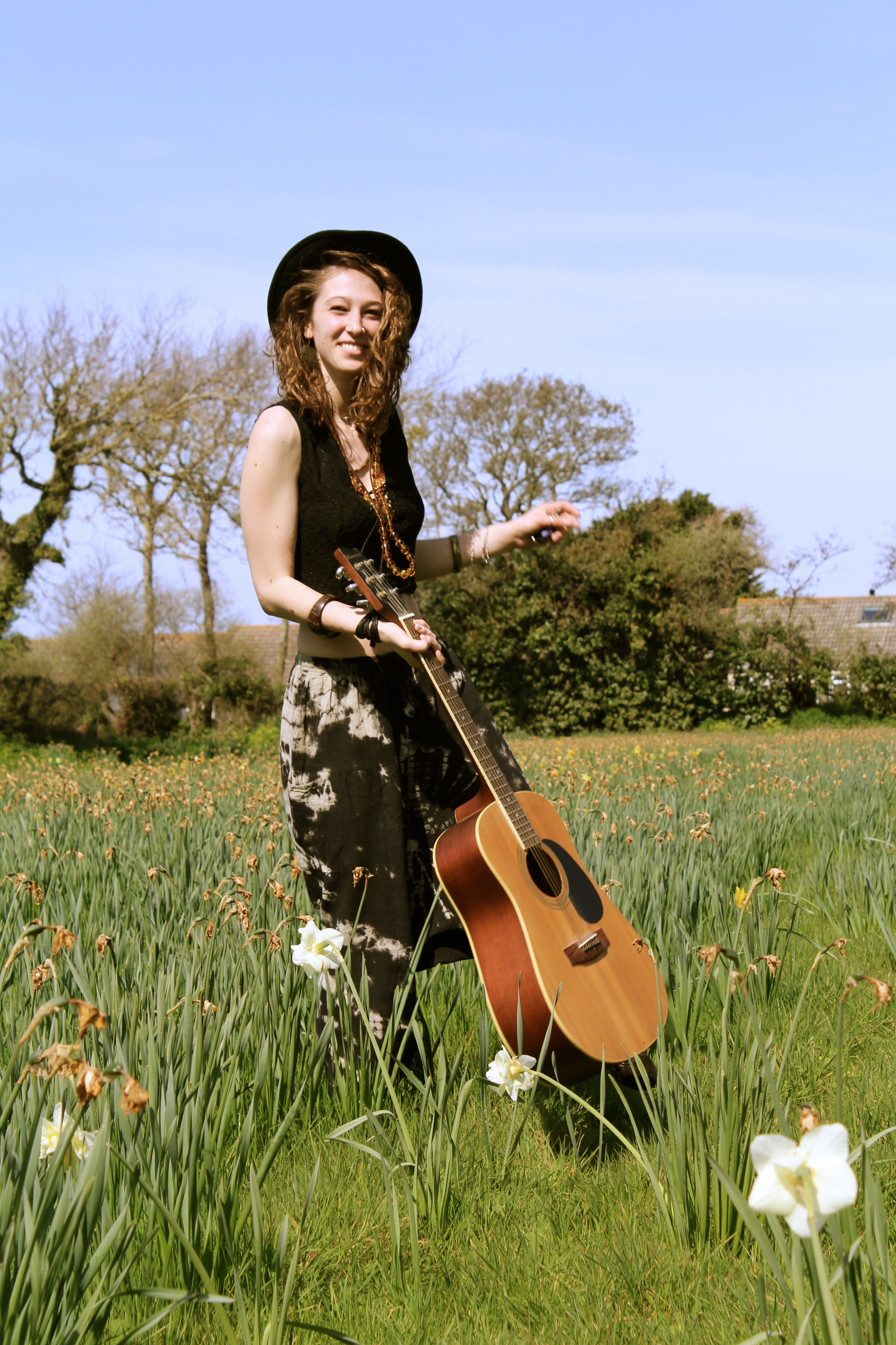
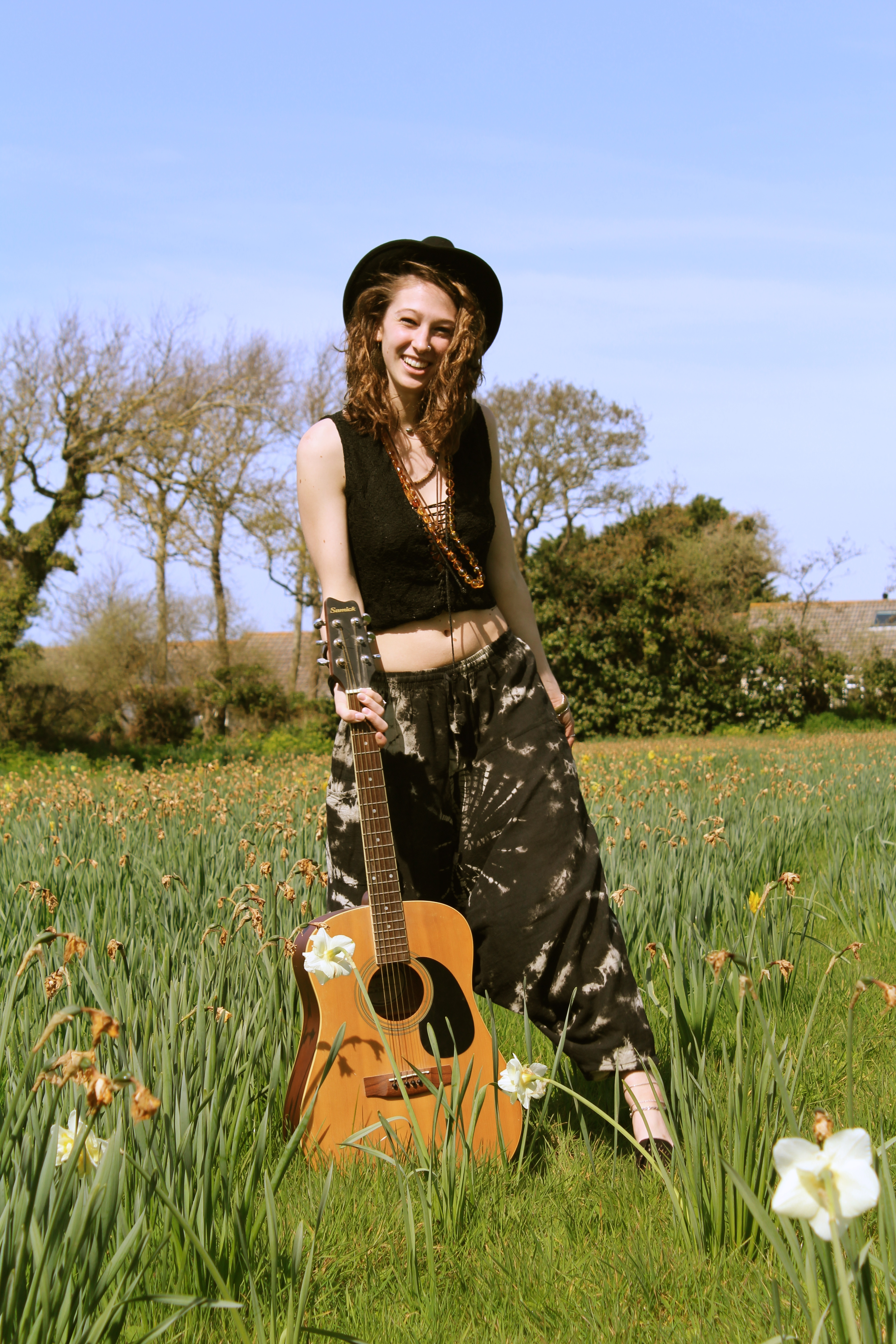
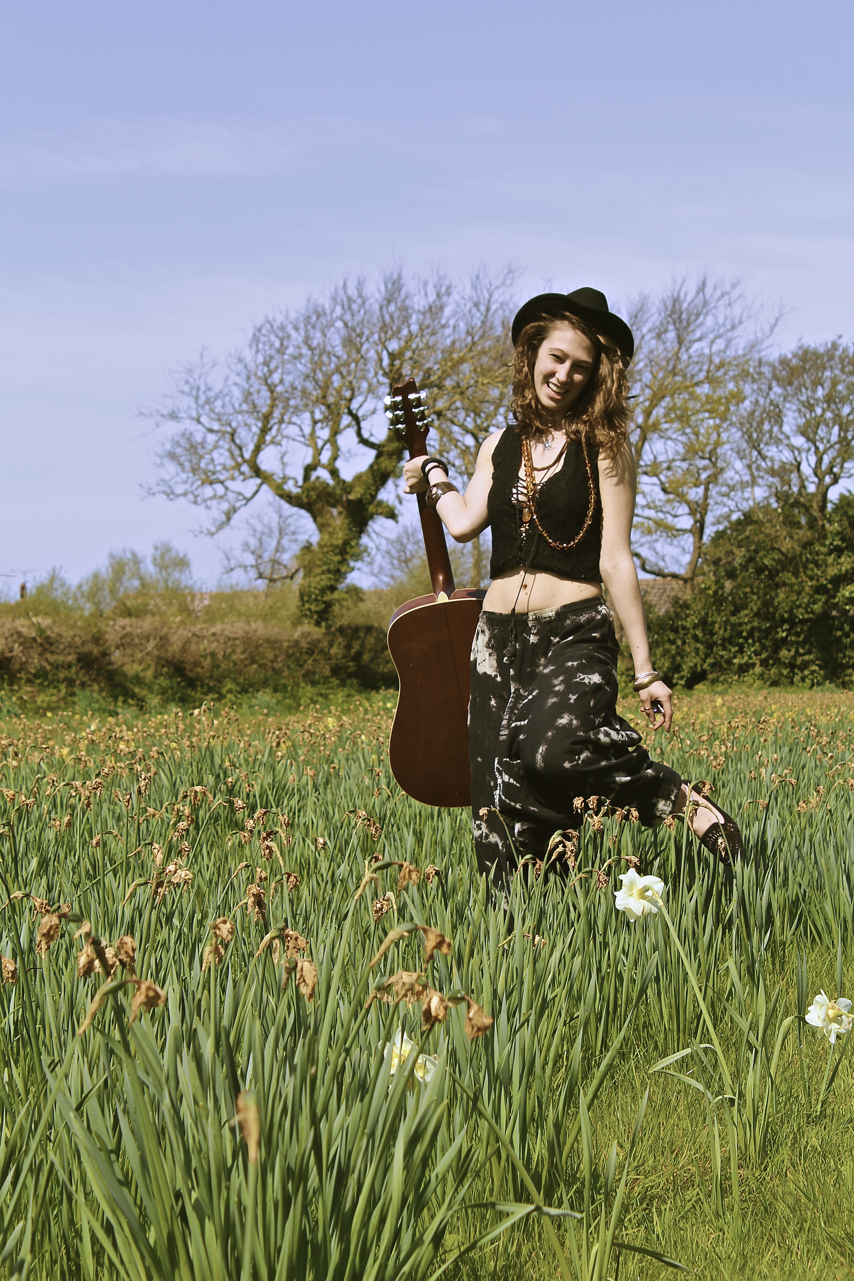
The reason for this shoot is because genuinely people associate spring with positivity,  because it’s going from the end of the bad weather to the start of the good weather. Therefore I thought I’d use the season to help bring positive vibes to my photographs, another prop I used was the daffodils in my shoots, these are an important aspect as they are one of the most typical spring flowers, and therefore what represents spring in my photographs.

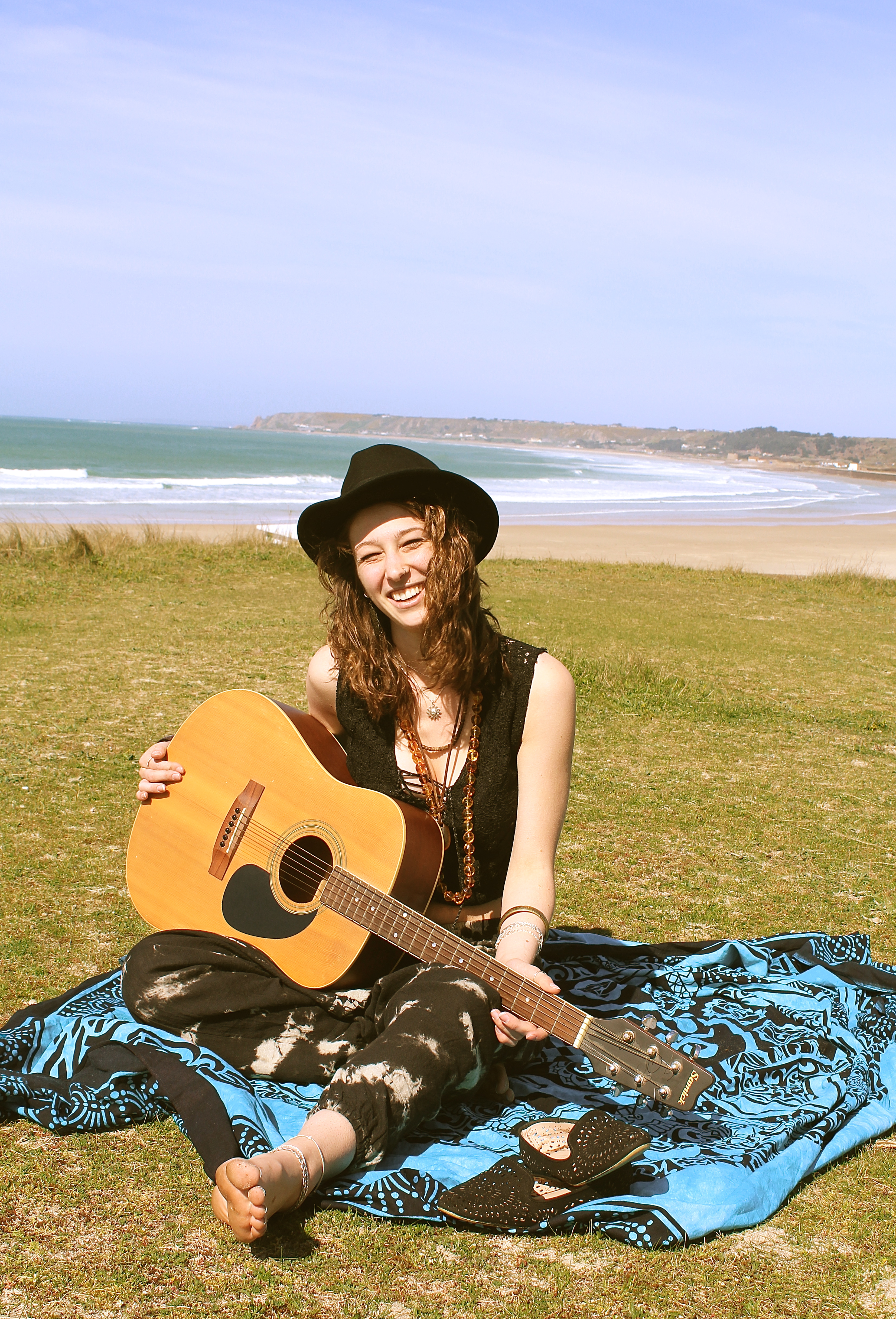
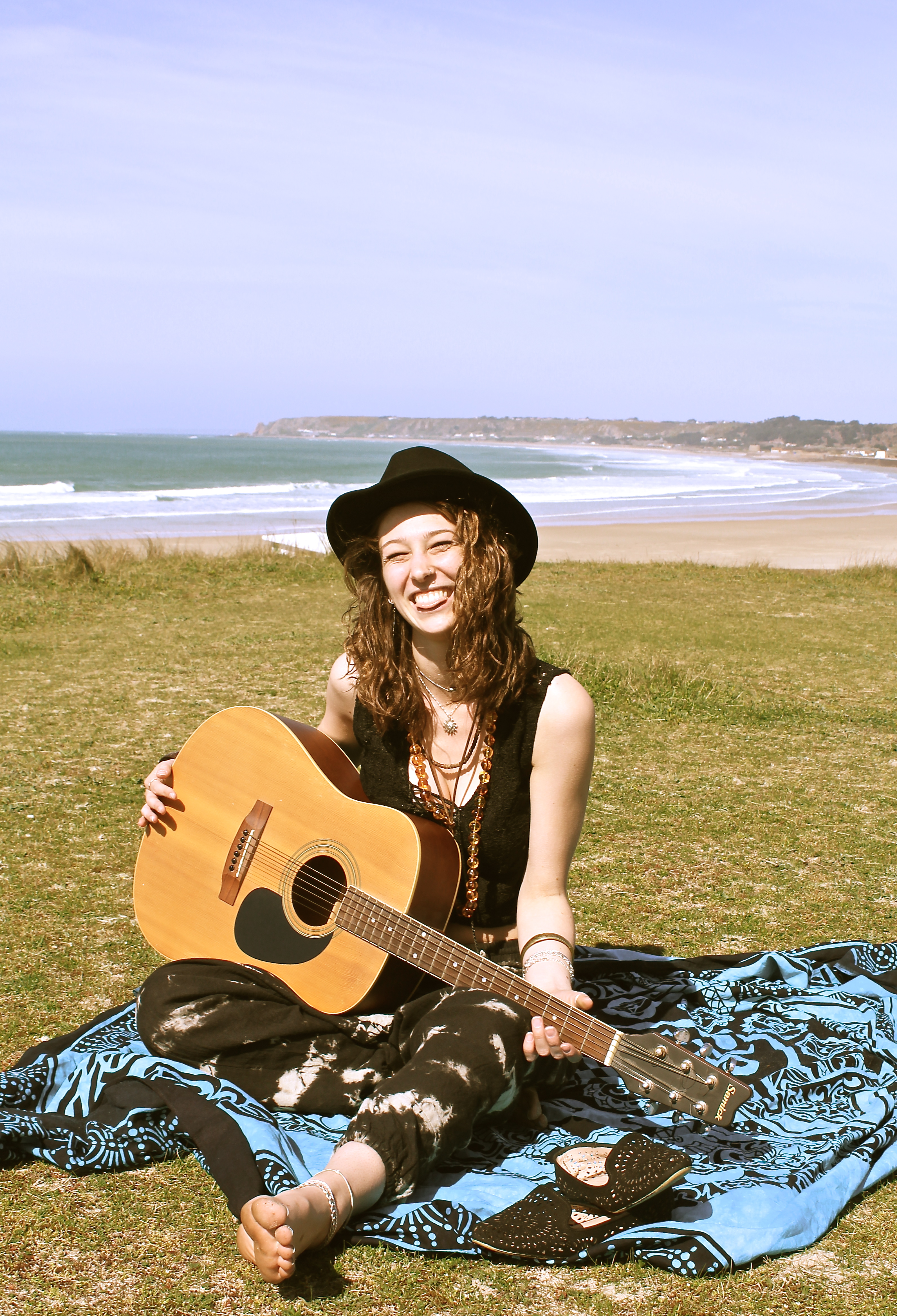
The image below works well as it looks like an image which may have been taken in the 60s when it was the decade of hippies, it looks like this by the use of the outfit the model is wearing, the use of the guitar and also the field of flowers, it also looks like its taken on an old film camera and looks like its been developed. This works well as with this shoot I was trying to represent peace and happiness and thats exactly what hippies are about, also it tends to be ‘free spirits’ / ‘hippies’ who tend to do a lot of travelling. Which works well as my photographs are all about a journey.

I love the photographs below, as they are capturing movement of the model, giving the photographs energy. The focus is on the model and the guitar, even though they’re both in the midground they are the focus and the foreground such as the daffodil is even slightly out of focus. The composition works well as the white daffodil is what your eyes are immediately drawn to therefore you look at that which shows you the season, making it positive before you even see the main subject, one then looks up to the model holding the guitar. The use of facial expression on the models face also creates a positive atmosphere and feeling to the photographs.


Nomadic Soul

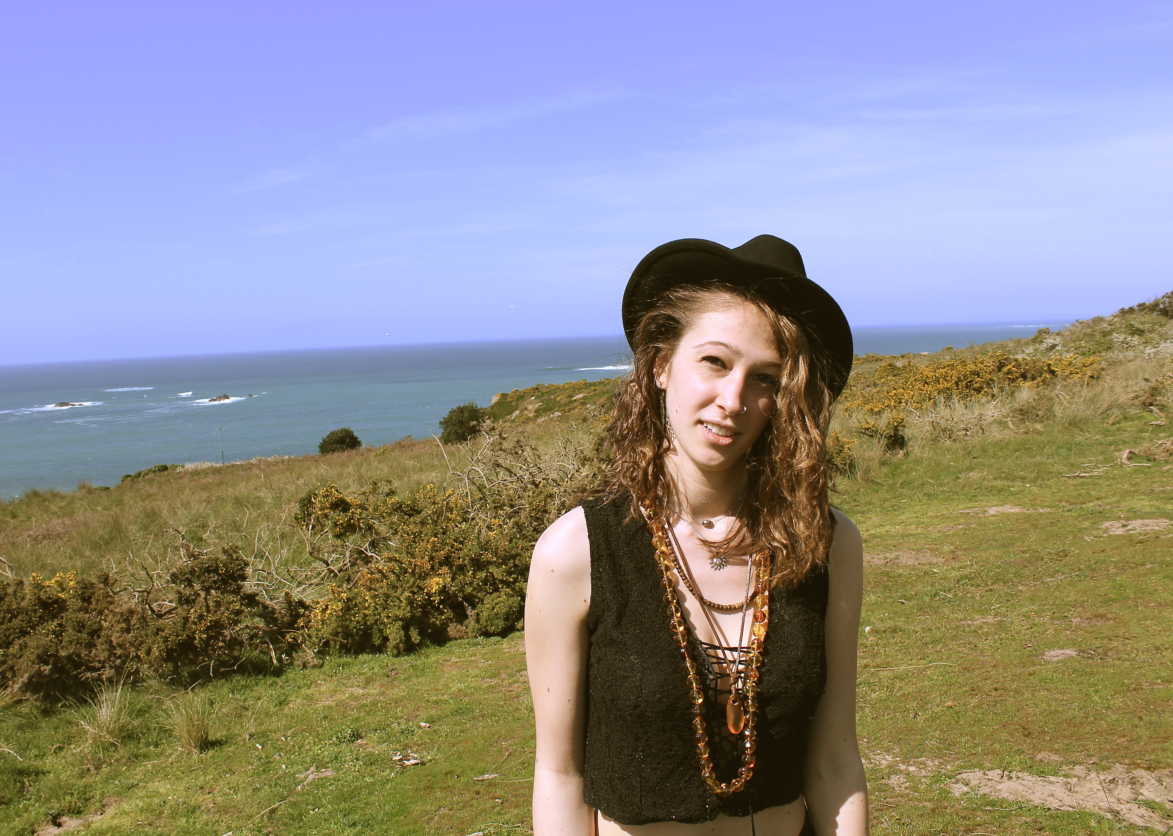
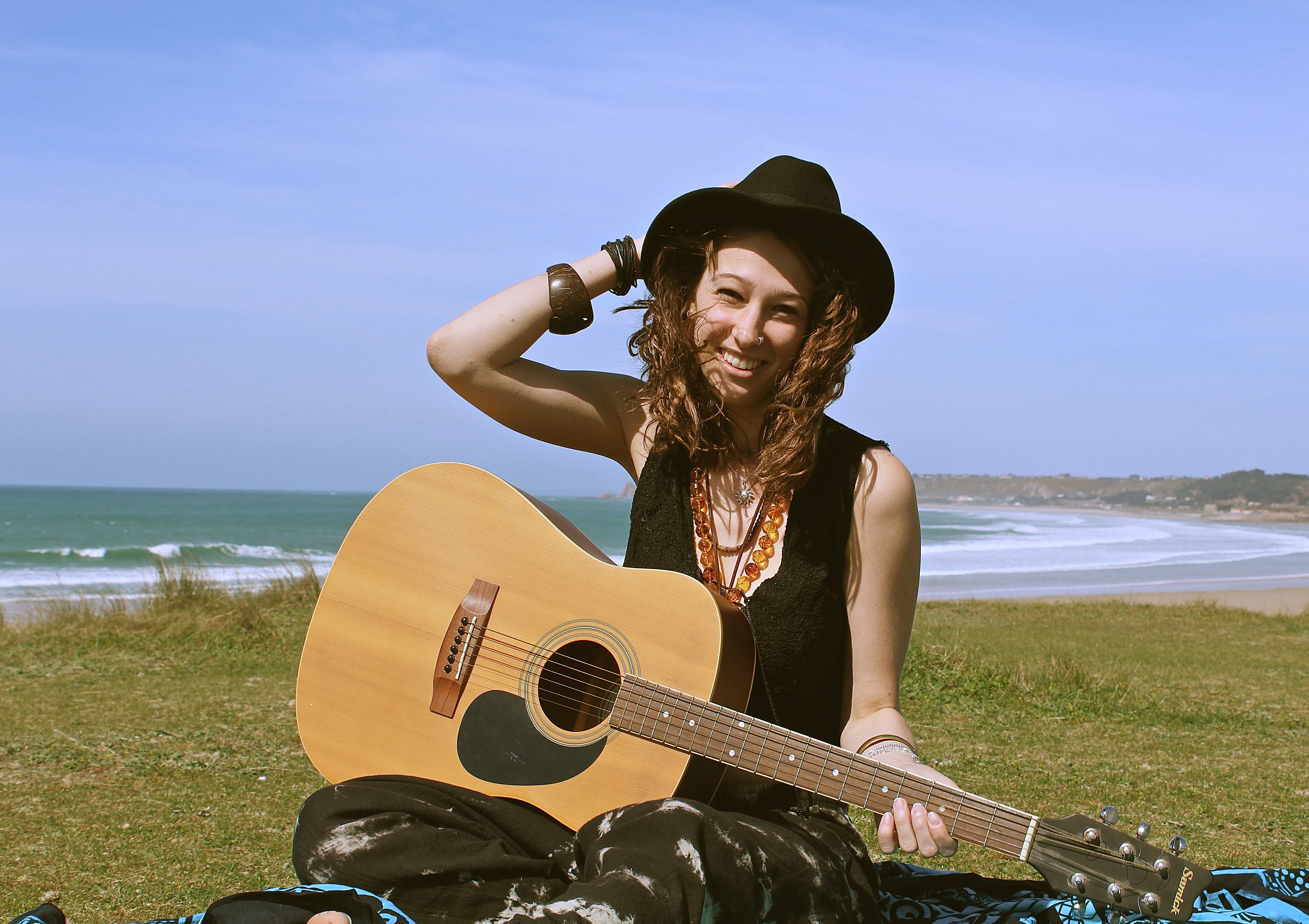
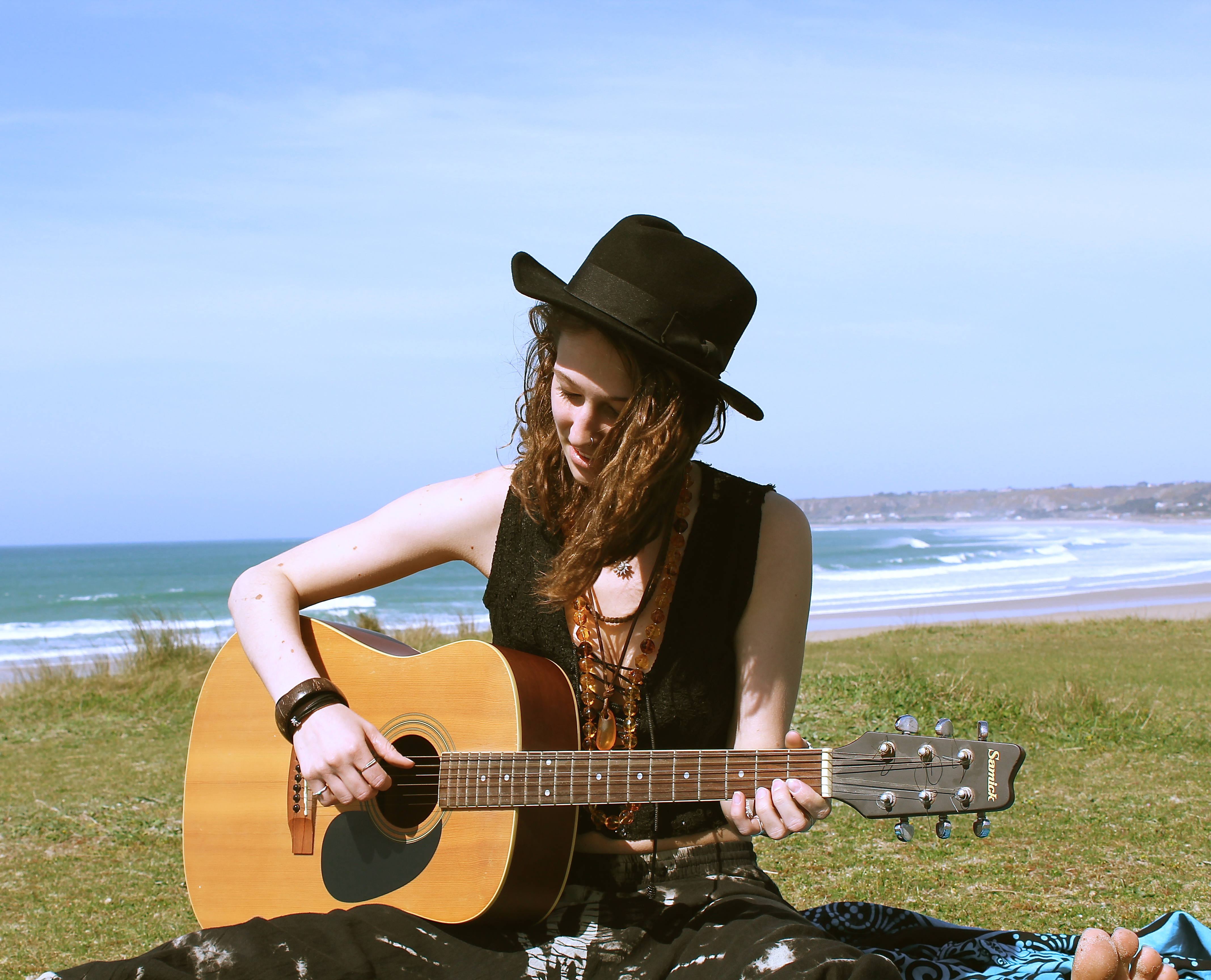
For this shoot, I wanted to represent a musical journey combined with a travelling journey. I wanted to represent a girl who was on the move, but would take her music with her everywhere, but not someone who would just use their IPod and headphones to listen to music, but someone who makes their own.

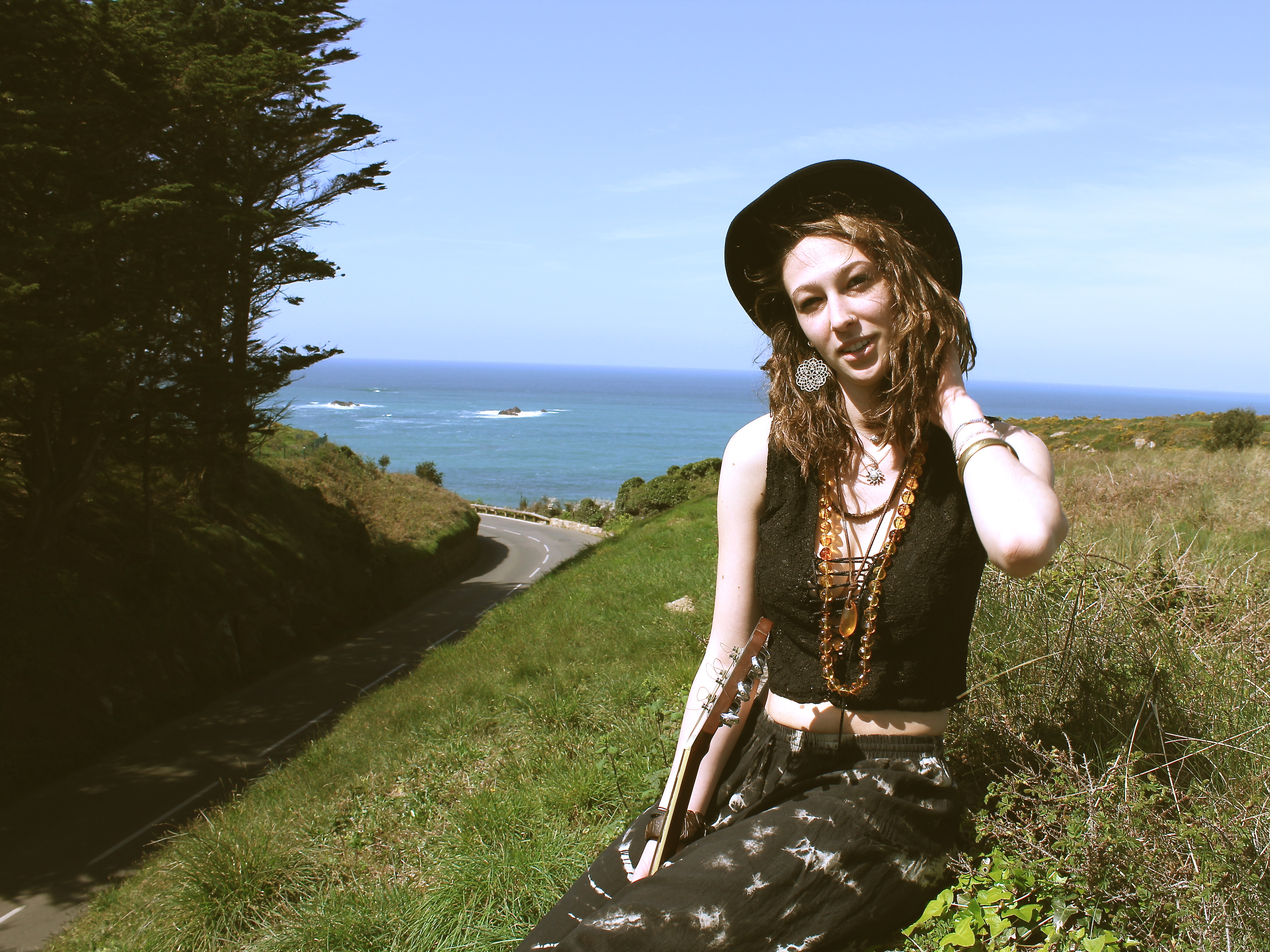
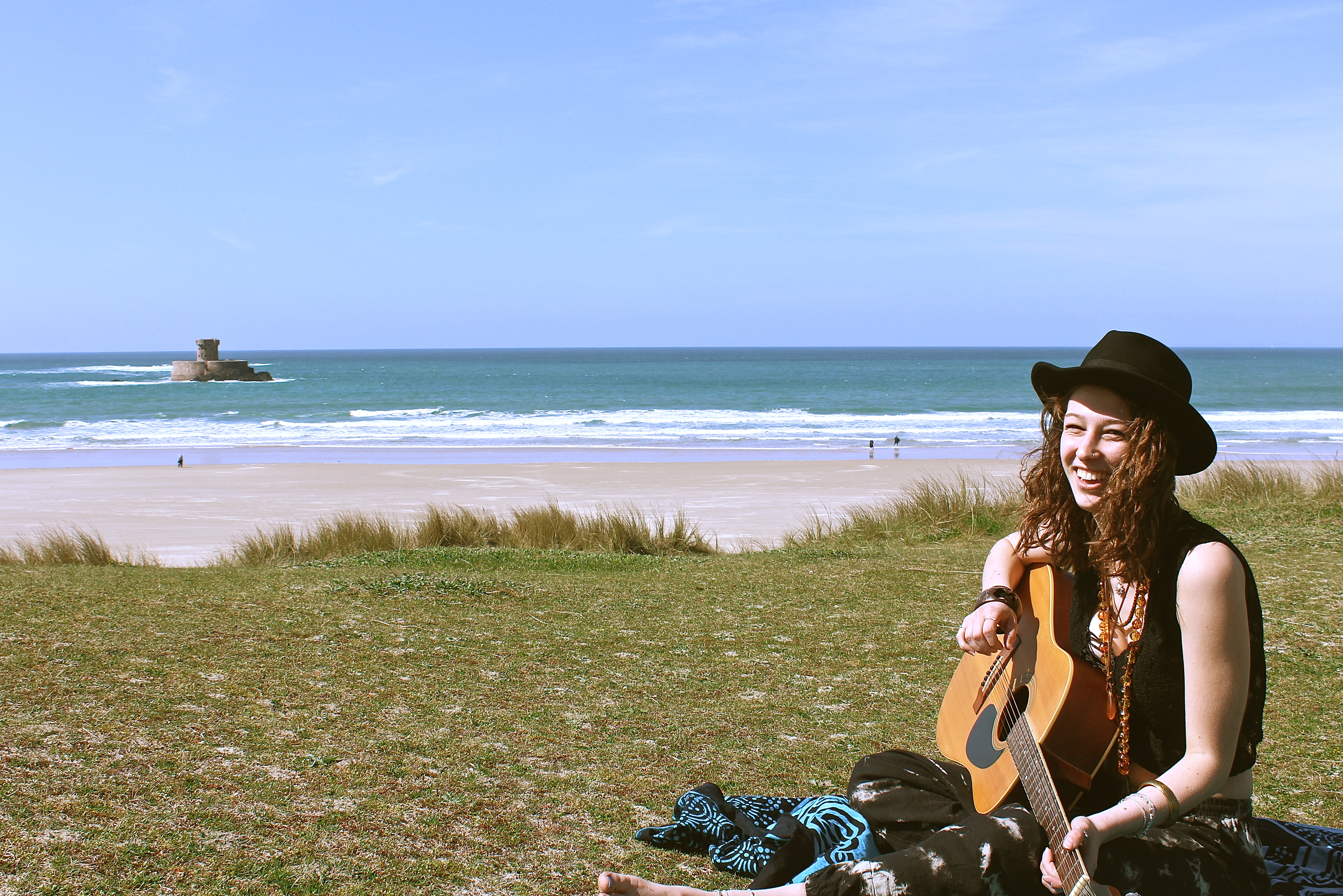
The reason for the location at the start of the shoot was because it shows a beautiful environment with the sea and trees in the background, but it also shows a road which represents movement and travelling. It’s as if the girl is following the road to the sea. This is why she ends up sat in front of the sea, because its representing her journey.

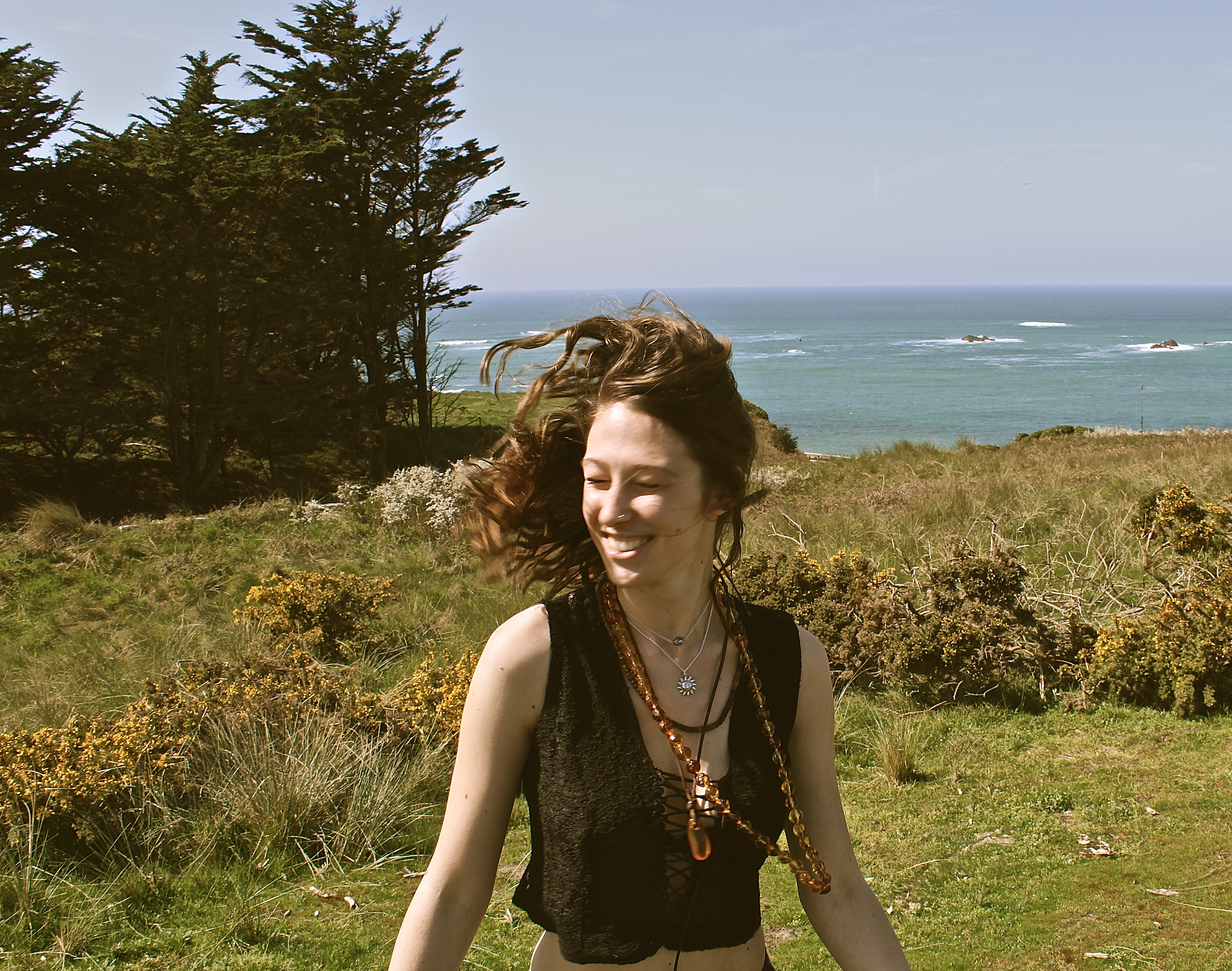
For this image below, I made her face away from the camera, and then I would count down to free and she’d turn her face around and I’d capture the moment. This technique is done to capture a moment which doesn’t look as posed and make it not feel as posed for the model so they don’t feel as awkward in front of the camera, and also to create movement in the photographs. In the image below, due to the position and natural lighting there is a loop lighting technique created on the models face. The thing I would change about this portrait is I should of waited a few more minutes for the cars to pass in the background, because I find they take away from the portrait, and I should have positioned the model slightly different so she wouldn’t be blinded by the sun and her eyes would be more open. However, I think the use of focal point worked well in this image, as I wanted the model to be the main subject, yet showing the important aspects like the sea and the road.

In the image below, there is a split lighting on the models face produced by natural lighting. The model is slightly positioned to the right however she is what immediately look at, due to her skin colour being pale. The composition works nicely as one can see the road which looks like it takes you directly to the sea. The way the model is higher up than the level of the road, makes her look adventurous and takes risks to appreciate natural beauty, and views like this inspires her to write new music. In this image there is a lot of depth, except in the background behind her upped body, where there is negative space, i think this works well as you focus on the mode more and aren’t distracted by a busy background. When editing this photograph I referred back to Theo Gosselin, as he tends to have a cinematic/vintage effect which I chose to use on this image.


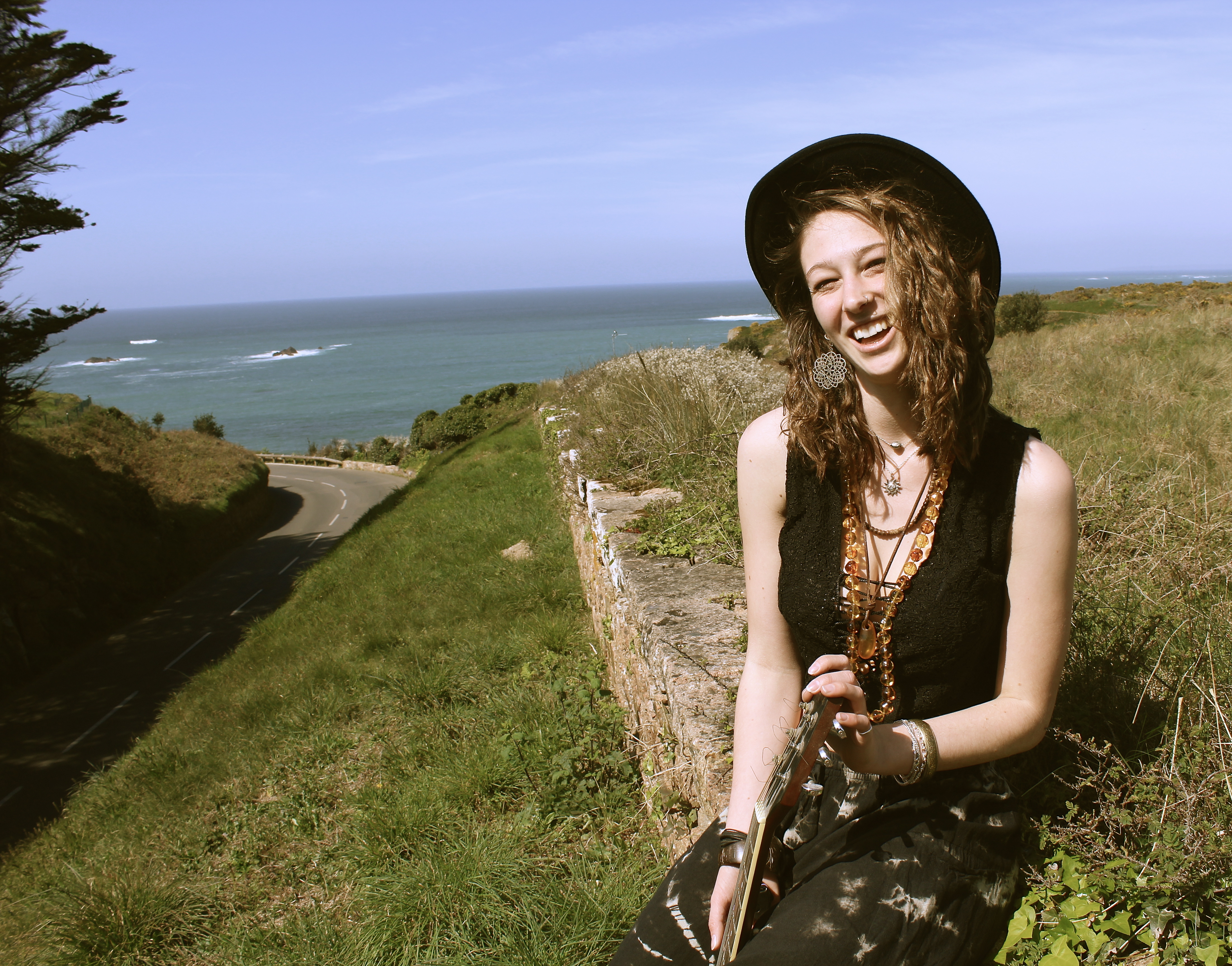
I love this image, as it looks so natural and in the moment, as if I just picked up my camera at the perfect time. When in reality it was staged to look the way it does, for example I wanted her to sit in this position so I could get the trees, on the right, and the wall on the left to frame her and the sea in the background. For this image I also used the technique where I would get her to turn around so it wasn’t looking posed.

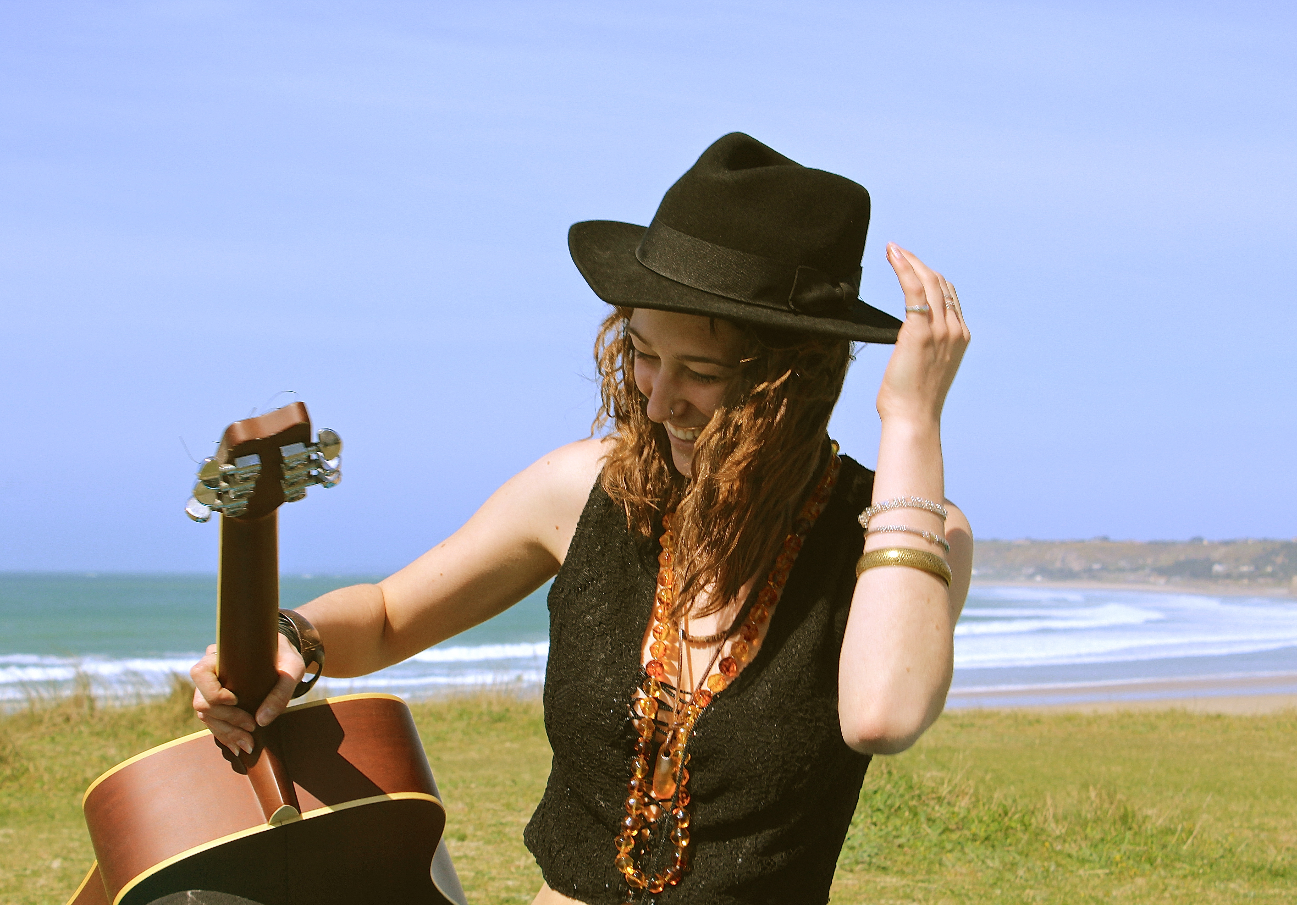
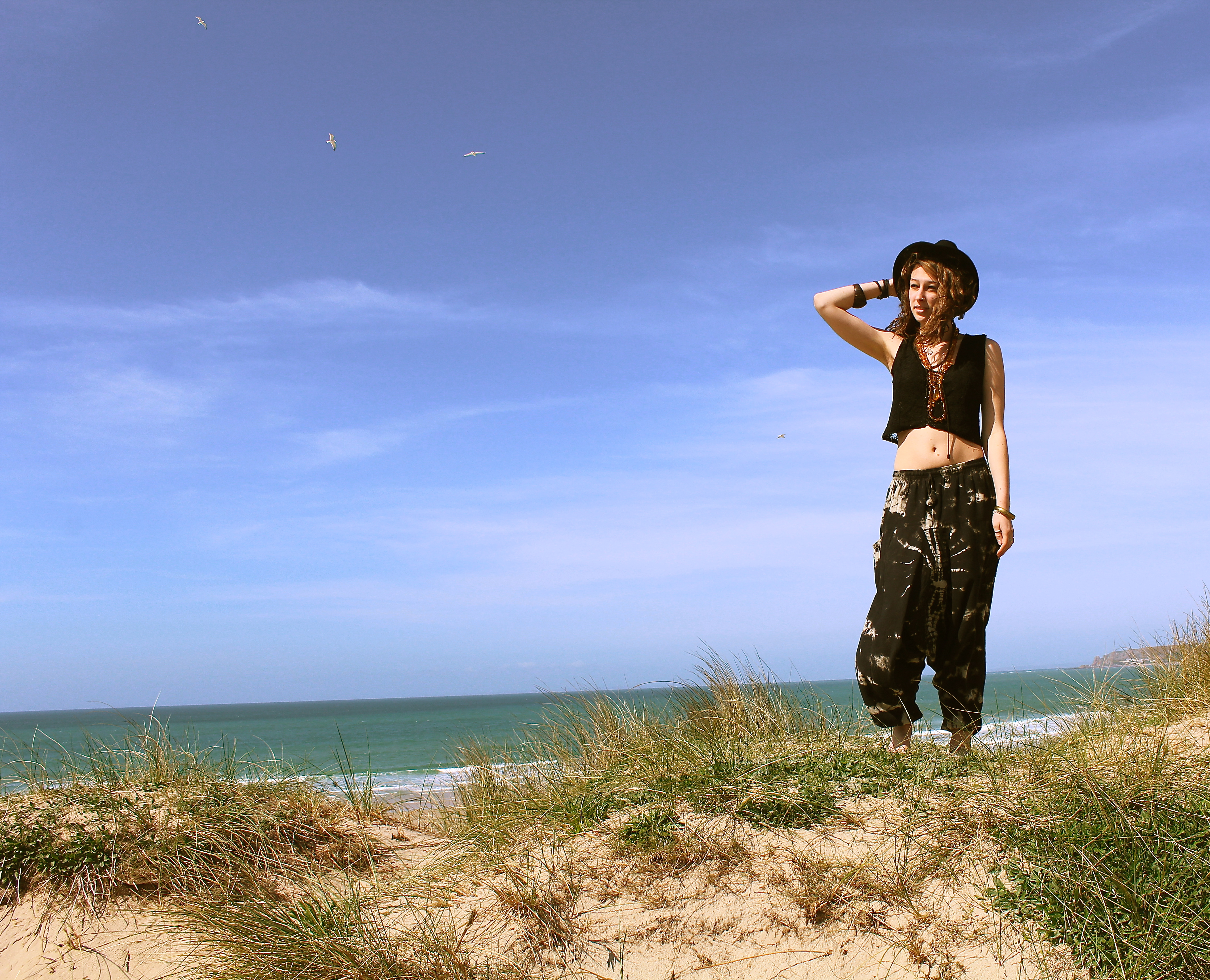
This image works well due to all the different elements, such as the birds in the background. The way the models got her arm bent, holding onto her hat, the carve of her elbow almost works as an arrow therefore your eyes follow the direction the elbows pointing in, which makes your eyes focus on the birds in the background. Normally one associates birds with peace and freedom, which is what i wanted to represent in this shoot. When i think of birds, i think of fleeing the nest, which is what these young people have done, they’ve taken their vans and have gone travelling away from home. I also like the fact one quite often hears the term ‘a songbird’ which is a bird with a musical song, like what the girl in this shoot has, as she’s got her guitar with her in most photographs.

St Ouen umbrella den – Night

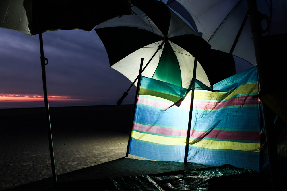
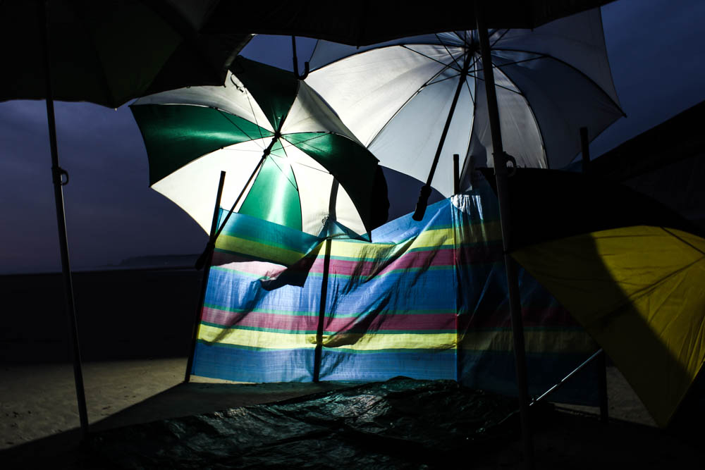
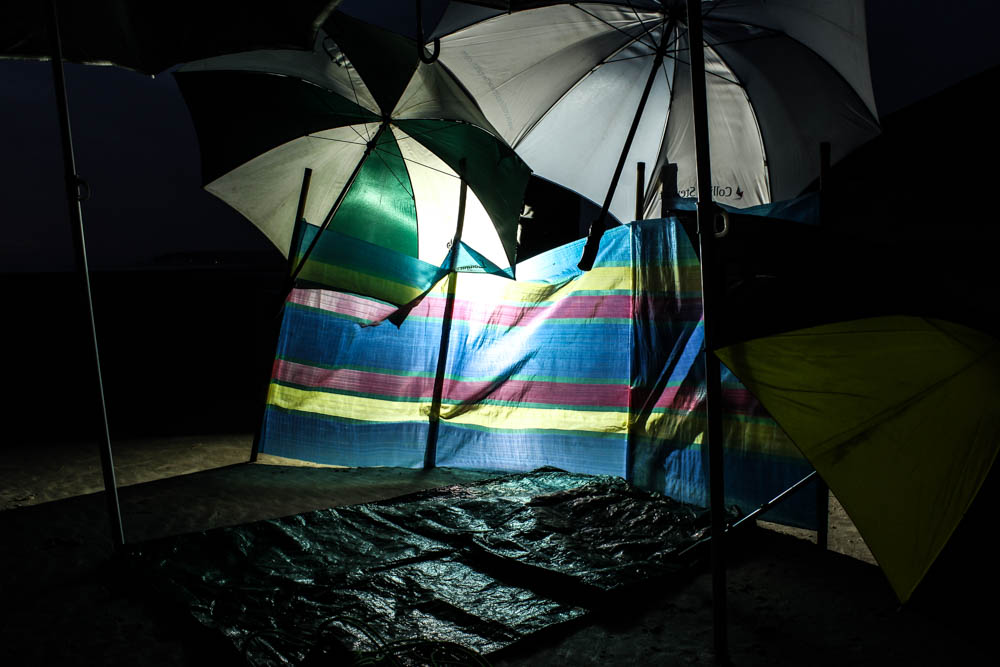
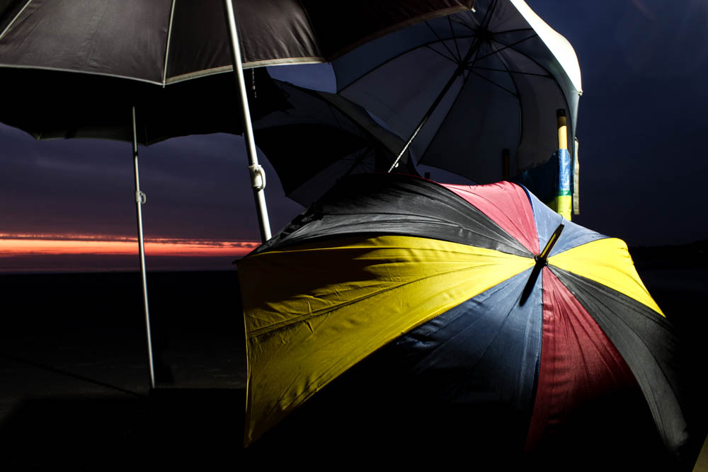
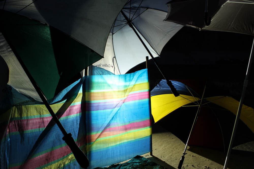
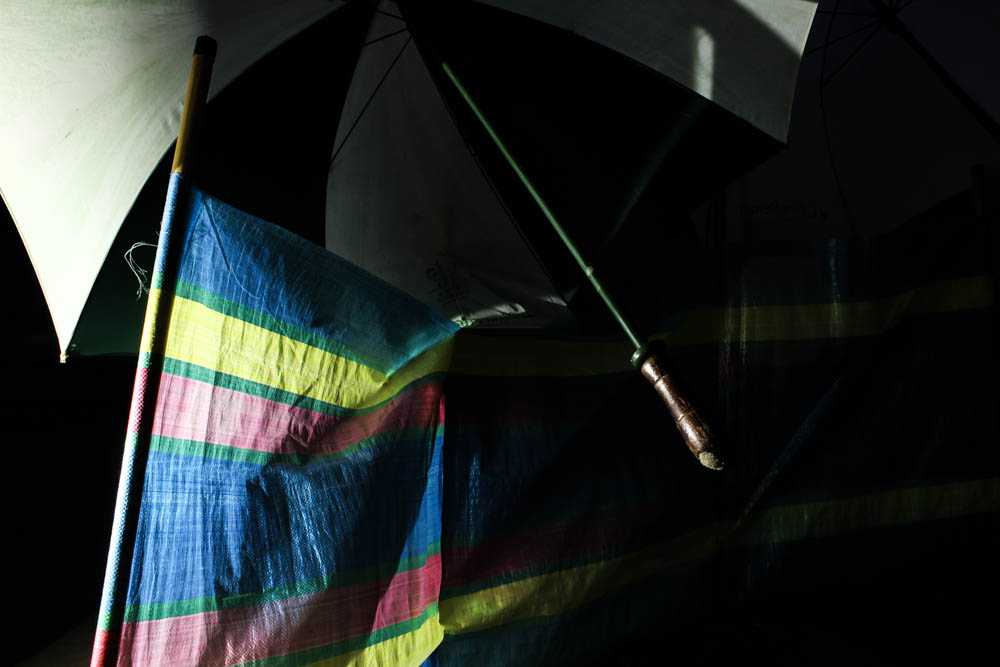
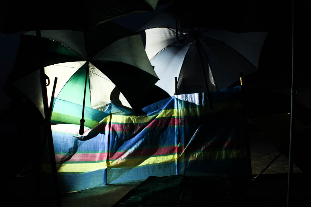
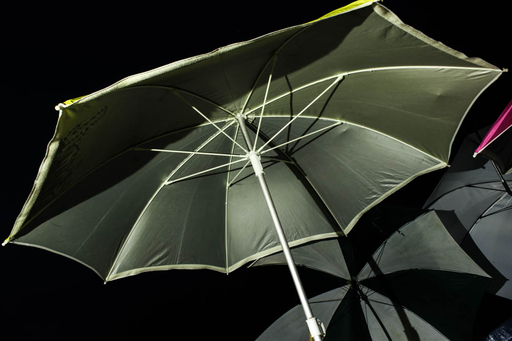
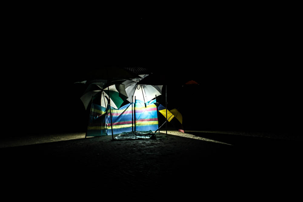
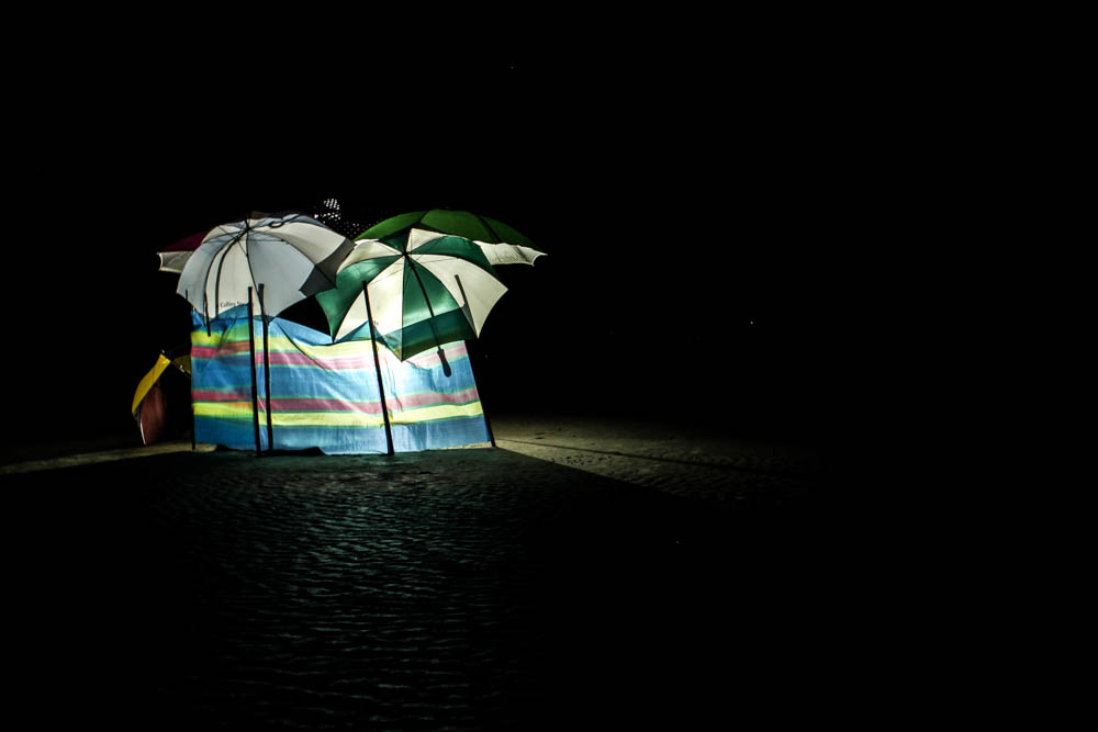
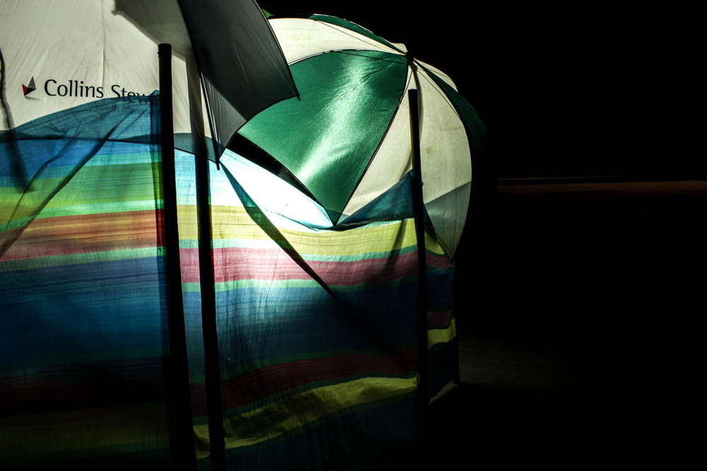
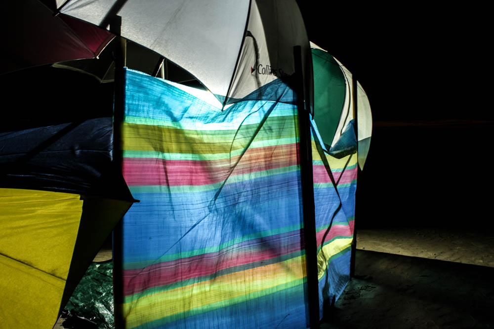
I wasn’t entirely sure how these pictures were going to turn out when i headed to the beach with an industrial light. Overall they actually went so much better then i expected them to! I really loved in Toroptsov’s photographs how the light had a very eerie quality to it and i wasn’t entirely sure i would be able to create the same effect myself in my images. I decided to start with the umbrella den as the easiest and quickest to create in case the idea of photographing the dens at night wasn’t going to come together and really work. I think overall these images achieve exactly the same effect as Toroptsov’s work. The best images are the ones in which the light is behind the material which creates a soft glow to the light which makes it look a lot less industrial.  I photographed the den just as the sun was setting and then as the sky turned from blue to black. I think these images work really well overall.

To capture these images i had to use a very low shutter speed of 2 seconds and a tripod to avoid camera shake.

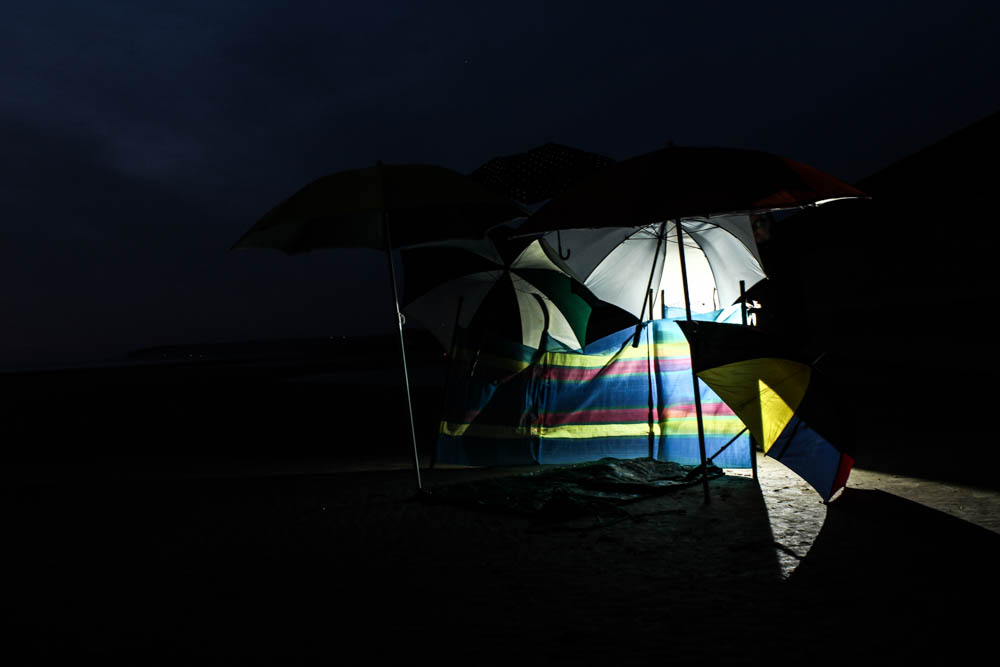
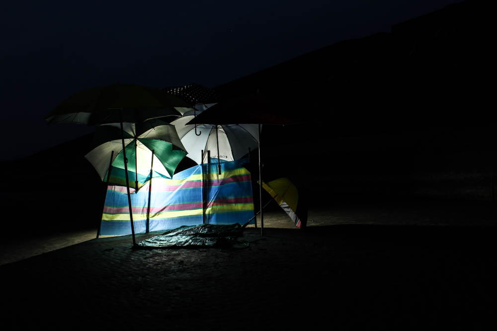
The above and below photographs are both very similar compositions just taken at different times of the night when the light was different. This difference in light interestingly creates completely different impressions of the photographs. I think i prefer the above image as the bluish sky highlights the colours in the umbrellas more. I composed the photographs so as to take the photograph of the den almost straight on. The den fills the entire frame as i was close enough to the den that the front umbrellas are out of the frame as it appears as if i am just walking into the den. I then composed the light to the left of the den so as to use to rule of thirds with the light. The light is the brightest point of the images and therefore your eyes begin at this point and then travel around the rest of the den. I quite like how by having the light source as it is it casts the outer areas of the den in shadow and only illuminates certain elements. This causes like in  Toroptsov’s photographs for your eyes to try and decipher the outer areas of the dens and adds mystery and intrigue. This works even better in the below image as the sky is so dark that the den could be anywhere. The lack of light in the background also causes the light to create straight lines, beams of light outwards from behind the den. I think i also prefer the composition of the above image as it is from slightly further away then the below image.

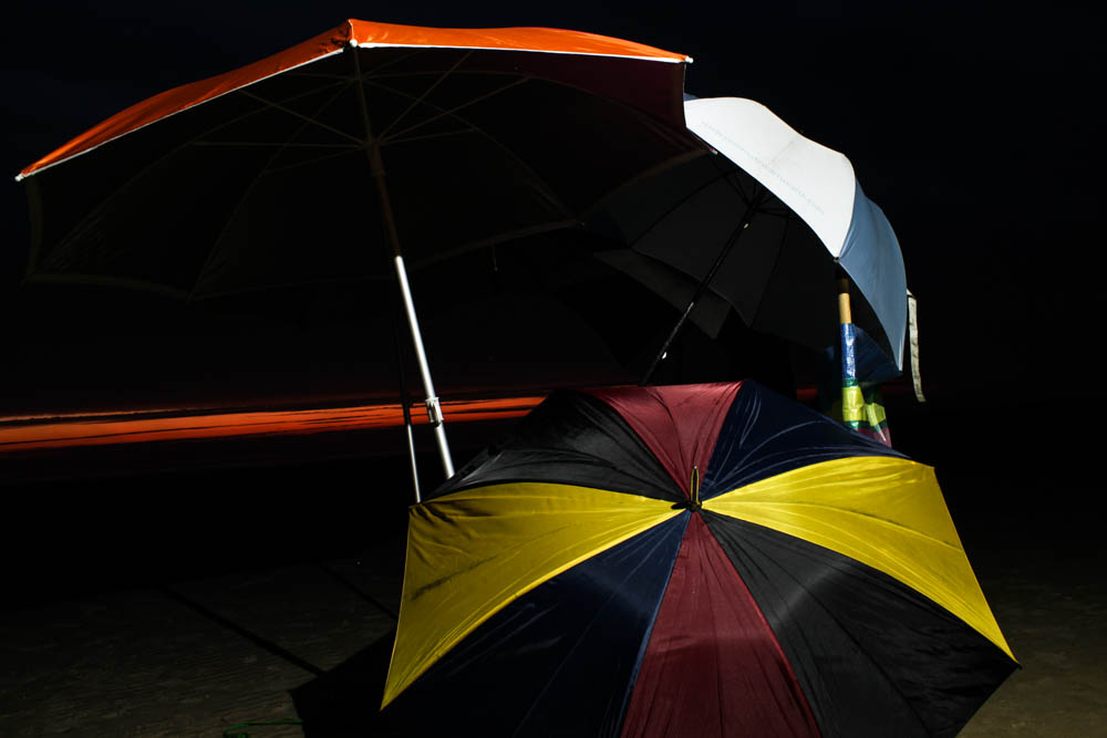
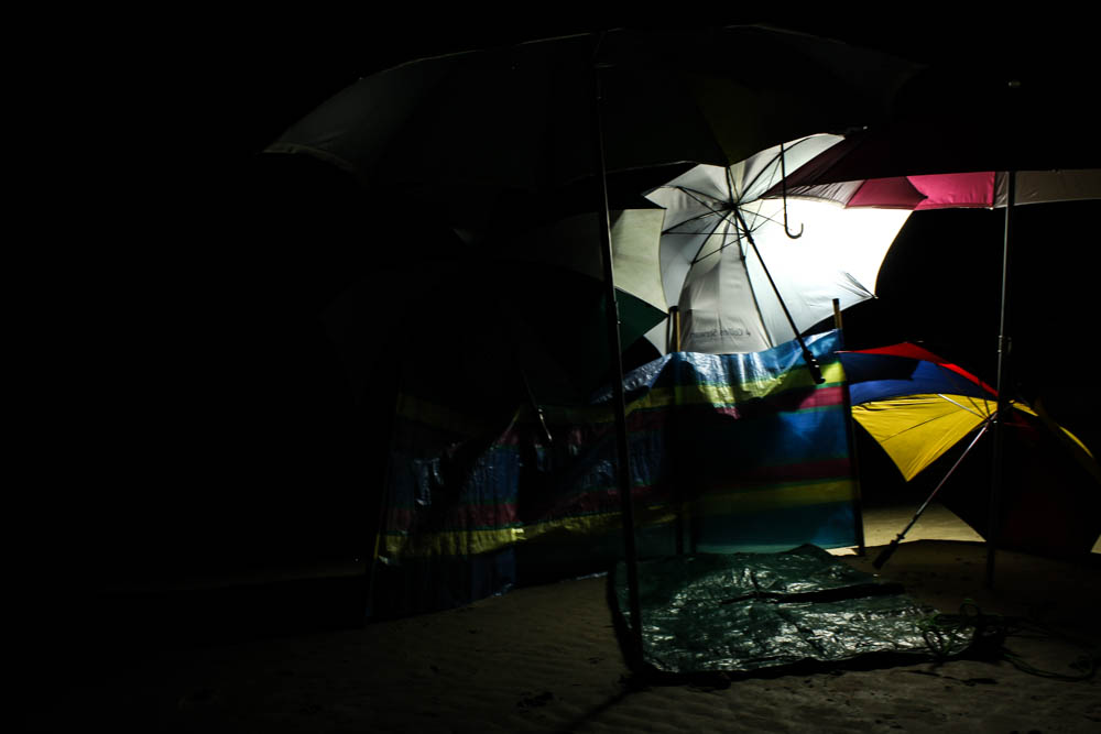
The above image is really interesting as it is one of the few images which i actually liked which had the light shinning directly onto the umbrellas rather then behind them. In most of the pictures the light from behind was softer and therefore more eerie but in this images the reflection of light on the umbrella in the foreground works really well. The light shines directly onto the umbrella in the foreground which is composed according to the rule of thirds to the right hand side of the frame. The light from this harsh bright point right in the center of the umbrella then spread outwards to the rest of the den so you can see the shadows and silhouettes of the rest of the composition. The sky in this image is also fairly early on in the night and so it is a blueish colour and this light in the background i think helps to soften the light in the foreground. I think the angles of the umbrella in the foreground also helps to guide your eyes around the frame as your eyes travel off the umbrella and into the rest of the frame. The beach and sand itself is fairly dark and therefore the umbrellas do stand out vividly against it.

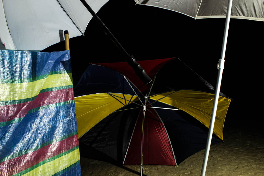
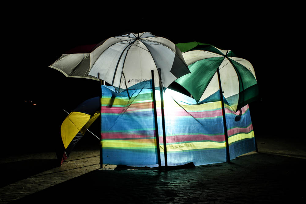
The above photograph is a more abstract composition of the den, with the umbrellas composed to all be at odd angles pointing inwards within the frame. I composed the light source to be dead in the center of the frame shinning right through the windbreak rather then an umbrella. The light source looked brighter in shinning through the windbreak as the material was thinner then the umbrellas. I then haven’t included the entirety of any of the umbrellas, instead including elements of most of them in an abstract manner. I did however think about having my composition so that the handles of all the umbrellas pointed inwards at odd angles to create an interesting arrangement. This was one of the photographs that i took later on so the sky around the umbrellas is really dark and therefore conveys contrasts more between the intense colour of the light and the darkness around it.

The above photograph has exactly the same contrast, it may even be more intense as the light source in this image isn’t directly behind the umbrella.


The above and below photographs are then some of the images i took from further away from the dens so as to capture the whole structure. These ones worked really well the darker it got to have such a vivid contrast between the light behind the dens and the darkness surrounding them. Both images i used the rule of thirds to composed the dens at an angle within the frame. I really like in these mages how your eyes are drawn to the brightest point on the image in the center and then your eyes travel around the composition trying to work out the rest of the structure which is in partial darkness.

The above and below images are ones which were taken with the light shinning directly onto the structure rather then behind. Overall i defiantly prefer the other images for generating images with a softer and more eerie light.

These images are then more photographs which explore taking pictures of the dens at different angles and from a distance. I like how as the night got darker the beams of the light across the sand became more and more prominent, so that in these images the den is radiating light out into its surrounding.

Artist reference – Yury Toroptsov

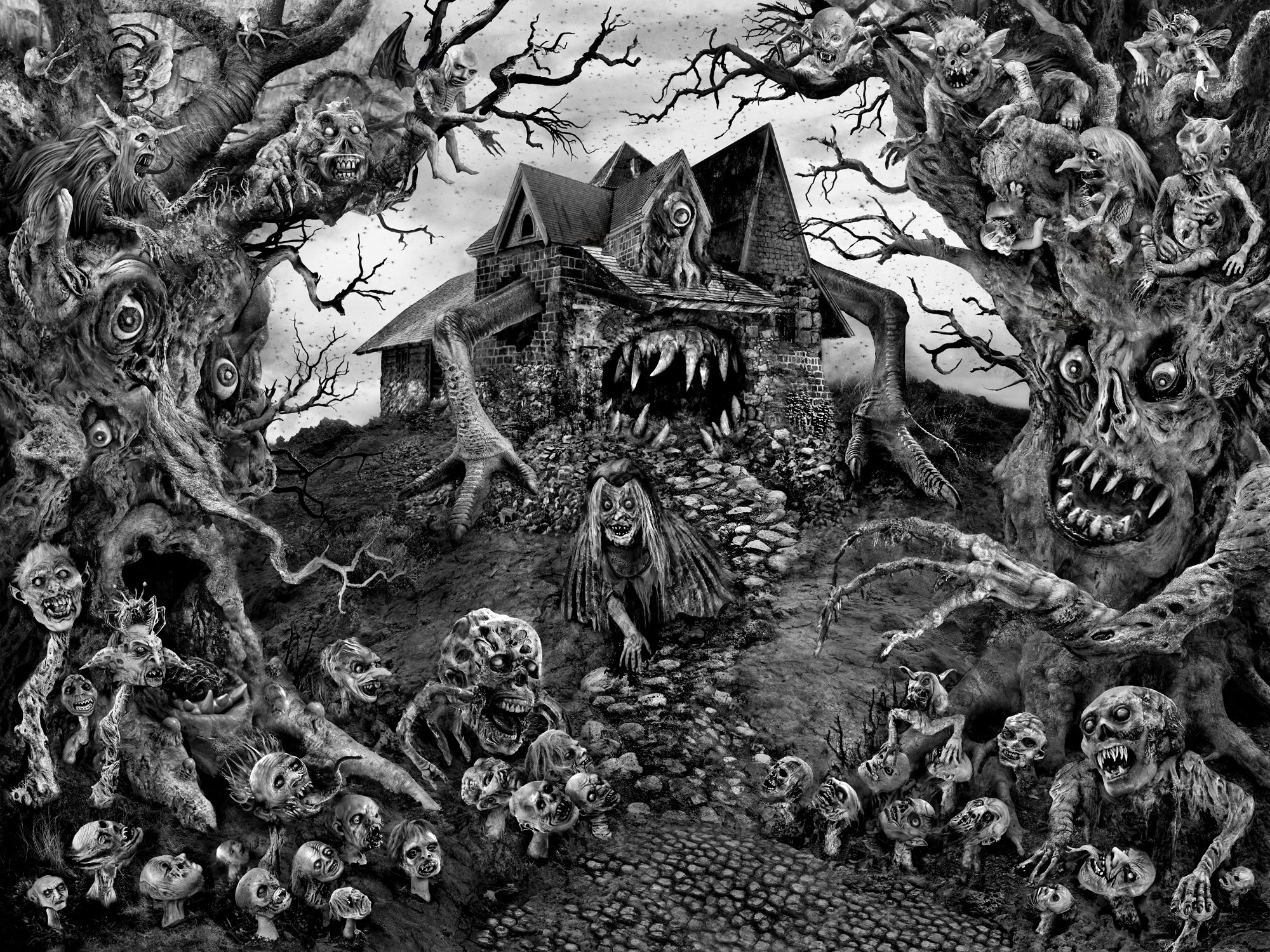
“Night came but the darkness didn’t last long. The eyes of all the skulls on the fence around the house of Baba Yaga began to gleam and the forest became as bright as day”. -From “Vassilissa The Beautiful” Russian fairy tale

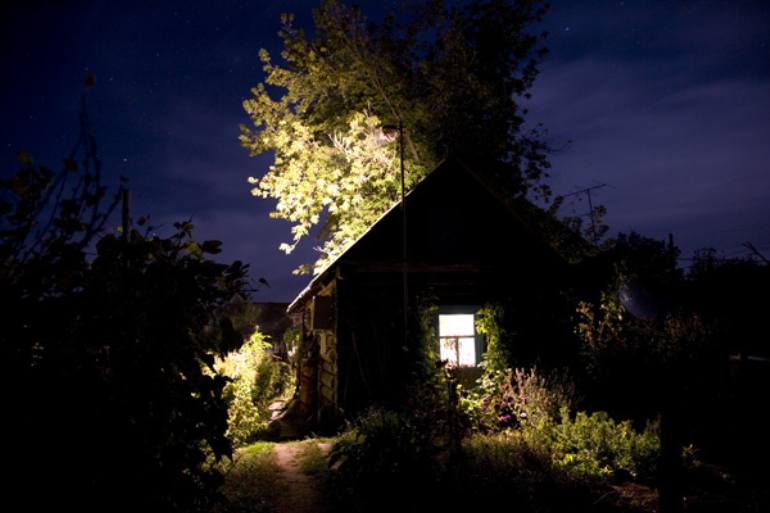
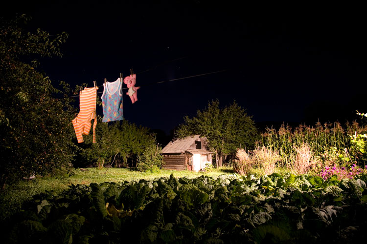
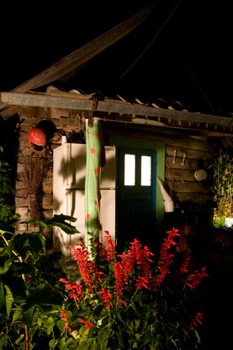
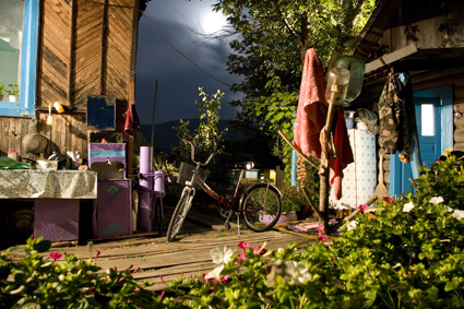
Yury Toropsov was born in 1974 in a rural community near Vladivostok. His project which i’m going to be considering is called  “The House of Baba Yaga” and was his first project to get him noticed within the photographic industry. Toropsov in this project returned to his family home and photographed the daily reality of life while considering the children’s story “Baba Yaga”. His project creates a contrast between photographs of portraits of the family currently living in the house taken during the day to photographs at night of the houses exterior. The result is an eerie set of images which create a very strange impression of the house.  The night time photographs are going to be my main focus though i do really like the concept of having a contrast between day and night photographs in my work. The night time photographs are filled with long shadows from bright sources of light which illuminate elements of the house but not all of it. This contrast between the saturated colours of the house and then the darkness of the shadows creates an otherworldly appeal to the photographs which is also heavily influenced by the association with the Russian fairy tales. Toroptsov’s influence from his native fairy tales is really significant within his work as it influences how we view the photographs and gives an overall atmosphere to the photographs.

The tale of Baba Yaga is very similar to the English tale, Hansel and Gretal.  It is a Slavic tale which centers around an ugly old women who lives in a house surrounded by skeletons of the people she has eaten.  Baba Yaga has been used to instill fear into people for centuries, with various variations of the tale depending on the exact town or country. It has been said however that this tale is symbolism for the fear that people feel towards the elderly. The elderly, particularly older women  have been either despised or feared by some for generations as they signify all things that are undesirable to us. They are ageing, with wrinkles that question vanity and they signify the eventuality of death. In the 1600’s and in many other periods older women were often condemned as witches because of this fear. I feel like Toroptsov is questioning with his photographs a persons perceived reality of people; almost suggesting how people are not always as they seem and could indeed be hiding something like witchcraft. He takes these photographs of people who look perfectly normal but then juxtaposes them besides this eeire photographs he takes of their house at night which suggests a hidden layer to the people. By only photographing the house from outside at night is suggests something is going on, that there is something that we as a viewer are missing about these people by simply considering just their portraits. The link to the Baba Yaga tale influences us to think along more sinister routes though  Baba Yaga also has a warmer side to her and is believed to help lost travelers and those who seek her wisdom and advice. She  seems to represent the dichotomies present in humans, the good and the evil, real and the imagined co-existing. I think that she symbolizes both is really significant in considering Toroptsov’s project as he is seemingly presenting us with both the real and the imagined but then causing us to question both in relation to each other. The real photographs of the people are questioned by us as we view the creepy night time photographs and believe that there is more to the story.

Toroptsov’s photographs explore very cleverly a use of light that creates an ethereal atmosphere to his images. It is his use of light as well as his juxtaposition that i want to consider closely. The cottage he has photographed seems very far removed from the modern world with the use of lighting as the lighting all appears very natural. The light from the moon is very prominent in lighting the photographs as well as an intense bright light from within the house which seeps into the surroundings. Toroptsov in creating his photographs so as to be able to capture all the tiny bits of light used 30 second exposures. In creating some of my dens i want to take influence from Toroptsov and his work in having a juxtaposition between night and day. I want to photograph my dens at night time to show a completely different side to them. I think it will be interesting to consider how in the day time dens appear to be a place of safety and warmth and how these structures might look very different and many slightly sinister in a different light. I could then also have the people photographs i am planning on taking contrasting like Toroptsov’s with the night time dens. Like Toroptsov i am going to use very long exposures to create my photographs and a tripod. I will be experimenting with using both natural lighting of the moon to illuminate the dens but i think i will probably need to use artificial light in many locations due to  their remote locations. I will therefore also be experimenting with having a light inside the den shinning out or having light shining from behind and in front onto the den to see which effects work best. I think i am also going to be exploring how nature and man made objects come together to create structures which is similar to his work. I also really want to explore the influence that stories can have over my photographs of dens, like the influence of Baba Yaga.


IMAGE ANALYSIS


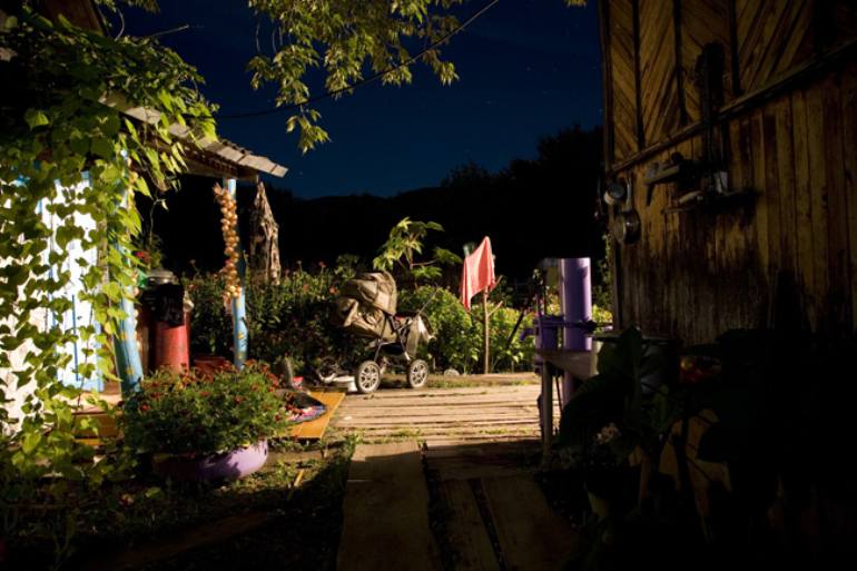
As light is the key element of Toroptsov’s photographs it is important to begin by considering how he has used it and what effect it creates. Within the frame below the foreground is in shadow, as well as the far background, there being a small section in the center which is illuminated. The light in the photograph spills into the frame from around the corner of the building and from a source that we can not see. The brightest point of the photograph is to the left hand side of the frame where this light directly shines onto a reflective material of the building. Your eyes therefore work their way from this point furthest from the light source at the left hand side of the frame to the right side of the frame but intrigue is created by us not being able to see where the light source is coming from.  The photograph is essentially divided into three segments of light, the photograph having been taken in the blue hour after the sun has set which gives the far backgrounds darkness more depth and distinction between the trees and the sky. The items in the immediate foreground are interesting because they are cast in such dark shadows that they are only silhouettes and therefore exactly what the objects are is questionable. This creates further intrigue in the images. The photograph then also has another dimension apart from the interesting light which is how nature and man-made objects are merging. Green plants are in all elements of the frame. growing over the objects and buildings. This creates even more of an ethereal sense to the photograph as it causes us to question the context to the photograph further and the location. The interesting light does create an atmosphere but then the random objects and over grown nature begins to add a story the photograph and raises questions. The pram right in the dead center of the frame is the most significant element in creating a story as it suggest a family, linking perfectly to how this is a family house. The pram becomes the center element to the photograph as we question what has happened to this family, where they are and the absence of people becomes even more noticeable. All all of Toroptsov’s photographs the lack of people is so striking as objects are left seemingly abandoned as if people are going to return to use them. This more than anything links with the Baba Yaga tale and we question if something sinister has happened to these people due to the association. Overall i think the most significant part of the photograph is how the foreground lacks light but we can not see the light source which leads you into noticing the other elements about the photograph.


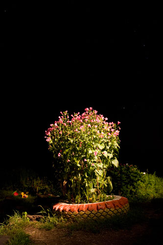
The above photograph is perhaps the simplest of all of Toroptsov’s photographs as it doesn’t feature so much of the household clutter which dominants in the other photographs. This photograph is taken in very different light to the above photograph. The above photograph being taken in the blue hour and this photograph having been taken when the sky is black. The darkness of the sky in this photograph is what creates the eerie quality to the image. The light in the photograph shines directly onto the plant in the center of the frame from the right hand side, interestingly with shadows in the foreground and background. The light shines directly and pretty much only onto the plant. This causes the plant to be surrounded by the black sky and shadows in the foreground, it therefore standing out vividly within the frame. The plant is the only focus in the image and so has been composed right in the center. In this photograph we once again have the coming together of man made and natural objects though in this photograph it appears more intentional.  The plant has been planted within a tire and grown into a patch of flowers. Due to the intentionalality of this the photograph doesn’t have the same quality as the above photographs in raising questions. I think this photograph works well as an accompanying photograph, rather than as an explanation Toroptsov’s whole project. It doesn’t have the same impact as the other photographs as it singles in so exclusively on a small element of  the house rather than showing the bigger picture.


Layering day time dens

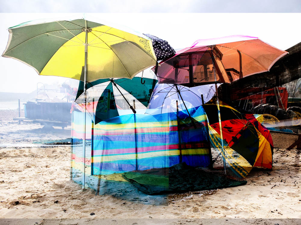
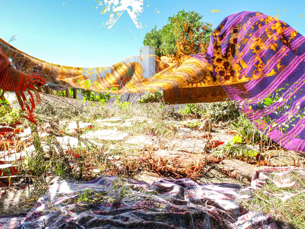
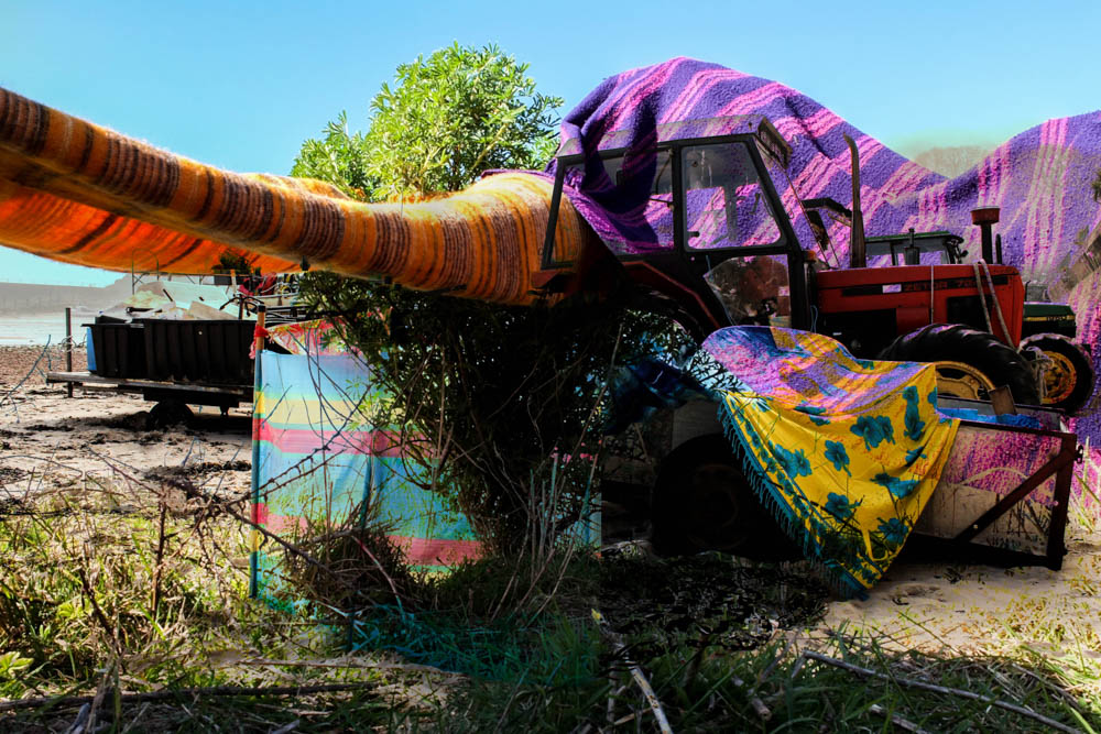
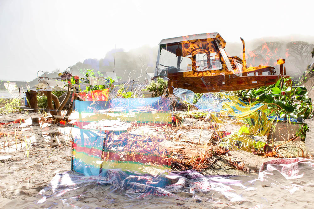
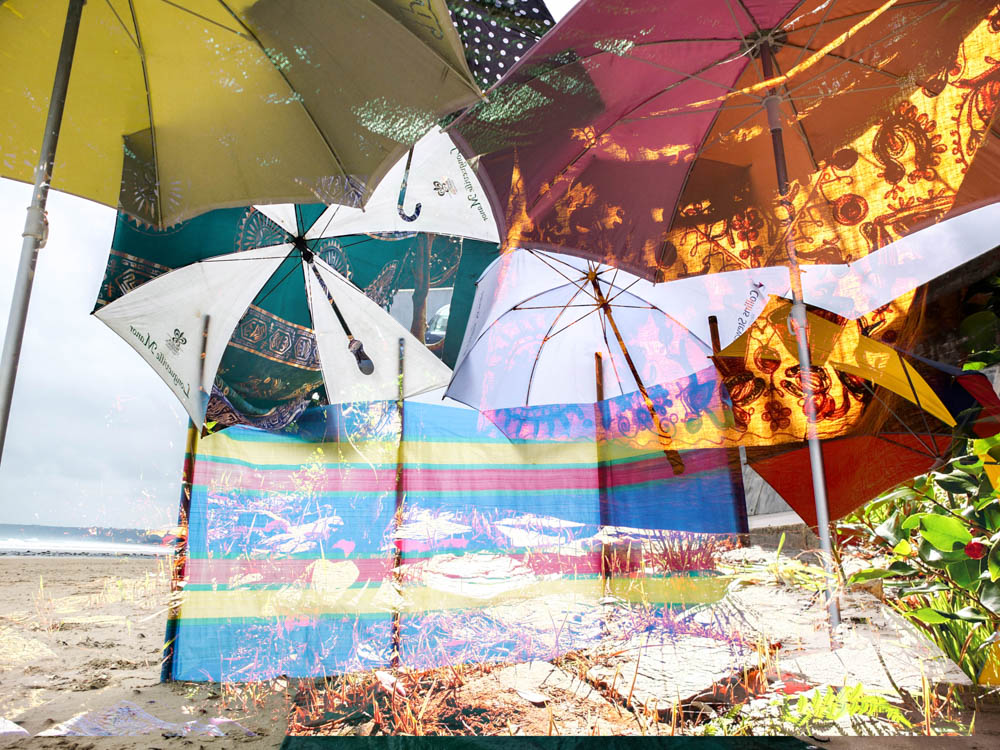
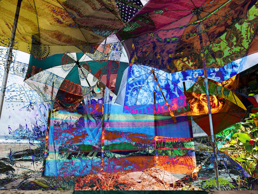
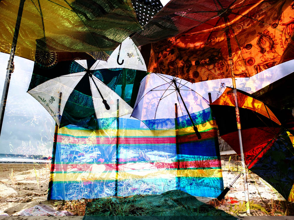
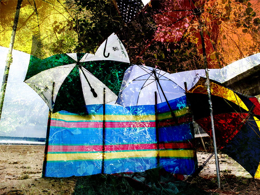
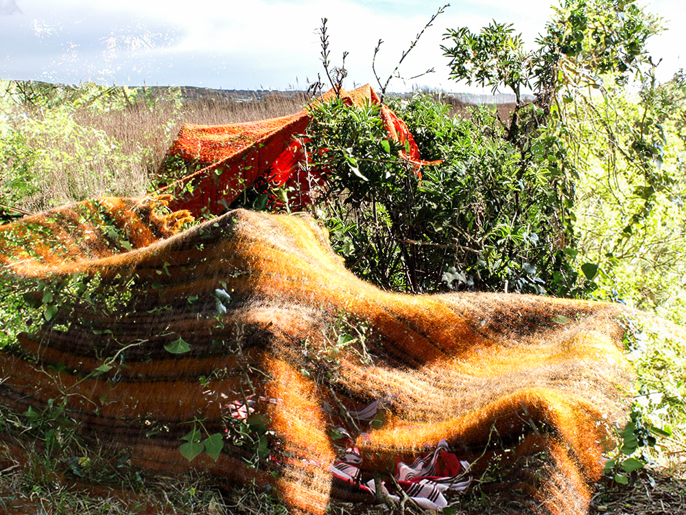
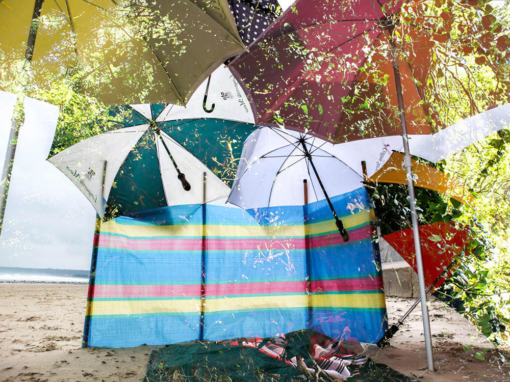
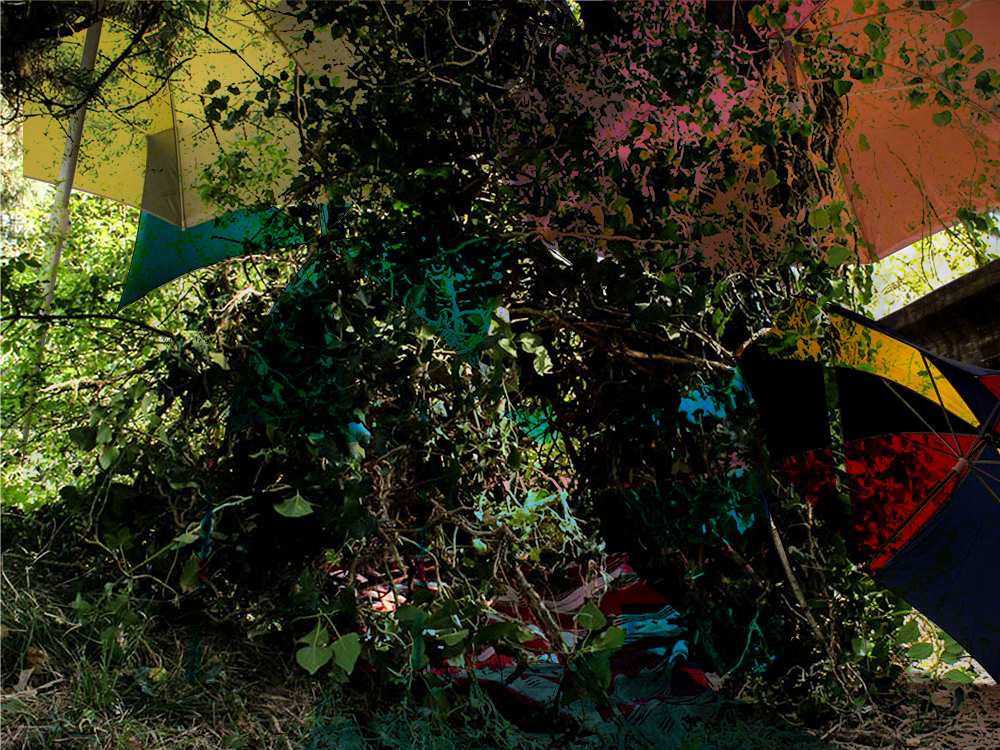
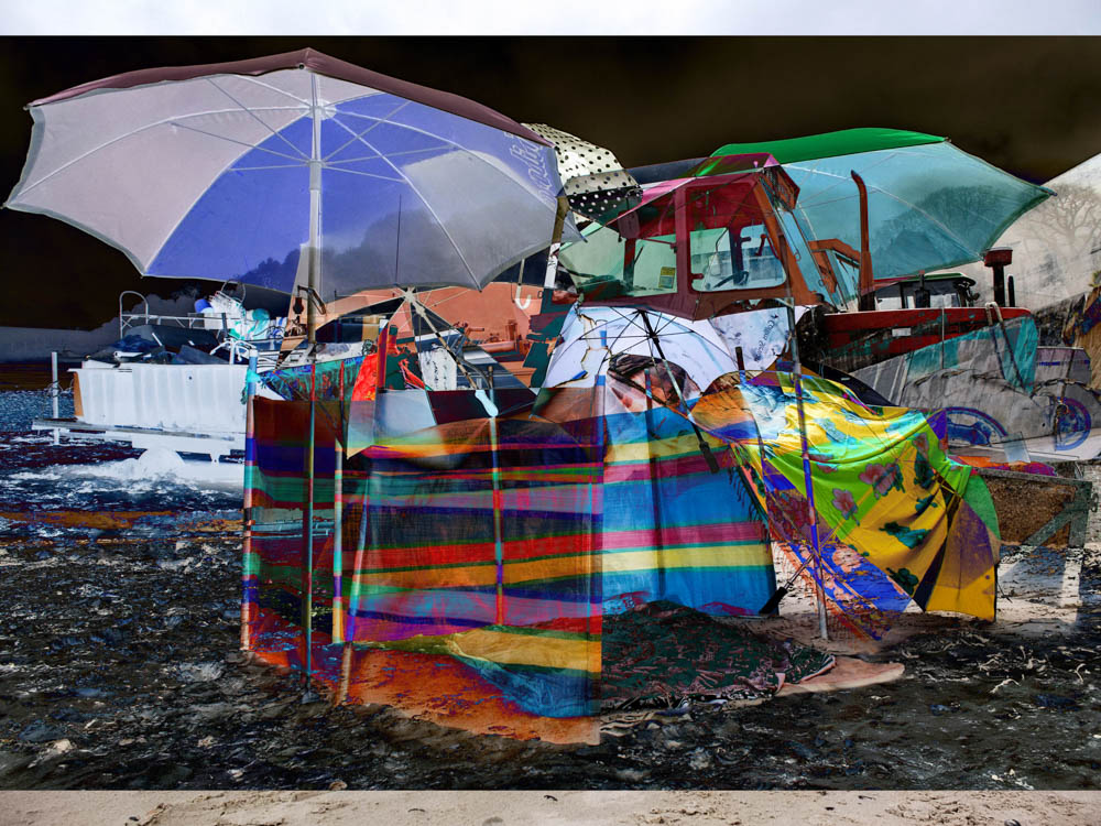
Once i had photographed all my day time dens i wanted to do a quick experimentation in which i layered different dens over each other. This was in consideration to as a child when i would build dens some games would role into another new den but same game and therefore the ideas of the dens would overlap. It also shows how i would borrow things which worked well with one den and bring them into another den, they weren’t completely separate ideas and concepts. I think some of this photographs have worked a lot better then other as some images are more compatible with one another but overall i think it was an interesting experimentation. 

Wood Den shoot

After considering the principles of organic architecture and how animals build dens i really wanted to incorporate this into this woodland den. Alongside the beach dens this type of den was the most common type of den we would build as children as they were the most fun to create. There is a whole program of education called “forest schooling” which my mum has always bee a massive advocate for which encourages children to interact with the environment to build dens ect. When she asks the children she teaches at school they all say that this is the favourite element of school for them as children really enjoy getting dirty and engaging with their environment. I have to say making this den was by far the most fun. I think its probably got something to do with how we have an innate part of us which enjoys foraging as we used to for food in the past. When we were kids i also remember how these dens the whole process could be turned into the game, the exploring the area and finding the best spot to build the den, the gathering of branches and then the building of the structure.

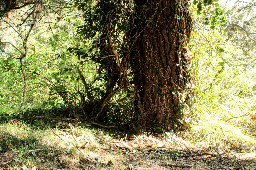
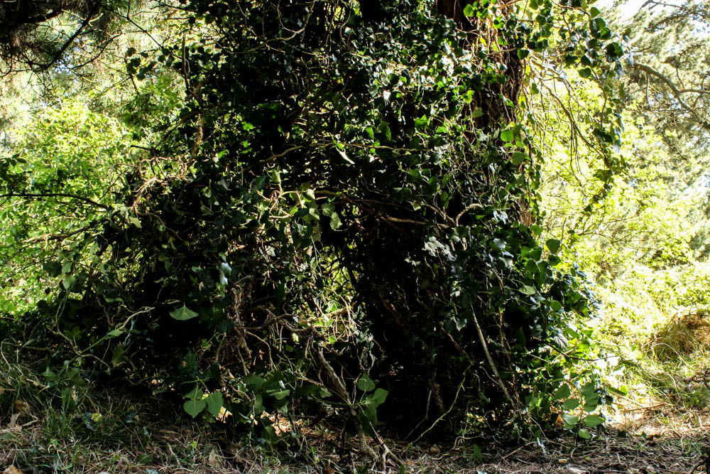
I choose to do this photo shoot on quite a bright sunny day as i considered that under the trees might be quite dark and i wanted my pictures to have light shinning through the trees. I spent a really long time deciding where to build this den, considering all the principles of organic architecture and where the best starting point would therefore be. I choose this spot as all the ivy meant i would be able to wind all the branches into it to create my structure and it also had a good strong solid base of the tree to lean the structure off. This compostion also included quite a lot of light and so the woods doesn’t look like a dark, dank environment.

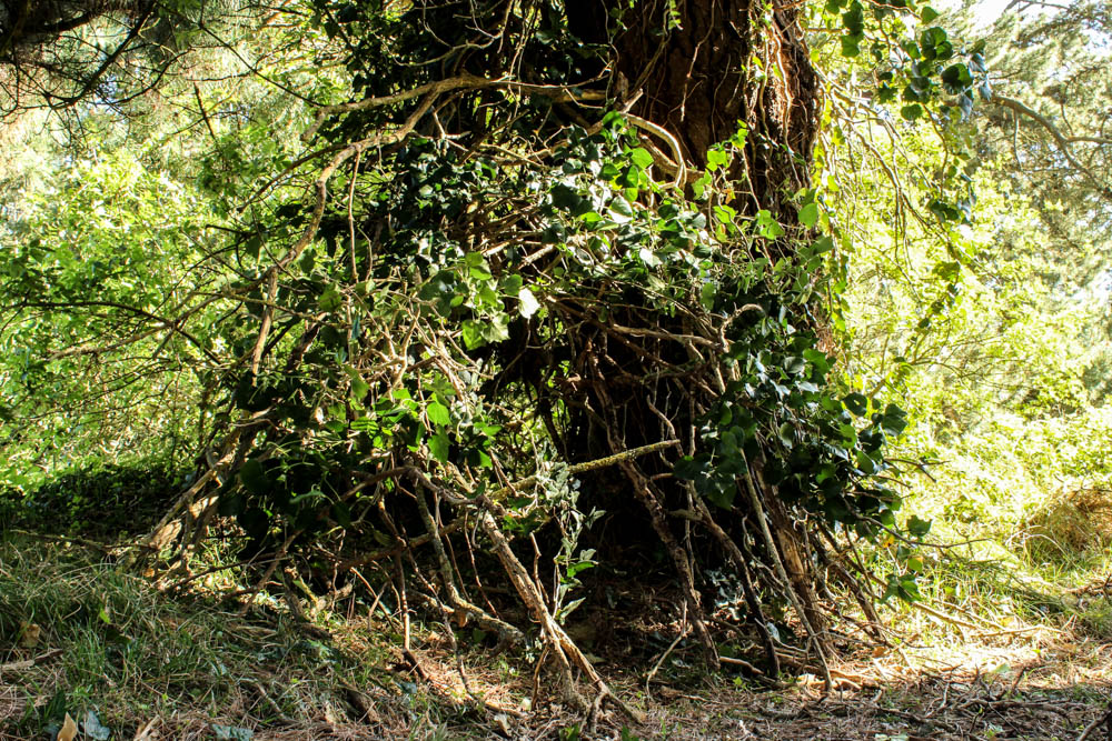
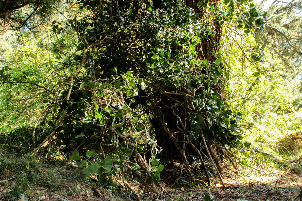
These process photographs are defiantly the best of all my photographs as you can really see how the structure develops and becomes more and more a part of the environment. As the den develops its disappears more and more into the environment of its surroundings.  I think this is really amazing to see in contrast to my other dens which stood out against the surroundings.

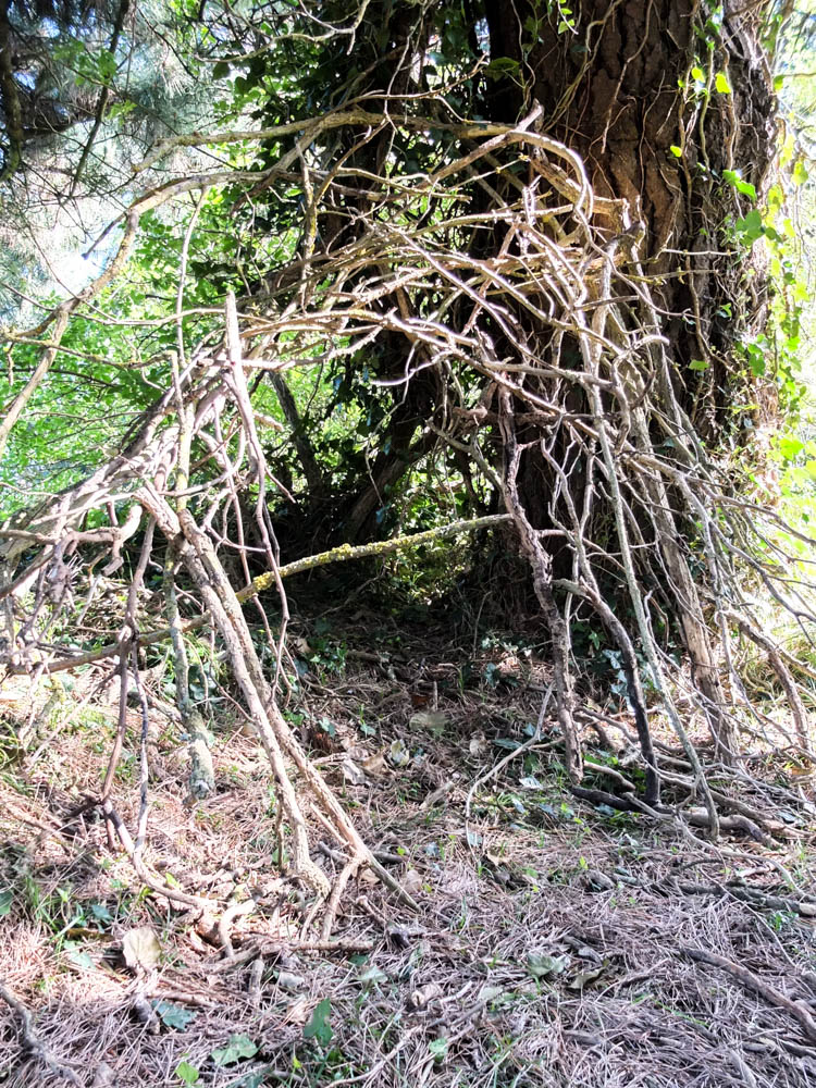
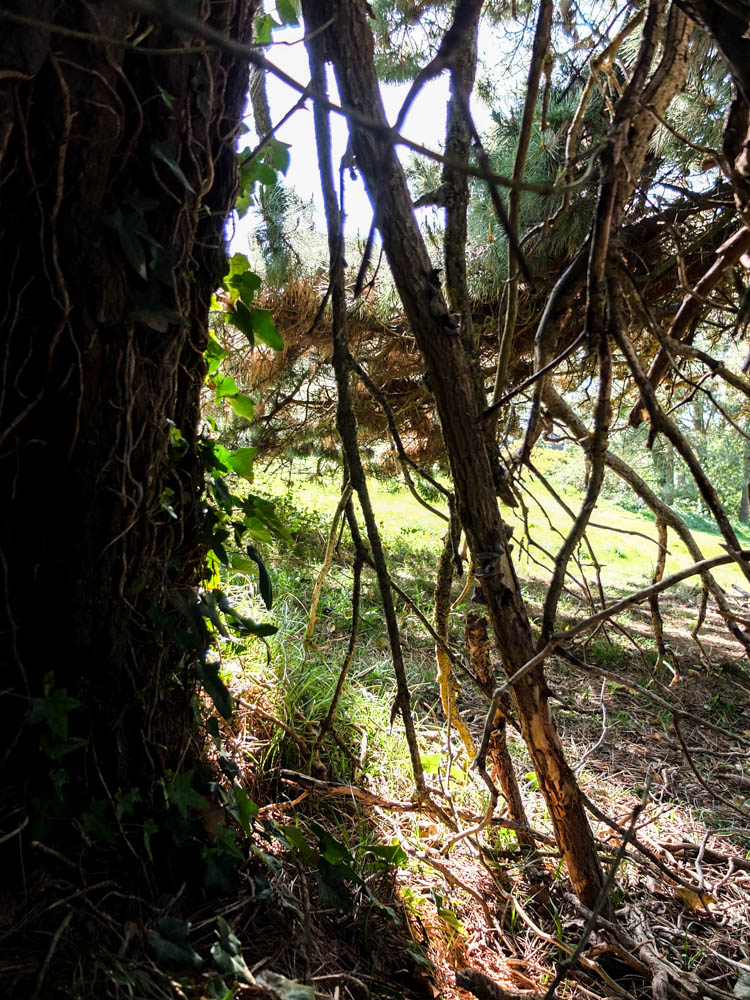
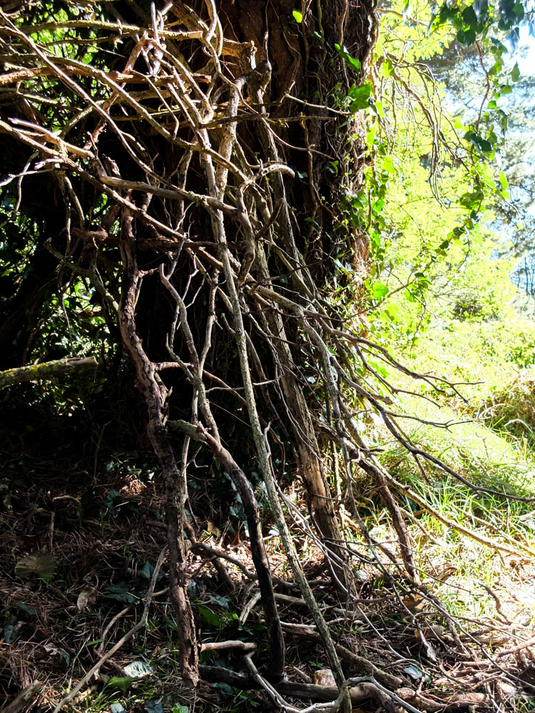
I really love the skeleton structure of branches that i created underneath all the ivy and therefore for this shoot i decided to take photographs which detailed the process more explicitly. The above photograph was an early on photograph of the structure. I took this image as i wanted to convey how the branches of the structure all fit together to create a criss cross in which ivy can be woven through. I took the photograph from a fairly low angle so that the branches appear as if they are reaching  outwards from where they begin. I think there is a slightly sinister nature to these bare structures as the den does look naked and almost quite witchy with all the gnarled branches. I deliberately only used branches which had already broken off trees and therefore the structure is made up of den wood which i think you can tell from these images. The majority of the branches are thick pieces of dead ivy which is why they are all interesting shapes and patterns. I think the light in the photograph above further adds to this feel as it is a bright white light, the picture slightly over exposed which gives the branches more of a bleached look which again is suggestive of bones. I composed the image so that the entrance of the den was dead in the center of the frame, The lightest point of the images being the branches surrounding the den and the spiral of their pattern leading you into the center of the den.

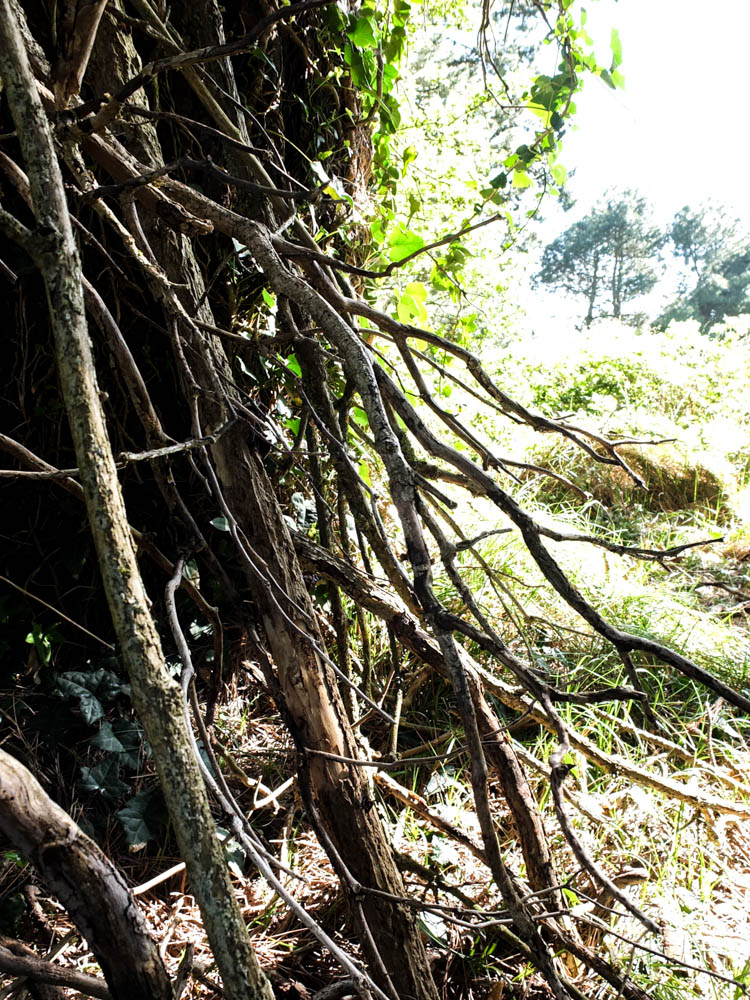
The above and below pictures are slightly more abstract compositions of the dens structure. The above images have a lot less light in them and the branches become more like silhouettes. The light source comes from the background, behind the branches and therefore the structure of the den stands out against them. I quite like the images as again the patterns of the branches gives the appearance that the branches are reaching outwards.

The below photograph is a composition from lying on the floor of the den and looking upwards. I really like this image as this is apparent from the sky an light which is behind the branches. The branches become an elaborate pattern in which the colour of the sky and the green of some leaves is behind. The light source from the sky is fairly bright, almost causing camera glare in some parts of the frame. This bleeding of the light past the branches into the den actually works quite well in suggesting a less sinister mood then the other photographs. Your eyes begin at the bottom of the frame where the light is the most intense brightness and then follow the twists and turns in the branches to the top of the frame.  I think this photograph is more like a “magical” den rather then a sinister seeming den. I think it might be quite good to have the two interpretations juxtaposed together.

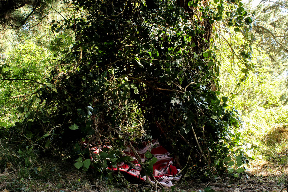
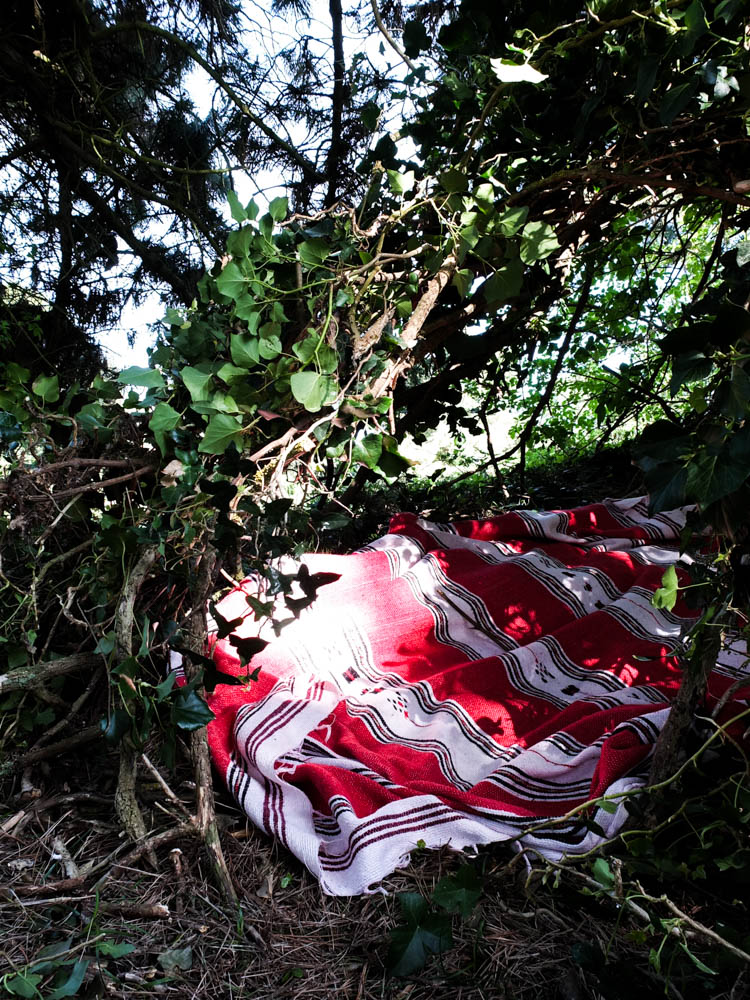
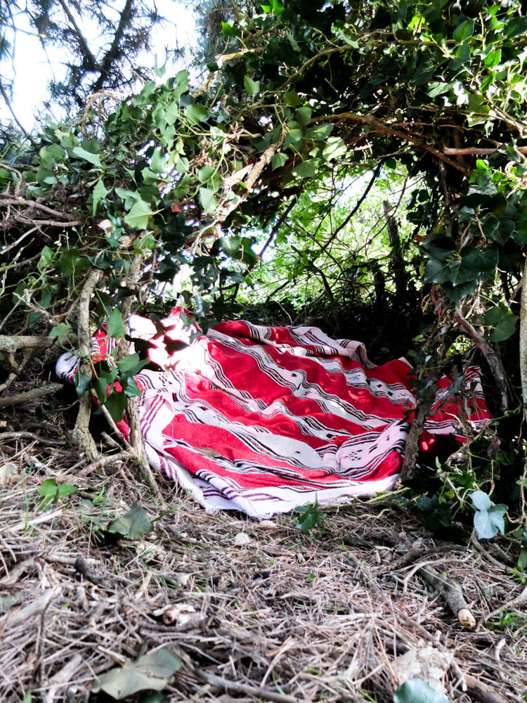
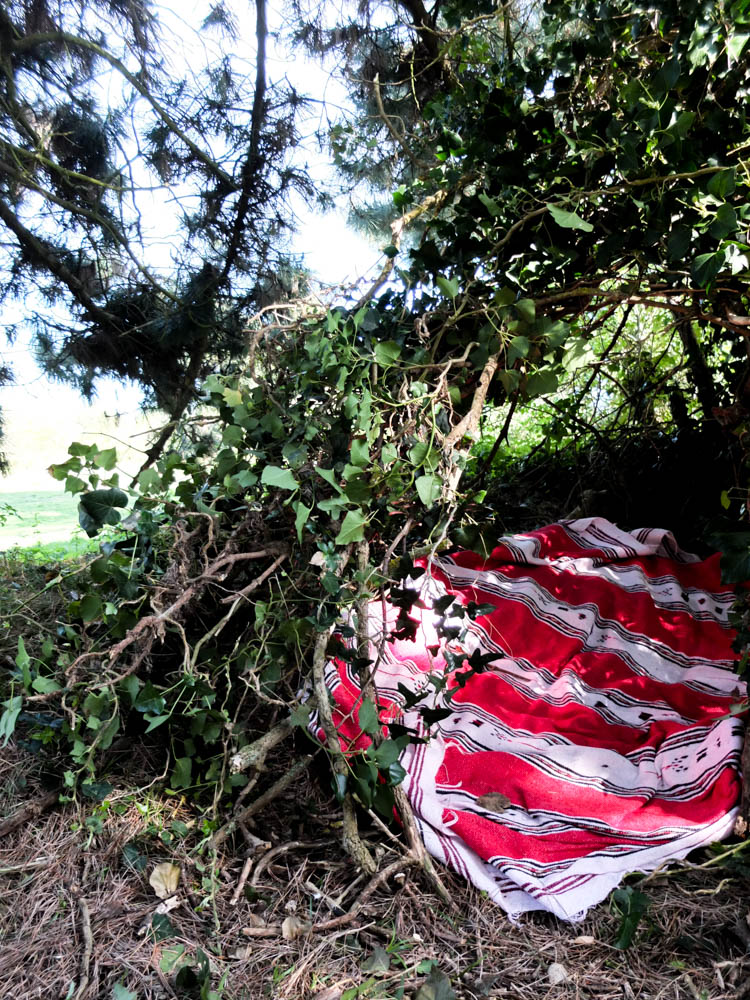
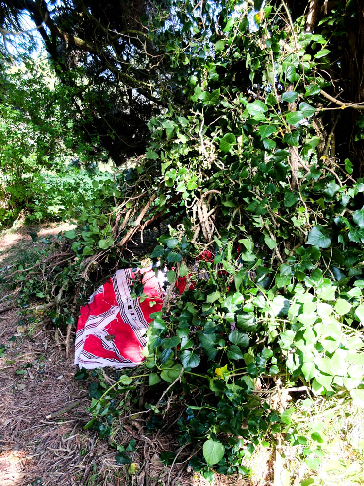
The above and below photographs show the final completed den. I used clashing colours in the den of the bright red blanket and the green of the forest and leaves as i wanted my den to partially stand out within the photographs. Once i added the green leaves to the wooded structure it almost completely disappeared into its surrounding. By having the bright red blanket its almost anchors the den in the photograph. The above and below photographs are just slightly different compositions of the same concept, having the light hitting the blanket and reflecting off it as well as a section of the dens entrance. The light in both photographs is a bright intense white, both reflecting off the den in the foreground and also shining through the trees in the background. Both photographs are composed to focus on one side of the den and the entrance, rather then the whole entrance. The dark shadows in the frame however over the second half of the blanket is very suggestive of  the rest of the den surrounding this point depicted in the photograph. I also struggled in images due to the busy nature of all the leaves and branches to get a real focal point which the blanket also helped with. It broke up all the very earthy colours of the frame.

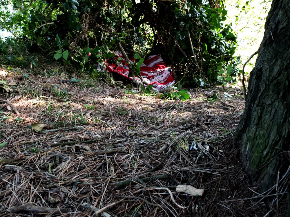
Above is my favourite photograph of the den as a whole. I composed the frame using the rule of thirds so as to have the entrance of the den to the left side of the frame. This then allowed me to include more of the environment around the den and the bright source of light in the background. In this composition the den looks as if it is apart of the tree itself and growing from its structure which i quite like. The bright light of the background helps to create a boundary of where the den ends which you struggle to see in some other photographs due to the den blending into the surroundings. The red blanket once again also helps to distinguish a depth inside the den which is hard to tell with all the leaves and earthy colours.

Below is a slightly different composition going on the same idea of having only part of the den in the frame. It doesn’t however work as well as the above composition simply because the light in the background isn’t as vibrant in defining the dens shape.