Category Archives: Uncategorized

Filters

Author:
Category:

My Final Prints

How I will present my Final Prints; 

I have chosen 5 photographs for my final prints. I’m going to mount them onto foam board separately, as I’ve designed a book which already puts them together as a story, so for my prints I want them to represent their own journey. The reason for presenting them on foam board is because I feel the images are too contemporary to have a border around them. I have experimented by choosing both landscape and portrait layouts for my final prints.

Final Prints; 

Image 1 – 

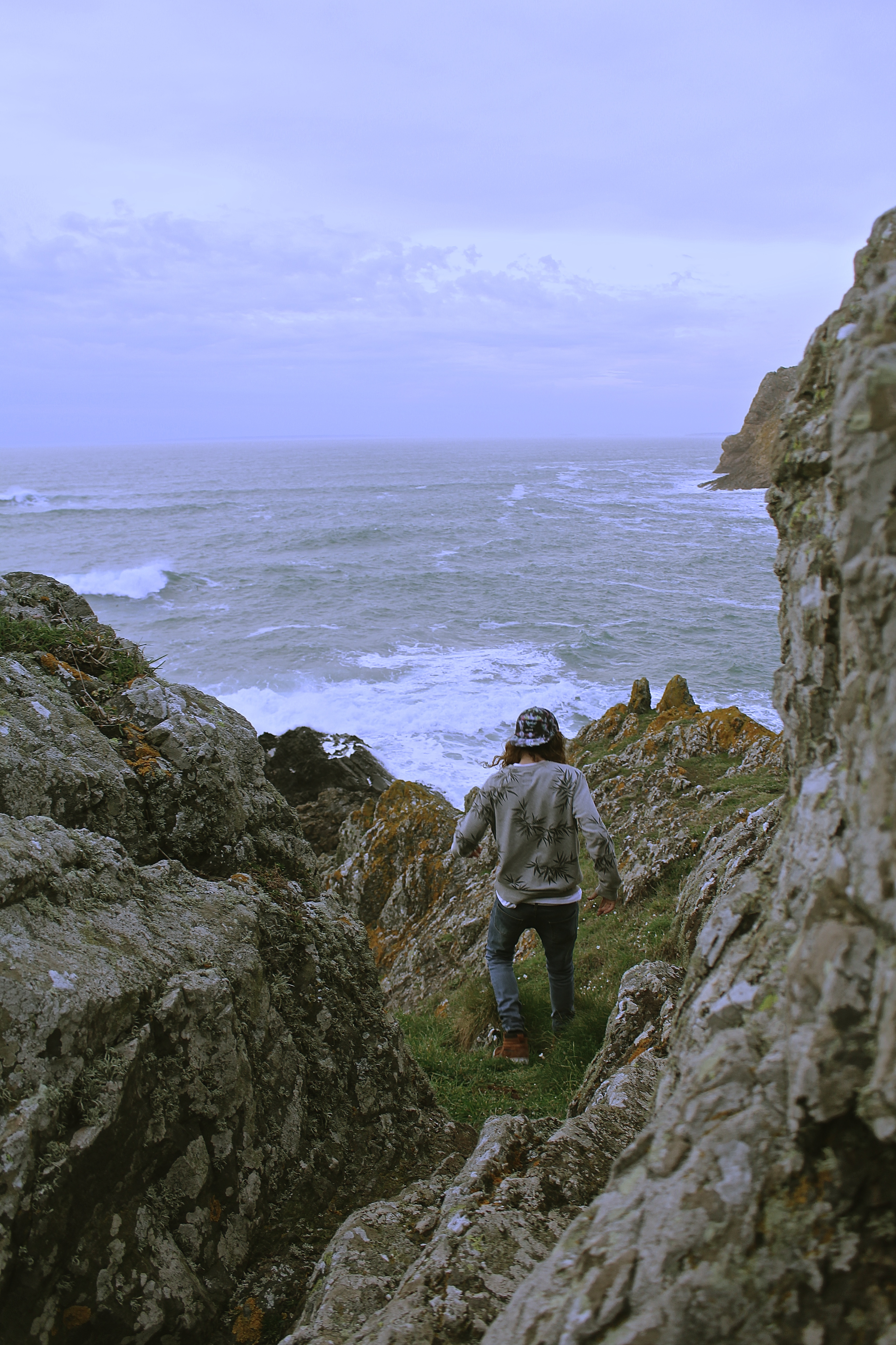
I love the image below, because the colour scheme works perfectly, his grey jumper with the grey stones and the brown shoes and hair combined with the brown seaweed. I also like how the image is shot from a birds eye view.

Image 2 –

The reason I selected the image below for printing, is because it’s very similar to one of the images I’ve selected for my book, except this has a portrait layout. This one is also framed by the rocks within the image, unlike the one chosen for my book. I would have put this one in my book although they were too similar for them both to be chosen. All my other prints I have selected have also been selected for my book as well, so I wanted something different.

Image 3 – 

I chosen the image below for my final print as it has a lot of energy and movement in it, which I wanted to represent in my photographs. I also like the surrounding the model is in and how it has a cinematic effect.

Image 4 –

The reason for choosing this image, is because I didn’t just want my prints to be just of individual models, I wanted to show the group journey. I love the natural lighting of this image, and the facial expressions of the model.

Image 5 – 

I chose the image below as I like how it looks like its been taken in a fashion photography style. Also, the image shows my use of experimentation with focal point, as the girls legs are more in focus than her face, which actually works well. When printed this is more obvious than on the screen of the computer.

Environment – Final Image Layout

When contemplating an idea for the presentation of my final photographs, I was initially unsure of what to do. Though after some thought I decided upon an idea which I felt would justify my images the best and my importantly my project. Below documents the process of this.

This collection of images feature my final photographs that will be presented for my exam project. These images alone, are not all necessarily my favourites or even my strongest in my opinion, but I wish to present them in such a way that they do become my strongest set of images.

My intentions are to present images in sets of two, I have a collection of 10 images, which will be made into 5 by pairing the photographs in Photoshop. Images of similar aesthetic qualities have been chosen to be paired together, a standard portrait is always featured, alongside a more metaphorical image, that conveys a more poetic feel. Ultimately, I am attempting to juxtapose my images, with others that may make the viewer question the character.

Examples of my final works are displayed below. These images will be printed into A3, where they will then be mounted onto white card, which will help to highlight the heavy contrast within the images.

Theo Gosselin Book ‘Sans limites’ compared to Corinne Day’s ‘Photo Diary’

For my final outcome for the project ‘Environments’, I’m producing a book, this is because all my photographs can finally come together and tell a story.  Therefore when designing my layout I compared Theo Gosselins Book ‘Sans limites’ to Corinne Day’s ‘Photo Diary’. The reason for selecting these two photographers is because they were both big influences to my photographs, and there photo books have a lot of similarities and differences which are good for comparing when it comes to designing my book.

Theo Gosselin – Sans Limites; 

Theo Gosselin has been my main source of inspiration throughout this project, therefore I have looked at his book ‘Sans Limites’ to get ideas and inspiration for the layout of my book.

The video below shows a flick-through of Theo Gosselins work in his book Sans Limites;

Gosselin has purposely chose not to put the title on the front cover. Also, he’s intentionally chosen a cover which is an oil spill, which is linked with the fact he’s on a road trip. Therefore using an image which makes you think, because before opening the book one doesn’t know he’s on a road trip, and therefore capturing the readers attention before even opening the book.

When reading the book ‘Sans Limites’ there is 3 double spread pages before the page which states the title, and Theo Gosselin, the photographers name. I believe this makes it more interesting as normally that’s the immediate page you see when opening a photo-book. Alternatively, Gosselin captures the readers attention and allows them to think for themselves what the book is going to be about, rather than just reading the title.

After analyzing Theos book I have noticed the vast majority of his pages are double-spreads. I think this is because there’s so many aspects to his photographs which he doesn’t wants the reader to miss, which the viewer may have done if he put them on a smaller scale.

On the other hand, when he doesn’t do double page spreads he tends to have pictures which have white borders around them, and tend to have a completely blank page opposite. This is probably because he doesn’t want the viewer to get distracted and not completely focused on one.

When I saw this double page spread in Gosselins book, I was quite surprised, as he’s put the models face directly in the binding of the book. Personally I wouldn’t do this in my own layout, as it takes away from one of the main aspects of the photograph, just because of the way he’s presented the photo. In my opinion, I would still do a double page spread but with a white border as that way you can still take in the photograph but the binding isn’t as distracting. Although, this doesn’t work with Gosselins work as he has the theme of using the full double page spread or having it very plain, there’s no in-between. I think that this image has to many aspects which are aesthetically pleasing to put it onto a smaller layout.

After scrutinizing Theo Gosselins book ‘Sans Limites’, I have noticed my photo-book should have some sort of layout and pattern, which how I present double page spreads against my smaller scale images. I’ve also thought about how I don’t necessarily have to have my title on the front cover or immediately when opening the page, which may be interesting when reading my book. Another important aspect I noticed is when reading his book, there’s no text among the images. I think for my personal project I won’t add text either, as I want the photographs to tell a story in themselves.

Corinne Day – Photo Diary

The reason for comparing Gosselins work to Days is because I analysed both artists work, and their work has both differences and similarities.

The video below shows a flick-through of Corinne Days work in her book Photo Diary;

Her autobiographical book, “Diary” was published by Krus Verlag in 2000, and contained frank and at times shocking images of Day and her friends. The images in “Diary” featured young people hanging out, taking drugs and having sex, and have been compared to the documentary realism of Nan Goldin, another artist who’s work I’ve analysed for this project. Coinciding with the publication of “Diary”, Day had two large scale exhibitions in London in 2000.

The front cover of Days book is black, with a photograph of her friend on the front cover, with ‘Corinne Day Diary’ written underneath the photograph, looking like a caption but actually being the title for the book. This is opposite to Gosselins as he has no writing on it, and nobody featuring on it.  Day has used a very explicit image for the front cover, as it looks as if the girl has just snorted some sort of drug as she has blue around and inside her nostril.
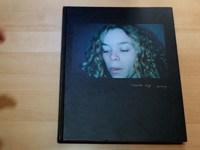
Similarly, to Gosselins book she opens immediately with an image and not her name or title. Capturing your attention straight away. However, she uses text in the way she captions the photographs, giving the viewer a bit more of an insight to the image, whereas Gosselin never uses text with his images.

Corinne Day tends to shoot images in colour, except for a few, which are presented next to one another in the book. Gosselin is similar in the way he tends to shoot in colour, however he has no images in his book which are in black and white.

The main difference I personally noticed between Day and Gosselin, is that the majority of Gosselins book is double spread pages, whereas Day has no double page spreads featuring in her book. Also, when Gosselin doesn’t do a double page spread he tends to have one next to a blank page bordered, however Day uses book next to one another for most of her book, as shown below;

In both books nudity is shown, however Gosselins nudity seems to be not as sexualised as Days. As one can see in the below image, hers are very explicit. However, the image below shows a similar layout to what Theo Gosselin uses when he doesn’t do double page spreads.

In conclusion, I have been influenced by both photographers books as they both have a certain style which I find aesthetically pleasing. Therefore, when designing my photo book I will take ideas from both of their books and alter it slightly to make it my own, combining both of their ideas.

 

Projecting onto a den


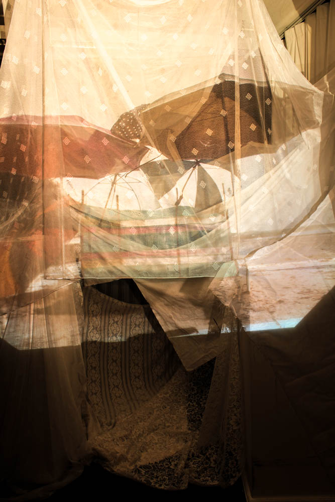
As i looked at the work of  Felicity Hammond i decided to create a den and then project my images onto it. Below you can see the structure of the den with no images projected onto it. I decided to build the den out of white material as i wanted the projections to be as clear as possible. I built the den to have loads of layers of material as i wanted the projections to be projected onto an abstract surface. I wanted my projections to look more abstract by having the material in wacky fold and curves. I used a variety of different types of white material as i wanted to see how the different opacities of the material looked with the different projections on them. The majority of the material i used was some sort of lace. I though that symbolically this could be quite interesting to consider the contrast between the old fashioned material and the dens made in childhood. My images of dens are essentially looking back in to the past and i used a material to construct my den which was traditionally used in the past. Lace has an extensive history, beginning to be made in 1500 AD. In my mind it is mainly associated with the Victorian ages and grandmothers houses. I simply though that as my whole project is about looking back in time, the material itself in this den should be a reflection of times past. 

Overall the idea worked better then i thought. I wasn’t sure how clear the projections were going to look when they were projected onto the material but they actually showed up really well. I was also able to make quite an interesting den structure as i made it inside and therefore had more walls ect to be able to attach the material to so that it lay right. This den more than any of the others really explores how material can be layered and folded over each other to construct a structure. 

The below image shows the setup i used. I simply used a normal projector in which i moved the distance towards and away from the den to project the dens onto the structure. The only thing was that the projector created quite an yellowish light which was not as effective as the white light i had been using to photograph my night time dens.

Above and below are the umbrella den projections. Some of the projections worked a lot better then others and this was one of the most effective ones. I quite like how there is the slight hints of colour from the projection but without it being a solid form or colour. I think this works better as the den and the projection therefore blend together better. The only annoying thing is the definite line where the projection ends as the light from the projector ends. This is frustrating just because i would have liked to have been able to take some pictures of the den as a whole with the projection on them but it doesn’t look very effective as you can see from the below image.  This is defiantly an instillation however which needs to be seen in person as it looks a lot more effective when you can see the projections in reality. 

The above image shows a close up of the projection on the den.

The beach den at St Brelades also worked really well. The way the material falls within the photograph in the foreground works really effectively. I think this image works so well as the colour of the sky has been washed out to become white and therefore it blends really nicely into the material. 

These images were the best as i started to project the material a bit more abstractly. I projected the above photograph on the corner of the den which was where the material fell in an abstract way. As i wasn’t projecting the material straight onto the structure and it wasn’t a flat part of the structure it created a more dynamic image. I quite like in this one how the projection ends and the rest of the frame is in darkness. It doesn’t work for other images but for this one it is really effective in emphasizing the abstract way in which the material falls. I think it also works because the angle of the purple material it at the same angle as the material coming down from the top of the frame. This creates the impression that the projection and den is more of the same.

The above and below images are close ups of where the material is curved and folded over itself and the projection appears in a more abstract manner because of this overall, i quite like the effect. 

The above and below dens were the ones which didn’t work very well. I think it was probably the photographs i choose to project from which just weren’t as effective.


Sewing into Photographs

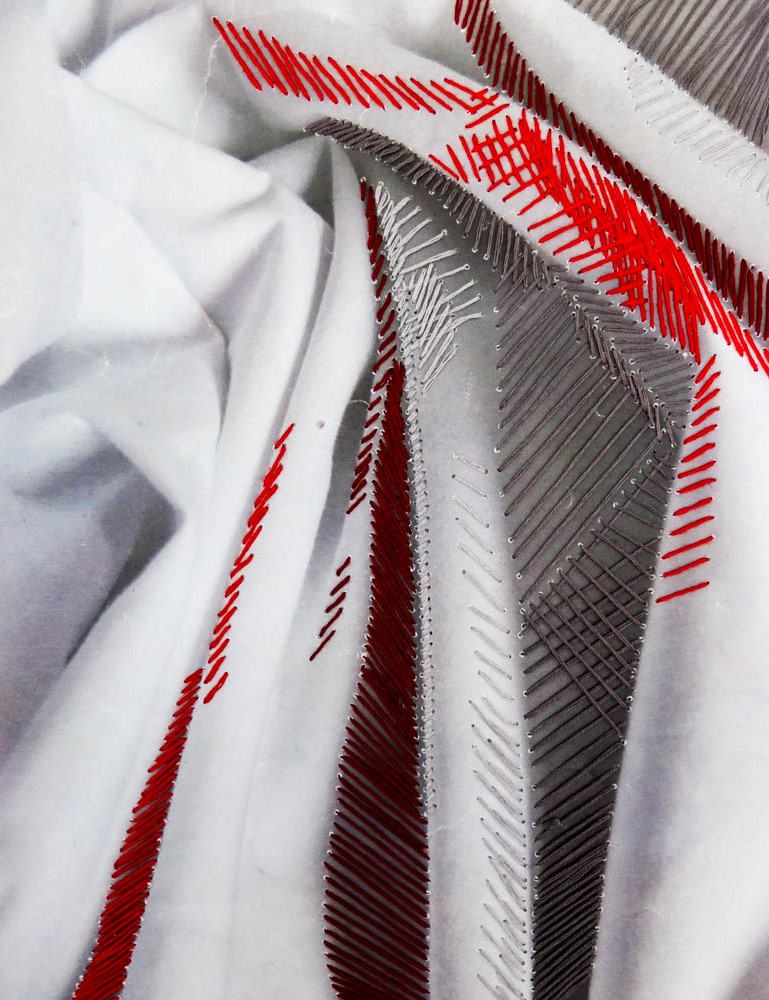
Thinking about ways to display my photographs has lead me to the little experimentation below. As Hammond’s work was all about conveying the tactile nature of photographs by making them into sculptures i wanted to experiment with other ways to make my photographs tactile. Therefore i decided to sew into them. My photographs are all about the materials used to build the dens and building dens is a tactile experience. I therefore decided to create some images which revolved around a tactile experience. I photographed some plain white sheets and then decided to sew into them adding loads of bright colours. The whole point of the dens is also the bright and vibrant colours which causes them to clash with their surroundings and so i wanted to add colour to the white sheets. I think this also links quite well with my idea which came directly from Hammond’s work, the projecting of my images onto white sheets. Here instead of projecting the images i am sewing patterns and colours into the work. Overall i quite liked it as a little experimentation of creating tactile photographs.